
Apps
Apple is already backing out of Liquid Glass
Beta updates are reducing transparency


Apple is introducing a new design philosophy for the upcoming iOS 26. Instead of the solid colors we’re so used to, the new operating system is switching to Liquid Glass, a transparent design that allows users to see behind panels. However, despite the brand’s excitement since the design’s announcement, Apple continues to tailor the transparency ahead of the system’s launch.
Liquid Glass is new to Apple, but it should be familiar to anyone who used a Windows PC from around two decades ago. Back then, Microsoft reveled in transparent windows and toolbars. The operating system has since adopted a flatter design. With iOS 26, Apply is ironically going old school… but not without some hiccups.
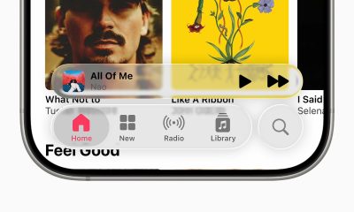
In the third beta of iOS 26 (via Sam Kohl on X), Apple is having a slight change of heart. Rather than a very transparent design with slightly obscured details, the newer design offers whiter colors with only a blurred peek at what’s behind everything.
This isn’t even the first time that Apple went back on its original vision. Towards the end of June, the company also added a bit more opacity through another update, making design elements much easier to read when there are chaotic elements on the main screen. Now, it’s even easier to read.
On the flip side, Android 16 focuses on improving the readability of its design by adding bolder fonts and icons. Liquid Glass, in contrast, has been criticized for lacking readability. It’s a clear diverging of paths for Android and iOS.
However, with the number of opacity-increasing updates, Apple might be backtracking ever so slowly on its bold vision of the future. The changes are now creating a rift between fans who appreciated the braver version of Liquid Glass and those who prefer readability.
SEE ALSO: iOS 26: new Liquid Glass design, Apple Intelligence, more




Apps
Firefox ad reunites all your favorite memes from decades ago
The Numa Numa Guy, Annoying Orange, and Chocolate Rain are back!

Before Tung Tung Tung Sahur and Skibidi Toilet, the early internet was populated by charismatic personalities looking to make their presences felt in a land that didn’t have a lot of rules yet. As early users, we danced to “Dragostea din tei,” belted out “Chocolate Rain,” and copied “Shoes” word-for-word. Today, Firefox is bringing all those good memories back for a grand reunion.
In a new ad, the web browser featured ten of the biggest stars of the early internet including the aforementioned Numa Numa Guy, Tay Zonday, and Shoes’ Kelly. You can also see Annoying Orange, Chuck Testa, Overly Attached Girlfriend, Bad Luck Brian, Where the Hell is Matt?, the Apparently Kid, and the Success Kid.
Now, this isn’t just a reunion. The ad has a clear message about today’s most concerning issue: AI. Everything has “built-in AI, always asking, asking, asking,” as the Annoying Orange said.
“They make money by following us, and somehow, I’m the creepy one?” the Overly Attached Girlfriend asked.
All these famous personalities are asking what happened to the internet today. Obviously, the big takeaway is that we should all go back to Firefox.
Compared to other browsers, Firefox has a lot of built-in features that offer a lot of control for users. For one, it has its own VPN for privacy. Secondly, reflecting the ad’s message against AI, the browser has a toggle to minimize AI features.
SEE ALSO: Google illegally destroys 250,000 trees for a single AI data center
Apps
Salesforce introduces Slack Frontline for deskless workers
Simple, secure, mobile-first way for deskless teams across retail, healthcare, manufacturing, field service

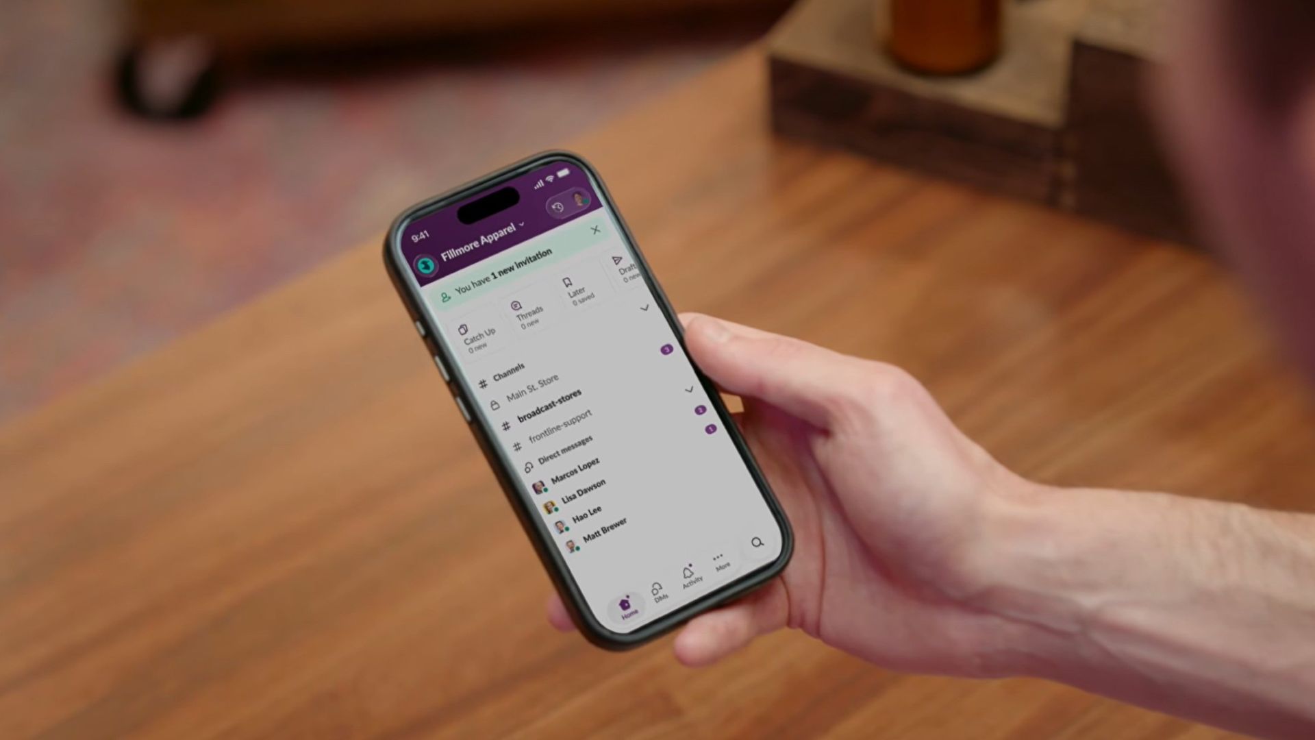
Salesforce is bridging the massive divide between corporate headquarters and deskless workers with the launch of Slack Frontline.
This new solution is designed specifically for retail associates, healthcare providers, factory workers, and field crews.
The mobile-first workspace brings communication, data, role-specific tools, and AI together in a single clutter-free app.
While frontline employees make up about 80 percent of the global workforce, they have historically been left out of workplace transformation, often relying on paper checklists, group texts, and broken communication loops.
Slack Frontline addresses these challenges by giving mobile workers up to 10 role-relevant channels, instant Huddles with headquarters, on-demand AI agents, and automated workflows.
Backed by Salesforce data and enterprise-grade security, the platform lets IT teams govern the entire workforce under one secure layer with employee ID sign-ins, multifactor authentication, and compliance configurations like HIPAA.
This ensures that critical updates, training materials, and shift handoffs reach workers directly in their pockets without needing corporate email addresses or shared terminals.
Moreover, the platform is tailored to transform operations across multiple industries, including retail, home healthcare, manufacturing, hospitality, and field services.
For instance, retail teams can instantly sync promotions and monitor inventory, while healthcare professionals can securely review patient histories and coordinate care on the go.
Manufacturing and hospitality teams benefit from drastically reduced downtime and faster issue resolution, cutting response times significantly.
Slack Frontline is available now as an add-on for businesses on the Slack Enterprise+ plan.
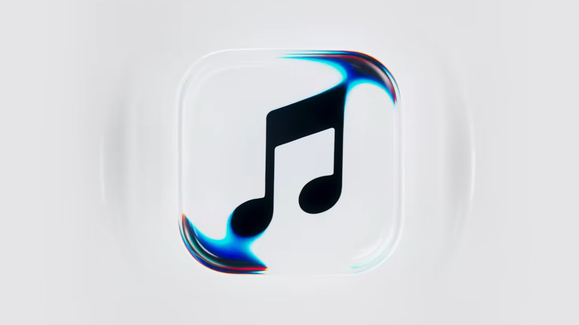
Apple Music is getting a revamp. In one of the tamer things going on with the brand today, Apple has introduced a new design language for its native music streaming platform.
In the midst of all the hubbub surrounding the iPhone Duo, Apple released a change in the visual identity of Apple Music. Rather than a static logo, the platform’s newest evolution offers a dynamic look that melds Liquid Glass and the power of sound together.
Confirmed through a behind-the-scenes video, Apple says that the new aesthetic was made with practical effects. Music producer Fred Again and NEST Acoustics submerged the platform’s logo in a tank of mineral oil and creating ripples with sound. The new language matches well with the chrome aesthetic typical of today’s trends and… well, Liquid Glass, of course.
Apple says that the more ripple-filled version will play before longer content like concert recordings (similar to Netflix’s startup stinger). Meanwhile, a black-and-white version will replace the app’s icon currently colored red and white. Current previews show off a simple logo, but it’s unknown whether Apple is adding a but more elements when the final version drops.
The updated version will debut for users after next week’s iOS 27.2 and macOS 27.2 updates.
SEE ALSO: Apple iPhone Duo Unboxing and Hands-on

ROG G700 review: The best prebuilt PC you can get off the shelf
This PC will make you stop worrying about specs.

HP OMEN Max 16 review: Gamer-maxxing in deep black
Peripherals deemed necessary to max this out

vivo V80 review: Good phone, tough sell
A capable travel companion

4 new nutribullet kitchen essentials to make holiday hosting easier

Inside Infinix’s first global concept store in Bali

Wild Rift Patch 7.3, celebrates K/DA comeback

LG showcases its latest AI TVs in the Philippines

Your coffee nook is getting a makeover with Starbucks’ holiday collections


-
 News2 weeks ago
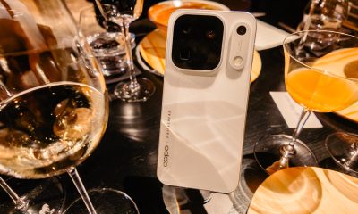
OPPO Find X10 Series: Price, availability in the Philippines
-

 Cameras2 weeks ago
DJI Osmo Pocket 4P Pearl White now available globally
-

 News2 weeks ago
OPPO Find X10 Series: Price, availability
-
 Lifestyle2 days ago
Your coffee nook is getting a makeover with Starbucks’ holiday collections
-
Gaming2 weeks ago
HP OMEN Max 16 review: Gamer-maxxing in deep black
-
 Entertainment2 weeks ago
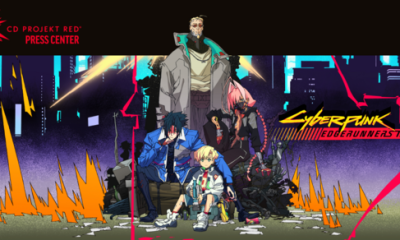
Cyberpunk: Edgerunners 2 now streaming, Cyberpunk 2077 update coming
-

 Lifestyle4 days ago
Sticker season is back, and so is the planner your ~friends~ might fill in for you
-

 Laptops2 weeks ago
ASUS ProArt P14, P16 laptops with NVIDIA RTX Spark now available