
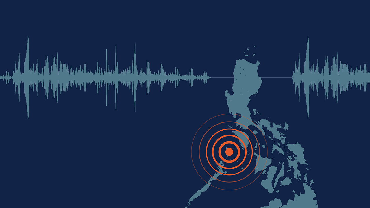
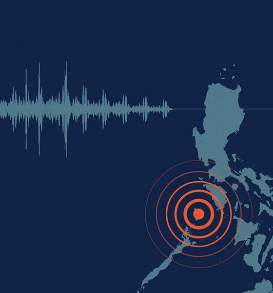
Back in July, an earthquake rocked Metro Manila. Unbeknownst to most but noticed by some, a globally renowned company was helping everyone through the natural incident: Google. In the few minutes leading up to and during the 6.7 magnitude earthquake, Android users received important alerts warning them of the ongoing tremors. Though it wasn’t the dreaded Big One, the alert afforded attentive users a few precious seconds to either seek appropriate cover or stop doing dangerous tasks.
Incidentally, the tech surrounding Google’s earthquake alert system wasn’t just hastily built on ongoing databases or social media. Google actually packed in a fully responsive earthquake sensor for Android phones.
Faster than an earthquake
The forever-increasing speed of technology has always been a contentious element since the rise of smartphones. Developers and users alike have wondered how accurate or quick our favorite devices can warn us of things happening around us. There’s even an XKCD comic about how Twitter can warn us of an earthquake minutes before it reaches the reader.
Over the years, technology has developed new ways to deliver alerts. From simple weather apps to city-wide messaging systems, users can receive warnings in a timely fashion. Practically nothing is a surprise anymore with the right technology.
That said, Google has successfully developed a new system that can rely on other Android smartphones to accurately tell whether or not an earthquake is happening.
A quake detector in your pocket
Speaking to Android Police, the feature’s lead engineer Marc Stogaitis described how Google’s earthquake sensor leveraged other devices to tell users about the quake. It all revolves around the different sensors built inside your phone.
As it is, every smartphone comes with a host of sensors to support its different functions. A light detector can seamlessly adjust brightness and camera settings, and a gyroscope can support compasses, for example. With earthquakes, the biggest element to ponder on is a smartphone’s movement and vibrations during an earthquake.

According to the lead engineer, figuring out the metrics for detecting an earthquake wasn’t a problem. After decades of accurate seismograph technology, developers already have an idea on what they need to measure.
However, the technology does not stop there. Naturally, there are hiccups to relying on just a single (or even every) phone’s data. For one, a city-wide messaging system can set off everyone’s phone in a single area, potentially causing false positives. Plus, relying on a single phone is definitely tricky. There are multiple actions which can cause vibrations akin to an earthquake.
Crowdsourcing a quake
The feature doesn’t rely on just one phone. It doesn’t tap into every Android phone in an area either. Instead, it collates data from phones plugged into a charger. Naturally, a plugged-in phone is the most reliable barometer in terms of battery reliability. They won’t die out in the middle of an earthquake and ruin a source of data. Additionally, charging phones are often stationary. They won’t be affected by motions that mimic earthquakes.
Google “listens” to charging devices in an area. If the subset meets the criteria for an earthquake, the company quickly determines the earthquake’s epicenter (based on approximate location) and magnitude. Once the system declares that a quake is indeed happening, it sends out an alert to nearby devices and gives them the time needed to seek shelter.
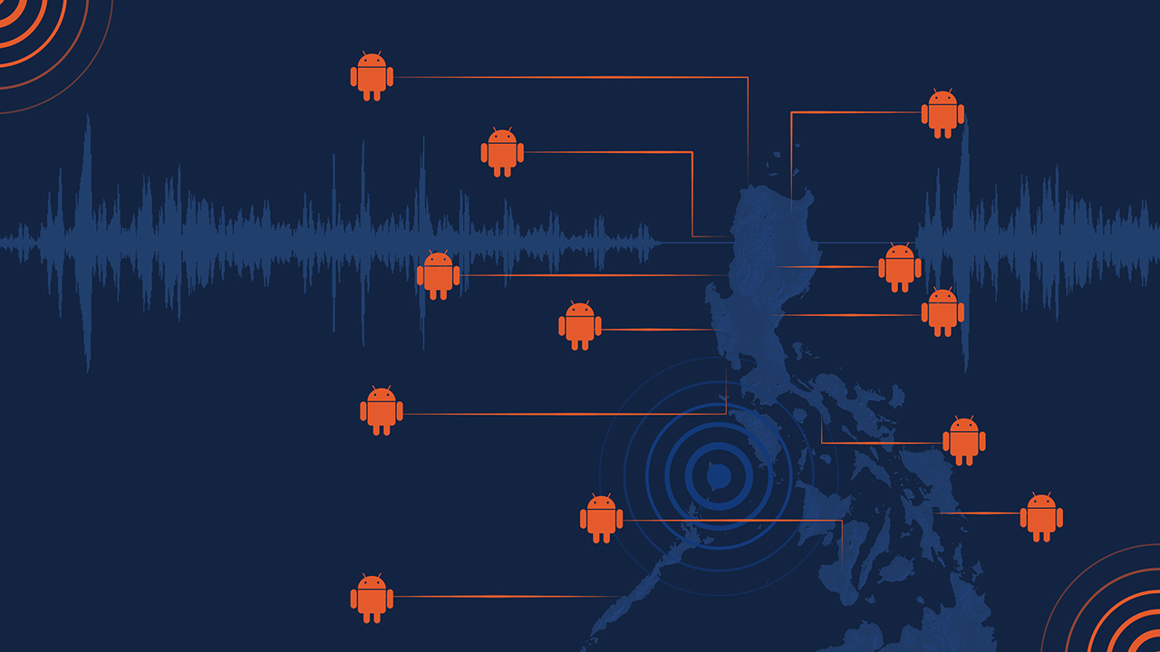
The alerts naturally prioritize people nearer to the epicenter. But, of course, the speed will ultimately depend on the phone’s connectivity. A phone hooked up to a building’s fast Wi-Fi connection will receive alerts faster than a commuter’s phone on data while going through a tunnel.
Still, the short time that the alerts give users is enough to save themselves from a precarious situation. Though the feature can potentially warn users of quakes minutes in advance, Stogaitis says that it will more realistically push alerts five to ten seconds before the incident. However, five seconds is enough to go under a table and have some sort of protection against falling debris.
Still keeping things private
For anyone worrying about how Google is handling their data, Stogaitis says that the company removes all identifiers from the data except for approximate location. And, despite that, Google still maintains that the feature will be the most accurate that it can be. Either way, the feature will be useful for any earthquakes in the future.
The earthquake sensor is available for any Android phone running Lollipop and above. Naturally, the feature still necessitates that users turn on emergency alerts on their phone.


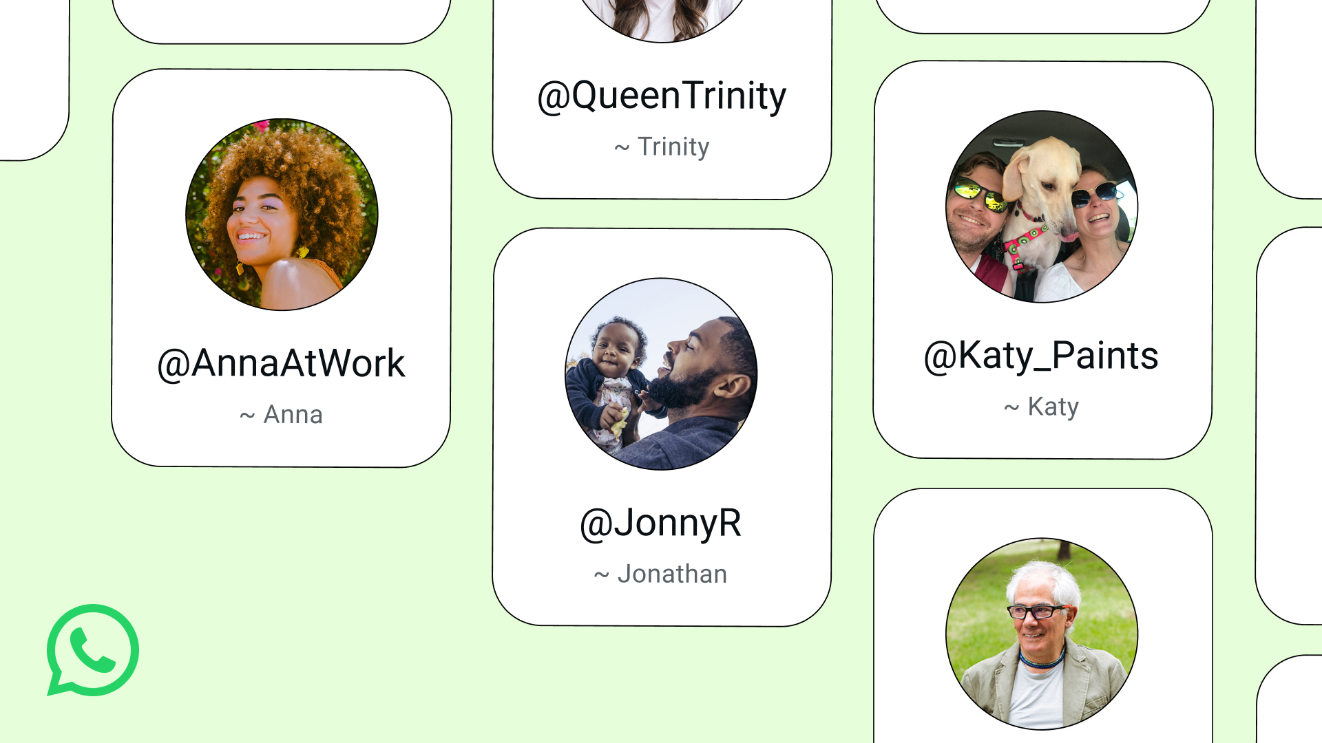
WhatsApp is about to get an extra later of protection. After thriving on number-based chatting, the platform will soon add usernames, eliminating the need to share your number with strangers.
Usernames are the standard way of maintaining your anonymity online. Though most platforms today require users to log their email addresses or phone numbers, establishing a username can prevent other users from seeing this information way too easily.
Today, Meta has started rolling out reservations for WhatsApp usernames. The feature itself isn’t available yet, but early adopters can grab theirs as soon as the setting becomes available on their app.
To access the reservation, users can go to Settings > Account > Username. Of note, this isn’t available for everyone yet. But if you want to take dibs on a specific name, be on the lookout for the setting.
As for the username itself, users can reserve anything as long as it’s unique. Business owners and creators can also use their Facebook or Instagram handles as their WhatsApp usernames.
The feature, once it launches, will stop users from accessing your phone number when messaging. Similarly, other users will now need your exact username to start a conversation. Users can also set a separate code to protect conversations further.
SEE ALSO: Meta adds subscriptions for Facebook, Instagram, and WhatsApp
Apps
HONOR, Xiaomi are working on their own Privacy Displays
Samsung’s Privacy Display is apparently very popular
Normally, a smartphone brand’s blatant copying of another brand’s feature is not a good practice. Today, however, there is a new feature that we wish other brands would copy: Samsung’s Privacy Display. Thankfully, some brands, like HONOR, have finally gotten the message and are working on version of the feature.
As reported by Digital Chat Station on Weibo, HONOR is reportedly working on a privacy screen for its smartphones. Likewise, Xiaomi is working on the same thing, potentially launching the feature for the Xiaomi 18 Pro.
For the uninitiated, the Samsung Privacy Display is a built-in feature that blocks visibility of the screen at certain angles. If you’re not looking at the screen from the front, all you’ll see is a black void. It’s a built-in version of those protective screens that you can buy separately. Besides adding a nice layer of protection against scratches, it’s also meant to prevent snooping from your shoulder.
Samsung’s take was widely acclaimed for being insanely useful. When it arrives, this feature will be a godsend to more brands. Even better, users will no longer need to rely on third-party screen just to enjoy the privacy.
That said, there’s still no indication as to when these features will arrive on either HONOR or Xiaomi.
SEE ALSO: LE SSERAFIM Chaewon flexes Galaxy S26 Ultra Privacy Display
Meta does not have the most stellar of reputations. Despite offering the world’s most popular social media platforms, the company, through its various experiments throughout the years, continuously proves that it has other priorities than just providing the best for its users. Today, another reported experiment wants to take Meta to a new market that its users might fall into: the prediction market.
If you haven’t heard of the prediction market, consider yourself lucky. These apps, such as Kalshi, are basically just gambling platforms without the glitz of playing cards or the rigor of the stock market. Users gamble on mundane circumstances like the weather and more serious ones like war.
Today, as reported by The New York Times, Mark Zuckerberg is reportedly asking Meta to develop a prediction app of its own. Interestingly, the experimental app, supposedly called Arena, will use virtual points, rather than real money. However, Meta has not ruled out real money — and hence, real gambling — in the future.
Meta is entering the industry at an extremely volatile time. The world is starting to crack down on prediction markets. Some users, for example, have been accused of using insider information to get easy wins on these platforms. Some markets have also accused these platforms of subverting anti-gambling laws.
SEE ALSO: Meta adds subscriptions for Facebook, Instagram, and WhatsApp

realme C100: Enduring and durable in spite of entry-level realities
Enough power but needs more agility
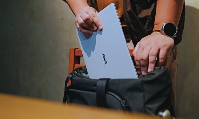

The ASUS ExpertBook Ultra wins you over
The laptop sneaks up on you


vivo X300 Ultra review: A “Whole Different Animal”
Got the beast (finally) unleashed!

Sony launches IER-M500 in-ear monitors
realme C100: Enduring and durable in spite of entry-level realities

Microsoft dictates that a new Fallout game is coming

New York becomes first state to ban smart glasses

HoYo FEST 2026 details announced; tickets on sale from July 16

Buyer’s Guide: TECNO SPARK 50 Pro vs SPARK 50 5G

TECNO’s SPARK 50 Pro is the latest budget smartphone battery beast

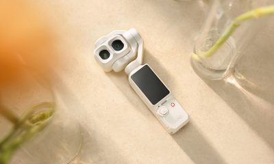
DJI Osmo Pocket 4P launches with dual lenses and a 1-inch sensor
vivo X300 Ultra review: A “Whole Different Animal”
Lenovo says RAM prices are not coming back down again


-
 Cameras2 weeks ago
DJI Osmo Pocket 4P launches with dual lenses and a 1-inch sensor
-
 News2 weeks ago
Lenovo says RAM prices are not coming back down again
-
 News1 day ago
New York becomes first state to ban smart glasses
-
Laptops1 week ago
The ASUS ExpertBook Ultra wins you over
-

 Gaming1 week ago
PlayStation goes all-digital in 2028
-

 Laptops1 week ago
ASUS launches the ExpertBook Ultra
-
 Gaming1 week ago
Xbox might get rid of physical discs too
-

 Enterprise1 week ago
Google ordered to pay EUR 4.1 billion in fines