


Reviews
Huawei MatePad Pro 12.6: A worthy pro tablet
Even more if you’re already invested in Huawei’s ecosystem
Recovering from their dark past of being cannibalized by the growing sizes of smartphones, tablets have once again secured their spot in the market. From what had just seemed to be a bigger smartphone, tablets have gotten overhauled into a somewhat capable and more portable laptop replacement.
This is thanks to the few determined brands that persistently kept looking for innovative uses for these large devices.
Among the few is Huawei who once again brings us something very promising this year as they introduce their most powerful tablet yet – the new Huawei MatePad Pro 12.6.
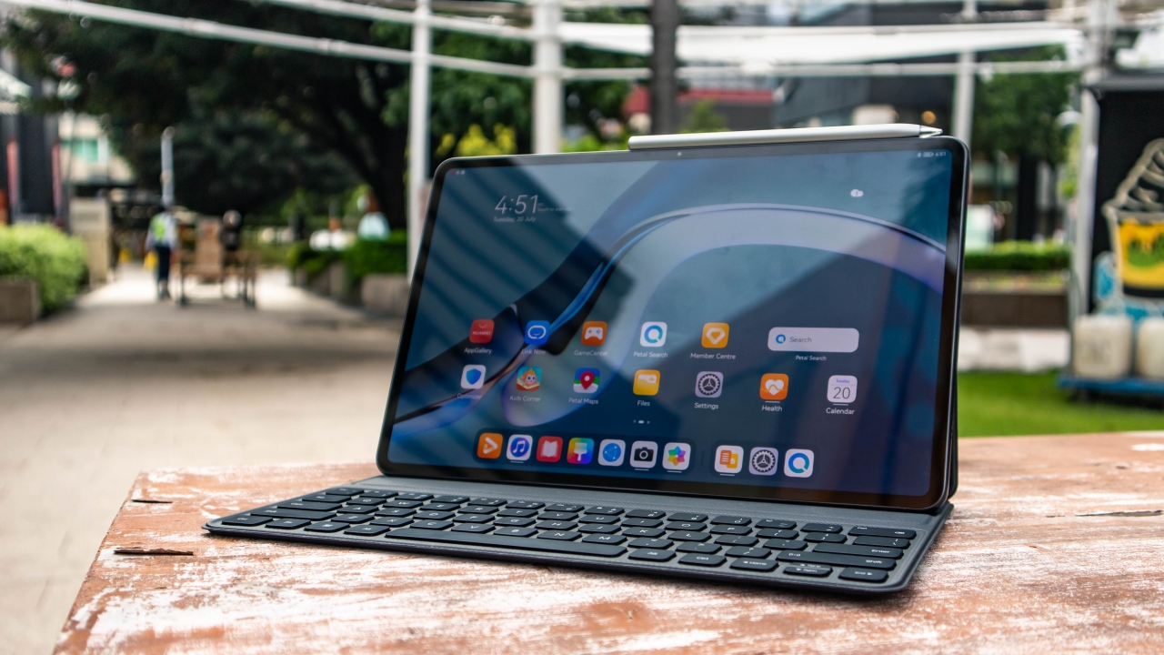
Sleek design
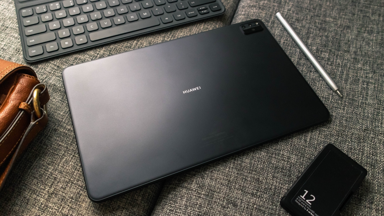
Faithful to the MatePad series’ design, the MatePad Pro is built with an aluminum body with a Matte Grey finish. On its front, we have the 12.6-inch OLED display framed with its sleek looking ultra slim bezels.
While the design isn’t something to marvel at, the incredibly thin 5.6mm bezels still manages to carry in it the front facing camera which makes it look a bit cleaner than the punch hole design seen on its predecessor.

For a 12.6-inch device, the MatePad Pro is relatively lightweight as it is lighter than Apple’s iPad Pro 12.9-inch at only 609g. Though you would still probably prefer to use this on your desk as hand holding it like you would with a smartphone would still feel tiring for your arms after a while. After all, you’re still carrying more than half a kilo.
Snappy performance with capable hardware
Running on flagship specs, the MatePad Pro is powered by a Kirin 9000E 5G SoC, 8GB of RAM and 256GB of internal storage. If you’re unfamiliar with this chipset, this happens to be Huawei’s contender that goes head on with the also very powerful flagship from Qualcomm, the Snapdragon 888.
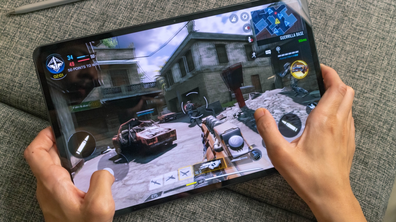
So how does it perform? Well, just as you would expect from a flagship – everything felt snappy fast. From gaming on graphically demanding games, like Call of Duty: Mobile and Asphalt 9: Legends to some light video editing with FilmoraGo, the MatePad Pro handled everything like a charm. It was a struggle playing FPS games because of its size though, but its hardware is more than capable rendering everything even at the highest graphic settings.
Vibrant yet accurate OLED display
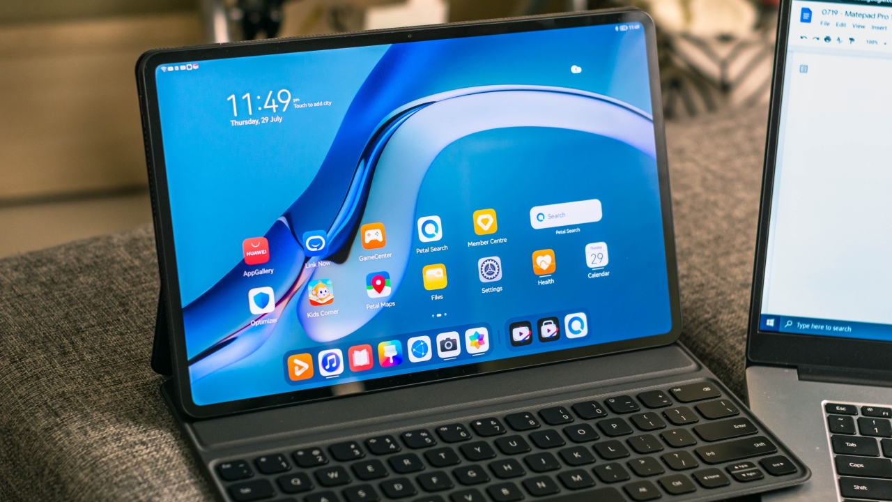
There’s plenty of room to play with in this 12.6-inch OLED display as its screen resolution of 2560×1600 and the 16:10 aspect ratio makes it perfect for multitasking apps side by side.
I understand that many creative professionals are probably eyeing on using this for creative work. And here I say, this display is also perfect for such use. With its DCI-P3 color gamut, colors appear closer to what they would actually look like in real life.
That being said, taking breaks and watching videos on this screen is also a pleasurable experience as the deep blacks and the high contrast produced by OLEDs really makes images pop.

The screen brightness is also more than enough for indoor use but much like any other OLED device, viewing under direct sunlight is a struggle.
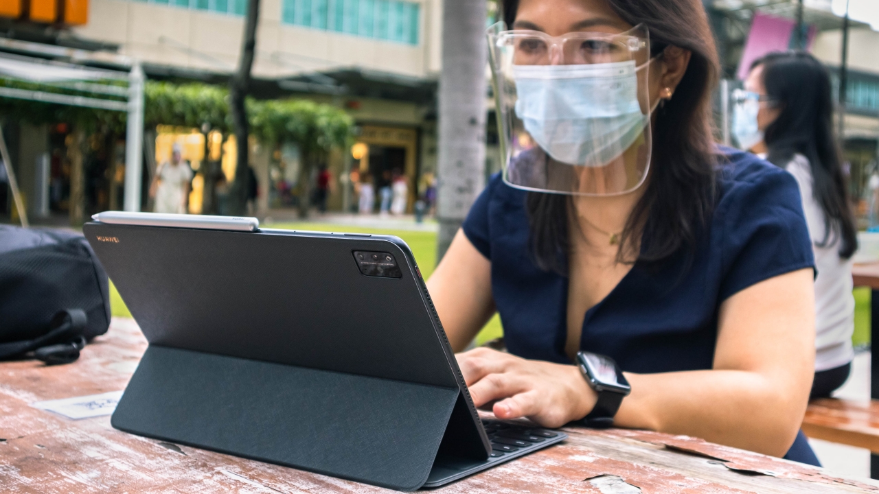
A multifunctional keyboard and the new M-Pencil 2.0

A magnetic keyboard that doubles as a protective cover isn’t something new for tablets. I do like how the keys are widely spaced, the relatively long key travel and its professional look. However, do take note that this does not come close to the same user experience as Apple’s Magic Keyboard for the iPad rather it is similar to their Smart Keyboard Folio.
For one, it doesn’t have a trackpad which is a bummer and the keys are placed near the edge of the frame. This leaves us no space to rest our palms on if we were to use this on smaller spaces.

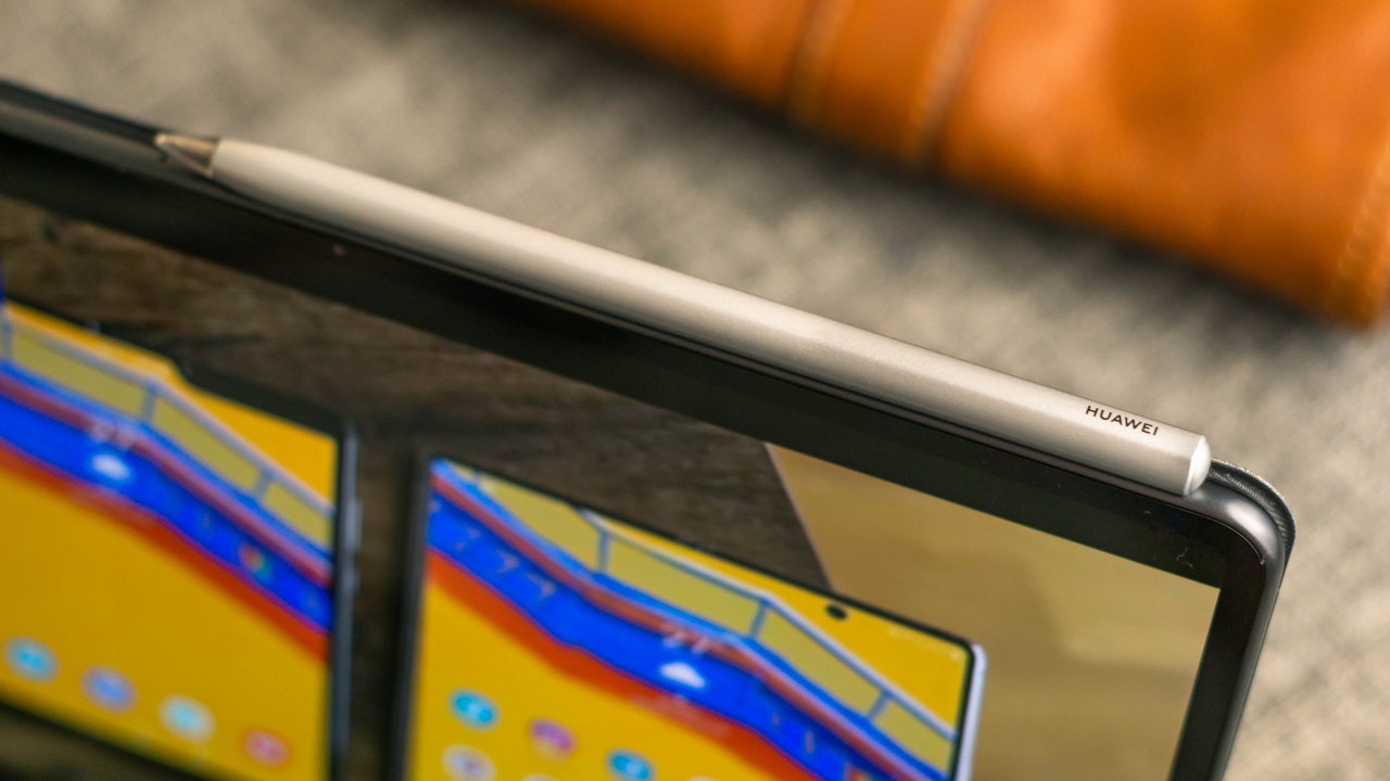
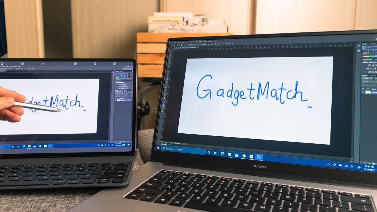
The M-Pencil 2.0, on the other hand, is really good. With its 4,096 levels of pressure sensitivity, this new version of the M-Pencil is capable of simulating different strokes that artists do if they were using a brush or a pencil. It also has handy shortcuts like Double-tap Toggle which allows you to go back and forth selecting different tools.

When left on its docked position, the M-Pencil 2.0 seamlessly connects to the tablet and automatically charges itself leaving it always fully charged and ready to use.
Powered by HarmonyOS 2.0
I had mixed feelings with HarmonyOS going into this review, and I can say, I still do. Yes, it does feel very polished and similar to Android but the app compatibility is still what keeps me away from fully investing myself in it.
While Huawei’s AppGallery may have a growing library of apps, it still lacks many of the familiar apps that we use. The good news is most of these apps are ones that can be accessed through the browser like Facebook, Youtube and Netflix.
And here’s the thing. You’d probably use this tablet like how you’d use a laptop anyway and on our laptops, that’s exactly how we access these — on our browser.

I’ve also realized that most Android apps will actually work with HarmonyOS 2.0, you’d just have to install them manually. That’s where the new Petal Search feature comes in handy. You can simply type in the name of a third party app you’re looking for and it would look for an appropriate APK file for you from different sources.
Multi Screen Collaboration with Huawei devices

A feature you get access to if you’re living in Huawei’s ecosystem is the Multi Screen Collaboration. It’s also what I enjoyed most with this MatePad Pro. Paired with the MateBook D15 that I’m currently using, I was able to mirror and extend the laptop’s display to the MatePad as well as drag and drop my files between the two devices.
It certainly feels like you’re getting more out of your device as it opens up more possibilities of what you can do with this tablet. I was able to use the MatePad as a drawing tablet controlling the laptop as well as use it as an additional desktop workspace. This gave me much freedom for multitasking and an accurate reference monitor for photo editing.
Battery that’s built to last
Back in the earlier days of tablets, I remember owning a tablet which struggled to last two hours on web browsing. That isn’t the case here. Huawei rates this device to last up to 9 hours straight web browsing with its large 10,050mAh battery. Long enough to last you a whole work day or even longer if you plan on doing work offline.
The included 40W fast charger should get you all juiced up for about a little over two hours which is pretty decent for such a big battery capacity. I also charged this with the charger that came with the MateBook D15 and that worked well too so less things to pack in case you happen to have both devices with you.
Cameras that may come in handy
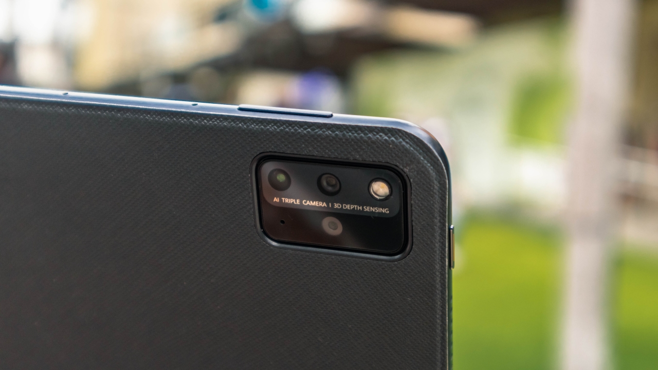
Kind of unique for a tablet, the MatePad Pro 12.6 comes packed with three cameras. A 13MP main shooter, 8MP wide angle and a 3D depth sensor.
You may kind of look weird doing mobile photography on such a huge device, but if that is really something that you prefer doing, the MatePad Pro can definitely get the job done.
I’d say decent enough image quality, but more than enough for a tablet since you’ll just probably use this to take photos of documents or references for work.
Exquisite audio quality for a tablet
A total of eight speakers have been loaded into this body. With four woofers and four tweeters tuned by Harman Kardon, I was blown away by how good this sounded. This may just be the best sounding speaker setup I’ve experienced on a portable device.
Without exaggeration, this beats even most laptops I’ve used. I could really hear the details and the full range of instruments I’ve listened to. With deep kicks and crispy snare drums, nylon guitars and orchestrated string instruments sound heavenly.
Is the MatePad Pro 12.6 your GadgetMatch?
If you’re just planning on getting something bigger than your phone for browsing and media consumption, the steep price tag of the MatePad Pro makes it hard to recommend.
This changes however, if you’re a graphic artist looking for an iPad Pro alternative especially if you consider that the competition is priced even higher.

The solid specs, great display, large battery capacity and that stellar sound quality is absolutely worth the price. Even more if you’re already invested in Huawei’s ecosystem, adding the MatePad Pro really unlocks a range of handy features. It’s a very definite yes for me.
I’m really excited to see what’s in store for the MatePad Pro in the near future as more apps become available and grow more stable running on the HarmonyOS.
The MatePad Pro 12.6 retails at PhP 55,999.


Reviews
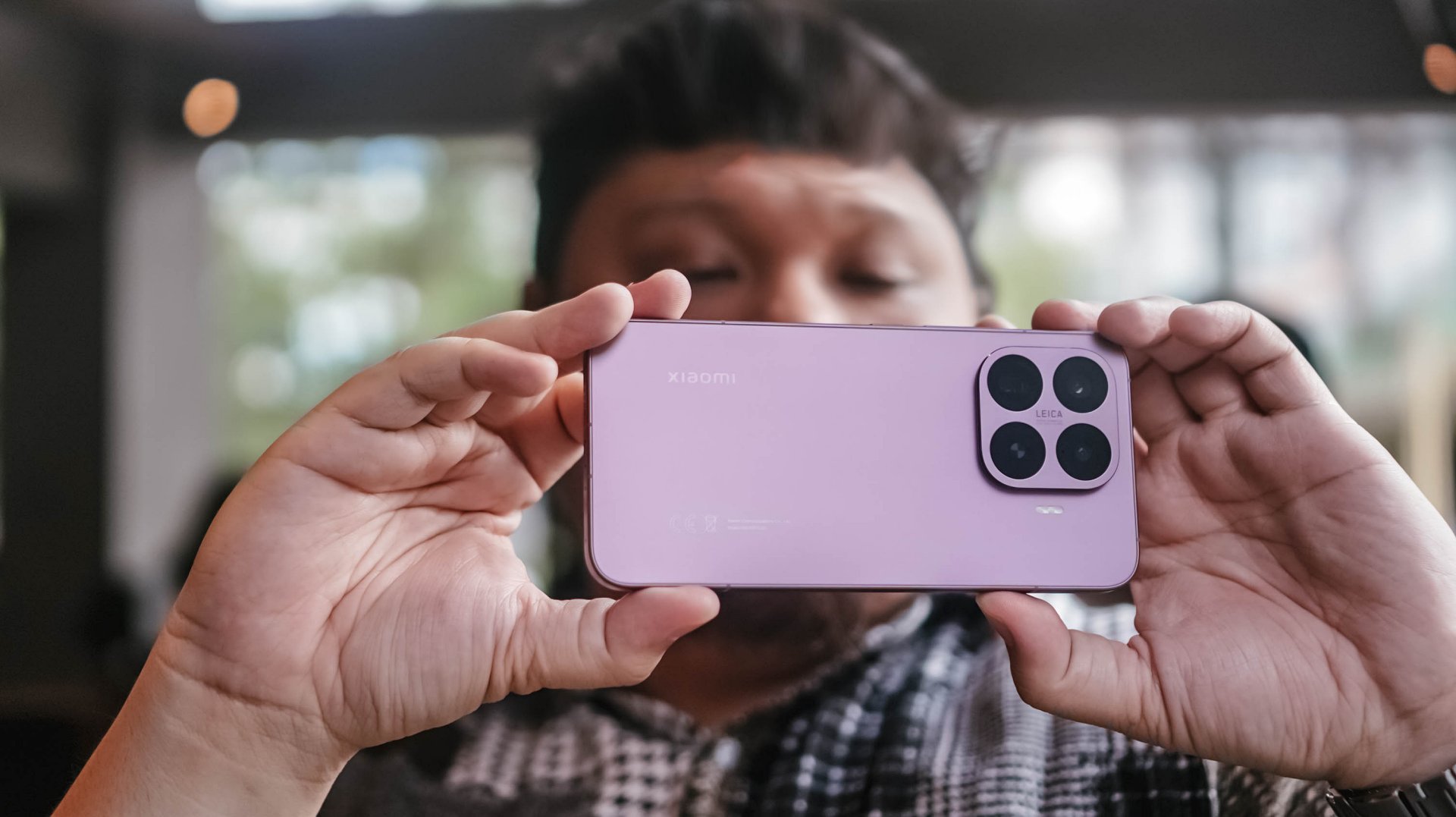
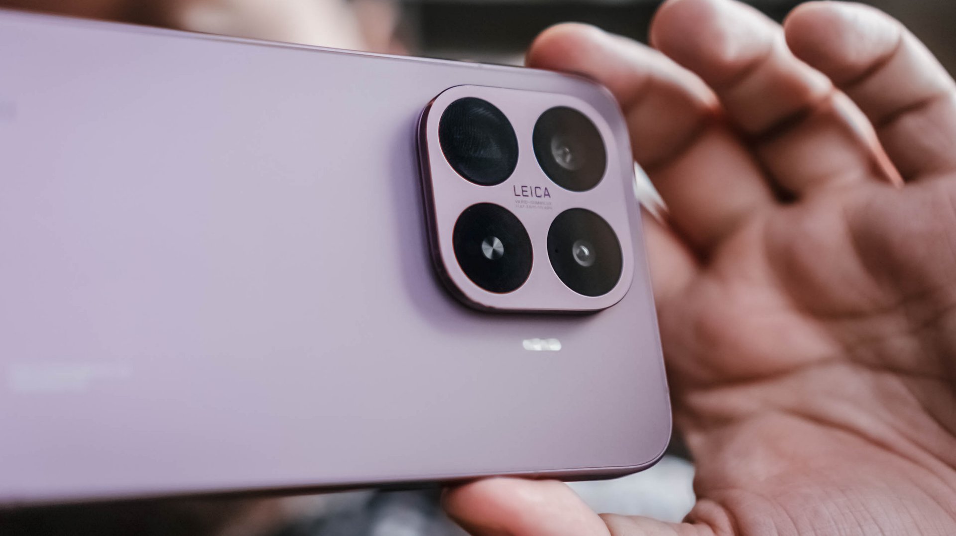
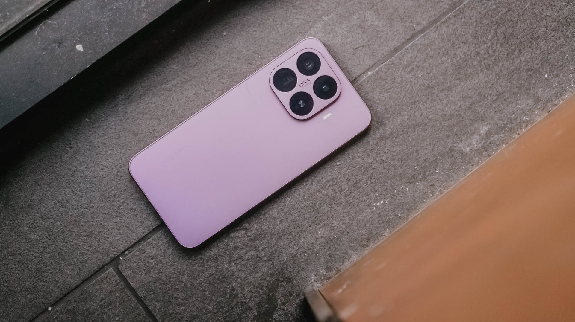
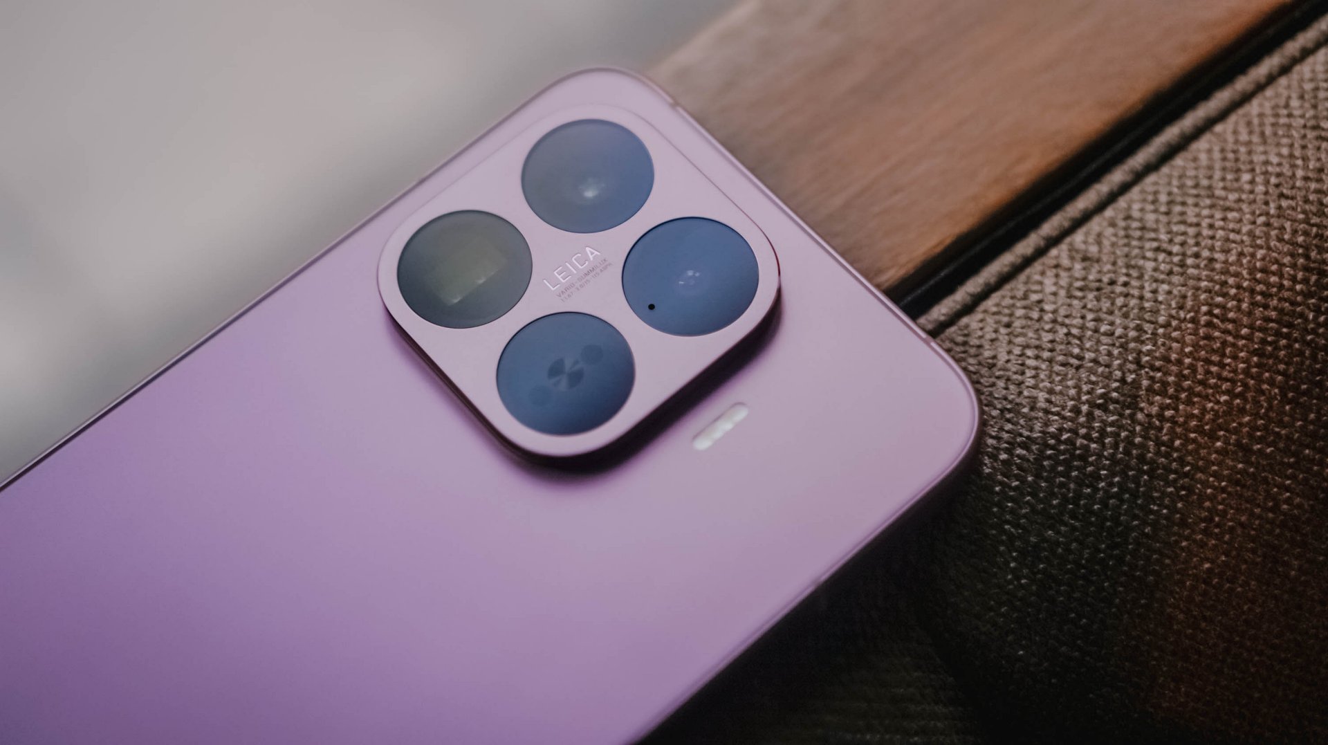
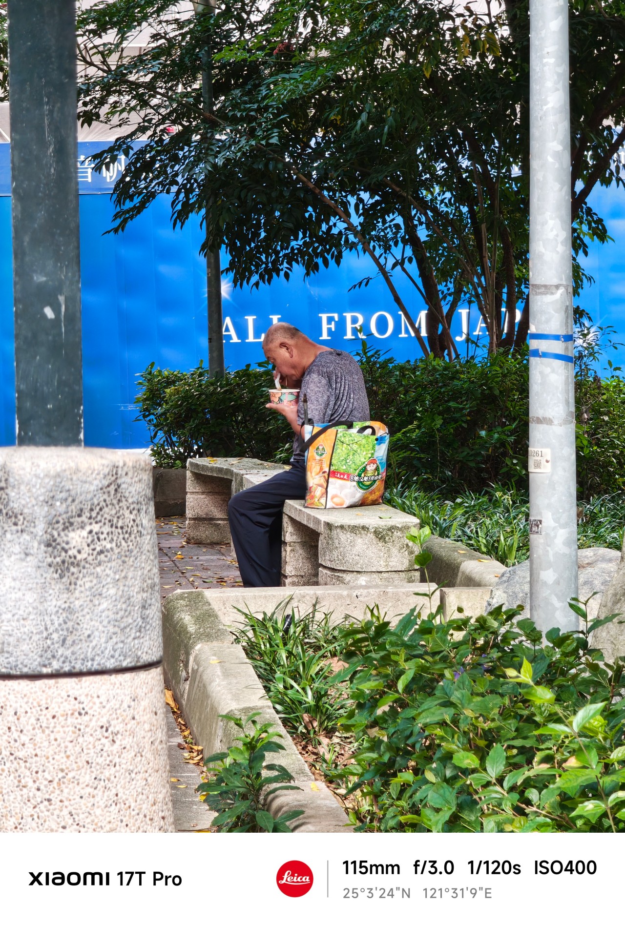
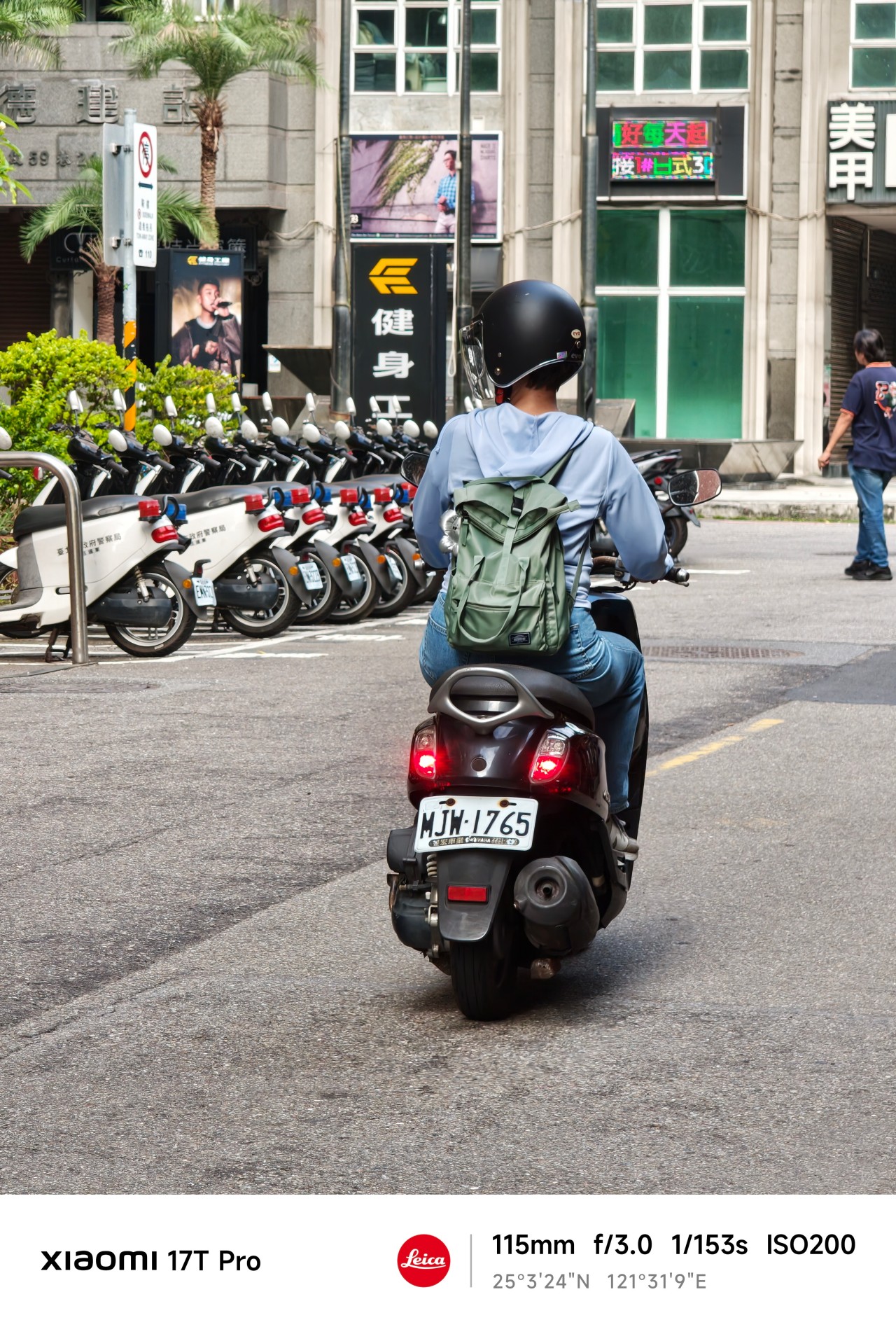
Close without crossing: A Xiaomi 17T Pro photo essay
Distance and closeness are not always opposites.
I have spent the better part of the last few weeks grappling with multiple emotions.
I feel silly referencing this but as a “feel” type, my days are guided by vibe and mood. It’s been a challenge trying to reconcile and make sense of everything.
Thankfully, the Xiaomi 17T Pro presented an unexpected outlet.
So no, this isn’t exactly a review of the Xiaomi 17T Pro. This is yours truly, once again, processing feelings through a telephoto essay.
The “T” is for Telephoto
When being briefed about Xiaomi’s latest device, my favorite part was when a guest photographer jokingly attached the T in the Xiaomi 17T series to “telephoto.”
It’s not official or anything. But in this case, it made perfect sense.
My relationship with Xiaomi’s T series has always been a little complicated. For a while it felt like it was searching for an identity. One year it was positioned as a performance-focused device. Then it became an all-rounder.
Now, one of its biggest highlights is a dedicated 115mm equivalent telephoto camera. The reality is that it might actually be all of those things at once.
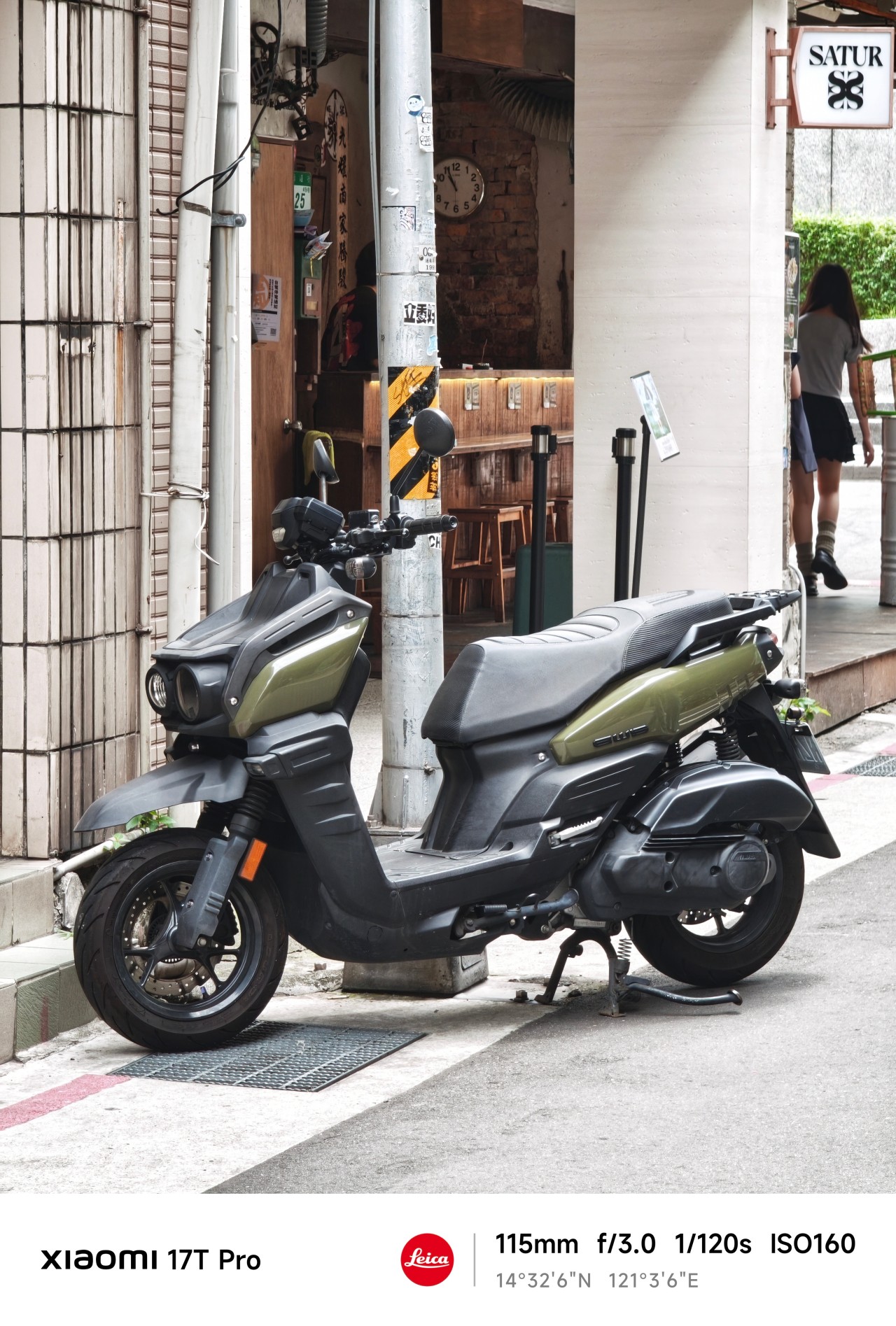
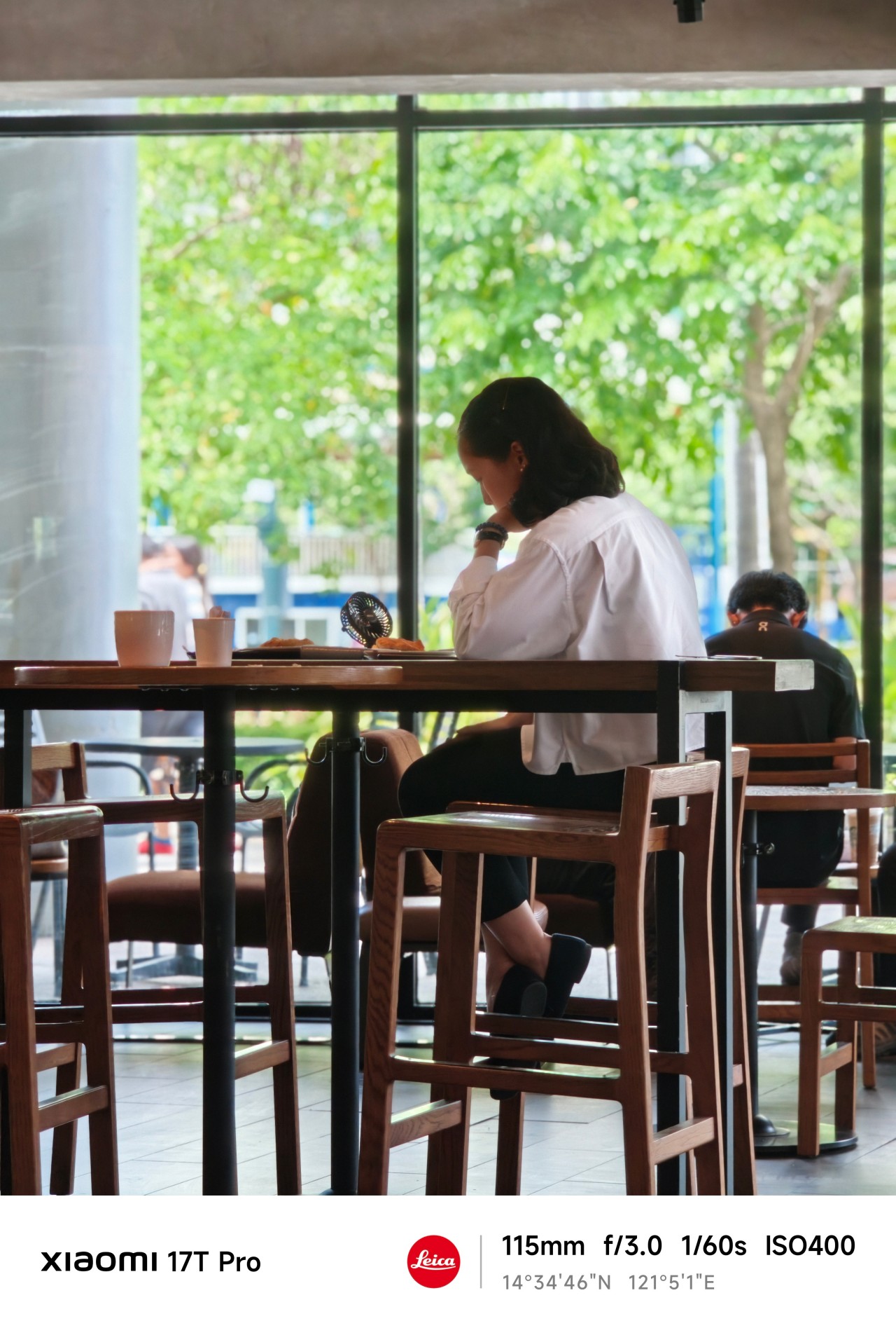
For this piece, however, I ignored almost everything else. I shot almost exclusively at 115mm.
No elaborate test plan, no checklist of scenarios, and no mission to prove a point. I simply carried the phone everywhere and photographed whatever caught my attention.
At first, I thought I was testing a camera. Eventually, I realized the camera was teaching me something instead.
Chasing
When the year started, I was certain about something. Or perhaps someone.
The conversations were easy. The banter felt natural. The possibility of something more lingered quietly in the background.
After a few genuine attempts, reality eventually became clear. This wasn’t going where I secretly hoped it would. I felt defeated.
But apparently, I wasn’t done learning yet.
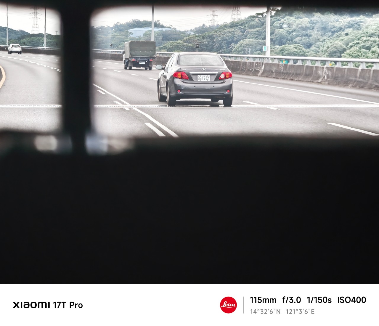
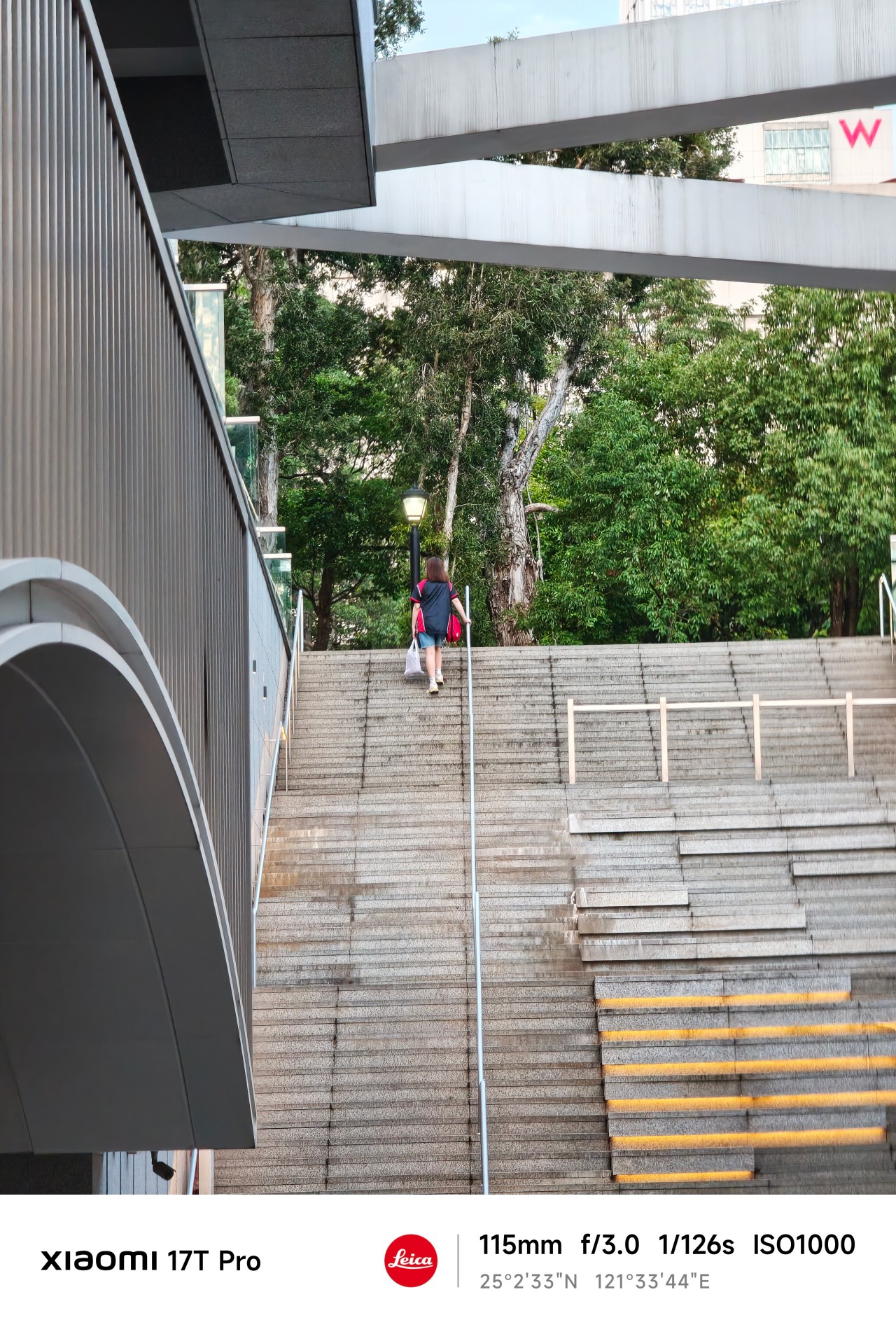
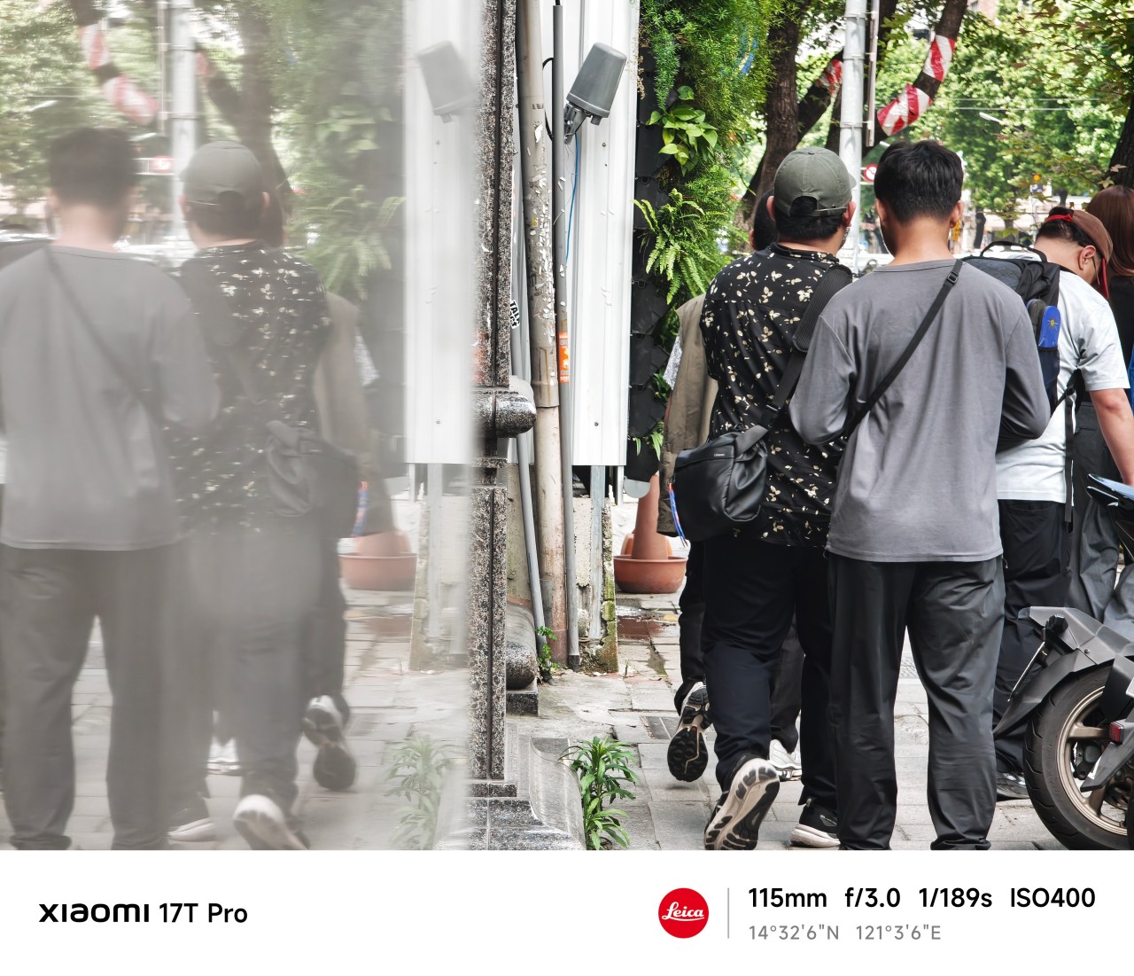
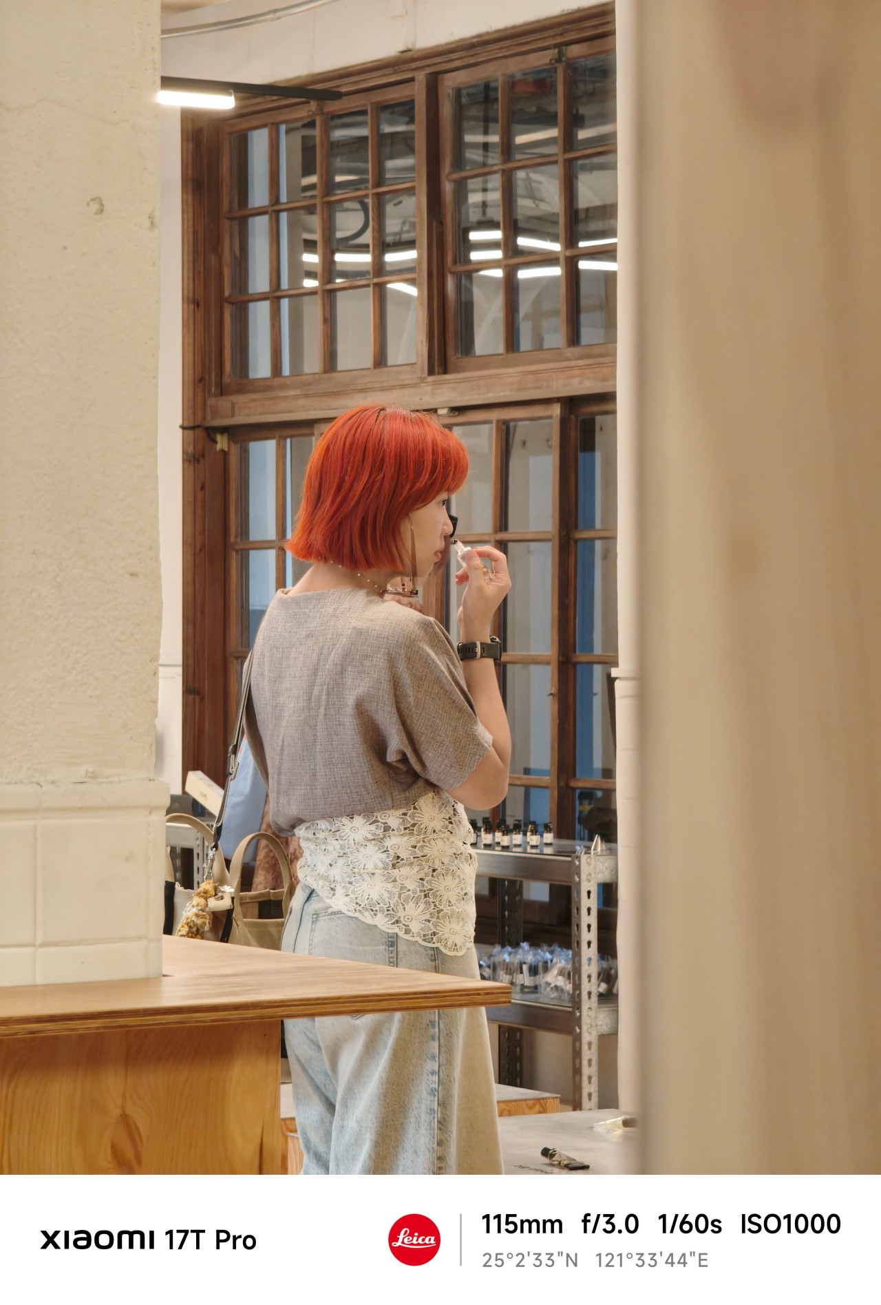
One thing I quickly discovered about shooting at 115mm is that distance changes how you approach a subject.
You cannot simply stand where you are and expect every shot to work. Sometimes you move. Sometimes you wait. And sometimes you accept that a moment isn’t yours to capture.
 The Xiaomi 17T Pro’s telephoto camera made those adjustments feel surprisingly natural. The focal length compressed scenes beautifully while still allowing me to isolate subjects from busy surroundings.
More importantly, it encouraged patience. Not every frame needed to be forced.

Blind projection
Waiting in the wings was another lesson entirely.
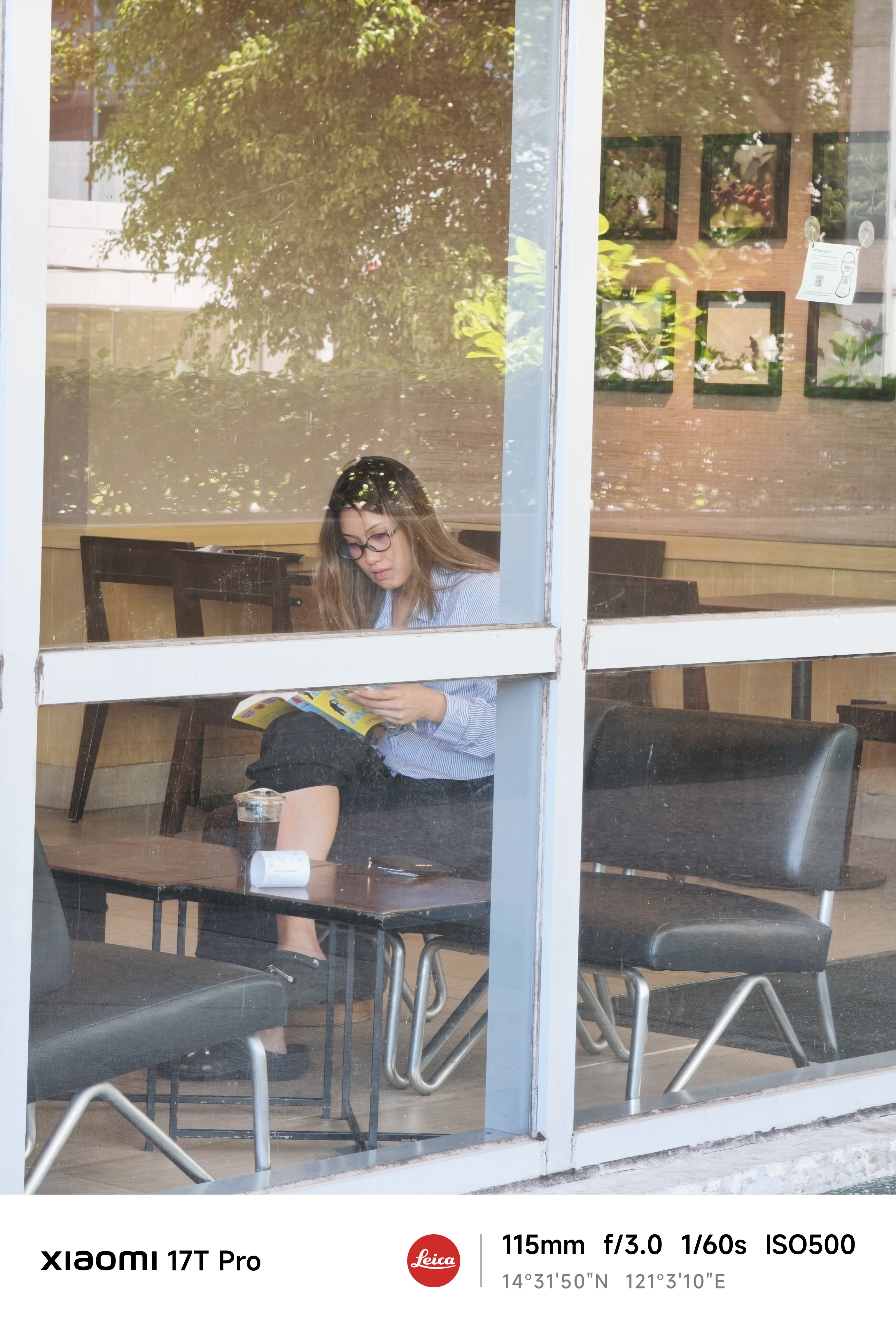
As a photographer, there are moments when something catches your attention immediately. A shape. A silhouette. A person. A scene.
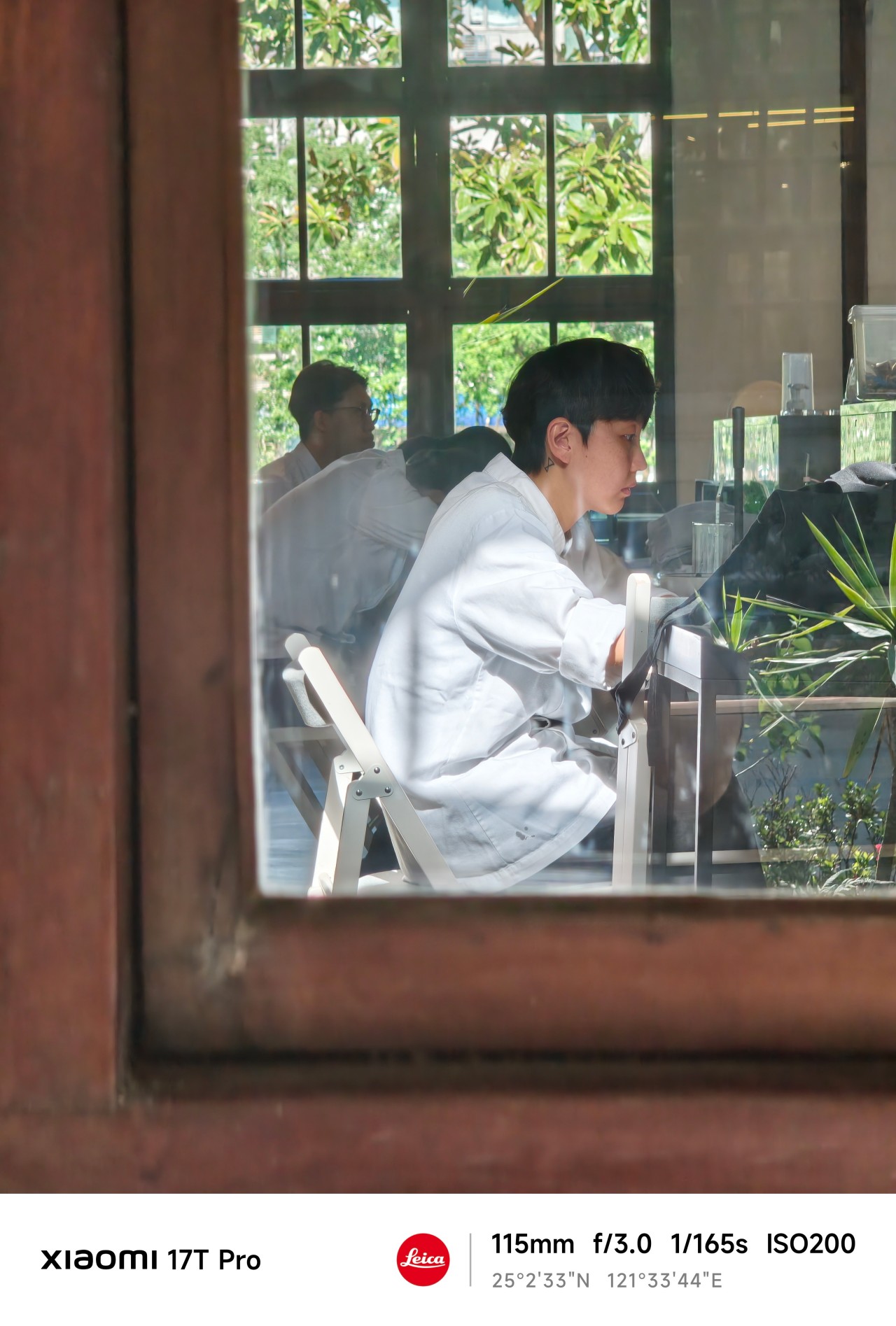 From a distance, it looks compelling.
The problem is that distance leaves room for imagination. Sometimes too much room. You think you know what you’re looking at. But you don’t.
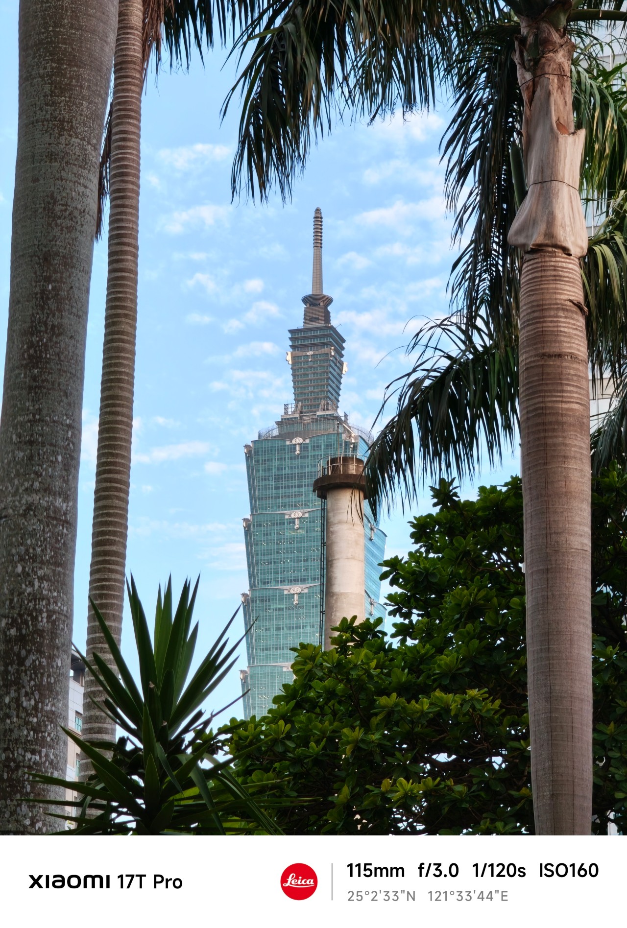
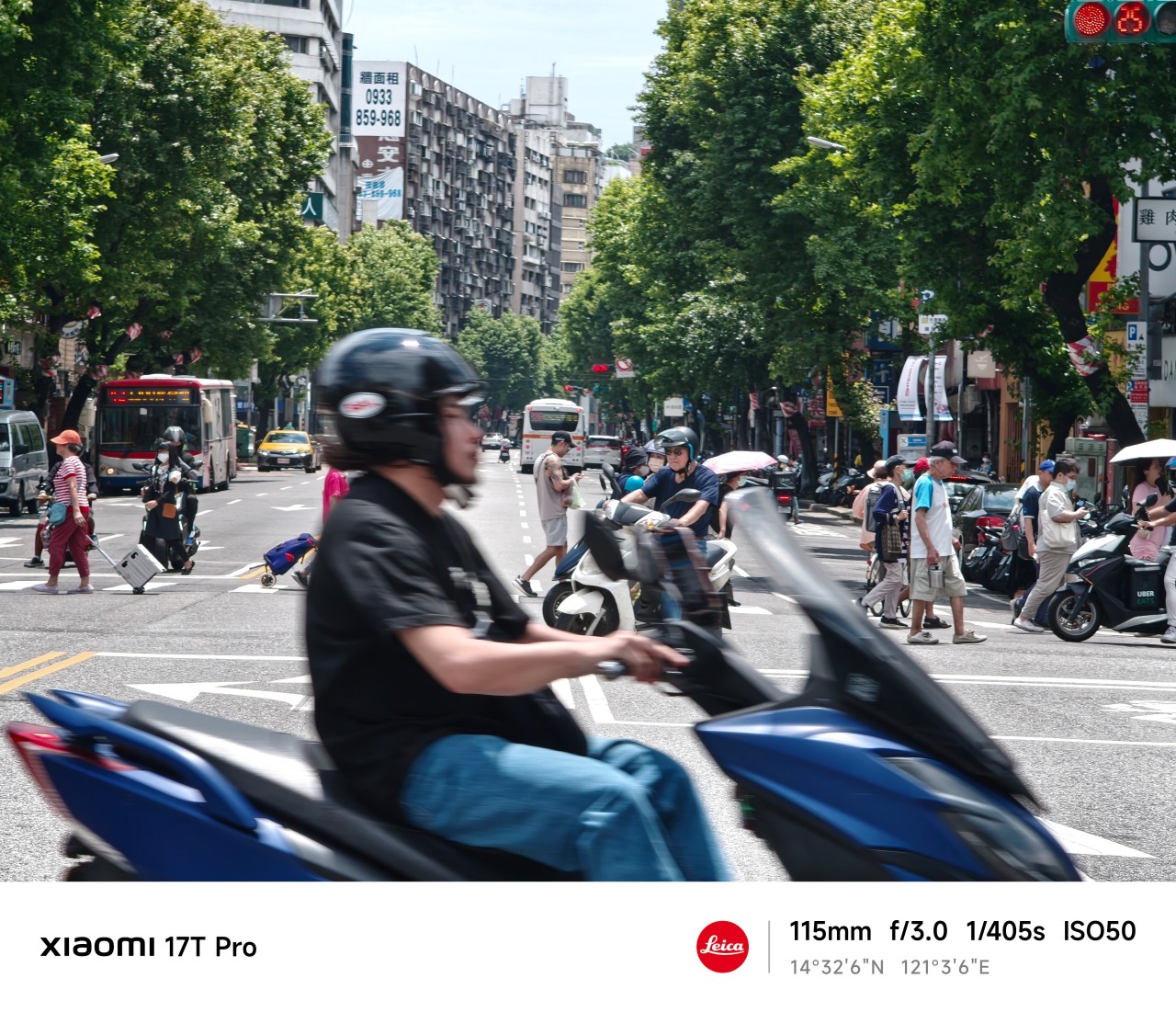
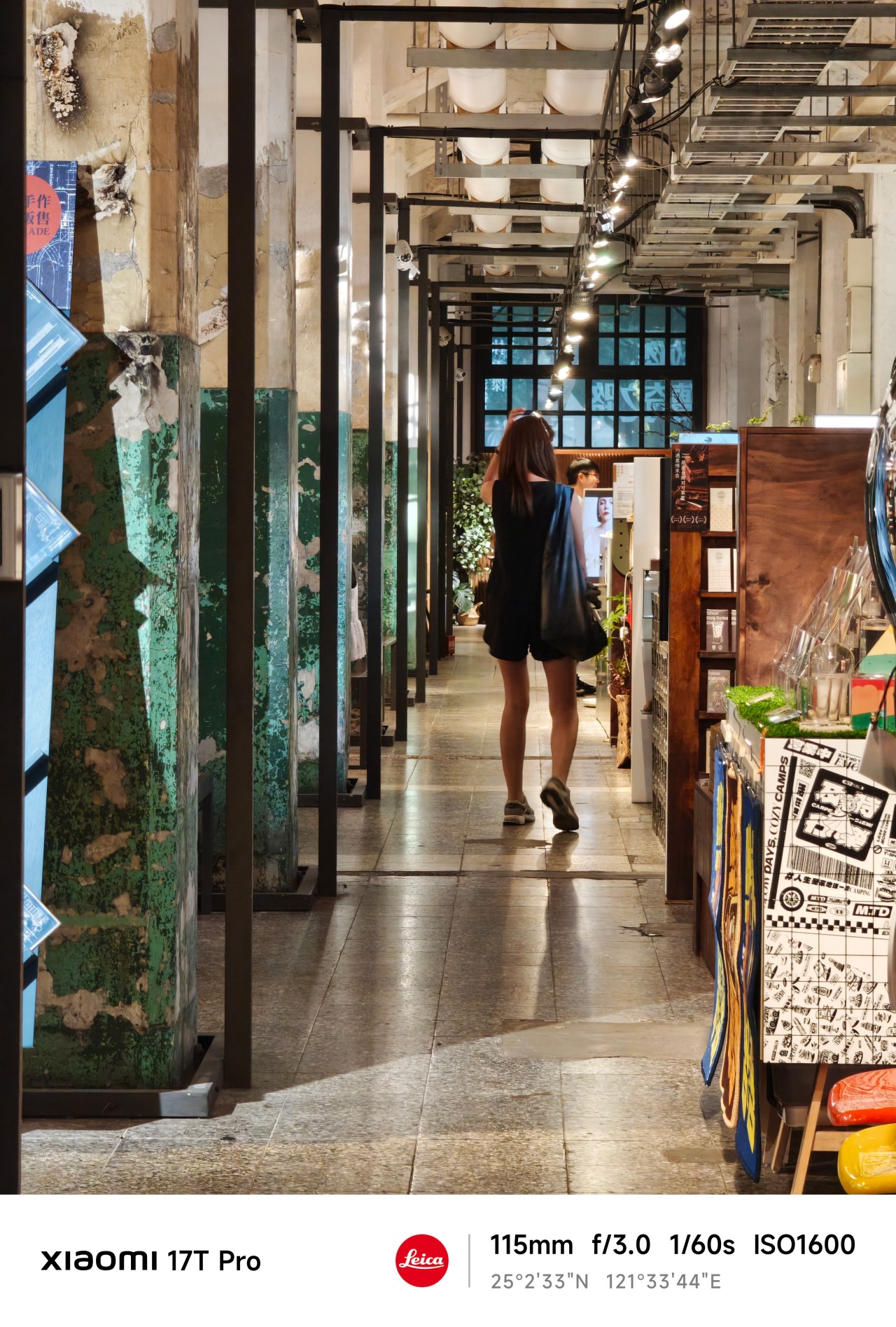
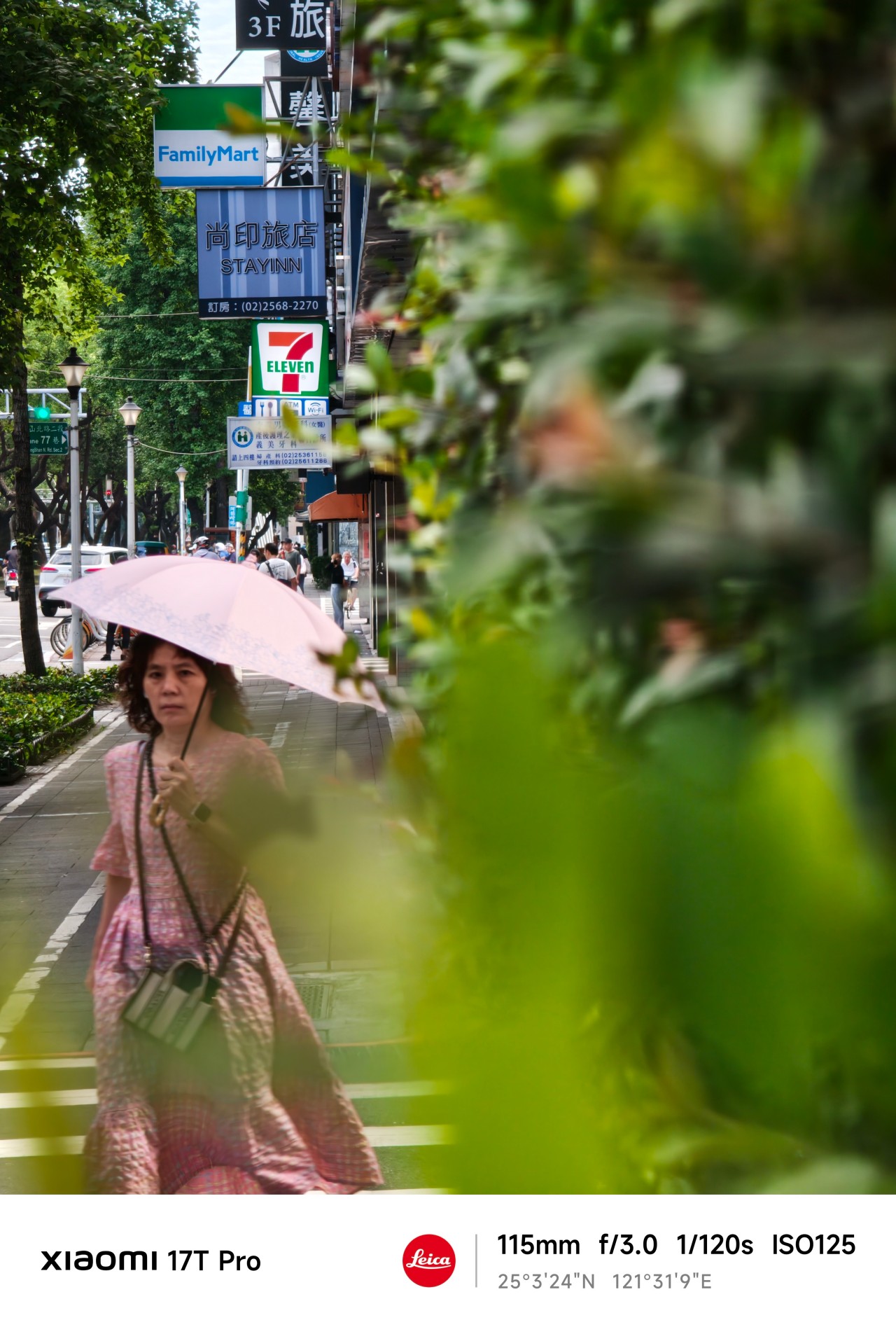
 The more I used the 115mm lens, the more I appreciated how it could pull distant subjects closer while still leaving context around them. It gave me a cleaner view of things that initially felt obscured.

Yet photography has limits. A lens can reveal details. It cannot reveal meaning. That part still requires understanding what’s actually in front of you.
Generative longing
After some quiet reflection, I realized that much of what occupied my attention wasn’t reality at all. It was possibility. Potential.
Stories constructed from incomplete information. As it turns out, people aren’t the only subjects we do this to. Photographers do it all the time.
We imagine a frame before it exists. Then we convince ourselves the next corner might hold something extraordinary. And we chase moments that never arrive.
Sometimes they do. Most of the time they don’t.
The Xiaomi 17T Pro encouraged a different approach.
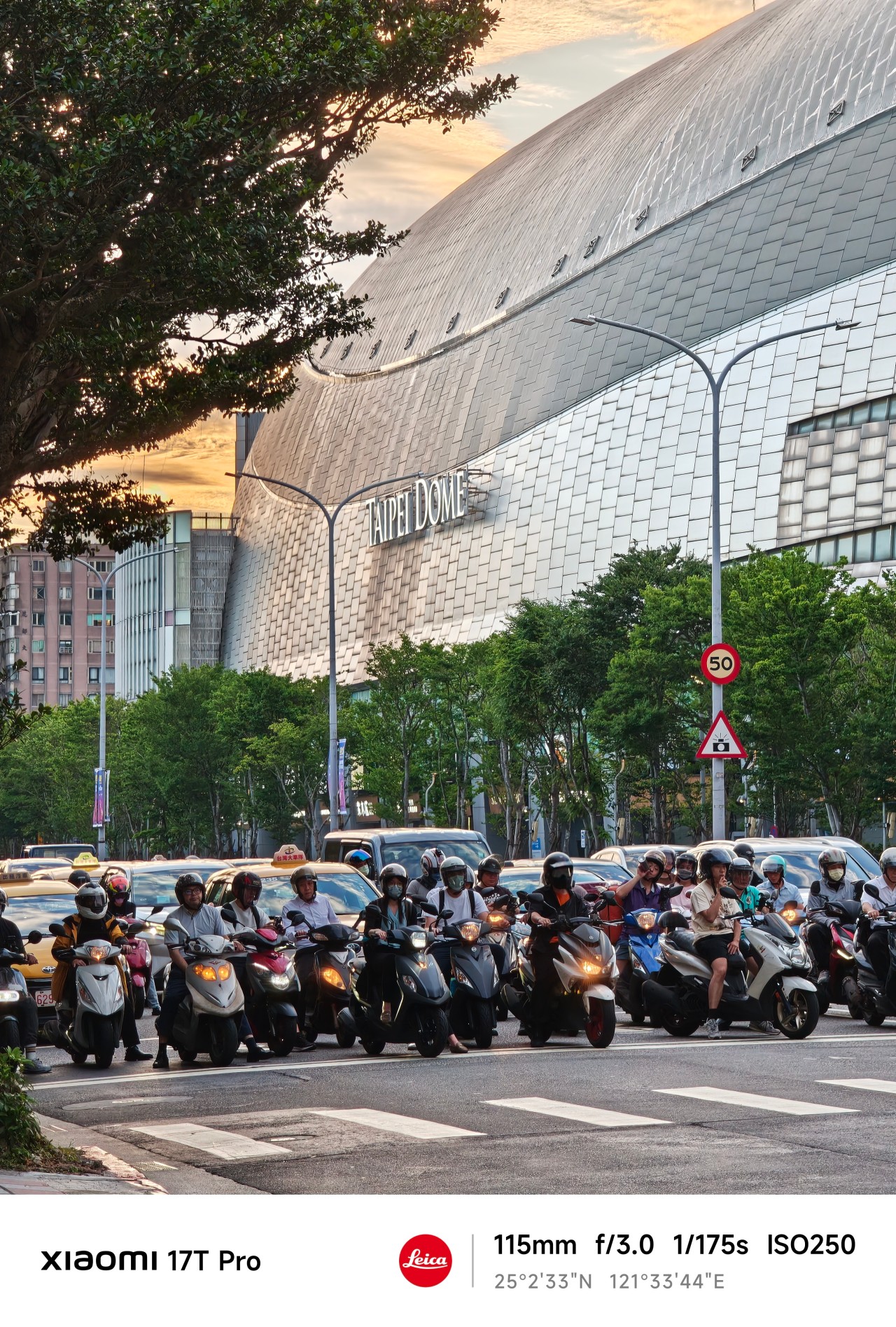
Instead of hunting for specific shots, I found myself roaming freely. Walking more. Observing more. Adjusting my position constantly to find a better composition.
After a few days, I stopped thinking about the lens itself and started understanding the space around me.
I knew how far to stand, what would fit into frame, and when a moment was worth waiting for.
The telephoto camera became less about zooming in and more about understanding my position relative to a scene.
And that’s when things started getting interesting.
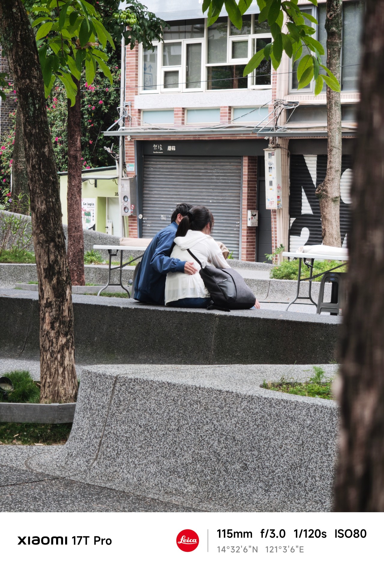
Close without crossing
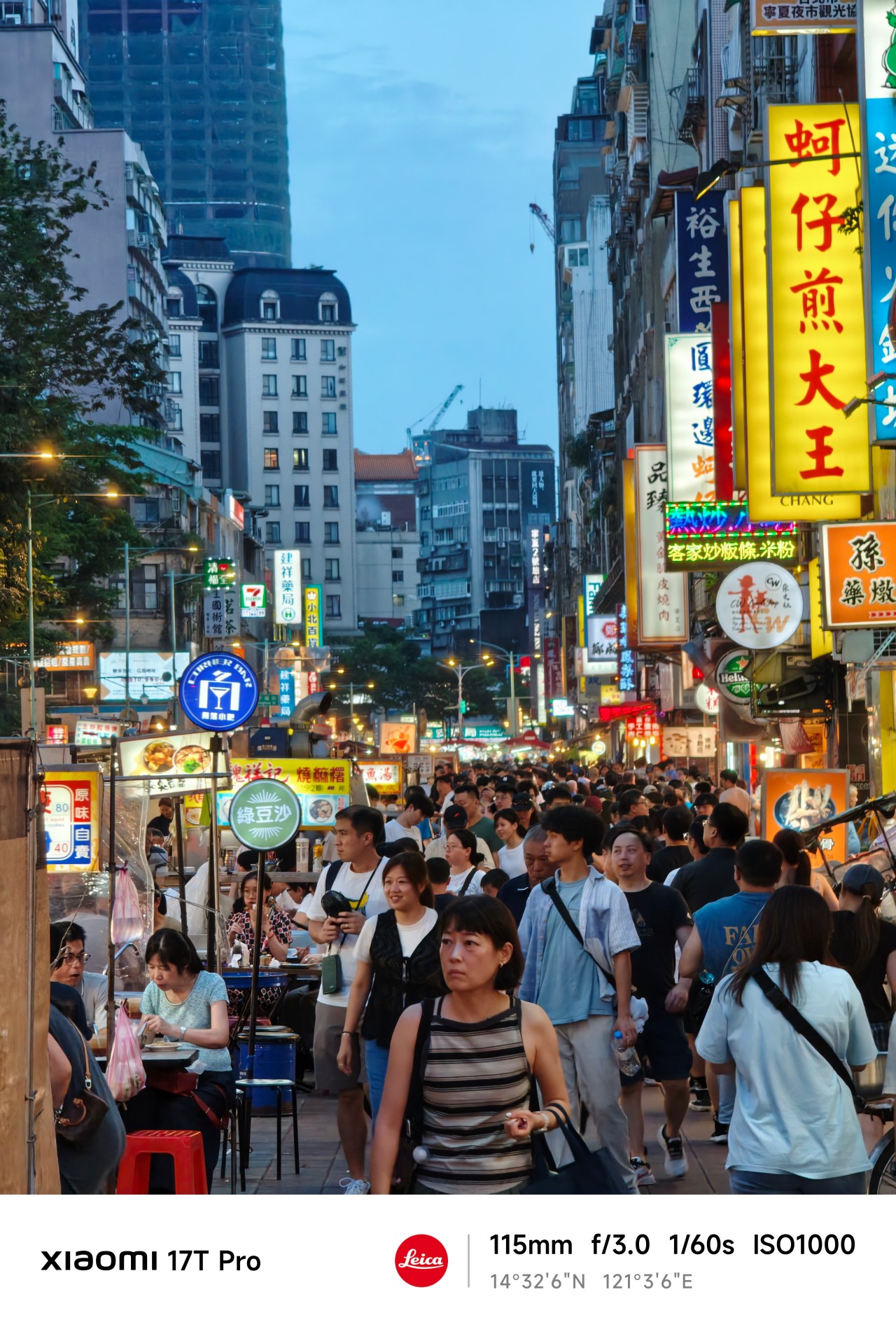
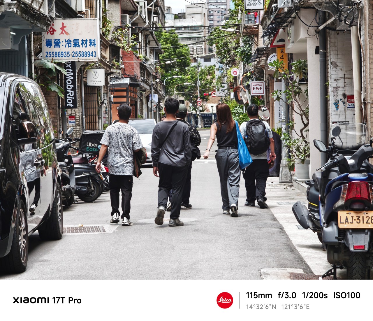
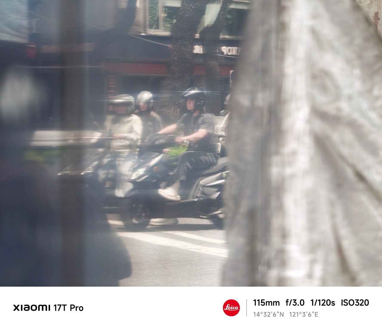
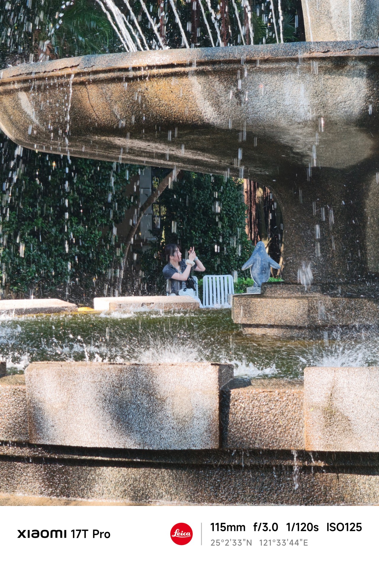
Something unexpected happened while reviewing this gallery. There are more people here than in any collection of sample photos I’ve ever taken.
Normally, I avoid photographing people. I’ve always worried it feels intrusive. The telephoto lens changed that.
 The extra reach allowed me to observe moments without disrupting them. Most of the people here aren’t looking at the camera. Many are turned away entirely. They’re simply existing within their own space.
And perhaps that’s what fascinated me most.
After spending so much time chasing, projecting, and attaching meaning to things that only existed in my head, I found myself approaching photography differently.
There was no grand pursuit. No dramatic realization. No need to manufacture scenarios. I simply paid attention.
 Telephoto photography is often associated with distance. Over the last few weeks, however, it taught me something else.
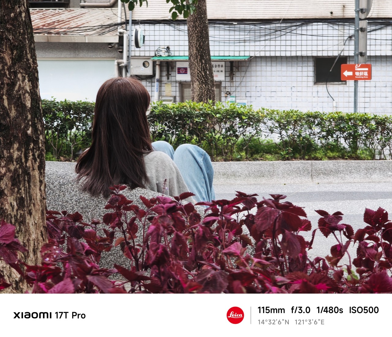
Distance and closeness are not always opposites.
Sometimes maintaining a little distance is what allows a moment to remain exactly what it is. Sometimes stepping back helps you see more clearly.
 And sometimes the people, places, and experiences that matter most are not the ones furthest away. They’re already within view.
Shooting at 115mm taught me that keeping a little distance can be its own way of staying close.
Maybe that’s what this gallery ultimately became. Not a collection of subjects I couldn’t reach. Not proof of anything.
Just a record of moments I was fortunate enough to witness.
Health
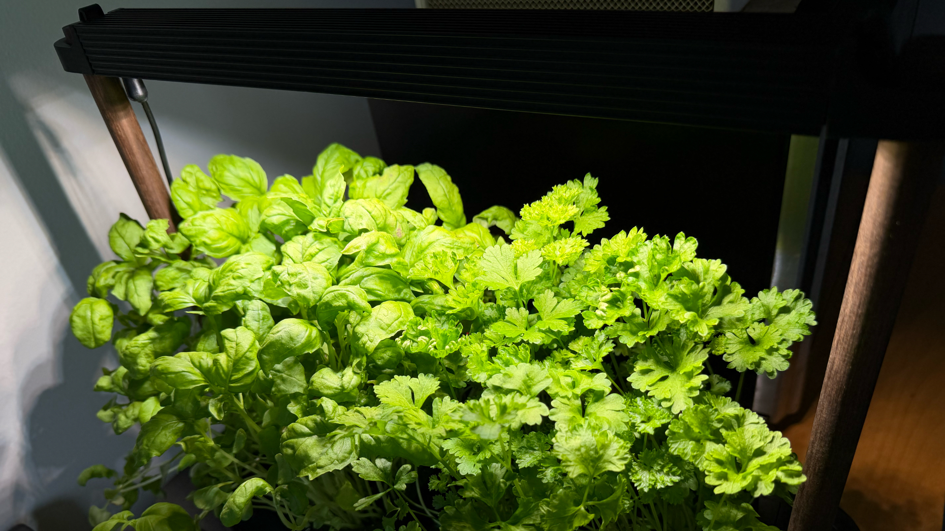
Spring reset: Growing more at home with Auk Mini
From kitchen counter experiment to everyday habit
Spring and summer rolling around almost always makes me want to reset something in my routine.
A few years ago, it was growing broccoli sprouts in a jar. Getting the Auk Mini over Christmas felt like the natural next step.
From sprouts to something more
Starting with sprouts was easy. After having them at a family gathering, it clicked that I could actually grow something, even in our small apartment. Anyone, including my husband can do it on the kitchen counter, and upkeep takes less than a minute a day. Watching something grow and actually eating it made me realize how nice it is to have fresh greens around all the time.
The Auk Mini builds on that. Instead of just one thing in a jar, now I have herbs growing consistently at home.
Getting started was easy
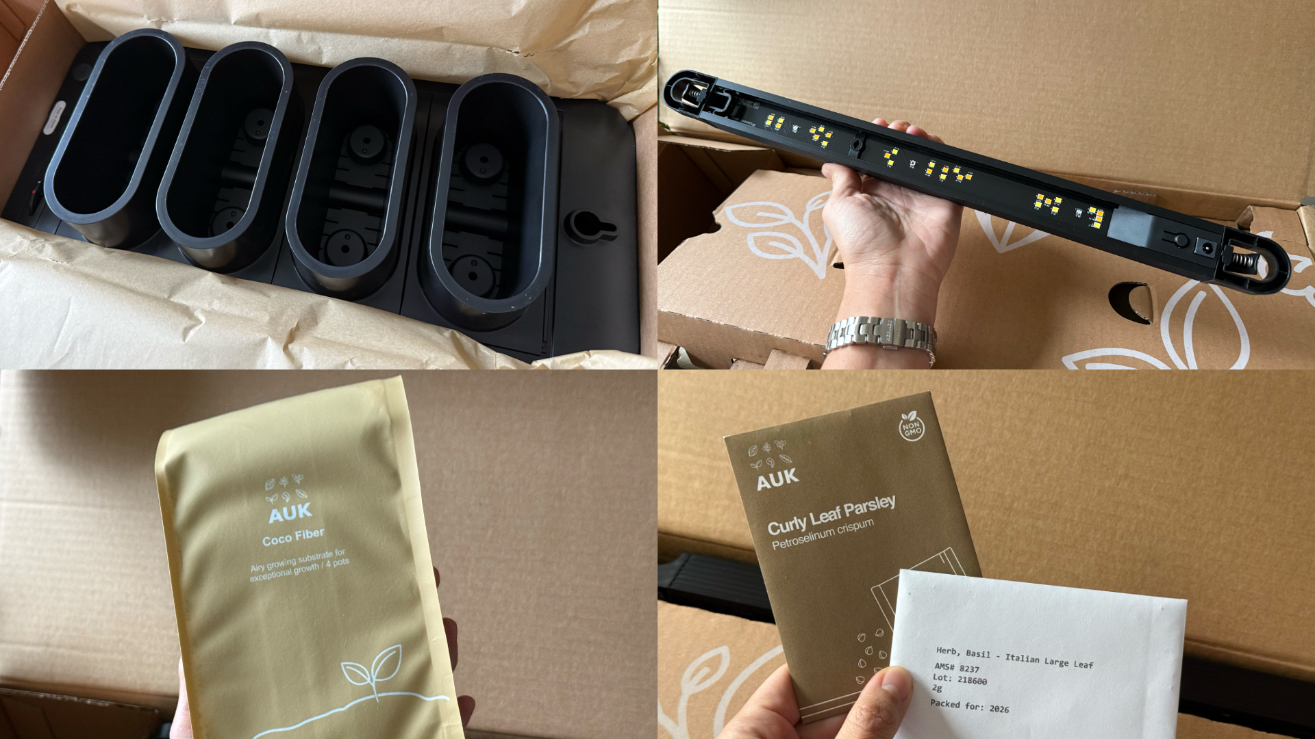
This was the part I was most unsure about, but it ended up being very straightforward. Setup took a few minutes, the instructions were clear, and nothing felt overly technical. The kit comes with everything you need to start: Auk Mini itself, seeds for planting, coco fiber, and nutrients that you add to the water to support both growth and flavor.
Once it’s up and running, it mostly takes care of itself. The lighting system handles what the plants need throughout the day, and the watering system keeps everything consistent. I have been away on trips, and I still come home to herbs that are healthy and fresh, waiting to be trimmed and added to my food.
It fits real life and small spaces

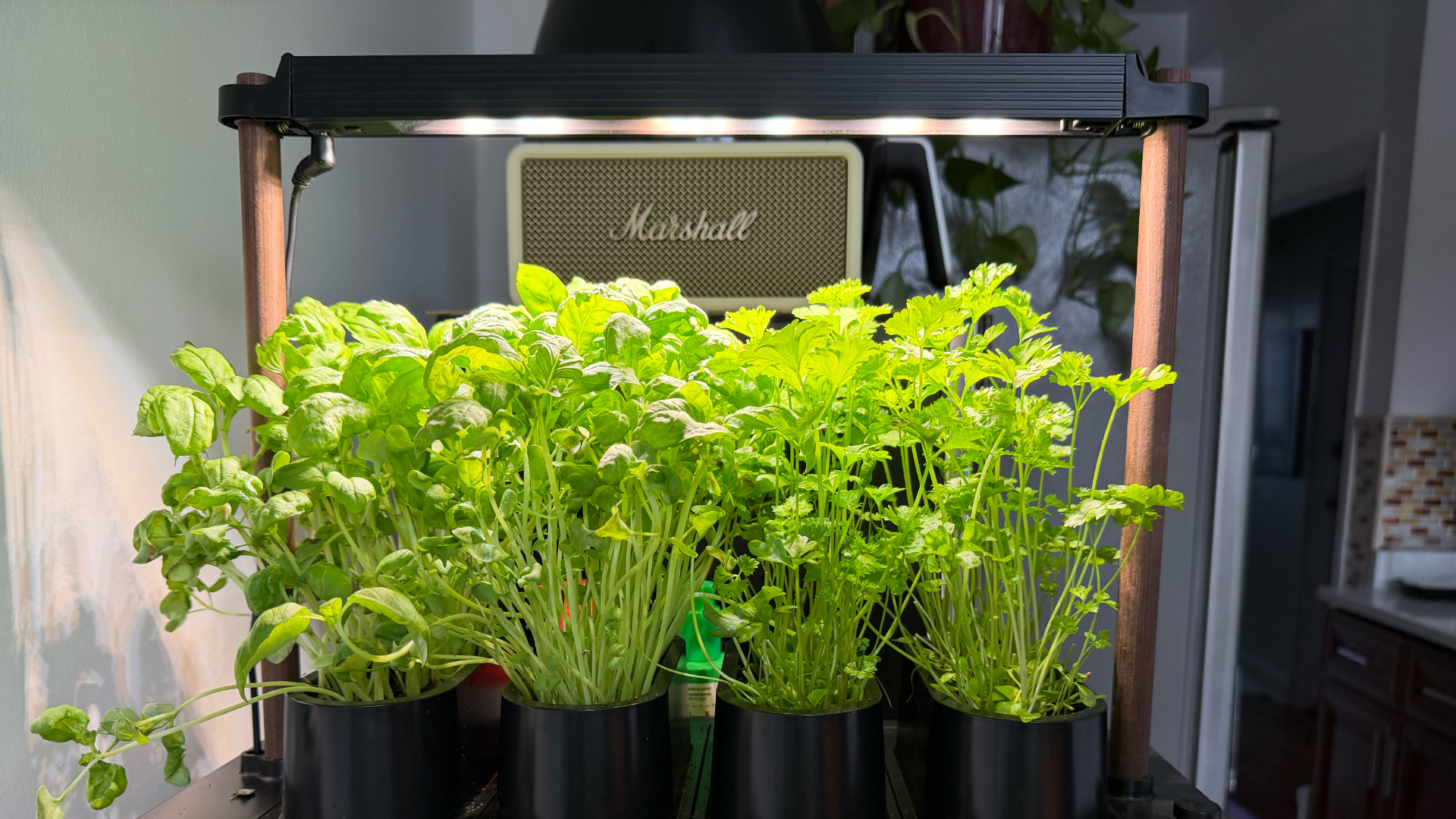
Fresh herbs growing beside my microwave
Living in a New York apartment, space is limited. While there are community gardens I could participate in, it’s not as convenient as having access to your own, especially when you’re in the middle of a snowstorm or a heatwave.
The Auk Mini sits beside my microwave, on a table that used to be my desk. It doesn’t feel like I added a new project to my life – it just blends in. I have the black and walnut version, which works well with the rest of my space, but it also comes in white, with oak or cork as other finishes, if you want something lighter.
Watching and competing
My husband and I set it up together and turned it into a challenge: who would harvest first?
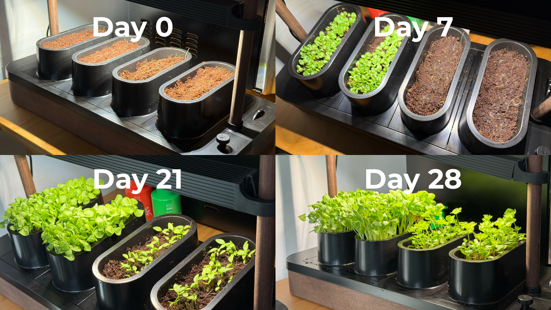
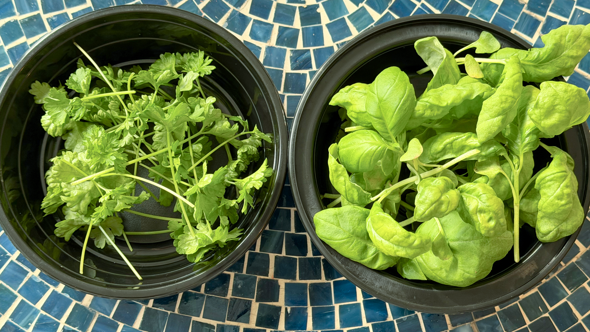
Our kit came with basil and parsley. He planted basil, which sprouted first. I took on parsley, which grew much slower and wasn’t ready for harvest until a little over six weeks later. The competition was a small thing, but it made the whole process more fun. We started paying attention to growth day by day, and it’s satisfying when you finally get to use what you grew.
One thing we learned pretty quickly is that different plants grow at different speeds, which can make lighting placement a little tricky in a shared setup like the Auk Mini. Since the basil grew faster and taller, we had to angle the light unevenly so it wouldn’t burn the basil while still giving the parsley enough exposure to catch up.
It changed how I use herbs
Basil and parsley used to be something I added as garnish. Now I’m using them all the time because they’re right within arm’s reach.

Learned to be creative and made pasta from scratch, made better with fresh herbs
I’ve been making sauces, marinades, pesto, even building meals and cocktails around them. It’s expanded the flavors we use in home cooking, and forced me to experiment instead of defaulting to our go-to recipes inspired by East Asian cooking. In fact, the biggest hurdle I’ve encountered is not having enough recipes in my repertoire that use herbs.
Even when a dish doesn’t call for it, I’ll cut some and add it anyway. Every time I did, it made the dish better. When something is always available and always fresh, you naturally start using more of it. And if you trim it properly, it just keeps growing back. It doesn’t go bad or get forgotten in the fridge.
You can grow anything you want
One of my favorite things about Auk Mini is that it’s not a proprietary system. They do offer other kits like a chili and tomato set or an Italian cuisine mix, but you can also grow your own choices.
I joined a Facebook group of Auk growers, and it’s been inspiring to see how others are using and expanding their indoor gardens. It makes me excited to try things that are harder to find or expensive in the U.S., especially vegetables and herbs I grew up with, like pechay, moringa, lemongrass, pandan, and kangkong.
A small step toward something bigger
Constant fresh herbs within reach
Growing herbs indoors reminds me of something from years ago. In university, I did an immersion program in a low-income community. We recommended sustainable food systems for the stay-at-home moms we met — including hydroponics systems — both as a source of extra income and fresh food.
That experience stayed with me, but I never acted on it. This feels like a small, techie version of that idea: a hydroponic system that works in real life, in a small space, and is easy to keep up with.
Is the Auk Mini your GadgetMatch?
Starting with sprouts showed me I could easily grow something. The Auk Mini showed me I can keep going and expand it. Now I have fresh greens ready whenever I need them.
It starts at $259, which isn’t the cheapest way to get into hydroponics. If you don’t use herbs on the daily like I do, the cost is even harder to justify. But that’s also why I recommend it even more. It’s convenient, it’s fresh, and at the same time it challenges you to be more creative with food.
Basil and parsley keep growing in the Auk Mini after multiple harvests
Auk Mini’s ease of setup and maintenance, and flexibility make it worth it, especially if you don’t know where to start. It was a great hobby to start the year with, and an even better habit I’ve kept building on five months on. It’s given me confidence I can grow my own food for the rest of my life, one way or another.
Editor’s Note: Since this article was first published, Auk has updated the name Auk Mini to Auk Mini 1. They also announced the Auk Mini 2, currently on preorder starting at $199. This newer model has a smaller footprint, redesigned lighting, new colorways, and the ability to use larger plant pots.
Accessories
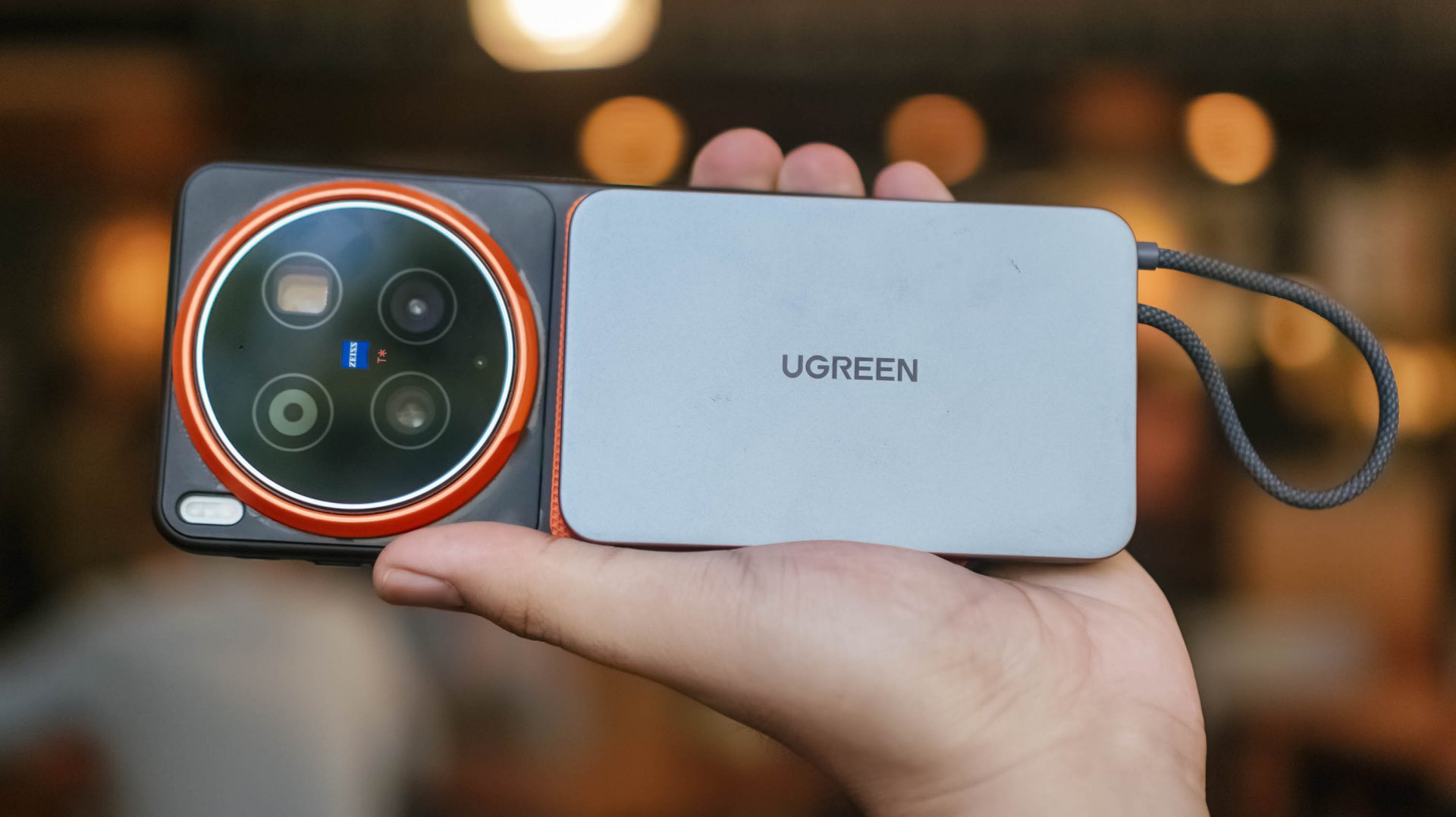
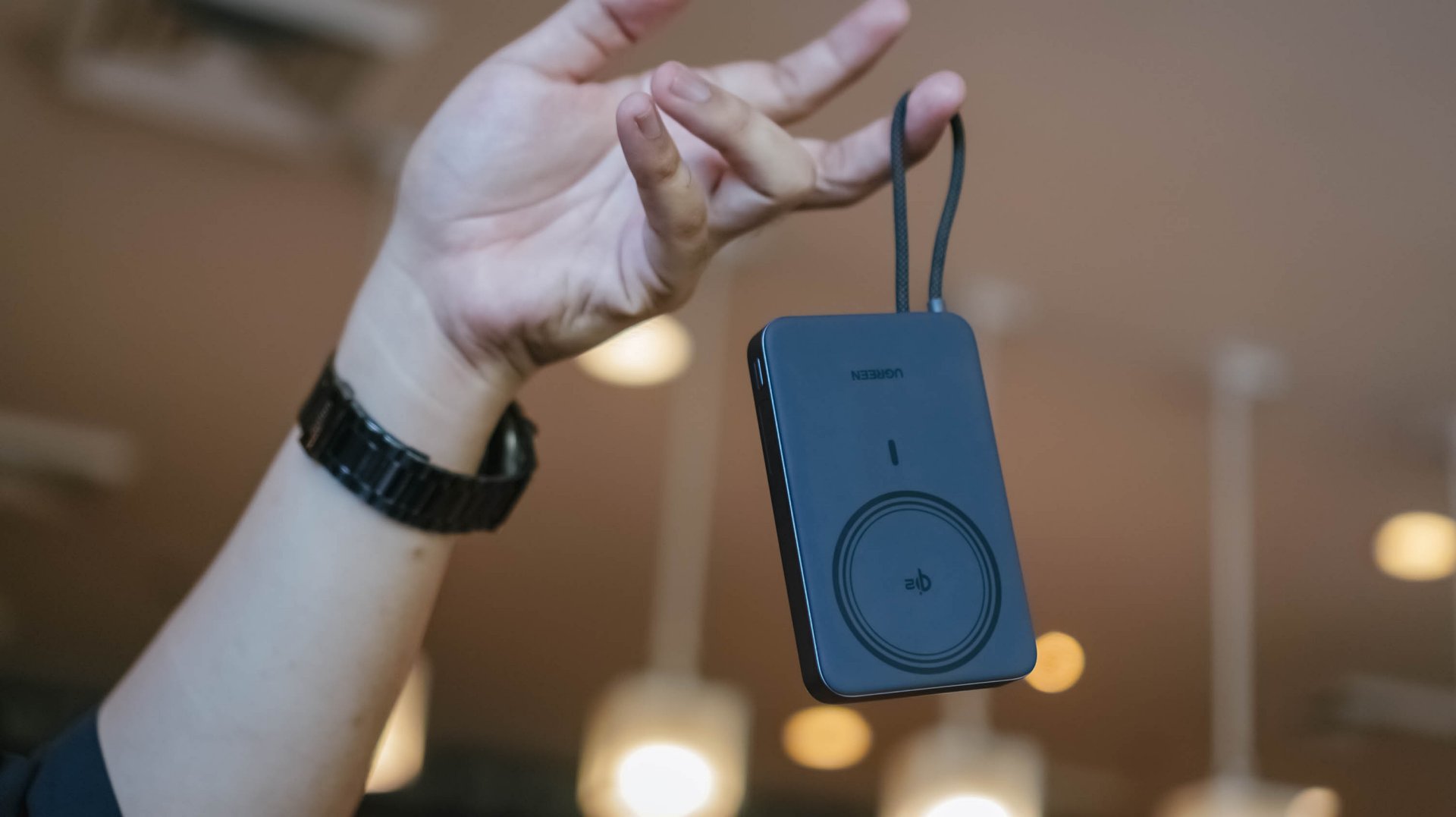
UGREEN MagFlow Air review: Airy Yet Mighty
Slim and light power bank with a strong suit and core
Power banks (or battery packs on the other side of the world) have gone through loops of ups and downs.
While it’s ever-popular for juicing up smartphones and several devices in a pinch, it’s also notorious for making you flinch whenever your airplane’s overhead bin blows some white smoke all of a sudden. Or worse: engulfing flames when left unattended.

But, with the advent of bigger yet slimmer (and safer) batteries this 2026, it’s hard not to wonder and ponder when such tech will arrive in power-packed accessories most of us use.
Very, Very Airy
For a refresher, UGREEN launched the MagFlow series not too long ago. That’s specifically eight months from the time of this writing.
One of its standout features is its LED display. Removing that feat with some running on the treadmill gives you a power bank that managed to shed some weight and trim down its waist.
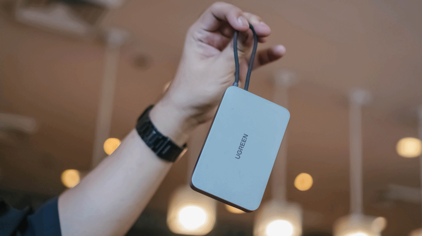
Thus, the UGREEN MagFlow Air truly stands out on the show floor.
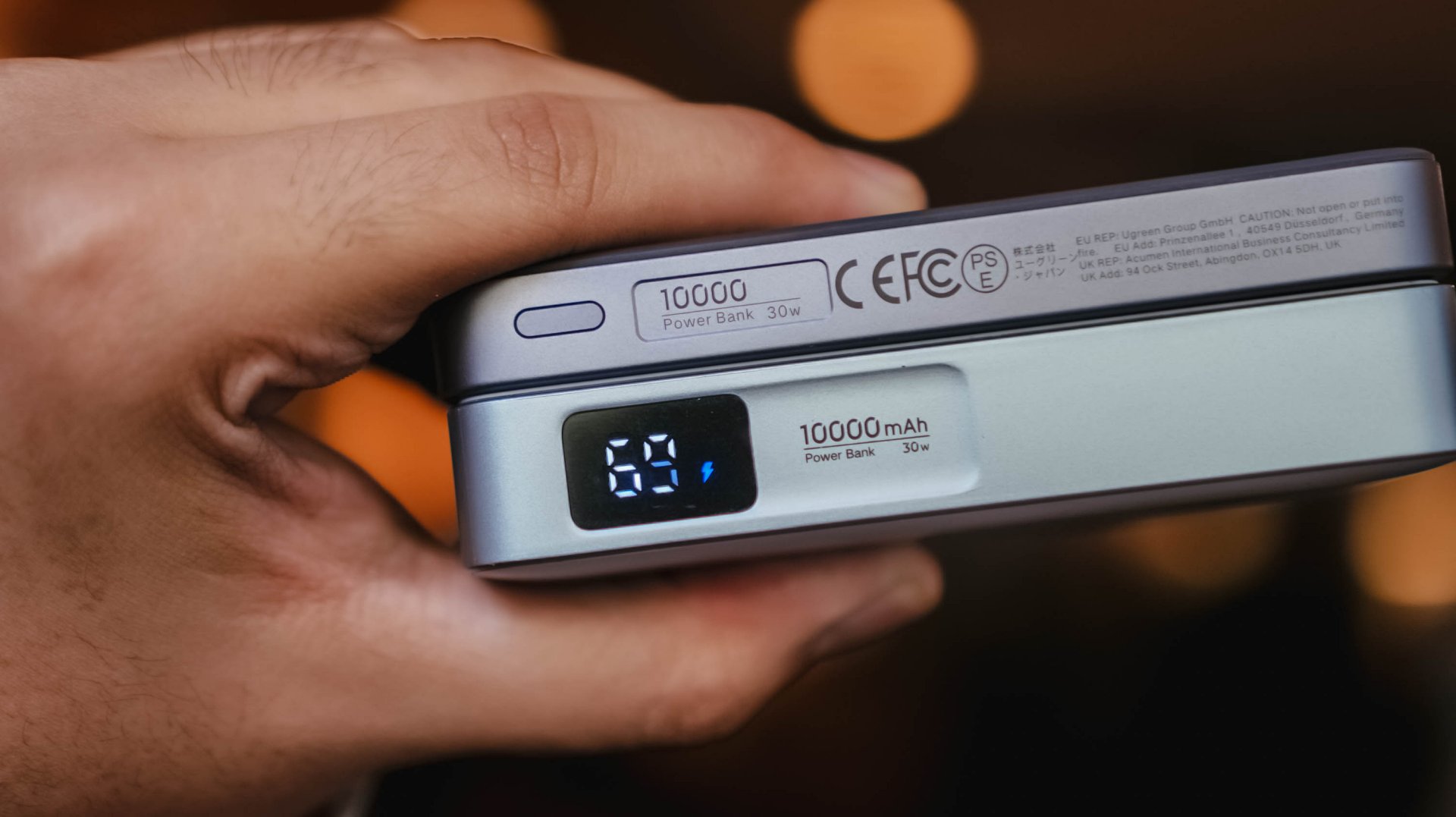
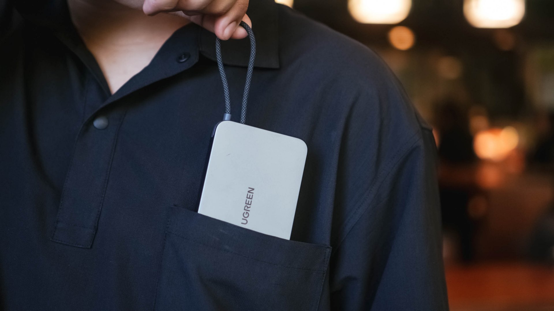
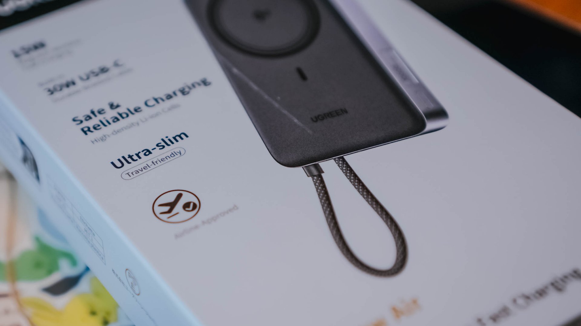
By the numbers, UGREEN’s MagFlow Air takes it to the next level with its 13.9mm slim chassis and 213 grams of feather-lightness.
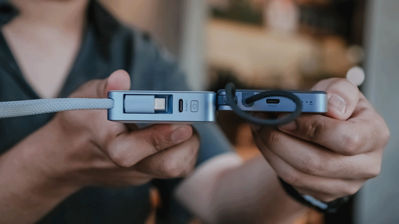
The regular MagFlow, on the other hand, is heavyweight at 254g and oh-so-juicy-thicc at 21mm.
I even tried putting the new model up against UGREEN’s first-gen MagSafe power bank I personally bought from 2023. My OG power bank was still thick at 19mm and weighed as much as 235 grams.
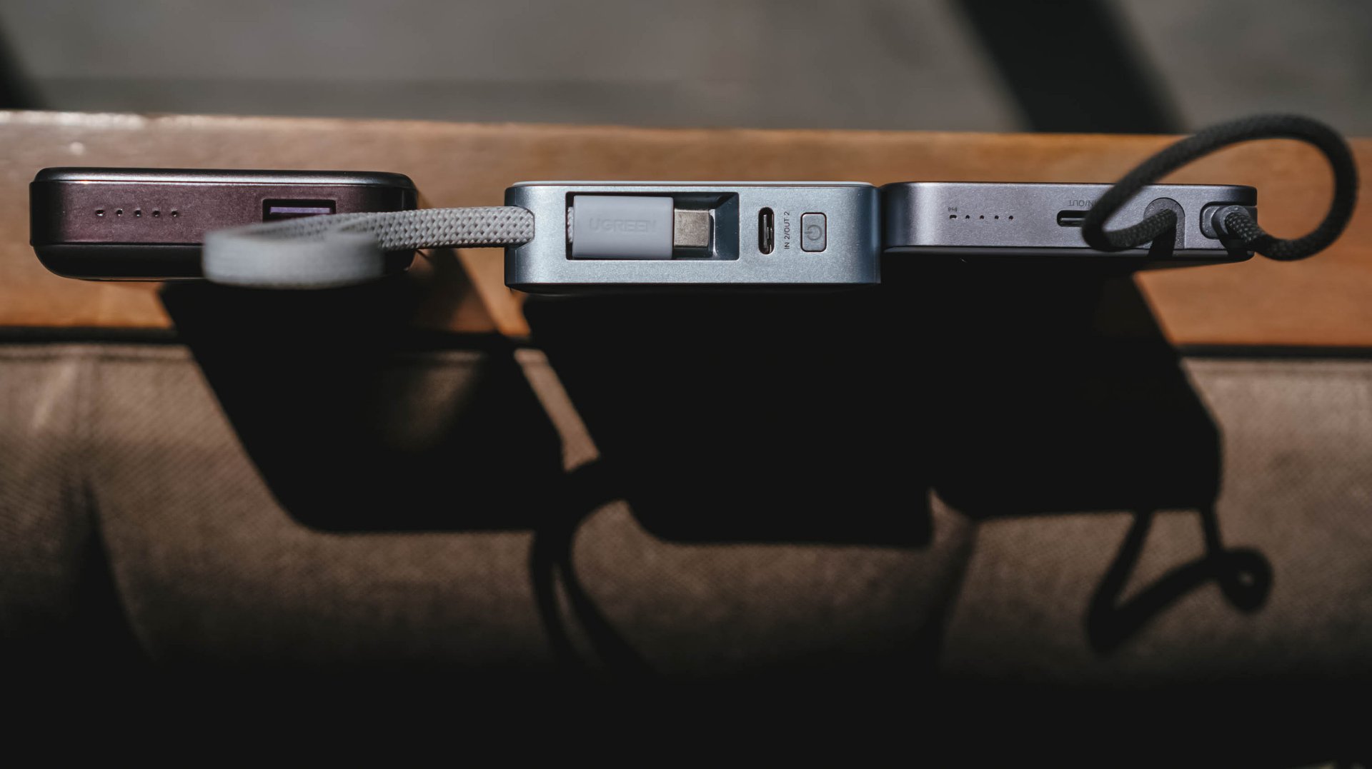
Visual differences aside, I’ve held it enough to say the size and weight differences were truly felt from every inch within.
But at what cost?
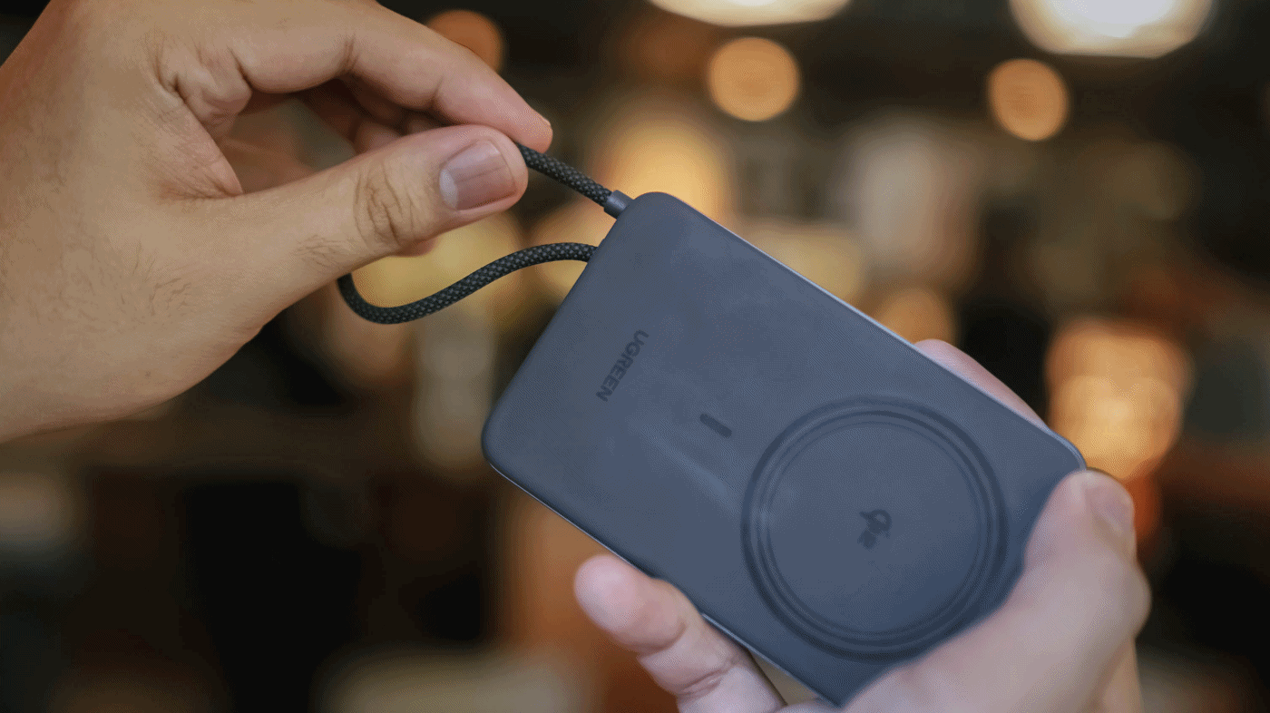
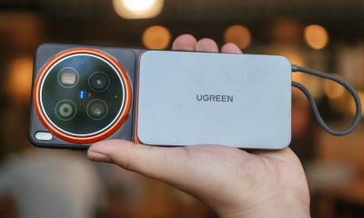
Just like its THICCer brother, the UGREEN MagFlow Air shares the same Qi2 wireless charging standard alongside the inclusion of Apple’s legendary MagSafe feature.
But, to achieve its thinner and lighter form factor, UGREEN clearly needed to make some sacrifices.
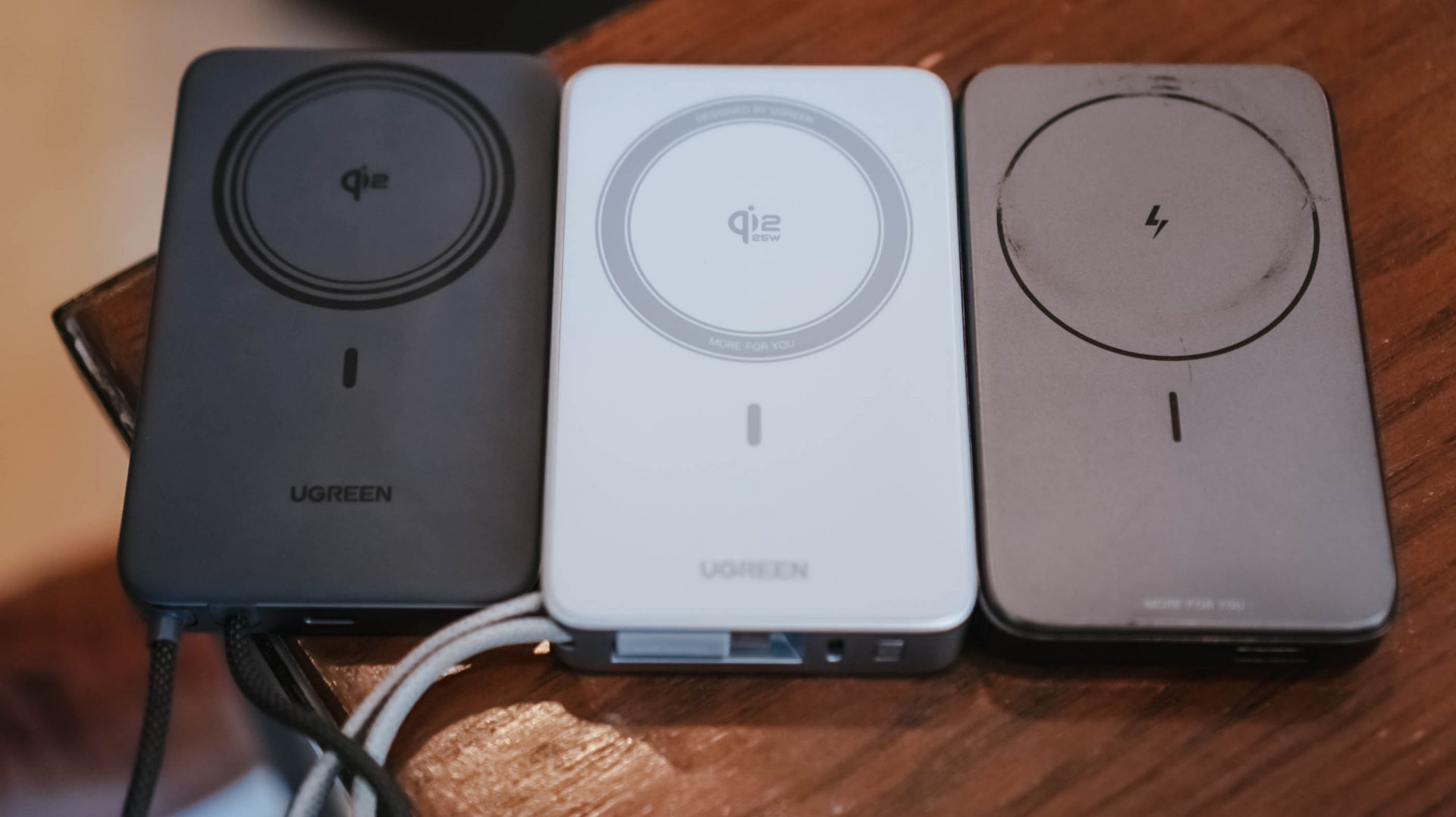
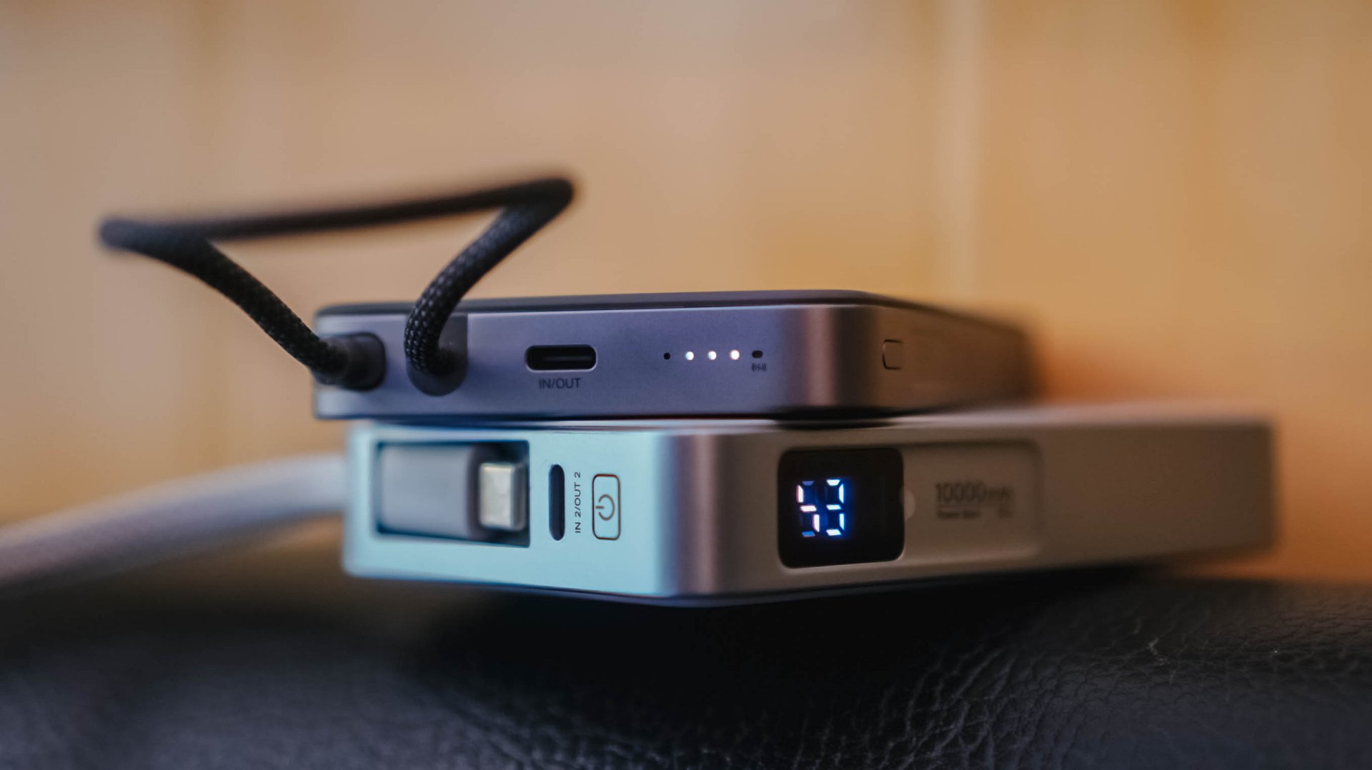
MagFlow Air vs MagFlow vs PB206
First and foremost: its wireless charging capabilities.
The first MagFlow power bank boasts as much as 25W wireless charging speeds. That has been downgraded to just 15W wireless in the newer MagFlow Air.
And another: the removal of its special LED display. This hinders possible buyers from checking if it actually fast charges one’s device.
Although some users prefer it, others don’t. It’s something that ends up on the buyer’s priorities at the end of the day.
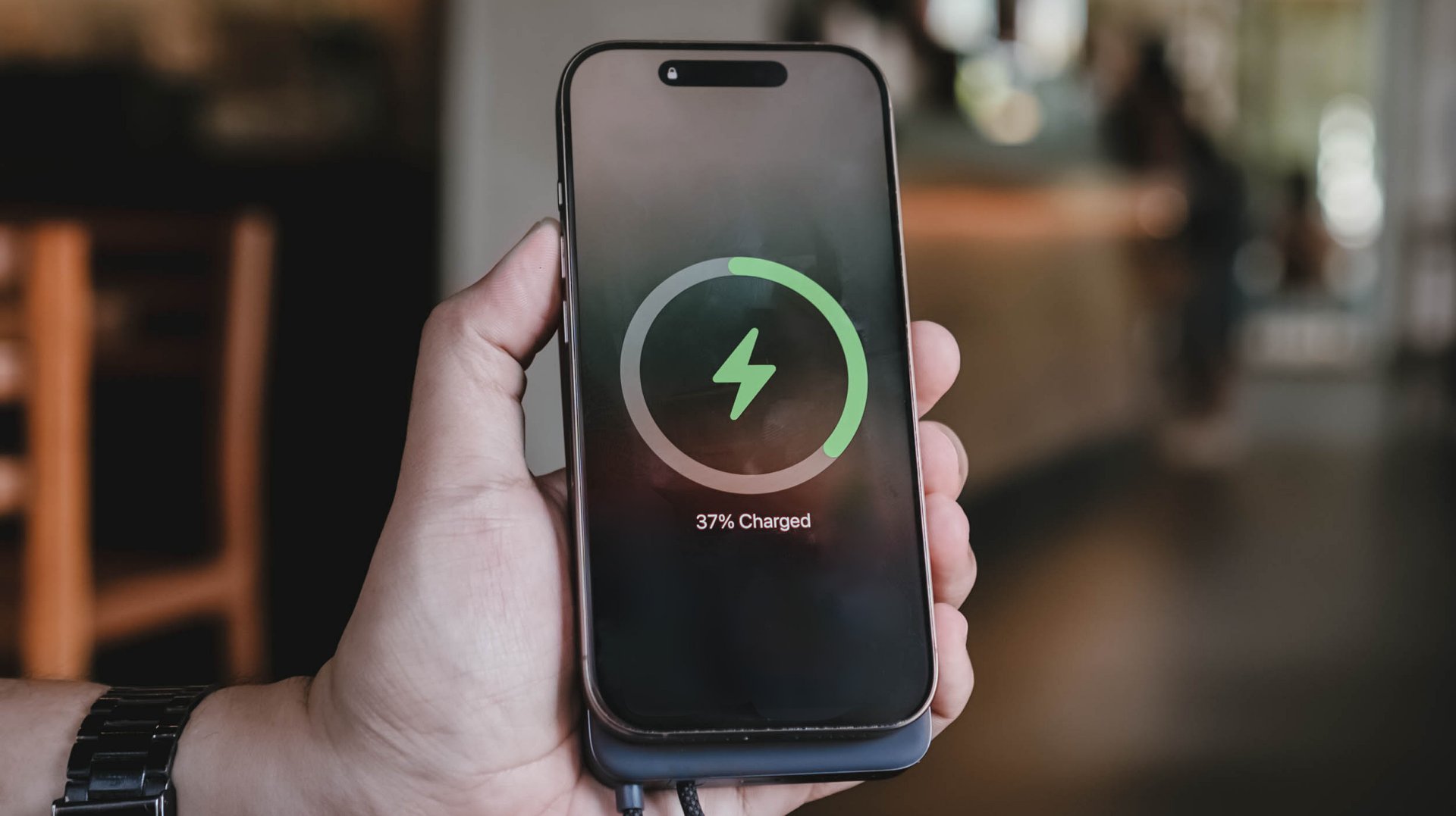
Which further brings me to my extensive charge tests and how I tried conducting it.
Feel that fill
With the absence of that dedicated display, knowing the power bank’s overall charge status relies on the conventional 4-bar indicator.
While percentage accuracy is clearly impossible, it didn’t hinder me from conducting my GadgetMatch Charge Test.
With my smart watch timer and dedication on keeping tabs with the power bank’s actual battery level, the test was still a success.
UGREEN claims this 10,000mAh power bank can be charged up for around two hours.
I am not sure what type of charger and cable UGREEN used for their test. On my end, I used two of the most extreme combos I have with me.

First, their very-own UGREEN 100W Uno GaN charger paired with ADATA’s magnetic USB-C to USB-C cable that supports Qualcomm’s Quick Charge (QC 3.0) speeds.
For another, vivo’s newest 100W FlashCharge adapter — now with a better USB-C port (instead of USB-A).
UGREEN 100W Uno + ADATA
|
vivo 100W FlashCharge +
|
|
START TIME (from 0%) |
1:57PM |
3:15PM |
1 bar |
approx. 45 minutes |
approx. 50 minutes |
2 bars |
approx. 1 hour 5 minutes |
approx. 1 hour 5 minutes |
3 bars |
approx. 1 hour 20 minutes |
approx. 1 hour 20 minutes |
4 bars |
approx. 1 hour 30 minutes |
approx. 1 hour 30 minutes |
END TIME (Full Bar 100%) |
4:18PM
|
6:02PM
|
While UGREEN did not explicitly specify if it’s exactly a two-hour charging time, these results prove that you can fully fill the power bank to the very brim as long as you got the fastest chargers and cables around.
Power up to the top
My extensive charging benchmarking doesn’t end there.
Just like any other power bank in the market, smartphones are also built different. While flagships lead the race in having the best charging speeds possible, modern-day midrangers barely feel “mid” now especially with their behemoth battery tanks.
For the most objective yet inclusive test possible, I’ve decided to use the MagFlow Air and its built-in USB-C cable to charge two phones from my stash: the all-new vivo X300 Ultra and the TECNO POVA Curve 2 5G.
ICYMI, vivo’s X300 Ultra boasts a 6600mAh Si/C battery that supports speedy 100W wired FlashCharge speeds.
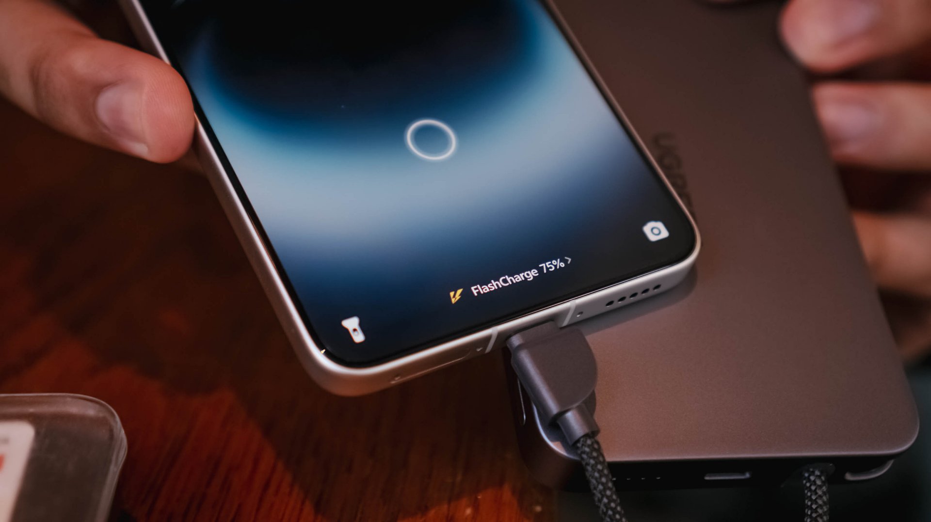
However, that’s not just limited to its bundled charger and cable. Thanks to a leveled-up USB-C PPS protocol, I was able to maximize its charging speeds even with just MagFlow Air’s stationary body cable.

On the other hand, the TECNO POVA Curve 2 5G has a gargantuan 8000mAh battery. Albeit, slower charging at 45W with the absence of PPS.
That said, my test shows differences affect overall charging time.
vivo X300 Ultra
|
TECNO POVA Curve 2 5G
|
|
START TIME (from 0%) |
4:54PM |
3:53AM |
5 minutes |
5% |
2% |
10 minutes |
13% |
8% |
15 minutes |
20% |
17% |
30 minutes |
47% |
21% |
45 minutes |
68% |
31% |
60 minutes |
96% |
40% |
75 minutes |
– |
46% |
90 minutes |
– |
53% |
120 minutes |
– |
72% |
150 minutes |
– |
88% |
END TIME (100%) |
4:18PM
|
6:43AM
|
Status Bar Indicator |
1 battery bar |
1 battery bar |
Moreover, this not only proves how fast and sturdy the built-in USB-C cable of the MagFlow Air is. It was also able to live up to its 10,000mAh battery capacity with both tests being able to keep one (1) battery bar alive and kicking.
Of course, using the USB-C port (given you have the right type of cable) can supply your phones and other devices as much as 30W of maximum charging output.
1-bar wonder?
As preluded to earlier, knowing the actual charge of the power bank after using it was never possible at all. Still, that never stopped me from trying to use it even under such a silly circumstance.
vivo X300 FE
|
vivo X300 Ultra
|
|
START TIME (from 0%) |
11:55AM |
1:45PM |
5 minutes |
1% |
7% |
10 minutes |
2% |
– |
15 minutes |
4% |
– |
30 minutes |
10% |
– |
45 minutes |
20% |
– |
FINAL PERCENTAGE |
27% |
8% |
Power bank dead after |
59 minutes |
7 minutes |
With that 1-bar left. it’s nothing but a guessing game. A battle against your anxious mind if it will actually help charge up your device or not.
This is also another testament that wired charging standards and protocols also matter as much as the charging cables and bricks we are also using for our power banks.
Safety is a HUGE priority
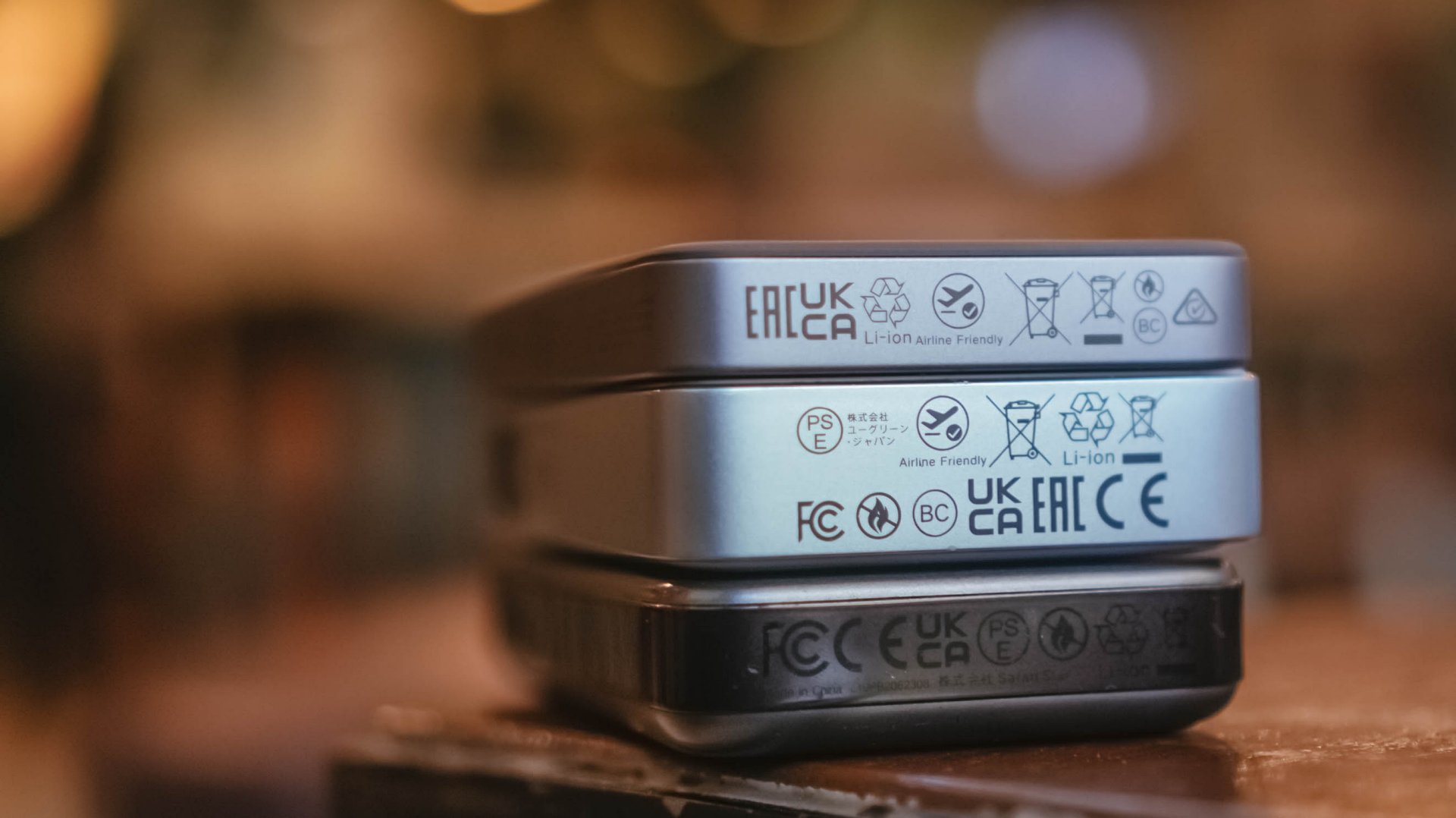
If you worry about bringing this in your upcoming trip, the UGREEN MagFlow Air is definitely allowed when you board your airplanes with its “airline-friendly” or “travel-friendly” mark.
My only cause of concern: Despite the brand originating in Mainland China, they still don’t put that much-needed CCC (triple C) Certification. Personally, this affected my work trips last year going to China.
Not being able to bring any certified power bank made me struggle — especially as someone who uses my phone as the main device when taking snaps and stills while still being connected to the internet via foreign SIM card (and/or eSIM).
Hopefully, UGREEN will secure all needed safety standards and certifications for it to be deemed as a “travel-friendly” power bank.
That said, even without China’s strict regulation against portable power packs, UGREEN’s multiple safety protections still make it a safe product to use whenever you’re out and about.
More so, that ThermalGuard feature that intelligently controls the overall temperature of the power bank when being used. A clear sign that it regulates heat caused by charging even in prolonged usage periods.
And now that we’re already at it, this is a friendly reminder not to use unauthorized third-party chargers and/or cables.
As much as you want your power banks, phones, and other devices to be safe from unsolicited battery blowouts, you should also be able to invest on authentic power adapters and charging cables that won’t harm or degrade the MagFlow Air.
Is the UGREEN MagFlow Air your GadgetMatch?
With a price of US$ 79.99, UGREEN’s MagFlow Air is definitely a power bank (or battery pack) worth considering and purchasing.
Without an ounce of doubt, the UGREEN MagFlow Air is a solid Super Swipe and deserves the GadgetMatch Seal of Approval.

If you’re not being too nitpicky about the lack of a dedicated status display or the slower 15W wireless charging speeds, the MagFlow Air is still as powerful as its MagFlow brother alongside other power banks in the same league.
While it’s overall slim and light, it still has a strong suit and core that makes it a must-have accessory to bring — especially if you’re the type who lugs, roams, or travels out a whole lot.

Close without crossing: A Xiaomi 17T Pro photo essay
Distance and closeness are not always opposites.

Spring reset: Growing more at home with Auk Mini
From kitchen counter experiment to everyday habit

UGREEN MagFlow Air review: Airy Yet Mighty
Slim and light power bank with a strong suit and core

The Surface Laptop Ultra wants to bring “unmetered intelligence” to you

Xiaomi 6.6 sale: Up to 6,000 off on select phones, more

Samsung Display unveils world’s first 4K 360Hz QD-OLED

Samsung Display makes its case for OLED at Computex 2026

God of War Laufey puts Faye in the spotlight


-

 Accessories2 weeks ago
CASETiFY x Tamagotchi brings back nostalgia
-
 Automotive2 weeks ago
GAC Aion UT brings big car energy to the compact segment
-

 Computers2 weeks ago
Samsung’s SECRET That Made OLED Even Better
-

 Events2 weeks ago
Recap: Google I/O 2026
-

 Gaming2 weeks ago
PlayStation increases the prices of PlayStation Plus
-
 Accessories2 weeks ago
Anker’s soundcore Liberty 5 Pro series is powered by an AI chip
-

 Smartphones2 weeks ago
Xiaomi launches budget-friendly REDMI A7 Pro
-

 Gaming2 weeks ago
Tales of ARISE – Beyond the Dawn Edition launches on Nintendo Switch 2