
Breaking up with Adobe Photoshop after 20 years
Wedding planning and Apple Creator Studio made me realize it was time


Planning a wedding, even a small and intimate one, has a way of sharpening your sense of priorities. Right as my fiancé and I were making decisions for our city hall wedding here in New York City, Apple announced Creator Studio.
Creator Studio is a subscription service that gets you access to eight creative pro and productivity apps for US$12.99 a month, or US$2.99 if you’re a student or educator. The design app included in the subscription, Pixelmator Pro, is also available as a standalone purchase for US$49.99. Adobe Photoshop, my design software of choice for over two decades costs me US$22.99 a month.
Seeing those numbers next to each other made me pause. It’s not that I was unhappy with Photoshop. I was just suddenly made aware how expensive it is. I’d been paying more for a single tool than I could for an entire creative ecosystem.
Adobe Photoshop was my first foray into the world of graphic design
Creative Studio’s lower price point, along with the free trial, made me consider switching to Pixelmator Pro altogether. That’s something I never thought I would do. Photoshop was how I got into graphic design. It was my first love, and up until recently, I truly thought it would be my ride or die.
Getting to know Pixelmator Pro
If you’re not familiar, Apple’s Pixelmator Pro is a graphic design and image editing app that’s similar to Adobe Photoshop. In practice, it covers a huge amount of the same ground but with a very different philosophy around usability and design.
I tried Pixelmator Pro, mostly as a challenge because we were doing a YouTube video on Apple Creator Studio. Personally, I was lowkey excited to try something new.
![]()
The first time I loaded the app, I recreated our YouTube thumbnail template — all within 10 minutes — and I haven’t looked back since.
Familiar enough to feel effortless
One of the biggest reasons my transition to Pixelmator Pro was so easy is muscle memory. Many shortcuts behave the same way: cmd+T for transform, cmd+R to show rulers, cmd+J to duplicate layers, just to name a few.
Having used Photoshop since high school, it felt familiar and intuitive — the complete opposite of how it felt to try and switch to Adobe Illustrator many years ago.
Photoshop is how I got into graphic design. It was my first love, and up until recently, I truly thought it would be my ride or die.
Later, I learned that you can import PSD (Photoshop) files directly to Pixelmator Pro. Apparently I didn’t even need to recreate the GadgetMatch assets. It does a good job of converting and preserving layers.
Photoshop now feels archaic
![]()
After using Pixelmator Pro for a few days, going back to Photoshop felt jarring. The sharp edges of the UI felt cold and rigid. Everything was layered with popups, panels, and tiny interruptions.
Pixelmator Pro, in comparison feels warm, smooth and frictionless. Its user interface is very Apple-like — rounded edges, softer icons and buttons. The Creator Studio version also gets the new Liquid Design touch, with transparent menus and elements that feel dynamic.
I especially love the little things. Color adjustments live in one simple panel instead of being scattered across different windows. There’s an eyedropper tool beside every color picker with a magnifier built-in.
When you hover over tools, it shows you the shortcut (e.g. “R” for Repair). There are also subtle animations, like when you use the Color Fill tool to change your canvas color.
Pixelmator Pro’s UI is warm, snappy, and approachable
The differences in user experience are stark. Photoshop’s animations either don’t exist or are too abrupt for one to notice.
Smart tools without the noise
Photoshop has one clear advantage over Pixelmator Pro: Generative AI. It’s great and powerful especially when you need to save time.
I personally used it a couple of times before to save time on cloning, erasing, or expanding elements. Am I going to miss it with this switch? Something tells me I won’t.
Pixelmator Pro’s clone and repair tools, though seemingly so simple, work like a charm. And for how I usually manipulate images, those two are more than enough.
From digital to physical
If Pixelmator Pro was going to replace Photoshop in my workflow, wedding prep was the perfect time to give it a real world test — and it more than held its own. Its ease of use gave me permission to think outside the box, because I knew I had a reliable tool that can help me make it happen.
On the left, a Kufic-inspired wedding logo designed on Pixelmator Pro; on the right, 3D printed stamps
Since my fiancé is half-Iranian, I designed a logo combining our names, inspired by Kufic calligraphy, and I did it entirely in Pixelmator Pro. I developed that same logo further and designed a save the date, with color, also inspired by Kufic calligraphy. I went through a few iterations to come up with the final designs, which were made easier by the Shape tool and grid overlays.
My fiancé then took the logo I designed in Pixelmator Pro, converted it to 3D on Revit, and printed it into stamps in different sizes. One way we’re using it is to deboss the handmade pottery he’s making as one of our party favors.
There are a few more wedding pieces I’m designing on Pixelmator Pro in the coming weeks: our final invitation, and the custom stationery for the dinner that follows the ceremony.
Through this whole process, Pixelmator Pro never felt like it got in the way, or that it was limited. On the contrary, it feels like that enabler friend who says yes to every idea I have, and can actually help make them real.
Powerful, but approachable
The best way I can describe what using Pixelmator Pro is like is this: it’s a mix of Photoshop’s professional tools, Canva’s free library of assets, and Apple’s UI sensibility.
Shortly after Apple announced Creator Studio, Adobe rolled out significant Creative Cloud discounts. Are they threatened? They better be.
That makes it great for beginners, small business owners, and casual creators. Like Canva, it comes with some beautiful templates to help someone with zero experience come up with something good.
But unlike Canva, it still feels like a serious design tool. I can do so much of what I need using Pixelmator Pro but with UI that’s so much more approachable compared to Photoshop.
As the great philosopher Ariana Grande once said, “Thank U, Next”
I remember meeting Canva’s founders before launch and not fully understanding their mission to make graphic design accessible to everyone. Now I do.
It was never about replacing Adobe products and pro designers. What Canva did was fill a huge void we didn’t know existed. They democratized something that used to be reserved only for the privileged few.
Pixelmator Pro comes with free templates, assets, and mockups like this MacBook Pro and coffee packaging
Pixelmator Pro’s lower barrier to entry has potential to make a significant impact. My hope is it opens doors for people who were previously shut out of the graphic design world, and that it becomes something they can grow with, just as I did with Photoshop.
Adobe is still the industry standard
Switching to Pixelmator Pro wasn’t about rejecting Adobe, in the same way that Canva’s success did not kill Photoshop.
It’s worth noting that Adobe products are still the standard in the industry. A lot of companies rely on them, and most schools teach them. In a traditional design or agency environment, Photoshop and Illustrator are still the default language.
![]()
Even on Apple’s own Design Resources site for developers, the official design templates are built for Adobe Photoshop and Illustrator, not Pixelmator Pro. That says a lot about how embedded Adobe is in professional workflows.
Competition makes the space better
Apple Creator Studio, and tools like Pixelmator Pro, challenge Adobe’s near-monopoly in a really healthy way.
It’s not lost on me that trading Photoshop with Apple software actually keeps me locked into one ecosystem. But having more pro creatives try Pixelmator Pro can put pressure on the industry. A strong alternative that’s more cost effective can force titans and dinosaurs to evolve in a way the likes of Corel was never able to do.
Ideally, that means better products and fairer pricing for everyone. Shortly after Apple announced Creator Studio, Adobe rolled out significant Creative Cloud discounts. Are they threatened? They better be.
Pixelmator Pro’s intuitive UI makes switching from Photoshop easy peasy
Access matters, and at the end of the day, with a healthy competition in the market, it’s consumers that win. Canva is a great example of this. It made design tools accessible to those who aren’t professionals. It didn’t make everyone a great designer, just as a novice who tries Final Cut Pro today won’t become a pro video editor tomorrow. Design is still a craft you develop over time with practice.
Is Pixelmator Pro my GadgetMatch?
Photoshop still has its place. But for my everyday work, and occasional personal projects, Pixelmator Pro can do everything that I need to accomplish, at a fraction of the cost.
It feels faster, lighter, and more alive. Honestly learning my way around new software has been so enjoyable — so much so that I feel a renewed sense of eagerness to try other design software like Blender and Figma.
Pixelmator Pro never felt like it got in the way, or that it was limited. On the contrary, it feels like that enabler friend who says yes to every idea I have, and can actually help make them real.
Wedding planning and Apple Creator Studio didn’t just make me switch to a new software. They also made me question how much I’ve been missing out on. How much of what I do is simply due to inertia?
![]()
Ending my longest relationship doesn’t mean it failed. I’m grateful for what Photoshop taught me. It helped shape the creative professional that I am today.
But alas, this is one area where my practicality wins over loyalty. Relationships — with people or with tools — only work when both parties keep showing up. There’s no room for complacency, despite the history.
Walking away from something that taught me so much feels bittersweet, but Pixelmator Pro fits the way I work now, and I hope it grows with me as I turn the next page.


Apps
GCash rolls out in-app OTPs via push notifications to fight scams
SMS-based codes will be phased out by June 22

GCash is completely changing how users secure their accounts by rolling out in-app OTPs by June 22.
This fully replaces traditional SMS-based authentication as part of heightened cybersecurity measures against phishing scams and financial fraud.
With this security upgrade, users will no longer receive their OTPs via text messages. Instead, the codes will be sent through secure push notifications directly inside the GCash app.
This provides a much safer verification experiences. The migration to internal authentication is a direct response to a directive from the Bangko Sentral ng Pilipinas (BSP) to phase out SMS-based OTPs by June 2026.
Furthermore, the shift aligns with the country’s Anti-Financial Account Scamming Act (AFASA), which mandates stricter safeguards to curb digital fraud.
For years, cybercriminals have targeted SMS-based verification codes through various spoofing and phishing tactics to gain unauthorized access to accounts.
By routing OTP requests directly through the user’s authenticated GCash app, the platform ensures that only the rightful account owner can receive and use the unique codes.
Beyond security, the switch brings some much-needed convenience. The instant, one-tap authentication removes the annoying hurdle of switching between apps, copying codes, or waiting for delayed text messages to arrive in areas with poor cellular signal.
To get in-app OTPs on the GCash app, simply turn on Push Notifications on your iOS or Android device.
Apps
The No-Nonsense guide to mid-year shopping
Let AI do the heavy lifting for you this Lazada 6.6 Super WOW Sale

The mid-year sale season is here, but the days of mindless impulse buying are over.
Shoppers are shifting toward intentional, value-driven decisions, focusing on quality, authenticity, and actual utility over flashy, low-quality gimmicks.
From 8:00 PM on June 5 until 11:59 PM on June 8, 2026, the Lazada 6.6 Super WOW Sale is dropping major discounts. But the real win is using the platform’s tools to maximize your budget.
Lock in the baseline discounts

Before diving into specific items, map out how to stack the core offers.
You can stretch your money by hunting down LazFlash Deals for up to 90% off, collecting up to PhP 3,000 in stackable vouchers, and ensuring every order qualifies for the free shipping offers available throughout the event.
True value comes from combining these three layers of savings on things you already need.
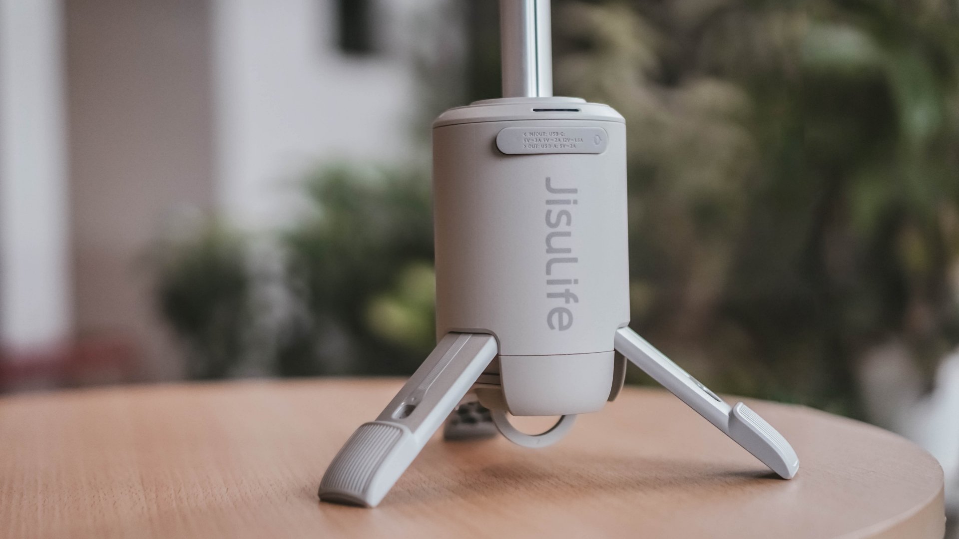
Jisulife: One of the participating, trusted brands you can get from LazMall
Filter for authentic value
Shopping smart means avoiding the trap of “too good to be true” counterfeits that end up in the trash.
Data shows a massive consumer shift toward trusted quality, with LazMall growth vastly outperforming standard listings during major sales.
To ensure your money goes toward genuine products with real warranties, restrict your browsing to official, brand-certified stores.
If you are upgrading your tech, parenting gear, or wardrobe, look to trusted names anchoring the sale like UGREEN, JisuLife, ANTA, Maserati Watches, Momcozy, and O.TWO.O.
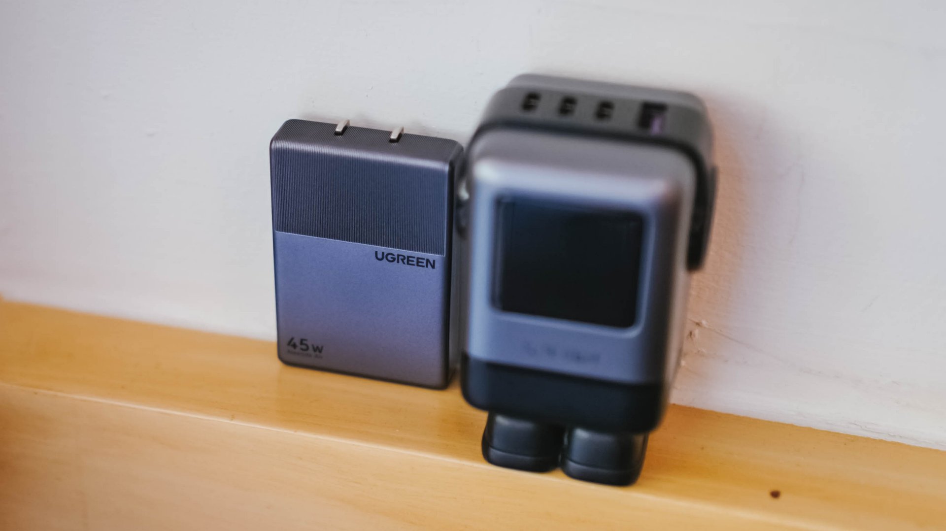
UGREEN: One of the participating, trusted brands you can get from LazMall
Outsmart the noise with built-in tech
Don’t waste hours scrolling through endless listings or guessing which product is better.
The smartest way to navigate a massive mid-year event is to let the platform’s built-in features cut through choice paralysis.

Tools like AI Lazzie and AI Picks allow you to instantly compare similar items, analyze prices, and get personalized recommendations based on actual data rather than generic marketing hype.
Smart Shopper Tip: True value is a mix of the right price, verified authenticity, and a seamless return policy. Use this sale period to stock up on everyday essentials and high-quality upgrades rather than panic-buying items you’ll regret later.

Is your wallet buckling from the weight of so many subscription services? Well, Meta has a trio of new subscriptions for you to sink your hard-earned cash towards. If you have a few dollars, here’s Facebook Plus, Instagram Plus, and WhatsApp Plus.
All three subscriptions are designed to add new features which can enhance the experience for those who practically live on these apps. Among the three, Instagram Plus is the meatiest. It offers users the ability to view other people’s Stories without showing up as a viewer, create more tailored audiences outside of Close Friends, and extend the duration of a Story beyond 24 hours, among others.
Since it shares similarities with Instagram, Facebook Plus offers much of the same features. WhatsApp Plus, however, offers more customization options including new themes, ringtones, and stickers.
If that’s not enough, Meta has also released a new subscription system for Meta AI. Though the basic use of the AI is still free, the new Meta One Plus and Meta One Premium plans offer more capacity and performance for power users. The company is also testing new creator-focused plans, Meta One Essential and Meta One Advanced.
Of course, the new AI-based plans are more focused on those who actually use the AI software. Meanwhile, the three app plans are more for regular users. Facebook Plus and Instagram Plus will cost US$ 3.99 per month. Meanwhile, WhatsApp Plus will cost US$ 2.99 per month.
SEE ALSO: Instagram takes on Snapchat yet again with new Instants feature


HONOR Magic V6 review: The best version of a book-style foldable?
Little left to sacrifice


Close without crossing: A Xiaomi 17T Pro photo essay
Distance and closeness are not always opposites.


Spring reset: Growing more at home with Auk Mini
From kitchen counter experiment to everyday habit

HONOR unveils 1st cinematic video captured by its Robot Phone

ROG launches 2026 Strix gaming laptop series

TECNO’s SPARK 50 Pro is the latest budget smartphone battery beast

Nothing is coming to over 500 Best Buy stores in the United States

This is the history of basketball videogames since the ’73 Knicks

The Infinix GT 50 Pro has the most inspired design for a gaming phone

UGREEN MagFlow Air review: Airy Yet Mighty
Spring reset: Growing more at home with Auk Mini

TECNO’s POVA 8 5G is both futuristic and future-ready

The UGREEN Nexode Air 65W is the only charger I travel with now

-
 India5 days ago
TECNO’s POVA 8 5G is both futuristic and future-ready
-

 News2 weeks ago
realme launches P4 Series 5G, including Power with 10,001mAh battery
-

 Hands-On2 weeks ago
The Xiaomi Watch S5 proves you don’t have to take it off
-

 Gaming2 weeks ago
God of War Laufey puts Faye in the spotlight
-

 Buyer's Guide1 week ago
Buyer’s Guide: Xiaomi Pad 8 Series
-

 Gaming2 weeks ago
Marvel’s Wolverine showcases brutal combat, confirms Jean Grey
-
Reviews6 days ago
HONOR Magic V6 review: The best version of a book-style foldable?
-

 Gaming5 days ago
Kingdom Hearts IV gets new trailer, confirms Switch 2 release