
Despite being a multimedia creative slash tech journalist for years, owning a tablet barely crossed my mind.
I solely rely on my Silicon-powered MacBook Pro for everything. Be that for heavy creative tasks or just writing when asked.

Frustrated Creative Comin’ Thru ✨
Prior to this, I’ve held a tablet for a gadget review — and it was actually my first time using an affordable tablet to such an extent.
Admittedly, my expectations were low due to its underwhelming specs. Moreover, its limitations simply made me realize tablets don’t have a critical use-case in my actual work.
But not too long after that pretty pad, a second one popped up.

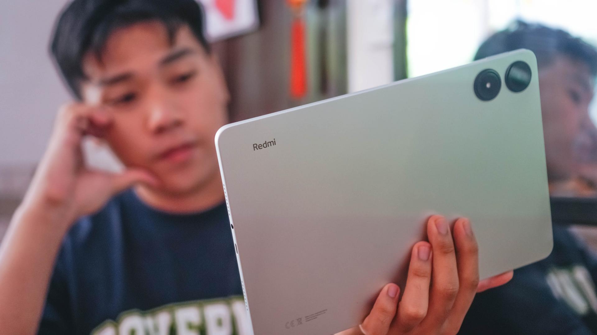
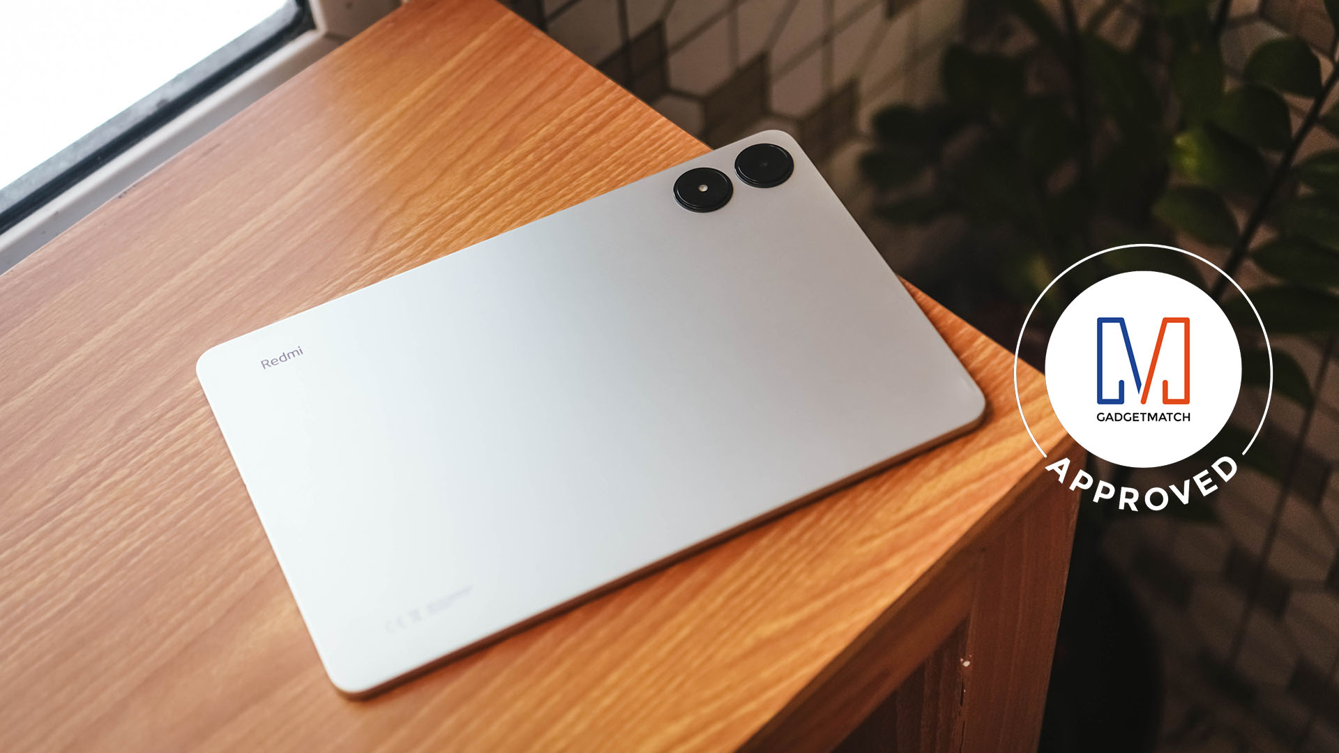
Clearly, the Redmi Pad Pro is the answer of Redmi (or Xiaomi) to consumers who want an all-rounder tablet without much burning too big a whole in their pockets.
But is the Redmi Pad Pro the perfect entry to lower-mid level tablet? Scroll over to find out if it’s your GadgetMatch.
Jack in the Box
Aside from the product itself, Xiaomi / Redmi also offers additional accessories to make it a proper “Pro” pad experience.
View this post on Instagram
Standout Sleekness
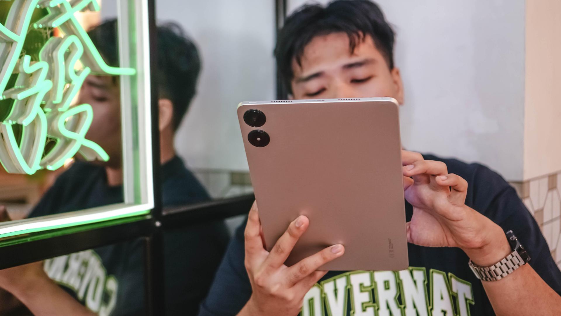
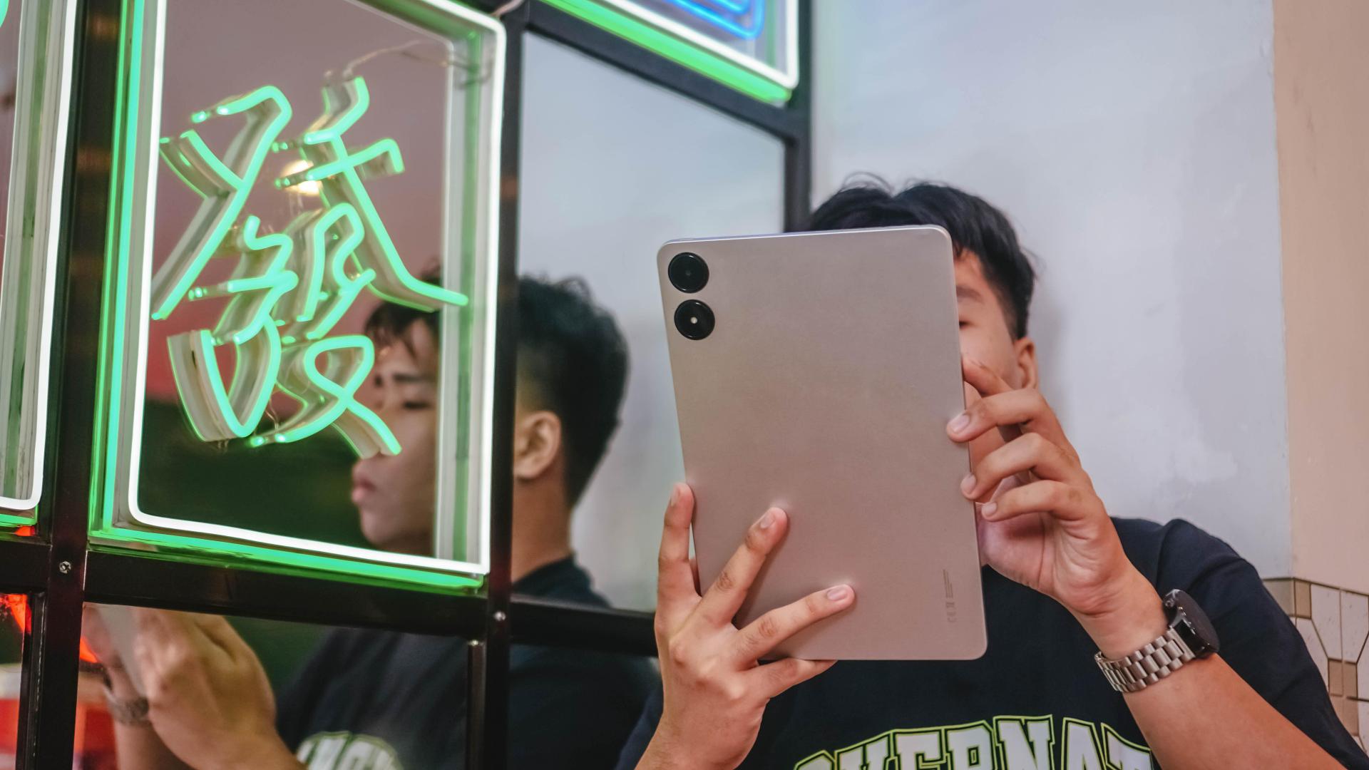
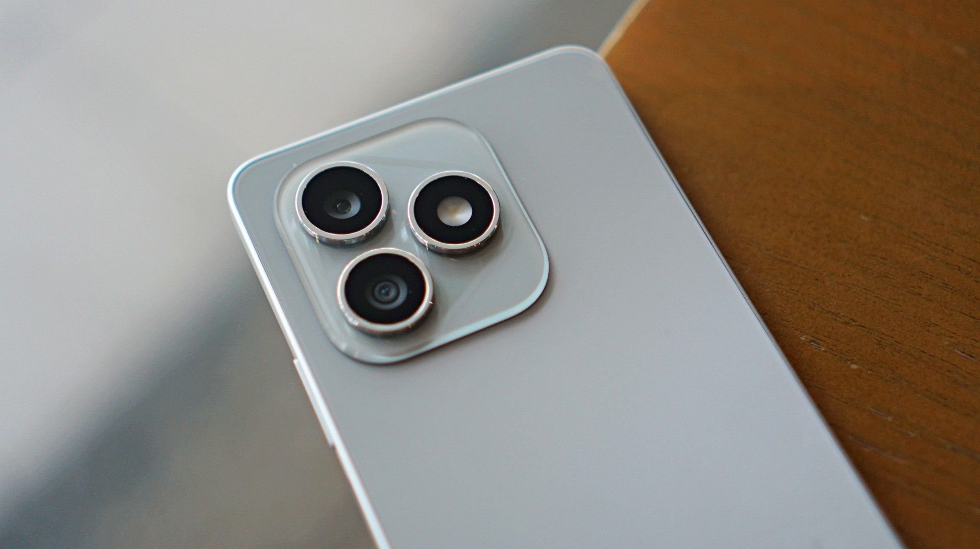
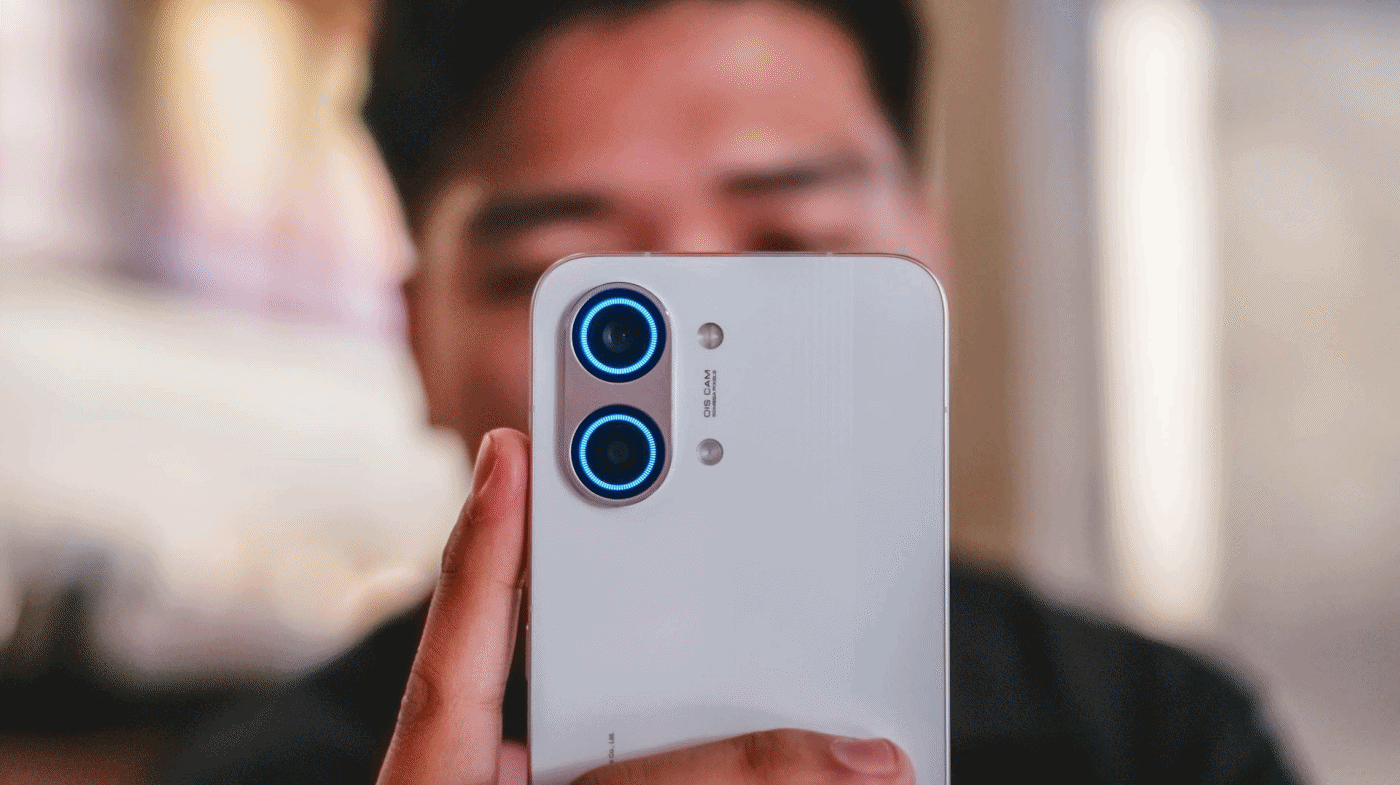
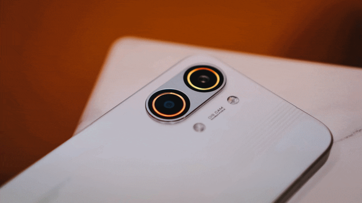
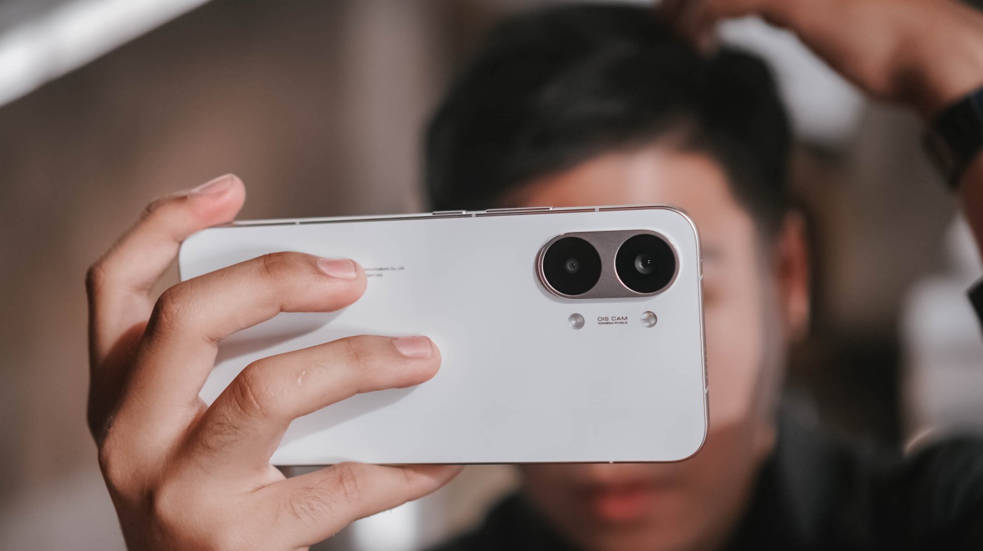
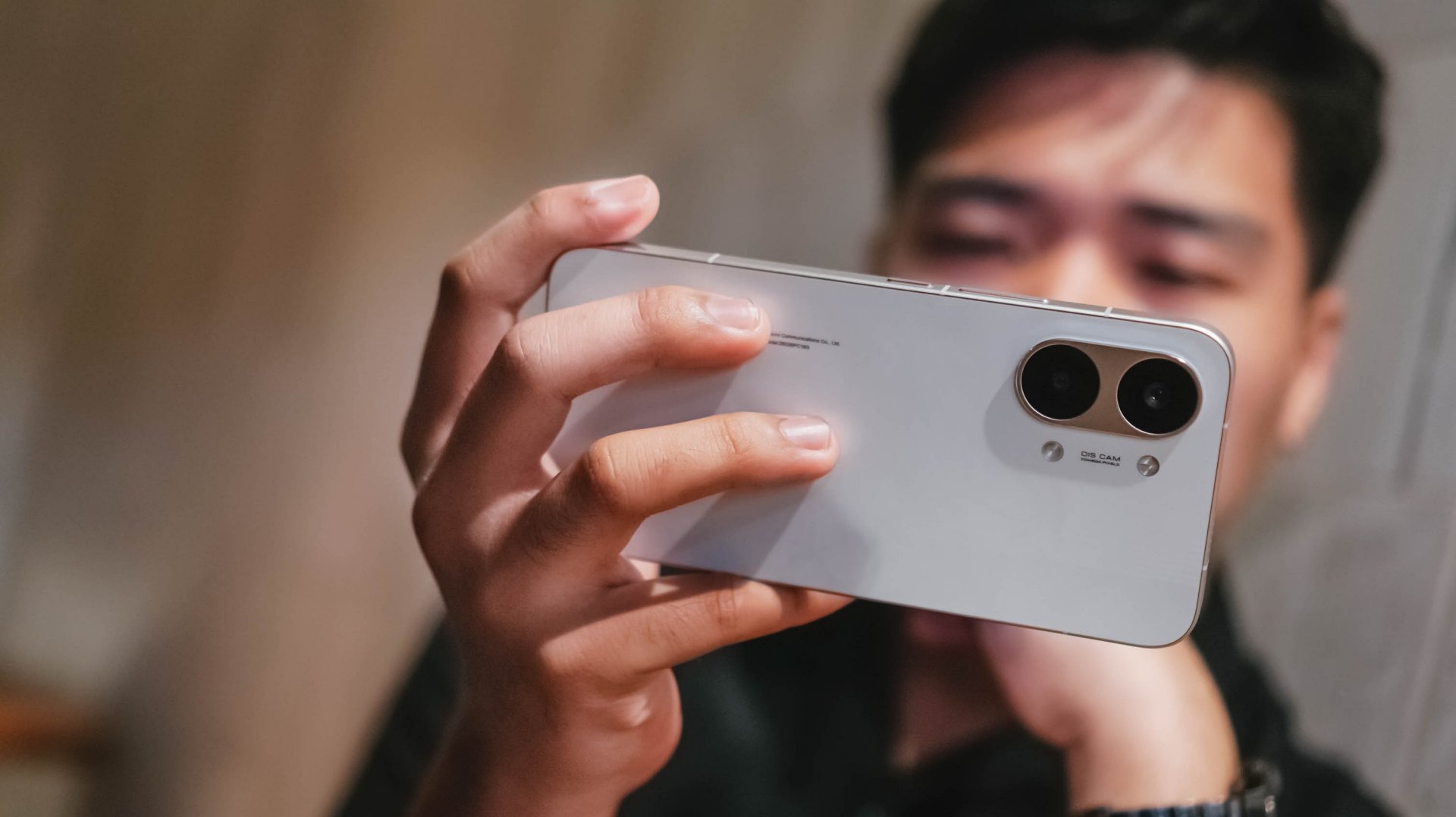
At first glance, the Redmi Pad Pro is a standout tablet on its own.

With its all-metal unibody design and stainless steel sides, it directly stomps the competition with their pseudo-premium build quality — which also affects long-term durability.
![]()
It is an overall fab slab of a tab that’s sturdy compared to its plast-icky counterparts.
While I’m not a fan of anything mint nor matcha, my eyes adore this Mint Green colorway that’s so sleek yet subtle. If this ain’t your cup of tea, there’s the pro-intended Graphite Gray colorway as well as a more refreshing Ocean Blue option waving at ya.

Punching the air rn after that D.O x Youngji cheek kiss 🥲
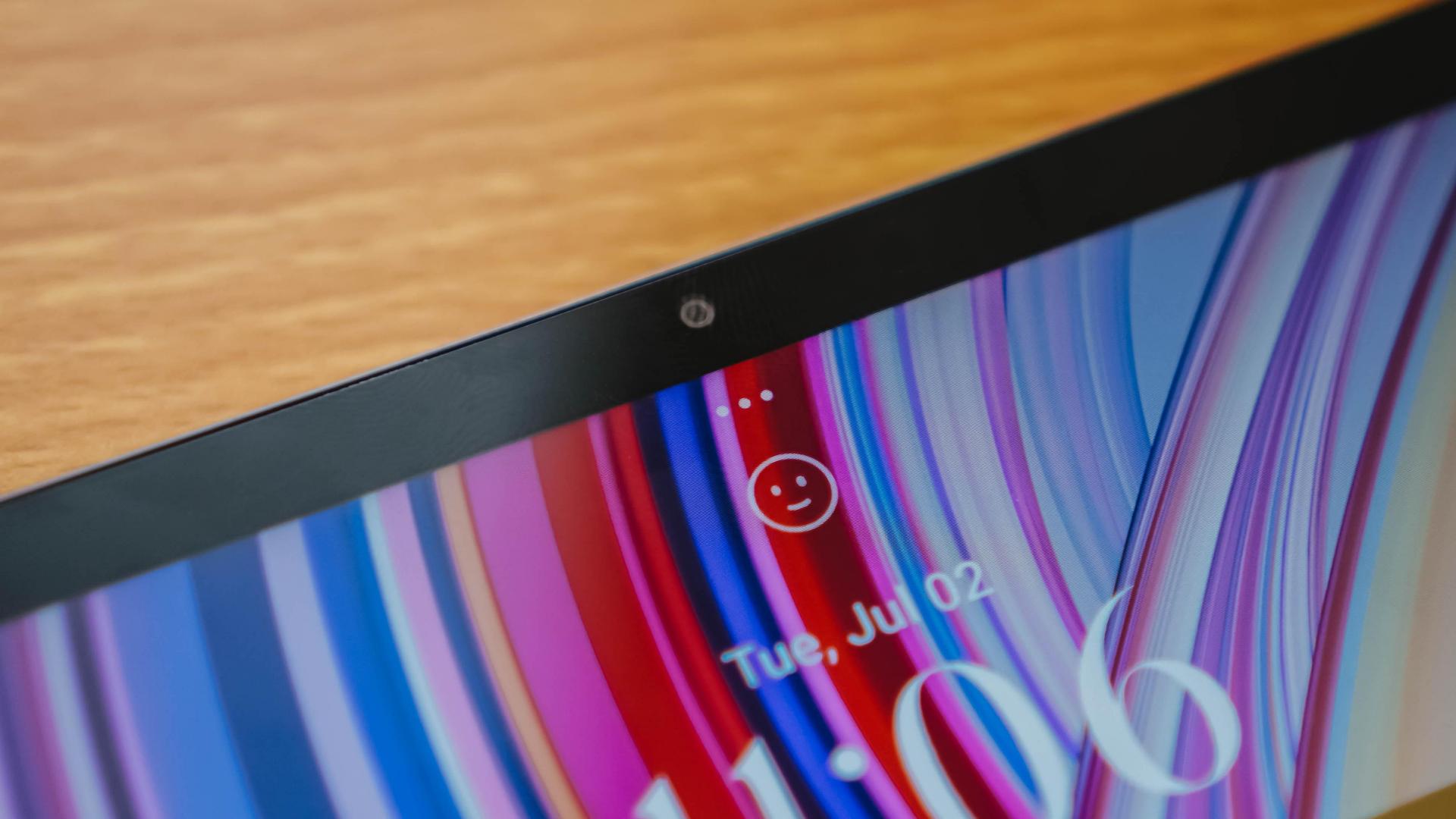
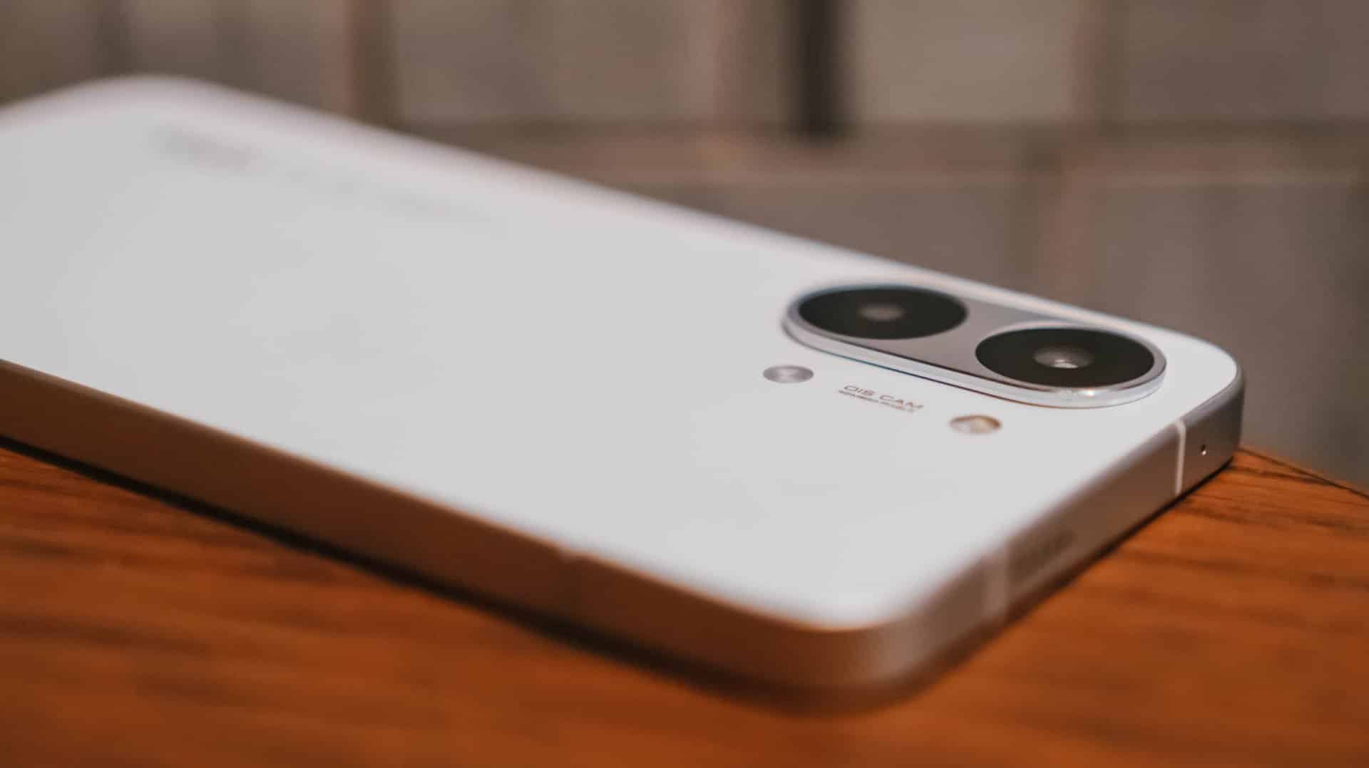
Speaking of, the Redmi Pad Pro’s front is strengthened by Corning’s Gorilla Glass 3 protection.
While this does not fully guarantee a shatter-free glass, it’s still a nice addition in case you, your kids, pets, or pretty much your anger management issues knock off the gargantuan device on the floor.
Buttons feel tactile when clicked. Even so, I’m not fond of its confusing layout where the power button and volume buttons are separated on different sides — much like Alaska and Russia separated by the Bering Sea, divided into two different continents and time zones 👁️👄👁️
It could have been placed right next to each other just like any other Android device for overall uniformity and familiarity — but I’m just gonna sheesh.

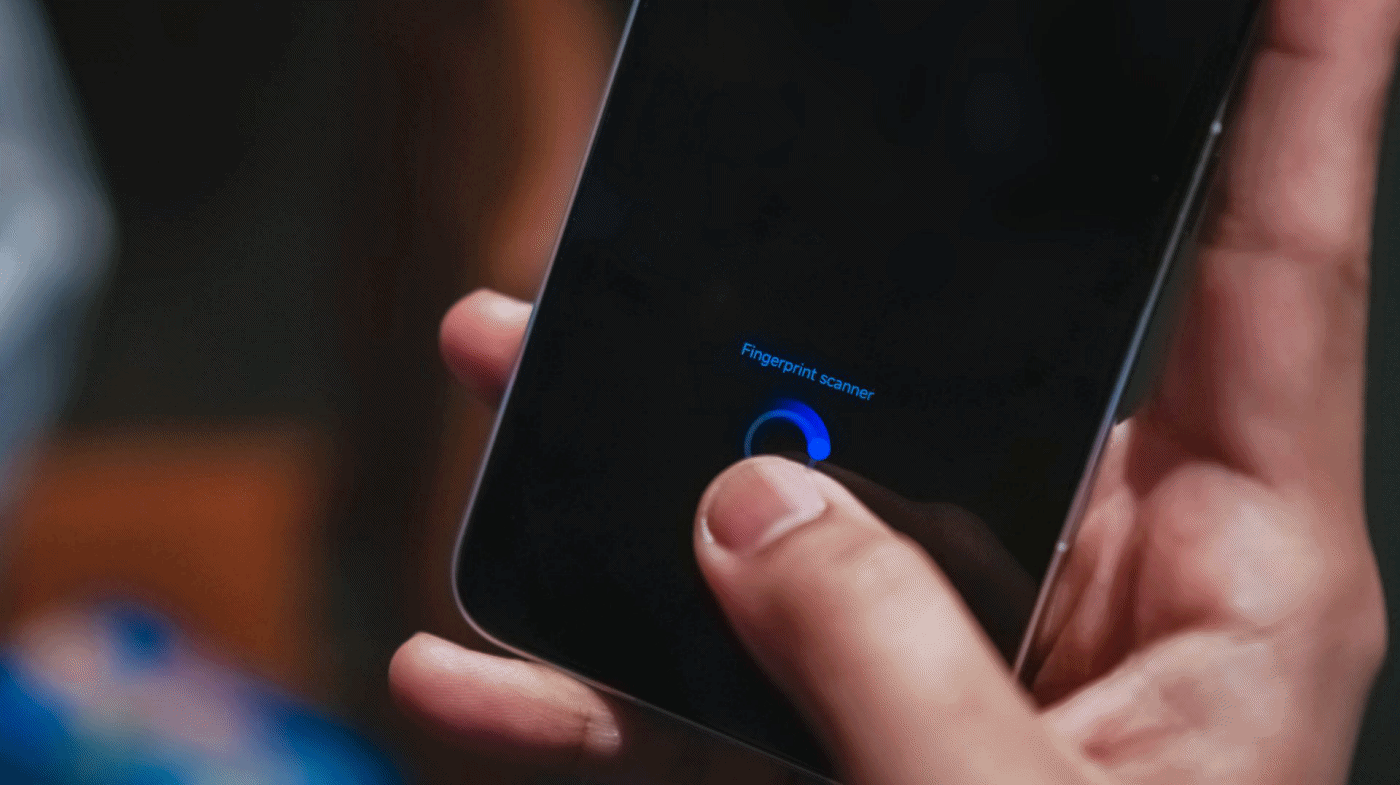
Just like in my previous pad review, my sentiment stays the same: A side-mounted fingerprint scanner would have been a better option instead of solely relying on the classic unlocking PIN, pattern, or the never foolproof face unlock method.
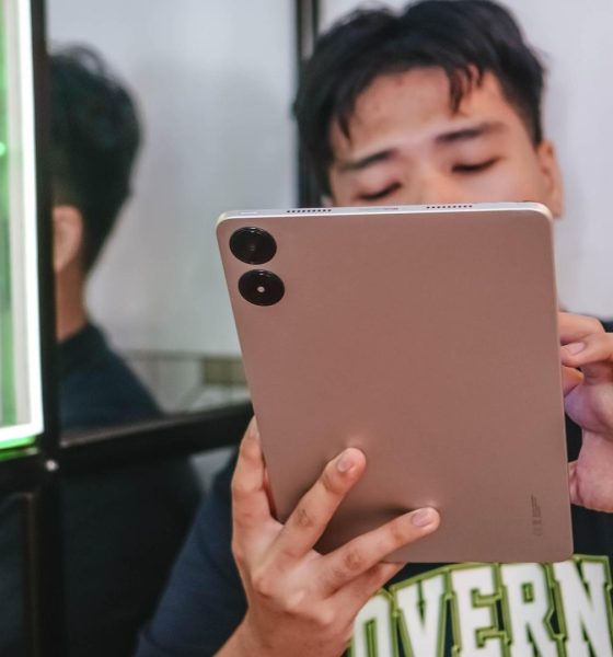
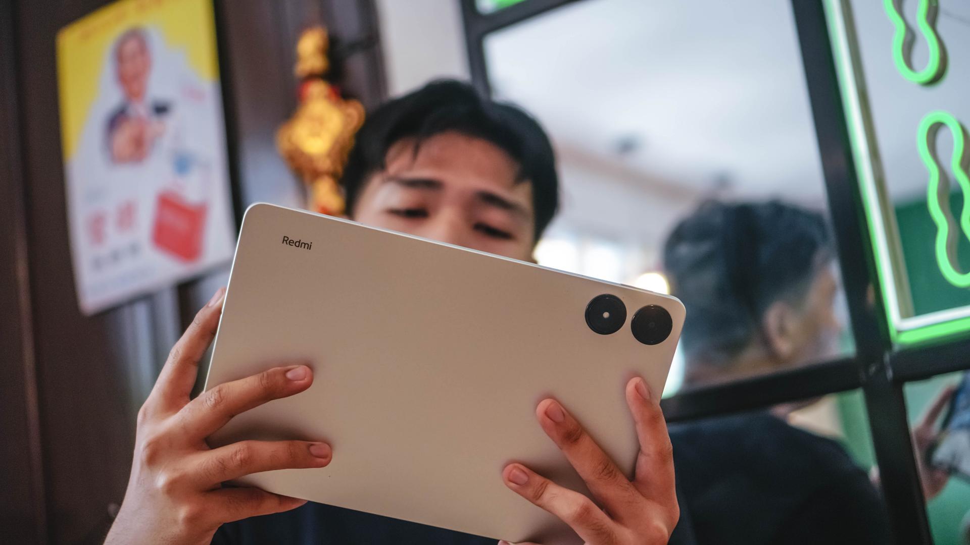
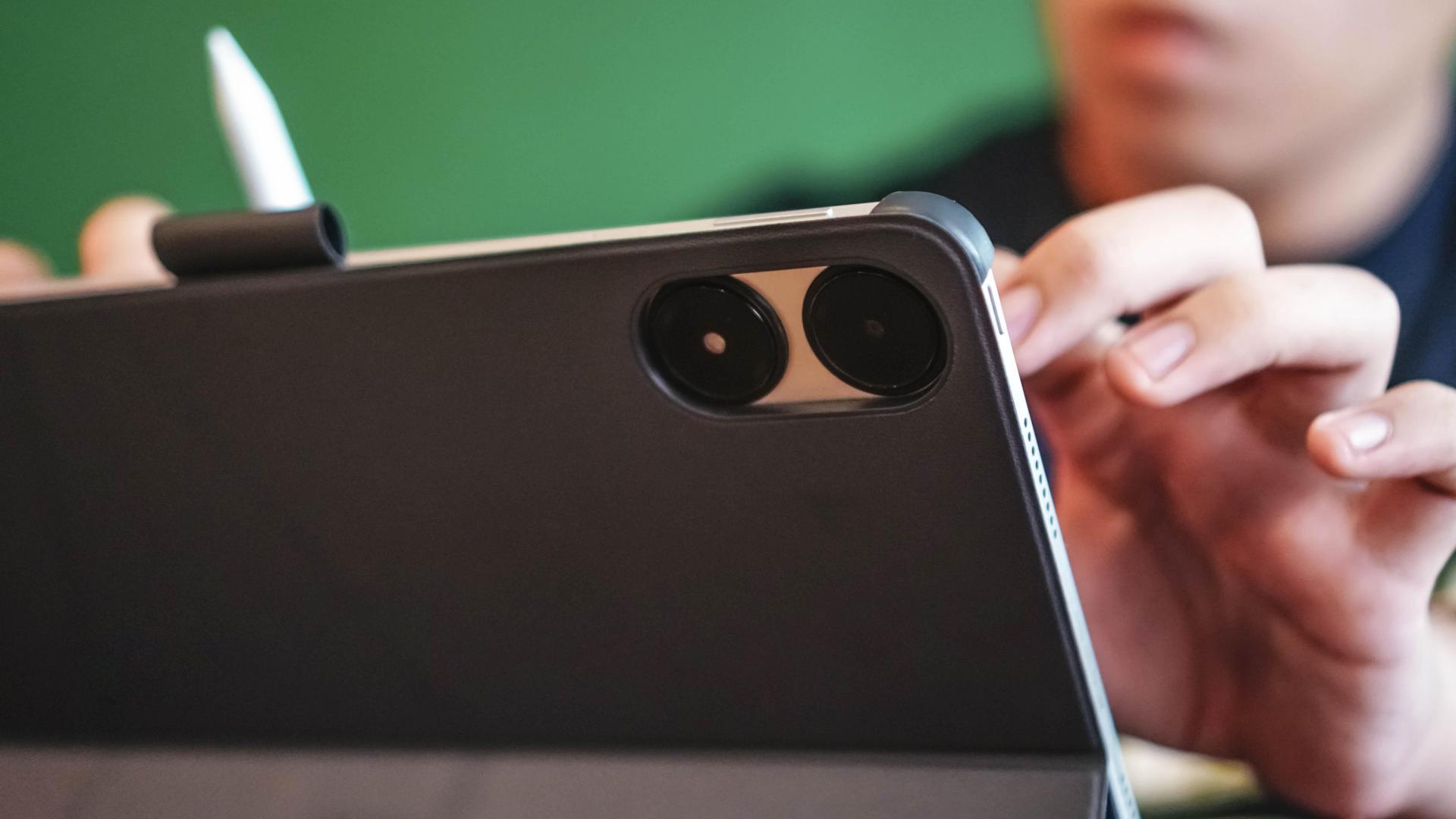
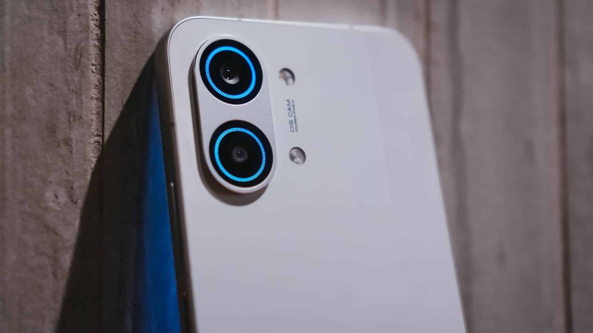
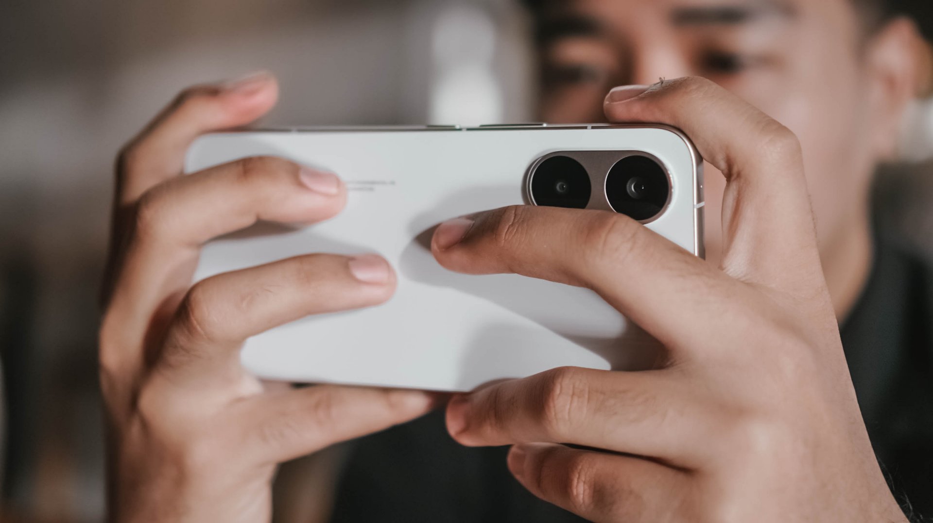
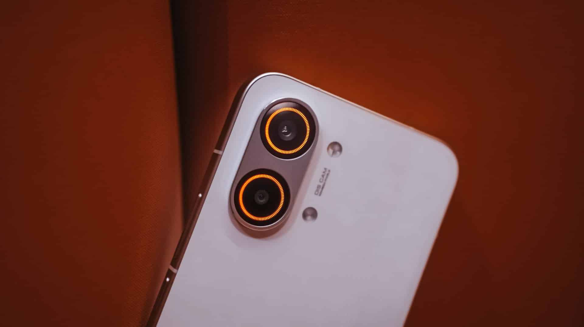
But hey! That 8-megapixel camera is beneficial for video calls — or selfies, if you prefer it that way.
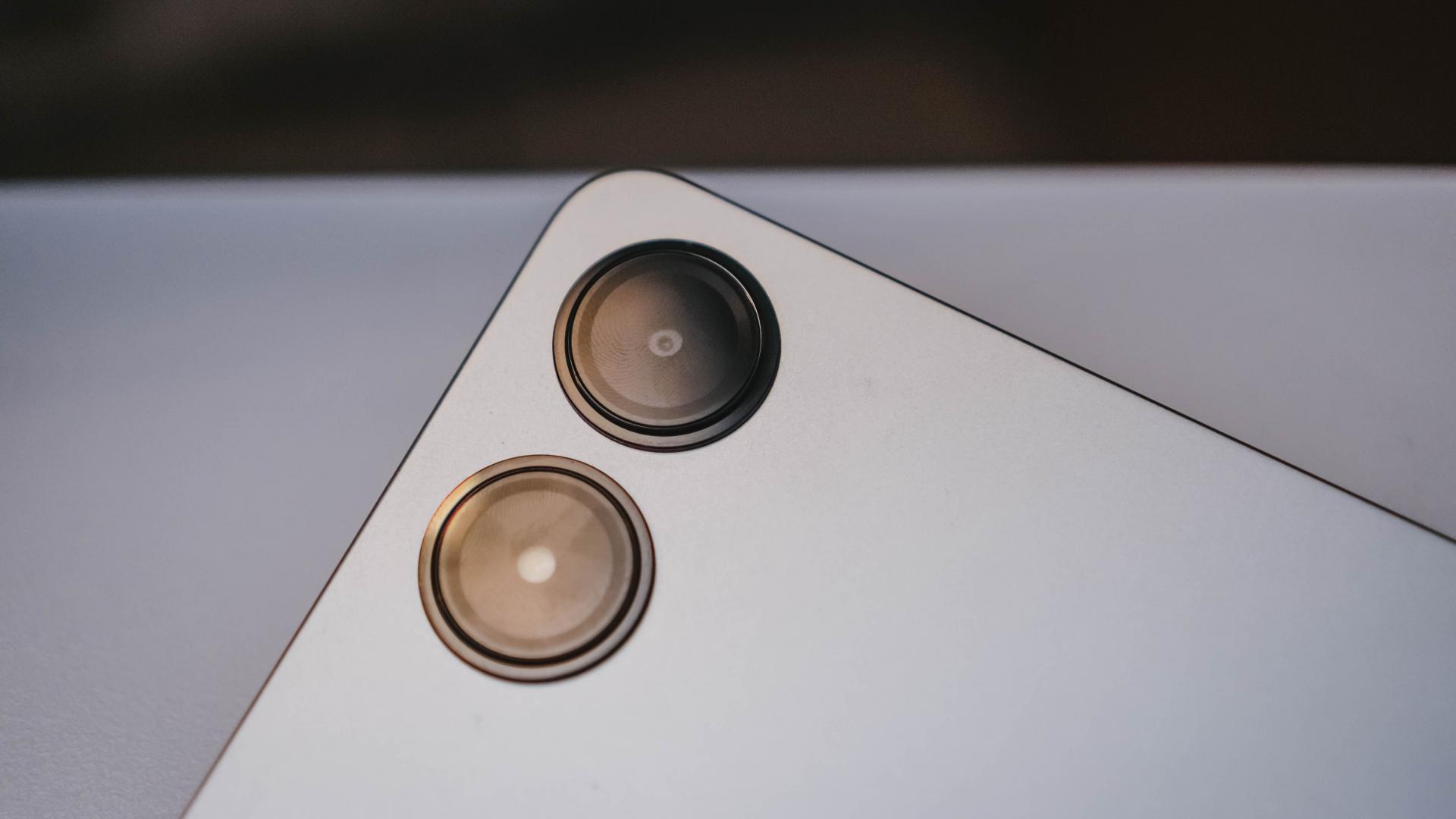
And while already on the topic, it features an 8-megapixel rear shooter as well…

…with a flash unit to amplify awfully dark scenarios.

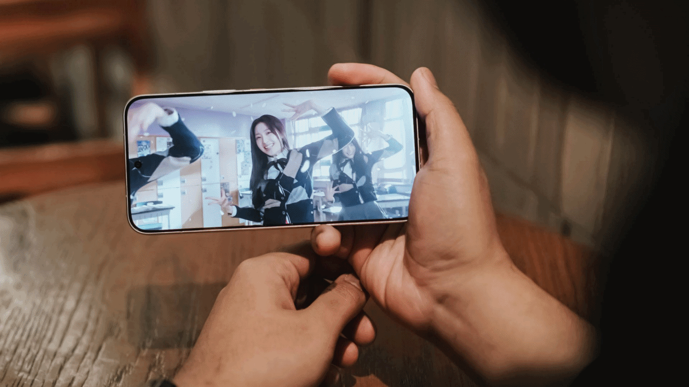
Visual Glory
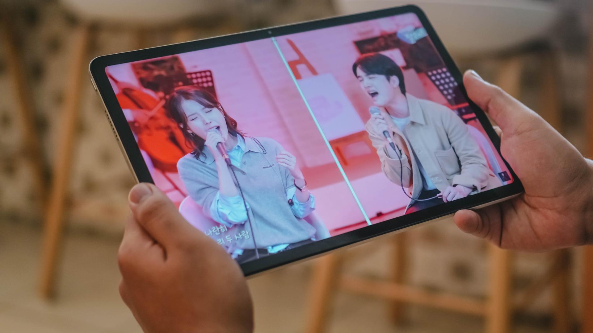
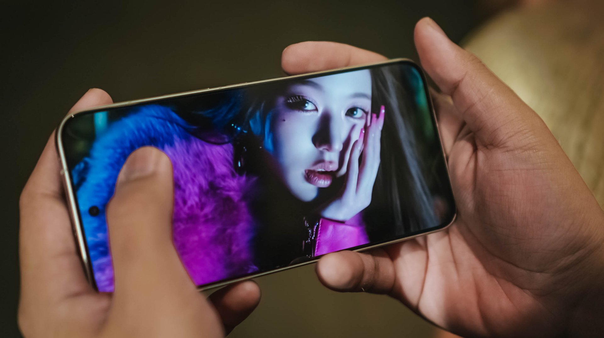
One major reason why some people opt to buy tablets over smartphones and laptops are none other than their display sizes in the sweet spot.
The Redmi Pad Pro attests to that with its humongous yet vividly glorious 12.1-inch screen.

Notice those slim bezels? That’s something that we used to dream of in the past — at least for budget-segment tabs.
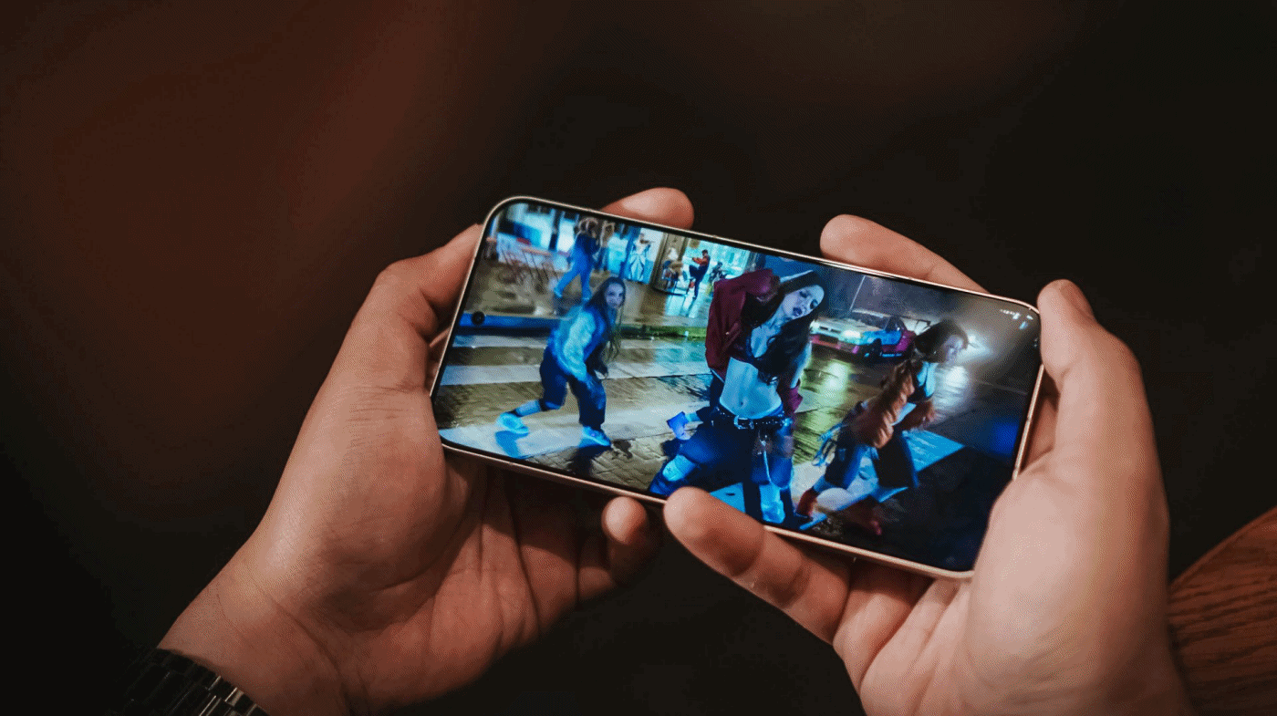
Still, screen size is just one factor. In this new era, display tech also matters.

Surprisingly, it has a 120Hz refresh rate and 240Hz sampling rate which make the tablet experience a lot better. Whether just for scrolling, simply scribbling and sketching, or being heavily-focused on gaming.

Shenter Xiaoting and their last Kep1er comeback as #OT9 — while I’m silently ~ w e e p i n g ~ in the corner
For all the display nerds, here are the needed nutrients you need to digest: 2.5K display resolution (2560 x 1600), pixel density of 249 ppi (pixels per inch), 500 nits of max brightness (additional 100 nits in HBM), 12-bit color depth, 68.7 billion colors support, 1500:1 contrast ratio, 16:10 aspect ratio.
My two ultimate vocal biases in one! Now, we only need a proper IU x D.O collab song real soon
It doesn’t stop there! It even supports Dolby Vision as well as eye-protection features. The tablet also has certain certifications from TÜV Rheinland — flicker-free, circadian-friendly, and most of all, low in blue light.
Superior Sound
Overall look and feel aren’t the only factors to consider when purchasing a shiny slab.
To make multimedia consumption more immersive, the Redmi Pad Pro boasts a quad surround-sound speaker system.

I may not be a full-blown audiophile but those four speakers altogether deliver rich sound with the ideal mix of bass, mids, and treble.

Watch Netflix’s Hierarchy to further pollute your minds 🥰
It’s loud enough to fill that void in you when volume hits around 50~75%. This is ideal not just with your usual Netflix (or Disney+) and chill moments. It’s also very desirable for loud party banging or your solemn sessions in the bathroom. And by that, I mean singing until your hoarse voice gives up on you 😭
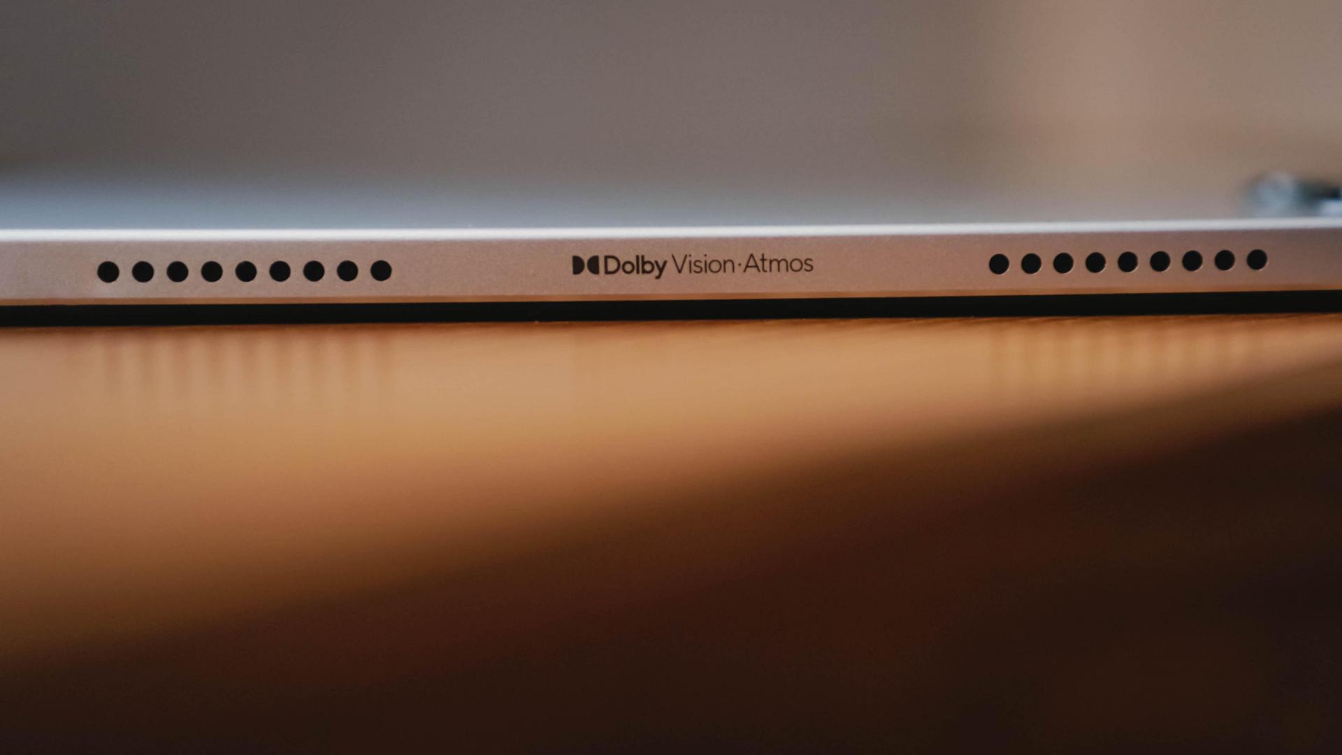
Remember that Dolby Vision display? Well, the speakers are powered by Dolby Atmos as well.
🎵 How long before we 🎶 — give KISS OF LIFE the 1st Win and Coachella performance they deserve?
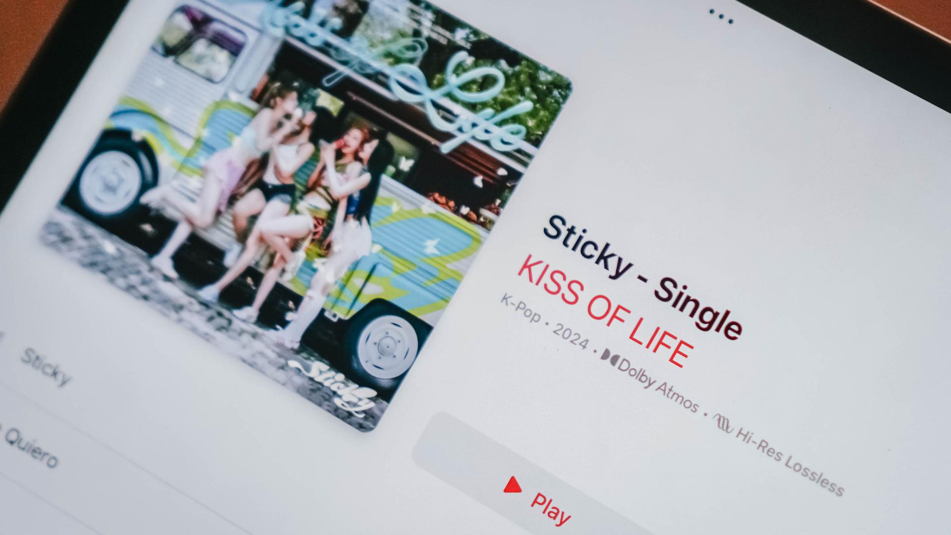
As someone who’s an Apple Music patron, this special sound feature means a lot.
I can decipher how bad a 128kbps audio sounds compared to the Lossless and Dolby Atmos offerings — which aren’t present in most people’s preferred music platform.

You thought it stops there? Spatial Audio is also in attendance.
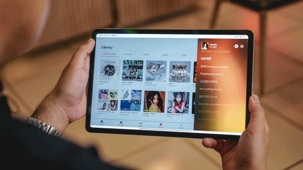
Stream Gyubin’s Satellite to soothe your ears with her ethereal vocals
It’s not limited to Apple devices and other supported audio peripherals. Spatial Audio can be toggled even in speaker mode.
While some barely notice the difference, it gives me that surround sound feeling that other devices fail to provide.
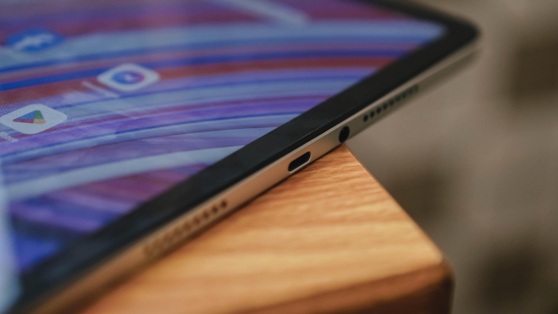
Not free from being wire-free? The 3.5mm audio jack saves the day for those who fully-rely on their LDAC-powered headphones. Audio masters can even plug-in their traditional speakers and profesh amplifiers whenever, wherever.
Decently Speedy
The Redmi Pad Pro is powered by Qualcomm’s Snapdragon 7s Gen 2 chipset based on a 4nm process.
If you’ve held the Redmi Note 13 Pro 5G, it should come as no surprise how quick it performs.
Gliding through socials was a breeze. Although multitasking = momentarily hiccups.
Heejin being the biggest loser trapped in a hot person’s body — and don’t @ me fellow Orbits, it’s an ongoing trend on X/Twitter
That might just be the limited 6GB memory that I have. Even opening just two to three apps simultaneously means other apps need to be sacrificed and stopped for good.
Anyhow, Xiaomi says this is exclusive for media reviewers as retail units should come in a bigger 8GB LPDDR4X RAM — which should also be the ideal memory configuration for this device anyway.

Honestly, 128GB in today’s digital age isn’t enough — at least for my tech needs. Luckily, the Redmi Pad Pro is being offered in a bigger 256GB storage with the same UFS 2.2 standard.
If that still feels insufficient, it has a dedicated microSD slot that can be expanded up to 1.5TB.
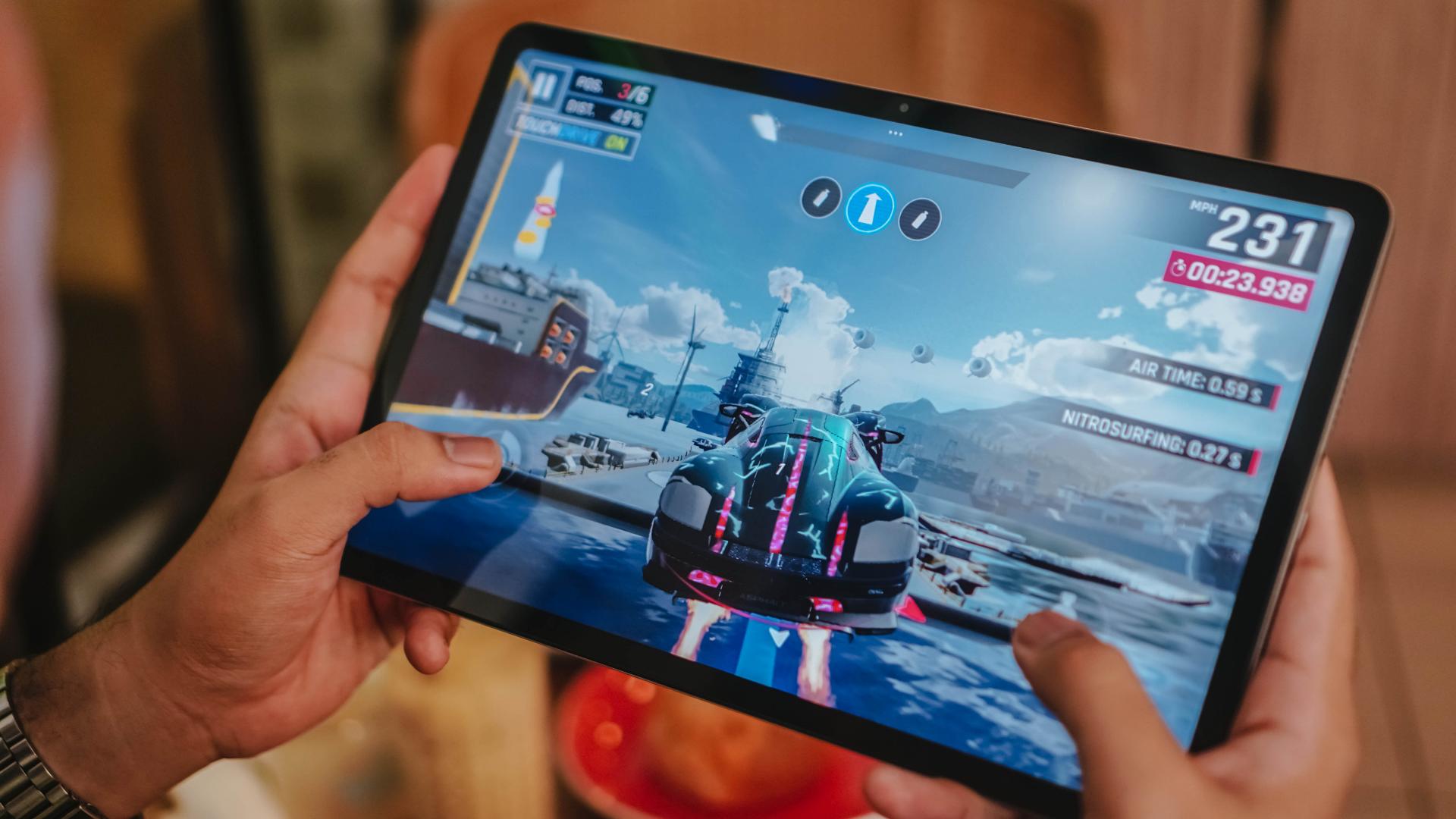
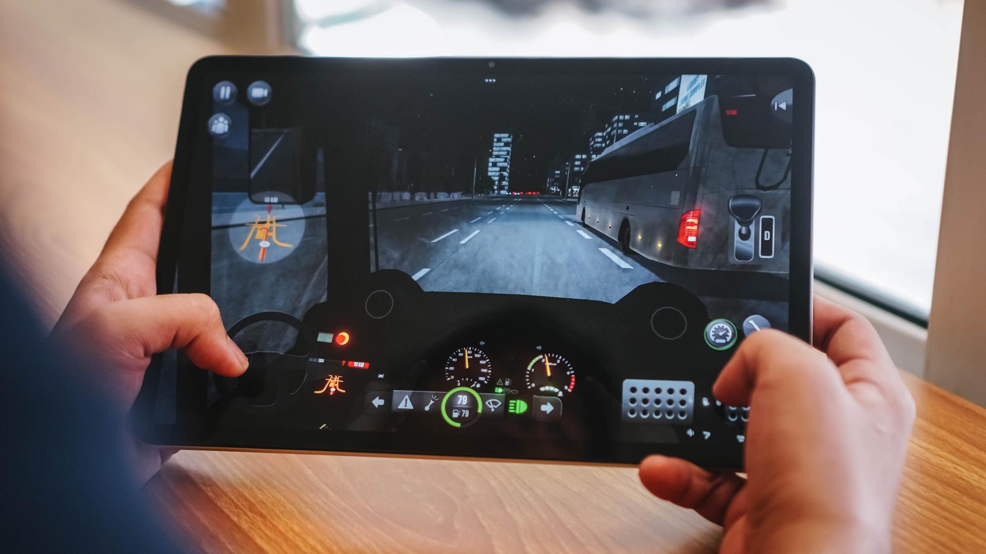
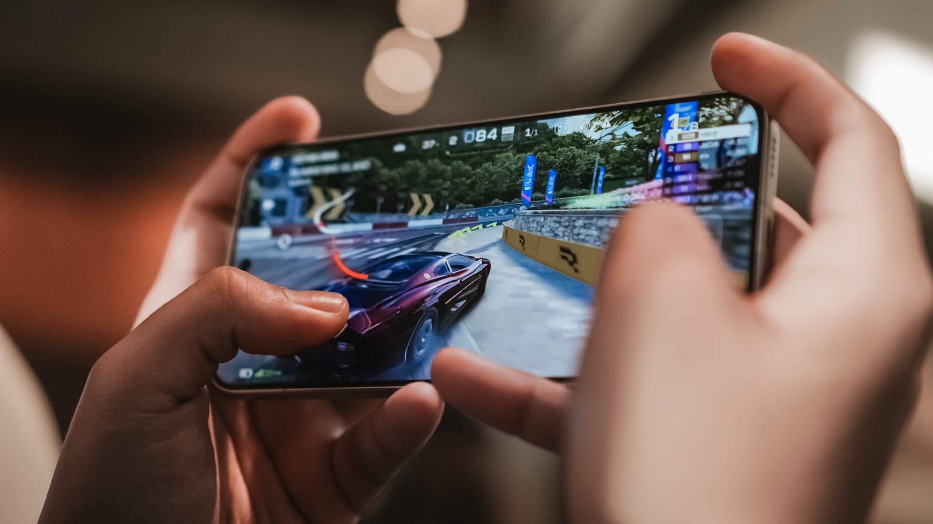
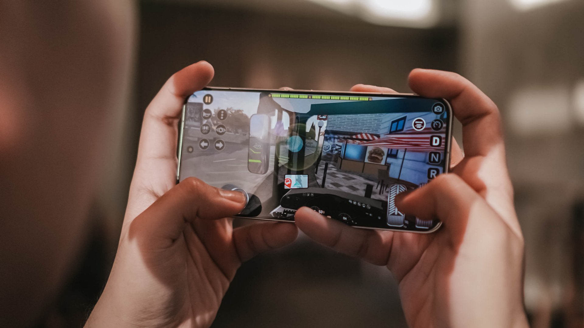
With this chipset, one shouldn’t be shocked that the tablet can run your usual game titles.
With the presence of Xiaomi’s Game Turbo feature, it boosts the already awesome performance when gaming.
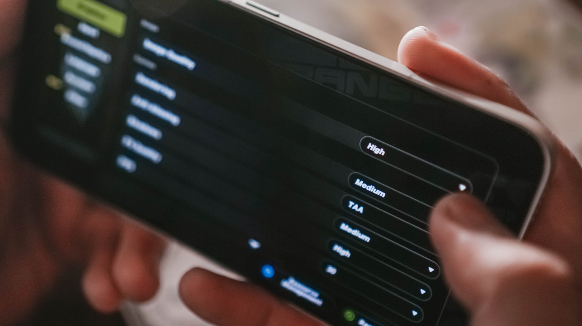
Although for graphics-intensive games like Genshin Impact, expect a decrease in quality because of how heavy it is.

Admittedly, I’ve gotten accustomed to playing games on a foldable rather than the usual smartphone aspect ratio.

And with its behemoth display, I enjoyed gaming more than ever. So much so that I never missed a beat while in the heat of the match.

But despite being thin at just 7.52mm, 571 grams is still pretty hefty. It made my hands and arms sore over around thirty minutes to an hour of gaming.
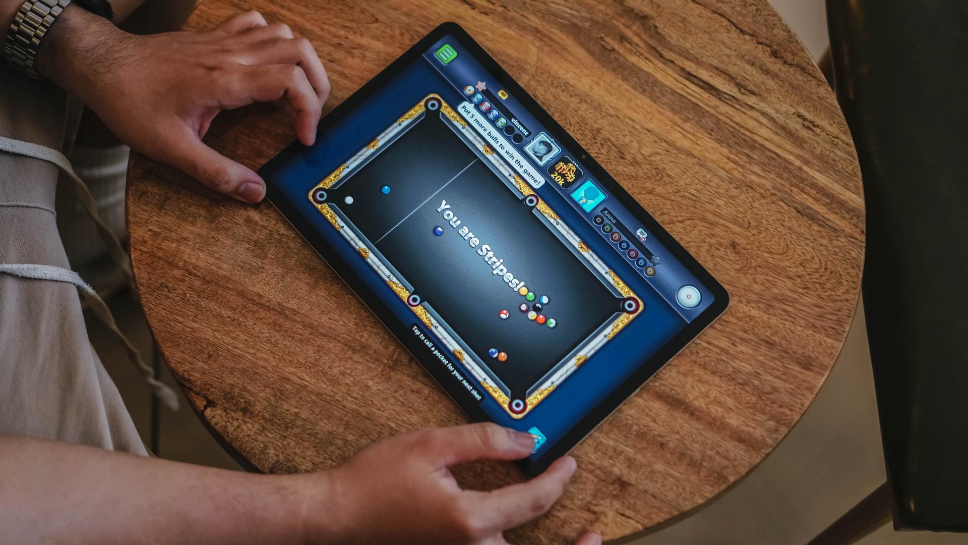
That said, this large slab can still be laid flat on a table — which is suitable for shooting billiard balls in 8 Ball Pool — or duel with a friend in Chess!
Efficiency (with some Deficiency)
The Redmi Pad Pro packs a 10,000mAh battery. For a device such size, it’s sufficient enough to last you within the day — or more when casually used.

With moderate usage, it can last ’til the night light shines outside.
I’ve used it like any tablet user would do: Stream hours-worth of K-Dramarathon and K-Poplaylists. An hour (or two) of gaming. Even some sketching when bored for around thirty minutes.

Standby time is superb. Expect the tablet to last the next day or even longer. On the contrary, overall screen usage lasts as much as six (6) hours — much like regular smartphones these days.
I’m expecting at least a better power efficiency with the chipset used. However, I find the large screen to be the culprit. More so, it’s equipped with an IPS LCD panel. It does NOT turn off black pixels when unused — unlike OLED displays do.

That said, I don’t expect such display tech on a pad in this class anyway. It still is a solid slab for your creative, entertainment, and work needs.
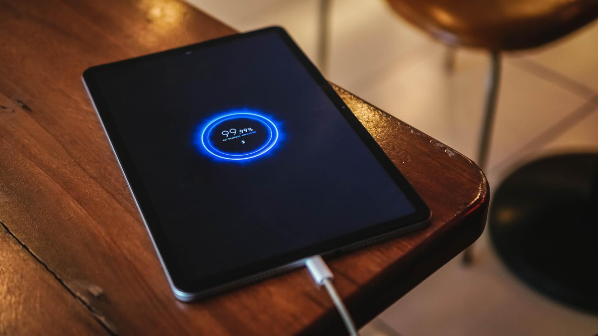
The full unboxing video above already spoiled it. The Redmi Pad Pro does NOT include a charger out of the box. Very uncharacteristic of the sub-brand as they always ship chargers with their devices. IDK, maybe to cut some cost?
But if you’re in a tight pinch, it supports an adequate 33W Mi Turbo Charge — much like the Xiaomi Mi 10T Pro I held three years ago.
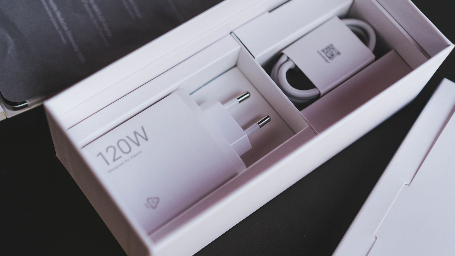
Xiaomi 120W HyperCharge Adapter (Redmi Note 12 Pro+ 5G)
That said, if you own any fast chargers from Xiaomi (or Redmi, even POCO), the Redmi Pad Pro supports them. In my case, I used my Xiaomi 13 Pro’s super-fast 120W Hyper Charger.
While it cannot obviously fully-utilize the charger’s max charging speeds, the Redmi Pad Pro was still able to activate its 33W Turbo Charging feature.
| From 0% | START TIME: 3:23AM |
| 3 minutes | 3% |
| 5 minutes | 5% |
| 10 minutes | 10% |
| 15 minutes | 16% |
| 20 minutes | 21% |
| 30 minutes | 34% |
| 40 minutes | 45% |
| 45 minutes | 50% |
| 1 hour | 69% |
| 1 hour 10 minutes | 79% |
| 1 hour 15 minutes | 84% |
| 1 hour 20 minutes | 89% |
| 1 hour 25 minutes | 94% |
| 1 hour 30 minutes | 99% |
| TOTAL | 1 hour, 32 minutes END TIME: 4:55 AM |
That 33W fast charging protocol helped fill up the Redmi Pad Pro’s massive battery in just around 1.5 hours — a lot better than the painfully sluggish three-hour+ charging time of the last pad I held.
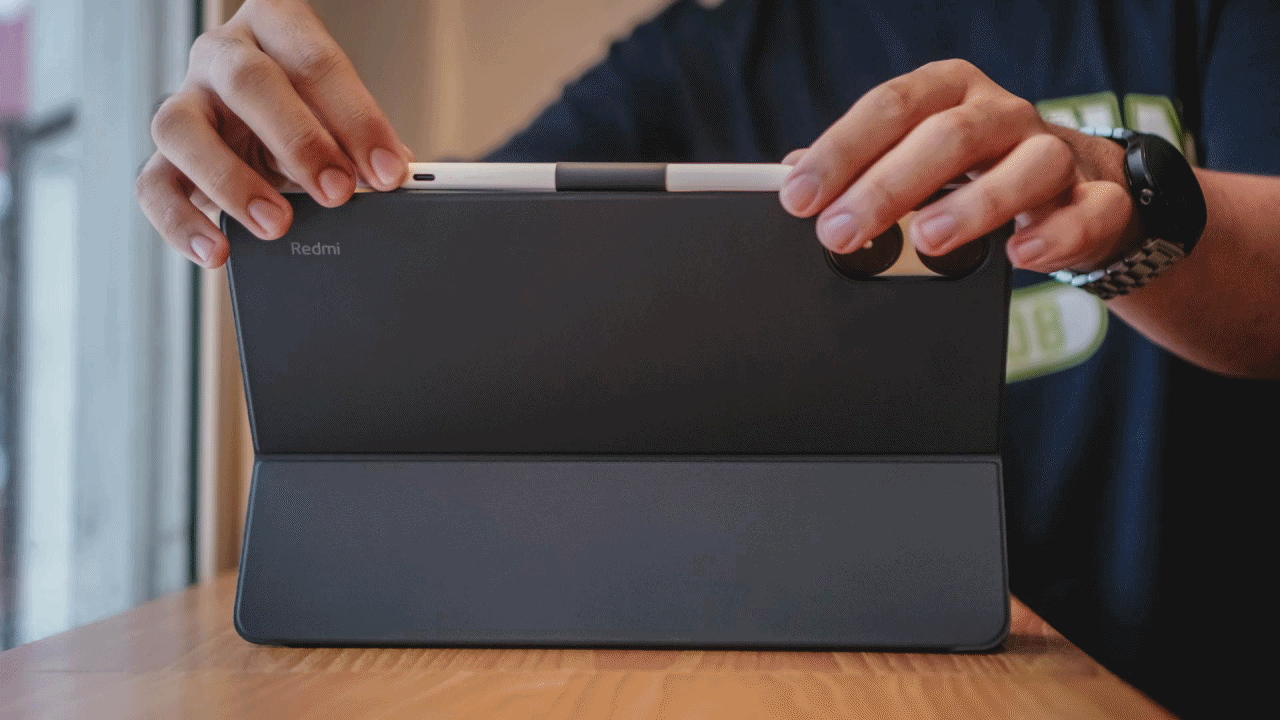
Pro Pad–perience
The Redmi Pad Pro fully functions as a standalone product. However, the overall “Pad Pro” experience feels somewhat limiting without its additional accessories.
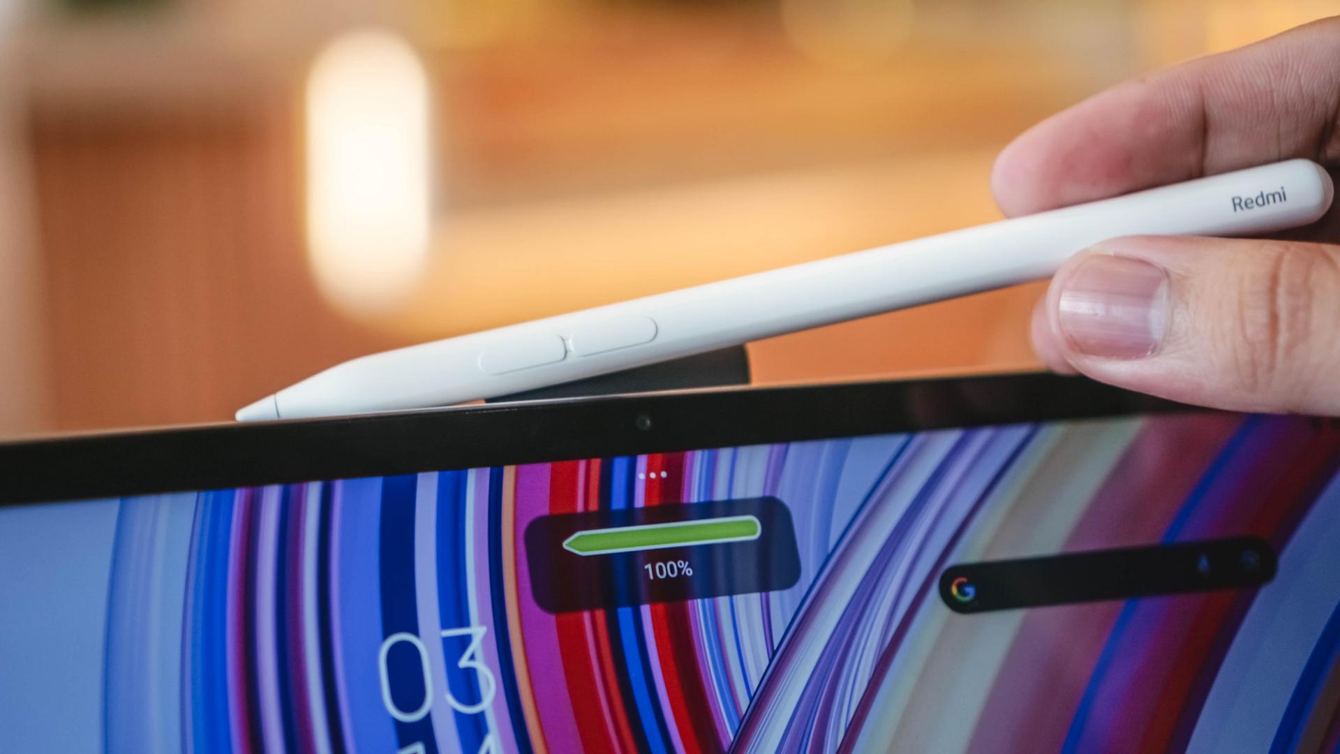
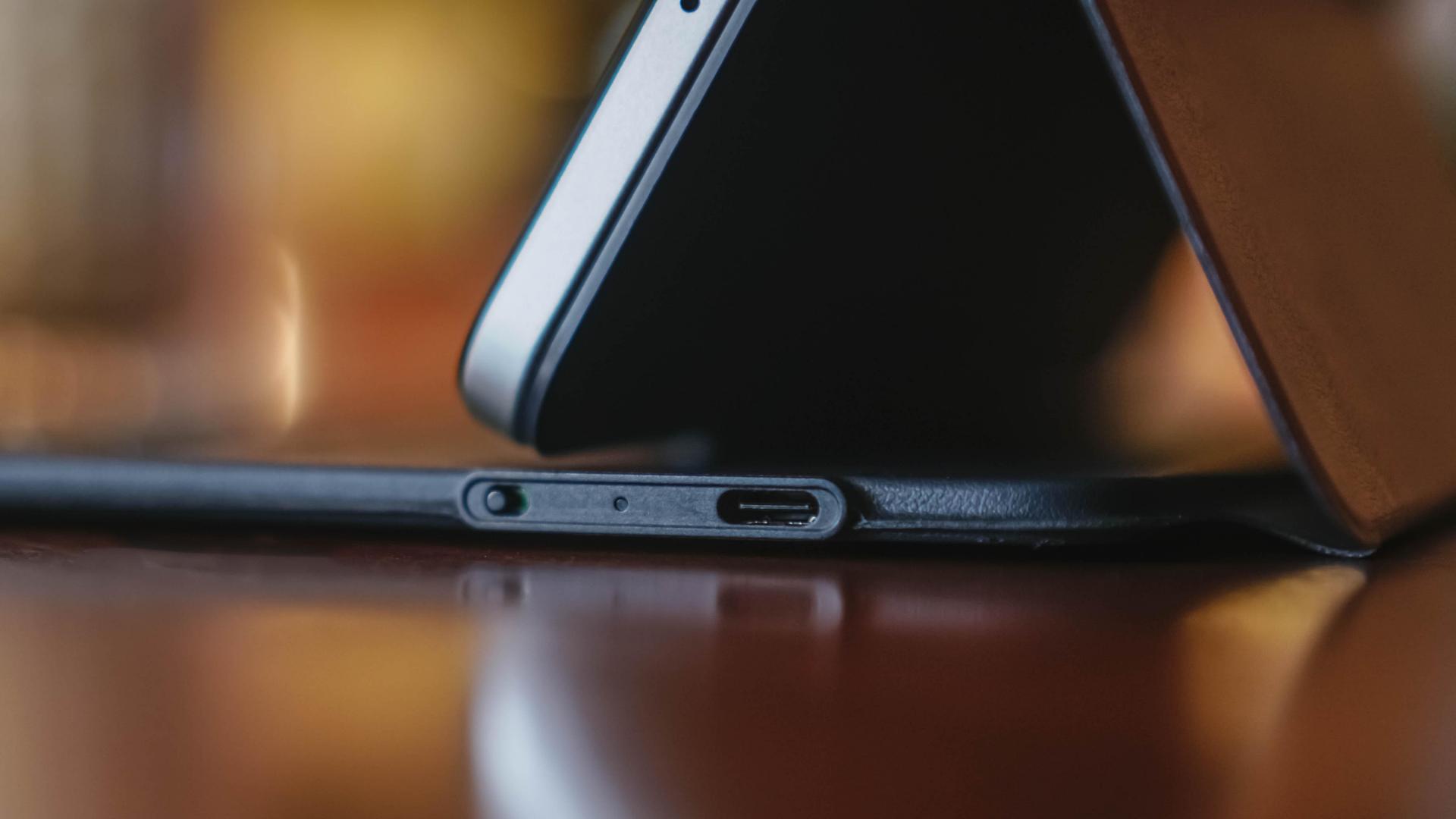
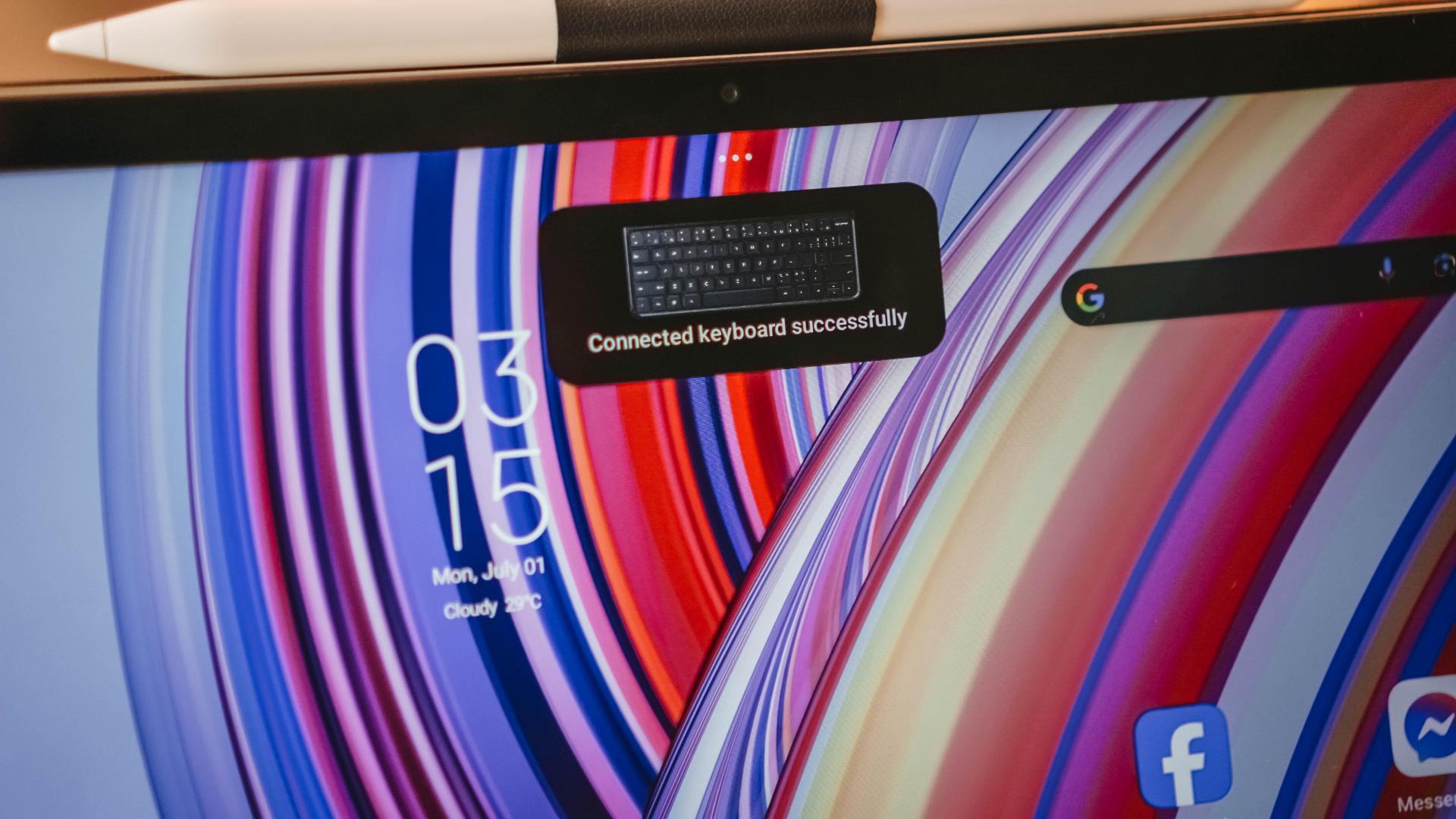
The Redmi Pad Pro offers the additional (and optional) Redmi Smart Keyboard and Redmi Smart Pen — but with some trade-offs.

Both of them aren’t being powered/charged on the device. Instead, they run separately through their own batteries — all while being connected via Bluetooth.
Power Switch is there when not being used
Say goodbye to your clutter-free slash wire-free lifestyle as both products only rely on wired USB-C charging.
The Smart Pen doesn’t support magnetic wireless charging. Furthermore, its Smart Keyboard isn’t powered by magnetic pogo pins.
Nonetheless, I don’t mind these caveats as long as these products serve their actual purpose. After all, we get these full-on “Pro” pad accessories for less.
And if you’re worried about the lack of magnets, the Smart Keyboard has a dedicated Smart Pen holder.
As per battery, both accessories manage to last at least a day. It even goes for more than two when you don’t use ’em excessively.
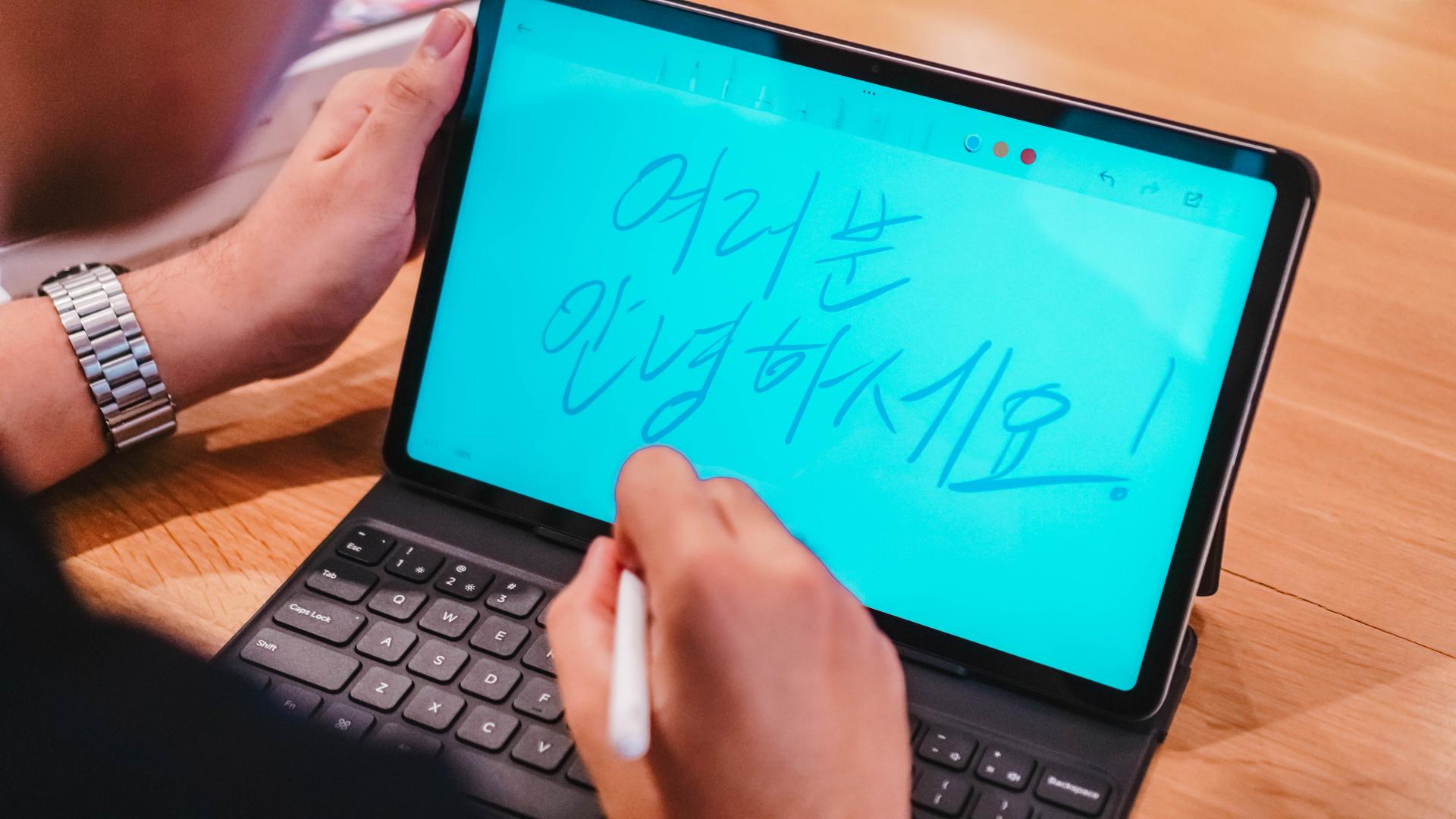
The quick brown fox jumps over the lazy dog
No, that ain’t an error. That’s what I type out when testing and evaluating a new keyboard.

TL;DR: I’ve been typing with a MacBook keyboard for eight years now that I got so used to its layout — from my old 2015 MacBook Pro way back in college ’til the company-issued M2 Max MacBook Pro that I have with me rn.
Now, this is where I can confidently say such familiarity doesn’t require an additional learning curve.

If I explain the feeling, it’s in the middle ground of being mushy and clicky — not that it’s a bad thing. IMHO, it still feels very comfortable to type on.

Believe me or not, this review article was typewritten using the Redmi Pad Pro’s keyboard from the start ’til the very end. Photos and Rodneil all prove that.
If you value shortcuts like I do, those are recognized by the keyboard as well. The improvements in Xiaomi’s HyperOS over its bug-infested MIUI counterpart is its ultimate saving grace.
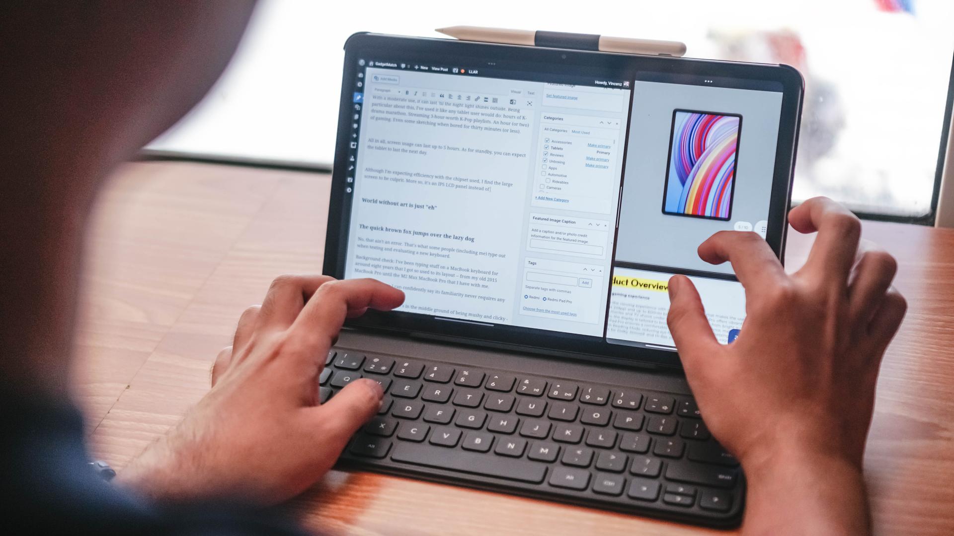
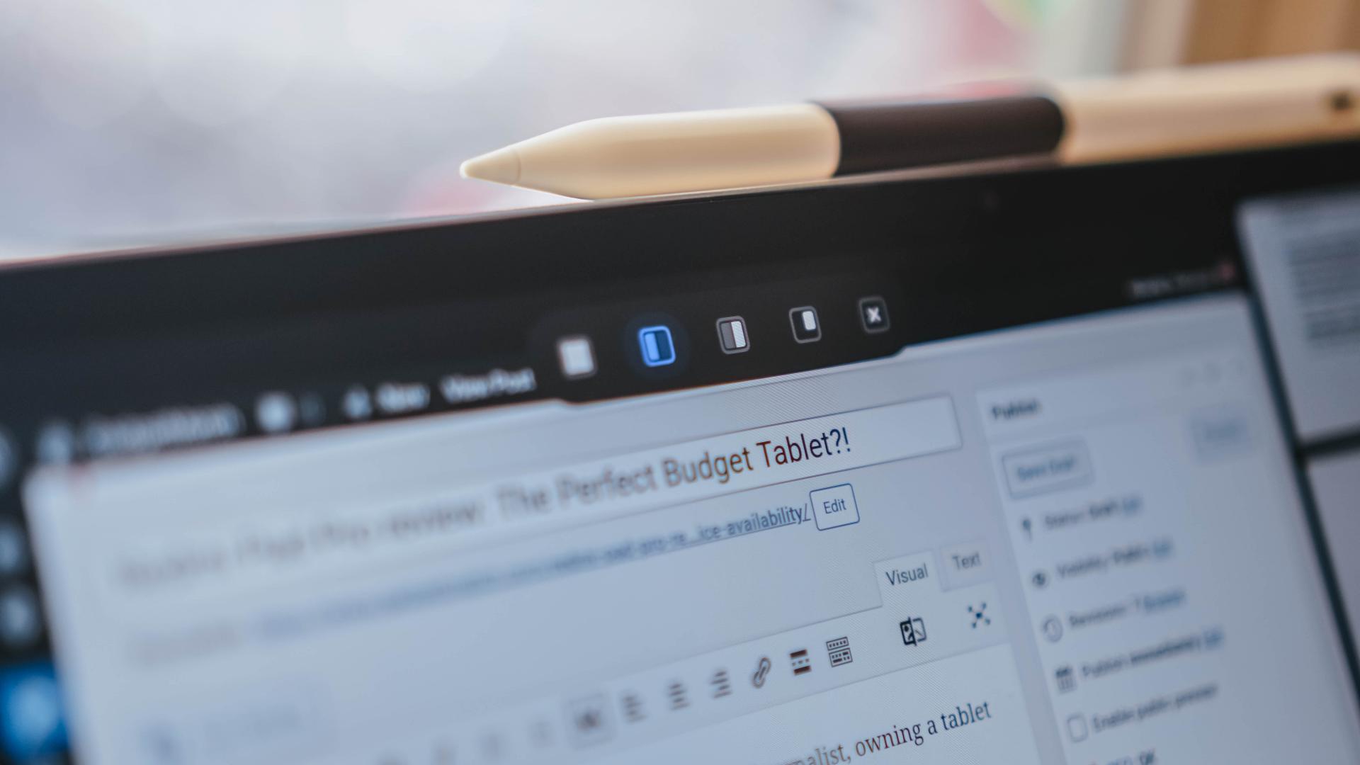
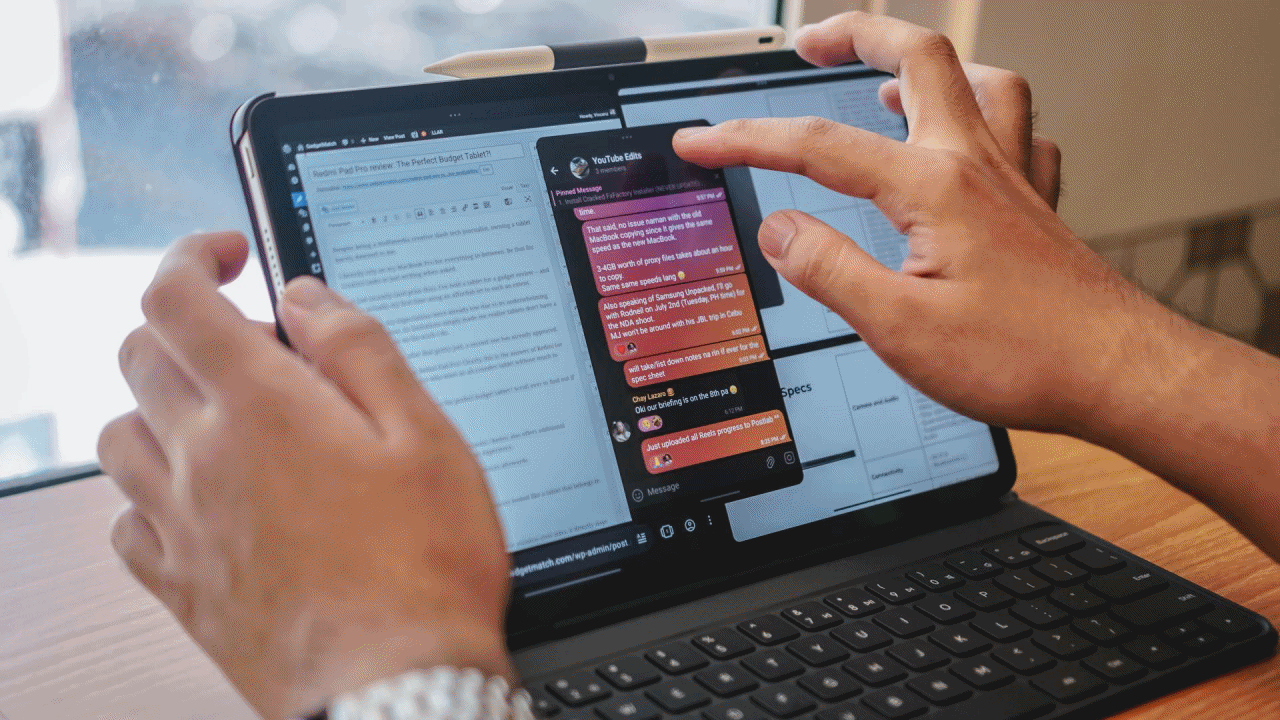
Split-screen multitasking? The Redmi Pad Pro is made for that as well.
I love its nifty three-dot marker found on the upper part of every app so I can easily select several multi-tasking segments.
It can even add another floating window on top of the two side-by-side apps just so one can maximize its overall display real estate and multitasking capabilities.
It’s resizeable as well
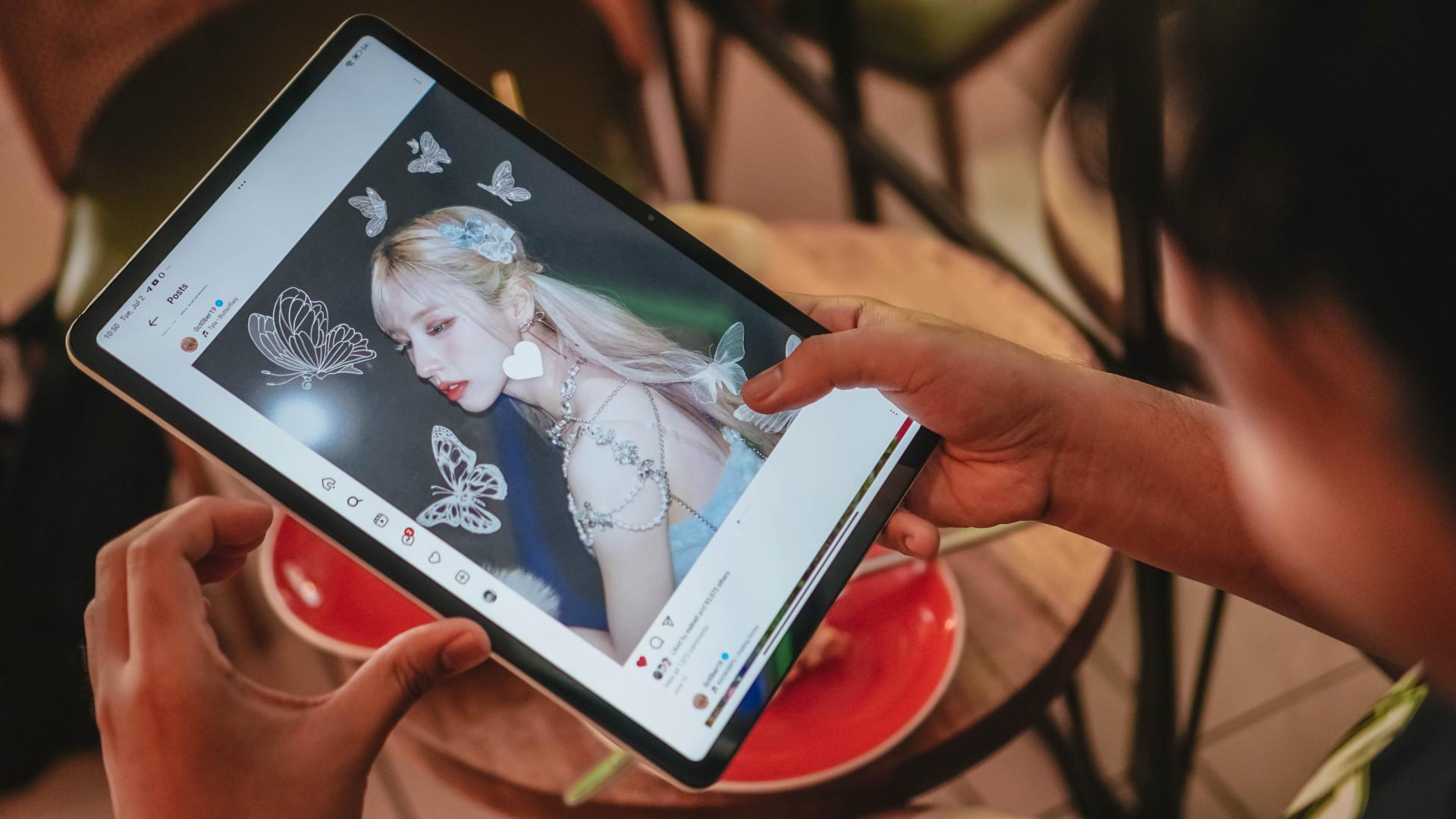
The possibilities are endless! I even tried several combos such as YouTube + X (formerly Twitter) and Instagram x TikTok on each side with the floating Apple Music window. Thus, multi-tasking of a multifandom K-Pop stan has been fulfilled.
Admittedly, the lack of a trackpad doesn’t feel “lacking” to me. If you want a full PC-like experience without using the touchscreen, you can also connect your mouse (via Bluetooth or USB-C) and the Redmi Pad Pro will easily recognize it without frills. I just experimented on it when I got too tired touching the display while out and about.
Earth without art is just “eh”
I used to sketch and scribble a lot during my prime — ’til it slowly vanished like my talent, passion, and soul.
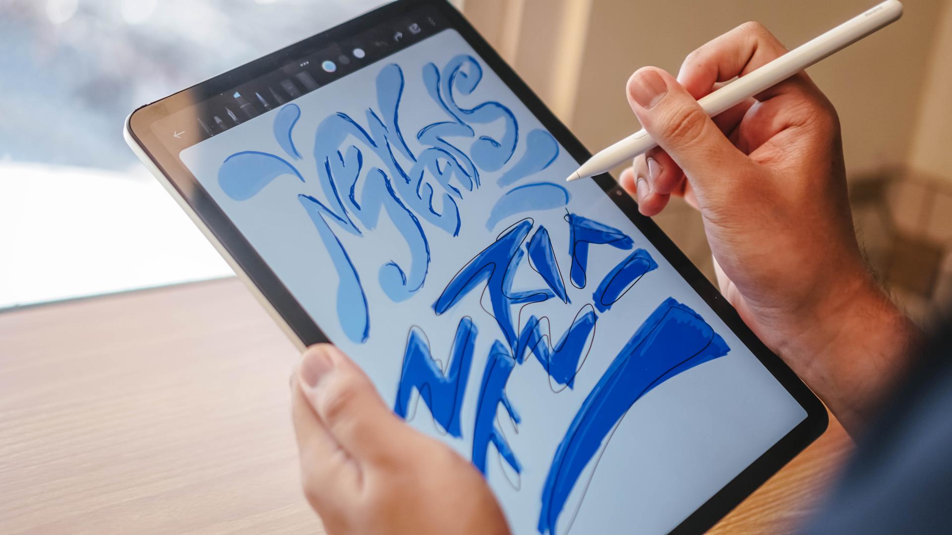
Still, I tried much of what my slightly creative hands and mind can do by doing some lettering.
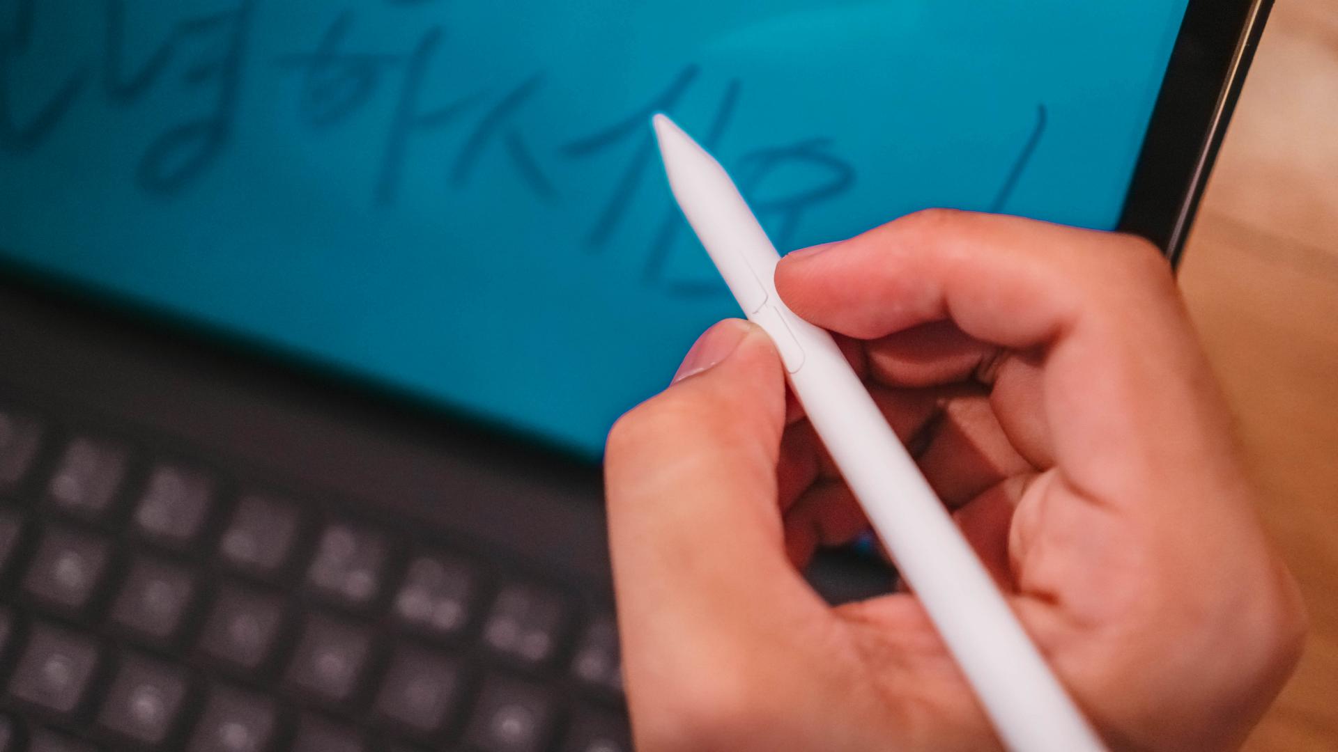
If you look closely, the Redmi Smart Pen has two buttons on its sides. Their purposes? One can be used for taking partial or full screenshots. The other can switch between pens, pencils, or even the eraser — at least in its proprietary Mi Canvas drawing app.

The Redmi Smart Pen delivers a smooth experience all throughout. That’s most especially thanks to its 4096 levels of pressure sensitivity.
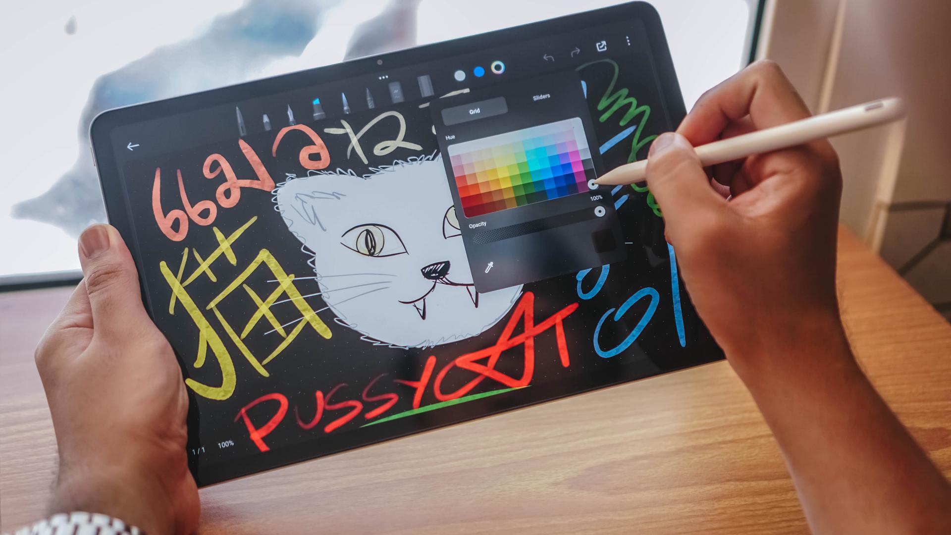
You can even see the thick and thin strokes on the multi-Asian Cat Art I did.
Hovering the pen over tools and colors even show cool popping/highlighting animations — which is more likely to appear on pricier flagship Pro counter-pads.

And with the complement of Redmi Pad Pro’s non-laminated display, the overall experience doesn’t feel cheap at all — despite being targeted towards budget-conscious creatives.
Creativity Companion
The utmost use case of Redmi Smart Pen and Smart Keyboard don’t end there.
I even utilized much of the potential of the tablet and its accessories through other commonly used apps by creatives, for creatives.
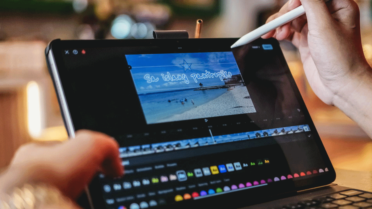
If you’re into quick and easy shorts for TikTok or Instagram Reels, CapCut works well. For Full HD clips, it does the job. For 4K footages, expect some wear and tear out and about especially with its midrange-class SoC.
I assume Filmora, DJI’s LightCut, GoPro’s Quik, and other similar video editing apps work the same way.
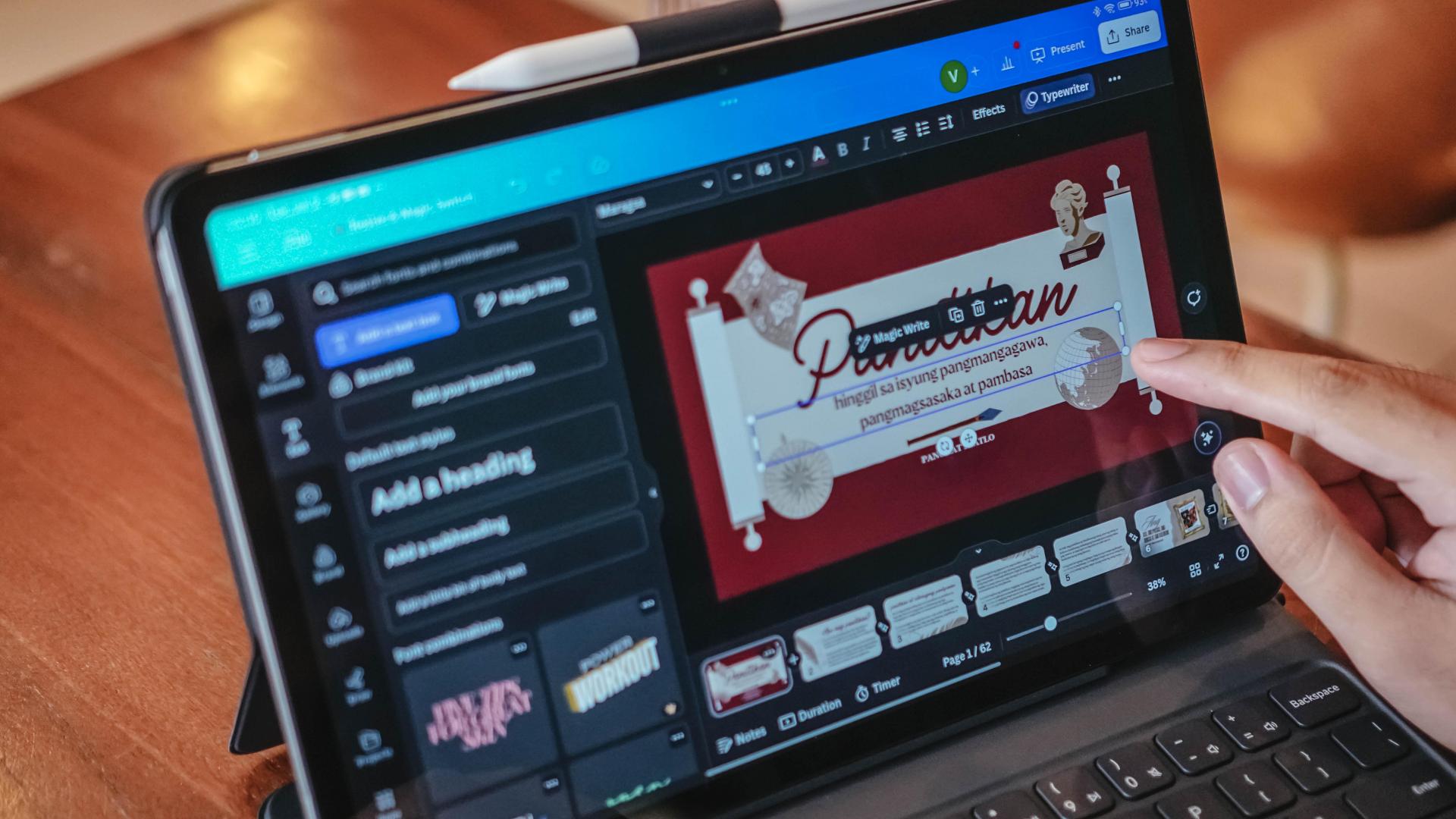
Another would be Canva — the ever-popular presentation slash graphics app. Typing in boxes, selecting and dragging elements were all child’s play with the added feats of the smart pen and keyboard.

Moreover, that pen is also useful for fine-tuning every curve and detail in either Adobe’s Lightroom Mobile or Photoshop Express, Google’s Snapseed, VSCO, or even GoDaddy’s Studio.
Is the Redmi Pad Pro your GadgetMatch?
With a starting price of PhP 13,999 for the 8+128GB variant (and PhP 14,999 with twice the onboard storage), the Redmi Pad Pro is an easy peasy recommendation for those who want to try out a proper pad-perience without having to shell out a lot.
Sure, there are cheaper tablets out there that offer the same look and feel with great audiovisuals altogether. However, the Redmi Pad Pro has an exceptional look, build, display, and audio quality that are unrivaled for its price.
And even if it’s not, in any way, the most powerful pad around, it’s very commendable in the category it belongs to.
For creatives, students, enthusiasts, hobbyists, business-minded peeps, and even frugal professionals who are looking for a pocket-friendly pad that can do a little bit of everything, the Redmi Pad Pro can do just that.
Although add-ons always come at an extra cost, the accessories of the Redmi Pad Pro are still reasonably priced.

Spending PhP 22,000 utmost is still the most viable option than throwing away much of your hard-earned savings for a pricey “Pro” pad priced the same way as high-powered budget laptops.
Their accessories? Cost as much as the Redmi Pad Pro itself. Not everyone can truly afford that.

Some might argue, the Redmi Pad Pro is considered a “midrange” tablet for what it possesses.
I still dare to say it is the perfect “budget” tablet that truly understands the essence of a true tablet — something that has good synergy between hardware, software, support for accessories. Lastly, the product’s overall cost.
Combined altogether, the Redmi Pad Pro creates that perfect harmony that’s also value for money.
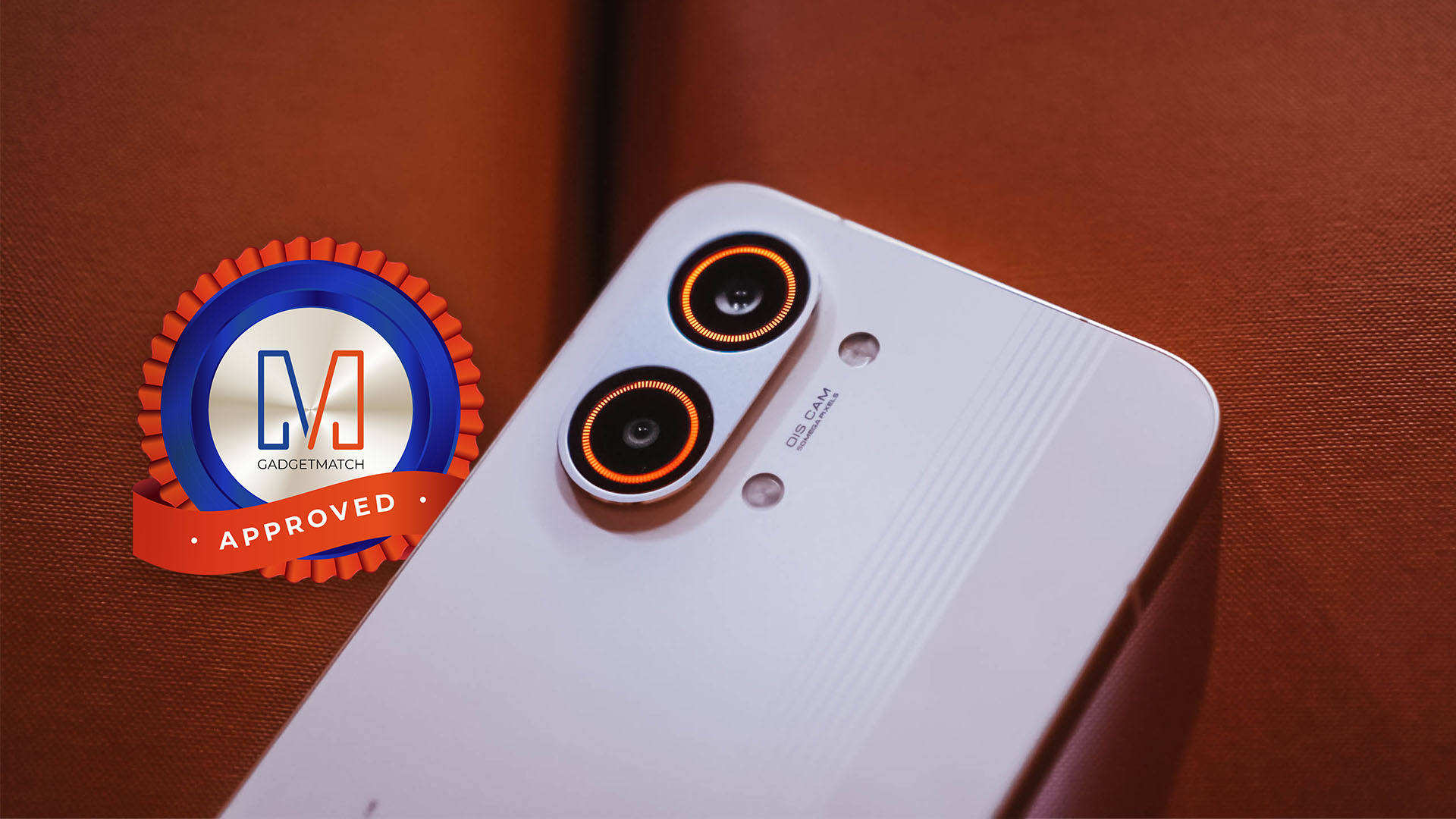
And for its overall worth, the Redmi Pad Pro is overall a worthy recipient of the GadgetMatch Seal of Approval.


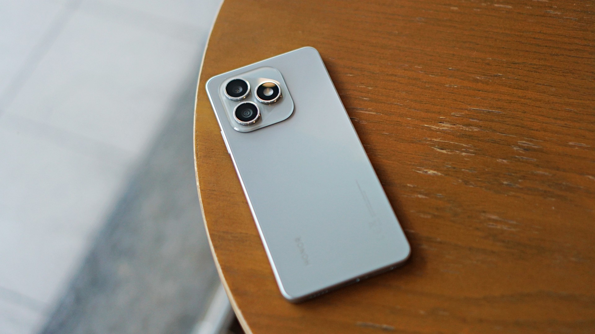
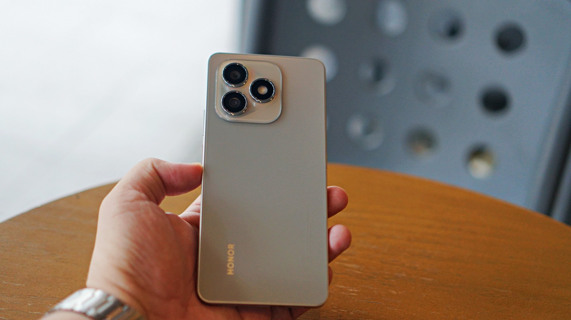
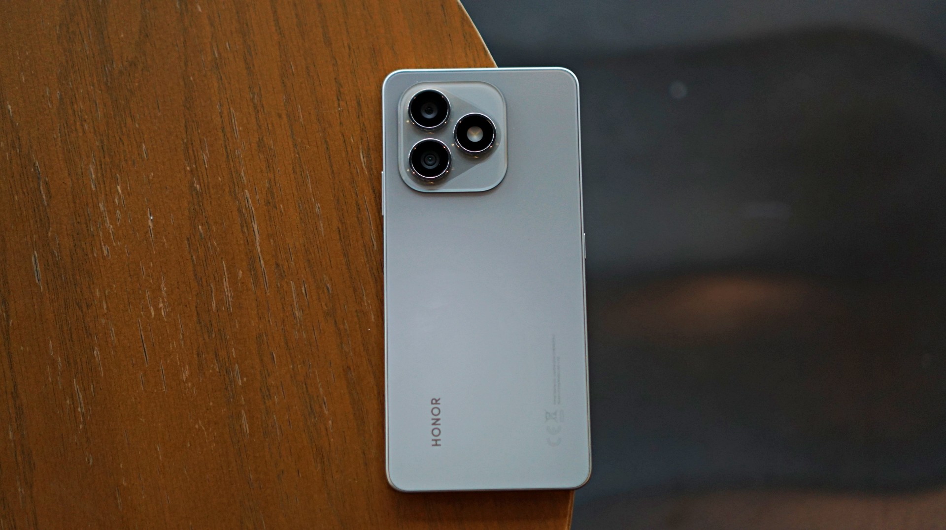
Some smartphones aim to stand out. Others just aim to work. The HONOR X8d falls squarely into the second category.
In day-to-day use, it presents itself as a device that focuses on the essentials. It’s functional, predictable, and easy to understand—but also a reminder of how noticeable the gap can be once performance and responsiveness start to lag behind.
A design-first approach
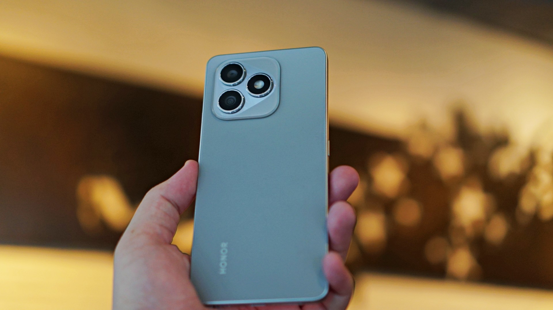
The HONOR X8d makes a decent first impression. It’s slim, relatively lightweight, and easy to hold despite packing a large battery. The flat sides and smooth back give it a clean, modern look, while the camera module adds a bit of visual identity.
It’s available in Light Blue, Velvet Black, and Velvet Grey—options that lean into its youthful positioning. The device also feels sturdy in hand, backed by SGS certification for drop and crush resistance, along with IP65-level protection against dust and splashes.
For a device in this category, the HONOR X8d delivers a build that feels dependable enough for daily use.
Display and media: Bright and usable
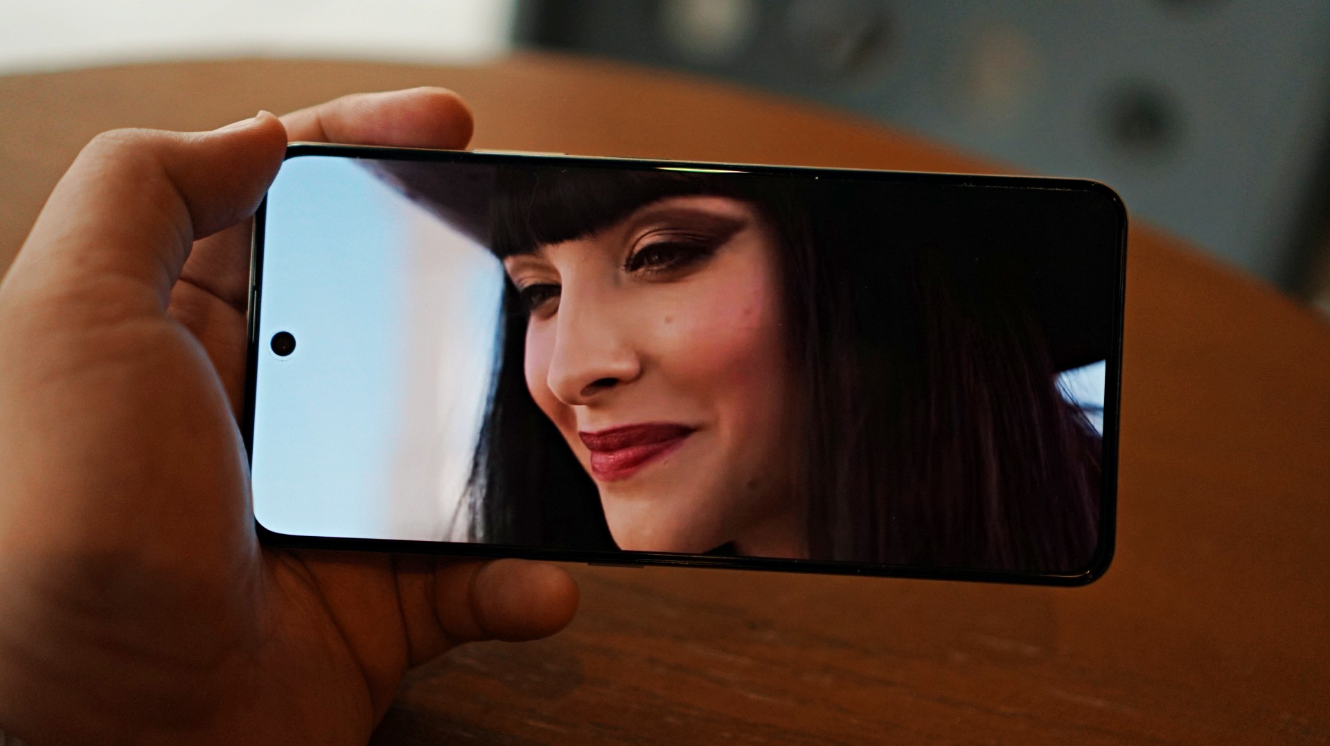
Miss All Sunday makes everything look good
Up front, the HONOR X8d features a 6.77-inch AMOLED display with a 120Hz refresh rate and up to 3000 nits peak brightness. Colors are vibrant, and the panel supports 100% DCI-P3, which helps content look lively.
For casual viewing, the experience is serviceable. Watching shows or videos feels comfortable, and the high brightness ensures visibility even under harsh lighting. Features like 3840Hz PWM dimming and E-Book mode also help reduce eye strain during extended use.
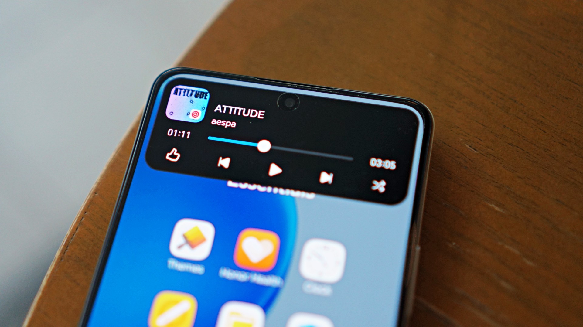
Now Playing: One Piece Season 2
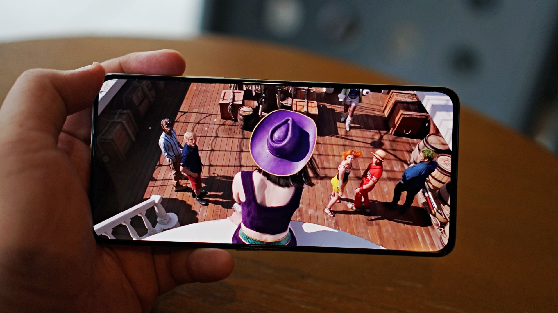
I skimmed through a few episodes of the One Piece Season 2 live action on Netflix and again it was… alright. Nothing here will blow you away but it serves its purpose.
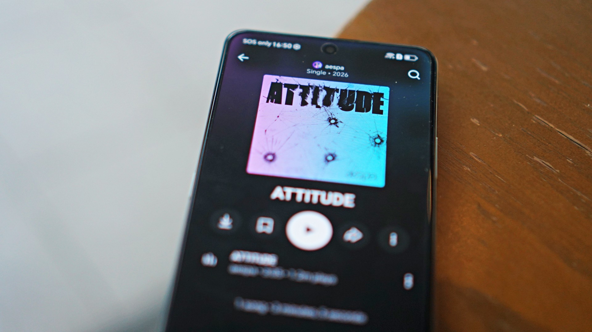 I also listened to “Attitude” by aespa on YouTube music and it just echoes the general feeling of the phone – serviceable.
That said, the overall experience remains straightforward. It delivers what you need for day-to-day media consumption without going much further.
Performance is where compromises show
The HONOR X8d runs on the Snapdragon 6s 4G Gen 2 paired with 8GB of RAM. On paper, it’s positioned for everyday tasks, but in practice, performance leans on the modest side.
Basic interactions like switching between apps or scrolling through feeds can feel slower than expected. There’s a noticeable delay at times, even during simple tasks, which affects the overall flow of the experience.
This extends to camera usage as well, where responsiveness can occasionally feel a step behind. The device remains usable, but the pacing may feel dragging depending on what you’re used to.
Cameras are reliable in good light
The HONOR X8d is equipped with a 108MP main camera alongside a 5MP wide camera, with a 16MP shooter up front.
In good lighting conditions, the phone produces decent images. Shots are clear enough, with acceptable detail and color for social media sharing. The camera system also benefits from a suite of AI tools such as AI Eraser, AI Cutout, and AI Upscale, which add flexibility when editing photos.
Zoom options at 1x, 2x, and 3x remain usable, though results are best when lighting is favorable. Overall, the camera system is dependable for casual snaps.


Software and AI: familiar, feature-filled
Running on MagicOS 10 based on Android 16, the HONOR X8d comes with a feature-rich software experience. It includes tools like AI Translate, AI Writing, AI Notes, and AI Recorder, alongside features such as Magic Portal and Circle to Search.

Like many Android skins today, MagicOS follows a design approach that will feel immediately familiar. The layout, navigation, and overall structure borrow heavily from the iOS-inspired blueprint that most brands have adopted. It’s easy to get into, even for less experienced users.
Typical of entry-level smartphones, the device also includes app recommendations out of the box. Thankfully, these aren’t overly intrusive, and many of the suggested apps are ones users would likely install anyway.
The software helps add depth to the overall package, even if the hardware limits how smooth everything feels in actual use.
Battery and everyday use is a clear strength
One of the standout features of the HONOR X8d is its 7000mAh battery. It’s designed to last through extended use, whether for streaming, browsing, or everyday communication.
Paired with 45W HONOR SuperCharge, topping up the device remains relatively quick. For users who prioritize longevity over speed, this is easily one of the more reliable aspects of the phone.
Is the HONOR X8d your GadgetMatch?
When HONOR Philippines was first teasing the phone it was positioned as something for students. But if I were a parent, I’m pretty sure I’d like my kid to have some kind of advantage and not have to deal with a device that might not be able to keep up with them.
After learning that it’s priced at PhP 15,999 my verdict just became much clearer. This is a Swipe Left.
Add a few more to that price and you can get an excellent smartphone at its early bird price.
The HONOR X8d focuses on delivering the basics—design that works, a large battery, and a feature-filled software experience.
However, the overall experience depends heavily on what you prioritize. For users who simply need a phone that can get through daily tasks, the X8d does enough to hold its ground. For those who value speed and responsiveness, it may feel a step behind.
Whether it fits your needs ultimately comes down to how much you’re willing to trade performance for battery life and features.
Reviews
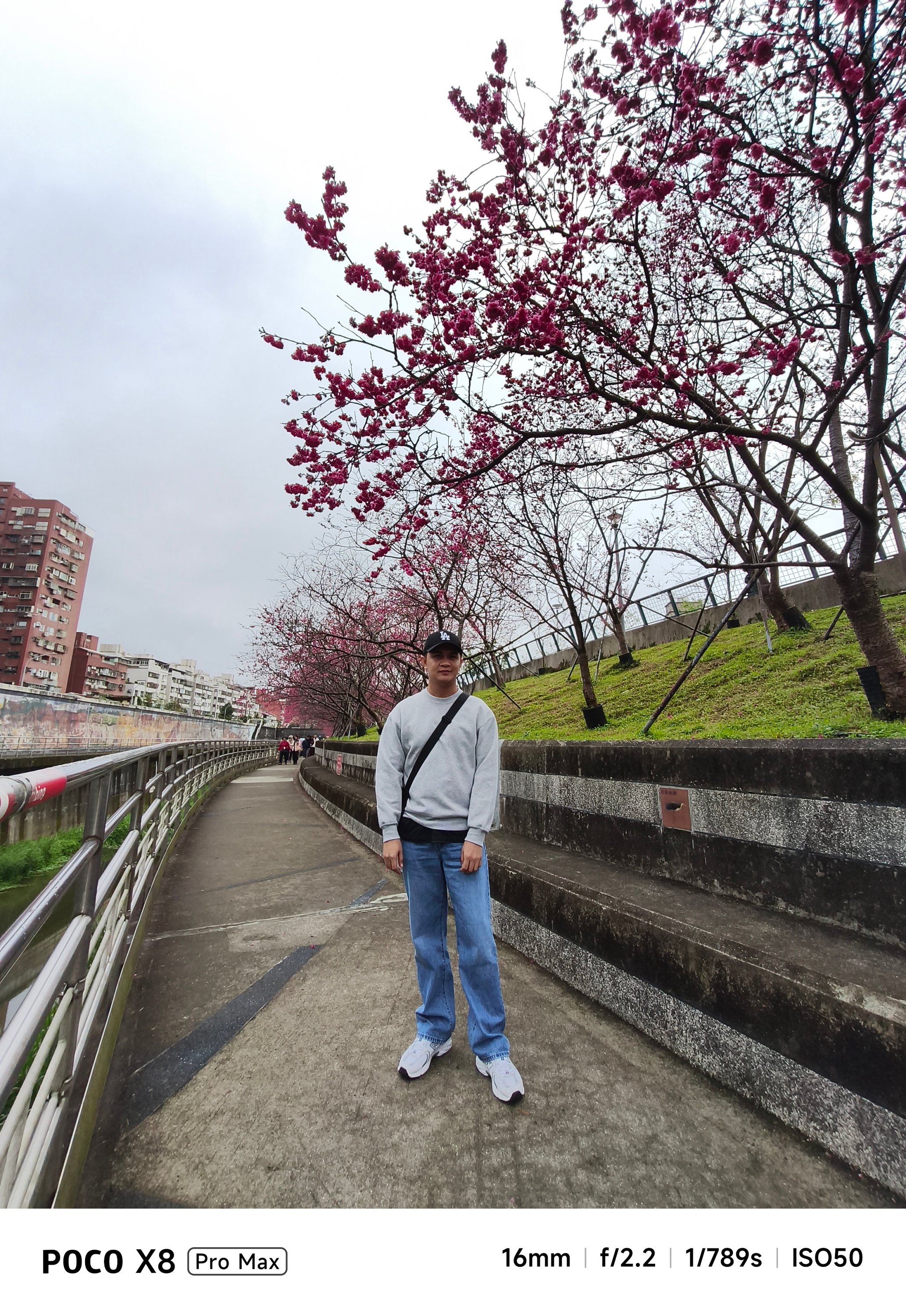
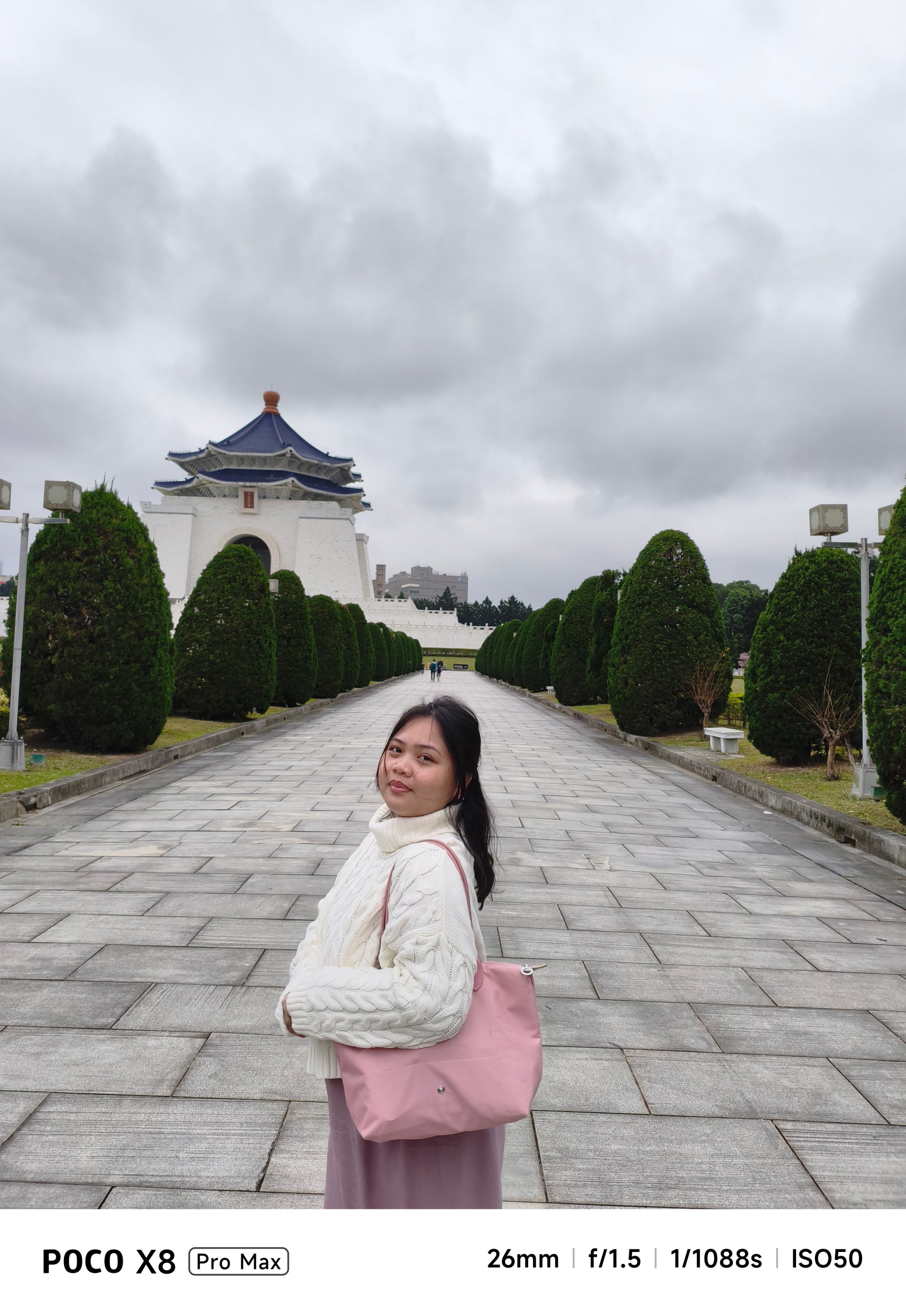
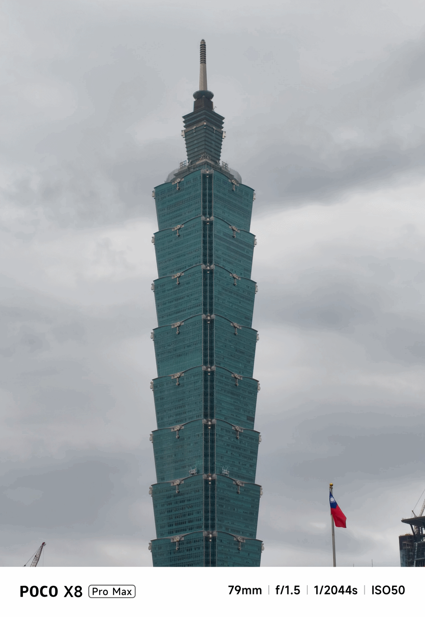
POCO X8 Pro Max review: A new beast from the far east
That “Pro Max” naming superlative is more than justified
Just when I thought POCO was done for the first quarter of 2026, I was instantly humbled.
Two months after the M8 Pro I’ve held, POCO is back with another beast, packing an even more powerful punch.
Here’s my extensive experience with the all-new POCO X8 Pro Max.
Nothing flashy, yet still fancy
First time with the POCO X8 Pro Max, it’s honestly nothing too fancy.
While it does not dare to rival the likes of the Nothing Phone (4a) Pro, Infinix’s NOTE 60 Ultra, or TECNO’s POVA Curve 2 5G, the POCO X8 Pro Max still shines in its own way.
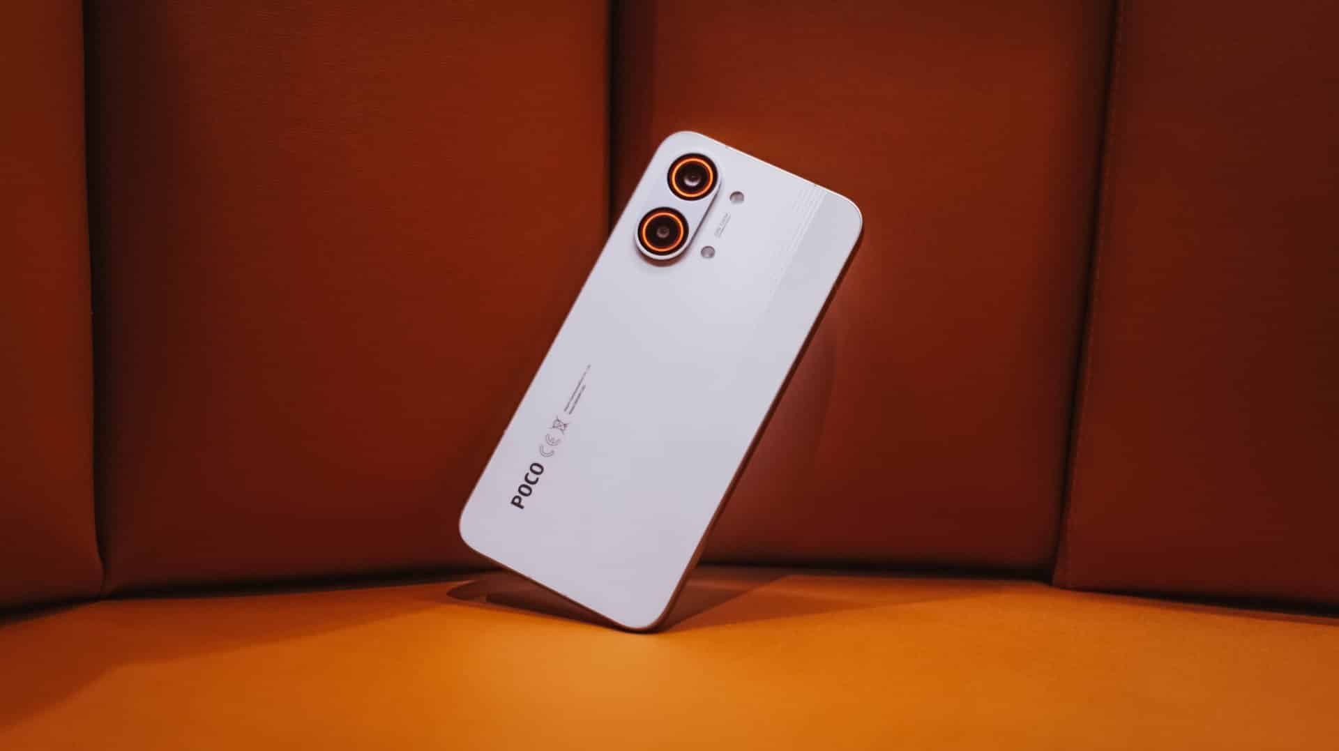
The back is clean and minimal with only the ever-so-slightly-protruding camera bump and POCO branding in sight. Upon closer inspection though, those subtle set of lines appears when hit by faint light.
And while we’re at it, that camera bump houses an RGB light deco around the camera duo. It’s customizable with eight (8) colors alongside brightness level adjustments.
Not only does it add flair, but it’s functional too as it glows up to notify you of alerts, to indicate battery charge, to flash for a camera timer, or to light up even when just playing music or games.
The White colorway that I have adds more to that fanciness. I don’t know if it’s the same thing with the Black and Blue shades, though.
Sandwiched by that sturdy metal frame is a back cover made of fiberglass, something that is lightweight and durable at the same time.
Speaking of, the X8 Pro Max boasts quintessential quad IP ratings: IP66, IP68, IP69, and IP69K. It can withstand not just all the fine dust, beach sand, or even fresh water (but not sea water). It’s also able to resist hot jet water streams, just in case you’re stuck in such situations.
It’s great to see that these stronger IP ratings have become a staple, not just in flagships, but in most midrange offerings.
Marvelous and monstrous
Last year, POCO had only the vanilla X7 and X7 Pro (plus a special Iron Man Edition) in its X-rsenal. This year, POCO have changed things quite a bit by bringing in a newcomer with the familiar “Pro Max” naming.

And, they weren’t playing when they said “Pro Max” as this is equipped with the latest MediaTek Dimensity 9500s 3nm SoC. To be fair, this is a slightly under-clocked version of the Dimensity 9500 found on modern-day flagships, such as the vivo X300 Pro I rock daily.
Still, that doesn’t mean an underpowered performance.
First and foremost, the ever-popular Zenless Zone Zero by HoYoverse runs in High graphics settings by default. Genshin Impact has the same default setting.

The Qualcomm Snapdragon 7s Gen 4 found on the POCO M8 Pro, however, goes only for the lowest setting.
Another favorite hardcore game of mine: Racing Master based on Nvidia’s PhysX physics engine.
As expected, this racing game can run in Ultra-High + 60fps configuration. The M8 Pro stutters and throttles a lot during the first gameplay.
This further proves that it’s not always Snapdragon that’s winning over Dimensity.
POCO’s 3D IceLoop Cooling System also prevented those unwanted hiccups. To be precise, it features a large 5800mm² liquid cooling area where the vapor and liquid are separated for an even highly-efficient heat dissipation.
With those examples in mind, it already gives you the idea that this beast of a smartphone can handle most (if not all) of the graphics-intensive titles you can think of.
POCO further proves that this is, indeed, a Pro Max smartphone. With a speedy 12GB LPDDR5X memory and up to 512GB of UFS 4.1 storage, it’s honestly an overkill for a midranger.
Most phones in the range are stuck with the LPDDR4X and UFS 3.1 combo. It’s more evident now that the global RAM (and components) shortage affects everyone — smartphone makers not exempted.
My gaming sessions would not be as easy-breezy without that buttery-smooth 120Hz display alongside that 480Hz/2560Hz touch sampling rates.
Now Playing: Even If This Love Disappears Tonight
With display already in the way, it’s high time to talk deeply about it.
One fine flight, I was bored and cannot sleep. I then just tried to watch something I added in my Netflix list — Even If This Love Disappears Tonight / 오늘 밤, 세계에서 이 사랑이 사라진다 해도 (Oneul bam, segye-eseo i sarangi sarajinda haedo).
Although I am not the type who favors cast over synopsis, Shin Si-ah being the lead honestly enticed me to click this over its gut-wrenching story.
The longer I watch it, the more I get mesmerized — both visuals and overall chemistry of her (as Seoyoon) and Choo Young-woo (as Jaewon).

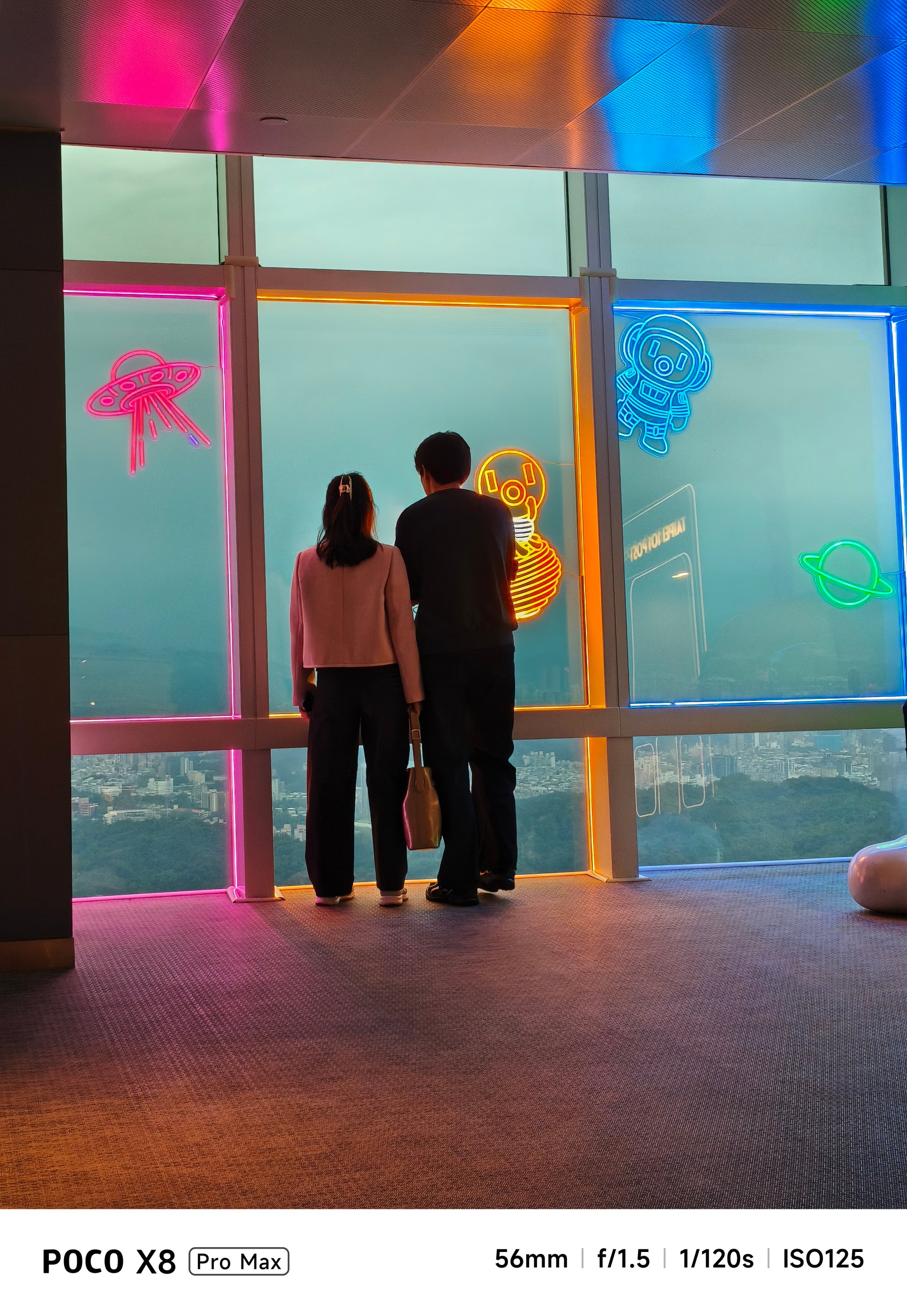
With its massive 6.83-inch AMOLED 1.5K display with up to 3500 nits of peak brightness, it’s as bright and crystal clear as this beach in Pohang, South Korea.

Spoiler alert ‼️ Much like Jaewon’s disappearance in Seoyoon’s memory, the same can be said on the X8 Pro Max. Once you are already immersed, it makes you think the display bezels have also disappeared into thin air because of how thin they are.

Seoyoon’s heartfelt emotions on-screen can be seen more especially that this display supports all the imaginable pro-grade standards in a modern-day smartphone: 12-bit color depth, 68 Billion Colors, DCI-P3 Wide Color Gamut, HDR10+, Dolby Vision.
You have been warned, though. This film is not for the faint-hearted.
But in case you faint on the ground, Corning’s Gorilla Glass 7i protects that precious display from unwanted scathes and scratches. While not as “pro” as Gorilla Glass Victus 2 or Xiaomi’s very own Dragon Crystal Glass 3, that’s still better than having no protection at all 😜
You know what’s “pro”? The inclusion of an ultrasonic in-display fingerprint scanner.
It’s honestly a dealbreaker whenever you’re in a hurry. Being able to unlock the phone in a split-second compared to conventional optical sensors in most midrangers adds up to the “Pro Max” definition of this phone.
On Queue: IVE, H1-KEY, GIRLSET
To immerse myself more, I also tried playing IVE’s futuristic BLACKHOLE music video.

Whether it’s the darkest of blacks or the whitest of whites in Liz’s scenes, or just a pop of color like Jang Wonyoung, this vibrant display is more than enough to satisfy your eyes.
But what’s a pro-grade display without a “Pro Max” audio? Well, the POCO X8 Pro Max doesn’t want to stop just yet.
With its symmetrical stereo speakers alongside that 400% volume boost feature, it instantly filled the room when I was in my banging streaming sessions in the shivering shower.
POCO promises that those speakers are certified for Hi-Res Audio and Dolby Atmos.
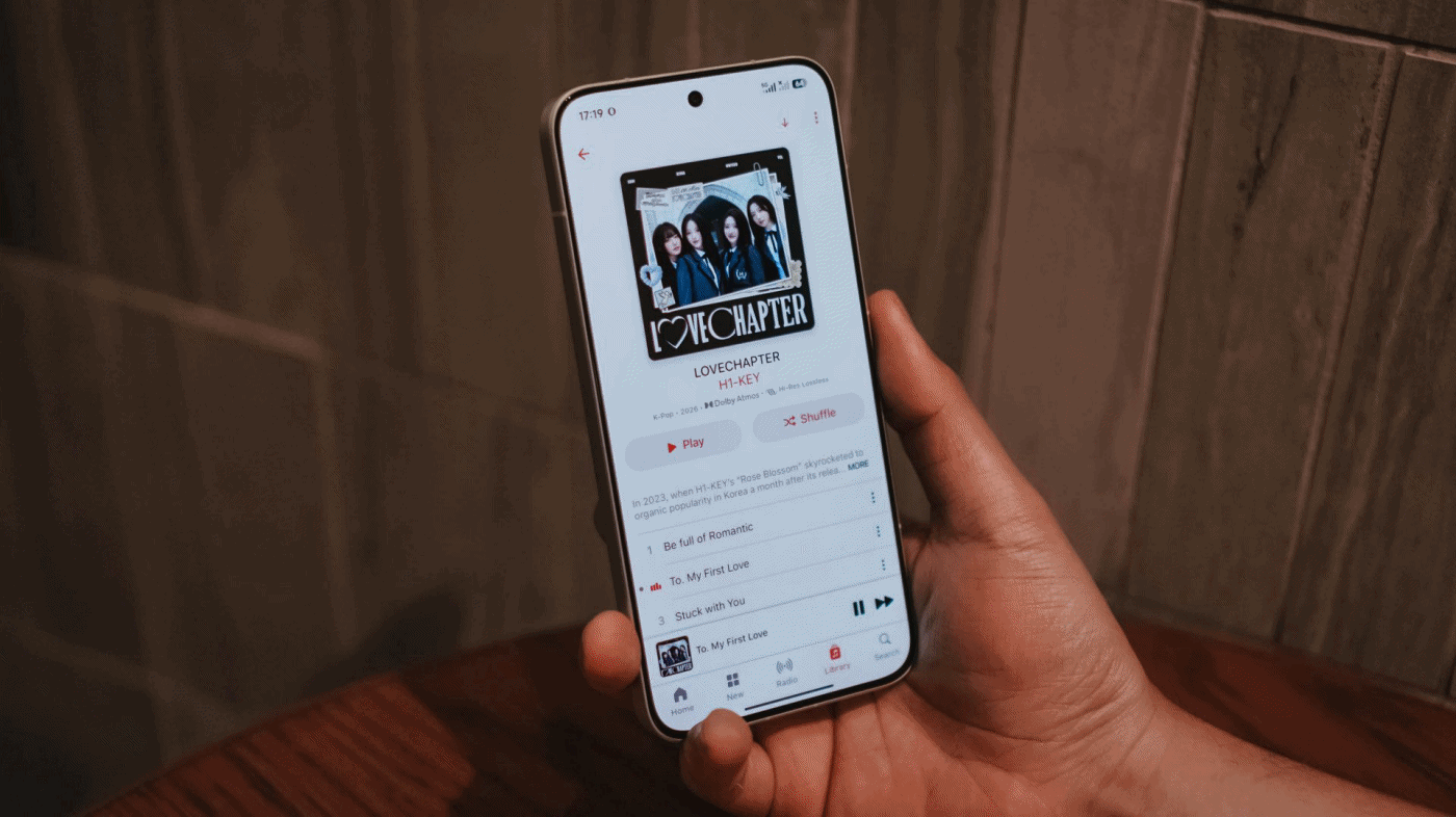
My curiosities led me to streaming H1-KEY’s full LOVECHAPTER EP in Lossless format via Apple Music.
Right off the bat, I can already hear the great separation of treble, mid, and bass in their latest comeback track, To. My First Love. Hwiseo’s adlibs truly astounded me — and so did their harmony in every chorus.
As I listen further, it made me realize it’s a great K-Pop song that brings back that good ol’ 2nd-gen K-Pop vibes. Moreover, it also fits well as an anime opening.
Not Like A Movie is also one of K-Pop’s underrated songs of 2026 that I’ve been playing ever since its release last January 2026. The whole LOVECHAPTER EP honestly deserves more praises much like this phone’s superb sound output.
Additionally, GIRLSET’s TWEAK truly made me weak with how soothing their vocals are. Mind you, I listened both in English and in Spanish (just because I suddenly miss Barcelona).
If that’s not enough, I have also tried listening to the acappella version and I felt like I’m listening to the Gods in heaven with how pure their vocals alongside their soulful harmonization.
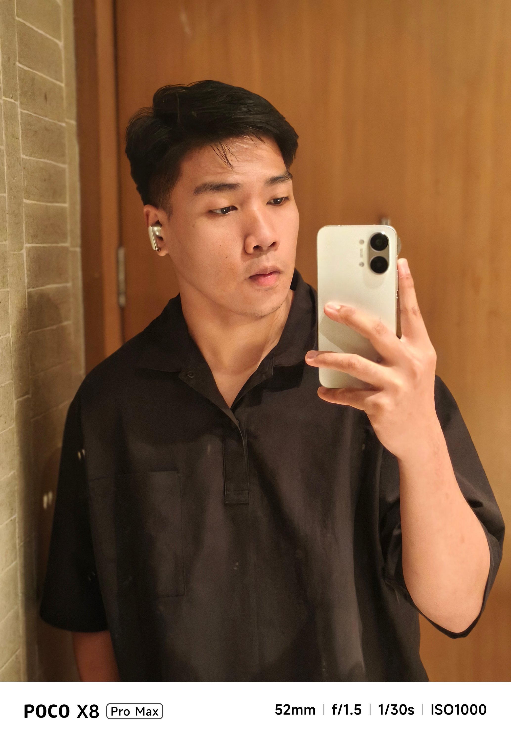
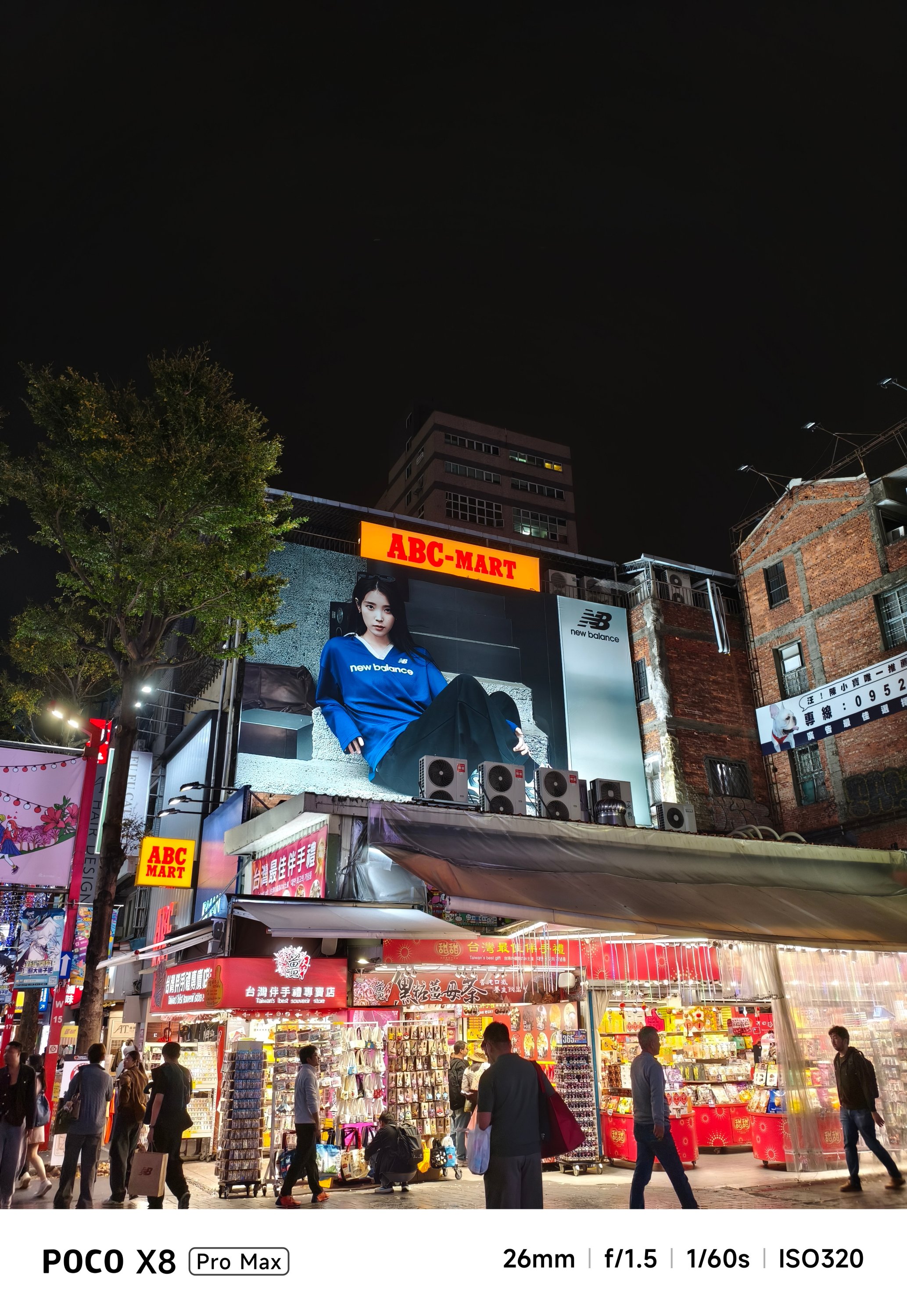
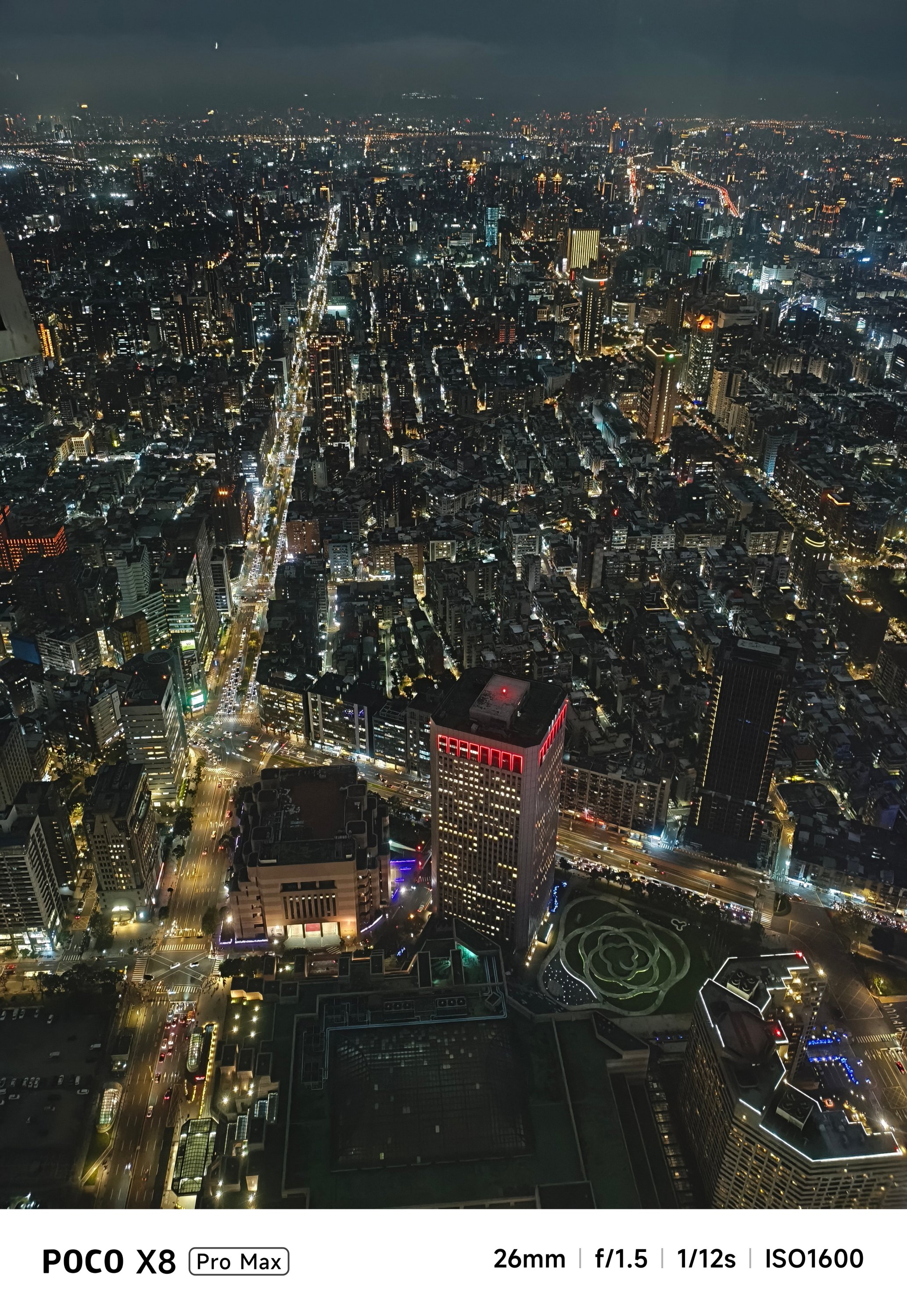
Satisfying snapper
Let’s be real: Cameras are the mostly forgotten aspects among phones in this segment.
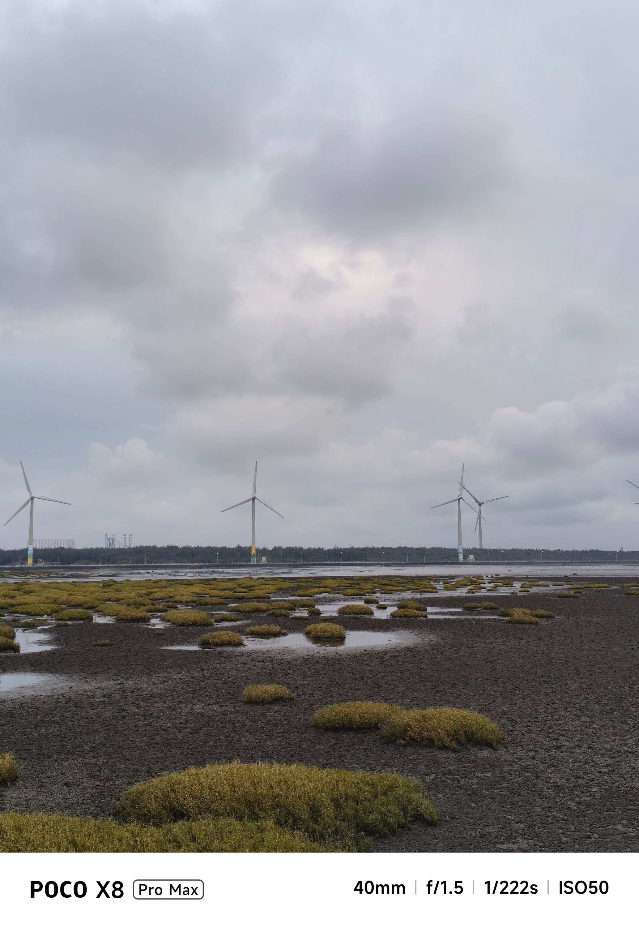
On paper, none of its cameras have Sony’s LYT / IMX or Samsung’s ISOCELL sensors. Instead, you’ll get a 50MP f/1.5 main rear camera based on LightHunter Fusion 600’s 1/1.95-inch sensor.
Meanwhile, its ultra-wide shooter is nothing special at 8MP f/2.2. For selfies, it’s a 20MP front snapper.
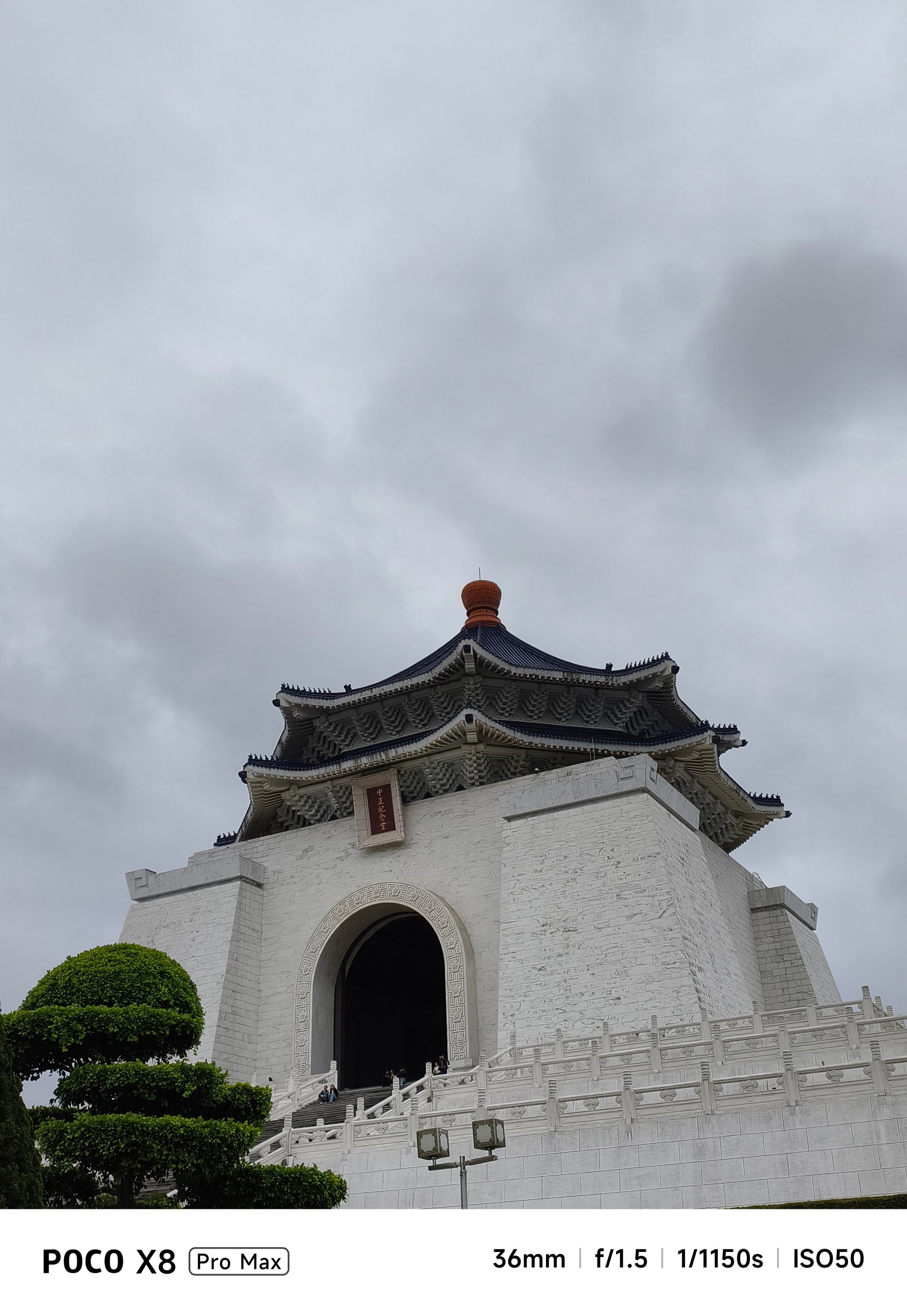
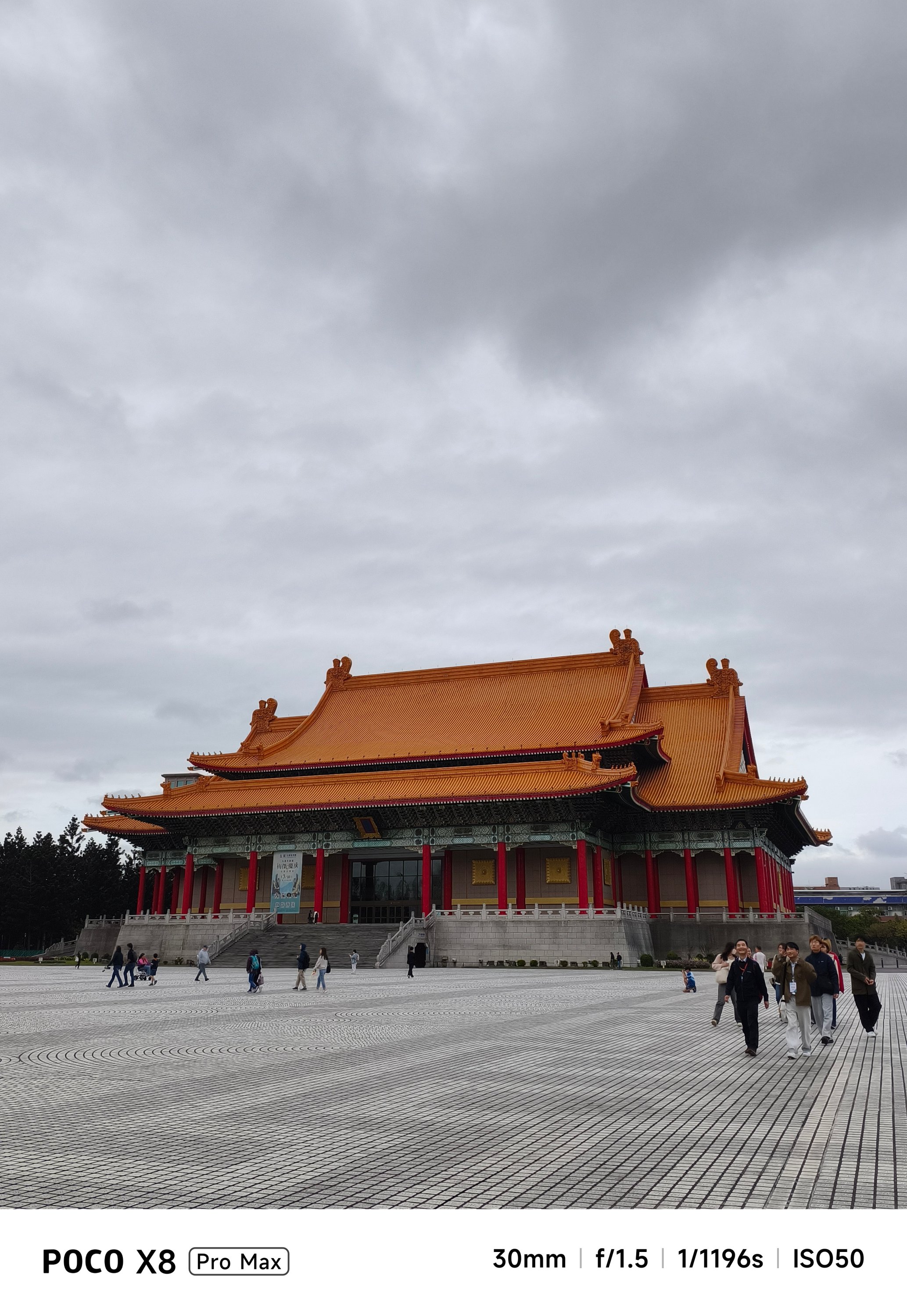
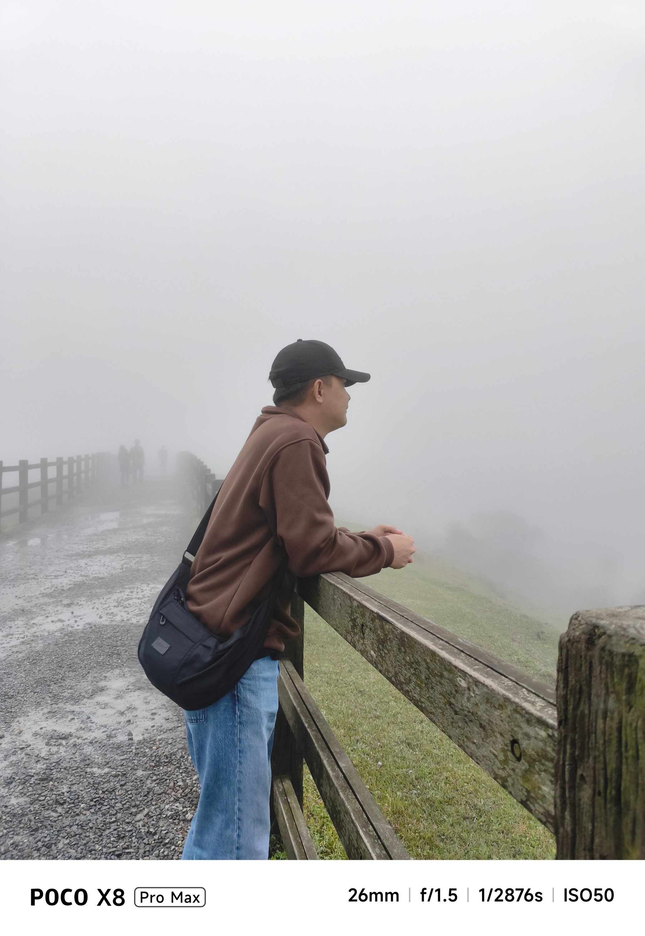
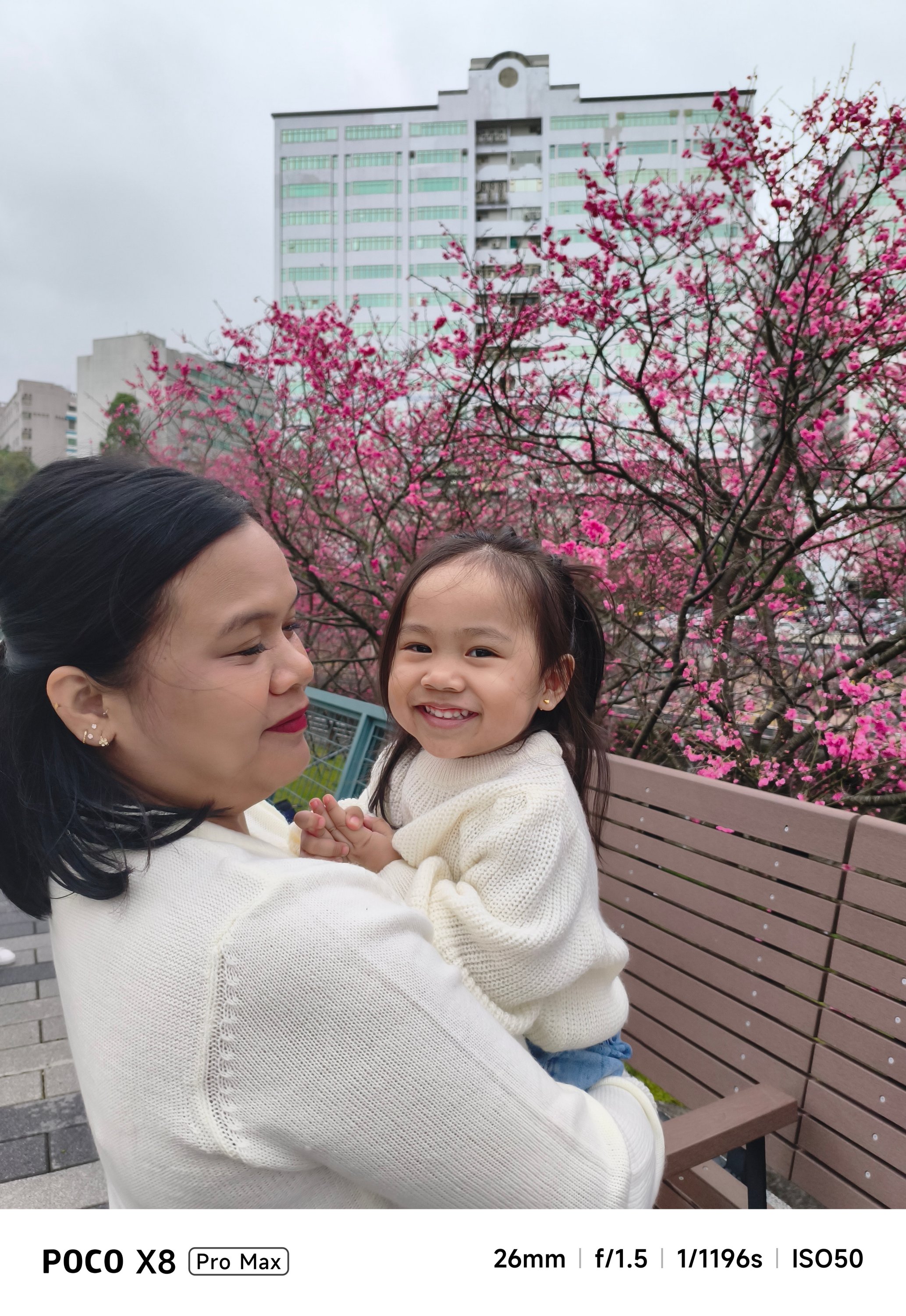
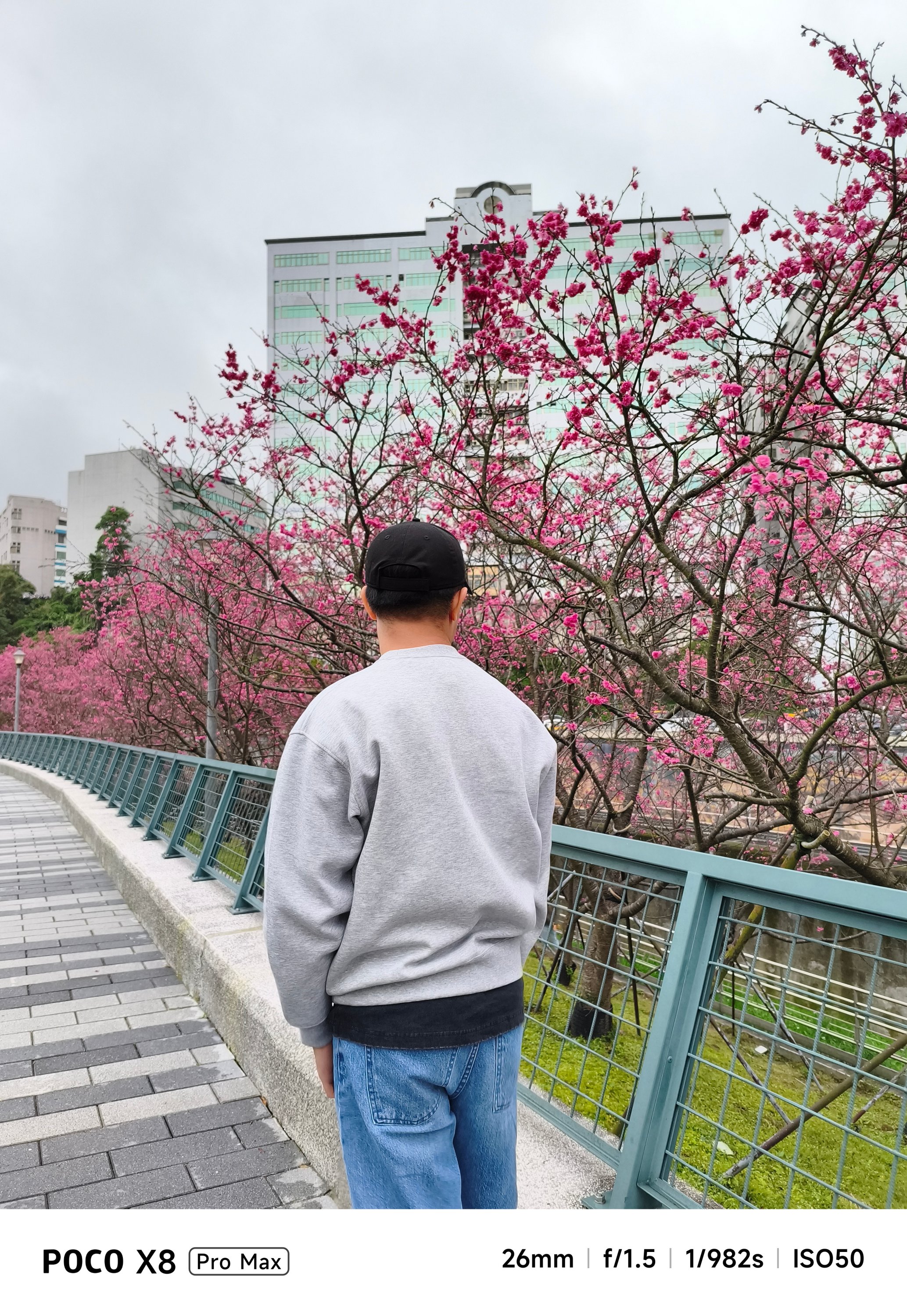
But, as we always say here, specs aren’t everything. Looking solely at the filling of the cake, the POCO X8 Pro Max can still deliver satisfying snaps.


With the right angle, framing, and even lighting, it can deliver quality shots regardless of the camera hardware it possesses.


Portraits are surprisingly decent, too.

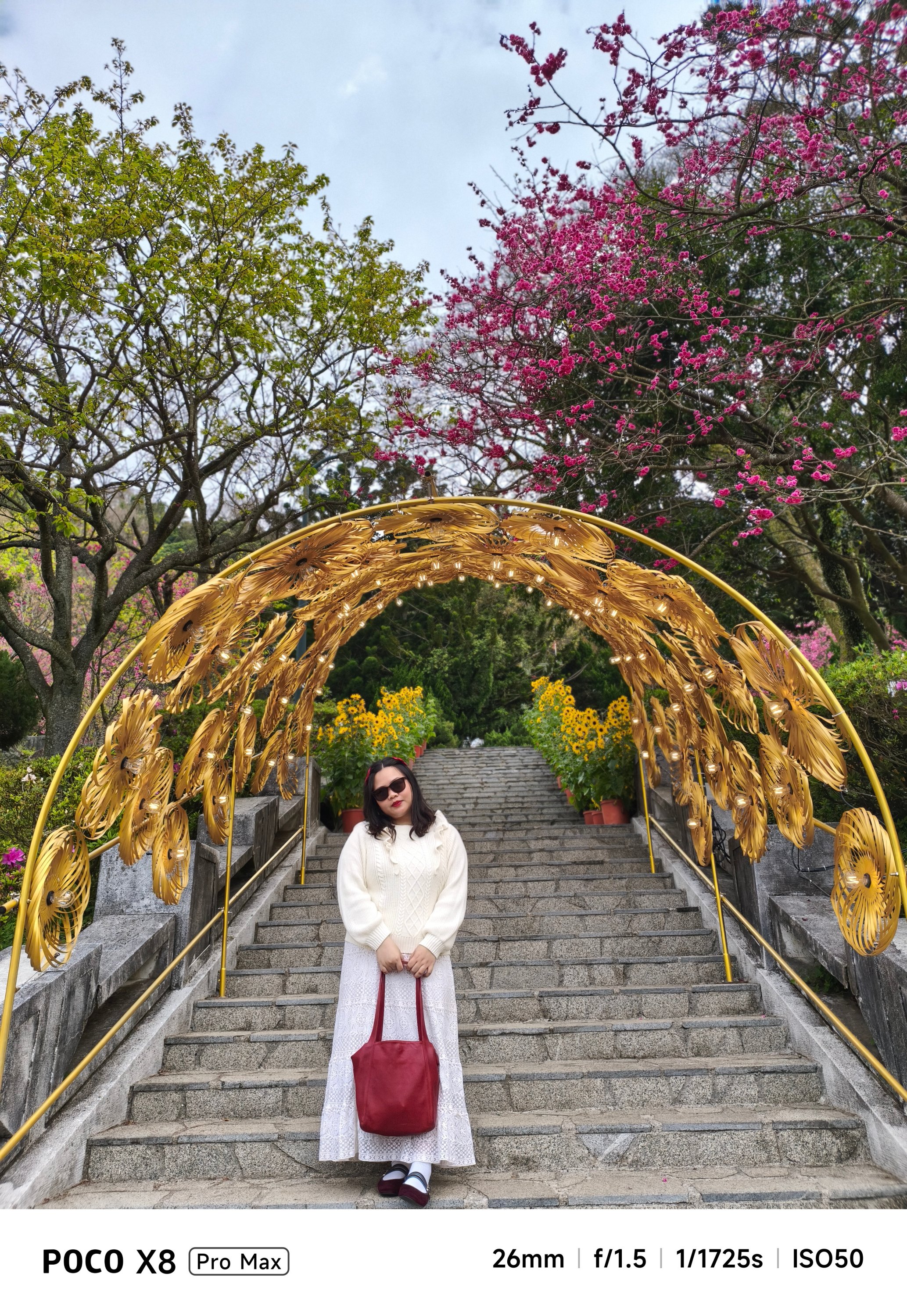
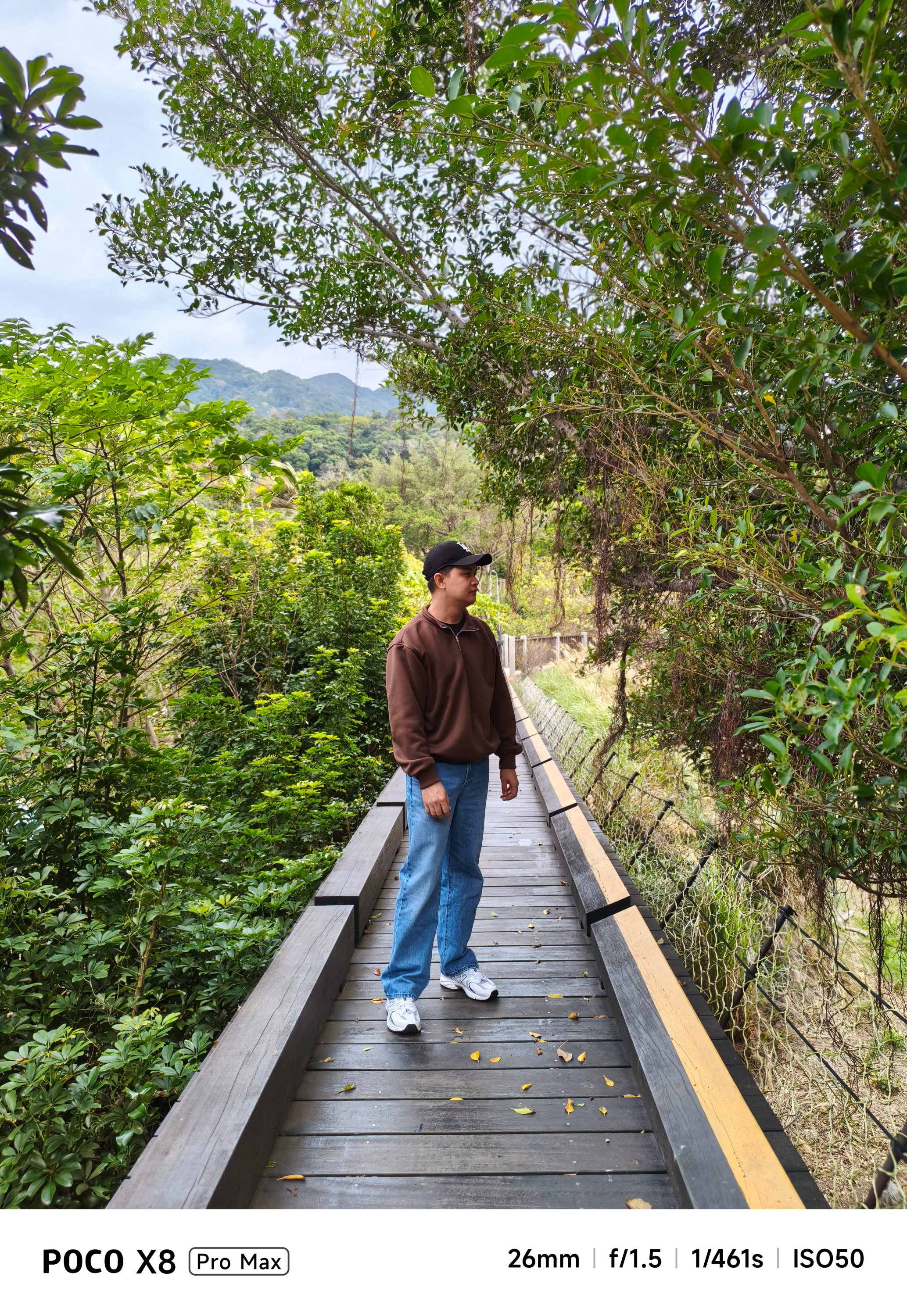

They are social media-ready and post-worthy as well.


If you’re not a professional shooter, that shutter responsiveness is enough for those picture-perfect portraits.


Cutouts aren’t flawless, though. But, what should we even expect in a conventional camera combo like this?
-

- Portrait OFF
-
- Portrait ON
The absence of a dedicated zoom camera is evident when you try to capture anything past the 3x range.


Meanwhile, dimly-lit shots can be either a hit or miss.


In a scene where there’s the least amount of natural light, it will rely heavily on sharpening and brightening the image.
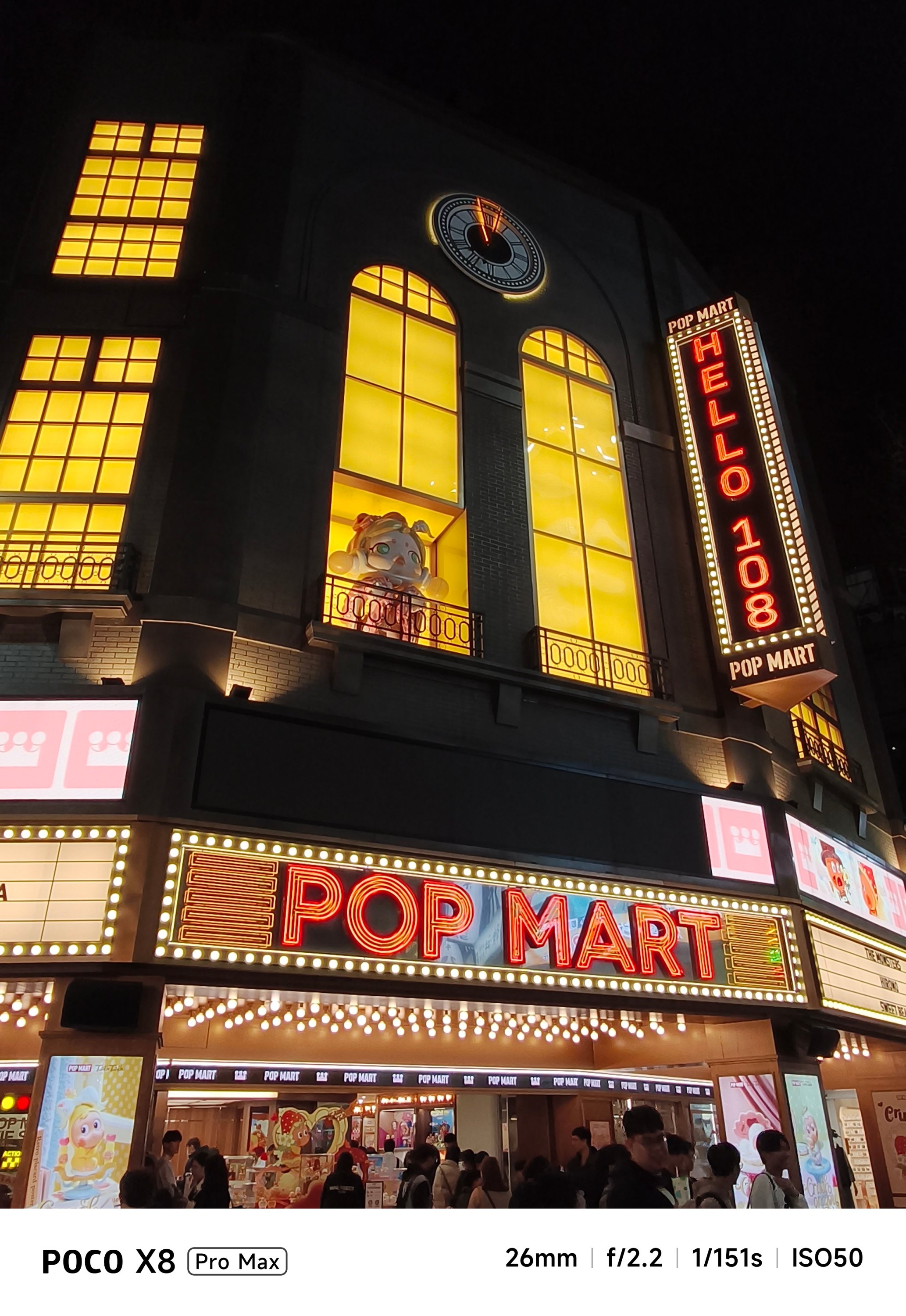

Nevertheless, food shots will still look appetizing enough, regardless of lighting condition.


Battery behemoth
Last but certainly not the least, the POCO X8 Pro Max packs a mighty tank inside — an 8500mAh Si/C battery, to be exact. This is currently POCO’s biggest battery offering in their current line of smartphones.
I would be lying though if I didn’t say I am envious that the China variant (REDMI Turbo 5 MAX) has a bigger 9000mAh capacity.
Still, for day-to-day basis, it’s hard to fully drain the phone in one sitting. If you’re chronically online, the POCO X8 Pro Max will surely handle all your social media-ddiction.

As we speak, gaming is pretty much the baseline for being able to tell how power hungry this beast is.
For instance, the moment I set up and installed all the necessary games I can think of, that 5-hour installation of three games only took up about 20% of charge from its 68% battery state — fresh from the factory.
During a mix of 2.5-hour gameplay, the battery depleted from 48% down to 31%.

Even consuming entertainment shouldn’t be much of a battery hog. Binging K-Pop music videos and live performances on YouTube plus Netflix titles for around three hours ears only a measly 10%.

Heck, even with just 1% remaining in the tank, I was still able to play H1-KEY’s latest comeback song in Apple Music for another ten minutes before the phone fully died.
Now, this is where Xiaomi’s 100W HyperCharge capability comes in.
Although the review unit I have doesn’t have one, I was still able to hook it in with an existing 100W HyperCharge adapter from my stash.
However, most users won’t even have one. Thankfully, the POCO X8 Pro Max is compatible with the PPS charging protocol which enables third-party chargers to fully-utilize that 100W charging speeds, and the results aren’t far off.
My GadgetMatch Charge Test further proves that.
Xiaomi 100W HyperCharge Adapter |
UGREEN 100W Uno GaN Charger |
|
START TIME (From 0%) |
3:18PM |
12:34AM |
3 minutes |
0% |
1% |
5 minutes |
4% |
2% |
10 minutes |
8% |
11% |
15 minutes |
17% |
15% |
20 minutes |
22% |
24% |
30 minutes |
34% |
37% |
45 minutes |
55% |
57% |
1 hour |
76% |
77% |
1 hour 15 minutes |
94% |
95% |
END TIME |
4:48PM
|
2:08AM
|
As an addition, I also made the POCO X8 Pro Max as my personal hotspot. I went out around 8AM with 100% charge left. The moment I got back home by 11 in the evening, there’s still 43% left. Most phones have already drained right after the sun has set by 6PM.

Moreover, not only it’s limited to just a dual physical SIM slot. Another slot can run eSIM, which is always my go-to option when traveling. It’s a huge relief this POCO phone supports it as the M8 Pro doesn’t have one.
Speaking of, this phone can also serve as your power bank! With its 27W reverse wired charging support, it can top-up the dead batteries of your 5000mAh phones 👀
And before I forget, Xiaomi’s HyperOS 3 isn’t the most power-efficient system out there. If you happened to read my POCO M8 Pro and Xiaomi Pad 8 review write-ups, you already get the gist of this.
To be specific, as I breezed through my last battery settings, I’ve noticed that App Vault drained the second highest when your phone is in idle mode. I haven’t even set up the feature as of this writing.
This is another reason why my sentiments against the company’s OS keep getting stronger. I’m just hoping they could fix these worrisome woes that affects a lot of existing and prospective Xiaomi / REDMI / POCO users.
Is the POCO X8 Pro Max your GadgetMatch?
The arrival of the POCO X8 Pro Max blows the rest of the competition out of the water.
Although Xiaomi’s HyperOS is the elephant in the room, that was easily overshadowed by how mighty this smartphone is.

The POCO X8 Pro Max is as straightforward as it can get. From visuals, to core performance, all the way to battery endurance (and even capable cameras), I honestly cannot speak ill about it — especially for a phone in this price point.
Whether you’re just a casual user looking for a pro-grade yet inexpensive smartphone or you’re purely just a spec-savvy nerd, you’ll easily drool with how great the POCO X8 Pro Max is.
And with prices of just PhP 25,999 or PhP 27,999 / US$ 469 or 529 paired with all these powerful hardware, what more can you ask for?
They are even heavily discounted now with early bird offers ranging between PhP 18,499 ~ PhP 20,249 and US$ 429 and 459 respectively.
If it is not evident enough with my high praises, the POCO X8 Pro Max is an ultimate Swipe Right, Super Swipe, and a worthy recipient of the GadgetMatch Seal of Approval.
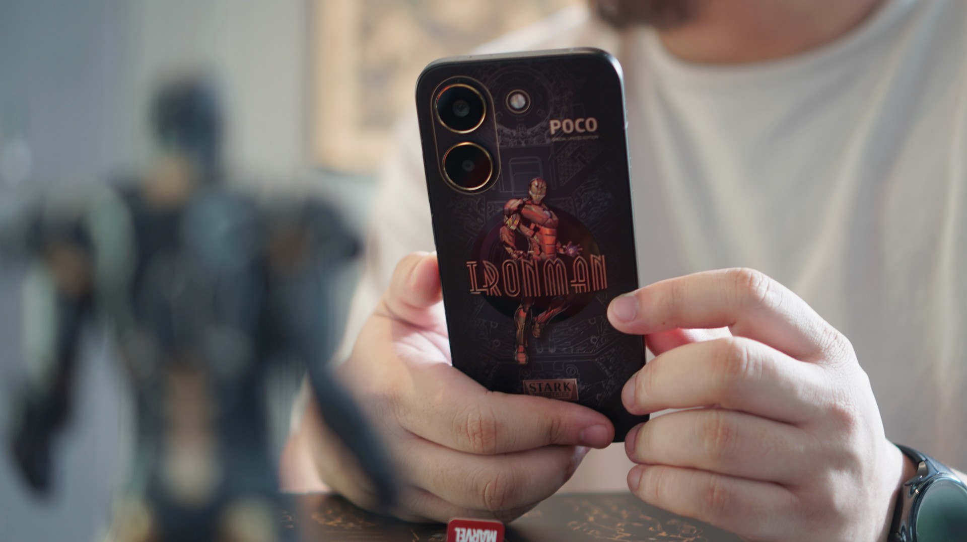
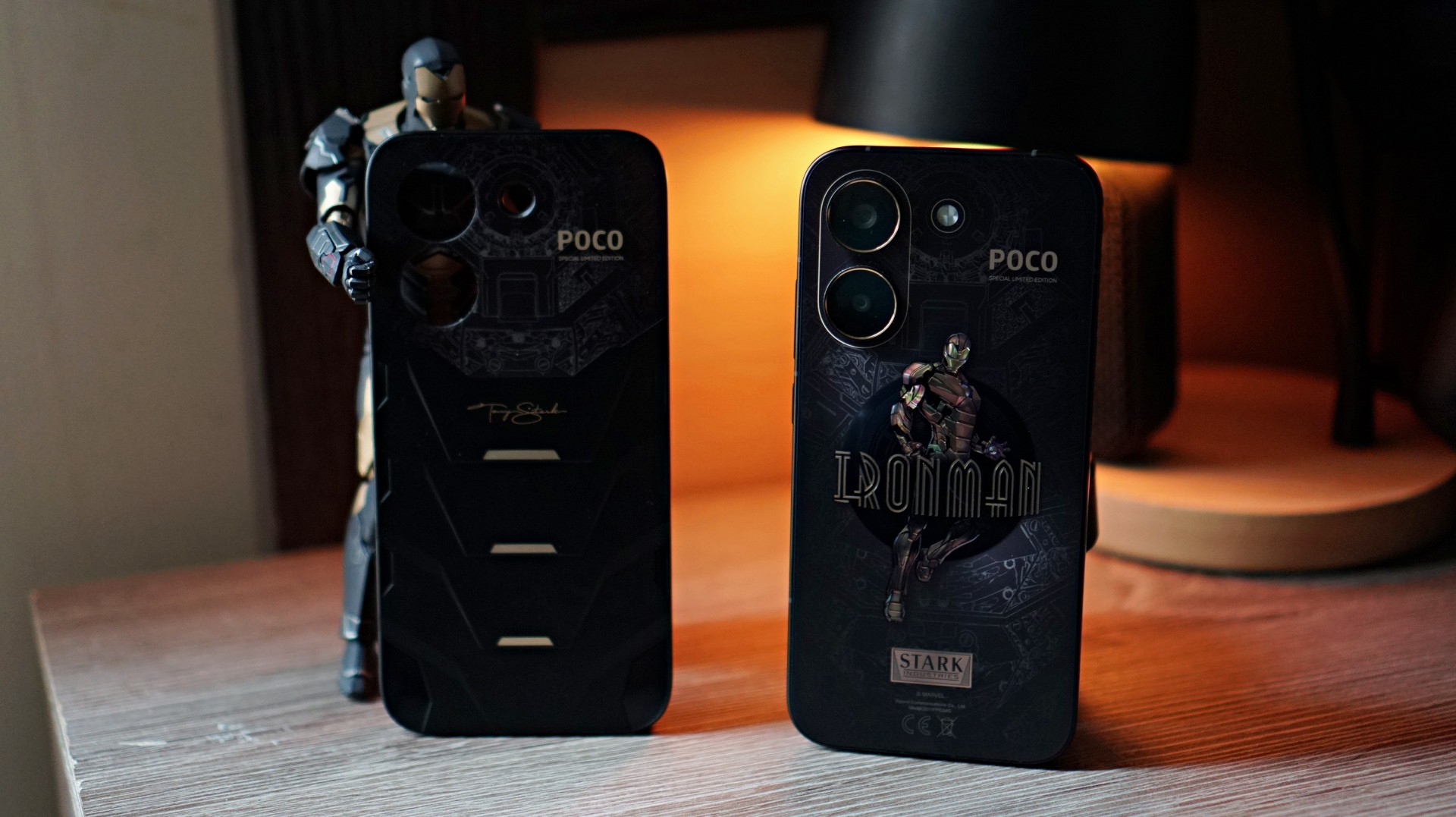
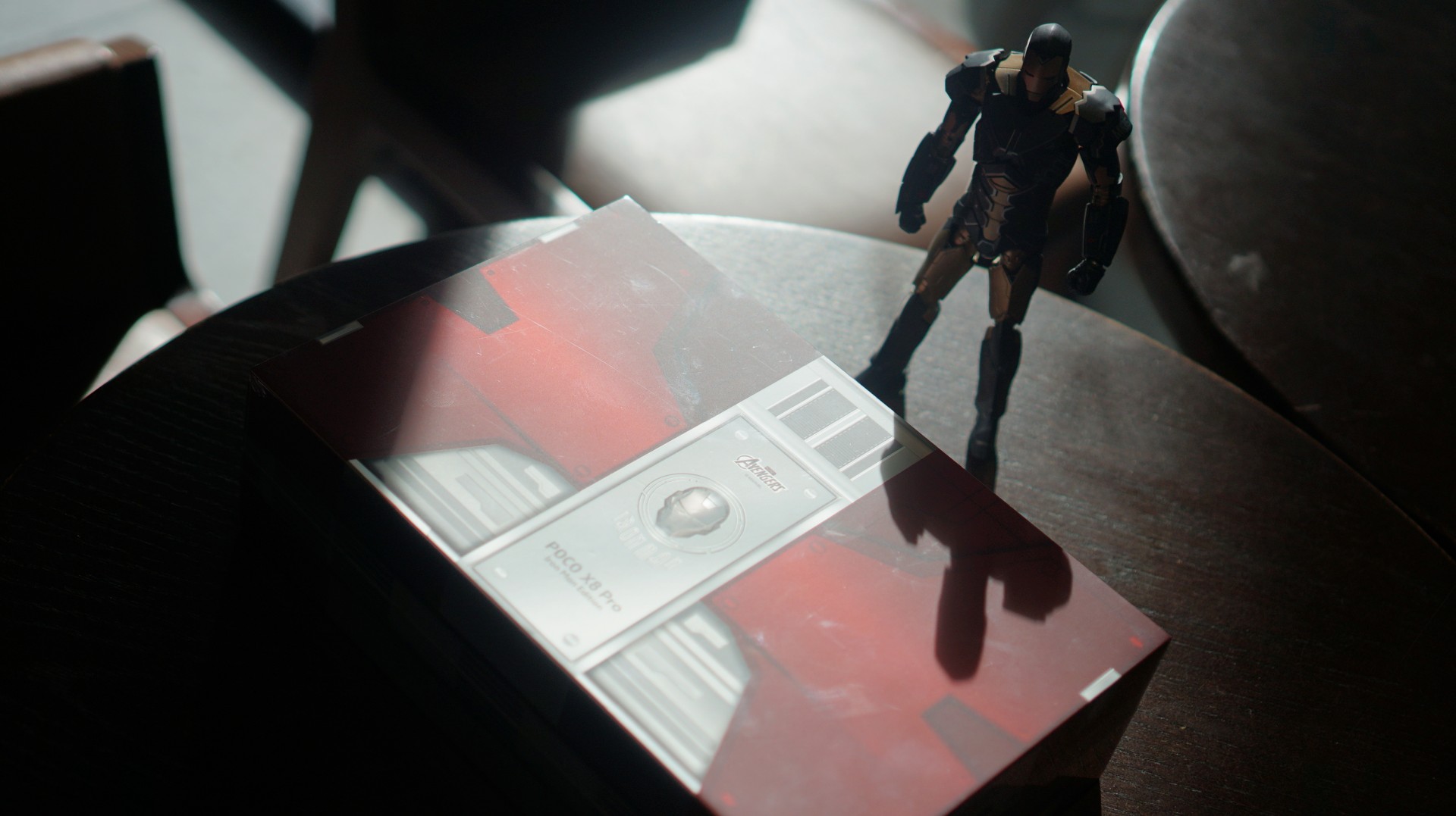
Strip away the Stark Industries styling and the POCO X8 Pro Iron Man Edition is still what POCO does best — a capable midrange smartphone with steady performance, solid battery life, and a display that holds up well for everyday use.
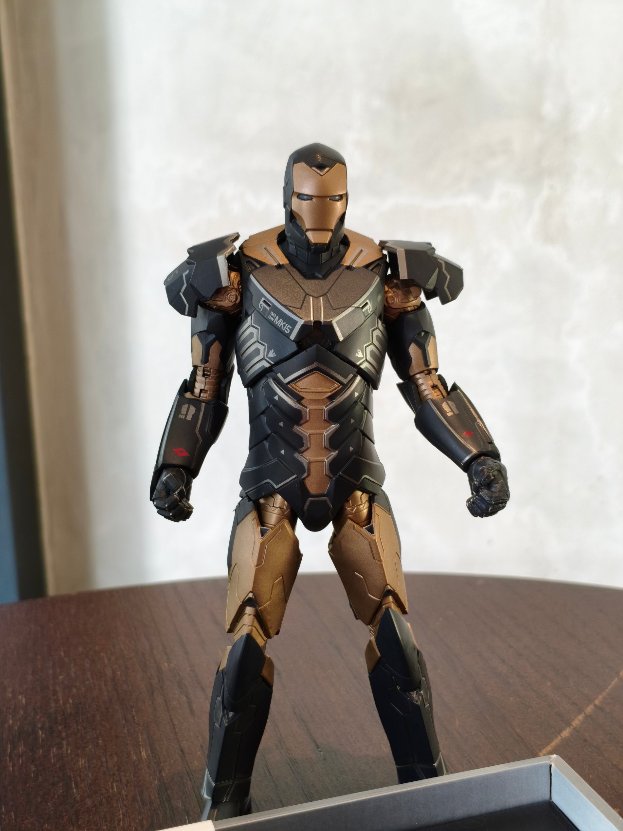
The difference this time is the armor it’s wearing.
POCO’s latest collaboration wraps the familiar X-series formula in a design inspired by Iron Man’s Mark XV armor, codenamed “Sneaky.” Unlike the classic red-and-gold suit most fans recognize, this stealth-focused armor features a darker black-and-gold palette and appeared as part of the Iron Legion in Iron Man 3.
It’s a stylish twist on an otherwise familiar smartphone. The real question is whether the superhero aesthetic adds enough to make this midrange device stand out.
Design and feel: Stark-inspired aesthetics

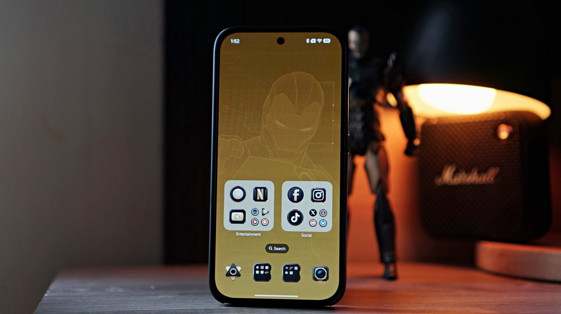
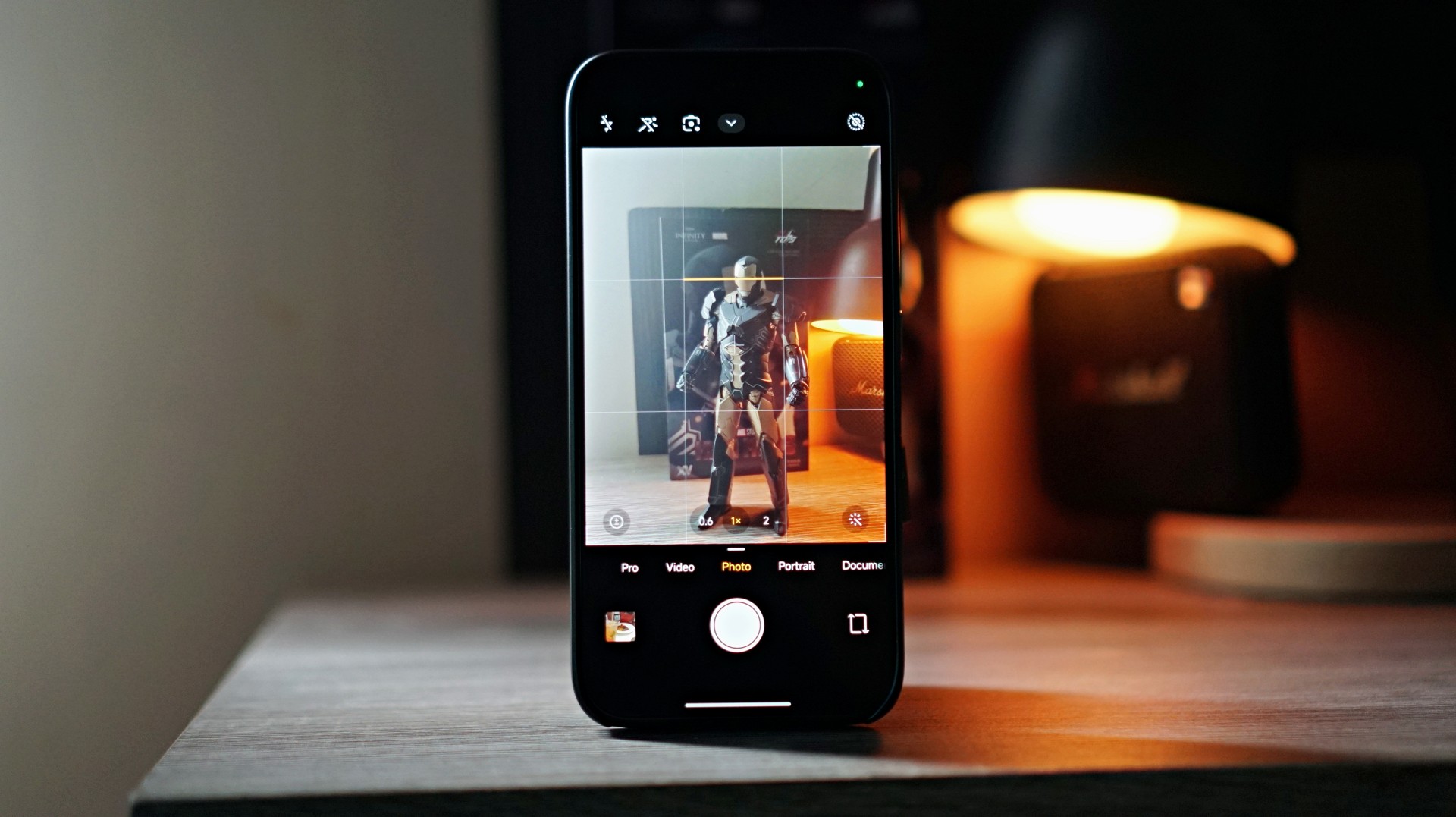
The back design of the bare phone prominently features an image of Iron Man. The styling clearly leans into the Mark XV armor inspiration, with a black-and-gold finish that resembles the torso plating of the stealth suit.
It’s bold without being overly flashy.
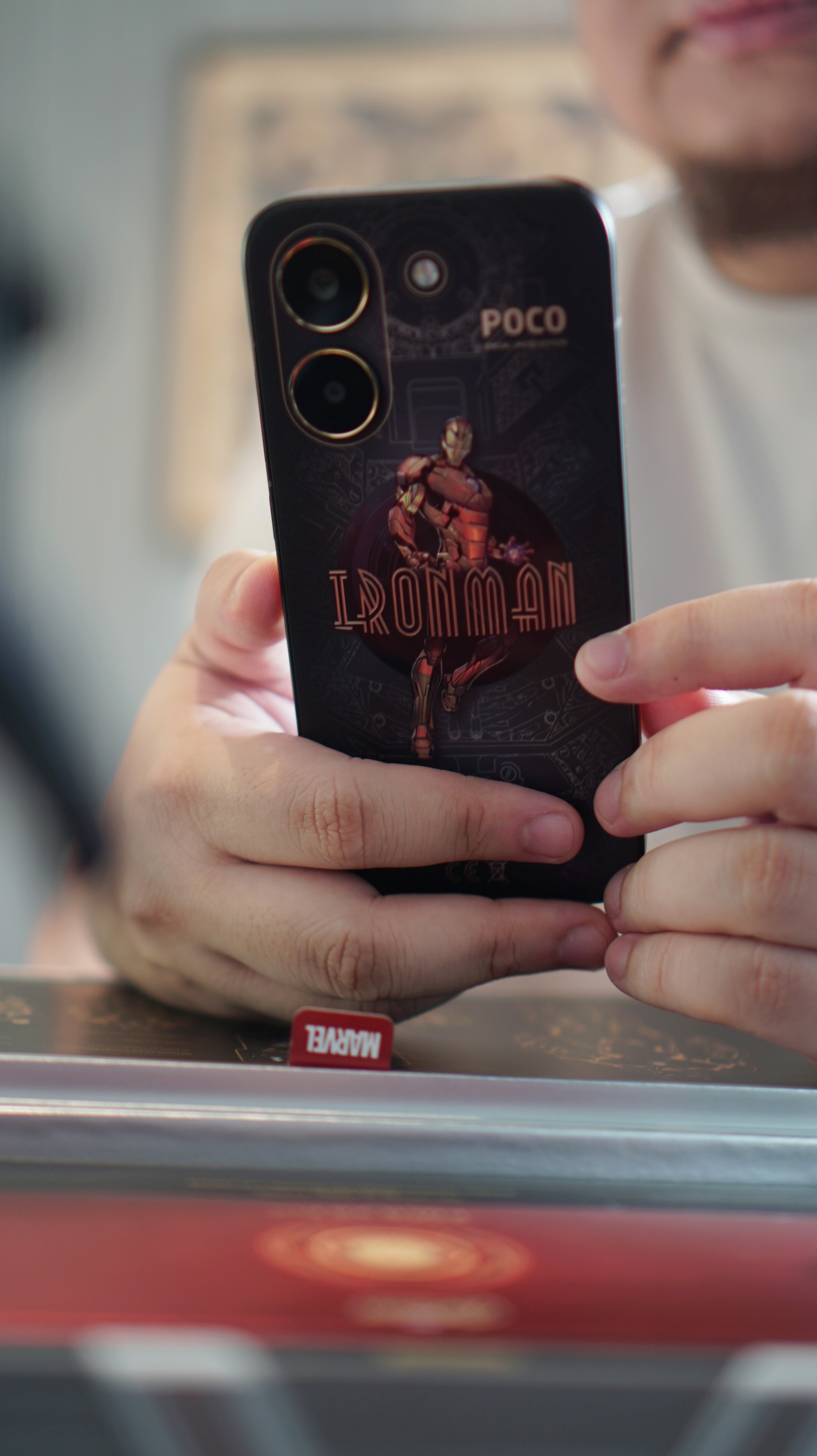
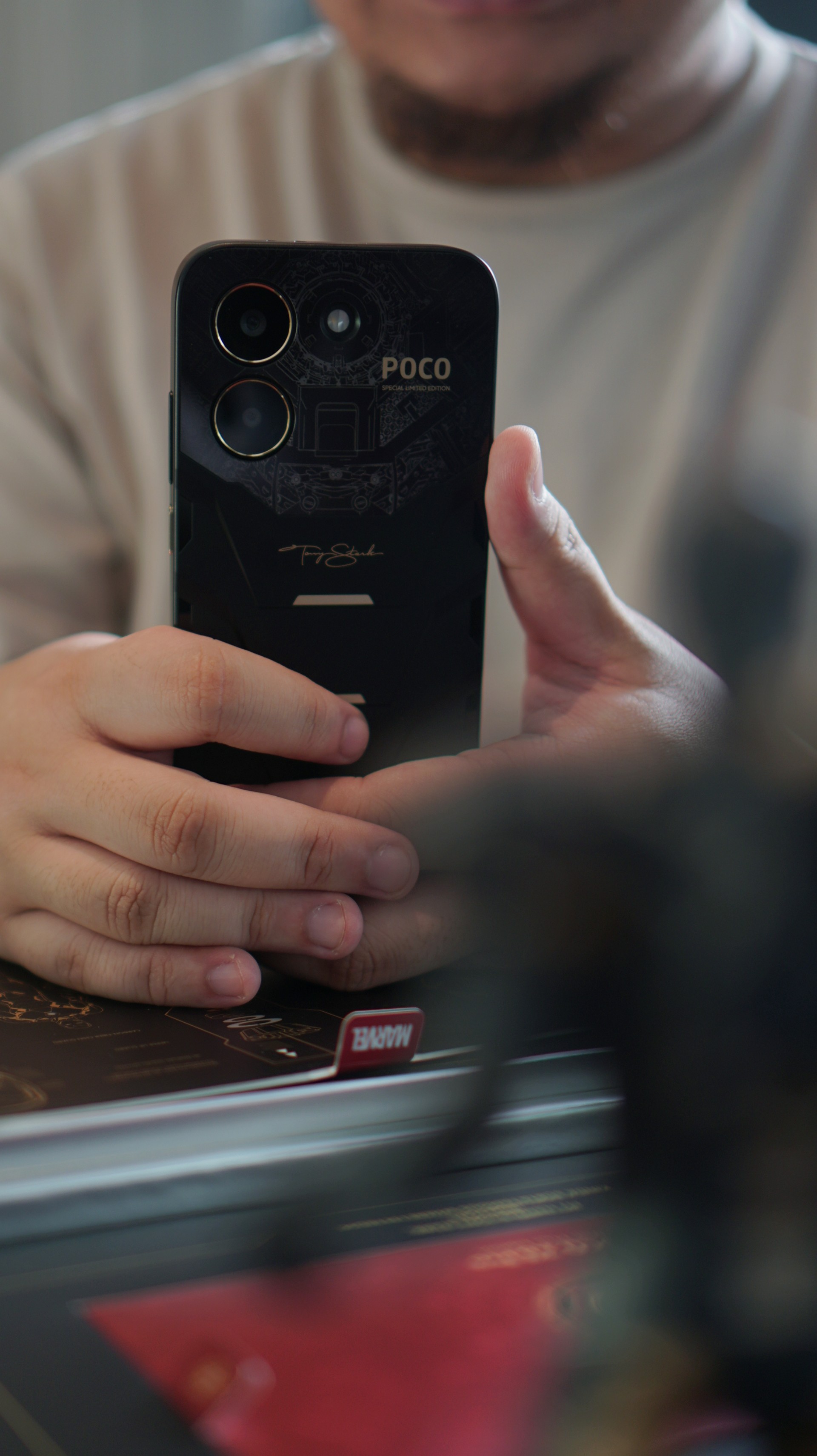
Interestingly, the look changes quite a bit once you snap on the included case — which is actually my recommendation. With the case on, the design becomes a bit stealthier while also giving the phone a slightly better feel in the hand.
The overall handfeel of the smartphone reminds me a lot of the iPhone 14 Pro Max with a CASETiFY case on — just a tad less chunky. That’s a configuration I used for the past three years, so the shape and weight felt oddly familiar the moment I picked this up.
It helps that the camera module doesn’t protrude very much. With the case on, the back sits flatter than expected, making the phone feel balanced when placed on a desk.
Overall, the design is easily the most distinctive part of this device. Even if you’re not a hardcore Marvel fan, the black-and-gold styling still looks quite good.
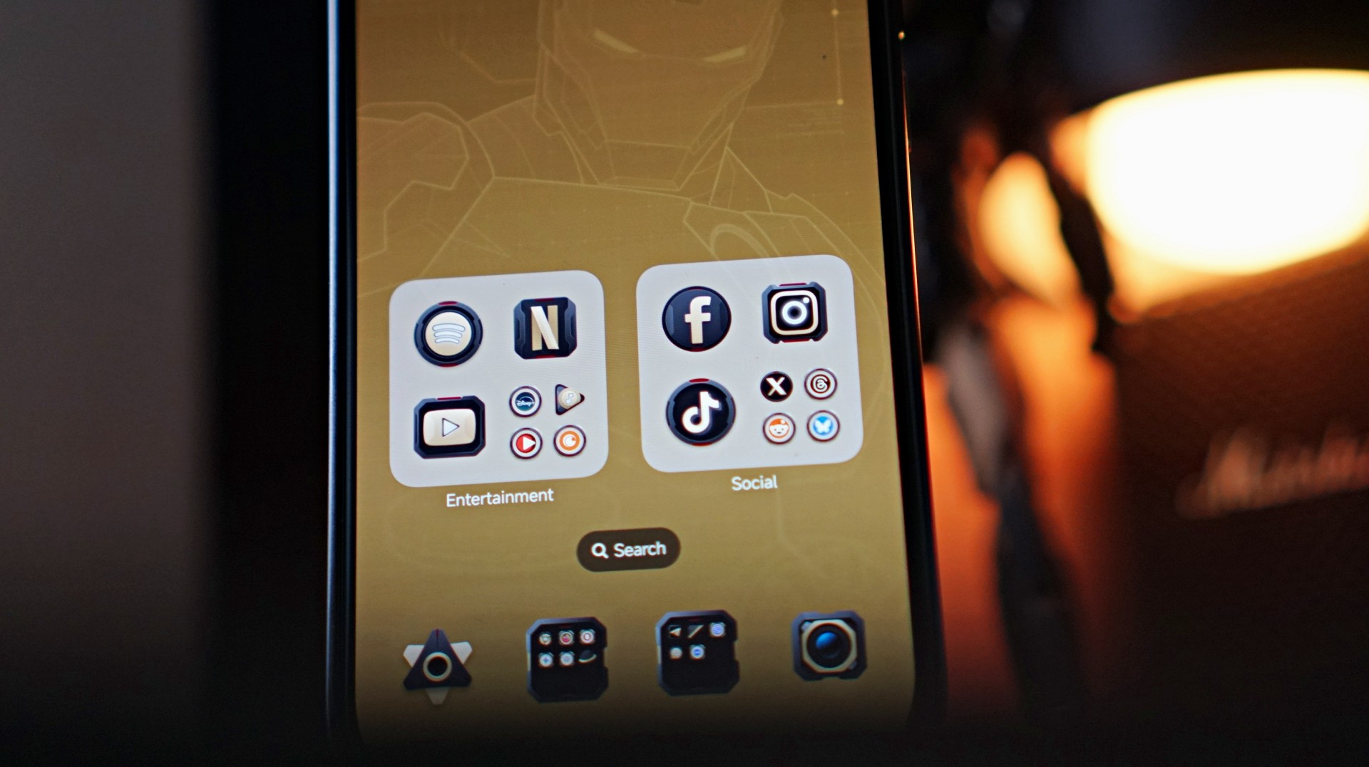
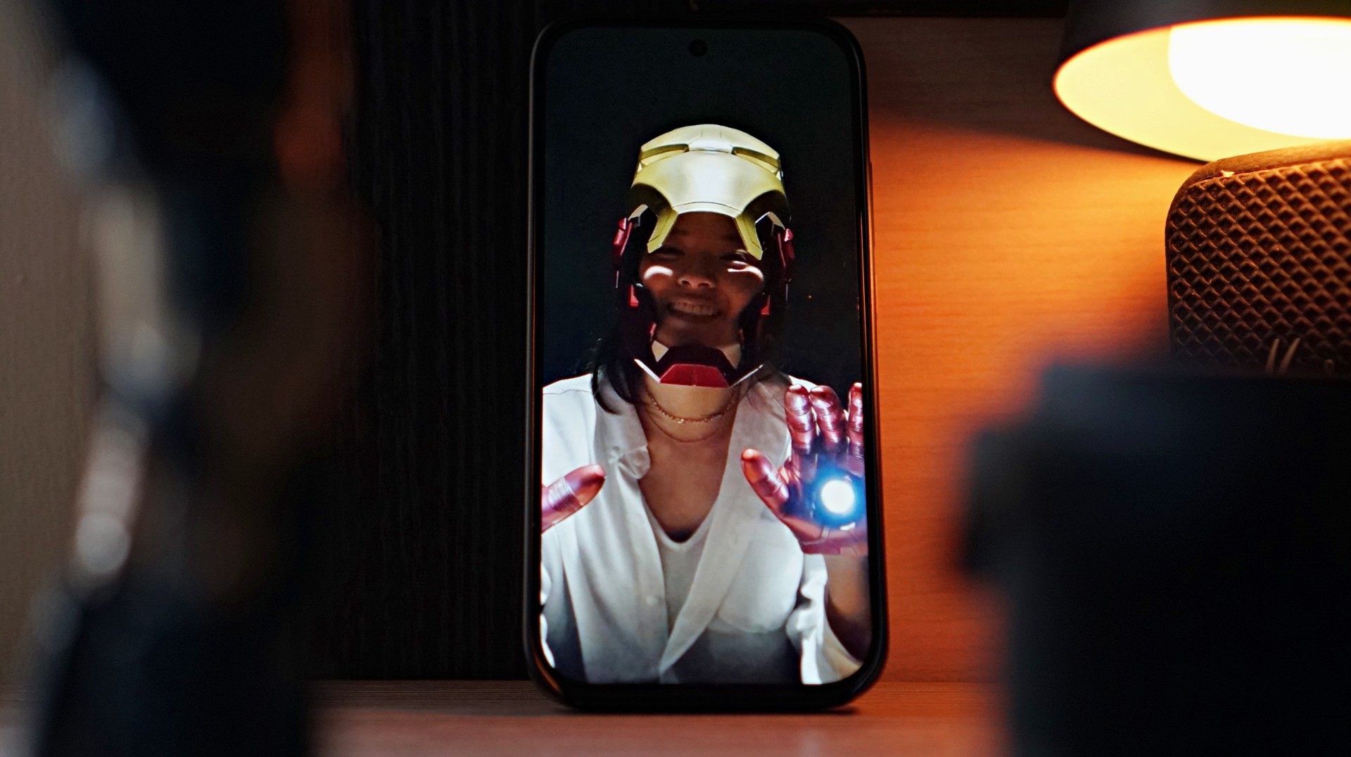
The Iron Man theme also extends to the phone’s software. POCO applies the Stark-inspired “armor” across the system UI, most noticeably on the app icons. Naturally, not every app has a custom icon, so unsupported ones are wrapped in a circular frame that resembles the Arc Reactor on Iron Man’s chest. It’s a small touch, but it helps the theme feel more cohesive across the entire phone.
Of course, underneath all that Stark-inspired styling is still a very familiar POCO midrange smartphone.
Performance: Steady for everyday tasks

Under the hood, the POCO X8 Pro Iron Man Edition is powered by the Dimensity 8500-Ultra processor paired with 12GB of RAM and 512GB of storage.
In daily use, performance is steady for most casual smartphone tasks.
I spent a lot of time doing the usual things — browsing websites, scrolling through reels, TikToks, and what-have-you. Everything felt smooth and responsive throughout.
Like with anything related to Xiaomi, you do get the usual preinstalled apps and occasional ads within the interface. It’s something longtime users of the ecosystem will already be familiar with, but it’s still worth mentioning.
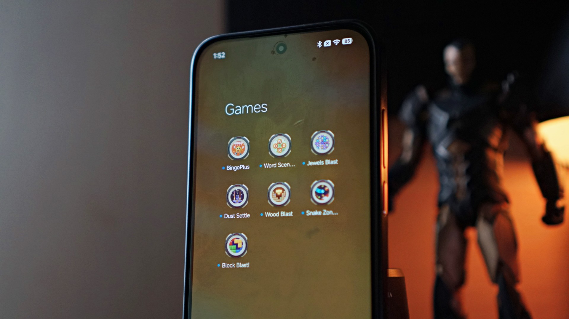
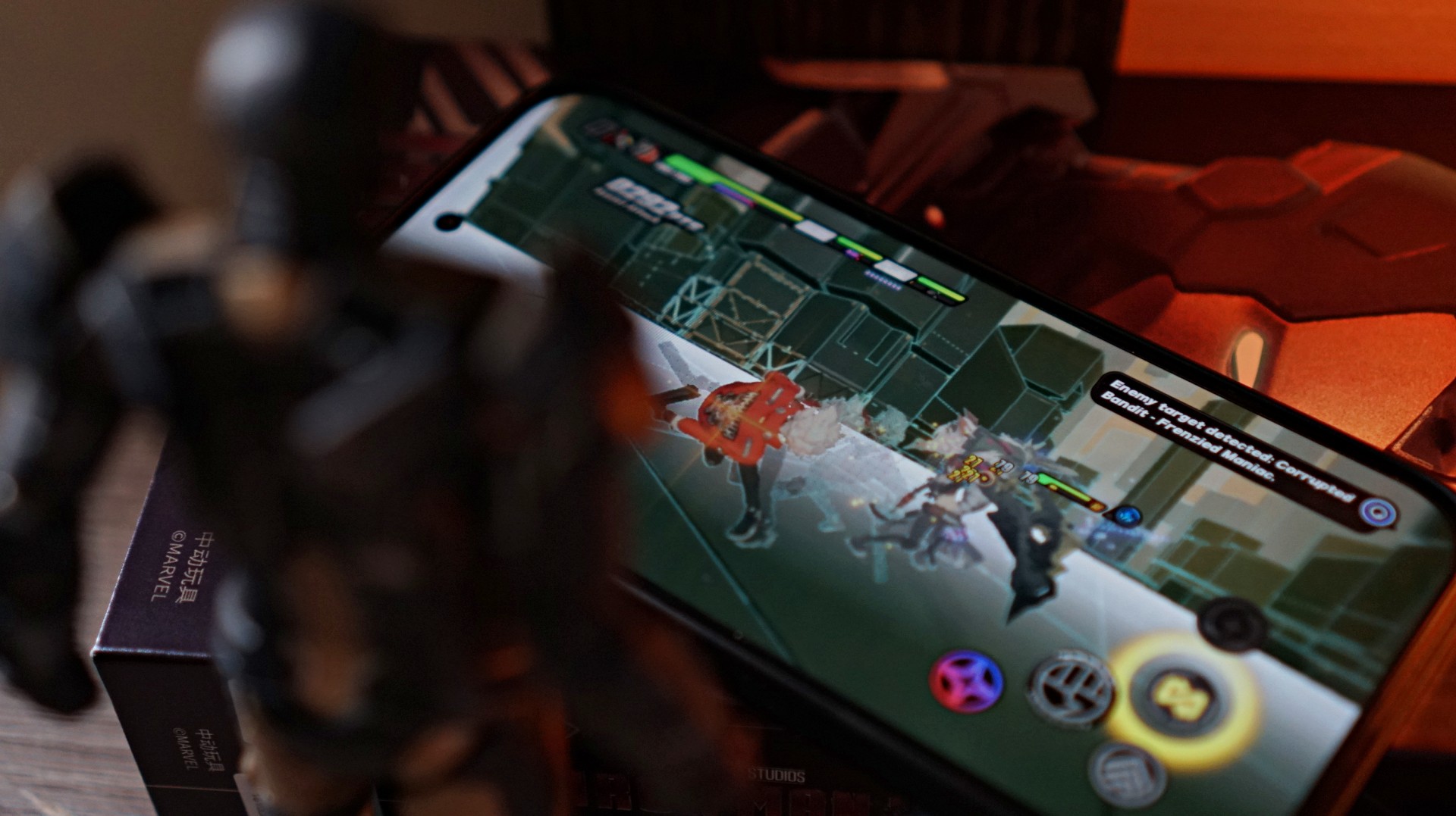
Gaming performance is also respectable.
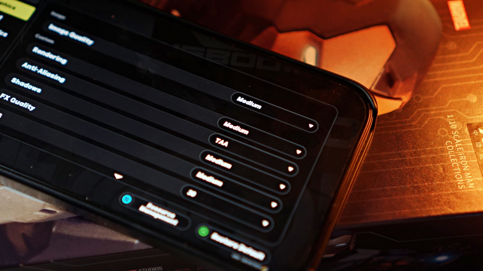
I fired up Zenless Zone Zero, and the default graphics configuration was set to Medium. That setup actually worked quite well, ensuring that the action-packed gameplay — complete with plenty of particle effects on screen — stayed smooth.
The lower resolution didn’t feel like much of a compromise either, especially on the phone’s 6.59-inch display.
For a midrange device, the overall experience is stable and dependable, which is exactly what most users in this segment are looking for.
Display and media consumption
The 6.59-inch AMOLED display delivers exactly what you would expect from a midrange device today.
It’s above average and quite serviceable. It’s not going to wow you, but you’re definitely not going to feel shortchanged either.
Colors look vibrant, brightness is more than enough for most situations, and the 120Hz refresh rate keeps scrolling and animations smooth.
Now Playing: Iron Man 3
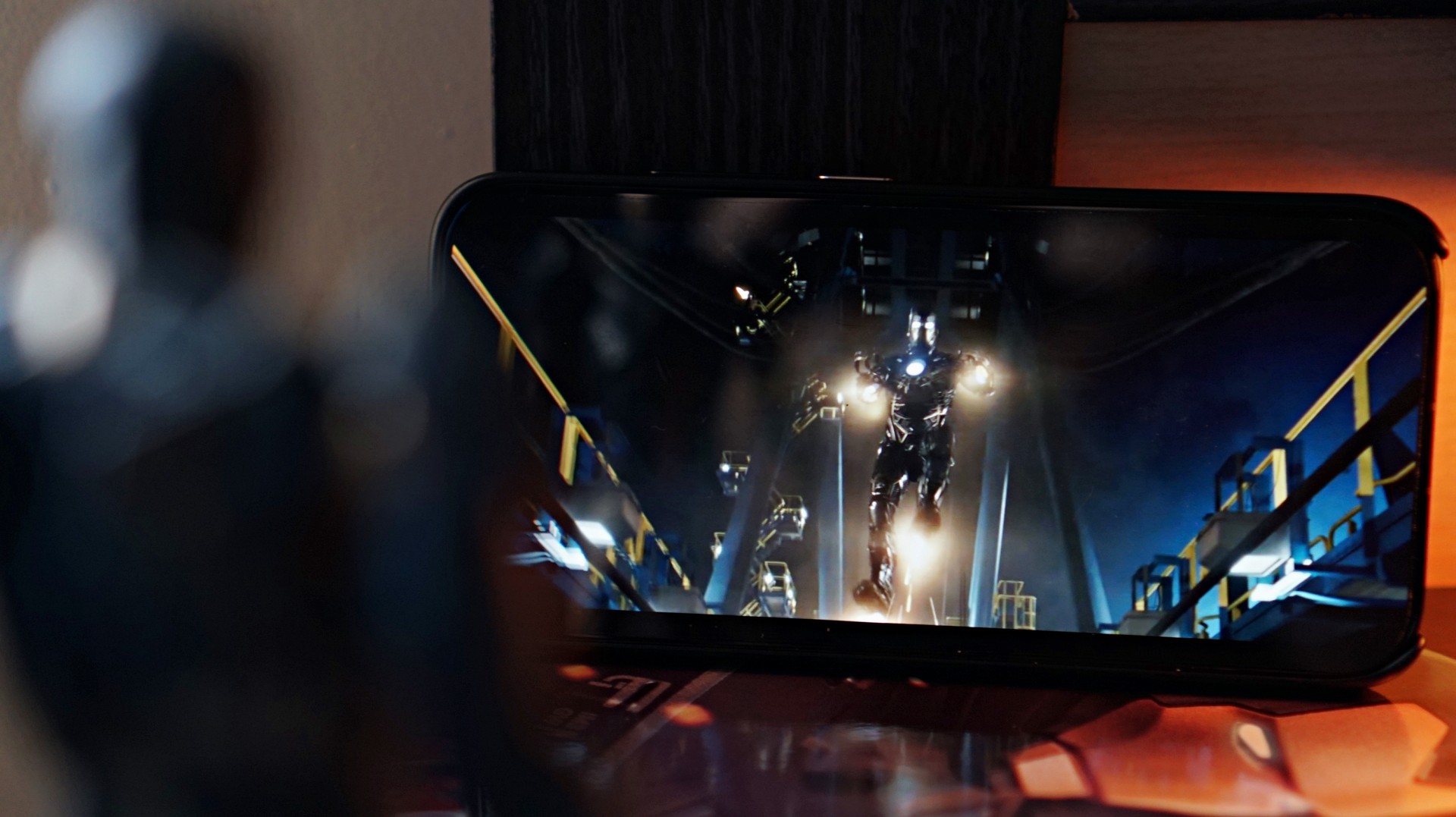
To stay on theme, I decided to watch a bit of Iron Man 3 on the phone.
The display does its job well, delivering clean and crisp visuals during playback. Explosions pop nicely on screen, and darker scenes still retain decent clarity.
The stereo speakers are fine for casual viewing, but you’ll probably want to use headphones if you’re looking for a truly satisfying audio experience.
Overall, media consumption falls somewhere in the average to above-average range — which is also a pretty accurate way to describe how the movie itself was received when it first came out in 2013.
Battery and charging
Battery life is one of the stronger aspects of the POCO X8 Pro Iron Man Edition.
The phone packs a large 6500mAh battery, which easily lasts a full day with moderate usage.
That includes a mix of social media browsing, watching videos, messaging, and the occasional gaming session.
Charging is also impressively fast.
Going from 50% to full takes about an episode and a half of an anime — roughly around 30 to 35 minutes. It’s quick enough that topping up the phone during short breaks becomes very convenient.
For a device in this price range, the combination of a large battery and fast charging makes the phone feel reliable throughout the day.
Cameras: right where you expect them
Camera performance is exactly where you’d expect it to be for a midrange smartphone.
Photos are perfectly fine for casual social media posts, but they’re not going to compete with higher-end flagship devices.


One thing to watch out for is the difference in image output between focal lengths. Switching between the ultrawide (0.6x), 1x, and 2x zoom can produce noticeably different results in terms of color and overall look.


In fact, even using the same lens can sometimes produce varying results depending on lighting conditions.


Images tend to have a slightly warm tone with a bit of extra contrast. Lighting plays a big role in how the final photo turns out, so results can vary quite a bit from shot to shot.
Selfies show similar behavior. Taking photos with and without the beauty filter can sometimes result in different exposure levels, which feels a bit odd.
-

- Beauty filter ON
-

- Beauty filter OFF
The best way to approach this camera system is to take multiple shots of the same scene. It may sound tedious, but snapping two or three photos increases the chances of getting one that looks just right.


The easiest way to describe the overall camera experience is inconsistent. If you’re the type who takes several photos before picking the best one to post on social media, you’ll probably be fine. But if you prefer reliable point-and-shoot results, it might take a bit more patience.
A curious collaboration
Iron Man has remained one of the most iconic characters in the Marvel universe ever since his silver screen debut in 2008.
But interestingly, there hasn’t been much happening around the character since the events of Avengers: Endgame.
While Robert Downey Jr. is set to return to the MCU as Doctor Doom in the upcoming Avengers: Doomsday, the lack of any current Iron Man storyline makes this collaboration feel a little unexpected.
That doesn’t necessarily make it a bad one, though.
The POCO X8 Pro Iron Man Edition looks good, the box and packaging are genuinely impressive, and the themed design adds a bit of personality to what is otherwise a very familiar smartphone.
For hardcore Iron Man collectors, the appeal is obvious.
For everyone else, it’s essentially a solid midrange phone dressed in superhero armor. And if it lands somewhere close to the previous Iron Man Edition’s price of around PhP 22,999 (In the Philippines), it will likely hit exactly the audience it’s meant for — fans who don’t mind spending a little extra for a collector-style device.
It may not be the most exciting smartphone in the midrange category, but it’s still a fun collaboration nonetheless.


nubia to launch new Neo 5 series gaming phones on March 28

SHINOBI: Art of Vengeance’s SEGA Villains Stage out on April 3

AMD poised to lead agentic AI era with high-performance CPUs

CIPTA debuts AI GPU server, edge workstation at CloudFest 2026

Dune: Part Three teaser trailer: First look at Robert Pattinson’s Scytale


-

 Reviews4 days ago
POCO X8 Pro Max review: A new beast from the far east
-

 News4 days ago
POCO X8 Pro Series: Price, availability in the Philippines
-

 Laptops1 week ago
Apple MacBook Neo Review
-

 Computers2 weeks ago
GIGABYTE collaborates with Capcom for RE Requiem custom PC
-

 Apps1 week ago
Google Maps is finally getting a 3D mode
-

 Entertainment1 week ago
The internet is thirsting over the One Piece Season 2 cast
-

 News2 weeks ago
Globe postpaid opens pre-orders for Samsung Galaxy S26 series
-

 Features1 week ago
Galaxy AI on the Samsung Galaxy S26 Ultra