


The gaming phone segment is the last bastion against the rapid encroachment of AI over every smartphone today. Whereas most devices today focus on packing the most AI-based features, the smartphones of yesteryear were all about having the best processor, the best cameras, the best screen, and the best battery. If, like me, you miss the days when everyone chased for raw power, you will likely love the ROG Phone 9 Pro.
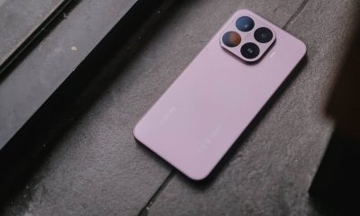
Unassuming design underlines power underneath
Every time I try a new gaming phone, I always breathe out a sigh of relief that no one does edgy designs anymore. At the same time, I still appreciate how today’s crop of gamer gear retains a small design quirk that harkens back to that time. It’s like an inside joke for gamers.
The ROG Phone 9 Pro follows that formula. It’s the definition of “business in the streets, freak in the sheets” design. In front and on the sides, the phone barely registers as a gaming phone, broken only by the side-mounted USB-C slot and the ultra-rare headphone jack. It looks like a standard smartphone.
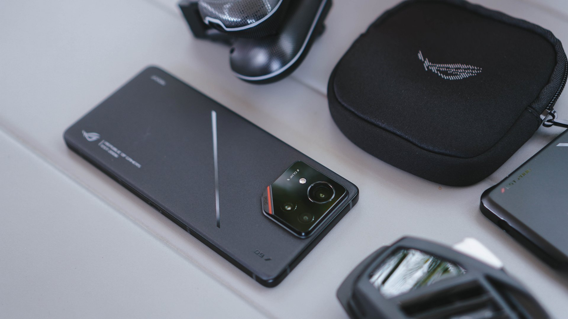
When turned around, the phone shows off its true colors. Subtle glossy decals break the monotony of matte, brandishing the ROG logo for those in the know. Albeit chunky, the elevated camera island hints at the power underneath. A small dip in the lower right corner contains the only splash of color on the entire phone: a thin red strip and a subtle “ROG” lettering.
The best screen the market can offer
The ROG Phone 9 Pro’s screen is one of the best you can get today. It has a 6.78-inch AMOLED LTPO display, capable of putting out a resolution of 2400 x 1080 pixels and 185Hz of refresh rate. The bezel is also very thin, which is what you want for a phone like this. For me, this screen is perfectly balanced for watching videos and playing games.
It also helps that the screen is protected by Gorilla Glass Victus 2. Since the gaming phone is already an investment, roughhousing with this device is out of the question. However, having the best screen protection for durability is a good safety net for unexpected accidents.
Now, a minuscule pain point that mobile gamers might have is the punch hole camera. Though it’s a tiny speck, competitive gamers can find umbrage in losing screen real estate for the camera. If this is an issue, the ROG Phone 9 Pro thankfully features different screen options which will shrink the screen to keep clear of the small dot. It’s not the most elegant solution, but it’s enough to ensure a full display for games.
Just absolute power for everything
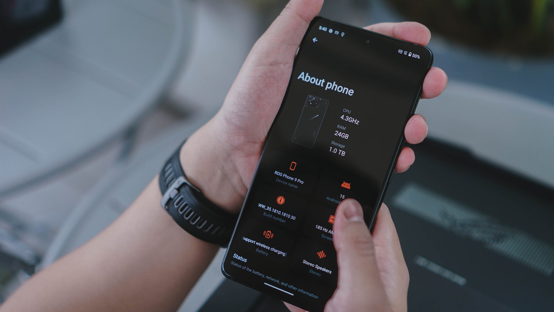
Though I often complain about AI getting into everything, I appreciate how NPUs can elevate the performances of otherwise middling chipsets. That said, there’s just something about the raw muscle of a hearty processor. The ROG Phone 9 Pro has that processor: a chunky Snapdragon 8 Elite paired with up to 24GB of RAM and up to 1TB of storage.
Without a doubt, the chipset can handle all the daily tasks you require from a smartphone. However, the main spotlight is how it can handle games today. I can guarantee that the phone performs spectacularly.
I tested it with Zenless Zone Zero and Infinity Nikki. Both games ran smoothly. In fact, the phone could even push ZZZ’s settings to the maximum possible for mobile, including 60 frames per second. If you’re a hardcore mobile gamer, the ROG Phone 9 Pro is a perfect driver.
The included Armoury Crate app further optimizes performance by boosting either performance and network performance, or battery life. Customization really helps bring out the best out of this already amazing phone.
After playing for an hour, the phone did heat up, averaging around 38 degrees. It was still manageable, but the discomfort can ramp up if you have the phone naked. If anything, the package comes with a useful case that dissipates heat effectively. ROG also sells other cases that accomplish the same.
Additionally, the package includes an Aero Active Cooler X, a detachable fan to cool the rear of the phone for lengthy gaming sessions. Naturally, having the cooler attached will deplete the battery more quickly, but it’s the perfect accessory if you play plugged in while in bed.
A light matrix to fill in the boredom
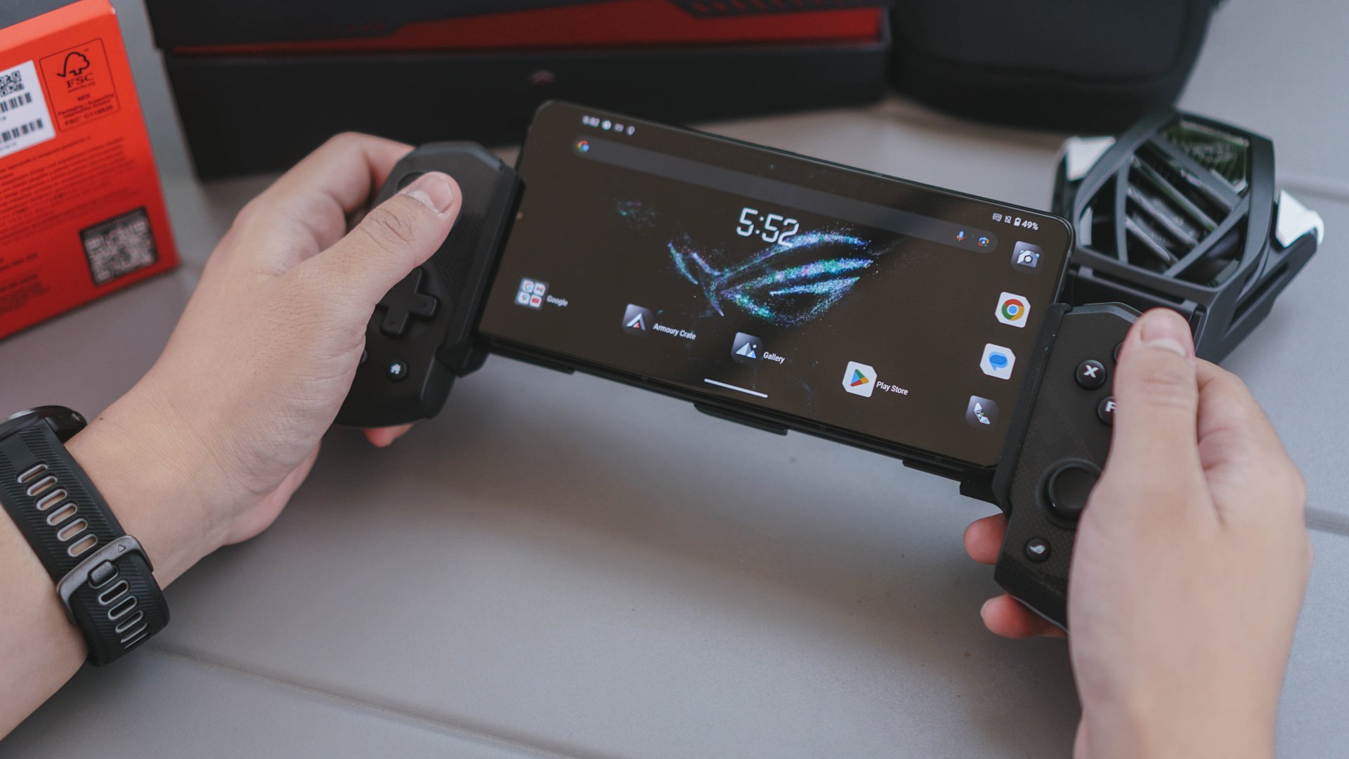
Though the rear is a mostly clean matte panel, the bottom part lights up with a 648-dot mini-LED matrix. At first, I thought that this feature — officially called AniMe Vision — was unnecessary and too flashy. It quickly grew on me, though.
Most users will likely know the matrix as an always-on display to show off the phone. It can be programmed to show a static name, a clock, an ersatz notification panel, a music visualizer, or even a countdown for the camera. I’ve mostly switched this off, but I can’t deny how useful it is to see how many notifications I have while the phone is face down.
Another included app, AniMe Play, turns the matrix into a playable screen. If you’ve played any of the two games I mentioned above, then you’ve experienced the dreaded boredom when a live-service game suddenly gets a hefty update, forcing you to stop playing for a while.
AniMe Play gets rid of that boredom with four retro-style games: Brick Smasher, Aero Invaders, Snake Venture, and Speedy Runner. All four games use the matrix screen and two haptic AirTriggers for controls.
I won’t get the ROG Phone 9 Pro just for AniMe Vision, but I applaud the creativity of the feature.
An unexpected camera underneath
A gaming phone doesn’t usually focus on camera. After all, why should it waste precious space on a bulky camera when it can allocate more resources on a bigger processor or battery? That said, the ROG Phone 9 Pro offers a huge surprise.
The rear camera comes with a 50-megapixel main sensor, a 32-megapixel telephoto sensor, and a 13-megapixel ultrawide sensor. Plus, the combination has a 6-axis hybrid gimbal stabilizer. With that feature, the camera can take clear shots even of moving subjects.


Quality wise, the phone takes surprisingly good shots. I took a few of my Pop Mart figures out for a photoshoot, and the results were stunning. It was like I had an actual camera with me. The colors are fantastic as they captured the more colorful figures. It also did well with more subdued figures as they leveraged contrast levels to achieve a somber mood.

Additionally, the 32-megapixel selfie shooter was more than capable of taking the odd shot in between gaming sessions. Selfies were brightly lit even at night.
Power that lasts for hours
Only 200mAh shy of the 6000mAh mark, the ROG Phone 9 Pro carries a large 5800mAh battery. On paper, the battery can easily last you the entire day with normal usage. However, paired with the smarter processor, it can impress in a few more ways.
After playing ZZZ actively for an hour, the phone’s battery dropped by only 20 percent, and this was under max settings. In one instance, I continued using the phone regularly after the hour-long sessions. The battery, albeit slightly drained from gaming, still lasted an entire day. In another instance, I continued draining the battery (then at around 80 percent) by keeping the game on. It lasted for around four hours.
Once empty, the phone charged back to full in less than an hour. Even a short 10- to 15-minute charging period got me through a pinch by adding a good 20 percent back.
Is the ROG Phone 9 Pro your GadgetMatch?
The ROG Phone 9 Pro is proof that you don’t need AI to create an impressive flagship. The phone packs in an absurd amount of technology, punctuated even further by a creative dot matrix screen. Even without a fold or an aggressively pushed AI, this gaming phone can wow both the general user and the hardcore mobile gamer.
Unfortunately for the budget-conscious gamer, the ROG Phone 9 Pro costs quite a bit. The base model — 16GB + 512GB — costs US$ 1,199. The top-of-the-line model, however, which comes with the AeroActive Cooler X Pro, costs US$ 1,499. Though it’s not as bad as the top foldables today, it’s still on the higher end of the spectrum for smartphone prices.
Personally, the ROG Phone 9 Pro is still a Super Swipe for me. If you’re looking for the best specs in a smartphone today, this new gaming phone has all of that and more. Though the price might turn away most users, it’s still worth the price of admission.
It also gets a GadgetMatch Seal of Approval!


Reviews
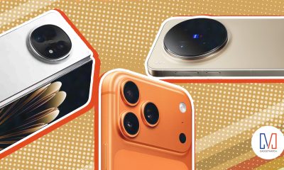
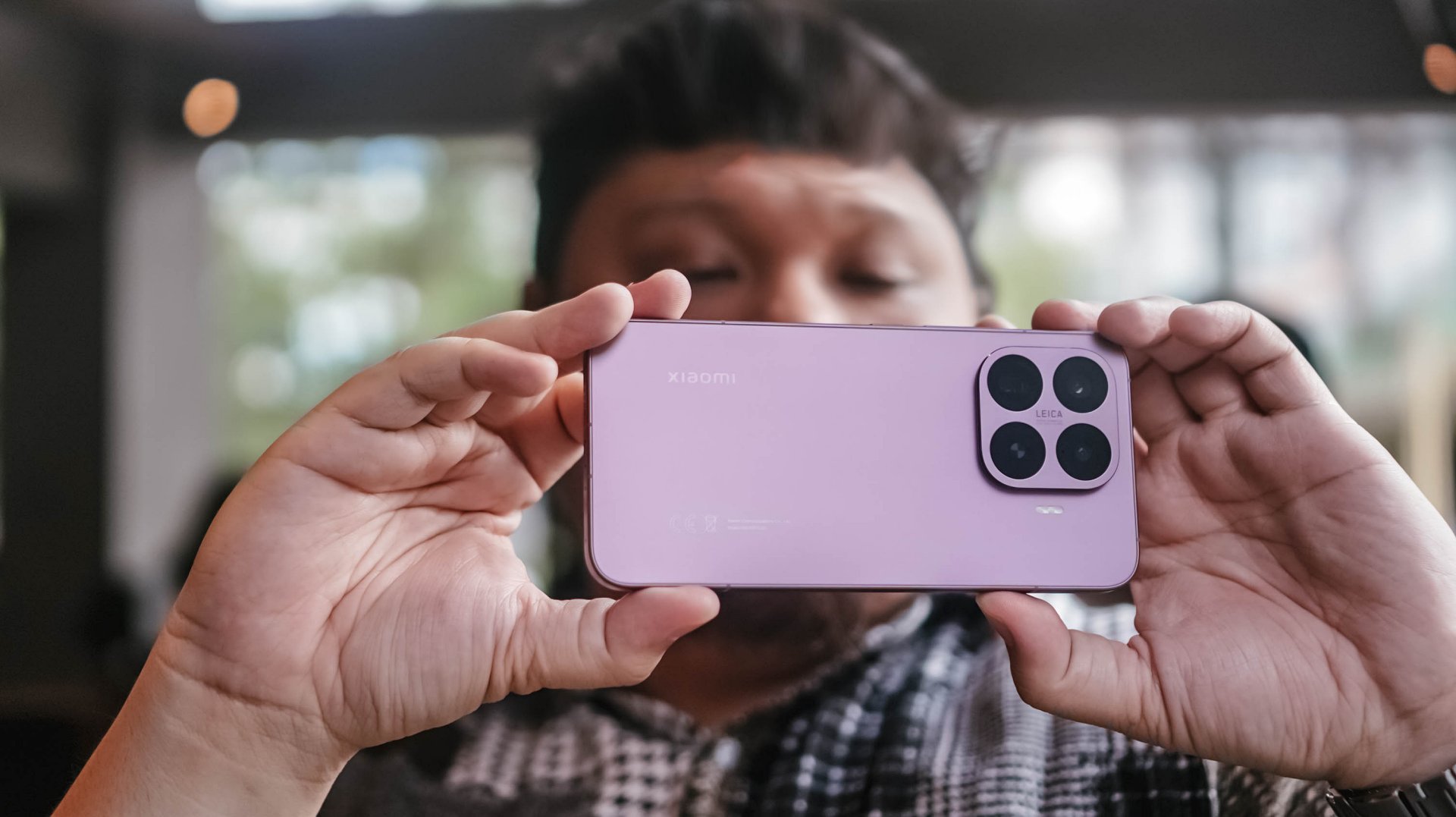
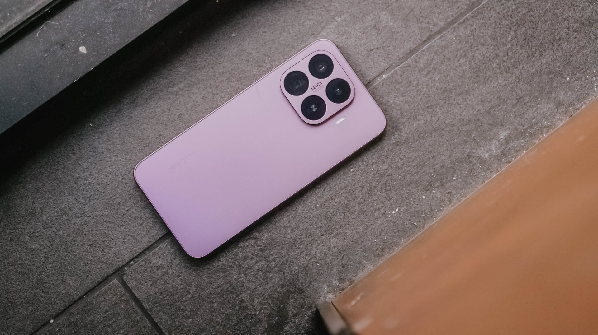
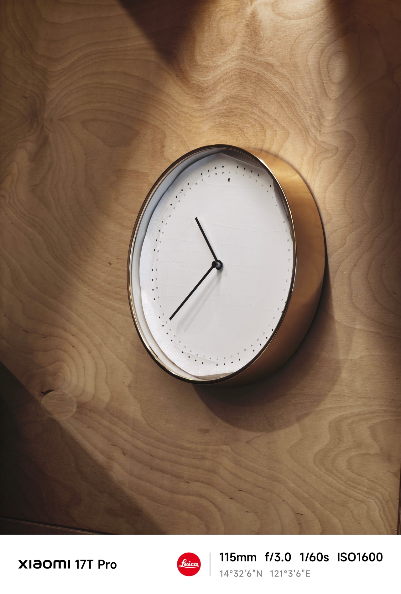
Close without crossing: A Xiaomi 17T Pro photo essay
Distance and closeness are not always opposites.
I have spent the better part of the last few weeks grappling with multiple emotions.
I feel silly referencing this but as a “feel” type, my days are guided by vibe and mood. It’s been a challenge trying to reconcile and make sense of everything.
Thankfully, the Xiaomi 17T Pro presented an unexpected outlet.
So no, this isn’t exactly a review of the Xiaomi 17T Pro. This is yours truly, once again, processing feelings through a telephoto essay.
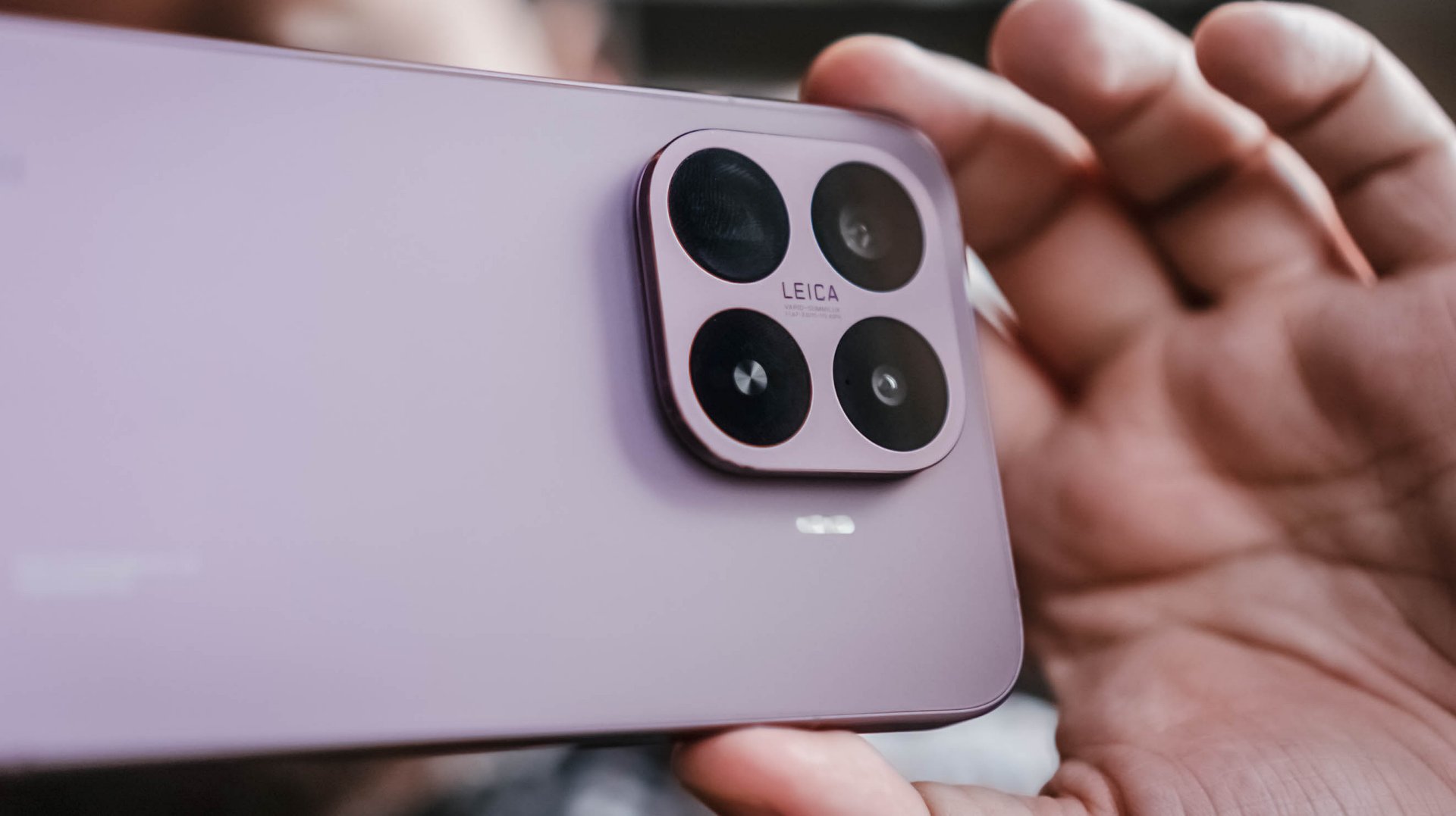
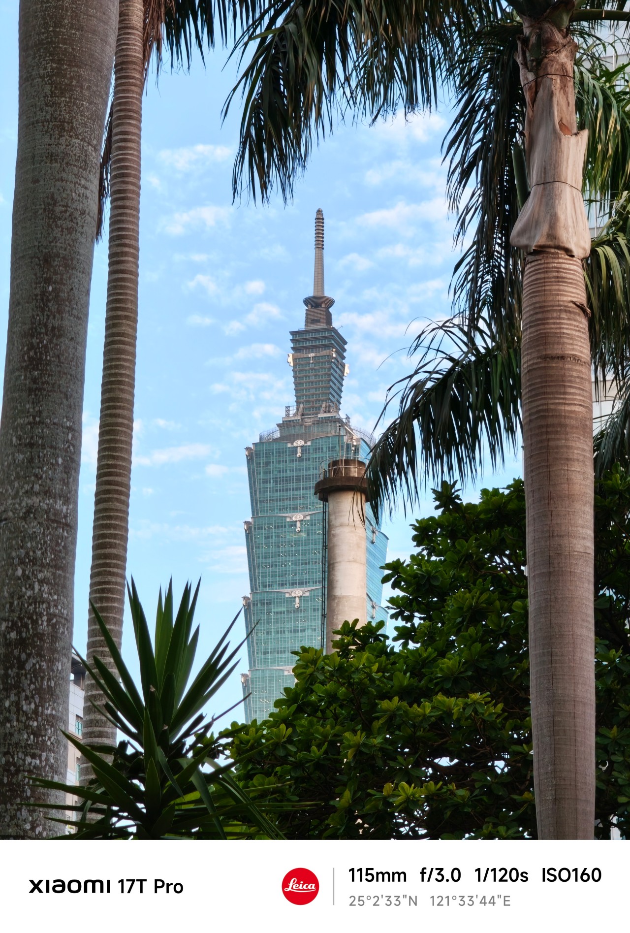
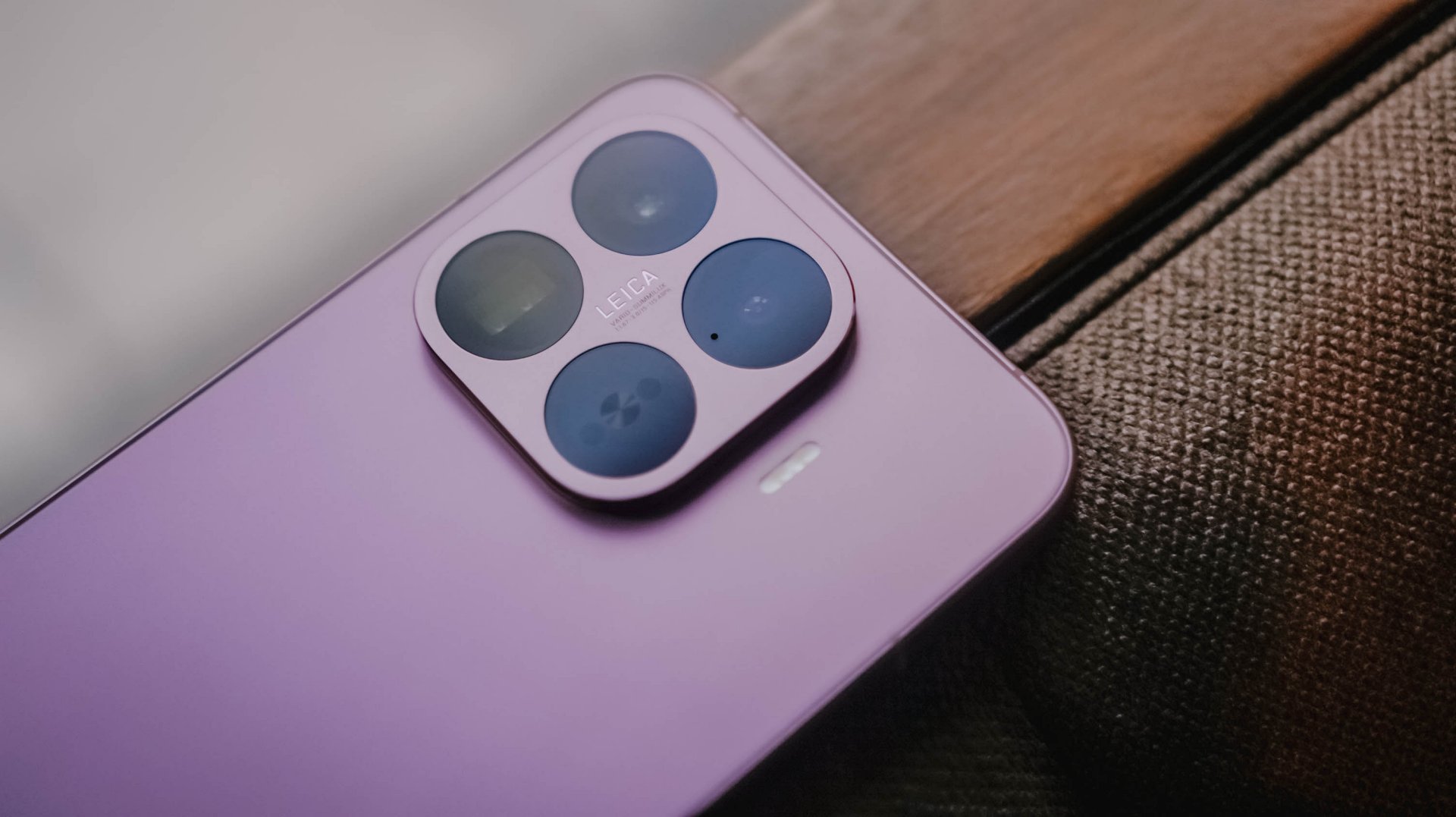
The “T” is for Telephoto
When being briefed about Xiaomi’s latest device, my favorite part was when a guest photographer jokingly attached the T in the Xiaomi 17T series to “telephoto.”
It’s not official or anything. But in this case, it made perfect sense.
My relationship with Xiaomi’s T series has always been a little complicated. For a while it felt like it was searching for an identity. One year it was positioned as a performance-focused device. Then it became an all-rounder.
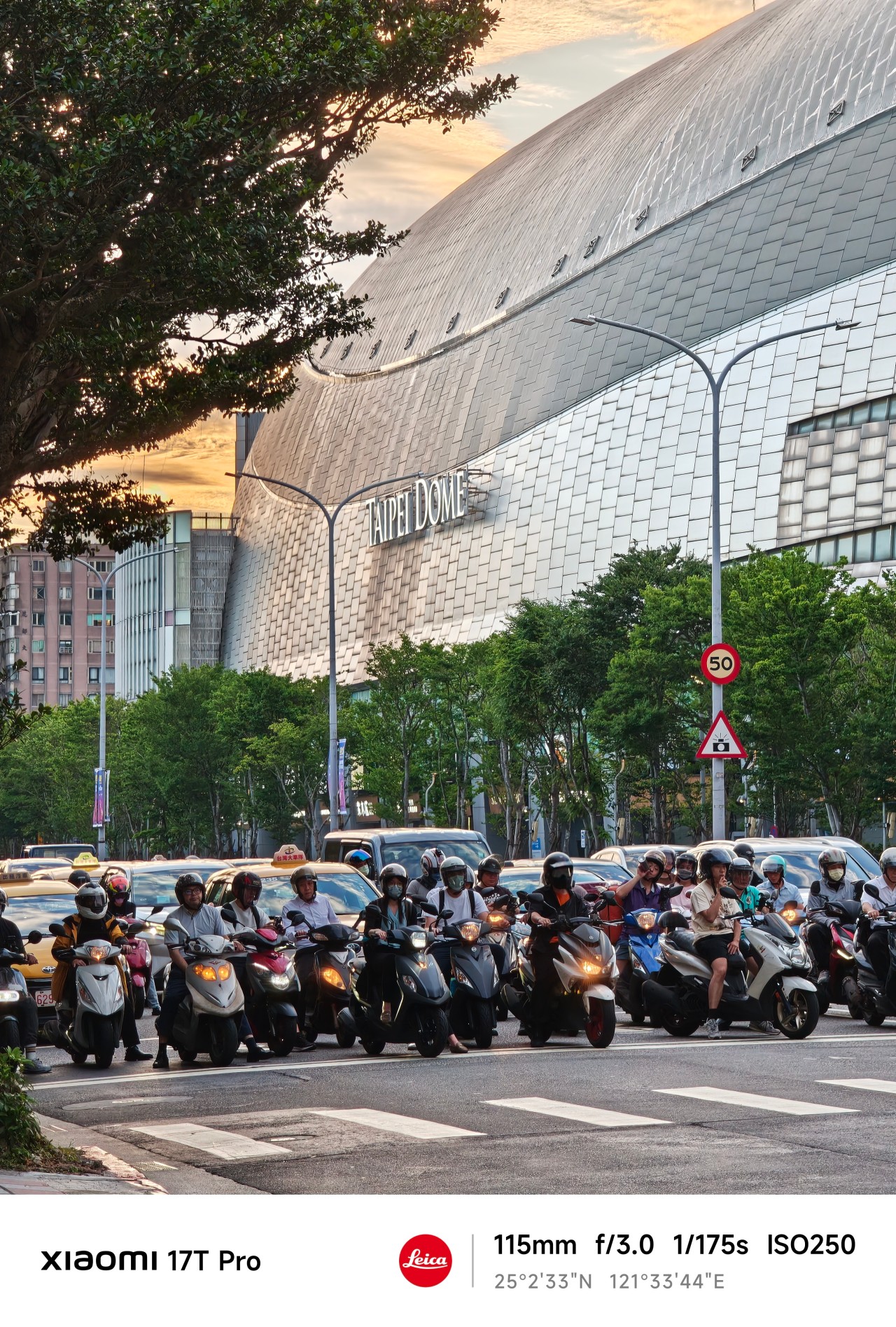
Now, one of its biggest highlights is a dedicated 115mm equivalent telephoto camera. The reality is that it might actually be all of those things at once.
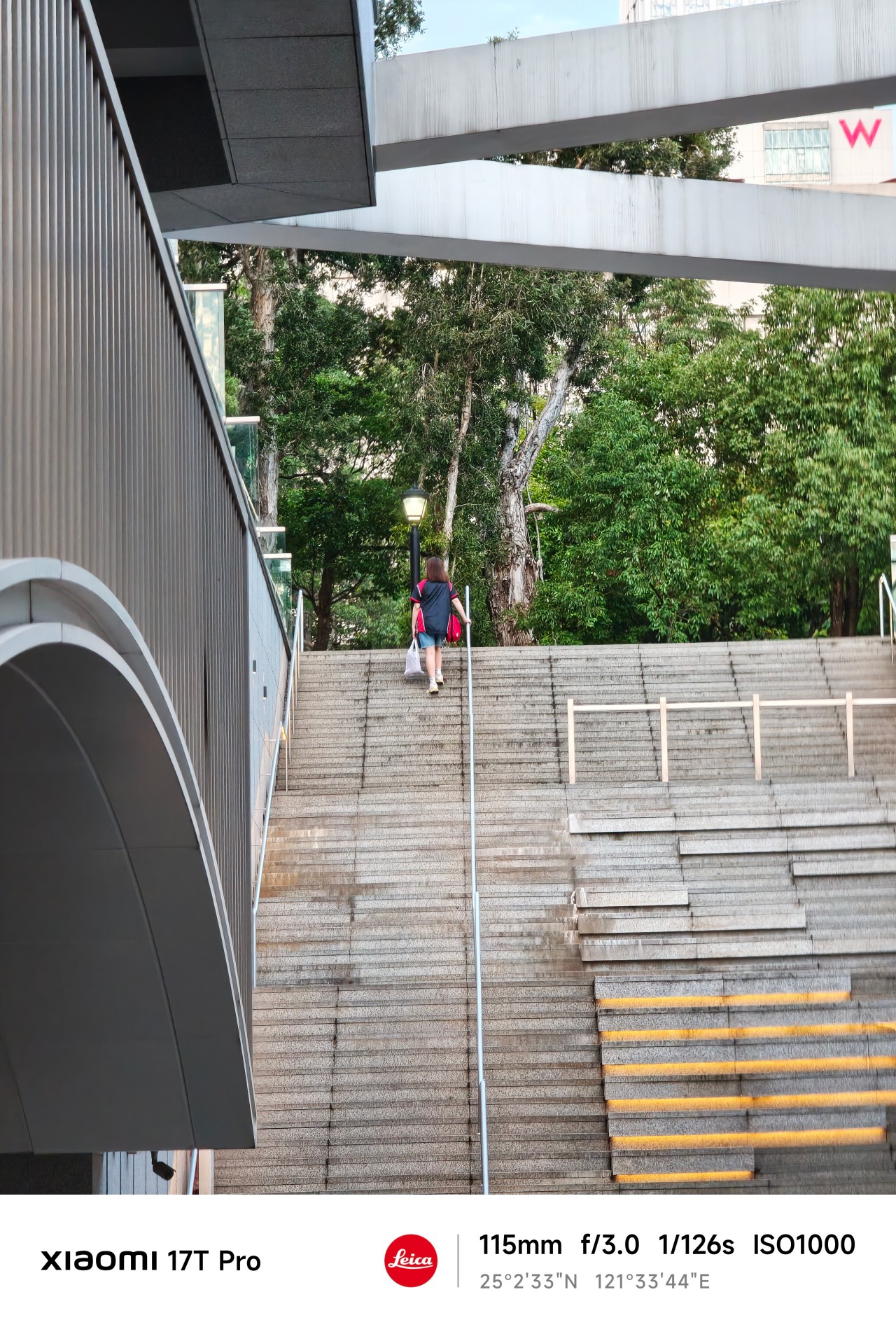
For this piece, however, I ignored almost everything else. I shot almost exclusively at 115mm.

No elaborate test plan, no checklist of scenarios, and no mission to prove a point. I simply carried the phone everywhere and photographed whatever caught my attention.
At first, I thought I was testing a camera. Eventually, I realized the camera was teaching me something instead.
Chasing
When the year started, I was certain about something. Or perhaps someone.
The conversations were easy. The banter felt natural. The possibility of something more lingered quietly in the background.
After a few genuine attempts, reality eventually became clear. This wasn’t going where I secretly hoped it would. I felt defeated.
But apparently, I wasn’t done learning yet.
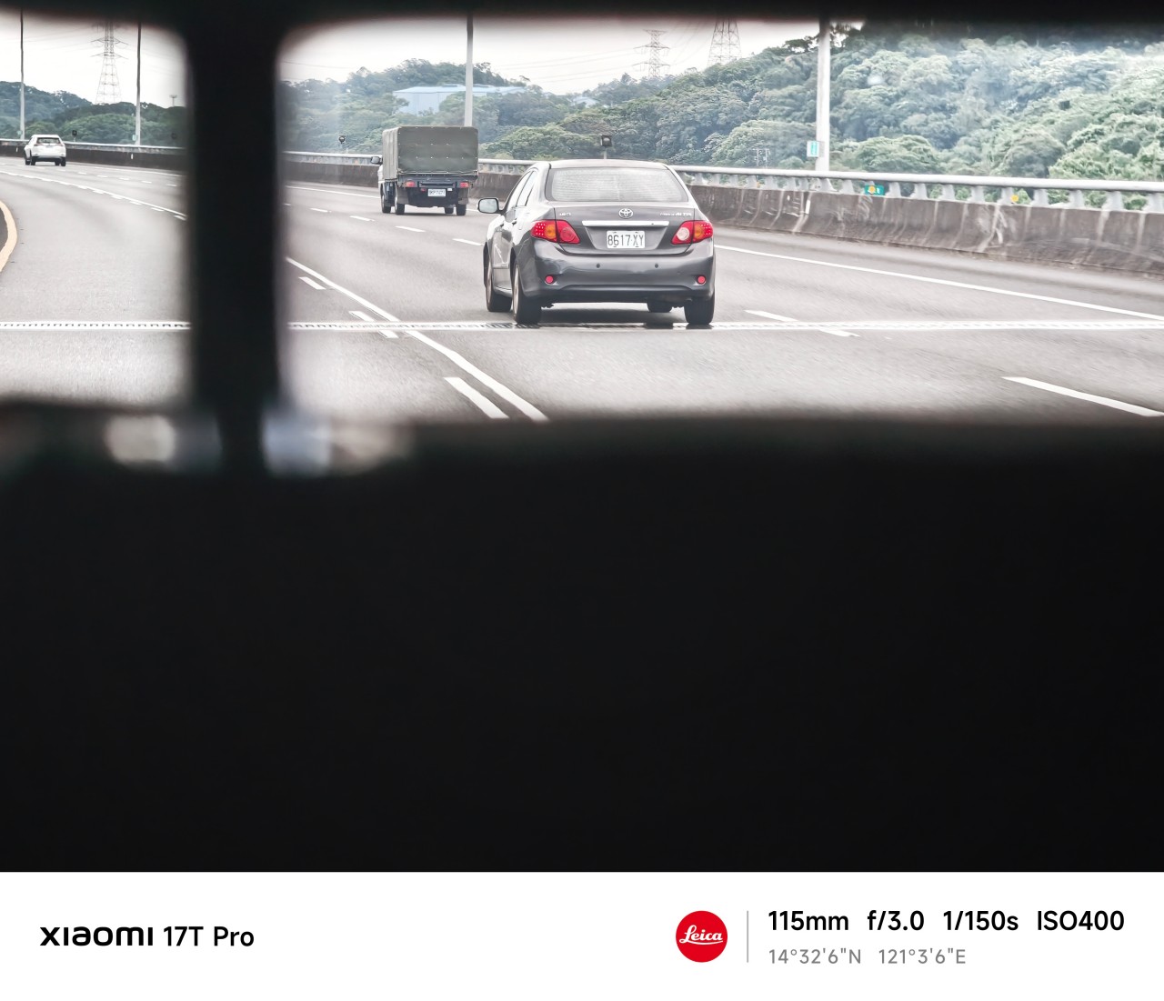
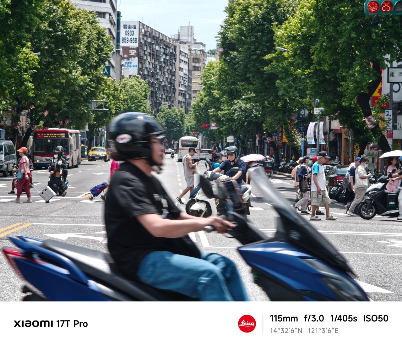
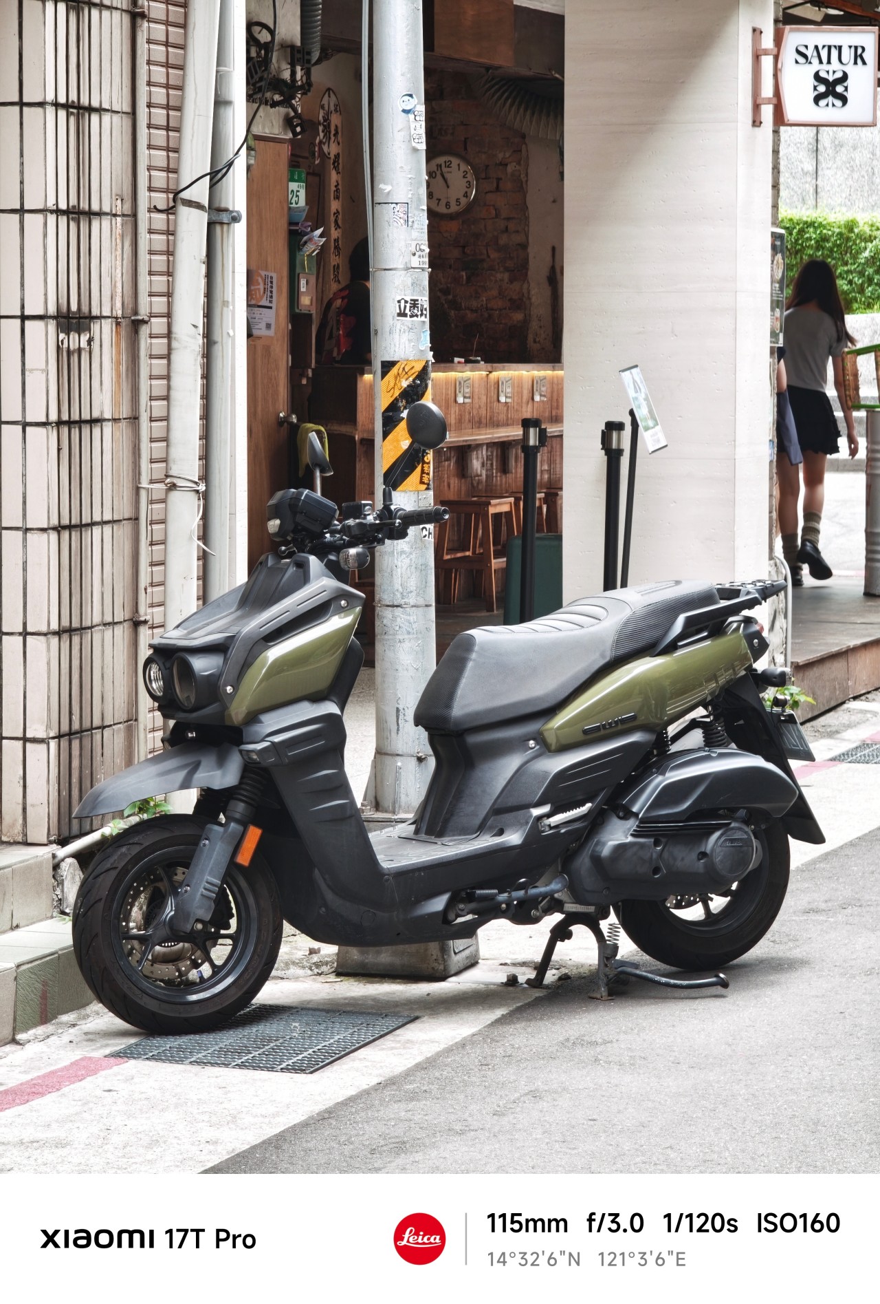
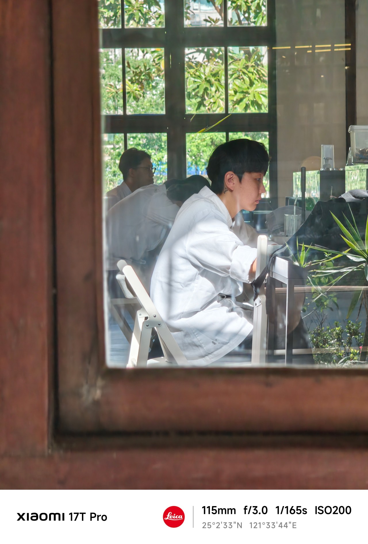
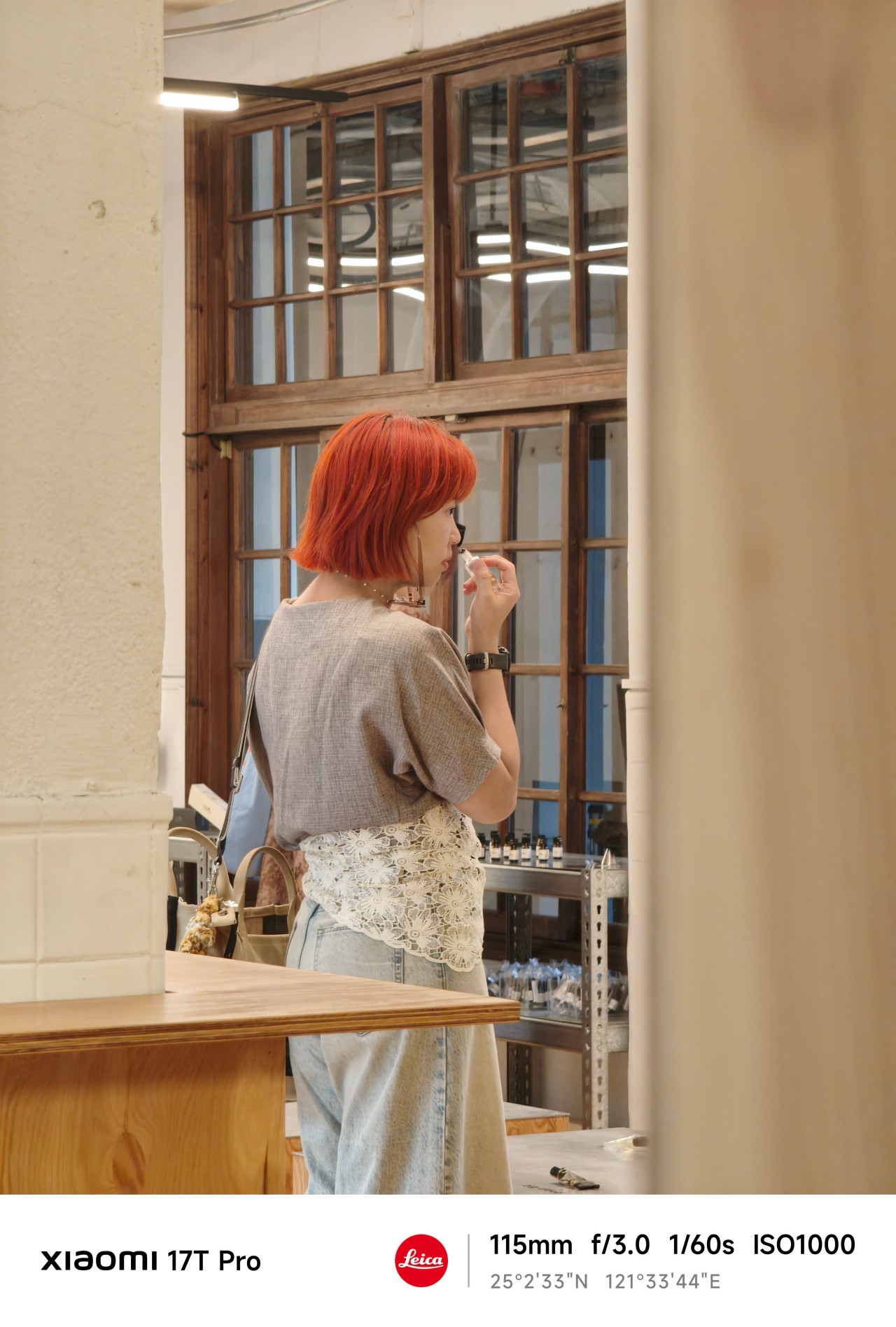
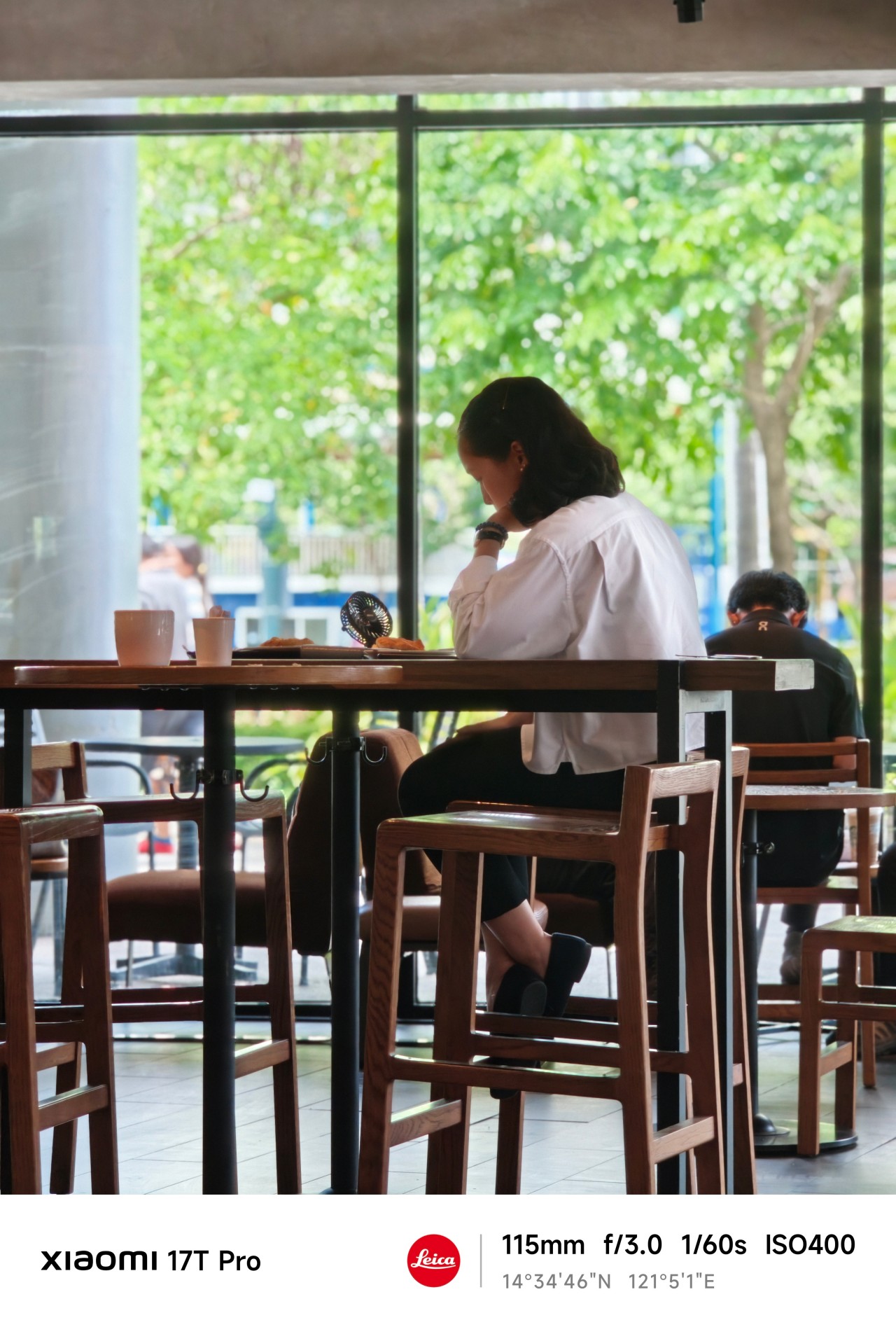
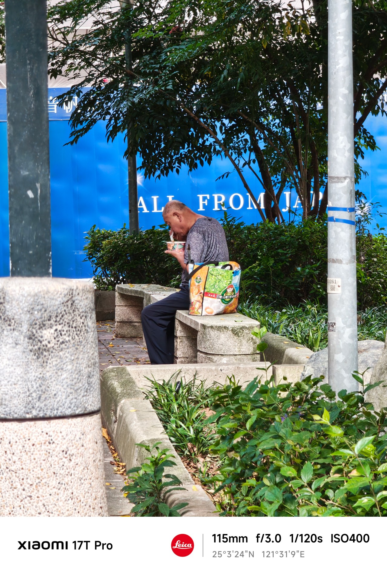
One thing I quickly discovered about shooting at 115mm is that distance changes how you approach a subject.
You cannot simply stand where you are and expect every shot to work. Sometimes you move. Sometimes you wait. And sometimes you accept that a moment isn’t yours to capture.
 The Xiaomi 17T Pro’s telephoto camera made those adjustments feel surprisingly natural. The focal length compressed scenes beautifully while still allowing me to isolate subjects from busy surroundings.
More importantly, it encouraged patience. Not every frame needed to be forced.

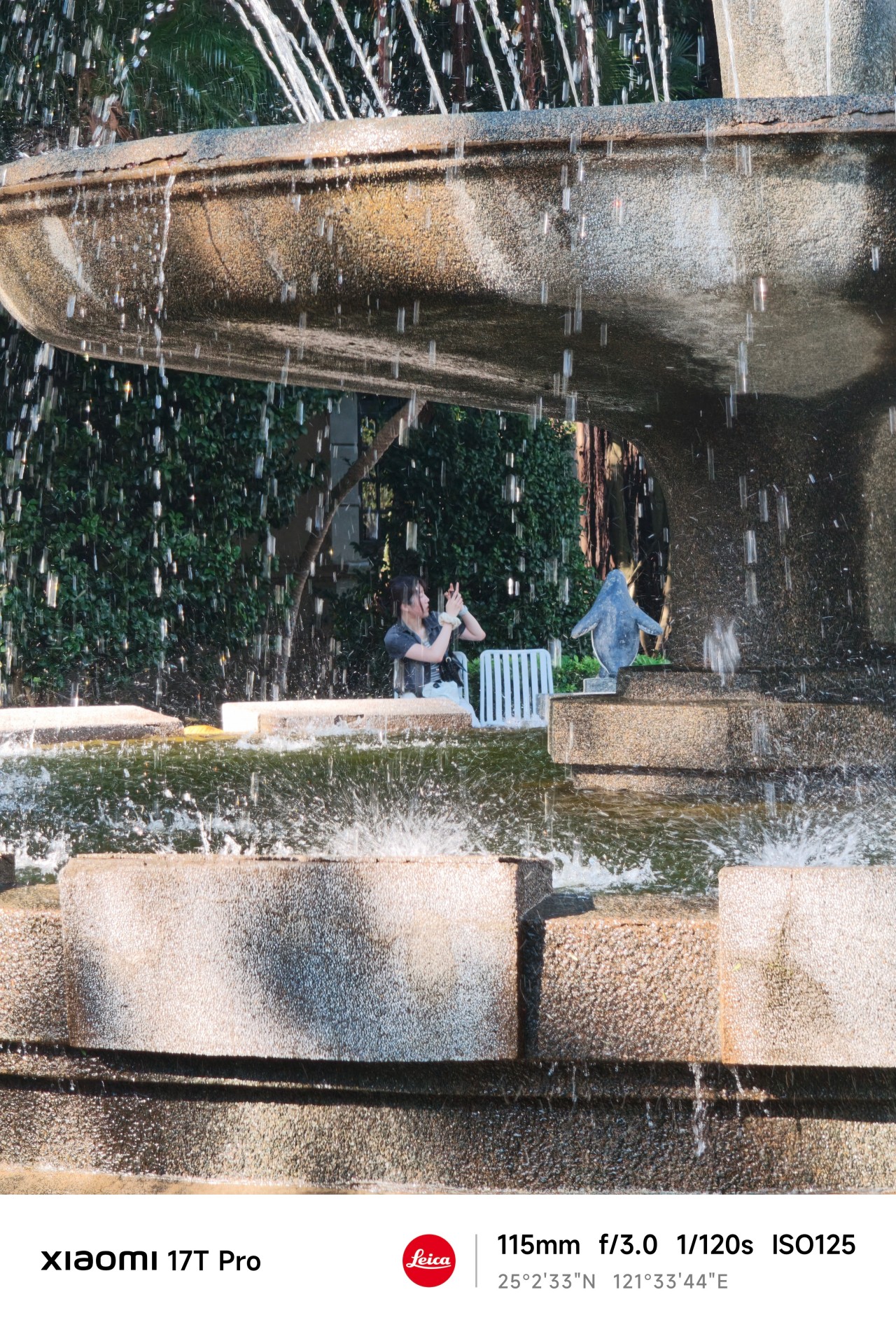
Blind projection
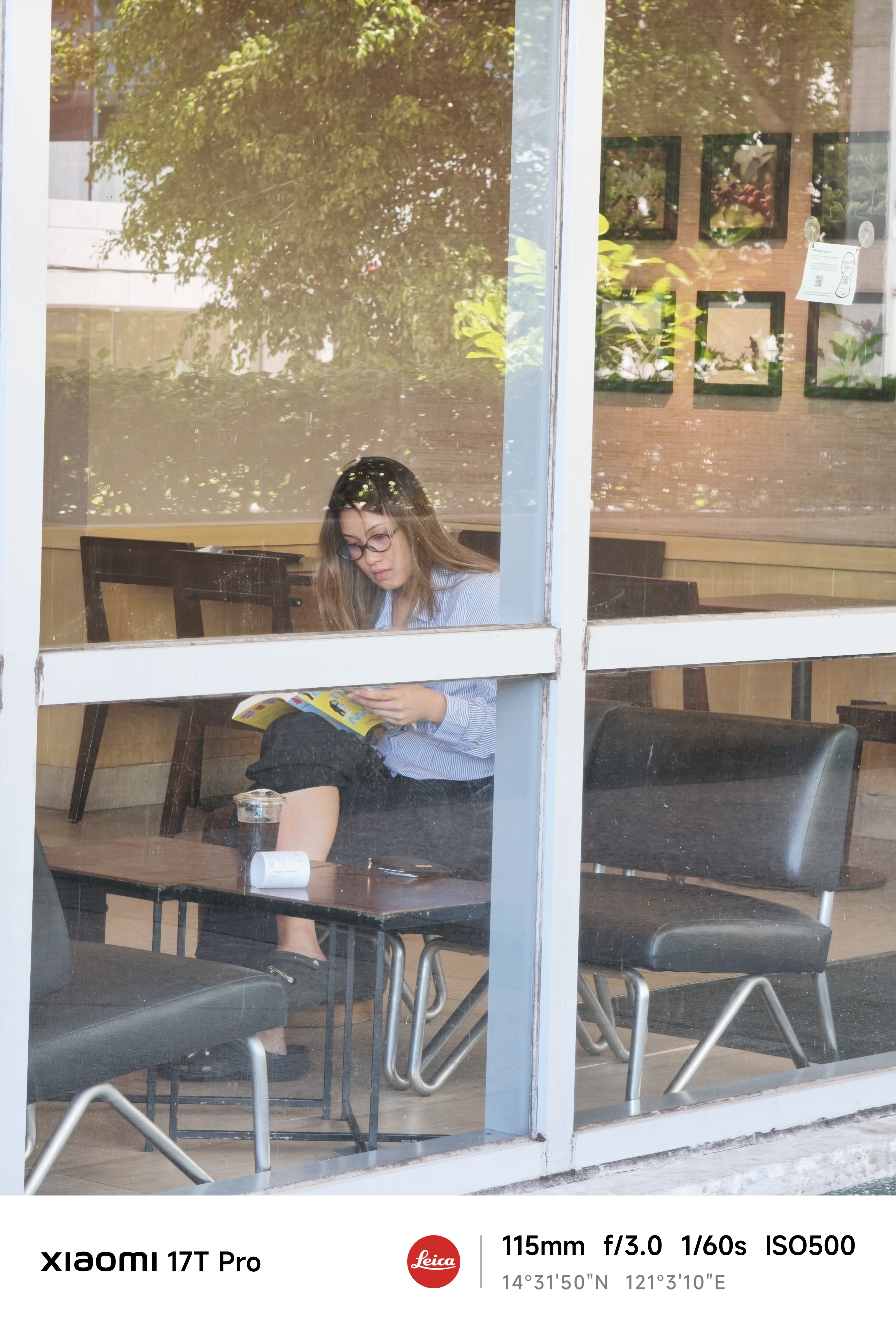
Waiting in the wings was another lesson entirely.
As a photographer, there are moments when something catches your attention immediately. A shape. A silhouette. A person. A scene.
 From a distance, it looks compelling.
The problem is that distance leaves room for imagination. Sometimes too much room. You think you know what you’re looking at. But you don’t.
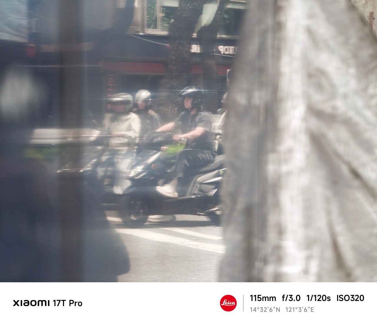 The more I used the 115mm lens, the more I appreciated how it could pull distant subjects closer while still leaving context around them. It gave me a cleaner view of things that initially felt obscured.

Yet photography has limits. A lens can reveal details. It cannot reveal meaning. That part still requires understanding what’s actually in front of you.
Generative longing
After some quiet reflection, I realized that much of what occupied my attention wasn’t reality at all. It was possibility. Potential.
Stories constructed from incomplete information. As it turns out, people aren’t the only subjects we do this to. Photographers do it all the time.

We imagine a frame before it exists. Then we convince ourselves the next corner might hold something extraordinary. And we chase moments that never arrive.
Sometimes they do. Most of the time they don’t.
The Xiaomi 17T Pro encouraged a different approach.
Instead of hunting for specific shots, I found myself roaming freely. Walking more. Observing more. Adjusting my position constantly to find a better composition.

After a few days, I stopped thinking about the lens itself and started understanding the space around me.
I knew how far to stand, what would fit into frame, and when a moment was worth waiting for.
The telephoto camera became less about zooming in and more about understanding my position relative to a scene.
And that’s when things started getting interesting.
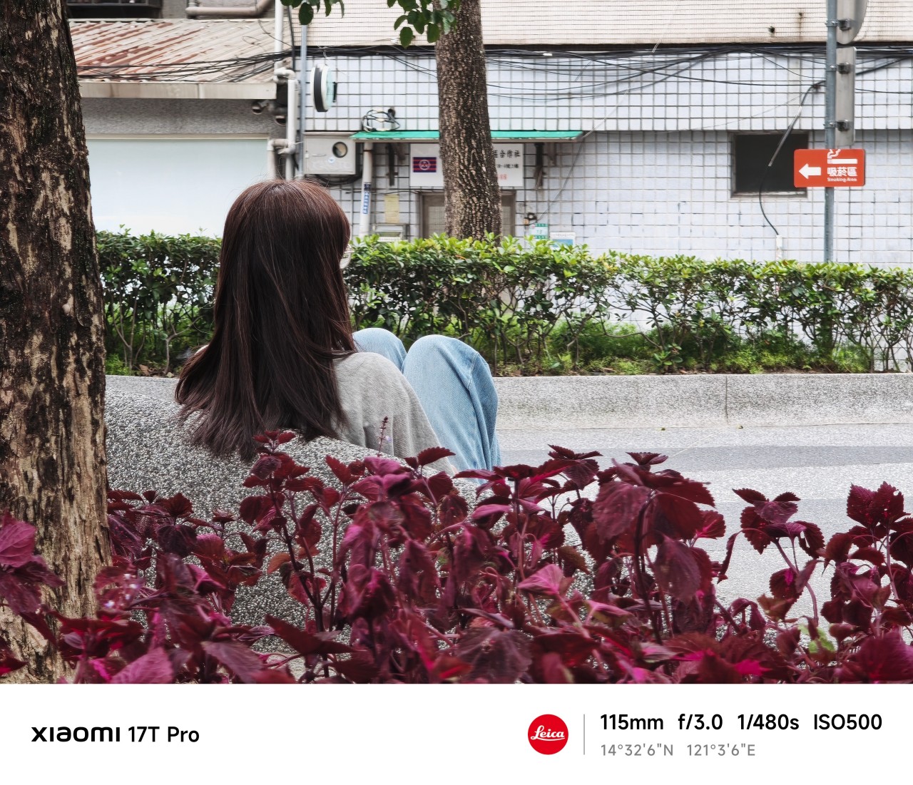
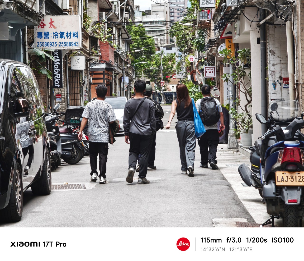
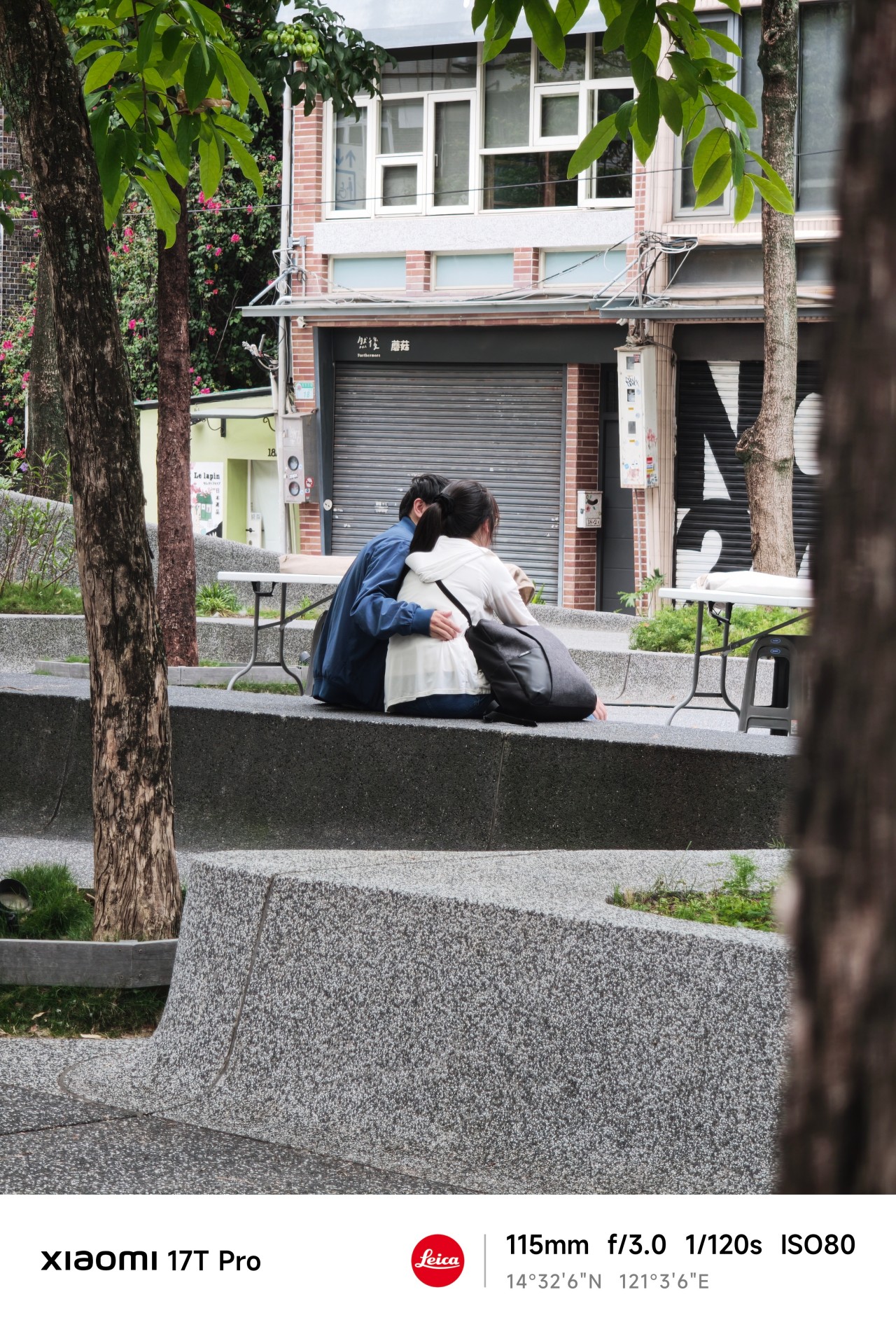
Close without crossing
Something unexpected happened while reviewing this gallery. There are more people here than in any collection of sample photos I’ve ever taken.
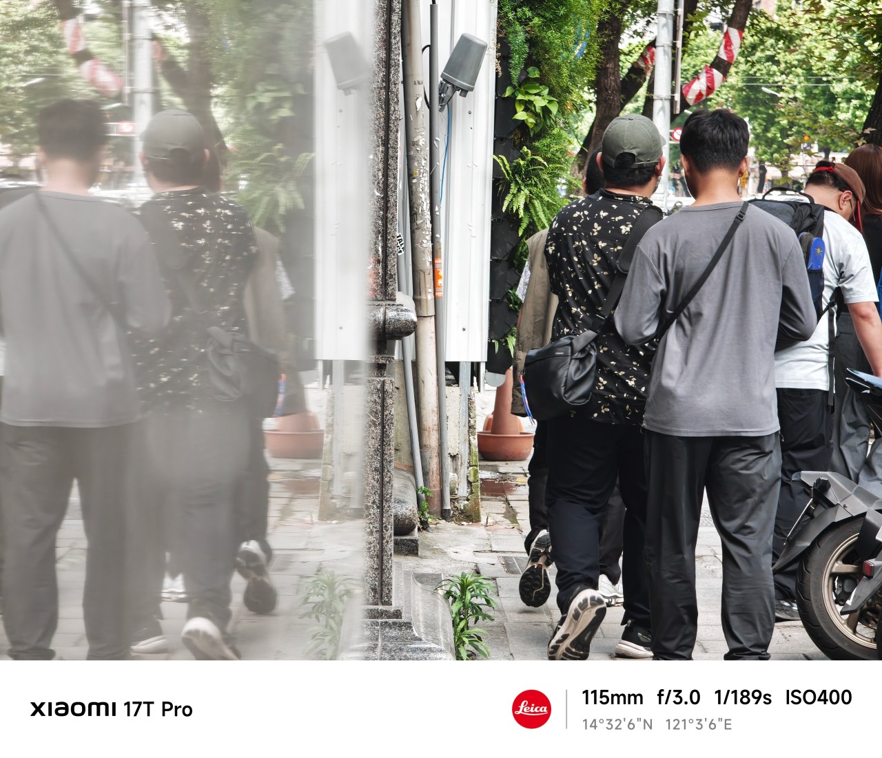
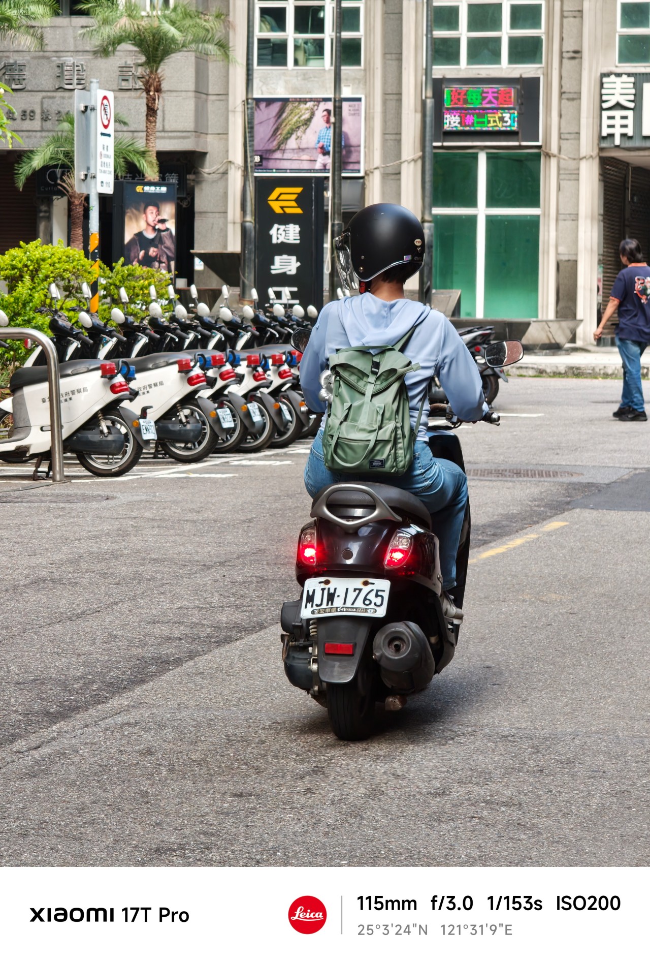
Normally, I avoid photographing people. I’ve always worried it feels intrusive. The telephoto lens changed that.
 The extra reach allowed me to observe moments without disrupting them. Most of the people here aren’t looking at the camera. Many are turned away entirely. They’re simply existing within their own space.
And perhaps that’s what fascinated me most.
After spending so much time chasing, projecting, and attaching meaning to things that only existed in my head, I found myself approaching photography differently.
There was no grand pursuit. No dramatic realization. No need to manufacture scenarios. I simply paid attention.
 Telephoto photography is often associated with distance. Over the last few weeks, however, it taught me something else.
Distance and closeness are not always opposites.
Sometimes maintaining a little distance is what allows a moment to remain exactly what it is. Sometimes stepping back helps you see more clearly.
 And sometimes the people, places, and experiences that matter most are not the ones furthest away. They’re already within view.
Shooting at 115mm taught me that keeping a little distance can be its own way of staying close.
Maybe that’s what this gallery ultimately became. Not a collection of subjects I couldn’t reach. Not proof of anything.
Just a record of moments I was fortunate enough to witness.
Health
Spring reset: Growing more at home with Auk Mini
From kitchen counter experiment to everyday habit
Spring and summer rolling around almost always makes me want to reset something in my routine.
A few years ago, it was growing broccoli sprouts in a jar. Getting the Auk Mini over Christmas felt like the natural next step.
From sprouts to something more
Starting with sprouts was easy. After having them at a family gathering, it clicked that I could actually grow something, even in our small apartment. Anyone, including my husband can do it on the kitchen counter, and upkeep takes less than a minute a day. Watching something grow and actually eating it made me realize how nice it is to have fresh greens around all the time.
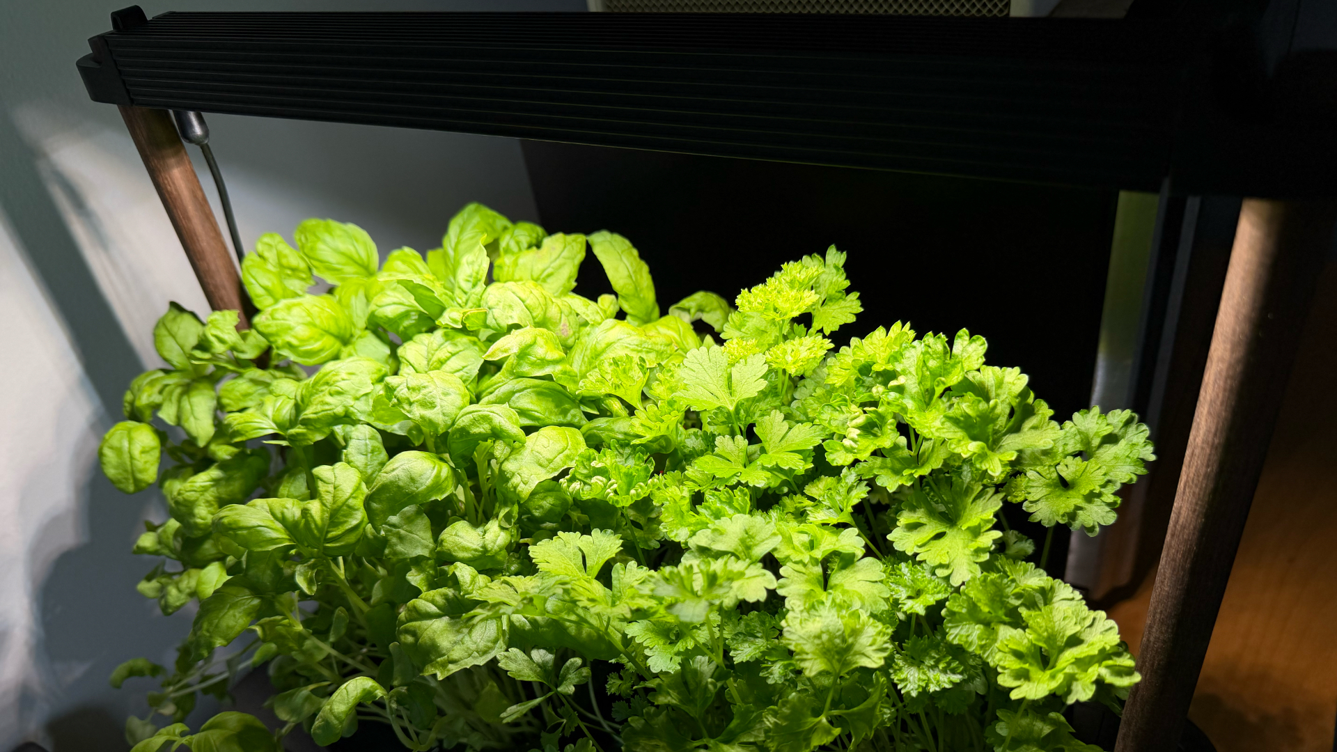
The Auk Mini builds on that. Instead of just one thing in a jar, now I have herbs growing consistently at home.
Getting started was easy
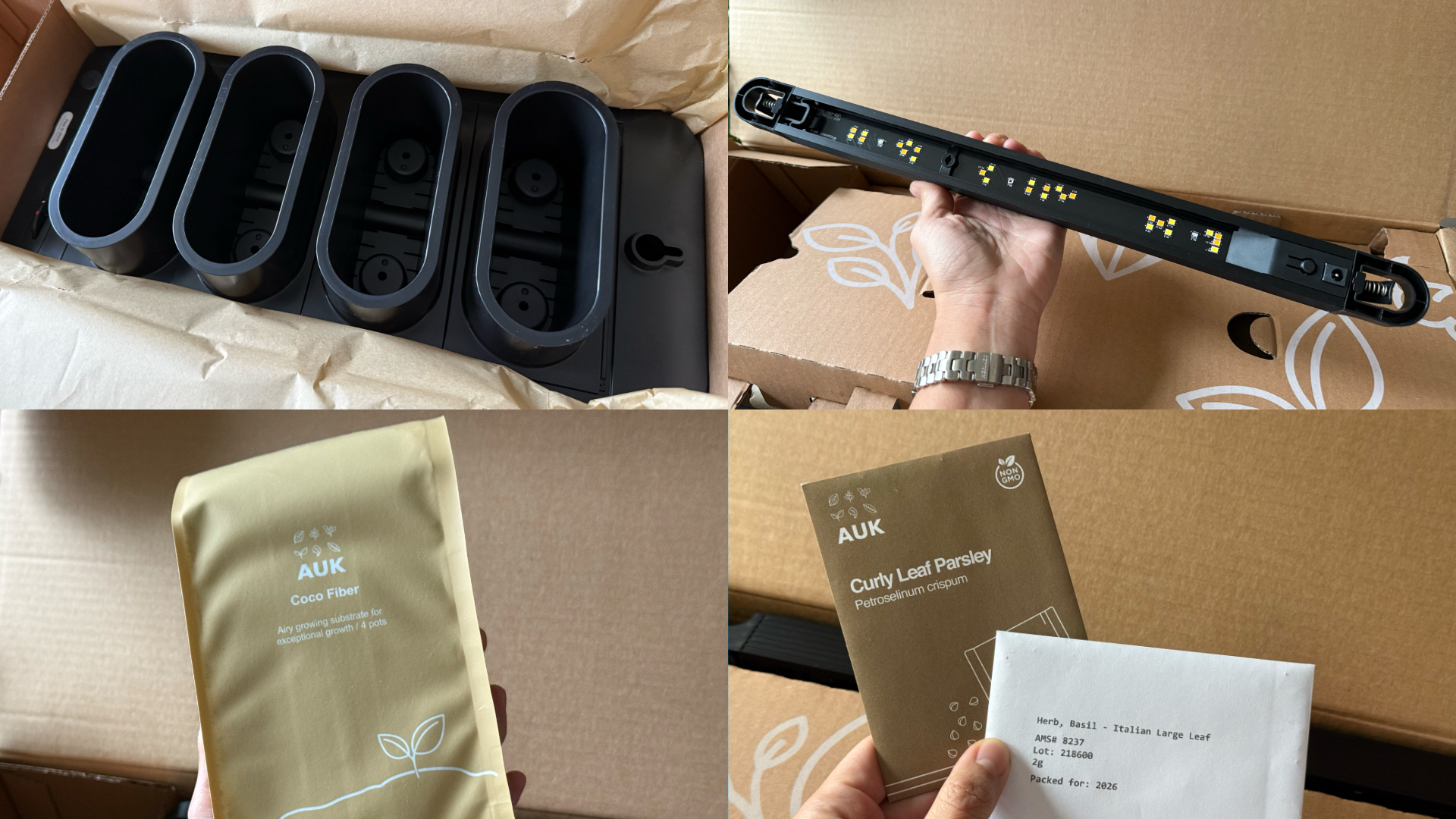
This was the part I was most unsure about, but it ended up being very straightforward. Setup took a few minutes, the instructions were clear, and nothing felt overly technical. The kit comes with everything you need to start: Auk Mini itself, seeds for planting, coco fiber, and nutrients that you add to the water to support both growth and flavor.
Once it’s up and running, it mostly takes care of itself. The lighting system handles what the plants need throughout the day, and the watering system keeps everything consistent. I have been away on trips, and I still come home to herbs that are healthy and fresh, waiting to be trimmed and added to my food.
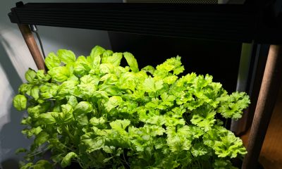
It fits real life and small spaces

Fresh herbs growing beside my microwave
Living in a New York apartment, space is limited. While there are community gardens I could participate in, it’s not as convenient as having access to your own, especially when you’re in the middle of a snowstorm or a heatwave.
The Auk Mini sits beside my microwave, on a table that used to be my desk. It doesn’t feel like I added a new project to my life – it just blends in. I have the black and walnut version, which works well with the rest of my space, but it also comes in white, with oak or cork as other finishes, if you want something lighter.
Watching and competing
My husband and I set it up together and turned it into a challenge: who would harvest first?
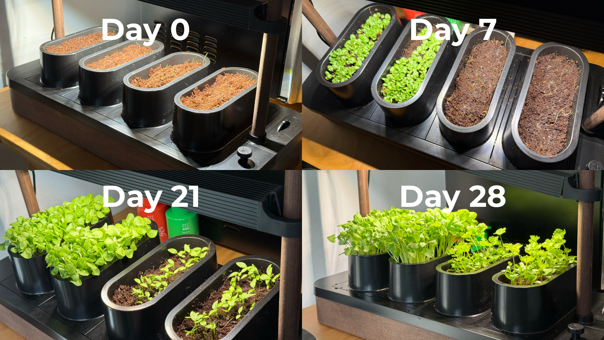
Our kit came with basil and parsley. He planted basil, which sprouted first. I took on parsley, which grew much slower and wasn’t ready for harvest until a little over six weeks later. The competition was a small thing, but it made the whole process more fun. We started paying attention to growth day by day, and it’s satisfying when you finally get to use what you grew.
One thing we learned pretty quickly is that different plants grow at different speeds, which can make lighting placement a little tricky in a shared setup like the Auk Mini. Since the basil grew faster and taller, we had to angle the light unevenly so it wouldn’t burn the basil while still giving the parsley enough exposure to catch up.
It changed how I use herbs
Basil and parsley used to be something I added as garnish. Now I’m using them all the time because they’re right within arm’s reach.

Learned to be creative and made pasta from scratch, made better with fresh herbs
I’ve been making sauces, marinades, pesto, even building meals and cocktails around them. It’s expanded the flavors we use in home cooking, and forced me to experiment instead of defaulting to our go-to recipes inspired by East Asian cooking. In fact, the biggest hurdle I’ve encountered is not having enough recipes in my repertoire that use herbs.
Even when a dish doesn’t call for it, I’ll cut some and add it anyway. Every time I did, it made the dish better. When something is always available and always fresh, you naturally start using more of it. And if you trim it properly, it just keeps growing back. It doesn’t go bad or get forgotten in the fridge.
You can grow anything you want
One of my favorite things about Auk Mini is that it’s not a proprietary system. They do offer other kits like a chili and tomato set or an Italian cuisine mix, but you can also grow your own choices.
I joined a Facebook group of Auk growers, and it’s been inspiring to see how others are using and expanding their indoor gardens. It makes me excited to try things that are harder to find or expensive in the U.S., especially vegetables and herbs I grew up with, like pechay, moringa, lemongrass, pandan, and kangkong.
A small step toward something bigger

Constant fresh herbs within reach
Growing herbs indoors reminds me of something from years ago. In university, I did an immersion program in a low-income community. We recommended sustainable food systems for the stay-at-home moms we met — including hydroponics systems — both as a source of extra income and fresh food.
That experience stayed with me, but I never acted on it. This feels like a small, techie version of that idea: a hydroponic system that works in real life, in a small space, and is easy to keep up with.
Is the Auk Mini your GadgetMatch?
Starting with sprouts showed me I could easily grow something. The Auk Mini showed me I can keep going and expand it. Now I have fresh greens ready whenever I need them.
It starts at $259, which isn’t the cheapest way to get into hydroponics. If you don’t use herbs on the daily like I do, the cost is even harder to justify. But that’s also why I recommend it even more. It’s convenient, it’s fresh, and at the same time it challenges you to be more creative with food.
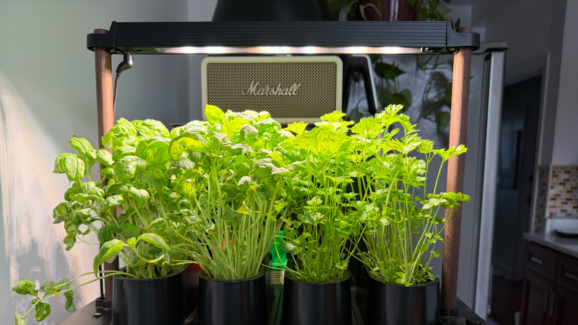
Basil and parsley keep growing in the Auk Mini after multiple harvests
Auk Mini’s ease of setup and maintenance, and flexibility make it worth it, especially if you don’t know where to start. It was a great hobby to start the year with, and an even better habit I’ve kept building on five months on. It’s given me confidence I can grow my own food for the rest of my life, one way or another.
Editor’s Note: Since this article was first published, Auk has updated the name Auk Mini to Auk Mini 1. They also announced the Auk Mini 2, currently on preorder starting at $199. This newer model has a smaller footprint, redesigned lighting, new colorways, and the ability to use larger plant pots.
Accessories
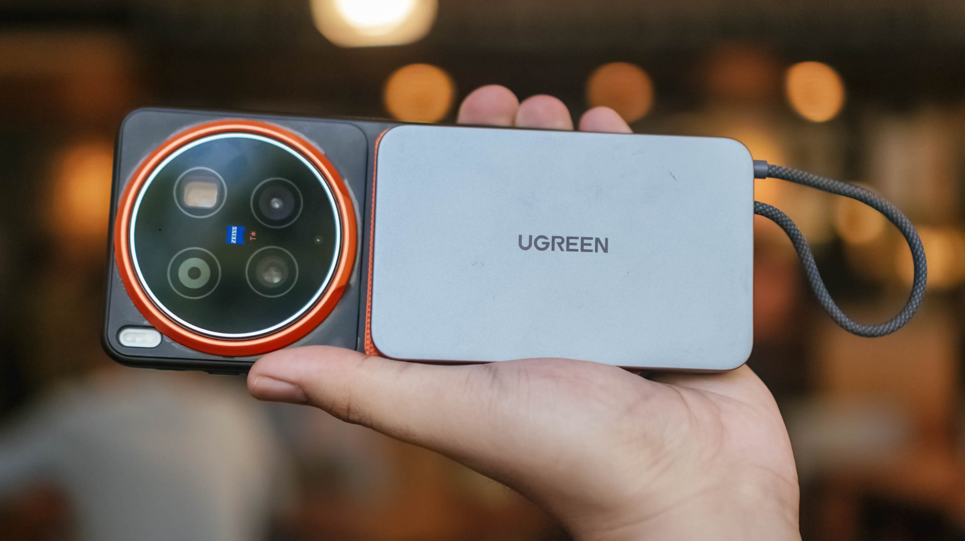
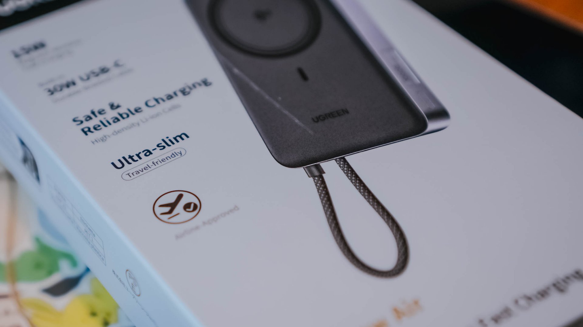
UGREEN MagFlow Air review: Airy Yet Mighty
Slim and light power bank with a strong suit and core
Power banks (or battery packs on the other side of the world) have gone through loops of ups and downs.
While it’s ever-popular for juicing up smartphones and several devices in a pinch, it’s also notorious for making you flinch whenever your airplane’s overhead bin blows some white smoke all of a sudden. Or worse: engulfing flames when left unattended.

But, with the advent of bigger yet slimmer (and safer) batteries this 2026, it’s hard not to wonder and ponder when such tech will arrive in power-packed accessories most of us use.
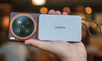
Very, Very Airy
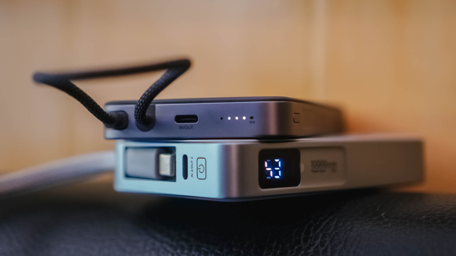
For a refresher, UGREEN launched the MagFlow series not too long ago. That’s specifically eight months from the time of this writing.
One of its standout features is its LED display. Removing that feat with some running on the treadmill gives you a power bank that managed to shed some weight and trim down its waist.
Thus, the UGREEN MagFlow Air truly stands out on the show floor.
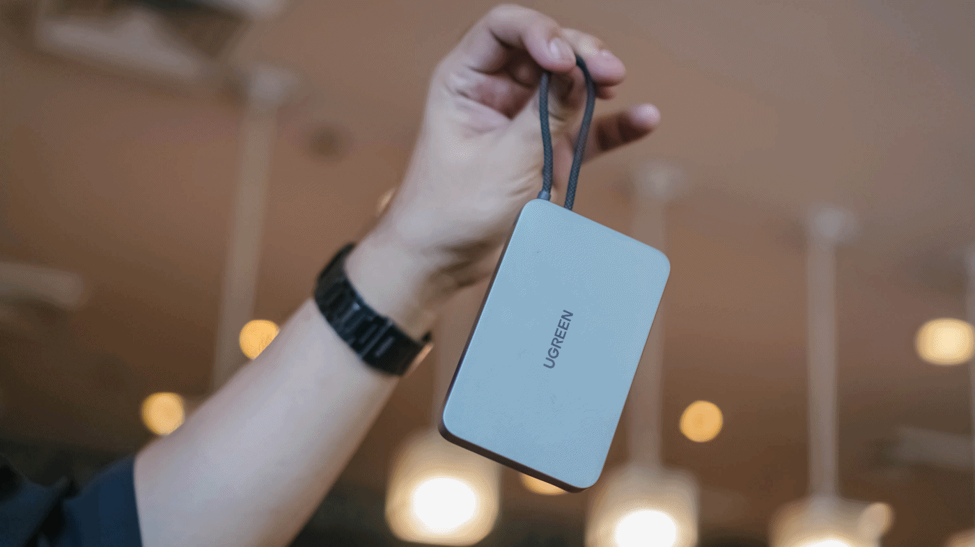
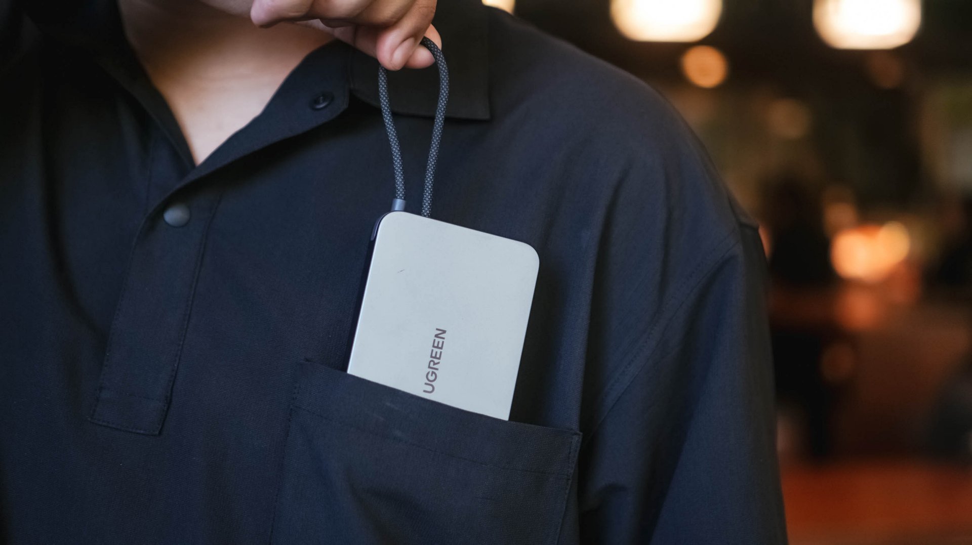
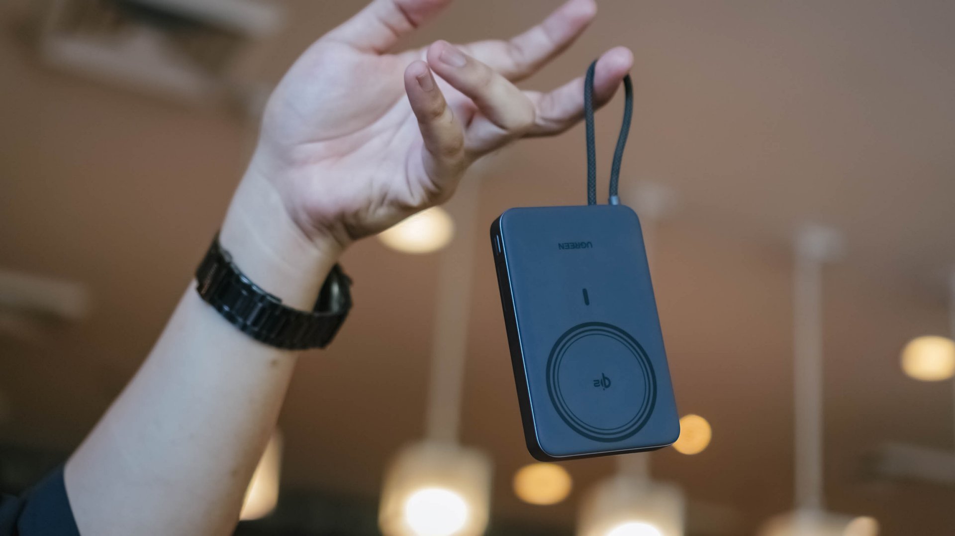
By the numbers, UGREEN’s MagFlow Air takes it to the next level with its 13.9mm slim chassis and 213 grams of feather-lightness.
The regular MagFlow, on the other hand, is heavyweight at 254g and oh-so-juicy-thicc at 21mm.
I even tried putting the new model up against UGREEN’s first-gen MagSafe power bank I personally bought from 2023. My OG power bank was still thick at 19mm and weighed as much as 235 grams.
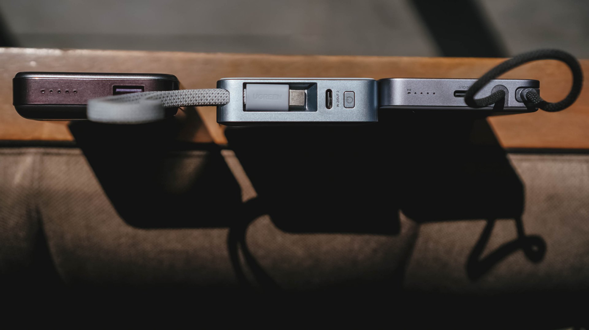
Visual differences aside, I’ve held it enough to say the size and weight differences were truly felt from every inch within.
But at what cost?
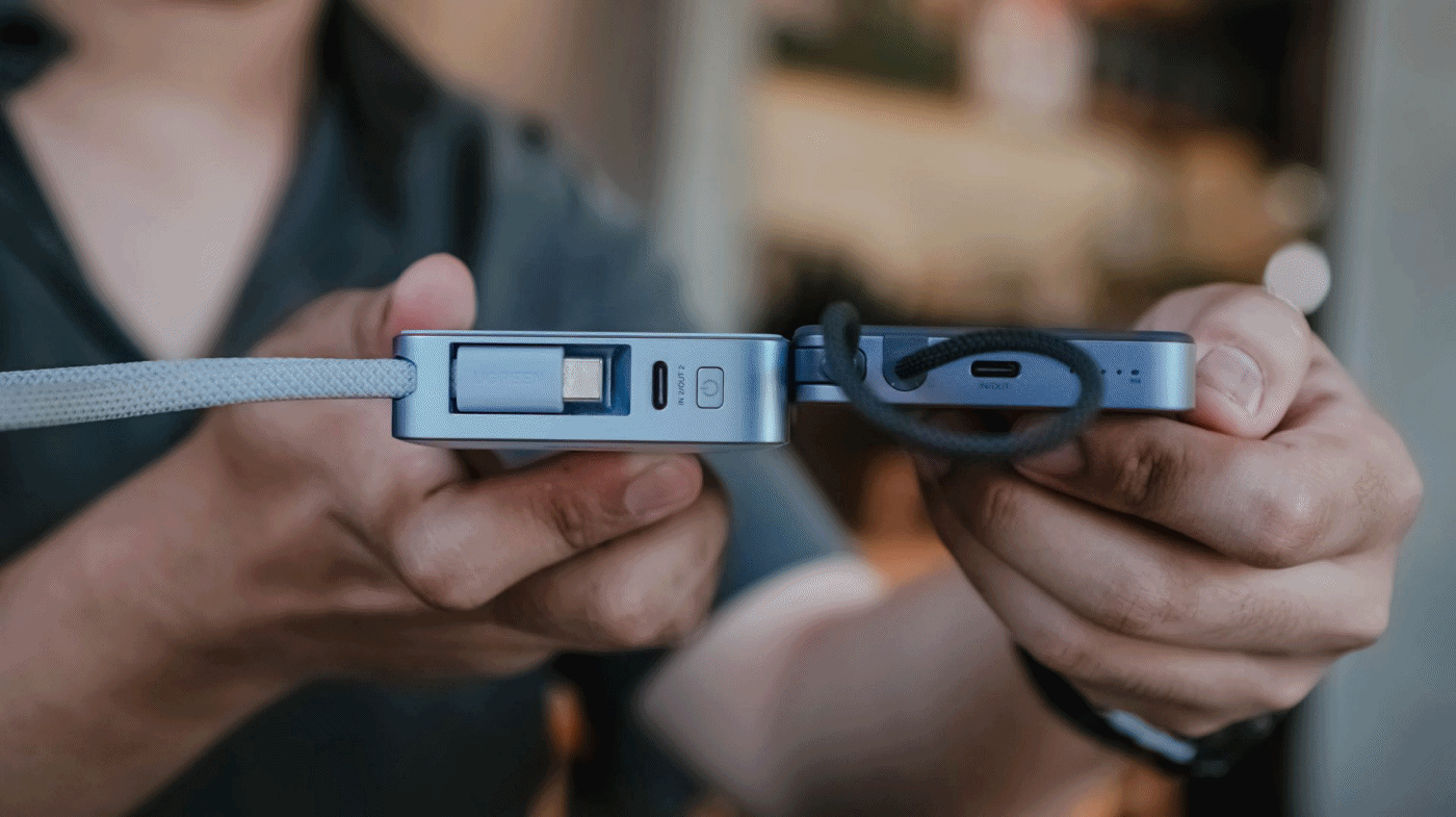
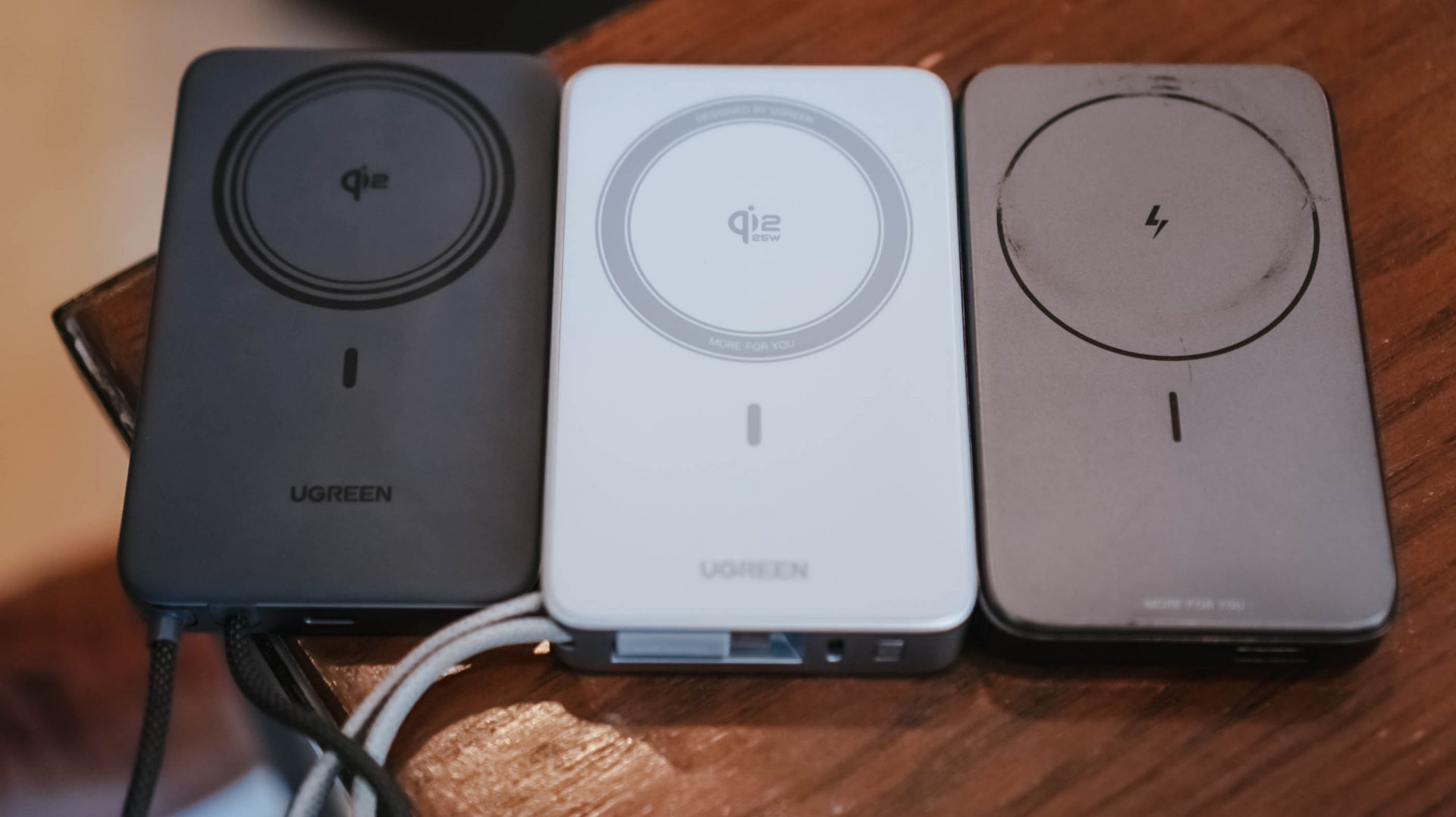
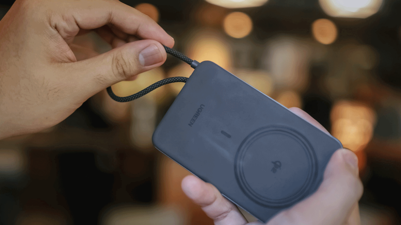
Just like its THICCer brother, the UGREEN MagFlow Air shares the same Qi2 wireless charging standard alongside the inclusion of Apple’s legendary MagSafe feature.
But, to achieve its thinner and lighter form factor, UGREEN clearly needed to make some sacrifices.
MagFlow Air vs MagFlow vs PB206
First and foremost: its wireless charging capabilities.
The first MagFlow power bank boasts as much as 25W wireless charging speeds. That has been downgraded to just 15W wireless in the newer MagFlow Air.
And another: the removal of its special LED display. This hinders possible buyers from checking if it actually fast charges one’s device.
Although some users prefer it, others don’t. It’s something that ends up on the buyer’s priorities at the end of the day.
Which further brings me to my extensive charge tests and how I tried conducting it.
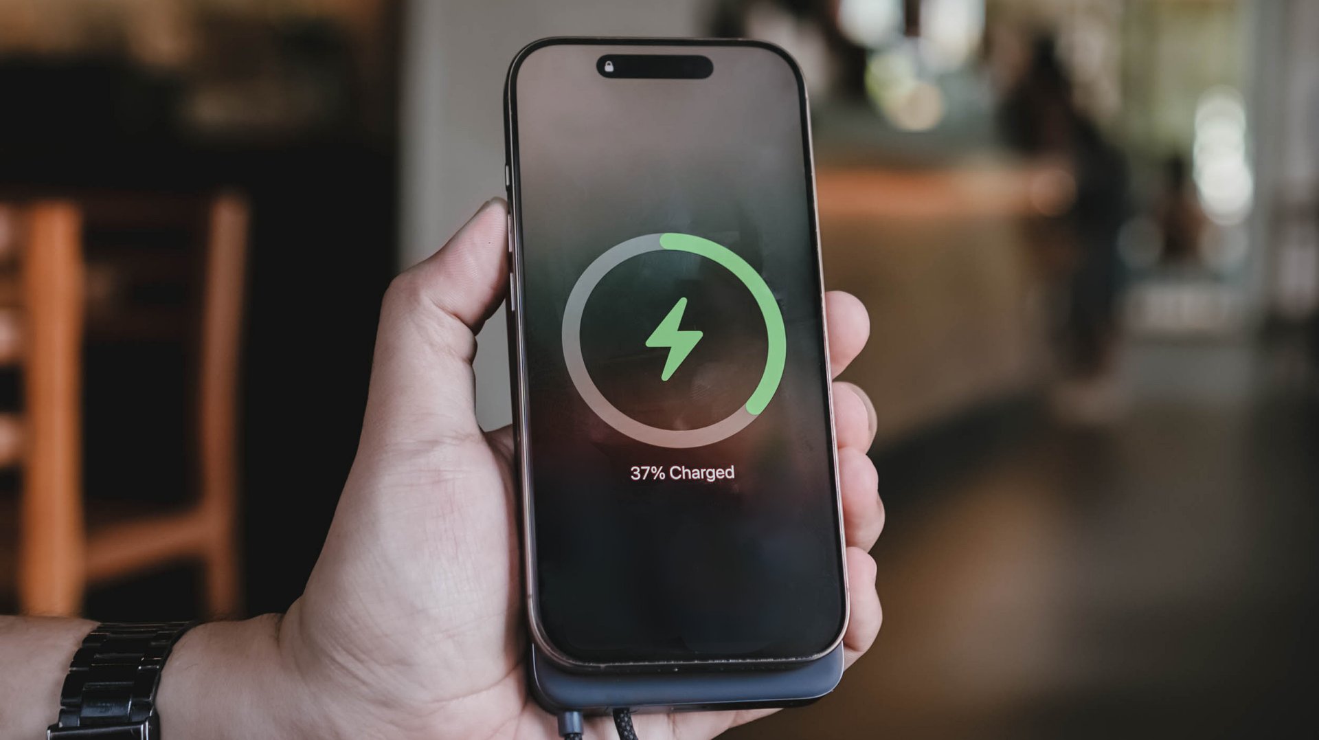
Feel that fill
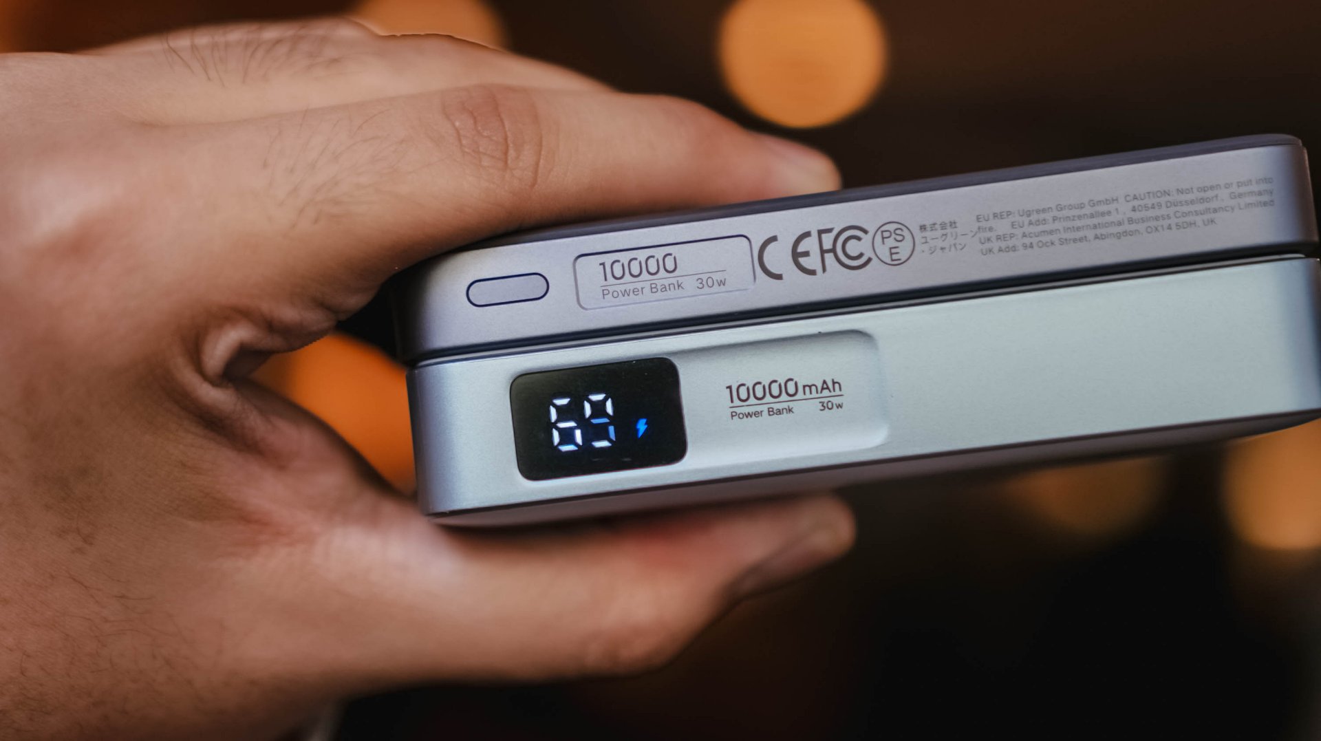
With the absence of that dedicated display, knowing the power bank’s overall charge status relies on the conventional 4-bar indicator.
While percentage accuracy is clearly impossible, it didn’t hinder me from conducting my GadgetMatch Charge Test.
With my smart watch timer and dedication on keeping tabs with the power bank’s actual battery level, the test was still a success.
UGREEN claims this 10,000mAh power bank can be charged up for around two hours.
I am not sure what type of charger and cable UGREEN used for their test. On my end, I used two of the most extreme combos I have with me.

First, their very-own UGREEN 100W Uno GaN charger paired with ADATA’s magnetic USB-C to USB-C cable that supports Qualcomm’s Quick Charge (QC 3.0) speeds.
For another, vivo’s newest 100W FlashCharge adapter — now with a better USB-C port (instead of USB-A).
UGREEN 100W Uno + ADATA
|
vivo 100W FlashCharge +
|
|
START TIME (from 0%) |
1:57PM |
3:15PM |
1 bar |
approx. 45 minutes |
approx. 50 minutes |
2 bars |
approx. 1 hour 5 minutes |
approx. 1 hour 5 minutes |
3 bars |
approx. 1 hour 20 minutes |
approx. 1 hour 20 minutes |
4 bars |
approx. 1 hour 30 minutes |
approx. 1 hour 30 minutes |
END TIME (Full Bar 100%) |
4:18PM
|
6:02PM
|
While UGREEN did not explicitly specify if it’s exactly a two-hour charging time, these results prove that you can fully fill the power bank to the very brim as long as you got the fastest chargers and cables around.
Power up to the top
My extensive charging benchmarking doesn’t end there.
Just like any other power bank in the market, smartphones are also built different. While flagships lead the race in having the best charging speeds possible, modern-day midrangers barely feel “mid” now especially with their behemoth battery tanks.
For the most objective yet inclusive test possible, I’ve decided to use the MagFlow Air and its built-in USB-C cable to charge two phones from my stash: the all-new vivo X300 Ultra and the TECNO POVA Curve 2 5G.
ICYMI, vivo’s X300 Ultra boasts a 6600mAh Si/C battery that supports speedy 100W wired FlashCharge speeds.
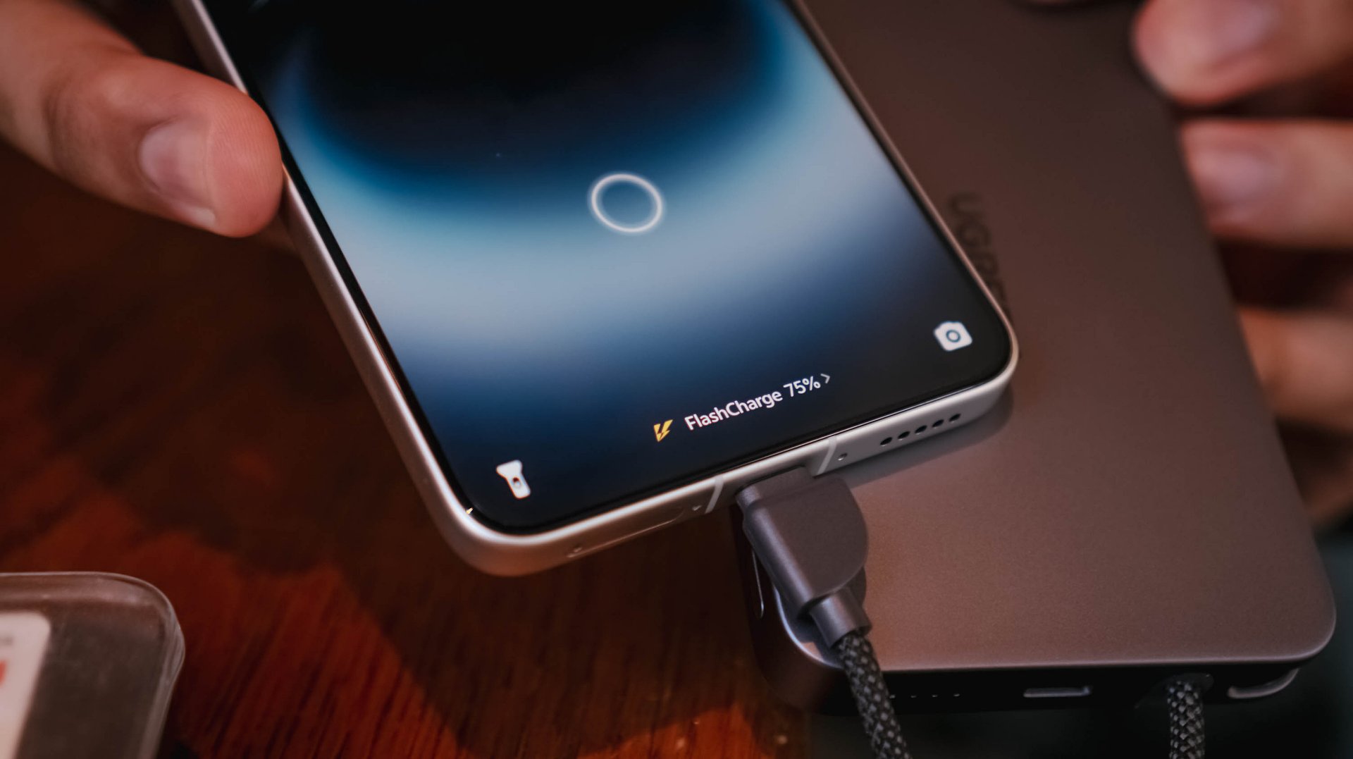
However, that’s not just limited to its bundled charger and cable. Thanks to a leveled-up USB-C PPS protocol, I was able to maximize its charging speeds even with just MagFlow Air’s stationary body cable.

On the other hand, the TECNO POVA Curve 2 5G has a gargantuan 8000mAh battery. Albeit, slower charging at 45W with the absence of PPS.
That said, my test shows differences affect overall charging time.
vivo X300 Ultra
|
TECNO POVA Curve 2 5G
|
|
START TIME (from 0%) |
4:54PM |
3:53AM |
5 minutes |
5% |
2% |
10 minutes |
13% |
8% |
15 minutes |
20% |
17% |
30 minutes |
47% |
21% |
45 minutes |
68% |
31% |
60 minutes |
96% |
40% |
75 minutes |
– |
46% |
90 minutes |
– |
53% |
120 minutes |
– |
72% |
150 minutes |
– |
88% |
END TIME (100%) |
4:18PM
|
6:43AM
|
Status Bar Indicator |
1 battery bar |
1 battery bar |
Moreover, this not only proves how fast and sturdy the built-in USB-C cable of the MagFlow Air is. It was also able to live up to its 10,000mAh battery capacity with both tests being able to keep one (1) battery bar alive and kicking.
Of course, using the USB-C port (given you have the right type of cable) can supply your phones and other devices as much as 30W of maximum charging output.
1-bar wonder?
As preluded to earlier, knowing the actual charge of the power bank after using it was never possible at all. Still, that never stopped me from trying to use it even under such a silly circumstance.
vivo X300 FE
|
vivo X300 Ultra
|
|
START TIME (from 0%) |
11:55AM |
1:45PM |
5 minutes |
1% |
7% |
10 minutes |
2% |
– |
15 minutes |
4% |
– |
30 minutes |
10% |
– |
45 minutes |
20% |
– |
FINAL PERCENTAGE |
27% |
8% |
Power bank dead after |
59 minutes |
7 minutes |
With that 1-bar left. it’s nothing but a guessing game. A battle against your anxious mind if it will actually help charge up your device or not.
This is also another testament that wired charging standards and protocols also matter as much as the charging cables and bricks we are also using for our power banks.
Safety is a HUGE priority
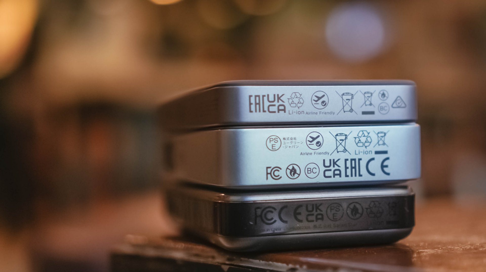
If you worry about bringing this in your upcoming trip, the UGREEN MagFlow Air is definitely allowed when you board your airplanes with its “airline-friendly” or “travel-friendly” mark.
My only cause of concern: Despite the brand originating in Mainland China, they still don’t put that much-needed CCC (triple C) Certification. Personally, this affected my work trips last year going to China.
Not being able to bring any certified power bank made me struggle — especially as someone who uses my phone as the main device when taking snaps and stills while still being connected to the internet via foreign SIM card (and/or eSIM).
Hopefully, UGREEN will secure all needed safety standards and certifications for it to be deemed as a “travel-friendly” power bank.
That said, even without China’s strict regulation against portable power packs, UGREEN’s multiple safety protections still make it a safe product to use whenever you’re out and about.
More so, that ThermalGuard feature that intelligently controls the overall temperature of the power bank when being used. A clear sign that it regulates heat caused by charging even in prolonged usage periods.
And now that we’re already at it, this is a friendly reminder not to use unauthorized third-party chargers and/or cables.
As much as you want your power banks, phones, and other devices to be safe from unsolicited battery blowouts, you should also be able to invest on authentic power adapters and charging cables that won’t harm or degrade the MagFlow Air.
Is the UGREEN MagFlow Air your GadgetMatch?
With a price of US$ 79.99, UGREEN’s MagFlow Air is definitely a power bank (or battery pack) worth considering and purchasing.
Without an ounce of doubt, the UGREEN MagFlow Air is a solid Super Swipe and deserves the GadgetMatch Seal of Approval.

If you’re not being too nitpicky about the lack of a dedicated status display or the slower 15W wireless charging speeds, the MagFlow Air is still as powerful as its MagFlow brother alongside other power banks in the same league.
While it’s overall slim and light, it still has a strong suit and core that makes it a must-have accessory to bring — especially if you’re the type who lugs, roams, or travels out a whole lot.

Close without crossing: A Xiaomi 17T Pro photo essay
Distance and closeness are not always opposites.

Spring reset: Growing more at home with Auk Mini
From kitchen counter experiment to everyday habit

UGREEN MagFlow Air review: Airy Yet Mighty
Slim and light power bank with a strong suit and core

Nintendo officially announces Ocarina of Time remake

Apple has essentially confirmed the launch of the iPhone Fold

Apple Intelligence gets smarter across apps

Siri AI can now understand your screen, apps, and personal context

WWDC26: Siri AI, parental controls, and more

HONOR 600 Pro review

The Infinix GT 50 Pro has the most inspired design for a gaming phone

Sony Xperia 1 VIII arrives with AI Camera Assistant, bigger telephoto sensor

vivo X300 FE review: Don’t judge the camera by its cutout
UGREEN MagFlow Air review: Airy Yet Mighty


-
Reviews2 weeks ago
Close without crossing: A Xiaomi 17T Pro photo essay
-
 Accessories2 weeks ago
UGREEN launches FineTrack Series with Apple Find My support
-
 Philippines2 weeks ago
Xiaomi 17T series Philippines price, availability, offers
-

 Gaming2 weeks ago
Acer unveils Predator Atlas 8 handheld with Intel Arc G-Series power
-

 Hands-On1 week ago
The Xiaomi Watch S5 proves you don’t have to take it off
-

 Computex 20261 week ago
ASUS ROG XBOX Ally X20 debuts at COMPUTEX 2026
-

 Gaming2 weeks ago
Valve just announced a massive price hike for the Steam Deck
-
 News5 days ago
realme launches P4 Series 5G, including Power with 10,001mAh battery