
Apps
Netflix is testing a human-crafted playlist feature
Available only for iOS users for now

After years of watching gritty mystery shows and laugh-out-loud comedies, Netflix still thinks that I might enjoy 2007’s romantic hit, One More Chance.
Content algorithms are far from perfect. At best, algorithm-assisted curation points towards currently trending titles you might want to catch up on. At worst, unappreciated suggestions usually clutter up feeds. Still, streaming services often rely on algorithms to fill up their users’ content menus.
Now, streaming is about to get an assist from its human creators. Recently, Disney announced its upcoming streaming service, Disney+. Besides a whole array of interesting features, the platform touts a more robust human-assisted curation system. Rather than relying on automatic playlists, Disney+ will have curated lists from professional experts. The decision is an interesting change from the streaming landscape’s usual systems.
Almost immediately after Disney’s announcement, Netflix has created a similar feature of its own. Spotted by an eagle-eyed Twitter user, the streaming giant is testing the addition of human-crafted Collections in its iOS app. The new feature will offer up expert suggestions based on a theme.

Image source: @ItsJeffHiggins/Twitter
Currently, Netflix categorizes its suggestions based on theme. In comparison, the Collections feature will include more specific categories, themes, and moods. For example, a list called “Let’s Keep It Light” will suggest an easy-to-watch fare of light-hearted titles. Another one called “Women Who Rule the Screen” will include, as the name suggests, the best female-led titles.
Right now, Netflix is still testing the feature exclusively for its iOS app. As such, the company has not confirmed a wider release in the future. Given the feature’s new addition to the streaming industry, Netflix likely wants better testing results before a wide release.
If anything, human intervention is a welcome change to today’s AI-driven landscape. Maybe now, Netflix can stop suggesting old romances to me.


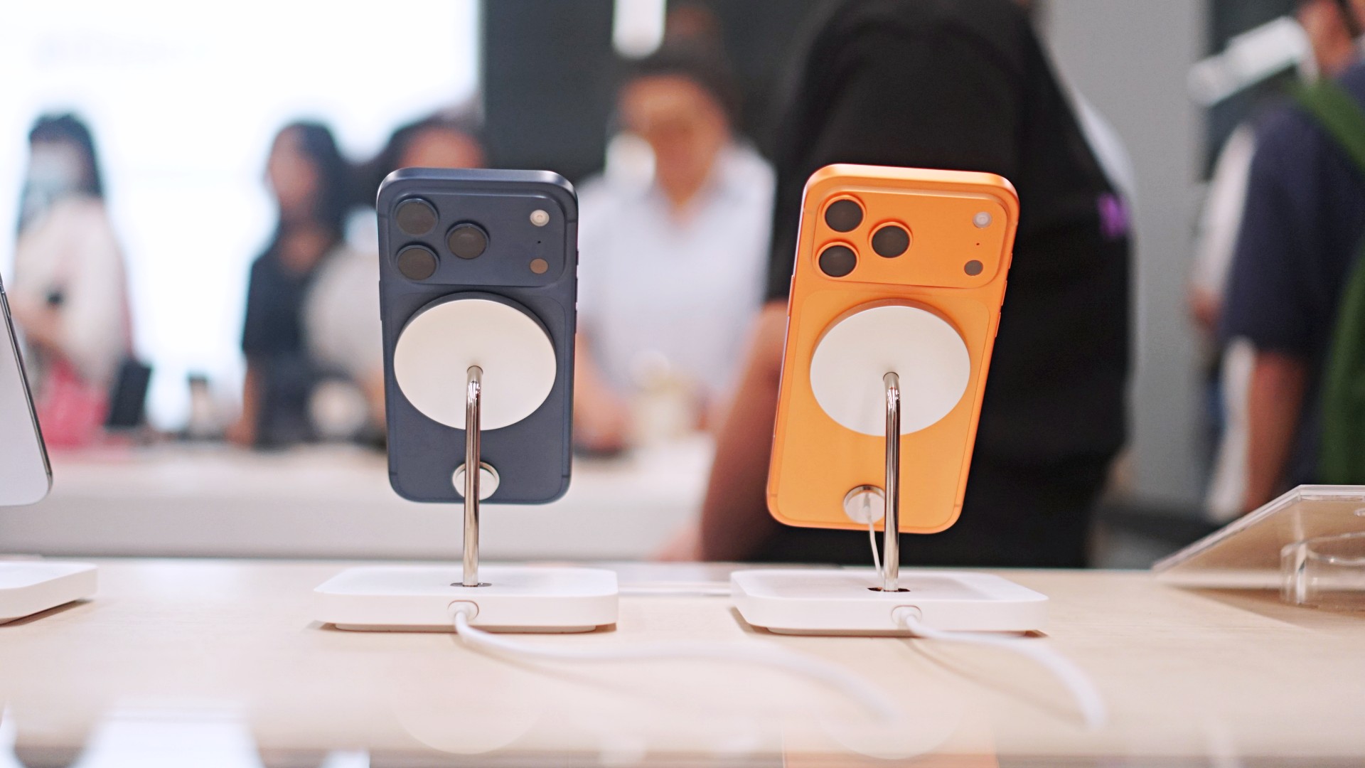
Normally, public betas come and go with nary a peep from anyone but dedicated fans and testers. After all, why care about a beta when the final release is likely just around the corner? This one, however, is special. Today, Apple launched the iOS 27 public beta, and it’s our first taste of the redesigned Siri AI.
Recently, WWDC 2026 unveiled Apple’s latest attempts at entering the AI segment. Whereas previous iterations to incorporate AI failed to make an impact, Siri AI promises to provide users with helpful feedback that’s actually helpful.
Now, in the public beta for iOS 27, users all over can finally access the new assistant. To get to the beta, you need to be a part of the beta program, which you can easily sign up for on beta.apple.com. Once signed up, you can get the update from Software Update in Settings. You’ll see options for a developer beta and a public beta. Choose iOS 27 Public Beta.
At face value, Siri AI offers much of what you’d get from a traditional AI-powered assistant. However, it does slightly differ because it integrates the entire phone. The assistant contextualizes your information (including emails, messages, and photos) to give you the most accurate feedback that you might need.
If that’s not enough, Siri AI also has its own chatbot app. If you’re more used to ChatGPT, the assistant should give you that bit of familiarity.
Now, if you don’t want to go for a beta, Apple is expected to launch iOS 27 in its final form sometime in September.
Apps
The case for traveling without a plan
How Grab’s 5-Star Travel Guide replaced my spreadsheets, for personal travel anyway
I have somehow acquired the reputation of a man permanently in transit.
Fill your feed with airport check-ins, road trips, hotel rooms, and race bibs for a decade, and people stop seeing travel as a hobby. They start treating it like a personality trait. And naturally, everyone is always breathless to know: “MJ, how on earth do you manage it all?”
Here’s the truth: every trip begins long before I pack a bag. A good itinerary takes time. Flights, hotels, transfers, backup plans, restaurant lists all have to fit together well enough to make the trip feel worthwhile.
My colleagues would probably call me a Type A traveler. They’ve watched me run international coverages and high-stakes business trips entirely off spreadsheets. Spreadsheets!
Timed down to the exact micro-second, complete with contingency plans for every possible disaster short of an alien invasion.
And they are completely right. For work. But personal travel? Oh, darling, personal travel plays by a completely different set of rules.
The luxury of letting go (and the panic that follows)
A month before departure, I am all about securing the basics. But once the flights and rooms are locked in? I completely let go.
I would much rather leave room for fabulous, unexpected curiosity than fill every single hour with another rigid destination.
Part of it is sheer decision fatigue. I spend so much of my professional life making executive decisions that the last thing I want to do on vacation is have a minor existential crisis at 2:00 p.m. over which artisanal café deserves the honor of my afternoon. I want to wake up, look at the sunlight filtering through the curtains, and let the universe decide.
Of course, ironically, that absolute freedom can spiral into its own fabulous brand of panic. I know I want to go somewhere chic. I just have absolutely no idea where.
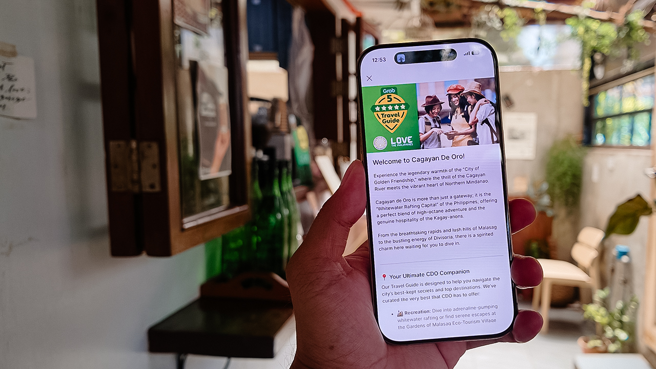
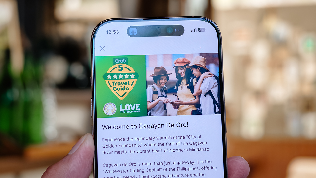
Which is precisely how Grab’s 5-Star Travel Guide quietly became the most indispensable accessory of my latest getaway.
Finding somewhere to spend the afternoon
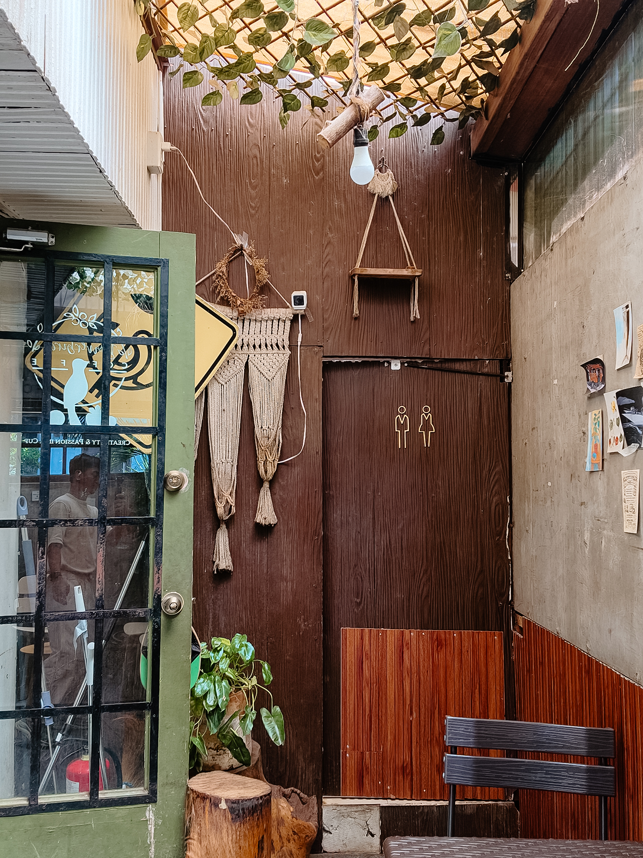
I recently flew to Cagayan de Oro to spend some quality time with my long-term, long-distance, low-commitment, casual boyfriend. (Yes, it’s complicated, but the mystery keeps it glamorous.)
I arrived with absolutely zero plans, and this was entirely deliberate. If there is one thing a strong, independent person must never do, it is rely on someone else to dictate his day — even if that someone is technically his own handsome, local tour guide.
Instead of waiting around for an itinerary to be handed to me, I simply opened my Grab app while I’m in downtown and slithered over to their Travel Guide.
My fabulous friend, Syra, glided over from Midtown, and we agreed to rendezvous in Uptown to finally check out H Proper Coffee, which was practically screaming at me from the top of the Grab list.
It’s the city’s legendary third-wave coffee pioneer — complete with a deeply impressive roastery — and it has recently, thank goodness, expanded to Makati.
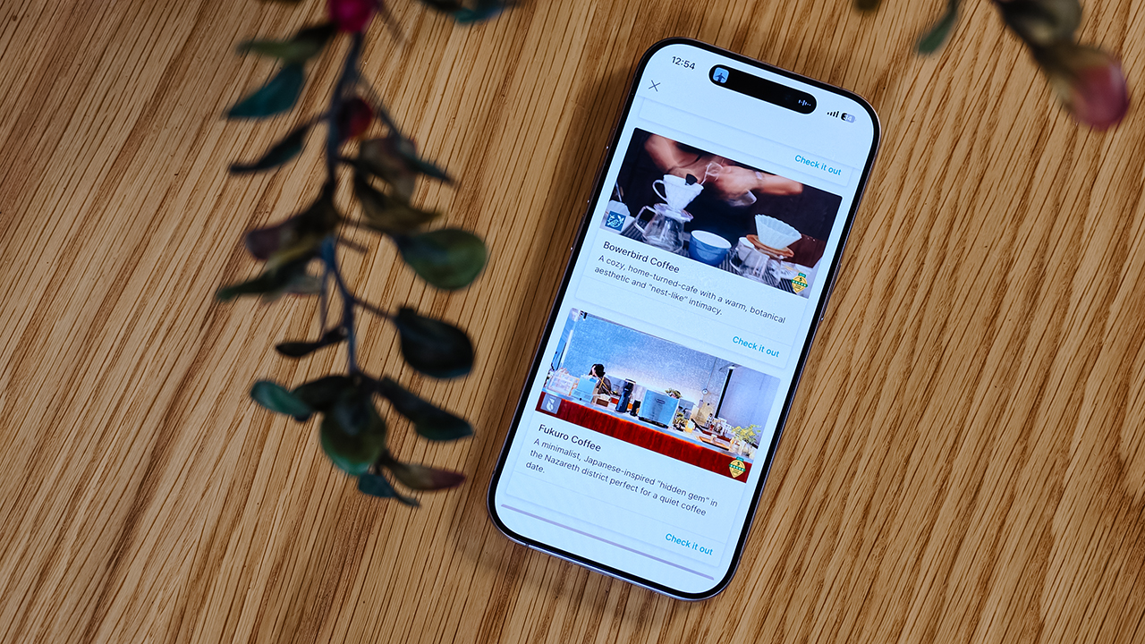
-
- Bowerbird Coffee

The guide also flirted with other familiar, delicious names like Milestone Coffee (where Syra and I had gossiped over lattes just six months prior), alongside Bowerbird Coffee, Fukuro, Apostrophe Café, The Lone Wolf, and Grae Coffee.
I must say, the recommendations were utterly spot-on. They weren’t just highly rated by random bots; these were the actual enclaves that the city’s stylish locals genuinely know and love.
Dinner dilemma (solved!)
The Travel Guide came through yet again when the sun began to set and the crucial question of dinner arose. Now, I absolutely adore discovering hidden neighborhood gems and family-run eateries. They possess a soul that no luxury restaurant could ever replicate.
That said, every proper holiday demands at least one evening where you put on a sharp blazer, splash on some Tom Ford, and indulge in a truly beautiful meal.
Unsurprisingly, Cucina Higala seduced me all over again. Look, I am a creature of habit. If I know an establishment delivers perfection, I will return.
Seeing it sitting proudly near the top of Grab’s curated list felt like a delicious little pat on the back; a quiet validation that my impeccable taste is worth trusting after all.
Beyond the plate
Refreshingly, the guide doesn’t stop at flat whites and fine dining. Grab’s Travel Guide also highlights local luxury hotels.
Though, fair warning, a few of them are the sort that make your credit card wince slightly. (But darling, they are five-star for a reason.)
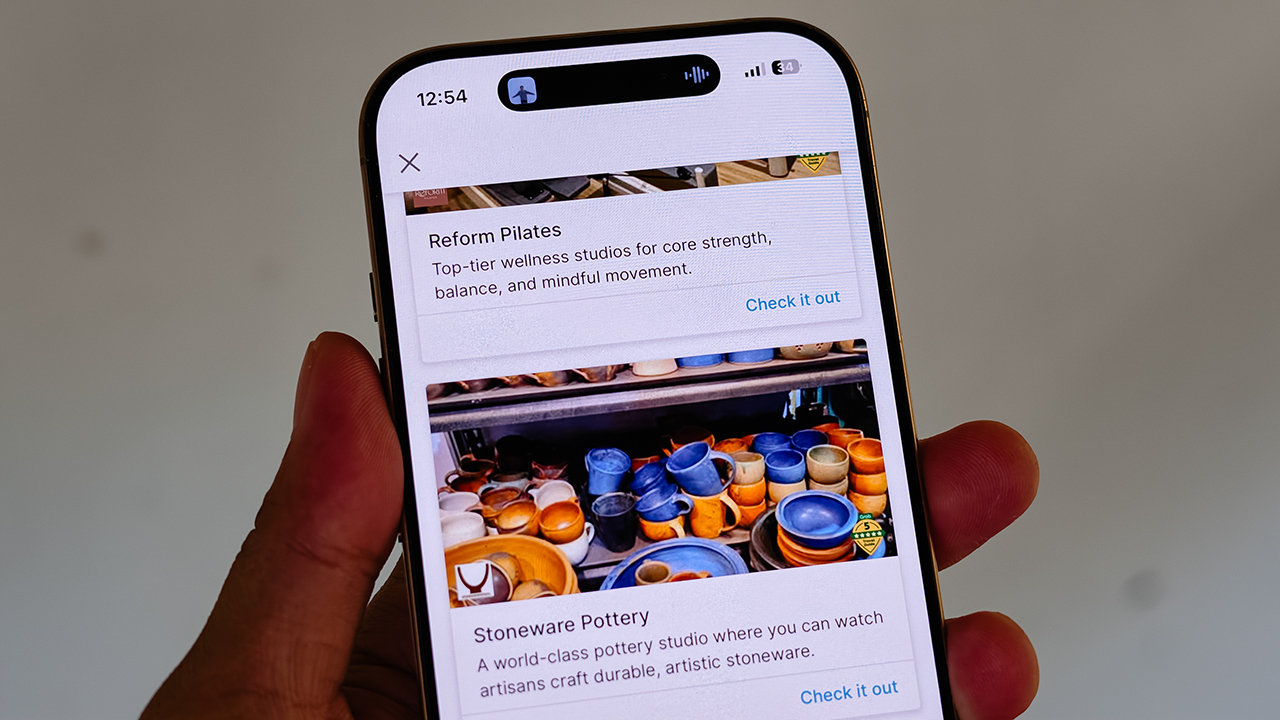
It also curates actual experiences. Browsing through the app, I found options for everything from heart-pounding whitewater rafting and sharp Pilates studios, to a world-class pottery atelier, a folkloric museum, and a sweeping, adventure-filled mountain retreat.
Some were already on my radar, but others? I would never, in a million years, have stumbled upon them myself. And that is the thrill of traveling this way. You leave just enough empty space in your diary to be utterly surprised.
For the spontaneous traveler
Let’s be clear: planning every detail down to the last centavo is not a flaw. When you’re younger or traveling on a strict budget, every single peso counts, and a meticulously plotted itinerary ensures you maximize both your wallet and your time.
But eventually, thank heavens, you reach a stage in life where the itinerary matters just a little bit less. A stage where time and budget stop being the terrifying monsters standing between you and a boarding pass.
You learn that not every single meal requires three weeks of intense counter-research. Not every hour requires a reservation confirmation number.
Sometimes, the most breathtaking, unforgettable moments happen simply because you wandered into a doorway you weren’t even looking for.
So, book the flight. Secure the hotel. Figure out how you’ll get around. Then let your feelings, and Grab’s Travel Guide, decide the rest.
Apps
Plot twist: Starbucks PH is letting you actually pick your reward now
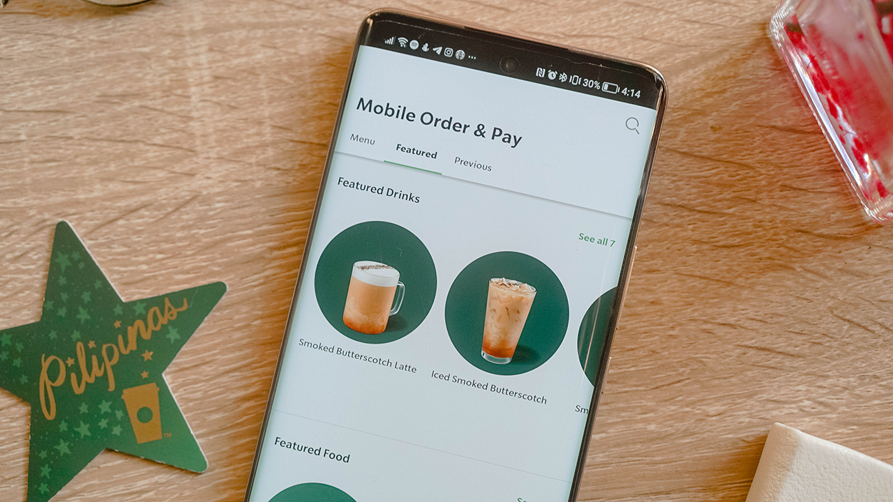
Starting July 21, you choose what you redeem and when, from just 50 Stars, on the new Starbucks PH app.
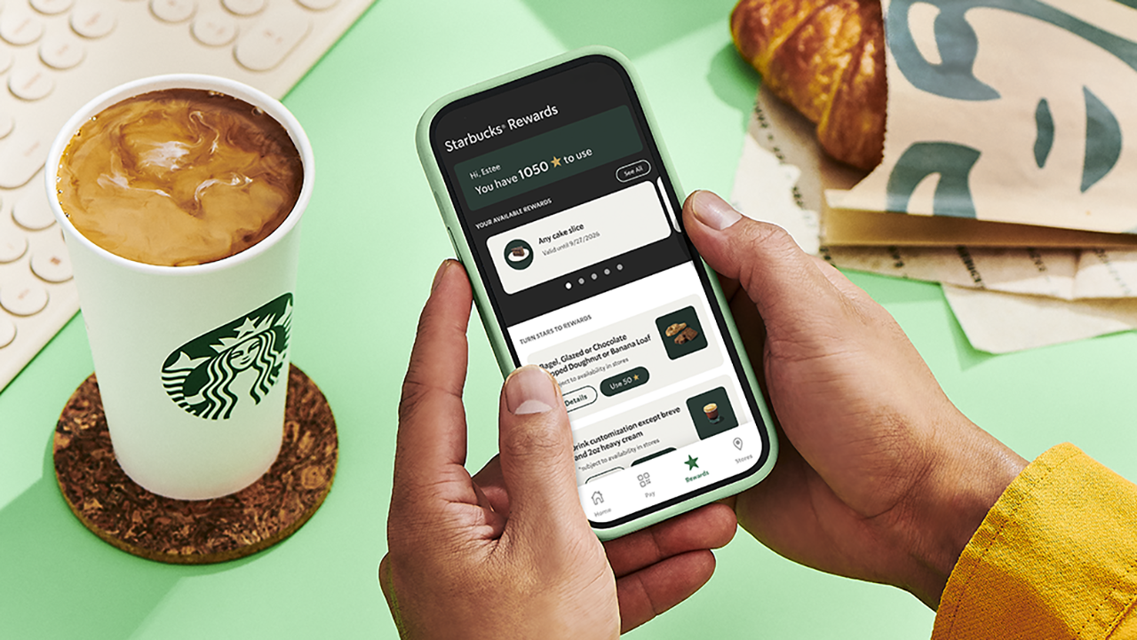
Confession time: I have spent an embarrassing number of hours doing mental math in line at Starbucks, staring at my Stars balance like it owes me money. Ninety-eight Stars. So close!
Two Stars short of a free drink that would just… appear, whether I wanted it that week or not. That’s the old system for you. It decided for me and I just showed up to collect.
Well, girl, the glory days of blind Star hoarding are over, and honestly? I’m thrilled.
Starting July 21, Starbucks Philippines is scrapping the automatic 100-Star-equals-one-voucher system it’s run since 2019. In its place: a Multi-Tiered Rewards system that finally treats members like adults who know what they want. Which, let’s be real, is exactly what I’ve wanted the whole time. I didn’t want a random cake slice I never asked for. I wanted to choose.
Tiers, explained (because I know you’re already doing the math)
Here’s where it gets good: You’re no longer stuck waiting for triple digits to cash in.
At 50 Stars, you can get a free drink customization or a bakery pick like a bagel, a banana loaf, or my personal weakness, the doughnut. Fifty Stars used to get you nothing but a longer wait. Now, it gets you a treat.
At 100 Stars, the world opens up. Any handcrafted beverage or bakery item are all yours to pick. This used to be the only option on the menu. Now, it’s just the middle tier.
And then there’s the new 150-Star tier, which lets you trade in for pasta, a sandwich, or a full cake slice. A whole meal, earned in caffeine.
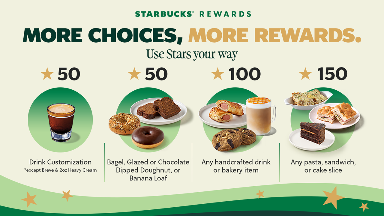
The only real exclusions to keep in mind: breve and the 2 oz heavy cream customization aren’t included at 50 Stars, and the Coffee Traveler Kit, French Press, and Reserve Ice Cream beverages sit outside the 100-Star tier. Small print, but worth knowing before you get to the counter with big plans.
The app situation (Deep breath, it’s fine)
Now, I’ll admit, hearing “you need a whole new app” gave me a small moment of panic.
New app, new login, new everything, right when I finally memorized where the barcode scanner button lives on the old one.
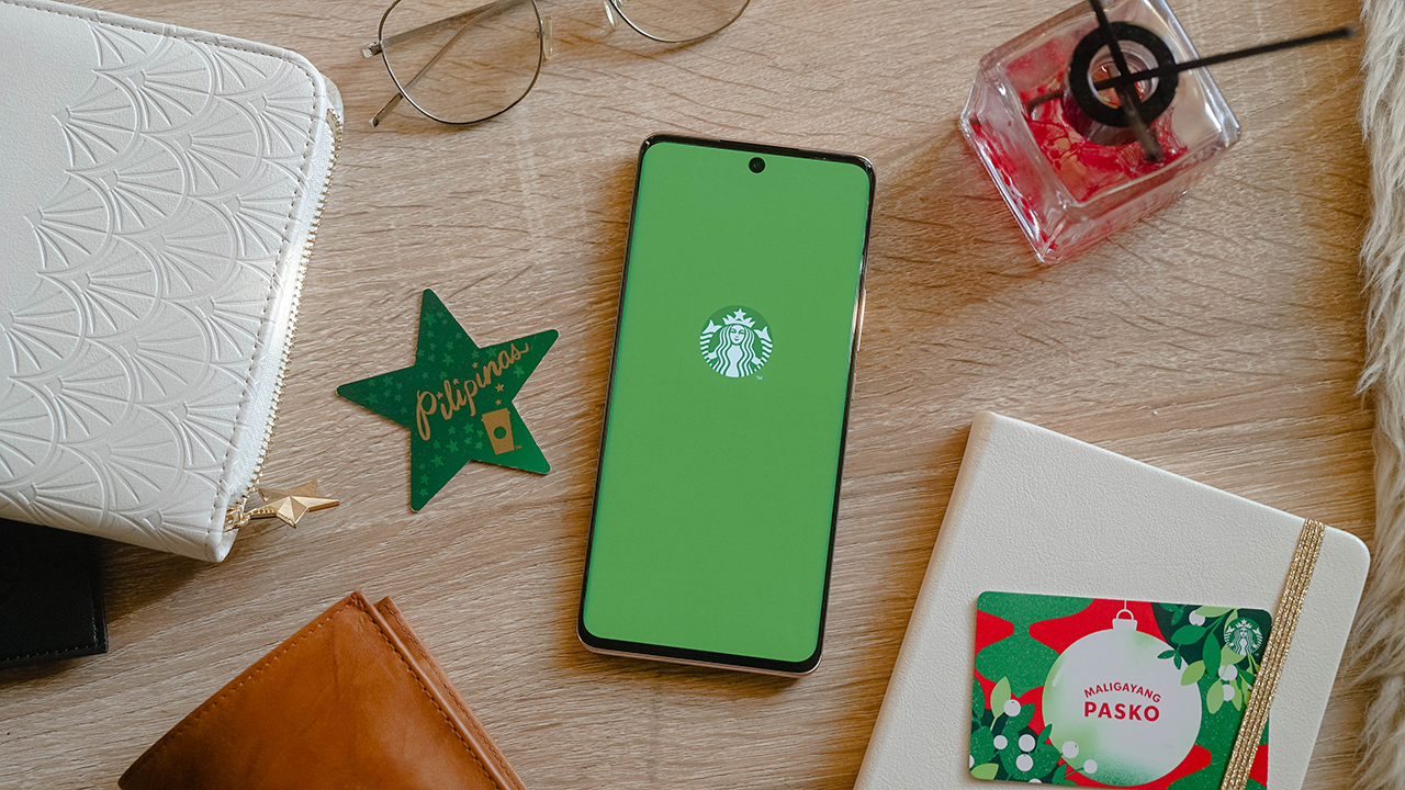
But here’s the relief: your Stars, your load balance, your account, all of it carries over automatically. No re-registering, and no starting from zero. You just download the new Starbucks PH App from the App Store or Google Play starting July 21, and your loyalty history walks right in with you.
The old app gets discontinued, so this isn’t optional, but it’s also not a hassle. Sign-in is faster, Star tracking updates in real time, and honestly, watching my Stars tick up instantly instead of refreshing the app like I’m checking a crush’s read receipts sounds like an upgrade I can get behind.
One thing to note if you’re a Mobile Order and Pay loyalist like me: it won’t be available on day one. Starbucks says it’s coming back in a future update, but the timing is still unannounced. Mildly inconvenient, but not a dealbreaker.
The part that actually changes how I use my Stars
Here’s the detail I didn’t expect to care about this much: Under the old system, your voucher’s 90-day countdown started the moment you crossed 100 Stars, whether you were ready to redeem or not.
Now, that 90-day clock only starts once you actually issue the reward yourself. Which means no more panic-ordering a bakery item I didn’t want just because the voucher was about to expire. I get to decide when the countdown even begins.
Stars still need to convert into a reward within a year, and anything unconverted still expires on your account anniversary, so it’s not an invitation to hoard forever. But within that window, the control is finally mine.
So, what now?
Mark your calendar for July 21. Download the new app, let your Stars migrate themselves while you do absolutely nothing, and start planning what you’re actually going to redeem instead of settling for whatever the algorithm decided you’d earned.
Fifty Stars for a banana loaf on a rough Monday. A hundred and fifty for a full pasta situation on a day that calls for one. My inner spreadsheet is already recalculating, and for once, that feels less like a chore and more like a plan.


realme C100: Enduring and durable in spite of entry-level realities
Enough power but needs more agility


The ASUS ExpertBook Ultra wins you over
The laptop sneaks up on you


vivo X300 Ultra review: A “Whole Different Animal”
Got the beast (finally) unleashed!

iOS 27 public beta gives us our first taste of Siri AI

The case for traveling without a plan

Most of the world’s PlayStations will be officially useless by 2028

Cebu Pacific becomes 1st SEA low-cost carrier with Starlink Wi-Fi

Going ‘back to school’ as an adult with the HP Smart Tank 580

Buyer’s Guide: TECNO SPARK 50 Pro vs SPARK 50 5G
vivo X300 Ultra review: A “Whole Different Animal”

New York becomes first state to ban smart glasses

DJI Osmo Pocket 4P launches with dual lenses and a 1-inch sensor

HONOR Watch 6 review: Less guessing, more knowing


-
 News6 days ago
New York becomes first state to ban smart glasses
-

 Singapore5 days ago
Sony launches IER-M500 in-ear monitors
-
Laptops2 weeks ago
The ASUS ExpertBook Ultra wins you over
-

 Computers7 days ago
GIGABYTE releases new AORUS RTX 5080 INFINITY graphics cards
-

 Gaming6 days ago
Microsoft dictates that a new Fallout game is coming
-

 Enterprise2 weeks ago
Google ordered to pay EUR 4.1 billion in fines
-

 Accessories2 weeks ago
Sony brings 1000X THE COLLEXION to the Philippines
-

 Gaming7 days ago
HoYo FEST 2026 details announced; tickets on sale from July 16