
Reviews
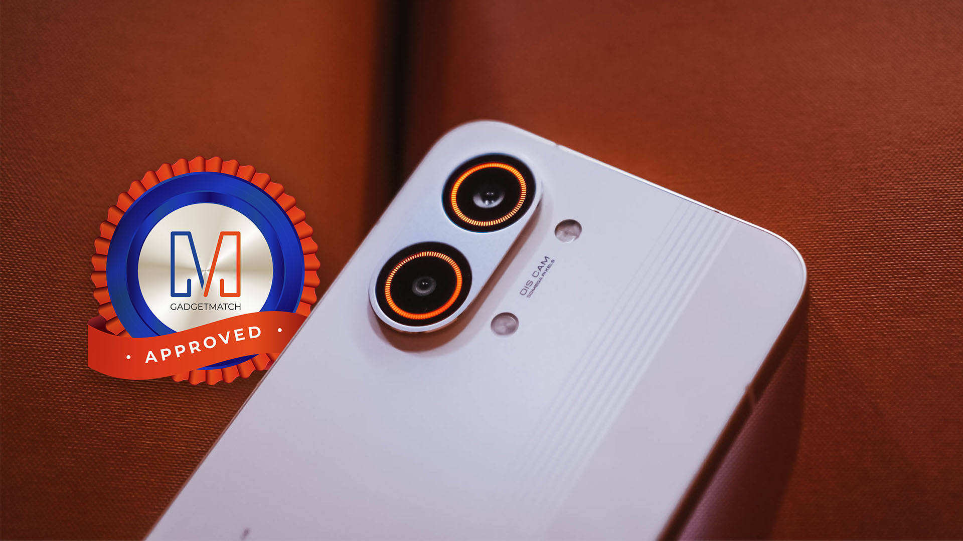
OPPO A5 Pro 5G: A cross between budget, lower midrange
Mostly budget specs and performance, but will AI and other improvements make it worthy?
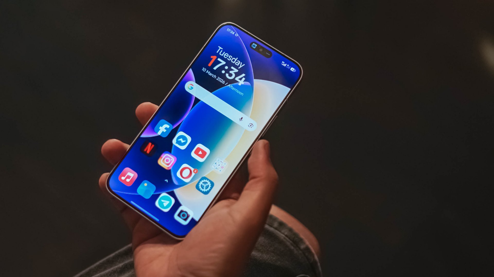
I don’t know what to make of the OPPO A5 Pro 5G after finding out about its official price. I have been using OPPO’s latest A series offering for weeks now. It’s useful. It works just fine.
But it’s always been a budget segment smartphone, and the PhP 15,999 price tag surprised me. It seems too lofty. Yes, I know the A5 Pro has 5G connectivity and a splash of AI enhancements.
In fact, I feel like it’s an intersection of a budget and a midrange devices’ specs and features, released at an interesting time.
But are all these enough to justify what OPPO A5 Pro 5G offers as a whole at this time? Let’s make more sense of it.
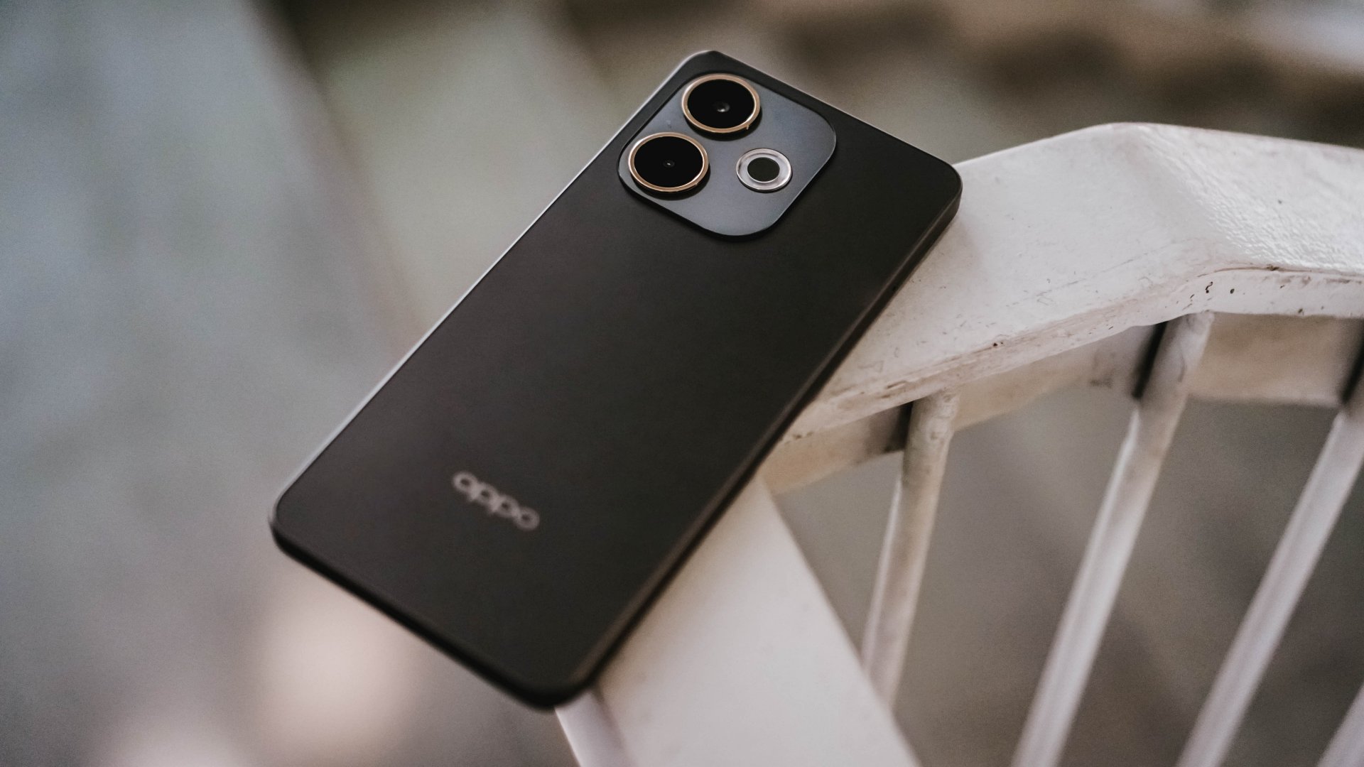
OPPO A5 Pro 5G specs
- Processor: MediaTek Dimensity 6300
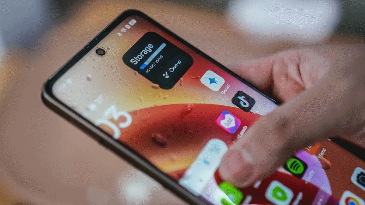
- Memory: 8GB base RAM, up to 8GB expansion
- Internal storage: 256GB
- Display: 6.67-inch HD (1,604 x 720) 120Hz IPS LCD, 264ppi pixel density
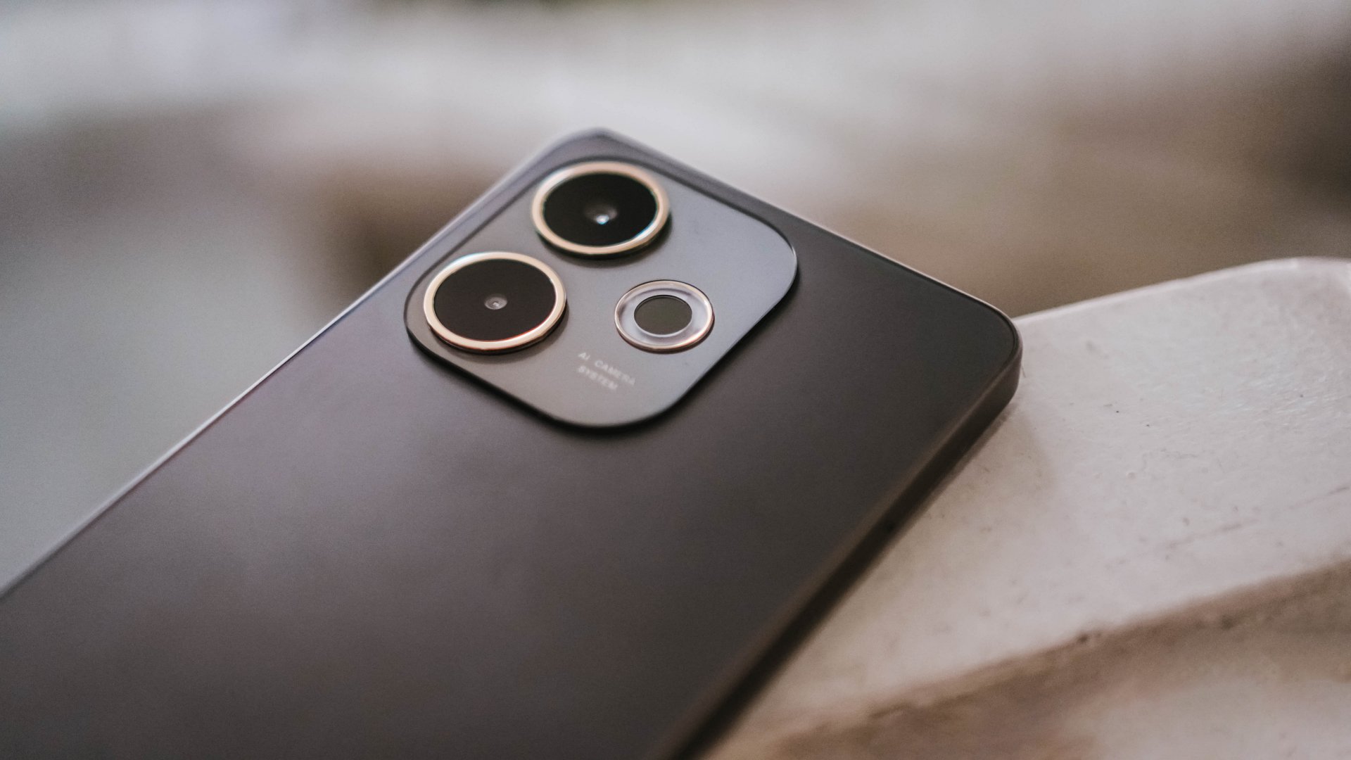
- Cameras: 50MP main camera, 2MP monochrome camera, 8MP selfie camera
- Battery: 5,800mAh
- Fast-charging: 45W SUPERVOOC
Having tested the OPPO A3 last year, I can say that many of the A5 Pro’s specs and features are a step up from its predecessor.
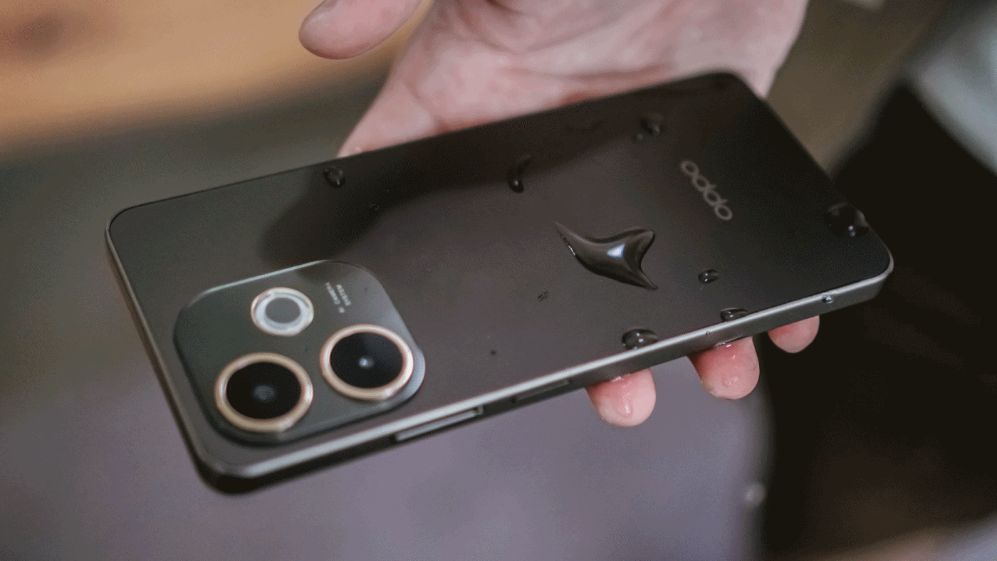
The device also improved from IP54 to a triple IP69, IP68, and IP66 water and dust resistance. That means it’s tailored for the current era and better equipped physically to handle elements, hot or cold.
Building on the features of the A60 and A3, the A5 Pro is likewise still Military-Grade Shock resistant.
In addition, it still also supports Dual SIM and 300% volume, among other practical and useful features. However, the A5 Pro has parted ways with the 3.5mm jack, if that matters.
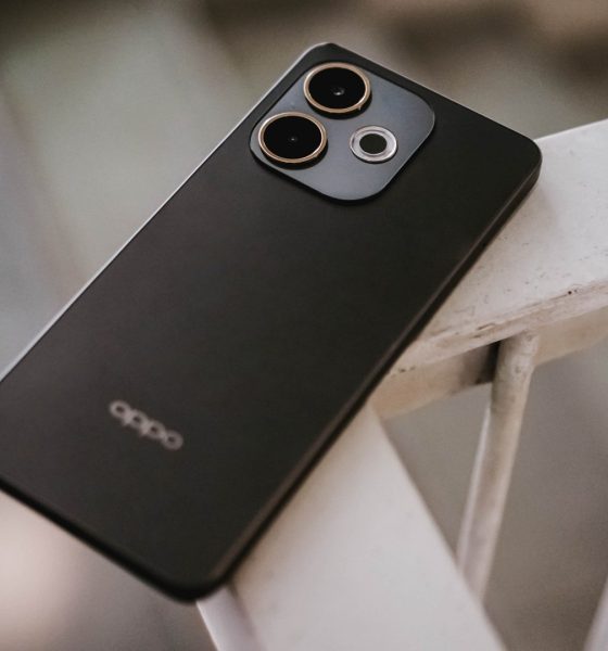
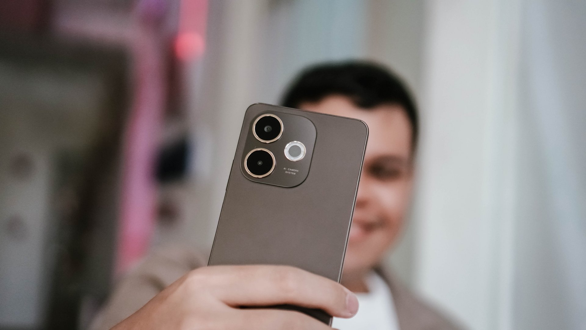
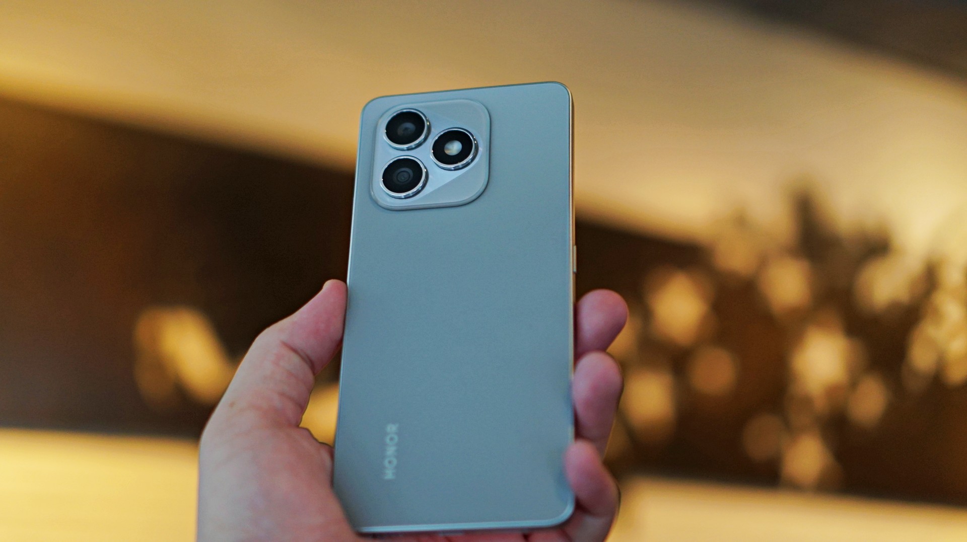
Look and feel
Like its previous iterations, the A5 Pro maintains a simplistic look. You get either a Bloom Pink or Mocha Brown colorway.
The frame feels smooth and there’s not enough friction. The back is a lot smoother because of its hydrophobic surface.
It’s slippery by default. But funny enough, when water dries up, it creates a better grip.
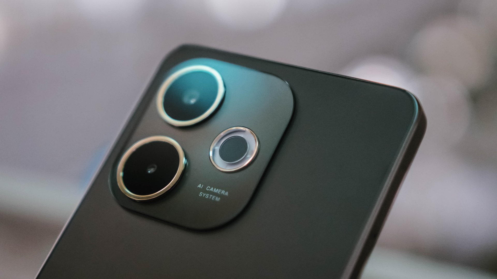
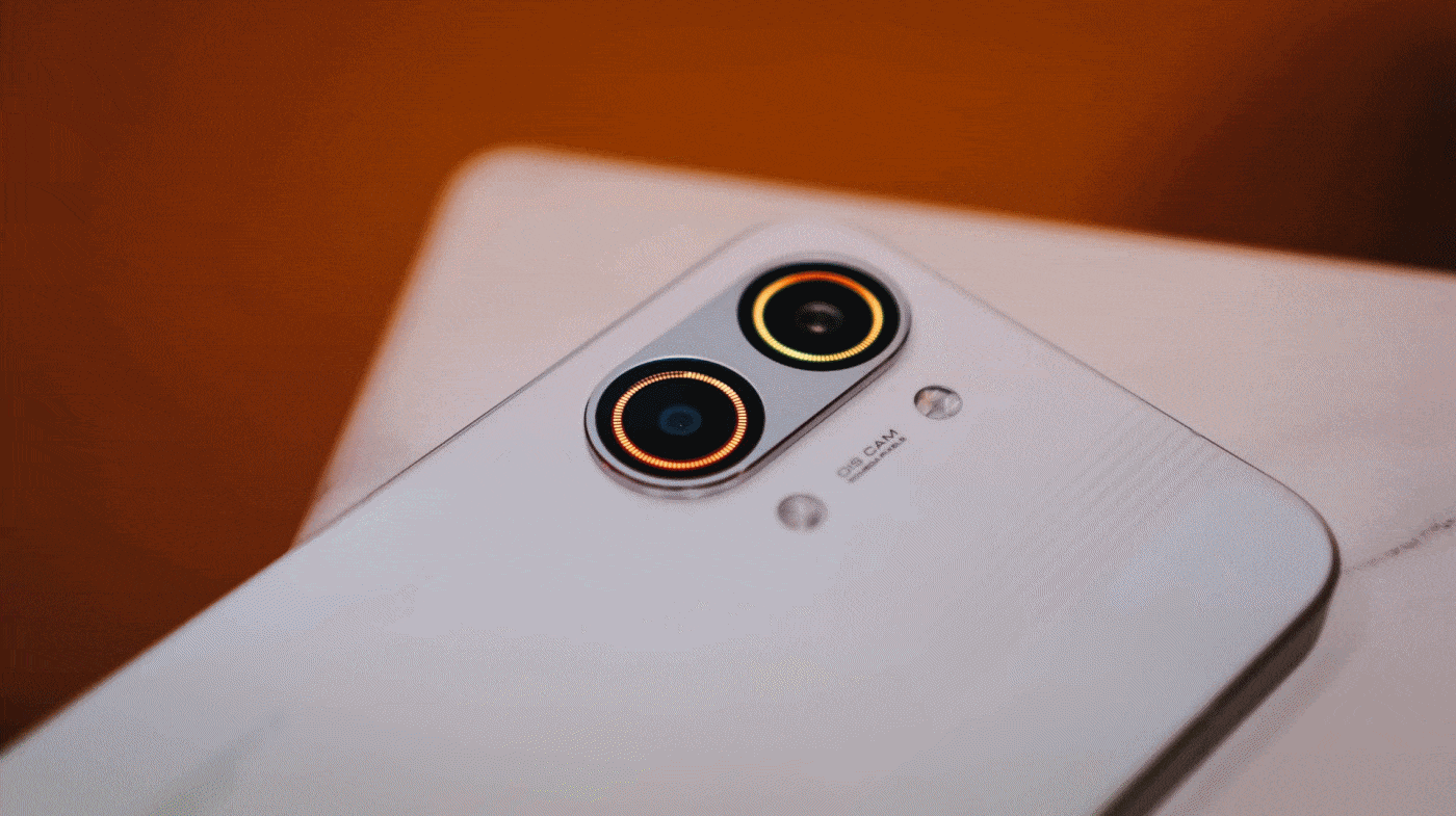
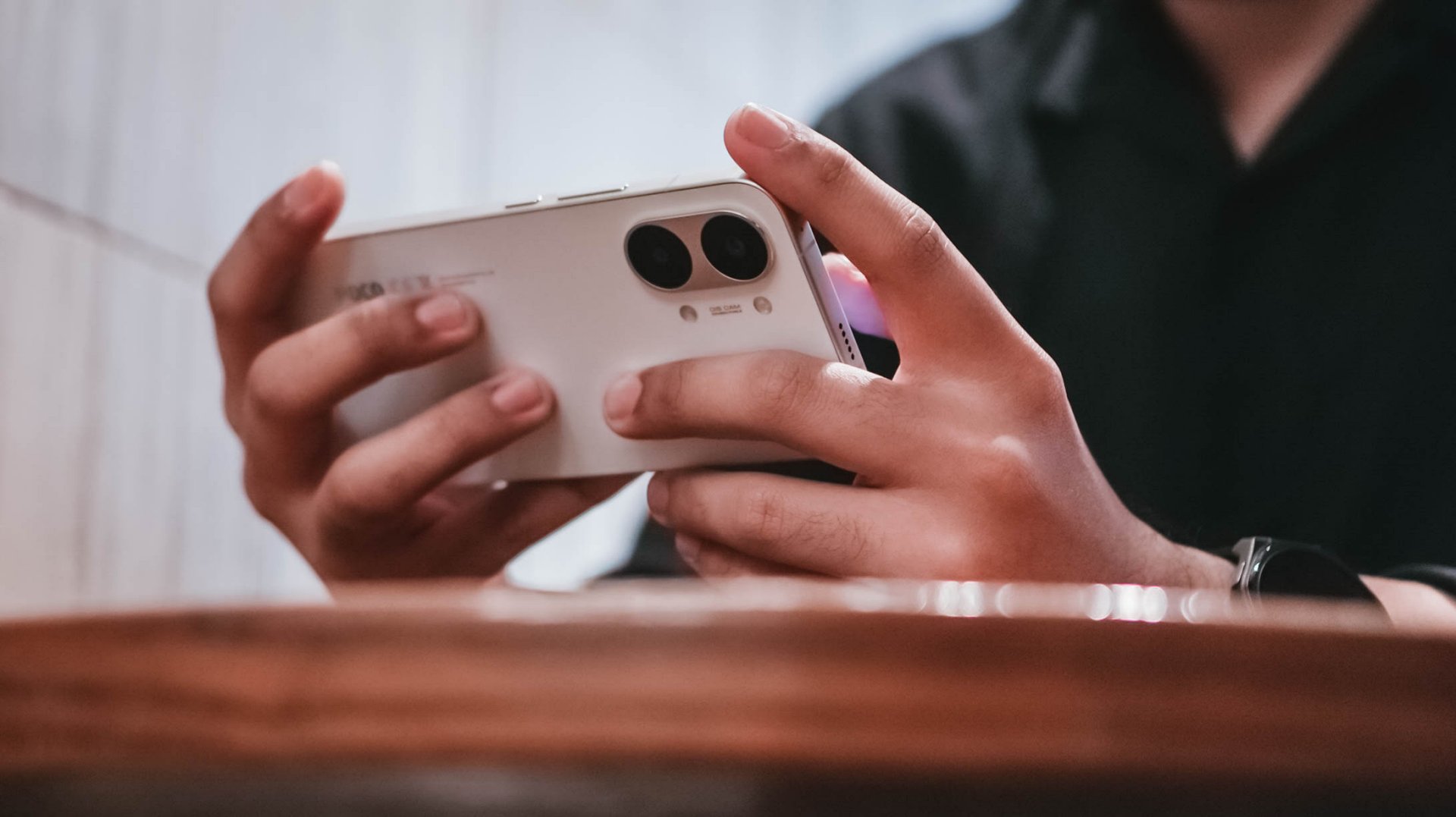
The phone once again has a large camera island that takes up significant real estate on the upper half of the back. The only obvious change is its flash, which has been made into a donut shape and is quite larger than that of the A3’s.
Size wise, it has a lot of width to it. When you use it with the case, it feels a significantly larger than some of the other midrange devices I’ve been using.
Optimized touches, decent brightness
OPPO has worked throughout the years to make the phone’s water resistance something that actually complements daily use. Even when the phone has water droplets on its screen, it does not ghost-touch.
You can still swipe up and down or side to side, switch from one app to another, and type messages when needed. This is beneficial for many scenarios.
OPPO also mentioned that even when you’re wearing gloves, you can still expect a responsive display. Again, that’s handy for delivery riders and other workers.
Or even just regular users who can’t get their hands off their phones while eating, washing clothes, and everything in between.
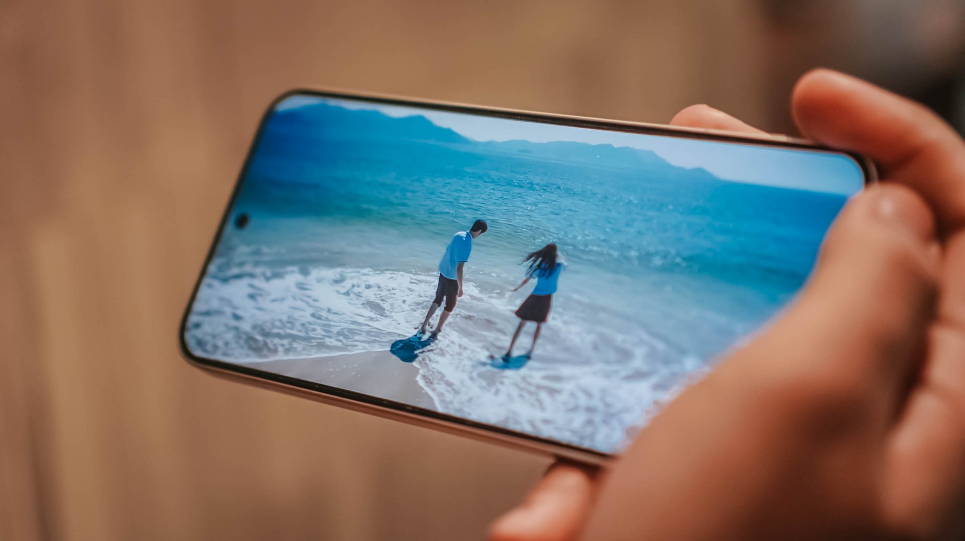
Moreover, users can again shoot up the brightness up to 1,000 nits. This is helpful outdoors, or when you’re wearing sunglasses, or both. What’s on screen appear somewhat recognizable.
Budget-level display
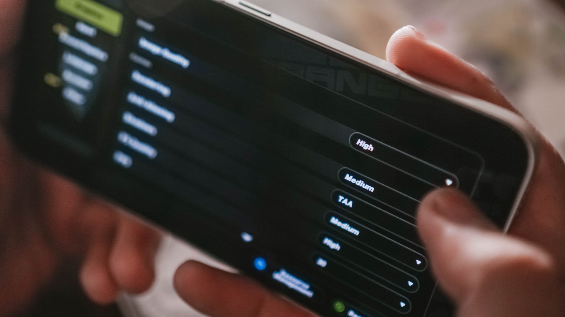
Speaking of the display, as it is only of HD quality at maximum, it kind of doesn’t matter even if you decide to watch YouTube videos at 1080p, or switch a mobile game’s graphics settings to “high” or “ultra”.
Details will become pixelated on the edges on some occasions, especially for gaming. It’s also difficult to view high-resolution photos to check if they’re sharp or clear enough, because of such limitations.

This is one of the obvious deal-breakers for the A5 Pro’s asking price, since there are many devices out there offering AMOLED displays or higher maximum resolution.
If anything, the flat screen is a plus, since I’m not a fan of curved displays. There’s more real estate in front.
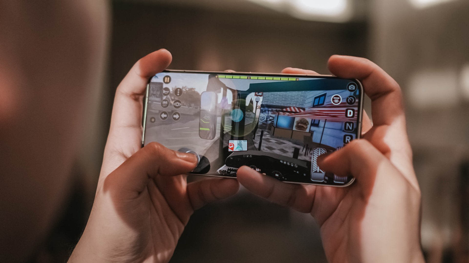
Budget-level performance
To push the A5 Pro when it comes to performance, I did my best to replicate multi-tasking scenarios from several potential users.
Whenever I headed out, I turned its location on and went to Google Maps to start Point A-to-Point B navigation. While doing so, I either browsed on Facebook or TikTok, or watched YouTube videos. The Messenger chat head also remained open.
In such cases, as expected, the device slowed down. You have to be a little patient. Sometimes, it does not respond right away to touches. There were also instances where commands were delayed.
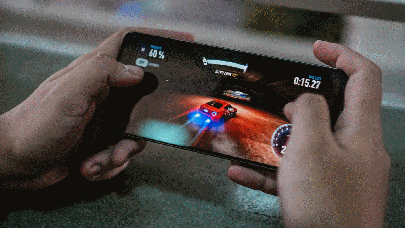
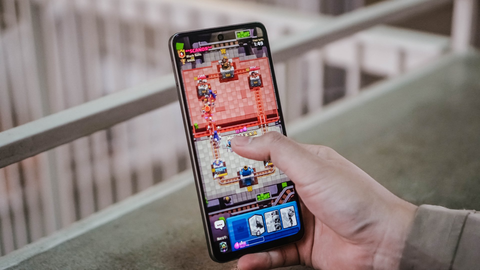
Still, the A5 Pro 5G can handle light to moderate games. Its optimizer distributes the workload evenly between CPU and GPU.
In my almost a month of using the device, I ran Clash Royale, Need For Speed: No Limits, Mobile Legends: Bang Bang, and Garena Free Fire, to name a few.
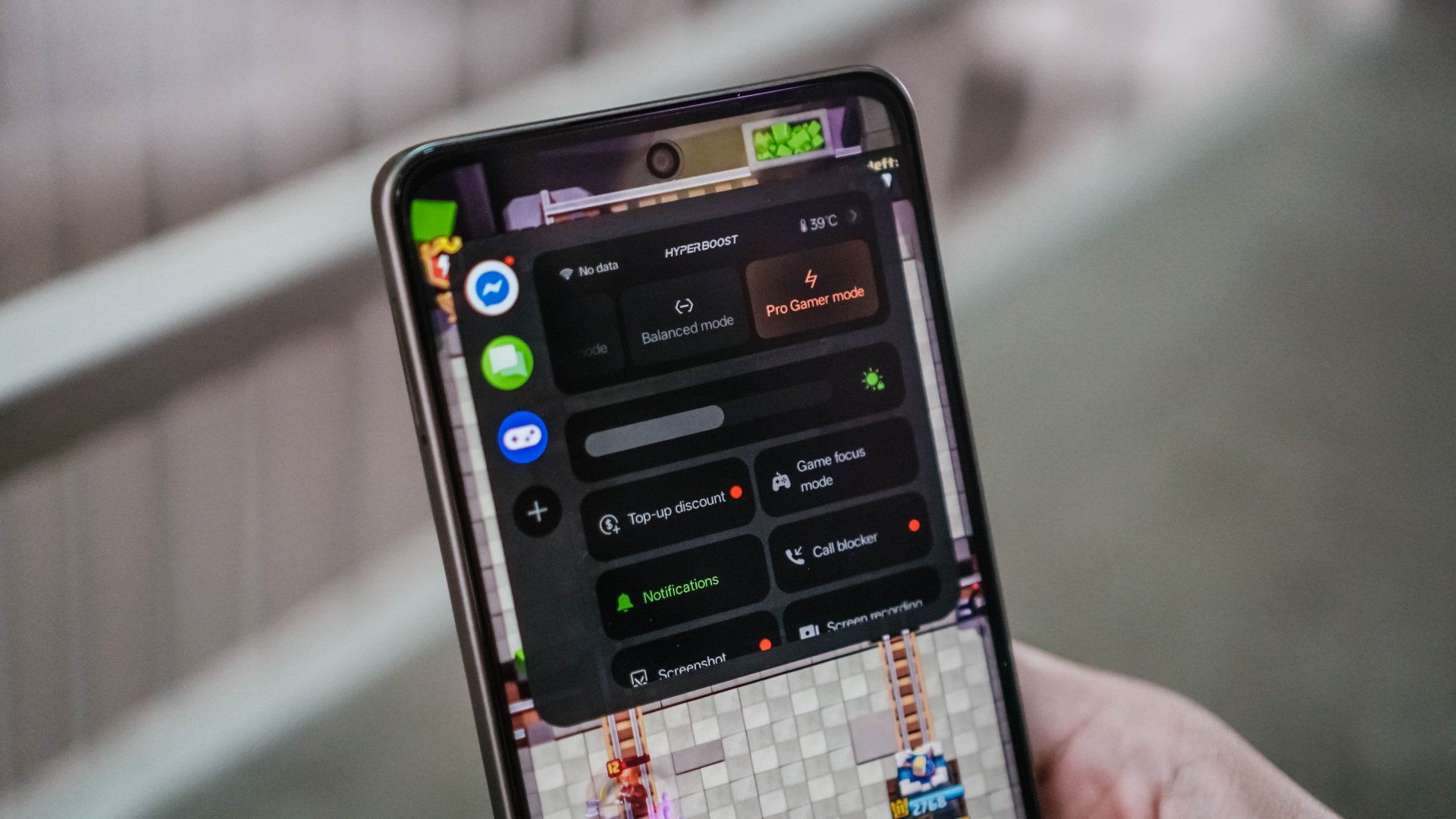
For the FPS title, I felt there was too much friction on the display and I couldn’t swipe hastily enough to shoot opponents.
Yet I still managed to put down several of them and finish inside of the top three each battle royale session.
There’s no question the A5 Pro can support light usage, like content consumption and simple browsing.
You just have to limit the number of apps open to make sure you can enjoy the experience. At the end of the day, it’s still a budget utility phone, albeit with some AI and hardware improvements.
AI LinkBoost 2.0, 360° Surround Antenna
On the positive end, there are two standout features on the OPPO A5 Pro 5G that somehow justify its asking price.
AI LinkBoost, of course, was first introduced on OPPO’s Reno series devices. What this does is integrates an algorithm so the hardware delivers better network performance, especially in tricky locations like elevators, underpasses, tunnels, and other weak-signal areas.
This is complemented by the 360° Surround Antenna that enhances efficiency and effectiveness. This provides a more stable and reliable network connection.
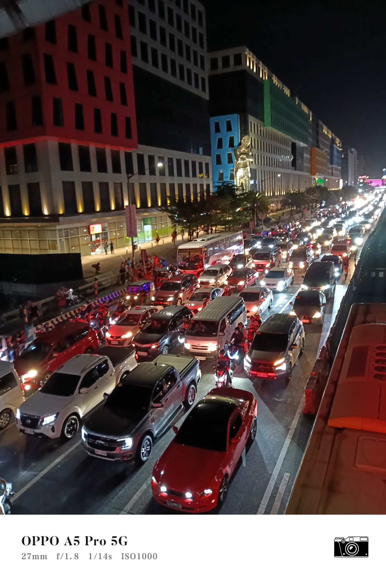
I personally felt the advantage of having the A5 Pro equipped with such features. While riding the MRT-3, I was still able to load videos quickly while the train passed along the Buendia underpass.
On another occasion, the phone remained on 5G connectivity while passing the Cavitex toll booths. On my older 5G-capable device with the same carrier and the same location, normally, it would have not been possible to even send a chat.
I also noticed how seamless the device switches from 5G to 4G and vice-versa when you have Smart 5G turned on. Perhaps, its these aspects that will make you appreciate the A5 Pro 5G more. That’s if you’re getting the 5G variant.
If you’re big on staying connected while commuting so you can browse or play online games continuously without interruptions, then the A5 Pro 5G can help you stay connected more seamlessly.
Cameras: Just alright
Onto its cameras, the A5 Pro 5G can again offer you a mix of “for documentations” and “for the ‘gram” capabilities.
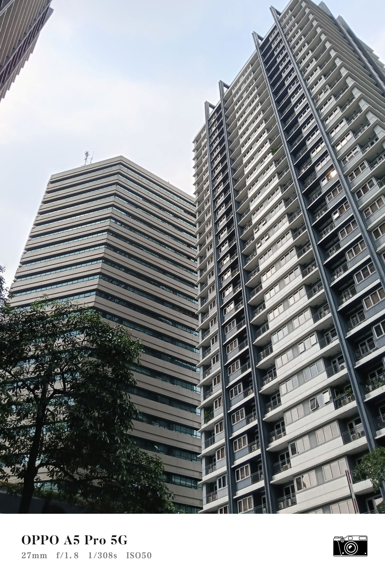
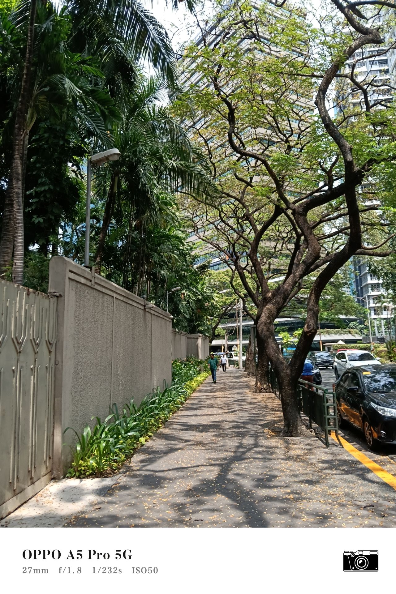
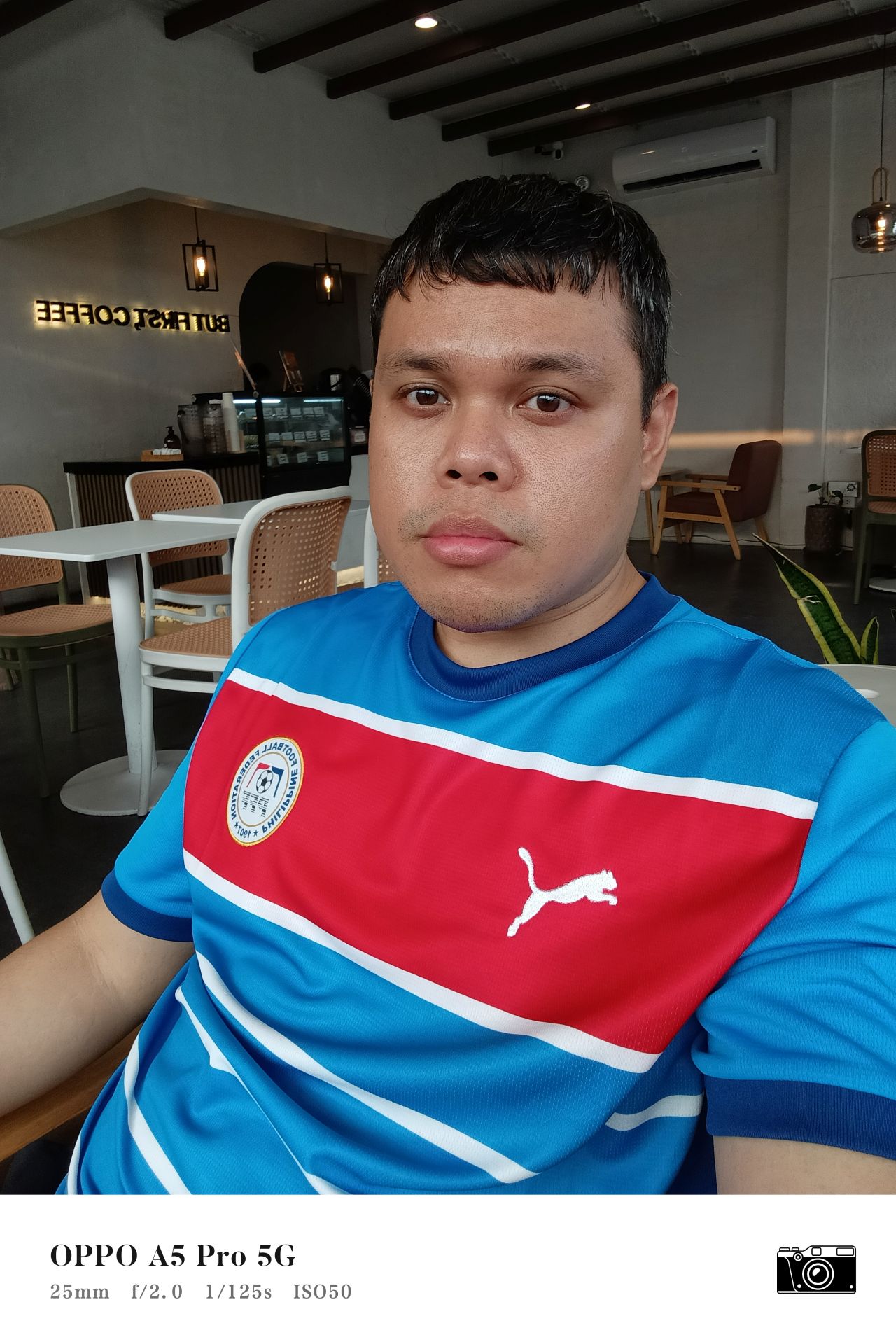
The 50MP main shooter can pull off captures with enough detail and clarity on 1X zoom, given the best lighting conditions.


Then again, it’s tough to actually gauge how good the photos you took look since you’re working on a subpar display.
But looking at them from a high-performing laptop, I can tell there’s decent quality. Color reproduction again leans on the natural tones side, but it’s not necessarily pale.
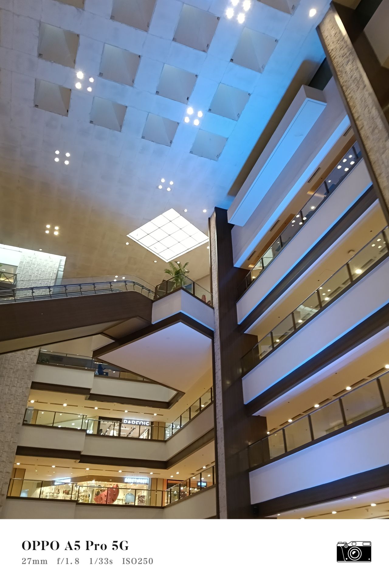
In some instances, you can still shoot up a photo’s shadows or exposure if it was taken against the light or indoors.


I just hope this is something manufacturers address in the future — having display tech that complements a phone’s camera package.
It’s good of OPPO to incorporate the AI Eraser feature. Although, I tried it once to eliminate the roof on the upper left part of this photo below, but the AI-generated clouds that replaced the spot looked like a painting to me.
On the positive end, the AI enhance feature is actually useful. You won’t see it too much at first glance, but zoom in, and you’ll notice some details have become sharpened or made clearer.


Night/low-light captures are hit or miss. I feel like you will need a stabilizer or a monopod/tripod if you wish to extend the exposure time.
This is where photos appear more smudged or of less detail and clarity.


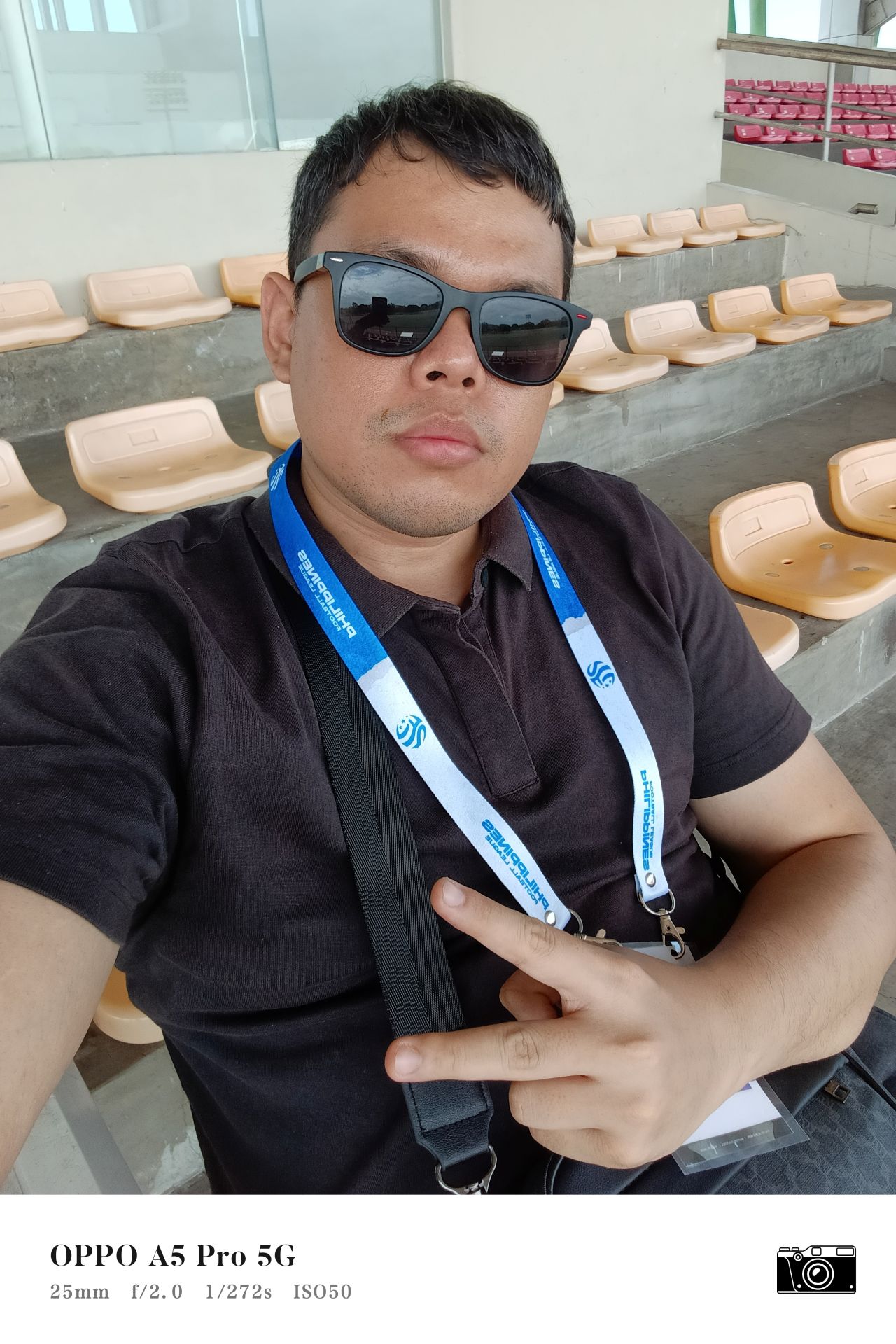
Lastly, selfies appear a lot warmer or as if I just had an allergic reaction. They are, however, quite better than those taken from a 2MP or 5MP shooter from significantly cheaper devices.
The selfie camera also captures subjects how they are, without much processing or “beautification”. It’s quite literally a point and shoot tool.

On the video recording end, the phone supports 1080p@60 filming. However, it feels all for naught without built-in stabilization.
Results still appear a lot shaky, as if there’s no difference. The audio picked up by the microphone also isn’t as crisp as other devices.
Too much for a ‘budget’ phone?
It’s clear that companies are in the middle of infusing more midrange features on phones generally known as “budget” tier devices.
And I feel like OPPO is trying to include as much features as they possibly could to make the device a lot more enticing.
It’s the next step to the evolution and a good thing. In just a few months’ time, when it all saturates, hopefully, successors to the A5 Pro 5G will cost a lot less.
But for now, I have to make sense of the device the way it’s been package at this stage of the cycle. So here we go.
Is this your BudgetMatch?
The OPPO A5 Pro 5G’s non-5G variant (8GB+128GB) retails for just PhP 10,999. That’s a massive difference from the 5G’s asking price.
If it’s the 4G variant, it’s a sure Swipe Right for me. The overall package the phone offers for that price point is enticing enough.
You’re talking about better RAM/ROM, improved connectivity with AI LinkBoost 2.0, and more enhancements here and there.
It’s a good upgrade overall if you’re coming from cheaper OPPO devices prior, or PhP 5,999 to PhP 9,999 range phones in general.
Arguably though, if you’re into gaming and want better performance or a better display, then yes, there are other devices in the market for a similar price point.
Where the decision-making gets tough is particularly with the A5 Pro 5G model. For just a few more bucks, you can already get a Reno F level device, or other camera-centric midrange phones with 5G connectivity too.
And for the same PhP 15,999 price tag, there are a handful of handsets out there that can do most of what the OPPO A5 Pro offers. Maybe even more affordable if you’re willing to settle for the 4G network.
I wouldn’t say it’s a hard pass, but it’s also too much for a phone that’s budget-performing at best. Shave off a couple of thousand pesos from that and you’ve got me listening, at least.


Gaming
WWE 2K26 lets you live out all the fantasy matches you could want
But you have to play for hours and hours to unlock everyone.
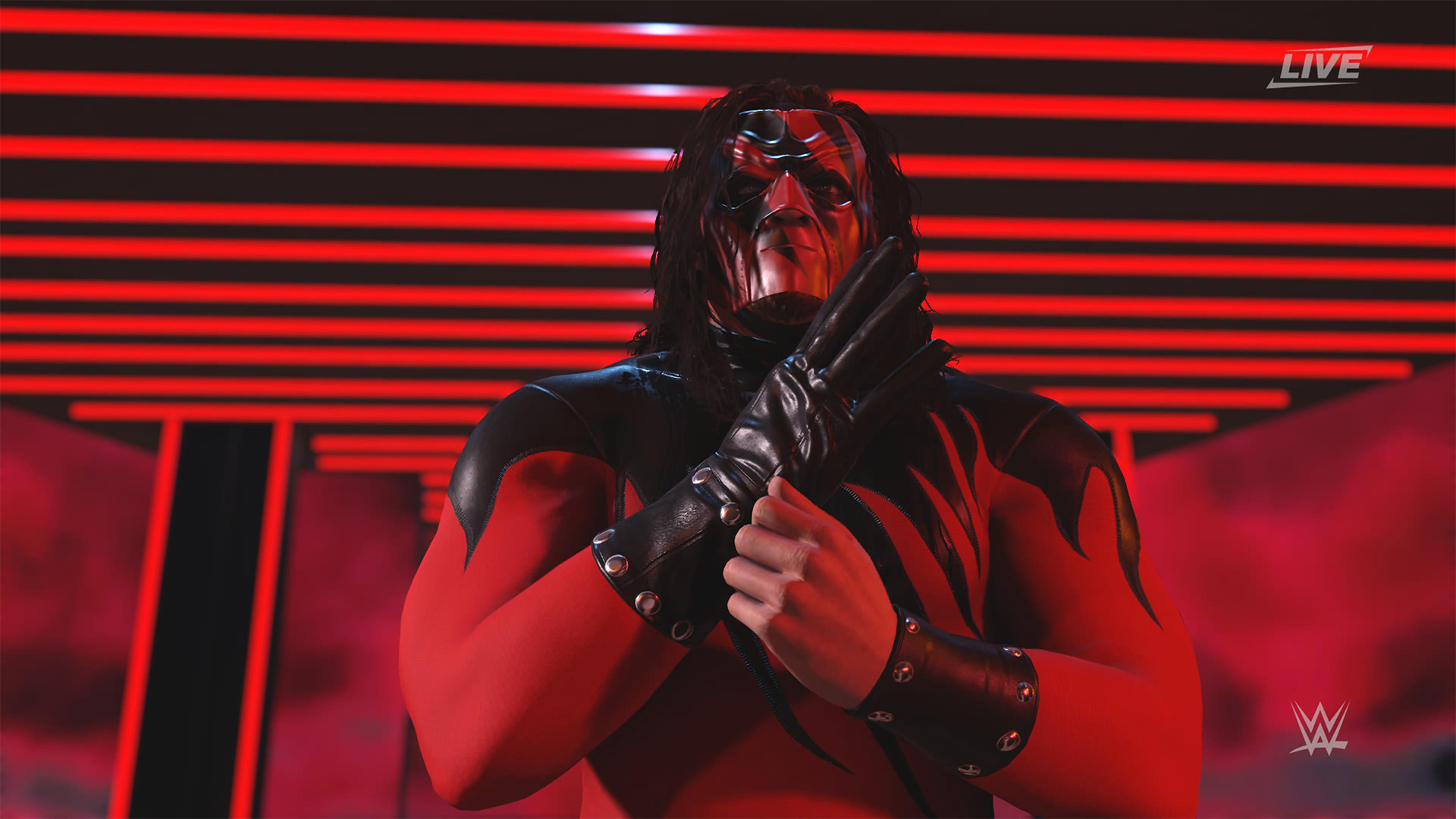
The old SmackDown vs. RAW games were some of the most fun I’ve had as a teenager. Though I didn’t own a PlayStation 2 or 3 then, I had a PlayStation Portable and the series’ corresponding version. Sure, it didn’t have the then-advanced graphics, but the games kept me company for many a day and night. And it all revolved around a simple premise: letting wrestling fans live out their fantasy matches.
Now, with over 400 playable characters on launch, WWE 2K26 hopes to rekindle that magic. Previously, 2K’s take on the wrestling simulator never really captivated me as much as the SvR series did. Though players still had a similarly large roster throughout the years, the series felt too homogenized, too riddled with microtransactions. This year, the series got me thinking again: Can sheer numbers singlehandedly usher a new renaissance for WWE gamers?
The good: Four hundred superstars under one banner
WWE 2K26 touts over four hundred playable characters on launch. With unannounced DLCs still on the horizon, this number will surely balloon further. Even for a dedicated WWE fan, having over four hundred playable characters is insane. Where else can I pit Joe Hendy against Andre the Giant and create my own WrestleMania III moment?

The only catch, however, is that the game did some stat padding to get to this enormous number. Besides having multiple personas for a single wrestler (and CM Punk alone has ten of these), the roster includes a platoon of fictional MyRISE characters, which comes off as distracting if you don’t particularly engage with the MyRISE mode.
Ironically, the game didn’t even need to pad its stats this way. For the first time in the series, the launch roster includes Superstars from the current WWE roster, TNA, AAA, and the Hall of Fame. I could spend hours just feeding a litany of Superstars to TNA legend Abyss. That’s something I could never have done in the old SvR days.
The good: A more fluid fighting system
It also helps that WWE 2K26’s fighting system is the most fluid that the series has been. Wrestlers no longer feel like wooden animatronics skipping from one animation to the next. Each punch flows smoothly into a clothesline, a grapple, a carry, or a finisher.
It is, of course, at the expense of a more complex control scheme where each input combination corresponds to its own move. A stray waggle of the right joystick, for example, can have your wrestler careening towards their opponent in ways you never intended.

It takes some time to get used to. Every time I get a WWE 2K game, I always need a refresher course for the controls. Plus, each entry introduces something different. This year introduces rushing opponents to the corner and carrying opponents in different ways.
Another new addition is the new third-person camera which follows your character, rather than being locked to the ring. To me, this was a welcome feature. The original camera can often betray you by having various elements (other wrestlers, the ring itself) block your view of the action, thus preventing you from reacting correctly to your opponent. The dynamic third-person camera solves this and makes the fight more immersive.

That said, the camera necessarily changes the controls a bit because you need the right joystick to look around. Because of that, I had to revert back to the original camera after a while. Regardless, this is a step in the right direction.
The improved fight scheme is also a step in the right direction. WWE 2K26 is the franchise’s most immersive entry to date because of how fluid the action plays out.
The meh: Iterative game modes
Every yearly sports simulator falls prey to the curse of iteration. Because it’s an annual release, every game needs to add something new for players. At the same time, the same game can’t iterate too much, or it might end up alienating fans of the previous title. Each WWE 2K title has to be the same but also a bit different.
WWE 2K26 goes through the same rigamarole. Most of the game’s different modes don’t offer a lot of improvements from last year. So, if you loved last year’s MyRISE, MyGM, and Universe Mode, you’ll likely find this year’s iteration inoffensive.

“Inoffensive,” however, isn’t the best way to sell a new game. At the very least, MyFACTION gets interesting improvements. For a mode I historically dislike every year, WWE 2K26’s MyFACTION ended up being the one I loved the most this year.
This year, the layout feels more intentional. Though it still lacks the exciting animations of NBA 2K, opening a pack no longer looks like a PowerPoint presentation. There’s also more ways to fight offline with the addition of a challenging World Tour mode. Plus, with intergender support and team chemistry, this feels like the update that MyFACTION needed.

In another twist of fate, Showcase Mode ended up being the loser this year. WWE 2K26 rehashes last year’s schtick of having the star rewrite their history. Last year, this worked with Paul Heyman, a notorious bad guy. It doesn’t really stick with this year’s star, CM Punk, the so-called voice of the voiceless.
Punk could have shined with the traditional style of laying their commentaries over their past matches, especially with his shoot style. Instead, we got a series of what-ifs with practically no commentary. It’s just not what I expected from a firebrand like CM Punk.
The bad: The Ringside Pass
For the first time in the series, WWE 2K26 has a battle pass called the Ringside Pass. Like battle passes in other games, the Ringside Pass unlocks more content as you play through the game. However, unlike today’s standard which revolves mostly on cosmetics, this version locks a treasure trove of playable wrestlers behind an experience gate.
Even if you already paid for the game, WWE 2K26 asks you to play an inordinate number of hours just to unlock the best wrestlers in the game.
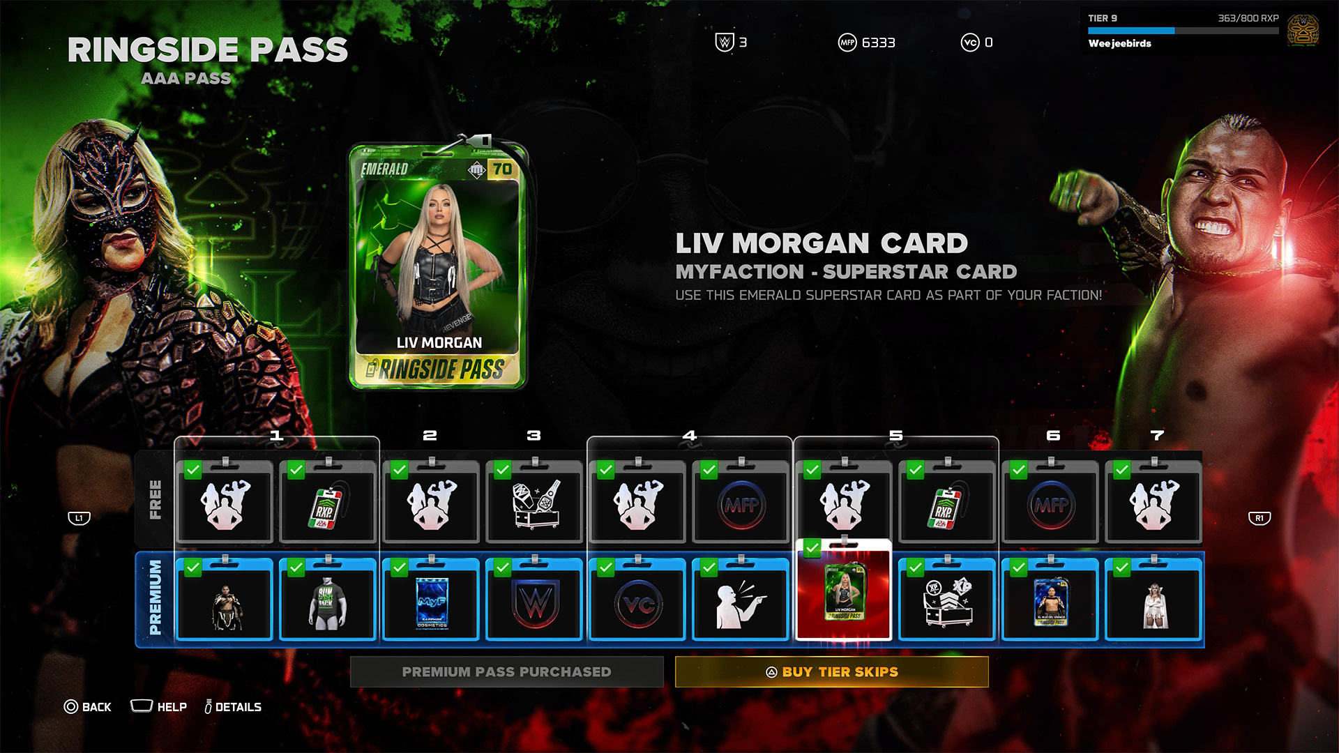
To be fair, it’s not all bad. Right out the gate, the game already gives you access to heavy hitters like CM Punk, Shawn Michaels, and John Cena. However, a lot of favorites are still unplayable including Bret Hart and Kurt Angle. This even includes the strongest version of Bray Wyatt, who’s locked under the last tier of the current pass.
Gaining experience isn’t an easy feat, either. After playing for hours and hours, I still haven’t unlocked more than half of the tiers. At the very least, there is no time limit, so I can play the game at my own pace.
Props to WWE 2K26 for making its battle pass have fulfilling rewards, but it’s still unfortunate that significant elements of the game are locked behind hours and hours of playtime.
The gameplay loop is real and repetitive. And it all circles back to how iterative the game modes are. If only the game modes ended up being as exciting as they were last year, then it would have been exciting to play over and over again. Instead, WWE 2K26 prevents you from engaging in greatest strengths: an exciting roster and a fluid fighting system.
Is WWE 2K26 your PlayMatch?
Last year’s WWE 2K25 was an exciting period for the series. Though this year’s version keeps most of what made the previous game so exciting, WWE 2K26 also adds features, especially the Ringside Pass, that ultimately detract from the entire experience. It’s a small step back, which can hopefully be rectified next year, if not in future updates.

WWE 2K26 is a Swipe Left if you didn’t love last year’s game anyway. The game doesn’t add anything that might change your mind.
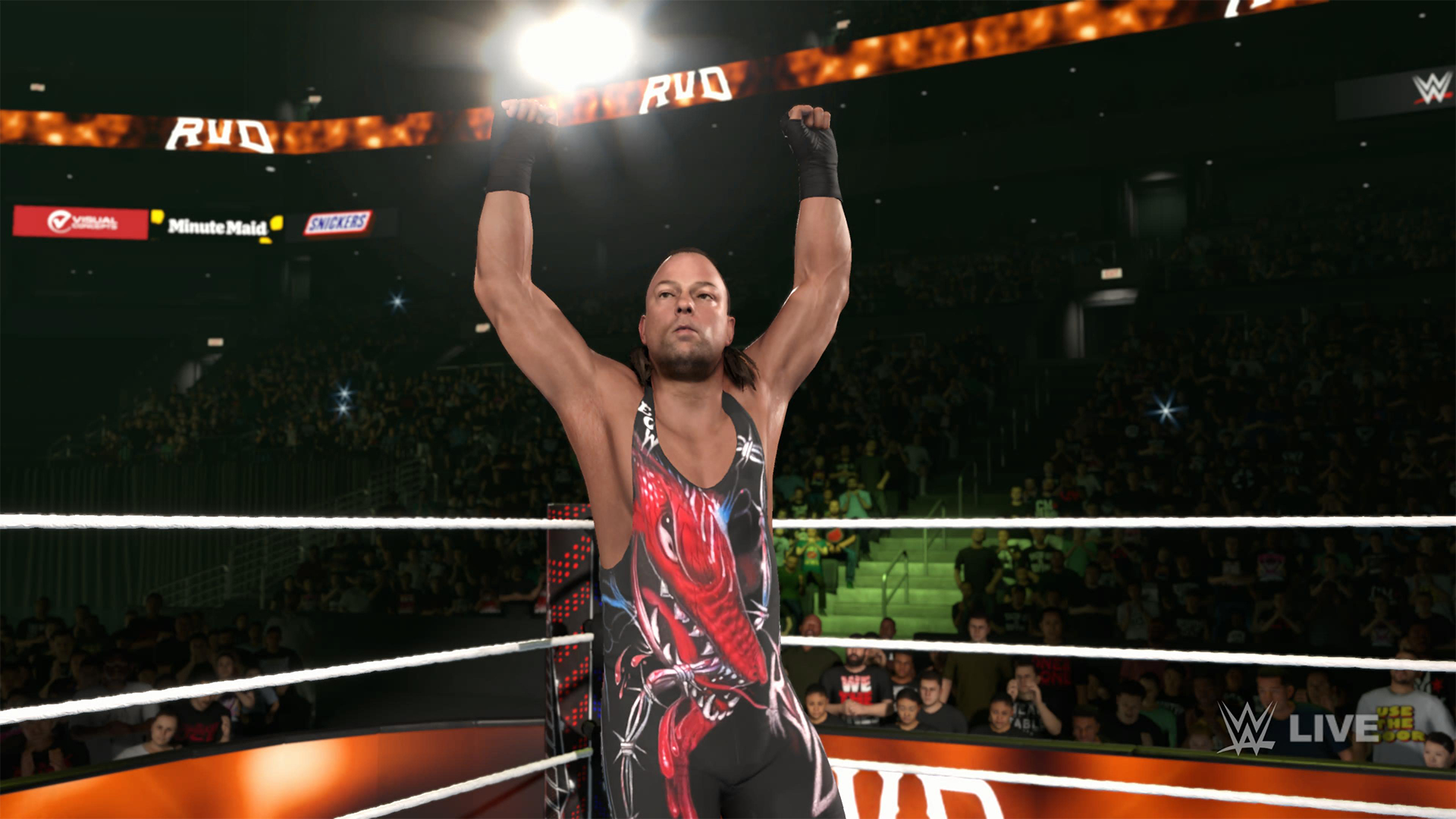
However, it’s a Swipe Right if you missed the pure joy of creating dream matches. The game’s massive roster allows for so many impossible matchups to happen, even if only in the digital realm. Just get ready to grind for a long time.
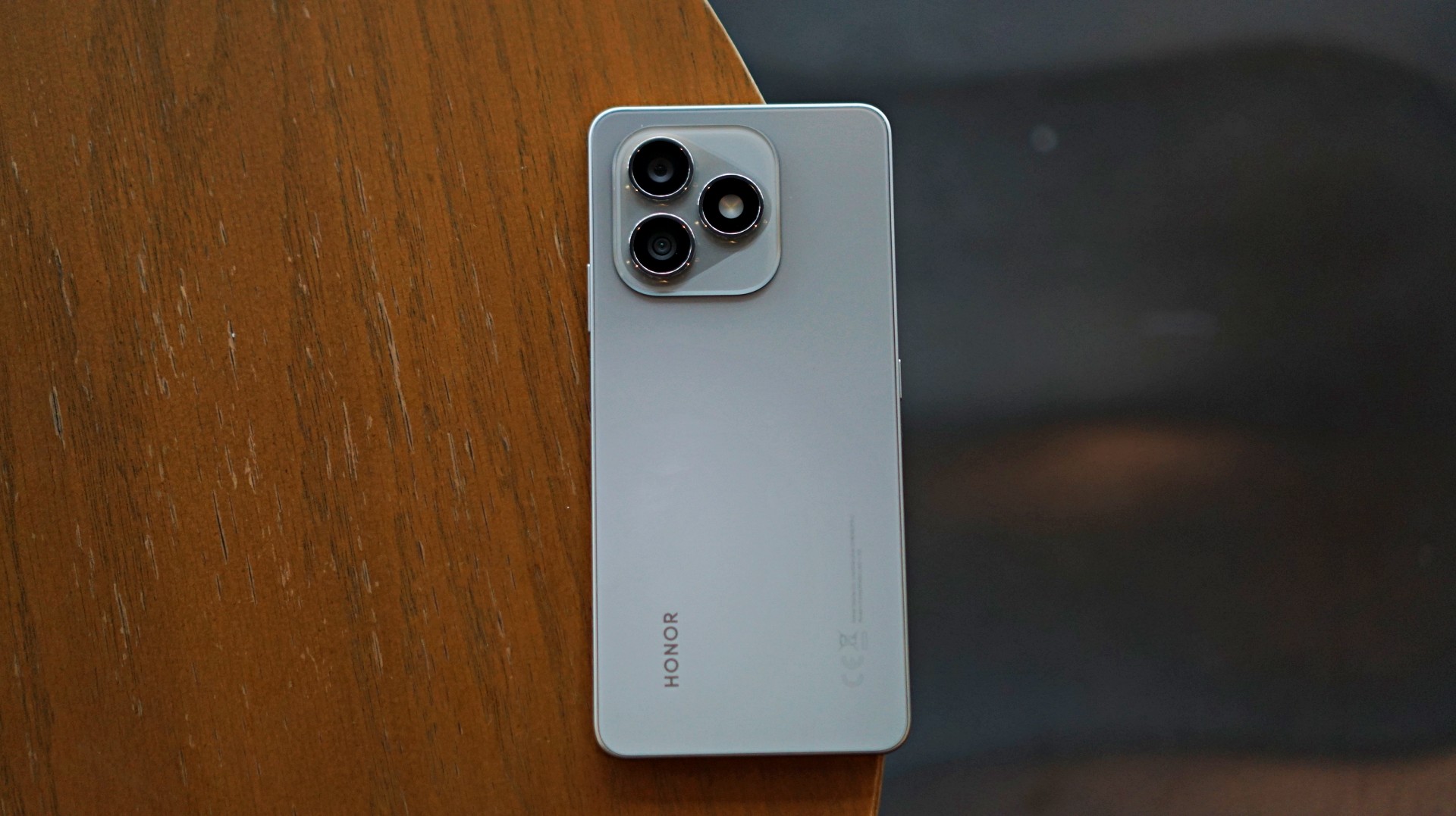
Some smartphones aim to stand out. Others just aim to work. The HONOR X8d falls squarely into the second category.
In day-to-day use, it presents itself as a device that focuses on the essentials. It’s functional, predictable, and easy to understand—but also a reminder of how noticeable the gap can be once performance and responsiveness start to lag behind.
A design-first approach
The HONOR X8d makes a decent first impression. It’s slim, relatively lightweight, and easy to hold despite packing a large battery. The flat sides and smooth back give it a clean, modern look, while the camera module adds a bit of visual identity.
It’s available in Light Blue, Velvet Black, and Velvet Grey—options that lean into its youthful positioning. The device also feels sturdy in hand, backed by SGS certification for drop and crush resistance, along with IP65-level protection against dust and splashes.
For a device in this category, the HONOR X8d delivers a build that feels dependable enough for daily use.
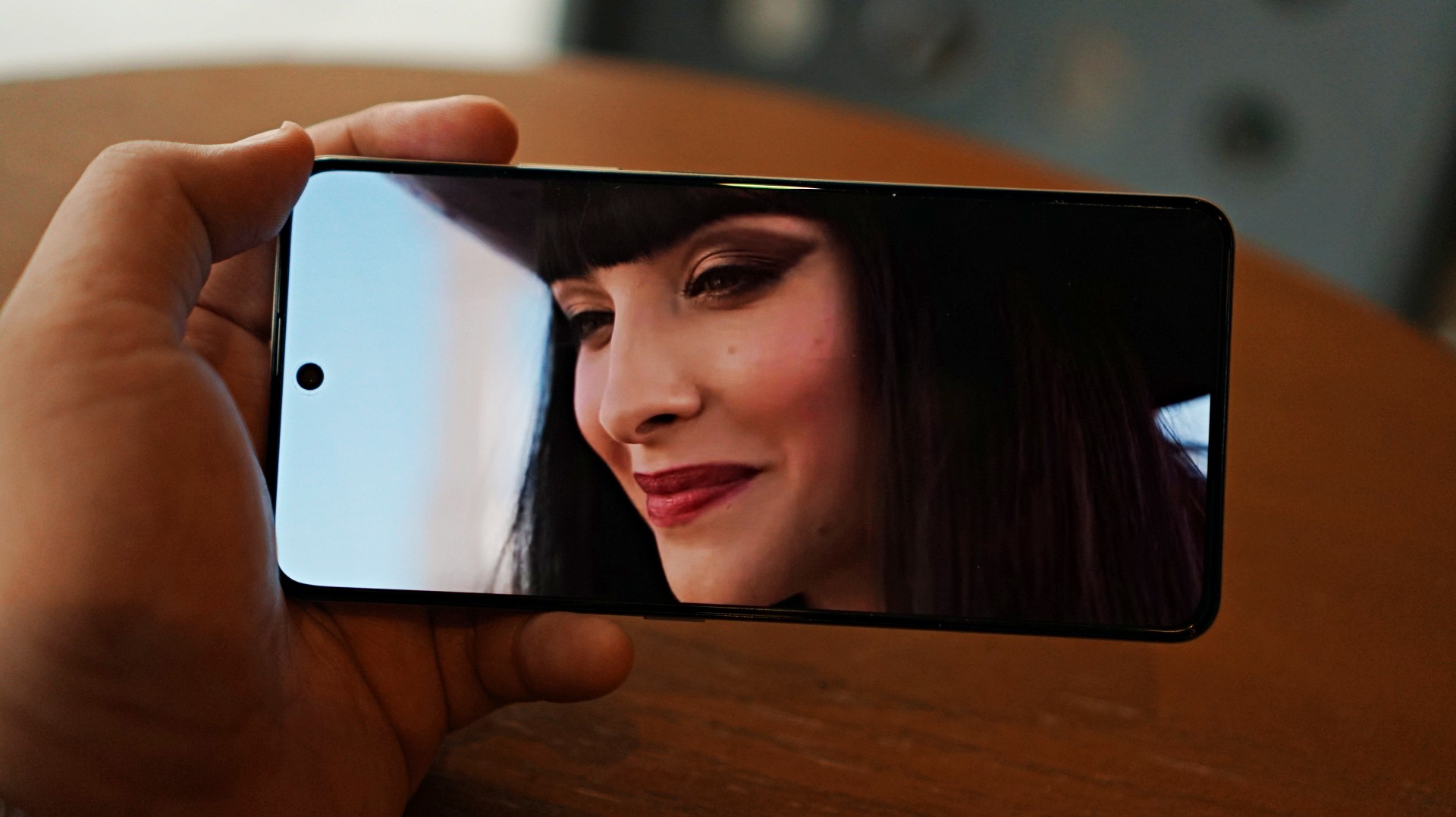
Display and media: Bright and usable
Miss All Sunday makes everything look good
Up front, the HONOR X8d features a 6.77-inch AMOLED display with a 120Hz refresh rate and up to 3000 nits peak brightness. Colors are vibrant, and the panel supports 100% DCI-P3, which helps content look lively.
For casual viewing, the experience is serviceable. Watching shows or videos feels comfortable, and the high brightness ensures visibility even under harsh lighting. Features like 3840Hz PWM dimming and E-Book mode also help reduce eye strain during extended use.
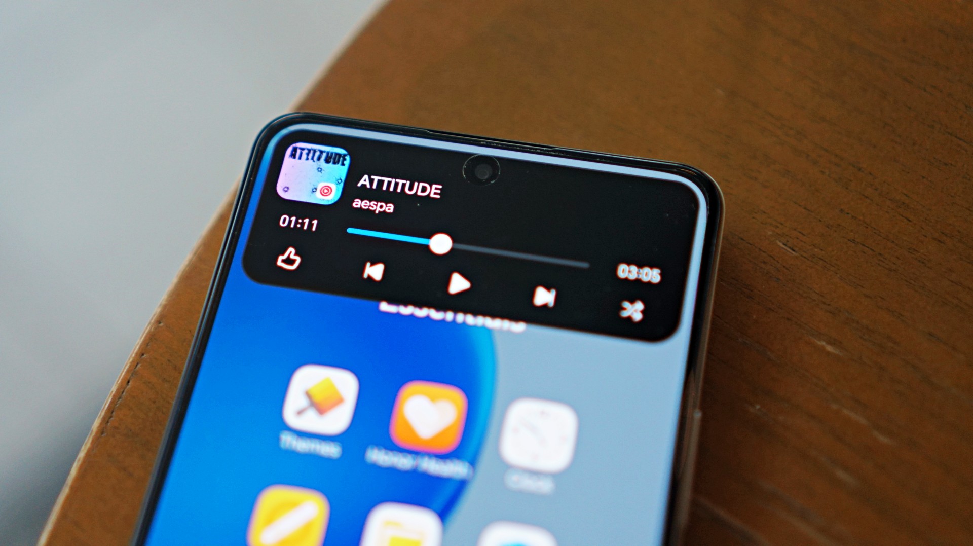
Now Playing: One Piece Season 2
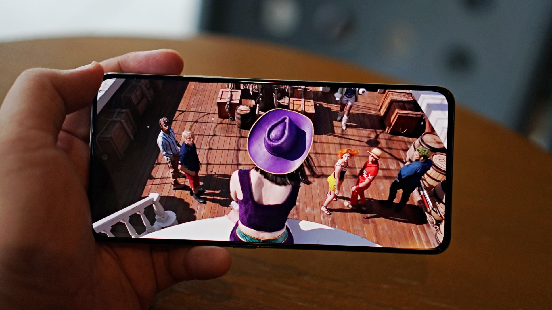
I skimmed through a few episodes of the One Piece Season 2 live action on Netflix and again it was… alright. Nothing here will blow you away but it serves its purpose.
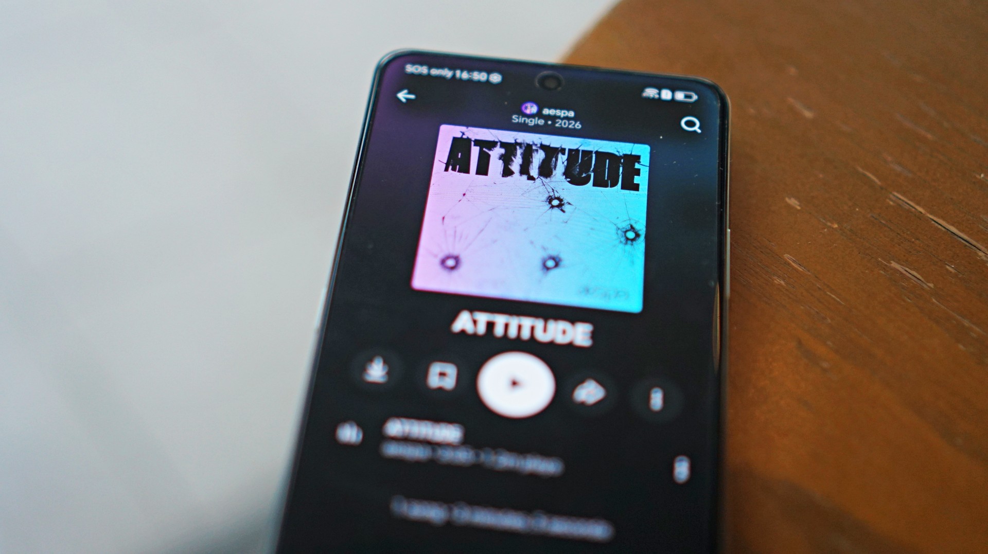 I also listened to “Attitude” by aespa on YouTube music and it just echoes the general feeling of the phone – serviceable.
That said, the overall experience remains straightforward. It delivers what you need for day-to-day media consumption without going much further.
Performance is where compromises show
The HONOR X8d runs on the Snapdragon 6s 4G Gen 2 paired with 8GB of RAM. On paper, it’s positioned for everyday tasks, but in practice, performance leans on the modest side.
Basic interactions like switching between apps or scrolling through feeds can feel slower than expected. There’s a noticeable delay at times, even during simple tasks, which affects the overall flow of the experience.
This extends to camera usage as well, where responsiveness can occasionally feel a step behind. The device remains usable, but the pacing may feel dragging depending on what you’re used to.
Cameras are reliable in good light
The HONOR X8d is equipped with a 108MP main camera alongside a 5MP wide camera, with a 16MP shooter up front.
In good lighting conditions, the phone produces decent images. Shots are clear enough, with acceptable detail and color for social media sharing. The camera system also benefits from a suite of AI tools such as AI Eraser, AI Cutout, and AI Upscale, which add flexibility when editing photos.
Zoom options at 1x, 2x, and 3x remain usable, though results are best when lighting is favorable. Overall, the camera system is dependable for casual snaps.


Software and AI: familiar, feature-filled
Running on MagicOS 10 based on Android 16, the HONOR X8d comes with a feature-rich software experience. It includes tools like AI Translate, AI Writing, AI Notes, and AI Recorder, alongside features such as Magic Portal and Circle to Search.

Like many Android skins today, MagicOS follows a design approach that will feel immediately familiar. The layout, navigation, and overall structure borrow heavily from the iOS-inspired blueprint that most brands have adopted. It’s easy to get into, even for less experienced users.
Typical of entry-level smartphones, the device also includes app recommendations out of the box. Thankfully, these aren’t overly intrusive, and many of the suggested apps are ones users would likely install anyway.
The software helps add depth to the overall package, even if the hardware limits how smooth everything feels in actual use.
Battery and everyday use is a clear strength
One of the standout features of the HONOR X8d is its 7000mAh battery. It’s designed to last through extended use, whether for streaming, browsing, or everyday communication.
Paired with 45W HONOR SuperCharge, topping up the device remains relatively quick. For users who prioritize longevity over speed, this is easily one of the more reliable aspects of the phone.
Is the HONOR X8d your GadgetMatch?
When HONOR Philippines was first teasing the phone it was positioned as something for students. But if I were a parent, I’m pretty sure I’d like my kid to have some kind of advantage and not have to deal with a device that might not be able to keep up with them.
After learning that it’s priced at PhP 15,999 my verdict just became much clearer. This is a Swipe Left.
Add a few more to that price and you can get an excellent smartphone at its early bird price.
The HONOR X8d focuses on delivering the basics—design that works, a large battery, and a feature-filled software experience.
However, the overall experience depends heavily on what you prioritize. For users who simply need a phone that can get through daily tasks, the X8d does enough to hold its ground. For those who value speed and responsiveness, it may feel a step behind.
Whether it fits your needs ultimately comes down to how much you’re willing to trade performance for battery life and features.
Reviews
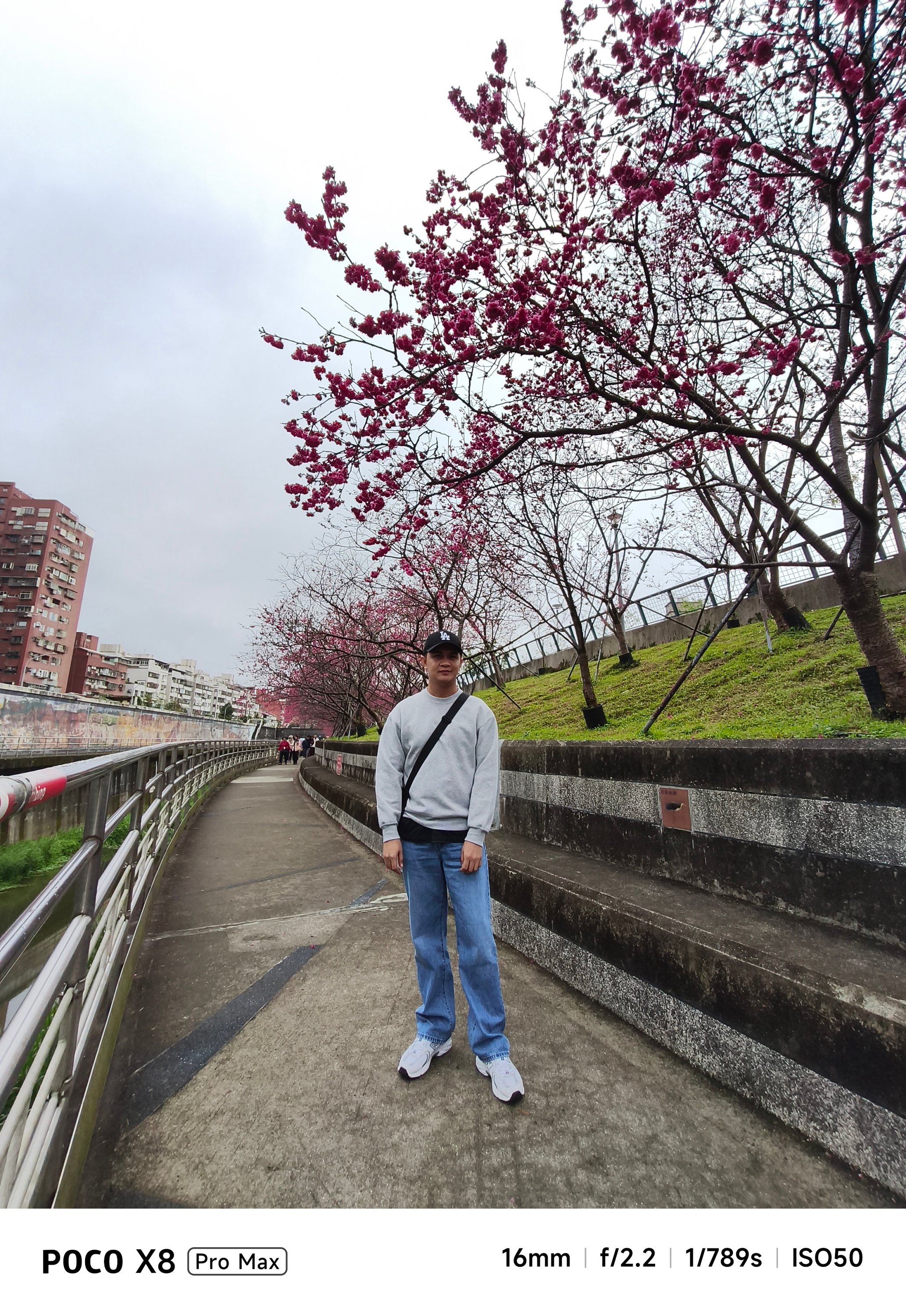
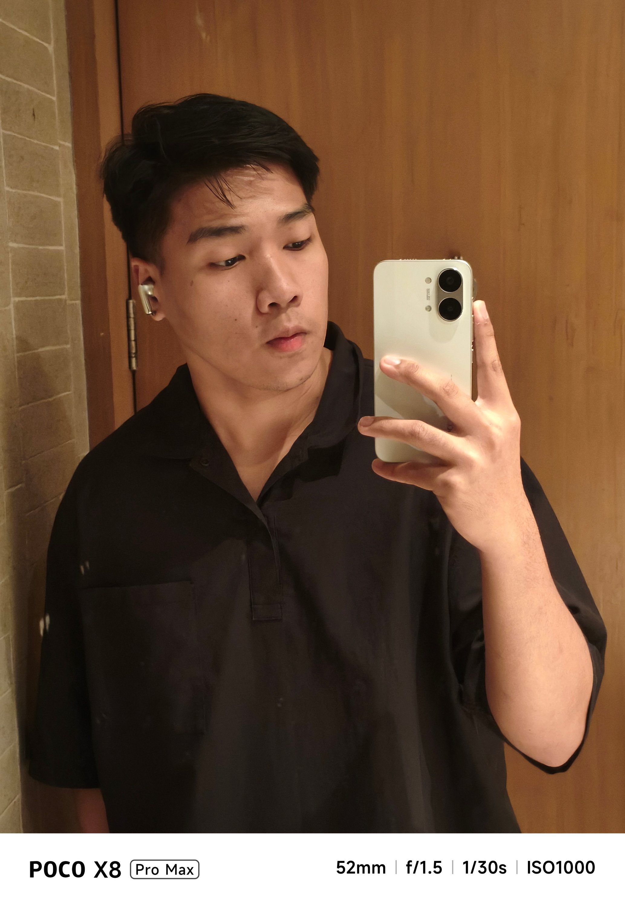
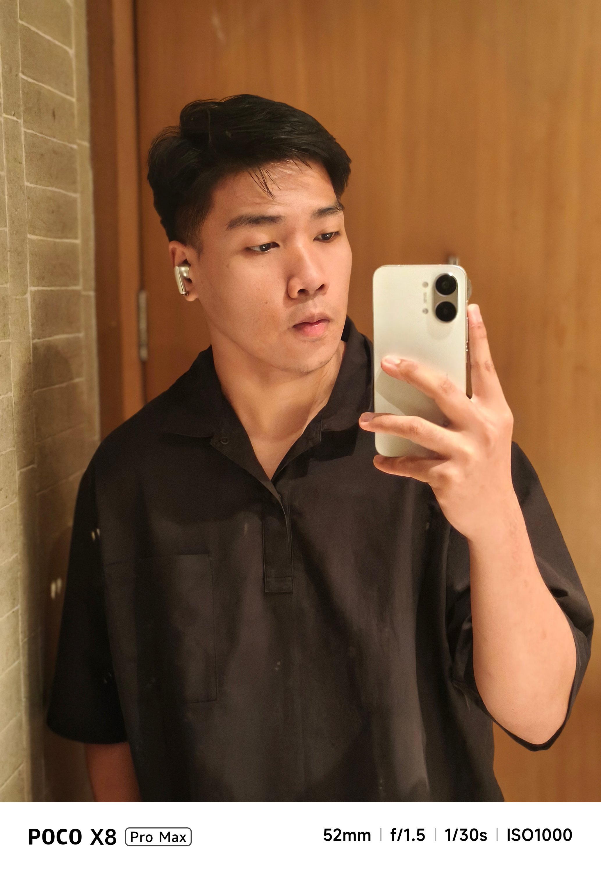
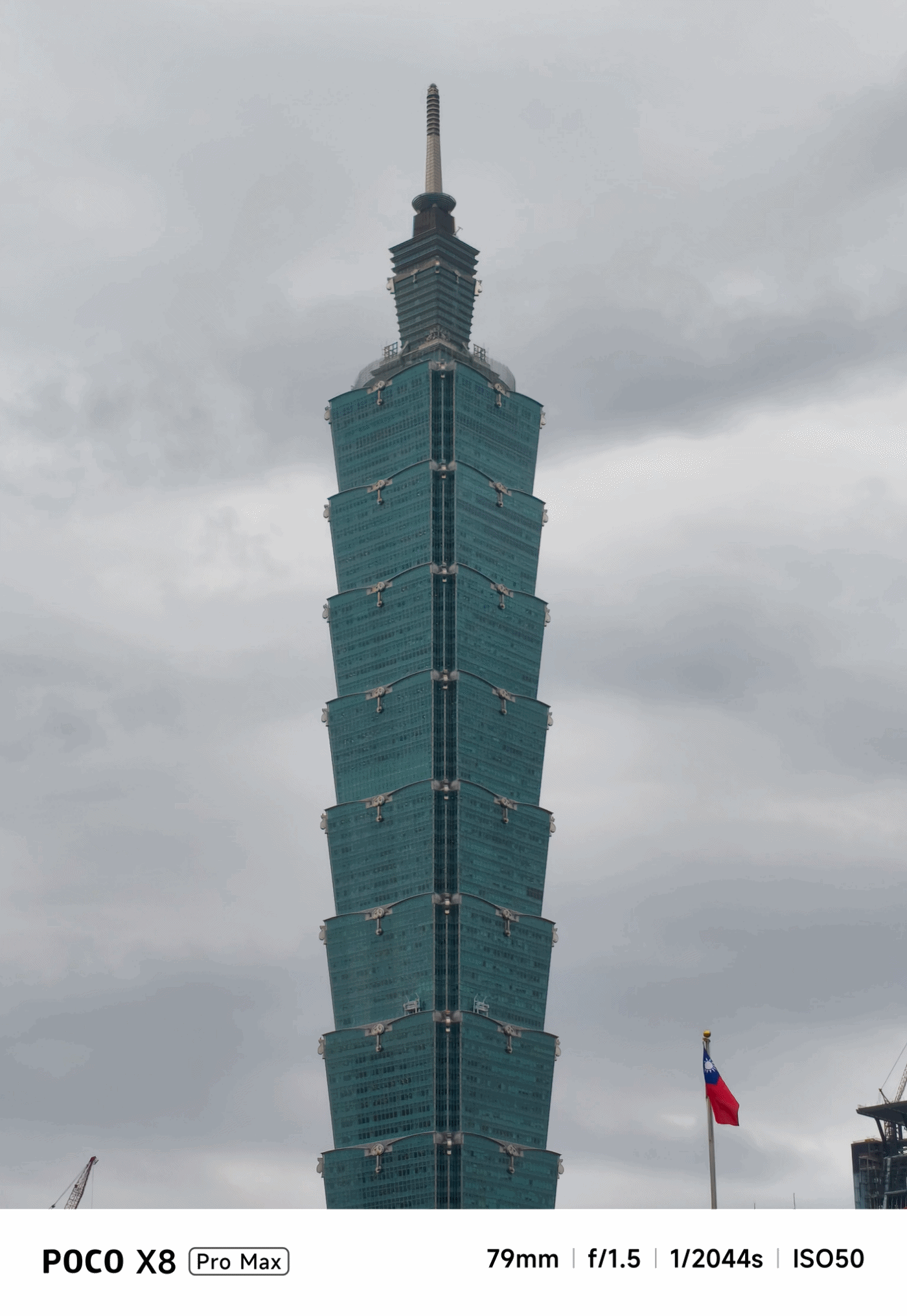
POCO X8 Pro Max review: A new beast from the far east
That “Pro Max” naming superlative is more than justified
Just when I thought POCO was done for the first quarter of 2026, I was instantly humbled.
Two months after the M8 Pro I’ve held, POCO is back with another beast, packing an even more powerful punch.
Here’s my extensive experience with the all-new POCO X8 Pro Max.
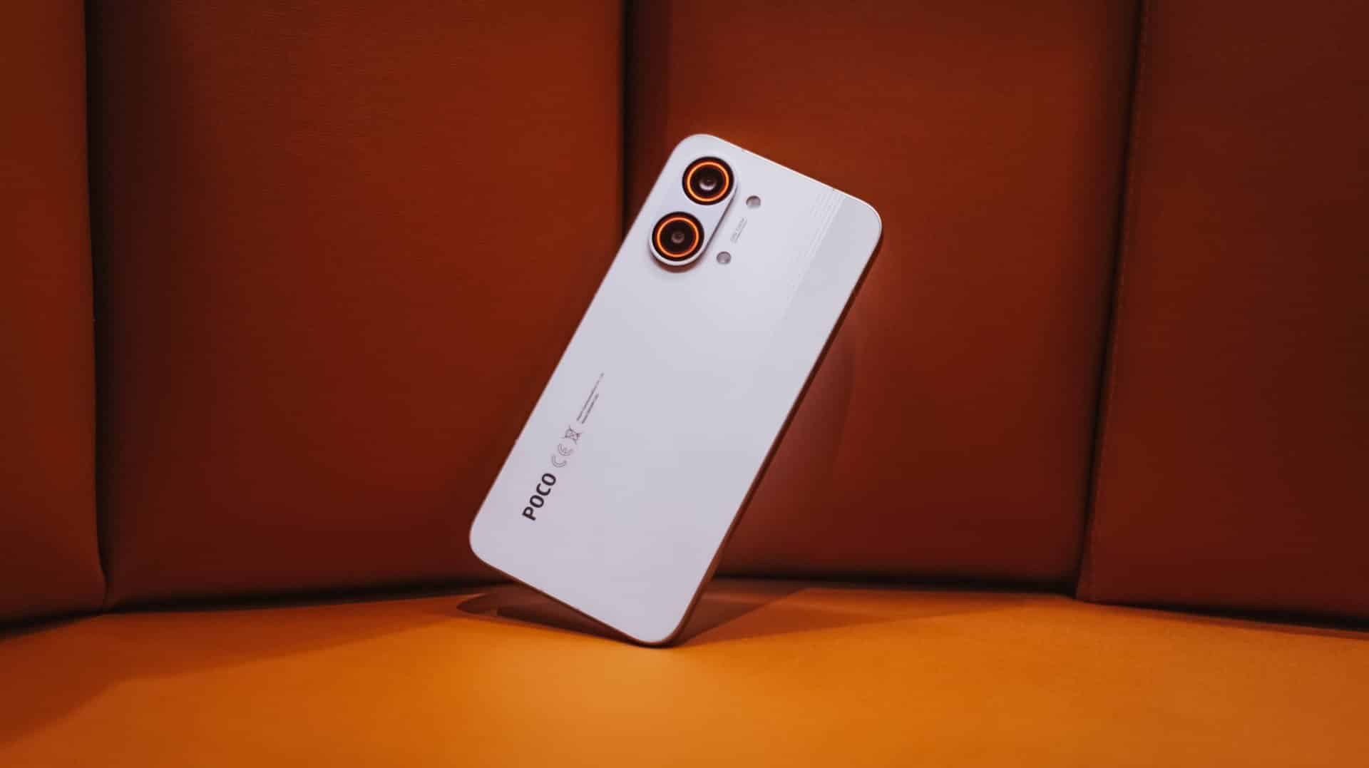
Nothing flashy, yet still fancy
First time with the POCO X8 Pro Max, it’s honestly nothing too fancy.
While it does not dare to rival the likes of the Nothing Phone (4a) Pro, Infinix’s NOTE 60 Ultra, or TECNO’s POVA Curve 2 5G, the POCO X8 Pro Max still shines in its own way.
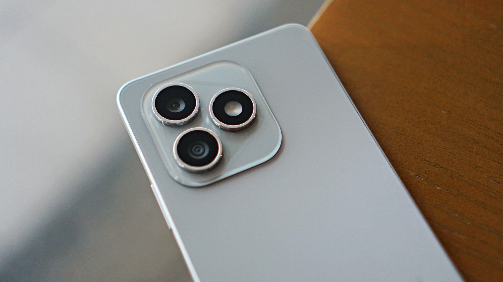
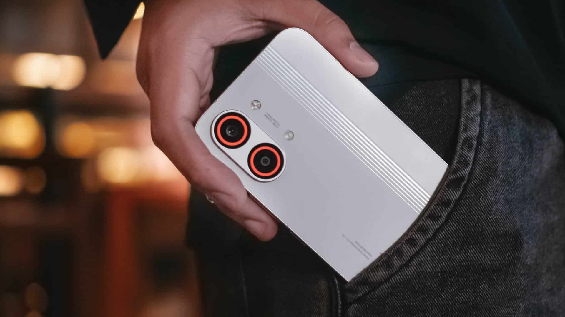
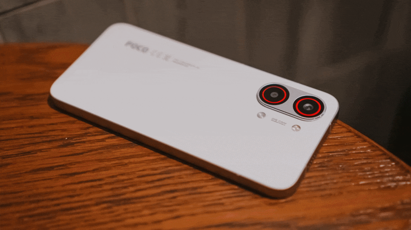
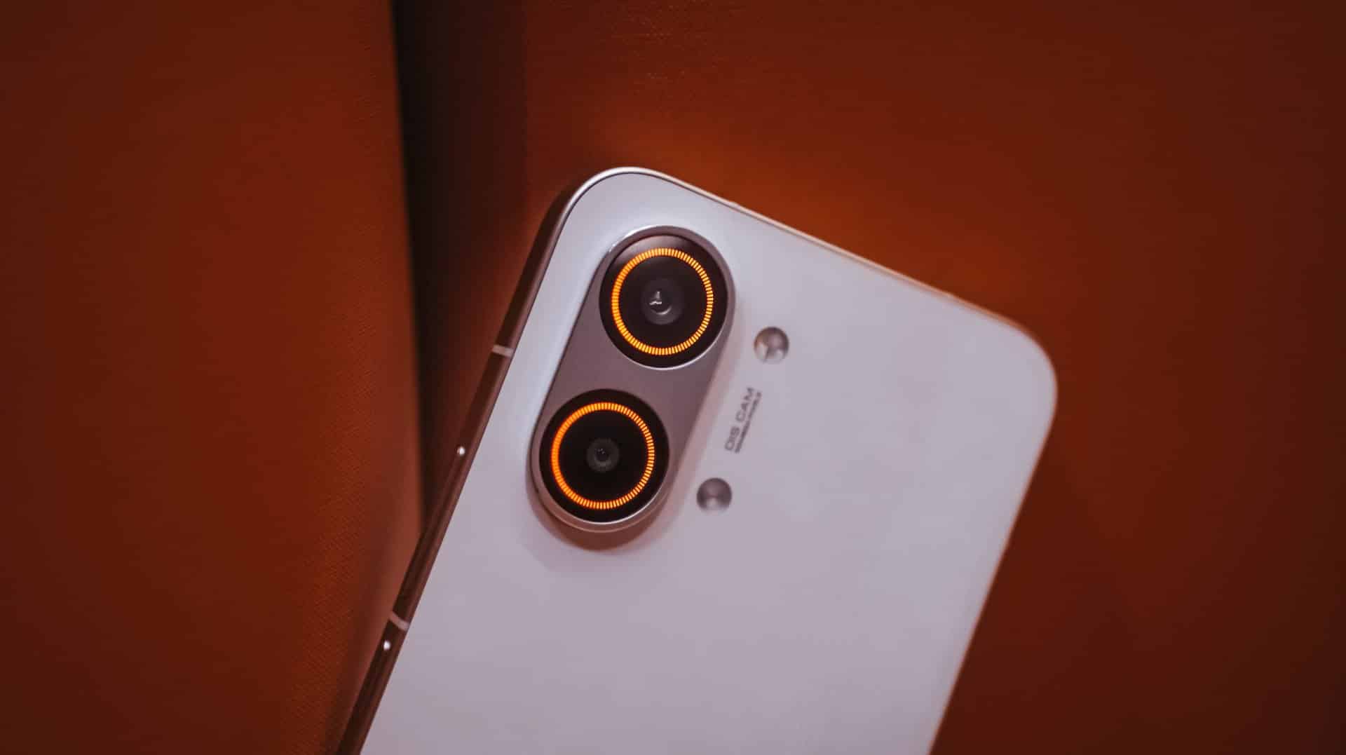
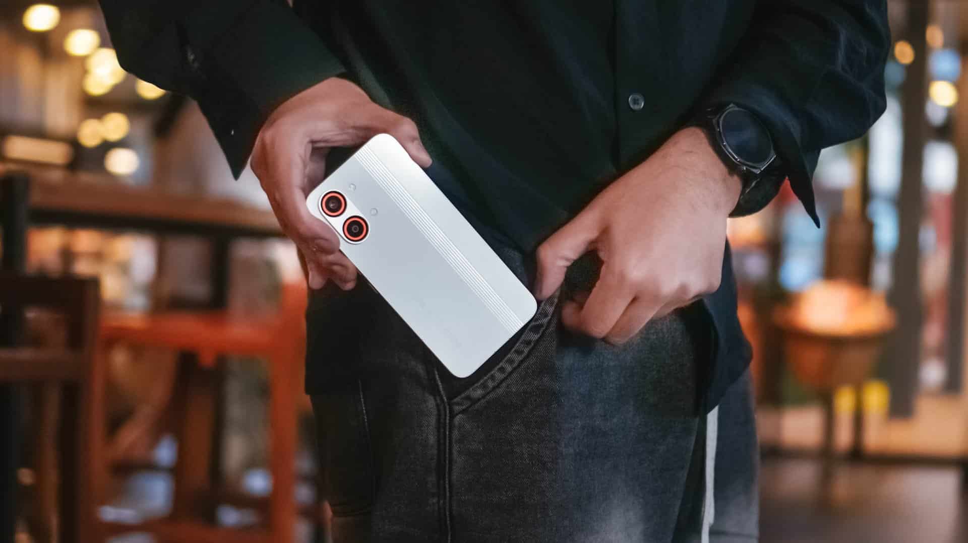
The back is clean and minimal with only the ever-so-slightly-protruding camera bump and POCO branding in sight. Upon closer inspection though, those subtle set of lines appears when hit by faint light.
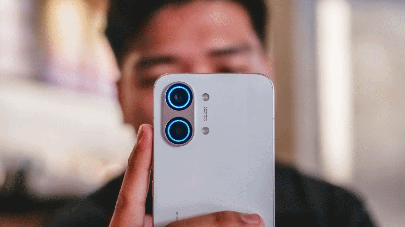
And while we’re at it, that camera bump houses an RGB light deco around the camera duo. It’s customizable with eight (8) colors alongside brightness level adjustments.
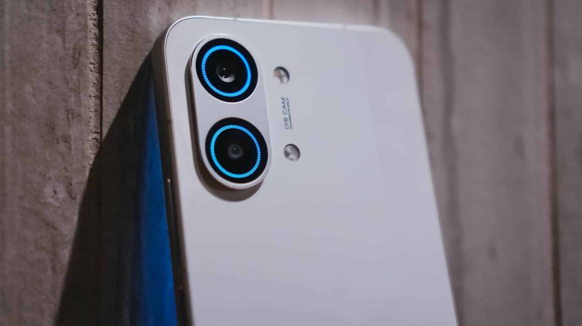
Not only does it add flair, but it’s functional too as it glows up to notify you of alerts, to indicate battery charge, to flash for a camera timer, or to light up even when just playing music or games.
The White colorway that I have adds more to that fanciness. I don’t know if it’s the same thing with the Black and Blue shades, though.
Sandwiched by that sturdy metal frame is a back cover made of fiberglass, something that is lightweight and durable at the same time.
Speaking of, the X8 Pro Max boasts quintessential quad IP ratings: IP66, IP68, IP69, and IP69K. It can withstand not just all the fine dust, beach sand, or even fresh water (but not sea water). It’s also able to resist hot jet water streams, just in case you’re stuck in such situations.
It’s great to see that these stronger IP ratings have become a staple, not just in flagships, but in most midrange offerings.
Marvelous and monstrous
Last year, POCO had only the vanilla X7 and X7 Pro (plus a special Iron Man Edition) in its X-rsenal. This year, POCO have changed things quite a bit by bringing in a newcomer with the familiar “Pro Max” naming.

And, they weren’t playing when they said “Pro Max” as this is equipped with the latest MediaTek Dimensity 9500s 3nm SoC. To be fair, this is a slightly under-clocked version of the Dimensity 9500 found on modern-day flagships, such as the vivo X300 Pro I rock daily.
Still, that doesn’t mean an underpowered performance.
First and foremost, the ever-popular Zenless Zone Zero by HoYoverse runs in High graphics settings by default. Genshin Impact has the same default setting.

The Qualcomm Snapdragon 7s Gen 4 found on the POCO M8 Pro, however, goes only for the lowest setting.
Another favorite hardcore game of mine: Racing Master based on Nvidia’s PhysX physics engine.
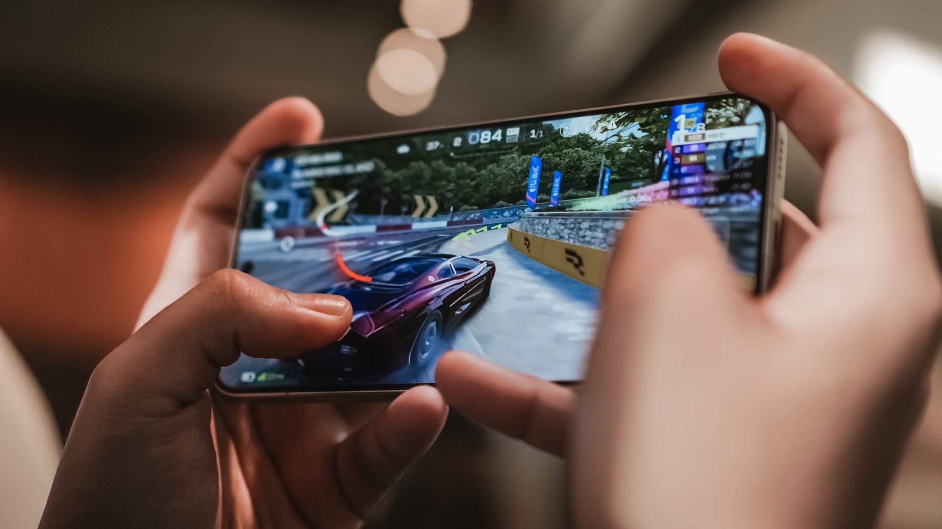
As expected, this racing game can run in Ultra-High + 60fps configuration. The M8 Pro stutters and throttles a lot during the first gameplay.
This further proves that it’s not always Snapdragon that’s winning over Dimensity.
POCO’s 3D IceLoop Cooling System also prevented those unwanted hiccups. To be precise, it features a large 5800mm² liquid cooling area where the vapor and liquid are separated for an even highly-efficient heat dissipation.
With those examples in mind, it already gives you the idea that this beast of a smartphone can handle most (if not all) of the graphics-intensive titles you can think of.
POCO further proves that this is, indeed, a Pro Max smartphone. With a speedy 12GB LPDDR5X memory and up to 512GB of UFS 4.1 storage, it’s honestly an overkill for a midranger.
Most phones in the range are stuck with the LPDDR4X and UFS 3.1 combo. It’s more evident now that the global RAM (and components) shortage affects everyone — smartphone makers not exempted.
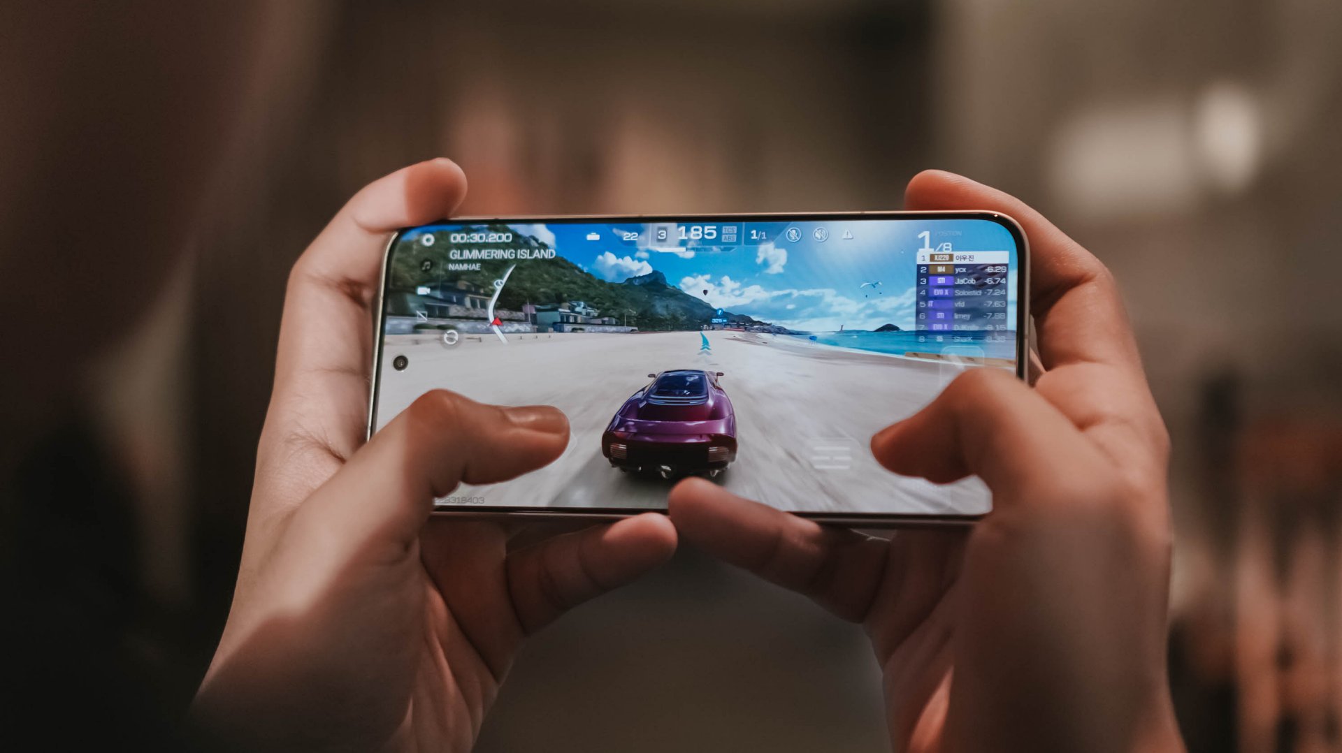
My gaming sessions would not be as easy-breezy without that buttery-smooth 120Hz display alongside that 480Hz/2560Hz touch sampling rates.
Now Playing: Even If This Love Disappears Tonight
With display already in the way, it’s high time to talk deeply about it.
One fine flight, I was bored and cannot sleep. I then just tried to watch something I added in my Netflix list — Even If This Love Disappears Tonight / 오늘 밤, 세계에서 이 사랑이 사라진다 해도 (Oneul bam, segye-eseo i sarangi sarajinda haedo).

Although I am not the type who favors cast over synopsis, Shin Si-ah being the lead honestly enticed me to click this over its gut-wrenching story.
The longer I watch it, the more I get mesmerized — both visuals and overall chemistry of her (as Seoyoon) and Choo Young-woo (as Jaewon).
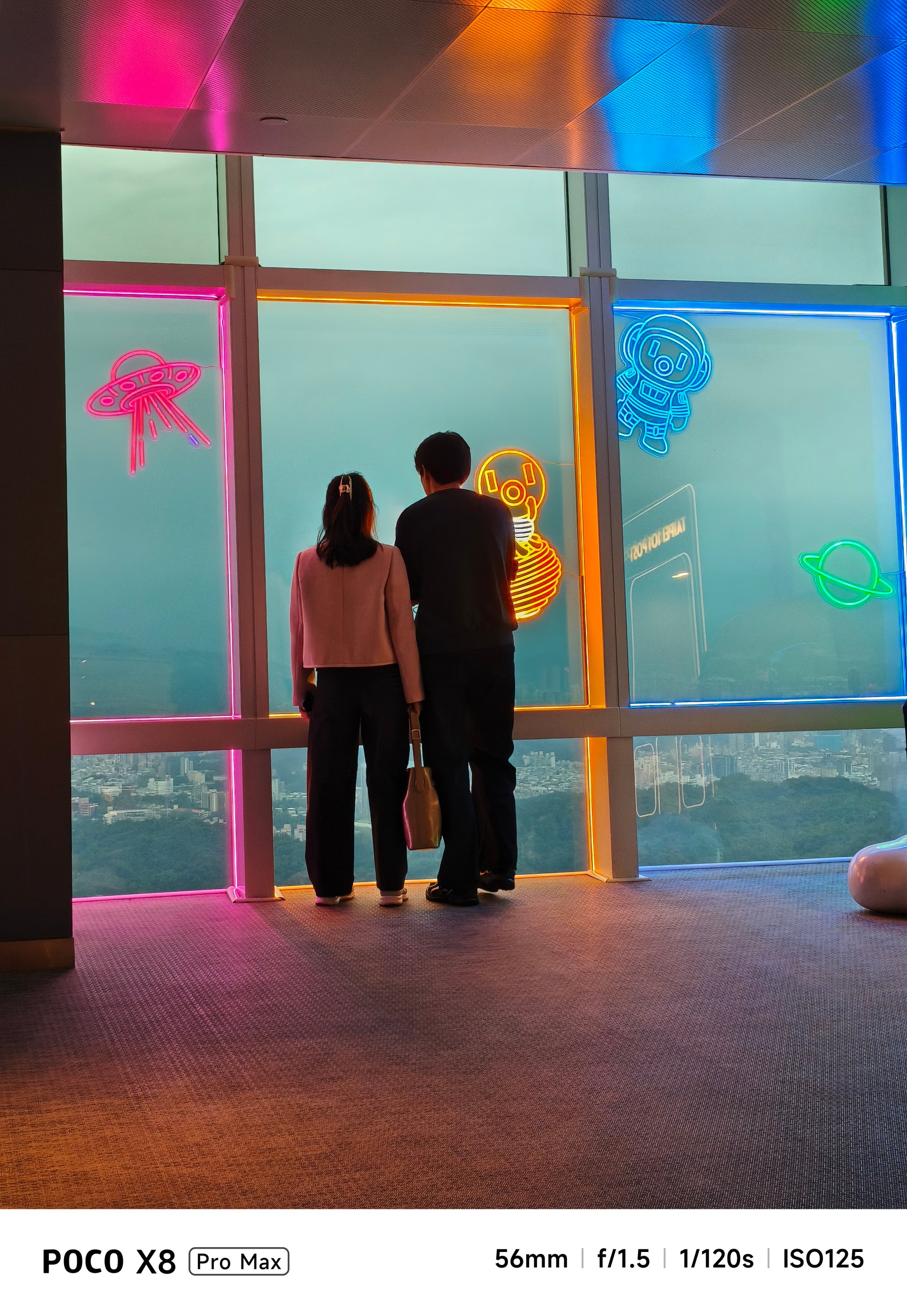
With its massive 6.83-inch AMOLED 1.5K display with up to 3500 nits of peak brightness, it’s as bright and crystal clear as this beach in Pohang, South Korea.

Spoiler alert ‼️ Much like Jaewon’s disappearance in Seoyoon’s memory, the same can be said on the X8 Pro Max. Once you are already immersed, it makes you think the display bezels have also disappeared into thin air because of how thin they are.
Seoyoon’s heartfelt emotions on-screen can be seen more especially that this display supports all the imaginable pro-grade standards in a modern-day smartphone: 12-bit color depth, 68 Billion Colors, DCI-P3 Wide Color Gamut, HDR10+, Dolby Vision.
You have been warned, though. This film is not for the faint-hearted.
But in case you faint on the ground, Corning’s Gorilla Glass 7i protects that precious display from unwanted scathes and scratches. While not as “pro” as Gorilla Glass Victus 2 or Xiaomi’s very own Dragon Crystal Glass 3, that’s still better than having no protection at all 😜
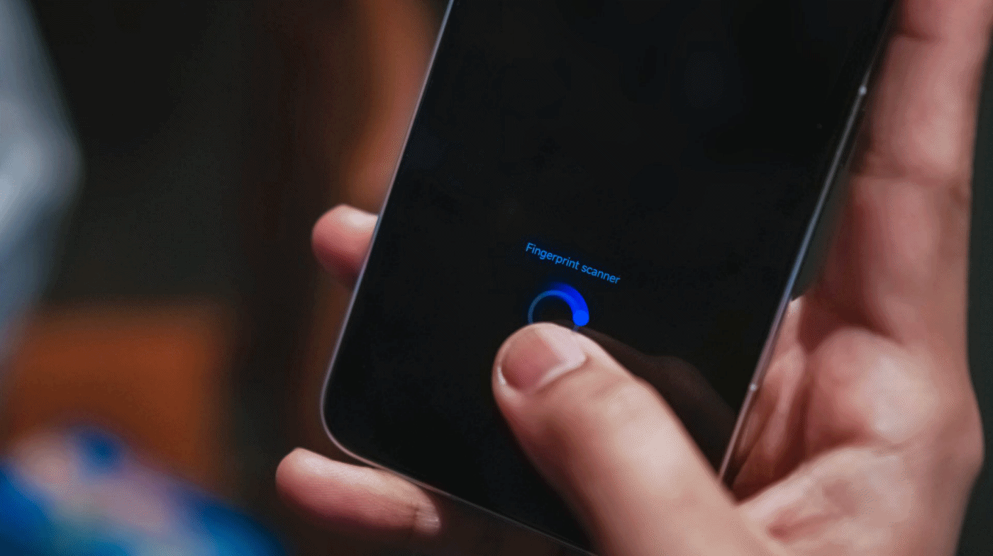
You know what’s “pro”? The inclusion of an ultrasonic in-display fingerprint scanner.
It’s honestly a dealbreaker whenever you’re in a hurry. Being able to unlock the phone in a split-second compared to conventional optical sensors in most midrangers adds up to the “Pro Max” definition of this phone.
On Queue: IVE, H1-KEY, GIRLSET
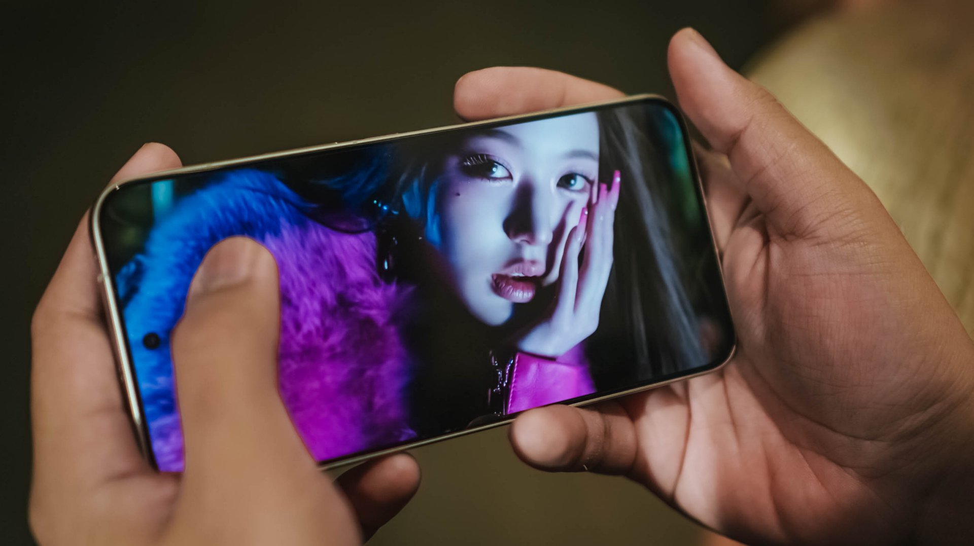
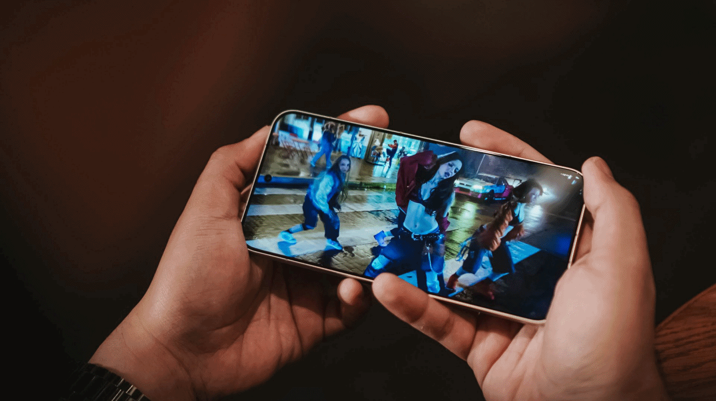
To immerse myself more, I also tried playing IVE’s futuristic BLACKHOLE music video.

Whether it’s the darkest of blacks or the whitest of whites in Liz’s scenes, or just a pop of color like Jang Wonyoung, this vibrant display is more than enough to satisfy your eyes.
But what’s a pro-grade display without a “Pro Max” audio? Well, the POCO X8 Pro Max doesn’t want to stop just yet.
With its symmetrical stereo speakers alongside that 400% volume boost feature, it instantly filled the room when I was in my banging streaming sessions in the shivering shower.
POCO promises that those speakers are certified for Hi-Res Audio and Dolby Atmos.
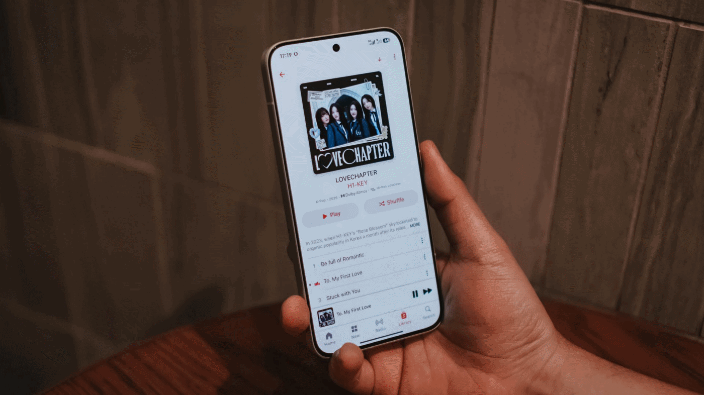
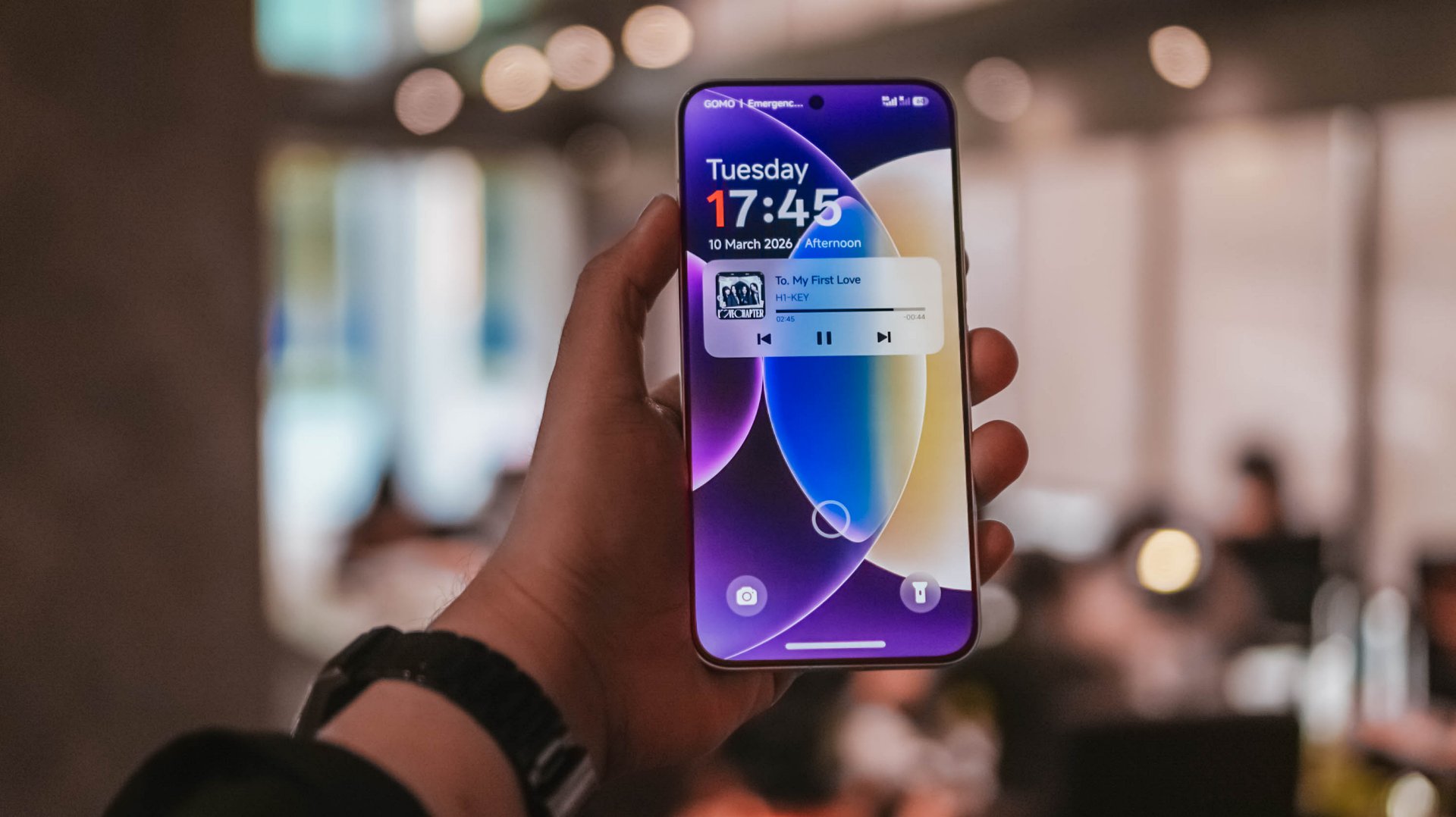
My curiosities led me to streaming H1-KEY’s full LOVECHAPTER EP in Lossless format via Apple Music.
Right off the bat, I can already hear the great separation of treble, mid, and bass in their latest comeback track, To. My First Love. Hwiseo’s adlibs truly astounded me — and so did their harmony in every chorus.

As I listen further, it made me realize it’s a great K-Pop song that brings back that good ol’ 2nd-gen K-Pop vibes. Moreover, it also fits well as an anime opening.
Not Like A Movie is also one of K-Pop’s underrated songs of 2026 that I’ve been playing ever since its release last January 2026. The whole LOVECHAPTER EP honestly deserves more praises much like this phone’s superb sound output.
Additionally, GIRLSET’s TWEAK truly made me weak with how soothing their vocals are. Mind you, I listened both in English and in Spanish (just because I suddenly miss Barcelona).
If that’s not enough, I have also tried listening to the acappella version and I felt like I’m listening to the Gods in heaven with how pure their vocals alongside their soulful harmonization.
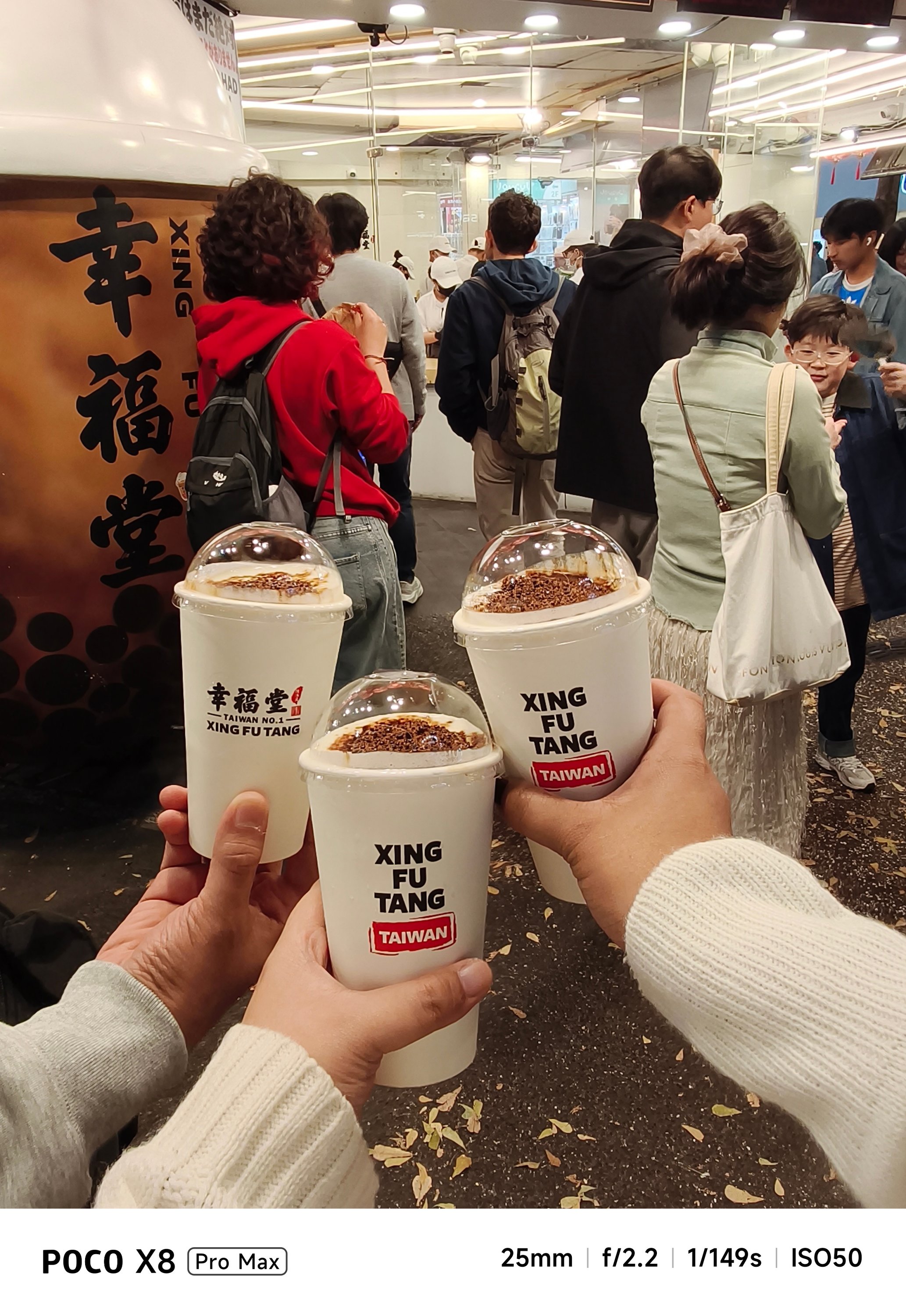
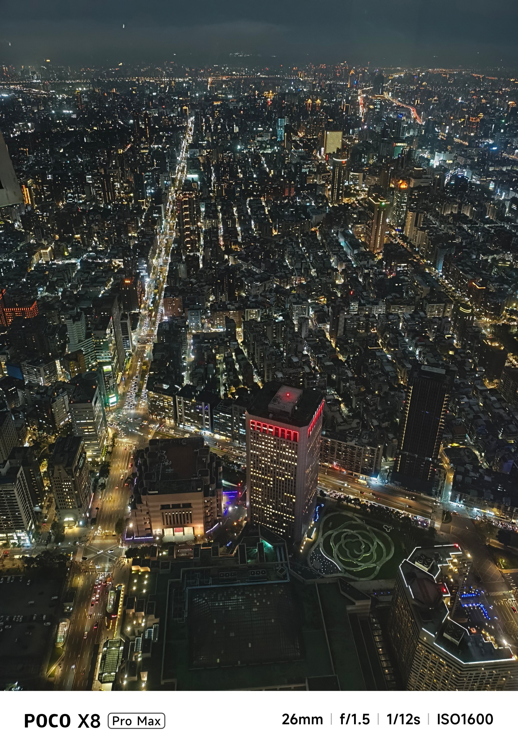
Satisfying snapper
Let’s be real: Cameras are the mostly forgotten aspects among phones in this segment.
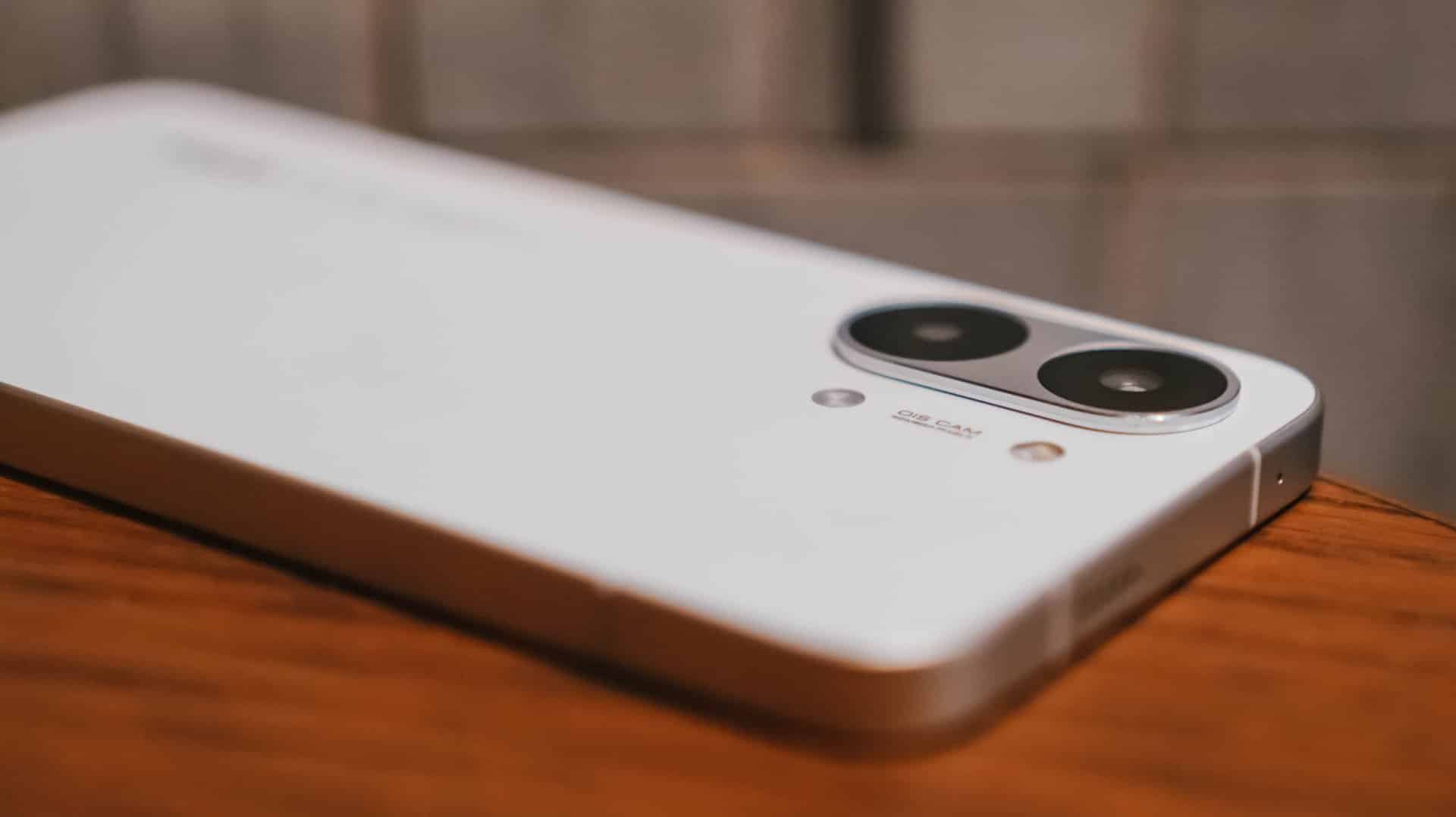
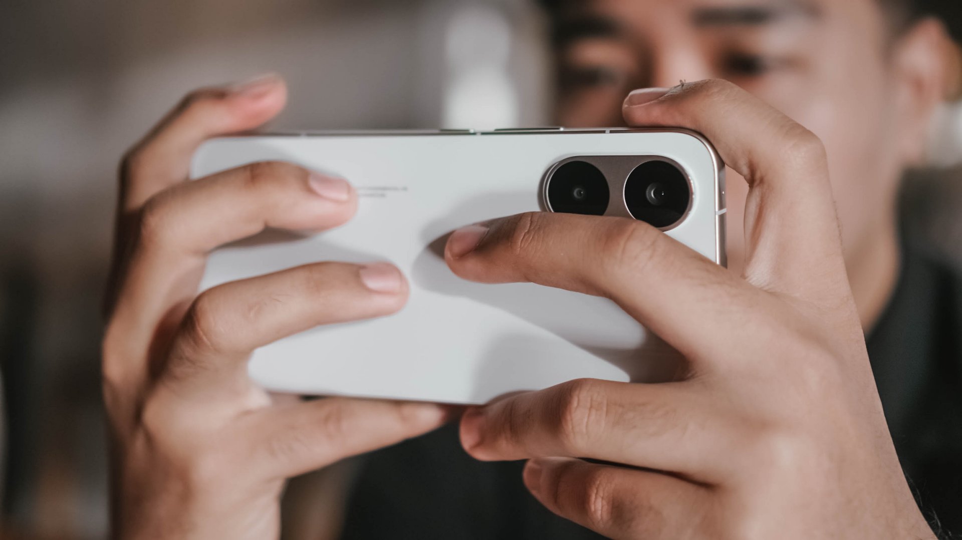
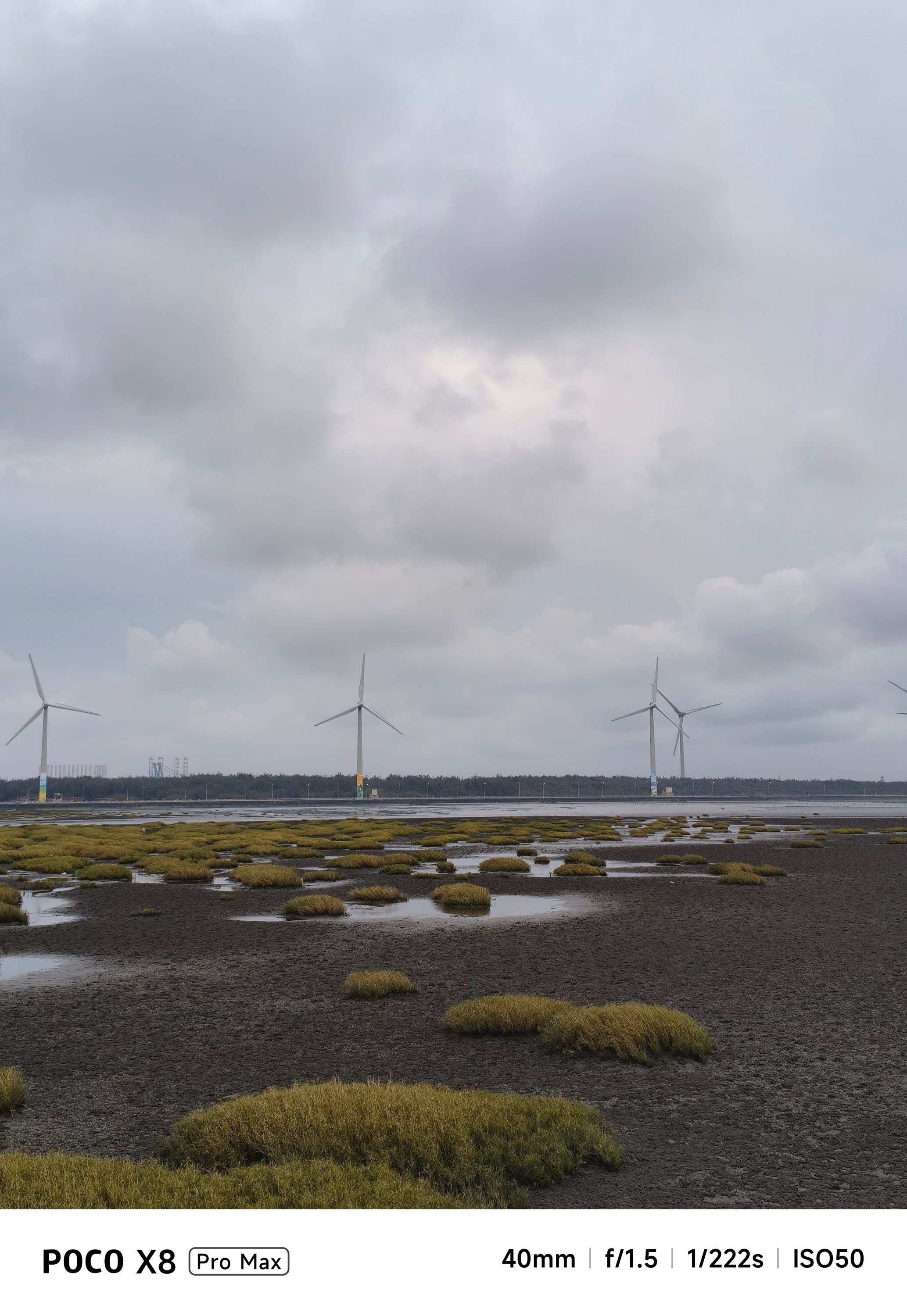
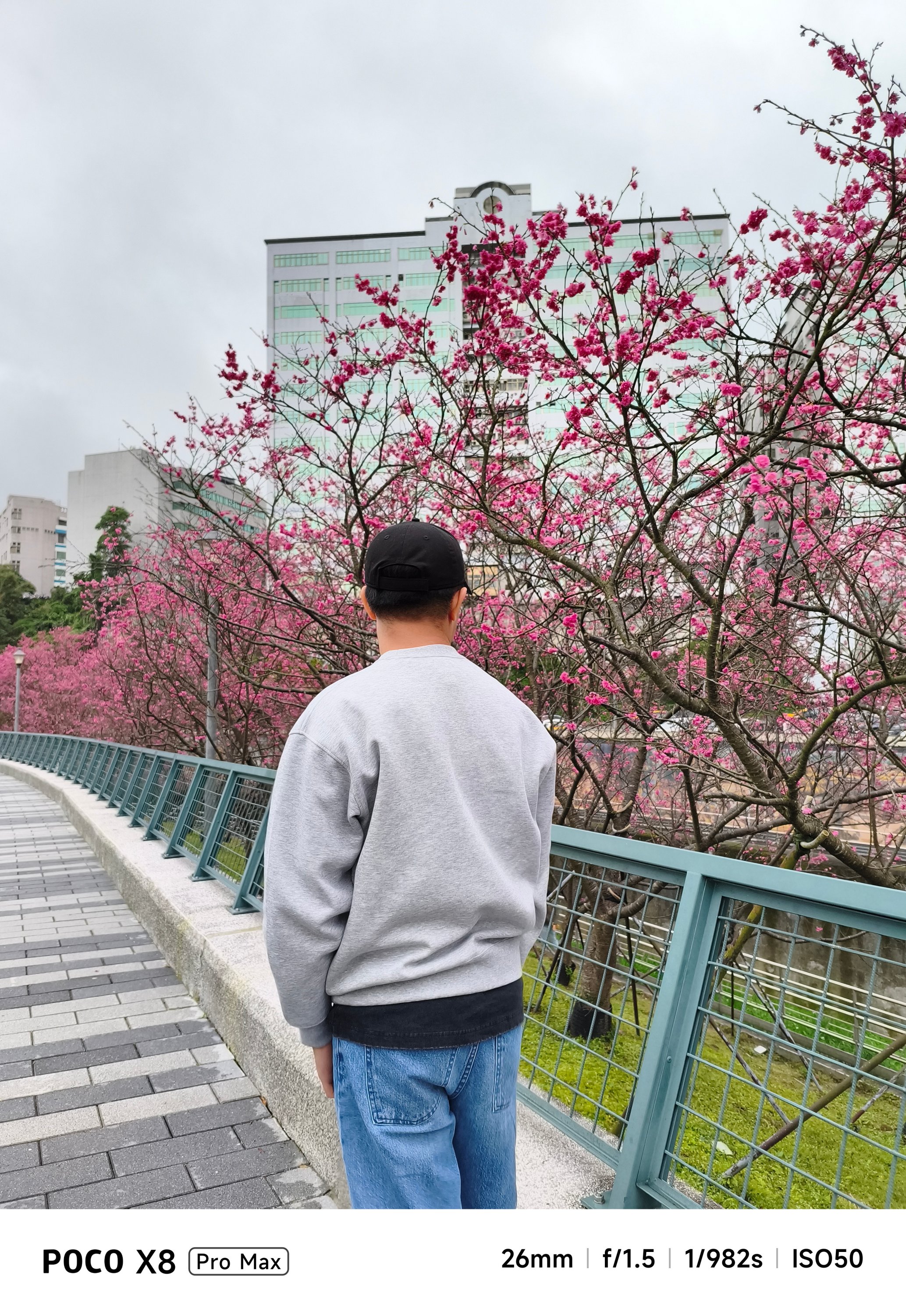
On paper, none of its cameras have Sony’s LYT / IMX or Samsung’s ISOCELL sensors. Instead, you’ll get a 50MP f/1.5 main rear camera based on LightHunter Fusion 600’s 1/1.95-inch sensor.
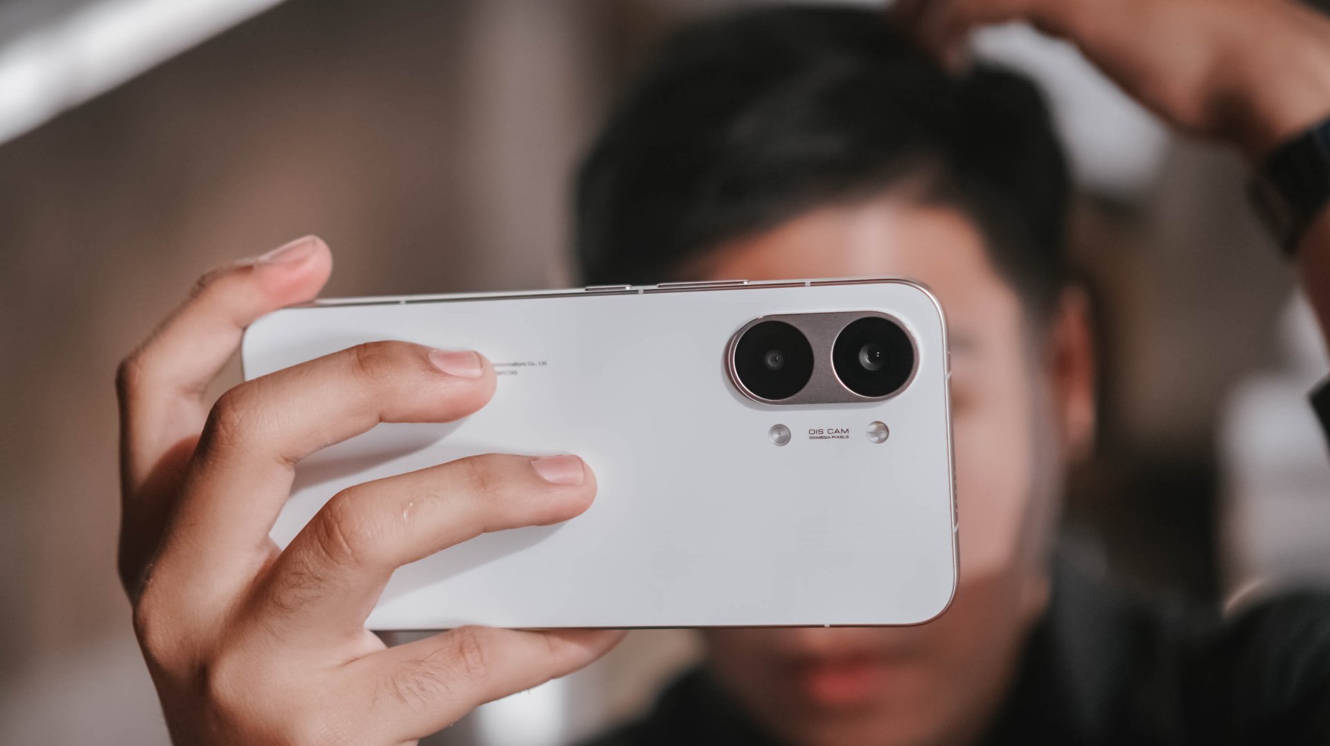
Meanwhile, its ultra-wide shooter is nothing special at 8MP f/2.2. For selfies, it’s a 20MP front snapper.
But, as we always say here, specs aren’t everything. Looking solely at the filling of the cake, the POCO X8 Pro Max can still deliver satisfying snaps.


With the right angle, framing, and even lighting, it can deliver quality shots regardless of the camera hardware it possesses.


Portraits are surprisingly decent, too.


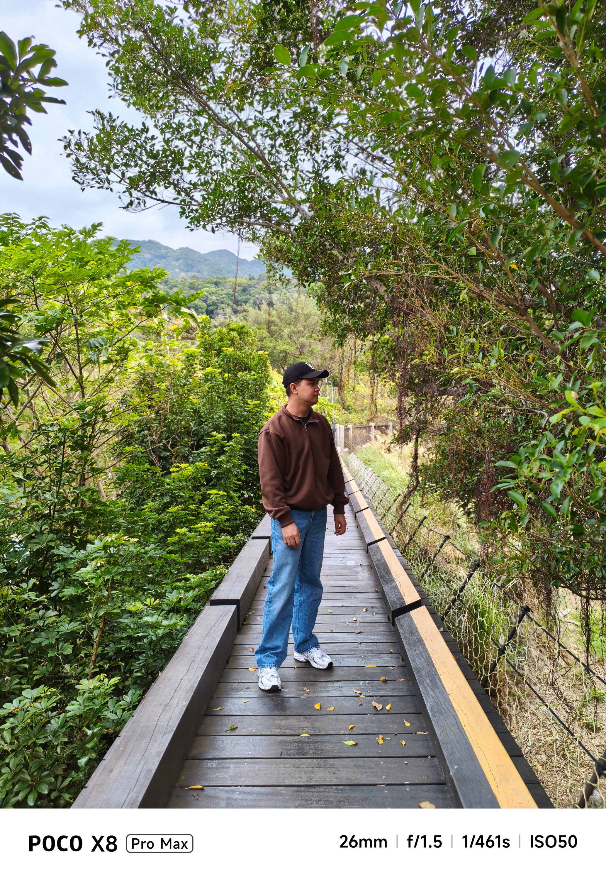

They are social media-ready and post-worthy as well.


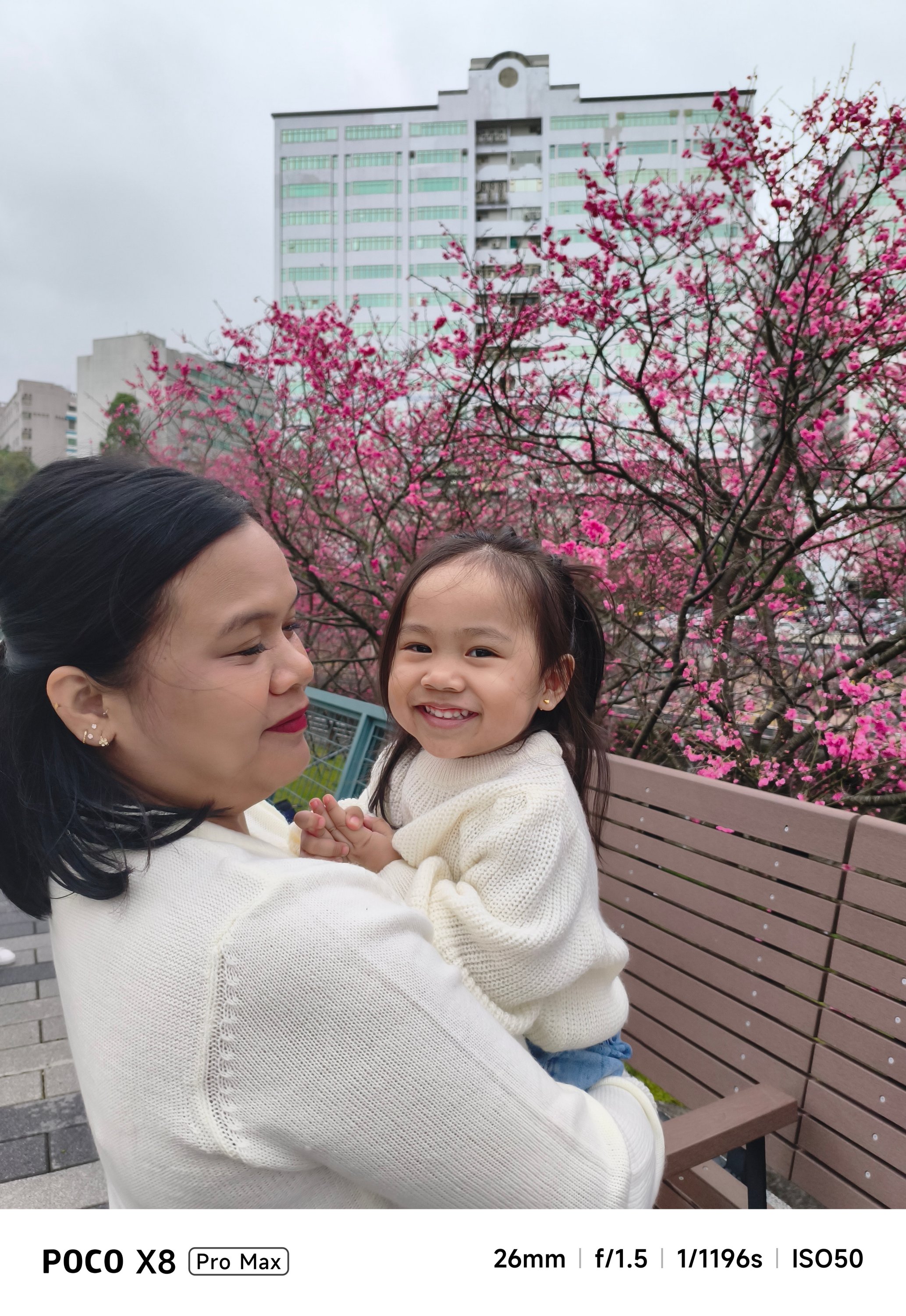

If you’re not a professional shooter, that shutter responsiveness is enough for those picture-perfect portraits.


Cutouts aren’t flawless, though. But, what should we even expect in a conventional camera combo like this?
-
- Portrait OFF
-
- Portrait ON
The absence of a dedicated zoom camera is evident when you try to capture anything past the 3x range.


Meanwhile, dimly-lit shots can be either a hit or miss.


In a scene where there’s the least amount of natural light, it will rely heavily on sharpening and brightening the image.

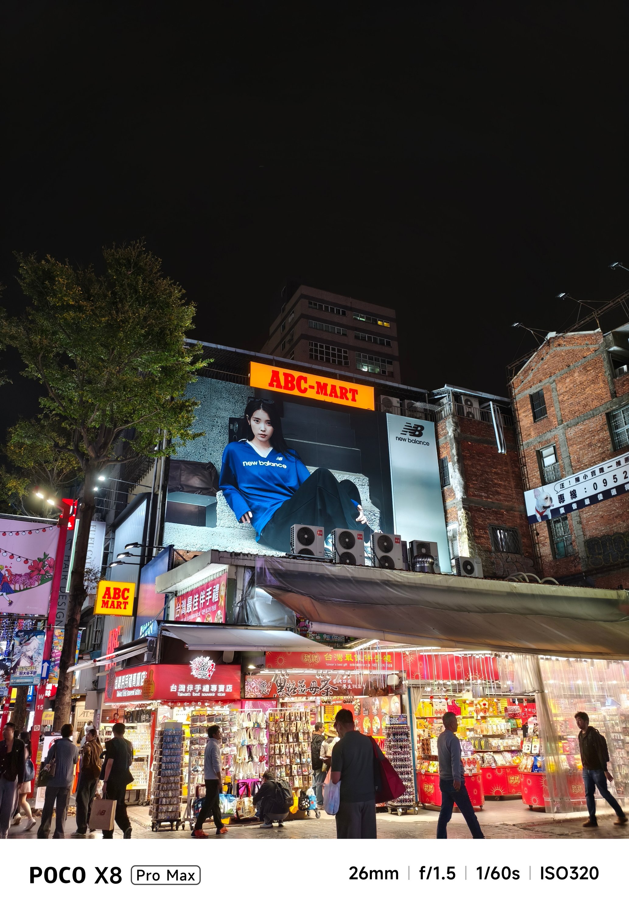
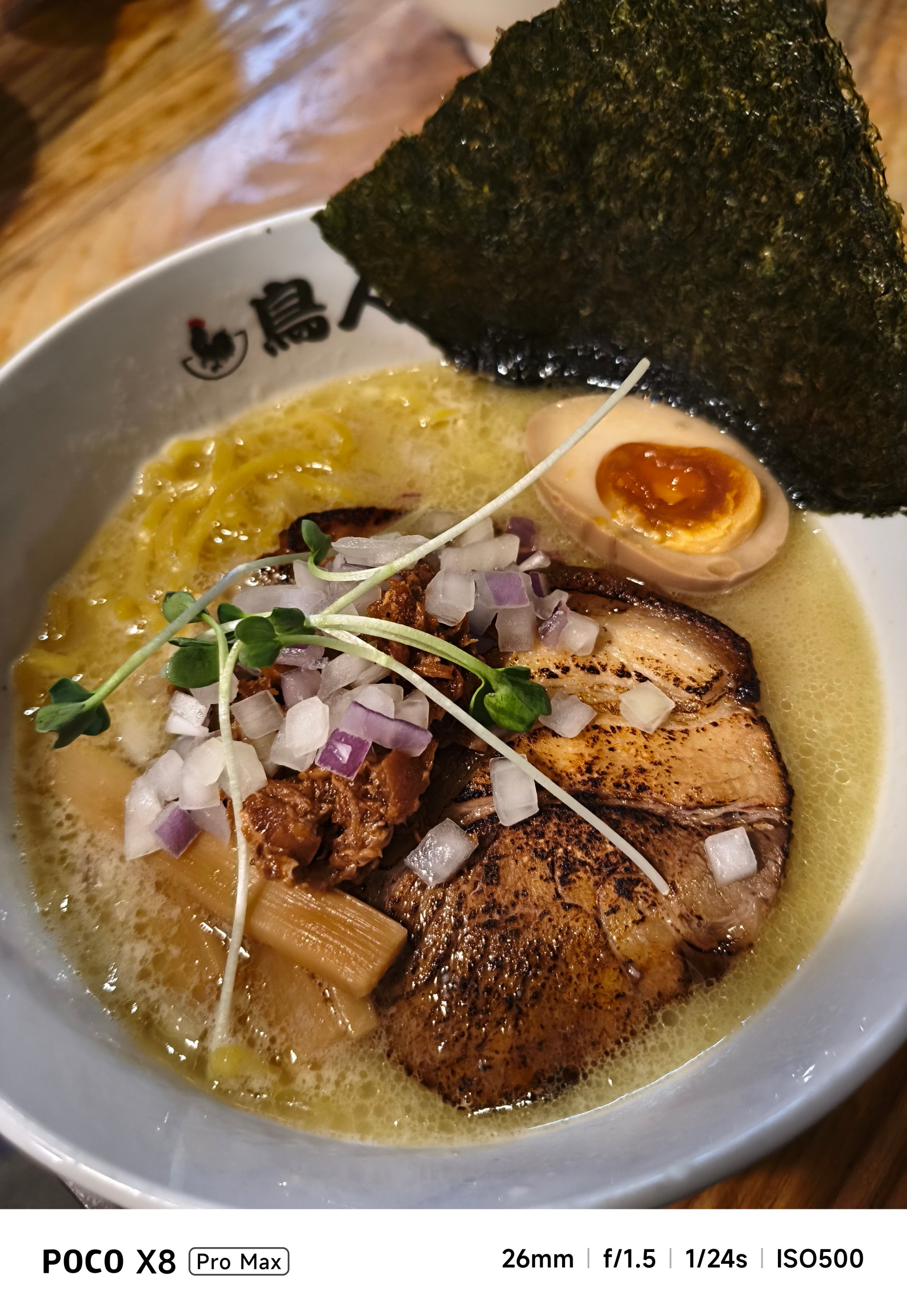
Nevertheless, food shots will still look appetizing enough, regardless of lighting condition.


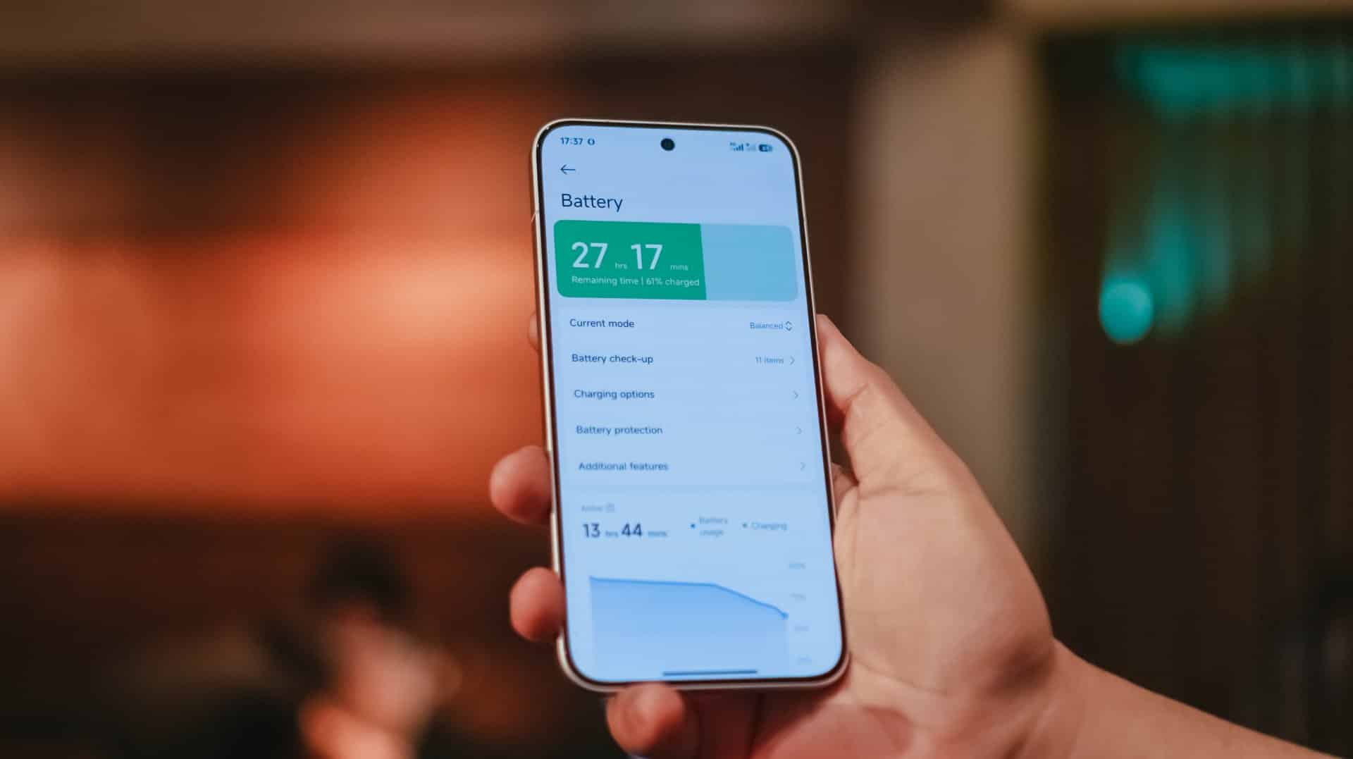
Battery behemoth
Last but certainly not the least, the POCO X8 Pro Max packs a mighty tank inside — an 8500mAh Si/C battery, to be exact. This is currently POCO’s biggest battery offering in their current line of smartphones.
I would be lying though if I didn’t say I am envious that the China variant (REDMI Turbo 5 MAX) has a bigger 9000mAh capacity.
Still, for day-to-day basis, it’s hard to fully drain the phone in one sitting. If you’re chronically online, the POCO X8 Pro Max will surely handle all your social media-ddiction.

As we speak, gaming is pretty much the baseline for being able to tell how power hungry this beast is.
For instance, the moment I set up and installed all the necessary games I can think of, that 5-hour installation of three games only took up about 20% of charge from its 68% battery state — fresh from the factory.
During a mix of 2.5-hour gameplay, the battery depleted from 48% down to 31%.

Even consuming entertainment shouldn’t be much of a battery hog. Binging K-Pop music videos and live performances on YouTube plus Netflix titles for around three hours ears only a measly 10%.

Heck, even with just 1% remaining in the tank, I was still able to play H1-KEY’s latest comeback song in Apple Music for another ten minutes before the phone fully died.
Now, this is where Xiaomi’s 100W HyperCharge capability comes in.
Although the review unit I have doesn’t have one, I was still able to hook it in with an existing 100W HyperCharge adapter from my stash.
However, most users won’t even have one. Thankfully, the POCO X8 Pro Max is compatible with the PPS charging protocol which enables third-party chargers to fully-utilize that 100W charging speeds, and the results aren’t far off.
My GadgetMatch Charge Test further proves that.
Xiaomi 100W HyperCharge Adapter |
UGREEN 100W Uno GaN Charger |
|
START TIME (From 0%) |
3:18PM |
12:34AM |
3 minutes |
0% |
1% |
5 minutes |
4% |
2% |
10 minutes |
8% |
11% |
15 minutes |
17% |
15% |
20 minutes |
22% |
24% |
30 minutes |
34% |
37% |
45 minutes |
55% |
57% |
1 hour |
76% |
77% |
1 hour 15 minutes |
94% |
95% |
END TIME |
4:48PM
|
2:08AM
|
As an addition, I also made the POCO X8 Pro Max as my personal hotspot. I went out around 8AM with 100% charge left. The moment I got back home by 11 in the evening, there’s still 43% left. Most phones have already drained right after the sun has set by 6PM.

Moreover, not only it’s limited to just a dual physical SIM slot. Another slot can run eSIM, which is always my go-to option when traveling. It’s a huge relief this POCO phone supports it as the M8 Pro doesn’t have one.
Speaking of, this phone can also serve as your power bank! With its 27W reverse wired charging support, it can top-up the dead batteries of your 5000mAh phones 👀
And before I forget, Xiaomi’s HyperOS 3 isn’t the most power-efficient system out there. If you happened to read my POCO M8 Pro and Xiaomi Pad 8 review write-ups, you already get the gist of this.
To be specific, as I breezed through my last battery settings, I’ve noticed that App Vault drained the second highest when your phone is in idle mode. I haven’t even set up the feature as of this writing.
This is another reason why my sentiments against the company’s OS keep getting stronger. I’m just hoping they could fix these worrisome woes that affects a lot of existing and prospective Xiaomi / REDMI / POCO users.
Is the POCO X8 Pro Max your GadgetMatch?
The arrival of the POCO X8 Pro Max blows the rest of the competition out of the water.
Although Xiaomi’s HyperOS is the elephant in the room, that was easily overshadowed by how mighty this smartphone is.
The POCO X8 Pro Max is as straightforward as it can get. From visuals, to core performance, all the way to battery endurance (and even capable cameras), I honestly cannot speak ill about it — especially for a phone in this price point.
Whether you’re just a casual user looking for a pro-grade yet inexpensive smartphone or you’re purely just a spec-savvy nerd, you’ll easily drool with how great the POCO X8 Pro Max is.
And with prices of just PhP 25,999 or PhP 27,999 / US$ 469 or 529 paired with all these powerful hardware, what more can you ask for?
They are even heavily discounted now with early bird offers ranging between PhP 18,499 ~ PhP 20,249 and US$ 429 and 459 respectively.
If it is not evident enough with my high praises, the POCO X8 Pro Max is an ultimate Swipe Right, Super Swipe, and a worthy recipient of the GadgetMatch Seal of Approval.


WWE 2K26 lets you live out all the fantasy matches you could want
But you have to play for hours and hours to unlock everyone.

The HONOR X8d is serviceable
Steady but slow?


POCO X8 Pro Max review: A new beast from the far east
That "Pro Max" naming superlative is more than justified
WWE 2K26 lets you live out all the fantasy matches you could want

Shokz OpenFit Pro launches at Power Mac Center, brings open-ear noise reduction

How the Ford Ranger is powering community resilience

God of War: Sons of Sparta takes a more contained approach to Kratos

Samsung brings AirDrop support to Quick Share with Galaxy S26 series


-
Reviews6 days ago
POCO X8 Pro Max review: A new beast from the far east
-

 News6 days ago
POCO X8 Pro Series: Price, availability in the Philippines
-

 Laptops2 weeks ago
Apple MacBook Neo Review
-

 Apps1 week ago
Google Maps is finally getting a 3D mode
-

 Features1 week ago
Galaxy AI on the Samsung Galaxy S26 Ultra
-

 Entertainment2 weeks ago
The internet is thirsting over the One Piece Season 2 cast
-

 Automotive2 weeks ago
BYD is reportedly considering an F1 team
-

 Gaming2 weeks ago
Resident Evil Requiem will get a story expansion