
Reviews
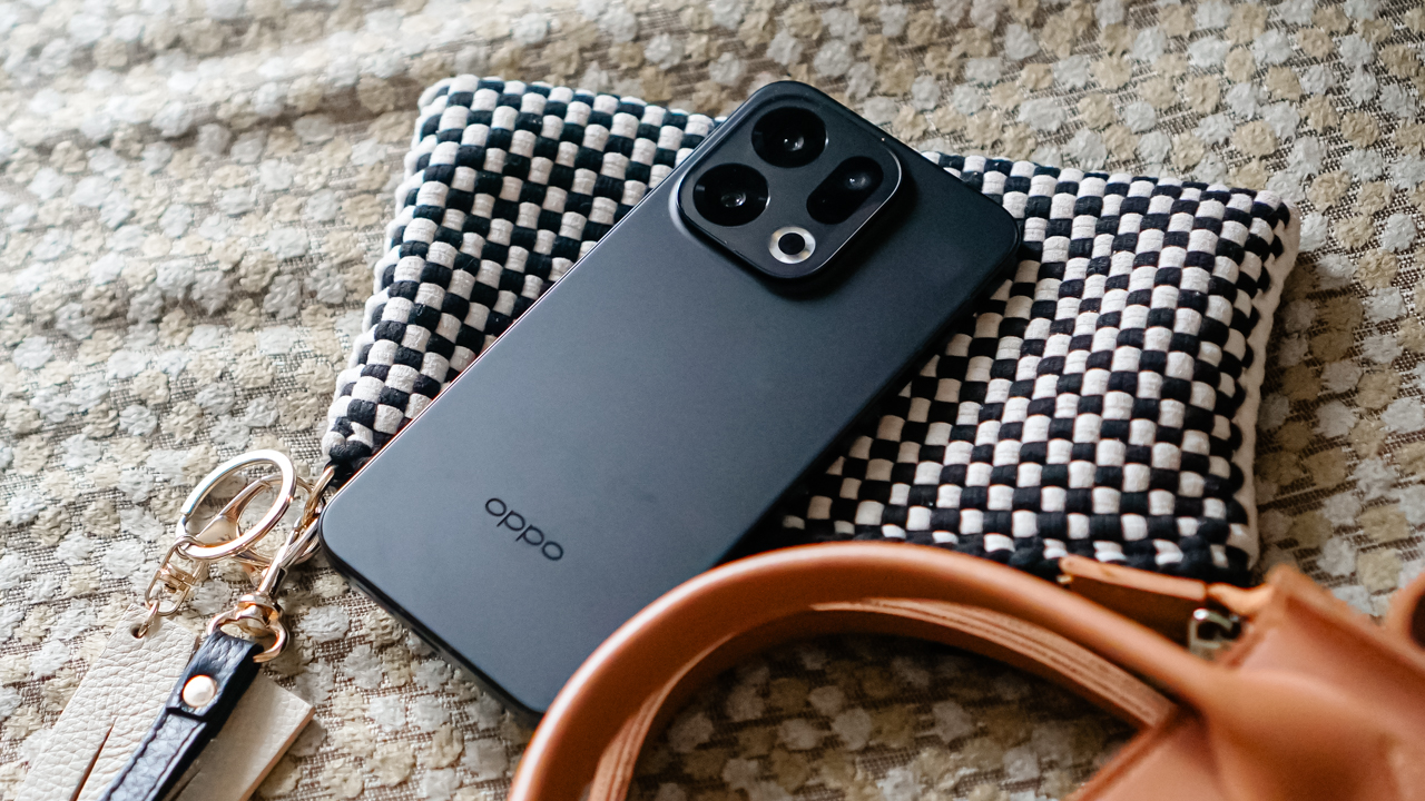
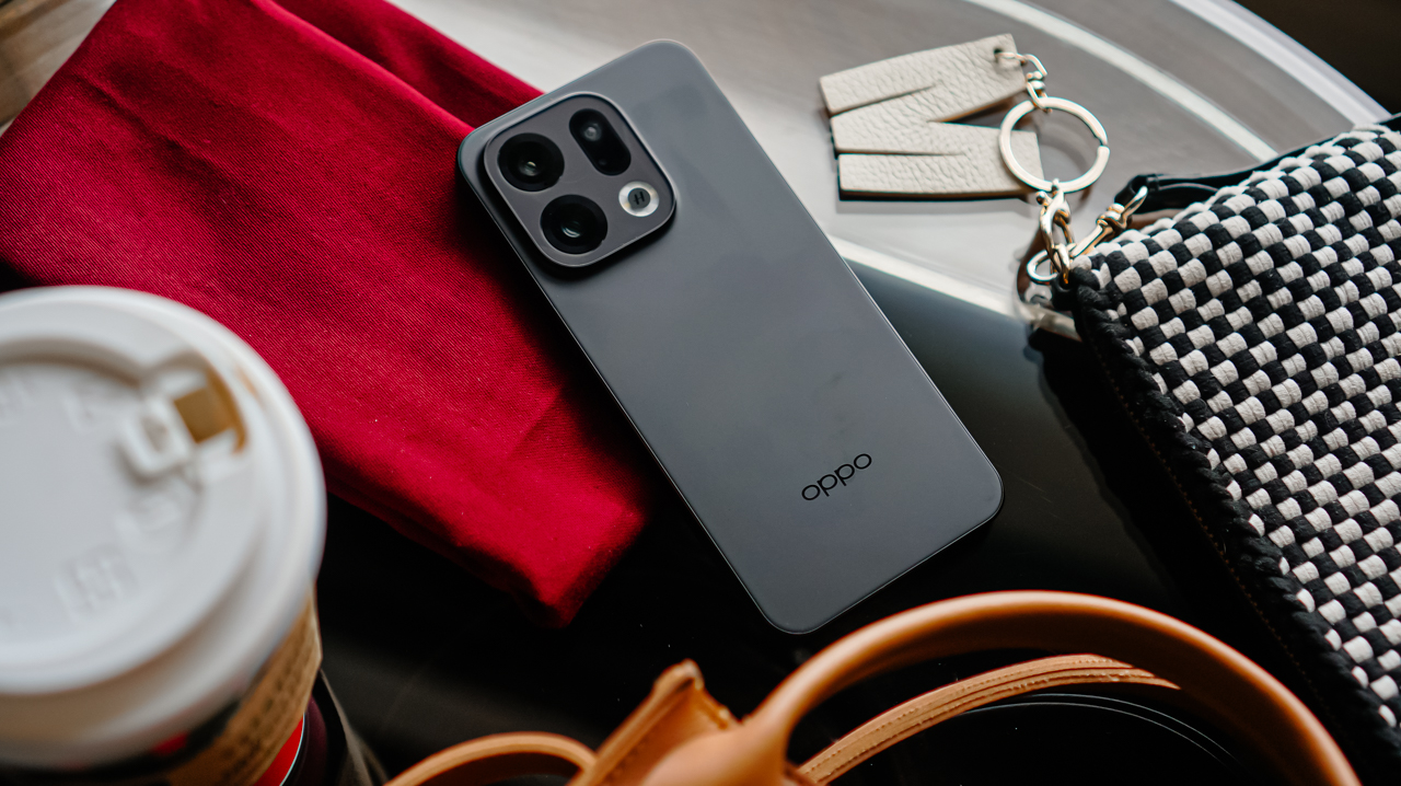
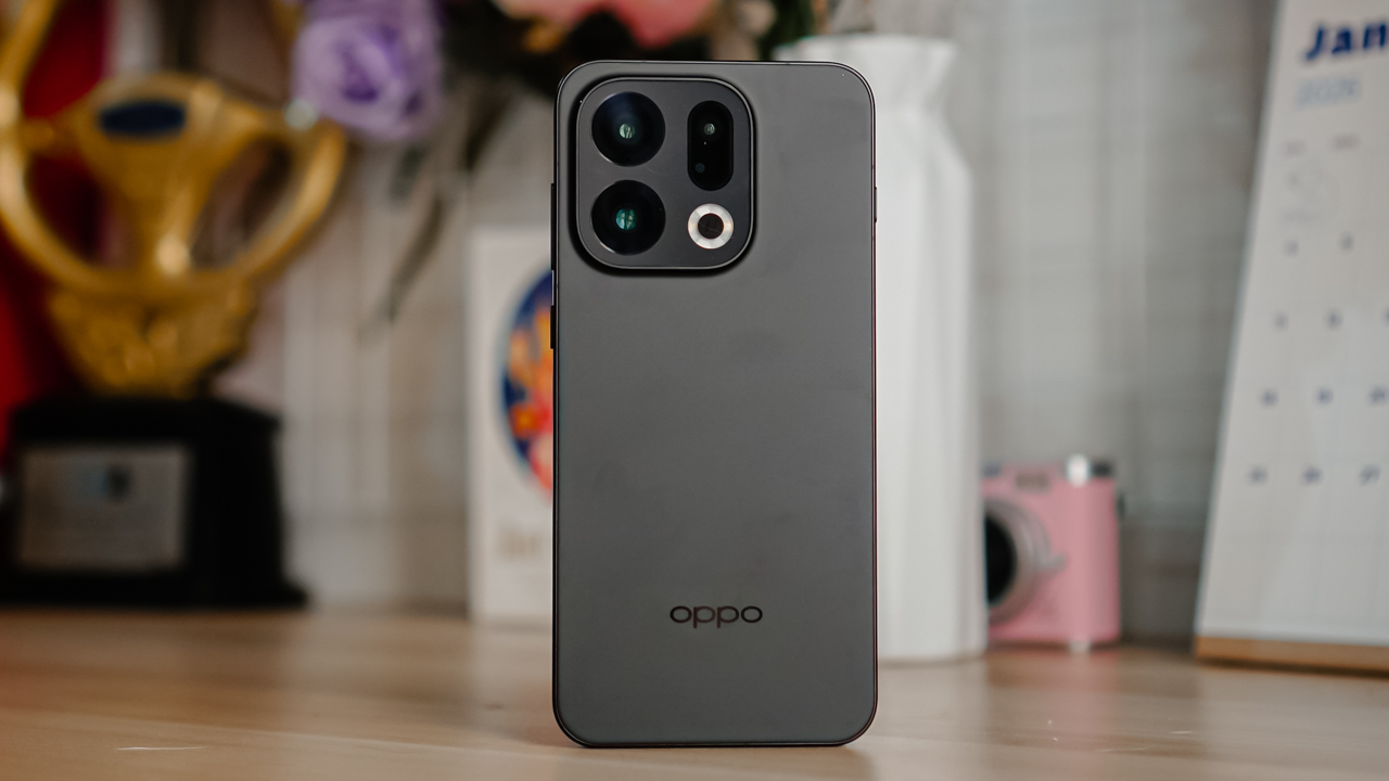
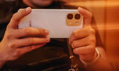
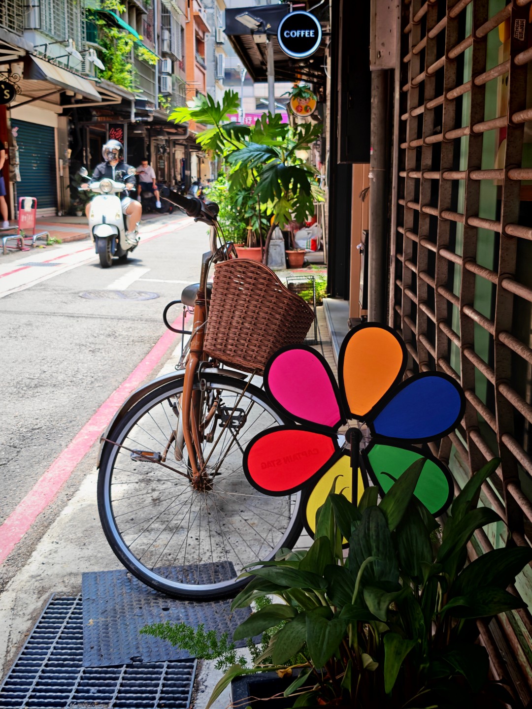
OPPO Find X9 review: Super Swipe material!
This is the flagship smartphone that’s ready for anything, just like you~
Life has a habit of throwing you into challenges you never trained for.
Smartphones should do the same. They should keep up and evolve with you, and sometimes surprise you with strength you did not expect.
I have used devices that moved backward when the world kept sprinting ahead, so I felt nervous when I first saw the OPPO Find X9.
I judged it instantly. The same distrust you give a contestant who looks too smug before a grueling Physical: Asia round. I thought I knew how the story would end, but I was wrong.
For more than a month, I carried the Find X9 like a teammate who reluctantly joined my squad. It traveled with me to Shenzhen, powered through my errands and deadlines, and survived my messy blend of workouts, airport transitions, and late‑night scrolls.
Halfway through, I realized that the OPPO Find X9 was not the timid underdog I imagined. It felt like watching a contestant who starts slow, then suddenly reveals a strength that makes you want to cheer.
Settling into its role like a seasoned contender
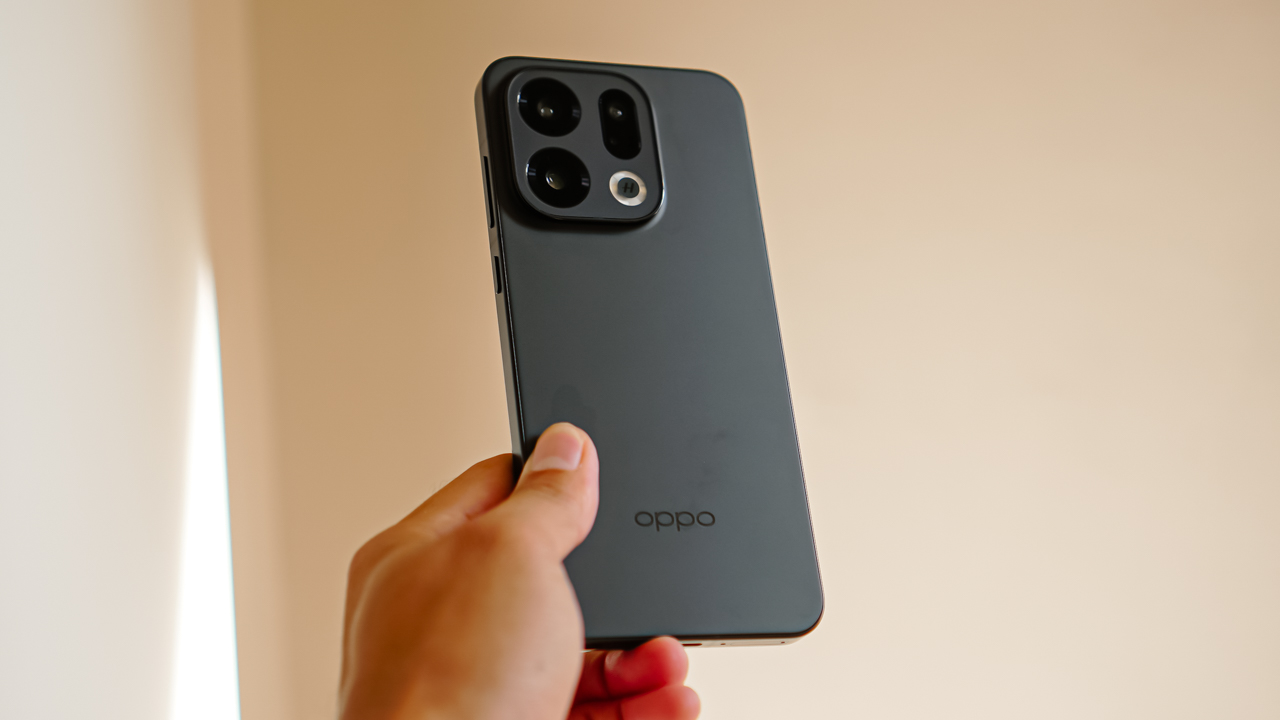
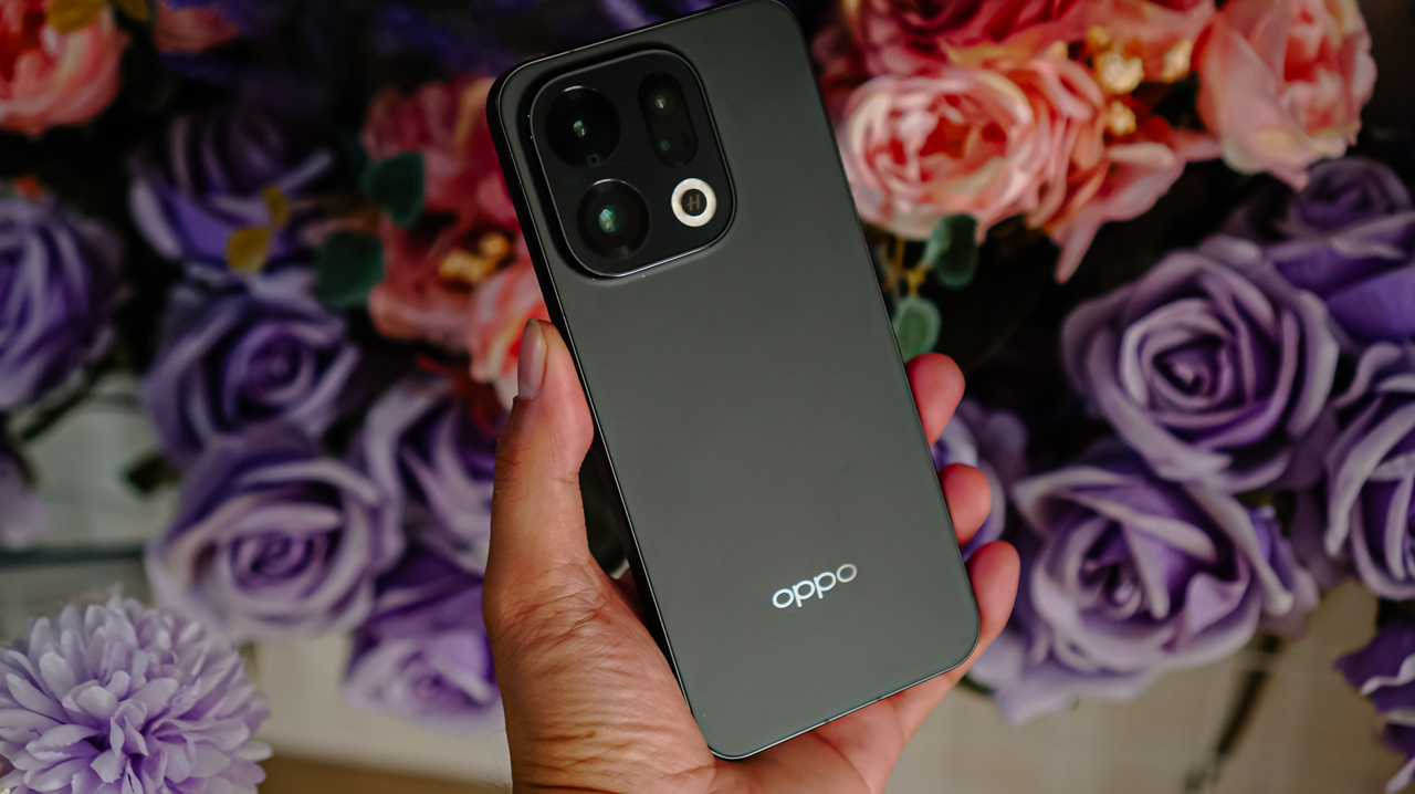
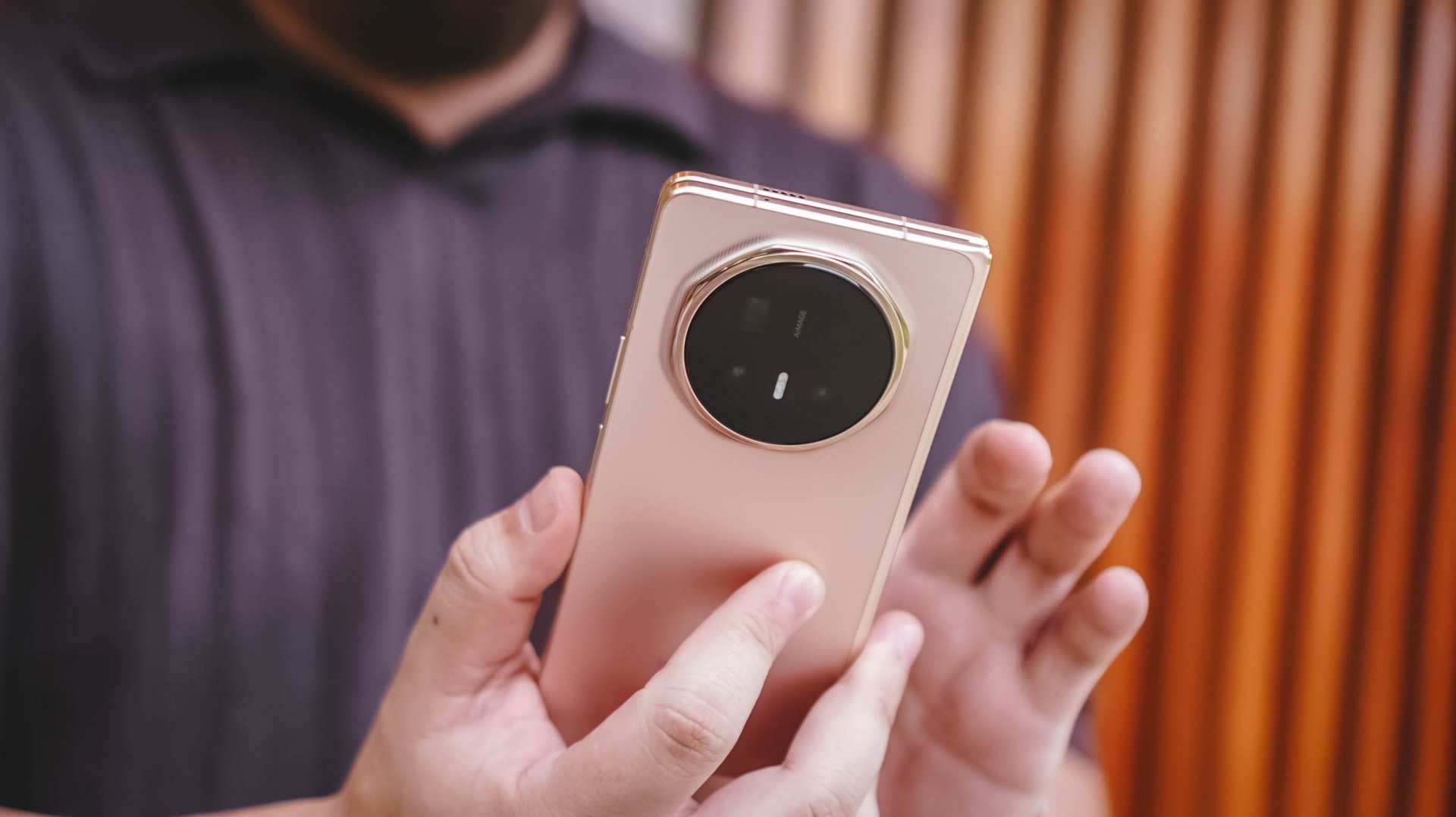
The Find X9 is OPPO’s premium flagship and it carries itself like someone who trains in silence and performs only when it matters.
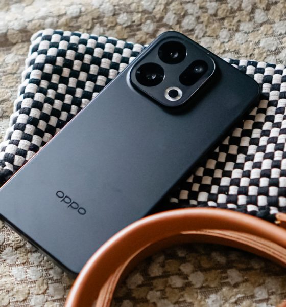
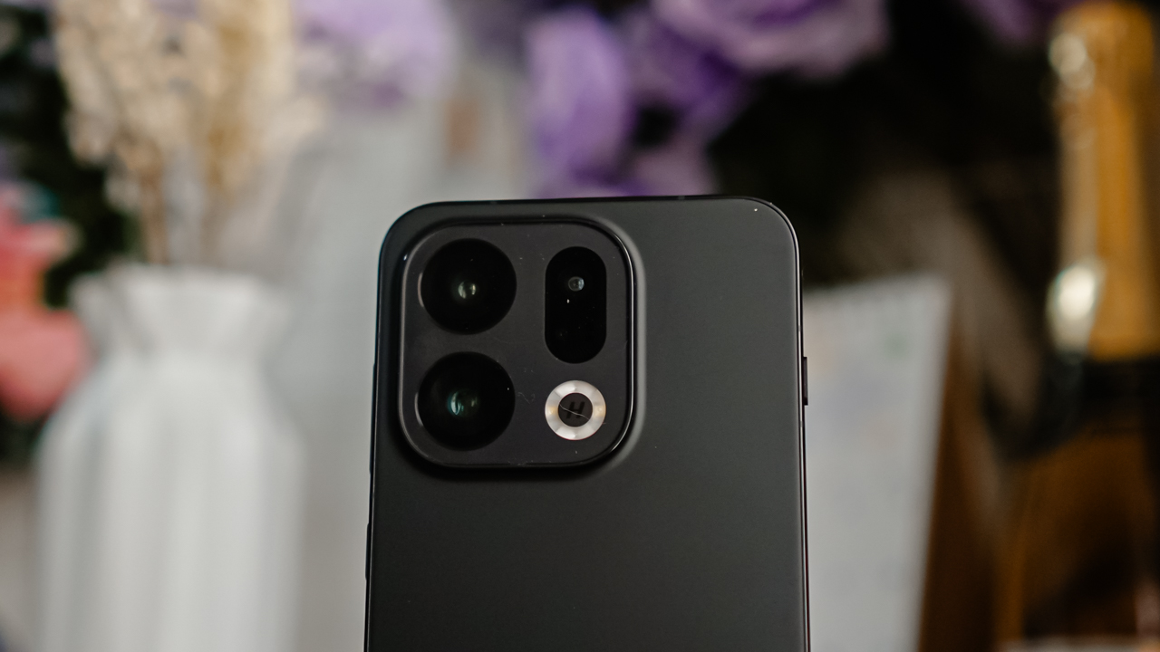
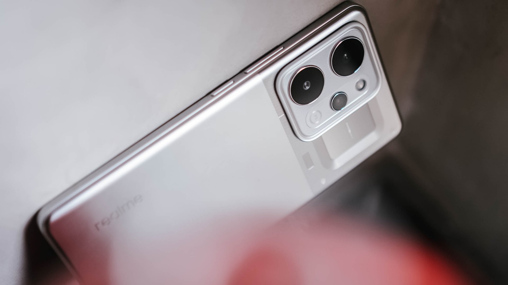
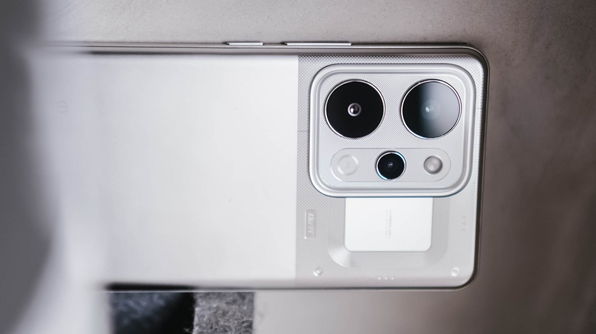
It keeps the familiar slate form of its predecessors, although the camera bump shifts back to a square layout that aligns with the rest of OPPO’s lineup. It feels like the brand wants its roster to share a common uniform, the way Physical: Asia teams arrive coordinated and ready for the cameras.
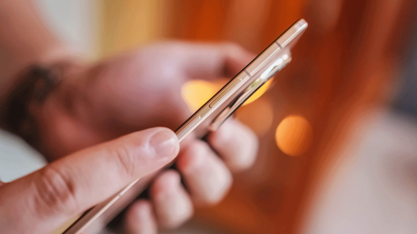
The boxy silhouette I loved from the Find X8 returns. It feels more refined and softened enough to sit comfortably in the hand.
It reminds me of my boxy iPhone 16 Pro, although the Find X9 is thinner and lighter. That difference becomes a blessing once you carry it through an entire day.
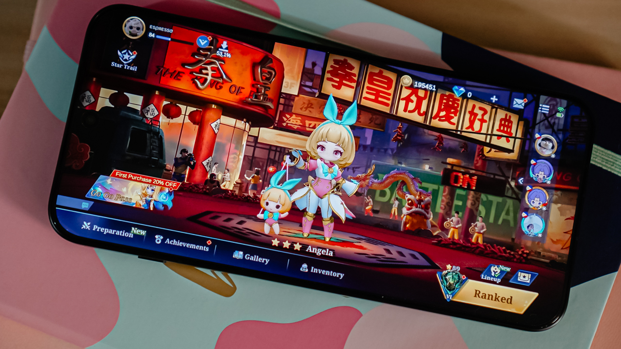
I even found myself playing Mobile Legends: Bang Bang and Magic Chess: Go Go longer than I planned. I tapped the screen with the intensity of an elimination round and only noticed the fatigue half an hour later.
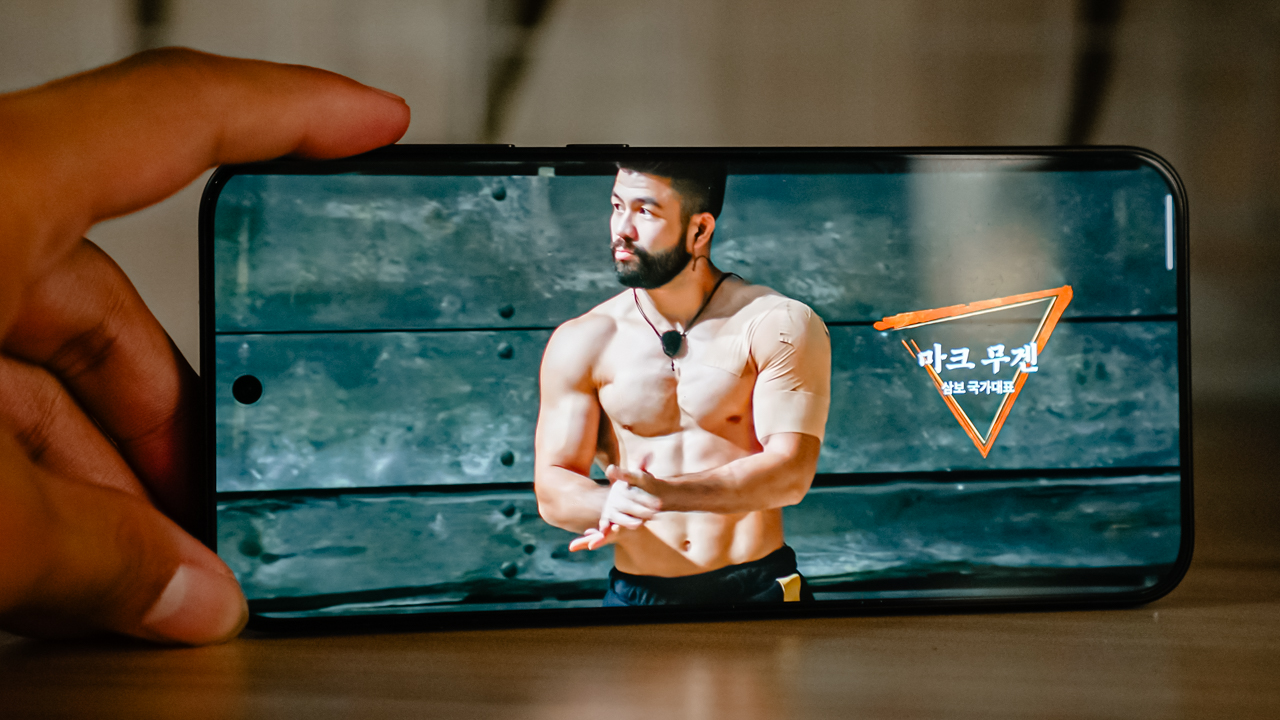
Now Playing: Netflix’s Physical: Asia

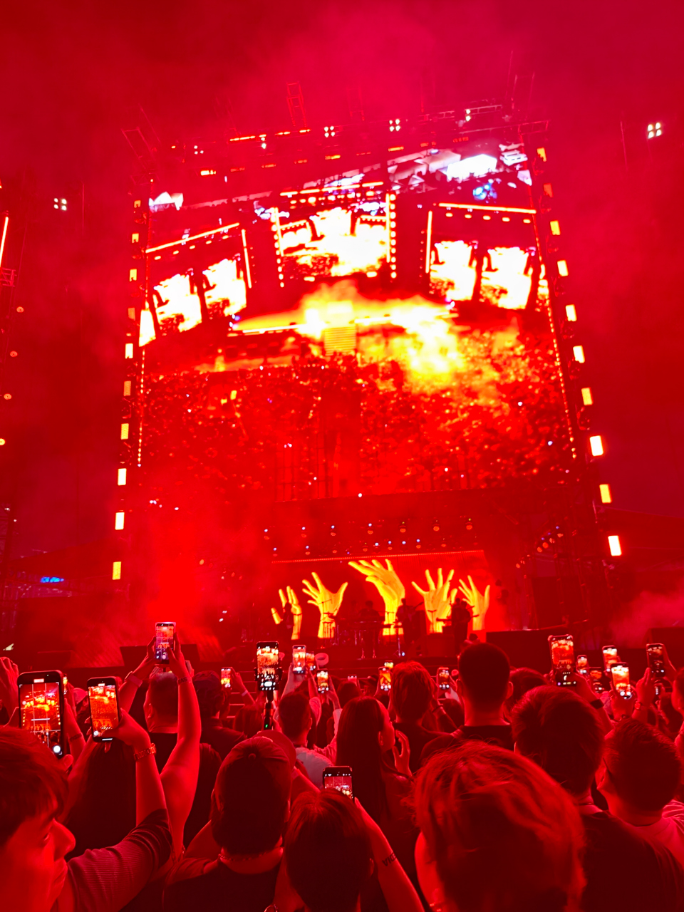
This is where the Find X9 became my sanctuary. The year‑end grind pushed me from plane to cab to hotel and kept me drifting between destinations like I was competing in my own endurance course.
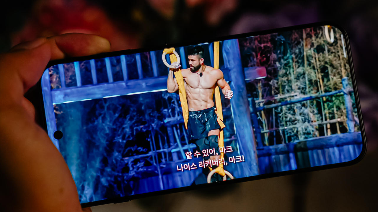
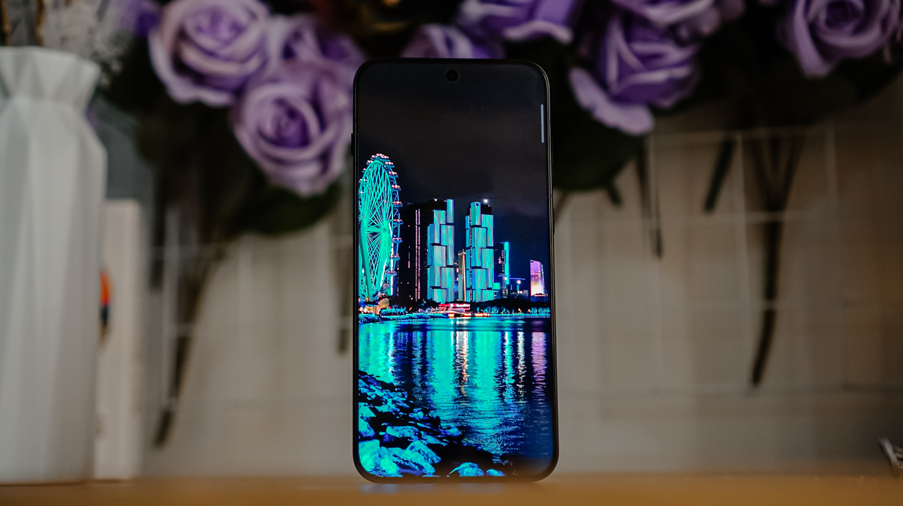
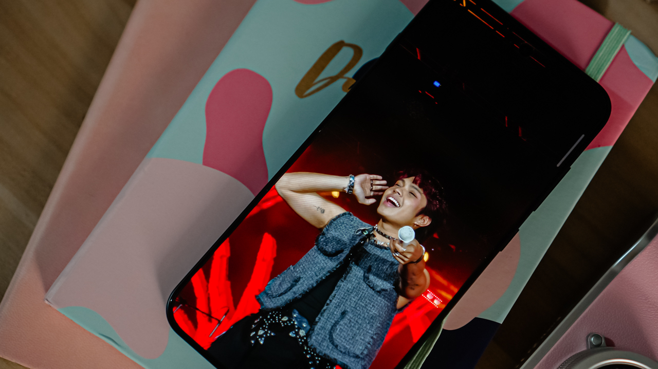
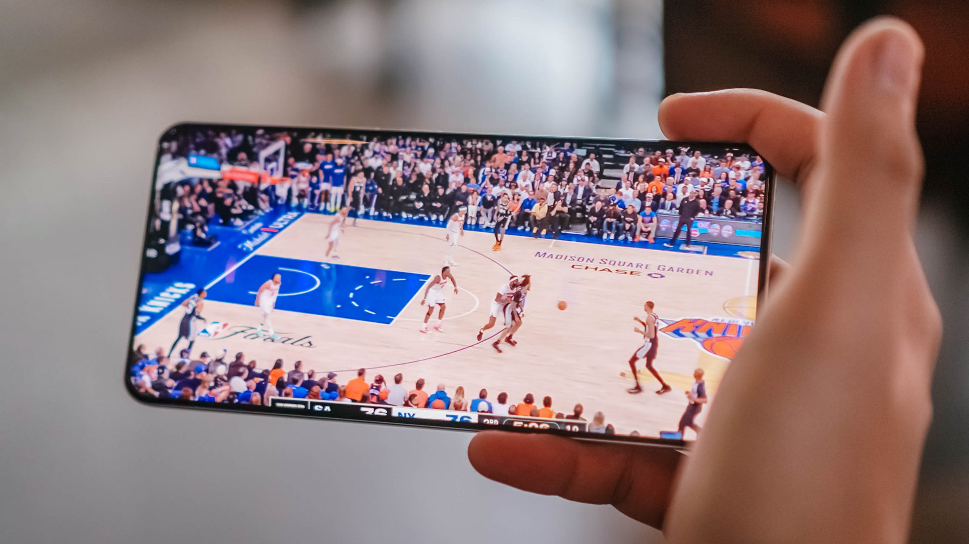
I barely stayed home, so I clung to the glowing screen whenever I needed a break. The 6.59‑inch AMOLED display feels familiar, although the ultra‑thin bezels create a stage that looks wider and more immersive.
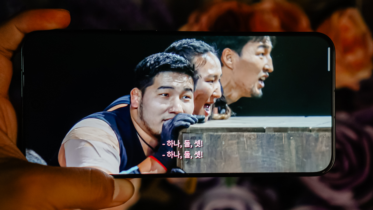
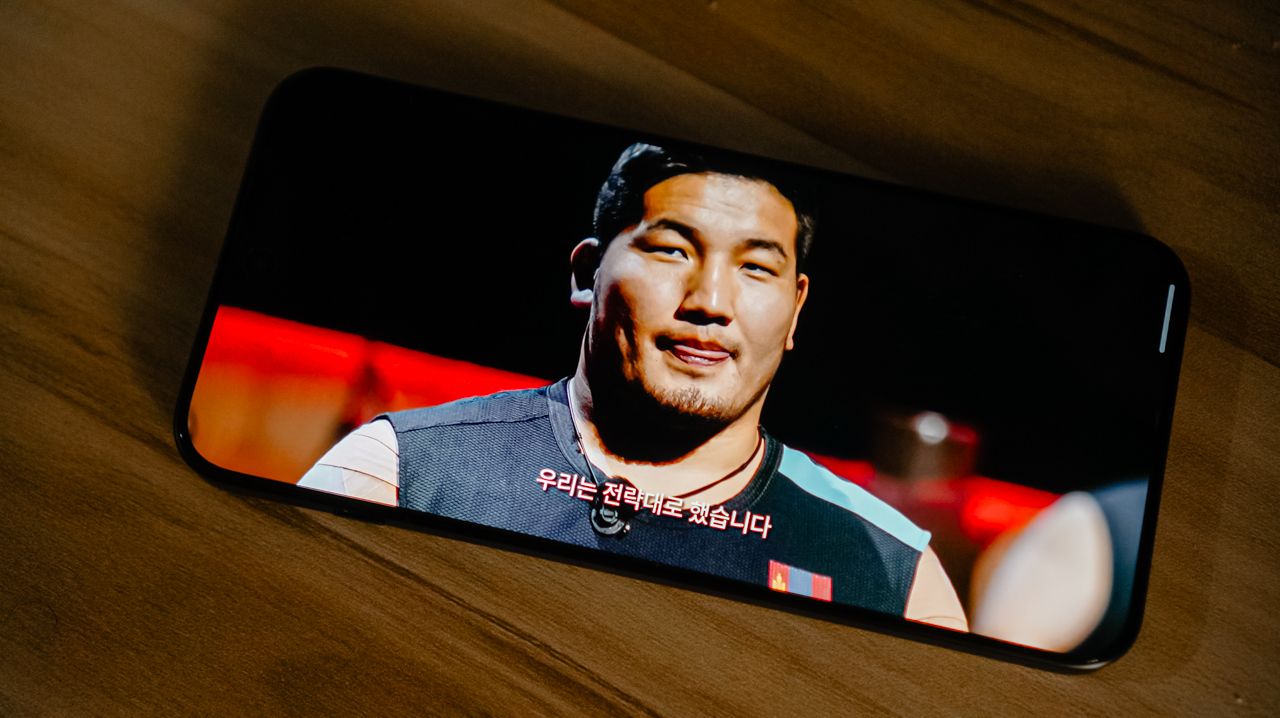
It made watching Netflix’s Physical: Asia feel larger than life. I watched Orkhonbayar Bayarsaikhan rally Team Mongolia with a conviction that made me forget where I was.
The crisp visuals pulled me into every challenge and moment of grit. Soon enough, my TikTok algorithm surrendered and fed me everything related to Team Mongolia, especially Orkhonbayar, who looks like a polar bear who can protect you while still being soft enough to lean on.
The only moment the illusion cracked was when the audio tried to catch up. The Dual Dolby Atmos speakers were loud, although they lacked the fullness I wanted. It felt like watching a high‑stakes challenge with a crowd that forgot to cheer.
Thankfully, I always had earbuds with me, so the storyline continued uninterrupted.

Knows when to push or hold back
Flagships do not get second chances. They need to perform on command the way Physical: Asia contestants must explode into action the moment a round begins.
The Find X9 understood this assignment. It runs on MediaTek’s 3nm Dimensity 9500 chipset, which feels like a regular Reno 14 that trained for months with the best coaches and came back transformed.
It handled multitasking, gaming, creative work, and frantic app switching with the focus of an athlete who knows exactly when to conserve energy and when to unleash power.
The 16GB LPDDR5X RAM and 512GB storage, combined with another 12GB of RAM expansion, give the phone an almost excessive strength that reminds me of challenges where every team sends its strongest member.
It mirrored my facet as an athlete. It’s capable, balanced, and ready for anything–just like yours truly.
Stamina that goes the distance
The smoothness from the Find X8 carried over beautifully. Nothing shocked me in terms of performance, which is exactly the point.
Flagships should feel consistent and quietly powerful, like contestants who never brag yet always outlast everyone.
The battery felt like the unexpected plot twist. During my trip to Shenzhen, the 7025mAh battery lasted two full days.
I used mobile data, scrolled endlessly, took photos, and filmed videos. I am so used to charging my phones every night while I shower that I instinctively reached for a charger and realized I did not need one.
The Find X9 kept going like I was watching a contestant breeze through a challenge you expected them to struggle with.
It didn’t ask for a break. It simply kept up and stayed with me through everything I wanted to do.
Support team that moves with you
After living with the OPPO Find X9, everything moved with a sense of intention, as if the system knows when to sprint and when to conserve energy.
Animations feel fluid and continuous, and scrolling feels lighter. App launches feel quicker without drawing attention to themselves.
This smoothness comes from OPPO’s new Luminous Rendering Engine, which renders visual elements in parallel so nothing stutters or breaks the flow. It feels like watching a well‑trained team move in sync.
Alongside it, the Trinity Engine manages resources intelligently, keeping the phone responsive even under pressure while controlling heat and power use.
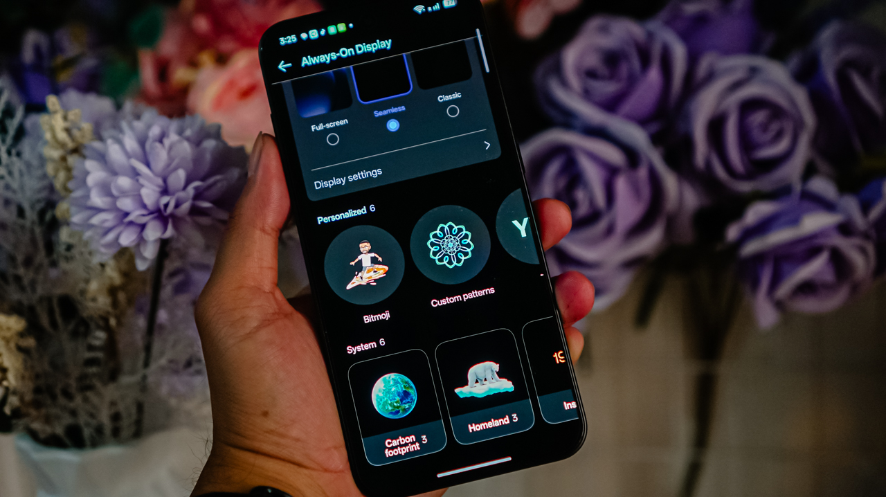
The interface itself feels refreshed and calmer, and customization finally feels playful again. I could set Motion Photos or videos as wallpapers, explore more font options, and even let AI suggest text styles that matched my overall theme.
The Flux Home Screen became a small joy. App folders could be resized into different shapes and the surrounding icons adjusted dynamically, making the layout feel alive rather than rigid.
The Always‑On Display also stepped up with full‑screen support, more widgets, and style options that felt personal instead of ornamental.
Also, OPPO’s growing AI ecosystem, including AI Mind Space, AI Mind Assistant, and Smart Collections, helped organize content quietly in the background.
Screenshots and notes felt easier to find, and suggestions appeared when they actually made sense. Integration with Google’s Gemini through Gemini Live added another layer of intelligence, allowing real‑time interactions that felt natural instead of forced.
What sealed the experience for a flagship device was its cross‑device connectivity. Features like Phone Connect and PC Connect let me share files and mirror my screen across phones, iPhones, Macs, and Windows PCs.
A steady hand when the stakes are high
The Find X9’s camera feels like the teammate who understands the game. It knows when to push and when to let the moment breathe.
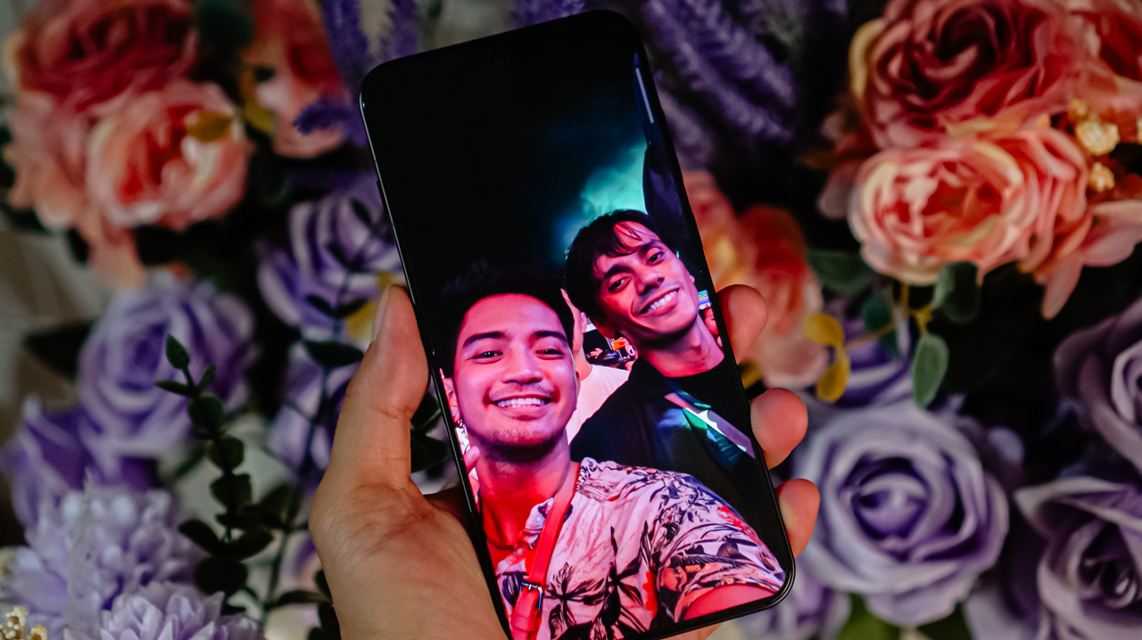
I noticed it first when taking portraits, especially in low light. The AI Portrait Glow steps in gently, balancing lighting and skin tones without flattening texture. Faces looked natural and skin tones stayed true, which felt flattering without feeling edited.
Beyond portraits, the suite of AI photo tools is best used when traveling. AI Eraser helped clean up distractions that would have ruined an otherwise great frame.
In busy streets or low‑light environments, AI Unblur helped rescue shots taken in motion. AI Reflection Remover did exactly what it promised, saving photos taken through glass without leaving obvious traces behind.
But what I appreciated most was how easy it was to trust the camera. I didn’t need to overthink angles or second‑guess results.
I lifted the phone, framed the shot, and let the Find X9 do the rest. It’s the best point‑and‑shoot smartphone camera for casual users or anyone learning the ropes of photography. It’s smart enough to call itself a smartphone.
Here are sample photos I’ve taken:


Pros & Cons
Pros
- Battery life that lasts through two full days of heavy use
- Flagship‑level performance that handles multitasking with ease
- Immersive, vibrant display perfect for streaming or gaming
- Intelligent, user‑friendly AI camera features
- Smooth, refined ColorOS 16 experience
- Customization tools that feel personal, not gimmicky
- Seamless cross‑device connectivity
Cons
- Speakers are loud but lack premium depth
- Performance might feel overkill for light users

Is the OPPO Find X9 your GadgetMatch?
The OPPO Find X9 is like that teammate who shows up consistently and performs under pressure.
Its performance is nothing short of flagship‑level, and it’s ready to handle anything you throw at it. It’s not perfect. No other smartphone is. But the minor flaws do not outweigh its endurance, consistency, design, and flagship performance.
Some may hesitate and consider it a Swipe Left. But for anyone who wants a smartphone that keeps pace with your life, performs without complaint, and quietly gets the job done, this is a Swipe Right.
And for us, it’s definitely a Super Swipe. The Find X9 earns the GadgetMatch Seal of Approval because it does more than look good and deliver excellent captures.
It’s one of the best flagship smartphones around that you won’t second‑guess buying at its price.
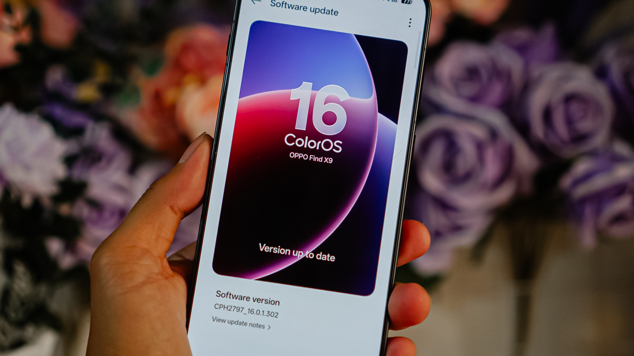
The OPPO Find X9 retails for PhP 69,999 for the 16GB + 512GB variant. It’s available nationwide through OPPO’s official stores, its official Shopee store, and partner channels.


Whenever a brand slaps a “long battery life” label on a box, we take it with a grain of salt.
Even as smartphone battery capacities have become larger as of late, endurance is still subjective. It’s heavily dependent on your daily screen time, signal strength, and other habits.
But when a smartphone lands on your desk with a gargantuan 10,001mAh battery, then that subjectivity basically goes right out the window.

That’s what the realme P4 Power chiefly brings to the Philippine market for the first time, in the brand’s P series relatively quiet debut in the country.
It’s here to eliminate low-battery anxiety and render your bulky external power banks completely obsolete.
Tether-less freedom
We wielded this device for weeks as a primary daily driver, and the endurance is nothing short of black magic.
The daily rotation included endless social media scrolling, video streaming, continuous navigation, and a relentless stress test: serving as a portable Wi-Fi hotspot for up to three separate devices simultaneously.
Through all that usage, the phone flat-out refused to die. I didn’t consciously “try” to drain it. I just know it would last an entire day for up to the wee hours.

When acting as a multi-device router, the chassis does heat up slightly, but it never crosses into alarming or uncomfortable territory.
It simply sips power, providing a level of tether-less freedom that no standard 5,000mAh or 6,000mAh smartphone can replicate.

When it is finally time to recharge the device, it supports 80W SUPERVOOC charging so you won’t have to spend hours waiting.
Even if you don’t replenish it back up to 100%, an hour’s worth of charging should keep you going the extra distance.
Immersive visuals, casual performance
The massive battery pairs beautifully with a expansive 6.8-inch 144Hz AMOLED display. With a high, 453ppi pixel density and 1280 x 2800 resolution, media consumption and gaming become highly engaging — at least from a visuals standpoint.

There is a wider aspect ratio so you don’t get a comically long phone, and a curved screen. We aren’t typical fond of this but the curvature seems subtle, meaning no accidental edge touches.
When it comes to performance, the MediaTek Dimensity 7400 Ultra chipset handles everyday tasks and casual, less-demanding titles with absolute ease.

However, when jumping into competitive matches of Call of Duty: Mobile or exploring the heavy landscapes of Honkai: Star Rail, you will encounter frame drops and stuttering from time to time.
It’s never jarring enough to ruin your match or hinder what you’re trying to do, but it does occasionally disrupt an otherwise smooth gaming experience.
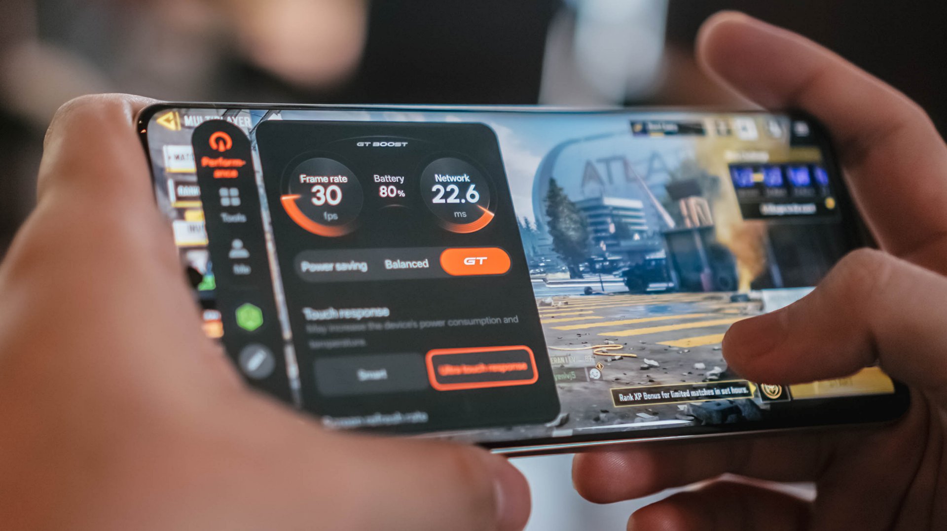
If anything, there’s Championship Mode and GT Mode to optimize the device for such tasks. Bypass Charging is a bonus so you can keep playing without the risk of device overheating.
Audio is loud but somewhat flat, but I didn’t expect much.
Heavy, mecha-inspired tank
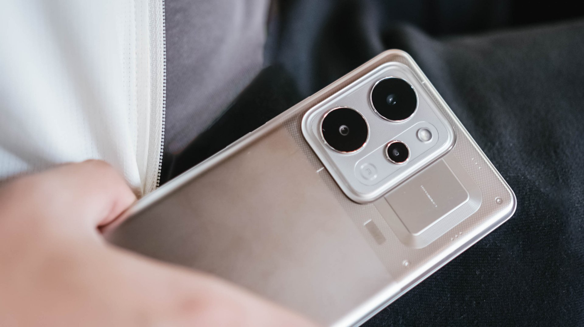
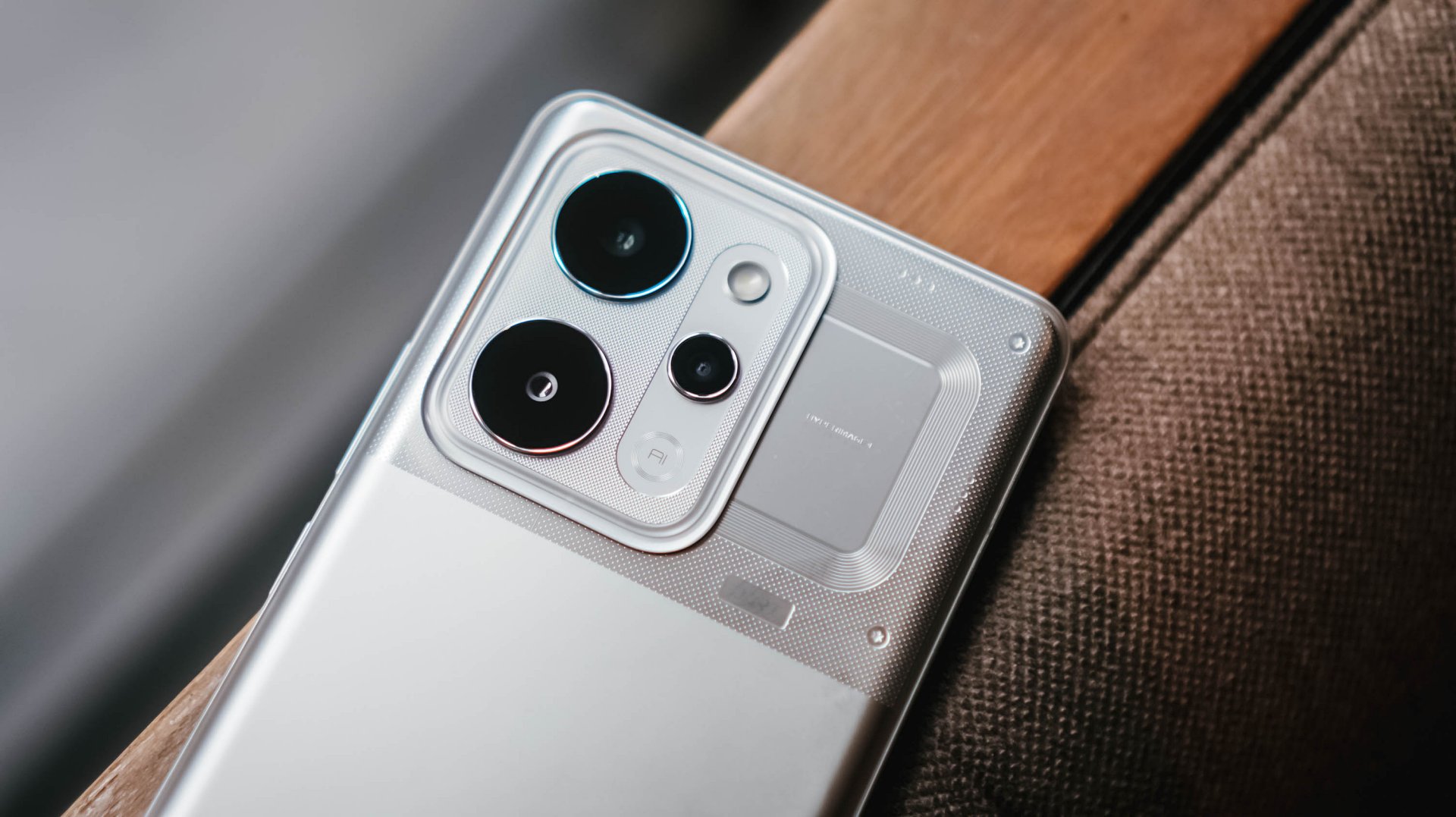
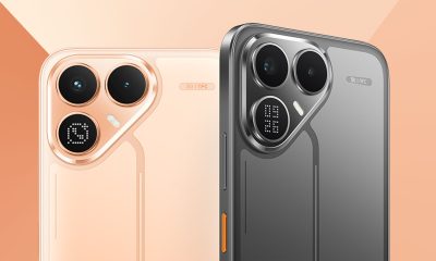
That display curvature is part of the phone’s overall aesthetic. Around the back, the realme P4 Power embraces its “all about power” persona with a distinct, machine-inspired design language.
The upper half where the camera island is located, in particular, look aggressive and sharp, as if a nod to mobile gaming. The colorway for this unit is silver metallic.
However, housing a 10,000mAh cell requires a serious physical compromise: weight. This phone is significantly, undeniably heavy.
The sheer heft is a constant reminder of the juice it carries, to the point where switching back to a “normal” smartphone yields a stark, instantly noticeable contrast in your hand and pockets.
Reliable main camera, lagging selfies
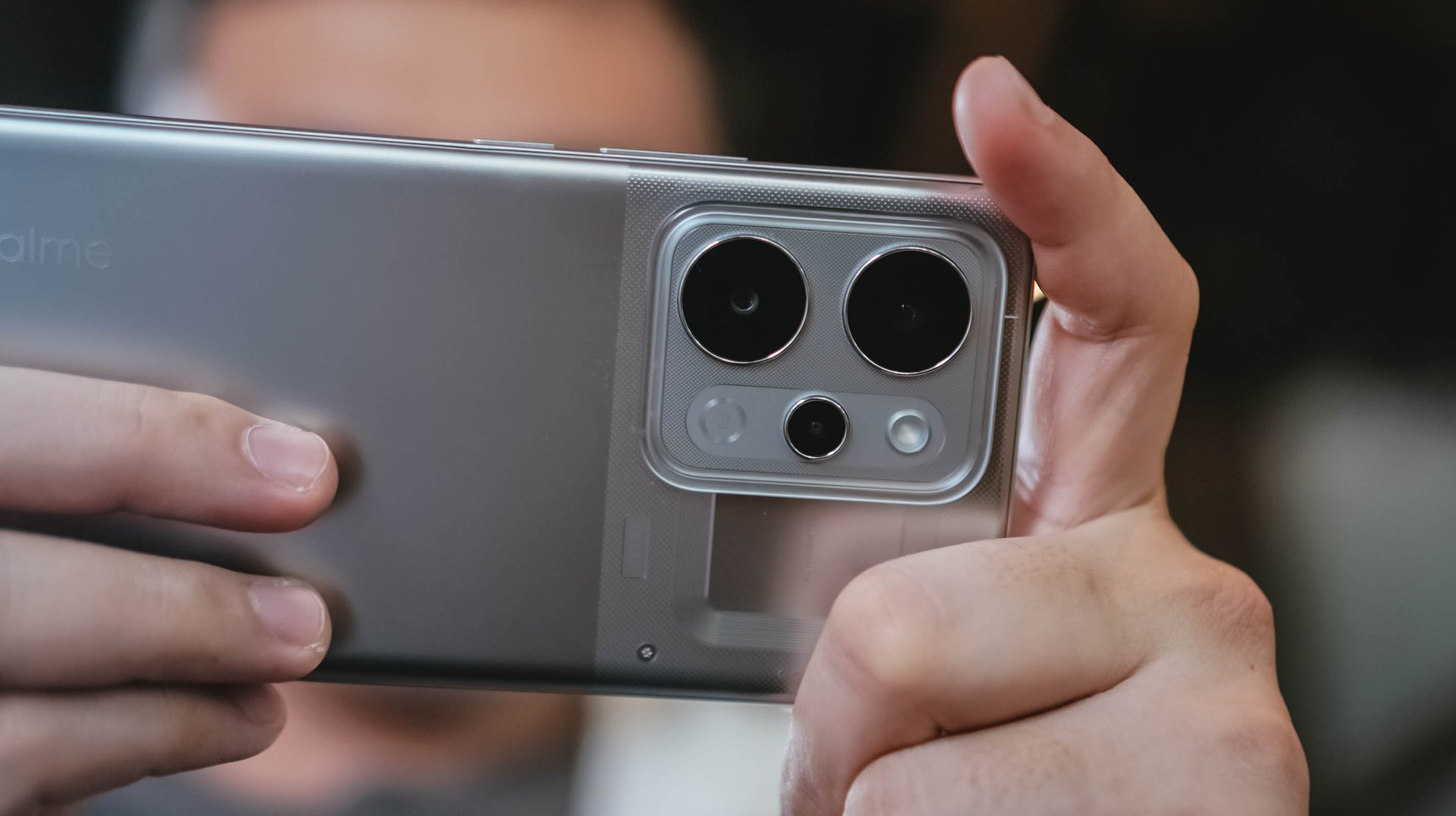
For its camera package, the realme P4 Power comes with a dependable 50MP main camera with a Sony IMX882 sensor.
I didn’t exactly “test” the camera but just naturally used it whenever I was out and about. Hence, I ended up with plenty of food, product reviews, and random finds.
Performance is decent, with the 1x to 1.5x range being the sweet spot. Compared to budget devices, there is definitely more detail and texture.
Color reproduction is likewise amenable, with some depth and acceptable clarity. But camera-centric mid-rangers can obviously offer punchier, more “popped-up” contrast.


With OIS, video recording is likewise smooth. It’s usable for casual vlogging, although lighting is still the catch. You’ll need an extra tofu light for instance, which sacrifices the portability of the phone itself.
@manilaconnoisseur Dropped by Daily Beer Korean Chicken and Beer in ArcoVia, Pasig for some food after a team meeting!
The selfie camera, meanwhile, also lags compared to older realme number series devices I’ve used. Sharpness, vividness, and color accuracy are lacking.
@manilaconnoisseur Lipton Soda Iced Tea, now available in Berry Burst flavor! Zero sugar pa rin! Check out now. @Pepsi Philippines #LiptonSodaIcedTea #LiptonSoda #LiptonSodaBerryBurst #LiptonSodaZeroSugar
Built to survive the elements
As an added bonus, realme didn’t sacrifice ruggedness for the sake of capacity. The handset comes armed with a familiar IP69 rating for dust and water resistance, including high-pressure water jets and submersion.
![]()
We took it out on outdoor jogs, and heavy sweat didn’t cause a single issue. Even when dealing with moisture, the display’s touch optimization remained responsive.
Is this your GadgetMatch?
The realme P4 Power sits right in the competitive PhP 25,999 price bracket. In an era where smartphone prices are continuously climbing, it still offers a value proposition as an all-around mid-range device.

Think of it as buying a standard mid-ranger plus a power bank, minus the double pocket clutter. Long-term battery degradation remains to be seen but it seems the device is a fair purchase for power users.
It’s a close call, but the P4 Power is still a Swipe Right especially if your lifestyle demands endless battery life above all else.
After a week with the HONOR Watch 6, I realized I liked having data on things I normally would just leave to uneducated guesses.
I love seeing my sleep metrics, knowing if my heart is actually racing, and seeing notifications on the fly. These are things I find truly helpful in how I go about life currently. That’s why I can already see myself using the watch beyond the review period.
The thing is, I wasn’t expecting any of this.

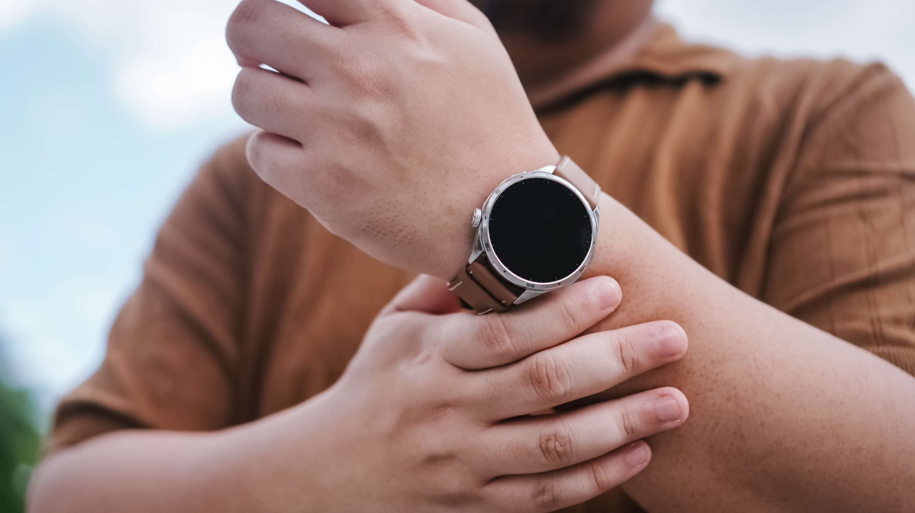
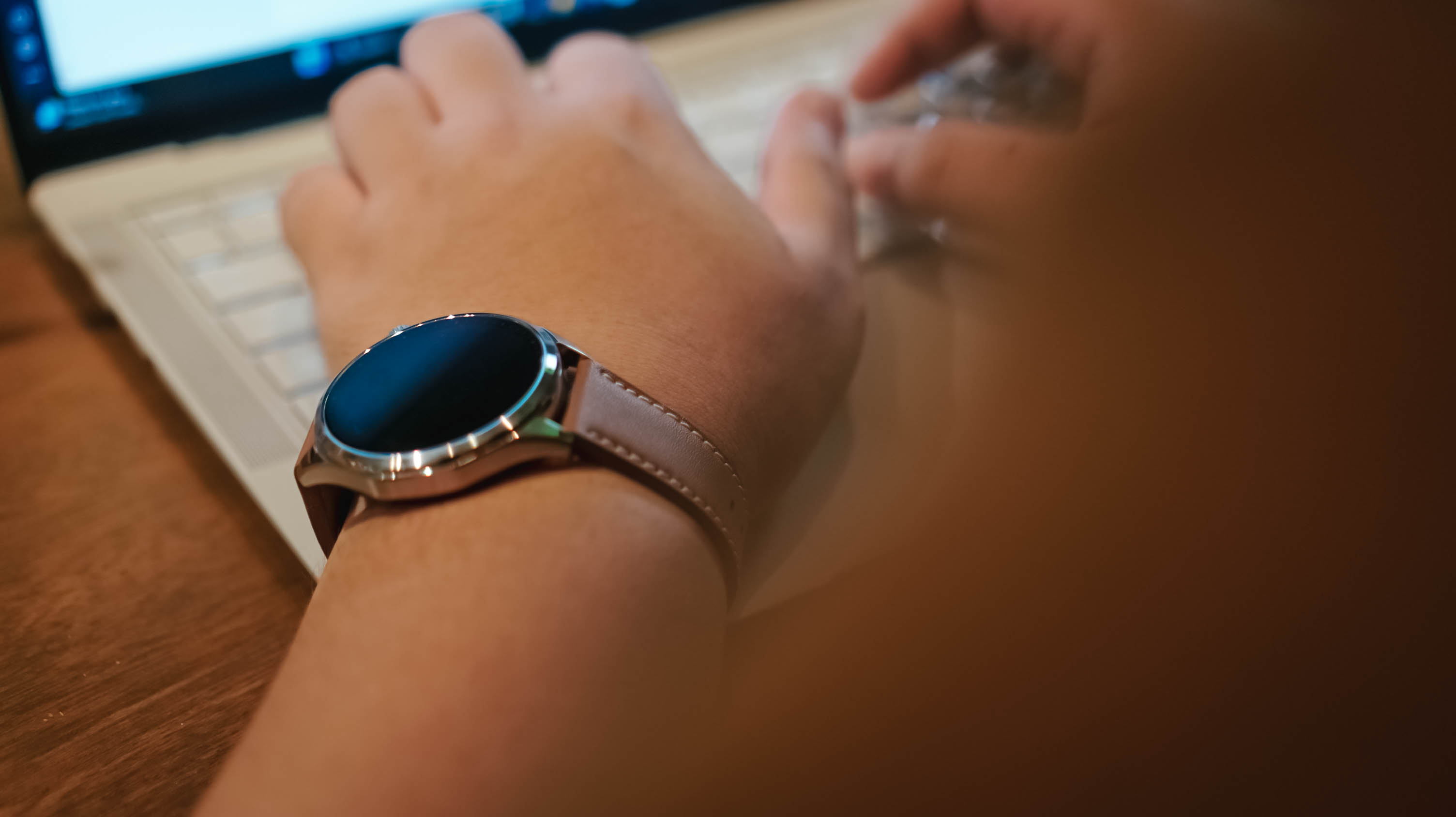
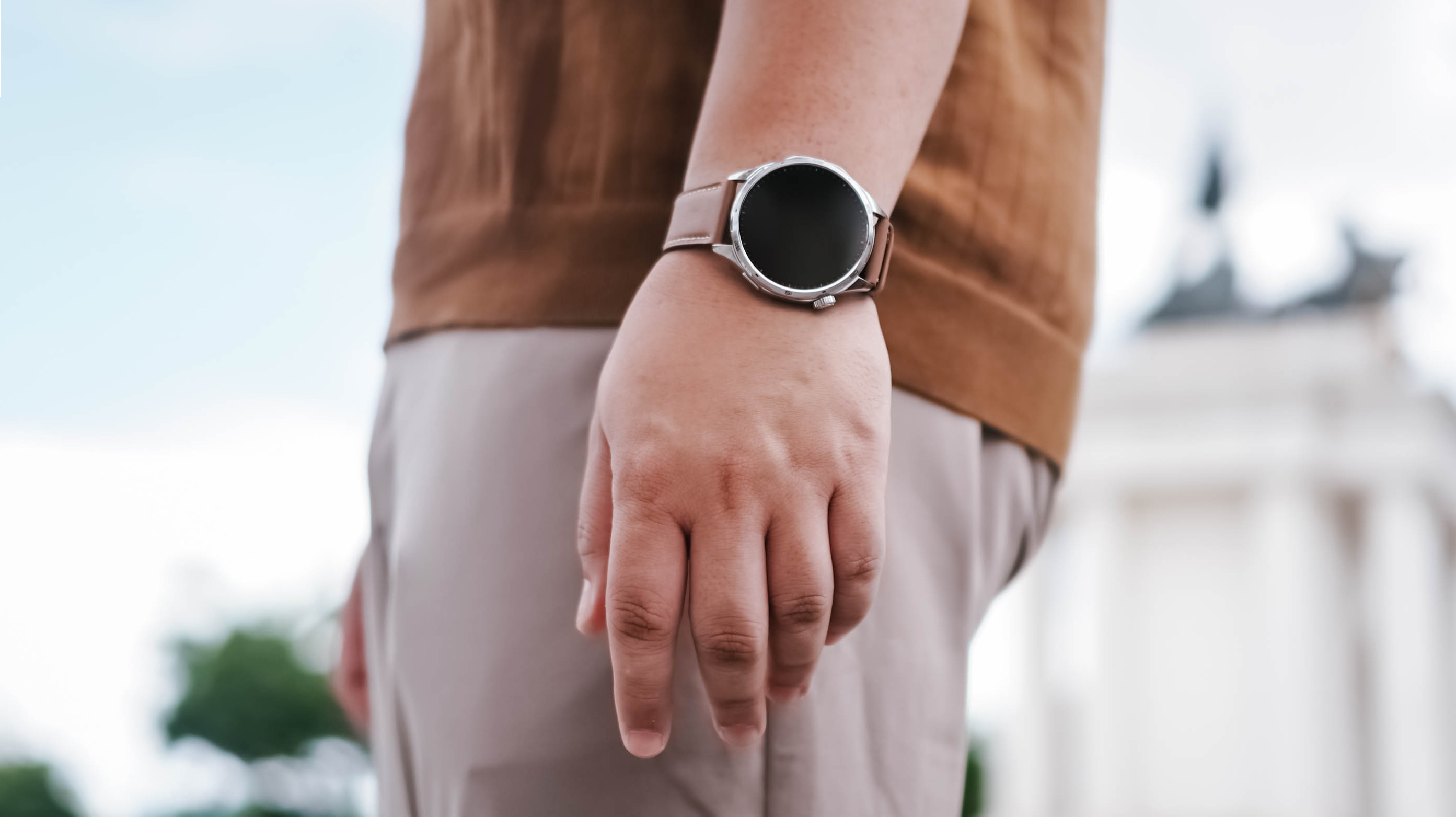
The first thing that jumped out at me when I first wore the HONOR Watch 6 was that it barely felt like it was there. I was half expecting it to be this chunky-feeling thing. But it wasn’t. I was pleasantly surprised.
I have the silver model with the brown leather strap, and it feels light to wear. That was key for me because what I really wanted to track more than anything was my sleep.
The only time I really started to notice that I was wearing it practically all the time was around the fifth or sixth day. And honestly, that says a lot because I tend to want to take off most of the smartwatches I’ve used in the past.
A smartwatch that fits daily life

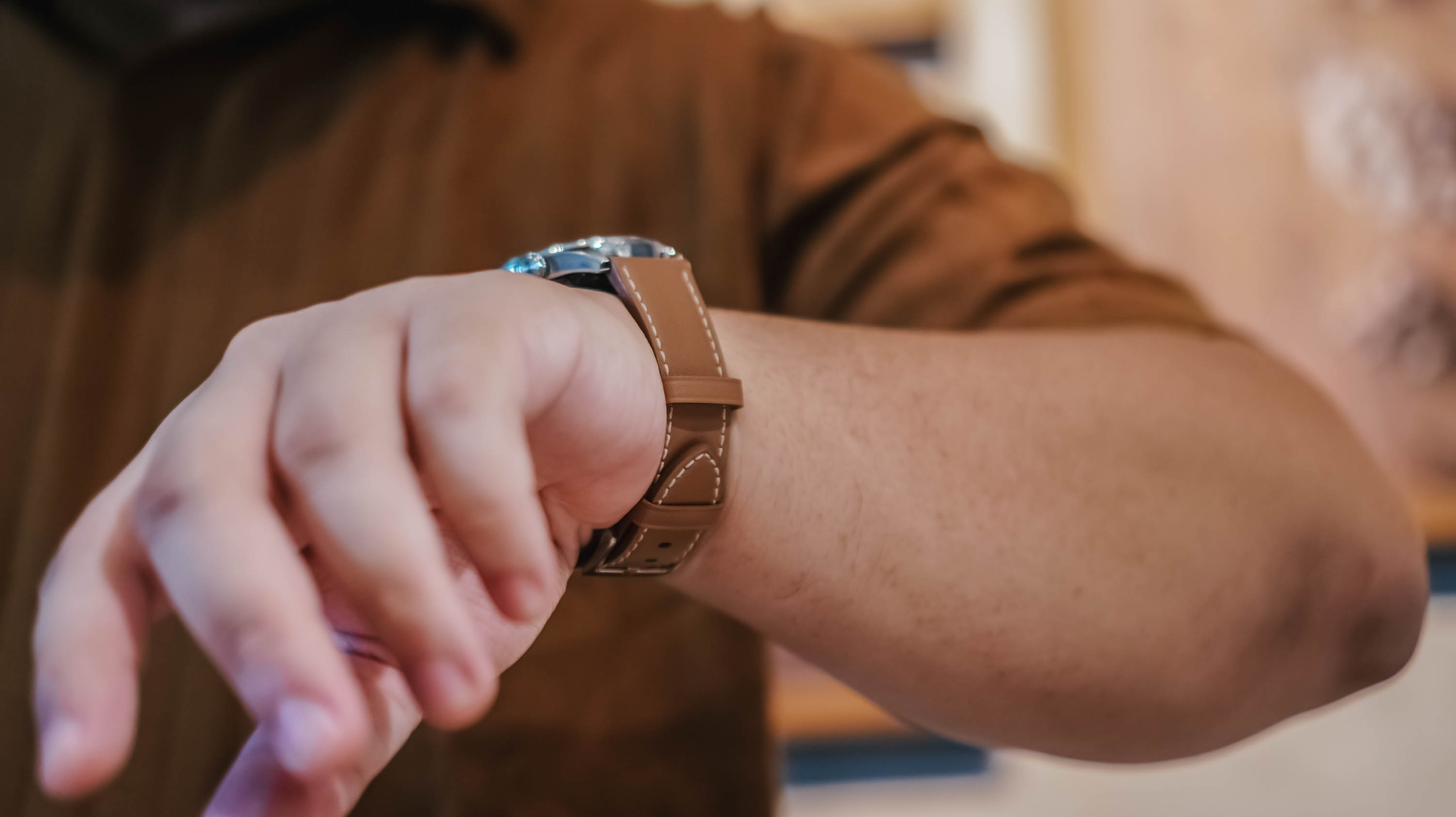
The brown leather strap is inoffensive in the best possible way. It blends well with both casual wear and smart casual outfits, which made it easy to keep on throughout the week.
In fact, I think it looks more at home during everyday life than during intense workouts.
That’s why I found myself looking at the HONOR Watch 6 less as a fitness watch and more as a health tracker that looks nice and tells me if there’s a proverbial fire I need to put out — or if she remembered me that day.
The display also quietly did its job.
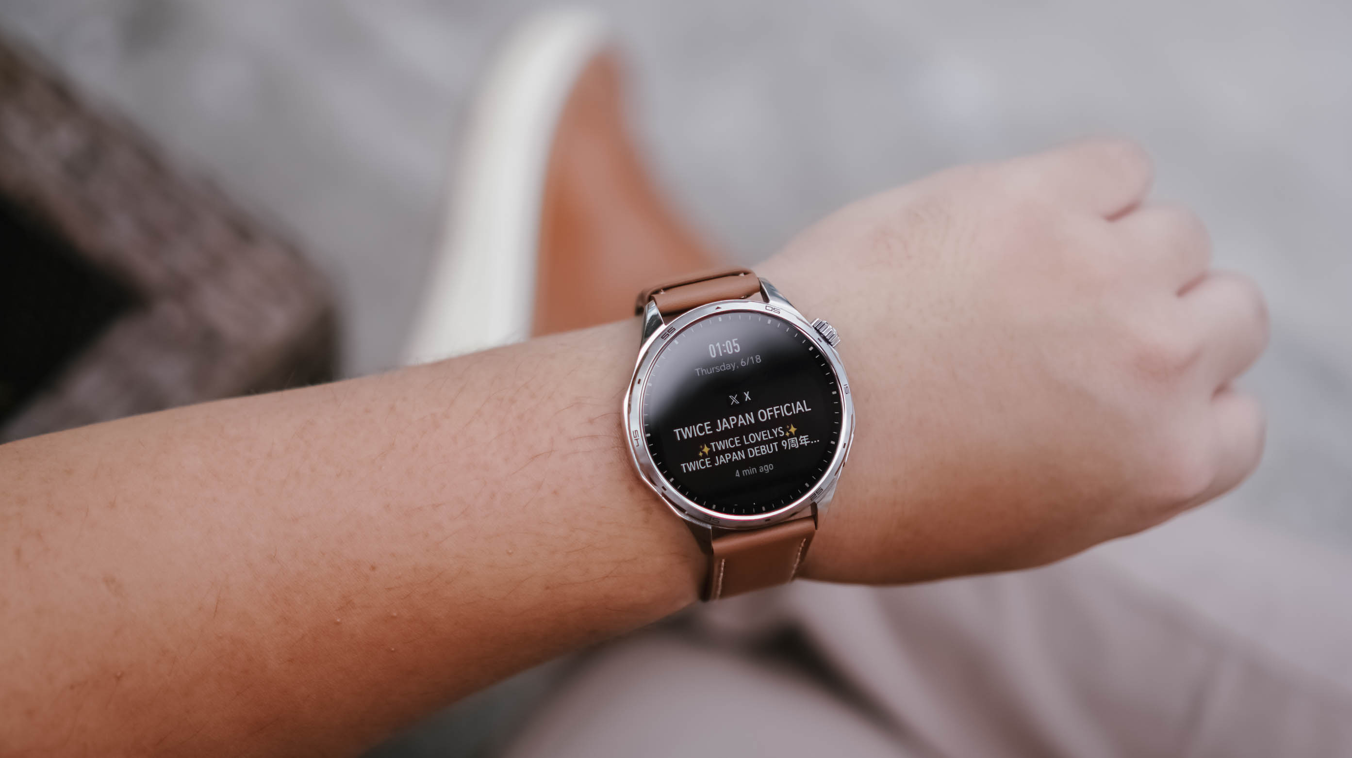
Of course it’s a TWICE notification
You know, I didn’t even think about it. Whenever I needed to check the time or glance at a notification, I simply gestured as anyone would to look at their watch. No matter where I was, what I needed to see was readily visible.
That’s probably the highest compliment I can give a smartwatch display. It never gave me a reason to think about it.
Managing attention without reaching for my phone
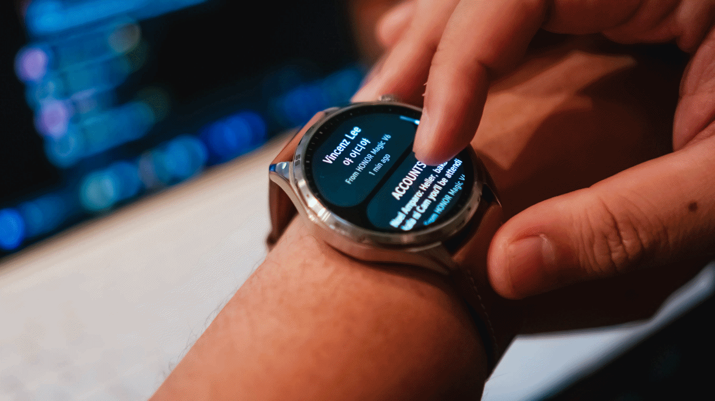
Oof. I cannot overstate how many notifications I get on any given day.
As a Managing Editor with occasional side hustles, notifications come from multiple messaging apps. One moment I’m tracking production progress on WhatsApp, the next I’m checking what the team is discussing on Telegram. Then there are the emails, Messenger messages from friends, and the “… sent you a reel” notifications that have recently dropped in frequency to my dismay.
I don’t always want to pull out my phone to check these.
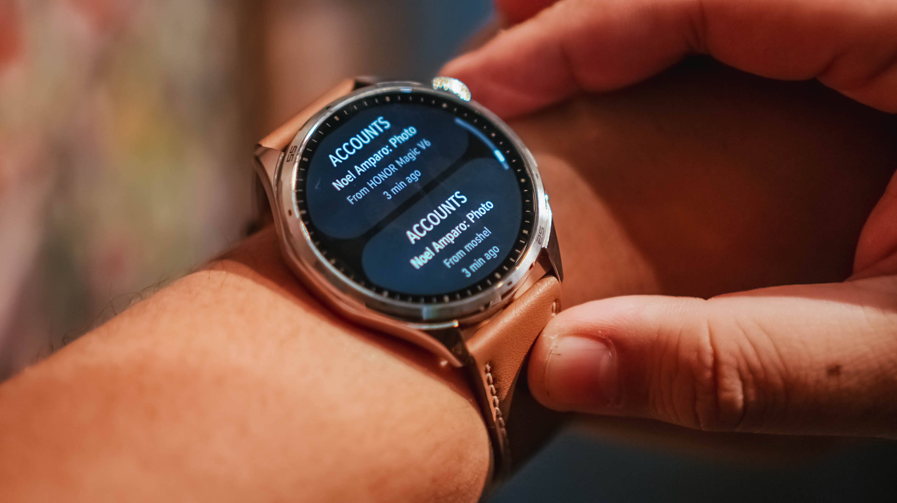
What I appreciated most about the HONOR Watch 6 is that notifications are grouped by app, and each one provides a clean preview. It gives me enough information to quickly assess what needs attention and what can wait.
For someone who is constantly juggling attention, that proved surprisingly useful.
Replacing guesses with data
The feature I was most interested in wasn’t fitness tracking.
It was sleep tracking.
Some time ago, a friend of mine started tracking her sleep and it helped her better regulate her energy throughout the day. I am nowhere near that level of discipline, but I was curious.
Between traveling across time zones, late-night coverage, doomscrolling, revenge bedtime procrastination, and everything else life throws at us, I honestly wasn’t sure if I was getting enough sleep.
![]()
What I learned is that I tend to wake up at least once in the middle of the night. Not for anything, really. I just do.
The mornings that felt best were often the nights where my sleep wasn’t interrupted. I know that sounds obvious, but if you’re not actively paying attention, these are the kinds of patterns you can easily miss.
The same goes for heart rate tracking.
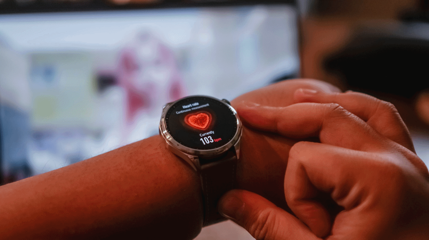
During a particularly stressful stretch, I noticed my heart rate was consistently elevated. It wasn’t exactly surprising, but seeing the data attached to the feeling made it feel more real.
That’s what I found myself appreciating most about the HONOR Watch 6. It didn’t magically solve anything. It simply helped me replace assumptions with information.
Battery life that quietly impressed
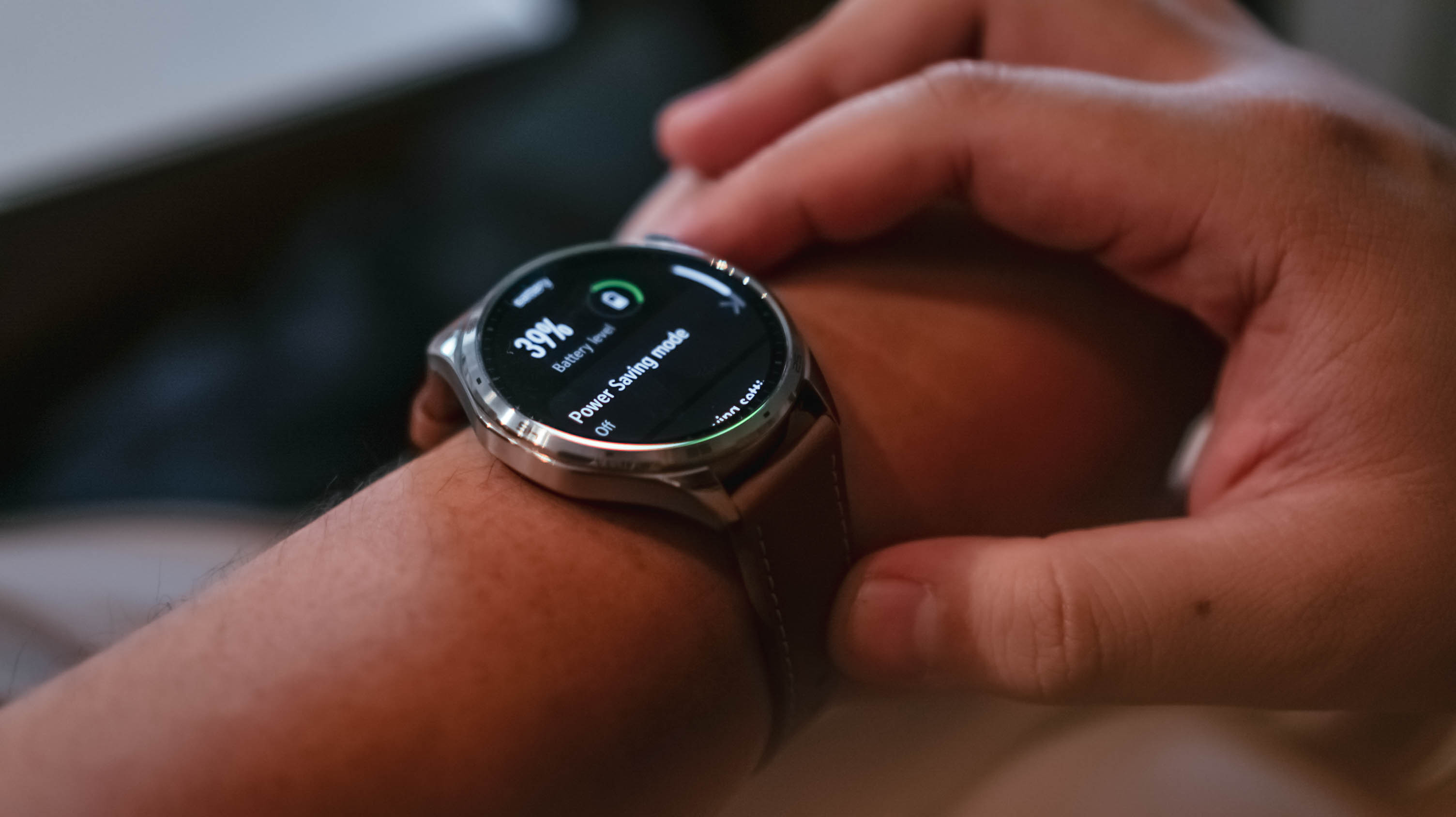
As of taking the photos, the battery life is at 39% – still coming off the first initial charge.
I charged the watch the moment I unboxed it. Seven days later, it was sitting at 59%.
During that time, I wore it constantly. Notifications were enabled. Health tracking was enabled. I tracked a handful of kettlebell workouts and wore it while sleeping.
I wasn’t exactly pushing the watch to its limits, but I also wasn’t babying it.
The result was a battery experience that quickly faded into the background. That’s exactly what I want from a smartwatch.
Everything else
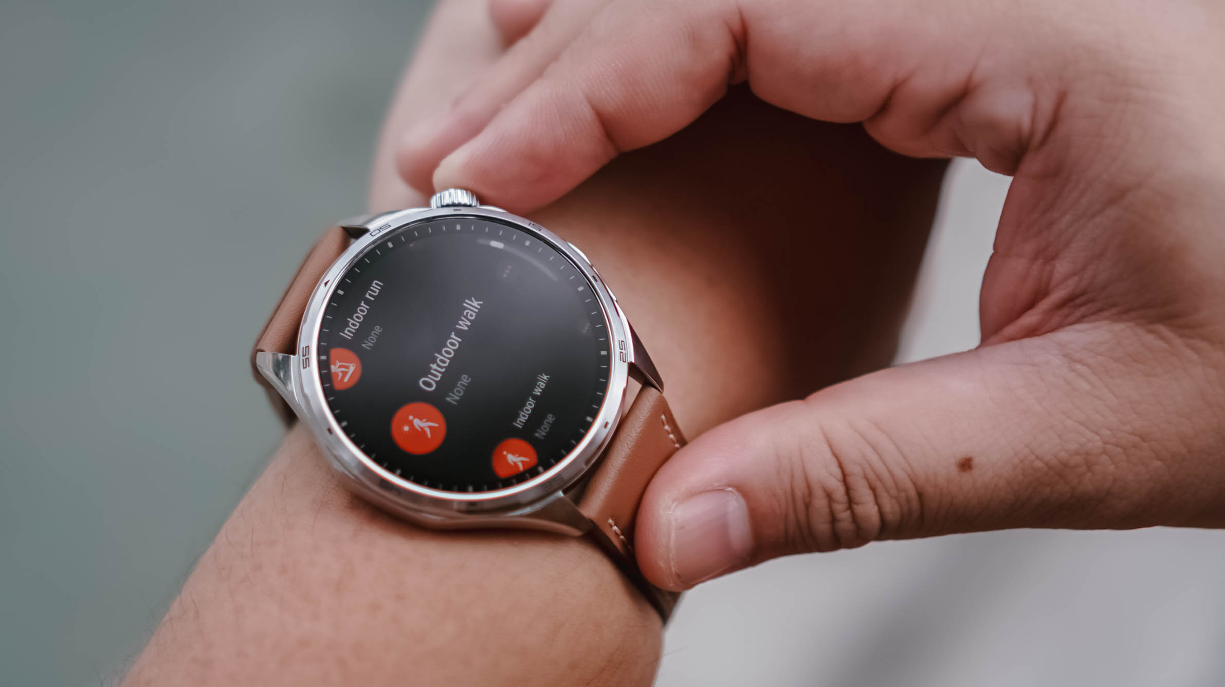
To be completely honest, I didn’t have the time or bandwidth to thoroughly test every feature.
My workout sessions were limited to a few kettlebell workouts and my usual walking. That said, the breadth of sports tracking available here is impressive. If you can think of an activity, there’s a good chance the HONOR Watch 6 can track it.
Pairing was also straightforward. The initial setup process and software updates went smoothly, even if updates immediately after unboxing remain one of my least favorite parts of testing any device.
My one annoyance came from using the watch with multiple HONOR phones. At times, notifications would arrive twice or arrive at slightly different times depending on which device was relaying them. There’s probably a setting that solves this. I just didn’t have the opportunity to dig deeper.
Same notification, two different phones
As for features like AI Recorder and NFC payments, I simply didn’t encounter situations where they became essential to my routine. That’s not necessarily a criticism. It may simply reflect how different people use smartwatches.
Is the HONOR Watch 6 your GadgetMatch?

Something I don’t think we’ve talked about enough is that the HONOR Watch 6 also works well with an iPhone.
If you don’t particularly like the look of the Apple Watch but still want a smartwatch on your wrist, this is a viable alternative.
The HONOR Watch 6 is for people who want useful technology that blends into everyday life. It looks good enough for casual outings and nicer occasions alike, while still offering the usual smartwatch essentials like health tracking, workout monitoring, notifications, and long battery life.
After about a week with the HONOR Watch 6, I realized I liked having data on things I normally would just leave to uneducated guesses.
Smartwatches aren’t for everyone. But if you fancy having one, the HONOR Watch 6 is an easy swipe right.
It has the right features, excellent battery life, and a design that fits comfortably into many parts of daily life.
That’s really all most people need.
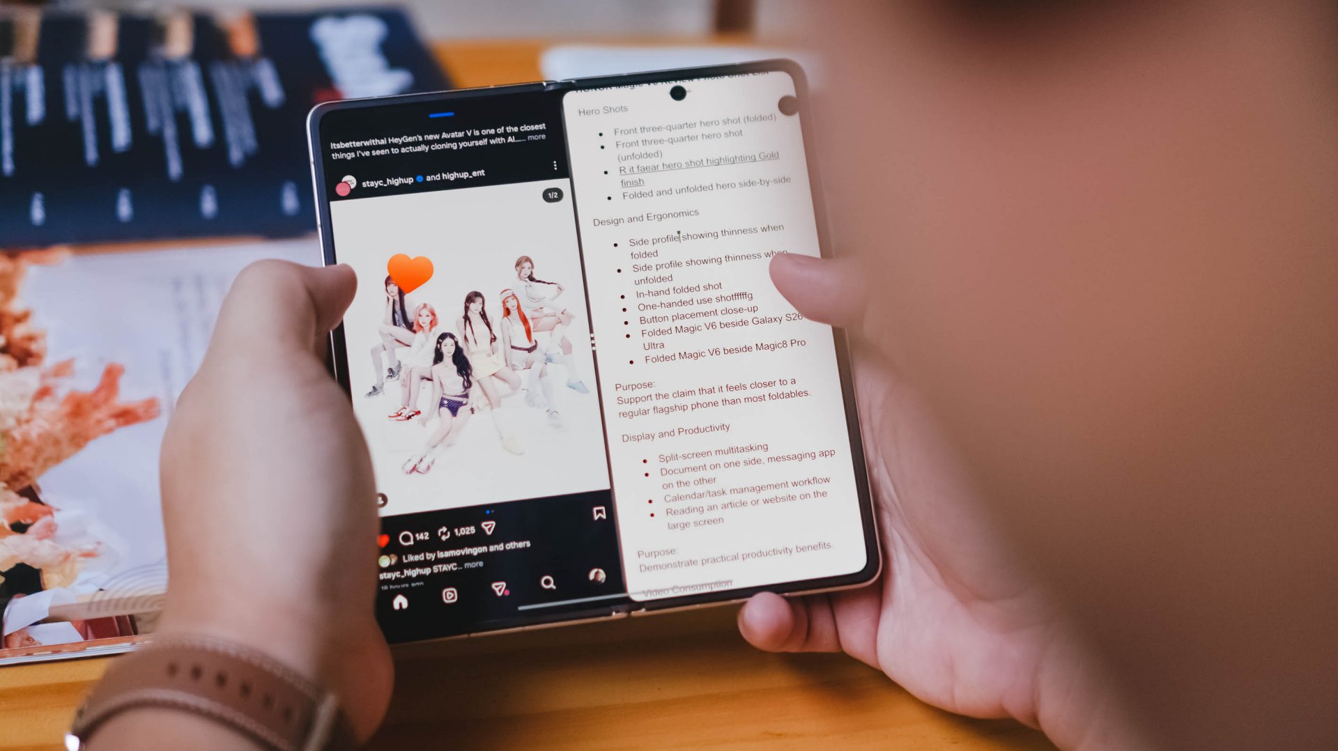
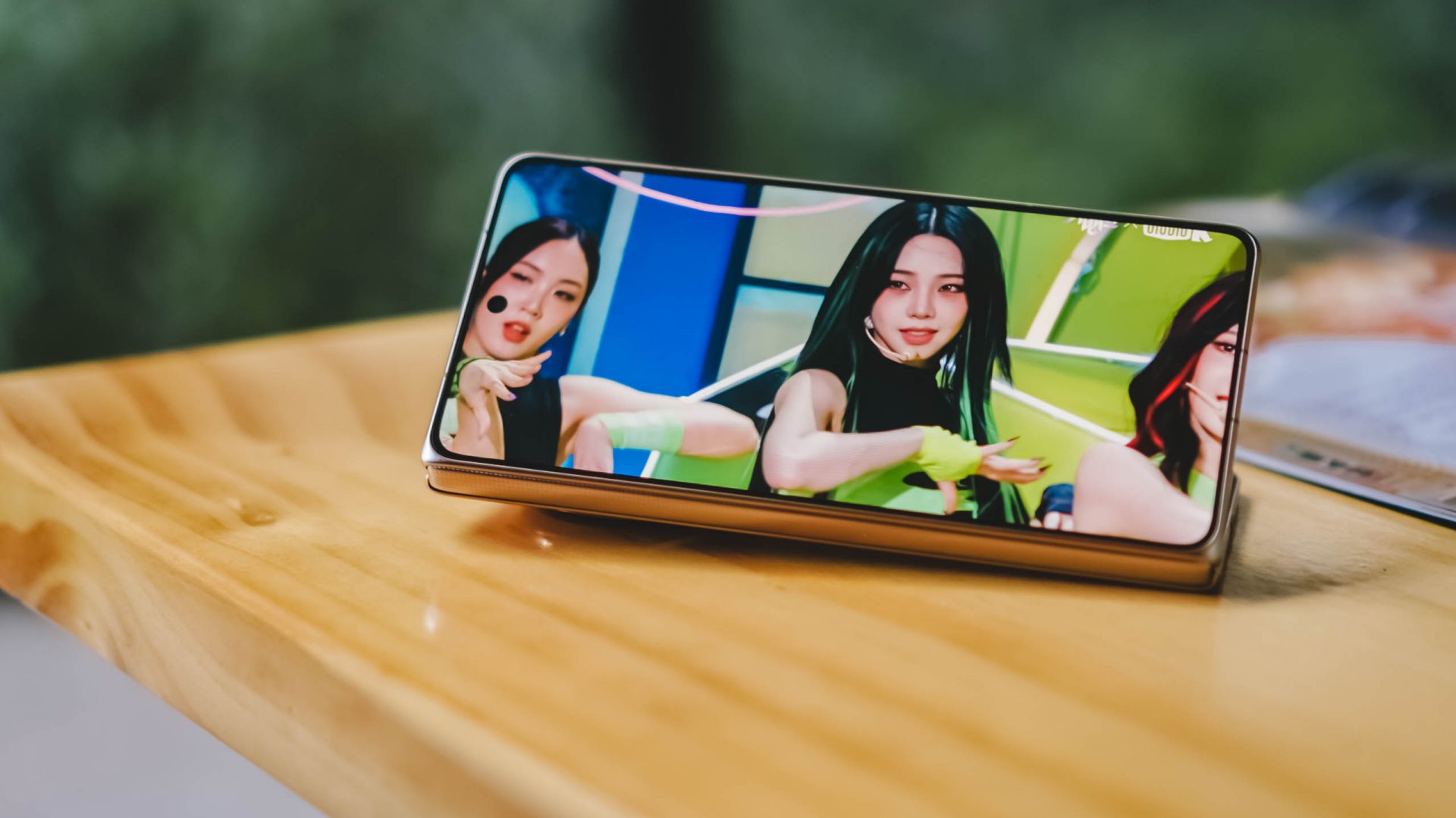
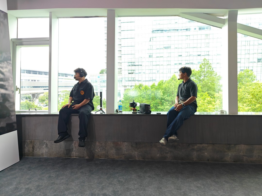
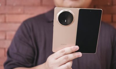
Before I learned when the HONOR Magic V6 review embargo would lift, I had already become aware of the possibility of upcoming wide foldables.
The idea immediately caught my attention because it seemed to address one of the few remaining questions I have about today’s book-style foldables.
They’re excellent productivity devices. The larger, almost square-like display is perfect for multitasking, reading, editing documents, and working with multiple apps at once.
But much of the content we consume today isn’t square.
It’s vertical: Reels. Shorts. TikToks. Fancams.
Or it’s widescreen: YouTube videos. Movies. TV shows.
Book-style foldables can absolutely play these types of content. But when unfolded, they don’t always make the best use of the additional screen space because of their aspect ratio.
That thought lingered in the back of my mind while testing the HONOR Magic V6.
What surprised me was that despite that lingering question, the Magic V6 still made a compelling case for the current form factor. In fact, if the goal is to create a foldable that feels as close as possible to a regular flagship smartphone while still unfolding into a tablet, HONOR may have come closer than anyone else.
The HONOR Magic V6 is priced at RM 7,699 in Malaysia, with pre-orders running from June 4 to 11, 2026 and bundled gifts worth up to RM 3,797.
That’s flagship foldable money. Fortunately, the Magic V6 spends very little time reminding you that it’s a foldable and most of its time convincing you it’s simply a very good smartphone.
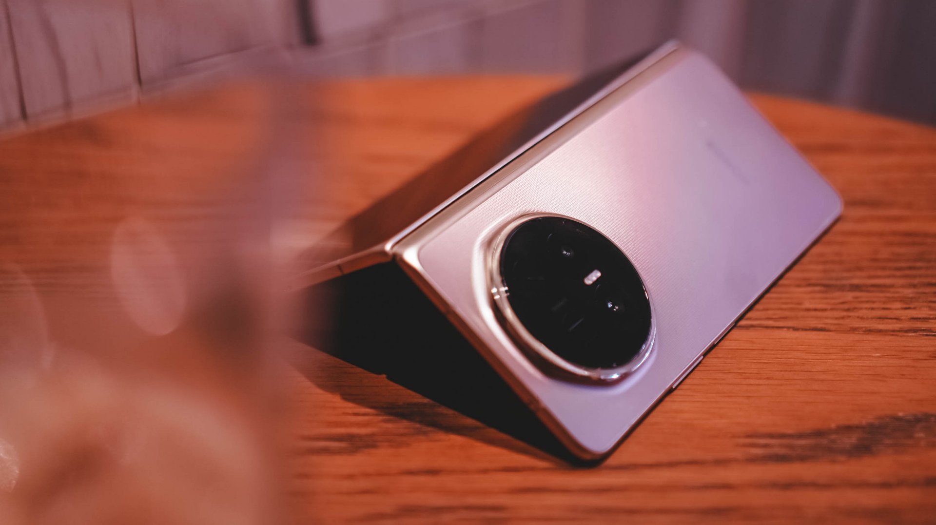
It feels like a regular smartphone
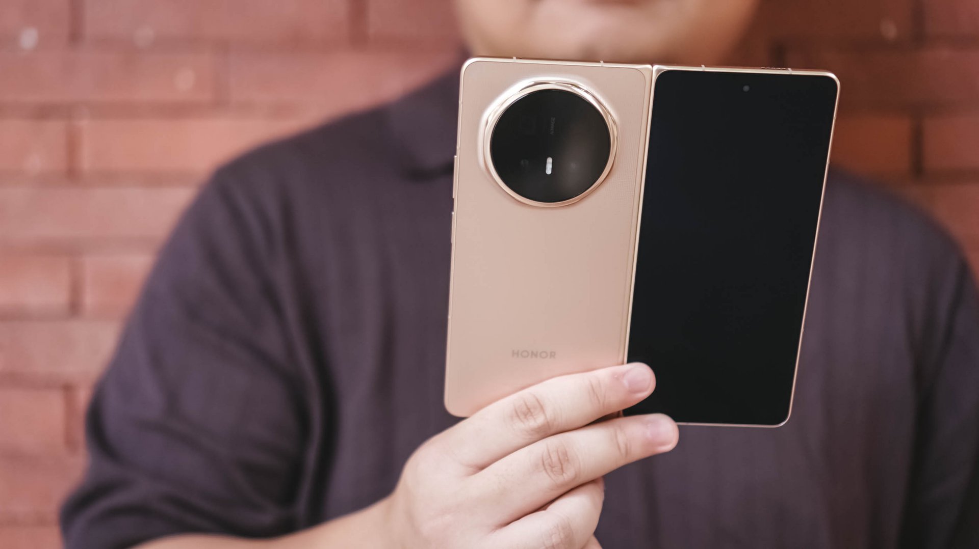
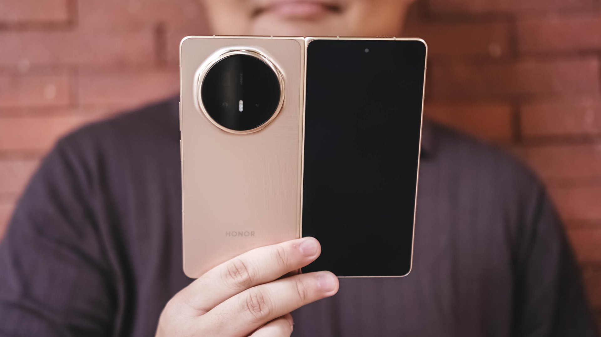
The HONOR Magic V6 looks and feels almost too much like a standard slab smartphone that you almost forget it can unfold into a larger screen.
That’s perhaps the most impressive thing about the device.
Most certainly, I felt the Galaxy S26 Ultra more when carrying it compared to the Magic V6. Despite being a foldable, it never feels cumbersome in daily use.
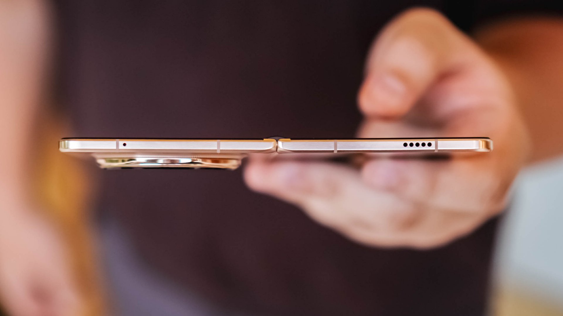
One of the subtle improvements I appreciated most was the button placement.
This is one of those low-key things you don’t really think about at first but becomes important over time. There’s little to no adjustment required when moving from a regular smartphone to the Magic V6 because the buttons sit exactly where you expect them to.
I use it alongside both the HONOR Magic8 Pro and Samsung Galaxy S26 Ultra and the transition feels seamless. That’s something I can’t quite say about the OPPO Find N6, whose power button still sits at a height that feels a little awkward.
Folded, the Magic V6 doesn’t feel like a compromise compared to a traditional flagship.
It simply feels like a regular flagship smartphone.
Unfolded, it feels natural too. The display even feels larger than the Galaxy Z Fold7 and HONOR Magic V5 that I used previously.
And that’s where the appeal of a book-style foldable continues to shine.
Productivity remains the killer feature
The larger display became particularly useful during several production shoots.
I found myself timekeeping to make sure we stayed on schedule while simultaneously checking scripts and production notes. It’s one of those situations where the larger screen immediately proves its value.
On another occasion, I handed the unfolded device to a project lead so she could review a script while planning shots for the day.
It immediately made her stop and consider whether she should get a foldable herself.
Moments like these highlight the unique advantage of book-style foldables.
The larger screen doesn’t just exist for the sake of being larger. It enables workflows that simply aren’t as comfortable on a conventional smartphone.
That’s why, despite my growing curiosity about where foldables go next, the Magic V6 reminded me why this category became appealing in the first place.
Battery confidence is underrated
An overwhelming yes.
That’s my answer when asked whether the battery capacity translates into confidence.
The Magic V6 is an endurance beast.
I never worried about using it folded or unfolded throughout the day. I never worried about taking photos, multitasking, or spending extended periods on the larger display.
For the most part, I simply knew that no matter what I did during a normal day, I’d still have enough battery to get home or reach somewhere I could recharge.
As someone who tends to become conscious about battery life once it drops below 50 percent, that’s saying something.
I also noticed myself worrying about the battery less the more time I spent with the device. I got used to how much power it consumed depending on what I was doing throughout the day.
Compared to the Galaxy Z Fold7 and HONOR Magic V5, the Magic V6 feels like it has more endurance.
It also charges faster.
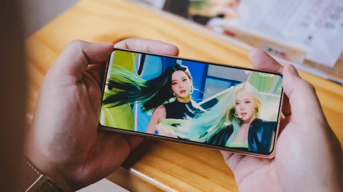
The media consumption question
Did the Magic V6 make me watch more videos than I normally would on a phone?
Not really.
Most of my phone-based video consumption consists of Reels, Shorts, and the occasional K-pop fancam. Longer content usually happens elsewhere. If I’m watching a movie, a series, or even a lengthy YouTube video, I’d much rather do it on a TV or tablet.
For the purposes of this review, I spent some time watching aespa Karina’s “Lemonade” facecam. I figured if there was any content I’d naturally watch on a phone, it would be that.
Folded and held in hand, it’s your typical smartphone viewing affair. In fact, the cover display is still a little narrower than I personally prefer.
You can also prop it up in Flex Mode and watch hands-free, which works surprisingly well when you’re sitting at a desk or table.
When unfolded, things become a little more complicated.
You can watch content in its original aspect ratio and live with the black bars. At night, they practically disappear. In brighter environments, they’re much more noticeable.
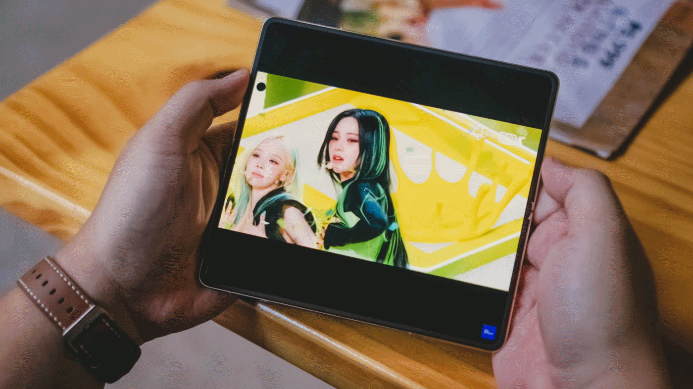
You can also pinch to zoom and fill more of the display. This works particularly well for content where the subject stays near the center of the frame. Facecams like Karina’s are a perfect example.
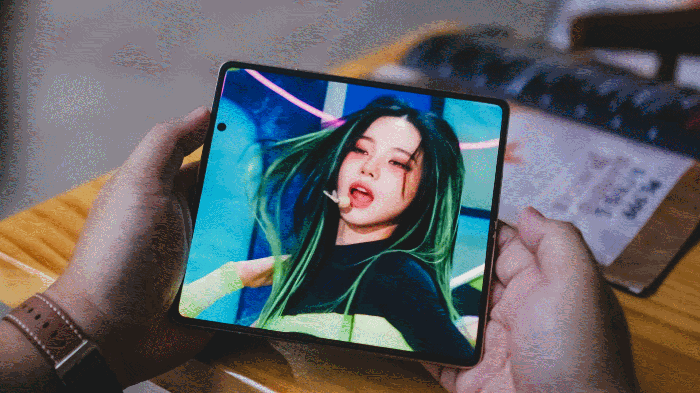
Why is Karina giving so much Shego vibes here?
The challenge is that much of today’s content exists in either 9:16 or 16:9 formats, while book-style foldables unfold into something much closer to a square.
The result is that the additional screen space isn’t always utilized as efficiently as you might expect.
That’s not really a criticism of the Magic V6 itself.
Rather, it’s one of the reasons I’ve become interested in the idea of wide foldables. The Magic V6 excels at productivity because of its aspect ratio. Whether that same aspect ratio remains ideal for modern media consumption is a question I continue to think about.
Cameras that don’t feel like a compromise
The camera system is one of the standout features of the device.
For a foldable, it takes really good photos. Photos I wouldn’t hesitate to post immediately on social media.
I’ve become particularly fond of HONOR’s Authentic Filter and used it extensively throughout my testing. The images look excellent and carry a look that I genuinely enjoy.
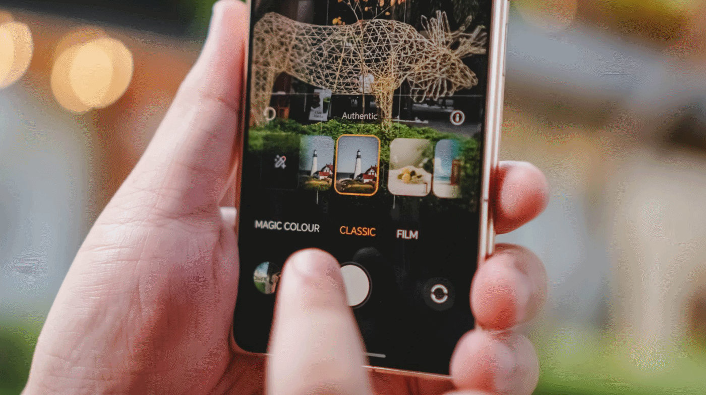
I still notice some limitations once I move beyond 6x zoom, but realistically, most users won’t spend much time there.
For everyday photography, the Magic V6 delivers more than enough.
That’s important because it removes one of the traditional compromises associated with foldables. Check out the samples below.
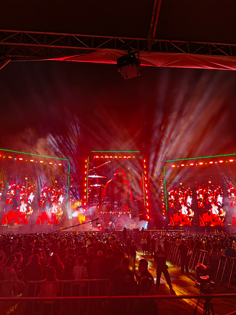
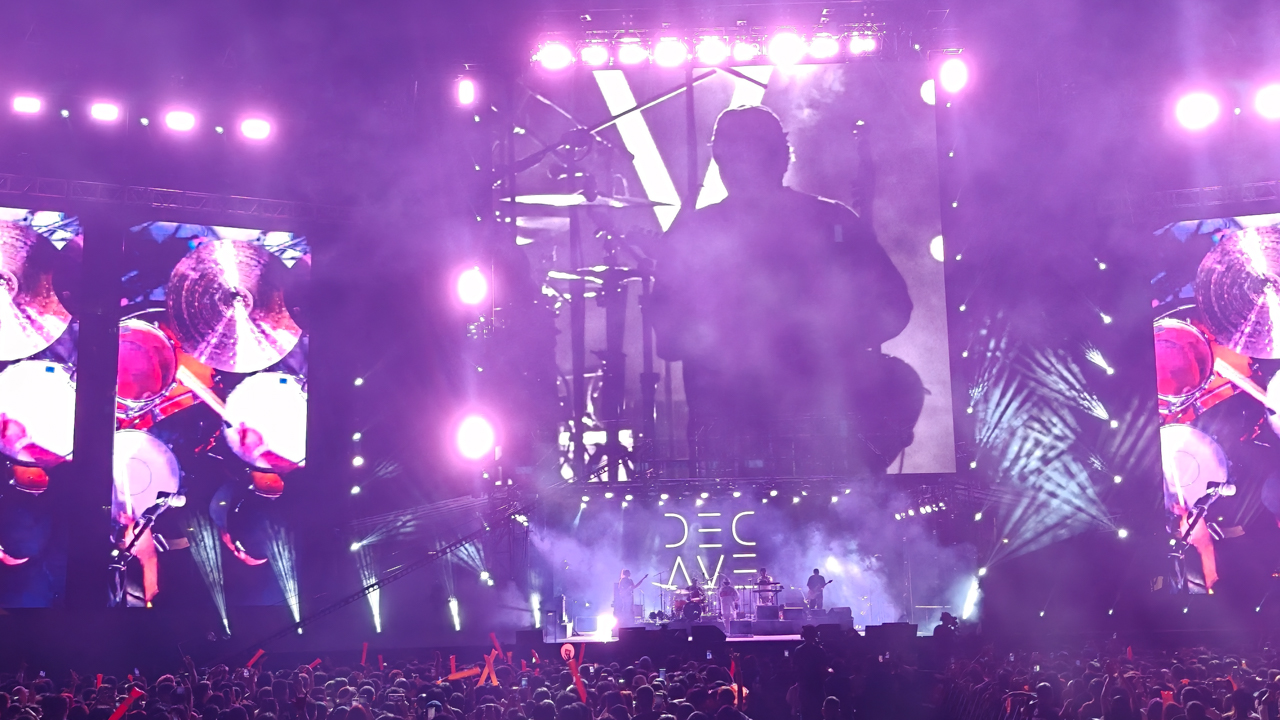
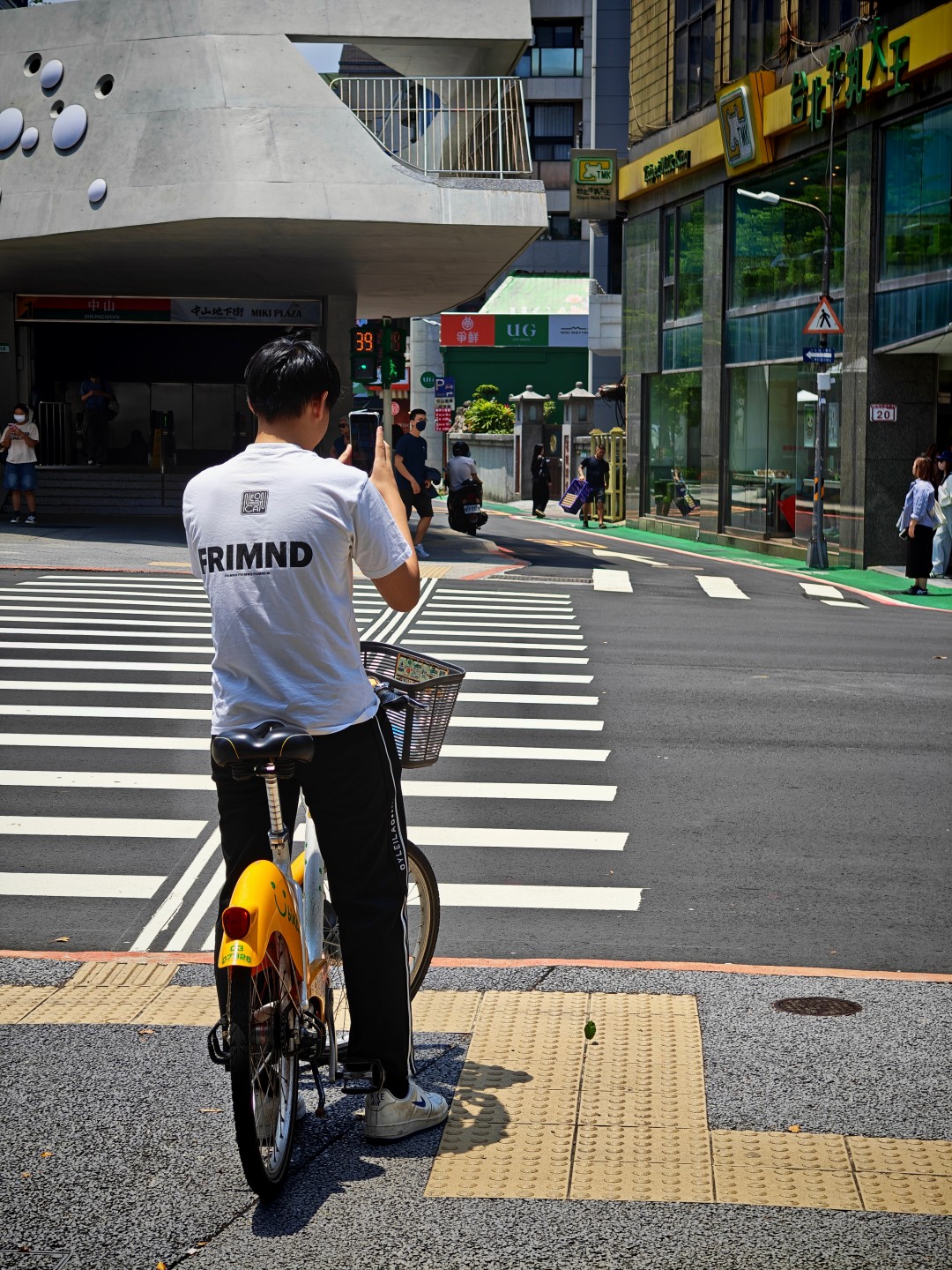
Witcher in Concert night


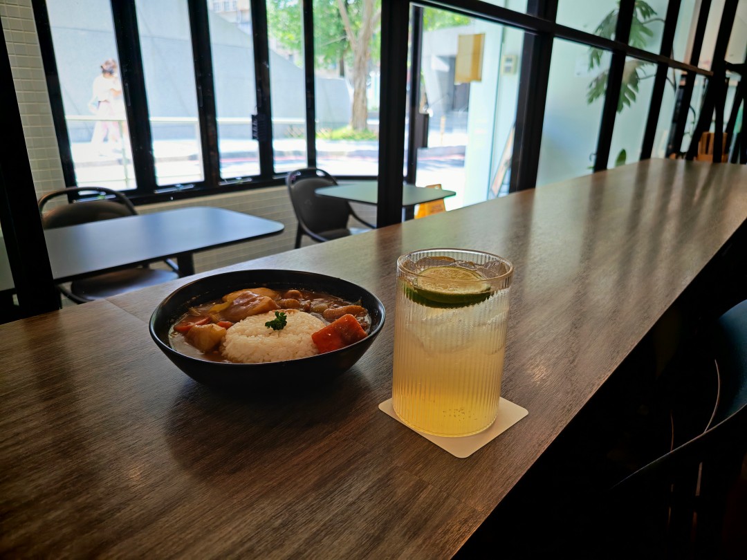
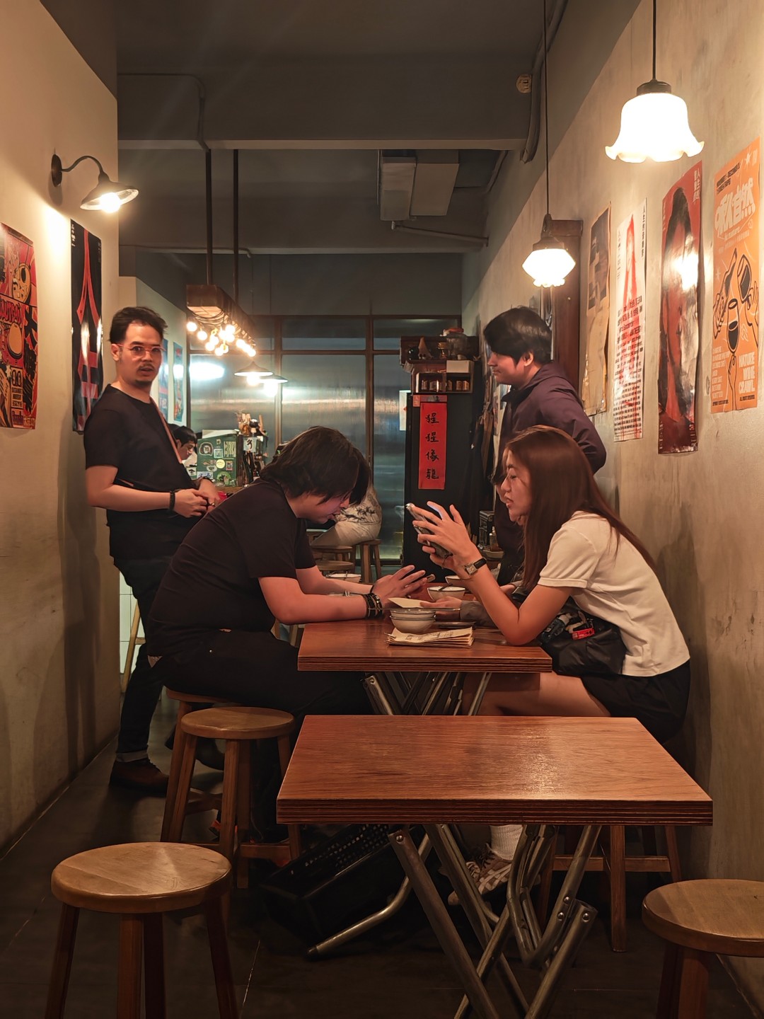
Food with friends


Taipei streets part 1


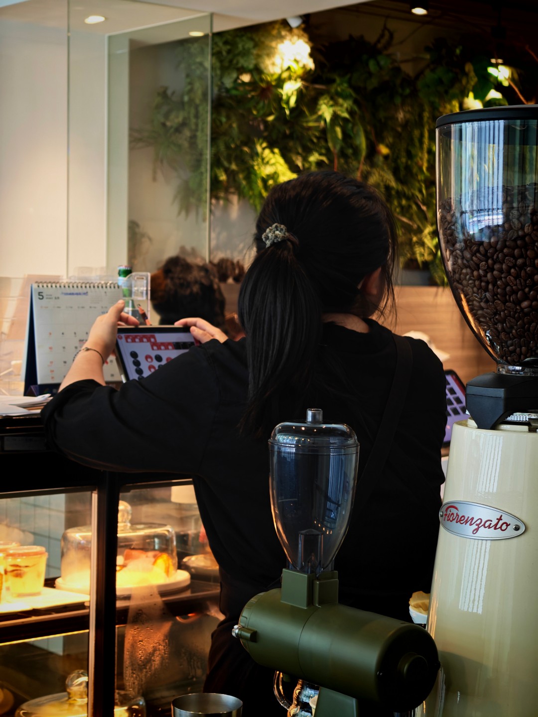
Middle Name Coffee and Space


Taipei streets part 2


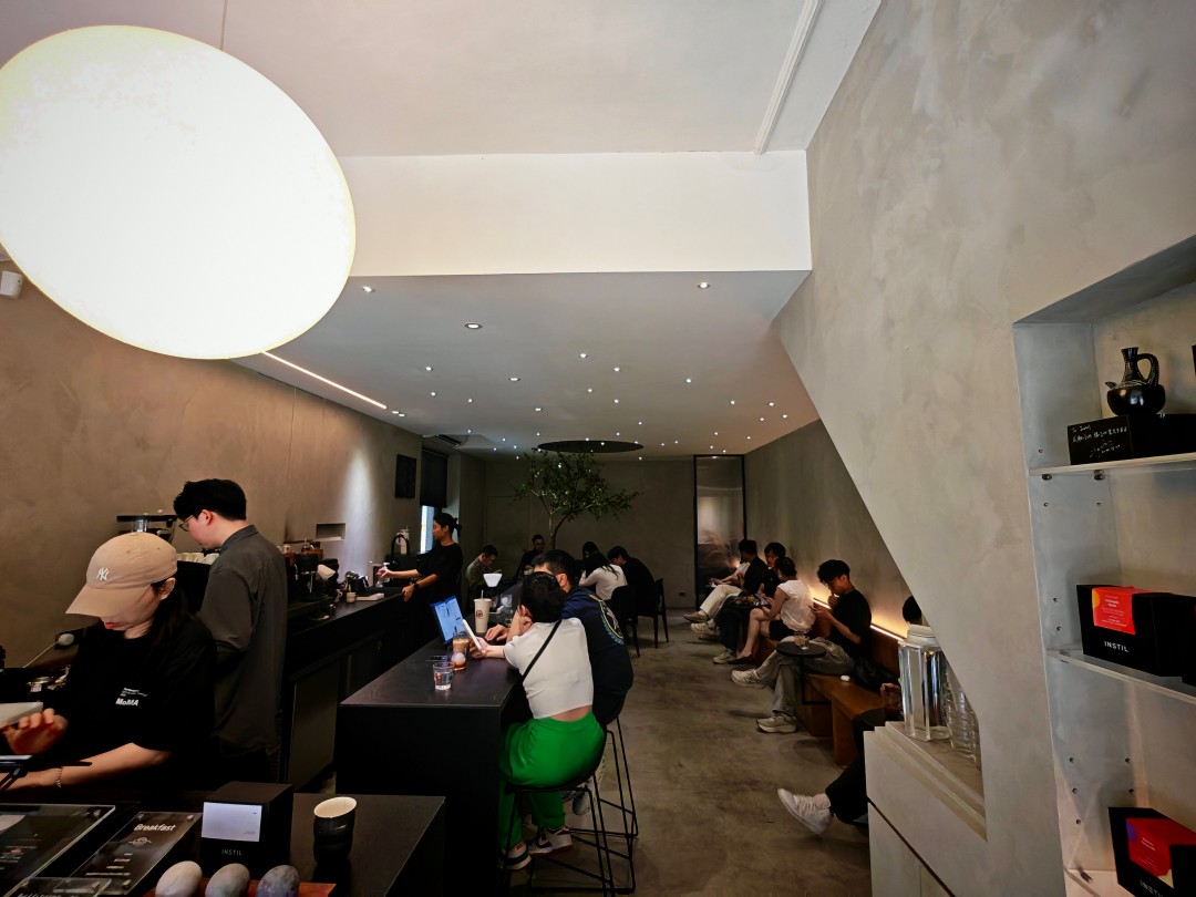
Instil Coffee


Taipei streets part 3


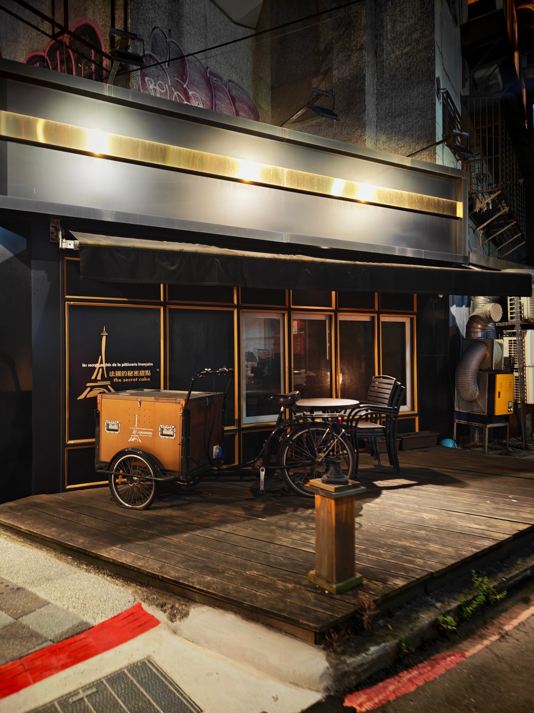
Taipei at night + Bar Shock


Taipei at night + Backstreet Bar


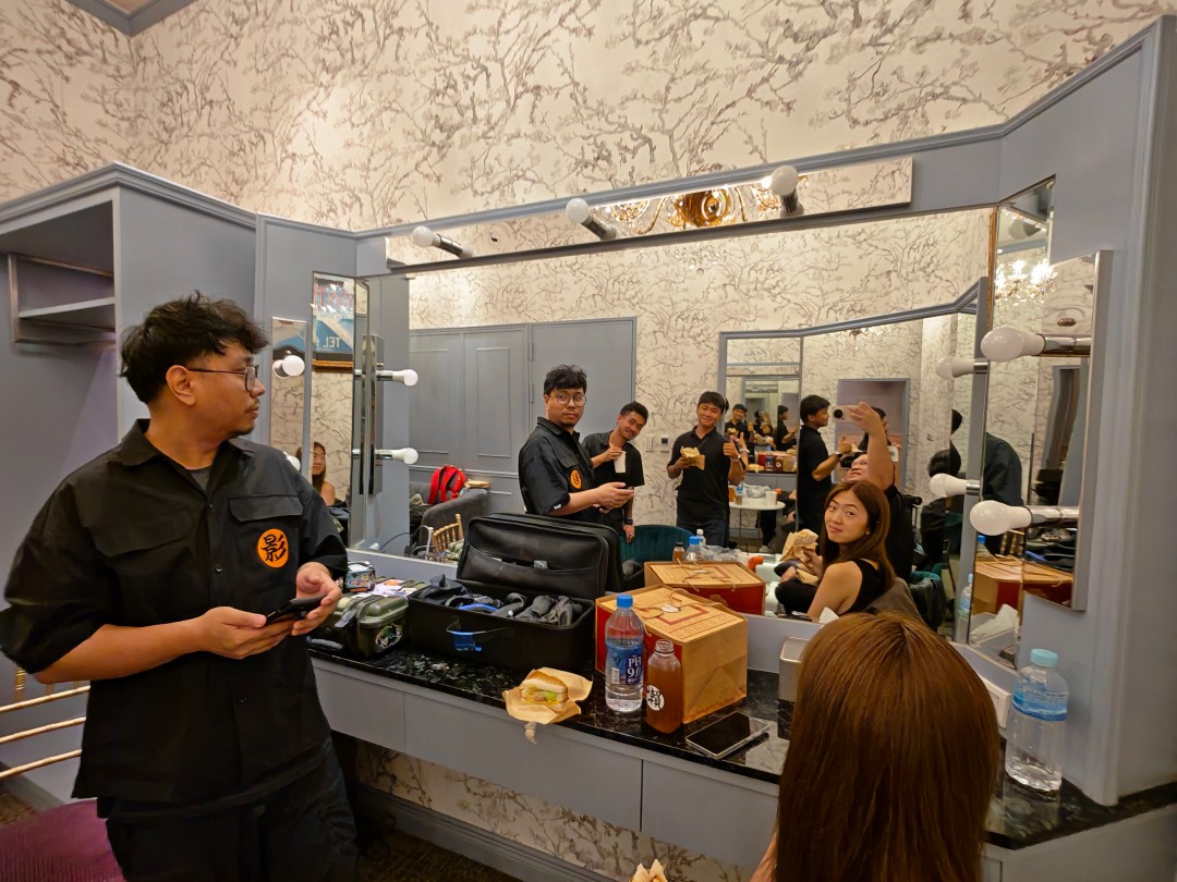
Side gig


Sushi Party


Apple-friendly and easy to live with
One of the more pleasant surprises was how useful the Apple ecosystem features turned out to be.
Funny story.
I attended a sushi party where one of the guests happened to be an engineer who liked tinkering with hardware. He brought a small development board loaded with chips and components. When powered on, it mimicked the pairing process of AirPods and attempted to communicate with nearby Apple devices.
As he was scanning the room for iPhones, he was surprised to see his setup interacting with the HONOR Magic V6 I was carrying.
It’s a small anecdote, but it serves as a real-world reminder of how much effort HONOR has put into making the device work alongside Apple’s ecosystem.
More practically, I’ve regularly used the Magic V6 to move files between the phone and my MacBook Pro M4. The process is straightforward and useful enough that it naturally became part of my workflow.
The same can be said about durability.
The funny thing is people often comment about how not-so-careful I am with my devices. It’s not that I don’t take care of them. I simply carry a lot of gear at once and sometimes toss things into my bag without thinking too much about it.
Despite that less-than-careful handling, the Magic V6 hasn’t sustained any significant or noticeable damage.
Is the HONOR Magic V6 your GadgetMatch?
The HONOR Magic V6 is the fulfillment of the book-style foldable promise.
It’s a standard-sized smartphone that unfolds into something larger. It unlocks productivity and multitasking capabilities exactly the way you imagine it would.

The weight, thickness, and handling are about as close as you’re going to get to a regular smartphone. What’s remarkable is that HONOR achieved this while also delivering excellent battery life, fast charging, and a camera system that rarely feels like a compromise.
It won’t stop me from being curious about where foldables go next.
But it did remind me how good today’s foldables have already become.
If we’re judging the HONOR Magic V6 based on what a book-style foldable is supposed to be, there is very little left to sacrifice. That’s why I’m giving the Magic V6 the GadgetMatch Seal of Approval.

The realme P4 Power: realme’s midrange power play?
A power bank and a phone — and more


HONOR Watch 6 Review: Less guessing, more knowing
Beyond educated guesses

HONOR Magic V6 review: The best version of a book-style foldable?
Little left to sacrifice
The realme P4 Power: realme’s midrange power play?

The Adventures of Elliot: The Millennium Tales out now

Spider-Man: Brand New Day trailer offers biggest look yet

Inside an OCR training day with Bring Your Game

Why is AI loved in COMPUTEX but hated in the rest of the world?

TECNO’s POVA 8 5G is both futuristic and future-ready

Close without crossing: A Xiaomi 17T Pro photo essay

realme launches P4 Series 5G, including Power with 10,001mAh battery

The Xiaomi Watch S5 proves you don’t have to take it off

Samsung’s SECRET That Made OLED Even Better


-
 India1 week ago
TECNO’s POVA 8 5G is both futuristic and future-ready
-

 Buyer's Guide2 weeks ago
Buyer’s Guide: Xiaomi Pad 8 Series
-
Reviews1 week ago
HONOR Magic V6 review: The best version of a book-style foldable?
-

 Gaming1 week ago
Kingdom Hearts IV gets new trailer, confirms Switch 2 release
-

 Gaming1 week ago
Final Fantasy fans have two big reasons to look forward to 2026
-

 Smartphones1 week ago
Upcoming realme C100 series to feature 8,000mAh battery
-

 Gaming2 weeks ago
Nintendo officially announces Ocarina of Time remake
-
 News5 days ago
TECNO’s SPARK 50 Pro is the latest budget smartphone battery beast