
Reviews
The POCO Pad is perfect for the freelancing, remote-working you
Portable, reliable companion — for work, entertainment, and more
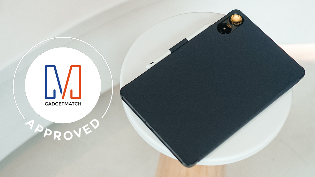
POCO continues to strengthen its footing as an independent brand under the Xiaomi umbrella. Earlier in the year, the brand released its first ever tablet: the POCO Pad. It’s been in the market for some time now, and retails for just PhP 15,599 (~US$ 275.40) for the lone configuration of 8GB+256GB.
If you’re looking for a tablet that has your back, the POCO Pad package will allow you to stay productive and carry out tasks usually reserved for laptops or PCs. That’s without sacrificing the workflow speed that much. The form factor is likewise perfect for entertainment and creative sessions. Let me get into all of these in a bit.
POCO Pad specs
The POCO Pad is positioned as an “all-round, flagship-level entertainment experience” provider. Here are some highlights of POCO’s first ever slate:
- Processor: Qualcomm Snapdragon 7s Gen 2 mobile chipset
- Display: 12.1-inch 120Hz 2.5K, Dolby Vision-supported
- OS: Xiaomi HyperOS
- RAM: 8GB
- Internal storage: 256GB
- Cameras: 8MP rear, 8MP front
- Battery: 10,000mAh
- Charging: 33W fast charging
In addition, the POCO Pad has a 3.5mm audio jack, a Dolby Atmos quad speaker system, and a slot for a microSD card. Its only downer, to be honest, is the absence of SIM support.
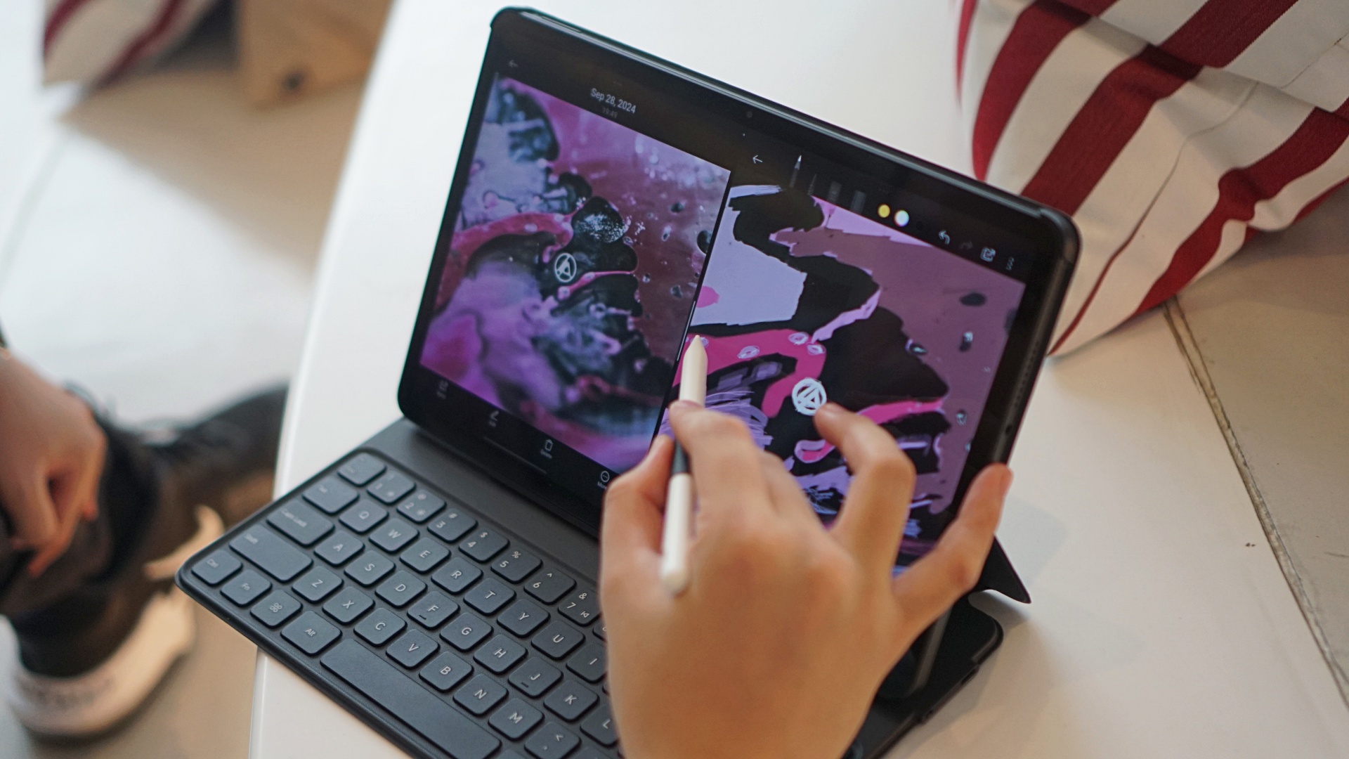
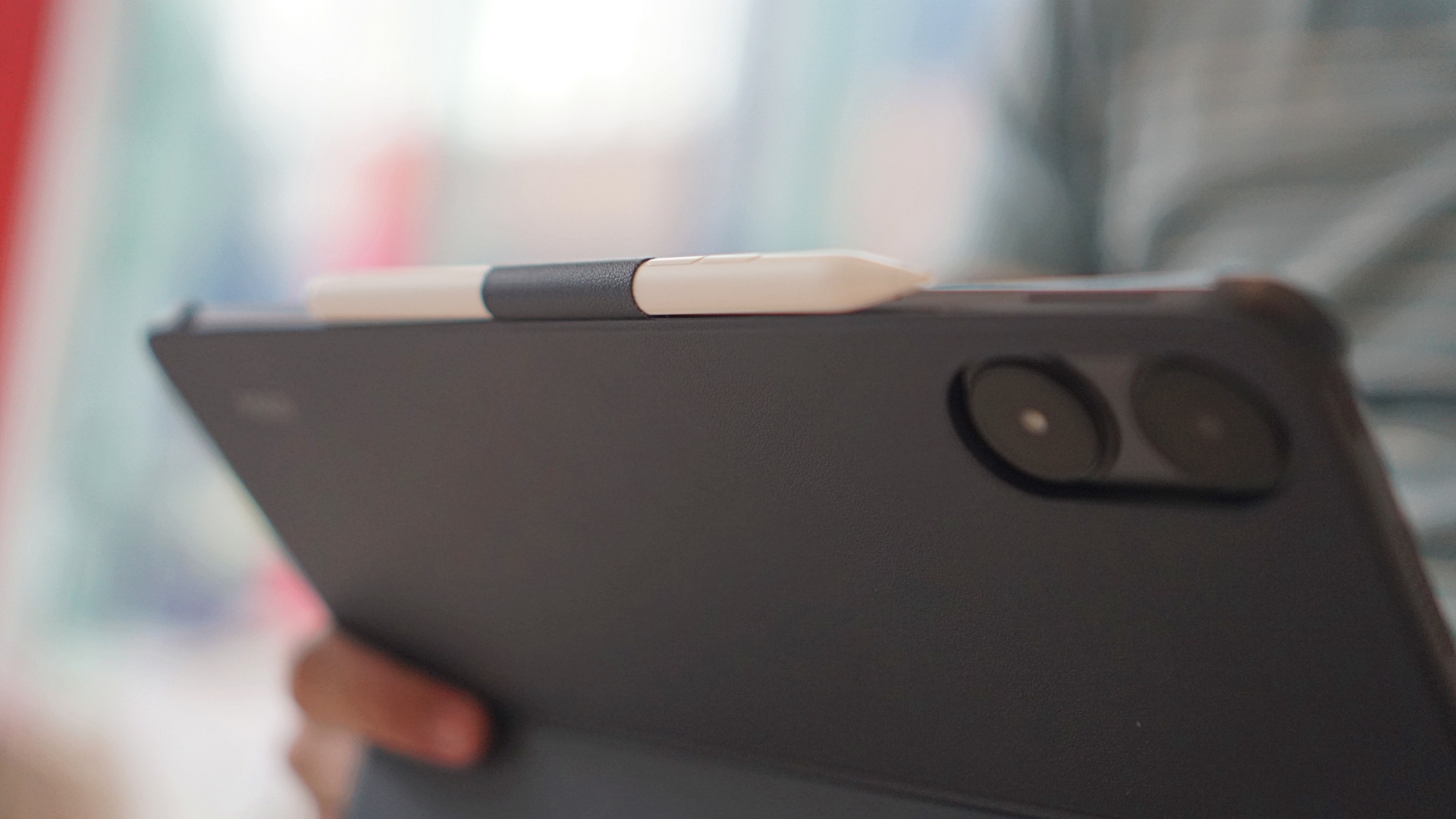
The tablet is packaged with a POCO Pad Keyboard, POCO Pad Pencil, and POCO Pad Cover for the complete experience. As a set, they’re easy to take with me wherever.

The pencil comes with a sleeve that has its own slot on the keyboard or pad cover. It’s not magnetic, but it doesn’t matter, considering the pad’s price point. You can just sneak the pencil in between the cover and the actual tablet on the top middle part (or side if held vertically). Both the pencil and keyboard charge via USB-C.
Portability factor
For a quick segue: I’ve used tablets in my previous life as a sports journalist. In the past, a slate had been more than enough to file stories straightly from arenas or stadiums. I write them on third-party apps, then paste them to Gmail to send them straight to my editors.
Occasionally, I live-tweet events, which was quite a thing during the early 2010s. Moreover, I attend sports teams’ practices at various gyms from time to time. That’s just the nomadic nature of being a sports storyteller.
Again, a tablet sufficed for that task. It were just mere characters and crappy quality images uploaded via 3G anyway. My previous organizations have always had desk editors and photographers to handle the rest.

But as the turn of the decade showed, the internet has become as visual as it is today. Graphics and short-form videos have taken social media by storm as an effective means to acquire information.
That means whoever has a job that involves social media needs tools with better processing power and ample storage to support what they need to accomplish.
Better devices needed for changing roles
With GadgetMatch, my role is also a lot different. I place stories directly on the website’s CMS, which means I usually need to be on a PC. I likewise download images, crop and resize them, and place them on articles.
In between, I respond to emails, watch videos that I need to storify as well, and open several tabs for supplemental information before packaging them into a coherent whole. I even attend events and shoot photos, albeit with just smartphones (for now).
It’s quite taxing. And I have always relied on at least a PhP 30,000-laptop to carry out these tasks. I never thought I can work on such a daily plate on a portable setup.

Enter the POCO Pad. It’s a refreshing switch for me from a remote yet rigid home-based setup to one that’s portable, convenient, and versatile. Best of all, I don’t have to sacrifice too much of my productivity speed. Working on the POCO Pad is nearly as good as my work rate on a laptop.
Built for portable productivity
I leveraged the POCO Pad mostly for work. I alternated the pen and my right hand as the cursor. The keyboard cover acted as the default case too, even when I was only watching on the pad. It puts the tablet in an ideal horizontal reclining angle. The magnetic attraction is snappy strong too.
Every once in a while, I have to switch the keyboard on and off before it could connect via Bluetooth. The pen sometimes takes a while to connect too. But I can live with these quirks.
The actual keyboard keys have just the right amount of snappiness and tactility to them. I personally liked how they sounded too. It’s almost the same as a budget laptop. It didn’t take me long to get used to its layout, except for the much smaller up and down buttons.
Synergy is key when dealing with tablets. When you learn how to work with what you have and know what tools to use at a specific time, everything will just keep flowing greatly.
Capable processor for a long day of work
Speaking of work, the POCO Pad went into trial by fire mode right away. All of the PlayStation State of Play-related news were done from the tablet. The next few days, RazerCon 2024 stories were aplenty. Throughout this busy stretch, the POCO Pad didn’t let me down.
Monitoring my outputs on Google Sheets is also a breeze. The same goes for my monthly finances which I plot on the same app. Sometimes, in the thick of things, I even tend to forget how many apps I have open, until I swipe up and realize there’s a ton. Yet the pad doesn’t slow down significantly.
If anything, I like the simplicity of the Xiaomi HyperOS UI. Bloatware is absent. You know exactly where to go to access what you need.
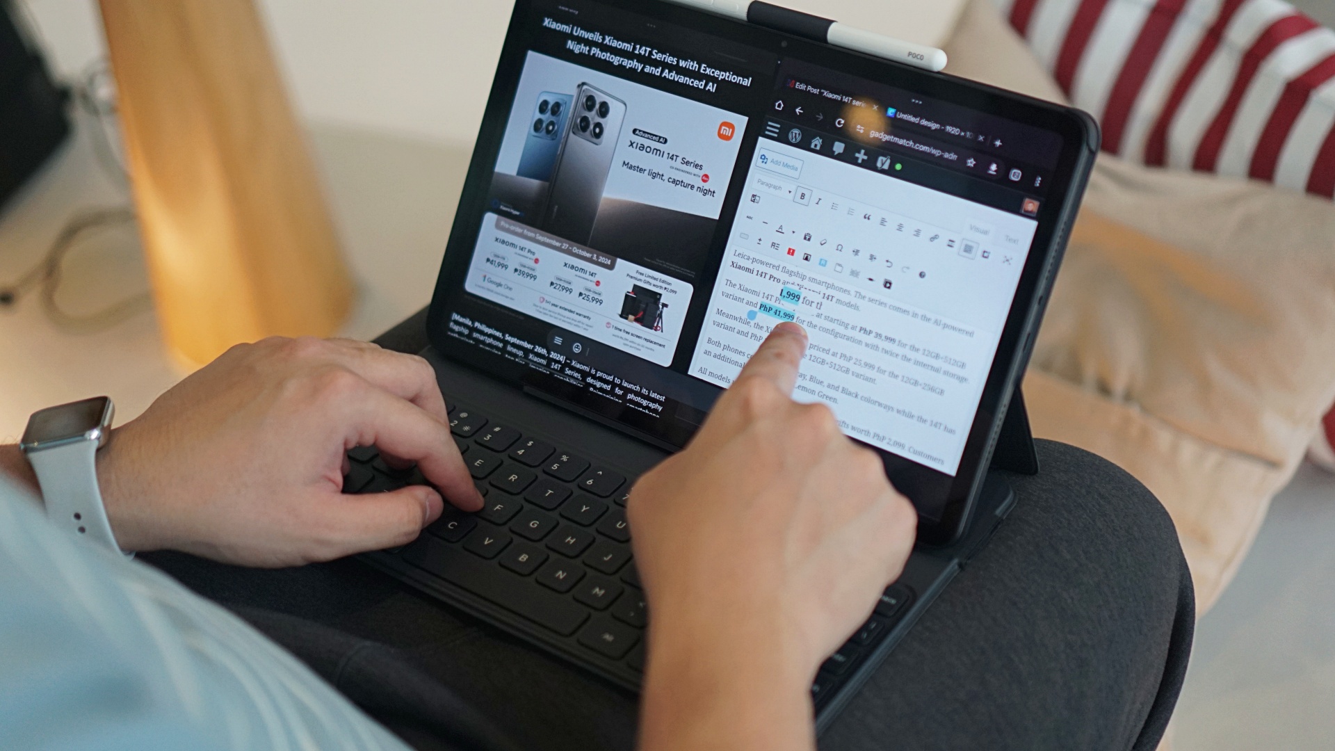
Multi-screen, floating window: Godsends
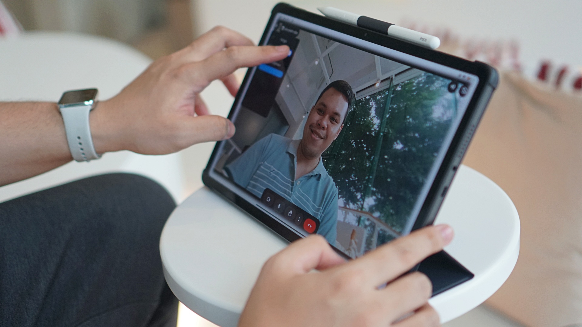
The POCO Pad’s multi-screen and floating window capabilities are, of course, game-changers for multitaskers like me. It’s exactly what I have been accustomed to doing on laptops.
I usually have Gmail on the left and Google Chrome on the right, where I write on the website’s CMS and open other tabs from time to time. Occasionally, I download press releases and photos via Google Drive, which opens on the left side. If I need to resize photos or work on quick collages, I open Canva on the browser.

On the POCO Pad, switching from one app to the other or opening other apps may take just slightly more time. On a laptop, dragging windows to the edge of the screen triggers a split-screen quite quicker. Copy-pasting links and other text is also a challenge sometimes on the tablet. Additionally, there are times where Chrome defaults to mobile mode.
Some apps aren’t optimized for a tablet of this display size either. Although, I enjoyed the fact that some apps open another virtual window when you click a notification or open a message. It’s as if the Windows 98 start menu sequence came back to life.
Overall, being able to multitask on this pad in virtually the same way I do on a much more expensive laptop is refreshing. And I’m taking full advantage of it. I can just easily insert the POCO Pad into one of my several tote bags if ever I need to take my work with me wherever.
The POCO Pad has also aided me during my few moonlighting sessions as a football commentator. The display allowed me to plot the respective clubs’ formations with the Mi Canvas app. Meanwhile, information I needed to pull up on the fly as the broadcast was live, e.g. rosters and league standings, I put on the other half of my screen.
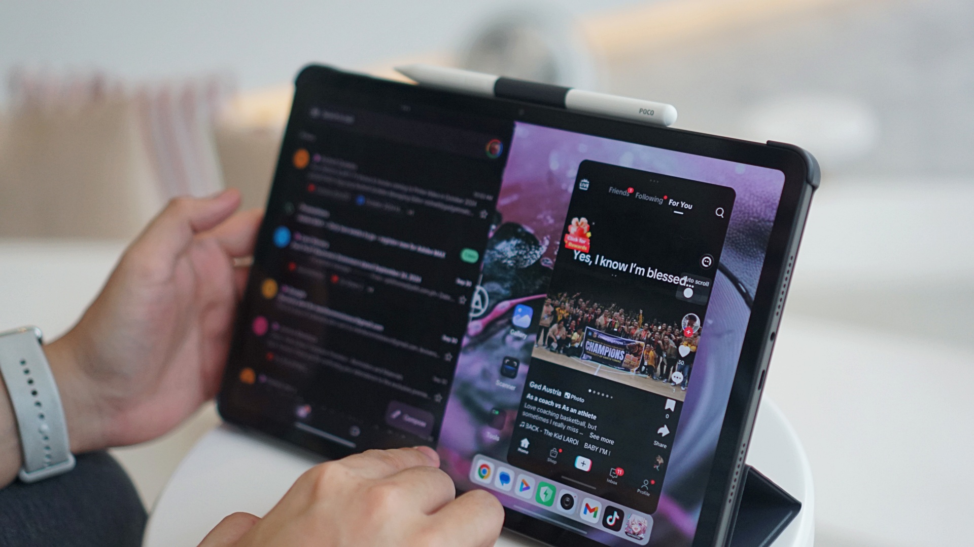
Immersive entertainment for less
And while I used the POCO Pad mostly for work, I also tried it out for content consumption. I binge-watched a few series on my go-to streaming apps, like One Dollar Lawyer. I also put certain YouTube videos on repeat, like Derrick Rose’s career highlights now that he’s retired from the game like me.

The sound from the POCO Pad’s quad speaker system is rich and of high quality. You’ll be able to discern the layers of sound, compared to budget handsets or cheap earphones. Wired or wireless, it’s easy to connect to your audio peripheral of choice too.

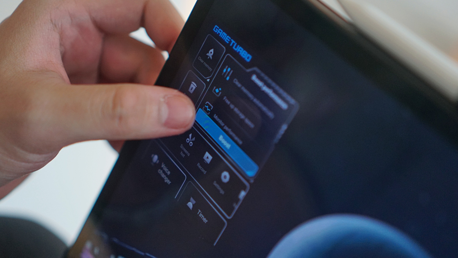
And you can even play games on this machine, like Honkai: Star Rail or Asphalt Legends Unite if you want its visuals playing from a 12.1-inch slab.
The pad even comes with a dedicated Game Turbo feature for a performance boost and for users to adjust other game-related settings.
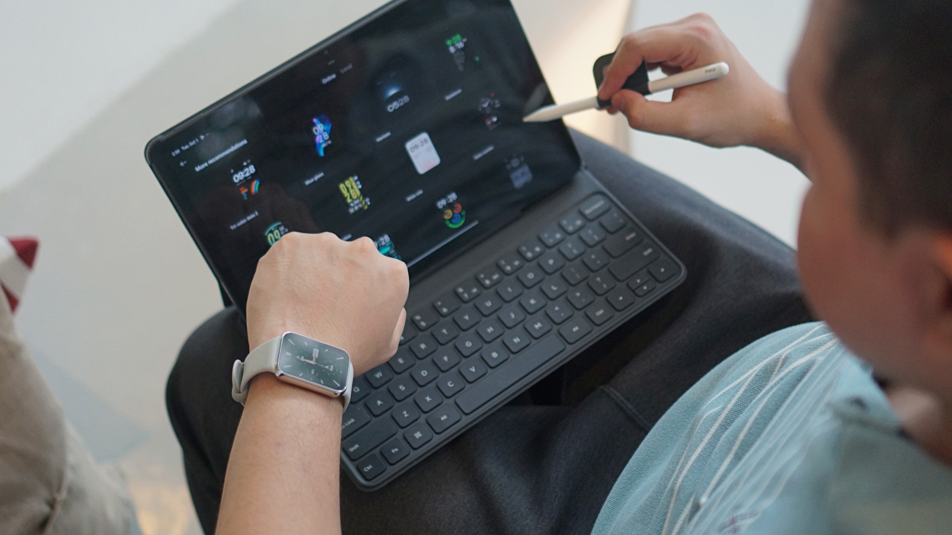
I also connected my Xiaomi Smart Band 8 Pro to check its watch faces. Sometimes, having a larger screen gives you a better vantage point when it comes to viewing certain visuals.
Creativity: Manual to digital
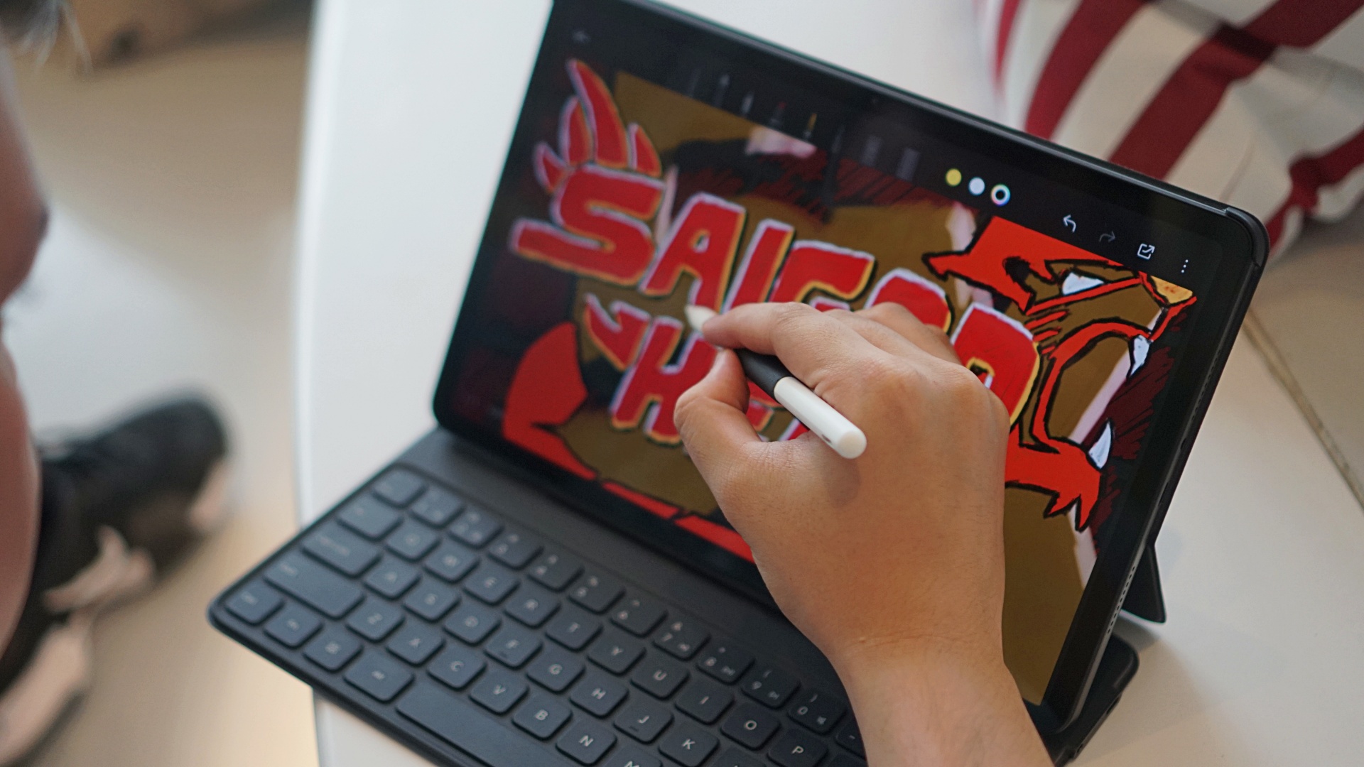
Furthermore, the POCO Pad is also a great way to take your creative passions from manual to digital. I tried the device’s built-in Mi Canvas app for quick drawings and sketches.
Naturally, the pressure sensing levels on the pad aren’t as comprehensive as that of a more expensive counterpart. The Mi Canvas app also has limited pens and brushes. But nothing’s stopping you from downloading third-party apps, like ibisPaint.
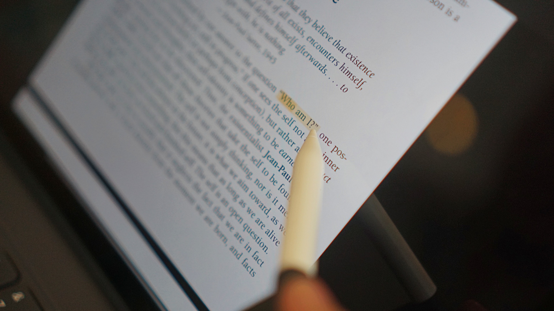
Or if you happen to just enjoy note-taking in a more modern way, add annotations to photos or PDF files, the POCO Pad is a great fit. Using the Drive PDF viewer, you can add doodles or highlight chunks of text.
You can also do quick animations on FlipaClip without major hiccups, given the capable processor.
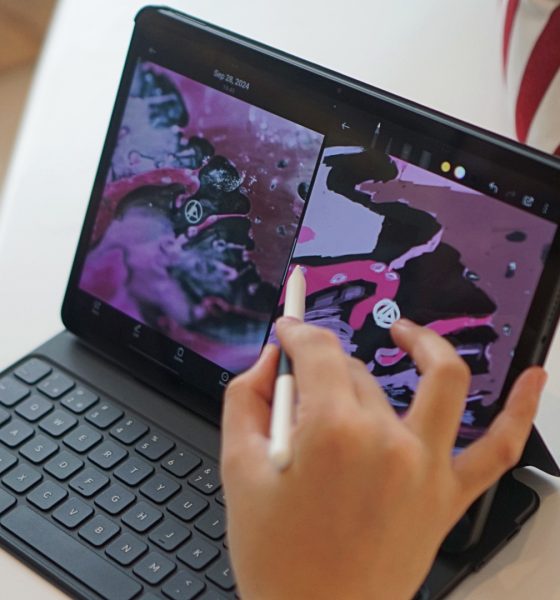
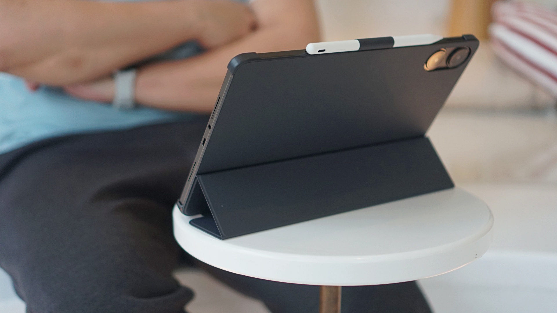
And as you can see below, if there’s no need to type, the pad cover suffices. Its flap has as trifold design that lets it become a firm support for the tablet when reclined.
Cameras: For your needs
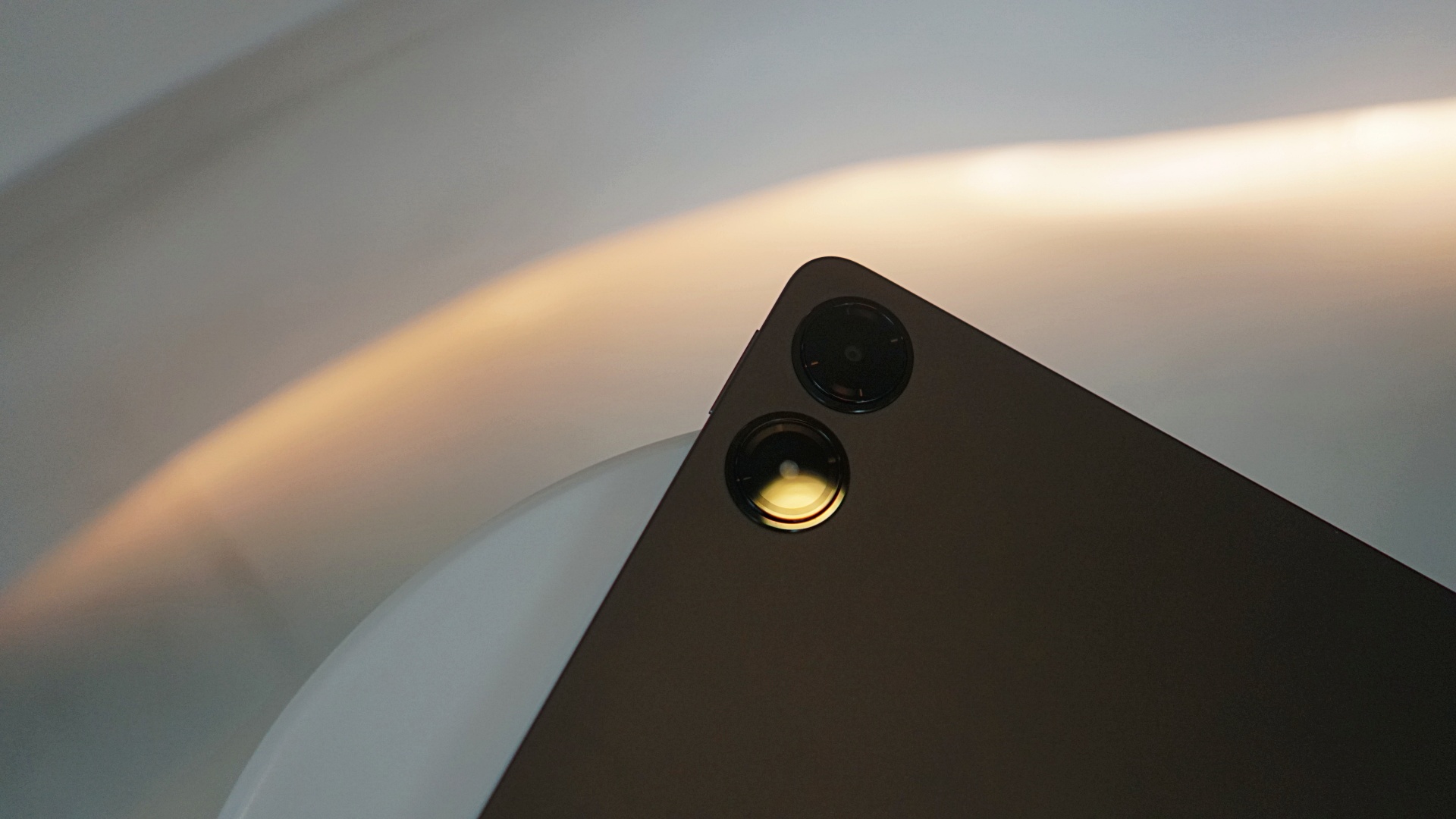
I hardly used the cameras on the POCO Pad. I only scanned QR codes for Wi-Fi a couple of times. Personally, it’s still awkward for me to take photos with a giant slab especially in outdoor scenarios.
But if you really need to record something or even film, the 8MP front and rear cameras you can get decent results for your needs. If you take notes of lessons in school, or just want to snap what’s in front of you quickly, the POCO Pad will do the deed.
Quality is decent when there is ample lighting. You may opt to use the flash to retain more detail. But overall, it works for quick outdoor captures.
Here are a few samples:


The wide field-of-view of the selfie camera is a bonus. It comes in handy for video conference calls and can highlight your background. You know, if you want to flex the dream Zoom background you worked hard for.

There’s also a document mode feature which make book pages, reading materials, and everything in between look like they’ve been scanned.
Battery for days
The POCO Pad comes with a 10,000mAh battery. That’s a ton of power. For just my writing-related tasks, a splash of listening to music and watching content, drawing, and casual browsing, the POCO Pad can easily last two days. For an entire afternoon’s worth of work, it will probably drain just 30 to 40%.
I brought this pad with me outdoors for a few times to settle inside coffee shops and begin working remotely on tasks. I did the same at home, and didn’t even have to open my laptop for days. The device doesn’t drain fast either when drawing or watching content, which is impressive considering you have to keep the display on for hours.
This pad easily takes the cake in terms of battery life. Not only do you get entry-level laptops dead in about two to three hours. They’re also usually an extra responsibility when carrying with you outdoors.
Is this your GadgetMatch (or… TabletMatch?)
POCO derived its brand name from the Spanish word meaning little. But had I not known that prior, I would have guessed the branding is a portmanteau of “portable” and “companion.”
That combination is exactly what the POCO Pad is: a reliable and portable productivity and entertainment companion that won’t let you down.
I like the fact that POCO didn’t even extensively promote this offering with slogans like “PC-level productivity” and yet it delivered convincingly.
It deserves equal praise as its twin sibling, the Redmi Pad Pro 5G, and its higher-segment sibling, the Xiaomi Pad 6S Pro 12.4. In other words, the GadgetMatch Seal of Approval.
The Xiaomi umbrella’s tablet collection is definitely on a roll, deservingly so.


I thought I was done with in-ear headphones. Then the Galaxy Buds4 Pro entered my atmosphere.
I was never truly comfortable with in-ear headphones. That’s why I leaned toward over-ear pairs. But I still wanted something compact for days when I wanted a lighter loadout.
Then came the Shokz OpenDots One. A clip-type, open-ear pair that felt like a game changer. It sounded good enough. It kept me aware of my surroundings. I used it to preview reels while out on coverage, while walking around the neighborhood, and even on quick trips to the barber.
I was ready to write off in-ears completely.
Good thing I didn’t.
A surprise I didn’t expect
I went into the Galaxy Buds4 Pro a little skeptical. I already liked the Galaxy Buds3 Pro, but comfort was never its strongest suit for me.
Then I wore the Buds4 Pro.
Right away, it felt different. More comfortable. More natural. I thought it was just new gadget novelty. But even after a week, that feeling didn’t fade.
That’s when it clicked. These are different. They don’t just sound good. They fit into your day better.
Finally looks like its own thing
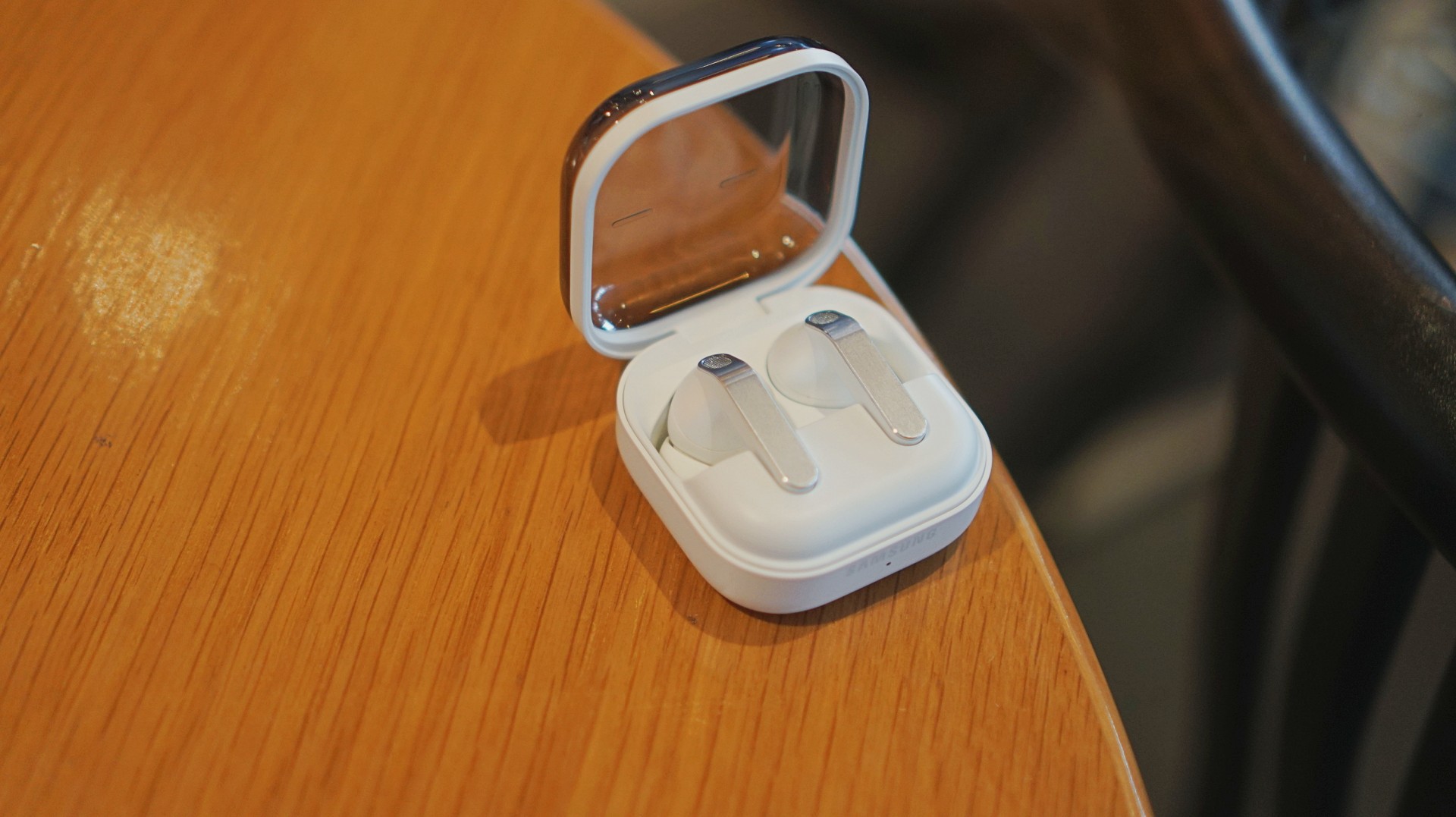
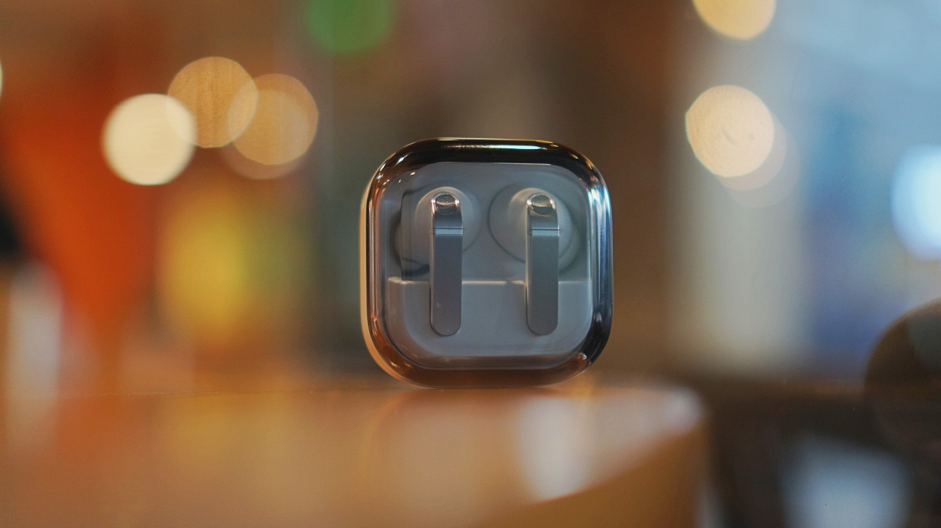
The first thing I loved? It doesn’t look like AirPods anymore.
The Galaxy Buds3 Pro looked a little too familiar. I didn’t hate it, but it didn’t feel like me. I like using tech that reflects a bit of individuality, and that design always felt a little tacky.
The blade design on the Galaxy Buds4 Pro fixes that.
It looks cool. Straight up.
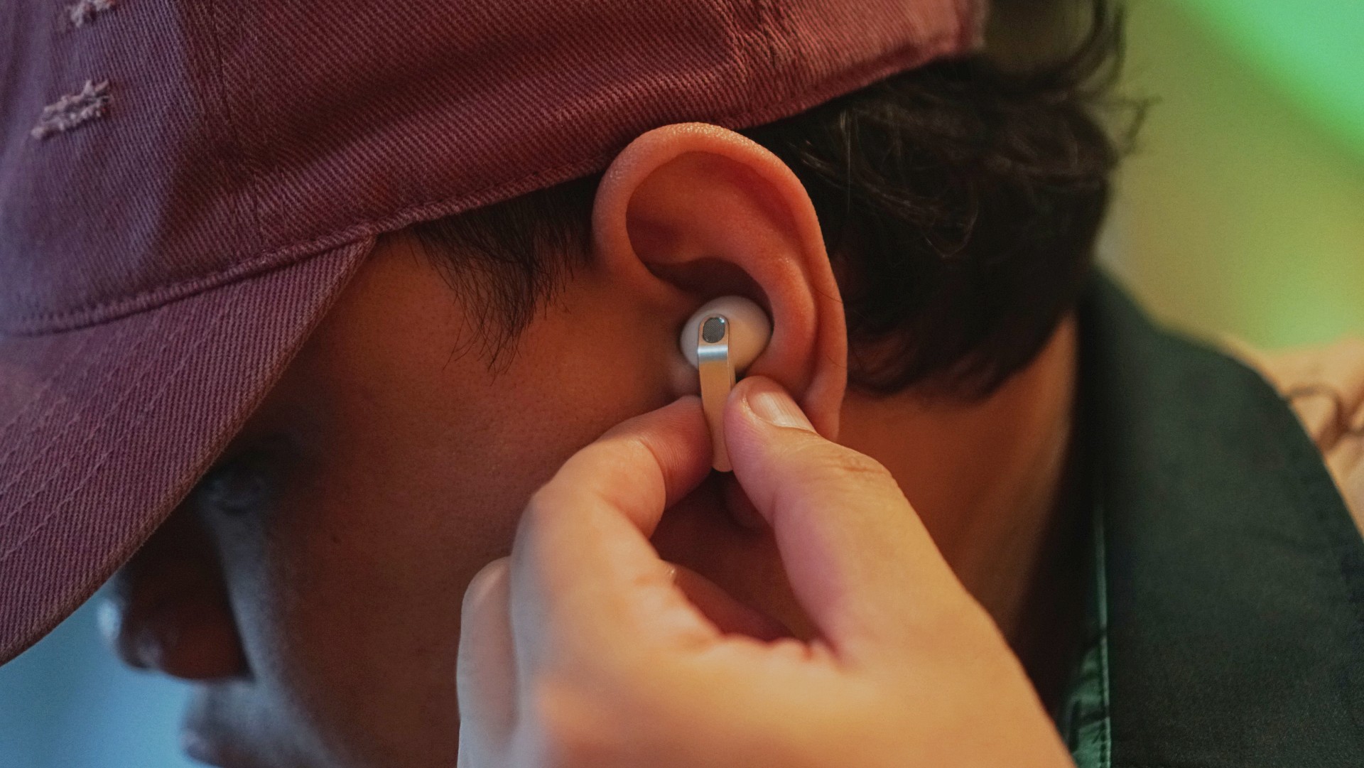
More importantly, it feels more like Samsung finally finding its design language again instead of borrowing from someone else. It’s not just aesthetic either. The shape makes controls easier to find and use.
It’s a small thing on paper. In practice, it changes how you feel about using it every day.
Controls feel easier too. Pinch to pause/play, slide up/down in the same pinching position if you want to adjust volume. It just works.
Comfort changes everything
This is the biggest upgrade for me.
With the Buds3 Pro, I loved the features but didn’t always enjoy having them in my ears. With the Buds4 Pro, that problem is gone.
It’s not that you don’t feel them at all. You do. But not in a way that makes you want to take them out.
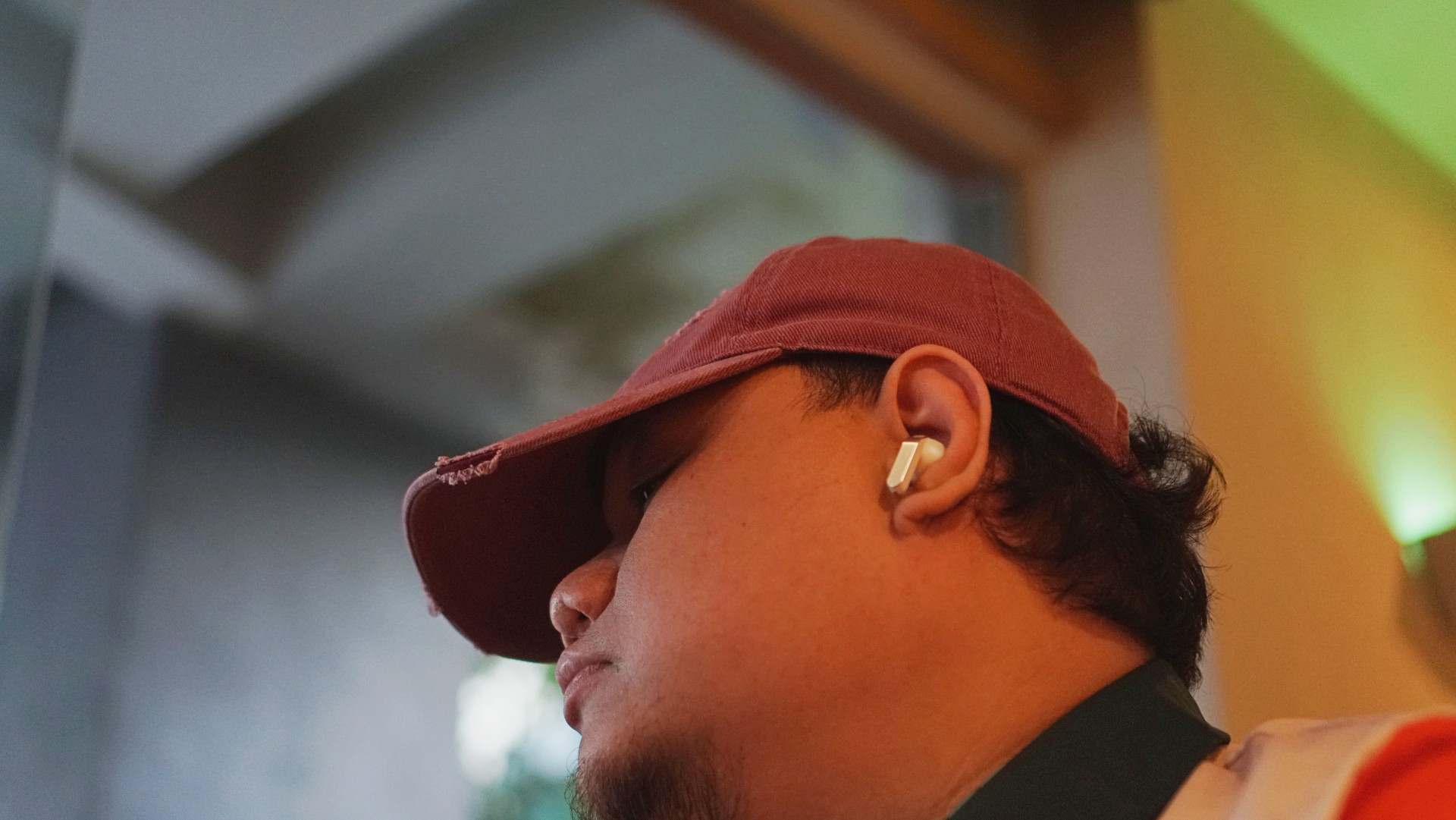
I’ve worn them for four straight hours while working in a café. Writing, replying to emails, just sitting there with music on. No urge to remove them. No fatigue that breaks your flow.
They stay in place, too. Even during brisk walks.
For someone who almost gave up on in-ears entirely, that alone is a massive win.
Rich, full, and now more layered
If you’ve used the Galaxy Buds3 Pro, you already know the sound is good. The Buds4 Pro takes that and pushes it one step higher. Rich, warm, full, and surprisingly layered. The difference hit me immediately.
I was listening to Spotify on the Galaxy S26 Ultra and started hearing details I don’t usually notice. It reminded me of the first time I heard lossless tracks on Apple Music with a really good pair of headphones.
And this is just on Spotify. Hell yeah, it makes Spotify feel good enough.
Hearing the little things
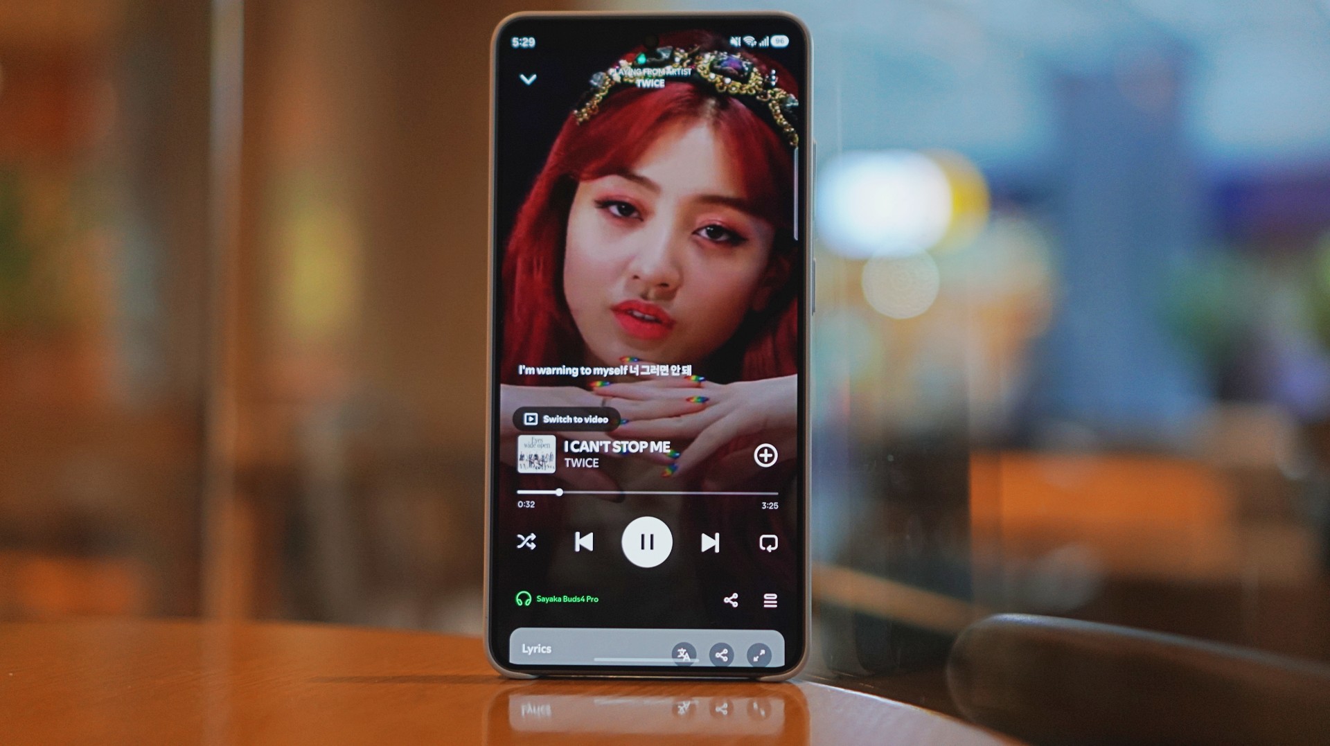
I listen to a mix of K-pop, KRNB, OPM, pop rock, and alternative rock. Across all of it, one thing stood out: separation. It’s easier to isolate sounds if you’re into that.
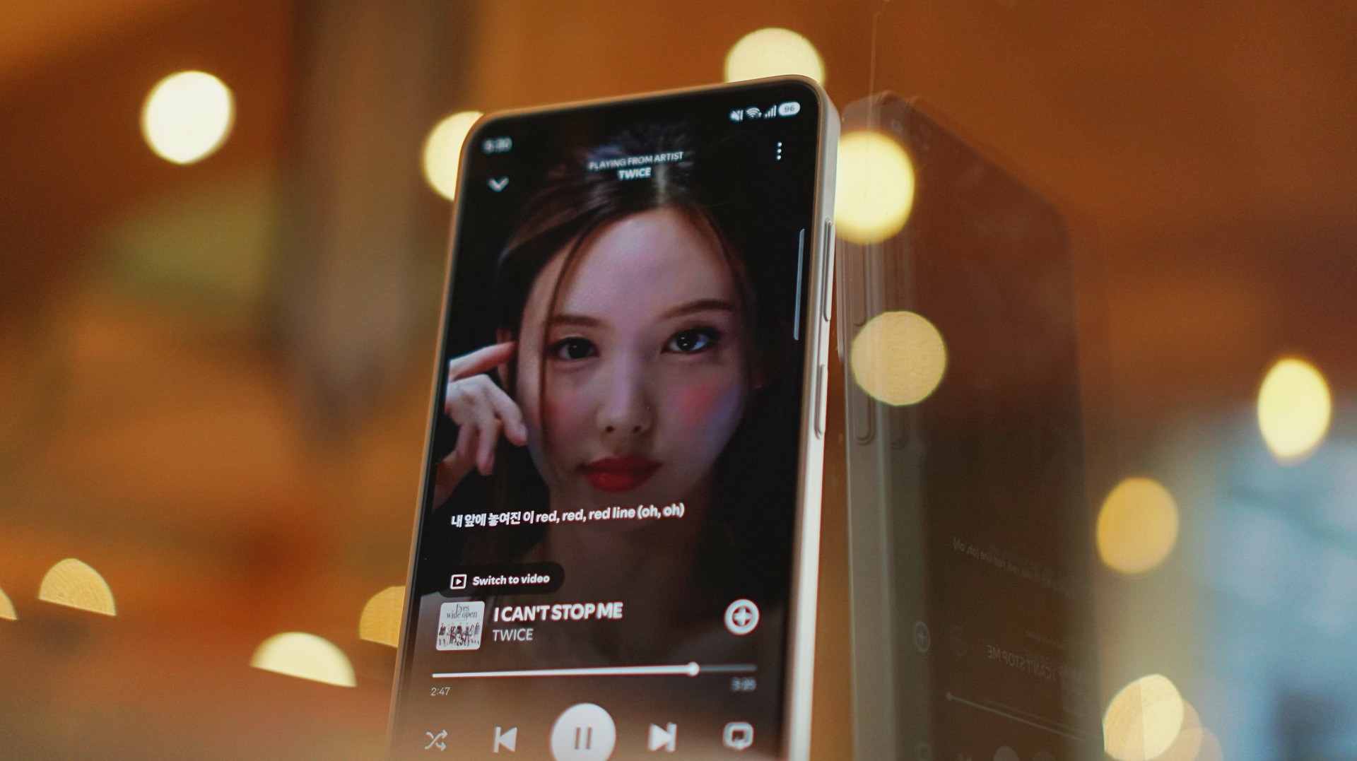
With TWICE tracks, I started picking up vocal riffs and runs from Jihyo and Nayeon that don’t always stand out on other setups. They’re not overpowering. Not distracting. They just sit there, completing the track.
It feels… intentional. Like everything has its place. It doesn’t just sound better. It makes music you already love feel new again.
A quick reality check
At one point, I forgot to charge the Buds4 Pro and switched to the HONOR Earbuds 4. Same track. Same app. Night and day difference.
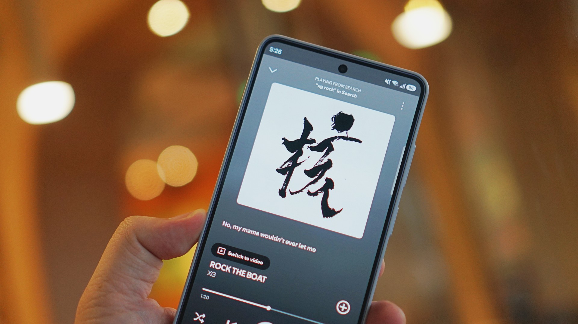
I was listening to “Rock the Boat” by XG when I made this switch.
The Galaxy Buds4 Pro sounded rich, warm, and full. The HONOR Earbuds 4 felt a few steps behind across the board. To be fair, they’re in different price brackets. But that moment still validated everything I was feeling about the Buds4 Pro.
ANC that gets the job done
Let’s set expectations.
The ANC is not Sony WH-1000XM6 level. But nothing is.
If Sony is an 11/10, this sits comfortably at around an 8.5.
And honestly? That’s more than enough.
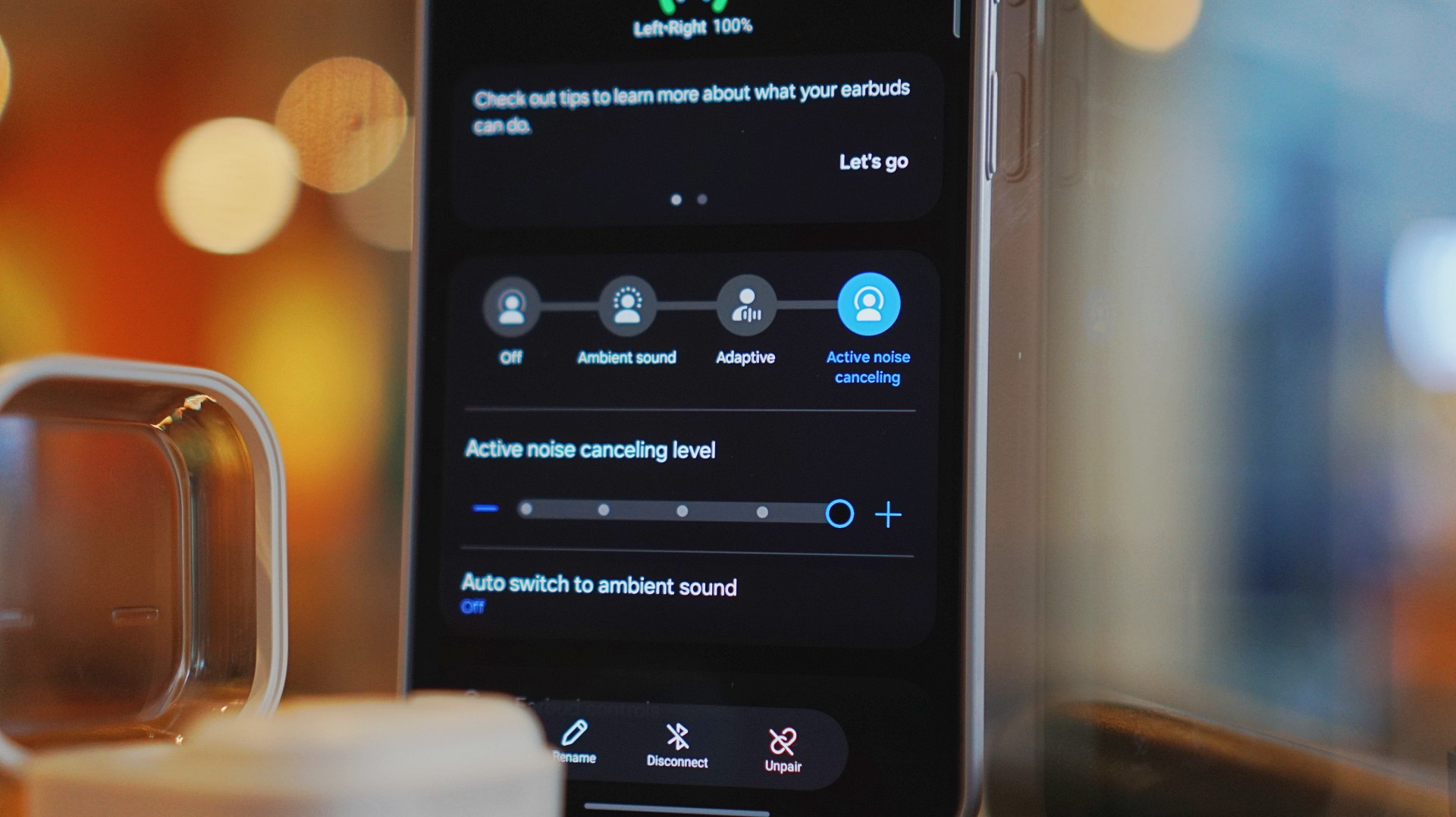
On a 12-hour flight from San Francisco back to the Philippines, I had these on almost the entire time. Engine noise was significantly reduced. There’s still a faint hum if you really listen for it, but it never got distracting.
In cafés, even when seated right next to the speaker, it blocks out enough noise for you to stay locked in.
It locks you in. You feel like the music is inside your head while still giving you elite sound, some spatial awareness, and surprising comfort.
That balance matters more than chasing perfection.
Adaptive ANC still needs patience
I default to turning ANC on manually. Adaptive ANC and EQ are there, but in my experience, they take a bit of time to kick in. Sometimes a minute or two.
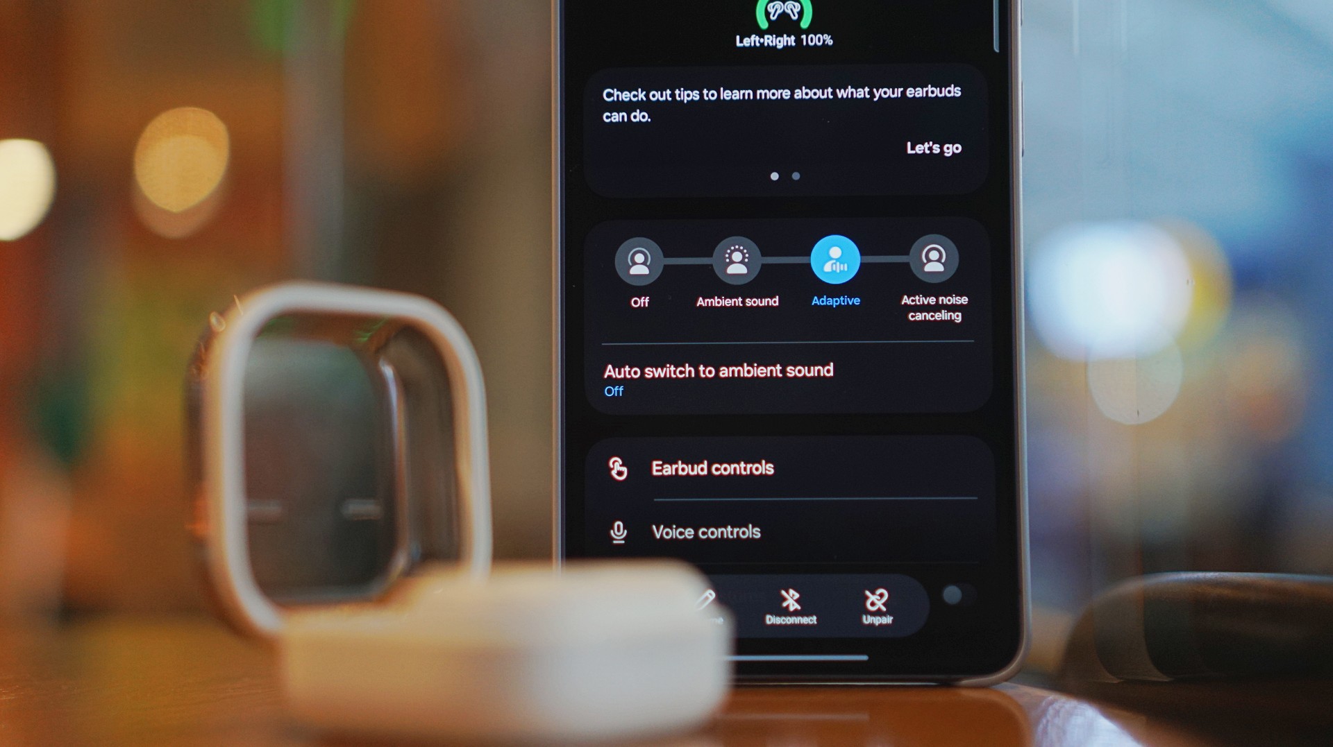
Because of that, I’ve built the habit of switching modes myself depending on where I am.
It works. It’s reliable. But I’d like to see this feel faster and more seamless over time.
Just fits into your day
This is the kind of device you don’t think about. I reach for it every time I step out. Walks, errands, quick food runs.
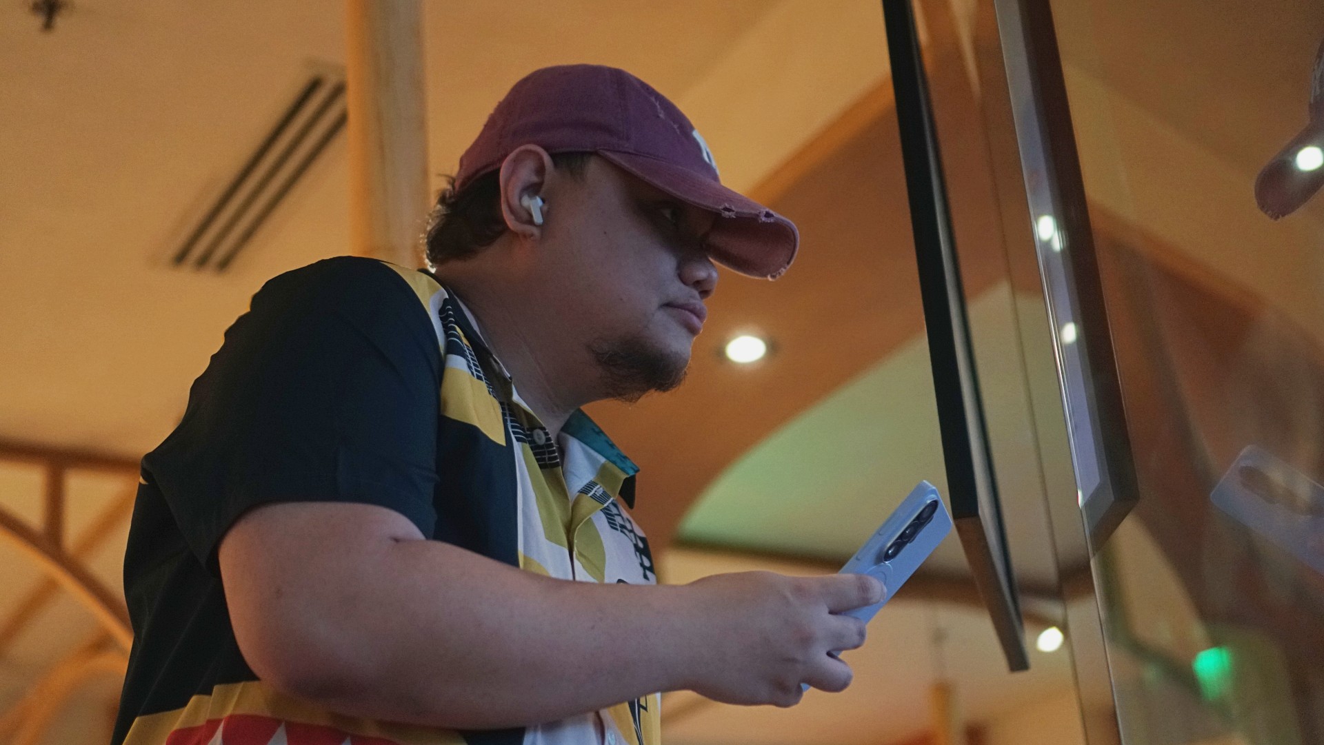
It’s perfect when you’re waiting in line and scrolling through reels. No accidental loud audio. No awkward moments. It just fits. That’s probably the best compliment I can give it.
Galaxy ecosystem still wins
Pairing is seamless. Controls are responsive. Everything works the way you expect it to. If you’re using a Galaxy device, this is a no-brainer.
Even outside the ecosystem, it still holds up. But you definitely get the best experience when you stay within it.
What still doesn’t matter (yet)
Features like AI Translate are still in that “nice to have” category for me. They’re promising. They’ll probably get better. But they’re not why you buy this.
You buy this for the sound, the comfort, and the everyday usability. And those are already excellent.
Is the Galaxy Buds4 Pro your GadgetMatch?
If the Galaxy Buds3 Pro was Samsung’s best so far, the Galaxy Buds4 Pro is that — made better. A meaningful refinement.
This is my default recommendation now.
The Galaxy Buds4 Pro is for people who want to get the best sound in a compact, easy-to-carry audio buddy to their smartphones.
If you’re coming from older earbuds, this is an easy upgrade.
If you’re coming from the Buds3 Pro, you can probably hold off — unless comfort and design matter a lot to you.
And if you’re deep in the Galaxy ecosystem?
This Buds4 you. Swipe up. No questions asked.
Gaming
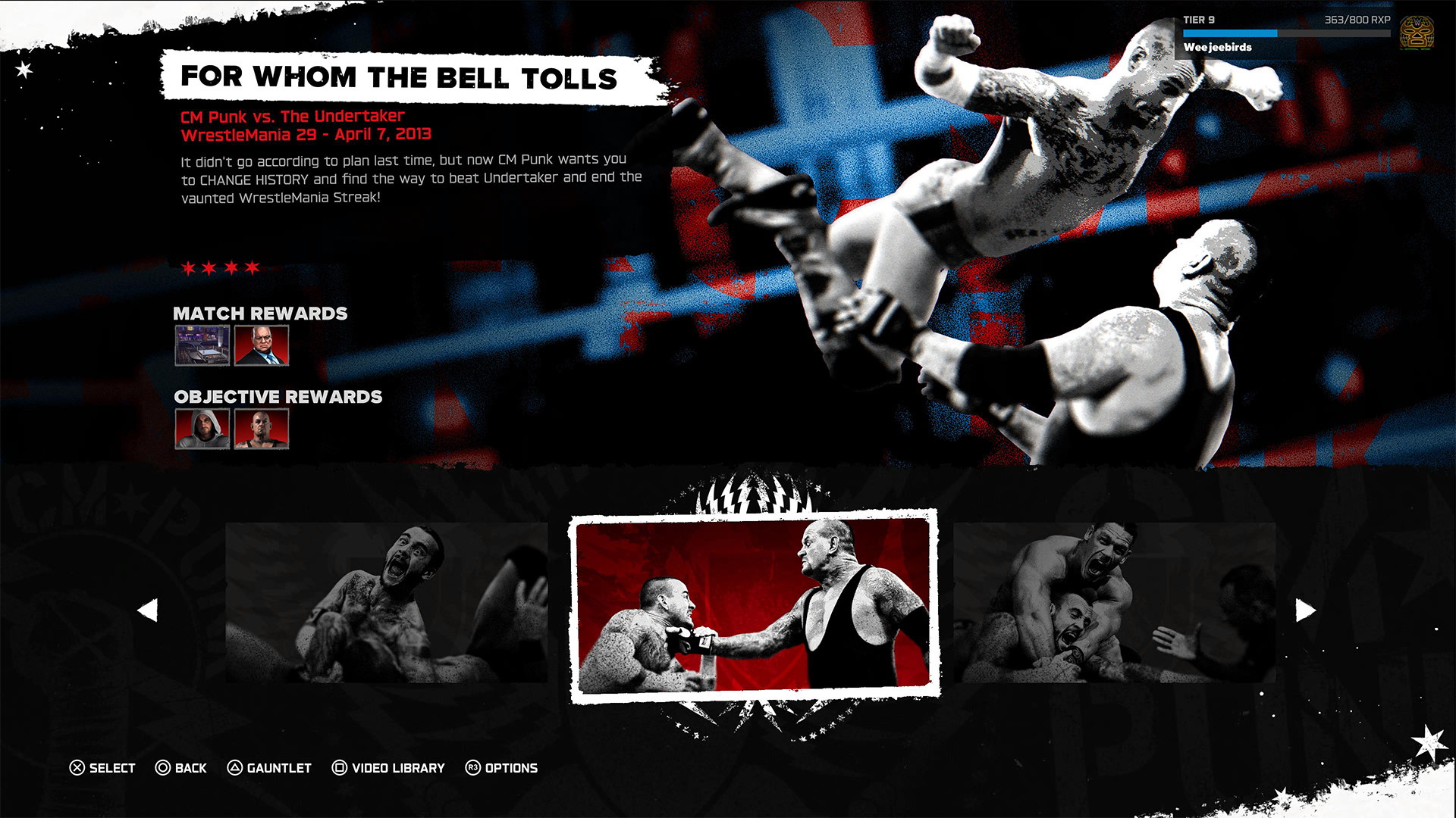
WWE 2K26 lets you live out all the fantasy matches you could want
But you have to play for hours and hours to unlock everyone.
The old SmackDown vs. RAW games were some of the most fun I’ve had as a teenager. Though I didn’t own a PlayStation 2 or 3 then, I had a PlayStation Portable and the series’ corresponding version. Sure, it didn’t have the then-advanced graphics, but the games kept me company for many a day and night. And it all revolved around a simple premise: letting wrestling fans live out their fantasy matches.
Now, with over 400 playable characters on launch, WWE 2K26 hopes to rekindle that magic. Previously, 2K’s take on the wrestling simulator never really captivated me as much as the SvR series did. Though players still had a similarly large roster throughout the years, the series felt too homogenized, too riddled with microtransactions. This year, the series got me thinking again: Can sheer numbers singlehandedly usher a new renaissance for WWE gamers?
The good: Four hundred superstars under one banner
WWE 2K26 touts over four hundred playable characters on launch. With unannounced DLCs still on the horizon, this number will surely balloon further. Even for a dedicated WWE fan, having over four hundred playable characters is insane. Where else can I pit Joe Hendy against Andre the Giant and create my own WrestleMania III moment?

The only catch, however, is that the game did some stat padding to get to this enormous number. Besides having multiple personas for a single wrestler (and CM Punk alone has ten of these), the roster includes a platoon of fictional MyRISE characters, which comes off as distracting if you don’t particularly engage with the MyRISE mode.
Ironically, the game didn’t even need to pad its stats this way. For the first time in the series, the launch roster includes Superstars from the current WWE roster, TNA, AAA, and the Hall of Fame. I could spend hours just feeding a litany of Superstars to TNA legend Abyss. That’s something I could never have done in the old SvR days.
The good: A more fluid fighting system
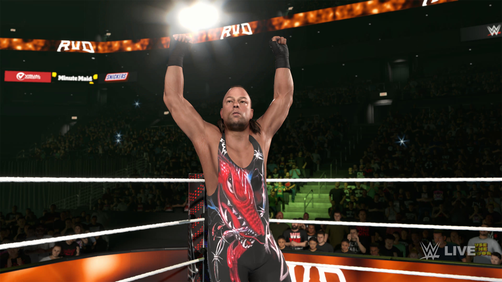
It also helps that WWE 2K26’s fighting system is the most fluid that the series has been. Wrestlers no longer feel like wooden animatronics skipping from one animation to the next. Each punch flows smoothly into a clothesline, a grapple, a carry, or a finisher.
It is, of course, at the expense of a more complex control scheme where each input combination corresponds to its own move. A stray waggle of the right joystick, for example, can have your wrestler careening towards their opponent in ways you never intended.

It takes some time to get used to. Every time I get a WWE 2K game, I always need a refresher course for the controls. Plus, each entry introduces something different. This year introduces rushing opponents to the corner and carrying opponents in different ways.
Another new addition is the new third-person camera which follows your character, rather than being locked to the ring. To me, this was a welcome feature. The original camera can often betray you by having various elements (other wrestlers, the ring itself) block your view of the action, thus preventing you from reacting correctly to your opponent. The dynamic third-person camera solves this and makes the fight more immersive.

That said, the camera necessarily changes the controls a bit because you need the right joystick to look around. Because of that, I had to revert back to the original camera after a while. Regardless, this is a step in the right direction.
The improved fight scheme is also a step in the right direction. WWE 2K26 is the franchise’s most immersive entry to date because of how fluid the action plays out.
The meh: Iterative game modes
Every yearly sports simulator falls prey to the curse of iteration. Because it’s an annual release, every game needs to add something new for players. At the same time, the same game can’t iterate too much, or it might end up alienating fans of the previous title. Each WWE 2K title has to be the same but also a bit different.
WWE 2K26 goes through the same rigamarole. Most of the game’s different modes don’t offer a lot of improvements from last year. So, if you loved last year’s MyRISE, MyGM, and Universe Mode, you’ll likely find this year’s iteration inoffensive.
“Inoffensive,” however, isn’t the best way to sell a new game. At the very least, MyFACTION gets interesting improvements. For a mode I historically dislike every year, WWE 2K26’s MyFACTION ended up being the one I loved the most this year.
This year, the layout feels more intentional. Though it still lacks the exciting animations of NBA 2K, opening a pack no longer looks like a PowerPoint presentation. There’s also more ways to fight offline with the addition of a challenging World Tour mode. Plus, with intergender support and team chemistry, this feels like the update that MyFACTION needed.

In another twist of fate, Showcase Mode ended up being the loser this year. WWE 2K26 rehashes last year’s schtick of having the star rewrite their history. Last year, this worked with Paul Heyman, a notorious bad guy. It doesn’t really stick with this year’s star, CM Punk, the so-called voice of the voiceless.
Punk could have shined with the traditional style of laying their commentaries over their past matches, especially with his shoot style. Instead, we got a series of what-ifs with practically no commentary. It’s just not what I expected from a firebrand like CM Punk.
The bad: The Ringside Pass
For the first time in the series, WWE 2K26 has a battle pass called the Ringside Pass. Like battle passes in other games, the Ringside Pass unlocks more content as you play through the game. However, unlike today’s standard which revolves mostly on cosmetics, this version locks a treasure trove of playable wrestlers behind an experience gate.
Even if you already paid for the game, WWE 2K26 asks you to play an inordinate number of hours just to unlock the best wrestlers in the game.
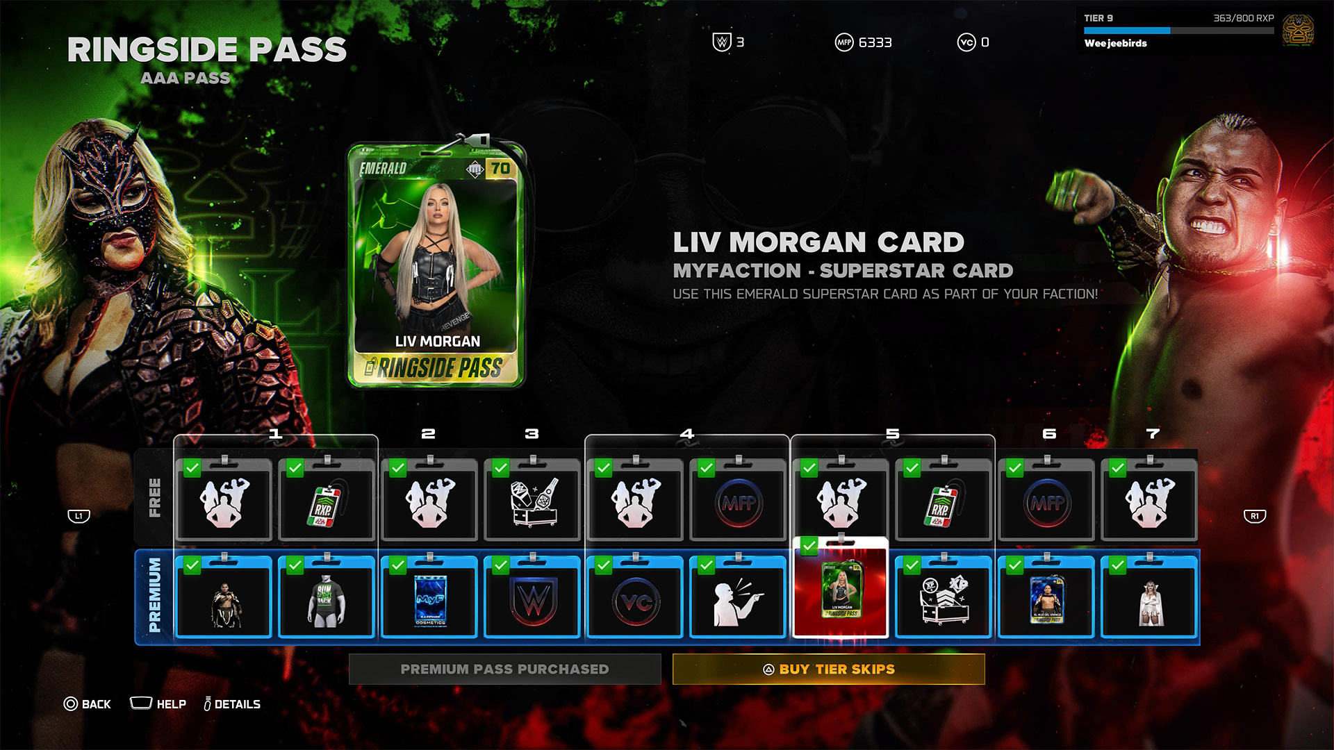
To be fair, it’s not all bad. Right out the gate, the game already gives you access to heavy hitters like CM Punk, Shawn Michaels, and John Cena. However, a lot of favorites are still unplayable including Bret Hart and Kurt Angle. This even includes the strongest version of Bray Wyatt, who’s locked under the last tier of the current pass.
Gaining experience isn’t an easy feat, either. After playing for hours and hours, I still haven’t unlocked more than half of the tiers. At the very least, there is no time limit, so I can play the game at my own pace.
Props to WWE 2K26 for making its battle pass have fulfilling rewards, but it’s still unfortunate that significant elements of the game are locked behind hours and hours of playtime.
The gameplay loop is real and repetitive. And it all circles back to how iterative the game modes are. If only the game modes ended up being as exciting as they were last year, then it would have been exciting to play over and over again. Instead, WWE 2K26 prevents you from engaging in greatest strengths: an exciting roster and a fluid fighting system.
Is WWE 2K26 your PlayMatch?
Last year’s WWE 2K25 was an exciting period for the series. Though this year’s version keeps most of what made the previous game so exciting, WWE 2K26 also adds features, especially the Ringside Pass, that ultimately detract from the entire experience. It’s a small step back, which can hopefully be rectified next year, if not in future updates.

WWE 2K26 is a Swipe Left if you didn’t love last year’s game anyway. The game doesn’t add anything that might change your mind.
However, it’s a Swipe Right if you missed the pure joy of creating dream matches. The game’s massive roster allows for so many impossible matchups to happen, even if only in the digital realm. Just get ready to grind for a long time.
Some smartphones aim to stand out. Others just aim to work. The HONOR X8d falls squarely into the second category.
In day-to-day use, it presents itself as a device that focuses on the essentials. It’s functional, predictable, and easy to understand—but also a reminder of how noticeable the gap can be once performance and responsiveness start to lag behind.
A design-first approach
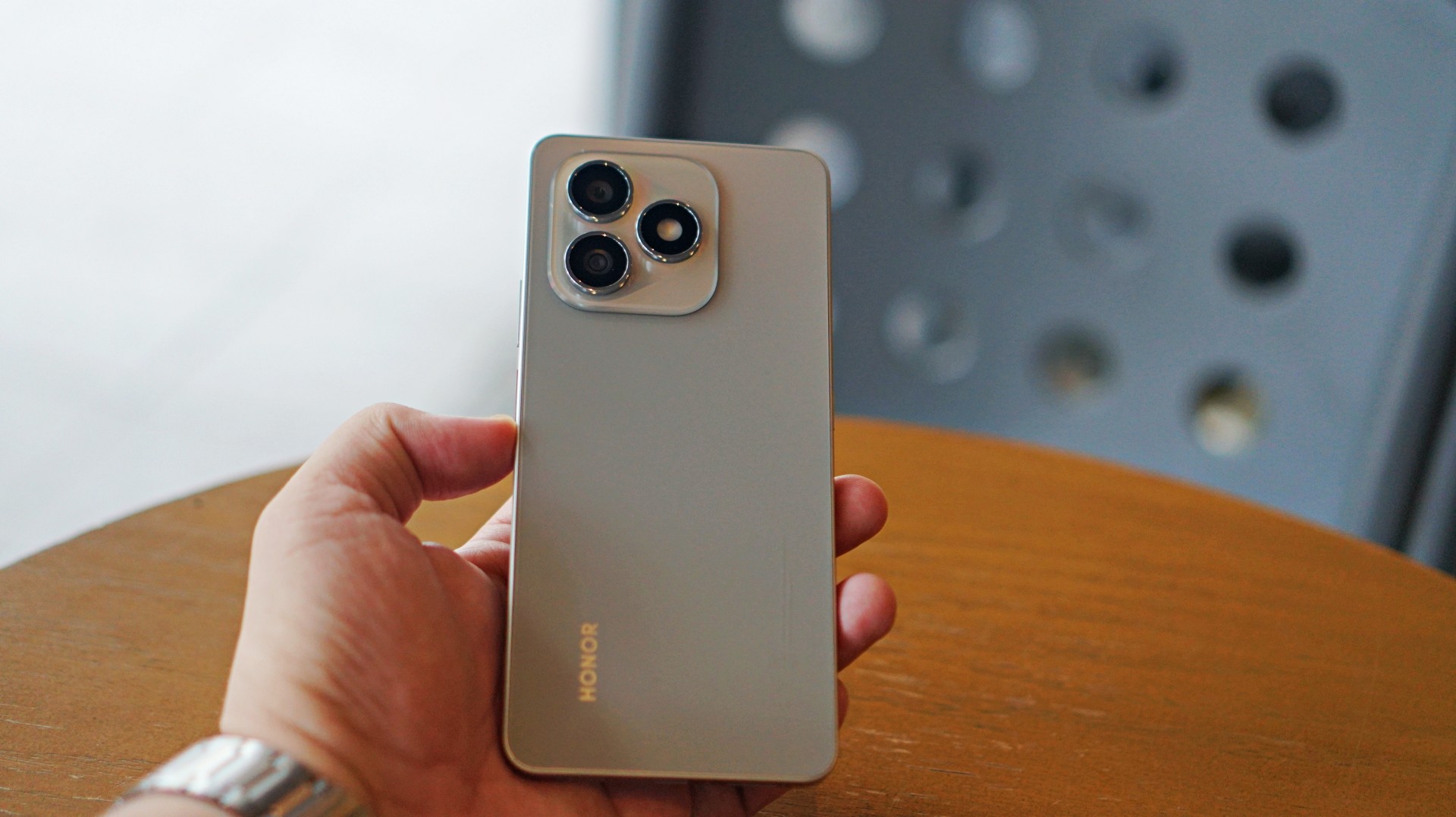
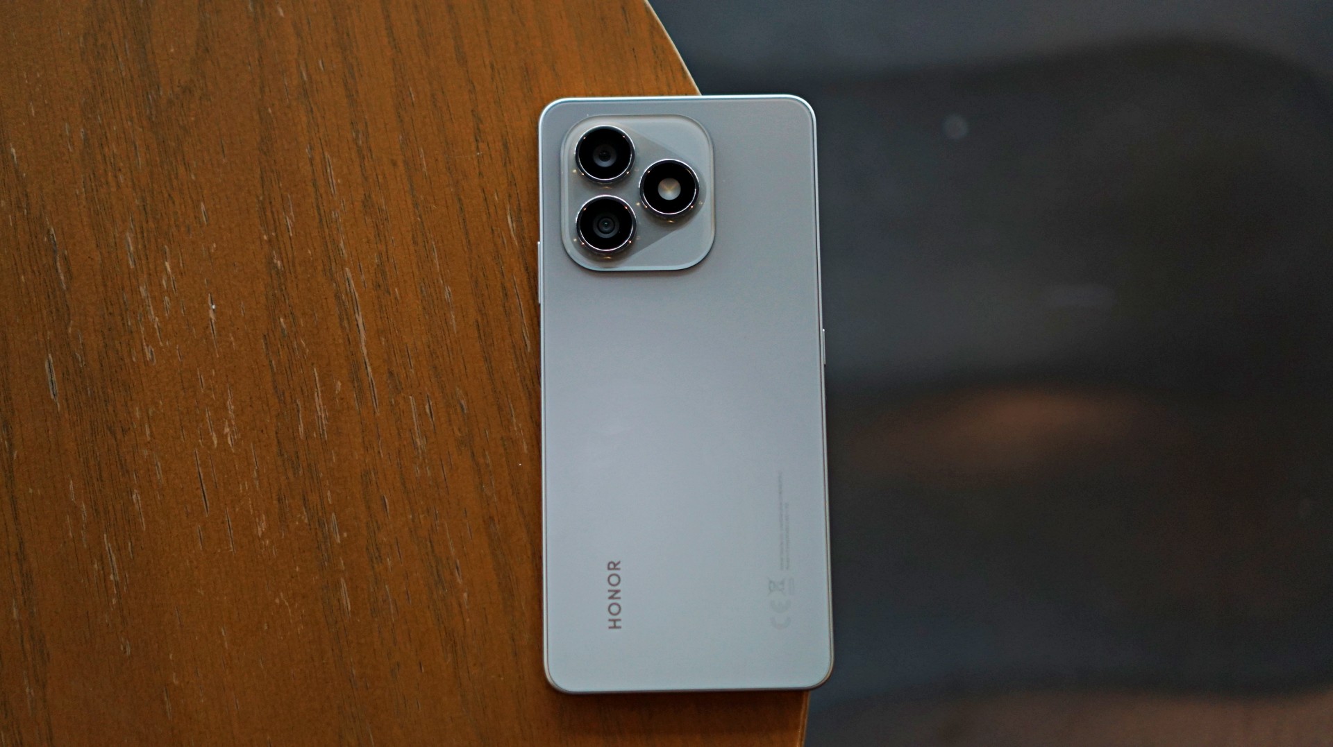
The HONOR X8d makes a decent first impression. It’s slim, relatively lightweight, and easy to hold despite packing a large battery. The flat sides and smooth back give it a clean, modern look, while the camera module adds a bit of visual identity.
It’s available in Light Blue, Velvet Black, and Velvet Grey—options that lean into its youthful positioning. The device also feels sturdy in hand, backed by SGS certification for drop and crush resistance, along with IP65-level protection against dust and splashes.
For a device in this category, the HONOR X8d delivers a build that feels dependable enough for daily use.
Display and media: Bright and usable
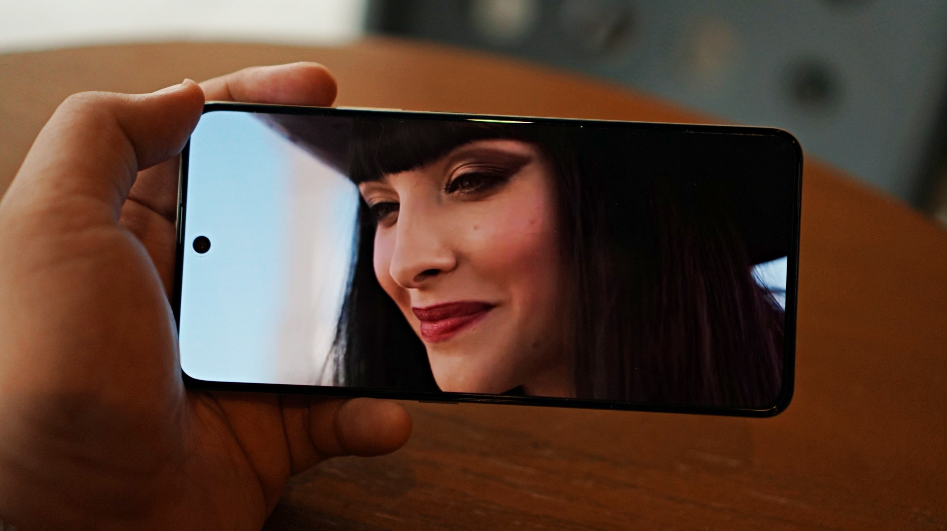
Miss All Sunday makes everything look good
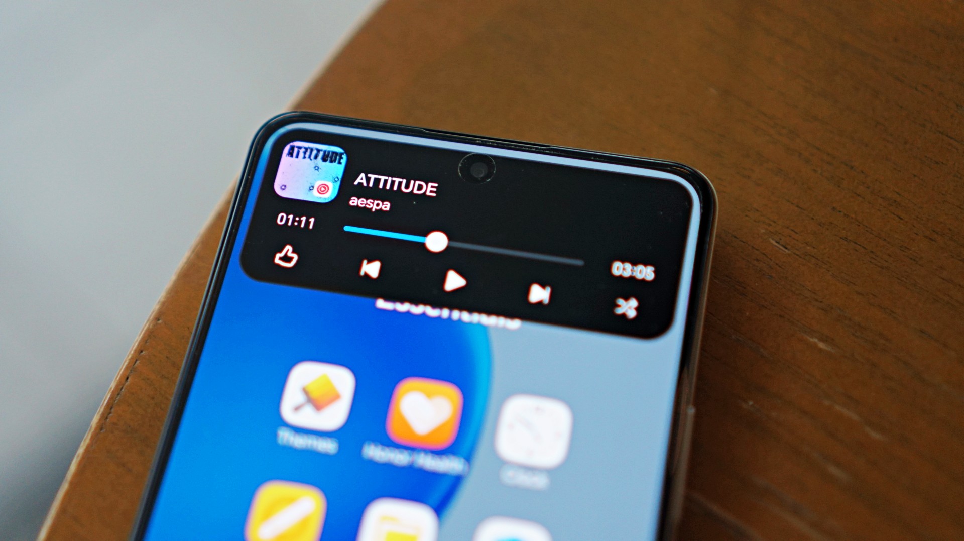
Up front, the HONOR X8d features a 6.77-inch AMOLED display with a 120Hz refresh rate and up to 3000 nits peak brightness. Colors are vibrant, and the panel supports 100% DCI-P3, which helps content look lively.
For casual viewing, the experience is serviceable. Watching shows or videos feels comfortable, and the high brightness ensures visibility even under harsh lighting. Features like 3840Hz PWM dimming and E-Book mode also help reduce eye strain during extended use.
Now Playing: One Piece Season 2
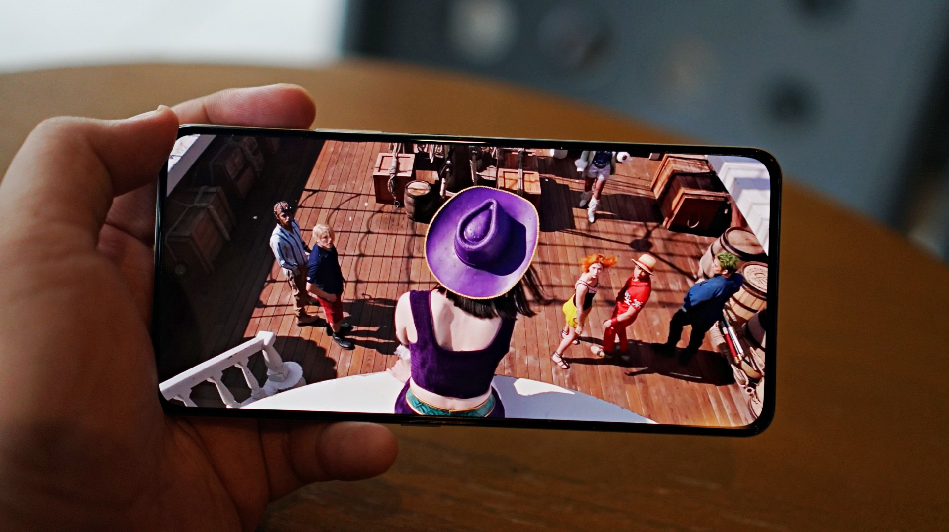
I skimmed through a few episodes of the One Piece Season 2 live action on Netflix and again it was… alright. Nothing here will blow you away but it serves its purpose.
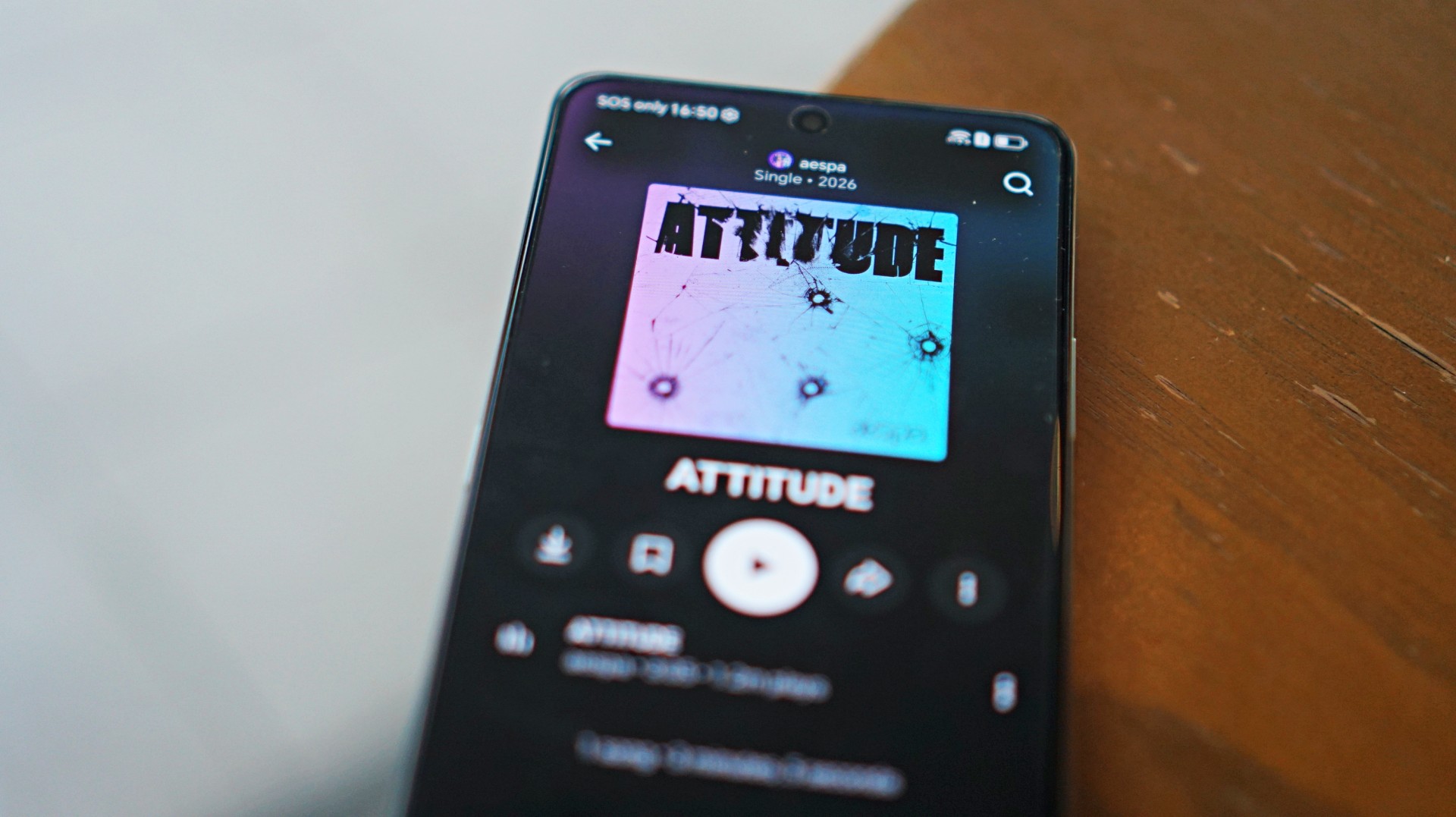 I also listened to “Attitude” by aespa on YouTube music and it just echoes the general feeling of the phone – serviceable.
That said, the overall experience remains straightforward. It delivers what you need for day-to-day media consumption without going much further.
Performance is where compromises show
The HONOR X8d runs on the Snapdragon 6s 4G Gen 2 paired with 8GB of RAM. On paper, it’s positioned for everyday tasks, but in practice, performance leans on the modest side.
Basic interactions like switching between apps or scrolling through feeds can feel slower than expected. There’s a noticeable delay at times, even during simple tasks, which affects the overall flow of the experience.
This extends to camera usage as well, where responsiveness can occasionally feel a step behind. The device remains usable, but the pacing may feel dragging depending on what you’re used to.
Cameras are reliable in good light
The HONOR X8d is equipped with a 108MP main camera alongside a 5MP wide camera, with a 16MP shooter up front.
In good lighting conditions, the phone produces decent images. Shots are clear enough, with acceptable detail and color for social media sharing. The camera system also benefits from a suite of AI tools such as AI Eraser, AI Cutout, and AI Upscale, which add flexibility when editing photos.
Zoom options at 1x, 2x, and 3x remain usable, though results are best when lighting is favorable. Overall, the camera system is dependable for casual snaps.


Software and AI: familiar, feature-filled
Running on MagicOS 10 based on Android 16, the HONOR X8d comes with a feature-rich software experience. It includes tools like AI Translate, AI Writing, AI Notes, and AI Recorder, alongside features such as Magic Portal and Circle to Search.

Like many Android skins today, MagicOS follows a design approach that will feel immediately familiar. The layout, navigation, and overall structure borrow heavily from the iOS-inspired blueprint that most brands have adopted. It’s easy to get into, even for less experienced users.
Typical of entry-level smartphones, the device also includes app recommendations out of the box. Thankfully, these aren’t overly intrusive, and many of the suggested apps are ones users would likely install anyway.
The software helps add depth to the overall package, even if the hardware limits how smooth everything feels in actual use.
Battery and everyday use is a clear strength
One of the standout features of the HONOR X8d is its 7000mAh battery. It’s designed to last through extended use, whether for streaming, browsing, or everyday communication.
Paired with 45W HONOR SuperCharge, topping up the device remains relatively quick. For users who prioritize longevity over speed, this is easily one of the more reliable aspects of the phone.
Is the HONOR X8d your GadgetMatch?
When HONOR Philippines was first teasing the phone it was positioned as something for students. But if I were a parent, I’m pretty sure I’d like my kid to have some kind of advantage and not have to deal with a device that might not be able to keep up with them.
After learning that it’s priced at PhP 15,999 my verdict just became much clearer. This is a Swipe Left.
Add a few more to that price and you can get an excellent smartphone at its early bird price.
The HONOR X8d focuses on delivering the basics—design that works, a large battery, and a feature-filled software experience.
However, the overall experience depends heavily on what you prioritize. For users who simply need a phone that can get through daily tasks, the X8d does enough to hold its ground. For those who value speed and responsiveness, it may feel a step behind.
Whether it fits your needs ultimately comes down to how much you’re willing to trade performance for battery life and features.


Galaxy Buds4 Pro review: I thought I was done with in-ears
This Buds4 you


WWE 2K26 lets you live out all the fantasy matches you could want
But you have to play for hours and hours to unlock everyone.

The HONOR X8d is serviceable
Steady but slow?

Life is Strange: Reunion now available on consoles and PC

Why this AI-powered eye health exam is the only reading you need this season

DJI officially launches the Avata 360 with 8K immersive imaging

The Changan Eado Plus officially lands in the Philippines

PLDT Home, Samsung team up for exclusive entertainment deals


-
 Reviews1 week ago
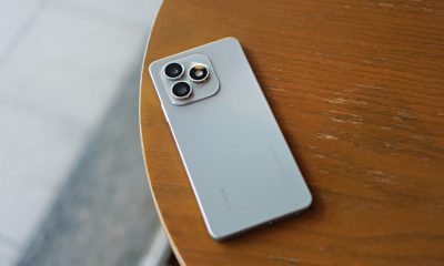
POCO X8 Pro Max review: A new beast from the far east
-

 News1 week ago
POCO X8 Pro Series: Price, availability in the Philippines
-

 Reviews1 week ago
POCO X8 Pro Iron Man Edition review: Midrange phone in superhero armor
-
 Reviews2 weeks ago
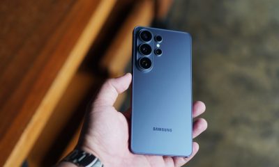
Samsung Galaxy S26 Ultra review: A phone you live with
-

 Automotive1 week ago
VinFast extends free unlimited charging in 3 markets amid rising fuel prices
-
 News1 week ago
POCO introduces X8 Pro Series with Dimensity 9500s
-
 Gaming1 week ago
NVIDIA’s DLSS 5 can turn your favorite AAA game into AI slop
-
Philippines1 week ago
The HONOR X8d is serviceable