

I’ve been giddy excited to review the realme 12 Pro+ 5G the moment its availability was announced. realme has been consistent about what its smartphones offer to its intended audience. The latest installment in the company’s famed number series is no exception.
This series focused on bringing exceptional cameras to phones for a significantly lower price range, along with a better overall performance.
Another reason why I looked forward to reviewing this is because I am arguably the most practical member on the GadgetMatch team. That’s just who I am, and as such, I give my thoughts on budget and midrange devices with a distinct vantage point.
Once, our ever gracious Managing Editor let me borrow a more expensive flagship killer for intensive coverage in my past life as a sports reporter. It easily delivered and it’s not even among the best smartphones last year. It definitely opened my eyes as to how different the experience is when you have a higher-end device. This is why the prospect of reviewing a capable midrange offering intrigued me.
I’ve heard that the realme 12 Pro+ 5G is at par with flagship killers in the PhP 30,000 to PhP 40,000 range. And it does not even cost that much. All that’s left to do is to try it out exhaustively for a few weeks to see for myself.
realme 12 Pro+ 5G specs
- Qualcomm Snapdragon 7s Gen 2 chipset
- realme UI 5.0 based on Android 14
- 12GB+12GB RAM
- 512GB internal cstorage, expandable up to
- 6.7-inch FHD+ display, 100% DCI-P3, 93% screen-to-body ratio
- 120Hz refresh rate, 240Hz touch sampling rate
- 5,000mAh battery
- 67W SUPERVOOC charge
Stylish, comfortable, just right
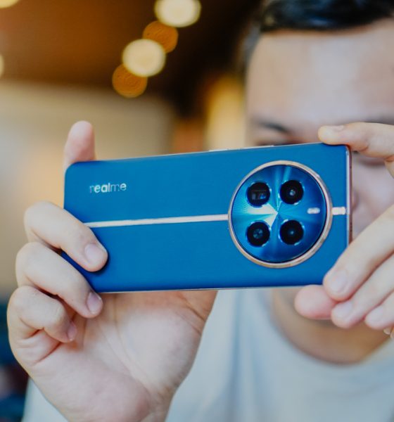
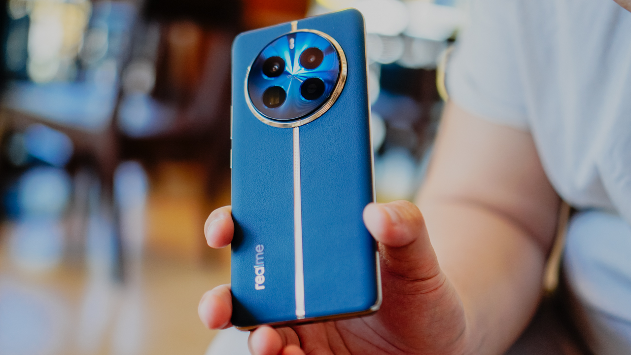
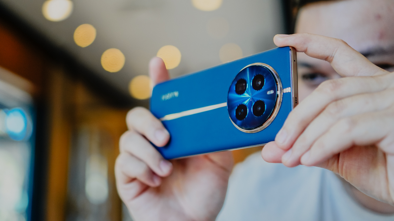
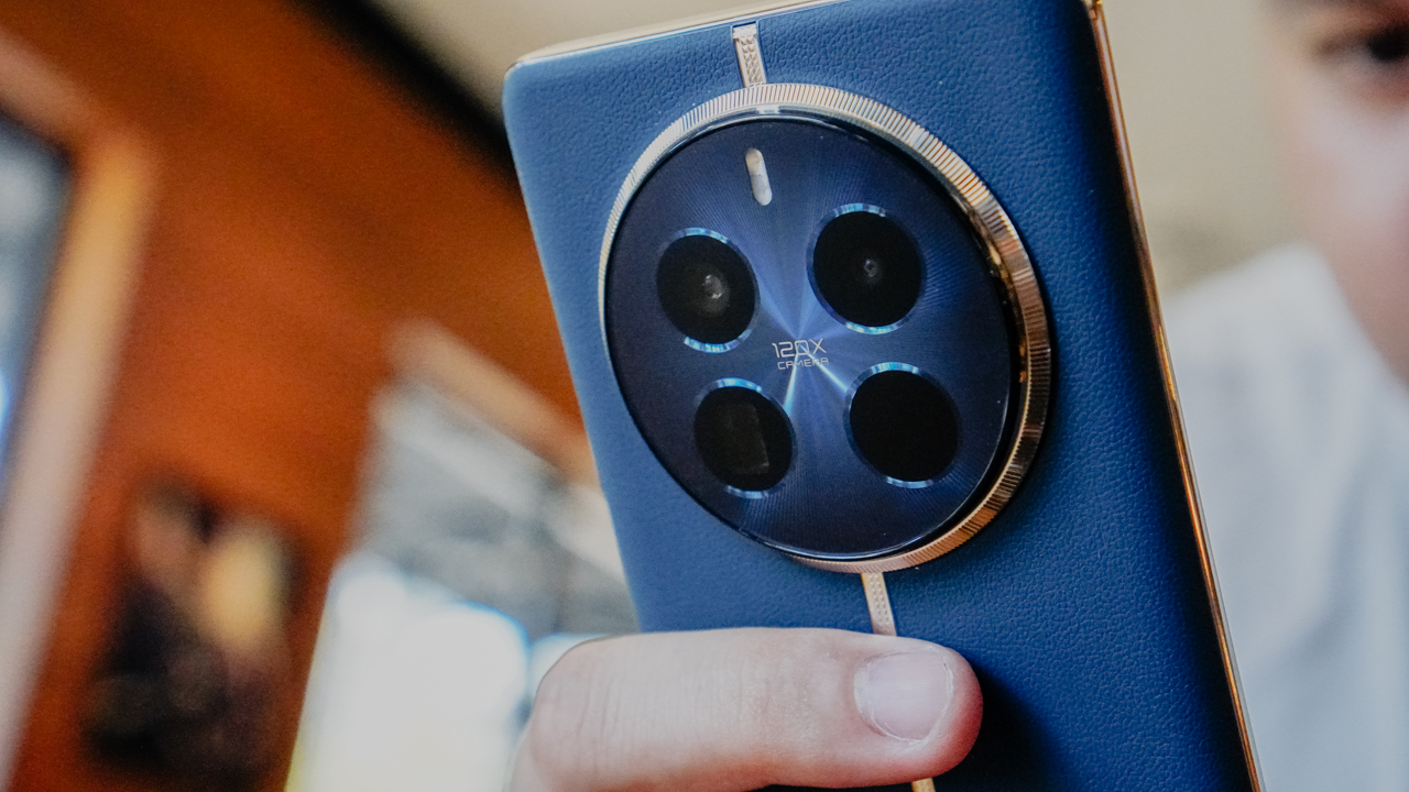
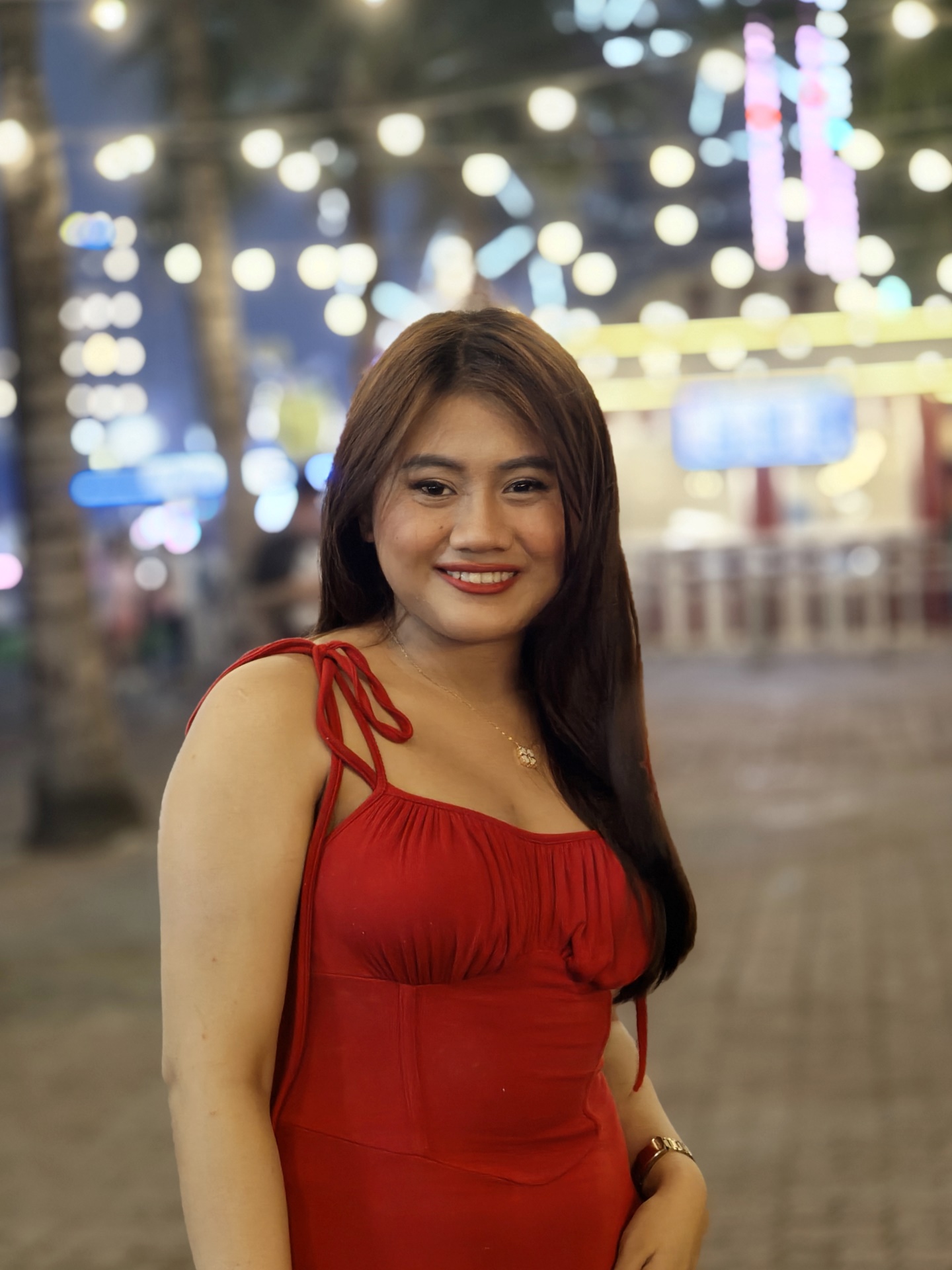
The realme 12 series takes off from the luxury watch-inspired design first introduced in the realme 11 Pro series. The realme 12 Pro+ model we got, in particular, comes in a Submarine Blue body with silver metallic trimmings.
Several prominent luxury watch brands are known for their blue and gold models. realme takes that inspiration for a classy look.
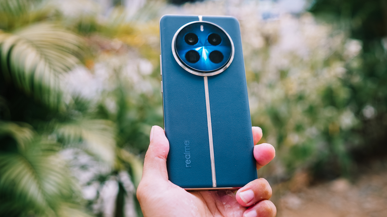
I personally love how realme did not overdo its design. The silver metallic trimming gives a white gold look when reflecting its environment. Using an actual gold color would have probably made it look a bit like a luxury watch knockoff.
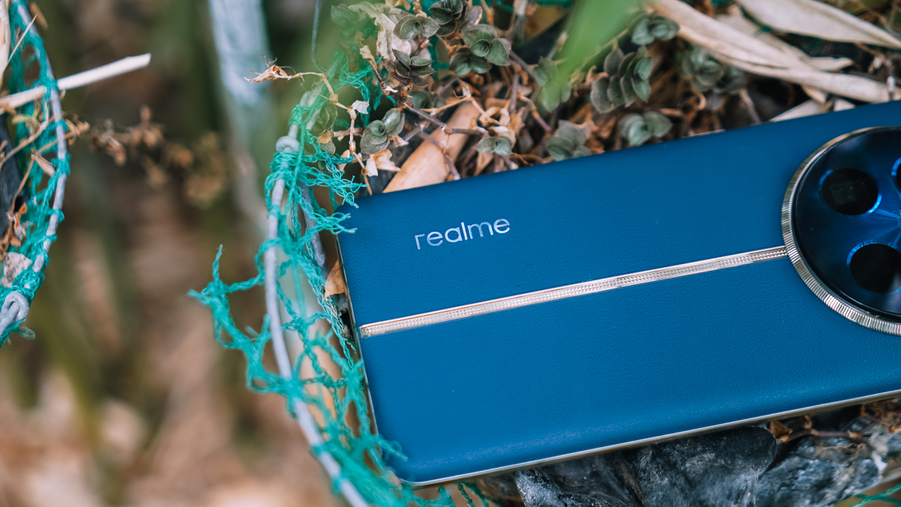
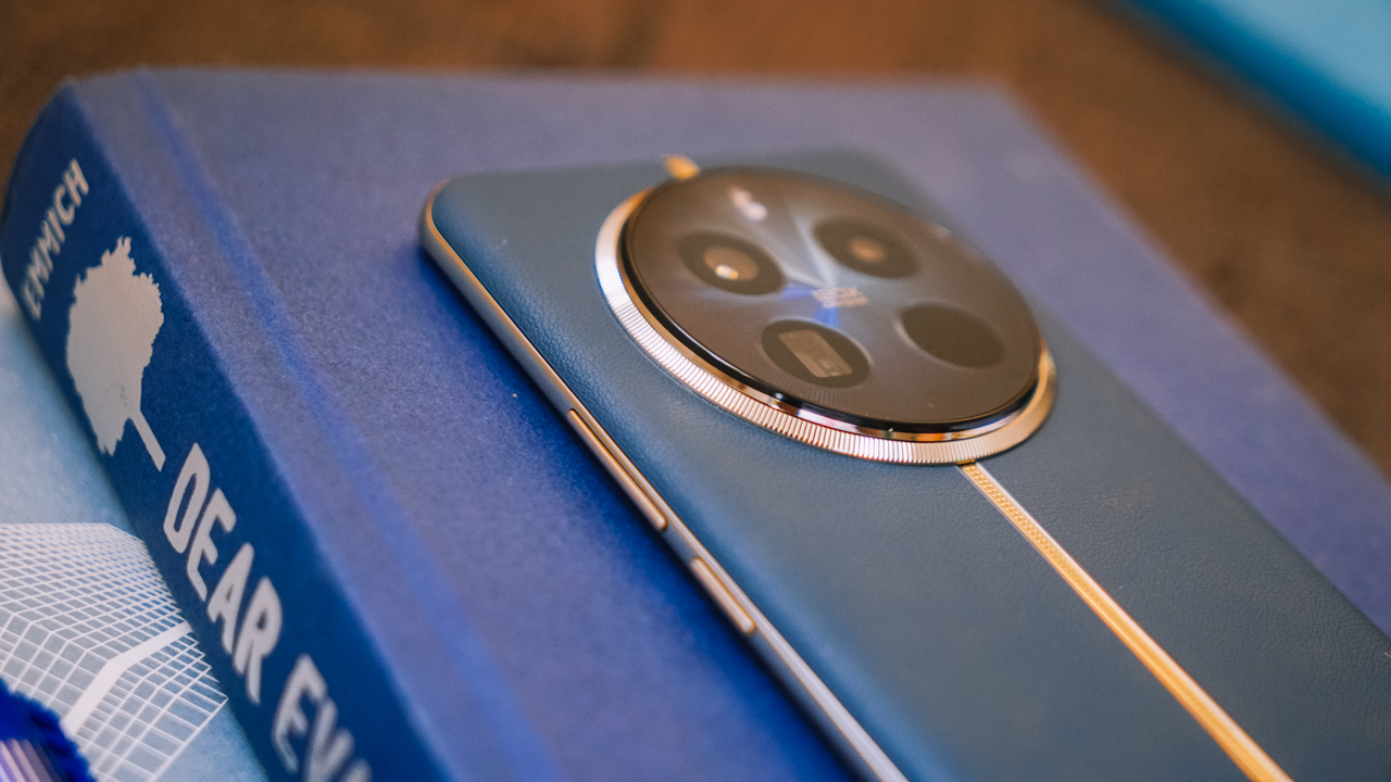
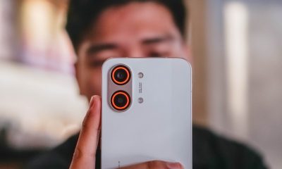
At the back, the cameras resemble a sundial with its circular arrangement, while the flash is located above. Instead of a round shape, the flash resembles a capsule. I would loved for the cameras to protrude a little bit more, like the ones on the realme 10 Pro.
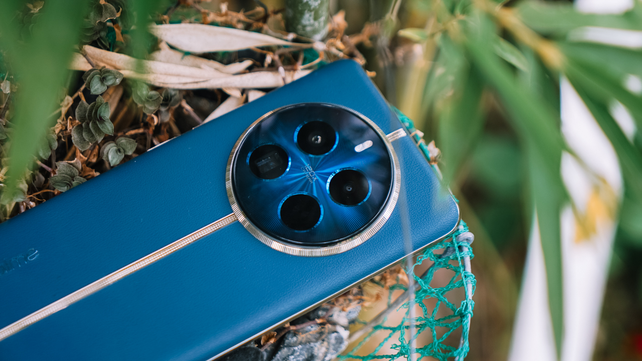
But you can’t fault the makers, knowing they’ve based the latest series on watches. Moreover, I would have loved for the bezels to get a lift so the cameras don’t touch the surface when laid flat.
I find the volume keys a little hard to press down as well, although it isn’t necessarily bothersome. It’s just that it would have taken a lot less effort to hold it down to adjust the volume easily.
All in all, it’s comfortable to hold. The vegan leather material ensures the phone does not slip, even without a case. The curved display also helps with the overall ergonomics of the device. I get that smartphones have been getting lighter and lighter as of late, but this has the right “lightness” to it when carried, shook, or waved.
Smooth performance, neat interface
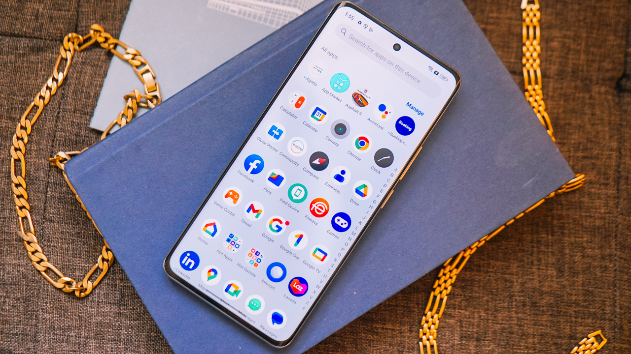
The realme 12 Pro+ runs on the realme 5.0 UI based on Android 14. It’s simple and easy to navigate. There is absolutely no trouble switching from one app to the other. Even if your attention drifts away, you’ll come back to apps the way you left them on the screen.
I utilized this no-frills interface when the device allowed me to conveniently make a short vlog on the spot. I filmed raw videos, compiled them, and edited using the YouCut app for the final result. Making a cover image with the help of the phone gallery’s cutout function was also a breeze.
Throughout the process, I was able to switch in between apps easily and smoothly. The phone probably lost just about 10% of battery life for an hour of usage covering filming and editing.
It’s just a little annoying when the keyboard stays on the screen for a second even when you’re not supposed to write anything. But I know this has been an Android issue for a while now. It didn’t hamper the vlog-making progress, anyway, or when I’m supposed to carry out tasks on the phone.
Great for games
In addition, the phone delivers as promised when it comes to gaming. I set Mobile Legends: Bang Bang to its highest possible graphics settings, and did not experience any hiccups in more than 30 minutes of playing. (Note that since the phone is still new, it did not have the “ultra” option).
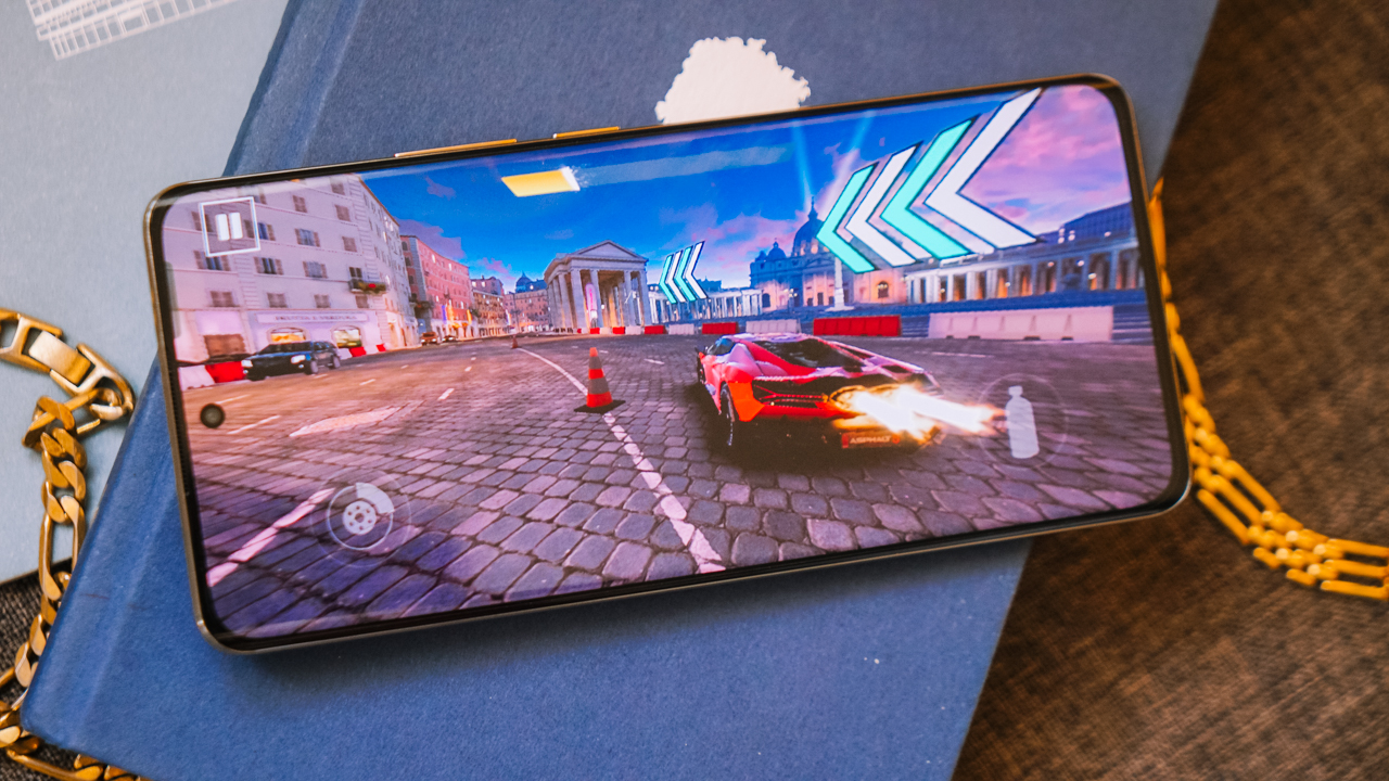
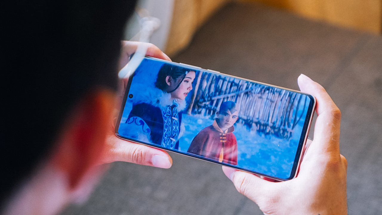
The phone didn’t become hot either, while the Dolby Atmos speakers provided an immersive audio experience. These speakers also elevate viewing whatever content, like on social media, listening to podcasts, playing music in the background, or streaming.
Speaking of immersive, the FHD+ screen gives users crisp detail and quality when watching, viewing photos, or even just scrolling casually.
Loaded battery life for a loaded day
The realme 12 Pro+ also gives you ample battery life for a long day. I went to SM Mall of Asia to shoot photos all day for this piece. Throughout, I had social media and other apps open and was connected to Wi-Fi.
Before the day began, I charged the phone from 39% to full in just 47 minutes. On other occasions, it clocked just 35 minutes from 47% to full and 40 minutes from 44% to full.
Like I mentioned above, the device consumes just about 10% battery for an hour of shooting. Under the hot weather, it did feel a little hotter after continuous shooting.
I did remove its jelly case and it went back to normal temperature. Naturally, it will have a shorter life span when you start doing more demanding tasks or play games for long periods. But overall, users should have no worries staying connected throughout a loaded day.

Camera package: Impressive as it gets
The realme 12 Pro+ has the following cameras:
- 64MP f/2.8 Periscope Portrait camera (OIS)
- 50MP f/1.8 Sony IMX890 main camera (OIS)
- 8MP f/2.2 ultra-wide camera
- 32MP f/2.4 Sony selfie camera
Previously, the realme 11 Pro+ had a 200MP OIS SuperZoom camera which essentially served as its main camera. realme the “main” camera and “Portrait” shooters this time for the realme 12 Pro+. Unlike its little brother, the realme 12+, this one has an ultra-wide camera instead of a macro camera.
The phone does an impressive job on quick captures. On normal zoom, the pictures usually come out vibrant and sharp, with amazing detail and quality. In my experience, I did notice that several results are saturated.
You just have to adjust it manually with the gallery’s in-app editing tool or preselect an appropriate filter on the fly. Sometimes, the results also look too sharp, but it’s a matter of timing. Perhaps, realme will roll out an update to adjust this as well.


The 32MP selfie camera, on the other hand, produces photos with smoother details. It also covers a lot with its 0.8x zoom option. This makes the selfie shooter ideal for group selfies or including backgrounds you shouldn’t miss.
[selfies]


Moving on, I’m also enamored with how the cameras preserved detail at up to 6x zoom. Under ideal conditions, you’ll get basically the same quality at 5x or 6x zoom. You’ll even get the results you intended to more oftentimes than not under challenging scenarios. Naturally, photos will get noisier when you zoom too much, but you’ll still recognize what you’re looking at.
At the realme 12 series launch event, I utilized this even when I was seated at the far back. During the event’s tour, I also snuck some shots from distance while behind other people. Shooting Mimi, the guest singer for the night, at 10x zoom still produced decent results.


Back at Mall of Asia, I realized that the camera package unlocks a lot of possibilities for enthusiasts. With a touch of creativity and the right angles, you can capture several photos that you wouldn’t think of normally. I love how with a combination of powerful hardware and processing, the phone just allows you to explore with more captures.


The main camera’s field of view is already wide enough to encapsulate everything in one frame. I used the ultrawide lens sparingly, but when I did, it gave me what I needed like when we rode the Ferris wheel.
Most of the scenery shots I took were captured from 3x to 6x zoom, and sometimes, even beyond. What impressed me was how there wasn’t much detail loss. Even at night when we spent time at the amusement park by the bay, the phone held its own.


I pushed the phone to the limits to test its “portrait master” label. It was pretty much trial and error in my case, but the 64MP Periscope camera made the entire experiment easier. Under good lighting, it delivered great results right away.


Meanwhile, at night, you’ll just need to keep attempting. I used the 1x zoom for full-body captures and the 3x zoom for half-body portraits, respectively. After several tries, the phone quite amazed me as it produced the right bokeh shots without segmentation error. I find this splendid, considering my girlfriend was superimposed against the bright lights of carnival games.
Even more astounding was during our bump car ride, I was able to snuck in some snaps at 5x zoom while my girlfriend was in transit. The phone still delivered without much noise or blurring. When she rode the drop tower, and while there it wasn’t ample lighting, the photos still came out with decent details.
This all the more highlighted how impressive the camera package the realme 12 Pro+ has. As a “bonus” for myself, I experimented a long exposure shot of paper windmills and the flying fiesta ride under Pro mode.


I did find a few chinks in the armor. I brought up segmentation because a few hours before nighttime, I tried to capture my girlfriend against the sunset.
When I used Portrait mode, the transition from blurred to non-blurred parts was obvious. Moreover, without a macro lens, it’s also challenging to achieve proper focus on close-up shots. You’ll need at least 10 centimeters of distance from the subject to start.
Nevertheless, what you’ll get overall with the camera package is astounding. If you’re looking for a formidable option for food, travel, night life, landscapes, and much more in between, the realme 12 Pro+ is definitely a go-to.
realme 12 Pro+ 5G: A midrange marvel

The realme 12 Pro+ 5G is an absolute steal considering its price point. You get a midrange marvel that can perform just like flagship killers that are pricier.
realme did its very best to create a smartphone that is as close as a flagship killer, and they got it in this device. The phone gives more than just being a “portrait master” (a monicker it is worthy of to begin with).

Best of all, you’ll hands down save a ton of cash if you consider investing in the realme 12 Pro+.
The realme 12 Pro+ 5G is priced at PhP 25,999. Customers may purchase for an introductory price of PhP 21,999 on Lazada, Shopee, and TikTok from March 7 to 15.


Practical Smart Home
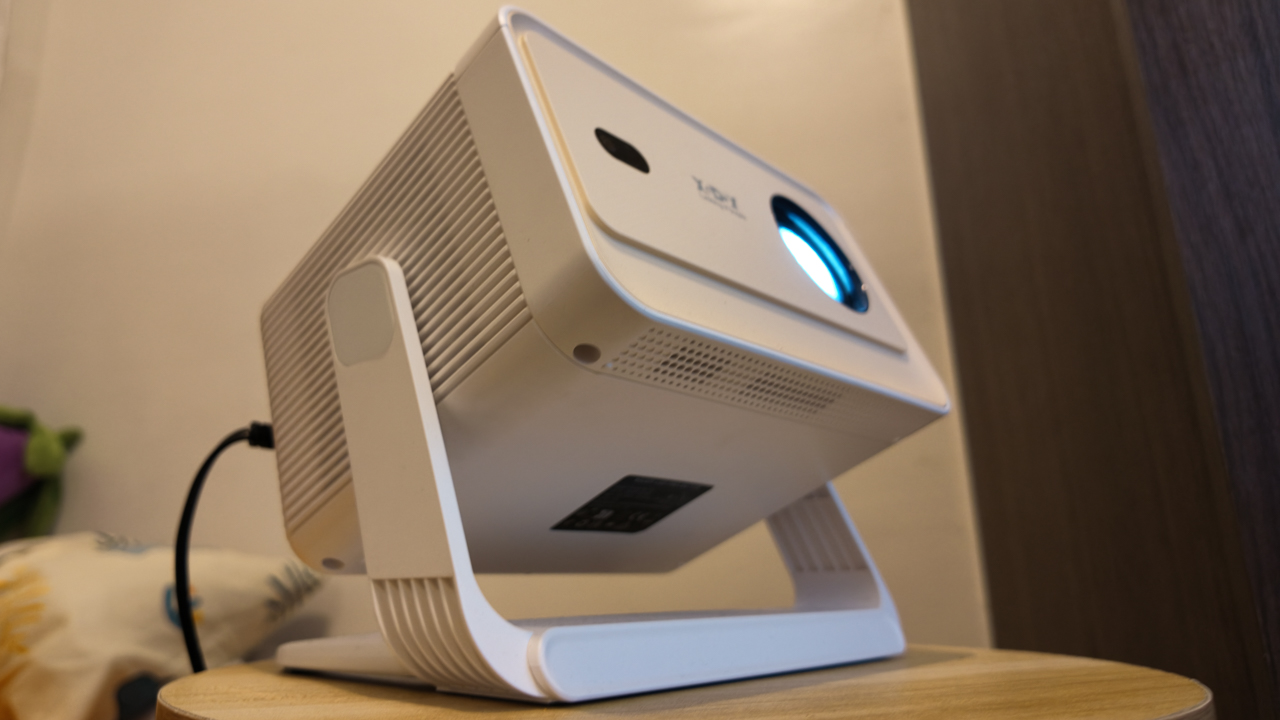
Why this 180-degree gimbal projector is a “small win” for solo living
At $200, the XGODY N6 Pro transformed my one-bedroom apartment into a sanctuary of independence
For a long time, I didn’t have a home entertainment setup.
As a young adult navigating the nuances of solo living, my iPad Pro was my constant companion. It was my theater and my window to the world, especially on those nights when the silence of a one-bedroom apartment hit a little too hard.
I’ve spent countless hours with that 11-inch screen as my only guest, filling the void with comfort shows while I worked, even though my space was perfectly capable of housing a real Smart TV.
But buying a TV felt like… commitment. A TV is a centerpiece you decorate around; an invitation for people to gather.
If you walked into my apartment, you’d see it doesn’t scream “hosting duties.” It screams sleep, train, grind, recover, and repeat.
There is no plush couch, no mahogany entertainment center. While it might look unusually sparse to others, it is mine.
And one of the best parts of living alone is making the final call on what actually fills your space. On one of my loneliest nights, the XGODY N6 Pro arrived, and suddenly, it shifted my state of mind from merely surviving to actually thriving in the life I built.
$200 of freedom
At US$ 200, the XGODY N6 Pro isn’t a casual purchase. When you’re living independently, every dollar is a tactical decision. There’s no safety net, no “calling home” if the budget breaks.
But even when you’re grinding, you deserve to have small luxuries; something that makes your life feel bigger than the room you are in.
For instance, watching your favorite shows projected across your own walls is the ultimate treat after a day spent exhausted.
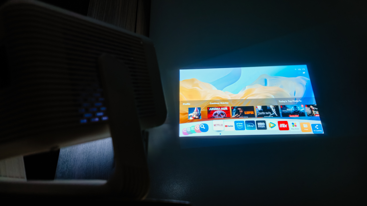
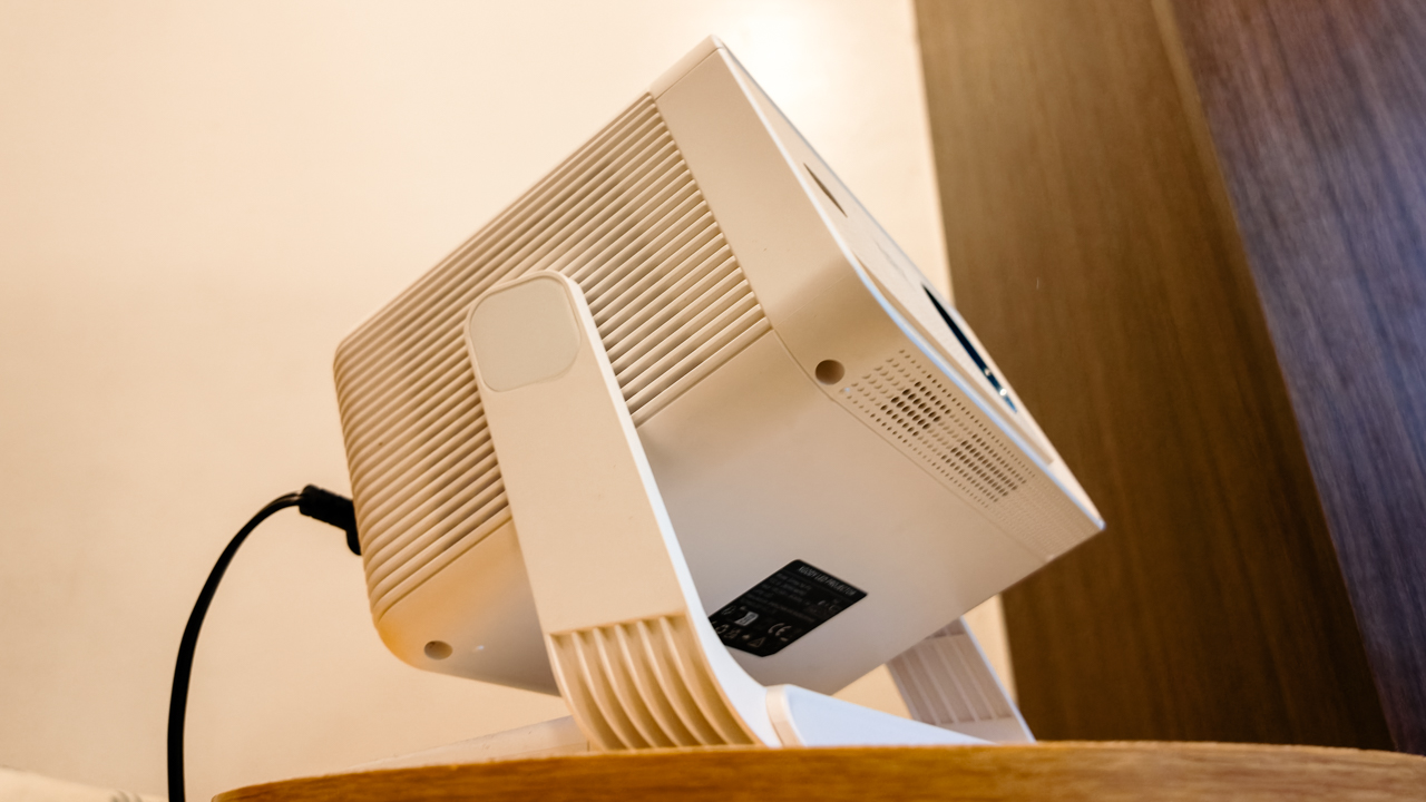
What surprised me most was how the projector adjusted to me, not the other way around. The 180-degree gimbal design sounds technical, but in reality, it simply means freedom.
I don’t have a proper tech setup, so I used my bar stool as a stand. It didn’t matter. Whether I’m sitting on my fabric gaming chair or tucked into bed, I just pivot the lens to whatever surface works best.
For once, I’m not craning my neck over a screen and I’m not adjusting myself to fit the device. It fits into my life exactly as it is.
Seamlessly self-sufficient
Independence changes the way you see technology. When your brain is fried from a long day, you just need life to be a tad easier. I don’t want complicated or demanding; I just want things that do their job so I can breathe.
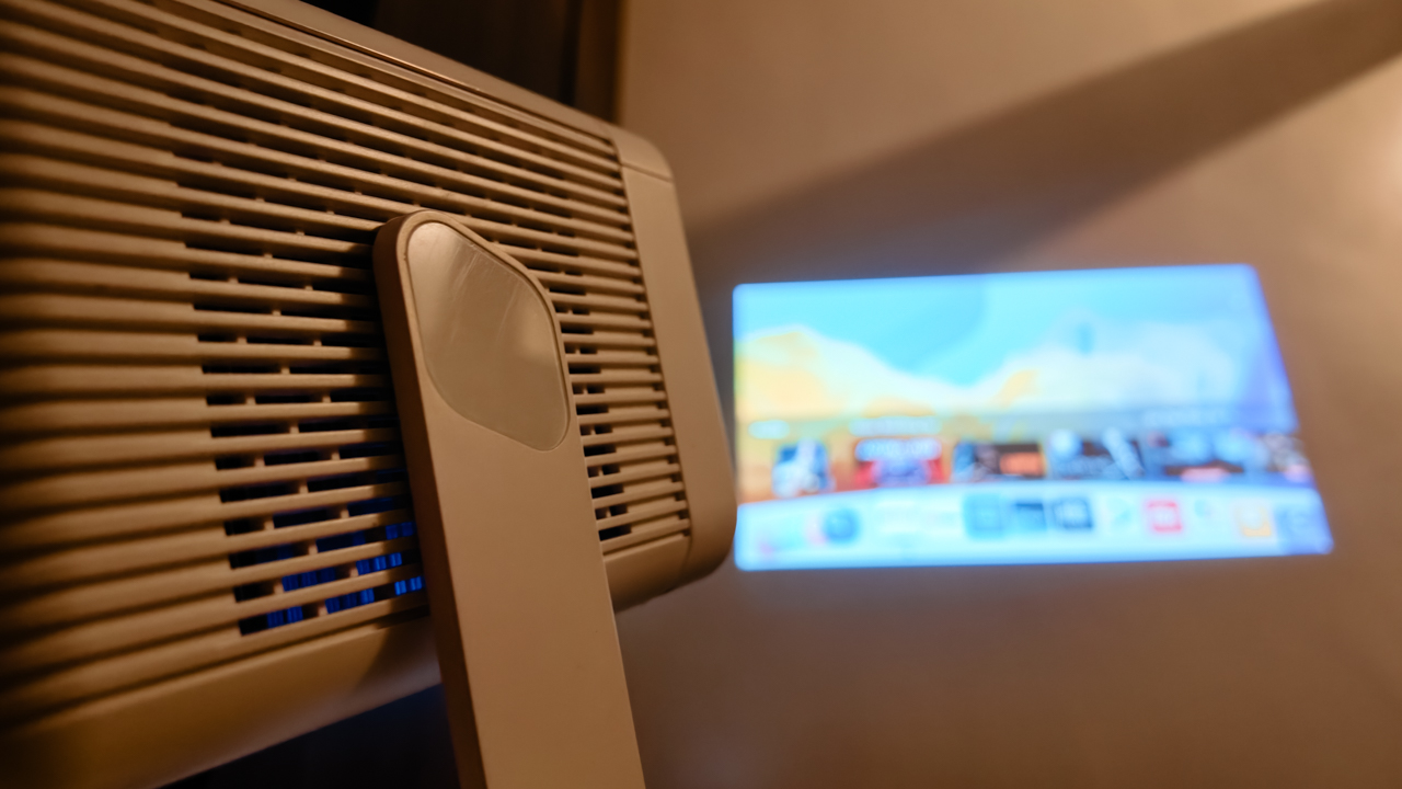
The remote-controlled electric focus and Auto Keystone Correction, in a way, are life-savers. I didn’t have to do anything, because the N6 Pro automatically squares the image as I pivot from wall to ceiling.
Its screen can stretch up to 200 inches, which still feels surreal to say out loud, though it’s smart enough to shrink if it detects an obstruction like a light switch.
Sometimes, it takes a moment to fully lock into clarity, though I have learned to appreciate that pause. It reminds me that not everything has to be instant to be worth it. (Especially since this is a budget device, I don’t want to ask too much.)
What truly impressed me was the WiFi 6 support. Streaming is smooth, and screen mirroring feels effortless. It reduces lag significantly, meaning my comfort shows never buffer.
With WhaleOS and 8,000+ apps built-in, I have everything I need right there.
Now Playing: People We Meet On Vacation
While I was getting used to the XGODY N6 Pro, Netflix dropped People We Meet On Vacation. And somehow, it felt personal.
Poppy, the main character, spends her life chasing the next experience. Her avoidance of settling mirrors my own desire for freedom. Always “catching flights, not feelings.”
Right now, every home is just a layover before my next destination. But having a projector like the N6 Pro makes me feel like I can take my sanctuary anywhere.

Poppy eventually found her happy ending, but I’m still in the chapters where I enjoy meeting new people and seeing new places.
For now, this projector is a companion; it’s there for the mundane moments when I return home from a long trip and need to decompress after the vacation ends.
Turning into a ritual
Even with 15,000 lumens, let’s be real: this is a creature of the night. It’s vibrant and clear in a dark room, but like most budget LEDs, it struggles when the sun peaks in.
I’ve turned my movie time into a ritual: closing the curtains and letting the night soak in, so I can watch the colors come alive.
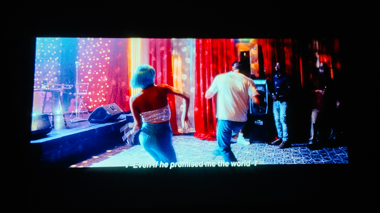
The 10,000:1 contrast ratio and 4K decoding provide enough depth to make the scenes feel sincere. Though, I’m happy with the 1080p native resolution already.
While the built-in 5W Hi-Fi speaker isn’t going to shake the walls, it’s enough for the eerie silence of a solo apartment. With Bluetooth 5.2, I usually pair my JBL Charge 6 for a fuller sound, but honestly, there are nights where the built-in audio is just enough.
Is the XGODY N6 Pro your GadgetMatch?
Living alone is made up of small wins.
Cooking your own meals. Keeping your space clean. Learning how to sit with yourself. And sometimes, turning a blank wall into your own home theater.
At US$200, the XGODY N6 Pro projects the pride of a life built on my own terms. It’s a reminder that you don’t need a massive living room to live a massive life.
Swipe Right if you’re a young adult trying to make it in the city, living in a space where every square inch is precious real estate.
It’s for the independent soul who wants the “Smart TV” experience through Android TV 11 and WiFi 6 without the bulky furniture that usually comes with it. It offers an excellent price-to-performance ratio for anyone who treats their home like a sanctuary, or a temporary layover.
Swipe Left if you are the kind of person who needs absolute technical perfection to feel satisfied. Similarly, if you’re an audiophile who expects a 5W built-in speaker to mimic a Dolby Atmos theater, you’ll find the sound a bit thin.
This isn’t the device for those who want a permanent, high-end home theater installation; it’s too scrappy and mobile for that kind of rigidity.
As I look up at the ceiling, I appreciate how far I’ve come from that 11-inch screen. And I realize I am no longer passing through. I am home.
The XGODY N6 Pro is available through its official website and online retailers like Amazon.
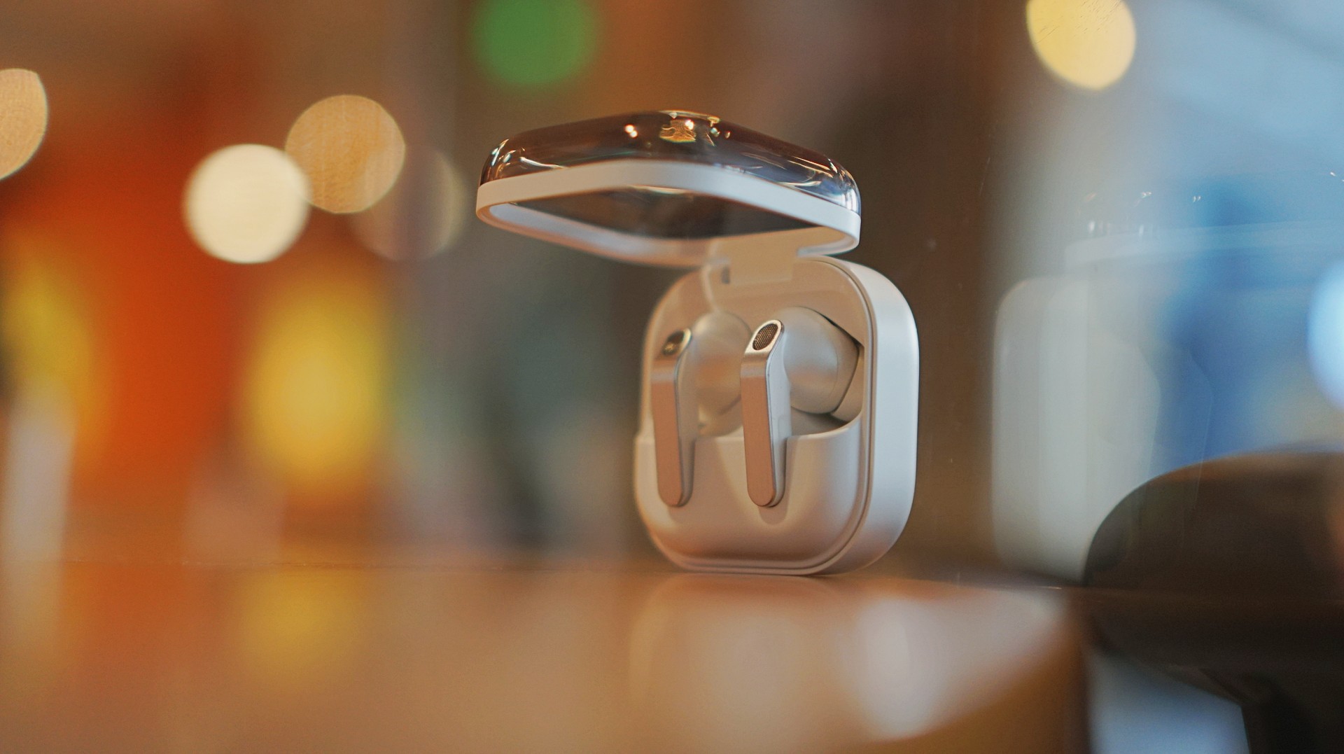
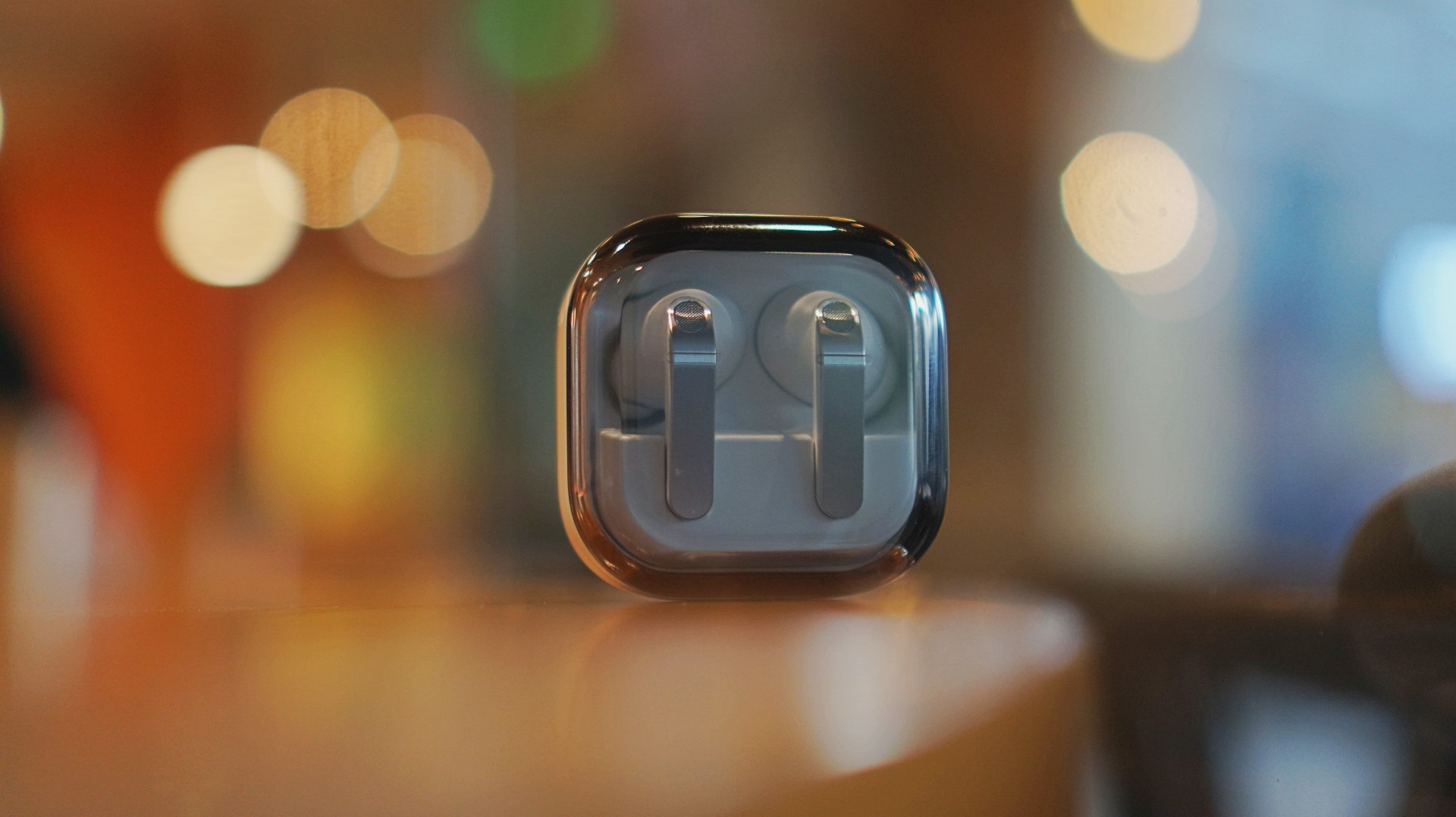
I thought I was done with in-ear headphones. Then the Galaxy Buds4 Pro entered my atmosphere.
I was never truly comfortable with in-ear headphones. That’s why I leaned toward over-ear pairs. But I still wanted something compact for days when I wanted a lighter loadout.
Then came the Shokz OpenDots One. A clip-type, open-ear pair that felt like a game changer. It sounded good enough. It kept me aware of my surroundings. I used it to preview reels while out on coverage, while walking around the neighborhood, and even on quick trips to the barber.
I was ready to write off in-ears completely.
Good thing I didn’t.
A surprise I didn’t expect
I went into the Galaxy Buds4 Pro a little skeptical. I already liked the Galaxy Buds3 Pro, but comfort was never its strongest suit for me.
Then I wore the Buds4 Pro.
Right away, it felt different. More comfortable. More natural. I thought it was just new gadget novelty. But even after a week, that feeling didn’t fade.
That’s when it clicked. These are different. They don’t just sound good. They fit into your day better.
Finally looks like its own thing
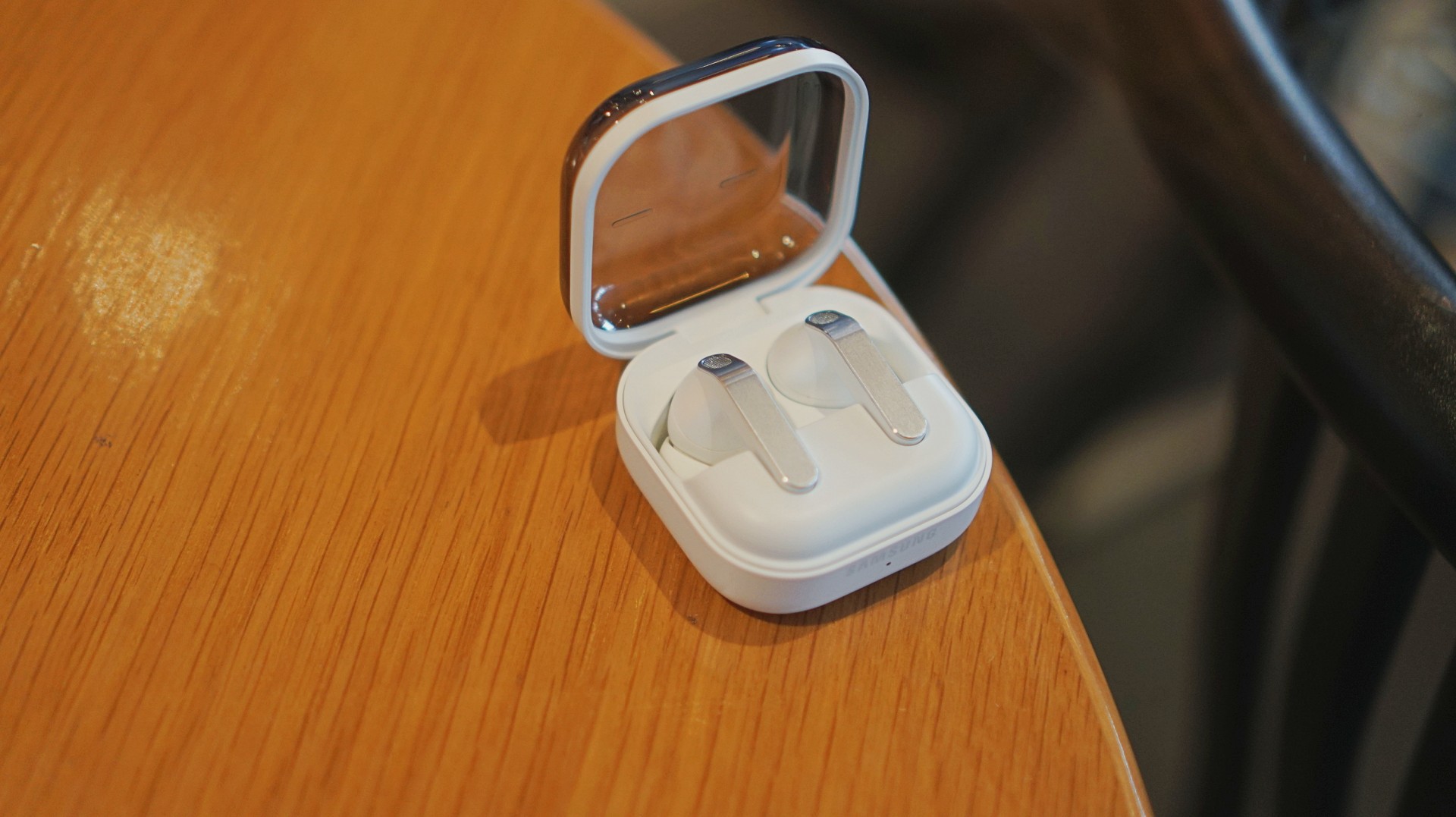
The first thing I loved? It doesn’t look like AirPods anymore.
The Galaxy Buds3 Pro looked a little too familiar. I didn’t hate it, but it didn’t feel like me. I like using tech that reflects a bit of individuality, and that design always felt a little tacky.
The blade design on the Galaxy Buds4 Pro fixes that.
It looks cool. Straight up.
More importantly, it feels more like Samsung finally finding its design language again instead of borrowing from someone else. It’s not just aesthetic either. The shape makes controls easier to find and use.
It’s a small thing on paper. In practice, it changes how you feel about using it every day.
Controls feel easier too. Pinch to pause/play, slide up/down in the same pinching position if you want to adjust volume. It just works.
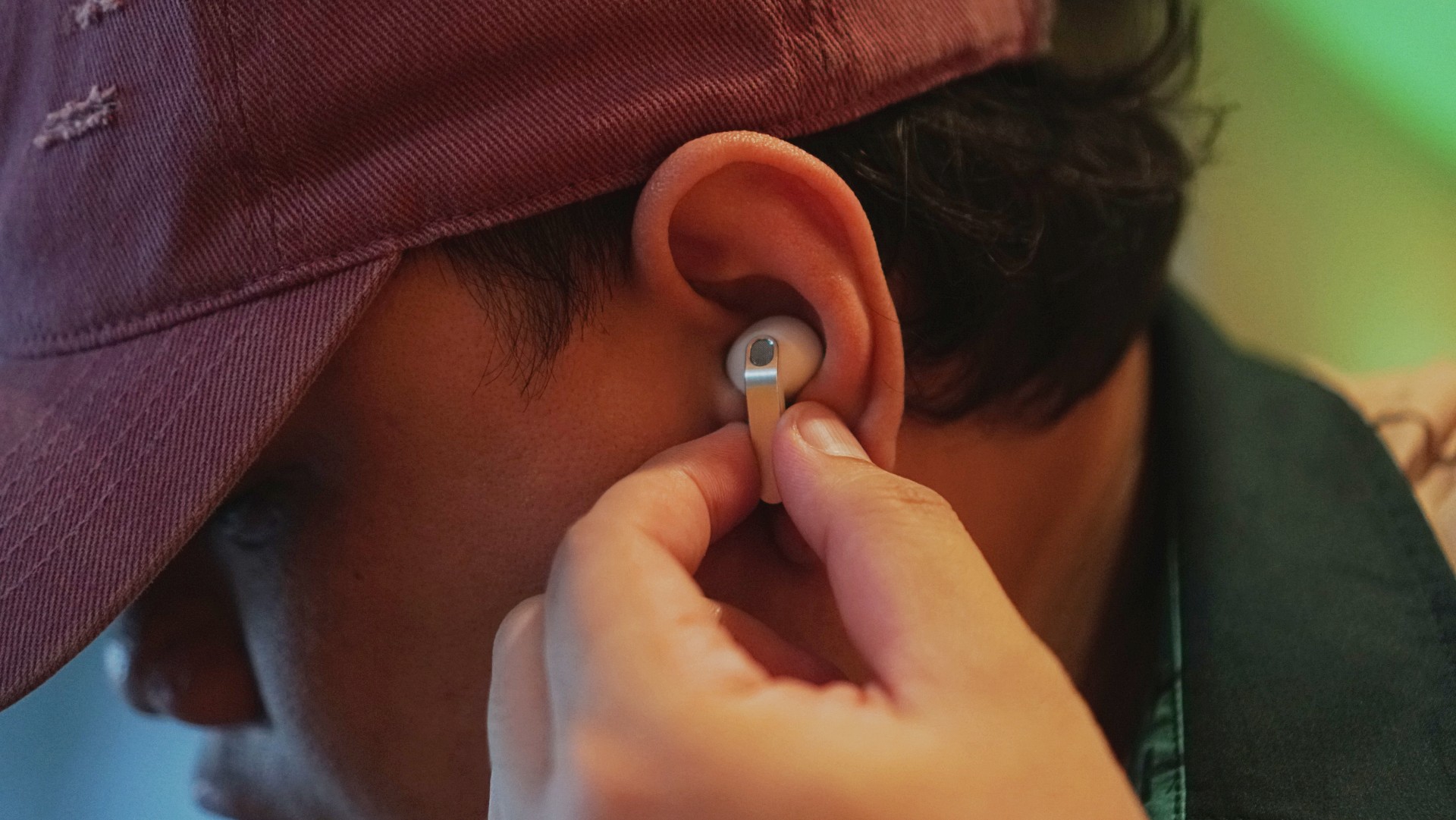
Comfort changes everything
This is the biggest upgrade for me.
With the Buds3 Pro, I loved the features but didn’t always enjoy having them in my ears. With the Buds4 Pro, that problem is gone.
It’s not that you don’t feel them at all. You do. But not in a way that makes you want to take them out.

I’ve worn them for four straight hours while working in a café. Writing, replying to emails, just sitting there with music on. No urge to remove them. No fatigue that breaks your flow.
They stay in place, too. Even during brisk walks.
For someone who almost gave up on in-ears entirely, that alone is a massive win.
Rich, full, and now more layered
If you’ve used the Galaxy Buds3 Pro, you already know the sound is good. The Buds4 Pro takes that and pushes it one step higher. Rich, warm, full, and surprisingly layered. The difference hit me immediately.
I was listening to Spotify on the Galaxy S26 Ultra and started hearing details I don’t usually notice. It reminded me of the first time I heard lossless tracks on Apple Music with a really good pair of headphones.
And this is just on Spotify. Hell yeah, it makes Spotify feel good enough.
Hearing the little things
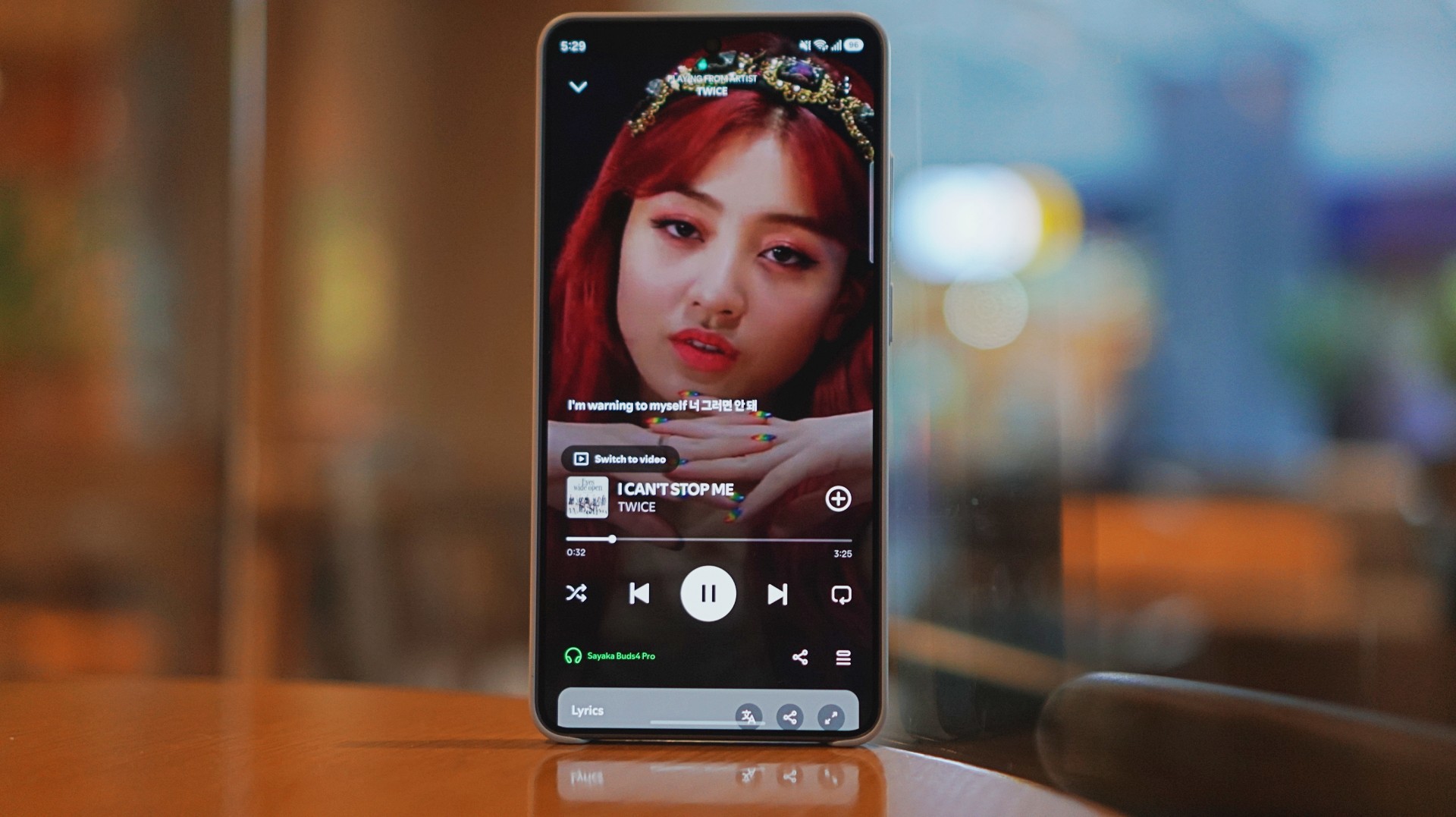
I listen to a mix of K-pop, KRNB, OPM, pop rock, and alternative rock. Across all of it, one thing stood out: separation. It’s easier to isolate sounds if you’re into that.
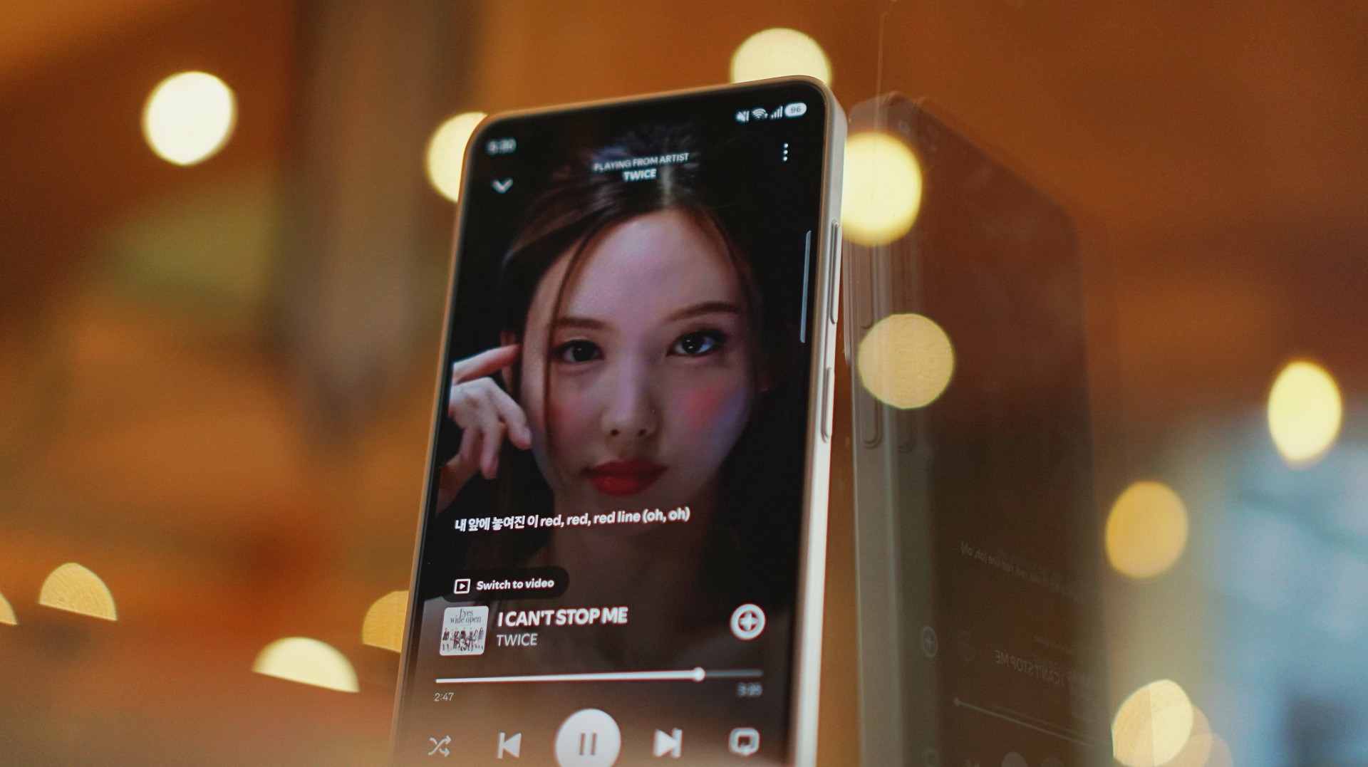
With TWICE tracks, I started picking up vocal riffs and runs from Jihyo and Nayeon that don’t always stand out on other setups. They’re not overpowering. Not distracting. They just sit there, completing the track.
It feels… intentional. Like everything has its place. It doesn’t just sound better. It makes music you already love feel new again.
A quick reality check
At one point, I forgot to charge the Buds4 Pro and switched to the HONOR Earbuds 4. Same track. Same app. Night and day difference.
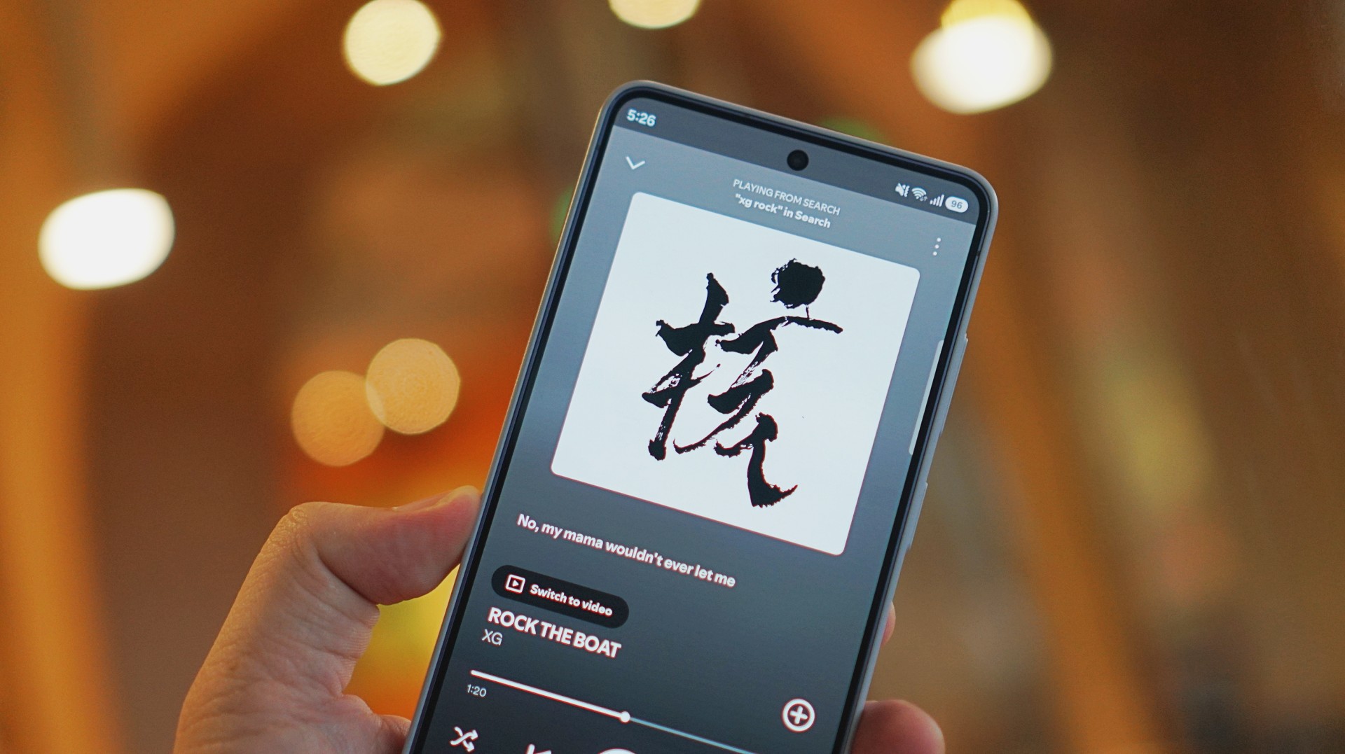
I was listening to “Rock the Boat” by XG when I made this switch.
The Galaxy Buds4 Pro sounded rich, warm, and full. The HONOR Earbuds 4 felt a few steps behind across the board. To be fair, they’re in different price brackets. But that moment still validated everything I was feeling about the Buds4 Pro.
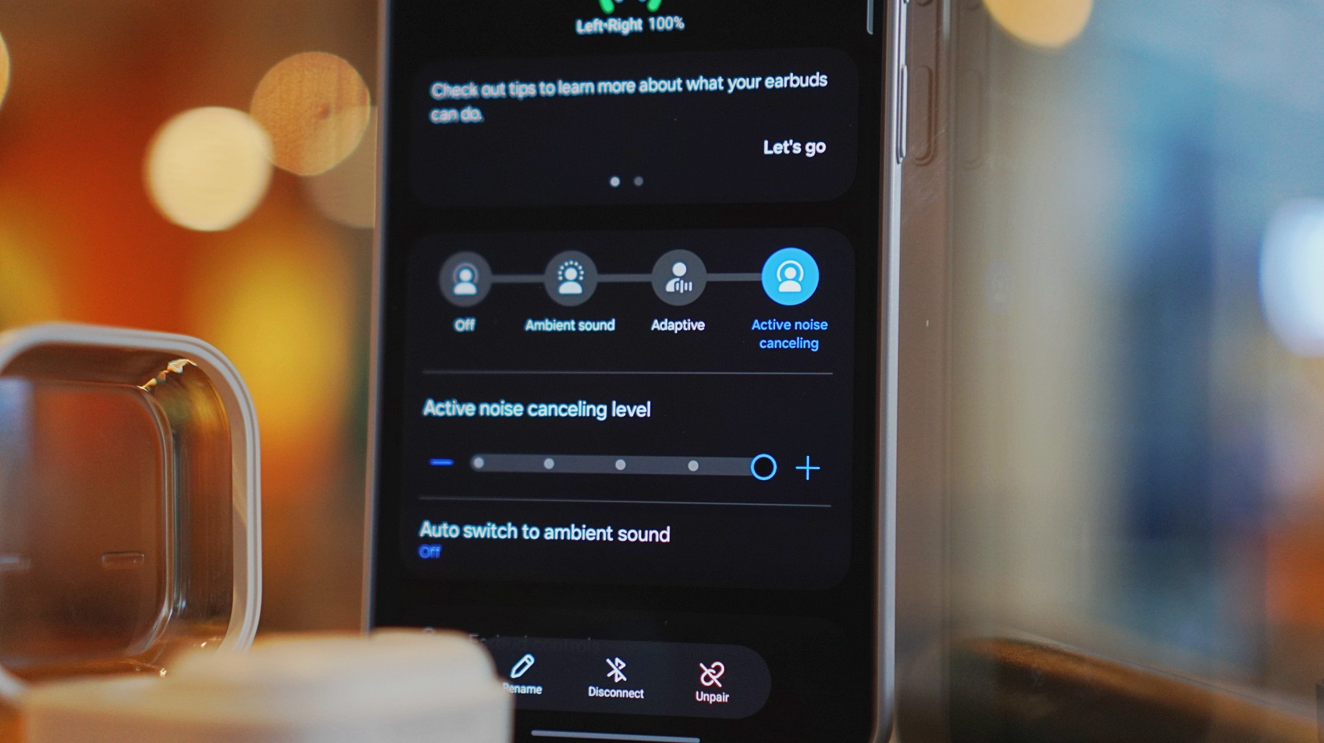
ANC that gets the job done
Let’s set expectations.
The ANC is not Sony WH-1000XM6 level. But nothing is.
If Sony is an 11/10, this sits comfortably at around an 8.5.
And honestly? That’s more than enough.
On a 12-hour flight from San Francisco back to the Philippines, I had these on almost the entire time. Engine noise was significantly reduced. There’s still a faint hum if you really listen for it, but it never got distracting.
In cafés, even when seated right next to the speaker, it blocks out enough noise for you to stay locked in.
It locks you in. You feel like the music is inside your head while still giving you elite sound, some spatial awareness, and surprising comfort.
That balance matters more than chasing perfection.
Adaptive ANC still needs patience
I default to turning ANC on manually. Adaptive ANC and EQ are there, but in my experience, they take a bit of time to kick in. Sometimes a minute or two.
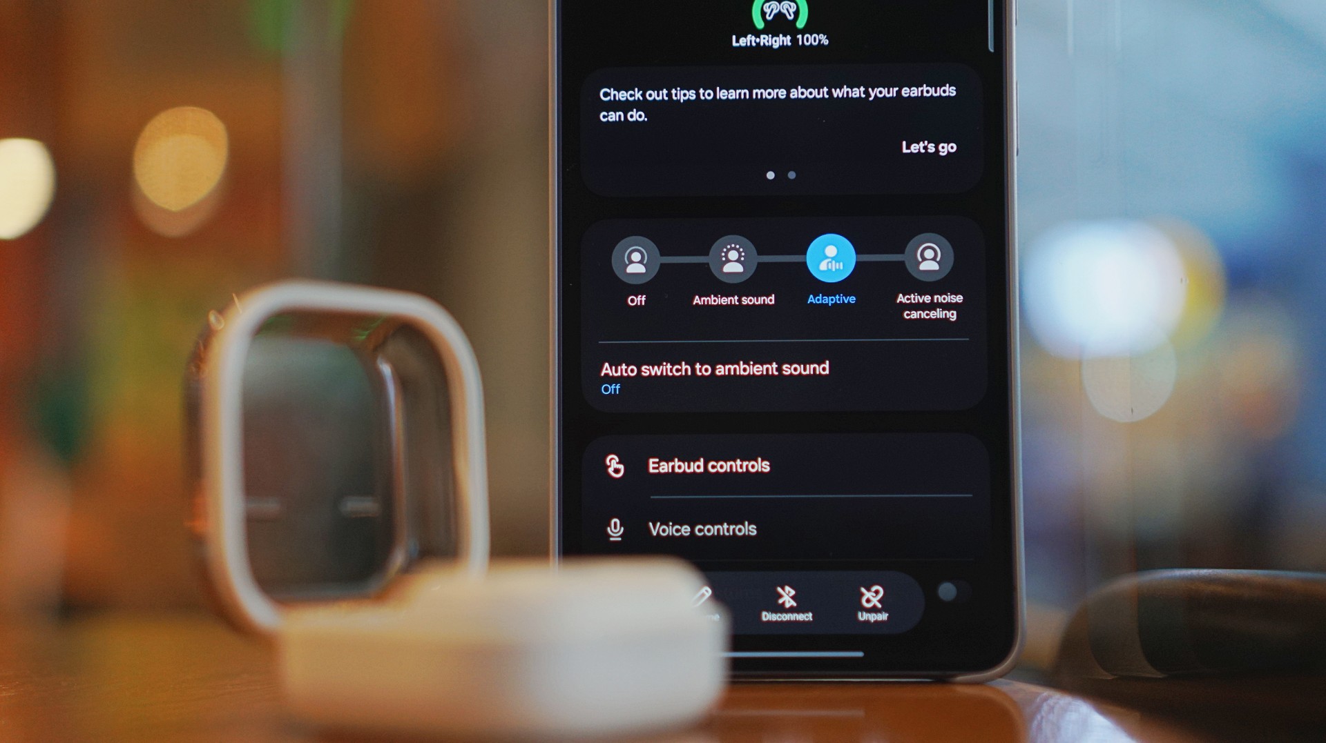
Because of that, I’ve built the habit of switching modes myself depending on where I am.
It works. It’s reliable. But I’d like to see this feel faster and more seamless over time.
Just fits into your day
This is the kind of device you don’t think about. I reach for it every time I step out. Walks, errands, quick food runs.

It’s perfect when you’re waiting in line and scrolling through reels. No accidental loud audio. No awkward moments. It just fits. That’s probably the best compliment I can give it.
Galaxy ecosystem still wins
Pairing is seamless. Controls are responsive. Everything works the way you expect it to. If you’re using a Galaxy device, this is a no-brainer.
Even outside the ecosystem, it still holds up. But you definitely get the best experience when you stay within it.
What still doesn’t matter (yet)
Features like AI Translate are still in that “nice to have” category for me. They’re promising. They’ll probably get better. But they’re not why you buy this.
You buy this for the sound, the comfort, and the everyday usability. And those are already excellent.
Is the Galaxy Buds4 Pro your GadgetMatch?
If the Galaxy Buds3 Pro was Samsung’s best so far, the Galaxy Buds4 Pro is that — made better. A meaningful refinement.
This is my default recommendation now.
The Galaxy Buds4 Pro is for people who want to get the best sound in a compact, easy-to-carry audio buddy to their smartphones.
If you’re coming from older earbuds, this is an easy upgrade.
If you’re coming from the Buds3 Pro, you can probably hold off — unless comfort and design matter a lot to you.
And if you’re deep in the Galaxy ecosystem?
This Buds4 you. Swipe up. No questions asked.
Gaming
WWE 2K26 lets you live out all the fantasy matches you could want
But you have to play for hours and hours to unlock everyone.

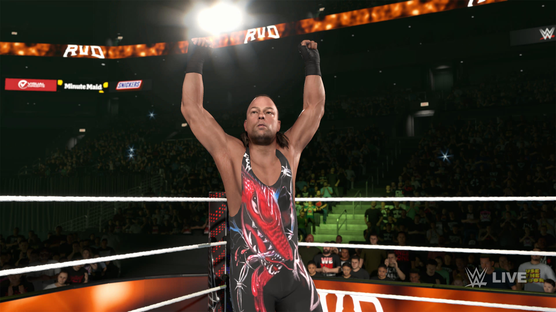
The old SmackDown vs. RAW games were some of the most fun I’ve had as a teenager. Though I didn’t own a PlayStation 2 or 3 then, I had a PlayStation Portable and the series’ corresponding version. Sure, it didn’t have the then-advanced graphics, but the games kept me company for many a day and night. And it all revolved around a simple premise: letting wrestling fans live out their fantasy matches.
Now, with over 400 playable characters on launch, WWE 2K26 hopes to rekindle that magic. Previously, 2K’s take on the wrestling simulator never really captivated me as much as the SvR series did. Though players still had a similarly large roster throughout the years, the series felt too homogenized, too riddled with microtransactions. This year, the series got me thinking again: Can sheer numbers singlehandedly usher a new renaissance for WWE gamers?
The good: Four hundred superstars under one banner
WWE 2K26 touts over four hundred playable characters on launch. With unannounced DLCs still on the horizon, this number will surely balloon further. Even for a dedicated WWE fan, having over four hundred playable characters is insane. Where else can I pit Joe Hendy against Andre the Giant and create my own WrestleMania III moment?

The only catch, however, is that the game did some stat padding to get to this enormous number. Besides having multiple personas for a single wrestler (and CM Punk alone has ten of these), the roster includes a platoon of fictional MyRISE characters, which comes off as distracting if you don’t particularly engage with the MyRISE mode.
Ironically, the game didn’t even need to pad its stats this way. For the first time in the series, the launch roster includes Superstars from the current WWE roster, TNA, AAA, and the Hall of Fame. I could spend hours just feeding a litany of Superstars to TNA legend Abyss. That’s something I could never have done in the old SvR days.
The good: A more fluid fighting system
It also helps that WWE 2K26’s fighting system is the most fluid that the series has been. Wrestlers no longer feel like wooden animatronics skipping from one animation to the next. Each punch flows smoothly into a clothesline, a grapple, a carry, or a finisher.
It is, of course, at the expense of a more complex control scheme where each input combination corresponds to its own move. A stray waggle of the right joystick, for example, can have your wrestler careening towards their opponent in ways you never intended.

It takes some time to get used to. Every time I get a WWE 2K game, I always need a refresher course for the controls. Plus, each entry introduces something different. This year introduces rushing opponents to the corner and carrying opponents in different ways.
Another new addition is the new third-person camera which follows your character, rather than being locked to the ring. To me, this was a welcome feature. The original camera can often betray you by having various elements (other wrestlers, the ring itself) block your view of the action, thus preventing you from reacting correctly to your opponent. The dynamic third-person camera solves this and makes the fight more immersive.

That said, the camera necessarily changes the controls a bit because you need the right joystick to look around. Because of that, I had to revert back to the original camera after a while. Regardless, this is a step in the right direction.
The improved fight scheme is also a step in the right direction. WWE 2K26 is the franchise’s most immersive entry to date because of how fluid the action plays out.
The meh: Iterative game modes
Every yearly sports simulator falls prey to the curse of iteration. Because it’s an annual release, every game needs to add something new for players. At the same time, the same game can’t iterate too much, or it might end up alienating fans of the previous title. Each WWE 2K title has to be the same but also a bit different.
WWE 2K26 goes through the same rigamarole. Most of the game’s different modes don’t offer a lot of improvements from last year. So, if you loved last year’s MyRISE, MyGM, and Universe Mode, you’ll likely find this year’s iteration inoffensive.

“Inoffensive,” however, isn’t the best way to sell a new game. At the very least, MyFACTION gets interesting improvements. For a mode I historically dislike every year, WWE 2K26’s MyFACTION ended up being the one I loved the most this year.
This year, the layout feels more intentional. Though it still lacks the exciting animations of NBA 2K, opening a pack no longer looks like a PowerPoint presentation. There’s also more ways to fight offline with the addition of a challenging World Tour mode. Plus, with intergender support and team chemistry, this feels like the update that MyFACTION needed.

In another twist of fate, Showcase Mode ended up being the loser this year. WWE 2K26 rehashes last year’s schtick of having the star rewrite their history. Last year, this worked with Paul Heyman, a notorious bad guy. It doesn’t really stick with this year’s star, CM Punk, the so-called voice of the voiceless.
Punk could have shined with the traditional style of laying their commentaries over their past matches, especially with his shoot style. Instead, we got a series of what-ifs with practically no commentary. It’s just not what I expected from a firebrand like CM Punk.
The bad: The Ringside Pass
For the first time in the series, WWE 2K26 has a battle pass called the Ringside Pass. Like battle passes in other games, the Ringside Pass unlocks more content as you play through the game. However, unlike today’s standard which revolves mostly on cosmetics, this version locks a treasure trove of playable wrestlers behind an experience gate.
Even if you already paid for the game, WWE 2K26 asks you to play an inordinate number of hours just to unlock the best wrestlers in the game.
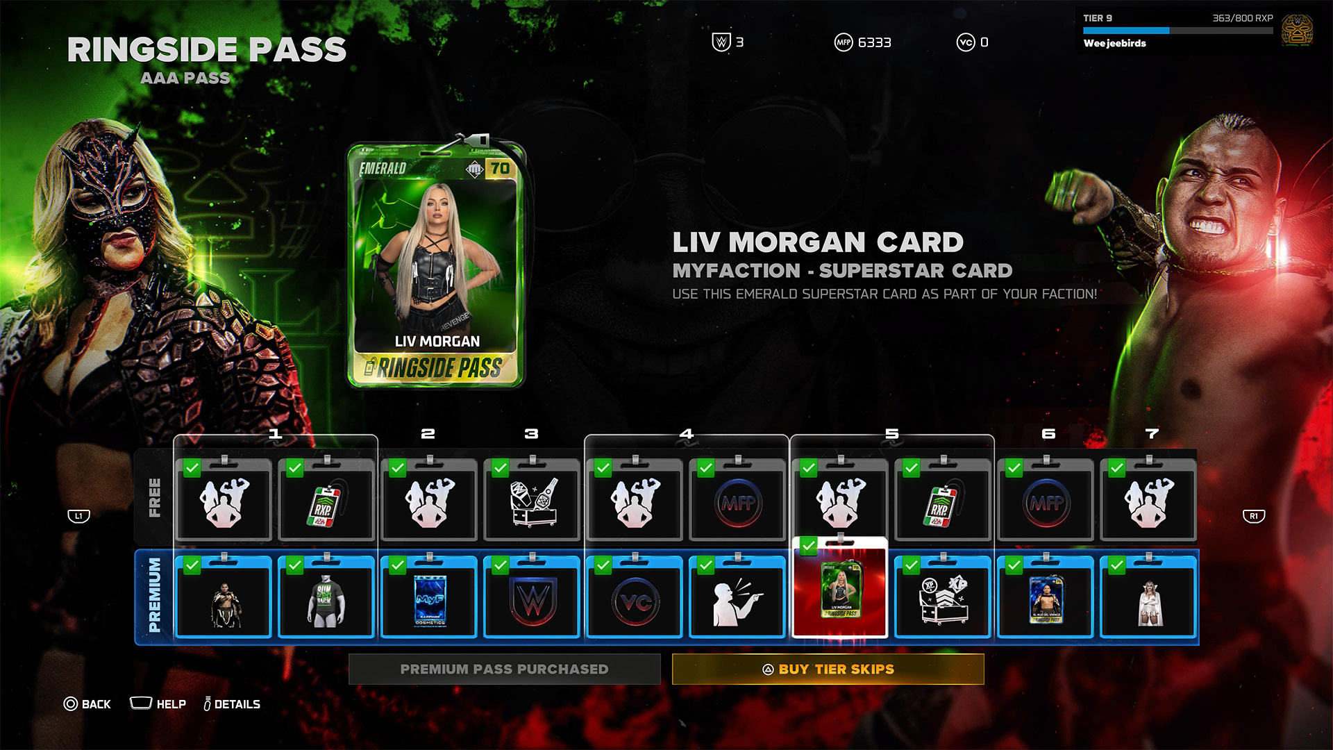
To be fair, it’s not all bad. Right out the gate, the game already gives you access to heavy hitters like CM Punk, Shawn Michaels, and John Cena. However, a lot of favorites are still unplayable including Bret Hart and Kurt Angle. This even includes the strongest version of Bray Wyatt, who’s locked under the last tier of the current pass.
Gaining experience isn’t an easy feat, either. After playing for hours and hours, I still haven’t unlocked more than half of the tiers. At the very least, there is no time limit, so I can play the game at my own pace.
Props to WWE 2K26 for making its battle pass have fulfilling rewards, but it’s still unfortunate that significant elements of the game are locked behind hours and hours of playtime.
The gameplay loop is real and repetitive. And it all circles back to how iterative the game modes are. If only the game modes ended up being as exciting as they were last year, then it would have been exciting to play over and over again. Instead, WWE 2K26 prevents you from engaging in greatest strengths: an exciting roster and a fluid fighting system.
Is WWE 2K26 your PlayMatch?
Last year’s WWE 2K25 was an exciting period for the series. Though this year’s version keeps most of what made the previous game so exciting, WWE 2K26 also adds features, especially the Ringside Pass, that ultimately detract from the entire experience. It’s a small step back, which can hopefully be rectified next year, if not in future updates.

WWE 2K26 is a Swipe Left if you didn’t love last year’s game anyway. The game doesn’t add anything that might change your mind.
However, it’s a Swipe Right if you missed the pure joy of creating dream matches. The game’s massive roster allows for so many impossible matchups to happen, even if only in the digital realm. Just get ready to grind for a long time.


Why this 180-degree gimbal projector is a “small win” for solo living
At $200, the XGODY N6 Pro transformed my one-bedroom apartment into a sanctuary of independence


Galaxy Buds4 Pro review: I thought I was done with in-ears
This Buds4 you


WWE 2K26 lets you live out all the fantasy matches you could want
But you have to play for hours and hours to unlock everyone.

Nintendo might be working on an Ocarina of Time remake

Global tech leaders to convene in Singapore for GITEX AI Asia 2026

Fujifilm Philippines introduces instax Mini Evo Cinema, Mini Link+
Why this 180-degree gimbal projector is a “small win” for solo living

nubia Neo 5 series launches in the PH, starts below PhP 12K


-

 Reviews2 weeks ago
POCO X8 Pro Max review: A new beast from the far east
-

 News2 weeks ago
POCO X8 Pro Series: Price, availability in the Philippines
-

 Reviews2 weeks ago
POCO X8 Pro Iron Man Edition review: Midrange phone in superhero armor
-

 Automotive2 weeks ago
VinFast extends free unlimited charging in 3 markets amid rising fuel prices
-
 Philippines2 weeks ago
The HONOR X8d is serviceable
-
 News2 weeks ago
POCO X8 Pro Series launches in Singapore with early bird prices
-

 News2 weeks ago
POCO introduces X8 Pro Series with Dimensity 9500s
-

 Gaming2 weeks ago
NVIDIA’s DLSS 5 can turn your favorite AAA game into AI slop