
Apps
Netflix is getting rid of its cheapest ad-free tier for good
Starting in Canada and the UK

During its astronomic rise as a streaming giant, Netflix diversified its various subscription tier offerings. The platform offered a plethora of options, mixing and matching ad visibility and video quality. Now, the landscape is shifting once more. Netflix is further paring down its tiers by snipping off its cheapest, ad-free plan for all users.
Last year, Netflix phased out its Basic subscription tier. Formerly the cheapest option for users to enjoy content without ads, the tier left Netflix for new and resubscribing users. Though the announcement was a death knell for the subscription tier, existing subscribers could still continue their cheaper rate indefinitely.
Now, Netflix has changed its mind. In a new letter for shareholders, the platform announced that the Basic tier is going away for good. Starting an unknown date, Basic subscribers must migrate to the cheaper ad-supported tiers or the more expensive ad-free ones. The next one, known as the Standard plan, costs US$ 15.49 per month.
Fortunately, the new zeitgeist isn’t rolling out everywhere just yet. The company will get rid of the plan starting in the second quarter of this year in the United Kingdom and Canada. Naturally, the company will look into expanding the new lineup in other countries soon.
With the new lineup, Netflix is likely moving users more into settling for ad-supported tiers or paying more for ad-free ones. It’s also likely that the platform will increase prices for the ad-free tiers in the coming future.


Apps
foodpanda relaunches cult-favorite roast chicken brand after 8 years of persistent search queries
Heritage chain Andok’s returns to the platform, driven entirely by long-term user analytics.

In the world of e-commerce and food delivery, platform algorithms usually dictate what consumers see. But occasionally, consumer behavior is so relentless that it shapes the platform’s strategy.
In a move driven entirely by long-term user analytics, foodpanda has officially relaunched Andok’s, one of the Philippines’ most iconic heritage rotisserie chains, back onto its platform after an eight-year absence.
The search bar as a digital wishlist
The decision to ink the partnership wasn’t just a marketing play. It was a response to an ongoing data anomaly. Despite being offline from the foodpanda platform for eight years, Andok’s consistently ranked as one of the most-searched merchants on the app.
Year after year, users treated the empty search results page as an unofficial wishlist. This persistent search intent gave foodpanda a clear, data-backed signal of pent-up demand.
Prior to the official digital rollout, teaser campaigns on social media validated this demand, generating thousands of organic interactions from users anticipating the return.
Bridging heritage flavor with digital infrastructure
For foodpanda, onboarding a merchant with this level of built-in demand fits its broader strategy of marketplace optimization and hyper-local network expansion, turning a heritage brand into another data point for how legacy retail plugs into delivery infrastructure.
For Andok’s, the integration works as a fast track to digital scale. A legacy quick-service chain skips years of independent app development and reaches customers already using foodpanda’s existing logistics network, on a platform they already check daily.
Andok’s built its following on charcoal spit-roasted chicken, a slow-cooked technique that’s stayed largely unchanged since the brand’s early days, alongside seasoned grilled pork belly.
More recently, the Dokito line extended that following into crispy fried chicken and chicken burgers, broadening the brand’s appeal beyond its original rotisserie format and giving foodpanda a menu with both heritage pull and everyday fast-food convenience.
Apps
Turn conversations into completed work: Zoom launches ZoomMate
Agentic AI work surface to help people move from conversation to execution
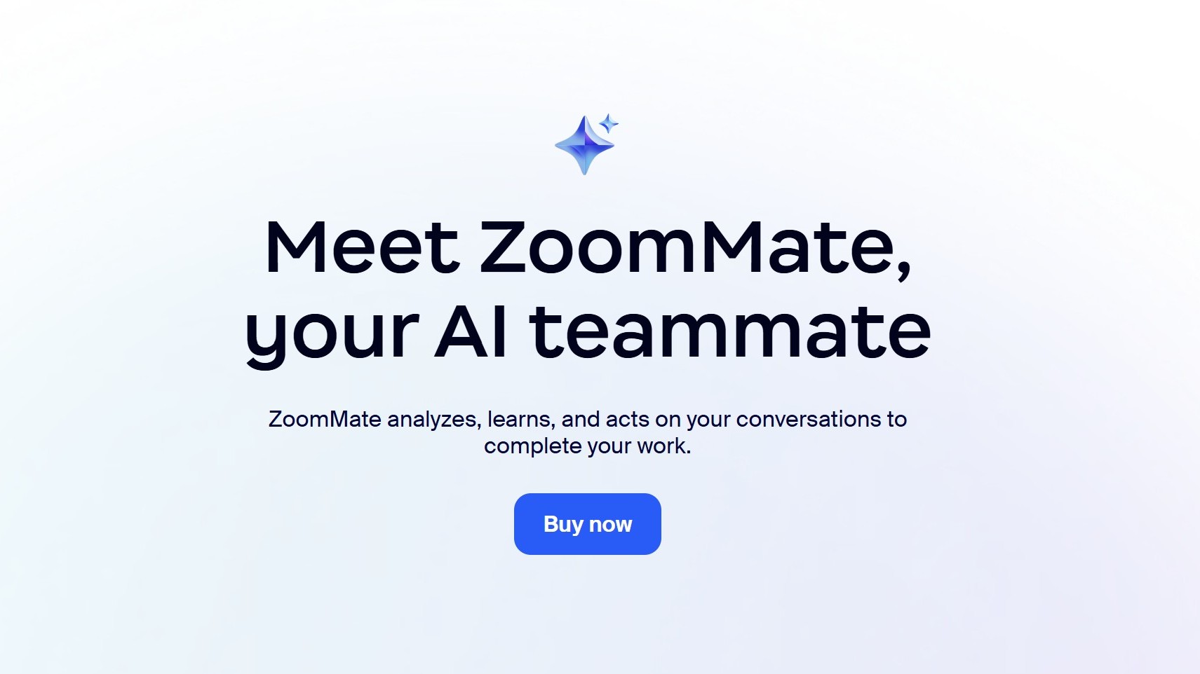
Zoom has officially announced ZoomMate, an agentic AI work surface to help people move from workplace conversations to execution without losing context along the way.
It will be offered in ZoomMate Basic (free) and ZoomMate which is priced starting at US$ 16.67 per month.
Unlike AI tools that solely rely on prompts or manual context, ZoomMate understands what was discussed to generate grounded, relevant outputs directly from meeting context.
The feature connects live conversational context to agentic search, workflow execution, custom agents, and AI content creation. It helps users overcome the friction introduced by fragmented tools and incomplete workflow by surfacing information across Zoom and connected business systems.
This creates deliverables from meeting and enterprise context, like presentations, documents, and spreadsheets. It also coordinates follow-though across workflows without switching tools.
ZoomMate capabilities
ZoomMate introduces advanced agentic AI capabilities that help teams move from insight to completion.
Agentic Search
With agentic search, it brings enterprise knowledge to every conversation. ZoomMate can search across Zoom, the web, and third-party systems to find the most relevant information for a project, account, ticket, policy, or business question.
Connecting to data sources such as ServiceNow, Salesforce, and Workday, and indexing across users’ integrated enterprise systems allows for surfacing information from enterprise files.
This includes customer records, open issues, service tickets, knowledge articles, project updates, files, and other business content.
Moreover, relevant context from Zoom Meetings, Phone, Chat, and other connected platforms, including Google and Microsoft, can be directly integrated into the flow of work.
Orchestrate
The next step is ZoomMate’s agentic layer enables proactive coordination and execution across systems, combining AI workflows with intelligent agents that can act, learn, and adapt within enterprise environments.
Agents can monitor ongoing projects, identify steps from meeting context, and automatically initiate follow-up actions for continuity.
Aside from that, ZoomMate can coordinate real-time task execution and can schedule events across Google Calendar or Microsoft Outlook.
Moreover, it updates records, creates follow-up tasks, drafts customer communications, and triggers onboarding or support workflows.
Complete
Lastly, ZoomMate turns meetings into finished work. It automatically creates presentations, documents, spreadsheets, reports, and project plans from meeting conversations and enterprise context so teams can move from discussion to execution faster.
It leverages Zoom’s AI Productivity Suite to update deliverables as decisions evolve, keeping plans, documents, and other outputs current in real time without manual syncing.
Apps
GCash rolls out in-app OTPs via push notifications to fight scams
SMS-based codes will be phased out by June 22
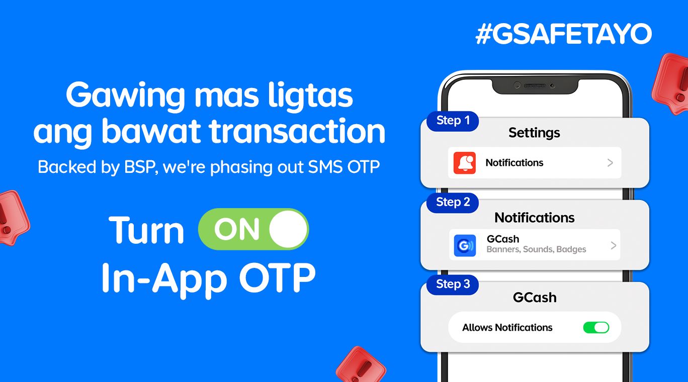
GCash is completely changing how users secure their accounts by rolling out in-app OTPs by June 22.
This fully replaces traditional SMS-based authentication as part of heightened cybersecurity measures against phishing scams and financial fraud.
With this security upgrade, users will no longer receive their OTPs via text messages. Instead, the codes will be sent through secure push notifications directly inside the GCash app.
This provides a much safer verification experiences. The migration to internal authentication is a direct response to a directive from the Bangko Sentral ng Pilipinas (BSP) to phase out SMS-based OTPs by June 2026.
Furthermore, the shift aligns with the country’s Anti-Financial Account Scamming Act (AFASA), which mandates stricter safeguards to curb digital fraud.
For years, cybercriminals have targeted SMS-based verification codes through various spoofing and phishing tactics to gain unauthorized access to accounts.
By routing OTP requests directly through the user’s authenticated GCash app, the platform ensures that only the rightful account owner can receive and use the unique codes.
Beyond security, the switch brings some much-needed convenience. The instant, one-tap authentication removes the annoying hurdle of switching between apps, copying codes, or waiting for delayed text messages to arrive in areas with poor cellular signal.
To get in-app OTPs on the GCash app, simply turn on Push Notifications on your iOS or Android device.


The realme P4 Power: realme’s midrange power play?
A power bank and a phone — and more


HONOR Watch 6 Review: Less guessing, more knowing
Beyond educated guesses


HONOR Magic V6 review: The best version of a book-style foldable?
Little left to sacrifice

What being a Superbod looks like in 2026
The realme P4 Power: realme’s midrange power play?

foodpanda relaunches cult-favorite roast chicken brand after 8 years of persistent search queries

The Adventures of Elliot: The Millennium Tales out now

Spider-Man: Brand New Day trailer offers biggest look yet

TECNO’s POVA 8 5G is both futuristic and future-ready

Close without crossing: A Xiaomi 17T Pro photo essay

realme launches P4 Series 5G, including Power with 10,001mAh battery

The Xiaomi Watch S5 proves you don’t have to take it off

Samsung’s SECRET That Made OLED Even Better


-
 India1 week ago
TECNO’s POVA 8 5G is both futuristic and future-ready
-

 Buyer's Guide2 weeks ago
Buyer’s Guide: Xiaomi Pad 8 Series
-
Reviews2 weeks ago
HONOR Magic V6 review: The best version of a book-style foldable?
-

 Gaming1 week ago
Kingdom Hearts IV gets new trailer, confirms Switch 2 release
-

 Gaming1 week ago
Final Fantasy fans have two big reasons to look forward to 2026
-

 Smartphones1 week ago
Upcoming realme C100 series to feature 8,000mAh battery
-

 Gaming2 weeks ago
Nintendo officially announces Ocarina of Time remake
-

 News5 days ago
TECNO’s SPARK 50 Pro is the latest budget smartphone battery beast