


Xiaomi followed up its Watch S1 series from 2022, not with an S2 series, but with the Watch S1 Pro. On paper, the Watch S1 Pro looks like Xiaomi took the best of both the S1 and the S1 active and melded it into a package that’s fit for all types of occasions.
In case you missed it, we did an Unboxing and First Impressions of the Xiaomi Watch S1 Pro. But to summarize quickly…
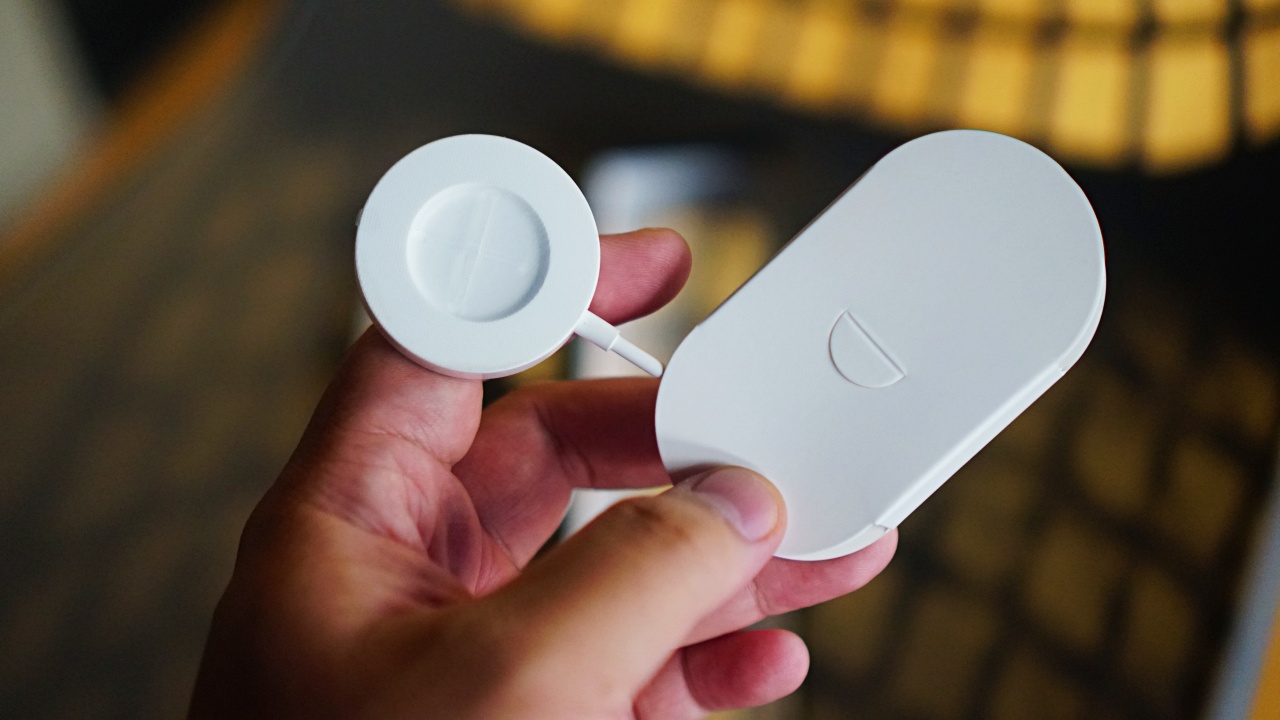
You get the watch itself.
The wireless charging dock.
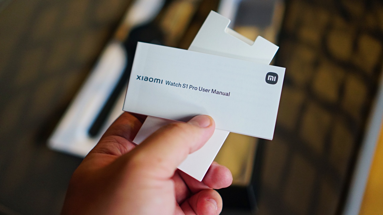
And some documentation (user manual and warranty).
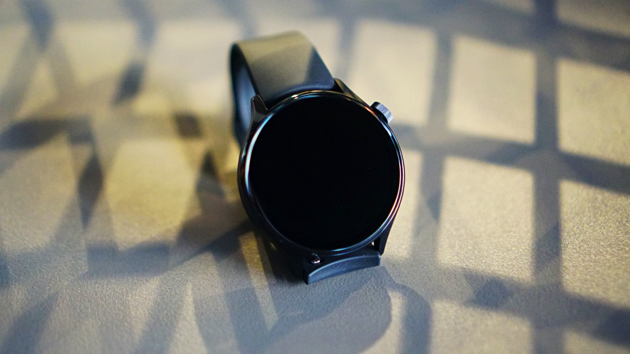
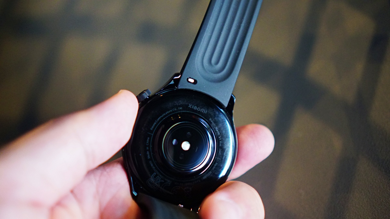
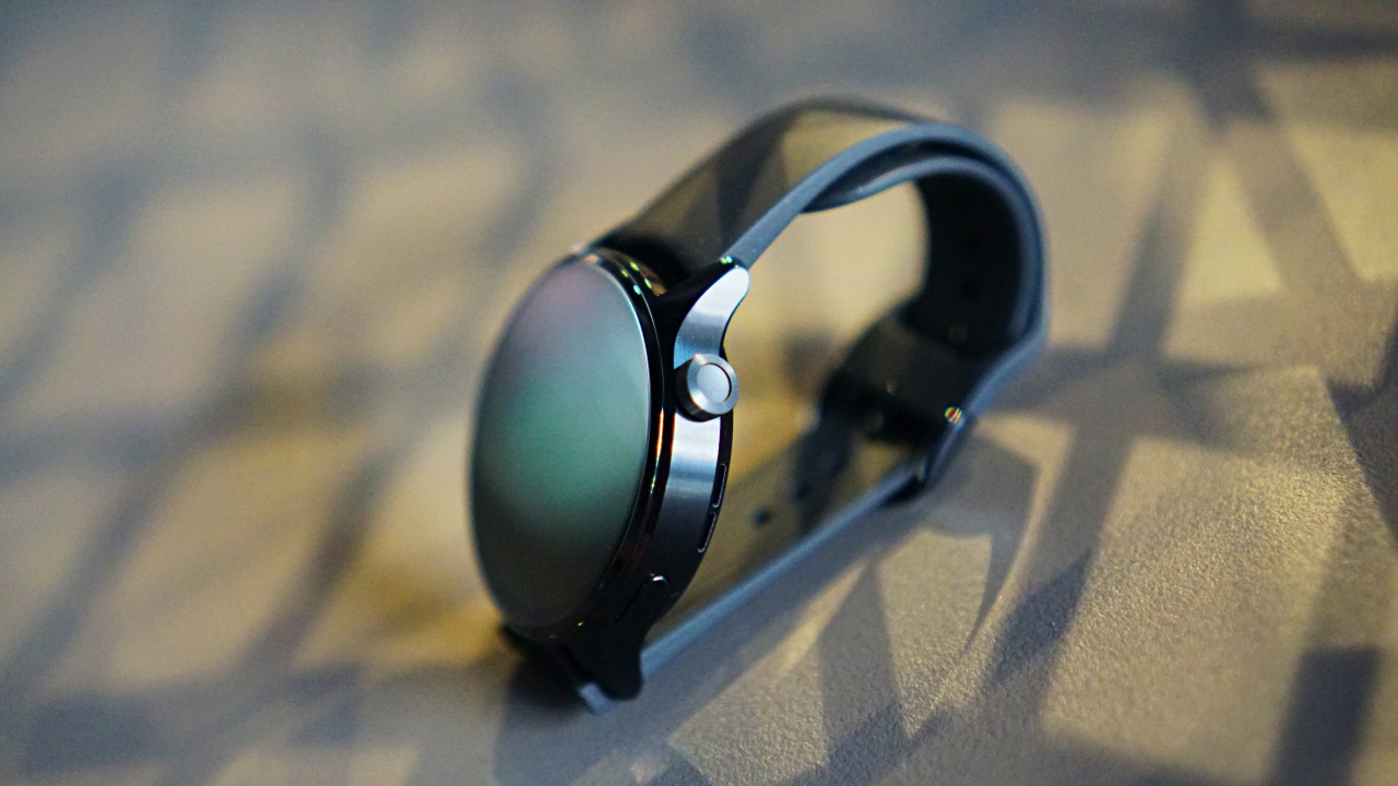
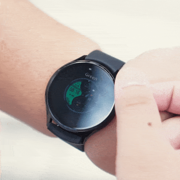
The variant we got is the Black Stainless Steel with the Black Fluororubber strap made for workouts.
There are some new key information we asked Xiaomi between the unboxing and this review:
As you know, the watch is also available in a silver stainless steel case with brown leather strap. If you want that strap, you can purchase it separately.

But you have an even wider range of choices as the straps of the S1 and S1 Active will also work with the S1 Pro.
If that’s still not enough, any 22mm strap size will work with the watch S1 Pro. So, you’re free to style it however you see fit.
It has a 1.47” display which is larger than the 1.43” on the other S1 series watches.
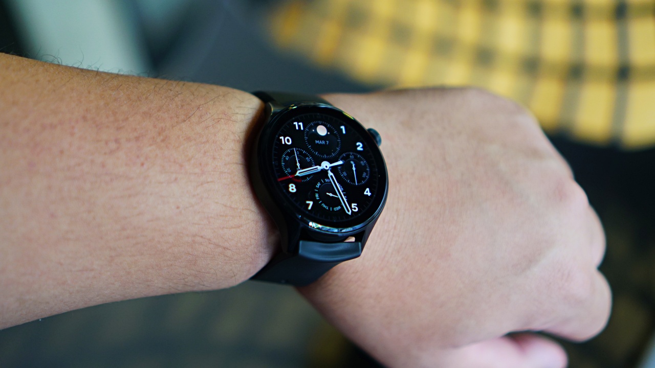
It also prominently features a crown for easier navigation.
That’s it. So, what’s it like using the Xiaomi Watch S1 Pro for a week? Let’s talk about it in the different scenarios that Xiaomi imagines you’ll use it for.
Daily

While working on this review, I’ve had to think about what it meant for me to own a smartwatch.
Due to the nature of my work, I’ve had the privilege of using a handful of them for a few weeks to a month. Over the last two years, I’ve mainly used one which also has a “pro” label on it.
To me, it’s now become a necessity. I get a ton of notifications daily. Work emails and messages dominate my day. Seeing the notifications come in through the watch helps me mentally prepare for the next task as I work on finishing the one that’s currently on my plate.
It helps that the Xiaomi Watch S1 Pro also displays exactly which app the notification came from. I’ve used some smartwatches in the past that could not make this distinction. Instead, they only show a brief part of the message with a default message icon. Glancing quickly when notifications come in helps me organize my thoughts better, and knowing which app the notification came from also helps me plan my next move better.
The UI’s design

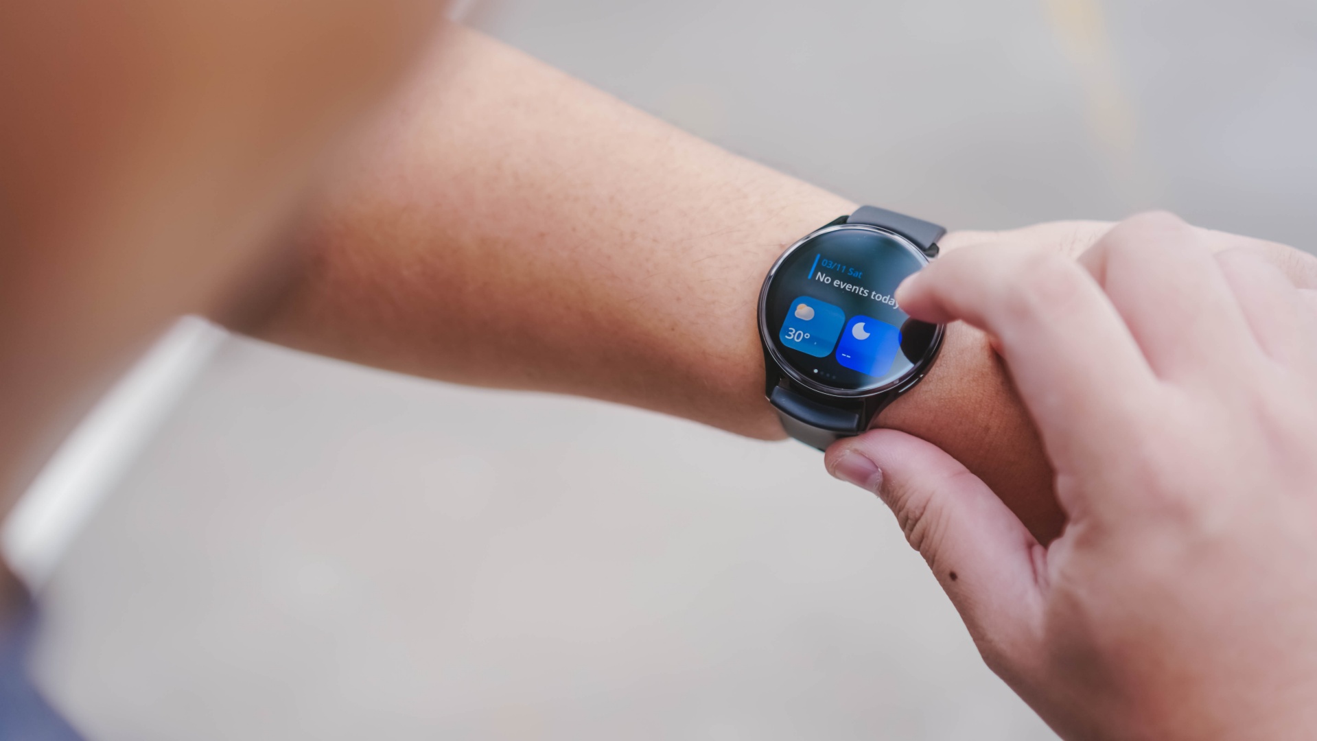
The app selection interface looks a lot like the Apple Watch. The difference being the general look and feel of the app’s themselves. I’m lukewarm on how they look. They’re not bad, but something about them feels a little off to me.
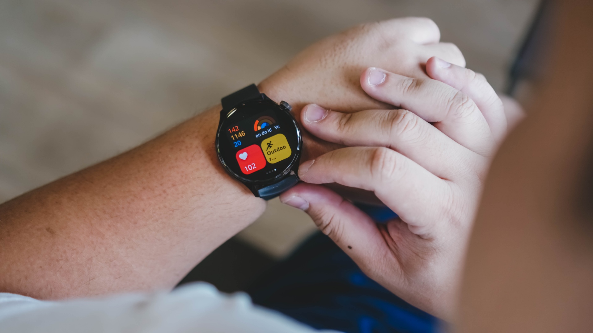
When you swipe left or right from the watch face, you can see the widgets available. There’s one for health monitoring, one for fitness, and another for Alexa. You can arrange them however you like. I personally put fitness as the first swipe from the left and the health monitoring as the first swipe from the right.
Here’s another area where I thought the widgets just didn’t look quite right. While all the elements fit inside the circular display, something tells me this layout fits a more rectangular shape better. Yes, the exact shape of the Apple Watch. Not a deal breaker, but it’s worth pointing out.
Xiaomi uses their own MIUI Watch OS so I asked Xiaomi if there will be an update to apply themes to change this. Unfortunately, there isn’t. Again, this isn’t objectively bad, I just personally wish there was a way to customize it.
Smart Casual

When the Xiaomi Watch S1 Pro was launched in Barcelona, Spain during MWC 2023. We had a chance to sit down with TJ Walton who takes the lead in talking up Xiaomi’s accessories and overall ecosystem. Referencing the silver stainless steel case with brown leather strap, he was asked if there was a conscious effort to make the watch look more luxurious. To which, he answered affirmatively.
While you can certainly say that for the silver case, leather strap variant, the black case, fluororubber one, in my opinion, does have its “luxury limits.” You wouldn’t wear this as is with formal attire. Thankfully, it does work in more smart casual or business casual fits.

It also helps that, as mentioned earlier, you can purchase separate straps to fit the occasion better. I already looked up 22mm watch straps on popular shopping platforms and you should have a field day from the selection. Everything from stainless steel, to leather straps are available for purchase.
While you can get away with the black fluororubber strap in most scenarios, you should do yourself a favor and buy an alternative strap or two so you can mix things up and accessorize appropriately.
Sports

I have said this a few times already in previous smartwatch reviews, but in case this is your first time reading mine, I hate workouts. Or at least the idea of working out. I’m just lazy like that. I do like walking and playing basketball.
I always just walk whenever I can. Especially when I’m traveling, there’s nothing like soaking in a place better than taking the time to stroll down its streets. The Xiaomi Watch S1 Pro’s step counter works just about as well as any step counter. There will be variance with other smartwatches which is natural, but it is fairly accurate. So, if you’re targeting a certain number of steps, you can rest easy knowing you walked enough to reach your goals.

Speaking of goals, that’s what I love about the workouts available on the Watch S1 Pro. With it, you can select whether you want to track the duration or by calories burned. The smartwatch I’ve been sporting simply tracks both at the same time but without the granular control of targeting each one.
This is especially helpful for someone like myself whose “workouts” are limited to solo basketball drills and occasional pick-up games with neighbors. I’m currently trying to lose the massive weight I gained during the pandemic, and I’m doing so by watching my daily calorie intake. If I can track my hoop sessions based on calories burned, it’s easier for me to maintain a calorie deficit in tandem with my current meal plan.

It also helps that the watch, overall, isn’t too bulky and doesn’t feel heavy on the wrist at all. It’s a stark contrast to what I currently use. Granted it’s one that’s close to being three years old.
100+ workouts

As advertised, there are 100 types of workouts that the Xiaomi Watch S1 Pro can track. Personally, I feel like this can be intimidating to a lot of people as it creates this idea that you need to try all of them to maximize the smartwatch. This isn’t true at all.
Just pick the workouts that work for you, the ones that you’re happy to do and can incorporate to your lifestyle. If you can do that, you’re already making the best of the smartwatch’s fitness features.
Battery life and other things of note

Xiaomi advertises up to 14-days of battery life in standard mode. If I extrapolate the results from my one-week use, you could see yourself charging the Xiaomi Watch S1 Pro every 4-5 days with moderate to heavy workout usage.
Under very bright sunlight, it can be challenging to see the watch face. But that’s a really isolated case. Most of the time, you won’t have trouble seeing the watch face right away.
As of writing, I thought the available watch faces are pretty limited. There’s also no option to add a custom image (at least now when you use it with an iPhone). I couldn’t try it with the Xiaomi 13 Pro, which has an instant pairing mode that’s convenient, because it’s currently with another team member for a camera shootout. Xiaomi said more watch faces should come soon.
Xiaomi Pay isn’t available in the Philippines. It’s currently available in WEU, CEE & Nordic, and Russia. Availability in more regions and countries are in the pipeline. However, Xiaomi says this is dependent mainly on the business development of the issuer VISA and Mastercard’s plan. Contactless payment has gained more traction (yes, I see the irony in those words) of late and I wish the support for the feature expands soonest.
Is the Xiaomi Watch S1 Pro your GadgetMatch?

The Xiaomi Watch S1 Pro has all the bells and whistles of a 2023 smartwatch. You have the usual health monitoring features (heart rate, sleep, blood oxygen, etc), as well as tracking for a huge number of activities.

And while the watch faces are limited at this point, the available ones offer enough versatility that you can switch it up depending on the occasion like you can with the straps.
The UI, I personally think, can be better, but it is objectively good. The battery life is also decent. It’s a happy middle ground between the charge-daily Apple Watch and the long-lasting offerings of Huawei.

Against its contemporaries, the Xiaomi Watch S1 Pro is most appealing for its price (PhP 16,999/ EUR 299). You get pro features you expect from a smartwatch, as well as the versatility of matching it with your style. It also helps that it works with both Android and iOS.
If you’re looking to take your personal health and fitness monitoring to a “pro” level, the Xiaomi Watch S1 Pro likely offers the best overall value right now.


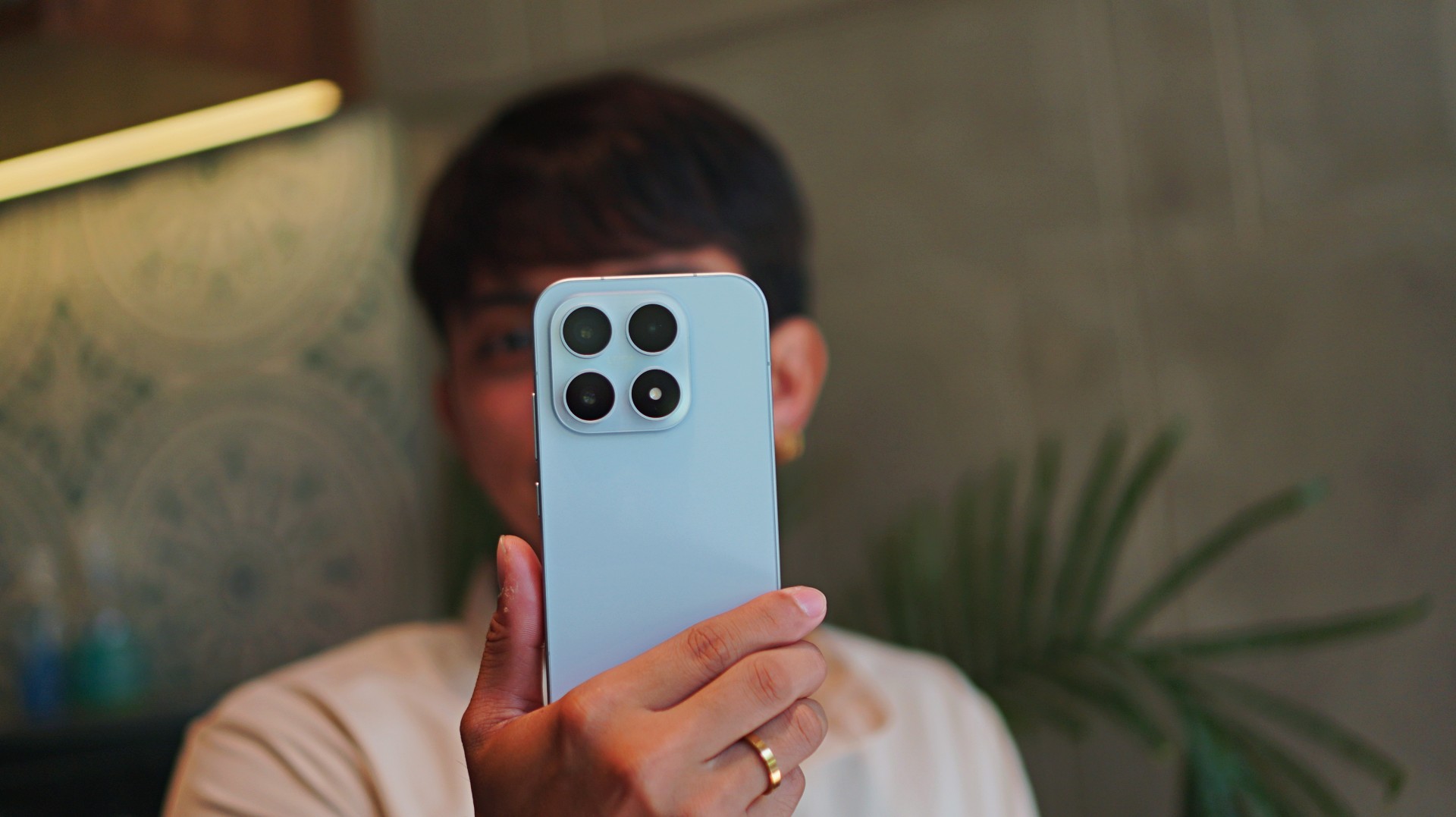
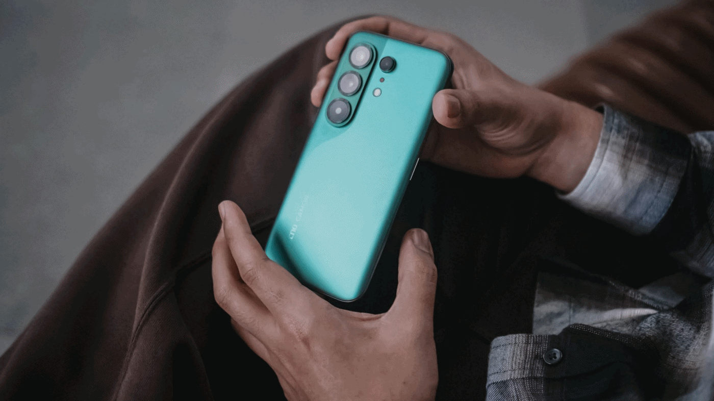
Base models are often an afterthought — even among flagship phones. And with a flashy, attention-grabbing Ultra variant in the lineup, it’s easy to overlook the smaller Xiaomi 17.
But like the base models that came before it, the Xiaomi 17 is a tiny but mighty true flagship. One that quietly delivers the core flagship experience without demanding the size, weight, or price of its bigger sibling.
It’s compact, powerful, and surprisingly capable. And perhaps more importantly, it’s a phone that makes mobile photography feel fun again.
For creators and photography enthusiasts who want a capable camera always within reach, the Xiaomi 17 feels like carrying a Leica-inspired camera in your pocket.
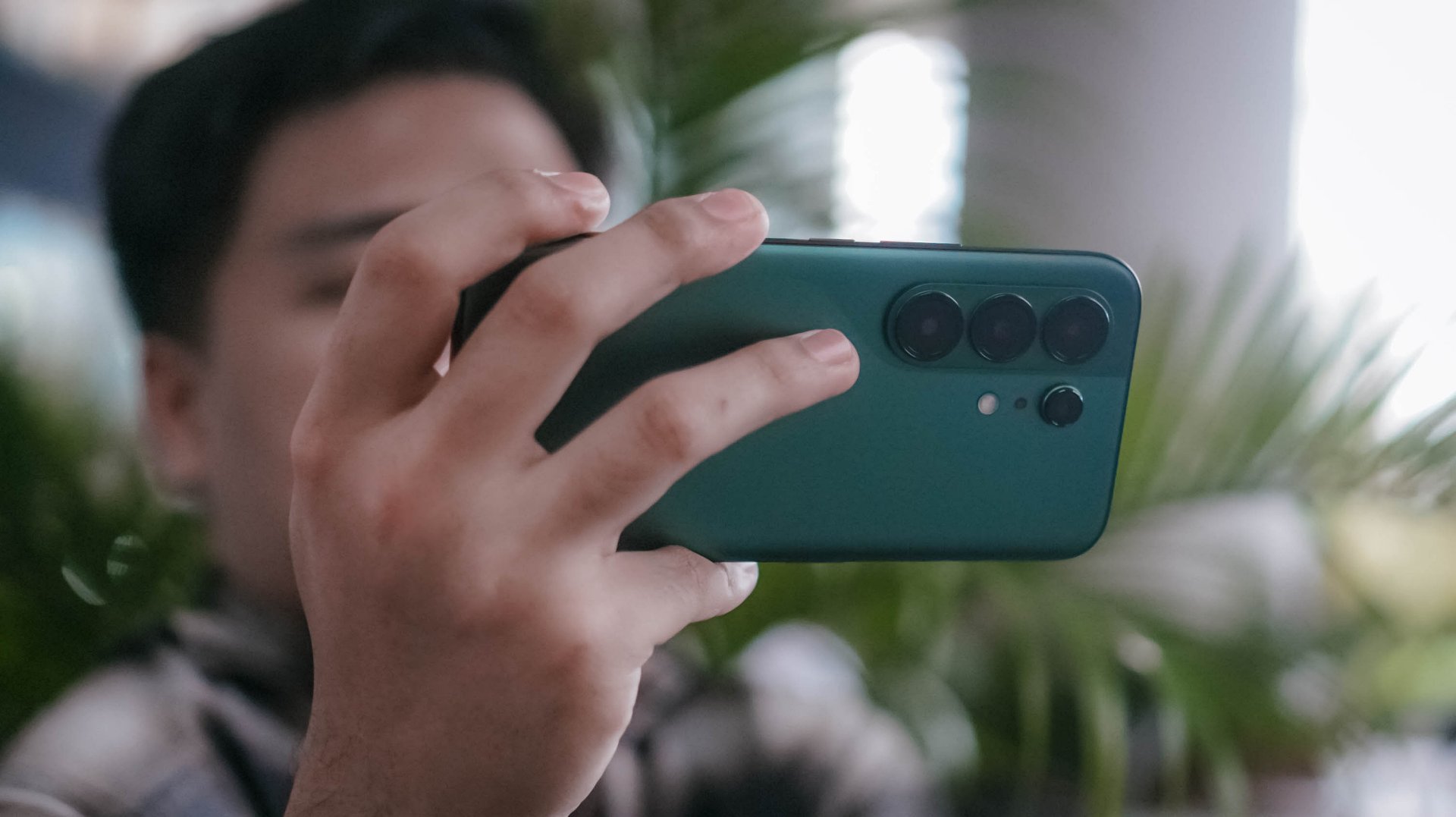
A phone that feels like a pocket camera

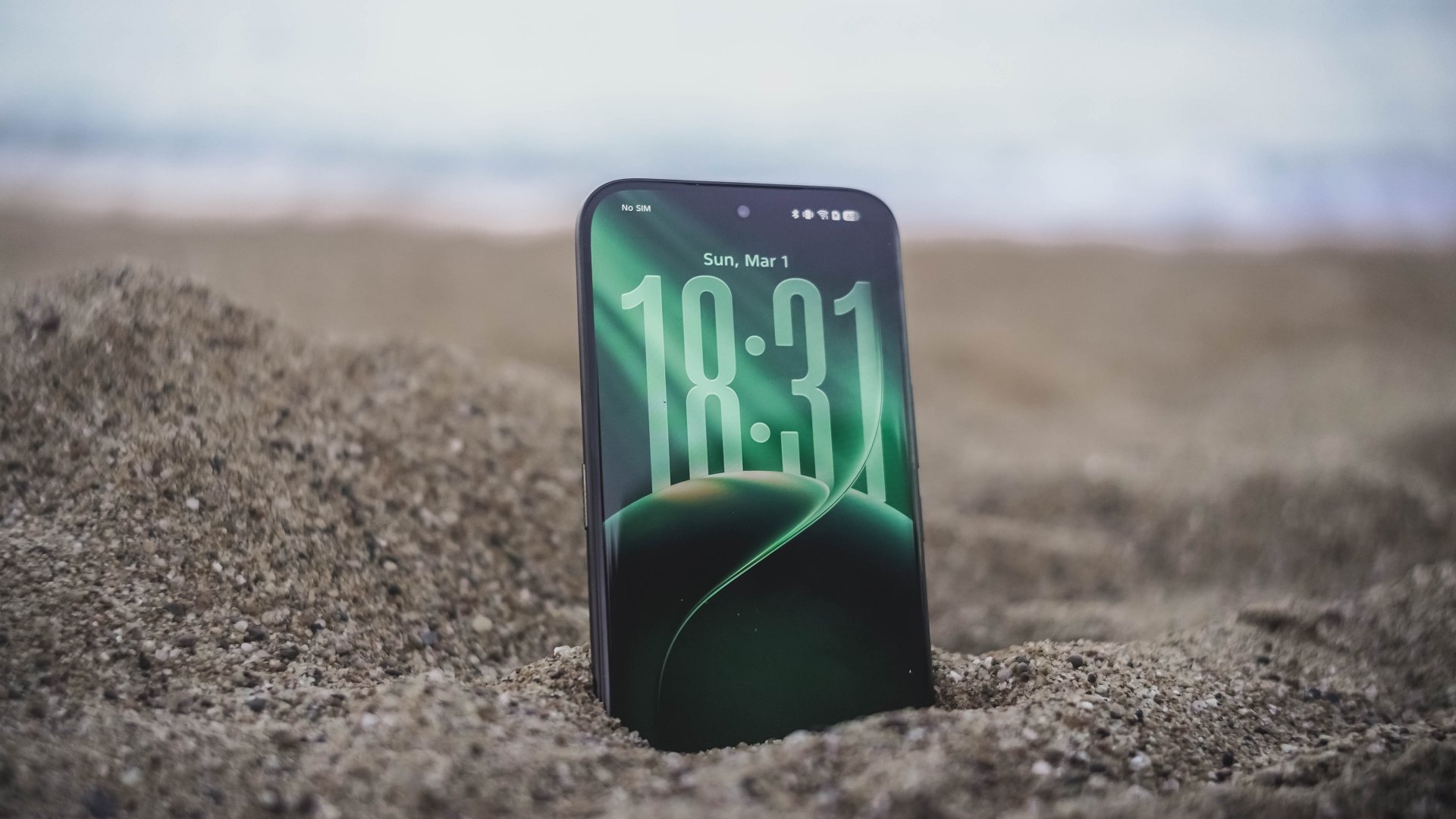
The first thing you notice about the Xiaomi 17 is how comfortable it feels.
Smartphones have steadily grown larger over the years, but the Xiaomi 17 brings things back to a more manageable size. It’s easy to grip, easy to carry, and easy to operate with one hand.
That might sound like a small thing, but it makes a big difference when you’re using the phone to take photos.
Pull it out of your pocket, frame the shot, press the shutter. The whole thing feels effortless. In many ways, it behaves more like a compact camera than a traditional flagship smartphone.

The design itself leans into that idea as well. The phone’s minimalist aesthetic, clean camera module, and smooth curves give it a polished but understated look.
Even the edges feel thoughtfully shaped, making the phone sit comfortably in your palm during longer shooting sessions.
It’s the kind of phone that doesn’t scream for attention — but once you start using it, it becomes difficult to put down.
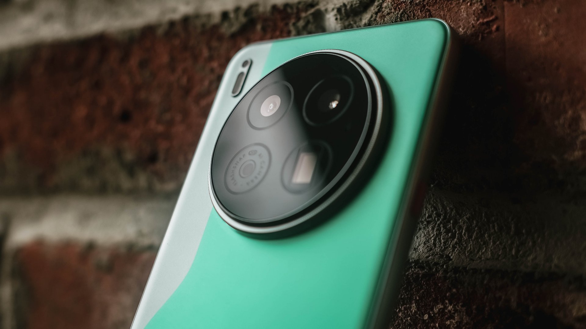
Essential Leica imagery
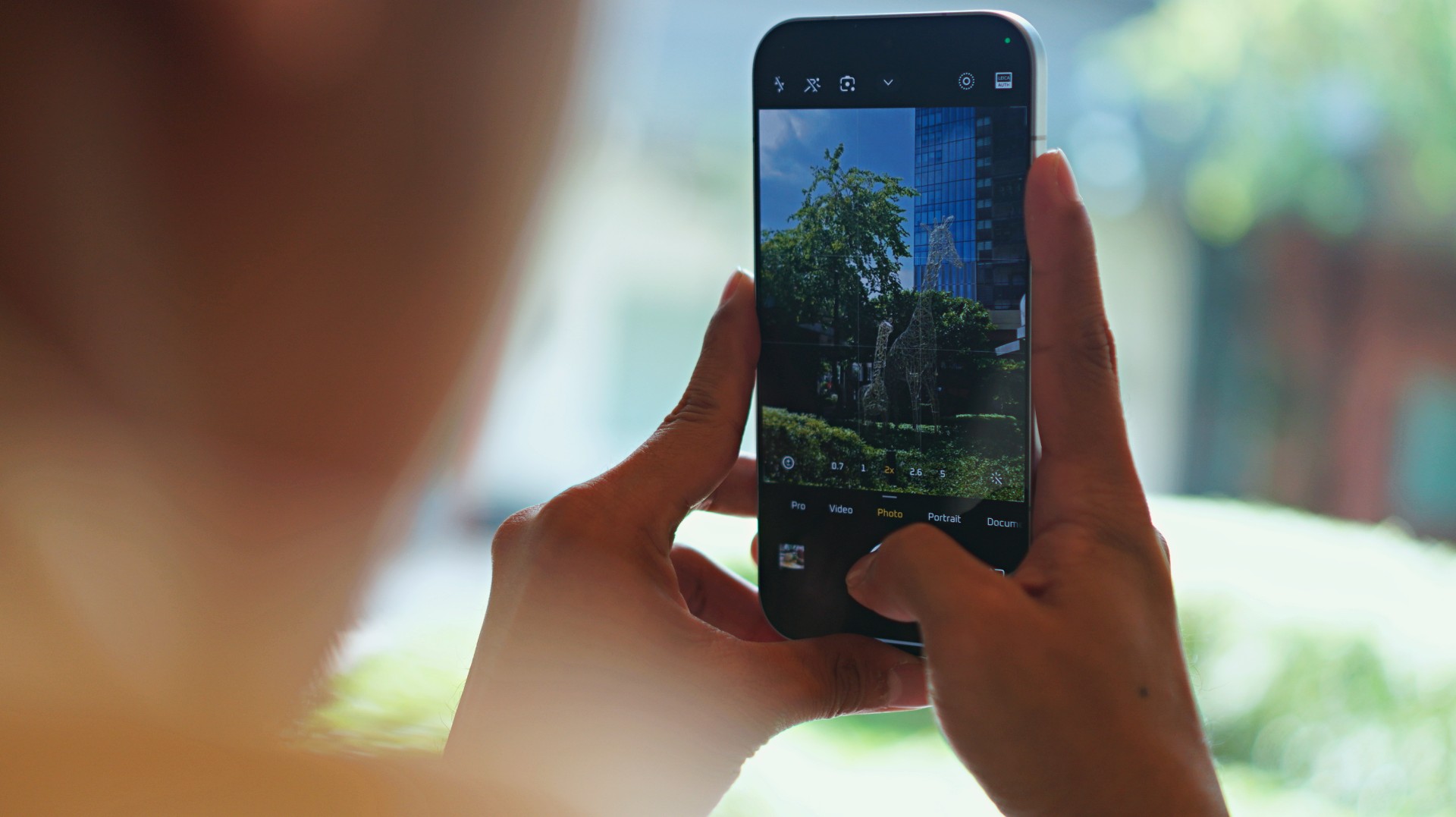
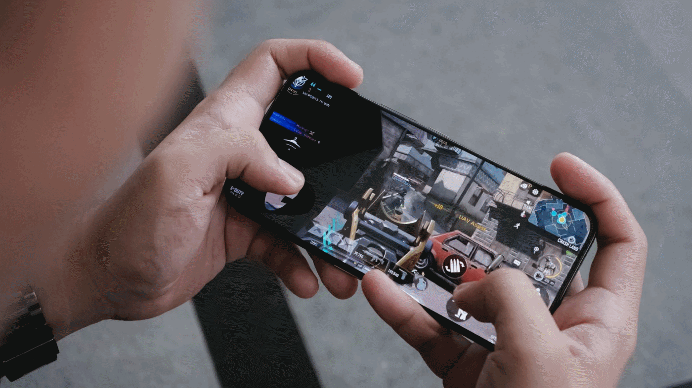
Mobile photography is where the Xiaomi 17 really shines.
It’s the kind of camera that inspires you to keep shooting. To keep capturing life stills with intent. And when the shots start coming together, that’s when you realize the Xiaomi 17 truly shoots Leica dream.
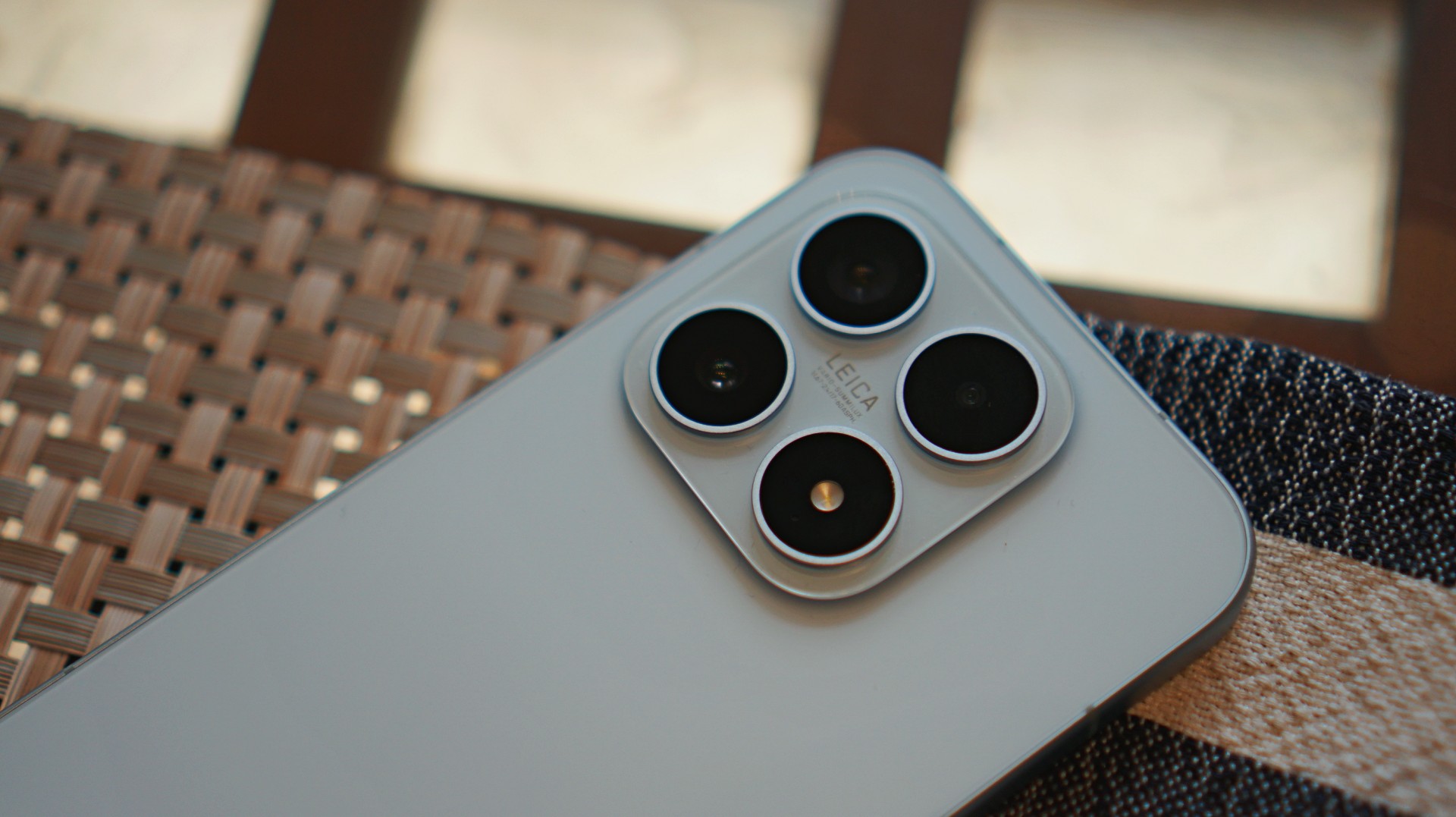
Co-engineered with Leica, the camera system focuses on capturing images with rich detail, balanced lighting, and distinctive color science.


Shots from the main camera look vibrant without feeling overly processed. Highlights stay controlled, shadows retain depth, and colors carry that signature Leica look — slightly dramatic, but still grounded in realism.
For everyday photography, the Xiaomi 17 excels.
During my time with the phone, I mindlessly walked around San Francisco taking as many sample photos as I could. Most of the time I was in a bit of a hurry, just snapping shots between stops. But even then, a surprising number of those photos still turned out pretty great. It’s the kind of camera that quietly saves moments you didn’t even think twice about capturing.


The zoom range isn’t the most extensive out there, but for most real-world scenarios — especially street photography and mid-range subjects — it delivers more than enough flexibility.
And because the phone itself is so comfortable to hold, it encourages you to take photos more often.
Changing the vibe after the shot
One of the coolest parts of the Xiaomi 17 camera experience is how playful it can be.
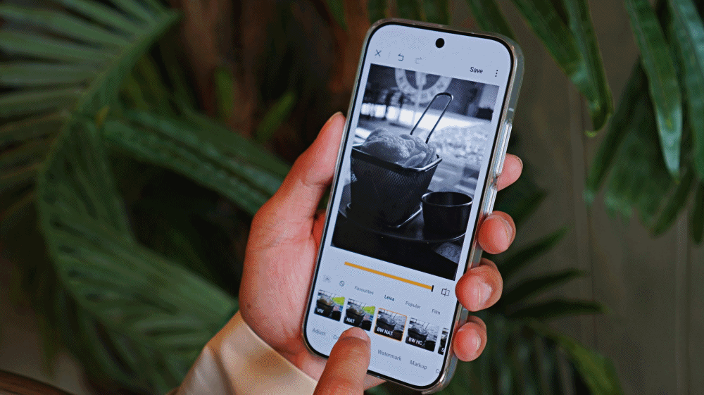
The Leica color profiles already give photos a distinctive look, but the phone also includes several creative filters that can dramatically change the mood of an image.
The existing filters look terrific. Aside from the Leica ones, personal favorites include Rhodium, Blues, Gourmand, and Cyberpunk.
What makes them even better is that you’re not stuck with the filter you used when taking the photo. After capturing the image, you can still change the style and instantly shift the entire vibe of the shot.


A photo that originally looked warm and cinematic can suddenly feel cooler and more dramatic. Another might turn vibrant and neon-like with a single tap.
It’s a simple feature, but it adds a lot of creative freedom to the photography process. And it turns editing into something enjoyable instead of something you feel obligated to do.
A compact phone with flagship power
Of course, great cameras are only part of the story.
The Xiaomi 17 runs on Qualcomm’s latest Snapdragon flagship processor, and in everyday use, that power is immediately noticeable.
Apps launch quickly. Multitasking feels smooth. Games run without hesitation.
More importantly, the performance feels consistent. Whether you’re editing photos, recording videos, or jumping between several apps, the phone rarely feels like it’s struggling to keep up.
It’s the kind of performance you expect from a flagship device — just delivered in a more compact body.
Although, during a humid day but still indoors, it did uncharacteristically heat up after taking a series of photos. Happened only once but worth taking note of.
Surprisingly strong media experience

The Xiaomi 17 may be smaller than many modern smartphones, but it still manages to deliver a strong media experience.
The display is bright, colorful, and smooth. Watching videos or browsing social media feels fluid and immersive.
Interestingly, I found that the screen works best in quieter, more relaxed moments.
When held at a distance, the compact display can sometimes make smaller details harder to see. But late at night, when the lights are down and you’re catching up with shows or doom-scrolling through your feeds, the experience becomes surprisingly cozy.
I used it mostly to catch up with what XG has been putting out lately. Their track “Rock the Boat” is going platinum on my playlist.
The stereo speakers deserve a shout-out too.
Despite the phone’s more diminutive size, the speakers pack a surprising amount of punch. Music, videos, and games all sound fuller than you might expect from a phone this compact.
Battery life that keeps up

Compact phones sometimes struggle with battery life, but that’s not the case here.
The Xiaomi 17 packs a large battery that easily carries the phone through a full day of typical use.
Photography sessions, social media browsing, streaming videos, and occasional gaming didn’t seem to drain it too aggressively.
And when you do need to recharge, Xiaomi’s fast charging technology means the phone powers up quickly.
Short charging sessions can already restore a significant amount of battery life, making it easy to keep the phone ready throughout the day.
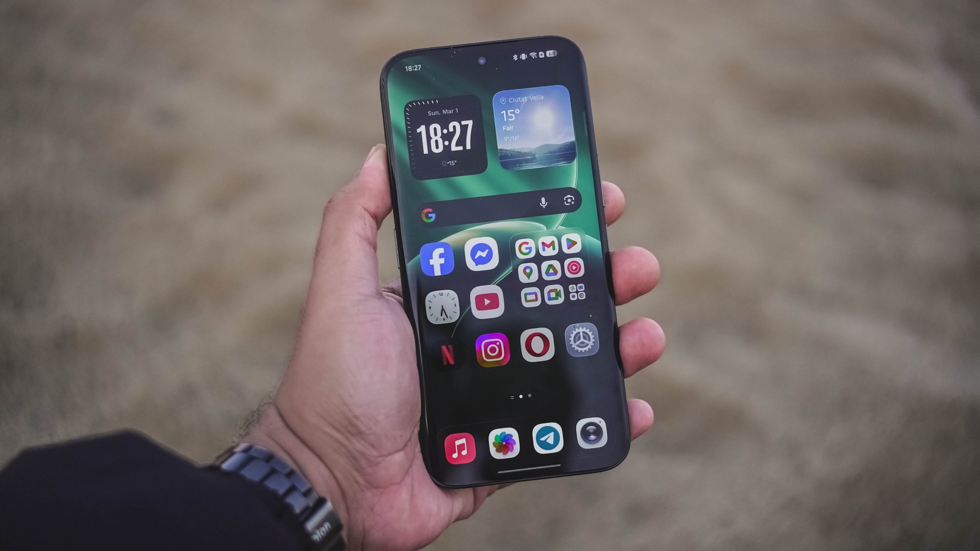
HyperOS and the familiar Xiaomi quirks
The Xiaomi 17 runs on HyperOS, Xiaomi’s latest software platform designed to connect its growing ecosystem of devices.
The system is fast and visually polished, but it does come with some familiar quirks.
By now, many users are already familiar with the bloatware and occasional ads that appear within certain system apps.
It’s something that has long been associated with Xiaomi’s software experience, and while it has improved over time, it hasn’t disappeared entirely.
Another observation is how the interface design can sometimes feel reminiscent of older smartphone aesthetics.
These are relatively minor nitpicks in the grand scheme of things, but they are still worth mentioning.
Thankfully, they don’t get in the way of the phone’s core strengths.
Xiaomi 17 specs
Display: 6.3-inch OLED, 1–120Hz refresh rate
Processor: Snapdragon 8 Elite Gen 5
RAM: 12GB
Storage: 256GB / 512GB
Battery & Charging: 6330mAh, 100W wired charging, 50W wireless charging
Size: 151.1 x 71.8 x 8.06mm, 191g
Cameras
- 50MP main camera
- 50MP telephoto
- 50MP ultra-wide
- 50MP front camera
Is the Xiaomi 17 your GadgetMatch?
The Xiaomi 17 works because it focuses on the right things.
It delivers strong performance, dependable battery life, and a camera system that genuinely encourages creativity.
More importantly, it makes photography enjoyable.
Between the Leica color science, the flexible filters, and the comfortable size, it’s a phone that invites you to take photos more often.
If you care a lot about mobile photography without compromising overall performance, the Xiaomi 17 is an easy Swipe Right.
It’s also a great option for people who prefer smaller phones but still want something that feels like a true flagship.
And if the idea of carrying a Leica-inspired camera in your pocket sounds appealing, the Xiaomi 17 might be exactly that.
A phone that turns everyday moments into photos that feel a little more Leica dream.
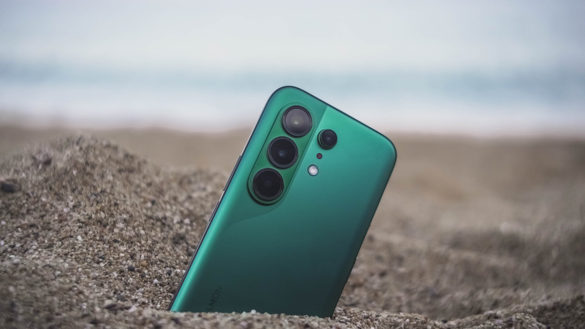
With phone brands suddenly changing their naming scheme superlatives, TECNO also decides to jump on the bandwagon with the ubiquitous “Ultra” labeling.
Ditching that truly unique “Premier” branding, 2026 ushers in a new era with the all-new CAMON 50 Ultra. But is it “Ultra” enough to dissolve its Premier line?
Felt that svelte
After having to experience the last two premium midrangers by TECNO, I was surprised by how they’ve shaken things up.
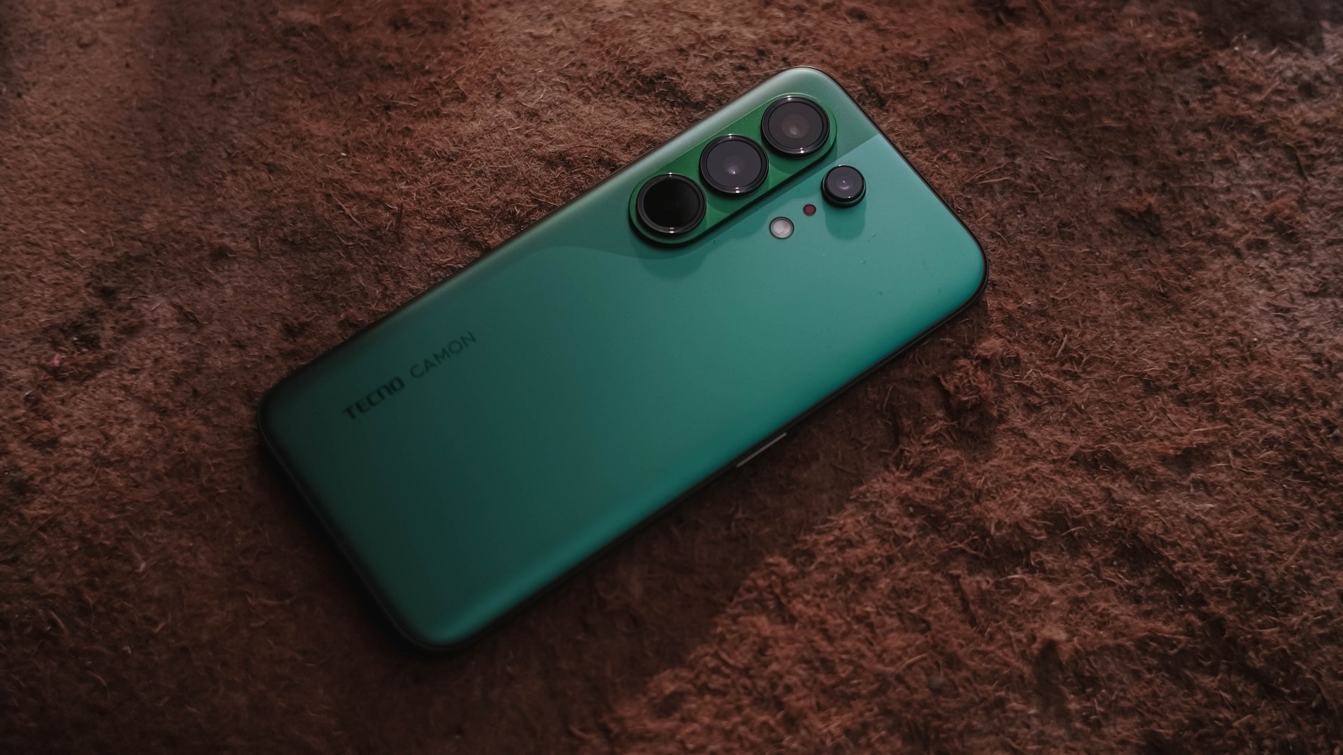
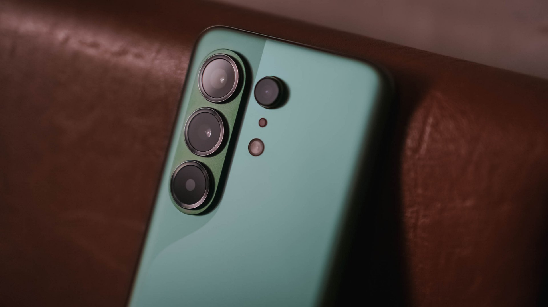
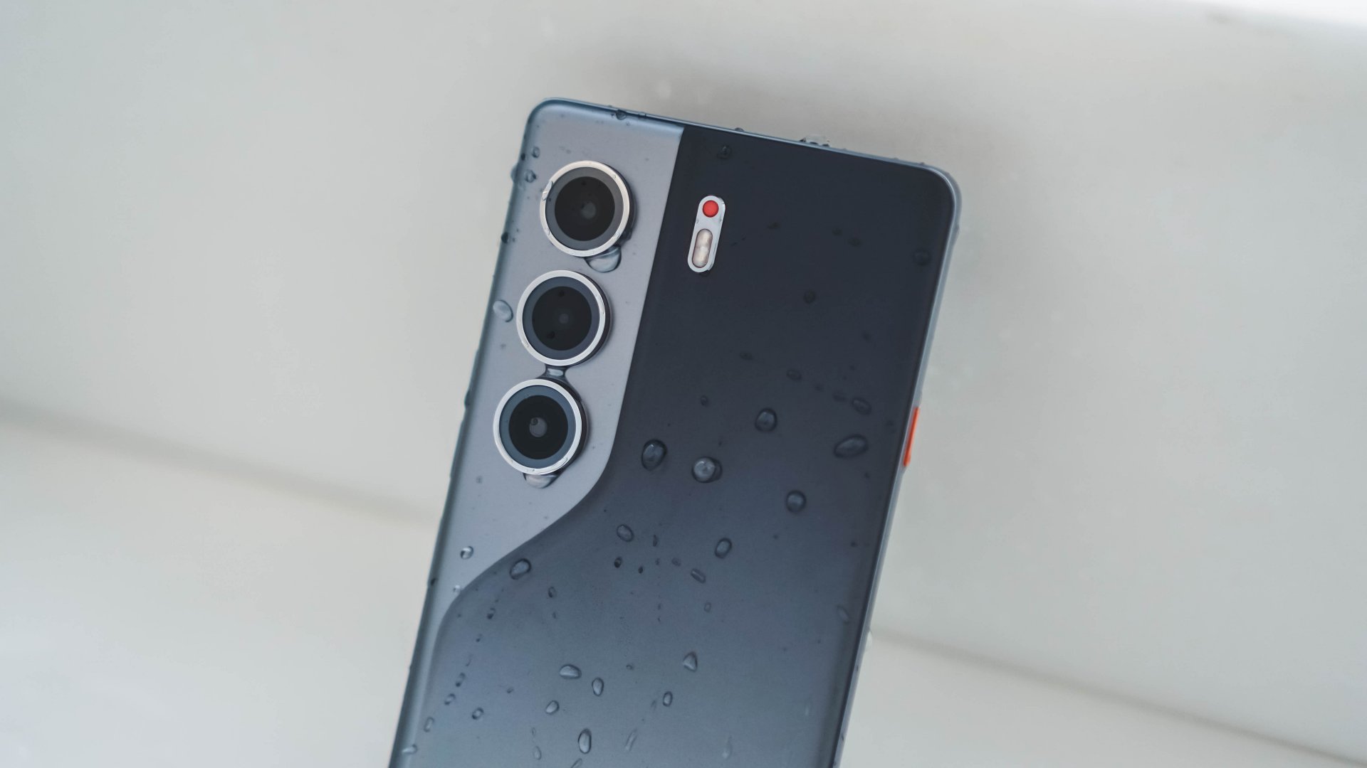
The most evident change is its back. This year’s CAMON 50 series all share the same design cues, regardless if it’s the base, Pro, and the newer Ultra model.
This not only ditches that signature, premium-looking circular camera cutout two generations in a row, all models are also hard to distinguish from one another.

As a visual guy, it felt like TECNO’s CAMON 40 and Samsung’s Galaxy S26 had a forbidden relationship — with the CAMON 50 being the child out of wedlock.
Still, I’m glad TECNO kept that distinct swan-neck curve which I truly admire since the CAMON 30 lineup.
![]()
However, looks are just part of the story. The moment I held the CAMON 50 Ultra for the first time, I felt nothing but featherweight lightness. While it’s subjective, personally, I love how I was able to hold it without feeling too bummed by its sheer size.
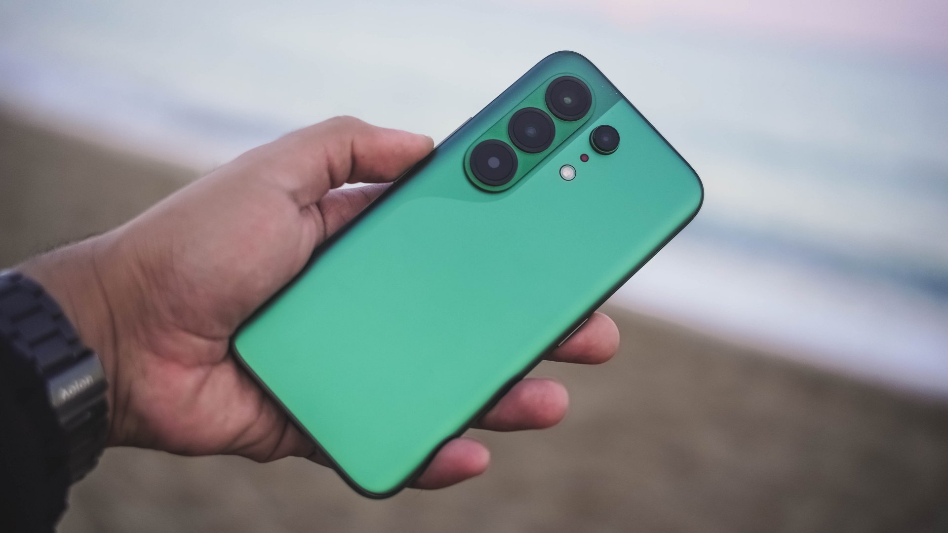
And, even with that lightweight-ness, holding it for long still felt premium to the touch — especially with its glass back.
Those dual-curved edges don’t feel sharp and are gentle in my palms.
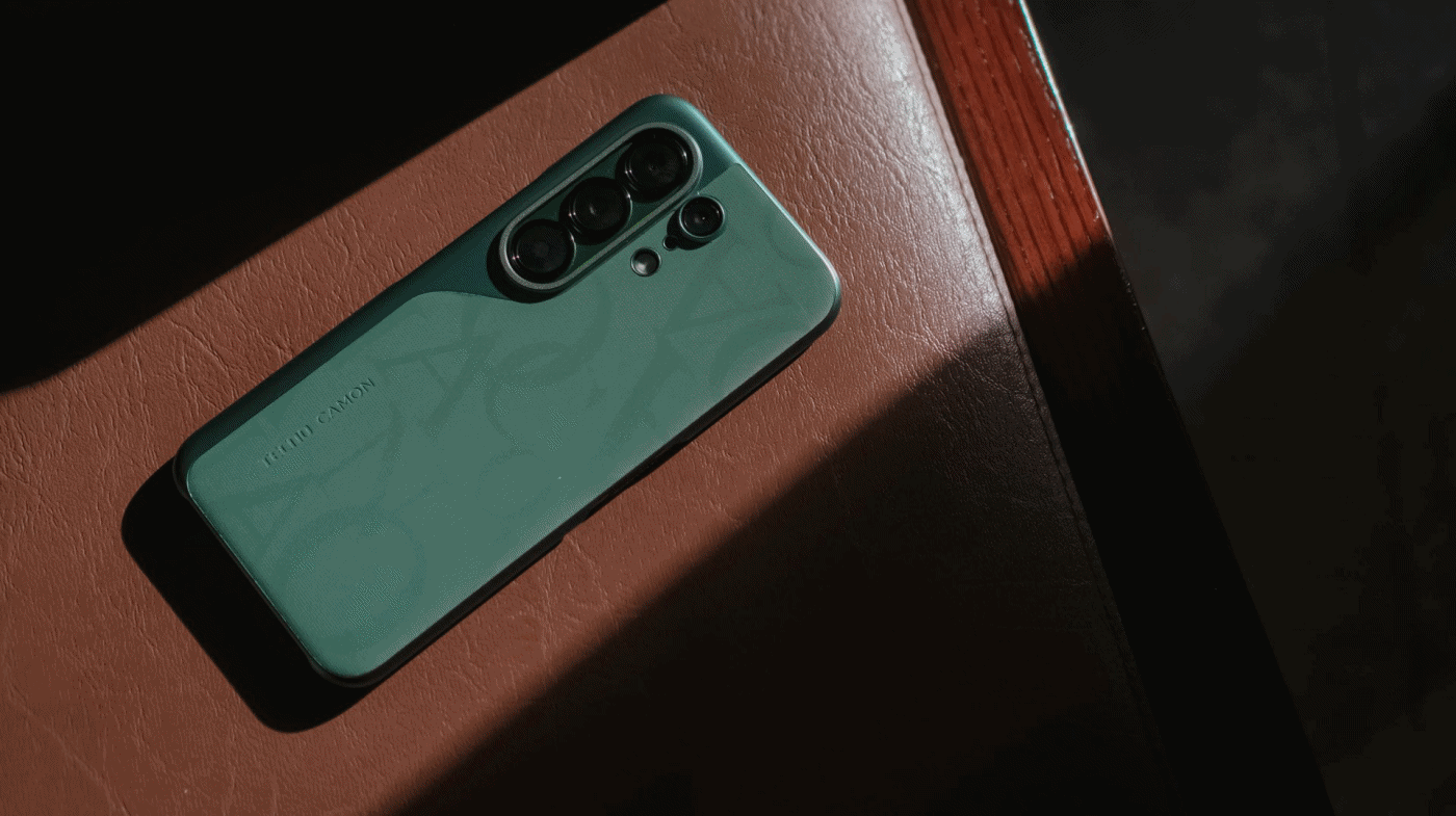
And while we’re still here, I want to commend how TECNO bundled this lavish-looking case that most (if not all) phone brands fail to provide.
Praiseworthy performer
Beneath that premium-feeling backing lies MediaTek’s Dimensity 7400 Ultimate SoC.
For those who keep stereotyping chip makers saying MediaTek is always a step behind from Qualcomm, it’s your brand bias kicking in.
As we always say, we don’t rely on benchmarks here. Still, here’s the list if you wanted to deep dive into all that nerdy stuff.
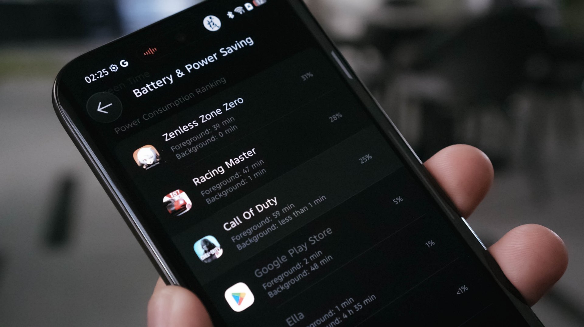
With that out of the way, let me be precise and concise with my real-life experience. Setting the bar high, this 4nm Dimensity chip is still a better performer than the Snapdragon 7s Gen 4-equipped POCO M8 Pro I reviewed at the start of 2026.
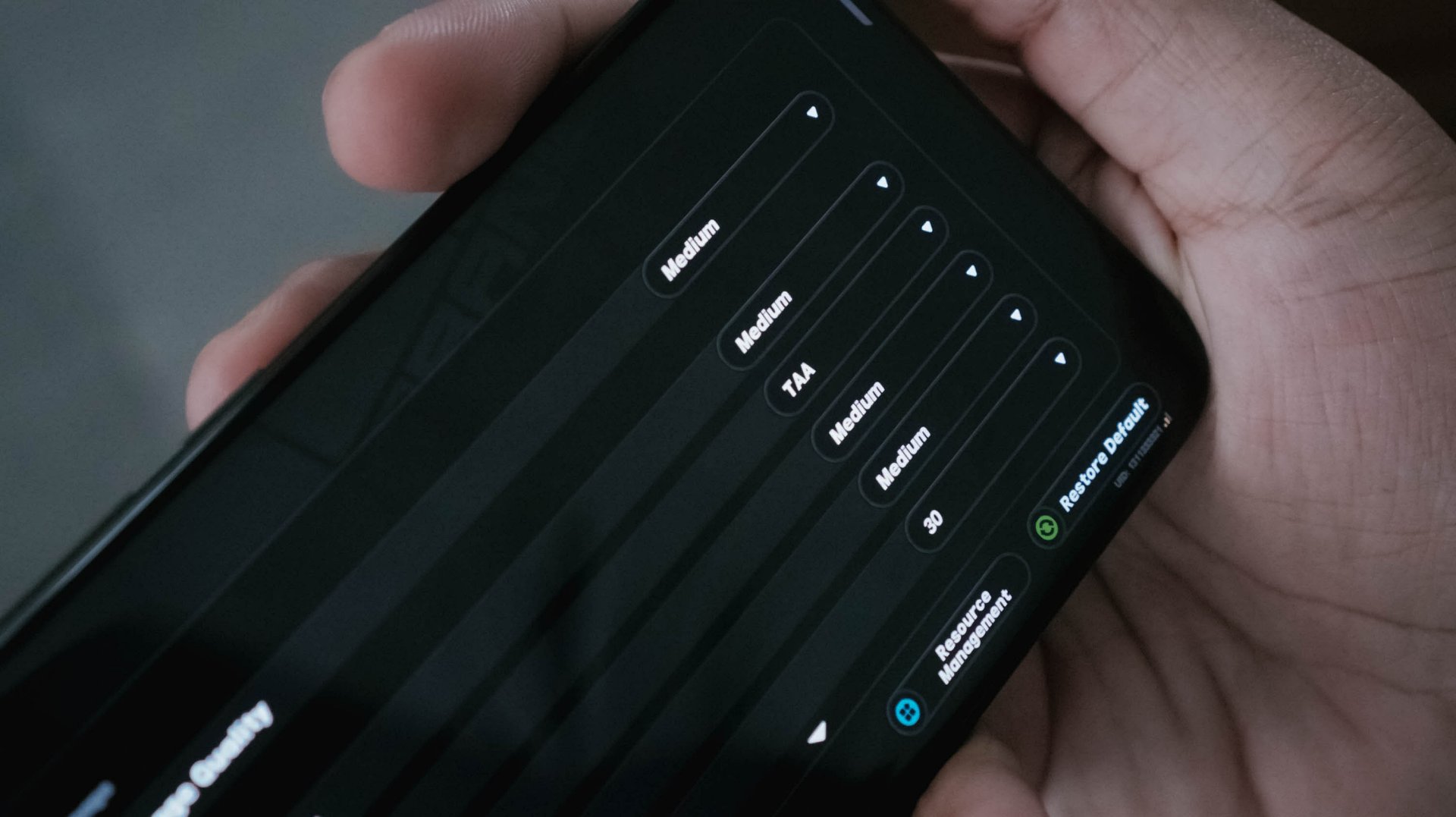
With HoYoverse’s Zenless Zone Zero as a prime example, I was able to run the game here in a more modest Medium settings. The Snapdragon chip I mentioned? It runs in the lowest resolution by default.
Result? The CAMON 50 Ultra performed smoother with less game hiccups compared to its POCO rival.
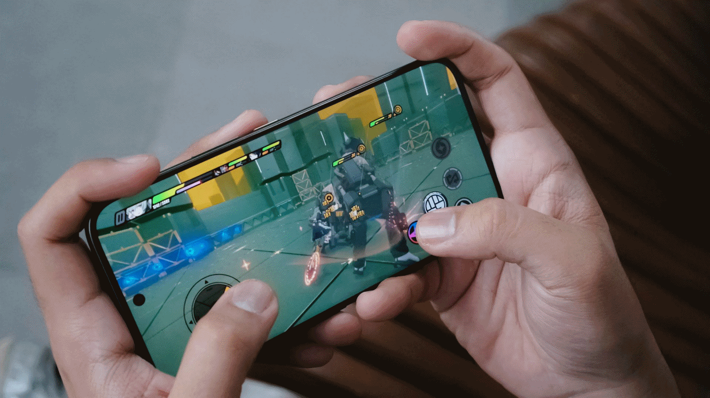
For utmost fairness, I also played two other games I’ve played in that previous write-up.
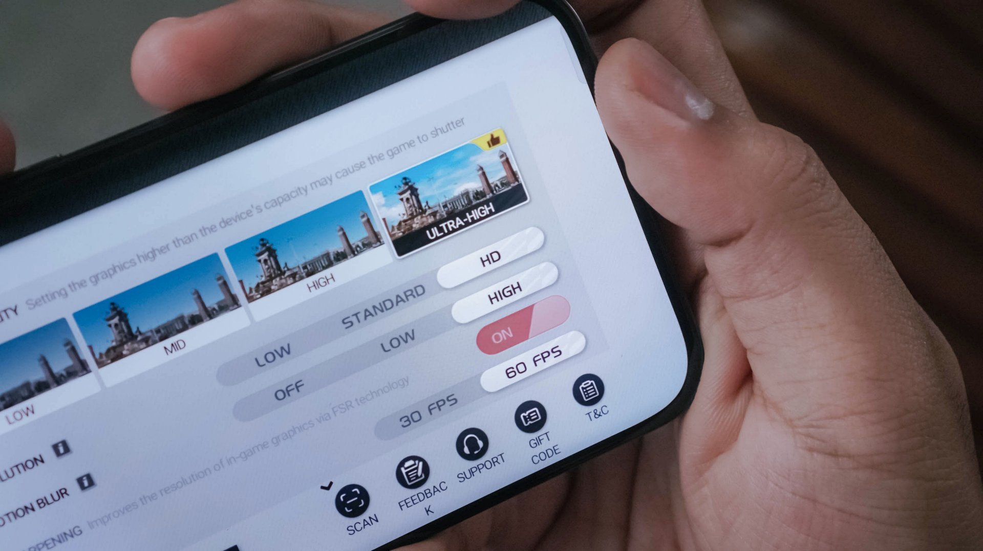
Another one is Racing Master running on Ultra-High graphics along a 60fps frame rate.
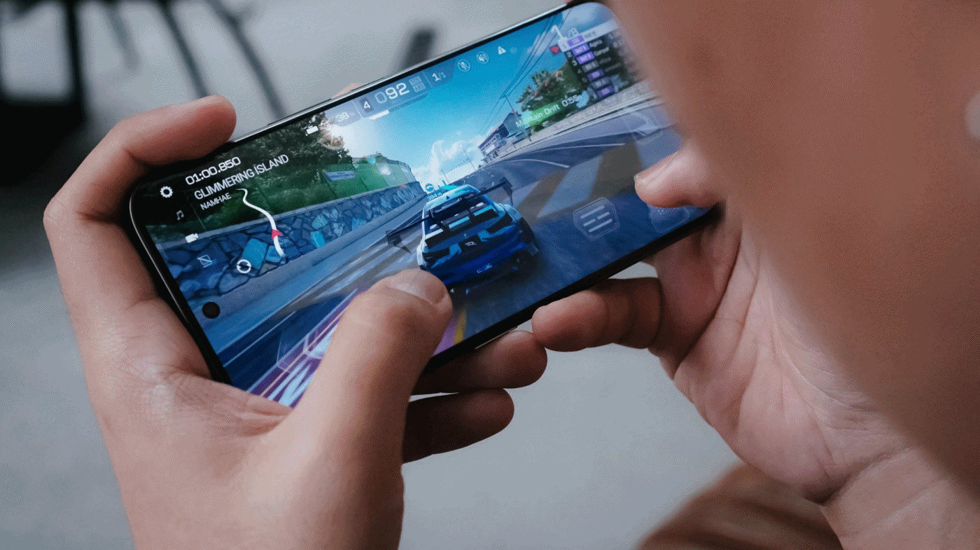
While the POCO M8 Pro suffered heavily during the first two ranked races with severe throttling, the CAMON 50 Ultra breezed through with ease.
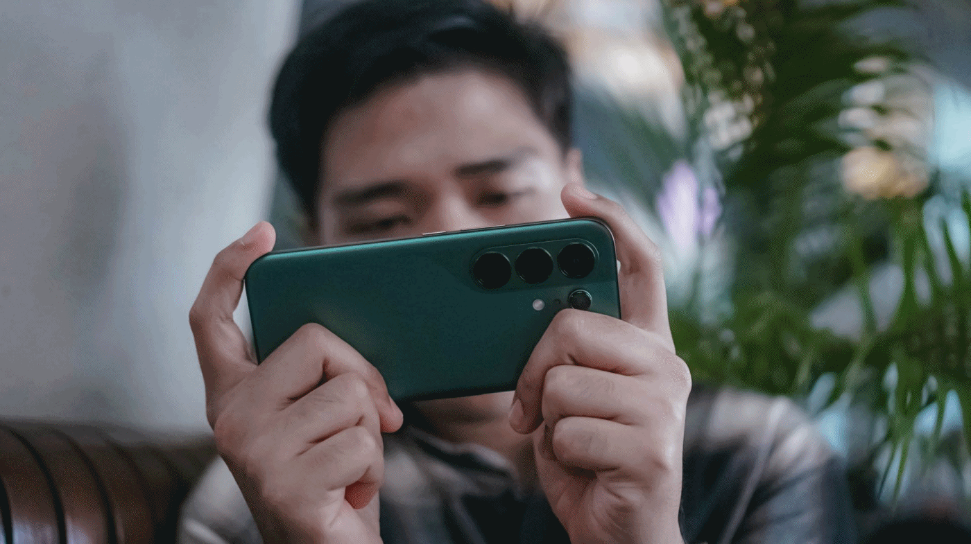
It’s given though that CoDM (Call of Duty: Mobile) will run well in both phones. Luckily, the CAMON 50 Ultra also offers that slippery-smooth 144Hz refresh rate to fast-track opponents’ movements without jitters.
Heat is always the by-product of energy. For an hour of gaming, of course that heat can be felt especially when your games run in the most extreme setting possible.
The only downside for me is, again, the lack of a bigger 512GB storage. With all the chunk of data we get nowadays, it’s easy to fill up that storage. Also, the lack of eSIM support which further hinders network compatibility when used in other countries.
Fascinating familiarity
Love it or not, phone brands have followed the “Liquid Glass” trend. TECNO isn’t an exception to that with the newly-refined HiOS 16 based on Android 16.
This is a welcome change I’m willing to embrace. Apple bringing back Frutiger Aero-like aesthetics is honestly a breath of fresh air. After all, I’ve been a huge fan of such translucency most especially during its peak with Windows Vista back when I was in 4th grade.
Also, maybe I just got fed up when minimalism dominated each and every part of the world like a wildfire.
Sentiments aside, HiOS 16 isn’t just about polished looks and keeping up to the trend. Overall feel is smoother and more responsive compared to its past releases.
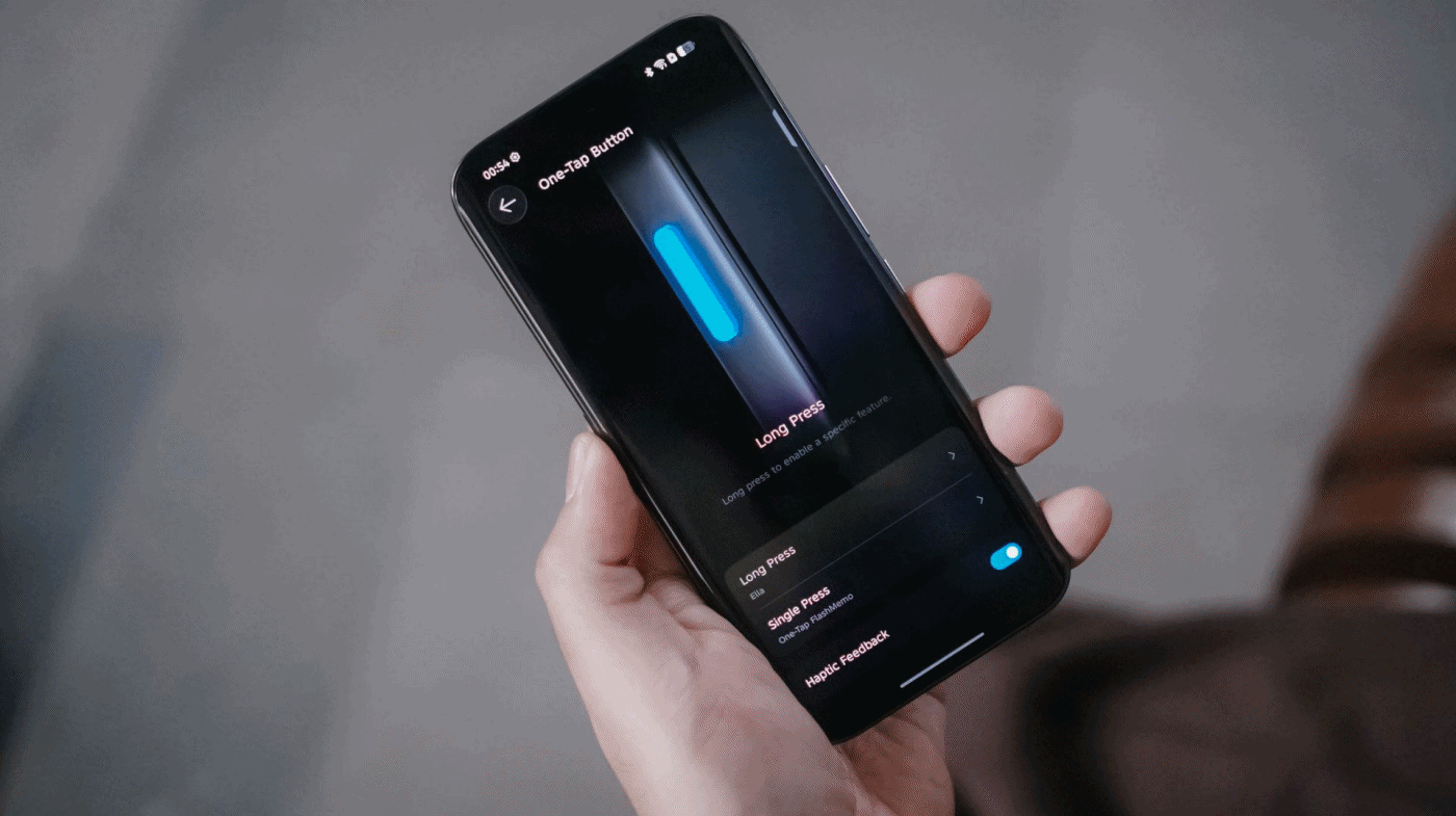
They have also kept the best things around — including the One-Tap button found on the phone’s left side that can be triggered through single or long presses.
Single press activates the new One-Tap FlashMemo. This is where TECNO AI analyzes what’s on your screen and stores it in its megamind.

The latter is system-configurable — even if it’s a game you wanted to play. That’s something other brands will hinder you from doing so.
Unlike last year though, TECNO moved the button further down so it’s more reachable by everyone’s fingers.
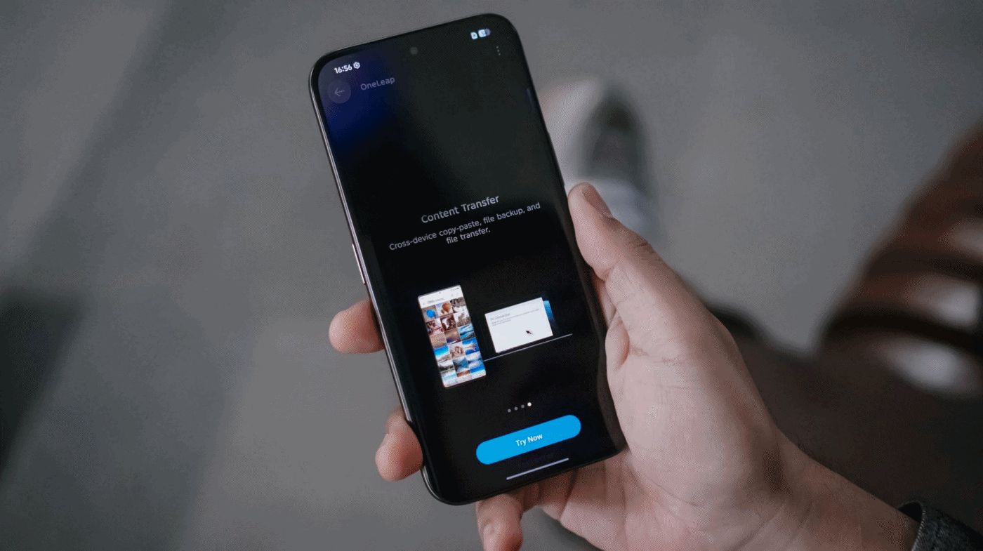
Another direction TECNO tries to move forward with: cross-connectivity between your host of devices.
With OneLeap Collaboration, this enables you to manage multiple devices into one. It enables both content transfer and multi-screen connection in just one hub.
And no, this isn’t limited to just TECNO devices. It even stores info of my appliances that can be controlled through the phone itself via IR (Infrared).
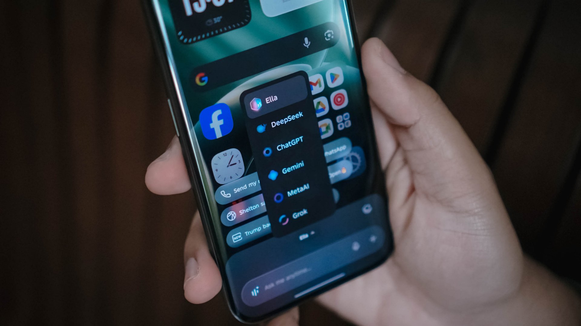
Other than the presence of Google’s Gemini and Circle to Search, Ella is still here to stay. By default, it can be summoned by long-pressing the power button.
And, unlike other AI assistants, TECNO gives you the freedom to choose whatever AI engine you prefer, whether that’s ChatGPT, DeepSeek, Gemini, MetaAI, or the ever-intriguing Grok.
Now Playing: The Art of Sarah
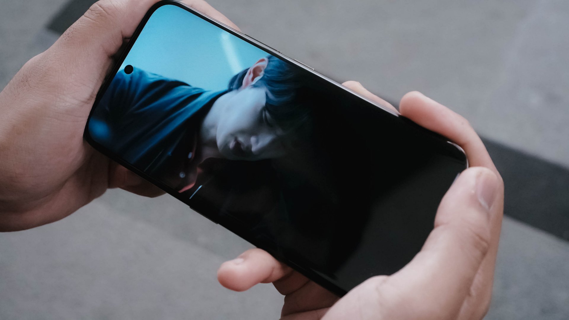
One K-Drama after another, The Art of Sarah instantly hooked me in during its Netflix premiere.

Much like how auspicious Sarah Kim is (and all her persona), the 6.78-inch AMOLED display of the CAMON 50 Ultra is crazily alluring to the eyes with some tomfoolery going on.
The bezels, while not as thin like the rest of the competition, still feels right for the eyes.

The 41-year-old Lee Junhyuk is aging like fine wine. I MEAN, LOOK!
Despite those gloomy and sulky tones, the three actors in the drama made me watch the series even more — which made me admire how fine their visuals are.
And unlike the cold corpse of “Sarah Kim” in the sewer who failed to survive that cold temperature, this phone is of the opposite. TECNO’s CAMON 50 Ultra can withstand temperatures as cold as -20ºC and as extreme as 45ºC.

New celebrity crush (again)
The CAMON 50 Ultra’s front is protected by Corning’s Gorilla Glass 7i. For an affordable midranger, that’s still a big win as others of the same league have nothing at all.
Now that we’re here, it’s also worthy to point out that the CAMON 50 Ultra not only boasts IP68 and IP69 water and dust resistance ratings, it’s also improved to IP69K. This makes it a tougher phone that can withstand even high-pressure water jets or sprays.
On Queue: Hearts2Hearts’ RUDE! + XG’s THE CORE
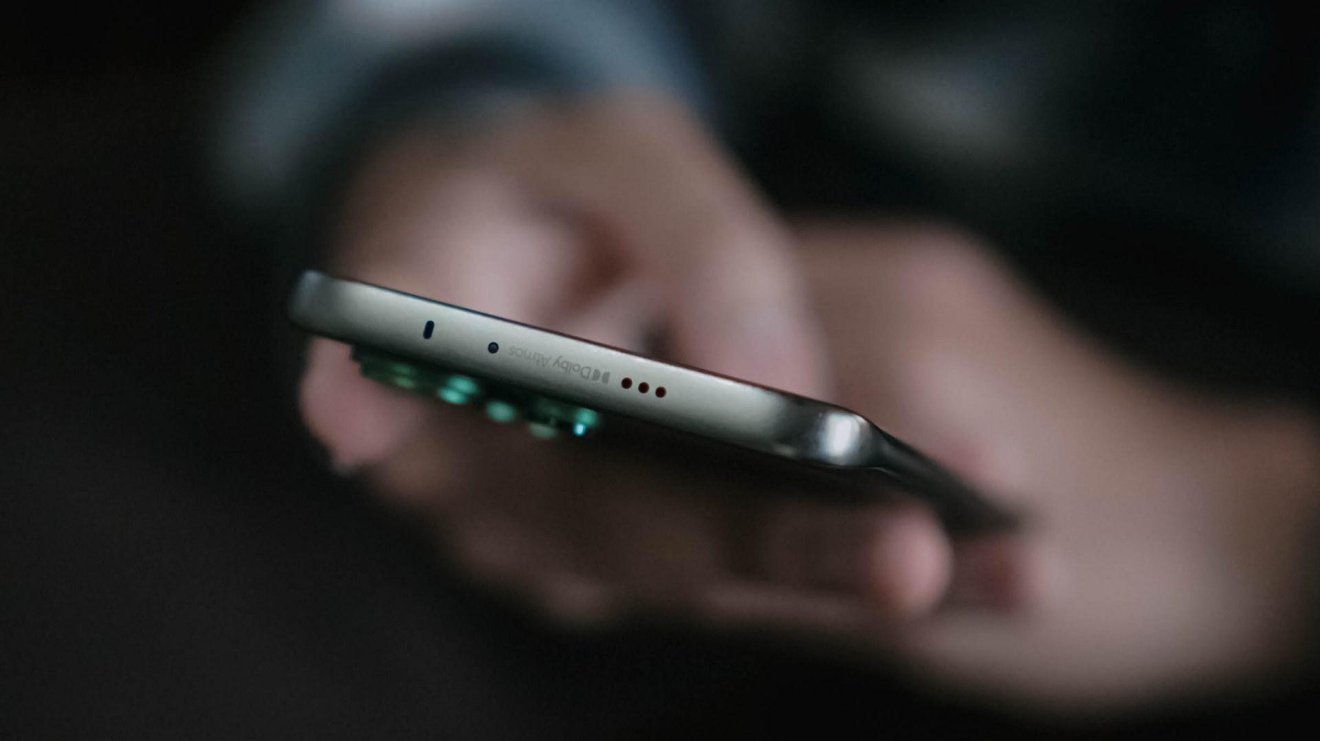
Of course, it wouldn’t be complete without testing out its speakers. On paper, it has a stereo speaker setup powered by Dolby Atmos.
As the iconic line of Hearts2Hearts’ (H2H’s) “Stella” in RUDE! : “Boy, does it look like I could care? I couldn’t even care less!” It felt like the CAMON 50 Ultra embodies the same spirit. As long as it’s loud enough, it begs to get in all the way.

In real-life, the speakers are loud enough to fill in your empty room. However, my nitpicky ears can easily tell that the bass isn’t that deep. More so, sound gets distorted once it reaches above 80%.
I tried comparing it to my other phones and my observations were right all along.
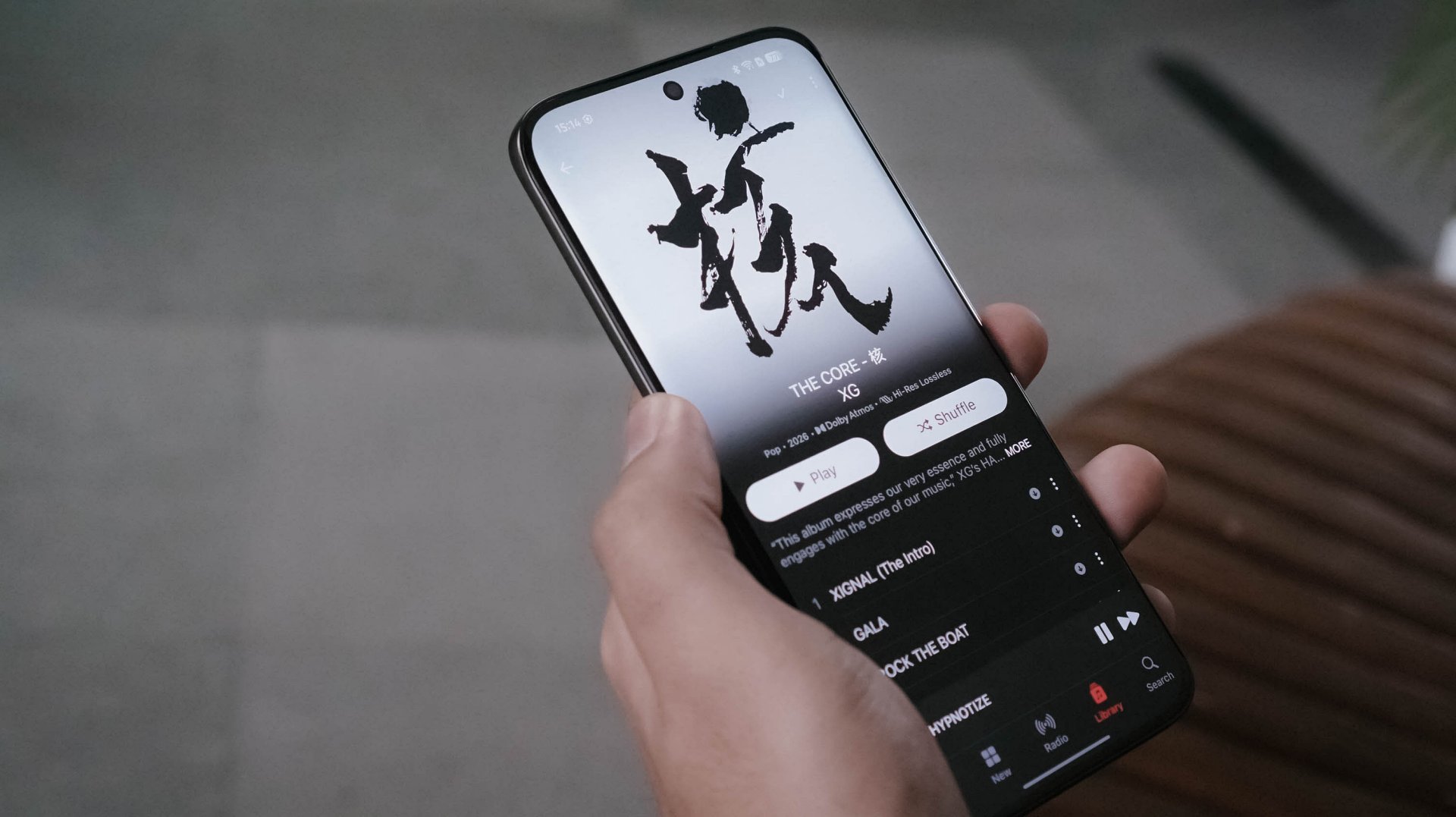
Even when I tried playing lossless versions of the full THE CORE album by XG in Apple Music, the same thing persists.
In songs like 4 SEASONS and TAKE MY BREATH, that loudness sounds alright as the songs are more into the solemn side. However, playing tracks like GALA and O.R.B, they instantly become a sore in the ears. Highs, mids, and lows all get distorted.
Not sure if this is just my unit though. Hopefully, TECNO can also work on improving their phones speakers in future iterations.
Still that solid snapper
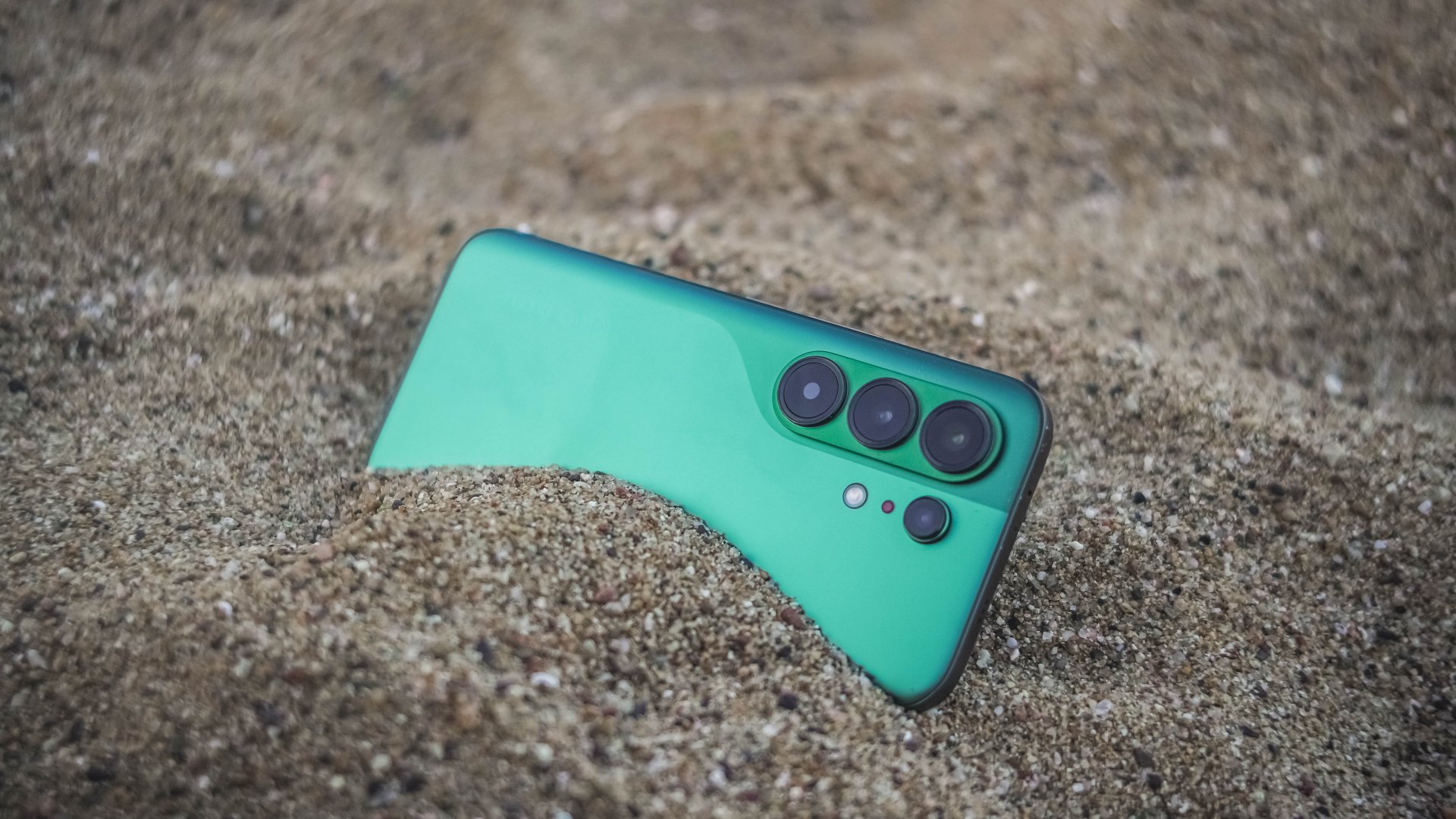
ICYMI, TECNO’s CAMON 40 series last year (except Premier) all shared the same main camera sensor.
The same story happens this year as all CAMON 50 models are still equipped with a 50MP Sony LYT-700C image sensor. As the saying goes: if it ain’t broke, don’t fix it.


And with the same sensor, the CAMON 50 Ultra will still be able to provide crisp and rich 2x shots even if it relies on in-sensor cropping.


Surprisingly, CAMON 50 Ultra’s 50MP 3x telephoto zoom module (85mm equivalent) is also found in the CAMON 50 Pro. Last year’s Pro models don’t have any.


In subjects that are really far away, the CAMON 50 Ultra delivers consistently.

While other brands fail to provide consistent colors between its cameras, the CAMON 50 Ultra begs to differ.


Speaking of color consistency, TECNO’s trio color styles (or profiles) are still there. However, it’s now tucked inside the lower collapsable menu unlike before where it’s exposed at the upper right top.
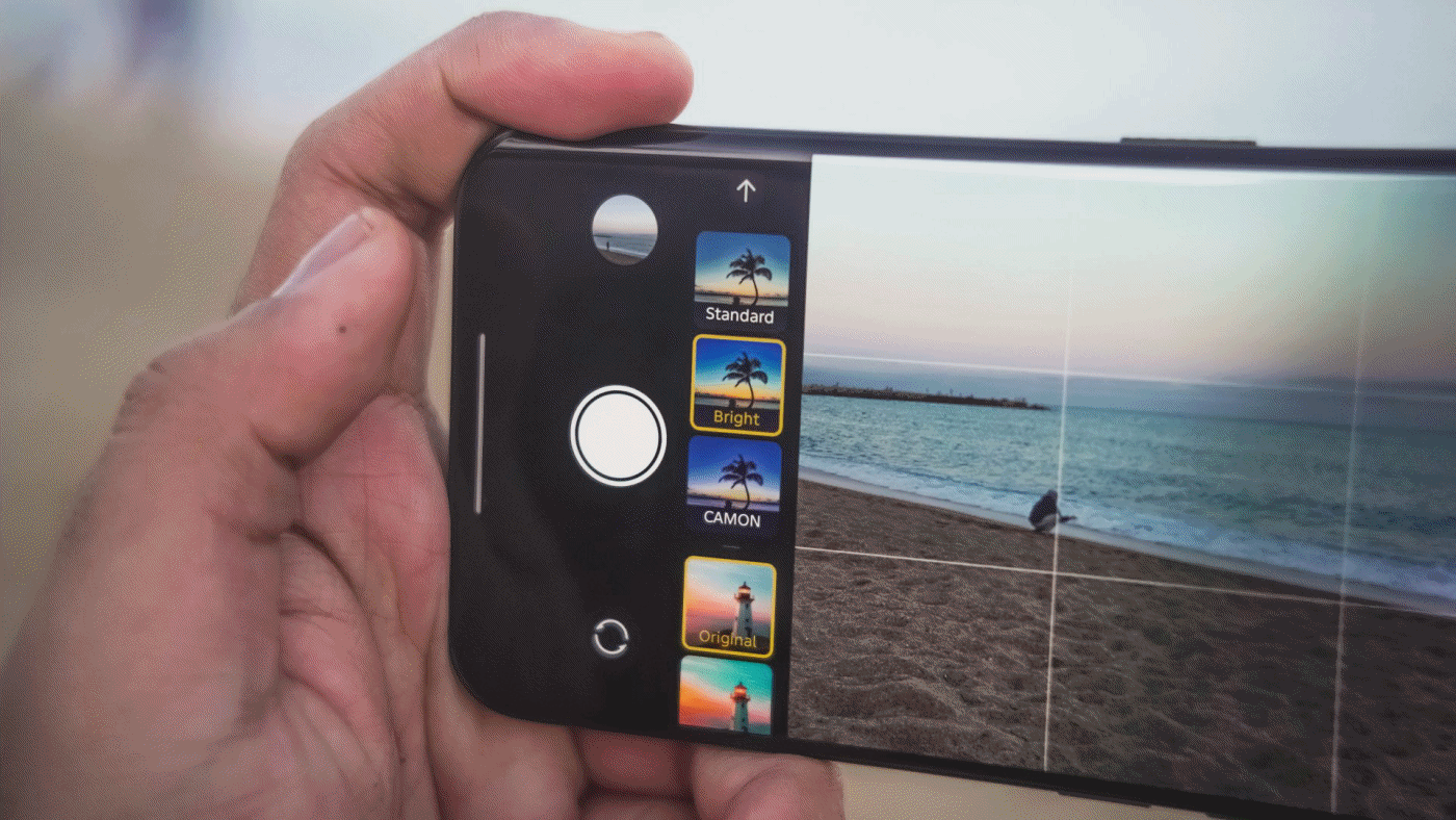
That has been replaced by a new feature they call “AI Auto Zoom” for better re-framing of shots even without hitting the shutter button.
Regardless, the looks are still the same like previous generations: Standard for a balanced look, Bright for more vibrant shots, CAMON for that subdued, soulful look.

Regardless of the focal length you choose, these color profiles should work.

One complaint when using the telephoto zoom? Its minimum focusing distance.
Other smartphones have telephoto zoom that works within closer ranges. But, the CAMON 50 Ultra struggles when doing so. It clearly reminded me of the periscope telephoto shooter found in last year’s CAMON 40 Premier with the same issue.


The only “fix” for this is to switch to the 85mm focal length (instead of 70mm). By backing up from your subject a little bit, you can take zoomed shots that are still closer in distance.
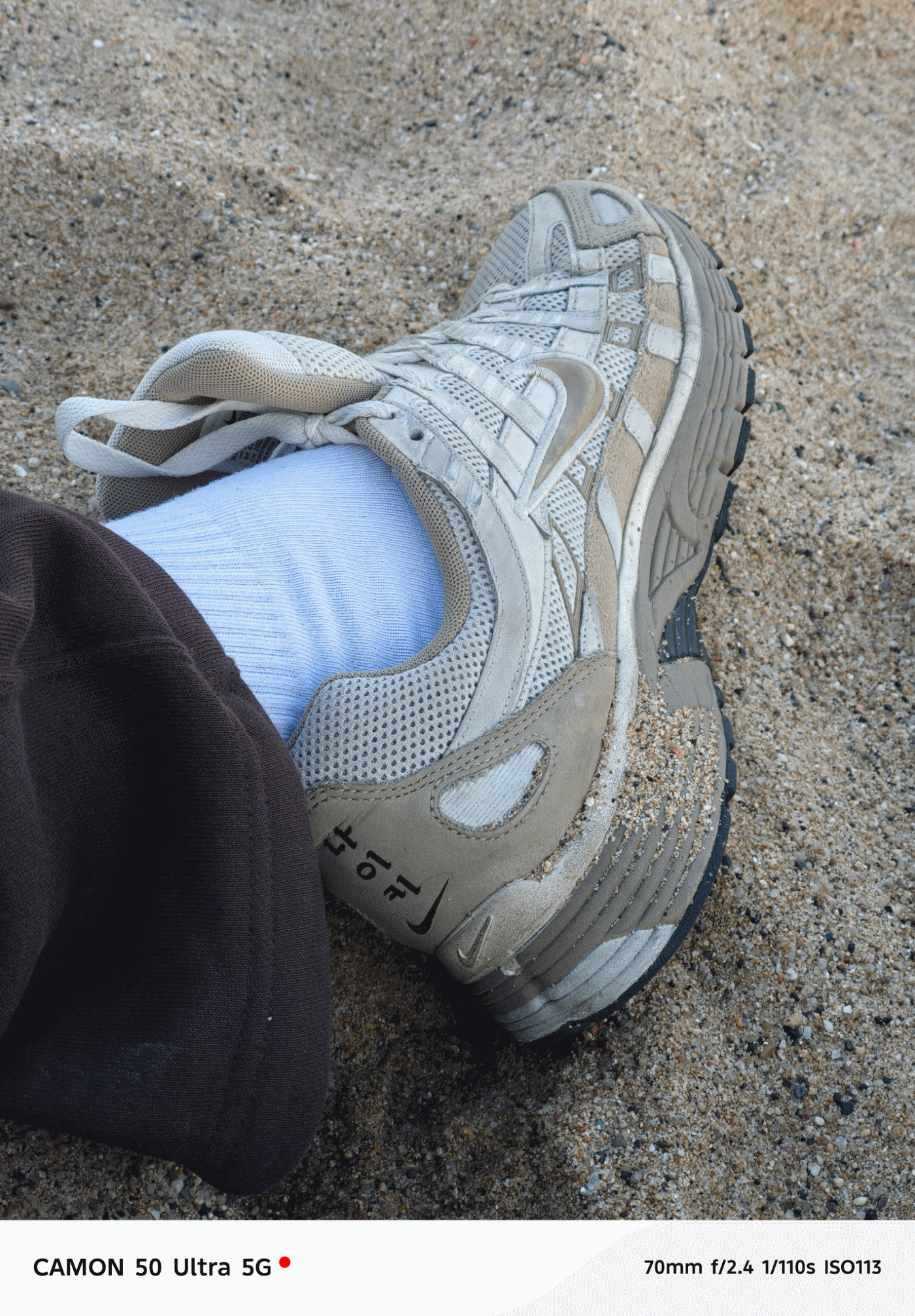
But, the best camera feature found in this midranger wonder? Its none other than its FlashSnap capabilities that lets the phone snap photos even before you click that shutter release.


I wouldn’t able to take these stellar shots without TECNO’s wonderful feature. Barcelona’s beach gulls are the (un)paid actors here for letting me snap these picture-perfect photos in a time freeze.


They have improved it this year too as it’s now capable of zooming in as much as 5x. It was limited to 3x on last year’s CAMON 40 Premier and 2x on the Pro model.


BONUS: Instant time-freeze with these crazy-fast toy cars during TECNO’s Booth Tour at MWC 2026

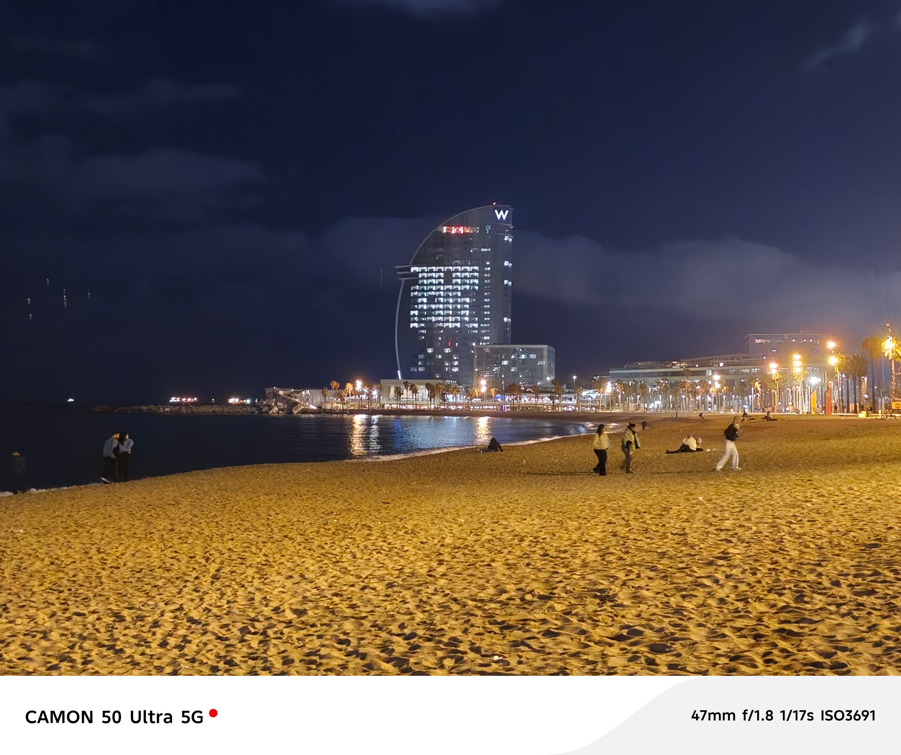
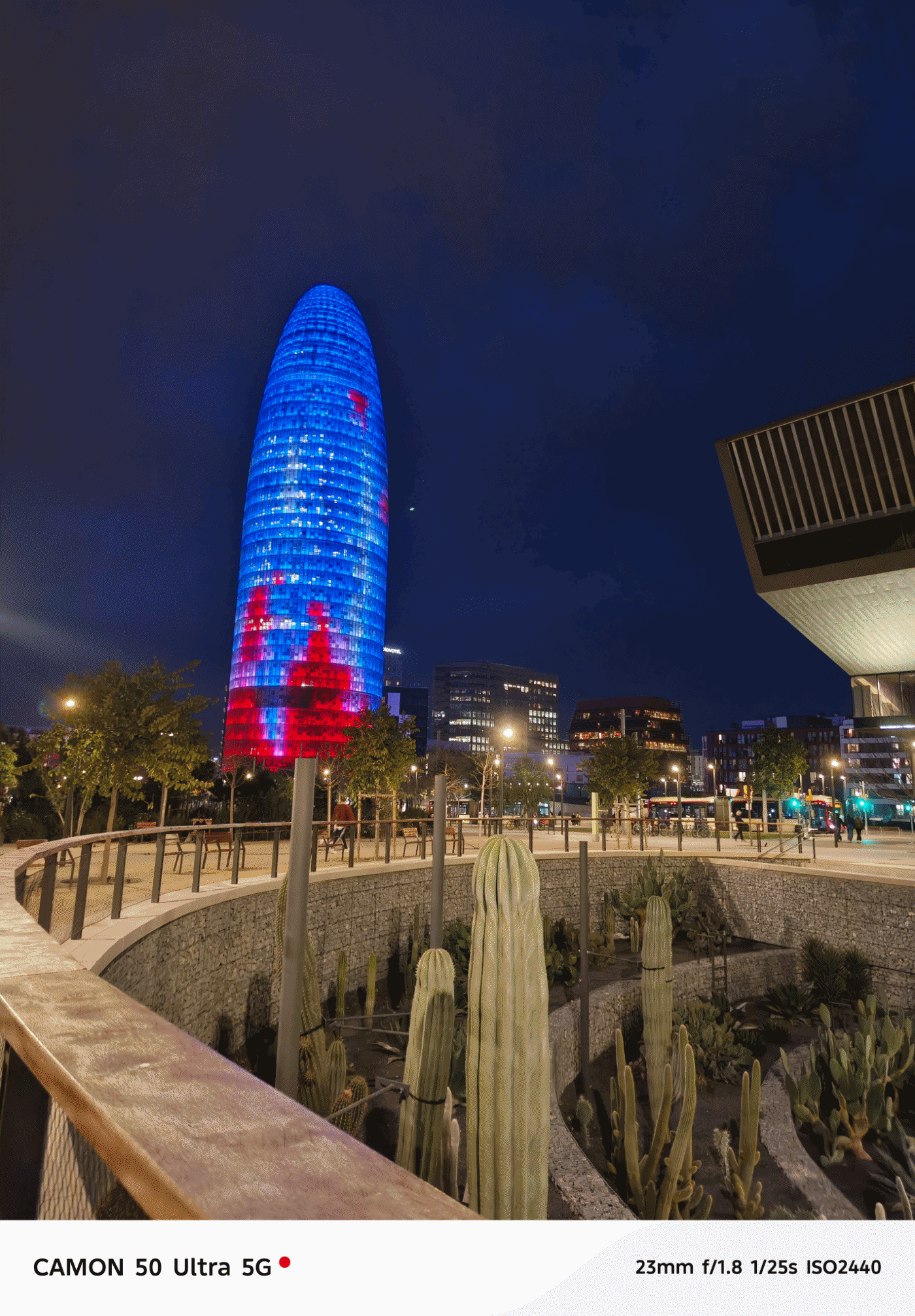
Low-light shots work wonders too. I didn’t expect it too look this good despite the SoC used that usually affects the overall quality of the night shot.


I didn’t even realize I took a lot more than what I have thought.


And before I forget, the ultra-wide performs well too at night even though it’s just the standard 8MP camera with a 112-degree FoV (Field of View).


Portraits aren’t that perfect — but should work day and night.


Now, the only things that draw the line (other than the the chip and lack of 5G connectivity) is the 50MP front-facing camera of the Ultra.
Both the base and Pro CAMON 50 models only have 32MP without AF (Auto Focus), only relying on FF (Fixed Focus).


Even if selfies are always against my will, here are some references.
Badly-needed battery boost
After handling various TECNO phones throughout my career, battery endurance is where it ultimately suffers. I felt it hard when using my PHANTOM V Fold2 from 2024 that keeps draining even on standby.
While this isn’t TECNO’s largest battery in a smartphone (as the award goes to the POVA Curve 2 5G with its monstrous 8000mAh capacity) this 6500mAh single-cell battery is something I’ve been wanting to have for long.

I’m also fortunate enough as other regions have a slightly downsized 6150mAh dual-cell battery. Still, both are heaps larger than last year’s 5100~5200mAh range. It’s even a milestone as the newly-launched Samsung Galaxy S26 series never got the battery bumps they all deserved.
With heavy-hitting tasks, the CAMON 50 Ultra ultimately consumes juice. A total of 145 minutes (or around 2.5 hours) of gameplay means losing as much as 84%. Three to four hours of binge-watching? That’s only a 8~10% deduction though. Streaming music for another hour? A mere 5% depletion.
In the moderate, regularly-mannered use-case, this phone lasts you through a full day with around 10% to spare.
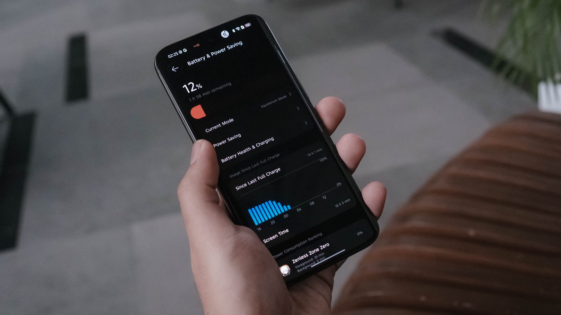
Best of all? Standby time can last up to 3 or 4 days! My other TECNO phones usually die after a day or two even without doing anything.
TECNO says it will still maintain its 80% capacity after 2000 charging cycles (or about five years). Only time can tell.

Once it totally depletes, the CAMON 50 Ultra can be filled up through its bundled 45W charger.
View this post on Instagram
At first, that sounded like a disappointment. However, my initial testing actually shows that the speeds are somewhat similar to the 90W speeds of my vivo X-flagship.
My GadgetMatch Charge Test further proves that point:
TECNO CAMON 50 Ultra
|
vivo X300 Pro
|
|
START TIME (From 0%) |
4:34PM |
1:59PM |
3 minutes |
4% |
1% |
5 minutes |
6% |
3% |
10 minutes |
12% |
10% |
15 minutes |
21% |
18% |
20 minutes |
30% |
24% |
30 minutes |
43% |
38% |
45 minutes |
65% |
57% |
1 hour |
85% |
71% |
1 hour 15 minutes |
99% |
99% |
END TIME |
5:51PM1 hour 16 minutes |
3:15PM1 hour 16 minutes |
So how is that even possible? Only the amazing people behind the tech can explain it.
As the reviewer myself, I am both in awe yet still in disbelief: are charging speed labels the real deal or are they’re just labeled for the sake of saying it’s “fast” enough?
Is the TECNO CAMON 50 Ultra your GadgetMatch?
As of this writing, TECNO has not provided exact pricing. But, for a phone still positioned below the US$ 600 / EUR 400 pricing range (approx. below PhP 30,000), the TECNO CAMON 50 Ultra is still one of those midrangers aimed towards users with a lean budget who also happens to value mean performance.
Swipe Left only if a curved edge display and 45W wired charging are dealbreakers for you — even if my charge test says otherwise.
Personally, it’s still a Swipe Right and a Super Swipe for me.
Its slender chassis, battery capacity boost, and solid shooting experience are already given. The combo of a reliable hardware plus refined OS are more reasons why the CAMON 50 Ultra is a phone worth checking out.
I may not have the consensus but, it seems like TECNO values what their community is saying.
For one, most of us wanted a bigger battery not just by numbers, it delivered a long-lasting endurance too.
Others pointed out that smaller and flat display on last year’s CAMON 40 Premier. This year, they brought back that bigger 6.78-inch curved display tech.
Last but definitely not the least, a streamlined and ever-fluid OS compared to what it was from two years ago.

If only they bring back 75W charging, a larger 512GB storage configuration, and even eSIM support, the next CAMON will instantly crush the mid-class.
Now, is the price bump from last year’s CAMON 40 line justifiable? Well, I am still blaming the AI-ddiction that led to component shortages as well as price hike craze.
404 Premier Not Found: The new era
As I still can’t get over how extremely catchy KiiiKiii’s latest hit track 404 (New Era) is, it inspired me to realize what TECNO did with its latest CAMON 50 series line. This might mark as the new era for TECNO — a bittersweet new beginning if I must insist (or resist).
Other than the company itself, no one knows why they went with this route. Based on my observation alone, it seems like TECNO is trying to play it safe this time, though not in a bad way.
TECNO CAMON 40 Premier | 2025
They want to upkeep with the demands of their aimed market without having to spend more for production and/or raise the overall price of its new line of smartphones two to threefold. And based from the spec sheet alone, the CAMON 50 Ultra is more of the successor to last year’s CAMON 40 Pro 5G rather than being the total replacement of the CAMON 40 Premier.
TECNO CAMON 40 Pro 5G | 2025
Also maybe, TECNO just wanted to “simplify” their model naming by omitting the “4G” and “5G” titles of the CAMON Pro lineup, making it sound cleaner and less confusing. But, that change still confuses a lot (myself included) with the “Ultra” being a newcomer — all while the signature “Premier” is nowhere in attendance.
Now, despite my sentiments of truly missing their Premier line, this new midranger still is a compelling choice. I never even thought I would enjoy the CAMON 50 Ultra as much as I would. It’s a well-refined piece of slab culminated by TECNO’s continuous strive to innovation.
I’m just wishfully thinking TECNO is just hiding the CAMON 50 Premier up in its sleeves and brings out that wild card on the deck months after this release. Hopefully, it doesn’t end up like their flagship PHANTOM X series that was never heard of since 2022.
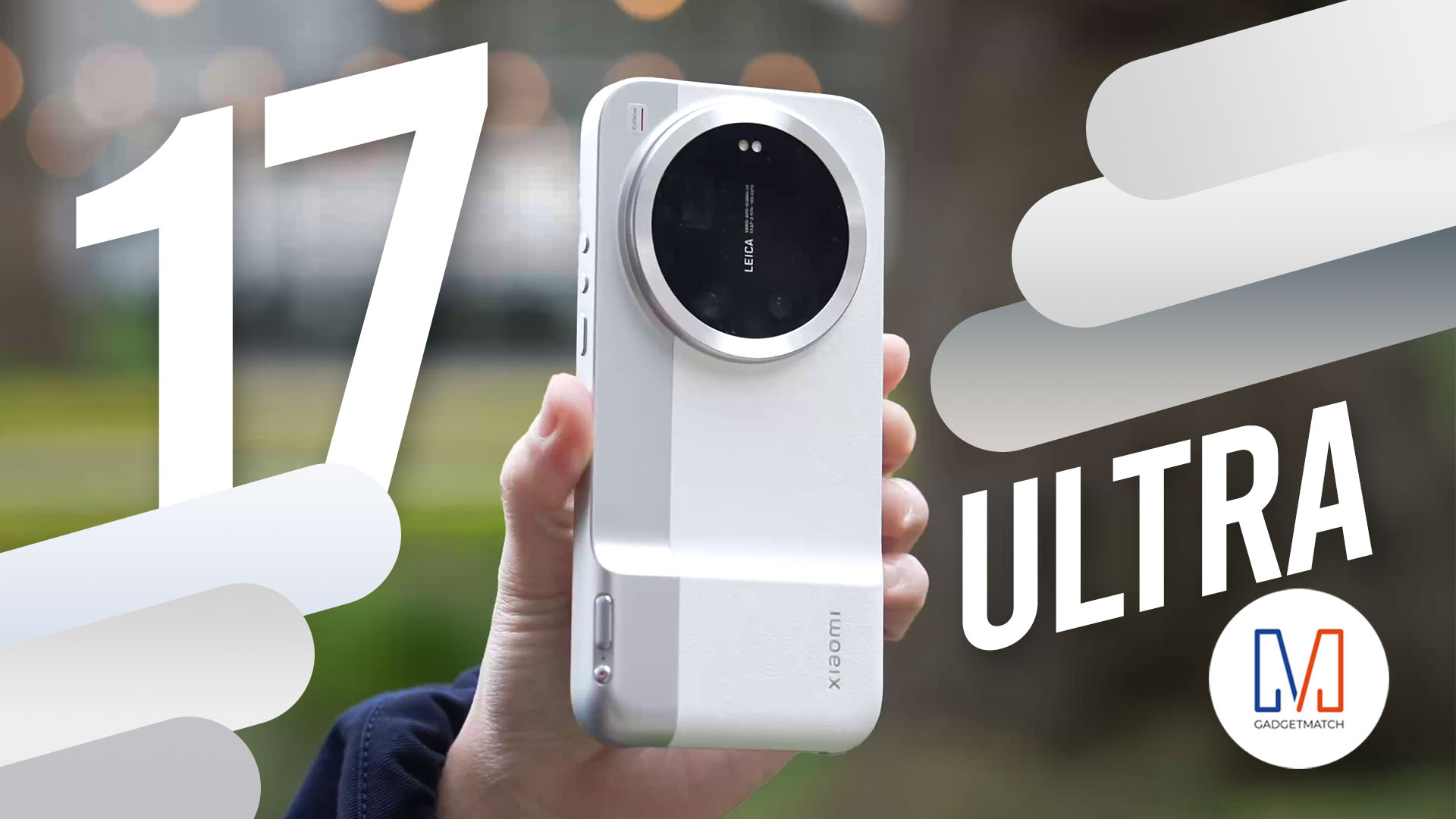
The all-new Xiaomi 17 Ultra isn’t perfect. But as a camera?
With a 1-inch sensor, continuous optical zoom, and Leica color science — this might be the most exciting camera phone Michael Josh has used in years.
If you care about photography more than a polish, you’ll want to watch this review.
Here’s our in-depth Xiaomi 17 Ultra review.

The Xiaomi 17 shoots Leica dream

Nintendo sues the United States

OPPO Reno15 F 5G hands-on

Project Helix is Xbox’s next console, and it plays PC games

Nothing adds color to its wearables with the Headphone (a)

Xiaomi 17 Ultra is now available outside China

TECNO will showcase the CAMON 50 and POVA 8 series at MWC 2026

The art of being in and behind the frame

HUAWEI MatePad 11.5 S 2026: The better-than-ever 4-in-1 productivity tablet

TECNO MEGABOOK K16s 13th review: No-frills beneath those grills


-
 News7 days ago
Xiaomi 17 Ultra is now available outside China
-
 MWC 20265 days ago
TECNO showcases cool concepts at MWC 2026
-

 MWC 20261 week ago
TECNO resurrects modular phones with this new concept
-

 Reviews7 days ago
Xiaomi Pad 8 review: Slab that slaps!
-
 MWC 20264 days ago
TECNO launches the all-new CAMON 50 series
-

 Reviews7 days ago
Forget the Phone: Xiaomi 17 Ultra Is A CAMERA!
-

 Reviews4 days ago
TECNO CAMON 50 Ultra review: End of an era?
-
 MWC 20263 days ago
Infinix NOTE 60 Ultra makes a motorsport-inspired debut