

Reviews
TECNO PHANTOM V Flip2 review: Flippin’tastic!
Two full months with TECNO’s second flip phone
We’ve seen a sudden storm of flippables this 2024 — from Xiaomi and HONOR’s first ever flagship flips, to wallet-friendly yet worthy flip phones by ZTE, HUAWEI, and motorola. Of course, the trendsetter won’t miss their chance with the latest Samsung Galaxy Z Flip6.
But we’re here for TECNO’s freshest flip. I’ve spent two good months with the brand’s second flip to see what it’s really capable of — and what it also lacks.
One Fine Flip
Appearance-wise, TECNO’s PHANTOM V Flip2 already shows a massive transformation compared to its predecessor.
It now looks more stylish and mature compared to last year’s cutesy and chic aesthetics.
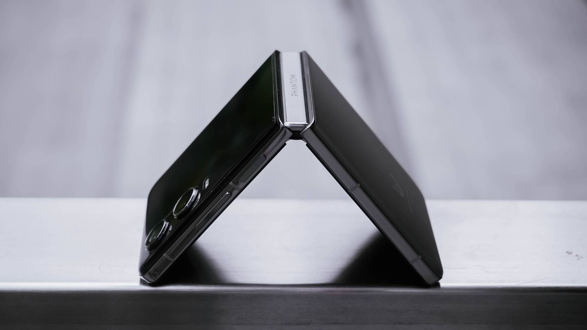
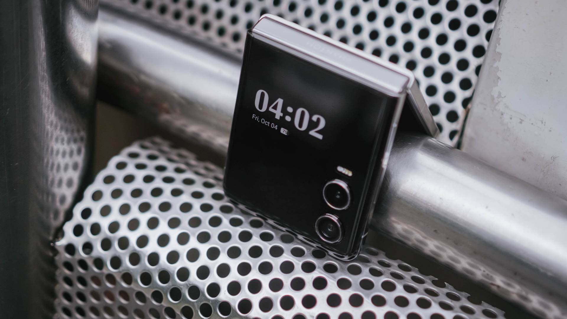
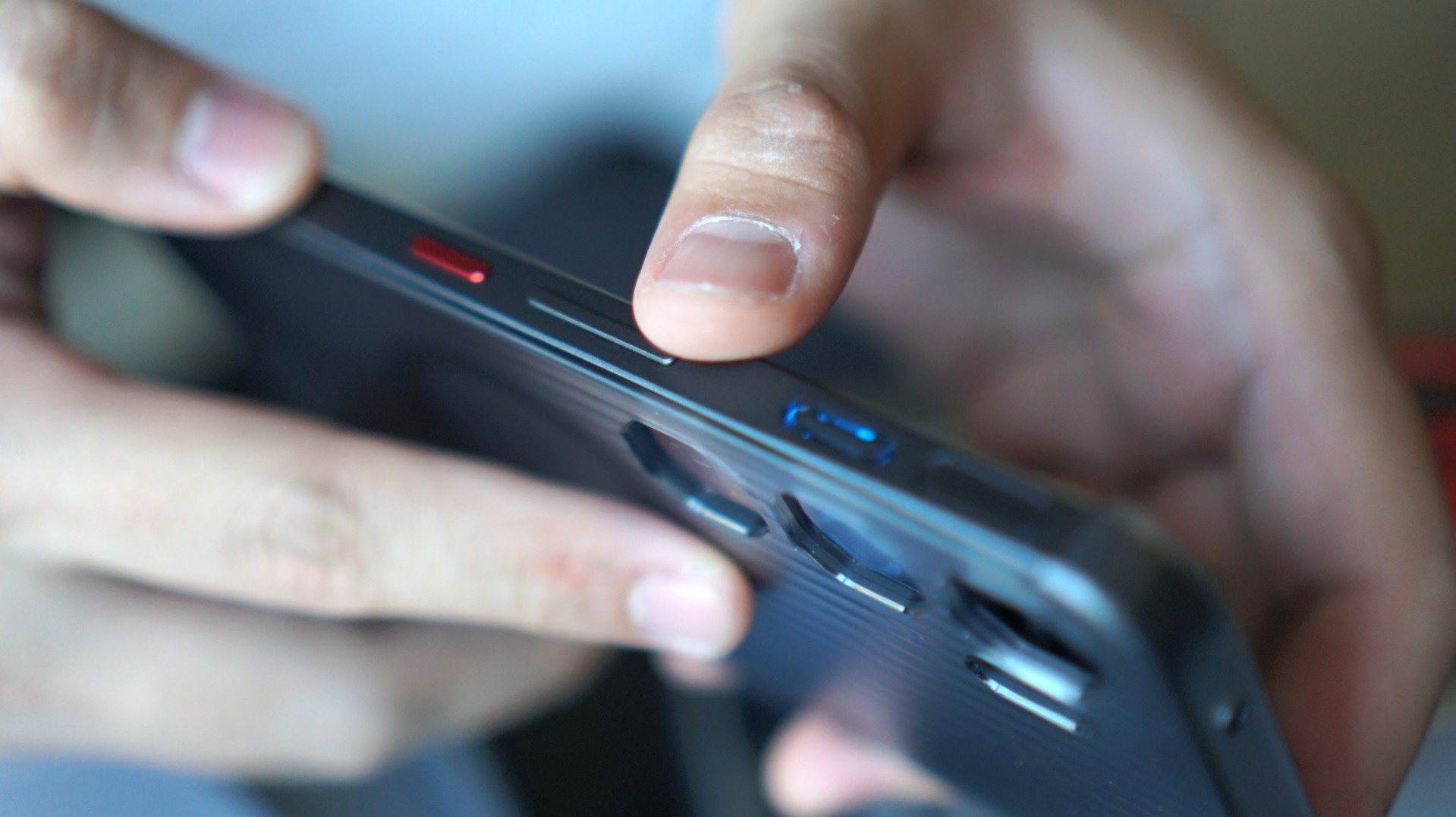
Folding the V Flip2 in half reveals its Double Helix Star Track Water Droplet Hinge. TECNO says this new hinge mechanism promises up to 400,000 folds.
Although two months isn’t enough to fully support that claim, folding and unfolding the device never felt cheap. It has enough resistance like other premium flip phones do — which is also a huge improvement versus the first iteration with its tacky hinge.
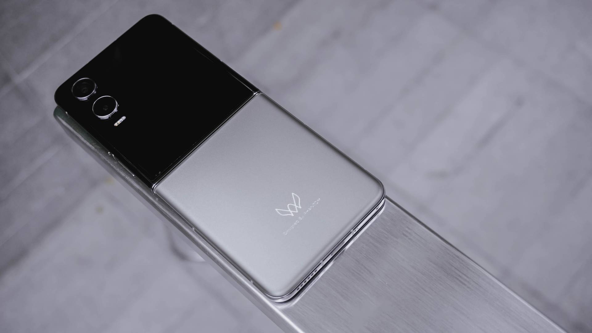
Turning to its back, I love how it doesn’t attract smudges or fingerprints. The texture is close to a fine sand. And even with the less flashy color, it still shows shimmer and glimmer all-around.
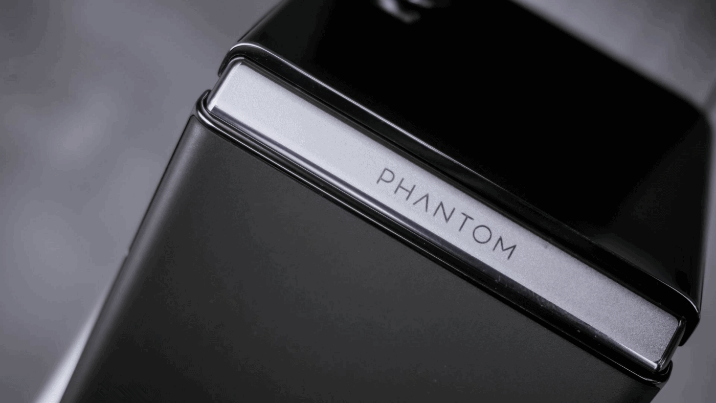
Looking closer, it now shows an engraved “Designed by PHANTOM” branding on it.
Also, that distinct PHANTOM logo adds an overall premium touch especially when hit by faint light.

Its shiny frame also looks premium like any other modern flagship.
At 196 grams, it’s not the lightest clamshell flip out there. But, that amount of heft makes it comfortable to hold.

It’s also not the thinnest flip, but its adequate thickness of 16mm makes it grippy enough even in one-handed use.
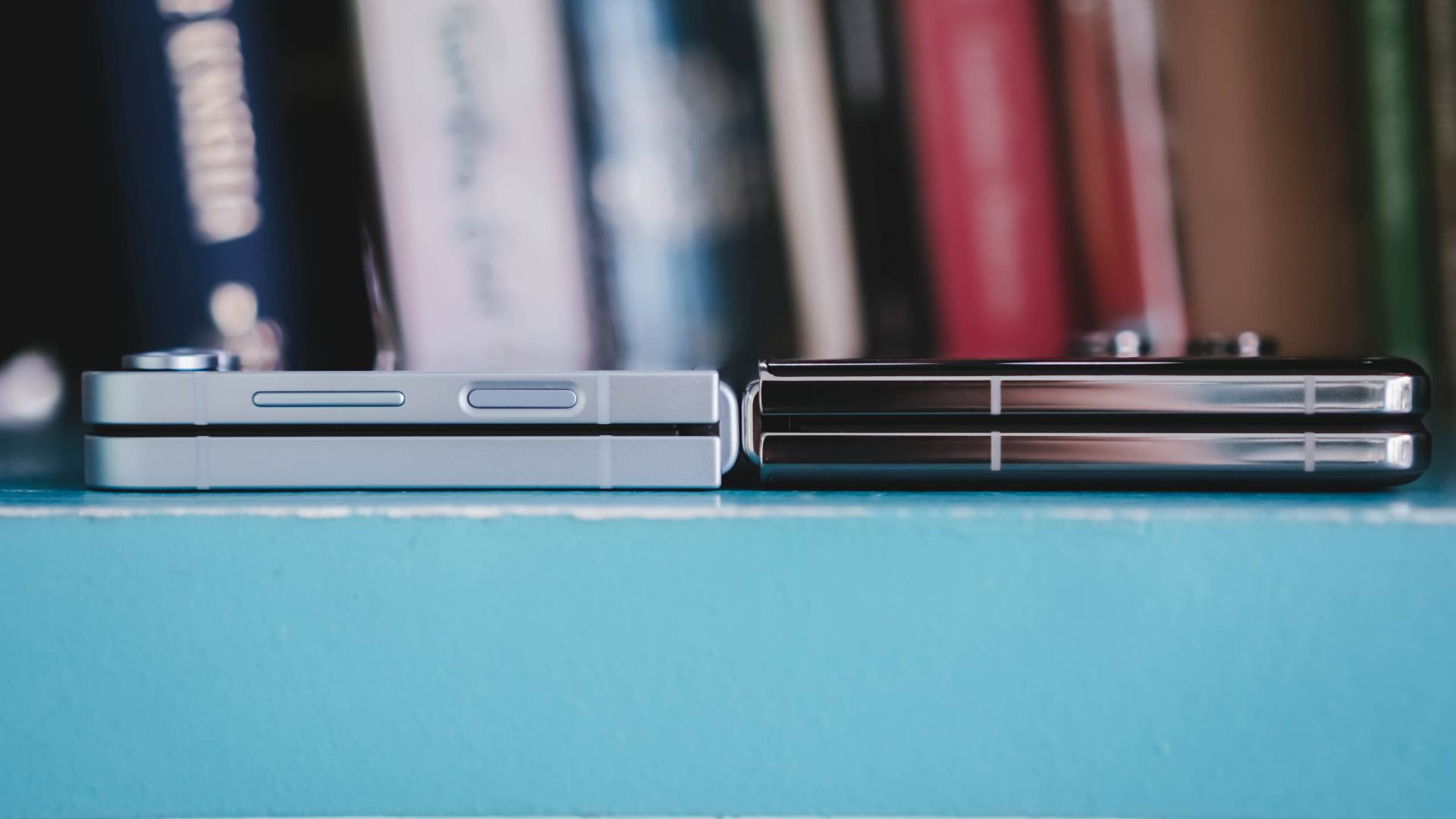
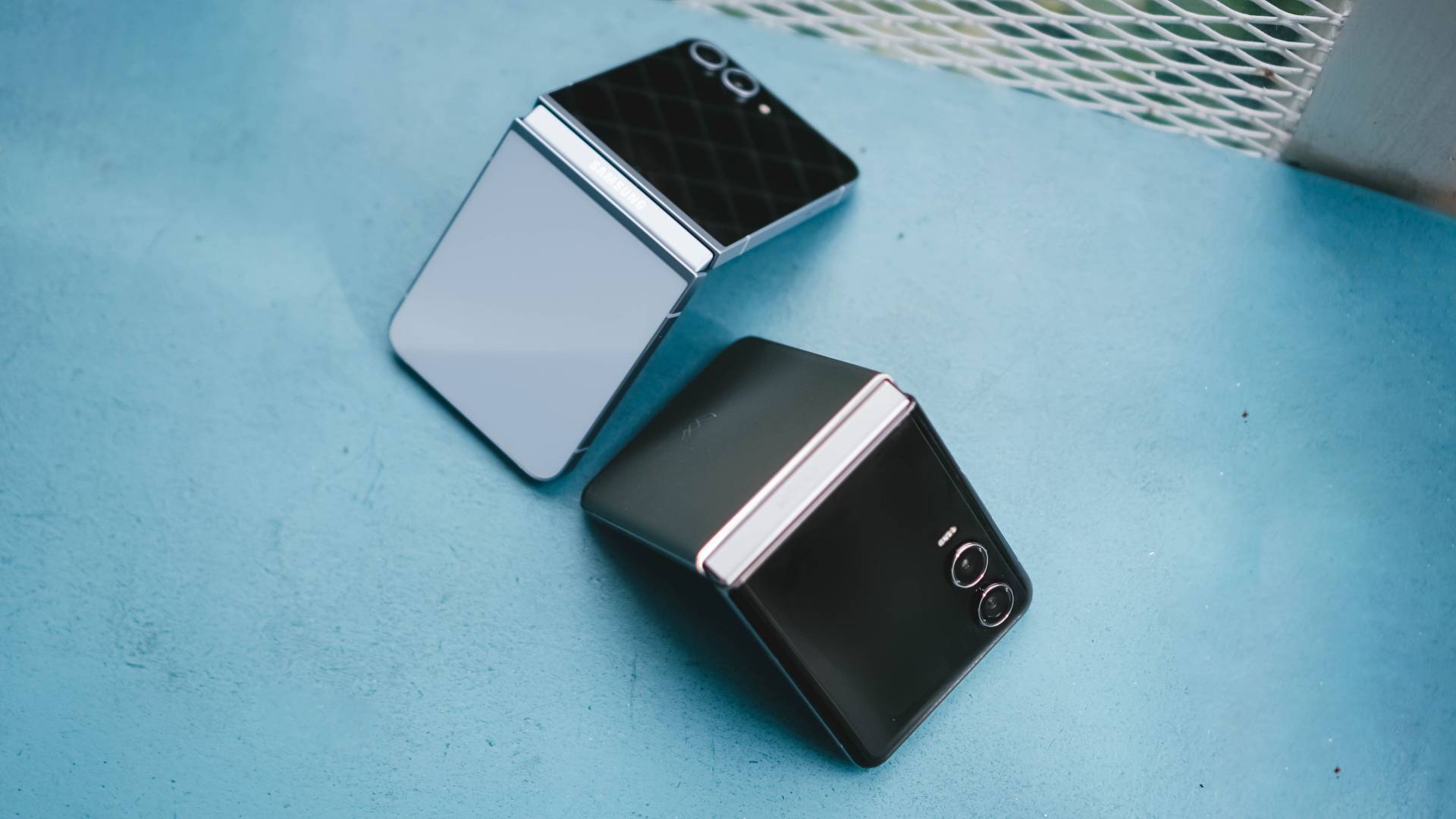
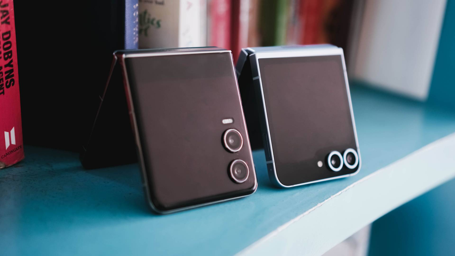
Samsung Galaxy Z Flip6 vs TECNO PHANTOM V Flip2
And for comparison’s sake, here’s what it looks like compared to Samsung Galaxy Z Flip6’s 14.9mm folded body with a matte frame. I can barely see the thickness difference.
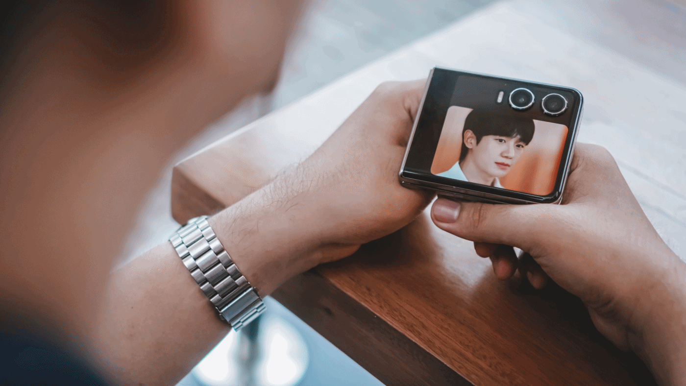
Cherish that cover screen
Although that iconic circular cover screen will be missed from its predecessor, I just love how TECNO decided to just jump into the bandwagon.
TECNO PHANTOM V Flip | 2023
Not that it’s a bad thing. For myself, I want a cover screen that’s usable too. After all, a bigger screen comes with greater overall usability.

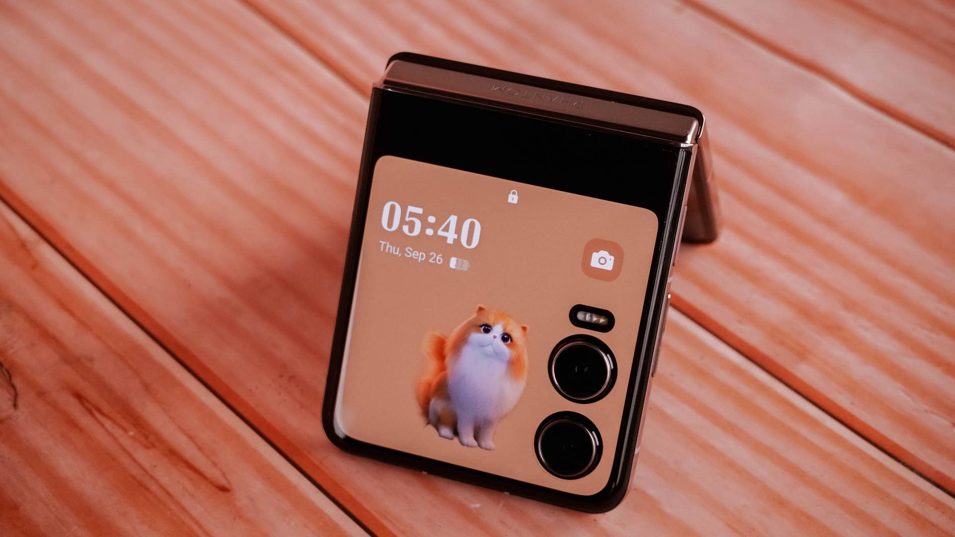
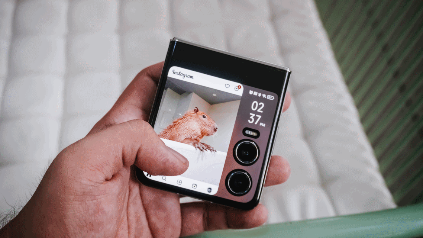
The new cover display accounts for better customization features — including quirky frames like this fluffy orange cat that I love.
There are five pets to pick including an alpaca, hamster, rabbit, dolphin, and falcon.

You can easily swipe through your cover lock screen styles by swiping left and right
I just wish TECNO would allow videos to be set as cover screen wallpaper. The only workaround for now is to select one of the built-in photo frames and pick the video wallpaper you desire.

In my case, I searched for the capybara live wallpaper found on Xiaomi’s MIX Flip — just because I love capybaras more than anything else.

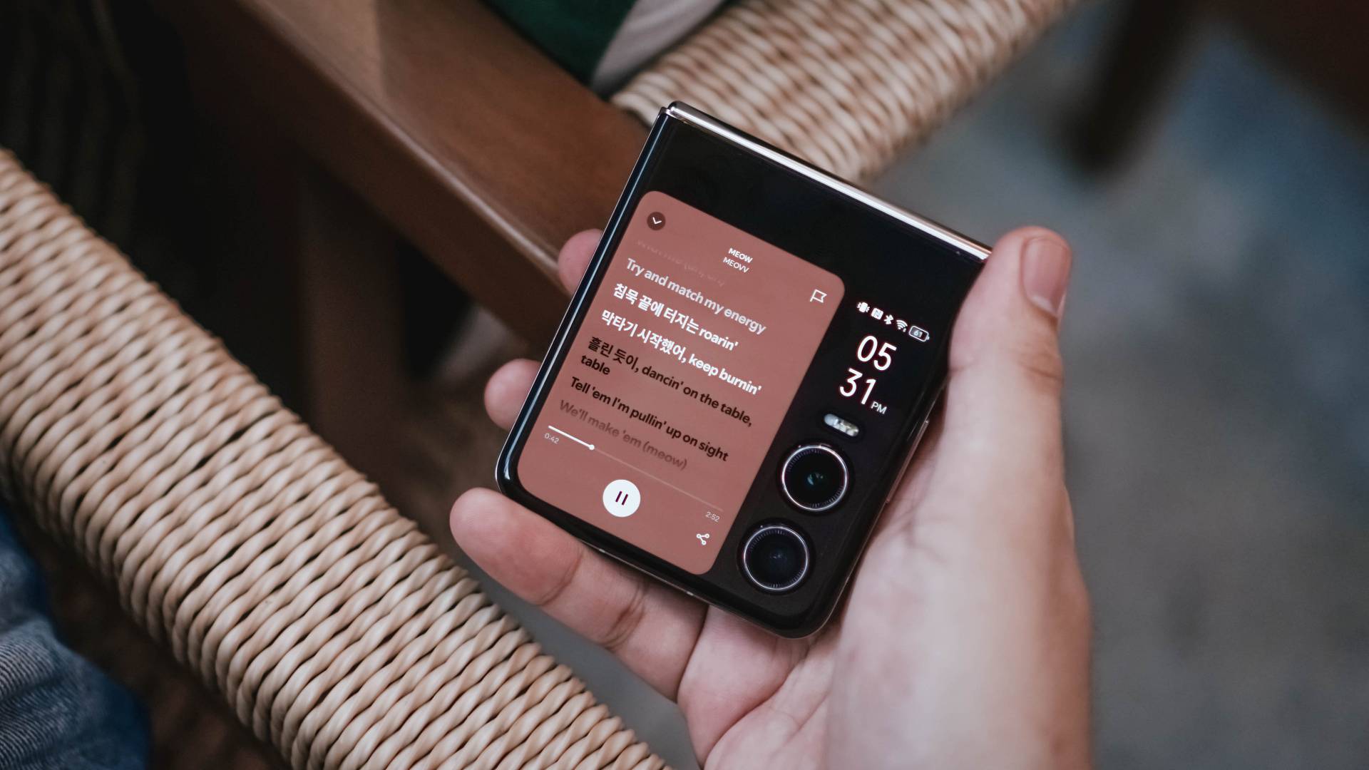
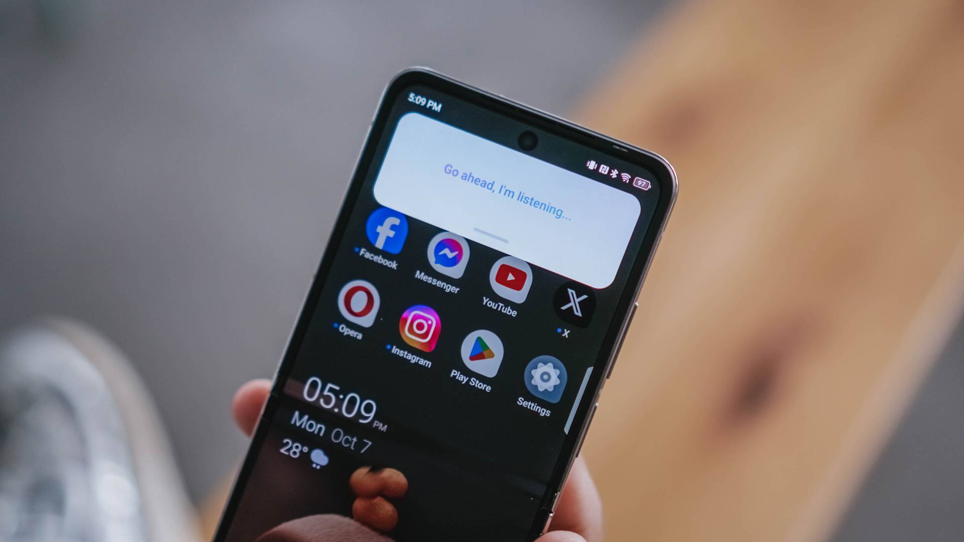
That bigger outer display not only gives you access over control center toggles and notifications…

…it also allows you to open apps and even reply to messages in full-screen keyboard without opening the flip itself.

It’s not just limited to YouTube; Netflix is also accessible in that dwarfed cover screen.
Even scrolling and liking posts and reels on Instagram is such a breeze!
My not-so-favorite music app also works here. I just wish Apple Music would also be supported in the near future.
Here’s a breakdown of some apps you can fully utilize on PHANTOM V Flip2’s large cover screen without actually flipping open the phone itself.
@gadgetmatch Can your flip phone’s cover screen do all of these? 🤔 #TECNOPhantomVFlip2 #foryou #fyp ♬ original sound – GadgetMatch

TECNO’s larger 3.64-inch cover screen is very beneficial. Even the latest iteration of Samsung’s flip cannot run most of these apps due to its smaller folder-shaped outer display (at 3.4 inches) and restrictive software.
Unleash the inner beauty
The moment you unflip the V Flip2, its 6.9-inch foldable LTPO AMOLED flexible display will greet you with its superior screen quality.
Looking by just numbers, it’s a big display. But personally, it’s not as big as it seems — maybe because it has a narrower 22:9 aspect ratio.

The moment I opened the device for the first time, it barely showed any crease. Refer to my unboxing below:
@gadgetmatch Unwrapping TECNO’s freshest flip 😌 #PhantomVFlip2 #Tecno #fyp #foryou #unboxing #unboxingvideo ♬ MILLION DOLLAR BABY (VHS) – Tommy Richman
But as expected, after two months of usage, the crease is there. Although, it’s not as prominent as I thought it would be.
I barely felt it’s presence as I’m so hooked to the content I’m viewing.

Although TECNO didn’t specifically state the maximum brightness level of its inner display, it looked bright even for outdoor usage.
Despite the small and foldable form factor, TECNO has managed to fit in some loud stereo speakers that doesn’t sound tinny nor cracked.
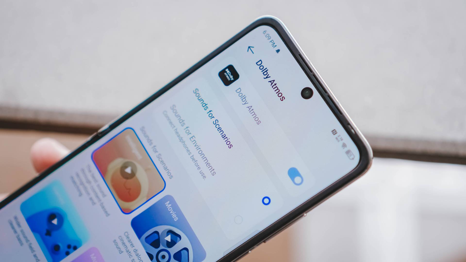
And to make the experience fuller, TECNO’s latest flip also has Dolby Atmos support. This ensures a great sound quality especially when I listen to songs that support it.
Tolerable Performer
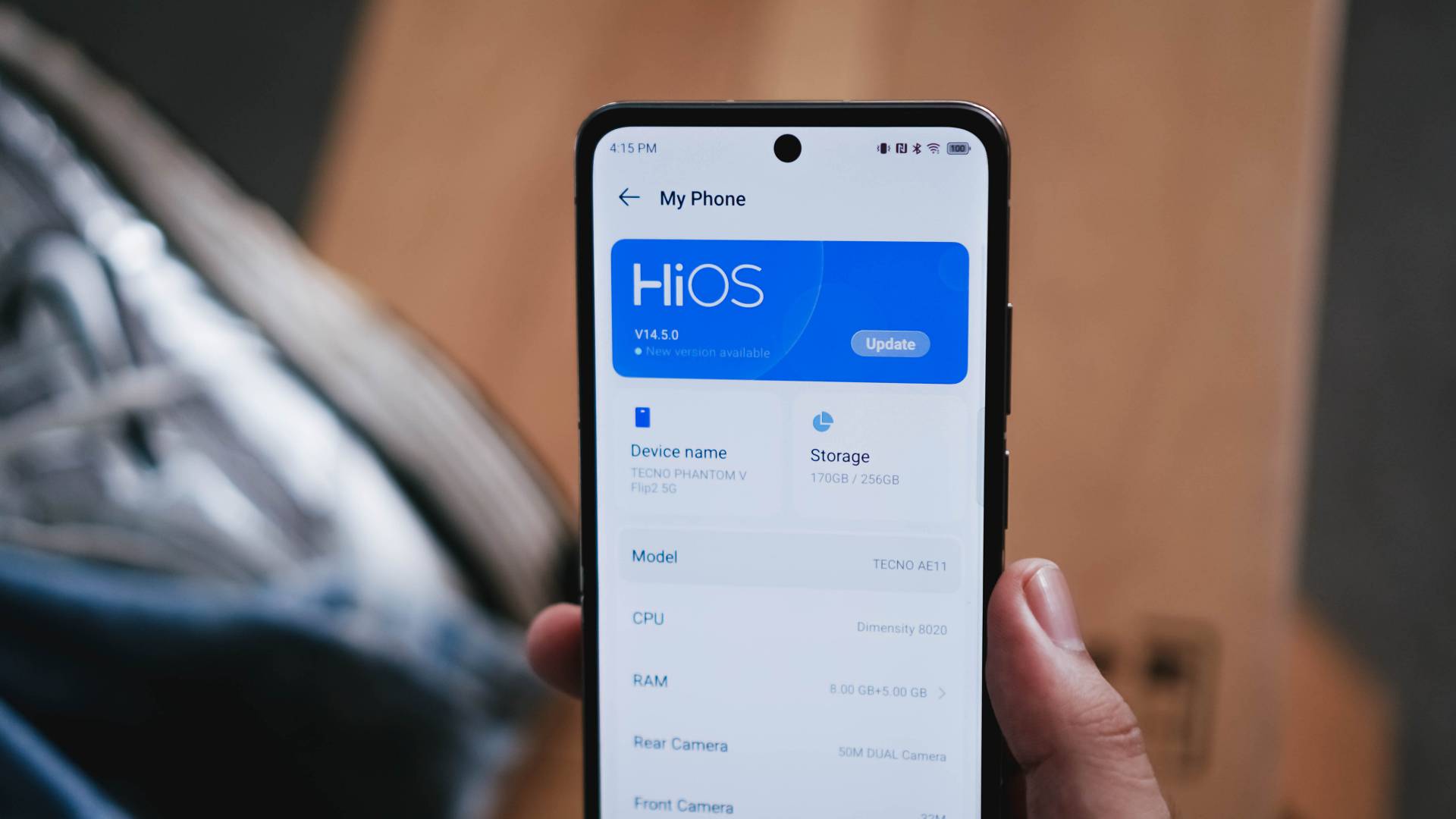
The PHANTOM V Flip2 runs MediaTek’s Dimensity 8020 8-core SoC based on a 6nm process — and it’s actually one of the rarest chipsets used in the smartphone world.
For reference, it has already powered their sister brand’s midrange device last year, the Infinix ZERO 30 5G.

As we all expect, most of the basic tasks run fine — socials, messaging, calls, tools, among others.
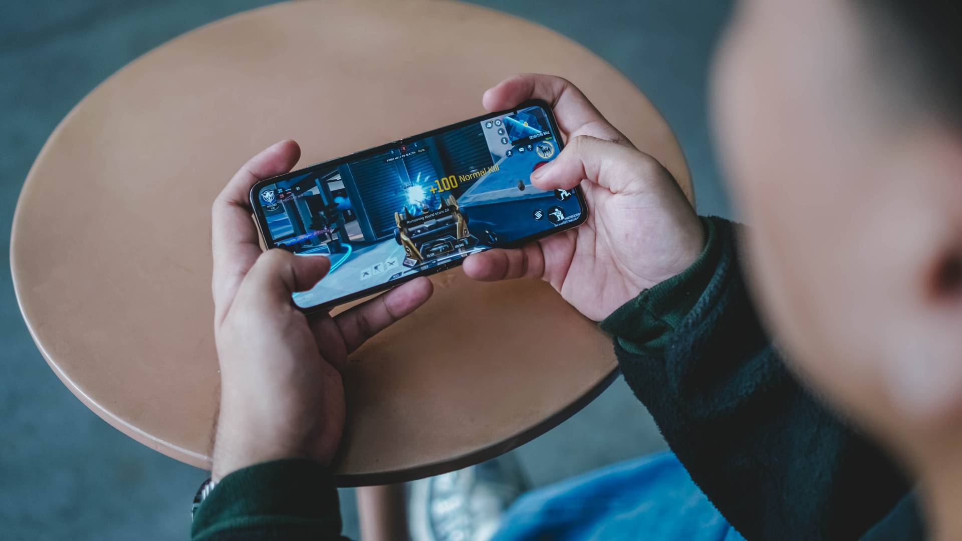
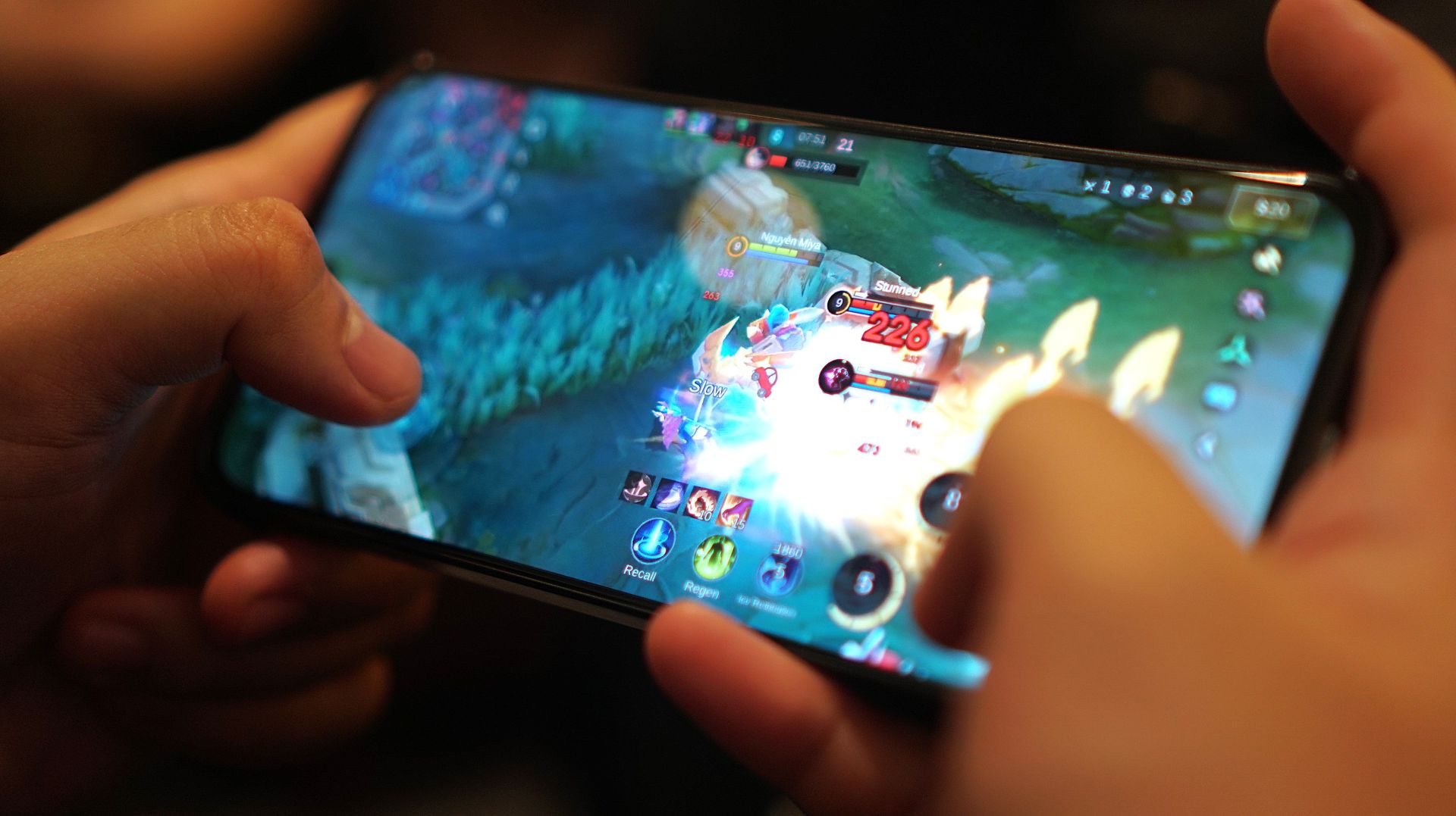
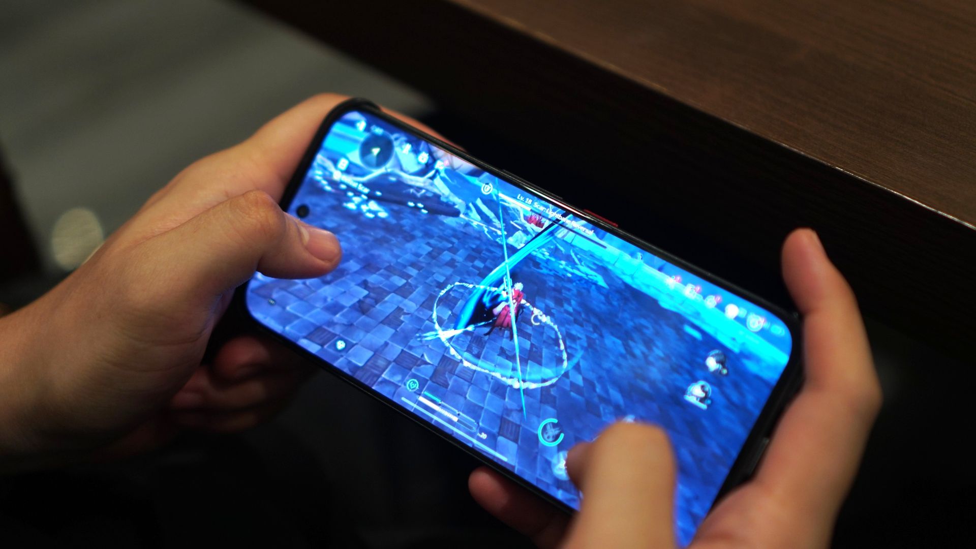
But when it comes to hardcore gaming, it’s far from being flawless.

Most graphics-intensive titles will still run but with occasional stutters.
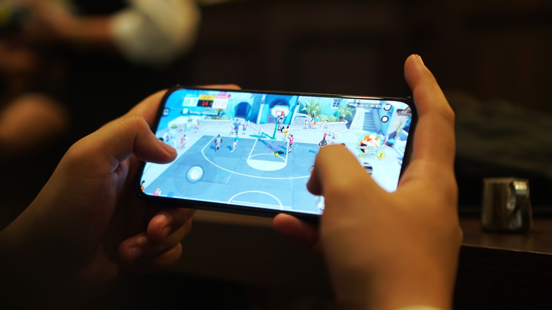
For instance, Zenless Zone Zero runs in the lowest graphics by default.

Activating Performance Mode in High Boost enhances the gameplay but at the expense of the battery life.
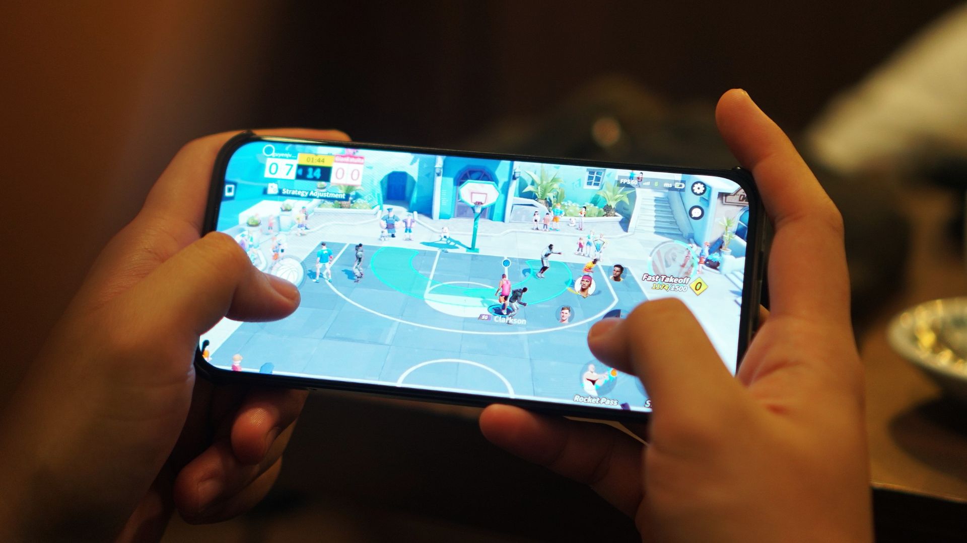
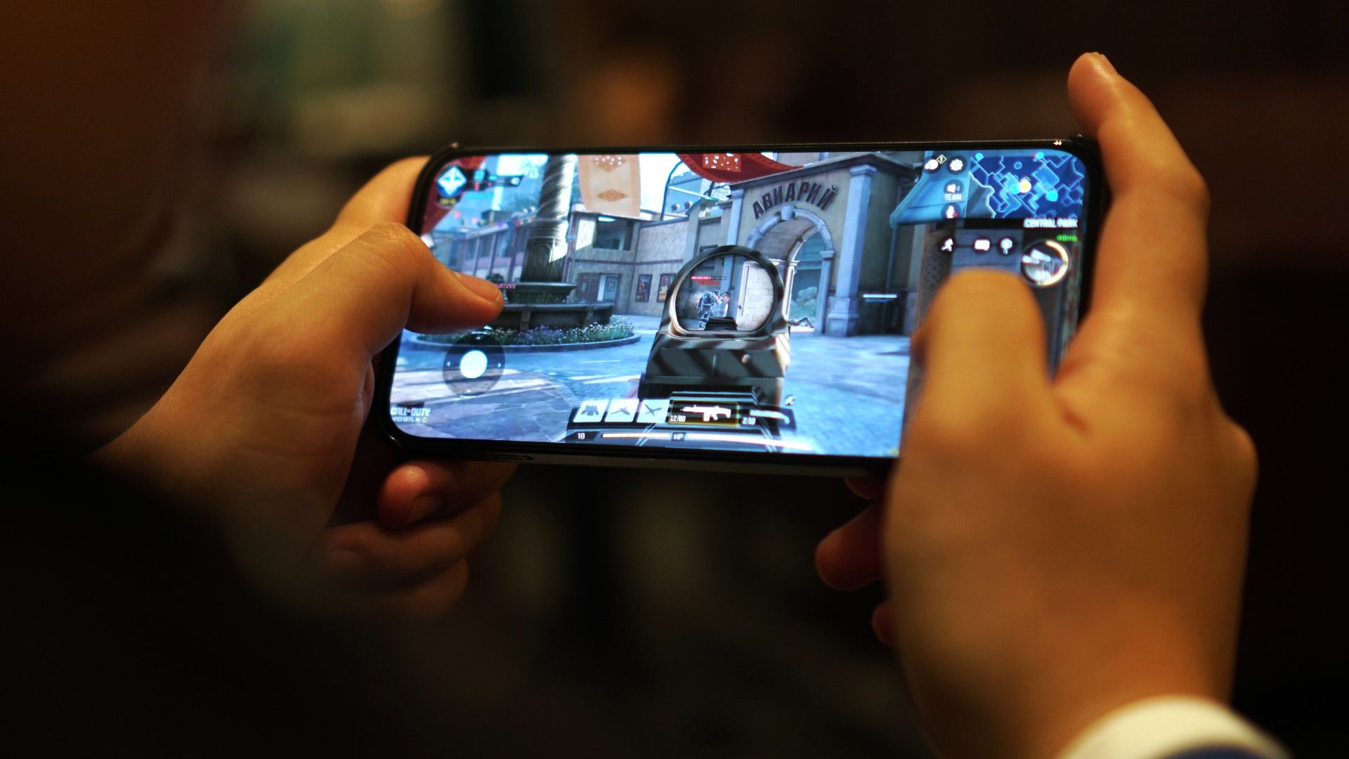
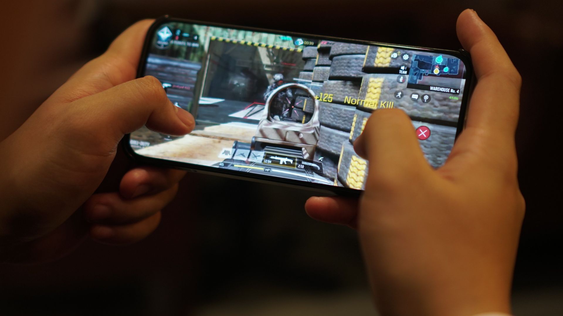
Meanwhile, games such as CoDM (Call of Duty: Mobile)…
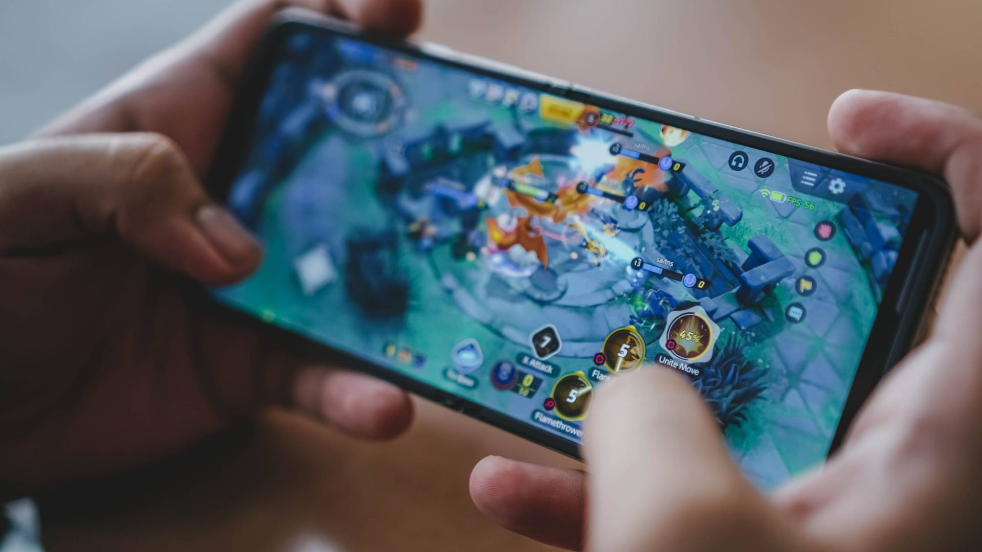
Pokémon Unite…
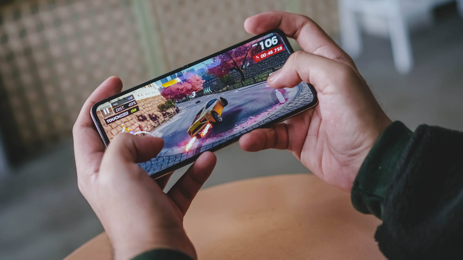
Asphalt Legends Unite…
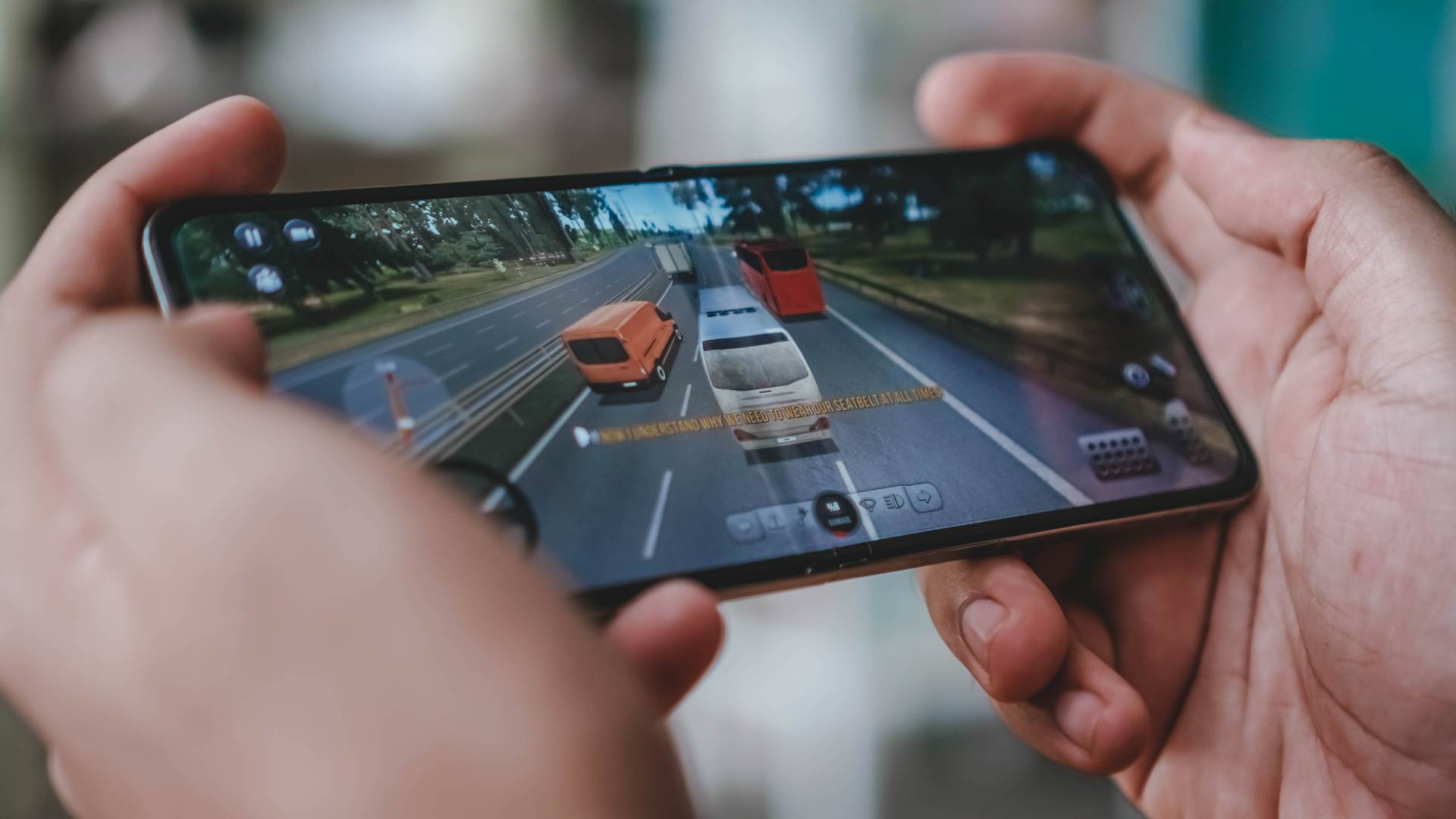
and even the very underrated Bus Simulator Ultimate should all run fine with medium settings ticked.
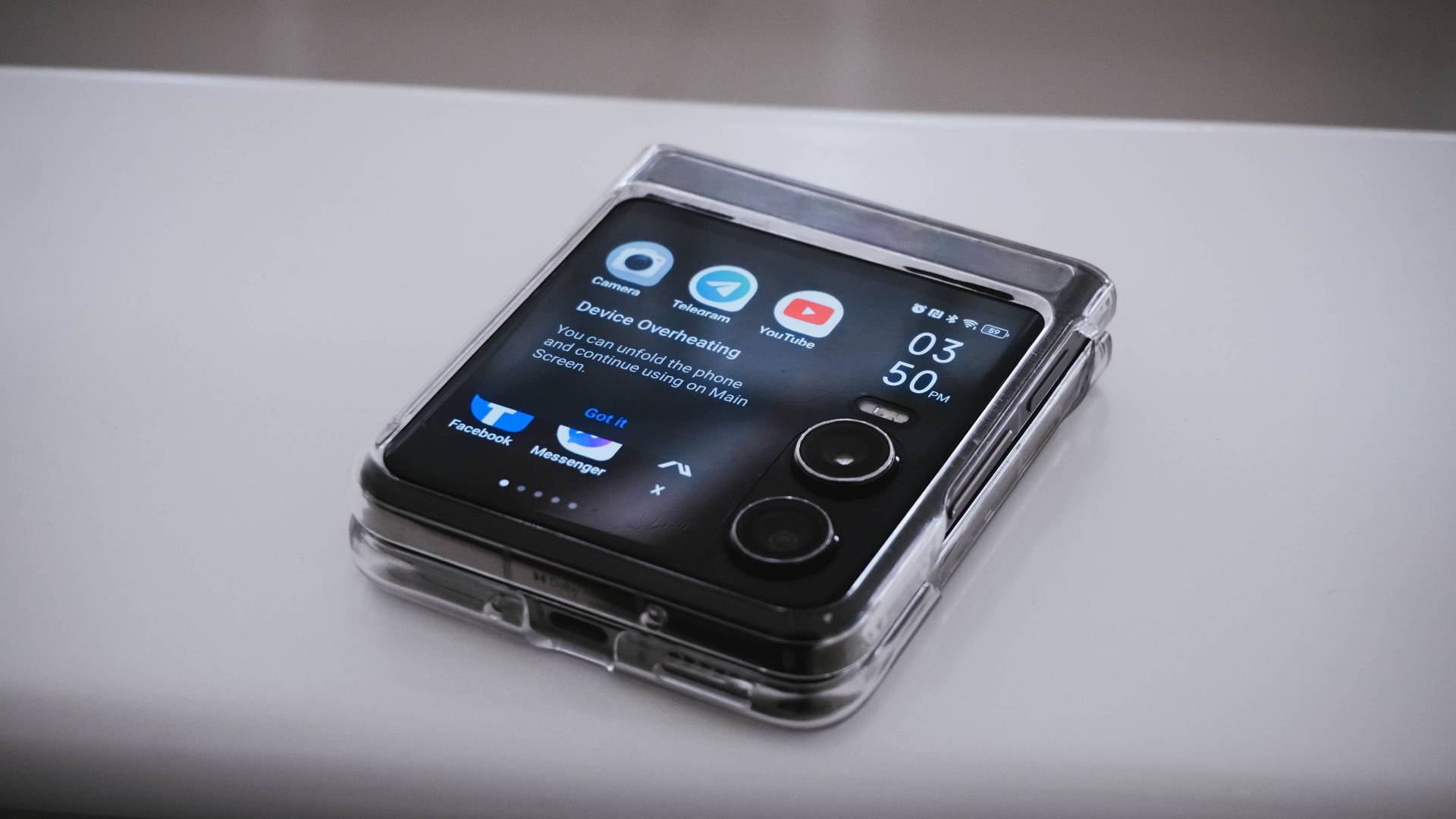
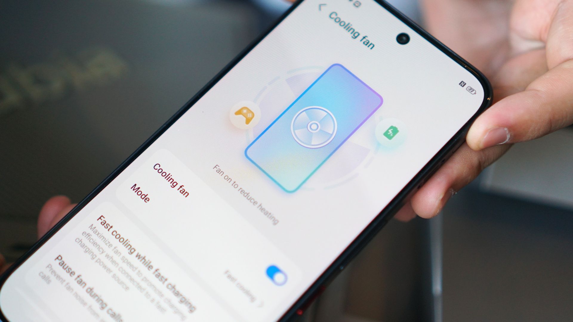
Heat is a by-product of continuous smartphone usage — and that’s when it prompted me to unfold the phone as it was already suffering from severe overheating.
To be fair, this only happened once during a very hot and humid afternoon outdoors.
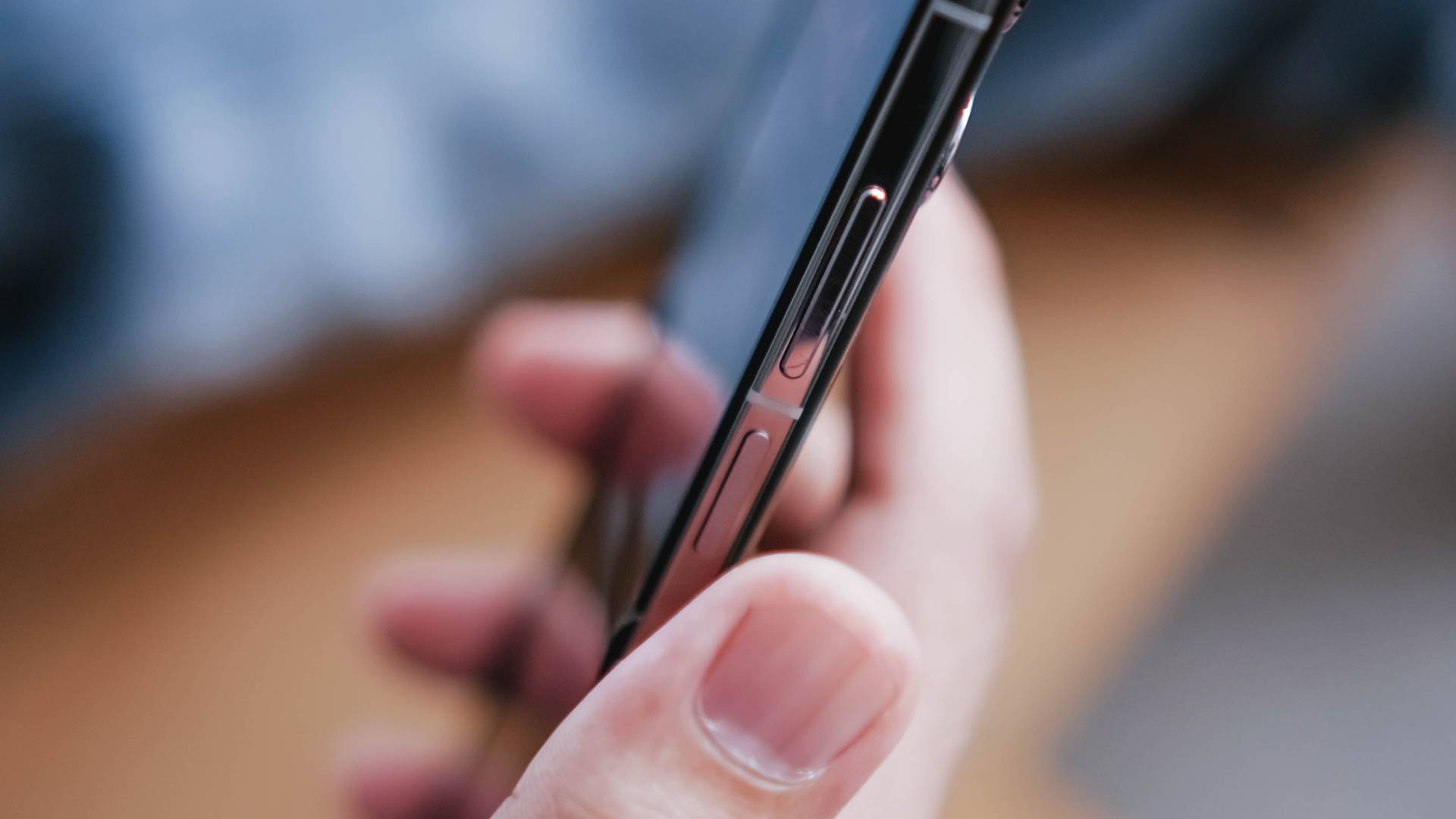
One worthy thing to note is how responsive its side-mounted fingerprint scanner is.
Originally, it had some bugs such as unwanted stutter and sluggishness especially when I just try to access the phone folded (via its cover screen).
TECNO thankfully resolved this with a software update. Unlocking has never been this responsive in cover screen mode.

However, it’s also worthy to point out that the PHANTOM V Flip2 doesn’t have any IP rating unlike the Galaxy Z Flip6’s IP48 rating.
Power-packed on paper
TECNO has an outstanding 4720mAh battery on paper. Unfortunately, the choice of the mid-class chipset might be the culprit on why the PHANTOM V Flip2 lasts only around 4 to 6 hours of onscreen usage.
But, giving the benefit of the doubt, using only the phone’s outer display and/or enabling battery saver mode can extend its overall endurance.
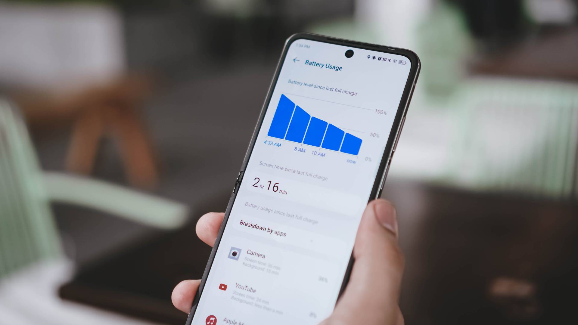
Fortunately, charging speeds got bumped up: from last year’s 45W to a speedier 70W fast charging — and it’s the fastest in any Flip as of this writing.
Already shown in the unboxing above, its 70W charging adapter and proprietary USB-C to USB-A cable are all bundled in the box.
Without further ado, here’s my definitive GadgetMatch Charge Test results:
| 1st Attempt | 2nd Attempt | |
| START TIME (From 0%) | 11:22PM | 3:30PM |
| 3 minutes | 12% | 11% |
| 5 minutes | 20% | 18% |
| 10 minutes | 27% | 26% |
| 15 minutes | 36% | 35% |
| 20 minutes | 43% | 42% |
| 30 minutes | 57% | 57% |
| 40 minutes | 73% | 71% |
| 45 minutes | 79% | 78% |
| 50 minutes | 87% | 85% |
| 55 minutes | 96% | 92% |
| 1 hour | — | 98% |
| END TIME | 12:21AM 59 minutes |
4:32PM 1 hour 2 minutes |
It’s very clear that you need at least an hour for you to fully-charge the Flip from its dead state.
Surprisingly competitive cameras
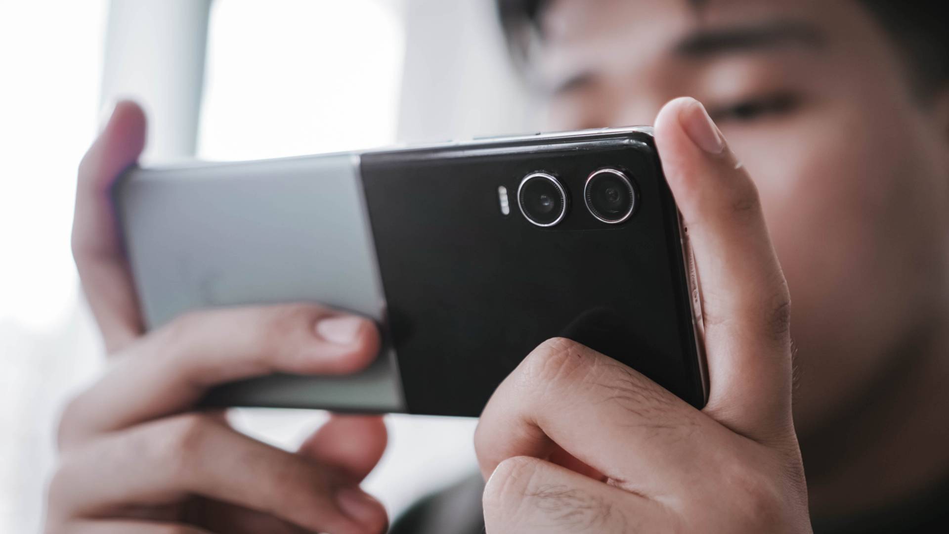
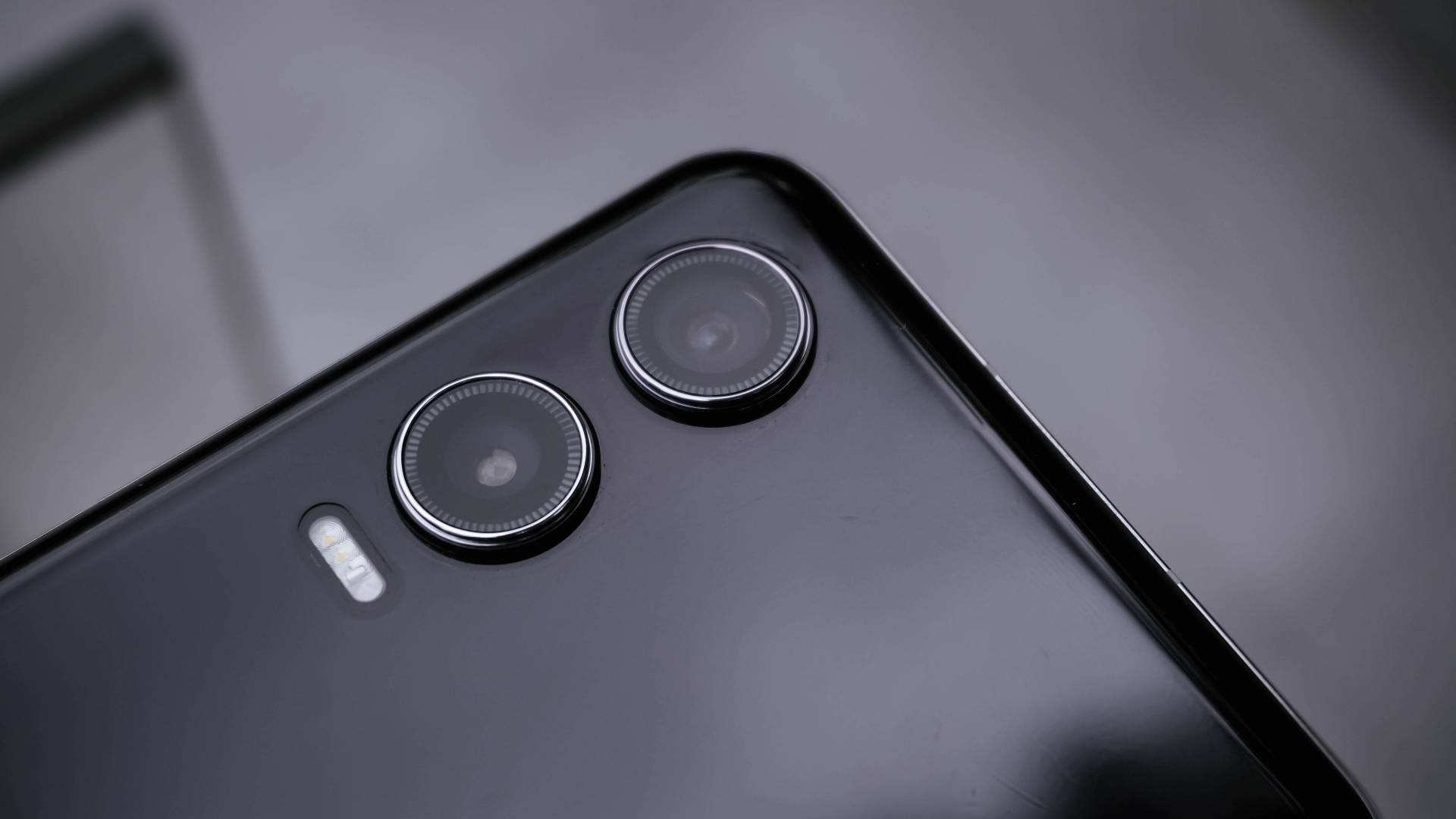
Just like any other 2024 flip phone, the TECNO PHANTOM V Flip2 is equipped with THE essential camera combo.
To be very precise, it features a dual 50MP layout for both its wide and ultra-wide angle lenses.
| Wide | 50MP 1/1.57” sensor |
| Ultra-Wide | 50MP 114º Field of View (FoV) |
| Selfie | 32MP f/2.45 |
But the proof is in the pudding. I have plenty of photo samples just for you to see that the PHANTOM V Flip2 is a very capable shooter despite its size and price.
In for a triple treat
Much like its recent CAMON 30 series cousin, the PHANTOM V Flip2 also features its trio of built-in camera color profiles: Standard, Bright, and PHANTOM.

Standard, from the term itself, gives the default look that’s both pleasing to viewers’ eyes and to devices’ screens alike.
Bright, on the other hand, gives that ✨ pop ✨ to dull-looking subjects.

Lastly, the PHANTOM profile gives an understated look with less saturation, shadows, and contrast altogether. It’s perfect if you want your shots to be more dramatic yet subdued.
If my explanation isn’t enough, I’ll let these GIFs do the talking.


Taking pride in wide
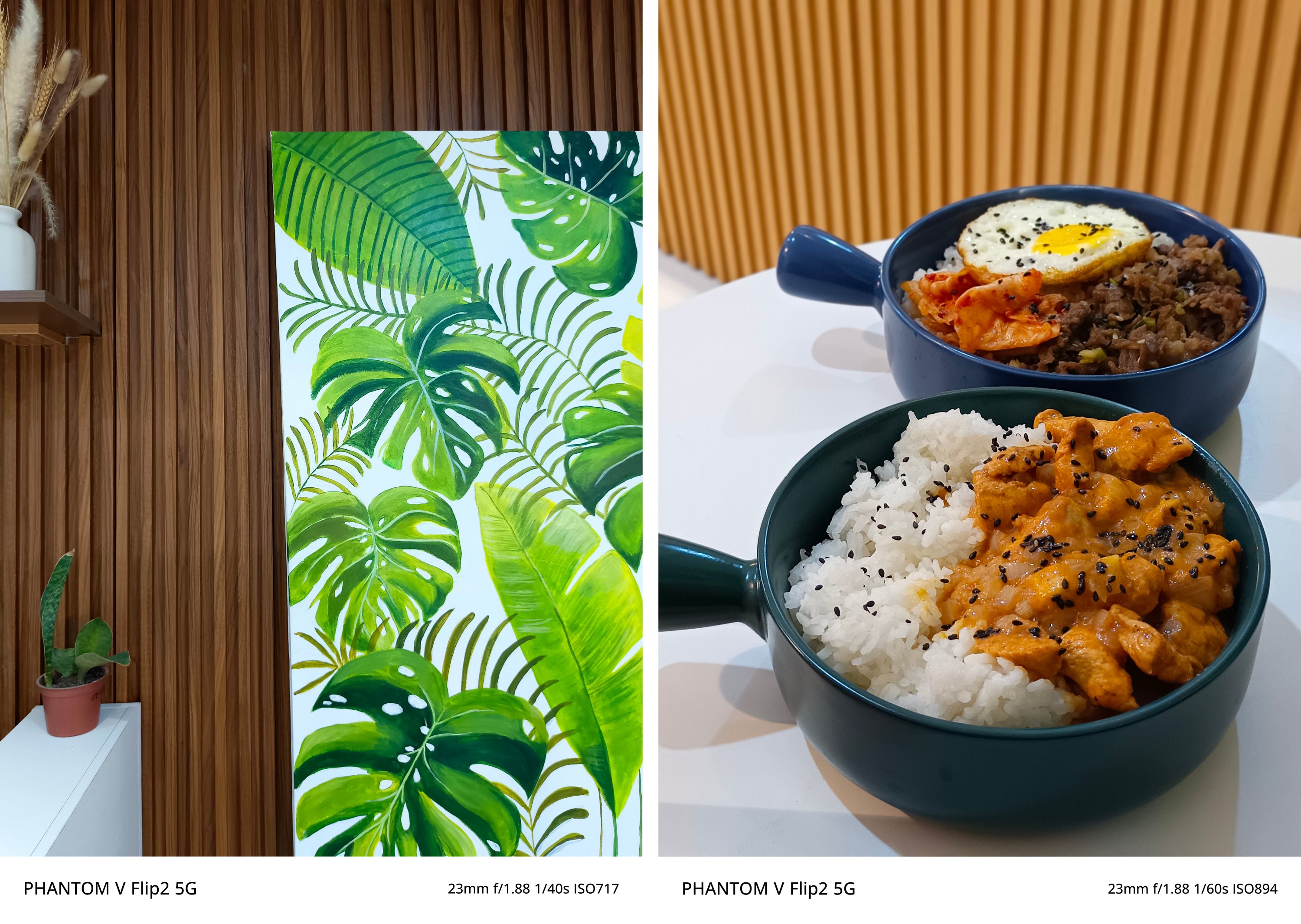
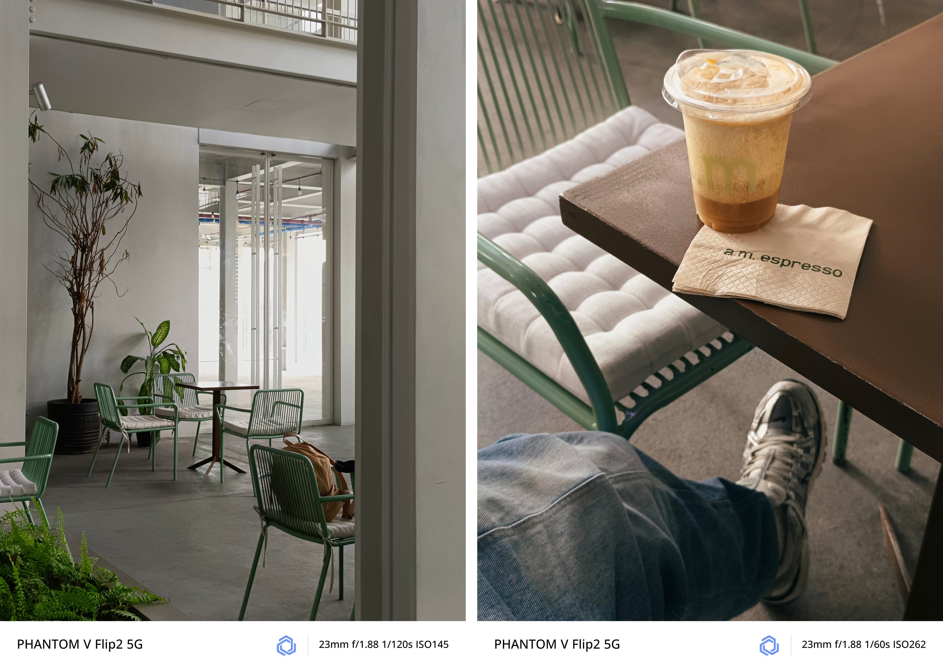
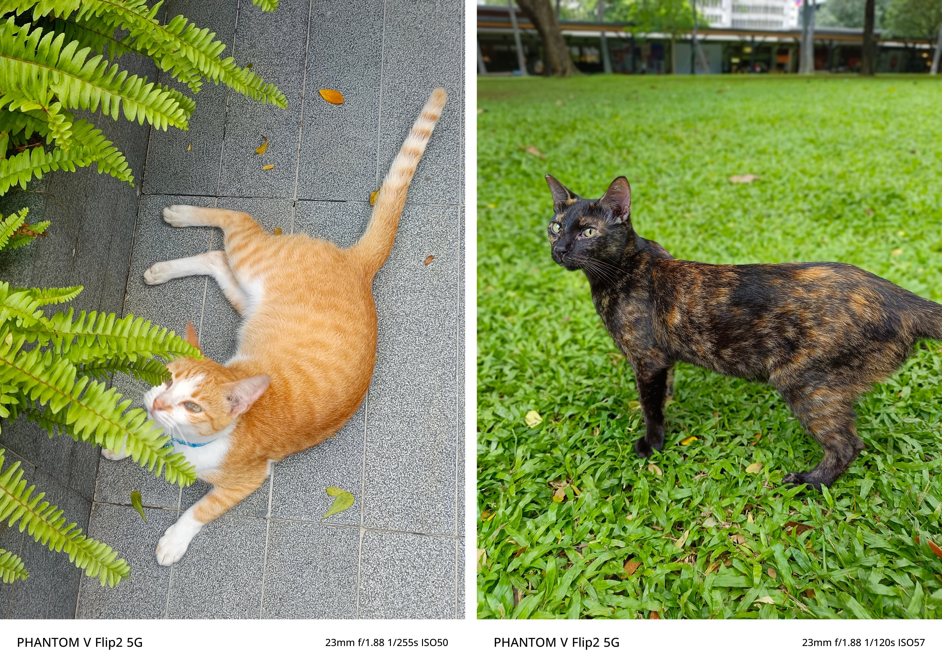
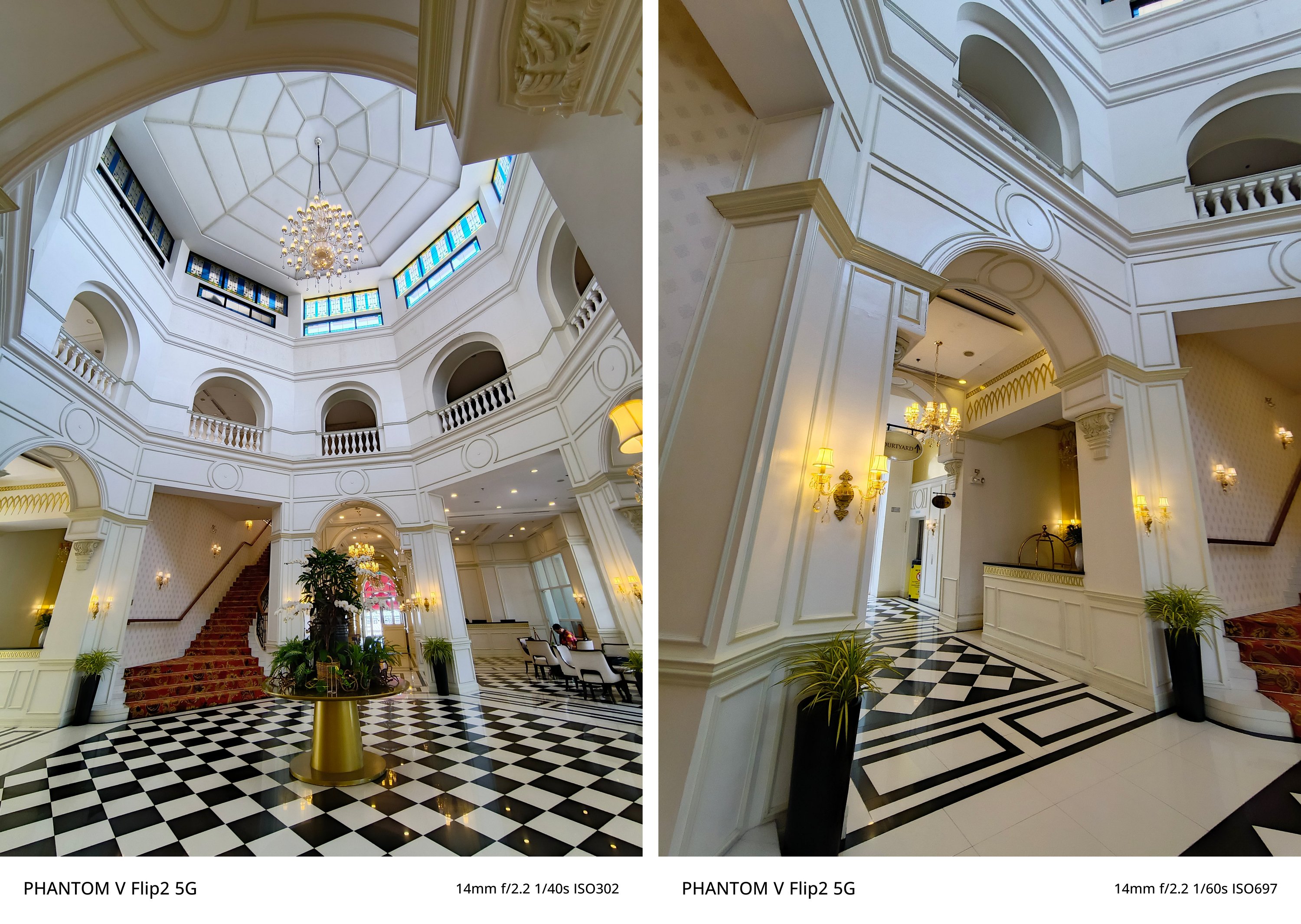
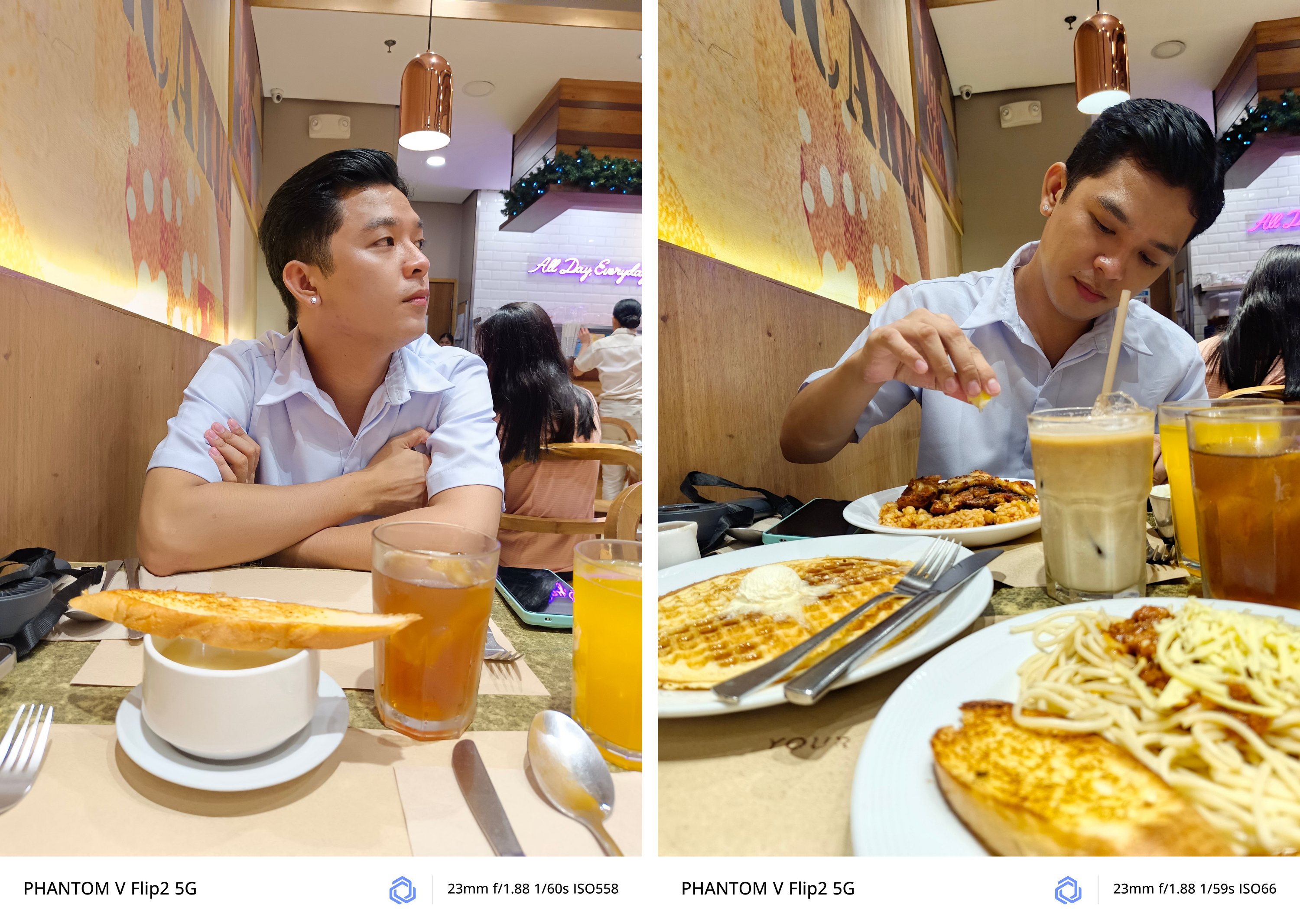
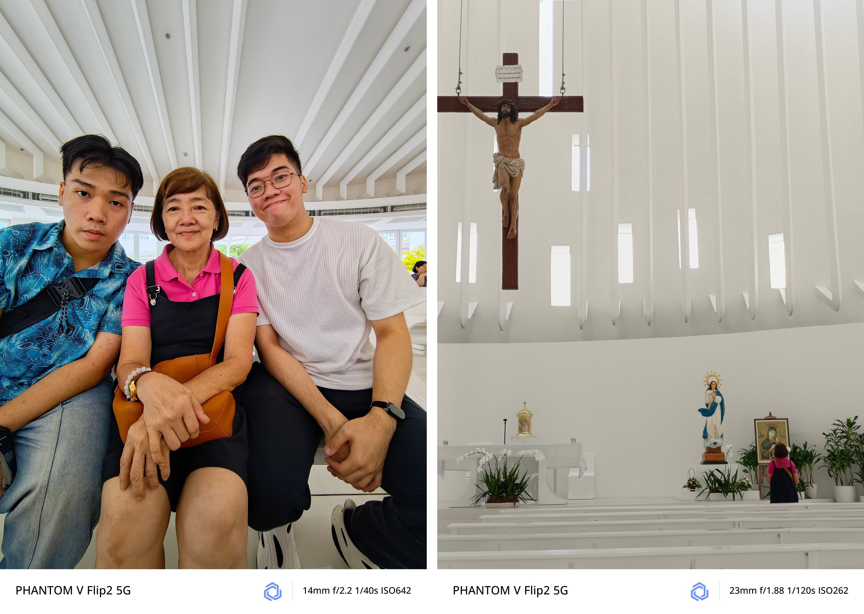
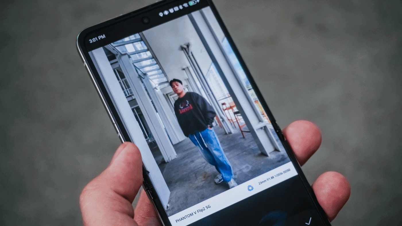
As what I already expect, regular 1x (wide) camera takes stunning shots.
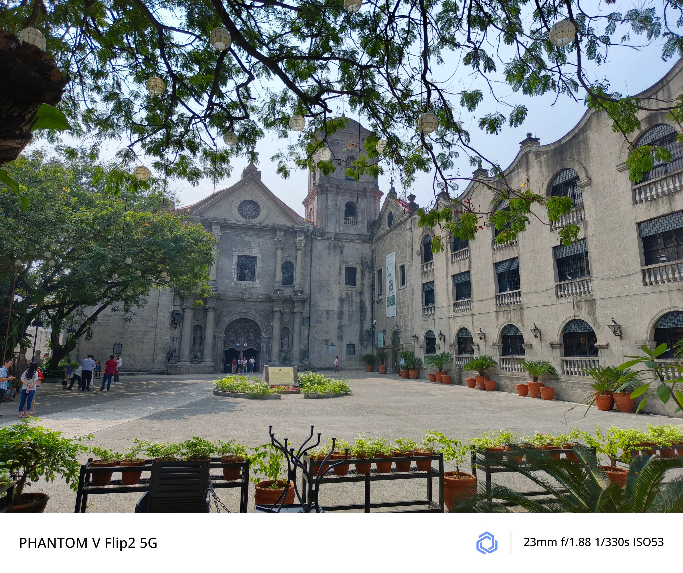
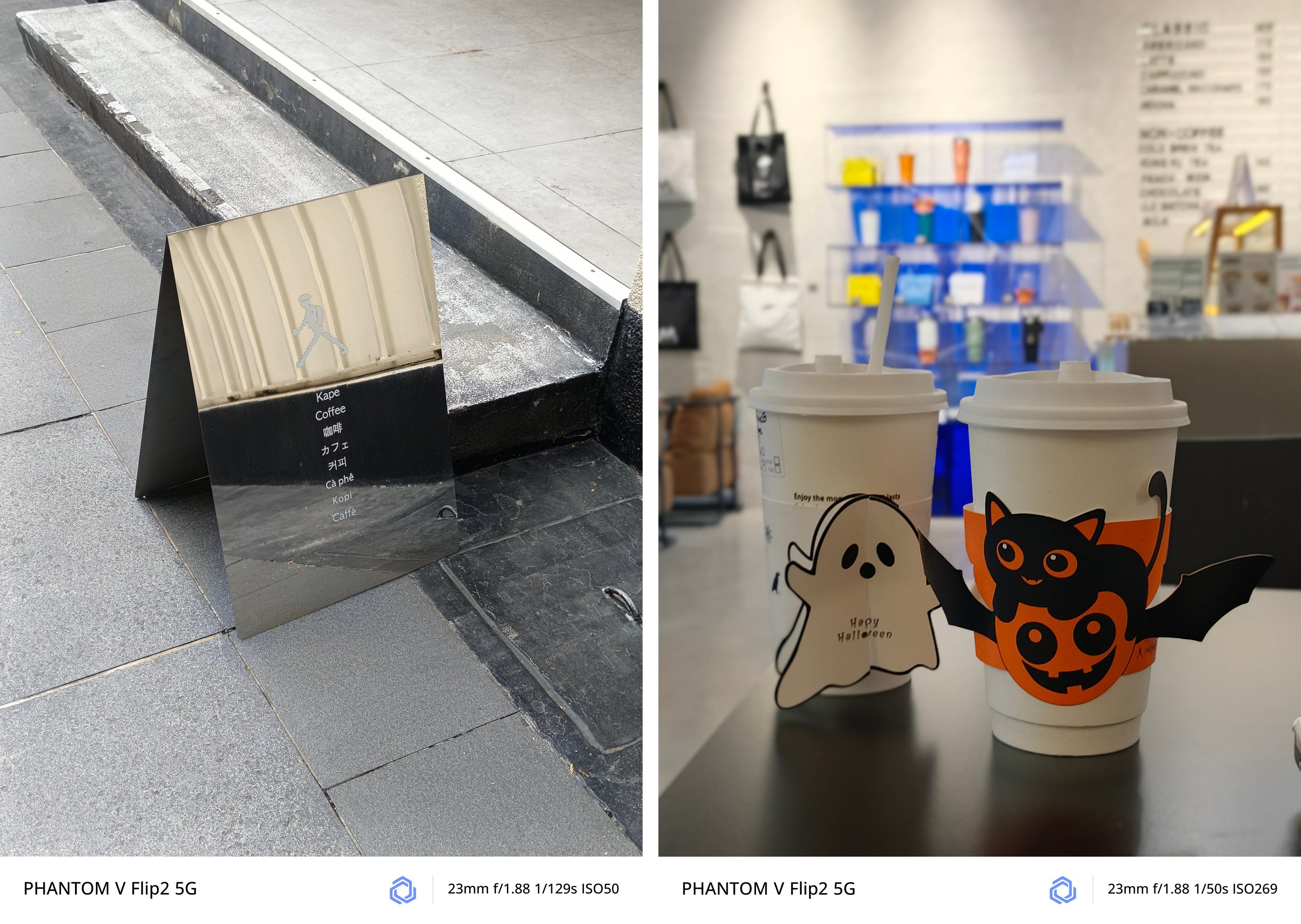
No matter what subject it is whether moving or unanimated, the PHANTOM V Flip2 can capture it clearly for you.
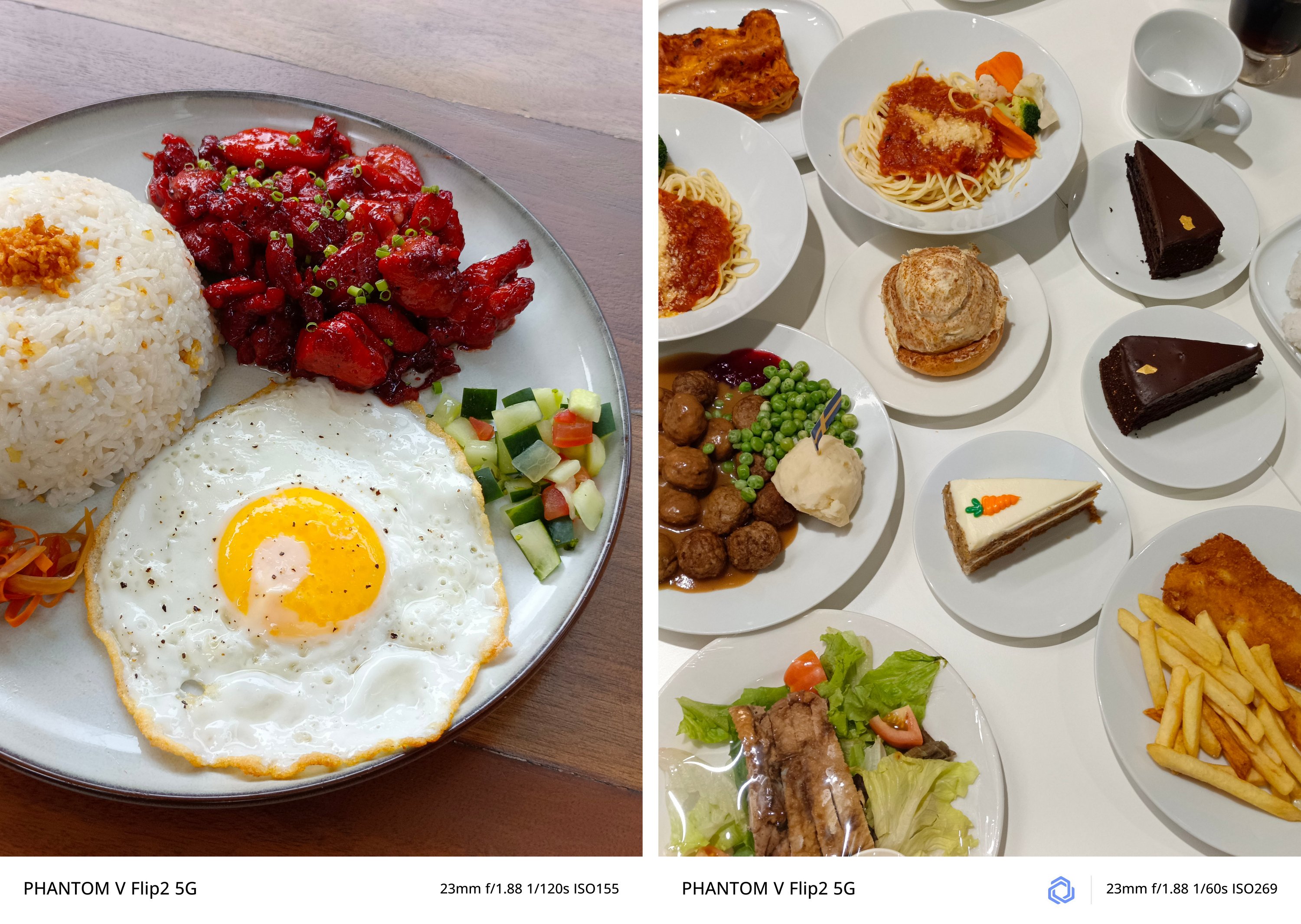
There’s no going overboard — whether that’s exposure, highlights, shadows, contrast, and sharpness.

Curious about low-light performance? TECNO’s AI algorithms at night took this shot without absurdity.

The wider, the better?
Honestly, I favor having this camera pairing more instead of the polarizing wide and 2x telephoto lenses found on both the Xiaomi MIX Flip as well as the motorola razr 50 Ultra (or razr+ 2024).
Although there’s no word about the actual aperture and sensor used, its ultra-wide camera is a good shooter as well.


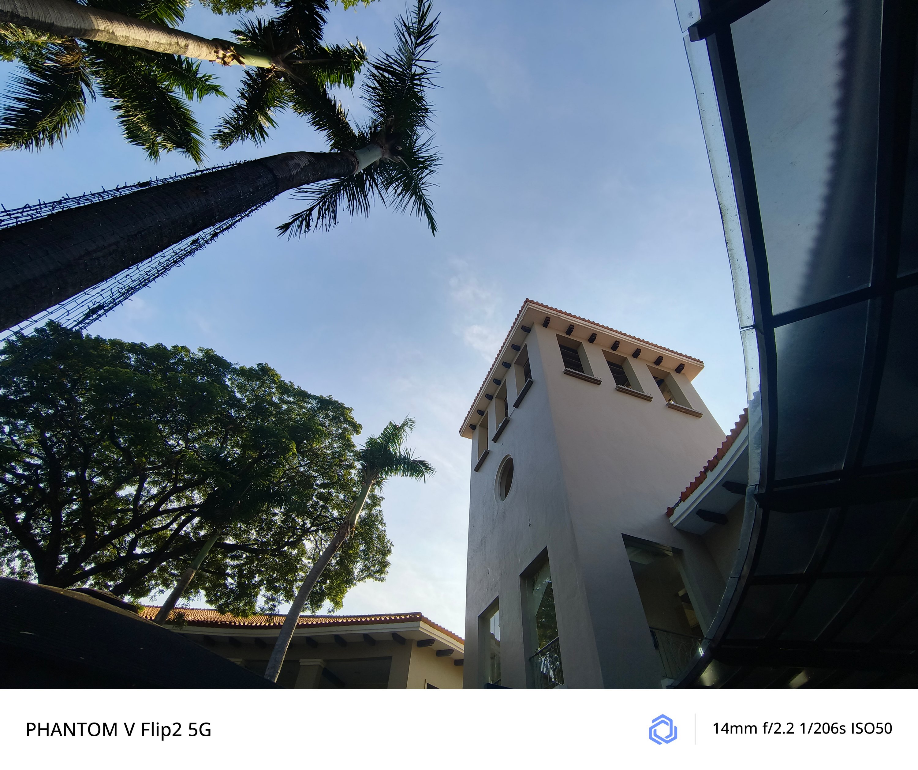
And if you’re wondering, quality is overall consistent in both modes.
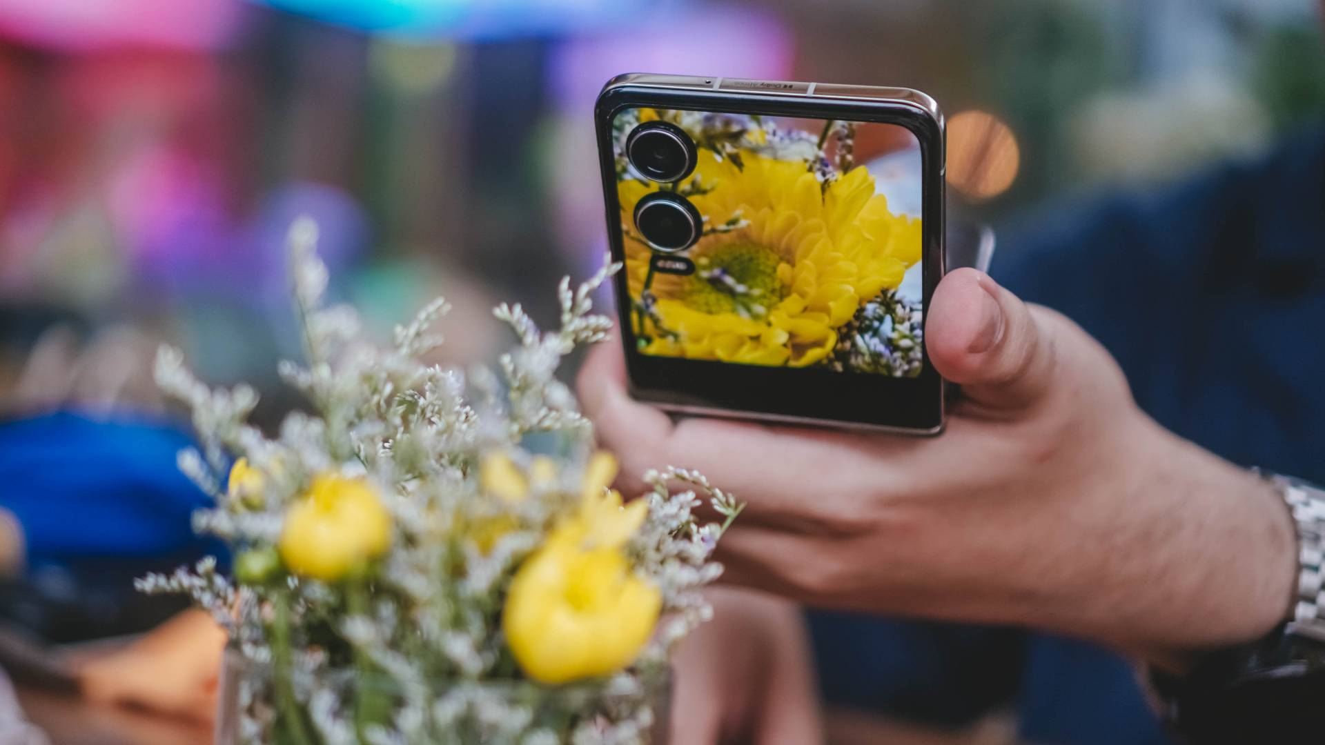
Macro Madness
Surprisingly, the PHANTOM V Flip2 was also able to take these incredible close-up / macro shots — as close as 5 to 10cm.

Whether it’s the middle part of this yellow flower consisting of its pistils and stamens…

…tiny rain drops on tiny leaves plus a chubby moth with its pretty wings…

…and even a dragonfly that’s weirdly attracted to a flower, the PHANTOM V Flip2 was able to document all of that with some few shutter presses.

No room for zoom?
Hardware-wise, the PHANTOM V Flip2 doesn’t have a dedicated telephoto zoom lens. Instead, it relies on its main 50MP camera when taking zoomed shots.
Remarkably, lossless 2x photos looked great as well.
It’s even beneficial when taking portraits with a sufficient amount of Depth of Field (DoF).
Freer than ever
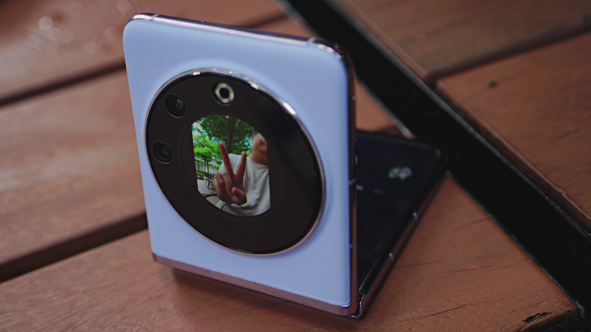
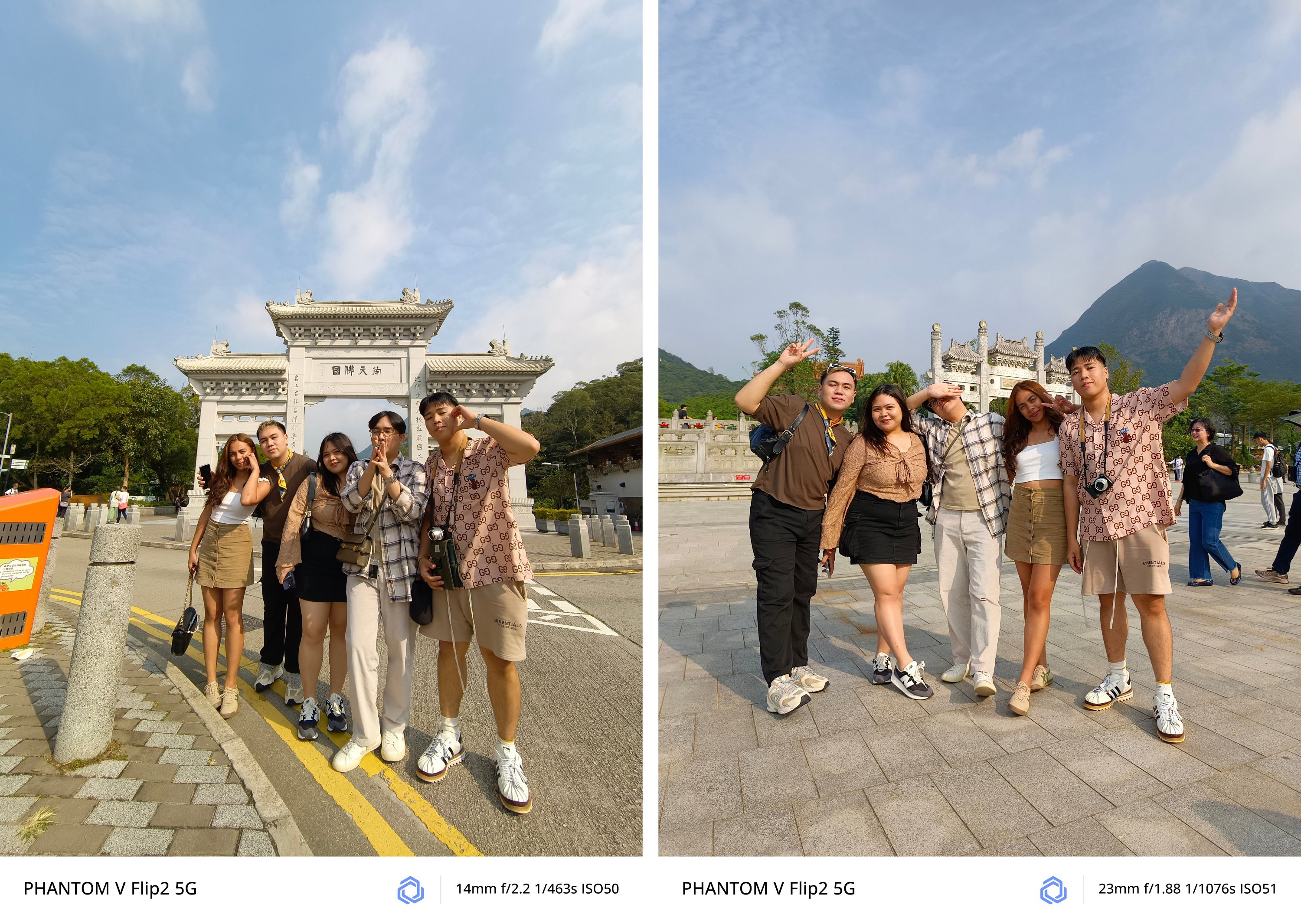
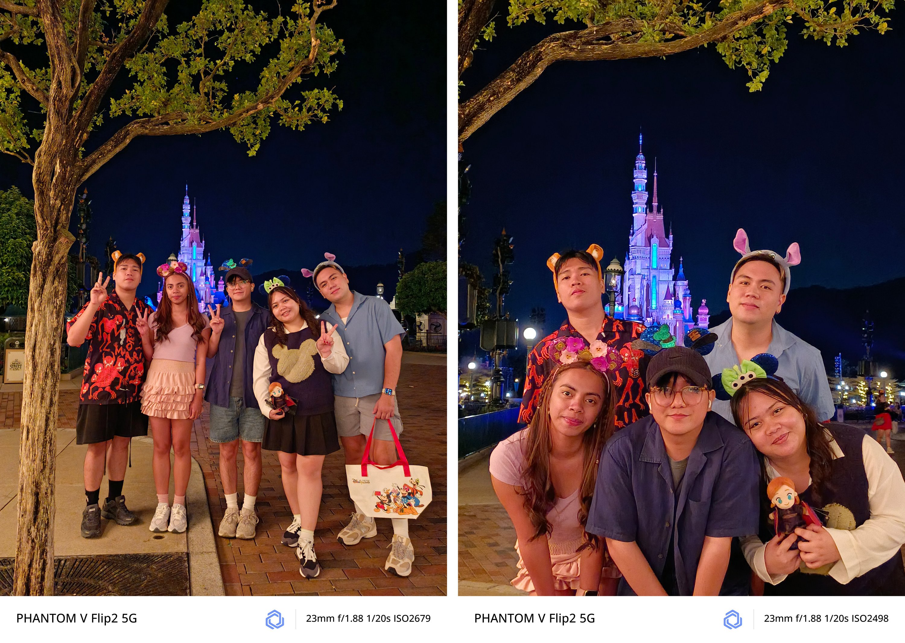
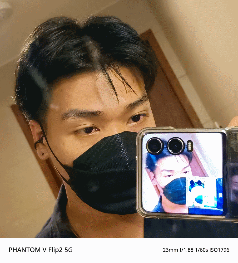
While already on the topic, the camera feature I enjoyed the most while using the PHANTOM V Flip2 is none other than its FreeCam System.
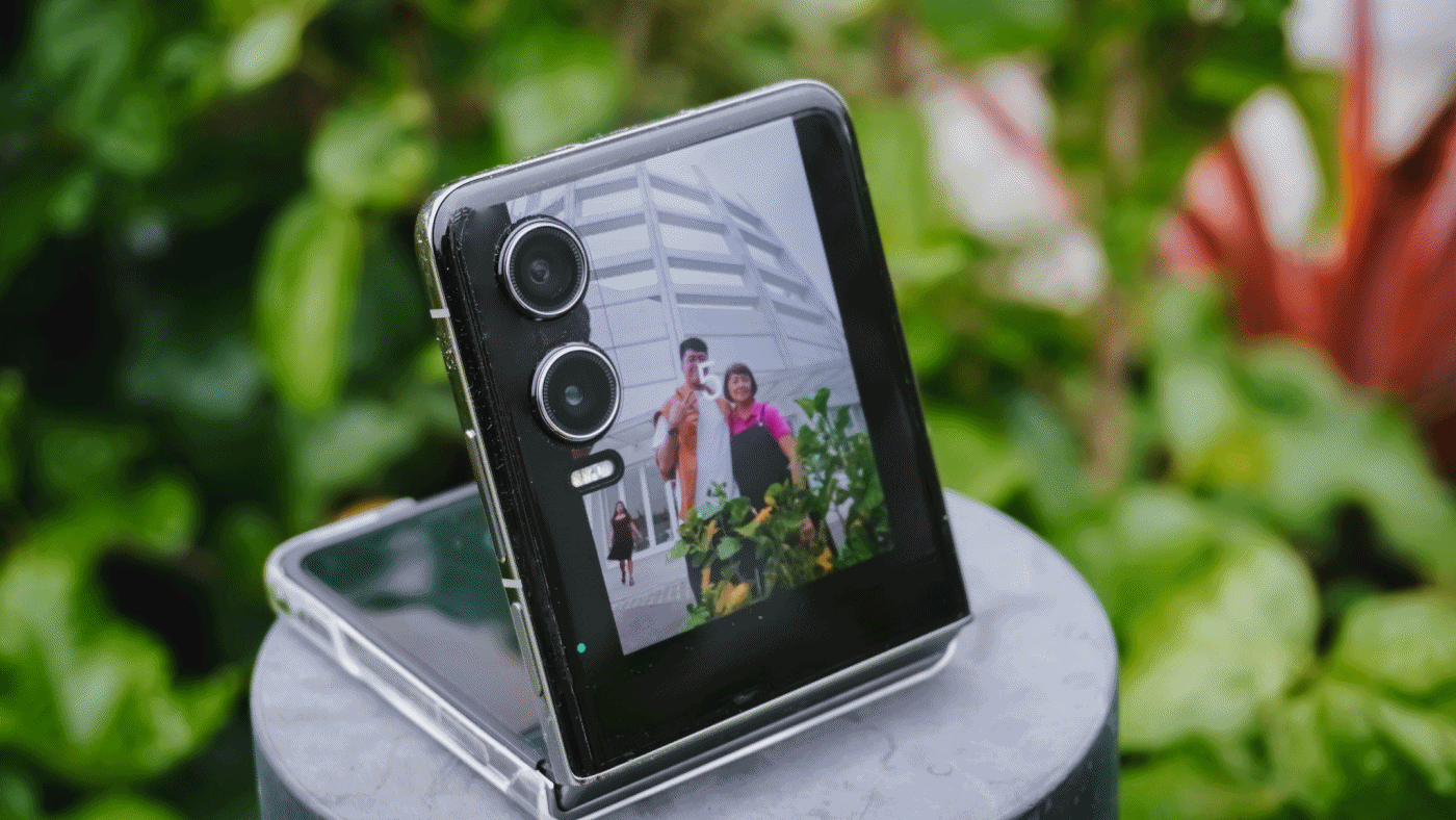
This basically lets you fold the phone in half. Prop it on any smooth and stable surface and it will instantly turn into your portable shooter. The new hinge mechanism simply makes the experience better and more secure.
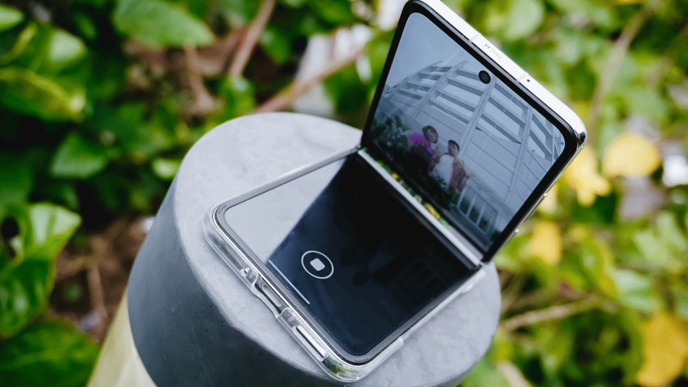
Enable the cover mode from the main flexible screen, et voilà! You can frame yourself and/or everyone else with no frills.
From there, you have two options to shoot. First is setting up a timer and toggle the camera by using hand gestures or voice commands. These were the results.
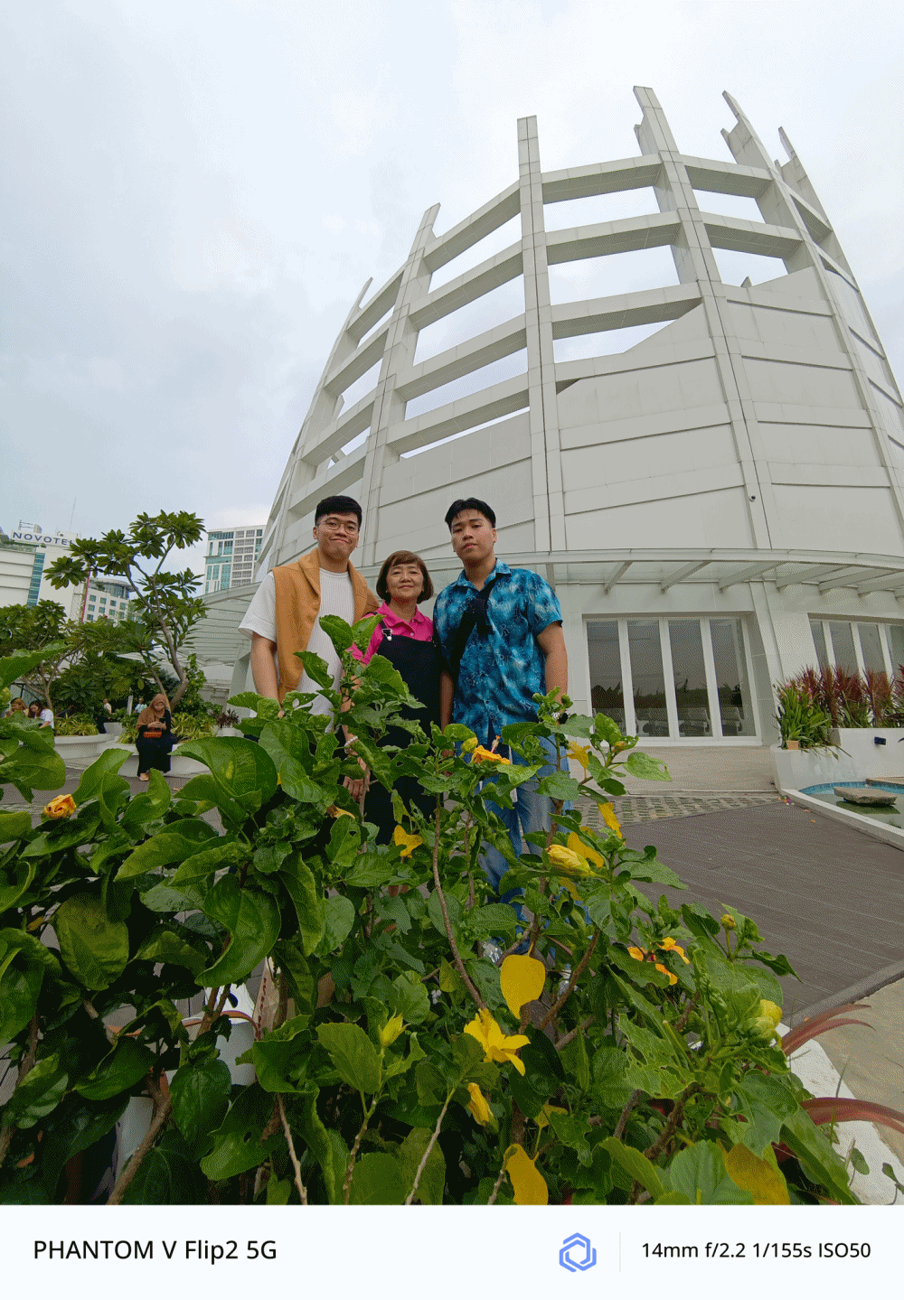
As fortunate as it seems, the pole, floor, staircase, and even the dumpster bin where I placed the V Flip2 were all stable to capture great memories without awkwardly asking a stranger to take a photo of us.
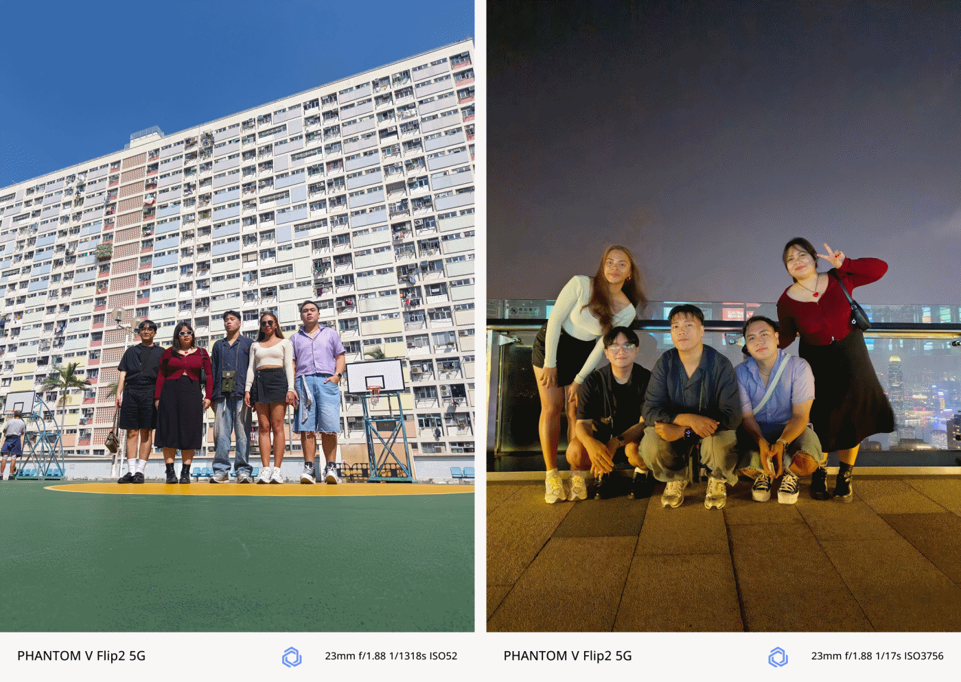
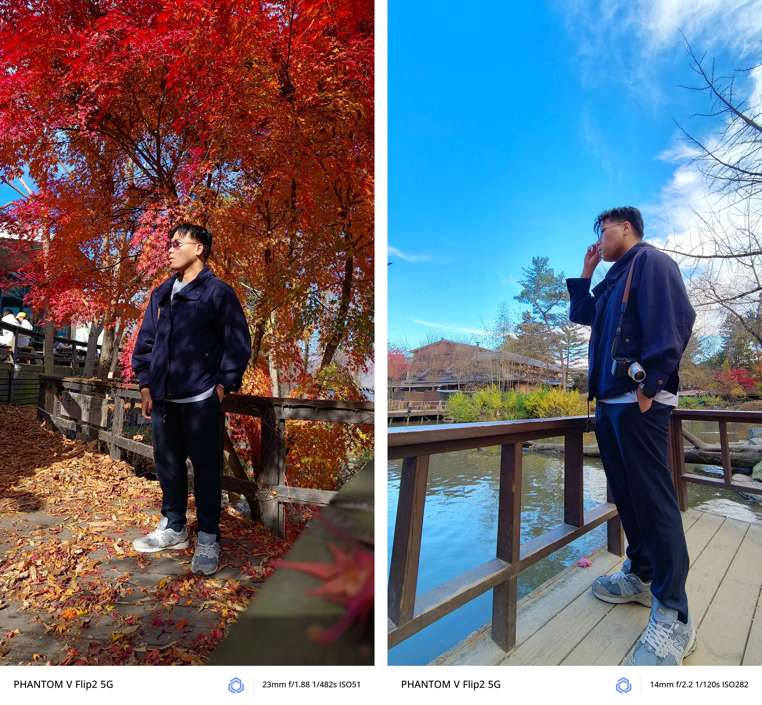
I have realized its full potential and how beneficial this Flip was when I had my trip to South Korea by myself.
Being in an introvert, I am afraid to ask people to take a photo of me.
Luckily, I bought and brought a monopod with a detachable Bluetooth remote control. I was then more confident when taking self-portraits — especially with the large cover screen and flexible camera system of the PHANTOM V Flip2.


All modes work regardless if it’s 1x wide, ultra-wide, or even 2x digital zoom.

Night mode also works like a charm!

It was almost pitch dark in Namsan Tower but the V Flip2 still managed to snap this
However, it’s not 100% perfect. If there’s one loophole, it would be the inability of the camera app to activate cover screen mode from the lock screen shortcut.
The only way to get it is to start from scratch — unflip and unlock the phone, then open the camera app from the main screen.
![]()
From there, you will see the cover screen icon at the upper left of the camera UI.
I still believe this can be fixed by TECNO through a future software update — much like how I am still eagerly waiting for a fix in its bigger brother, the V Fold2.
Trick or Treat?
Certain software features are what makes each Android smartphone manufacturer different from one another. In TECNO’s case, they’ve created HiOS with familiar features in mind.
IYKYK: TECNO has implemented a Dynamic Island-like functionality called “Dynamic Port”. It’s applicable to certain apps such as music (regardless if third-party app), countdown timer, face unlock, call status, charging indication, and more.
On the cover screen, it doesn’t do the same function. It only stays there as an indicator.

There are also AI-powered tools such as AI Smart Erase where you can erase unwanted people/objects out of a photo you just snapped or Intelligent Cut-Outs that outlines a subject you long-pressed.
Also, AI Drawing Board for the V Flip2 to AI-generated imagery based on certain art styles.
There’s also Ella — TECNO’s voice slash virtual AI assistant in one.
Not only it can search things for you, you can also ask for certain queries such as summarization of a long article, finding something in a document, and more.
And while already in the topic, the V Flip2 can also help with your writing woes with Text Generator, Rewrite, and even Proofread.
Is the TECNO PHANTOM V Flip2 your GadgetMatch?
The TECNO PHANTOM V Flip2 has a retail price of just US$ 699 (around EUR 645 / GBP 539 / SG$ 919 / PhP 40,425 / INR 58,765). This makes it one of the pocket-friendly 2024 flips out there — literally and figuratively.
UPDATE: TECNO has recently launched this in the Philippines for a special TikTok Shop-exclusive price of just PhP 27,999. It also includes freebies such as the PHANTOM Digital Video Case (PhP 1,999) plus a Limited Edition PHANTOM Luggage and Pin worth PhP 2,999.
After December 8, 2024, it goes back to its SRP of PhP 34,999 — which is still a lot less than its converted pricing above.
In line with GadgetMatch’s a la dating app concept of matching gadgets based on one’s wants and/or needs, we’re here to make it easier for you with just a series of swipes.
Swipe Left if you’re looking for a flip smartphone with a powerful processing power that can handle your triple A titles.
Swipe Right if you want that flip experience without having to sacrifice much of your savings.
As for me, I’m Super Swiping the TECNO PHANTOM V Flip2 as no other flip phone can match the great features it has for such value.
Flip or Flop?
If maximum performance is in your priority list, you’d know by now how the PHANTOM V Flip2 has flopped.

But, even though its MID-iaTek chip *pun intended* is the biggest compromise (and also the biggest factor for cost-cutting), it’s still hard to deny how irresistible and compelling this flippable is in 2024’s sea of flips.
Looking at the competition, the Xiaomi MIX Flip, HONOR Magic V Flip, Samsung Galaxy Z Flip6, and motorola razr 50 Ultra are all more powerful in overall performance. But the thing is, one will cost you a fortune.
Meanwhile, in the lower-end of the spectrum is where the HUAWEI nova flip and ZTE nubia flip both sit. They already have their fair share of downsides such as the smaller outer displays. Design neither an exception.

IMHO, its direct rival is none other than the motorola razr 50.
While they share similarities (and some differences) such as having the same cover screen size (minus V Flip2’s 120Hz display), quite similar dual camera setup (except for the razr 50’s measly 13MP UWA lens), the razr 50 is more packed with its 4nm Dimensity 7300X chipset.
Still, both phones are packed in the most modern flip design in mind.
That said, if you’ve been wanting to switch and try out the flip-erience without having to sacrifice much of your savings, the PHANTOM V Flip2 is the sign you’ve been waiting for.
You couldn’t get much of these features and prowess in other brands. Not even the Galaxy Z Flip6 could run most of the apps without flipping open the device itself.
Cameras are for another story. If you’ll ask me, it probably deserves a piece of its own just by how amazing the shots were thanks to both V Flip2’s camera hardware and TECNO’s AI camera algorithm combined.
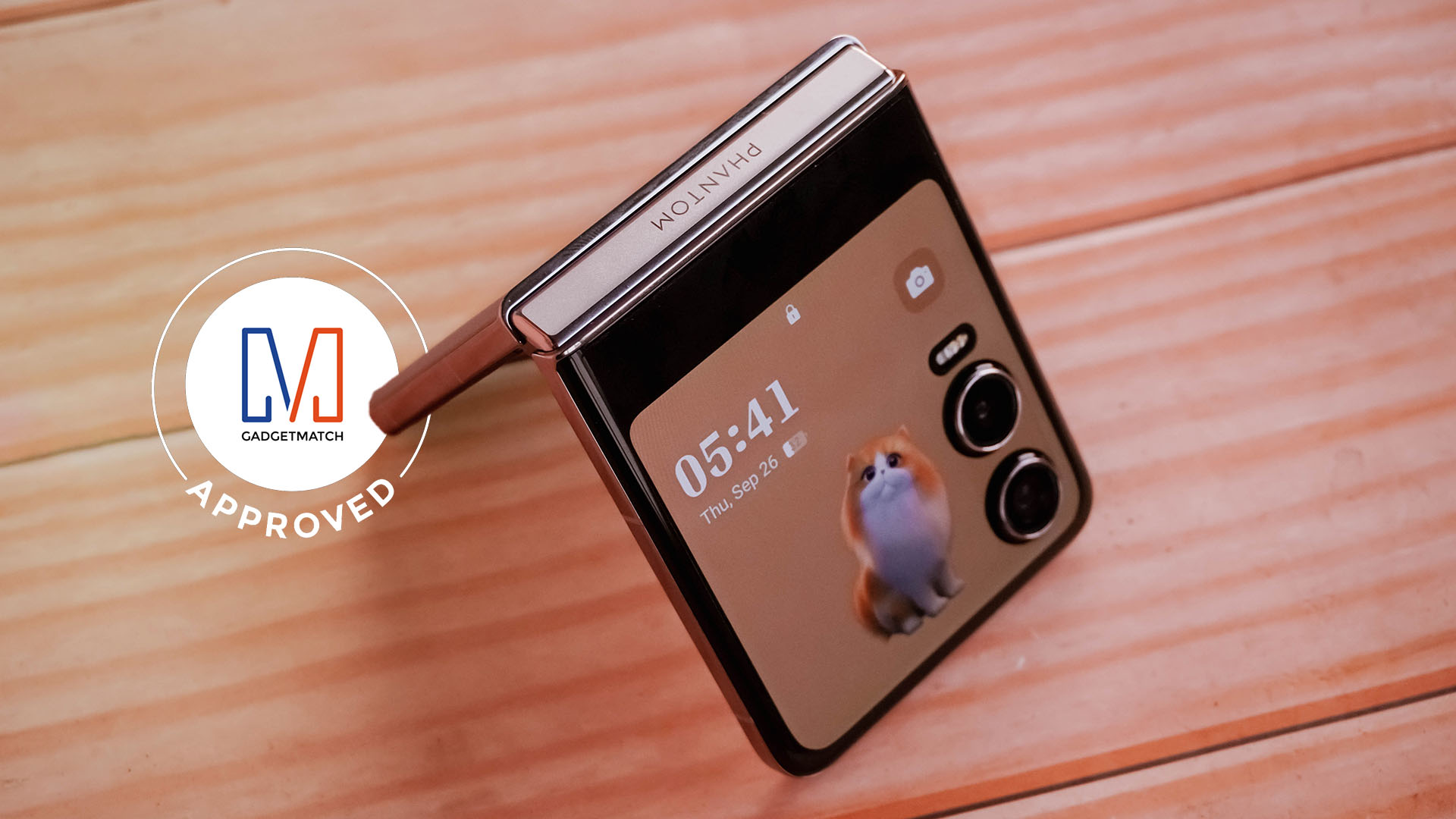
Without a doubt, TECNO’s PHANTOM V Flip2 deserves the GadgetMatch Seal of Approval.


Gaming
PRAGMATA is not for the faint of heart
Already a Game of the Year contender for all the feels
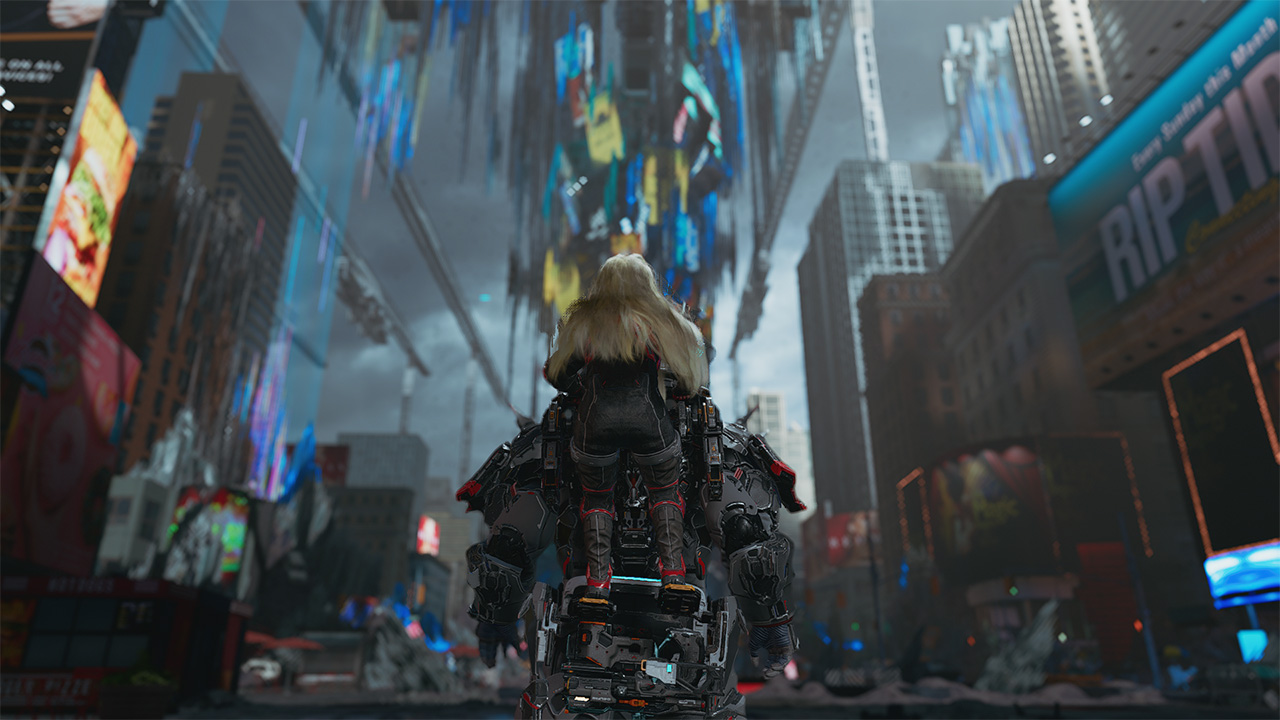
Six years and a few notable launch delays. That’s what it took for Capcom to finally introduce a new franchise in 2026. They already have legacy franchises getting new releases. However, the biggest question looming over their head was whether or not they dare to explore something new. What makes it more challenging is an entirely new team is working on its development. That comes with its own sets of risks and rewards.
This was the story of PRAGMATA, another exciting title finally getting its time in the spotlight on all modern platforms. Looking at trailers, screenshots, and even demo highlights, I already got the sense that this game may just be at par with a ton of sci-fi-inspired RPGs. The expectation on my end was clear: all action, all exploration, with a storyline that will tie everything together seamlessly.
I was not prepared for the storm of emotions and action that came my way.
Maximizing your brain power
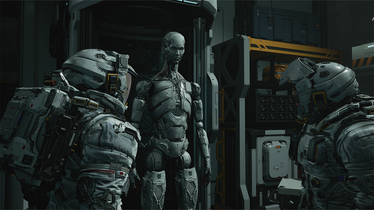
PRAGMATA operates like most action-packed RPGs with how combat works: you point, you shoot. To set that up, you play as Hugh. He is an engineer sent to a moonbase called the Cradle to investigate comms being down. As you enter the Cradle, something already feels off. Before you even get a chance to blink, you’re already plunging into danger as the AI that keeps it safe has gone rogue. By the time you come to, you’re attacked by one of the bots that helped you out. From there, must fight your way throughout the game to survive.

Luckily for you, a support android named D-I-0336-7 fixes you up. The android willingly helps you fight the rogue AI by hacking through them. Not only will the hacking deal additional damage, but it will help you identify enemy weak spots to exploit. However, to achieve the perfect hack, you are required to solve a puzzle-like board with nodes mid-fight. Essentially, you’ll be doing two things at once to survive and fight your way through the Cradle.
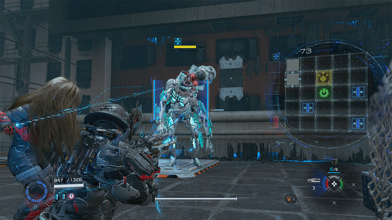
It’s the kind of mechanic that feels unique as the level of difficulty escalates with every encounter. Oftentimes, the hacking and the shooting are separate mechanics that are done to calmly set you up for the fights. Now, it’s do-or-die with the hacking increasing your odds of success immensely. Enemies are hard to defeat simply on the gunplay alone. And you will need to keep that in mind as you progress through the game.
Expansive world to complete and unlock
Speaking of progression, as you get out of that initial skirmish alive with D-I-0336-7, who Hugh cutely gives the nickname “Diana” to, you end up in a tram to the Shelter. Effectively, the Shelter serves as both your base of operations and a rest spot to retool before combat. As you go through every area of the game, you unlock newer features. These are REM Replicators, upgrades to your health, firepower and hacking skills, and access to more weapon schematics and nodes. Also, you can even set up matching suits for Hugh and Diana before heading out into the world again!

Once you have everything you need, you will venture out into areas in the Cradle that need to be restored. A lot of the areas are incredibly expansive. This allows you to explore and grab as many freebies lying around as you can. From the Lunafilament used for upgrades to newer weapons at your disposal, the game scatters these for you to find and harvest from the overworld. Of course, you’ll run into the occasional swarm of enemies but you have Diana, and Diana has you!
Diana’s hacking even extends into these as you progressively acquire new skills. As you progress, you’ll be able to remove map hazards, clear traps, and scale structures effortlessly. This fully allows exploration to be less of a drag. There are newer pathways to areas you previously couldn’t explore or made it easier to backtrack. Plus, there are stations that can be activated as save points and hangars to return to the Shelter that Diana can activate.
It’s a large hub to explore. You’re encouraged to get and know everything because this next part will have you strapped.
Building bridges back to Earth
Without completely spoiling too much, PRAGMATA‘s storyline is one you gradually feel and resonate with. Earlier, I mentioned that the whole reason Hugh and his team were in the Cradle was to investigate its unresponsiveness. In an unfortunate turn of events, Hugh gets separated from his team and has to go through the entire Cradle looking for a way to get back to Earth. Along the way, Diana resurrects Hugh from certain death and accompanies him throughout the excursion mostly to be a guide and helping hand.
Throughout the game, Hugh and Diana develop a strong bond that already borders a father-daughter dynamic. Originally, Hugh didn’t really consider himself as a parental figure since he doesn’t have kids of his own. However, he goes out of his way to ensure Diana’s safety and overall wellbeing – effectively giving human compassion and love to an android. Oddly enough, Diana almost certainly feels more human and would even want to join him back to Earth.
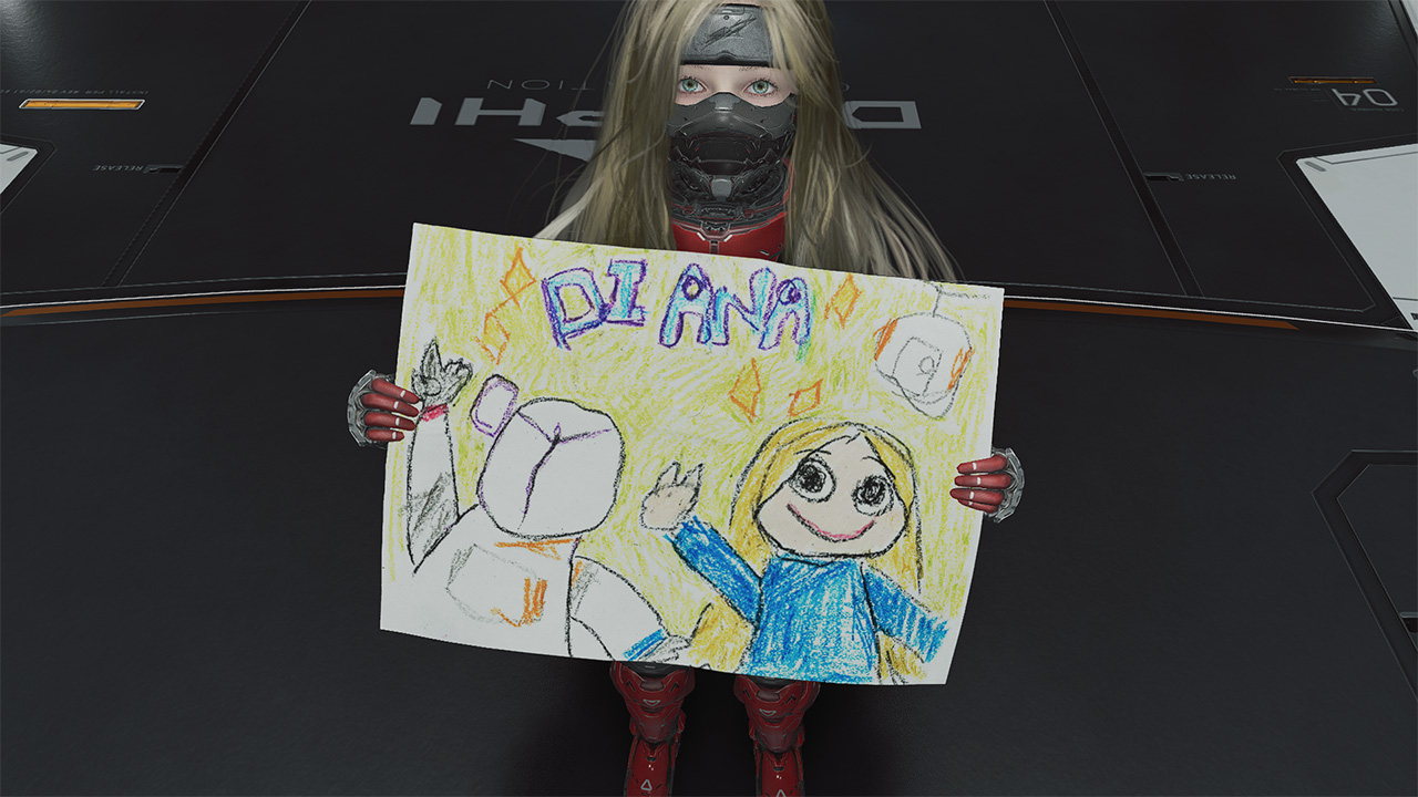
As you explore throughout the game, you also pick up schematics of real Earth objects that are processed in the Shelter’s REM Replicators. These are neat trinkets that Diana actually gets to play with, even to a point of bonding with Hugh through them. It’s the kind of heartwarming moments in between the chaos that reflects the dynamic that many people will truly appreciate.
Struggles picked, sacrifices made
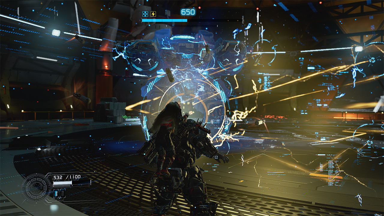
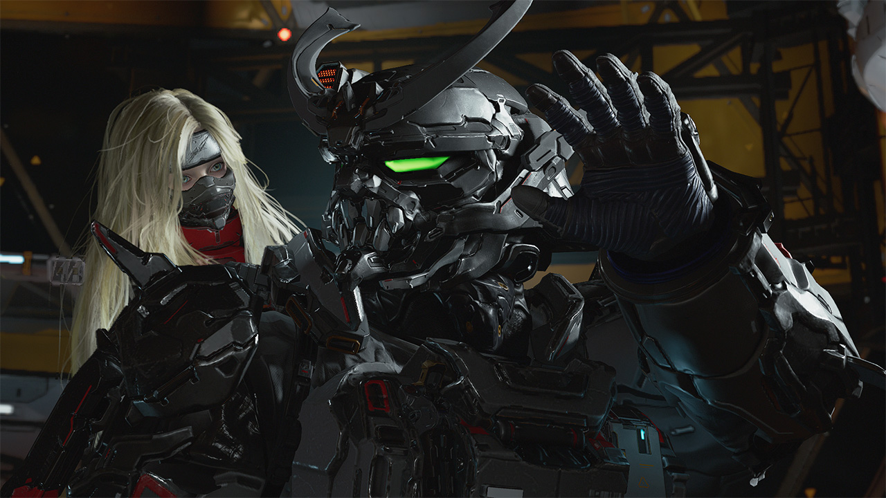
Remember how the game encourages you to explore to know everything? All of that was intentional for Hugh and Diana to get down to the bottom of what really happened at the Cradle. As it turns out, the AI mainframe of the Cradle, IDUS went into disarray after the moonquake that separated Hugh from his crew. Along the excursion through the Cradle, the pair discovers and meets up with another android called Eight who has the answers to effectively contain IDUS through Diana.

Only for them to realize that there are far graver dangers ahead. So now, the objective is to survive till the end, get back to Earth and stop anything that gets in the way. All throughout, you as Hugh will be tested on not only keeping Diana safe, but also ensuring that she gets to experience Earth with or without him. For the parents and parental figures out there, you know this feeling all too well.
A GamingMatch Made in Heaven?
No matter how you slice it, PRAGMATA nailed everything in my list of expectations: the right mix of exploration, easy-to-master combat mechanics, and an emotional story that transcends culture and hits right in the feels. It feels like Capcom continuously revitalizes the RPG experience with newer concepts and mechanics that truly test players at the core. Matching it with characters that allow you to have an emotional investment in, and the game hits right in the feels in more ways than one.
It’s a game that gradually keeps you engrossed in the experience from start to finish. From approaching tougher and larger enemies to traversing the overworld to collect resources, every instance feels wholly unique. Furthermore, the game incentivizes rest and reset without fully losing progress in your adventure.
More than anything, it offers a fresh take on character dynamics that will leave you in an emotional mess. Whether you like it or not. Admittedly, the bond between Hugh and Diana is one that a lot of people simply resonate and potentially aspire to have. It’s a reminder of how deep the human connection can truly transcend. And even be the ultimate key to survival against all olds.
Not only does PRAGMATA get a Swipe Right, but this game truly deserves to be up there for Game of the Year contention.
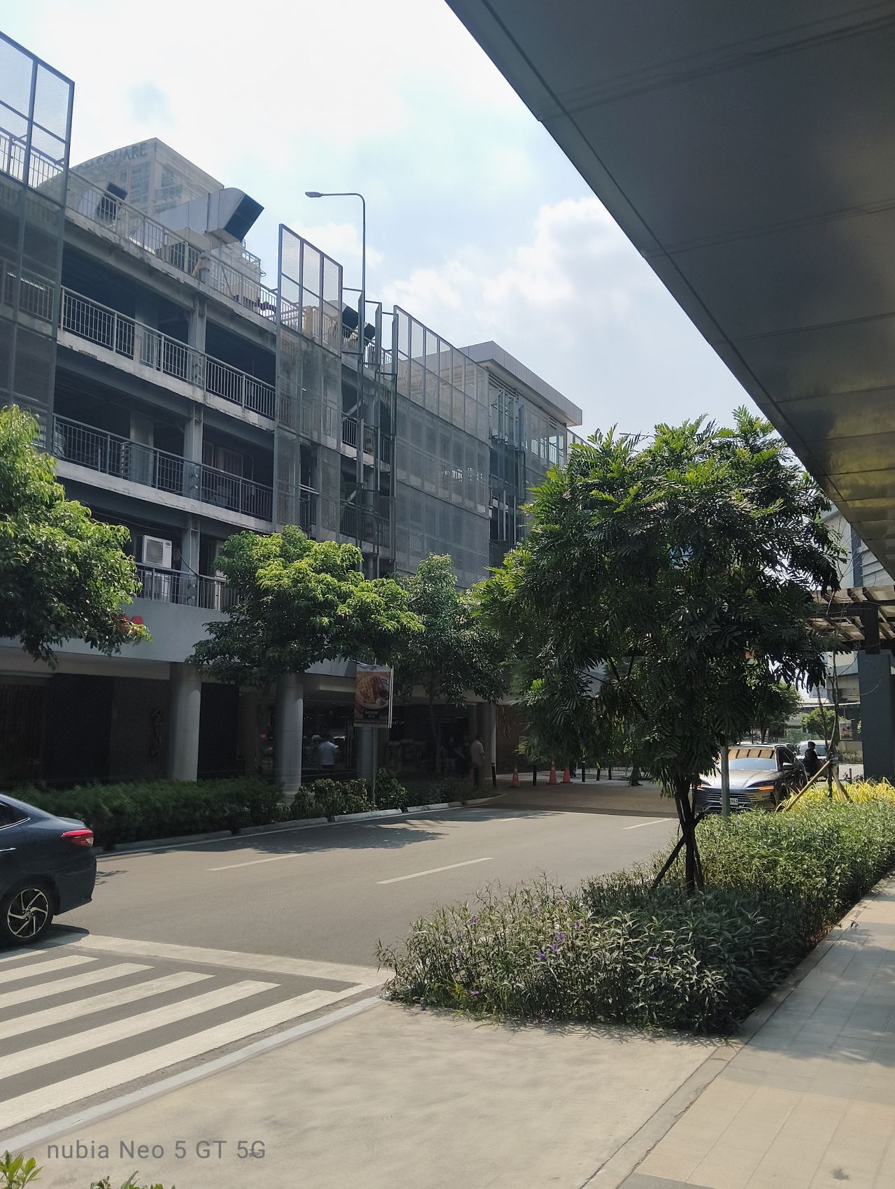
nubia has gone with an interesting direction for their latest midrange gaming line.
While other brands continue to blur the line between what is a “gaming-centric” smartphone and a reliable all-around device, the brands’ nubia Neo 5 series has been made even more aggressively for gaming.
And in 2026 where smartphone prices are skyrocketing and consumers are looking for the best value proposition before spending, that doesn’t seem to be the brightest route to go.
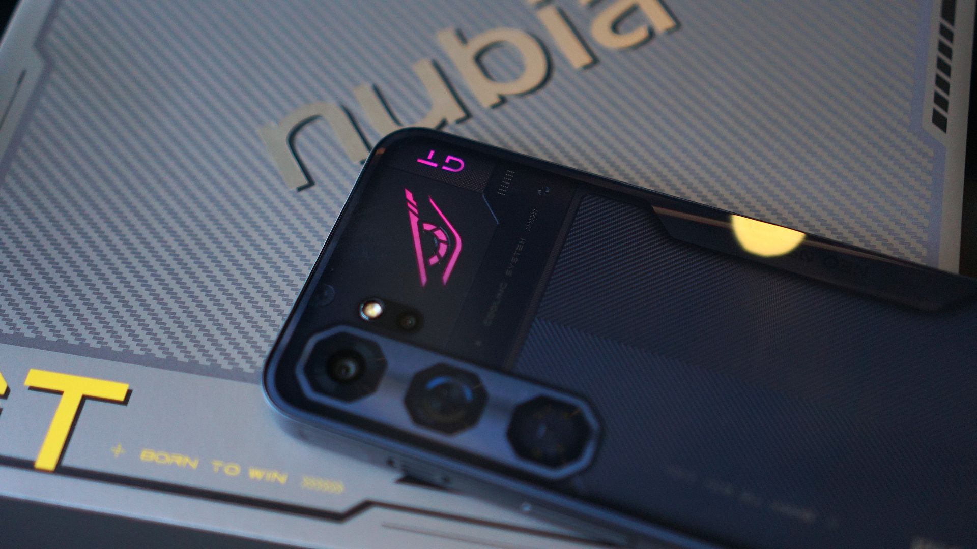
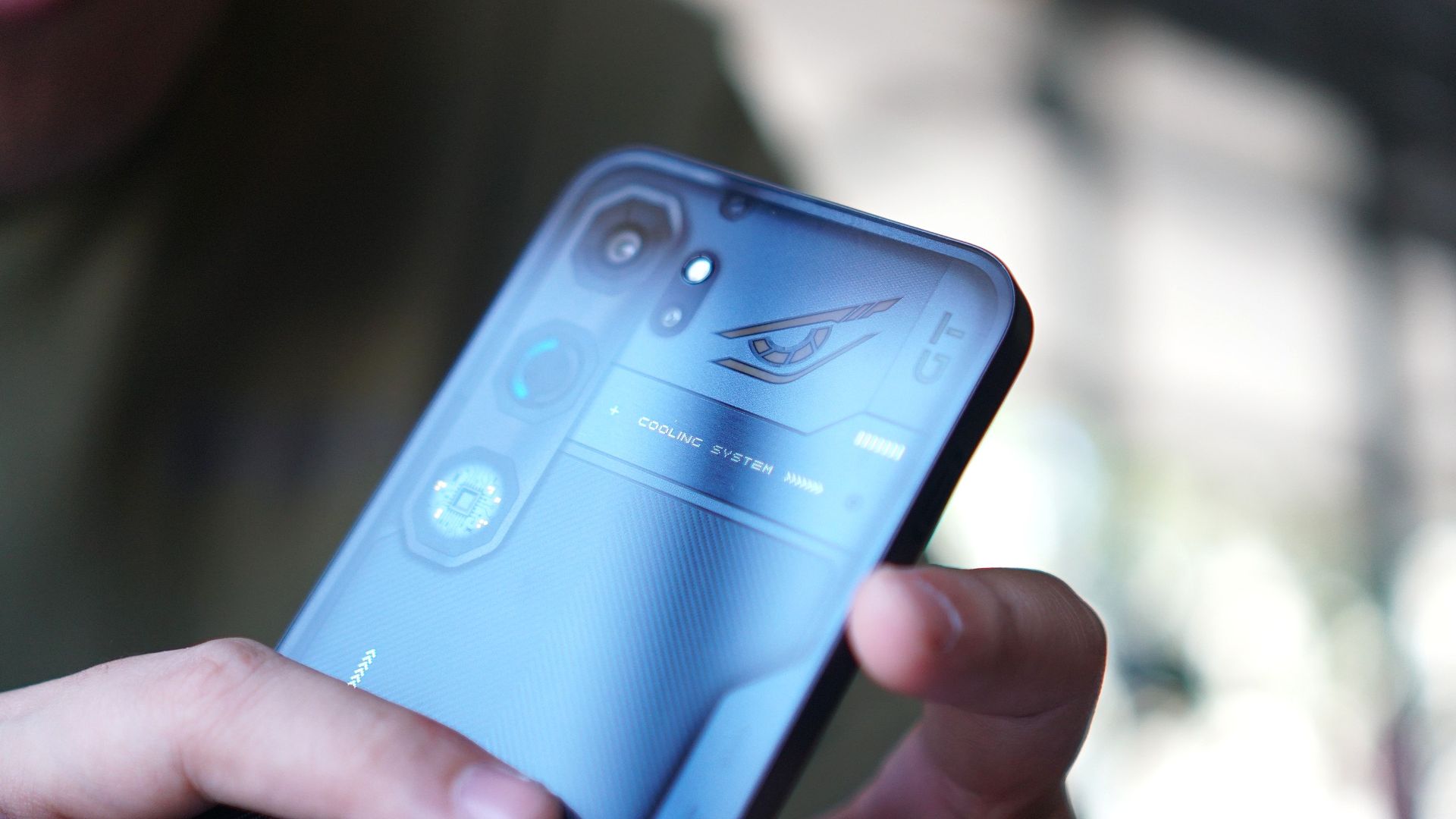
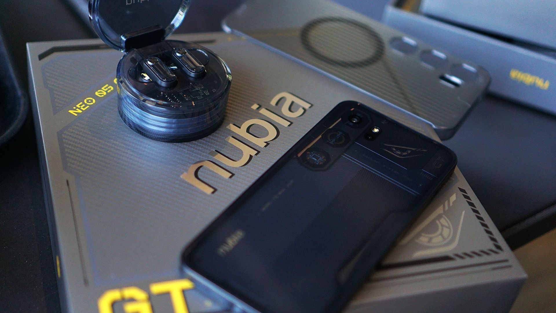
nubia Neo 5 GT
The nubia Neo 5 GT is the series’ top-of-the-line variant, with up 512GB of storage and a Dimensity 7400 processor.
The biggest highlight of the new series is the built-in cooling fan and Vapor Chamber cooling system.
This eliminates the need for a physical cooler, which you usually get for free anyway but have to attach to a magnetic phone case and power with a USB-C wire.
I think taking away that hassle of a set-up allows users to concentrate on gaming itself, as what this device is chiefly intended for.
And the cooling system does what it is solely asked to quite well: keep the phone’s temperature a lot cooler.
Moreover, if you’re playing for hours, this comes in helpful for bypass charging (branded as “Charge Separation” by nubia) to keep the temperature low.
The same purpose can be leveraged for quick charging, as the device’s 6,120mAh battery supports 80W charging.
Now of course, I’ve exhausted the device for about a month, playing my usual go-to mobile titles. Here’s how the phone performed with each game.
Mobile Legends: Bang Bang
As expected, MLBB is one of those titles that ran on the device without any problems. I can play multiple rounds even without the cooling fan turned on, and with the performance mode set to Eco.
Dunk City Dynasty
My time with this device also allowed me to revisit the NBA and NBPA-licensed Dunk City Dynasty.
I spent a lot of time on this multiplayer 3-on-3 title. Performance went generally smooth, although I had some connectivity issues.
This was a letdown since I needed to compete in real-time with other players. Nevertheless, I was able to chalk up several wins with characters like Jordan Clarkson and DeMar DeRozan.
Call of Duty Mobile
CODM was perhaps the first real test for this device, and this is where the cooling fan and a balanced performance setting came in handy.
Panning went without hiccups, allowing you to focus on just shooting. The graphics look more refined, specially with the phone’s 6.8-inch display. And fitting enough, the device did stay relatively cooler (I played mostly indoors).
Battery drain, of course, was somewhere in the 12% to 15% range, and even higher when playing with mobile data. The network was somewhat stable during the sessions I played.
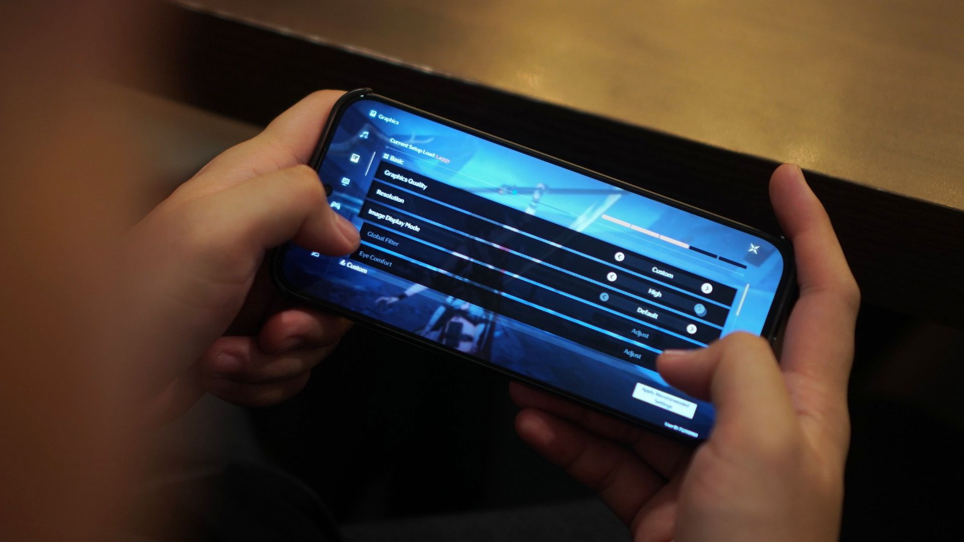
Wuthering Waves
I felt the nubia Neo 5 GT also excelled in distributing the resources for heavier mobile titles like Wuthering Waves.
Especially during combat, I didn’t experience any stutters nor frame drops with the fast-paced battles, which involved slashing, flying, and sliding, among other mechanics.
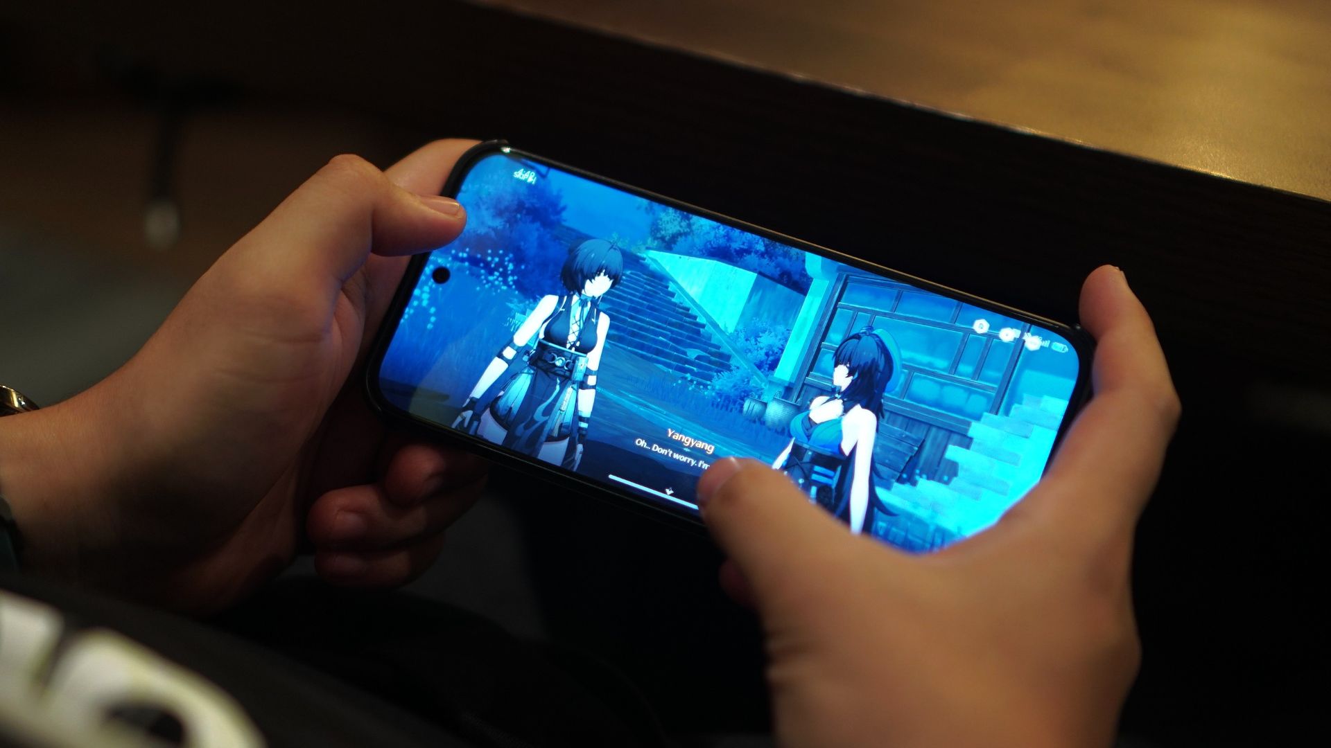
Taps felt responsive as well. If anything, I enjoyed playing this title again on this handset.
For reference, here’s the graphics settings I went with:
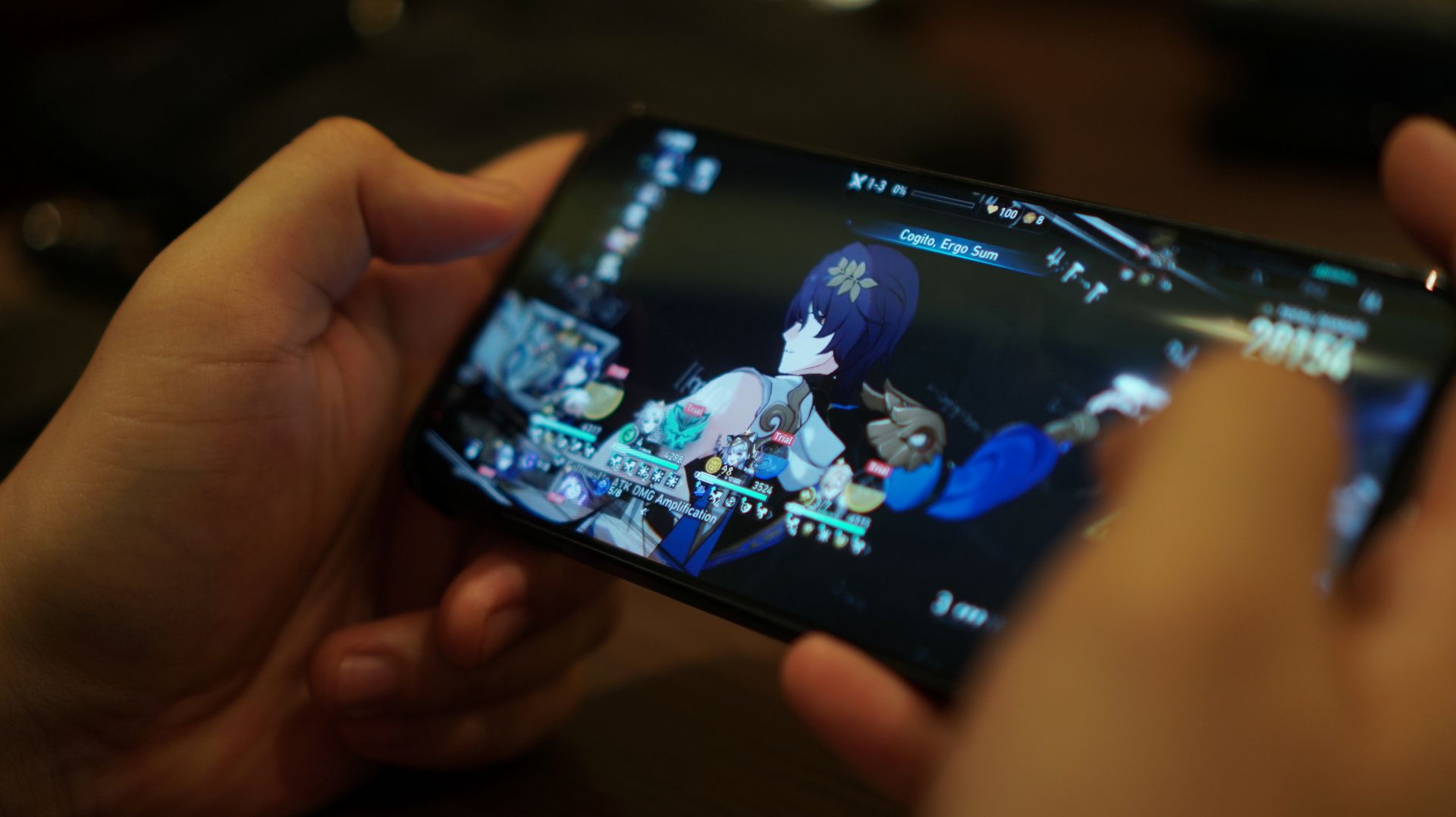
Honkai Star Rail

Lastly, HoYoverse’s space fantasy RPG also worked wonders on the device. That’s with the high-performance mode (Rise) on and the cooler again aiding the experience.
Visual effects definitely looked crisp and smooth, at a high frame rate setting. At 439ppi, the nubia Neo 5 GT’s pixel density ranks among the highest in its class, for refreshed graphics.
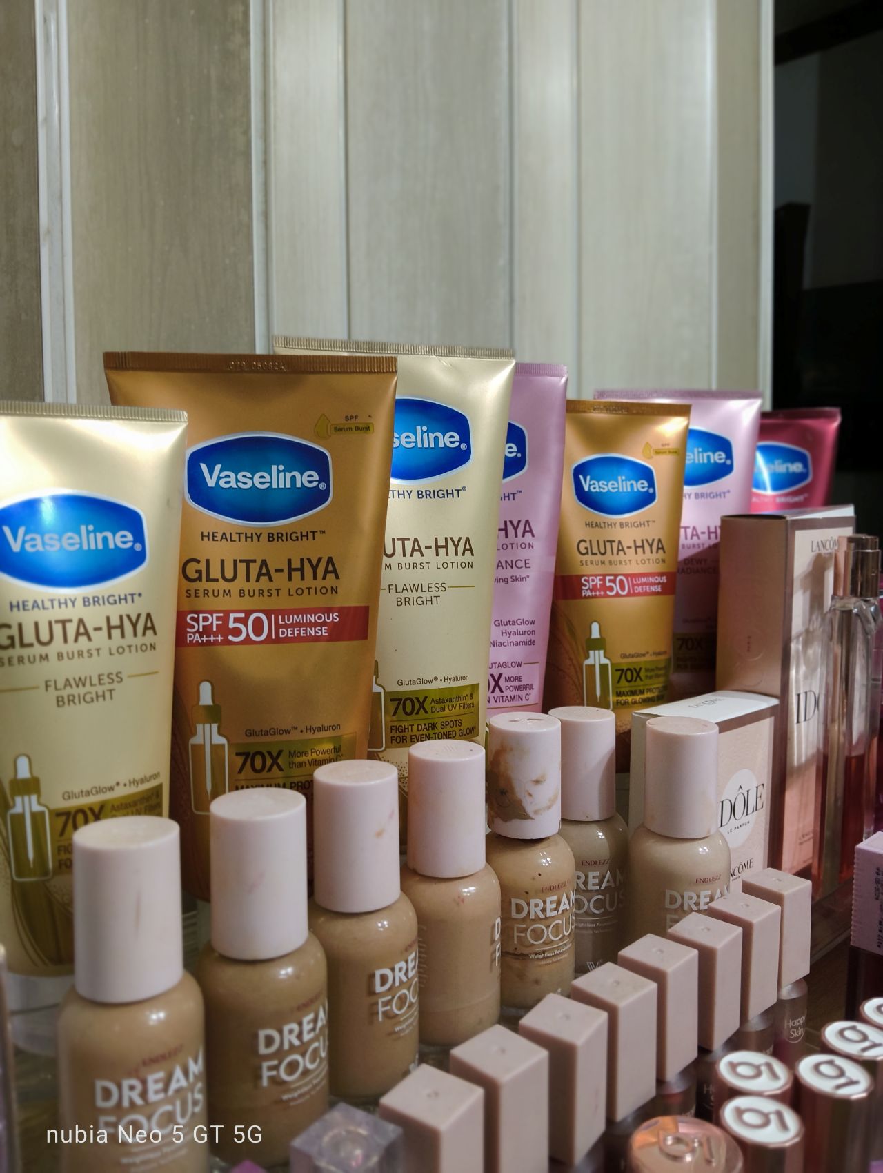
The 512GB storage capacity is definitely a plus. Just downloading assets for the two RPG titles will cost you about 100GB of space already.
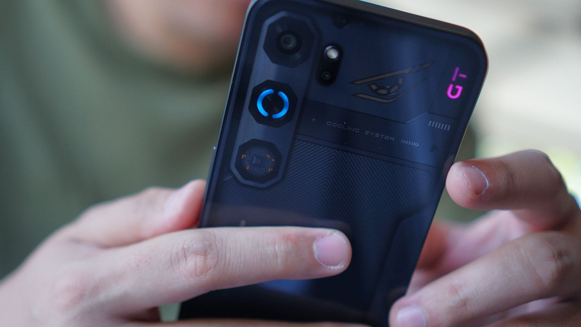
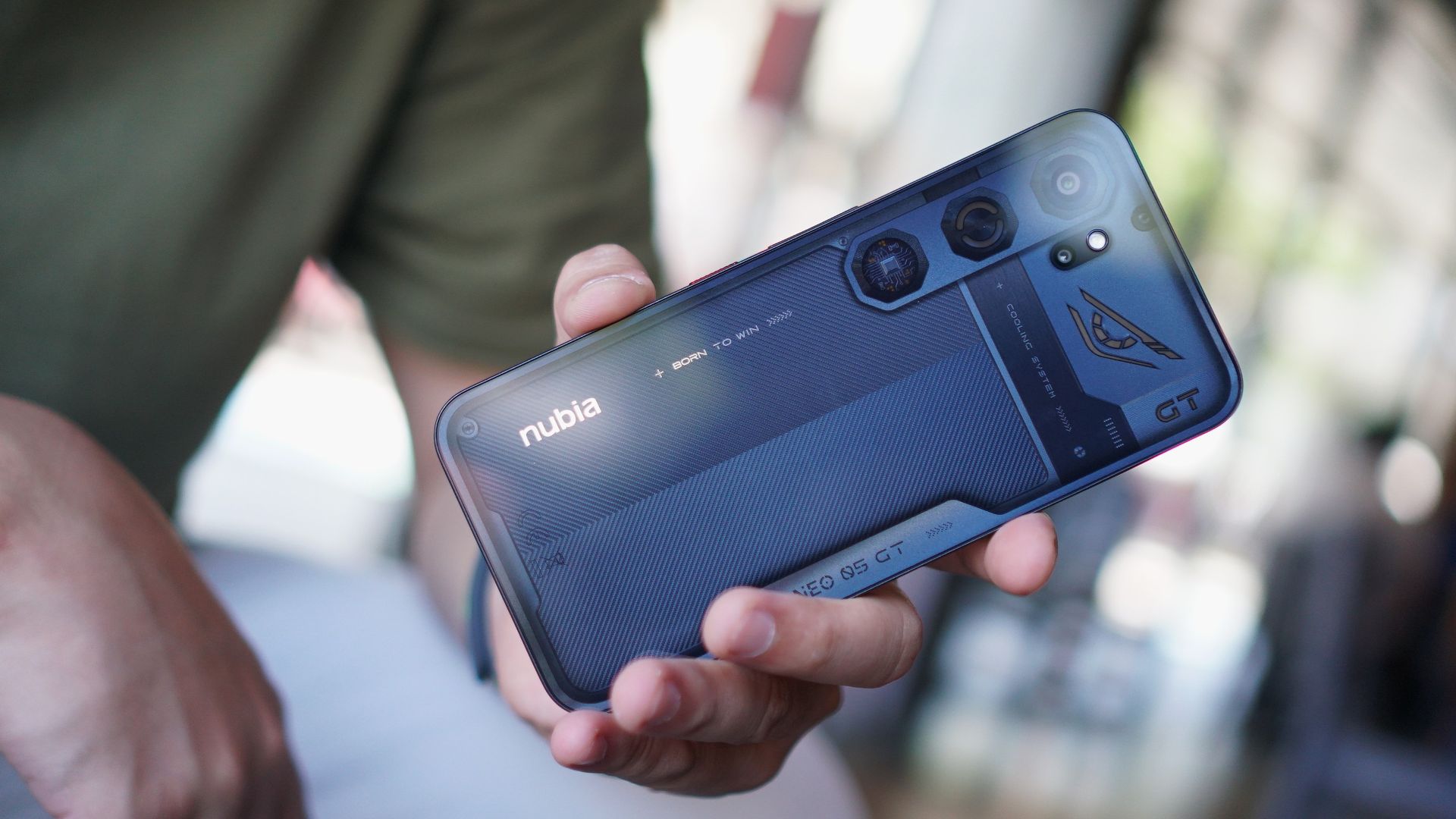
Look, OS
The nubia Neo 5 GT retains the familiar mecha-inspired finish, with a glossy back as if it has a glass cover. The lighting effects look a bit more toned down.
What’s good about the exterior design language is it took into consideration mobile gaming habits.
Even the tip of the USB-C charger was designed so that it doesn’t interfere when a user holds the phone in landscape mode.
The phone also has a completely flat back so you can just place it on a surface while playing or streaming.
The biggest adjustment is the placement of the volume buttons and power button on the right-hand side of the phone. That’s because of the cooling system’s exhausts.
And when I started using this phone, I did commit a lot of errors, tapping on the volume down button instead of the power button.
Going old school

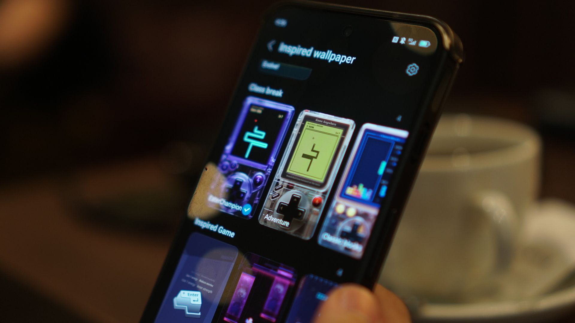
New to the series are integrated playable wallpapers, which throw you back to the good old days of playing Snake and Tetris.
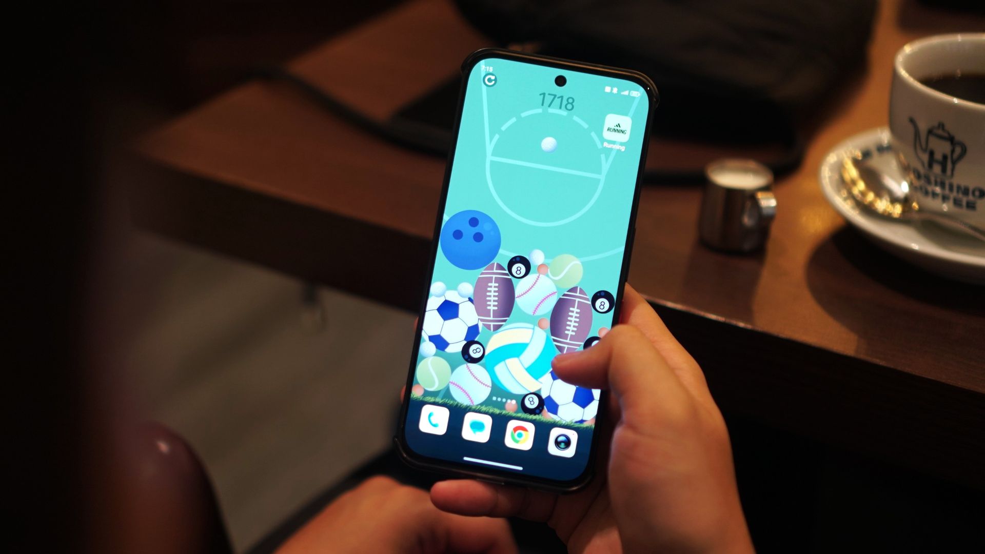
There’s also a 2048-inspired game but instead of numbers, you’re dealing with ball sports. The smaller balls (i.e. billiards, golf) combine to form larger ones (baseball, football) and you’ll have to make the most out of the space.
Admittedly, this took a lot of my time every day and even had some competitive runs with my partner as we tried to overtake each other’s high score.
Connectivity
As I’ve mentioned, on the downside, the device has had its unstable Wi-Fi and mobile data moments.
I experienced this especially with Dunk City Dynasty and the phone suffered amidst real-time head-to-head combat.
I do have a feeling my sessions just coincided with Holy Week, and networks may have been congested.
Still, it’s something to ponder, especially if you’re considering purchasing it for other purposes like in the case of TNVS or delivery riders.
Camera
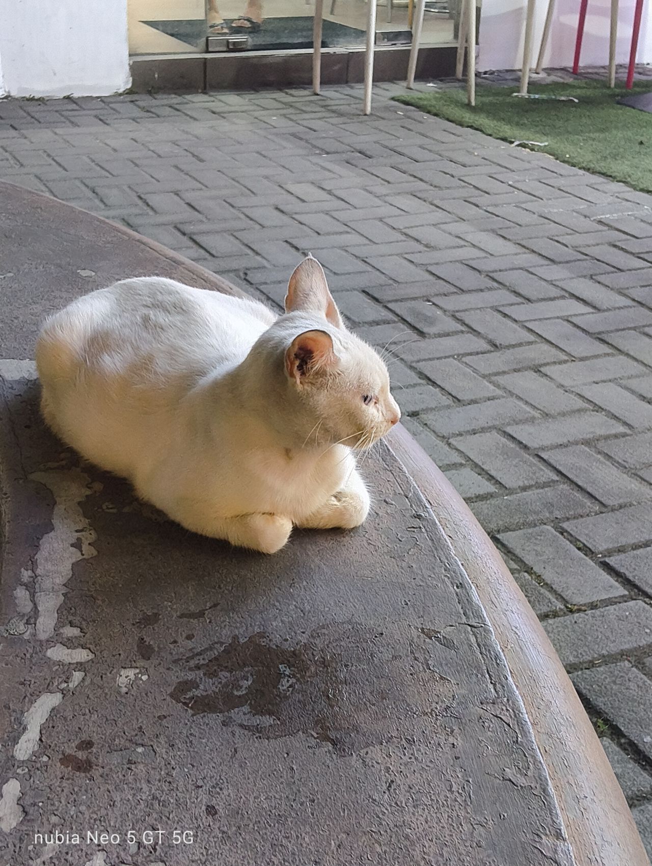
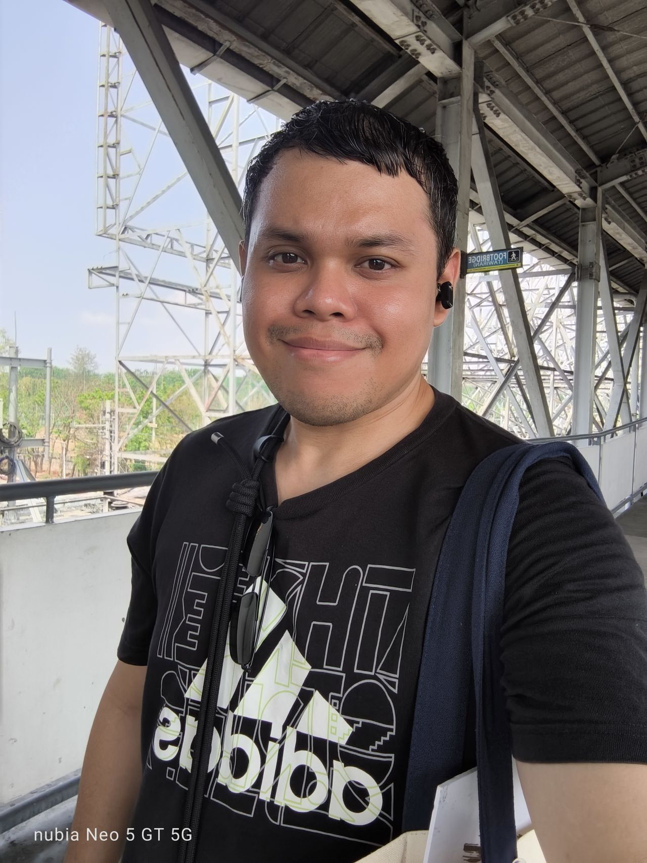
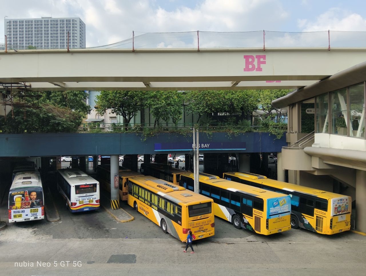
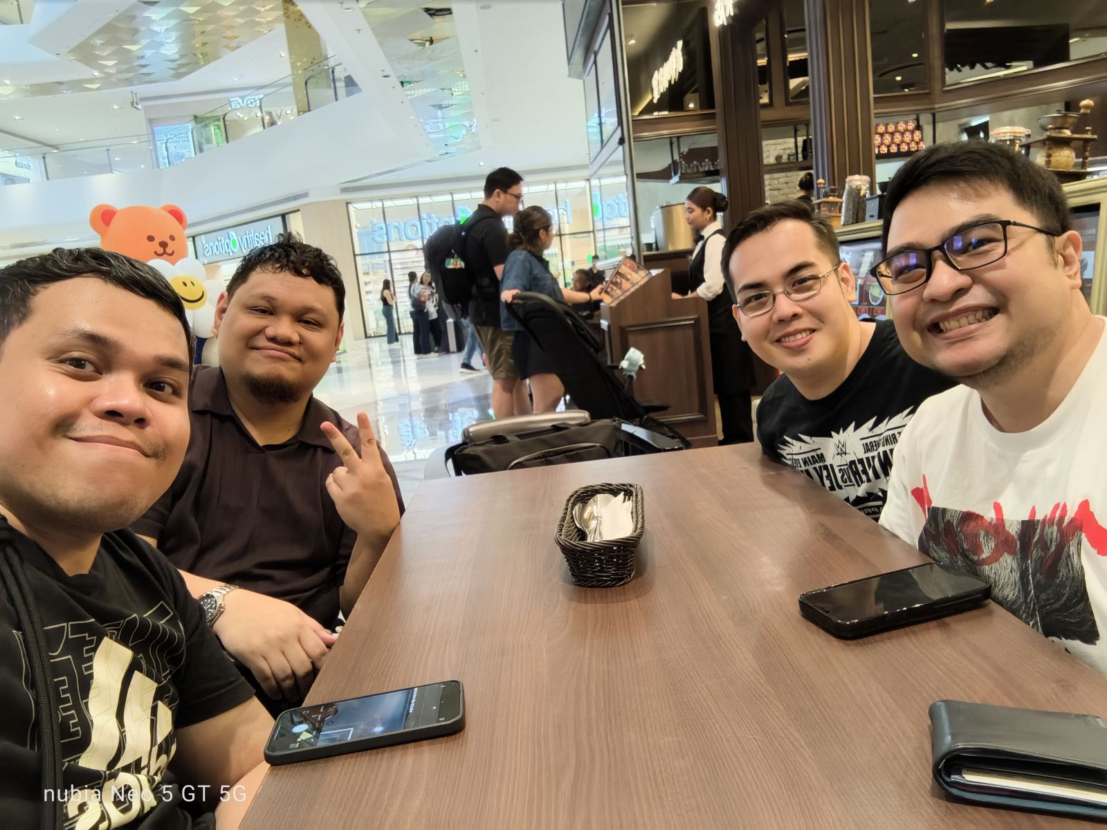
Onto the camera system, the nubia Neo 5 GT’s main camera is a 50MP shooter. I mostly just had captures of myself, food, and the street view.
For a device of this caliber, the camera does feel intended for such everyday moments. Lighting is a most definitely a friend, and colors can be off sometimes.
There are no violent reactions overall, but I have seen better and more capable camera systems on similar-priced devices.
Here are some samples:


Anything else?
Outside of gaming, I have been able to utilize this device pretty much as how it is intended to be used.
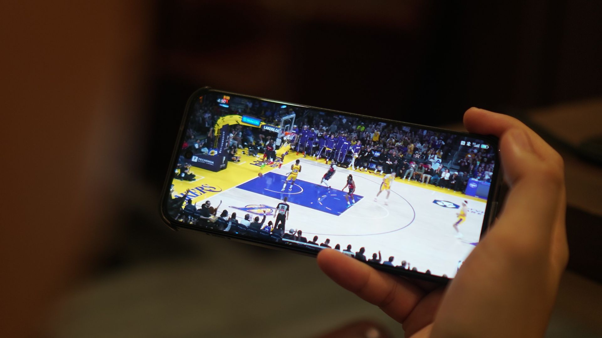
I browsed social media, watched basketball highlights, spoke with people through messaging apps, used Gemini, checked the maps, and everything else in between.
I would say loading times are a little better compared with extremely cheap handsets. The audio quality, however, sounds flat and cheap for music and gaming.
You do get the nubia Buds GT with early purchase, although the sound quality is too bass-leaning and not much of the mids and highs.
Is this your GadgetMatch?
The nubia Neo 5 GT is a Swipe Left. The addition of a built-in cooler and some OS add-ons make it enticing at first.
But for its price, you can already get a topnotch Infinix NOTE series device, or even a numbered series mid-ranger from the likes of HONOR, Redmi, or realme.
It’s understandably a niche device, but the value proposition feels off without a definitive punch and “all-around” offering.
At a time where consumers need more from manufacturers to justify price hikes, nubia went zagging with a more gaming-centric tool that doesn’t punch above its weight.
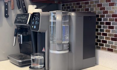
Convenient Smart Home
Giving up counter space for reverse osmosis: Living with Waterdrop M6H in NYC
A 7-stage filtration system
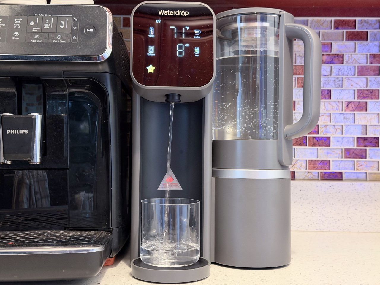
Living in New York City means two things when it comes to the kitchen: constantly negotiating with counter space and having the best drinking water in the country.
That’s exactly where a countertop reverse osmosis system like the Waterdrop M6H finds its place. It fits into apartment life surprisingly well, though not without tradeoffs.
Peace of mind
New York City is known for having some of the best drinking water in the country, and for most people, straight-from-the-tap is perfectly safe and dare I say: tastes the best, too.
But using a reverse osmosis system isn’t necessarily about fixing bad water. It can also take already good water and filtering it down to a much finer level.
The Waterdrop M6H uses a 7-stage filtration system, which goes beyond basic filtration to remove things like heavy metals, chlorine, PFAS, and microplastics, which you might not think about daily but are still present in trace amounts. It also has UV sterilization, adding another layer of protection by targeting bacteria that may not be caught in filtration alone.
That extra layer of filtration becomes especially helpful when you have guests or family visiting. My parents, for example, have more sensitive stomachs, so even small differences in water quality can matter.
One tradeoff with reverse osmosis is that it also removes naturally occurring minerals like calcium and magnesium. In practice, it shouldn’t be a major concern for most people. Food, not water, should be the primary source of these nutrients.
Built for apartment living
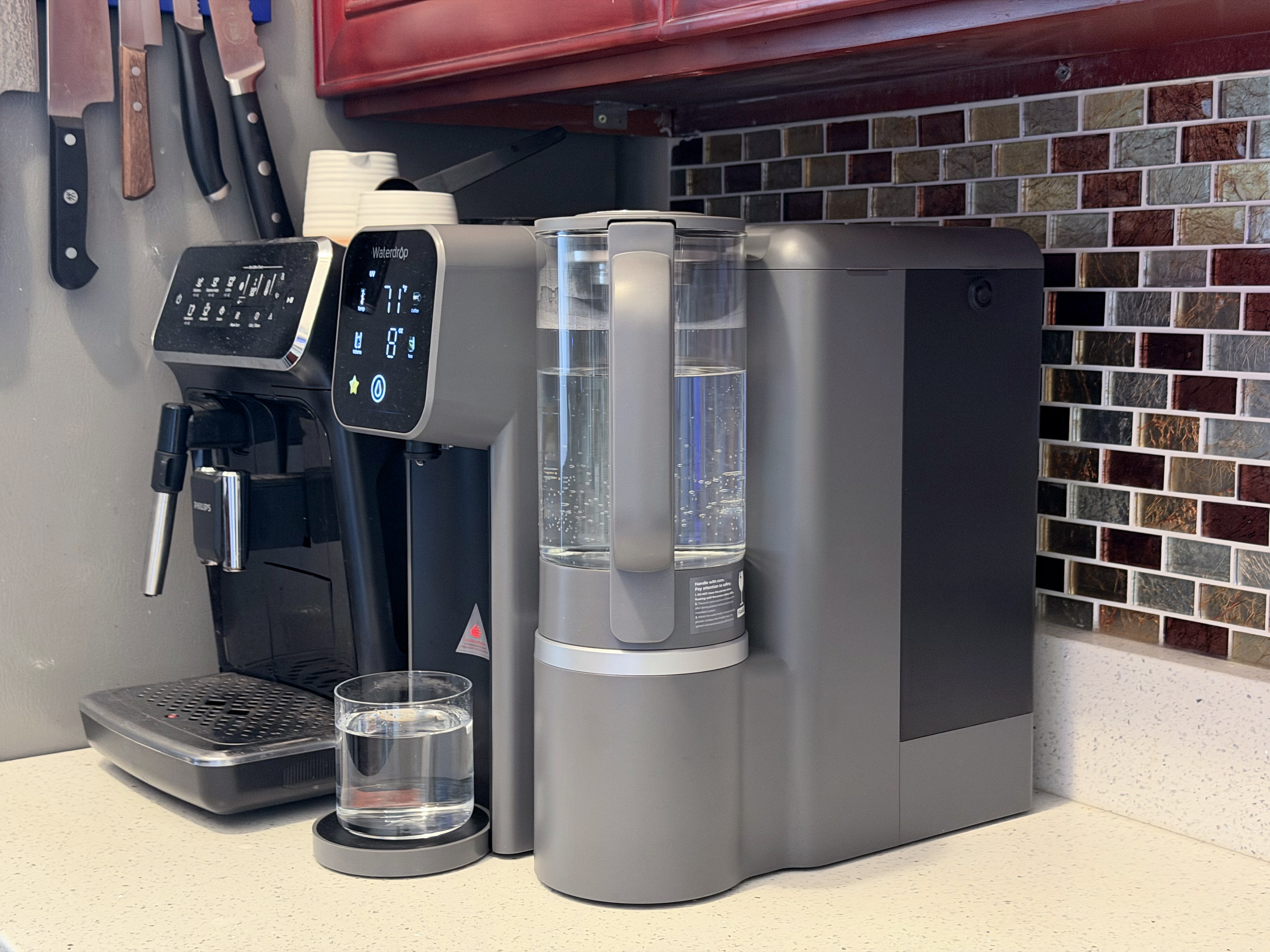
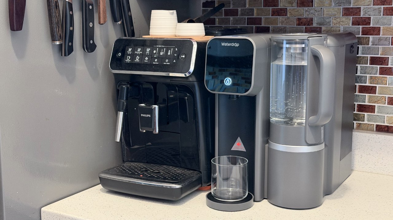
One of the biggest advantages of the Waterdrop M6H is how easy it is to set up. There’s no installation, no need to touch your plumbing, and if you’re renting: no back-and-forth with a landlord.
It sits on my counter like any other appliance. It’s roughly the size of my super automatic coffee machine, which makes it feel familiar and non-invasive. And just like my coffee machine, I get access to great drinking water with just a few presses.
For apartment dwellers like me, that plug-and-play design is a huge win. I could be living in my current home for years, but will likely still need to move out at some point. That means I can take the M6H with me no matter where life takes me.
Compact is both good and bad
That small footprint is what makes it viable in a city kitchen, but it also introduces the biggest inconvenience.
Because the unit is compact, the water tank isn’t huge, and neither is the wastewater capacity. The built-in 135oz water tank capacity is large enough to get you through a good portion of the day.
In practice, that means you’ll be refilling clean water and emptying the waste tank regularly, sometimes more than two times a day depending on usage.
It’s not difficult, but it’s definitely more hands-on than a built-in system that runs continuously in the background.
Eats up precious counter space
Beyond just physically occupying counter space, the machine changed how I use my kitchen.
The spot it takes is often the same area I would use for prepping food, whether that’s chopping vegetables, rolling or kneading dough, and plating meals. It’s also the same spot I use for putting dirty dishes before they get washed.
So while it technically fits, it reduced my working surface in a noticeable way. In a New York kitchen, losing even a small section of prep space can have a huge impact on one’s daily routine.
Bottle compatibility can be hit or miss
Another noticeable drawback of its compact size is the height clearance under the spout. If you tend to use taller insulated bottles, especially the narrow ones, they won’t always fit comfortably underneath.
I have a combination of tall and short ones, and so that means having to tilt the taller ones or filling them in stages, which interrupts an otherwise convenient experience.
Well thought-out experience
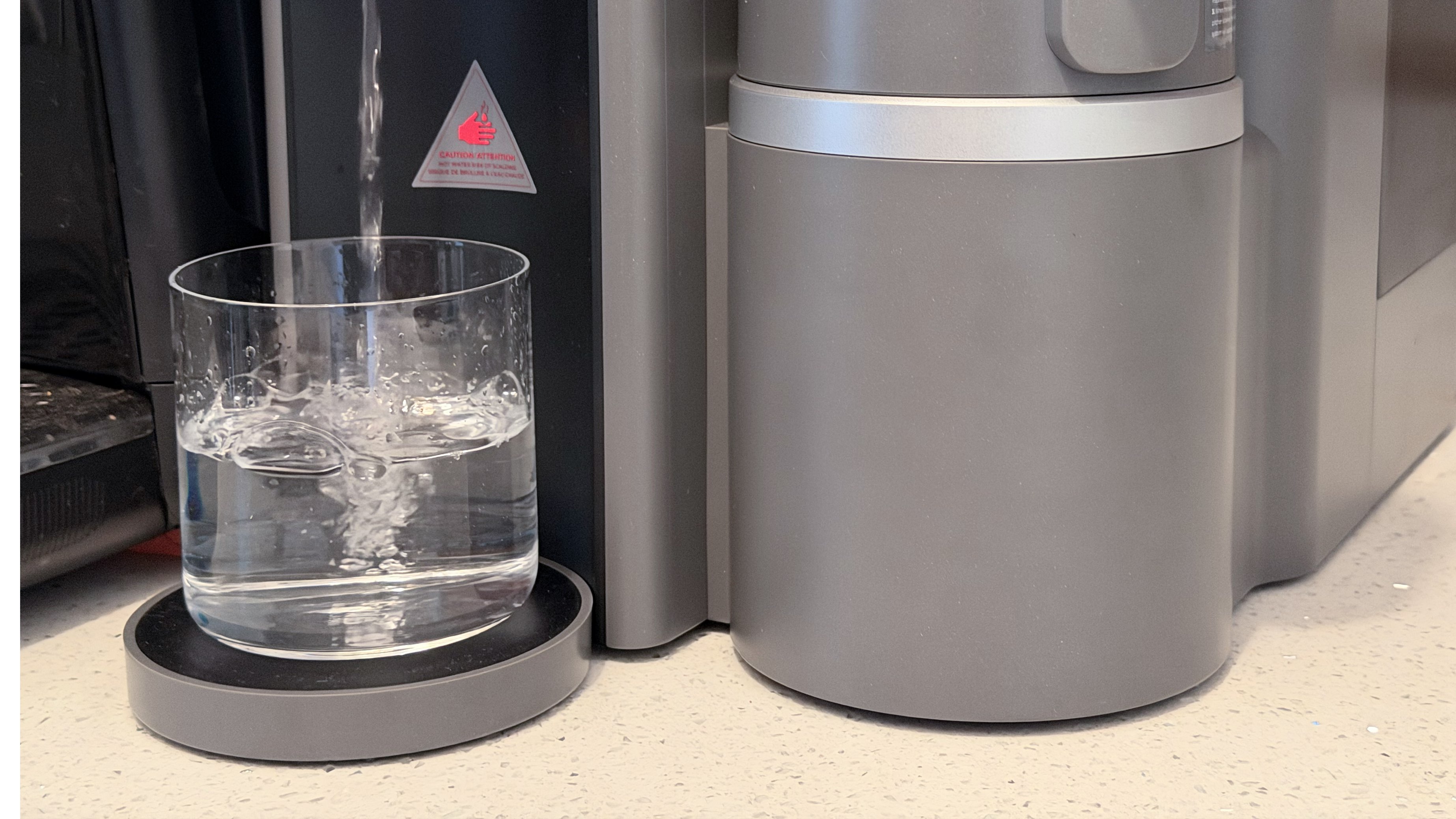
Where the Waterdrop M6H really stands out is in how easy it is to use. The touchscreen is intuitive without feeling overdesigned, and the preset buttons for coffee and tea temperatures are more than welcome. Thanks to its instant heating, I’m never waiting around for hot water when I want a comforting cup of tea after a chilly day out.
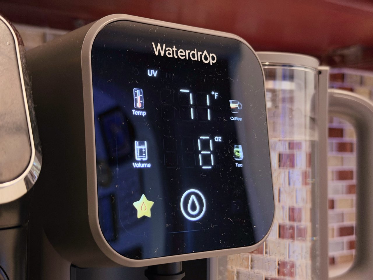
One of my favorite features is the ability to customize how many ounces of water you want dispensed. You can set it, place your glass or bottle underneath — as long as it fits — and walk away while it fills because it stops on its own. It’s a small detail that makes drinking clean water convenient.
It’s just a bonus that I’m more conscious of the amount of water I’m drinking on a daily basis.
The detachable glass pitcher is another thoughtful touch. You can take it off and pour directly to your vessel of choice, store it in the fridge for cold water, or use it directly for cooking.
Better than a filter pitcher
If you’ve used a standard filter pitcher before, the difference is immediate.
With something like a Brita, you’re constantly refilling and waiting for water to slowly drip through the filter before you can use it. The Waterdrop M6H produces purified water much faster and on demand.
Even though I have to refill the tank daily, it’s still far less frequent, and far less tedious, than topping off a pitcher multiple times a day.
Cost-wise, it also evens out over time. Instead of repeatedly buying smaller filters, you’re replacing one larger filter less often, with a more advanced level of filtration to show for it.
Is the Waterdrop M6H your GadgetMatch?
Even in a city with excellent tap water, a reverse osmosis system like the Waterdrop M6H can be helpful. It makes the most sense if you’re renting but still want better-than-tap filtration without dealing with permanent changes.
While not as inconvenient as a Brita pitcher, it still requires daily maintenance. It is not the best fit if you’re already tight on counter space, cook frequently and rely heavily on your prep area.
A permanently installed reverse osmosis system will always win when it comes to pure convenience, and Waterdrop has great options for that. It runs continuously, requires less day-to-day interaction that you just forget about it, and it doesn’t take up precious counter space.
For my current setup, the Waterdrop M6H is a practical middle ground. It delivers many of the same benefits in a flexible, renter-friendly form.
The Waterdrop M6H retails for US$429 before tax. Maintenance is straightforward: the replacement filter costs $79.99 and lasts about 12 months or roughly 1,100 gallons of water.
It isn’t cheap, but you can think of it as a long-term investment in your health. Its benefits aren’t immediate or obvious day-to-day, but something you’ll likely appreciate over time and thank yourself for later.


PRAGMATA is not for the faint of heart
Already a Game of the Year contender for all the feels

5 games with the nubia Neo 5 GT 5G
Niche device, but is worth the price?

Giving up counter space for reverse osmosis: Living with Waterdrop M6H in NYC
A 7-stage filtration system

Now Playing: Mortal Kombat II

New US-China ban might affect 75% of phones, laptops

iOS 26.5 will support end-to-end encryption RCS messaging

Win a trip to Boracay at the Power Mac Center x Shokz Pop-up booth in Rockwell

Star Wars: Galactic Racer launches October 6


-
 News2 weeks ago
OPPO Find X9 Ultra lands in PH: Price, availability, pre-order perks
-
 News2 weeks ago
OPPO Find X9s now official in PH: Price, availability, pre-order info
-

 Gaming2 weeks ago
Saros review: Returnal’s difficulty is back and better than ever
-
 News2 weeks ago
OPPO Find N6 now in PH: Price, pre-order, availability
-
 Automotive2 weeks ago
VinFast to expand in the Philippines with e-scooters: report
-

 Gaming1 week ago
Level Infinite launches Gangstar Mirage City exclusively in PH
-

 News2 weeks ago
realme 16 series 5G launches in the Philippines
-

 Laptops2 weeks ago
MacBook Neo officially arrives at Power Mac Center