


When I first got my hands on the Mate 20 Pro, I wondered to myself: Where do I even start?
Even after spending over a month with the phone and checking out its less feature-packed sibling, I still can’t help but be amazed by how much tech Huawei jammed into this thing.
It’s not even debatable; comparing the Mate 20 Pro to any other phone released this year would make the opposite side look stale. Inside and out, this is the most complete smartphone ever assembled.
Of course, that doesn’t mean it’s perfect. While Huawei focused so hard on one-upping its fiercest rivals, some old weaknesses showed up and new issues arose in the process.
Going through every single feature would be too much for a single article, however. I could easily surpass the monstrous word count of our iPhone XS review if I were to get overly thorough and technical.
Instead, it’s best to evaluate the Mate 20 Pro by its most impressive, as well as its most jarring, traits. Let’s begin with the usual: design.
I honestly wasn’t a fan of the stove-top arrangement of the rear cameras and excessively thick notch in front, but they eventually settled into my taste and I realized the purposes they served.
In short, I don’t have to deal with an awkward camera bulge on the rear, and the faster, more secure face login became a great alternative to the intuitive yet comparatively slow under-display fingerprint reader.
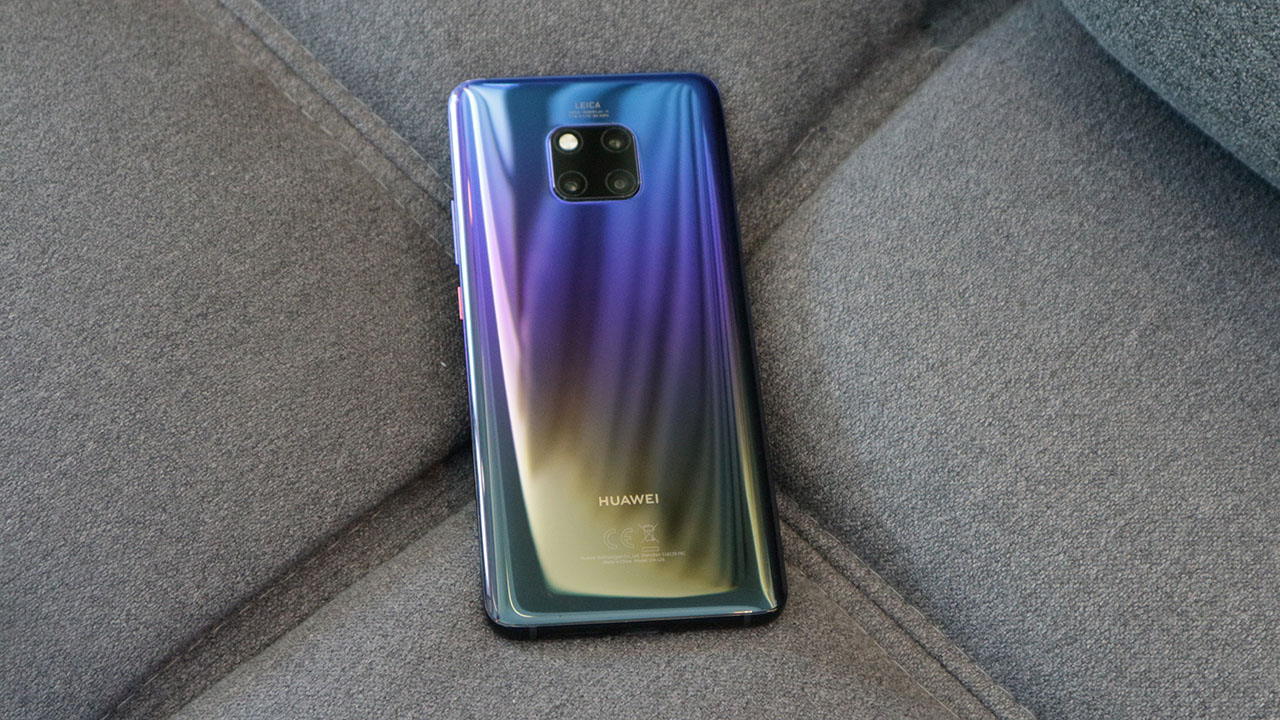
I also wasn’t interested in the curved edges at first, but I eventually missed them when switching to flatter phones. The way the curves mold into my hand and give that overflowing feel are actually more comfy than what I experienced on the Galaxy Note 9, which has a thicker and more unwieldy feel to it.
And despite the larger size, the proportions feel more ergonomic than the P20 Pro’s. In addition, the Mate 20 Pro’s Twilight gradient is a lot more appealing to me. It may be personal taste, but I’ve had a handful of people express the same opinion.
On the downside, the audio port is missing — something the regular Mate 20 has — and I find it strange that one of the stereo speakers has to come out of the USB-C port. This easily gets blocked when using the phone horizontally, especially when I forget that Huawei decided to place it there of all spots. It’s a sore point coming from the front-facing implementations of the Razer Phone 2 and Pixel 3.
Oh, and there’s an IR blaster in case you want to control your TV. Strange to see it on such a premium device, but I guess there’s a market for this, and maybe for those who like messing with televisions on display at the mall.
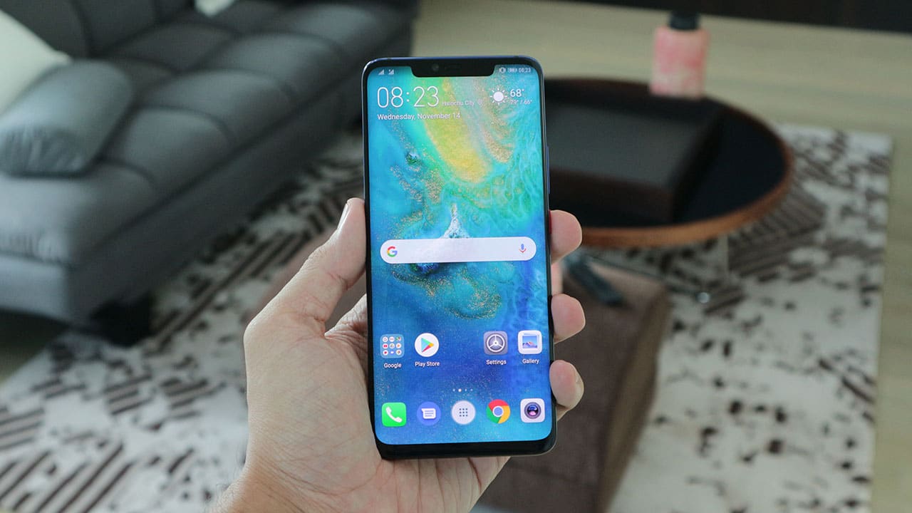
The 6.39-inch AMOLED screen itself is gorgeous. Colors pop and I love the super-dense 1440p resolution. Combined with the loud speakers and fast processing of the Kirin 980 chip, both video watching and gaming are a pleasure on this phone.
On that note, Huawei’s latest chipset is a marvel on its own. The 7nm architecture is no joke; it’s speedy AF and doesn’t overheat under pressure. Seriously, I threw the most demanding games at it and multitasked in between — nothing fazes it. It helps that I got 6GB of memory and 128GB of storage to play with. On the downside, the latter can only be expanded by Huawei’s (for now) proprietary NM Card slot. More on that here.
It’s a shame then that the EMUI skin is so behind compared to other interfaces. The Mate 20 Pro is one of the first phones to come with Android 9 Pie out of the box, but aside from a few additions like Digital Balance (the equivalent of Google’s Digital Wellbeing) and better volume controls, it’s a lot like Huawei’s clunky older software.
For one, you still need to tap an icon from the home screen to open the app drawer. This is one of the few skins that still makes you do that; others have a more intuitive swipe-up gesture to free up space on the app dock.
Want to activate your camera by double-pressing the volume down button while listening to music? Good luck with that, because doing so will simply lower the volume of your tunes. Again, other phones require a smarter double-press on the power button.
Another thing: I don’t adore the Mate 20 Pro’s always-on display. It’s nowhere near as informative as the ones found on the Galaxy or Pixel series. Sure, you’re provided with the date, time, and battery percentage, but getting a glimpse of notifications is frustrating at times, making me just go to the lockscreen to see what I’m receiving.
In addition, this has to be one of the weakest implementations of gesture navigation. Apple pioneered this style with the iPhone X, wherein you could swipe from the bottom to go to the home screen and hold it to enter multitasking; several Android manufacturers have copied this well, but Huawei didn’t get this right. Choosing the traditional back-home-app navigation bar alleviates this issue, but then you lose some of that precious real estate at the bottom.
Finally, there are certain apps — Google Photos and Maps, in particular — which have this awkward lag on EMUI. I’ve experienced this with the P20 Pro, and the problem still hasn’t gone away. I looked it up and it’s not an isolated issue.

The disconnect between the quality of hardware and software should’ve been resolved long ago. It’s reasons like this why people flock to iPhones and Pixels so easily, because they know that everything melds together so well, despite the lack of certain features. Huawei still has time to fix most if not all of these issues, but having seen no improvement on the P20 Pro after all this time, I wouldn’t hold my breath.
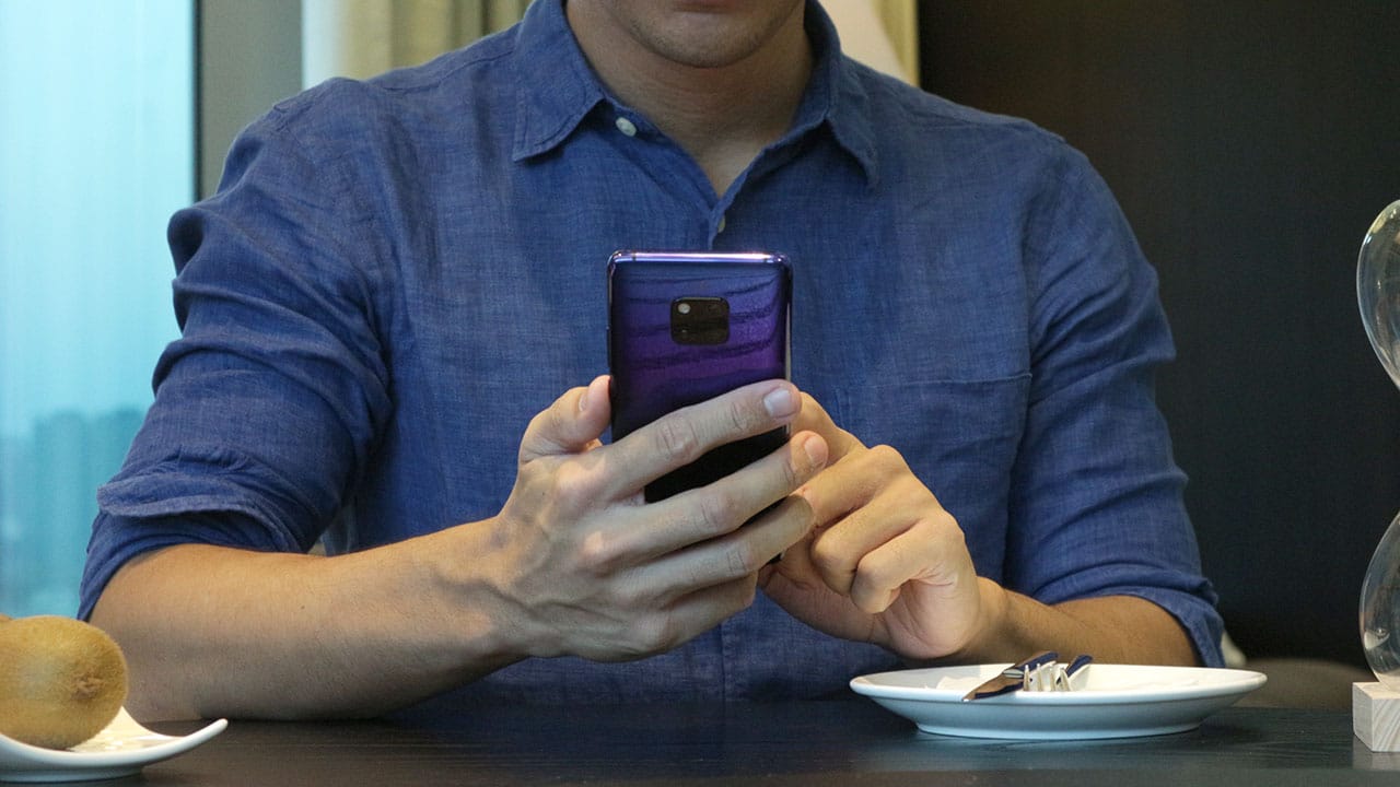
Cons aside, the added features are excellent, albeit excessive at times. One is the wireless reverse charging, which allows you to charge other Qi-enabled devices on the Mate 20 Pro’s back. It’s slow and part of a rare usage case, but it’s so cool to have when absolutely needed. Since the phone’s generous 4200mAh battery lasts two days anyway, it’s perfectly fine to share some juice with accessories like a smartwatch.
And because the capacity is so hefty, it’s only right for Huawei to enable 40W charging on this beast. This is by far the most convenient way to fill up a battery on any Huawei phone. It’s no exaggeration that it takes only half an hour to hit 70 percent from zero. Give it another 40 minutes, and you have a full charge. Going back to anything slower has been a pain for me.
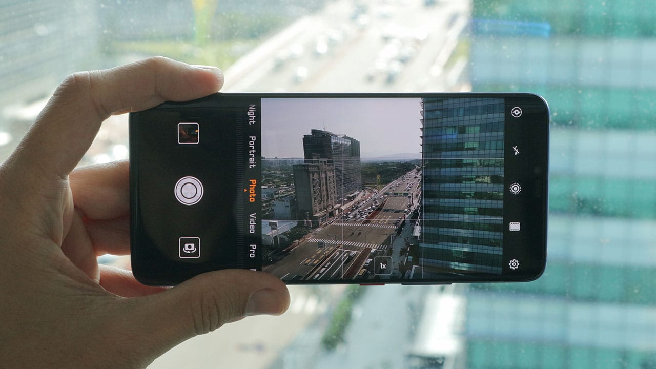
Reaching this point without talking about camera quality is a clear sign that the Mate 20 Pro is more than the sum of its pixels. At the same time, they’re a highlight of the phone and must be reviewed extensively.
You can learn more about the complex camera setup in our earlier hands-on, but in essence, the trio found on the back are what you should care most about. These are the 40-megapixel f/1.8 main shooter, 20-megapixel f/2.2 extra-wide camera, and 8-megapixel f/2.4 telephoto unit capable of optical zoom.
This translates into the most versatile cameras ever equipped on a smartphone. LG and ASUS popularized ultra-wide lenses while Apple and Samsung made telephoto shooters a thing, but it’s Huawei spearheading the complete package.
The monochrome sensor will be missed; it was Huawei’s signature feature up until the P20 Pro, but one can argue that it’s no longer necessary in this age of IG filters and colored sensors becoming advanced enough to create their own high dynamic range.


Traveling with this phone as my all-in-one camera is such a joy. When out in an open space, the ultra-wide-angle camera flourishes; while at an event in need of close-ups, the telephoto looks great up to 3x zoom — even 5x if lighting is enough.
Like the overall interface, the camera software is hit or miss. Although I appreciate the ease of switching between the primary modes, the dump of less-important ones under “More” bothers my organized self. You could leave Master AI on to let it choose the right mode for each situation, but it’s not that accurate, like any AI-powered camera you find these days.
For example, as I’m about to take a portrait in Auto mode, the app would switch to — you guessed it — Portrait mode and saturate the hell out of my subject after a short amount of lag. More often than not, the AI wouldn’t correctly identify the subject, sometimes even saying that black-and-white graffiti on a wall is a panda. Go figure.


The worst part is you can’t make adjustments after the AI-altered shot is made, which is something even lower-end Honor phones can do. Again, it’s hit or miss, and I bet a lot of users would rather keep Master AI off. Using it, however, is the fastest way to access special features like Super Macro, which emulates a macro lens’ extreme close-up of an item.
Huawei’s awesome Night mode is also back, and it’s as good as it ever was. Every time I’m out in the evening, I make sure to take a few shots with it on. Like before, it gives me a four-second or so exposure while handheld; advanced processing then creates a work of art nine out of ten times.
I had a chance to compare it with the Pixel 3’s Night Sight, and I must say that the results are mixed. While the Huawei side is better at making nighttime illumination look pretty, the Pixel 3 can see better in total darkness. Both are great, and I take low-light photos with both phones whenever I can. Don’t worry, a separate article for this comparison is in the works.


The front has the same, unimpressive 24-megapixel f/2 camera found on the P20 Pro. Why Huawei chose not to improve on this weak point is beyond me. With most Chinese rivals taking selfies seriously, it’s a surprise why the Mate 20 Pro feels so far behind.
Like the P20 Pro, selfies with this setup are less than stellar. Without proper autofocus or accurate blurring around the subject’s head, your face can turn into a mushy mess under poor lighting conditions and there isn’t even a way to turn off the integrated beauty mode — something which has bothered several reviewers including myself.
Still, I found the Mate 20 Pro’s selfies better than what the iPhone XR and Galaxy Note 9 produce, but not on the level of the Pixel 3 and its dual-cam design. I can only wish that the next Huawei flagship will up its self-portrait game in the same way the rear cameras have.
Is this your GadgetMatch?
In spite of all my complaints, nothing’s a real deal-breaker. The absolute completeness of the Mate 20 Pro automatically places it at the very top of the heap, awarding it our GadgetMatch Seal of Approval.
If you can ignore the lack of software optimization and polarizing design choices, you’re guaranteed to experience the best there is — this side of the Android space at least.

For those choosing between this and the regular Mate 20 or P20 Pro — which retail for the same amount in most regions now — I’d say go for the Mate 20 Pro if you value the front camera features and in-display fingerprint sensor. Its screen is also more impressive than the Mate 20’s, and the Kirin 980 chip blows away the P20 Pro’s older Kirin 970.
At the same time, the US$ 1,000 or so price point pits it against the likes of the Galaxy Note 9 and iPhone XS. To Huawei’s credit, the Mate 20 Pro is no incremental upgrade compared to the two aforementioned flagships. You’re getting a true successor with all the bells and whistles — practically no compromises this time.
If you’re willing to wait, the follow-up to the super-popular P20 Pro will reveal itself in a few months. It’ll likely have the same Kirin 980 processor, but the camera updates may be more significant and the overall software more optimized.


Reviews
realme C100: Enduring and durable in spite of entry-level realities
Enough power but needs more agility
Several smartphone brands have successfully balanced cost and capability in the entry-level and midrange segments. realme, on the other hand, appears to still be navigating this refinement process after the realignment in budget handsets.
The brand’s latest mass market offering, the realme C100, highlights an aggressive focus on physical endurance and battery capacity.
These are two welcome additions to give consumers more value for what they purchase. Yet, there are compromises in other areas that ultimately hold the package back from being a worthy everyday utility.
Long battery life

Bannering the realme C100 is its 8,000mAh Titan battery. This substantial boost in capacity translates to better longevity on a day-to-day basis.
For just casual usage patterns, it can easily last even up to four days. When left on standby, it can even stretch to an impressive nine days or so.
When finally time to recharge, the device supports 45W SUPERVOOC fast charging, which is ample for its segment.
As smartphone brands lean toward offering larger batteries, it’s a positive trade-off for those who don’t plan on purchasing power banks any time soon.
Unoptimized performance
The C100 is powered by a MediaTek Helio G92 Max processor and runs on the Android 16-based realme UI 7.0.
Performance is inconsistent at best. Light social media scrolling and casual streaming aren’t met with hiccups.

But, with gaming, the handset falters a bit, even with the supposedly less demanding titles like Mobile Legends: Bang Bang. There are frame drops, stutters, and a it of lag that disrupts the overall experience.
That’s even with GT Mode turned on.

This would also considerably hamper the workflow of utility workers’ daily routines, should they choose this.
Thankfully, with a long battery life, the C100 is still something you can wield to stay connected throughout the entire day, especially for commuters, students, and young professionals.

However, the lack of 5G connectivity is also a downer, especially if you’ll need a better and faster network.
Ideally, I would put it as chiefly just a tool for constant comms and something you’d put on your desk — expecting new messages, emails, and notifications or updates here and there.
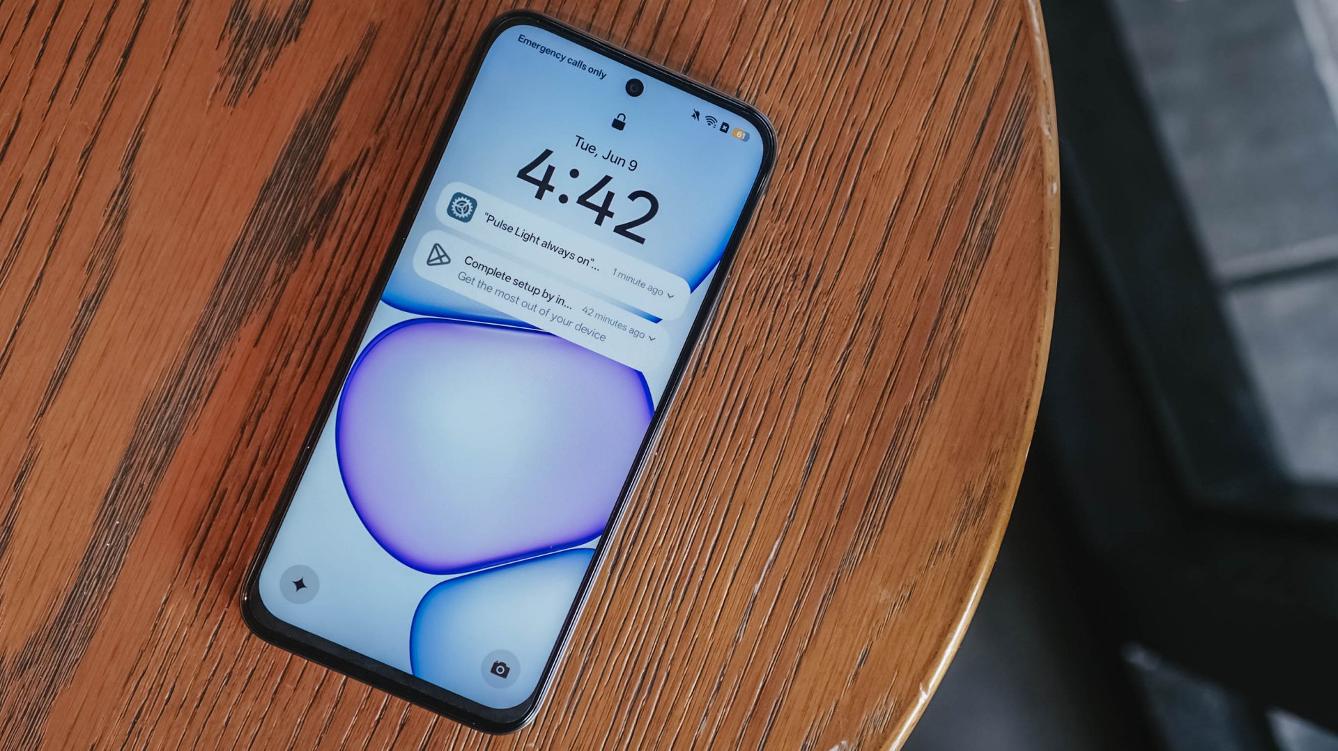
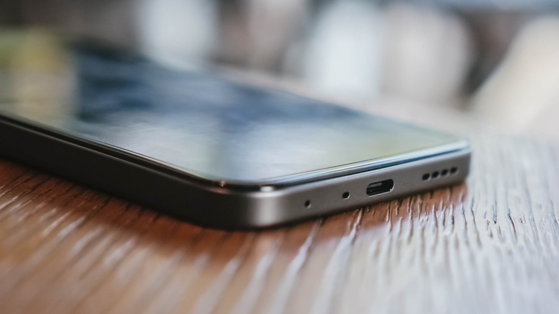
Inferior display
In front, the realme C100 sports a 6.8-inch 120Hz display on paper. It has an HD+ resolution but the pixel density sits at just a mere 256ppi.

There’s visible graininess or lack of distinct sharpness, be it streaming YouTube or viewing photos you’ve just taken with the device.
The same hardware limitation reminds me of past compromises in previous C series entries. Photos appear muddy and noticeably soft on screen, so it’s difficult to judge image clarity until files are transferred to another display.

The 1,200 nits of peak brightness helps a bit, although it is still a bit trickier to see things under the bright sunlight.
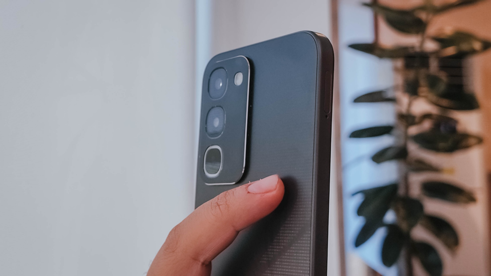
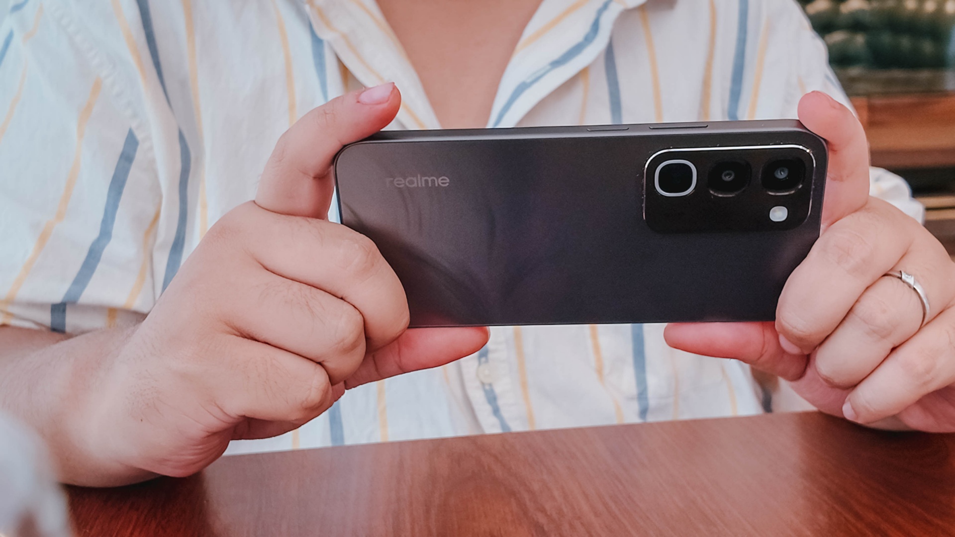
Cameras: Decent, as usual

For its camera, the realme C100 has quite the standard 50MP main camera. It’s decent for captures in terms of color and detail, but I’ve seen better overall quality from previous C series entries.
It’s tough when its indoors and under low light conditions — as expected. Naturally, you can’t expect the same detail outside of 1x zoom.
Some quick samples:


It’s a you-get-what-you-paid for on the stills department; something you’d use for documentation more rather than artistic captures. I would have hoped for more stability with filming, so you can use it for quick reels or splice them for vlogs.
When I asked my nephew to use the phone for a bit, he didn’t take too many images, which tells a lot about what the camera package can offer.
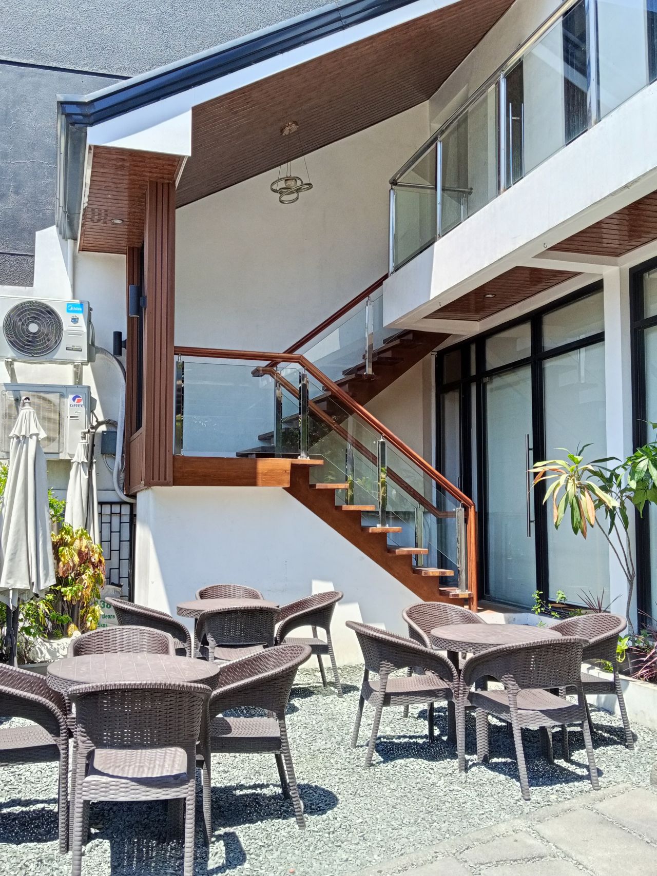
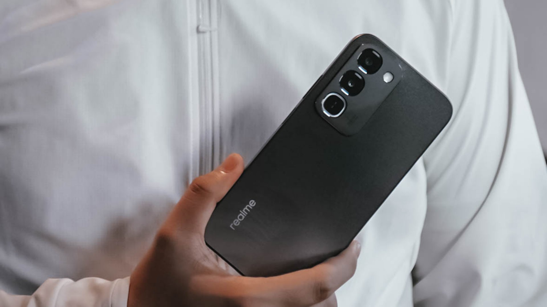
Look and feel
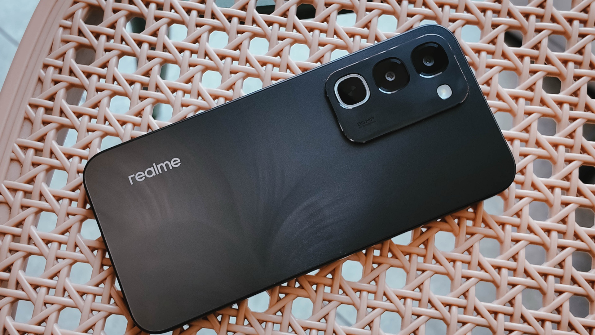
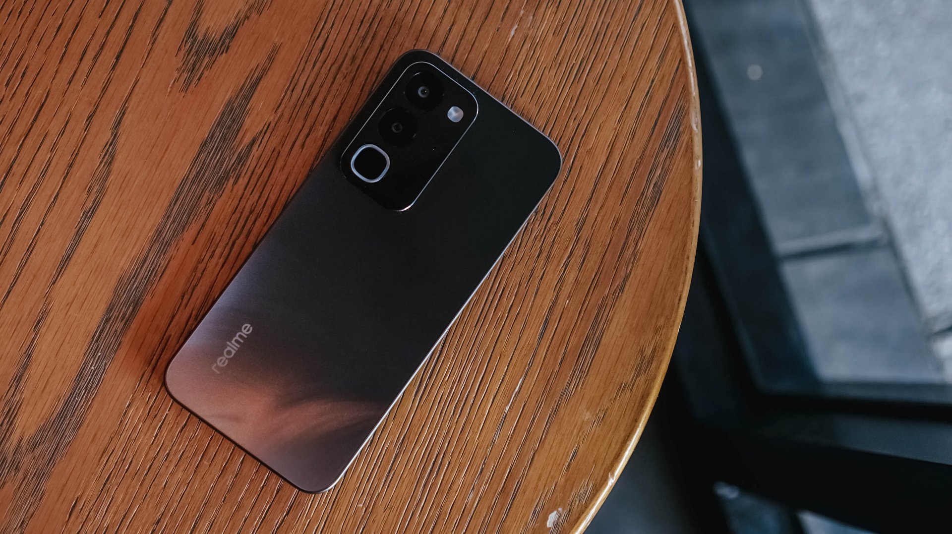
Onto its appearance, the device comes with a simple, squarish build with a faux triple camera island at the back.
It’s nothing we haven’t seen before, though in the place of round cameras, they look more like app icons shape-wise.
There’s slightly curved corners, just the right amount of thickness, a decent 90.4% screen-to-body ratio, and a bit of weight given the larger battery.
![]()
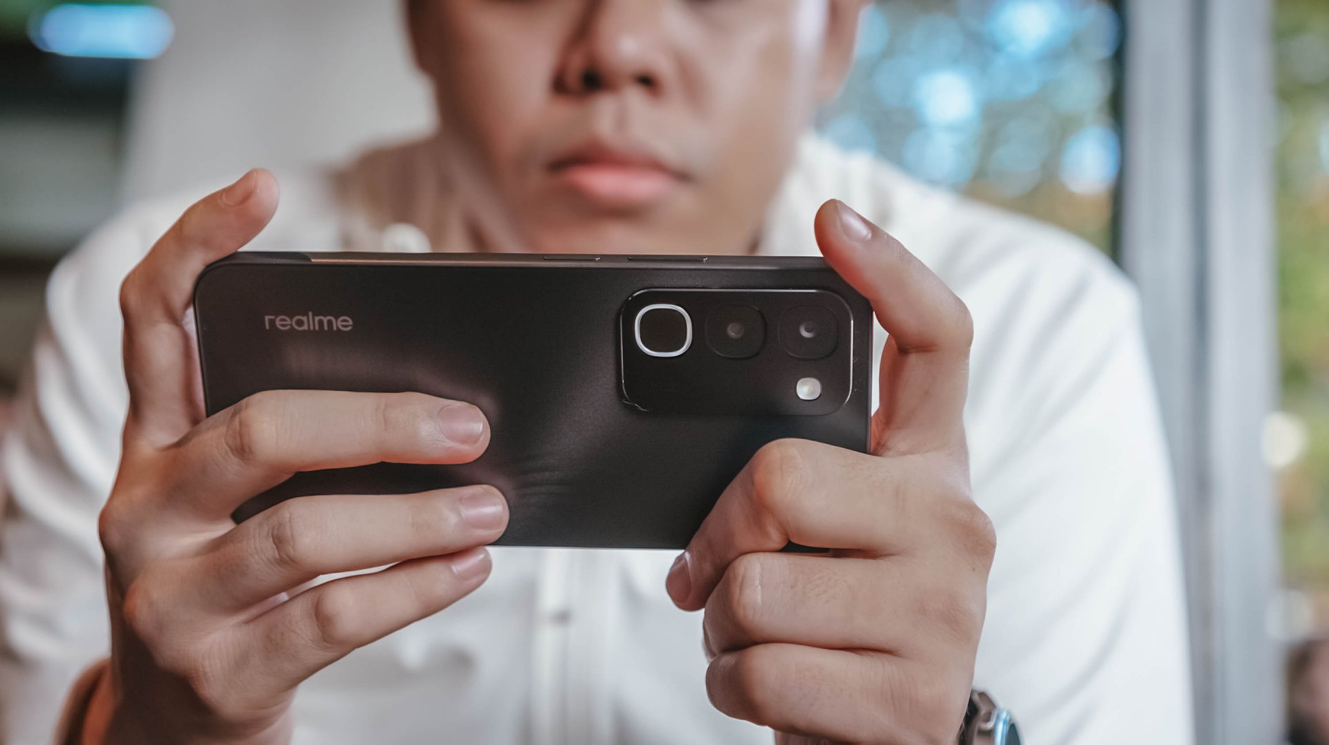
To its credit, the phone has a good grip and a less slippery back, even with its fancy design.
It is obviously great to have ArmorShell Glass protection too, as durability and ruggedness are two non-negotiables in this segment to remain competitive.
Aside from that, the phone boasts of IP66, IP68, IP69, and IP69K dust and water resistance. The display itself is also optimized for wet touches through Rain Touch Mode.
Is this your BudgetMatch?
For consumers prioritizing raw survival metrics, the final verdict leans toward a Swipe Left. It’s close though.
While the market shift toward military-grade drop resistance, high-tier IP waterproofing, and massive batteries makes sense as they save users from the hidden or unexpected costs of broken screens, liquid damage, and purchasing extra power banks, smartphones still requires a baseline level of operational smoothness.
At this price point, there are multiple cheaper alternatives with a more stable and responsive user experience.
There are also niche options providing a better gaming experience or camera performance, if either one is what you’re after.
There is just too many trade-offs with this particular unit, leaving some critical boxes unchecked.
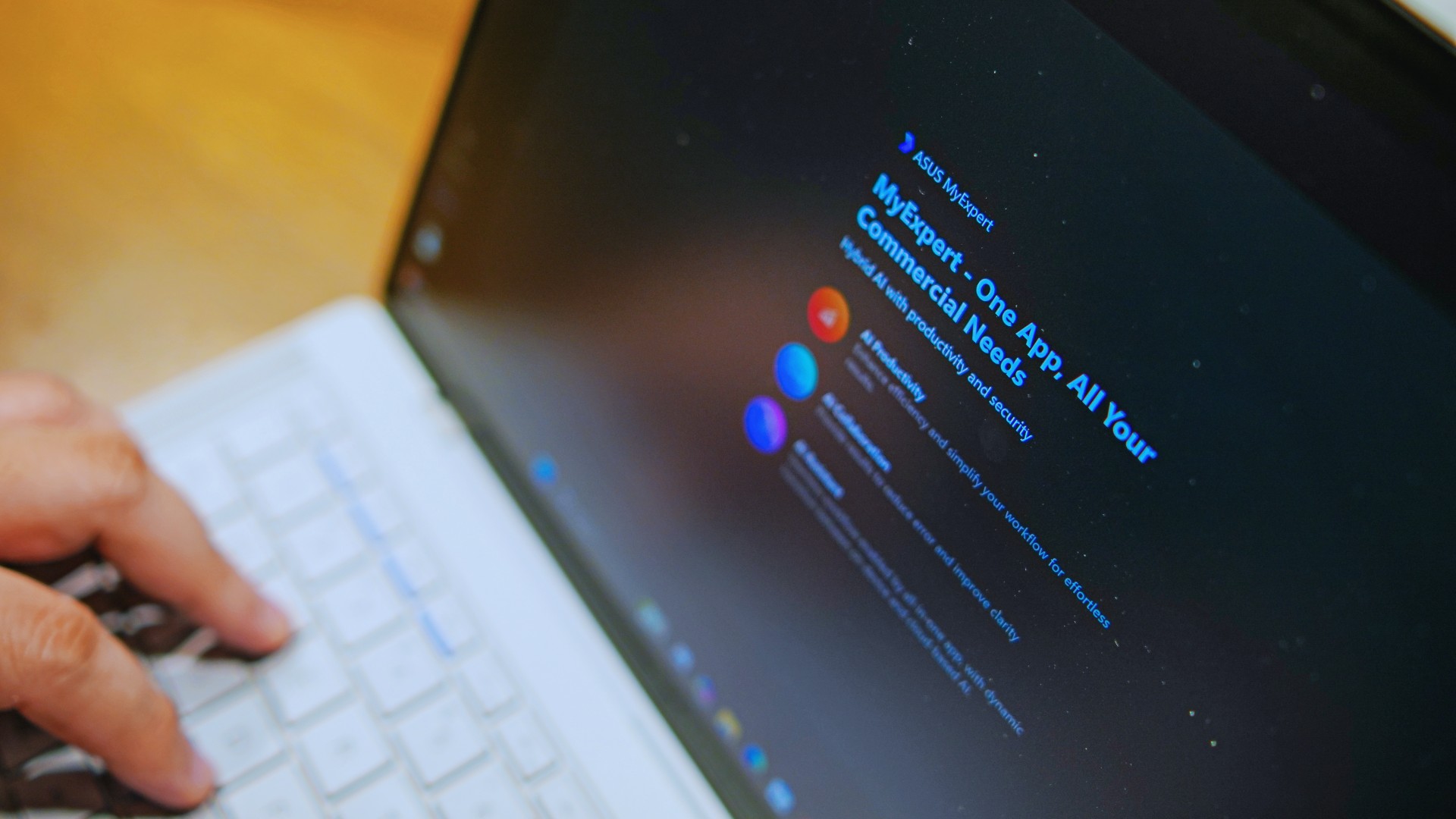
This is coming from someone who has done countless unboxings and has touched a wide variety of devices — the ASUS ExpertBook Ultra was… alright.
My first impression was that it certainly didn’t wow me as much as I expected it to after having read the brief, nor even after attending the tech seminar where ASUS laid out its vision for the laptop.
That’s probably the strangest thing about the ExpertBook Ultra. Because after having spent more time with it, the laptop grew on me.
Put cheekily, the ASUS ExpertBook Ultra wasn’t the laptop that made my head turn. Instead, it was the laptop that kept showing up consistently. Before I realized it, it’s become the one I wanted to keep coming back to.
And I think that’s the best way to describe my experience with ASUS’ flagship business notebook.
The laptop sneaks up on you.
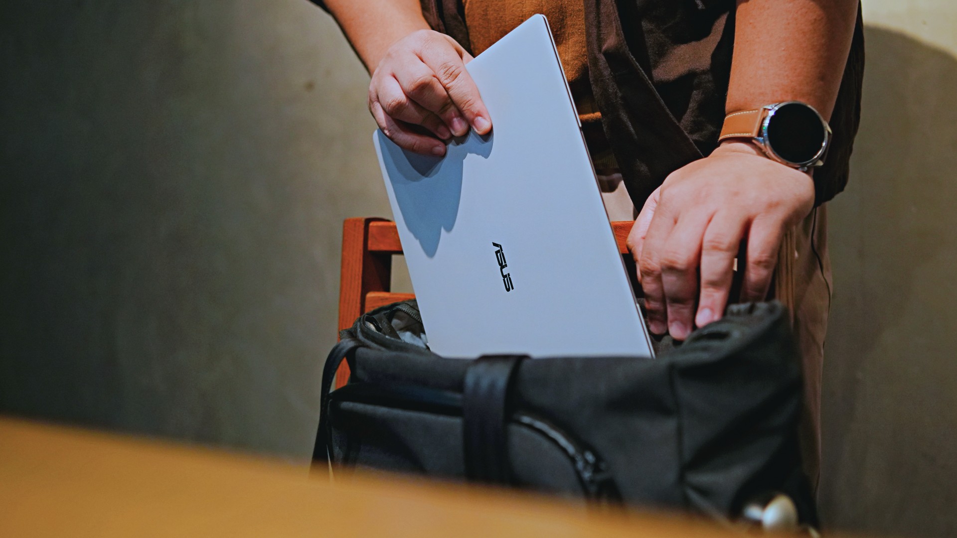
Built to be carried

I got the laptop right after Computex 2026 coverage. That meant my days were closer to how they normally are. That also meant I had to be more intentional about going out and bringing it with me as I tackled my day-to-day duties.
I normally carried it using my trusted EDC — the Alpaka Bravo Tote — and I have to say it definitely felt lighter than my usual laptop, which is the MacBook Pro M4.
The Apple laptop I regularly carry is, I have to admit, chunkier than I would prefer. So having the ExpertBook Ultra for about a week or so literally felt like some load was taken off my shoulders.
Did I ever forget it was there? I wouldn’t go that far.
But if you’re asking me which one I’d rather carry based on build and weight alone, I would, with no hesitation, reach for the ExpertBook Ultra.
That says a lot considering how attached I am to my usual setup.
ASUS likes talking about how light the ExpertBook Ultra is. Normally, that’s the sort of marketing line I acknowledge and quickly move past.
This time, I actually felt it.
The Nano Ceramic effect

One of the first things ASUS will tell you about the ExpertBook Ultra is its Nano Ceramic finish. I’ll admit, it felt like one of those things that sounds good on a slide presentation.
It’s one of those things that look gimmicky at first but actually feels incredible once you come across it on a daily basis.
It’s still early, so you can consider this very much part of the honeymoon phase with the laptop. Even so, the Nano Ceramic finish continues to inspire a bit of awe every time I pick it up.
I do feel like a little weirdo caressing the laptop ever so gently before I begin the day’s work wherever I may be. But that’s just a testament to how good it feels to touch.

And yes, it does reinforce the feeling that, “Hey, I’m working on a pretty fancy piece of machinery.”
It’s easy to underrate the effects of that feeling, but it’s those little intangible things that can sometimes help unlock perspectives and possibilities.
That’s not something you’ll find on a spec sheet. But it’s absolutely part of the experience.
A display that’s difficult to stop staring at

It also helps if STAYC Isa is on screen.
The display is magnificent.
As Captain America would say, “I can look at this all day.” Not the exact phrase, but you’re smart. You get it.
The OLED and matte coating is just a killer combo. Kind of like the Chaewon and Yeji “That’s a No No” challenge collab. Pardon the months-old K-pop reference. I’ve been so busy I haven’t really kept up with what’s new.
Anyway, the combination just comes at you unapologetically and you have no recourse but to bask in it. Maintaining the deep blacks and crisp colors is such a gift to your eyes.
I often sit right next to big windows when I’m out in cafés and the light did nothing to dull the effect of the display.

Two love, two love. I’m falling.
It was so good I often found myself fully diving into STAYC’s 2 LOVE music video in between writing this very review and coordinating with my team.
The matte coating deserves special mention here.
OLED panels already look fantastic. Pairing one with a matte finish that helps cut reflections without sacrificing the strengths of OLED makes for one of my favorite laptop displays in recent memory.
Typing just clicked

This is one of my favorite keyboard experiences. Things just clicked right from the start. No awkward feeling-out phase whatsoever.
I was touch typing like I was Doctor Strange trying to look into over 14 million possible outcomes and still landing on the right key every single time.
The keys feel closer to chiclet-style keyboards than anything else. Even so, the spacing is perfect and the travel satisfying.
Then there’s the haptic touchpad.

I typically don’t like using mice, especially when I’m out and about. With most Windows laptops I’ve used in the past, that eventually becomes a necessity.
That wasn’t the case with the ExpertBook Ultra. It’s easily one of the best-feeling touchpads I’ve used in recent memory.
My standard for touchpads has always been MacBooks. While the software is also doing some heavy lifting in that particular setup, the ExpertBook’s own comes pretty close.
That’s not praise I hand out lightly.
Performance that feels like overkill

Performance is one area where I cannot claim I fully pushed the capabilities of the ExpertBook Ultra.
Most of my tasks are browser-based. Plenty of tabs open, sure, but I don’t think I ever came close to really testing the capabilities of this business notebook. I imagine that would be the case for most of ASUS’ target audience.
Upon seeing the specs, I already knew this was going to be a bit of an overkill for my own use case. My time with it only proved that assessment.
The most I did with it was jump between browser tabs and chat apps, letting ChatGPT help me process unresolved feelings and questionable timing while I dealt with coordinating shoots, writing scripts and reviews, and dealing with external forces that leave me feeling drained.
Never once did the laptop feel slow. Never once did I find myself waiting.
What noise?
Speaking of things I didn’t notice, let’s talk about fan noise.
Again, since I didn’t really push this thing to its absolute limits, the fan never really kicked into high gear at any point during my time with it.
The same goes for thermals.
No task I did ever raised the temperature to uncomfortable levels. The laptop simply went about its business. Which, come to think of it, is probably the most business-laptop thing I can say about it.

Battery life that simply works
I was very impressed with its overall efficiency.
When I go out to work, I typically don’t stay out longer than five to six hours. Most of the time that’s five to six hours of really focused work—with some K-pop loving in between.
Being generally risk-averse, I still always brought my usual charger with me. Not once during my time with the device did I feel the need to plug in while working outside.
I would typically end my café work days somewhere between 30 to 40 percent and only juice the thing up once I got home while it was closed and not in use.
That’s exactly the kind of battery experience I want from a business laptop.
The AI question
The thing I struggle with when it comes to AI features on this machine is that a lot of them are Windows-based and that’s just not the AI I find reliable.
Right now, many of these features are nice-to-have.
I’m sure one of ASUS’ target users will likely find a use case for them.

As for me personally, this is one area I’d have to dig deeper into to actually find ways to integrate them into my workflow and general usage.
And honestly, that’s okay. The AI features weren’t the reason I kept reaching for the laptop.
Who is this actually for?

That’s a loaded question. Really, it’s built for anyone who can afford it.
With a starting price of PhP 129,995, this device comfortably sits in aspirational territory.
What I know for sure is that this is a machine for someone who’s already built some momentum in their chosen field and would like to level up.
The ASUS ExpertBook Ultra gives you a machine that can handle your business now and inspire you to dream bigger about your future.
Is the ASUS ExpertBook Ultra your GadgetMatch?
The thing I kept coming back to with the ExpertBook Ultra is that there is no one thing that made me turn to it.
Instead, it’s the combination of everything that it brings to the table. The premium-feeling build, lightweight design, wonderful display, excellent keyboard and touchpad. efficient performance, and the thoughtful extras. Together, they make it a laptop that’s easy to recommend to anyone who’s ready for it.
But what does ready for it actually mean?

It means it’s for people who have leveled up quite a bit in their grind and want a machine that matches their current status and future aspirations.
That’s what the ASUS ExpertBook Ultra represents. A modern classic that’s ready for now and whatever comes next.
That’s why it didn’t wow me. But it certainly won me over.
Reviews
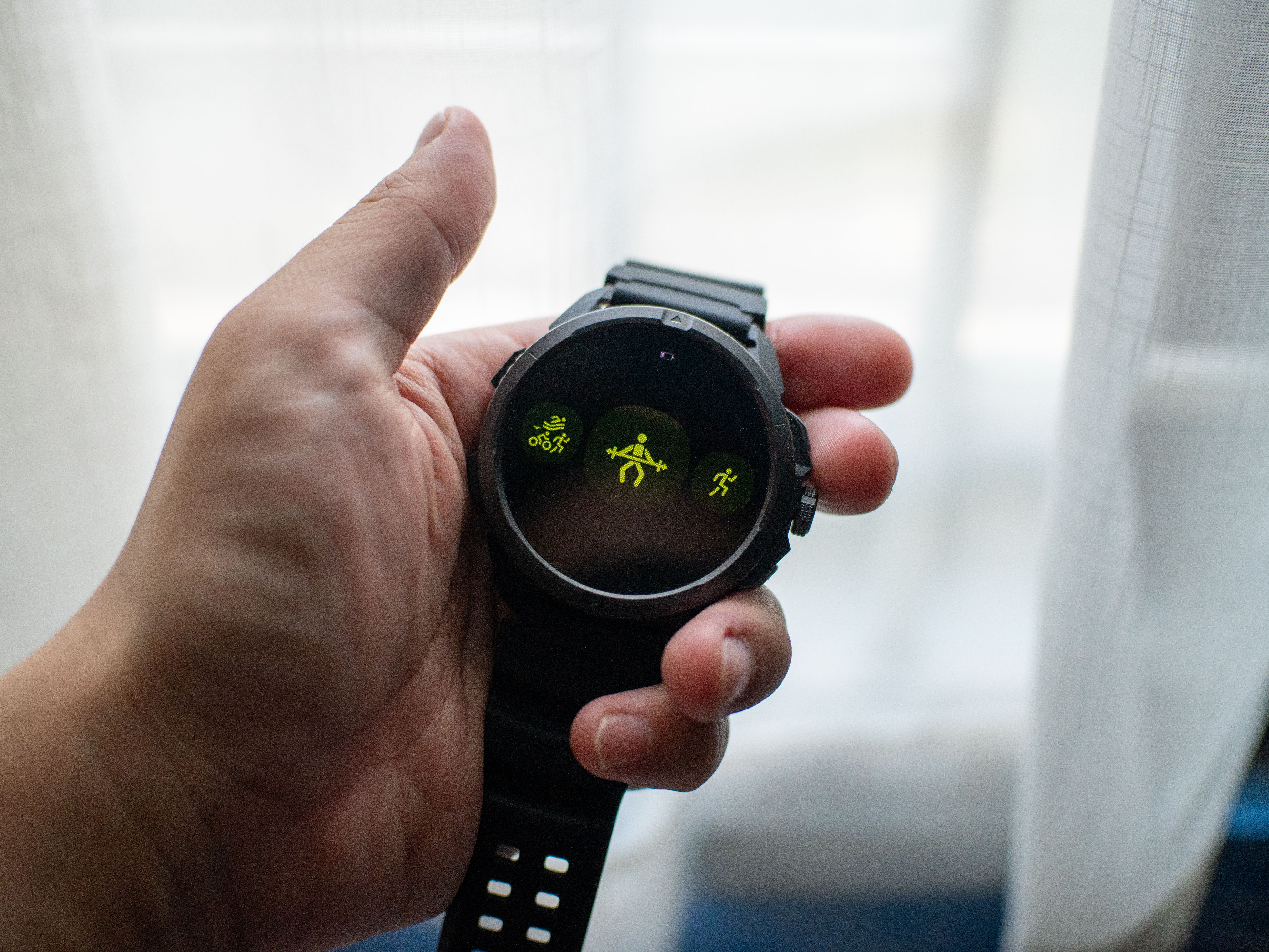
Nexal Watch Sport review: A rugged watch for small budgets
I couldn’t believe that watches this good could come for this cheap.
Between run clubs and HYROX training, fitness these days is a luxury. But it doesn’t have to be. When you realize that buying a new Garmin watch or On running shoe eats so much into your monthly budget, you start to discover those little things that make you go, “hey, maybe I don’t need all that expensive gear just to pound the pavement.” After all, humans perfected running before they figured out wearables.
That’s exactly how I felt with the Nexal Watch Sport.
Rugged as they come
I’ve always had a gripe with affordable smartwatches. Whereas budget smartphones are still able to wow users with unique (and durable) designs, affordable smartwatches often lack that polish, sometimes manifesting in flimsy straps or a clear lack of features.
The Nexal Watch Sport doesn’t suffer from that ailment. Housed in a matte black chassis, the wearable can hang with the rest. In spite of the minimalist design, it goes a long way to make me feel like I have an expensive wearable, rather than one that saves my monthly budget.
On the side, it comes with two simple buttons, a rotating crown, and a delightful array of flashlights (which I love, by the way). It’s also pleasantly light and doesn’t drag my wrist down, which is perfect for runners. The strap, though very bendy, lets my wrist breathe amid long runs. Finally, the double hooks ensure that the strap remains fixed to my wrist.

No more missed workouts
My favorite part about exploring a new smartwatch is going through its list of available workout modes. Offering over a hundred modes, the Nexal Watch Sport has you covered, no matter what you do to get the blood flowing. While you’re naturally getting the usual array ranging from running to lifting weights to pickleball, you’re also getting some pretty niche ones like parkour, darts, and jazz dancing.
Now, I know that I’ll never go for something like parkour, but it’s still nice to have that option. Plus, I’m sure actual practitioners of these sports will appreciate their inclusion. For me, having a wide array of modes to choose from adds that bit of feeling that maybe I can try one of those someday, and that’s an intangible plus with this feature.
As for performance, the modes I used — weightlifting and running — were accurate enough. I didn’t miss my Garmin Forerunner.
A clean interface
Another thing I look out for is the user interface. To my great surprise, the Nexal Watch Sport looks very clean. In fact, the main watch face looks better than a lot of options I’ve seen on either Fitbit or Garmin.
The main interface itself is simple, but that’s just what you need from a smartwatch. You don’t really want to fiddle around with settings on a small screen when all you want to do is to start running.
That said, the smartwatch isn’t the fastest. There’s a pronounced lag of about half a second when you use the screen. Functionally, it’s not too bad, but again, it’s frustrating when you’re about to start a run.

Now that’s a long battery life
“Rugged” describes this smartwatch to a tee. Nexal promises that a single charge can last up to thirty days on light use. Based on my estimates, this is largely true. The Watch Sport keeps on chugging along.
For regular people like me, this extremely durable battery is a boon for those who don’t want to charge their wearables too often. But it’s a godsend for those who prefer rugged outdoorsy sports. If you’re out in the wild, having a durable way to navigate and connect with the world is a must.
In our case, an extra-long battery life is a big benefit for on-the-go lifestyles. Whether I’m just working or working out, this battery is useful.
Is the Nexal Watch Sport your GadgetMatch?
The Nexal Watch Sport costs only PhP 6,999. It’s a bargain compared to even the cheapest models of the more popular brands.
With that price and its abundance of features you’d expect, this is a worthy purchase that you won’t regret. The only real flaw was the relatively slow interface, but that’s still workable. For that, the Nexal Watch Sport gets a Super Swipe.


realme C100: Enduring and durable in spite of entry-level realities
Enough power but needs more agility


The ASUS ExpertBook Ultra wins you over
The laptop sneaks up on you


Nexal Watch Sport review: A rugged watch for small budgets
I couldn't believe that watches this good could come for this cheap.

Avengers: Doomsday trailer assembles Marvel’s biggest heroes against Doctor Doom

Call of Duty, Aston Martin unveil Dreadnought for Modern Warfare 4

Lionel Messi’s face just unveiled the Galaxy Z Fold 8 Ultra early

Mercedes-Benz celebrates 140th anniversary at the Presidential Car Museum

Street Fighter 6’s first Filipina fighter arrives August 3

New York becomes first state to ban smart glasses

vivo X300 Ultra review: A “Whole Different Animal”

DJI Osmo Pocket 4P launches with dual lenses and a 1-inch sensor
Lenovo says RAM prices are not coming back down again

Camera Shootout: HONOR 600 Pro vs OPPO Reno15 Pro


-
 News2 weeks ago
New York becomes first state to ban smart glasses
-

 Singapore1 week ago
Sony launches IER-M500 in-ear monitors
-

 Gaming2 weeks ago
Microsoft dictates that a new Fallout game is coming
-

 Computers2 weeks ago
GIGABYTE releases new AORUS RTX 5080 INFINITY graphics cards
-

 Gaming2 weeks ago
HoYo FEST 2026 details announced; tickets on sale from July 16
-
Reviews1 week ago
realme C100: Enduring and durable in spite of entry-level realities
-

 Gaming2 weeks ago
Assassin’s Creed Black Flag Resynced available worldwide now
-

 News5 days ago
Samsung releases teaser with Spider-Man: Brand New Day Easter eggs