

I was first exposed to Infinix with the Hot 10S hands-on video I edited for our YouTube channel way back in 2021.
After that year, Rodneil asked me to shoot the ZERO Ultra for his remote work day video feature during the depressing pandemic.

Infinix ZERO Ultra | 2022
Another year had passed, that’s when the NOTE 30 series went by. I loved how the phone looked and performed despite its affordable price tag.
It’s safe to say I’m impressed with how the brand has been coming out with mighty phones for less.

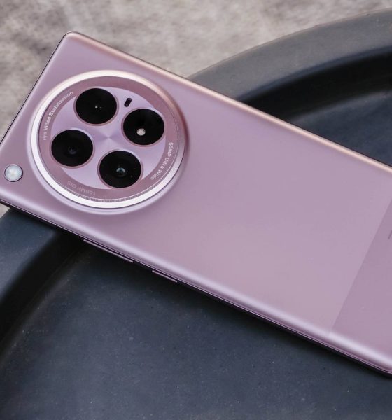
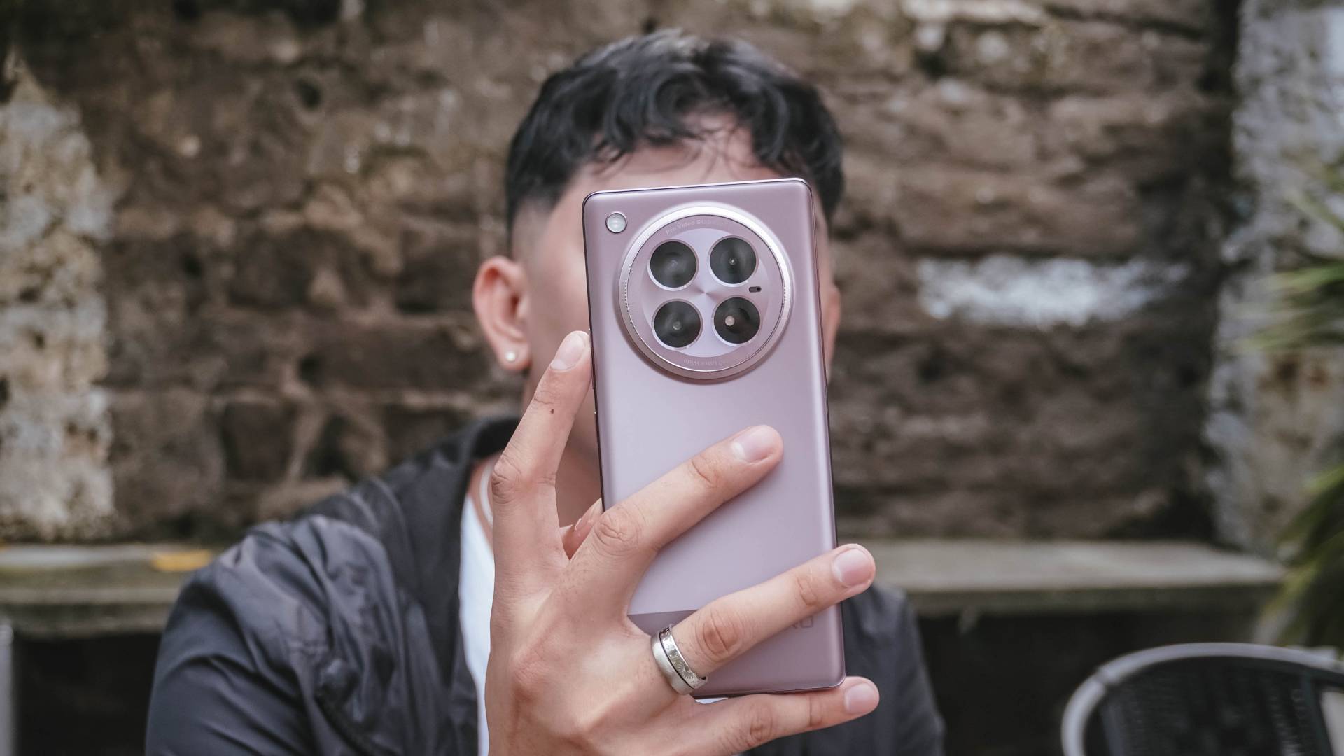
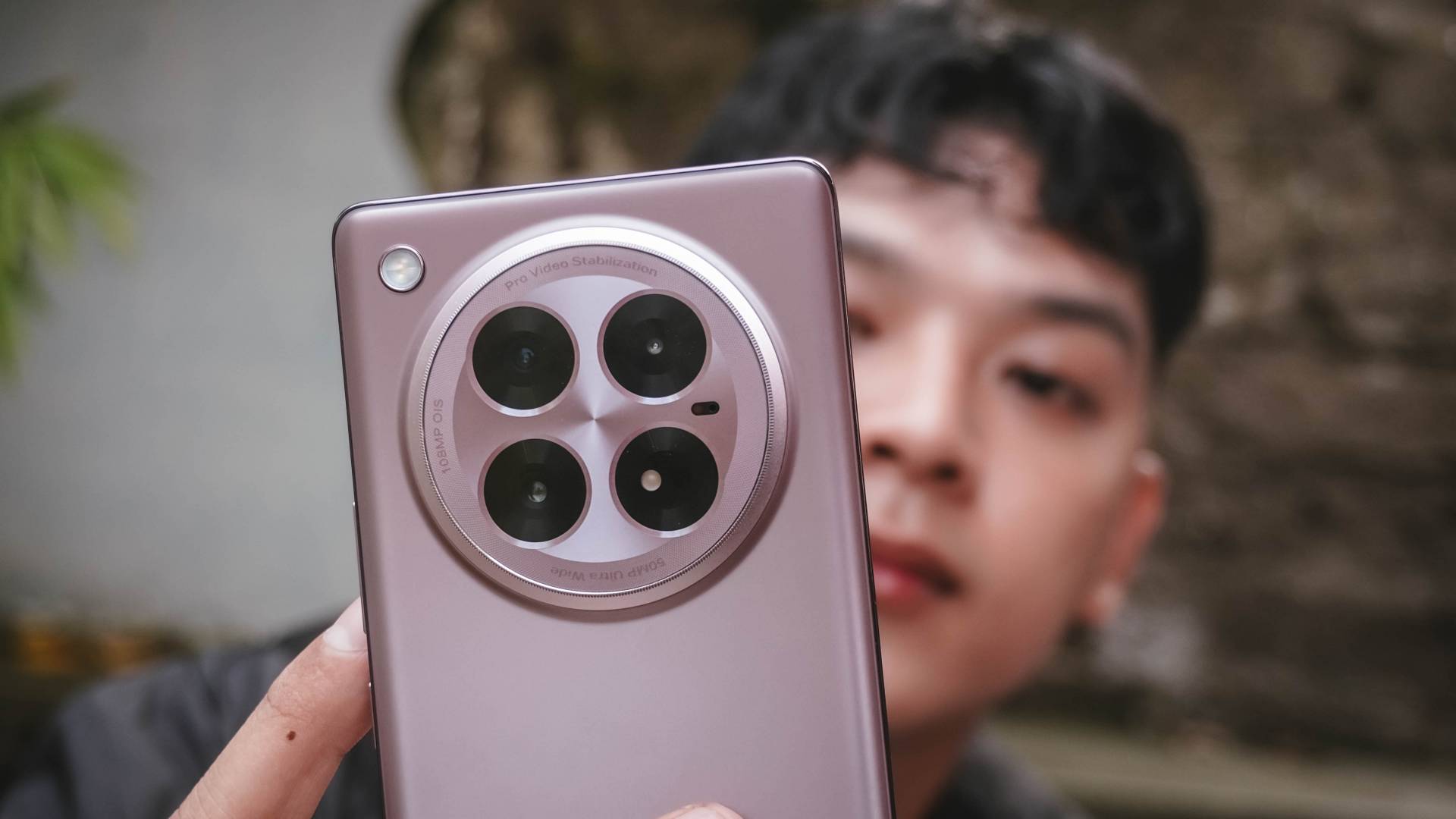
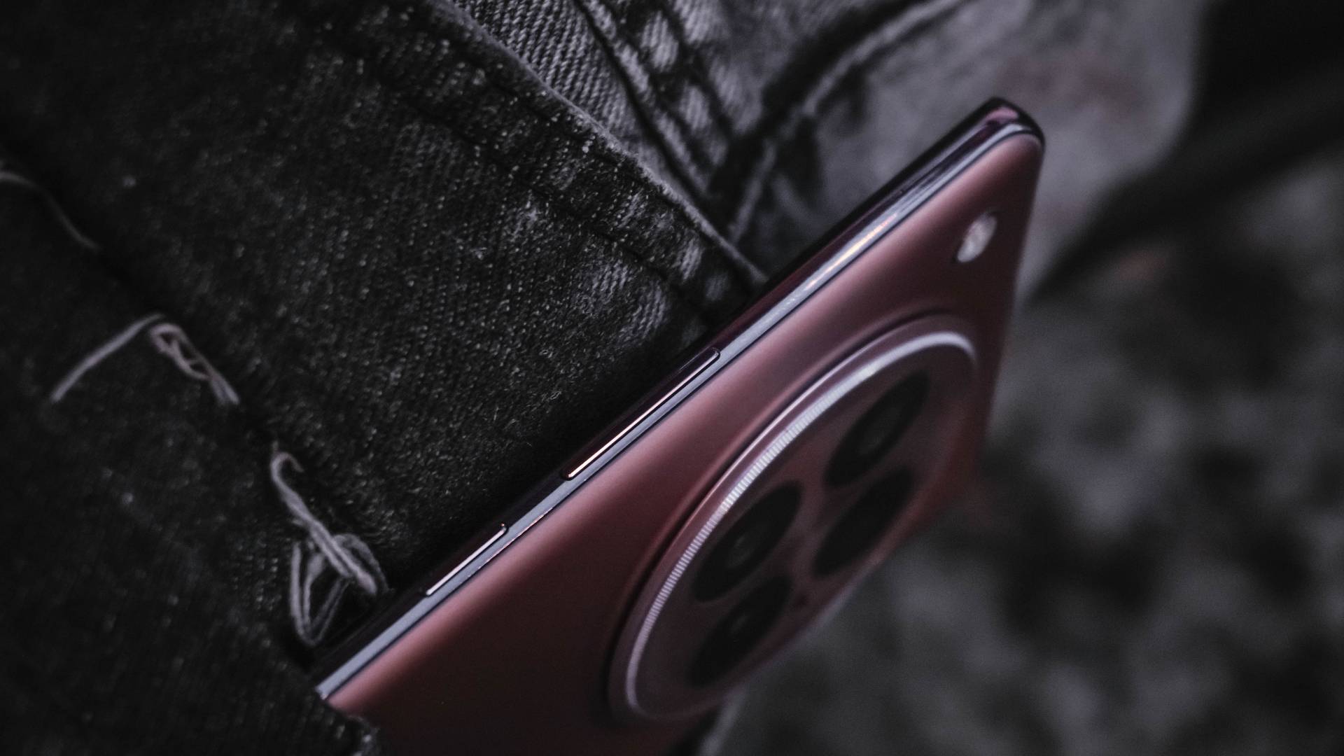
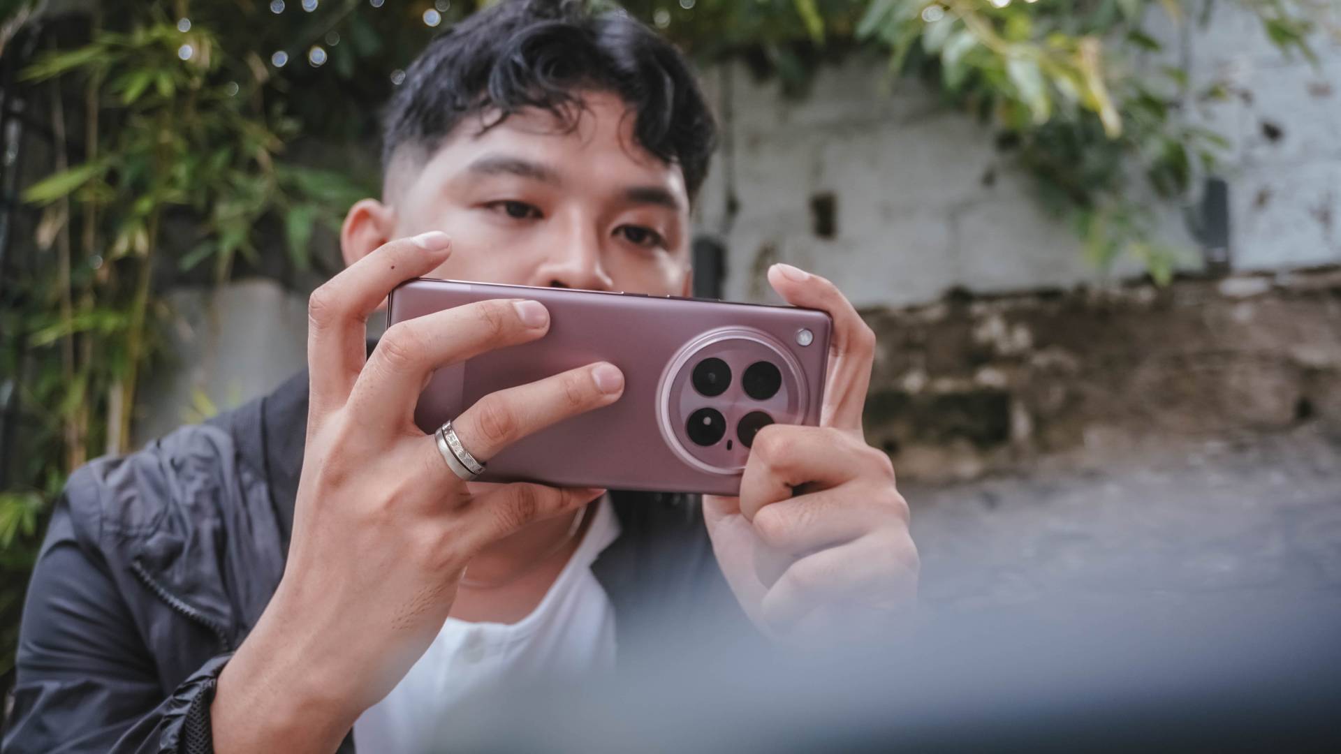
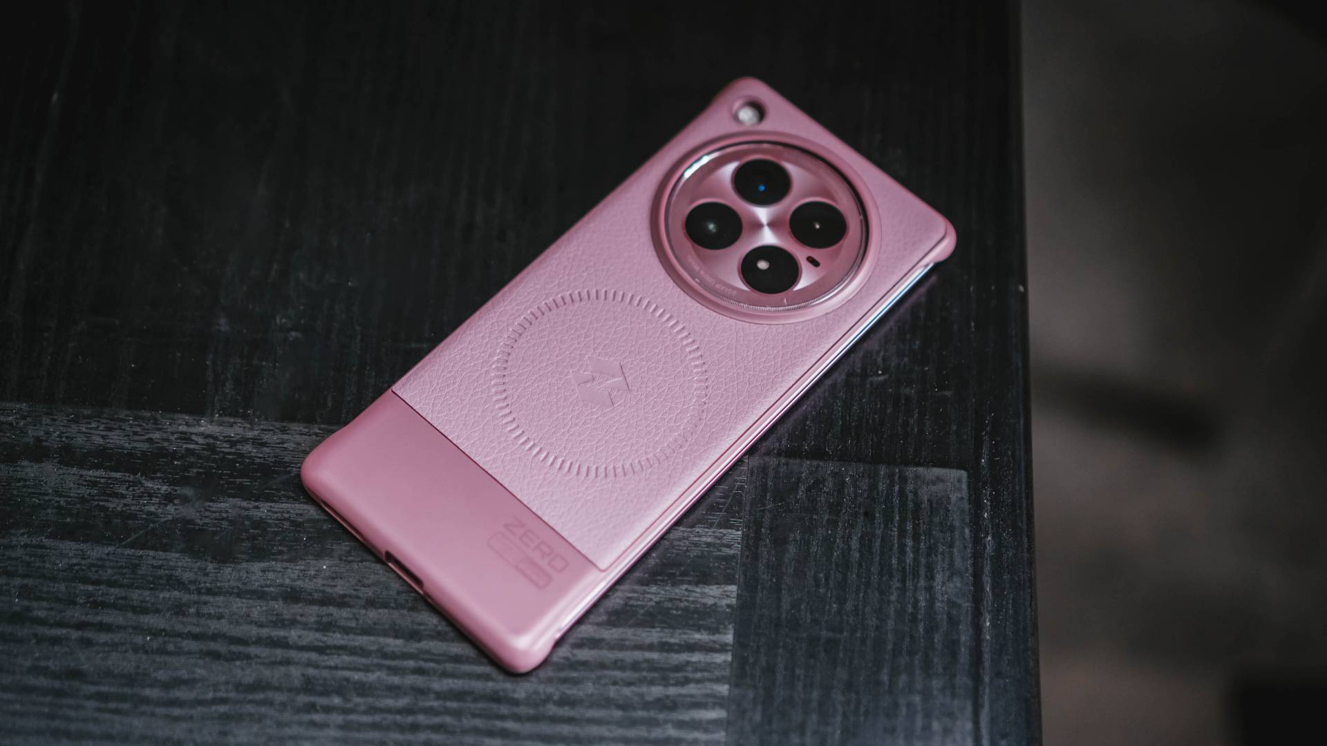
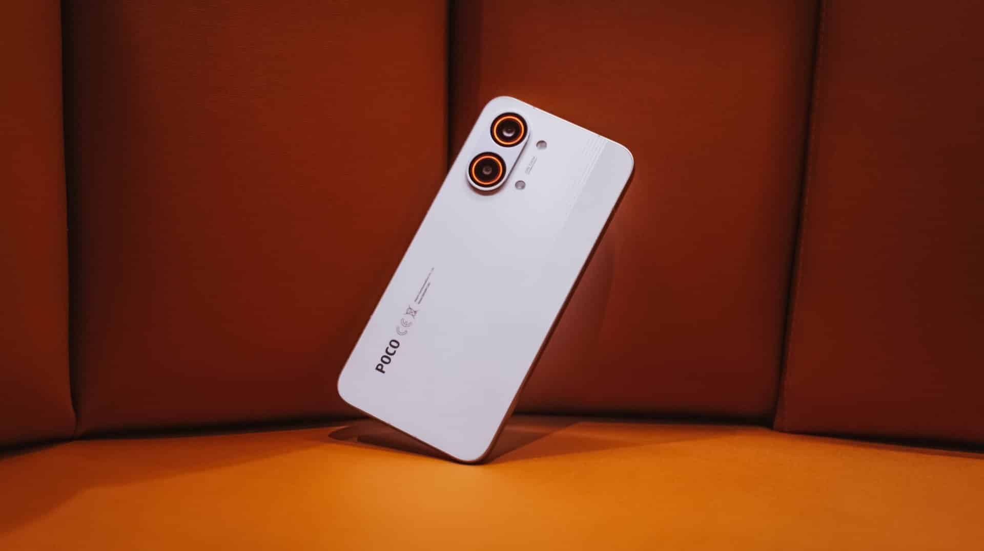
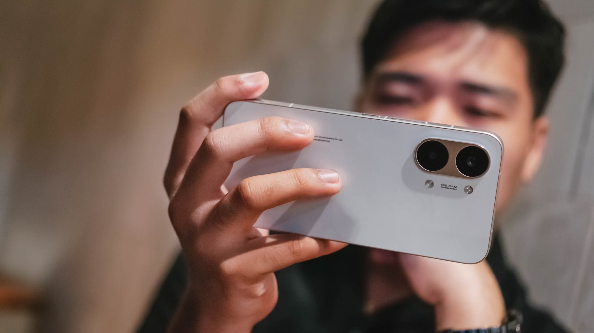
This 2024, I was finally given the firsthand chance to test out the best-in-class phone of the Hong Kong-based phone brand. Lo and behold, the Infinix ZERO 40 5G in its full glory.
P.S: I’m not an Infinix virgin anymore 🎉🥳
The Manifestation of Collaboration?
When I did my research about the brand’s past ZERO line, I was stunned to see the ZERO X Pro with its “From ZERO to HERO” tagline.
It then dawned to me that Infinix might have actually manifested it and made it a reality three years after.
Infinix ZERO X Pro | 2021 • That’s a serious glow-up though
ICYMI, they announced their exclusive partnership with GoPro through this smartphone.
This also meant that the ZERO 40 5G promises a video mastery just like THE “HERO” — or GoPro’s one and only action camera line.

GoPro HERO12 Black | 2023
As an added testament, I reviewed the GoPro HERO12 Black ten months ago — further validating how I witnessed the action camera’s commendable performance.

GoPro’s Quik app even comes pre-installed upon setup — solidifying the bridge between the two companies.
Walk The Talk
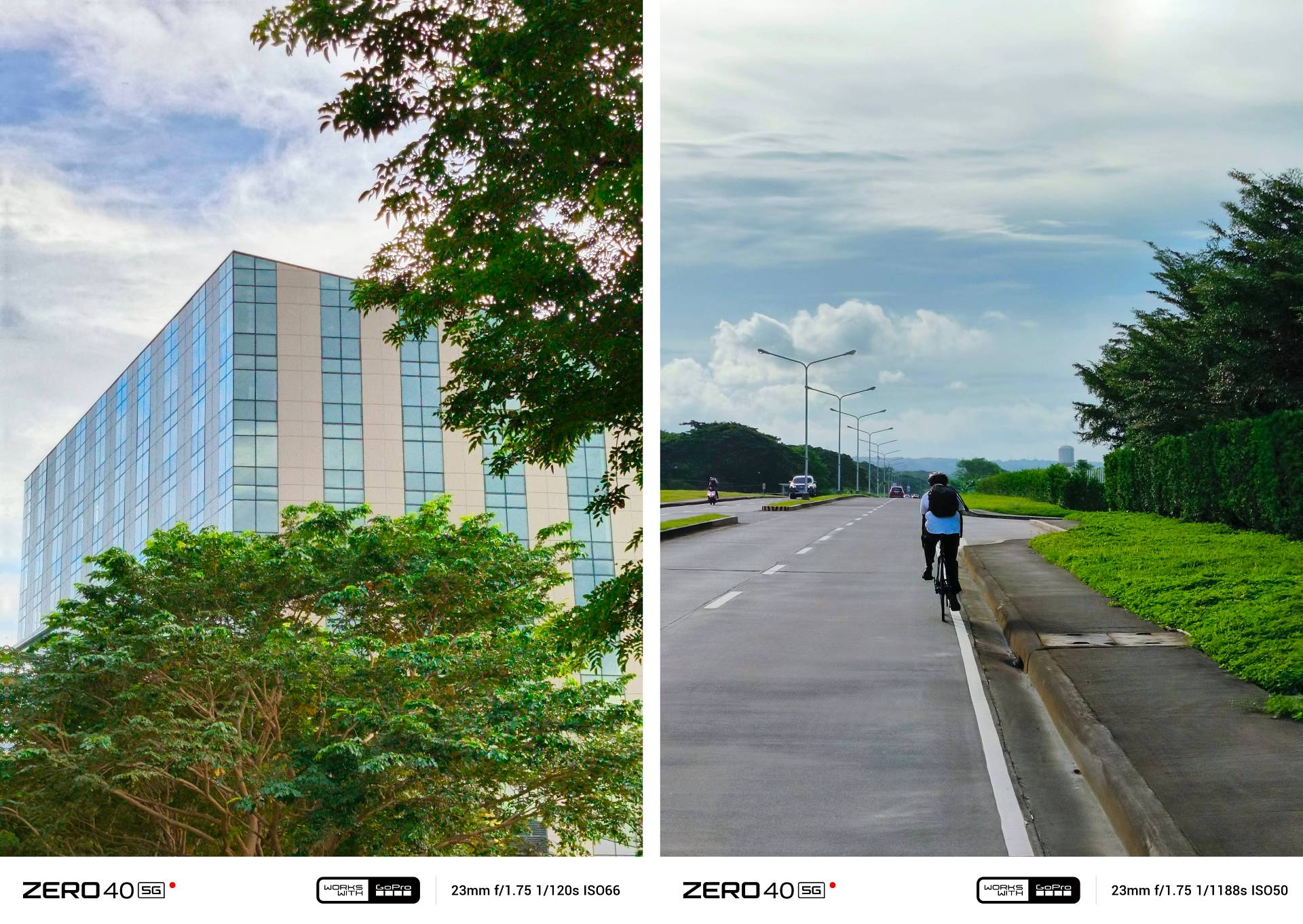
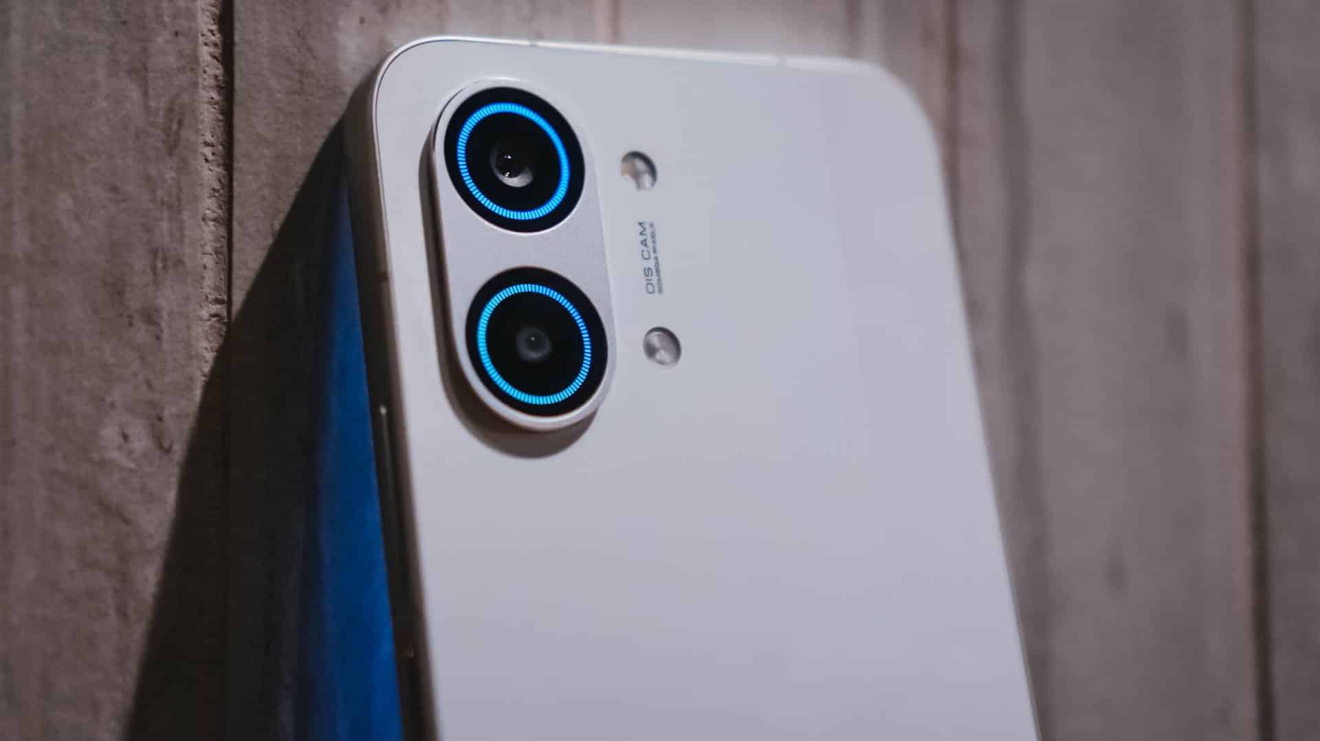
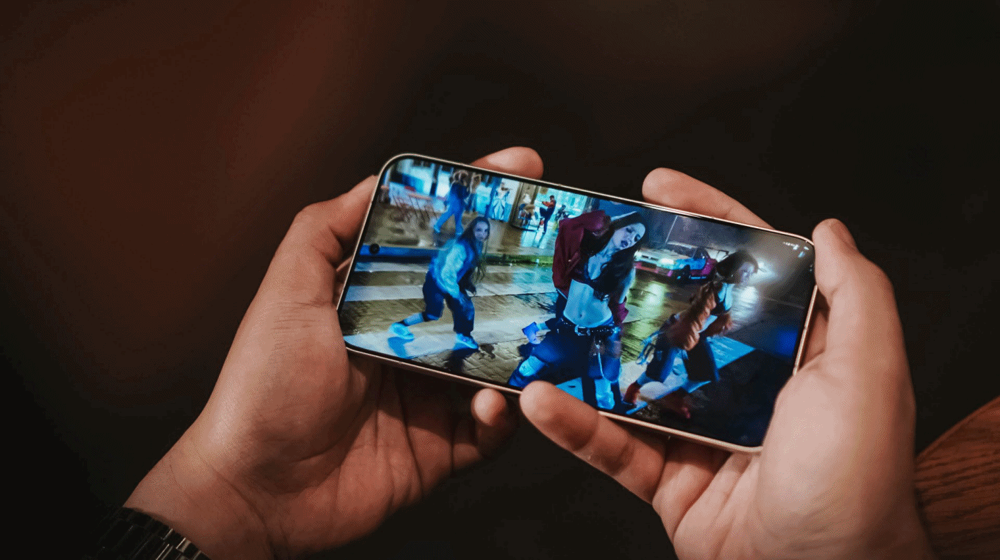
With the collab talk out of the way, it’s evident that the brand wanted to showcase the phone’s video recording capabilities. NGL, I had high hopes especially since this is a special collab with a brand specializing in action cameras.
Here’s a 60-seconder montage for you to see (95% cut-to-cut, 4% transitions, 1% supers, 0% color-grading):
@gadgetmatch #CaptureYourOwnStory with Infinix ZERO 40 5G’s new ProStable stabilization 🎥 #fyp #foryou #fypage #fypシ゚viral #fyppppppppppppppppppppppp #foryoupagе ♬ original sound – GadgetMatch
Just like their “in your face” partnership, I’ll also be upfront with my statement: this GoPro collab and their so-called “ProStable” video capabilities are nothing but marketing.
Infinix, like most Android brands, still has a long way to go when it comes to video shooting. That’s especially true for a smartphone in a category like this.
![]()
Already wondering what’s the fuss after seeing that simple yet slick montage I did? Well, I have listed down my specific woes.
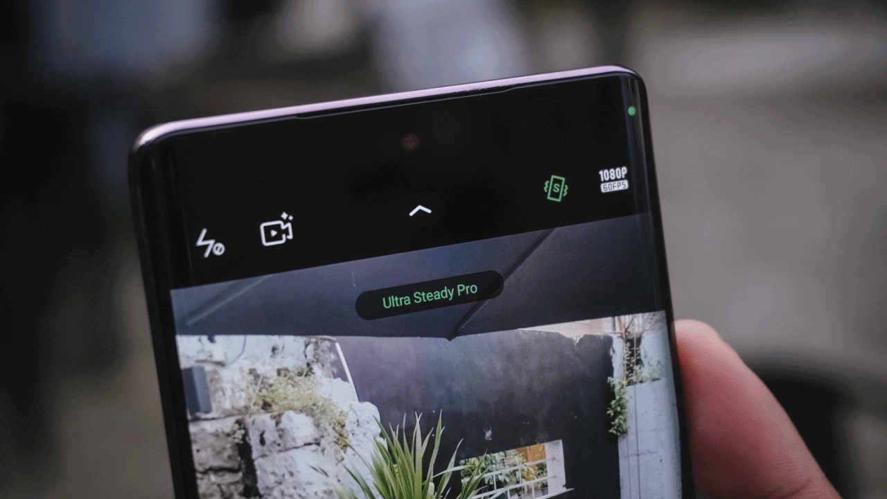
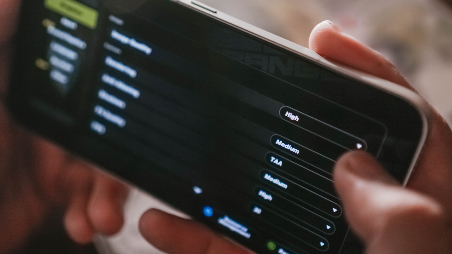
Ultra Steady mode + Full HD/60fps resolution is ON by default. But upon closer inspection, this mode maxes out at 4K/30fps.
Switching to the Ultra Steady Pro mode, the camera then switches out to the Ultra-Wide Lens mode. Weirdly, it’s still usable by 1x if you manually toggle it.
Personally, I always shoot videos in 4K/60fps so that I have the flexibility to slow them down during post by 75% or 50% in my standard 29.97fps editing workflow.
Flipping the camera to its front, Ultra Steady Pro doesn’t work at all. But Ultra Steady mode still works with the same resolution restriction.
And once you apply those LUT-like filters, beauty effects, built-in frames, and even bokeh blur, both ProStable stabilization modes turn OFF. Resolution is restricted to just Full HD with that choppy 30fps frame rate.
I tried experimenting between these “ProStable” modes and its UWA / 1x focal lengths just for us to see the fine line.
From the video above, you will notice that videos taken with Ultra Steady mode show shakiness, warping, defocusing, and even Dynamic Range shifting — particularly when I was shooting in a full swing.
Ultra Steady Pro tries to “fix” that but at the expense of a slower bitrate when it detects movements such as panning, tilting, and tracking while on the move. It doesn’t do much though when I was shooting while cycling. Not to mention, the phone heats up quite a bit.

Still, they marketed this as a phone meant for “vlogging”. I don’t think there should be boundaries like this. These confusing settings and limitations prove my bold statement that the partnership is more of a talk than walk.

I’m proud to say I have one of the steadiest hands when taking handheld footage. That’s why I’m also one of the team’s resident videographers aside from being their full-time YouTube editor.
And even if I say I’m credible enough for being a geeky multimedia creative, finicky users can easily point out such nuances especially after extensively playing with the phone and seeing the actual output.
Something Compelling
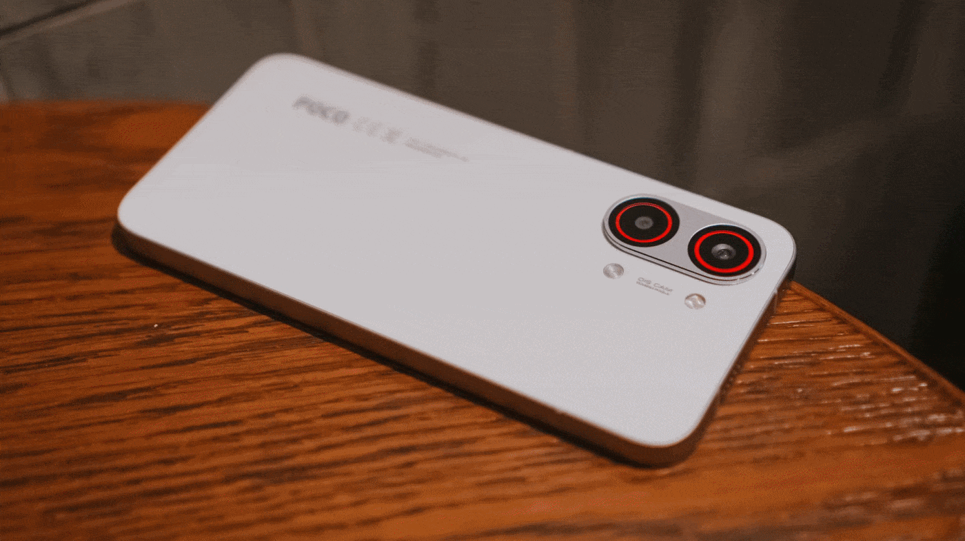
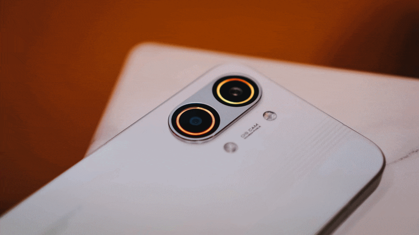
Camera performance continues in this section. This time, it’s all about the phone’s prowess when it comes to stills.
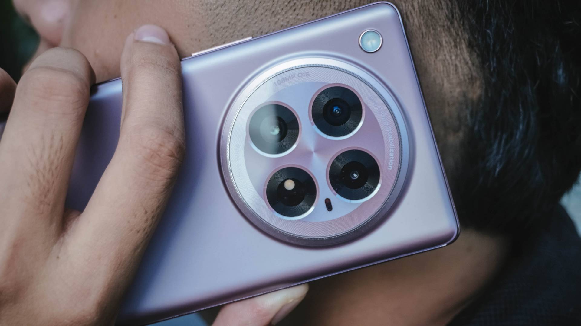
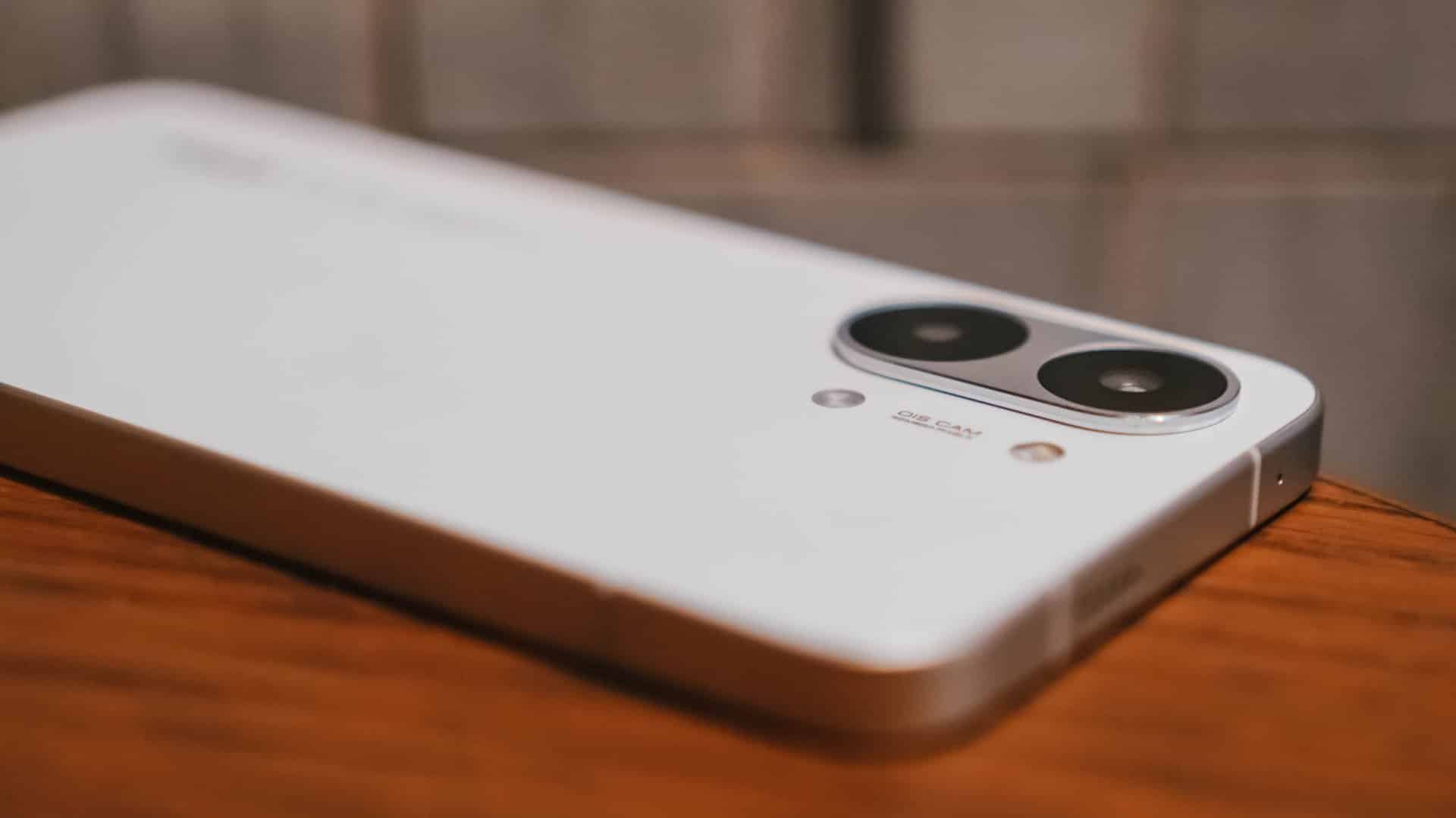
On paper, the ZERO 40 5G has a compelling camera hardware:
Wide |
108MP f/1.75
|
Ultra-Wide |
50MP f/2.0
|
Depth |
2MP f/2.4 |
Selfie |
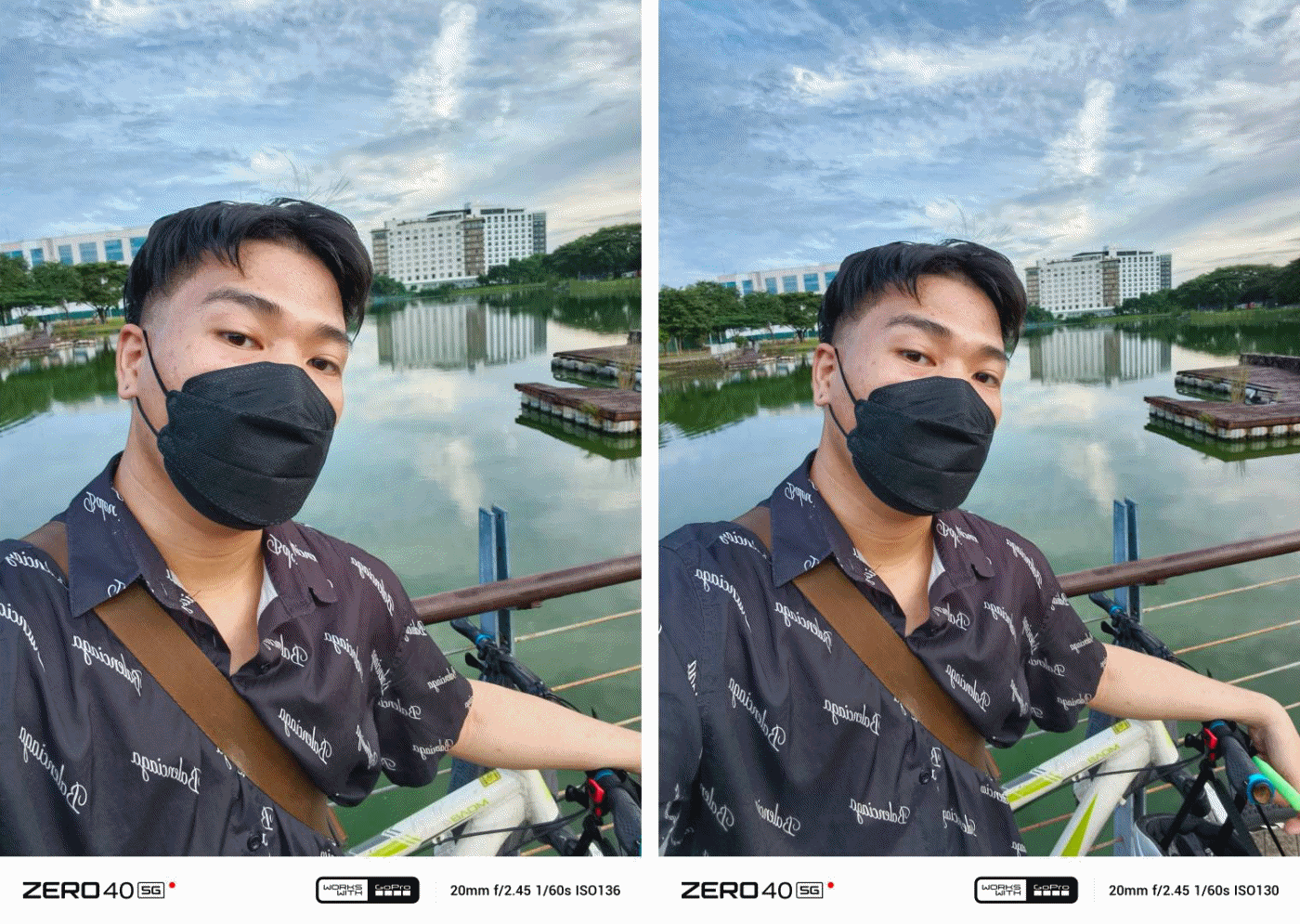
50MP f/2.45
|
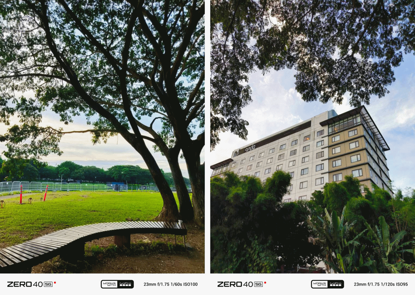
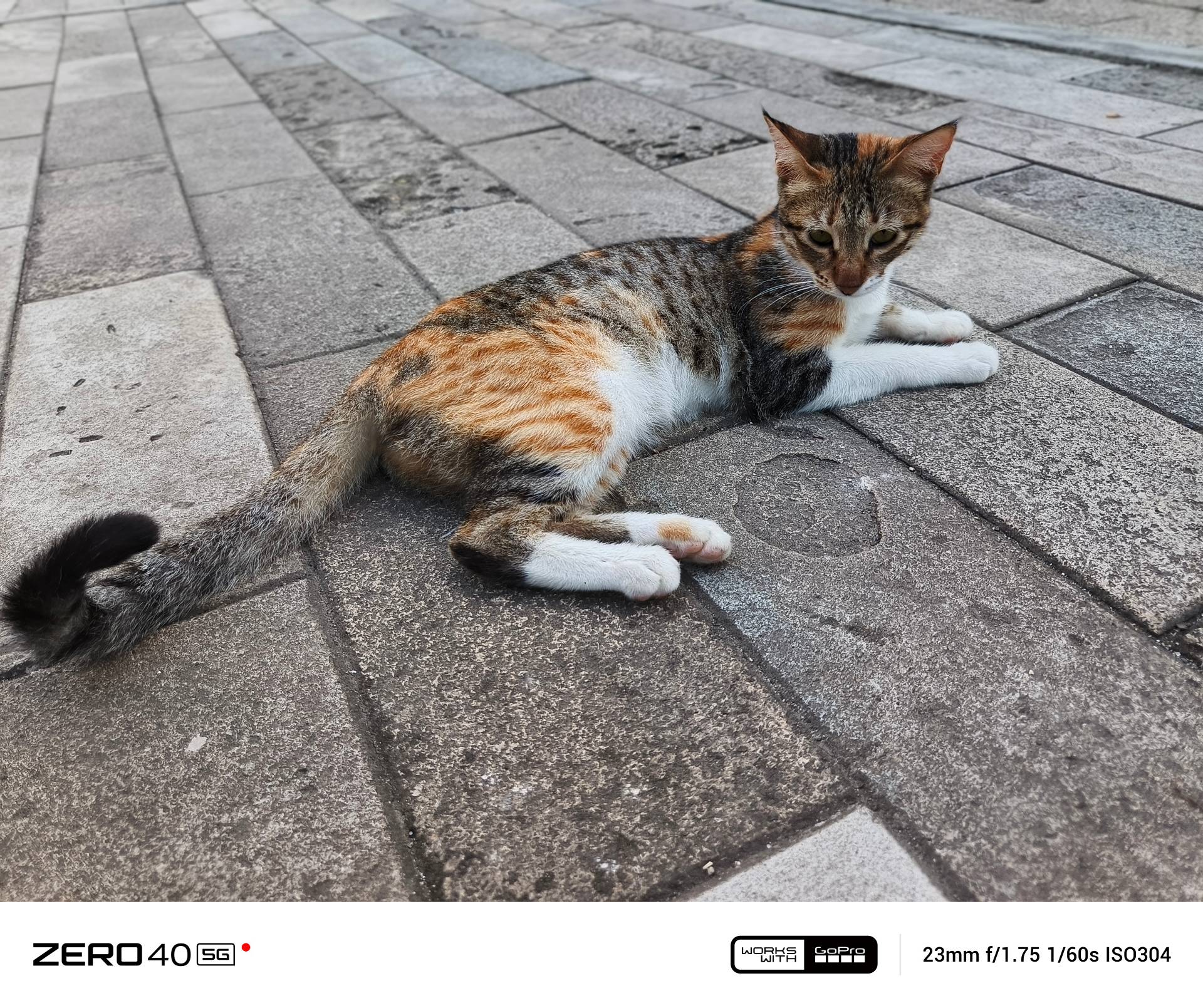
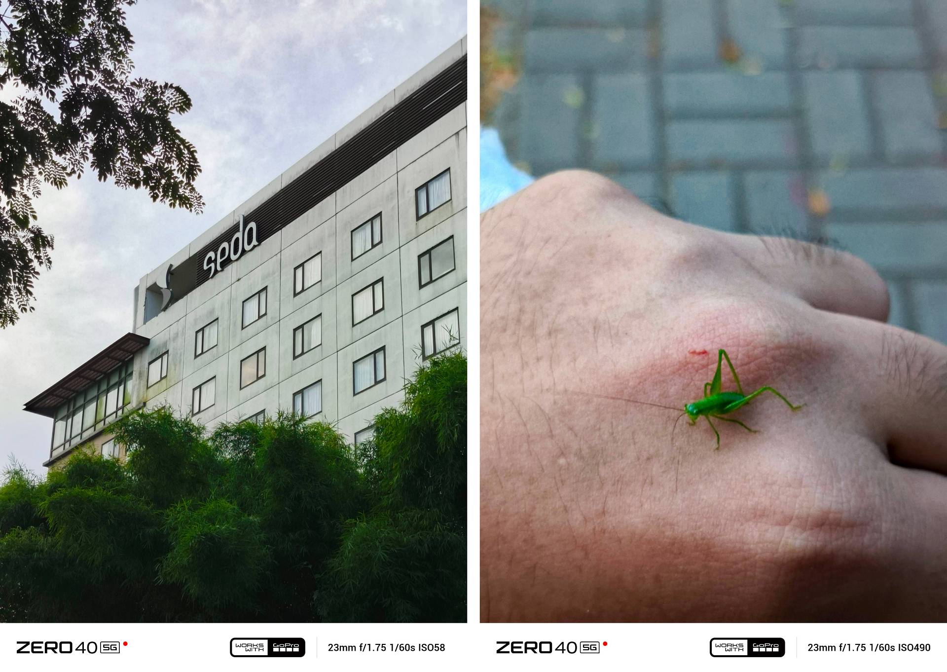
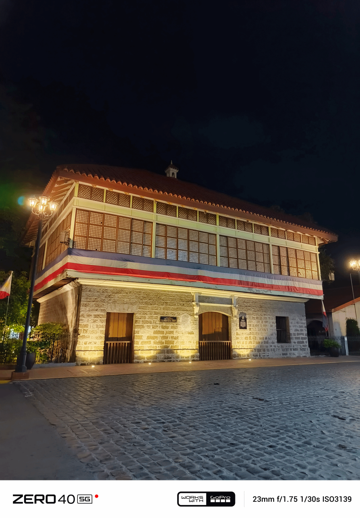
Stills taken with its 108MP main sensor are great considering its overall class and cost.
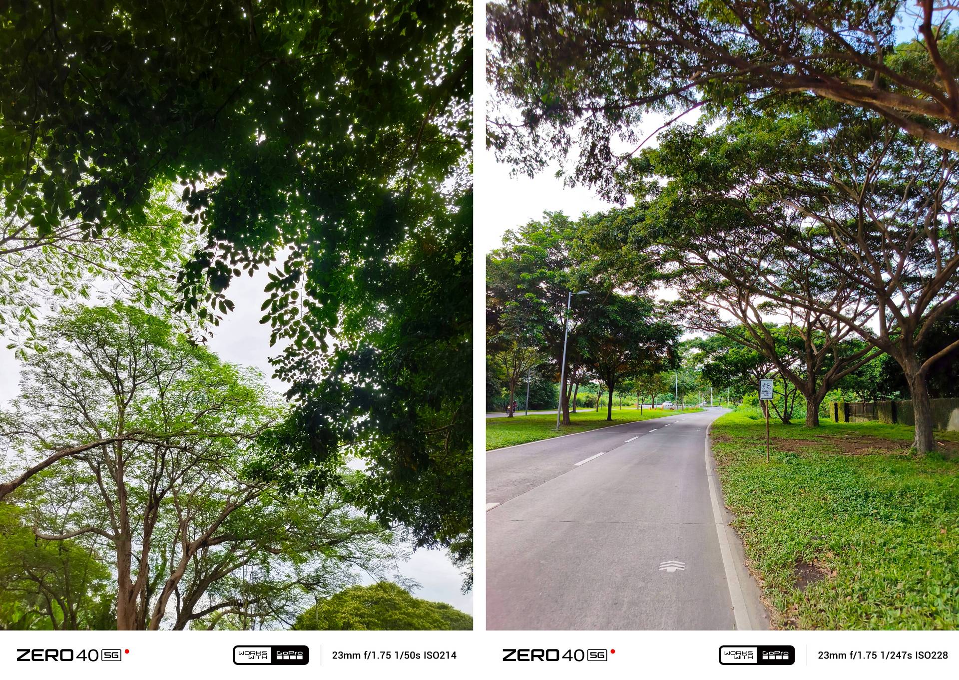

HDR comes in very handy during the signature Golden Hour.
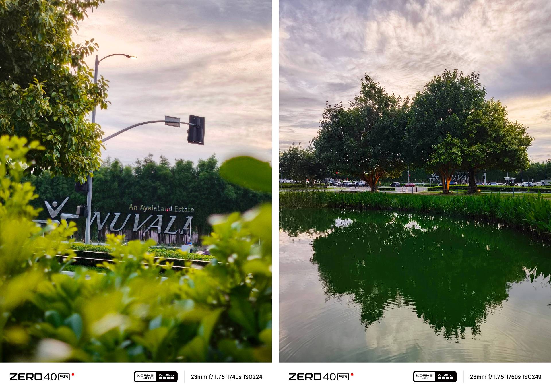
With the right distance, as well as focusing, framing, and timing, you get picture-perfect shots worthy to post online.

Despite the lack of a dedicated zoom lens, it can still capture photos with 2x lossless zoom.

Just don’t exceed past the 6x mark for desirable results.

But just like the bad taste it leaves in videos, photos are far from being safe.
1. Color inaccuracy and inconsistency is so evident
Especially noticeable when you switch from 1x Wide to UWA (Ultra-Wide Angle).

I don’t understand how the ultra-wide lens gives cooler photos in contrast to the main shooter.
Referring to the side-by-side video comparison above, this issue isn’t limited to stills as it happens in videos as well.
2. That 2MP depth sensor, just like its GoPro tactics, is purely useless.
Where’s the “depth” in a depth sensor?
Shots taken in Portrait Mode looked too artificial even if you reduce the bokeh effect. Those cutouts even remind me of the artificial-looking portraits with selective background blur taken way back in 2019.

All that excessive blur and sharpening are just unacceptable
To make it look more uncertain, the color science between taking a regular 2x photo versus a 2x shot in Portrait Mode is as inconsistent as its video capabilities.

Do you prefer the soulless regular 2x shot or the vibrant (or overly-processed) look of the food shot in Portrait Mode?
You can always have the bitter extremes but never the sweet in-betweens.
3. Zoomed shots are either a hit or miss.
Again, the existence of the useless depth sensor is here to blame.

Its Infinix’s one big mistake how they never brought that ground-breaking periscope zoom lens from the ZERO X Pro back then despite getting much praise.

Notice how the watermark focal length stays the same even in zoom?
Zoomed shots minus a zoom sensor just means it relies on digital crop or the so-called “lossless zoom”. And as obvious as it seems, the quality is either soft or over-sharpened.
Sure, 108MP sounds massive. But that doesn’t necessarily mean it takes better 2x cropped photos compared to a 50MP main camera with a larger sensor 👀
4. Night shots are better without Night Mode

Just notice that over-sharpening as well as blown-out highlights, stronger shadows, contrast, and blue casting altogether.

Even Super Night Mode makes the low-light image worse with all that grain and glare.
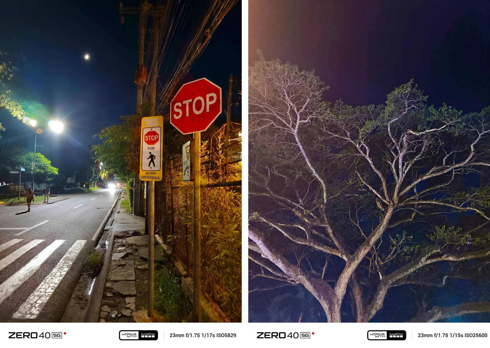
OFF vs Night Mode vs Super Night Mode
This last low-light shot is actually taken without night mode AI.

A whole lot better, right?
As for selfies, aspiring vloggers and influencers may or may not like it.
But for my taste, it’s standard and nothing too extravagant.
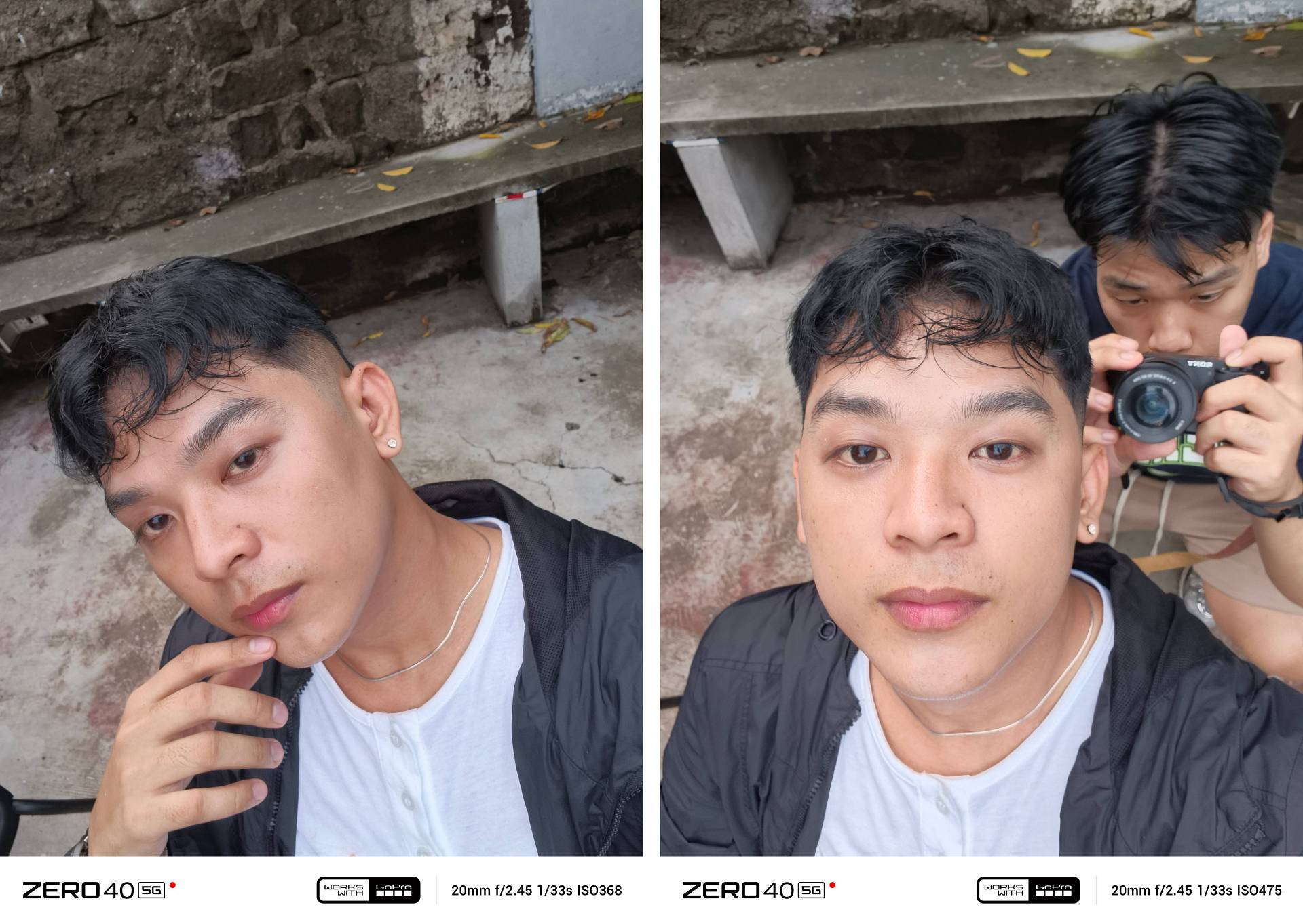

It has portrait mode in selfie though, just in case you don’t want to miss that feature.
Portrait OFF vs ON (1x Wide, UWA)
Oh So Svelte
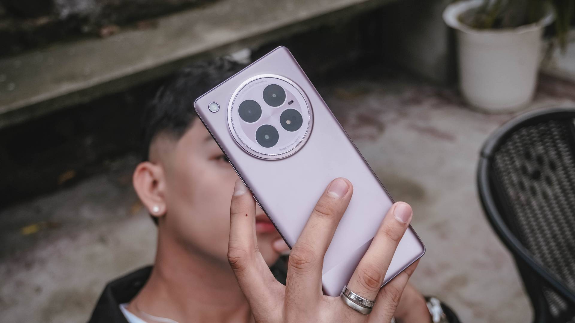
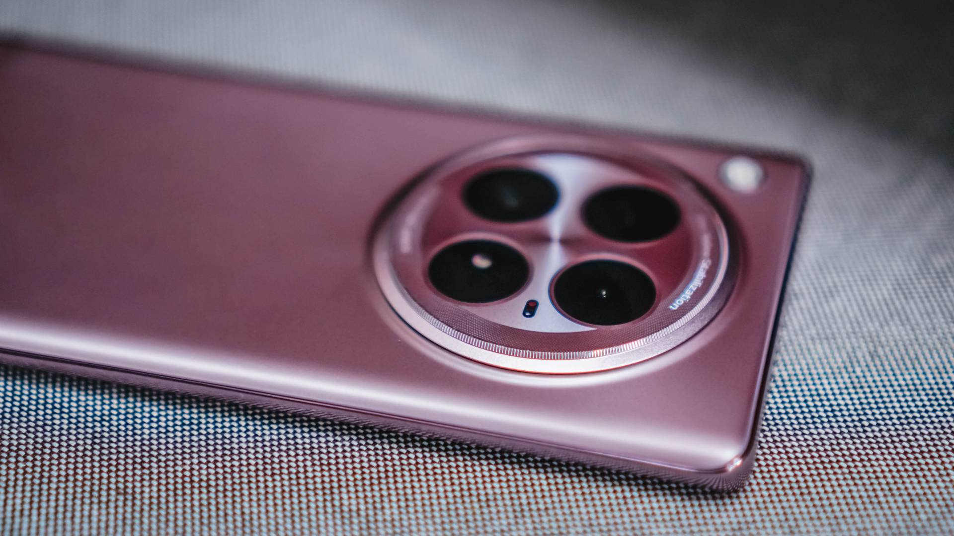
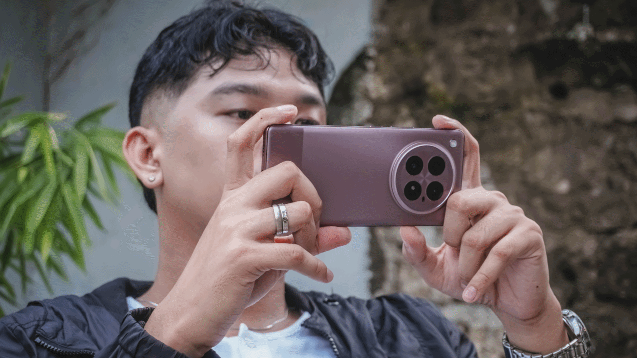
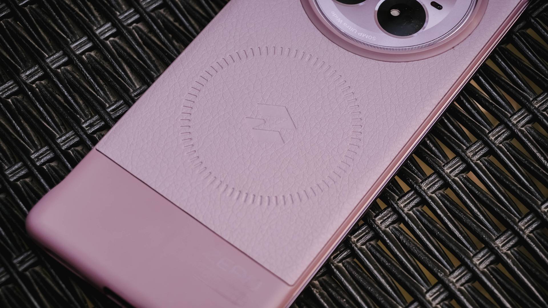
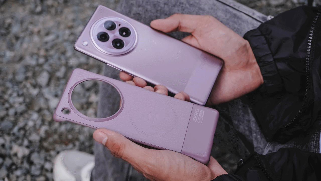
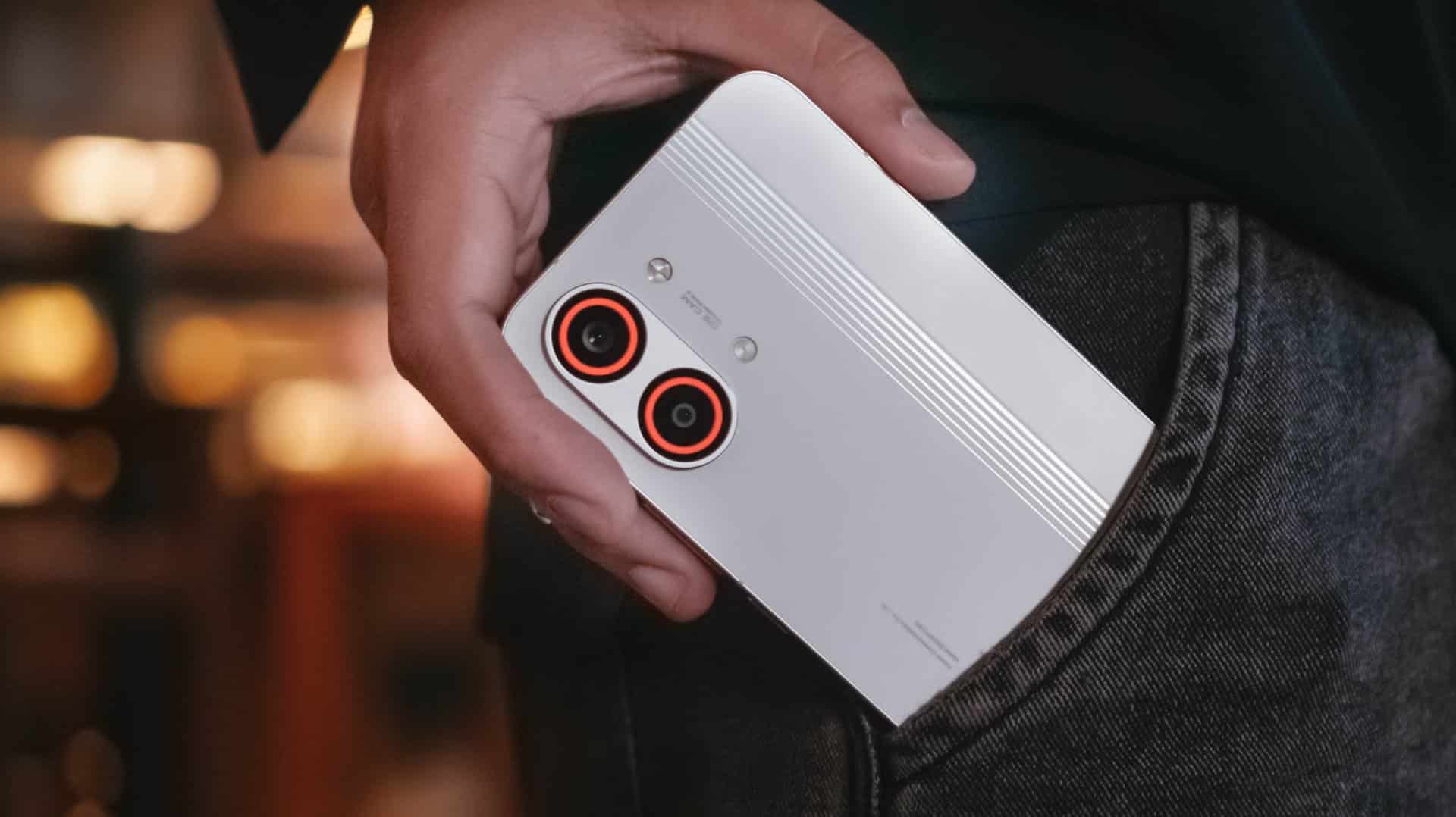
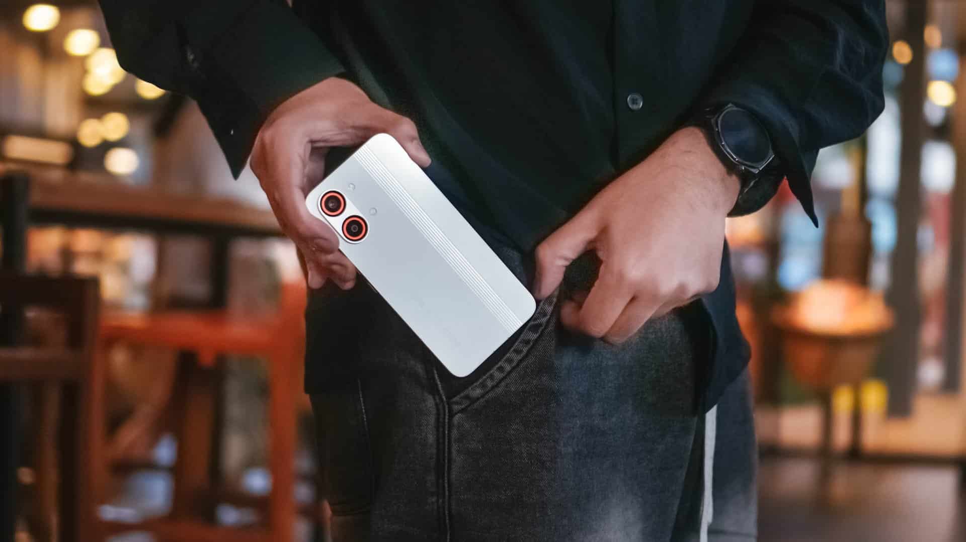
Opposed to my pool of issues regarding its camera performance, I honestly love Infinix ZERO 40 5G’s overall look and feel.
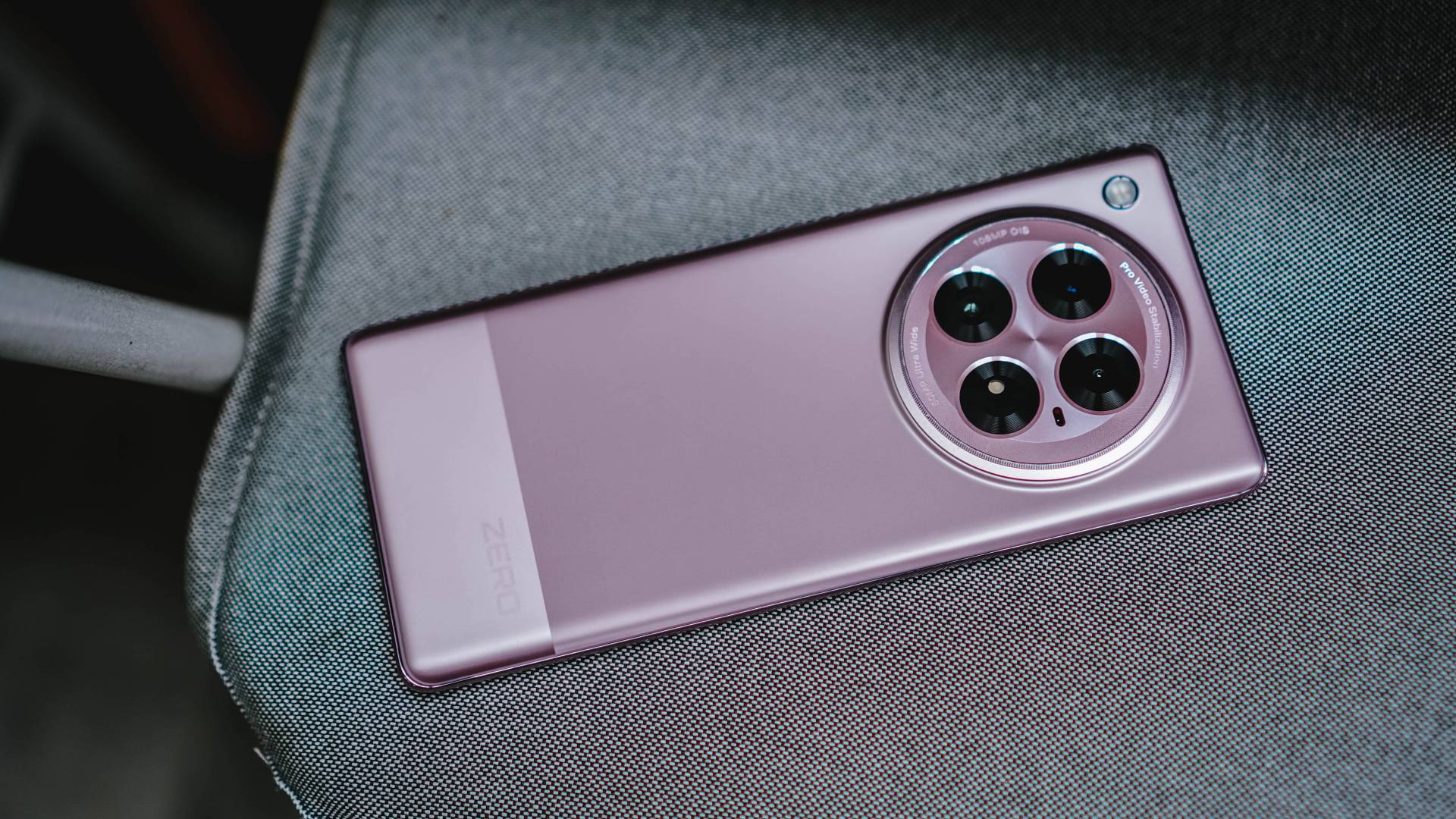
The model I have is in this subdued yet stunning Violet Garden colorway. Moving Titanium and Rock Black are its two other classy color choices.
If you’ve read my last TECNO CAMON 30 Premier review, I noted how curved displays are already out of trend.
While I’m still firm with that sentiment, I admit how seamless the curves are in this phone.
Its wrap-around screen gravitating towards the center of that frame together with the curved back all felt the phone is lightweight — especially for one-handed usage.
This type of form factor makes the phone feel so thin — even if it has the same exact 7.9mm thinness as its CAMON cousin (though ZERO is 15 grams lighter).

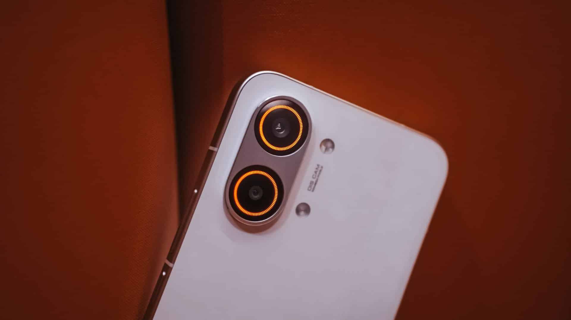
And like it or not, circular camera islands are the in-thing nowadays.
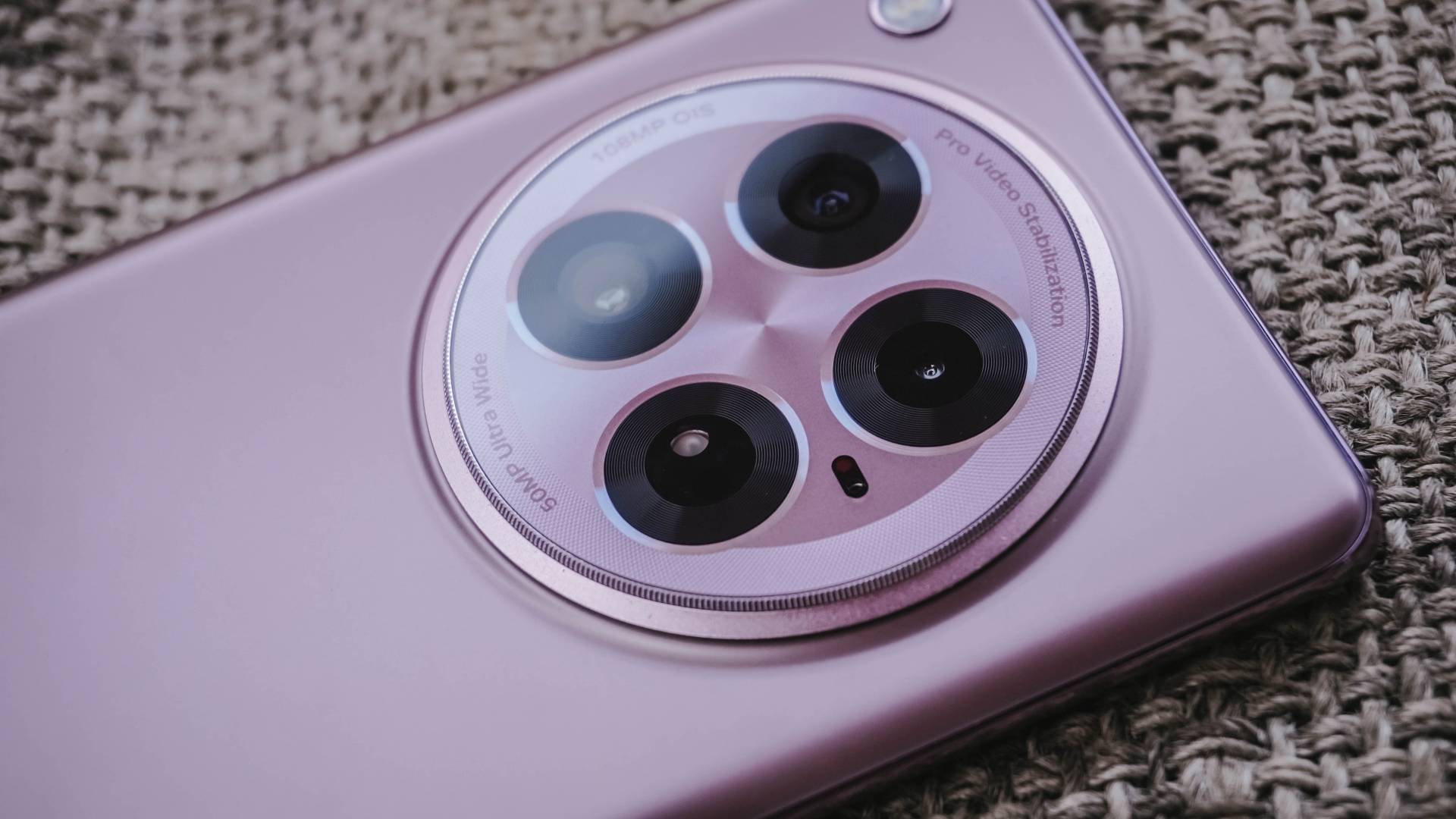
Infinix’s implementation looked elegant IMHO. Those intricate lines and circles instantly reminded me of a camera lens’ hardware.
Such design elements contribute to its sophisticated aesthetics.
Infinix ZERO 30 5G | 2023
I openly-welcome Infinix’s brave move of departing from their generic design language over the years.
Smooth-Sailing
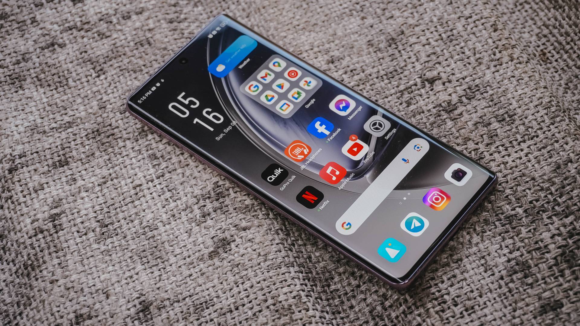
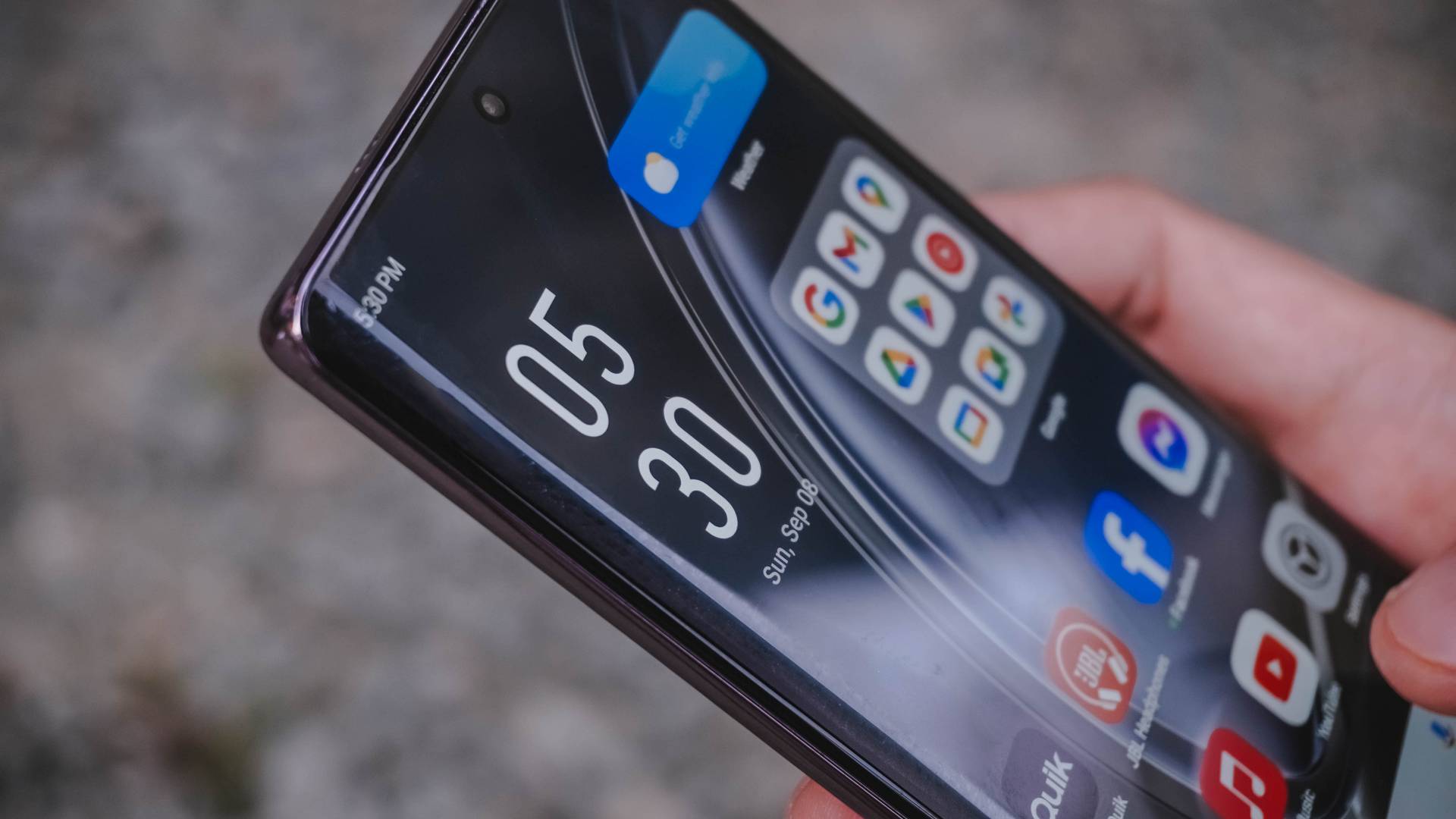
The Infinix ZERO 40 5G has a 6.78-inch LTPS Flexible AMOLED display with a buttery smooth 144Hz refresh rate — one of the rare phones to have it in 2024. Aside from its curves, it’s easier to hold because of its narrower aspect ratio.

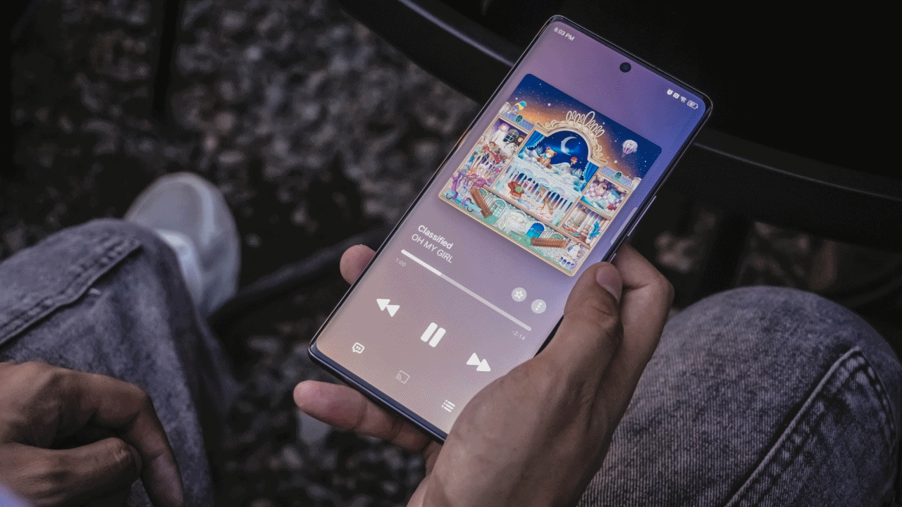
My obsession to cats is unstoppable, and so is to MEOVV 😻
I have no complaints with its superb screen. Its Full HD+ resolution is sharp enough for the 4K content I consume on YouTube.
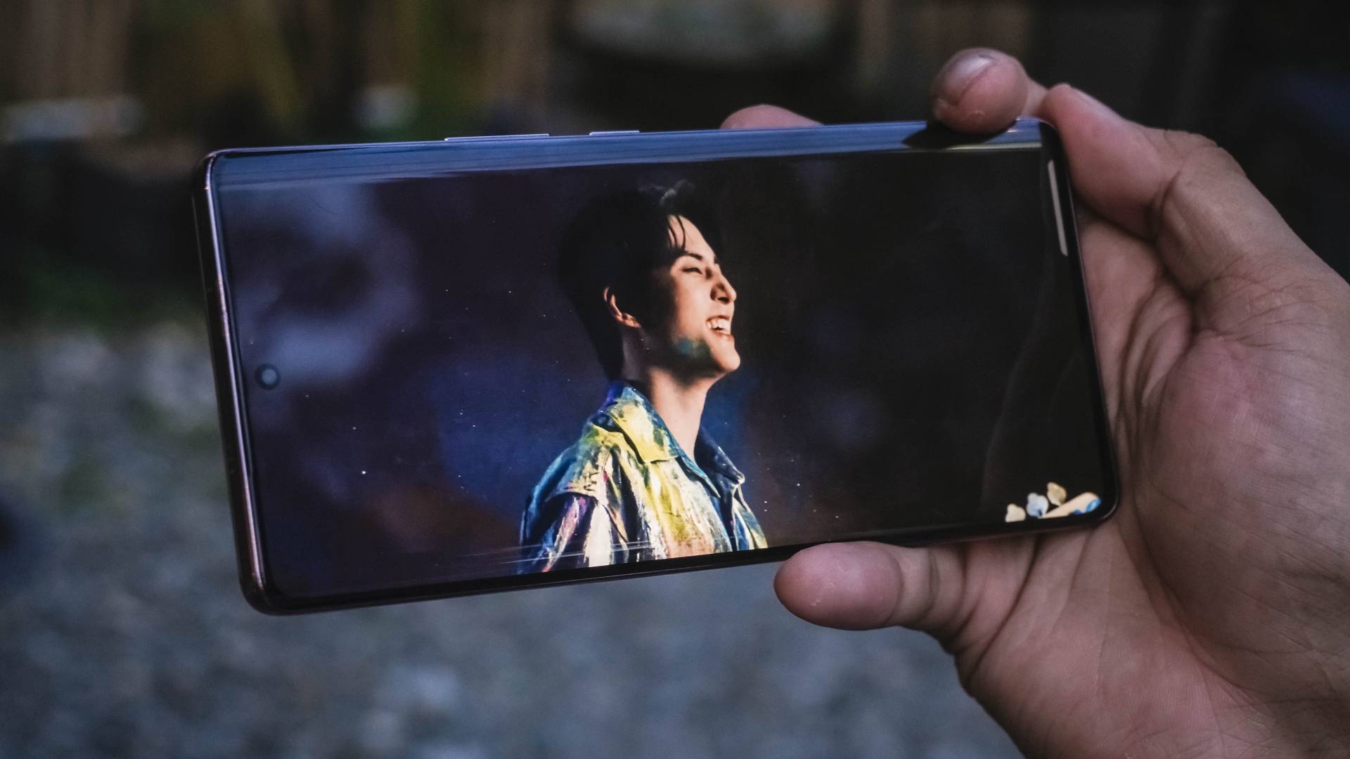
Young K’s smile will always be the death of me
Colors are vibrant too with 100% DCI-P3 wide color gamut support. It even has 2304Hz of PWM Dimming to protect those with sensitive eyes over prolonged use (which I don’t encounter, BTW).
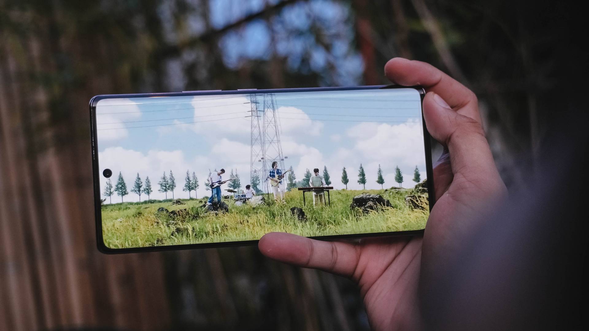
Moreover, a brightness of 1300 nits is enough both indoors and outdoors.

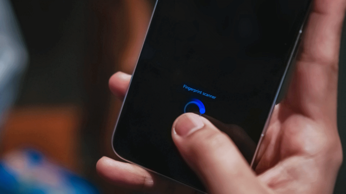
The only thing I don’t like is how low the in-display fingerprint scanner is positioned.
For a full, all-around entertainment experience, Infinix also partnered with one more tech brand. Known for their high-fidelity audio, ZERO 40 5G’s stereo speakers are tuned by JBL.
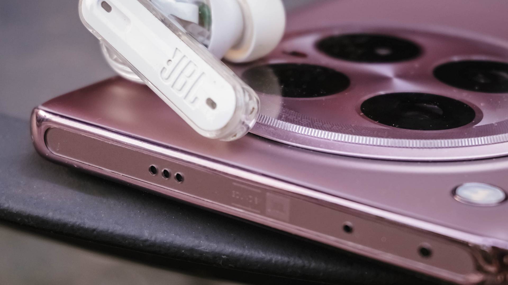
Owning a set of JBL wireless earbuds and mini speakers prove that a small form factor doesn’t equate to having a tinny sound output.

TL;DR I don’t have any pro-grade Bluetooth headphones with me but it’s worthy to point out that it’s one of the few smartphones that feature Hi-Res Lossless and Hi-Res Wireless Lossless Audio. This is very beneficial for those wired and Bluetooth audio devices that support Sony’s LDAC codec.
All in all, the audio in this phone is loud and clear. It’s neither too flat nor too bassy — just the middle-ground. It’s always perfect for my regular bathroom concert sesh.
And with that in mind, it also features an IP54 rating that makes it resistant to water splashes and dust. And to connect the dots even more, it’s also more reliable thanks to its Gorilla Glass 5 screen protection.
Familiar or Familial?
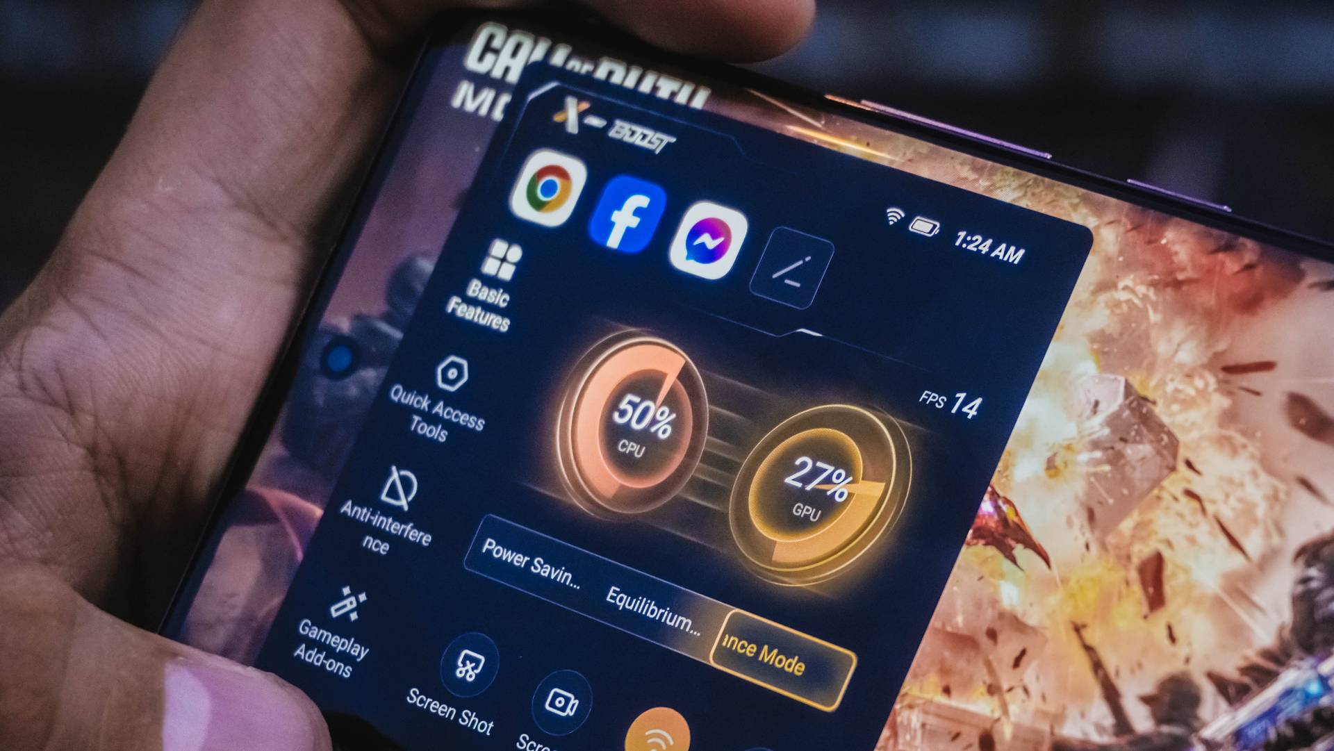
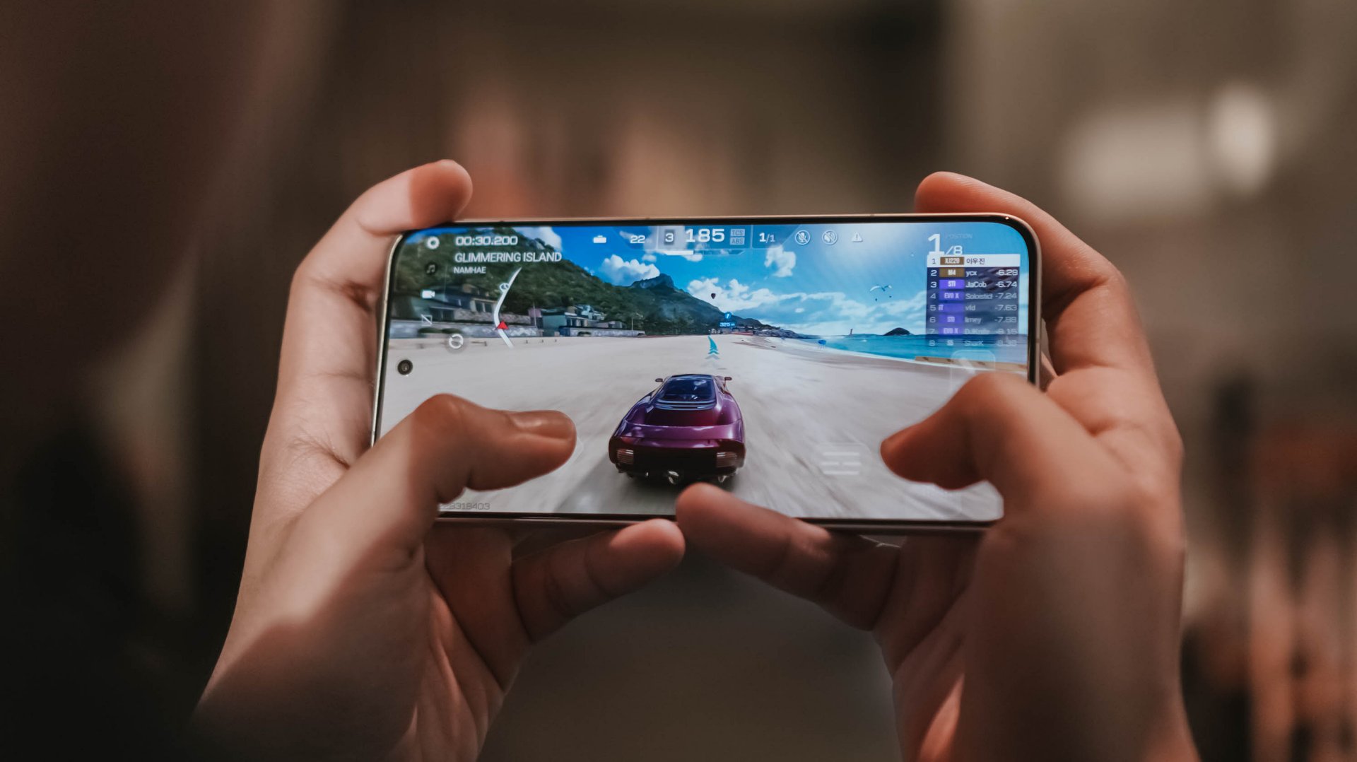
The ZERO 40 5G rocks MediaTek’s 4nm Dimensity 8200 Ultimate SoC. It has 12GB of LPDDR5X RAM and either 256 or 512GB of UFS 3.1 storage. Again, it’s literally like its CAMON 30 Pro/Premier cousin when it comes to internals.

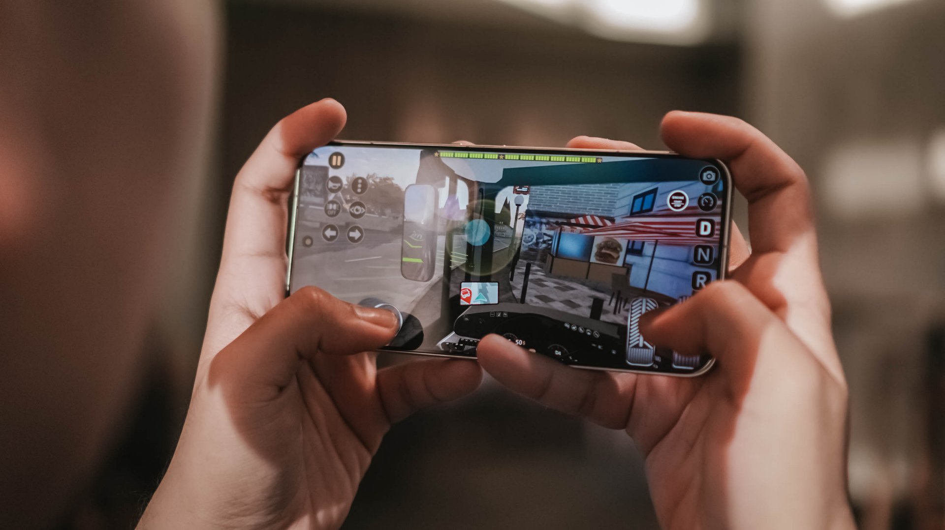
And if you still don’t know how it performs, it’s more than enough for the basic social and entertainment apps we use. Multitasking is also a breeze.
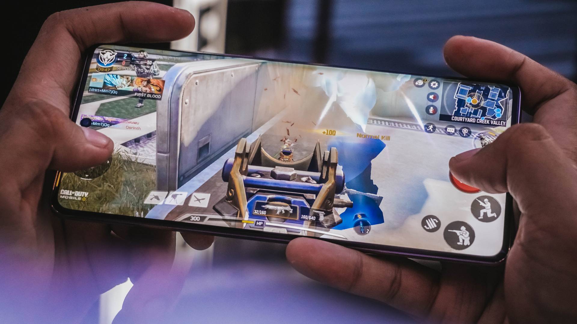
Most titles are playable in the highest graphic settings possible…
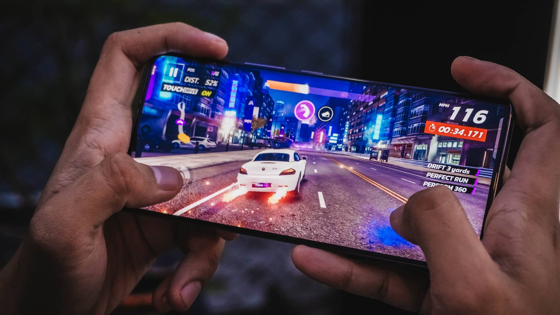
whether that be Asphalt Legends Unite, Pokémon UNITE, Call of Duty: Mobile (CoDM), or Mobile Legends: Bang Bang (MLBB).
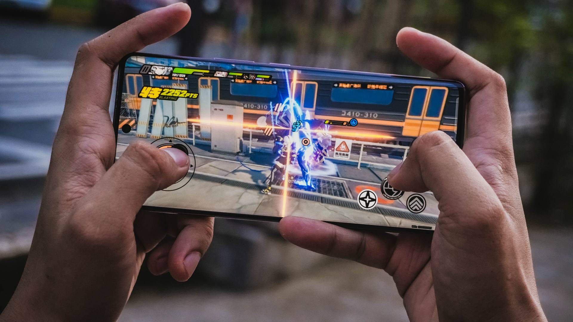
But as expected, you’ll need to be at medium to low settings when it comes to Genshin Impact, Zenless Zone Zero, Honkai Star Rail, Call of Duty: Warzone Mobile, and more.
The likeness of both the CAMON 30 and ZERO 40 series doesn’t end there.
Believe it or not, Infinix and TECNO are both under one parent company — Transsion Holdings. Although Infinix was founded way back in 2013, TECNO was first established in 2006. That’s a 7-year gap between the two brands.

Regardless, if you’re coming either from an old Infinix or TECNO phone, the chances of you getting lost in this flavor of Android is rare as Infinix’s XOS is quite similar to TECNO’s HiOS — especially with special features, just with changed names.
| INFINIX | TECNO | |
| Punch Hole Function | Dynamic Bar | Dynamic Port |
| App Cloning | XClone | App Twin |
| Game Booster | XBoost | High Boost |
| Voice Assistant | Folax | Ella |
| Cross App Transfer | Smart Hub | Smart Hub |
| Multitasking | Smart Panel | Smart Panel |
| RAM Extender | MemFusion | MemFusion |
Breakthrough or Breakeven?
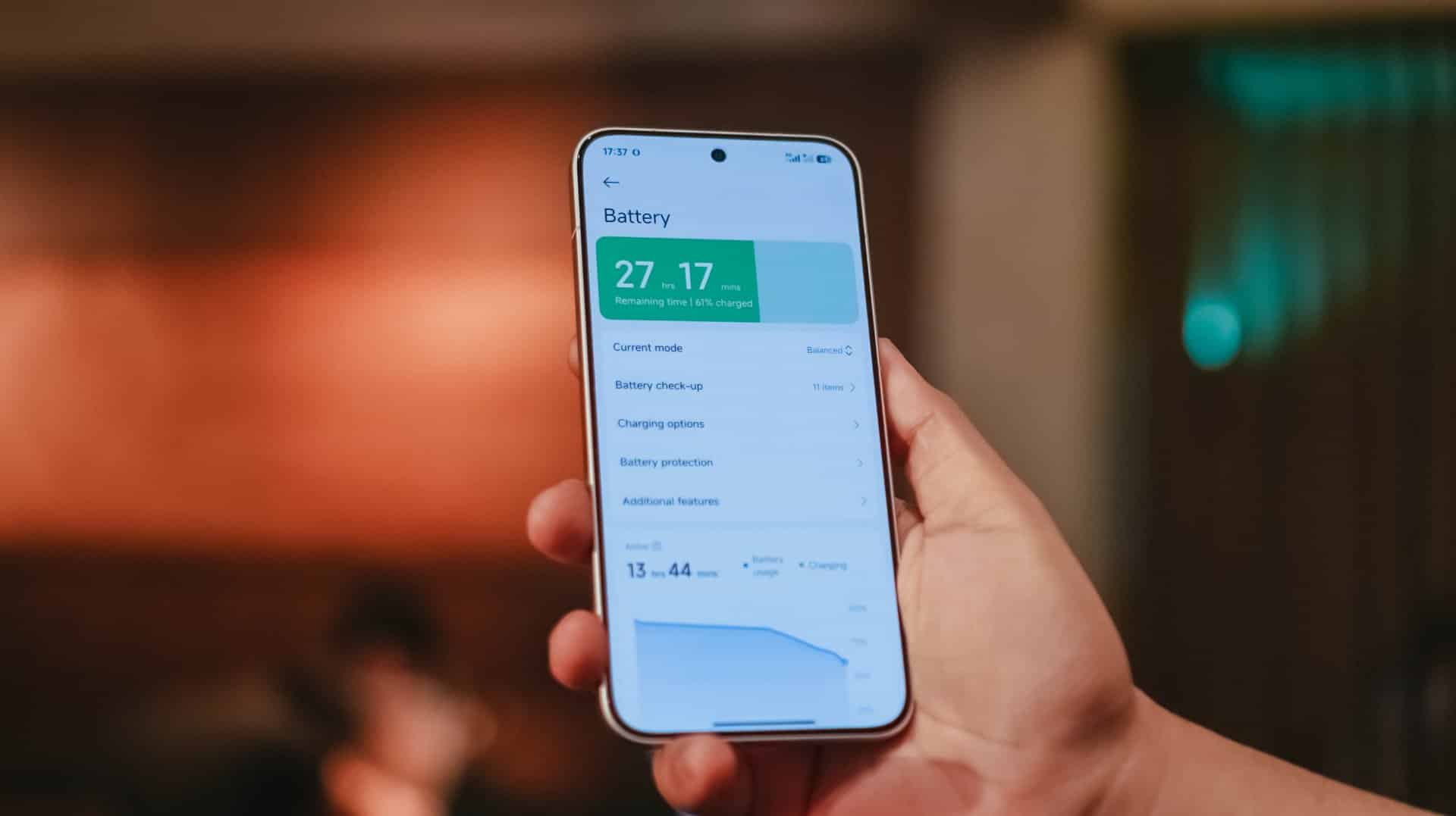
Another similarity of the ZERO 40 5G with its CAMON cousin is the large 5000mAh battery capacity.
With their same set of hardware, I expect it to drain much when gaming or watching. Of course, a light to moderate use means it can last for a day or more.
Unfortunately, unlike CAMON’s 70W speeds, Infinix only has 45W wired charging. I’m just glad they shipped it with its proprietary charger and adapter.
| Infinix 45W Fast Charge Adapter + bundled USB-C to USB-A cable |
UGREEN 100W GaN Charger + USB-C to USB-C cable |
|
| START TIME from 0% | 1:26AM | 11:21PM |
| 3 minutes | 8% | 5% |
| 5 minutes | 12% | 8% |
| 10 minutes | 20% | 13% |
| 15 minutes | 29% | 18% |
| 30 minutes | 51% | 32% |
| 45 minutes | 73% | 45% |
| 1 hour | 94% | 57% |
| 1 hour 15 minutes | — | 73% |
| 1 hour 30 minutes | — | 77% |
| 1 hour 45 minutes | — | 84% |
| 2 hours | — | 95% |
| END TIME to 100% | 2:32 AM 1 hour 6 minutes |
1:29AM 2 hours, 8 minutes |
If you’re a one charger to rule ’em all type of user, you can’t fully maximize its 45W speeds even if you have a speedy 100W GaN charger like I do. Your best bet is to always bring that brick every time you go with your phone.
🎵 Like It’s Magnetic 🎶
One special feature that the Infinix ZERO 40 5G possesses is its 20W wireless MagCharge capabilities.
Although there’s nothing grand about wireless charging in itself as the technology has continued to exist and evolve over the years, it’s still a big deal in this regard due to the fact that the ZERO 40 5G is one among the very, very few mid-rangers to include the more special magnetic type of wireless charging tech.
TL;DR Magnetic wireless charging used to be limited to the Apple’s iPhone 12 series and later as they first introduced the tech through MagSafe. It was just so recent that the consortium has created the Qi2 Wireless Charging Standard with magnets in it. HMD’s recently-released Skyline is the first and only Android smartphone to have one so far.
Infinix’s own version called “MagCharge” was first introduced in the NOTE 40 Pro+ released this year as well.

Personally, I can live without one. As a matter of fact, I’m not that big a fan as it’s painfully slow and the heat build-up contributes to the battery’s health over long periods of time. Still, it’s a nice addition for a smartphone at this price point.
Moreover, the magnetic charging case comes bundled in the box as seen in the unboxing video below.
@gadgetmatch Infinix 🤝 GoPro #fyp #foryou #foryoupage #fypシ #fypage #fypシ゚viral #fyppppppppppppppppppppppp #fypdongggggggg ♬ original sound – GadgetMatch
P.S: just so it happens you already own a MagSafe power bank, it will perfectly fit and work with this phone as well.
Is the Infinix ZERO 40 5G your GadgetMatch?
The Infinix ZERO 40 5G retails for just US$ 399 (EUR 362 / GBP 305 / SG$ 520 / PhP 22,400). Though just recently, they launched it in India with an official SRP of INR 27,999 | 256GB or INR 30,999 | 512GB.
With this pricing alone, it still amuses me how the brand continues to deliver smartphone features more than the price it actually offers.
But with the same set of mind and heart that runs the TECNO CAMON 30 Premier I recently reviewed, I would still recommend that one more wholeheartedly not just for its fast wired charging speeds, but mainly due to its best-in-class cameras for its price — a proper 3x telephoto unit, clean AF portraits, consistency in color science, even a more stable video stabilization.
Not to mention, its SRP in the Philippines competes with ZERO 40 5G’s converted pricing. Not so much in India though with that INR 9,000 price gap for the same 512GB variant.
If you reckon just because you wanted a curved display, a slimmer, lighter, and narrower form factor, plus that nifty magnetic charging addition, then I wouldn’t stop you from getting the ZERO 40 5G. It’s a novelty to find that premium-ness despite being in the mid-class.
That said, I have already warned all of you with its marketing ploy. For the market Infinix wants to target with this smartphone, its so-so photo and video capabilities doesn’t do much of a justice for it to be considered a powerful “vlogging smartphone”. The camera system of the ZERO 40 5G are just as mid as the category it belongs to.
Considering this for gaming? The Infinix GT 20 Pro is a lot worthier with its cheaper pricing despite having the same set of chipset.


Reviews
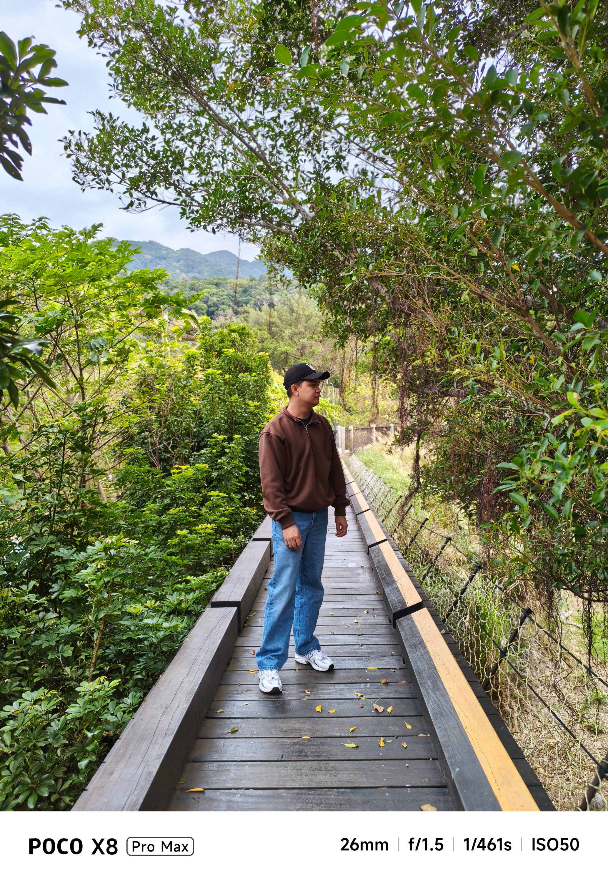
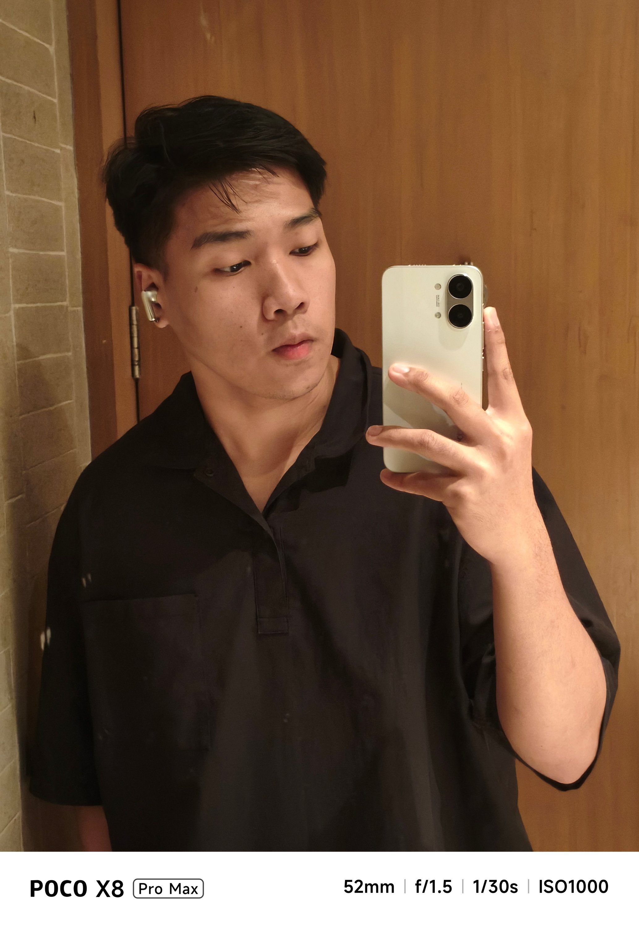
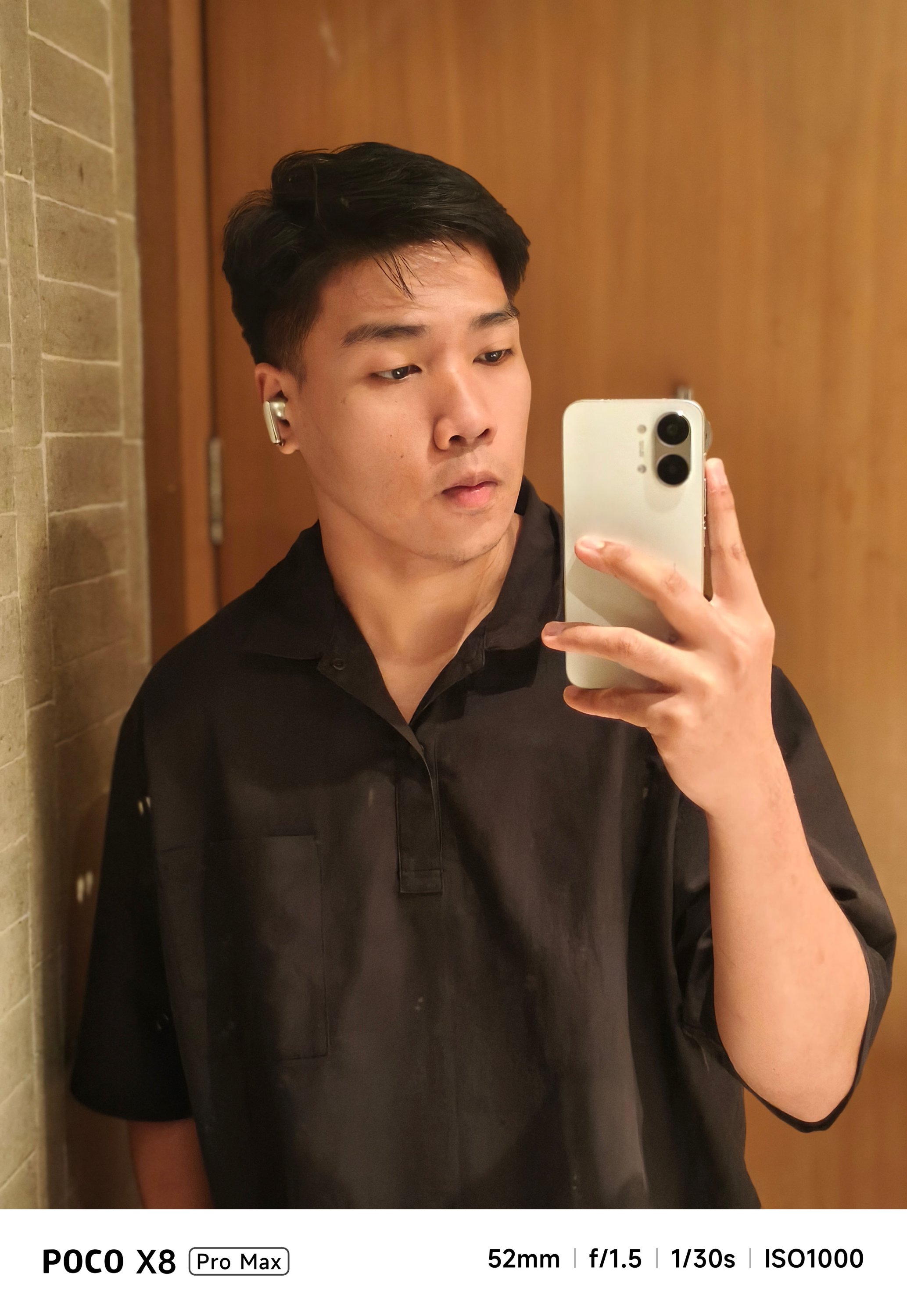
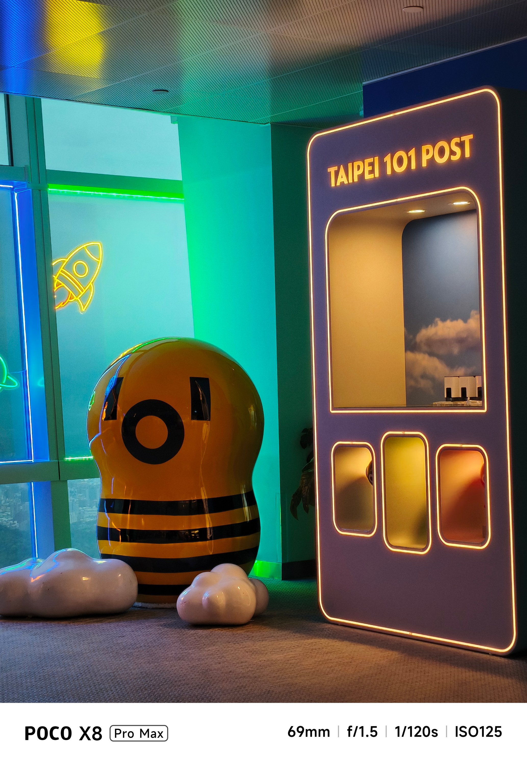
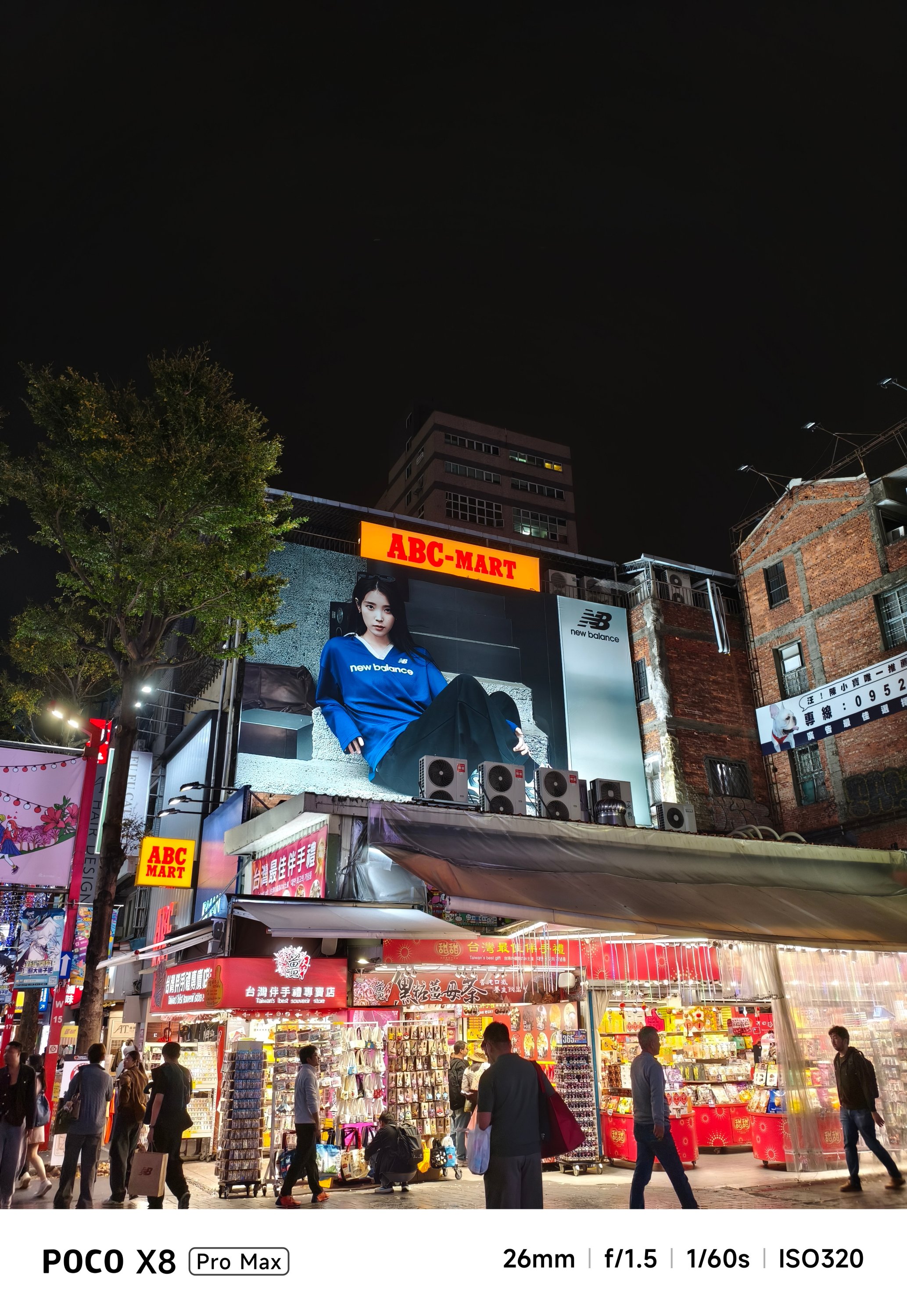
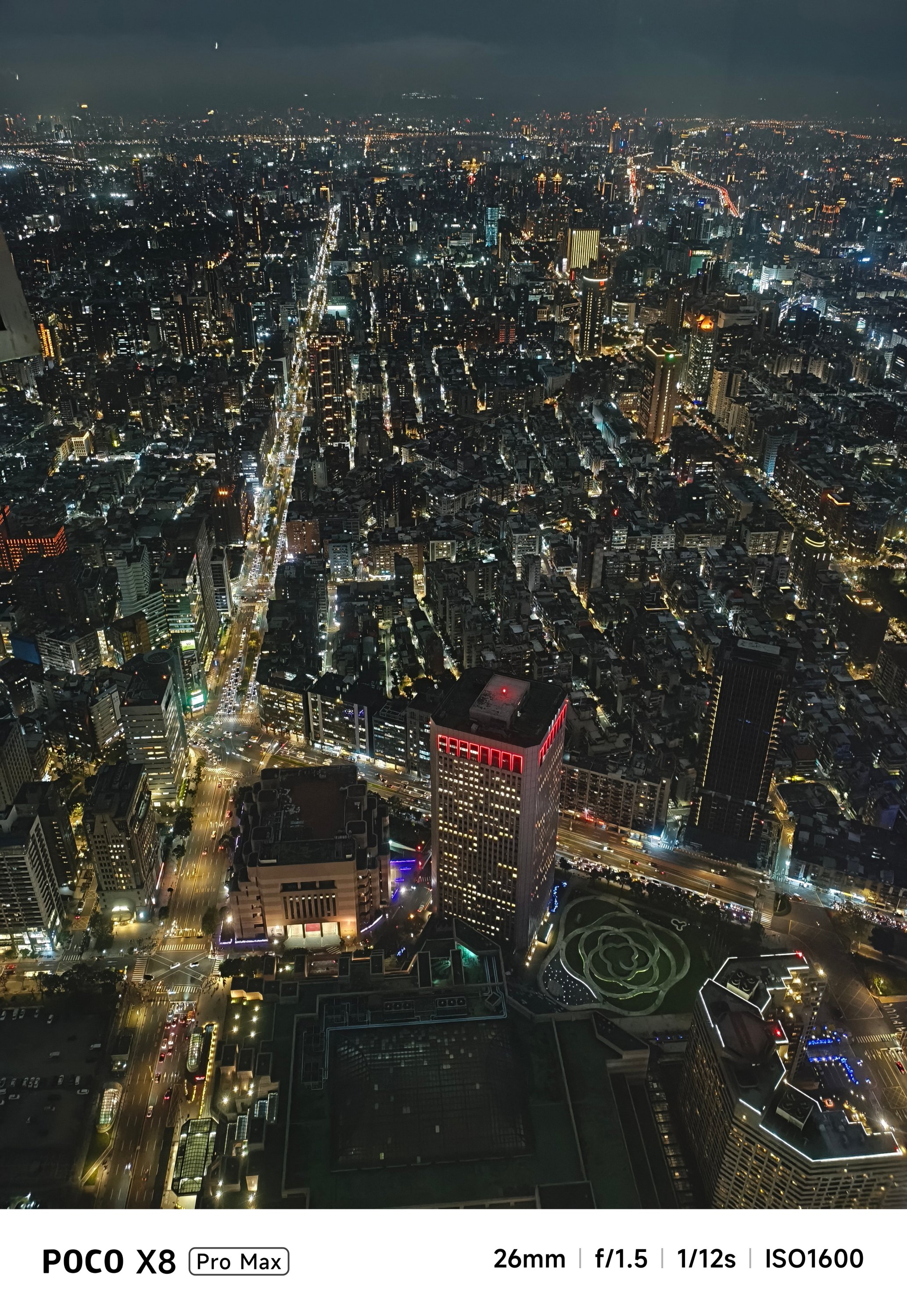
POCO X8 Pro Max review: A new beast from the far east
That “Pro Max” naming superlative is more than justified
Just when I thought POCO was done for the first quarter of 2026, I was instantly humbled.
Two months after the M8 Pro I’ve held, POCO is back with another beast, packing an even more powerful punch.
Here’s my extensive experience with the all-new POCO X8 Pro Max.
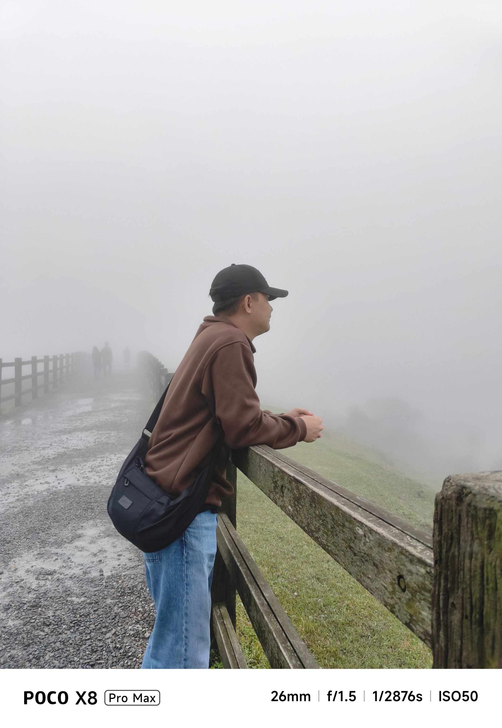
Nothing flashy, yet still fancy
First time with the POCO X8 Pro Max, it’s honestly nothing too fancy.
While it does not dare to rival the likes of the Nothing Phone (4a) Pro, Infinix’s NOTE 60 Ultra, or TECNO’s POVA Curve 2 5G, the POCO X8 Pro Max still shines in its own way.
The back is clean and minimal with only the ever-so-slightly-protruding camera bump and POCO branding in sight. Upon closer inspection though, those subtle set of lines appears when hit by faint light.
And while we’re at it, that camera bump houses an RGB light deco around the camera duo. It’s customizable with eight (8) colors alongside brightness level adjustments.
Not only does it add flair, but it’s functional too as it glows up to notify you of alerts, to indicate battery charge, to flash for a camera timer, or to light up even when just playing music or games.
The White colorway that I have adds more to that fanciness. I don’t know if it’s the same thing with the Black and Blue shades, though.
Sandwiched by that sturdy metal frame is a back cover made of fiberglass, something that is lightweight and durable at the same time.
Speaking of, the X8 Pro Max boasts quintessential quad IP ratings: IP66, IP68, IP69, and IP69K. It can withstand not just all the fine dust, beach sand, or even fresh water (but not sea water). It’s also able to resist hot jet water streams, just in case you’re stuck in such situations.
It’s great to see that these stronger IP ratings have become a staple, not just in flagships, but in most midrange offerings.
Marvelous and monstrous
Last year, POCO had only the vanilla X7 and X7 Pro (plus a special Iron Man Edition) in its X-rsenal. This year, POCO have changed things quite a bit by bringing in a newcomer with the familiar “Pro Max” naming.

And, they weren’t playing when they said “Pro Max” as this is equipped with the latest MediaTek Dimensity 9500s 3nm SoC. To be fair, this is a slightly under-clocked version of the Dimensity 9500 found on modern-day flagships, such as the vivo X300 Pro I rock daily.
Still, that doesn’t mean an underpowered performance.
First and foremost, the ever-popular Zenless Zone Zero by HoYoverse runs in High graphics settings by default. Genshin Impact has the same default setting.

The Qualcomm Snapdragon 7s Gen 4 found on the POCO M8 Pro, however, goes only for the lowest setting.
Another favorite hardcore game of mine: Racing Master based on Nvidia’s PhysX physics engine.
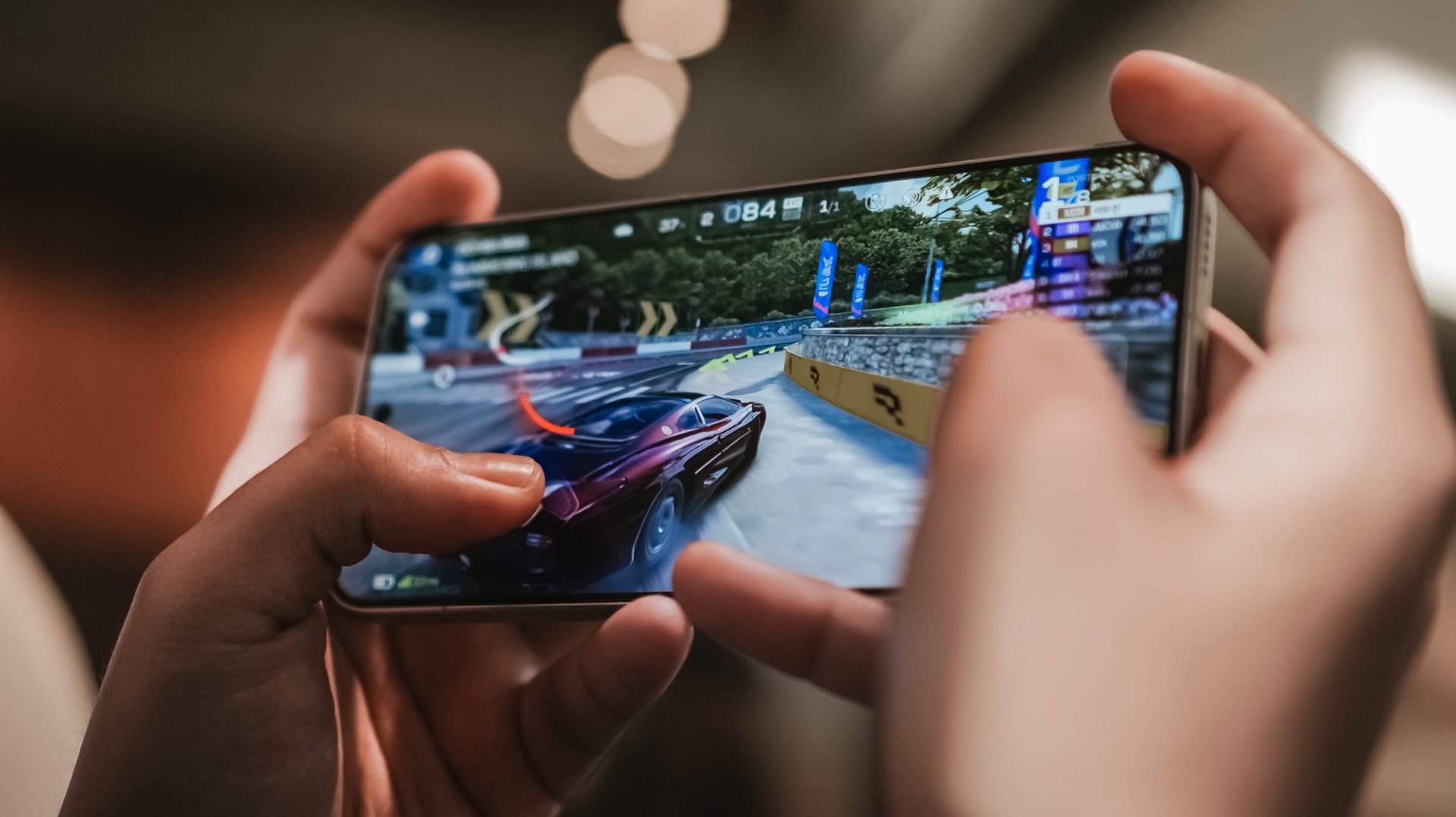
As expected, this racing game can run in Ultra-High + 60fps configuration. The M8 Pro stutters and throttles a lot during the first gameplay.
This further proves that it’s not always Snapdragon that’s winning over Dimensity.

POCO’s 3D IceLoop Cooling System also prevented those unwanted hiccups. To be precise, it features a large 5800mm² liquid cooling area where the vapor and liquid are separated for an even highly-efficient heat dissipation.
With those examples in mind, it already gives you the idea that this beast of a smartphone can handle most (if not all) of the graphics-intensive titles you can think of.
POCO further proves that this is, indeed, a Pro Max smartphone. With a speedy 12GB LPDDR5X memory and up to 512GB of UFS 4.1 storage, it’s honestly an overkill for a midranger.

Most phones in the range are stuck with the LPDDR4X and UFS 3.1 combo. It’s more evident now that the global RAM (and components) shortage affects everyone — smartphone makers not exempted.
My gaming sessions would not be as easy-breezy without that buttery-smooth 120Hz display alongside that 480Hz/2560Hz touch sampling rates.
Now Playing: Even If This Love Disappears Tonight
With display already in the way, it’s high time to talk deeply about it.
One fine flight, I was bored and cannot sleep. I then just tried to watch something I added in my Netflix list — Even If This Love Disappears Tonight / 오늘 밤, 세계에서 이 사랑이 사라진다 해도 (Oneul bam, segye-eseo i sarangi sarajinda haedo).

Although I am not the type who favors cast over synopsis, Shin Si-ah being the lead honestly enticed me to click this over its gut-wrenching story.
The longer I watch it, the more I get mesmerized — both visuals and overall chemistry of her (as Seoyoon) and Choo Young-woo (as Jaewon).

With its massive 6.83-inch AMOLED 1.5K display with up to 3500 nits of peak brightness, it’s as bright and crystal clear as this beach in Pohang, South Korea.

Spoiler alert ‼️ Much like Jaewon’s disappearance in Seoyoon’s memory, the same can be said on the X8 Pro Max. Once you are already immersed, it makes you think the display bezels have also disappeared into thin air because of how thin they are.

Seoyoon’s heartfelt emotions on-screen can be seen more especially that this display supports all the imaginable pro-grade standards in a modern-day smartphone: 12-bit color depth, 68 Billion Colors, DCI-P3 Wide Color Gamut, HDR10+, Dolby Vision.
You have been warned, though. This film is not for the faint-hearted.
But in case you faint on the ground, Corning’s Gorilla Glass 7i protects that precious display from unwanted scathes and scratches. While not as “pro” as Gorilla Glass Victus 2 or Xiaomi’s very own Dragon Crystal Glass 3, that’s still better than having no protection at all 😜
You know what’s “pro”? The inclusion of an ultrasonic in-display fingerprint scanner.
It’s honestly a dealbreaker whenever you’re in a hurry. Being able to unlock the phone in a split-second compared to conventional optical sensors in most midrangers adds up to the “Pro Max” definition of this phone.
On Queue: IVE, H1-KEY, GIRLSET
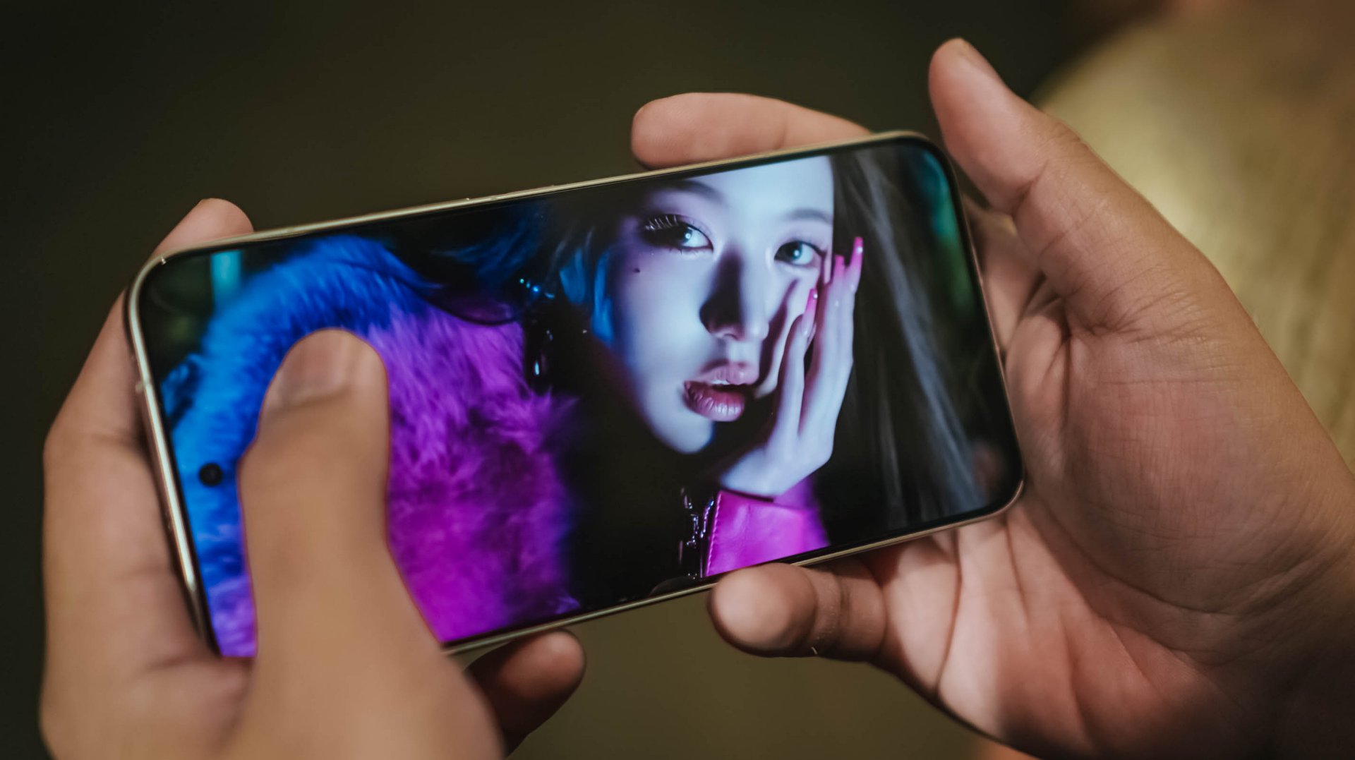
To immerse myself more, I also tried playing IVE’s futuristic BLACKHOLE music video.

Whether it’s the darkest of blacks or the whitest of whites in Liz’s scenes, or just a pop of color like Jang Wonyoung, this vibrant display is more than enough to satisfy your eyes.
But what’s a pro-grade display without a “Pro Max” audio? Well, the POCO X8 Pro Max doesn’t want to stop just yet.
With its symmetrical stereo speakers alongside that 400% volume boost feature, it instantly filled the room when I was in my banging streaming sessions in the shivering shower.
POCO promises that those speakers are certified for Hi-Res Audio and Dolby Atmos.
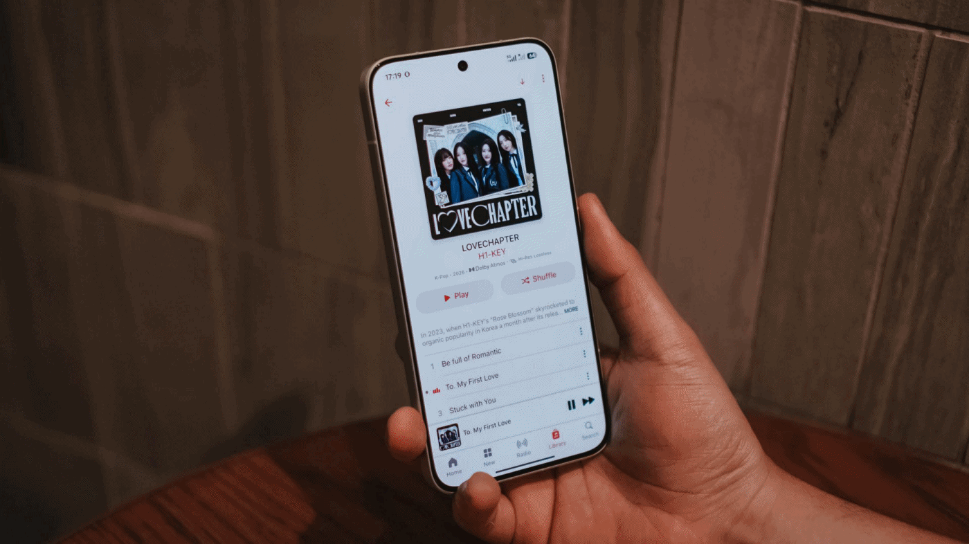
My curiosities led me to streaming H1-KEY’s full LOVECHAPTER EP in Lossless format via Apple Music.
Right off the bat, I can already hear the great separation of treble, mid, and bass in their latest comeback track, To. My First Love. Hwiseo’s adlibs truly astounded me — and so did their harmony in every chorus.

As I listen further, it made me realize it’s a great K-Pop song that brings back that good ol’ 2nd-gen K-Pop vibes. Moreover, it also fits well as an anime opening.
Not Like A Movie is also one of K-Pop’s underrated songs of 2026 that I’ve been playing ever since its release last January 2026. The whole LOVECHAPTER EP honestly deserves more praises much like this phone’s superb sound output.
Additionally, GIRLSET’s TWEAK truly made me weak with how soothing their vocals are. Mind you, I listened both in English and in Spanish (just because I suddenly miss Barcelona).
If that’s not enough, I have also tried listening to the acappella version and I felt like I’m listening to the Gods in heaven with how pure their vocals alongside their soulful harmonization.
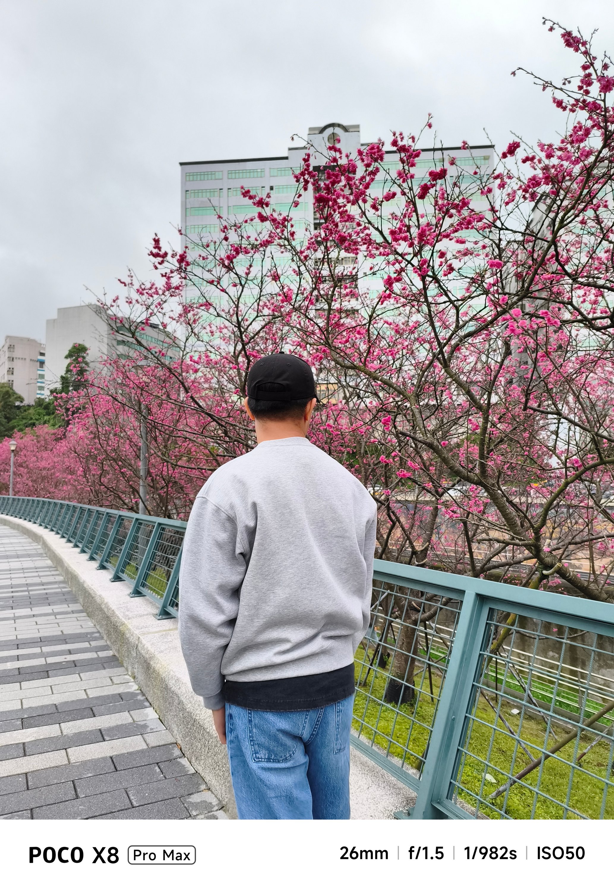
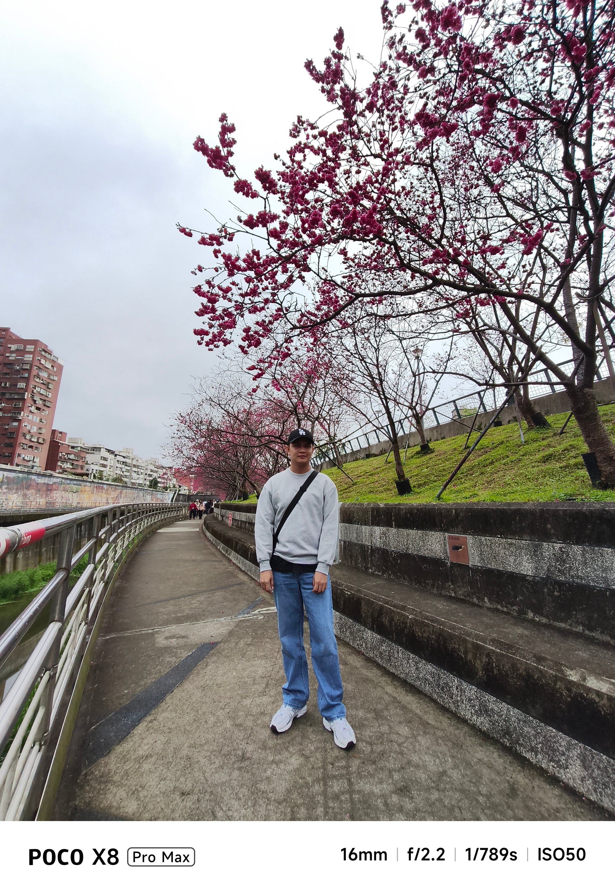
Satisfying snapper
Let’s be real: Cameras are the mostly forgotten aspects among phones in this segment.
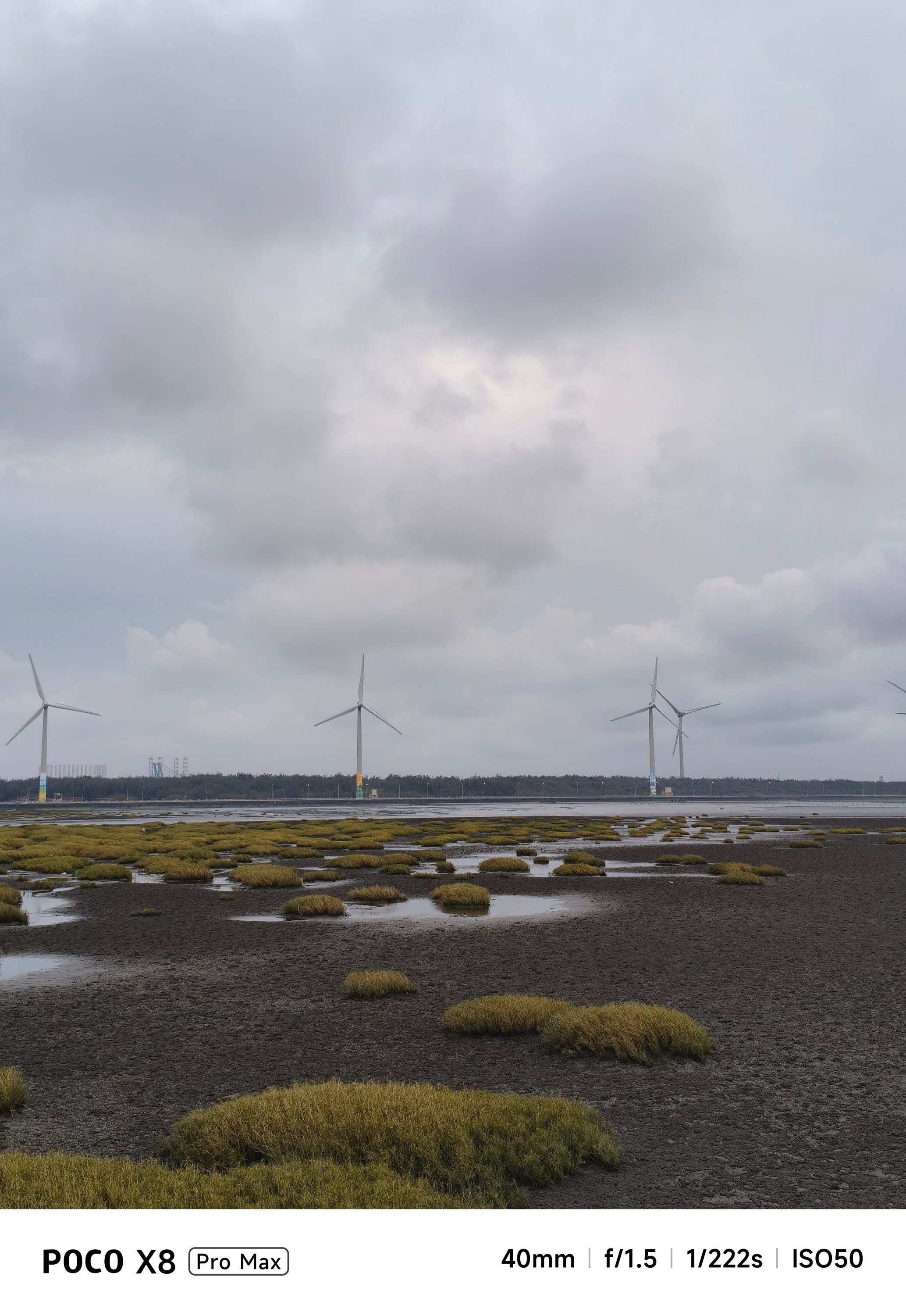
On paper, none of its cameras have Sony’s LYT / IMX or Samsung’s ISOCELL sensors. Instead, you’ll get a 50MP f/1.5 main rear camera based on LightHunter Fusion 600’s 1/1.95-inch sensor.
Meanwhile, its ultra-wide shooter is nothing special at 8MP f/2.2. For selfies, it’s a 20MP front snapper.
But, as we always say here, specs aren’t everything. Looking solely at the filling of the cake, the POCO X8 Pro Max can still deliver satisfying snaps.


With the right angle, framing, and even lighting, it can deliver quality shots regardless of the camera hardware it possesses.


Portraits are surprisingly decent, too.


They are social media-ready and post-worthy as well.


If you’re not a professional shooter, that shutter responsiveness is enough for those picture-perfect portraits.


Cutouts aren’t flawless, though. But, what should we even expect in a conventional camera combo like this?
-
- Portrait OFF
-
- Portrait ON
The absence of a dedicated zoom camera is evident when you try to capture anything past the 3x range.


Meanwhile, dimly-lit shots can be either a hit or miss.


In a scene where there’s the least amount of natural light, it will rely heavily on sharpening and brightening the image.


Nevertheless, food shots will still look appetizing enough, regardless of lighting condition.


Battery behemoth
Last but certainly not the least, the POCO X8 Pro Max packs a mighty tank inside — an 8500mAh Si/C battery, to be exact. This is currently POCO’s biggest battery offering in their current line of smartphones.
I would be lying though if I didn’t say I am envious that the China variant (REDMI Turbo 5 MAX) has a bigger 9000mAh capacity.
Still, for day-to-day basis, it’s hard to fully drain the phone in one sitting. If you’re chronically online, the POCO X8 Pro Max will surely handle all your social media-ddiction.

As we speak, gaming is pretty much the baseline for being able to tell how power hungry this beast is.
For instance, the moment I set up and installed all the necessary games I can think of, that 5-hour installation of three games only took up about 20% of charge from its 68% battery state — fresh from the factory.
During a mix of 2.5-hour gameplay, the battery depleted from 48% down to 31%.

Even consuming entertainment shouldn’t be much of a battery hog. Binging K-Pop music videos and live performances on YouTube plus Netflix titles for around three hours ears only a measly 10%.

Heck, even with just 1% remaining in the tank, I was still able to play H1-KEY’s latest comeback song in Apple Music for another ten minutes before the phone fully died.
Now, this is where Xiaomi’s 100W HyperCharge capability comes in.
Although the review unit I have doesn’t have one, I was still able to hook it in with an existing 100W HyperCharge adapter from my stash.
However, most users won’t even have one. Thankfully, the POCO X8 Pro Max is compatible with the PPS charging protocol which enables third-party chargers to fully-utilize that 100W charging speeds, and the results aren’t far off.
My GadgetMatch Charge Test further proves that.
Xiaomi 100W HyperCharge Adapter |
UGREEN 100W Uno GaN Charger |
|
START TIME (From 0%) |
3:18PM |
12:34AM |
3 minutes |
0% |
1% |
5 minutes |
4% |
2% |
10 minutes |
8% |
11% |
15 minutes |
17% |
15% |
20 minutes |
22% |
24% |
30 minutes |
34% |
37% |
45 minutes |
55% |
57% |
1 hour |
76% |
77% |
1 hour 15 minutes |
94% |
95% |
END TIME |
4:48PM
|
2:08AM
|
As an addition, I also made the POCO X8 Pro Max as my personal hotspot. I went out around 8AM with 100% charge left. The moment I got back home by 11 in the evening, there’s still 43% left. Most phones have already drained right after the sun has set by 6PM.

Moreover, not only it’s limited to just a dual physical SIM slot. Another slot can run eSIM, which is always my go-to option when traveling. It’s a huge relief this POCO phone supports it as the M8 Pro doesn’t have one.
Speaking of, this phone can also serve as your power bank! With its 27W reverse wired charging support, it can top-up the dead batteries of your 5000mAh phones 👀
And before I forget, Xiaomi’s HyperOS 3 isn’t the most power-efficient system out there. If you happened to read my POCO M8 Pro and Xiaomi Pad 8 review write-ups, you already get the gist of this.
To be specific, as I breezed through my last battery settings, I’ve noticed that App Vault drained the second highest when your phone is in idle mode. I haven’t even set up the feature as of this writing.
This is another reason why my sentiments against the company’s OS keep getting stronger. I’m just hoping they could fix these worrisome woes that affects a lot of existing and prospective Xiaomi / REDMI / POCO users.
Is the POCO X8 Pro Max your GadgetMatch?
The arrival of the POCO X8 Pro Max blows the rest of the competition out of the water.
Although Xiaomi’s HyperOS is the elephant in the room, that was easily overshadowed by how mighty this smartphone is.
The POCO X8 Pro Max is as straightforward as it can get. From visuals, to core performance, all the way to battery endurance (and even capable cameras), I honestly cannot speak ill about it — especially for a phone in this price point.
Whether you’re just a casual user looking for a pro-grade yet inexpensive smartphone or you’re purely just a spec-savvy nerd, you’ll easily drool with how great the POCO X8 Pro Max is.
And with prices of just PhP 25,999 or PhP 27,999 / US$ 469 or 529 paired with all these powerful hardware, what more can you ask for?
They are even heavily discounted now with early bird offers ranging between PhP 18,499 ~ PhP 20,249 and US$ 429 and 459 respectively.
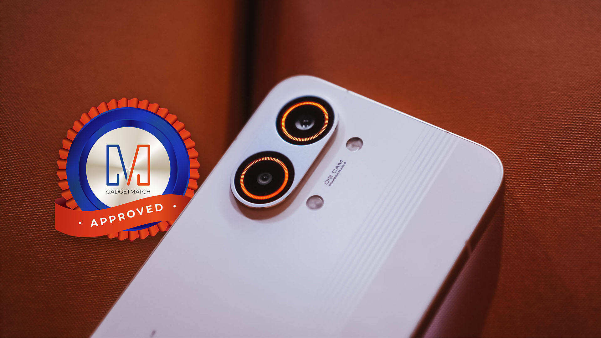
If it is not evident enough with my high praises, the POCO X8 Pro Max is an ultimate Swipe Right, Super Swipe, and a worthy recipient of the GadgetMatch Seal of Approval.
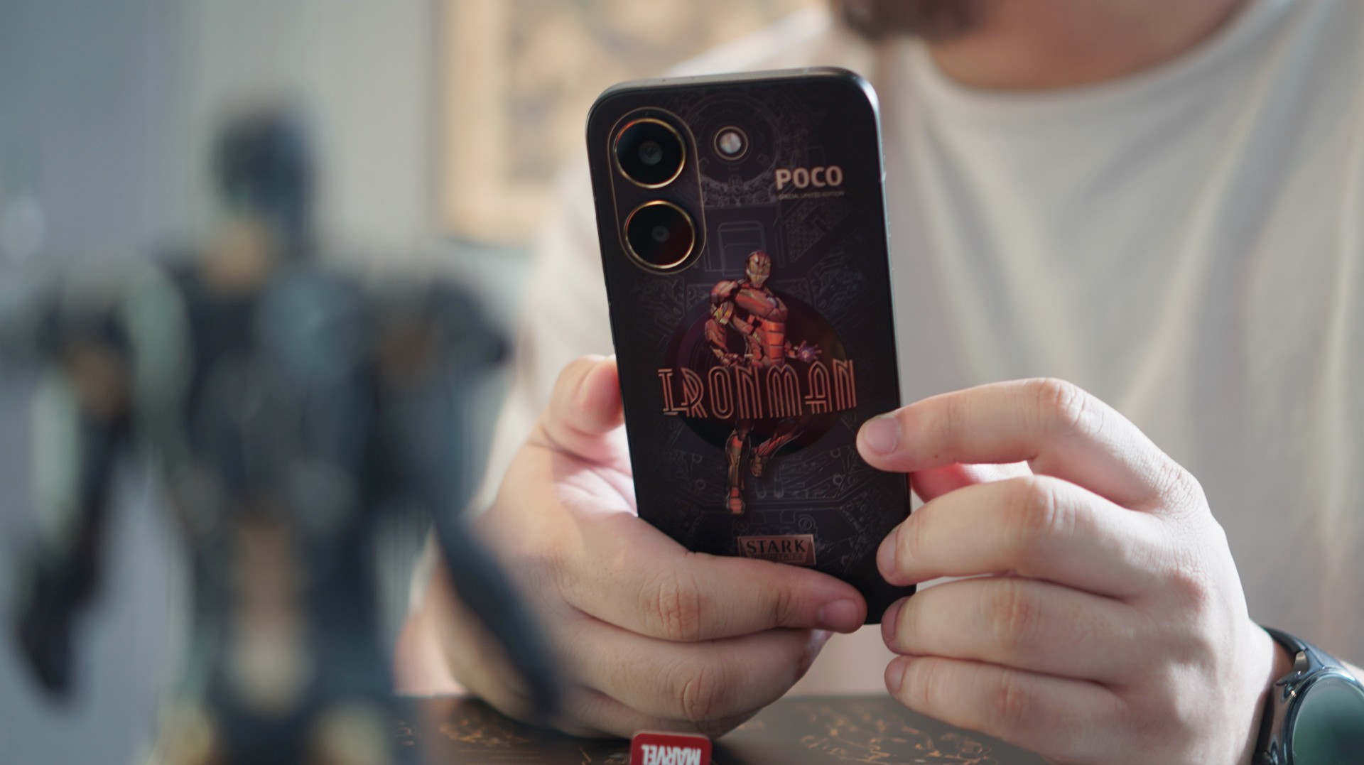
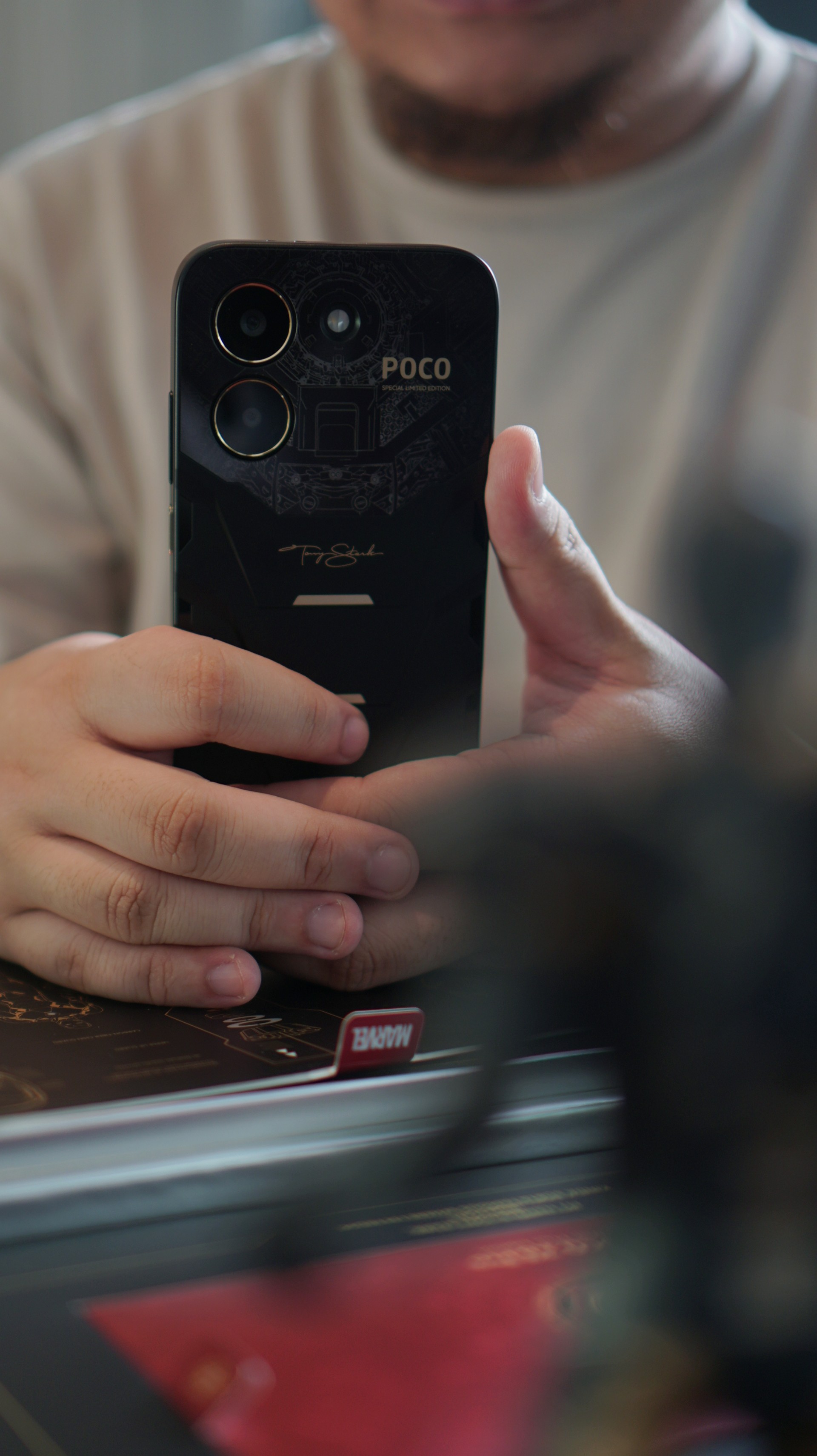
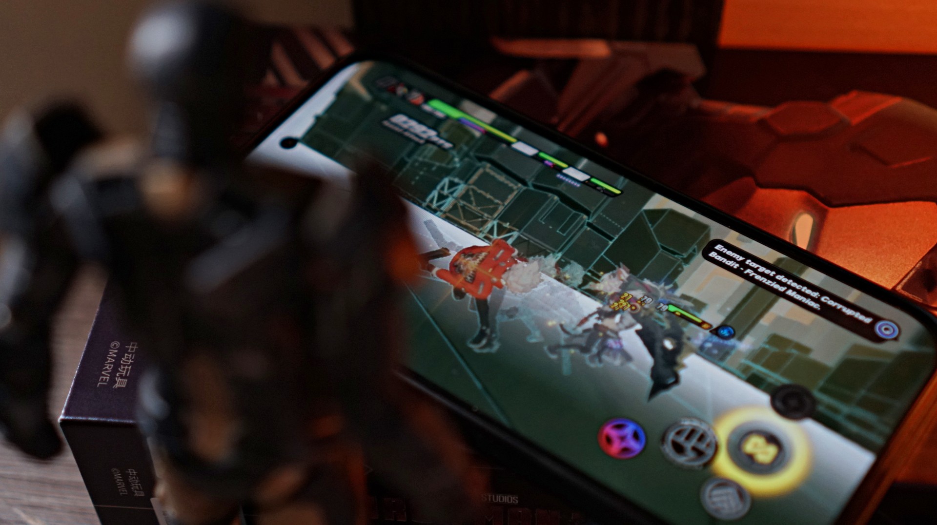
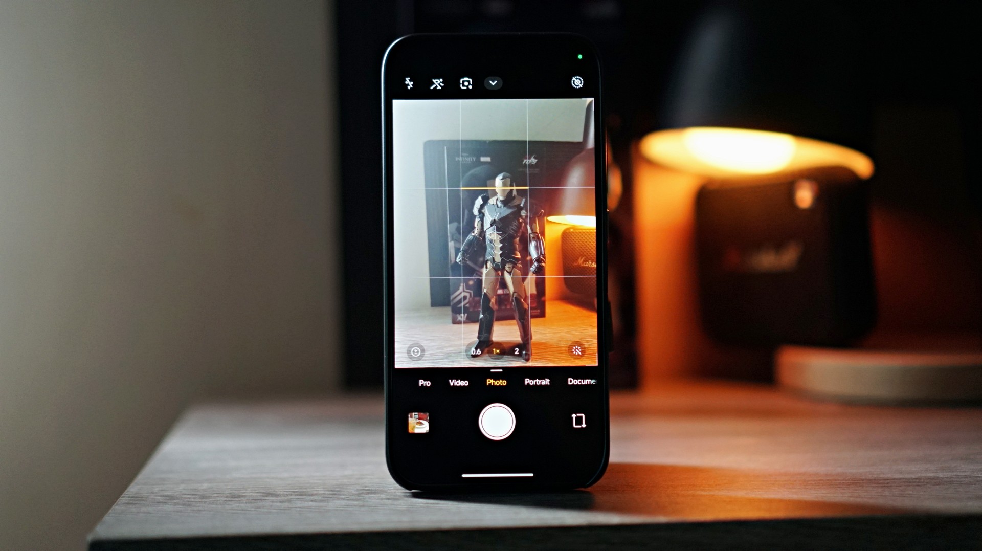
Strip away the Stark Industries styling and the POCO X8 Pro Iron Man Edition is still what POCO does best — a capable midrange smartphone with steady performance, solid battery life, and a display that holds up well for everyday use.
The difference this time is the armor it’s wearing.
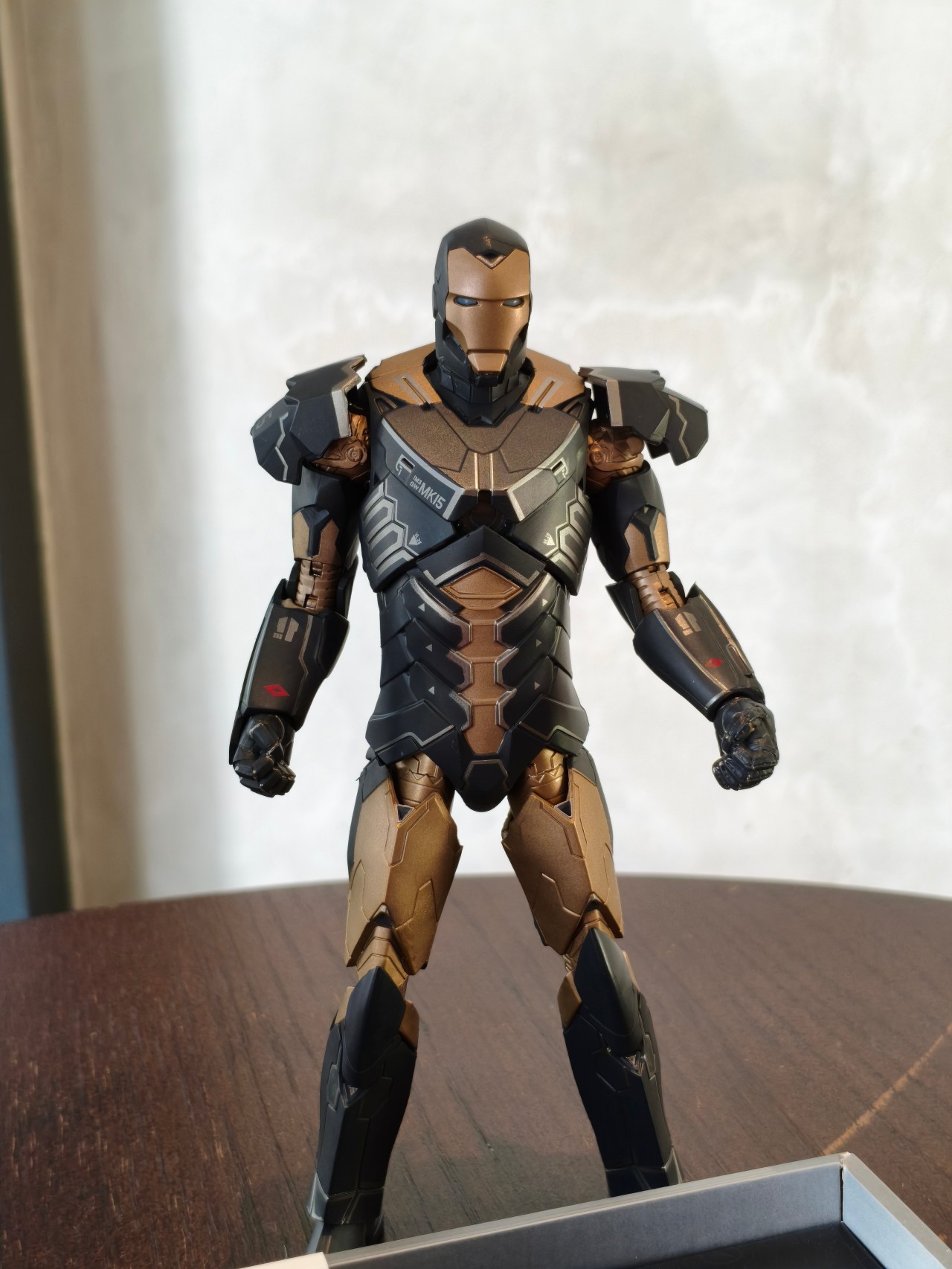
POCO’s latest collaboration wraps the familiar X-series formula in a design inspired by Iron Man’s Mark XV armor, codenamed “Sneaky.” Unlike the classic red-and-gold suit most fans recognize, this stealth-focused armor features a darker black-and-gold palette and appeared as part of the Iron Legion in Iron Man 3.
It’s a stylish twist on an otherwise familiar smartphone. The real question is whether the superhero aesthetic adds enough to make this midrange device stand out.
Design and feel: Stark-inspired aesthetics

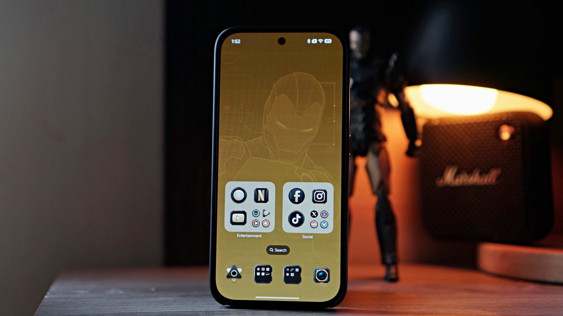
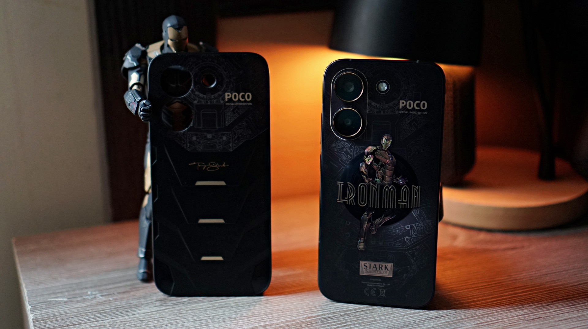
The back design of the bare phone prominently features an image of Iron Man. The styling clearly leans into the Mark XV armor inspiration, with a black-and-gold finish that resembles the torso plating of the stealth suit.
It’s bold without being overly flashy.
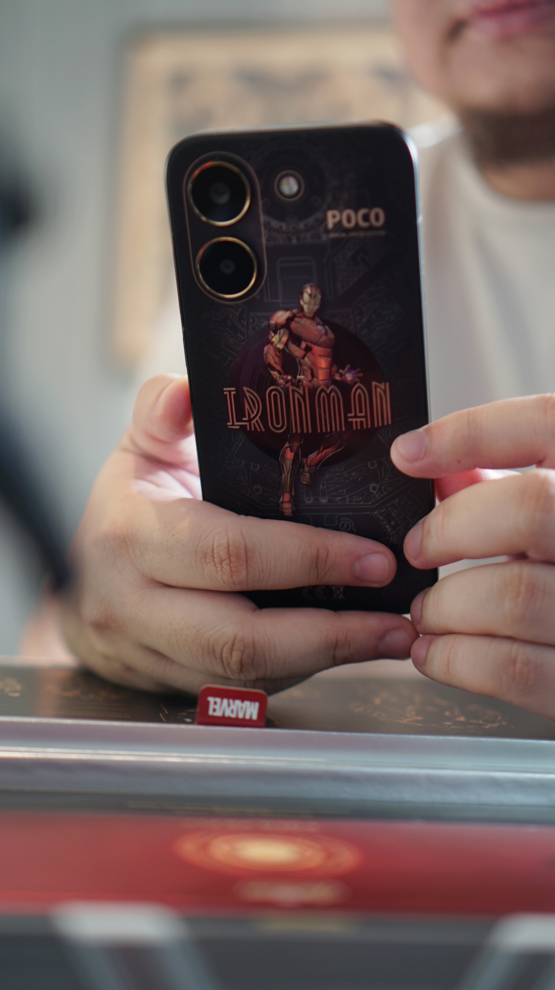
Interestingly, the look changes quite a bit once you snap on the included case — which is actually my recommendation. With the case on, the design becomes a bit stealthier while also giving the phone a slightly better feel in the hand.
The overall handfeel of the smartphone reminds me a lot of the iPhone 14 Pro Max with a CASETiFY case on — just a tad less chunky. That’s a configuration I used for the past three years, so the shape and weight felt oddly familiar the moment I picked this up.
It helps that the camera module doesn’t protrude very much. With the case on, the back sits flatter than expected, making the phone feel balanced when placed on a desk.
Overall, the design is easily the most distinctive part of this device. Even if you’re not a hardcore Marvel fan, the black-and-gold styling still looks quite good.
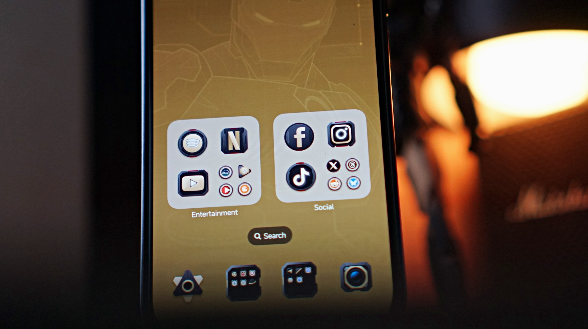
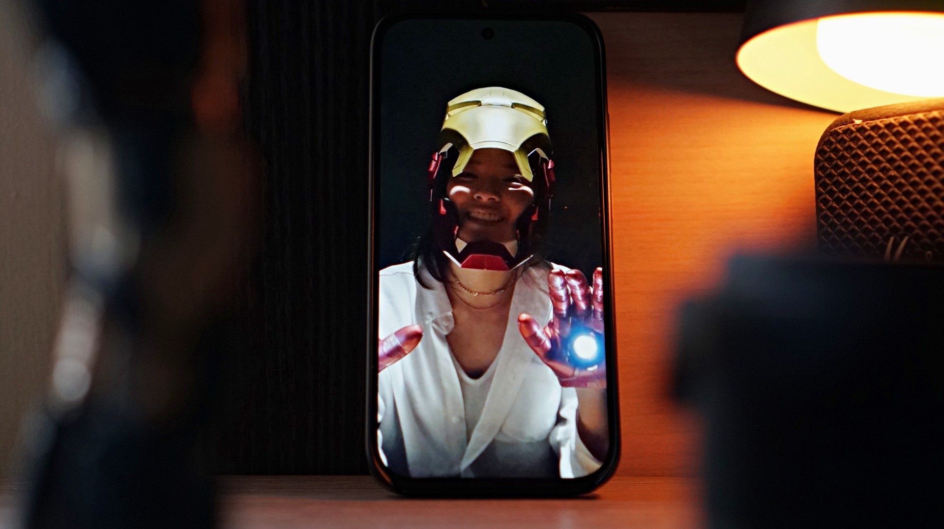
The Iron Man theme also extends to the phone’s software. POCO applies the Stark-inspired “armor” across the system UI, most noticeably on the app icons. Naturally, not every app has a custom icon, so unsupported ones are wrapped in a circular frame that resembles the Arc Reactor on Iron Man’s chest. It’s a small touch, but it helps the theme feel more cohesive across the entire phone.
Of course, underneath all that Stark-inspired styling is still a very familiar POCO midrange smartphone.
Performance: Steady for everyday tasks

Under the hood, the POCO X8 Pro Iron Man Edition is powered by the Dimensity 8500-Ultra processor paired with 12GB of RAM and 512GB of storage.
In daily use, performance is steady for most casual smartphone tasks.
I spent a lot of time doing the usual things — browsing websites, scrolling through reels, TikToks, and what-have-you. Everything felt smooth and responsive throughout.
Like with anything related to Xiaomi, you do get the usual preinstalled apps and occasional ads within the interface. It’s something longtime users of the ecosystem will already be familiar with, but it’s still worth mentioning.
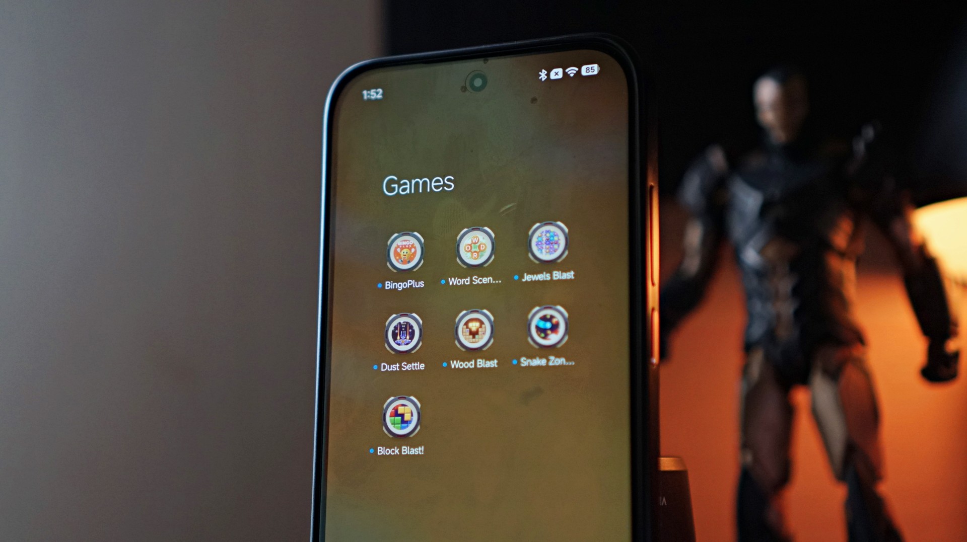
Gaming performance is also respectable.
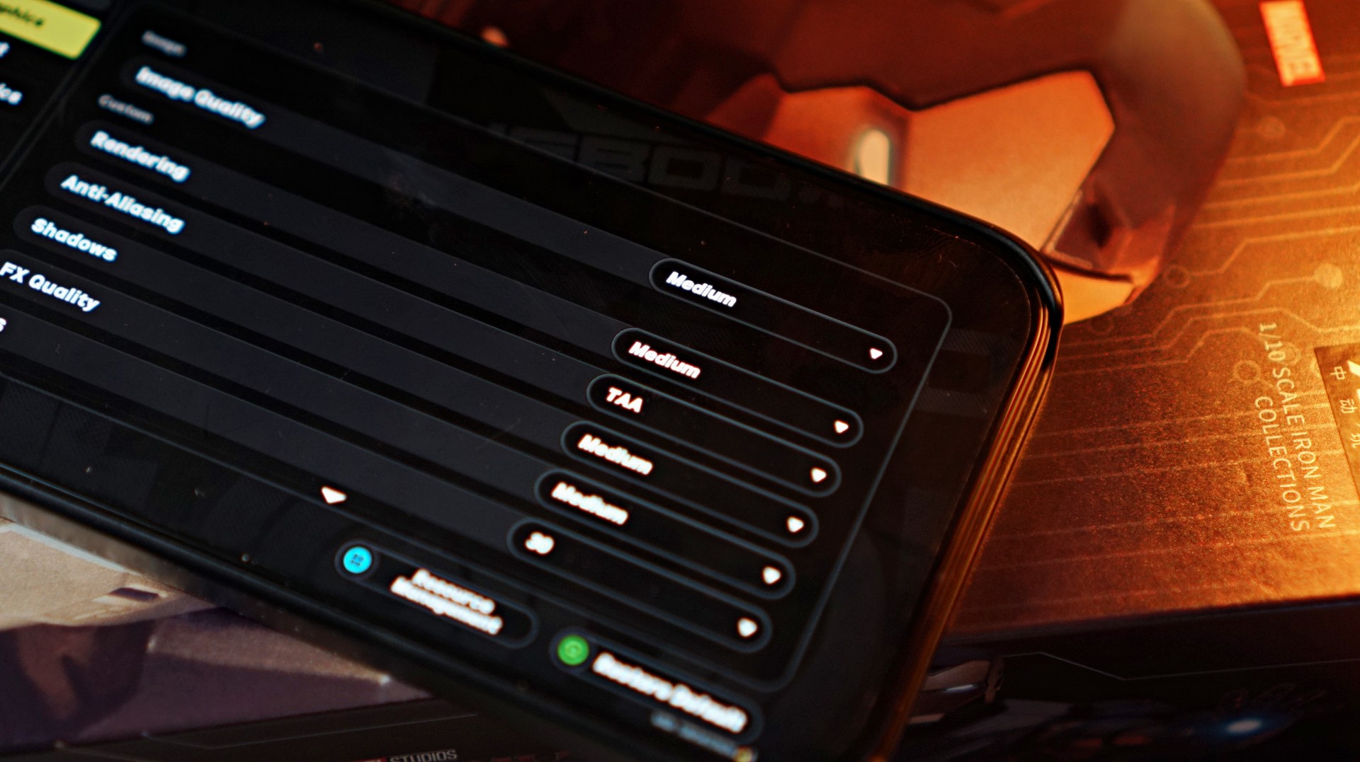
I fired up Zenless Zone Zero, and the default graphics configuration was set to Medium. That setup actually worked quite well, ensuring that the action-packed gameplay — complete with plenty of particle effects on screen — stayed smooth.
The lower resolution didn’t feel like much of a compromise either, especially on the phone’s 6.59-inch display.
For a midrange device, the overall experience is stable and dependable, which is exactly what most users in this segment are looking for.
Display and media consumption
The 6.59-inch AMOLED display delivers exactly what you would expect from a midrange device today.
It’s above average and quite serviceable. It’s not going to wow you, but you’re definitely not going to feel shortchanged either.
Colors look vibrant, brightness is more than enough for most situations, and the 120Hz refresh rate keeps scrolling and animations smooth.
Now Playing: Iron Man 3
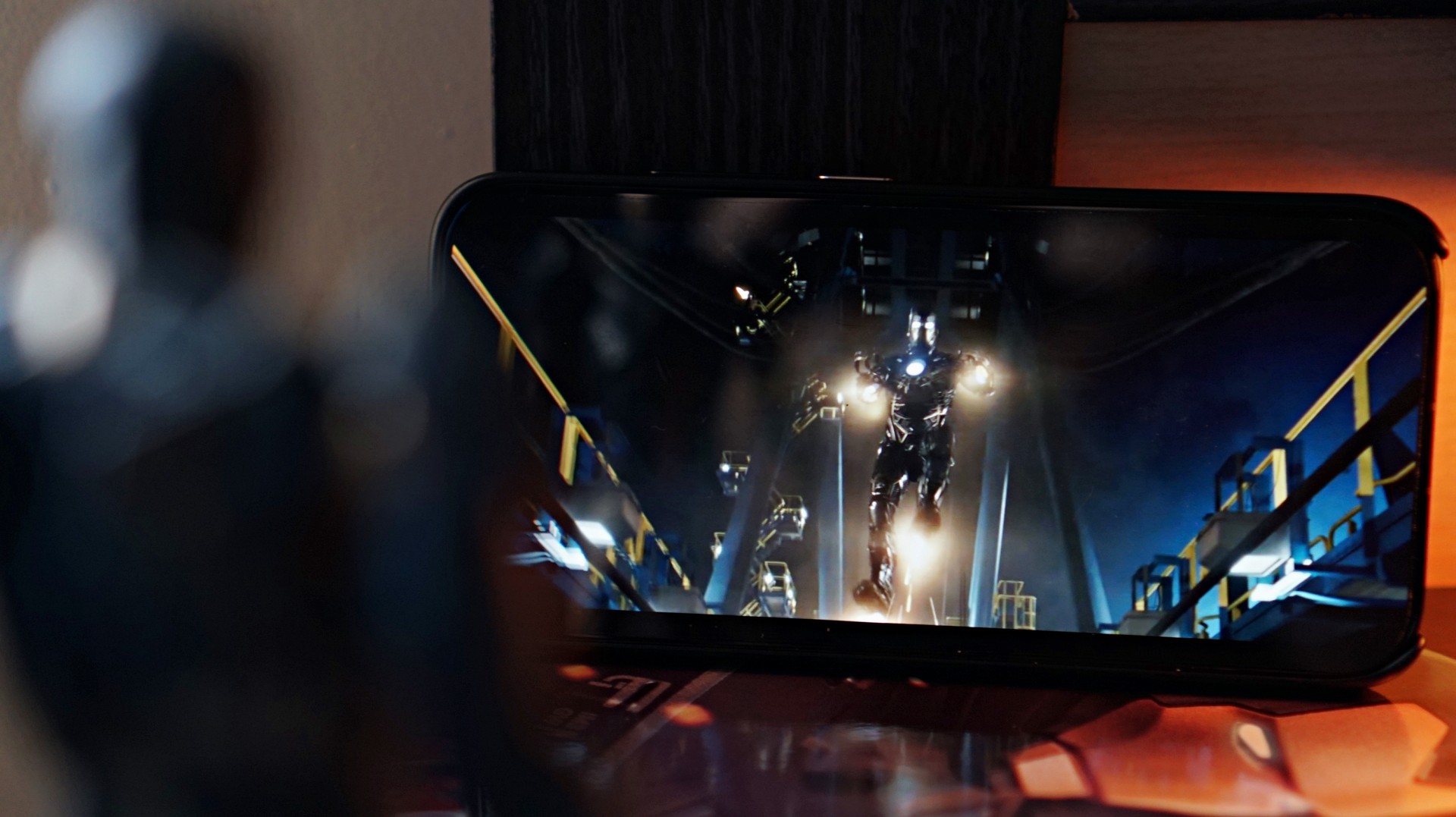
To stay on theme, I decided to watch a bit of Iron Man 3 on the phone.
The display does its job well, delivering clean and crisp visuals during playback. Explosions pop nicely on screen, and darker scenes still retain decent clarity.
The stereo speakers are fine for casual viewing, but you’ll probably want to use headphones if you’re looking for a truly satisfying audio experience.
Overall, media consumption falls somewhere in the average to above-average range — which is also a pretty accurate way to describe how the movie itself was received when it first came out in 2013.
Battery and charging
Battery life is one of the stronger aspects of the POCO X8 Pro Iron Man Edition.
The phone packs a large 6500mAh battery, which easily lasts a full day with moderate usage.
That includes a mix of social media browsing, watching videos, messaging, and the occasional gaming session.
Charging is also impressively fast.
Going from 50% to full takes about an episode and a half of an anime — roughly around 30 to 35 minutes. It’s quick enough that topping up the phone during short breaks becomes very convenient.
For a device in this price range, the combination of a large battery and fast charging makes the phone feel reliable throughout the day.
Cameras: right where you expect them
Camera performance is exactly where you’d expect it to be for a midrange smartphone.
Photos are perfectly fine for casual social media posts, but they’re not going to compete with higher-end flagship devices.


One thing to watch out for is the difference in image output between focal lengths. Switching between the ultrawide (0.6x), 1x, and 2x zoom can produce noticeably different results in terms of color and overall look.


In fact, even using the same lens can sometimes produce varying results depending on lighting conditions.


Images tend to have a slightly warm tone with a bit of extra contrast. Lighting plays a big role in how the final photo turns out, so results can vary quite a bit from shot to shot.
Selfies show similar behavior. Taking photos with and without the beauty filter can sometimes result in different exposure levels, which feels a bit odd.
-

- Beauty filter ON
-

- Beauty filter OFF
The best way to approach this camera system is to take multiple shots of the same scene. It may sound tedious, but snapping two or three photos increases the chances of getting one that looks just right.


The easiest way to describe the overall camera experience is inconsistent. If you’re the type who takes several photos before picking the best one to post on social media, you’ll probably be fine. But if you prefer reliable point-and-shoot results, it might take a bit more patience.
A curious collaboration
Iron Man has remained one of the most iconic characters in the Marvel universe ever since his silver screen debut in 2008.
But interestingly, there hasn’t been much happening around the character since the events of Avengers: Endgame.
While Robert Downey Jr. is set to return to the MCU as Doctor Doom in the upcoming Avengers: Doomsday, the lack of any current Iron Man storyline makes this collaboration feel a little unexpected.
That doesn’t necessarily make it a bad one, though.
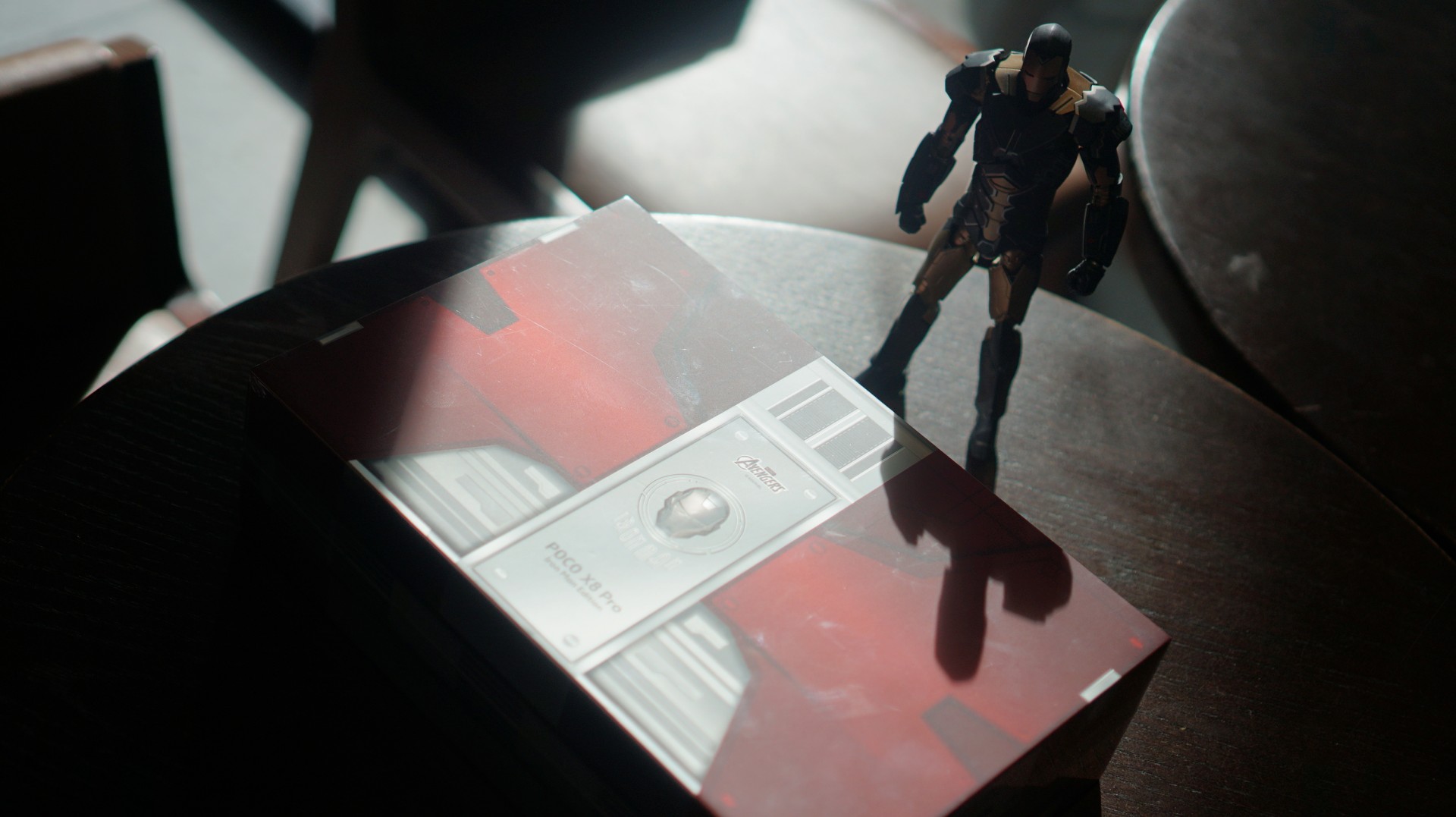
The POCO X8 Pro Iron Man Edition looks good, the box and packaging are genuinely impressive, and the themed design adds a bit of personality to what is otherwise a very familiar smartphone.
For hardcore Iron Man collectors, the appeal is obvious.
For everyone else, it’s essentially a solid midrange phone dressed in superhero armor. And if it lands somewhere close to the previous Iron Man Edition’s price of around PhP 22,999 (In the Philippines), it will likely hit exactly the audience it’s meant for — fans who don’t mind spending a little extra for a collector-style device.
It may not be the most exciting smartphone in the midrange category, but it’s still a fun collaboration nonetheless.

To be honest, I didn’t expect to like Project Hail Mary. I assumed that the decision to reveal the book’s biggest plot twist in the trailer was a mistake. I thought that the two-and-a-half-hour runtime might be too long. I worried that a hard sci-fi story like this one would be hard to translate into a feature-length film. Thank goodness I was wrong.
Project Hail Mary adapts Andy Weir’s novel of the same name. Indeed, that’s the same Andy Weir who wrote The Martian. Ryland Grace (Ryan Gosling), a molecular biologist, wakes up in an interstellar ship without his memory. With everyone else on board dead, he must find the answers to two questions on his own: who he is, and why he’s far away from Earth.
Though a soul-searching mystery might be entertaining in its own right, it wouldn’t be an Andy Weir story if it didn’t have some MacGyvering in space. Grace’s mission is apparently one of global importance. When a spacefaring virus starts to feed on the Sun and other surrounding stars, Earth sends a mission — that is, Ryland Grace and his deceased crewmates — to Tau Ceti, a faraway star somehow immune to the so-called astrophages.
Less problem solving, more emotion wrangling
Despite Weir’s tendencies to throw his protagonists into problem after problem, Phil Lord and Christopher Miller, who directed the adaptation, offers a more emotional story. Now, make no mistake; the original novel is already a tearjerker, but the film ups this even further by masterfully adapting the story’s most iconic character, Rocky.
Upon reaching Tau Ceti’s orbit, Grace realizes that he’s not alone. He isn’t the first visitor to the mysterious star. An alien spaceship is already orbiting the star. However, far from visions of War of the Worlds, this particular alien has a single mission: to save their own star from the same astrophages.

Rocky, as Grace calls them, looks like a living rock. Initially unable to communicate with the alien, Grave eventually builds a friendship with Rocky by translating the latter’s chirps to human words.
In the book, Rocky communicates with Grace (and the reader) through the broken English from a translating software. Naturally, the film adaptation offers more creative freedom. Instead of just text, Rocky gets a voice, thanks to James Ortiz, who offers a friendly-but-snarky character to the alien. As a result, Rocky feels more like a sidekick than just a (literally) alien entity.
Though it comes at the cost of some science-filled problem solving, Rocky’s slight change is more cinematic and can tug tighter at the heartstrings.
A healthy dose of humor
Rocky’s voice isn’t the only change. Despite the long runtime, the adaptation already prunes or shortens plot beats from the novel.
To be fair, all these changes don’t detract from the essence of the novel. Sometimes, they simplify. Other times, Lord and Miller infuse their trademark humor, which can be jarring for those expecting a more technical sci-fi story. But again, the novel’s spirit is still intact.

If anything, the added humor keeps the film entertaining throughout two-and-a-half hours. Now, if you’re tired of the so-called “Marvel humor,” there are moments of slapstick and snark sarcasm that pushes the limits of typical movie tropes. It’s just the price that an adaptation like this has to pay. Project Hail Mary’s plot is too complex to condense into the archetypal 90-minute window.
As someone who read and loved the original novel, it was difficult to see stitches between the book’s story and the screenplay’s changes. And I think that’s what makes the adaptation work so well.
Should you watch Project Hail Mary?
Project Hail Mary is as faithful as an adaptation can be. It doesn’t change the story for the sake of Hollywood. All the changes you’ll see are just ways to keep audiences engaged because of the long story. If you loved the book, there’s no way you wouldn’t love the adaptation, too.

Now, if you haven’t read the book, firstly, you’ll still love this movie. It’s a highly compelling story with high stakes and an emotional rollercoaster. Secondly, read the damn book. It’s a masterpiece of science fiction.


POCO X8 Pro Max review: A new beast from the far east
That "Pro Max" naming superlative is more than justified


POCO X8 Pro Iron Man Edition review: Midrange phone in superhero armor
POCO x MK15


Now Playing: Project Hail Mary
It's a treat for those who loved the original book.

GoTyme Bank, Visa partner for FIFA World Cup 2026 raffle giveaway

Spider-Man: Brand New Day first trailer hits hard — and gets weird

TUMI’s “Mediterranean Escape” brings vacation energy to Spring 2026 lineup

Switch 2 now lets you play old games in 1080p

OPPO Find N6 launches globally with near crease-free foldable display


-

 Reviews2 weeks ago
The Xiaomi 17 shoots Leica dream
-

 Gaming2 weeks ago
Ubisoft confirms Assassin’s Creed: Black Flag remake
-

 Gaming2 weeks ago
PlayStation will stop releasing its games on PC
-

 Hands-On2 weeks ago
OPPO Reno15 F 5G hands-on
-

 Gaming2 weeks ago
Project Helix is Xbox’s next console, and it plays PC games
-

 Computers1 week ago
GIGABYTE collaborates with Capcom for RE Requiem custom PC
-

 Entertainment7 days ago
The internet is thirsting over the One Piece Season 2 cast
-

 News2 weeks ago
Globe postpaid opens pre-orders for Samsung Galaxy S26 series