
Reviews
Xiaomi Mi Max 2 Review: A worthy successor?

When Xiaomi first announced its Mi Max last year, we were in awe; not just because of its sheer size, but because of how inexpensive it was. It continued on with its Prime variant five months after, and now, we have its latest generation. This is our review of the Xiaomi Mi Max 2.
Before we get into details, let’s take a look at its physique first.
The Mi Max 2 is a huge smartphone…

The enormous 6.44-inch 1080p display
… with solid build quality

The power button and volume rocker on the right
Xiaomi brings USB-C to the Mi Max 2

The USB-C port flanked by the speaker and microphone grilles
The antenna lines look just like the iPhone 7’s

Antenna bands are well-hidden
Clean aluminum slab with an underrated look

One big chunk of golden metal (or black if you have that color)
It runs MIUI 8 on top of Android Nougat

MIUI 8.5 Global to be specific, since we have the international version
It’s the ideal multimedia device
With its 6.44-inch display, the Mi Max 2 is able to deliver multimedia content better than smaller smartphones. The 1080p IPS LCD panel is still sharp at 342ppi despite its stretched dimensions, so I don’t have any issues with its clarity. What concerns me is its saturation and contrast, because when I compared it to other IPS panels, the Mi Max 2 looked slightly muted. There’s a higher contrast selection in the settings, but it didn’t provide the punchy values I was hoping for.

To compliment the big display, a pair of loud speakers is onboard the device. The stereo setup is discreet; we have the main loudspeaker at the bottom while the earpiece acts as the second channel to create the two-channel effect. I do enjoy using the Mi Max 2 to watch YouTube videos and movie trailers, thanks to the combination of the large display and quality speakers.
Also great for mobile gaming!
Gaming is also a strong suit of the Mi Max 2. It’s always better to play your favorite mobile titles on a big phone, as it lets you enjoy the games without the on-screen buttons occupying most of the display area. In addition, the gaming performance of the Mi Max 2 is something to brag about.
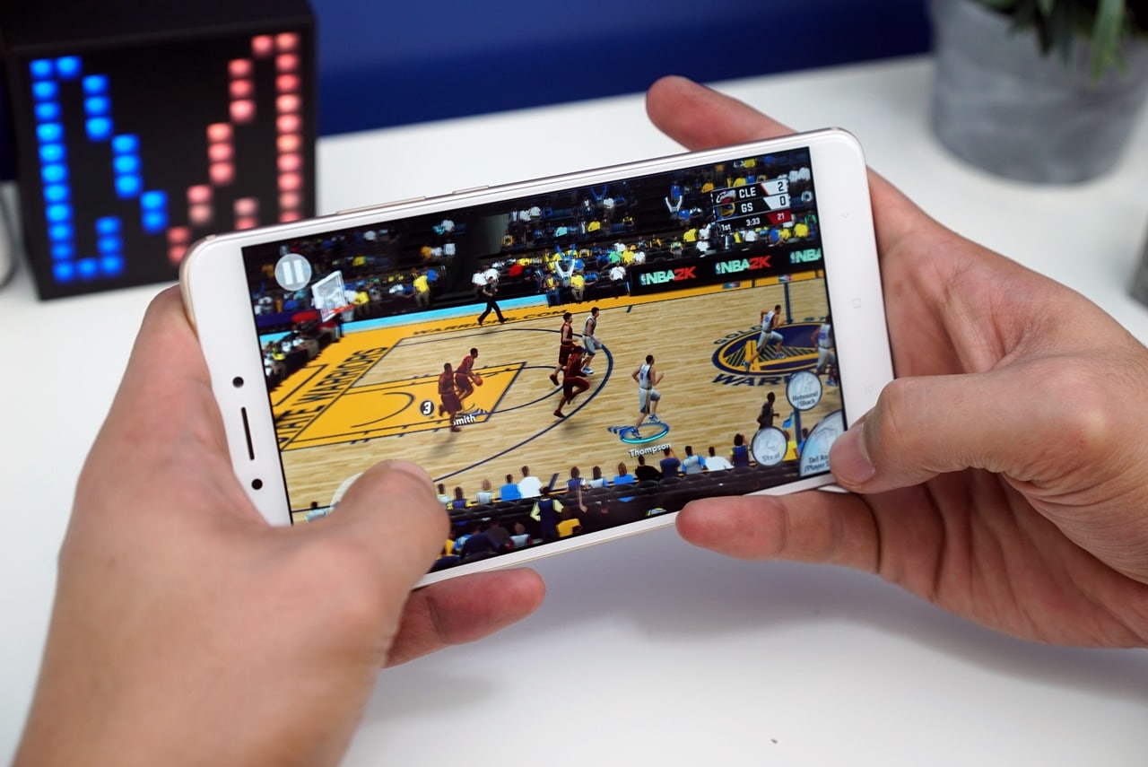
Powered by a Snapdragon 625 processor paired with 4GB of memory, intensive titles aren’t a chore for the handset. NBA 2K17 and Asphalt Xtreme run smoothly even on high settings, but some graphics optimizations are not available in other titles.
Camera is just okay
On paper, it has a 12-megapixel rear shooter with phase detection autofocus for quicker locks and a 5-megapixel selfie camera. Coming from other Xiaomi phones, we didn’t expect the Mi Max 2 to excel in mobile photography. Let’s take a look at the samples:


-

- Front Camera
While daytime photography is a piece of cake for the handset, its f/2.2 aperture knocks it down when it comes to indoor and low-light environments. The slow shutter speed and noisy image processing don’t help either. The same goes for the front camera, too.
Even the flagship models of Xiaomi don’t do well in photography, if that may act as consolation.
Leave your power bank at home
The “Max” aspect of the phone is not just found in the display, but also in the battery. The Mi Max 2 has a 5300mAh battery which is 450mAh more than its predecessor without the added bulk. It takes advantage of Quick Charge 3.0 from Qualcomm for speedy charging. (Big batteries need fast charging!)

Using the bundled fast charger, I was able to get from zero to 10 percent in 15 minutes. After 30 minutes of charging, the phone gets 19% of juice; while a full charge takes a little longer at about 3 hours. For a cell this big, its charging times are pretty okay, since you’ll get more power on the road in return. With casual usage, the phone can last two to three days on average. Playing games with mobile internet would create a larger impact, but it can still last a full day.
Is this your GadgetMatch?
While the Mi Max 2 is a good smartphone overall, there are a few points that a buyer must think through before considering the handset.
First, it’s a large device that sits between the smartphone and tablet territories. One-handed use is tricky and it’s pretty cumbersome to slip into your pocket. On top of that, it has a lackluster camera, which is disappointing for its range. Lastly, it’s not a big upgrade from last year’s model. If you own the first Mi Max, there’s no need to get this newer one. The older model also has the Nougat update and more or less the same specs.
But, if you’re looking for a big smartphone (and we’re talking 6.44 inches big) that can deliver good performance without the hefty price tag, the Mi Max 2 is an excellent buy. We’ll consider its premium build as the cherry on top since most affordable devices have issues in this regard.
Our review unit is from Gearbest which sells the Mi Max 2 for just US$ 270.
SEE ALSO: Xiaomi Mi 6 Unboxing and Hands-on
[irp posts=”17735″ name=”Xiaomi Mi 6 Unboxing and Hands-on”]


There’s a certain expectation that comes with a My Hero Academia game, especially one billed as the “final chapter.” You expect big emotions, loud battles, and characters pushed to their limits. After spending time with My Hero Academia: All’s Justice, it’s clear Bandai Namco isn’t trying to reinvent the arena fighter formula. Instead, it’s refining what fans already know and framing it around the series’ most climactic arc.
Early on, the game feels immediately familiar. If you’ve played previous My Hero Academia console titles, you’ll know exactly what you’re getting into. Combat rhythms, camera angles, and overall pacing don’t drastically change. For casual fighting game players like myself, the differences feel more granular than transformative, but that familiarity makes the game easy to settle into.

One notable addition is the dual control scheme: “Normal” and “Manual.” Normal mode smooths out inputs, lowering the skill floor, while Manual mode is the classic arena fighter setup. Normal works but reduces player agency in ways that feel unusual. Outside of combat, the game also replaces a standard menu with a city-like hub. Playing as Deku, you pull up a smartphone-style menu to access modes, subtly increasing immersion.
Combat and battle system

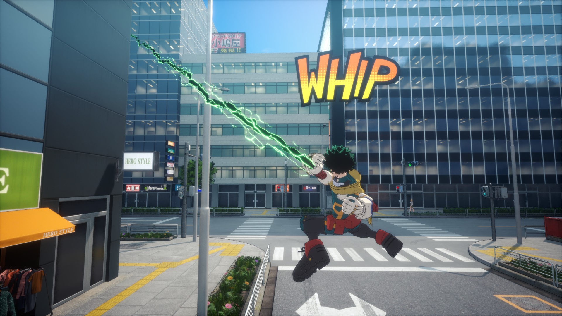
Combat feels largely unchanged in speed but leans more aerial than expected. Characters spend a lot of time in the air, creating distance and forcing you to think about positioning. Aggressive players may struggle, as patience and smart movement are rewarded more than constant pressure.
Quirks are intuitive, even for newcomers to 3D arena fighters. Visual indicators clearly communicate cooldowns and power states. Some Quirks are tuned for balance, but they still feel faithful to the anime. Ultimate and cinematic moves are satisfying and feel earned, never spammy.
Character variety is a standout. Deku, Bakugo, and Shoto share similar combat prompts, but their Quirks dictate unique movement, attack patterns, and space control. Deku, in particular, feels beginner-friendly, making him a natural starting point.
Roster and character balance

The roster feels large without overwhelming the player. Final-form characters aren’t instantly dominant; the true power spike comes when a character enters a “Rising” state after being the last fighter, gaining buffs across damage and abilities. Villains are just as enjoyable as heroes, with Dabi proving particularly fun to play. Story mode also presents moments of genuine challenge, such as facing multiple opponents at once.
While it’s early to speak on balance issues, the game seems thoughtfully tuned so far. Beginner-friendly characters include Deku, Bakugo, and Shoto, while other fighters may require more experience to master.
Team Up Missions
Team Up Missions offer shorter, varied challenges that feel like playable mini OVAs. While not essential to the main story, they unlock legacy battles and extra content for fans.
AI allies are competent and punish reckless play, which makes team composition matter more than cosmetic choices. While these missions don’t dramatically expand the fantasy of teamwork, they add fun replayable content for single-player fans.
Story and cinematic presentation

Story mode is where All’s Justice shines. Experiencing the Final War interactively delivers the same giddy excitement as watching those moments unfold in the anime. It evokes memories of the Naruto Ninja Storm series, balancing spectacle and fan service. Transitions between gameplay and cutscenes are serviceable—neither jarring nor groundbreaking.
The game assumes familiarity with the story, so newcomers may feel lost without prior anime knowledge. Battles often carry emotional weight, effectively allowing players to relive key moments of the Final War.
Visuals, performance, and audio

The game runs smoothly on PS5, even during effects-heavy fights. Character models are adequate, though not as sharp as hoped, while facial animations during story moments are expressive and well-done. The UI does enough to keep combat readable without distracting from the action.
Audio stands out. Voice acting delivers intensity, hit sounds feel impactful, and music consistently elevates big moments. The game is loud, but in a way that matches the over-the-top energy of the series.
Should you play My Hero Academia: All’s Justice

My Hero Academia: All’s Justice feels like a proper final chapter. It doesn’t overreach but delivers where it matters most. Competitive players will find depth, while anime fans can relive beloved battles interactively.
It may not redefine the genre, but it understands exactly what kind of game it wants to be—and it delivers that confidently.
The combination of familiar combat, a large and varied roster, cinematic story moments, and thoughtful extras like Team Up Missions makes it a satisfying experience for anyone looking to step into the shoes of their favorite heroes and villains.
Reviews
nubia V80 Max: Long battery, marginal upgrades, casual budget phone
Upgrades here and there, but is the price increase worth it?

The nubia V80 Max arrived in the Philippines with a noticeable price jump: PhP 6,499, up from the V70 Max’s PhP 4,799.
For it’s intended market — the budget-conscious users who are trying to make ends meet daily — those extra pesos matter a ton.
That’s why I’ve been torn on giving it a pass or no. I still am until now.

The V80 Max does tout durability upgrades and AI add-ons. The refreshed design also looks a bit more premium, ditching the circular camera island.
But all these improvements feel incremental or marginal. In the end, budget users need their phone to work as they try to survive each day too. From the get-go, using this device somewhat felt… non-enjoyable.
Performance: A bit unsteady
The nubia V80 Max is powered by a Unisoc T7250 processor with up to 1.8GHz clock speed. It can handle typing, messaging, and other light tasks.
However, just tapping on apps, loading them, and switching between them generally looked sluggish.

There’s also been slowdowns that weren’t experienced too much with the V70 Max, which my nephew even entrusted for PUBG.
I type quite fast, and to its credit, the nubia V80 Max has kept up. At least you can use this for endless chatting with friends and keeping loved ones updated.
But everywhere else, patience is required. Even just simulating a delivery rider’s routine and having navigation turned on was already pushed the phone past its comfort zone.

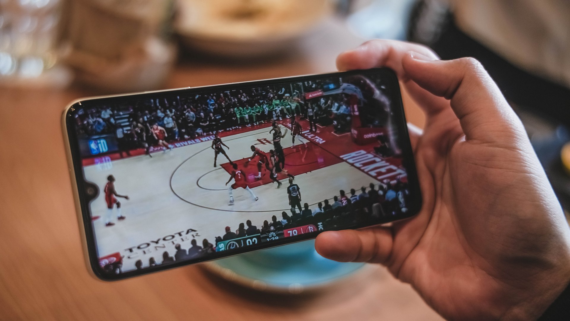
For gaming, I’ve played both Mobile Legends: Bang Bang and Need for Speed No Limits on the handset.
They are playable, although the overall experience may not be enjoyable due to sporadic connectivity issues and bare-minimum graphics.
Display: Bright but basic
In front, the nubia V80 Max has a large 6.9-inch IPS display that is similar to the V70 Max’s panel.
A notable improvement is 780 nits peak brightness. That’s a welcome upgrade for outdoor visibility.
However, the resolution maxes out at 720p for YouTube videos and other scenarios. That and a low pixel density make the display most specially underwhelming even for just photos of food.
They look a lot unappetizing and just makes you scroll down instead.

The thick bezels and black bars also lessen the audiovisual experience. Speaking of audio, the sound quality is just par for its segment. It’s not totally flat but far from a premium soundscape too.
Battery: Long-lasting, enough for light work
With a 6,000mAh battery like its predecessor, the nubia V80 Max can deliver a full day of light use. Besides, there’s not much “demanding” tasks you can do on it smoothly.
For basic communication all day, plus browsing and light gaming in between, you’ll surely have enough power left.
The only downside is that it takes about two hours to fully replenish back to full. That’s unlike other budget phones with 33W to 45W charging at the very least.
A nice surprise is Bypass Charging to power gaming and extended use.
Durability, water and dust resistance: For assurance
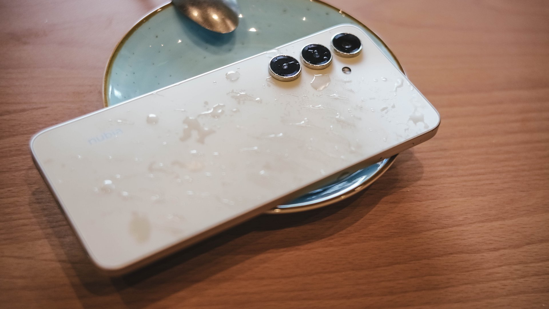
As nubia has previously mentioned, the V80 Max is practically the brand’s own entry to the “rugged budget phone” meta.
On paper, it has an IP64 rating and up to a 1.8-meter drop resistance. It’s always good to have these as extra insurance for parents handing phones to kids or workers in tough environments.

At the same time, it plays a part in the higher asking price. A cheap case and a lanyard should do the same without a price bump.
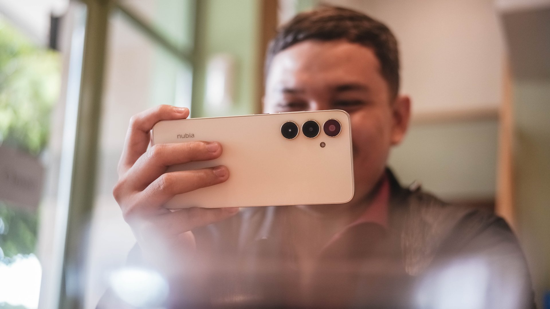
Cameras: Decent, with caveats

Lighting will always be your friend with a camera system like the V80 Max’s. The device comes with a 50MP main camera for decent detail and a 16MP counterpart in front.
It works, but your patience will definitely be tested. The results are fair to a point that the camera can be used for beyond documentation.


There was even one time I zoomed to 3X (in daylight) and the detail still looks amenable.

But forget quick captures. It takes time for the capture button to process your press. The camera demands stillness even after the snap.
To be fair, the colors are also decent — not washed out and totally dull. But in some cases, the color accuracy is off, especially for food and other red-hued subjects.


For good shots, just give them some post-processing, and they’re usable for social media.
One the other hand, low-light and night shots from both front and back shooters are predictably grainy and noisy.Selfies are also lighting-dependent for quality.


The camera UI could also use some upgrades. My palm also sometimes accidentally taps the right-hand side of the screen when holding the phone.
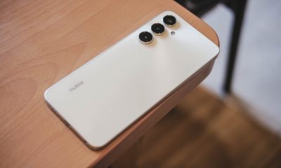
Design
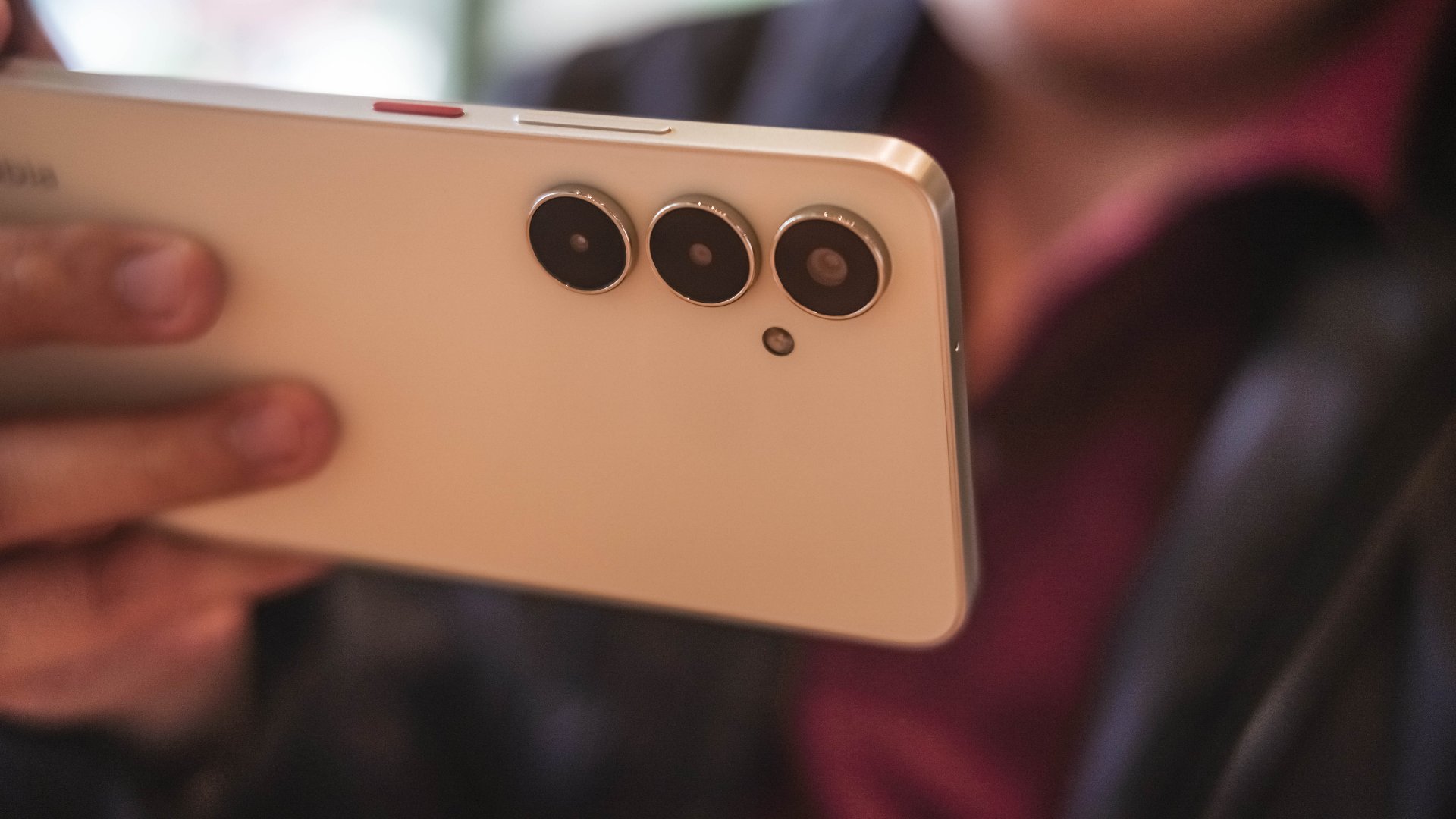
As mentioned, nubia has ditched the familiar Android top-middle-of-the-back camera island in favor of this setup:
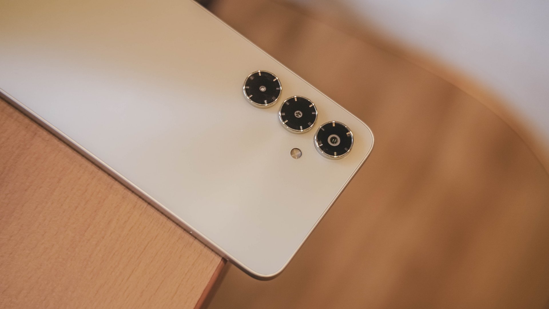
The three shooters protrude and are lined up vertically. You’ve definitely seen this arrangement from other Android brands, most notably Samsung’s previous offerings.
But it’s a new touch for nubia, while the power button being in red reflects their signature flair.
There are five colors, and mine was in Aurellia Gold which looks more of a light yellowish cream. The backside is smooth although the side frames provide enough friction for a good grip.

I’m pleased that the device didn’t come with bloatware out of the box.
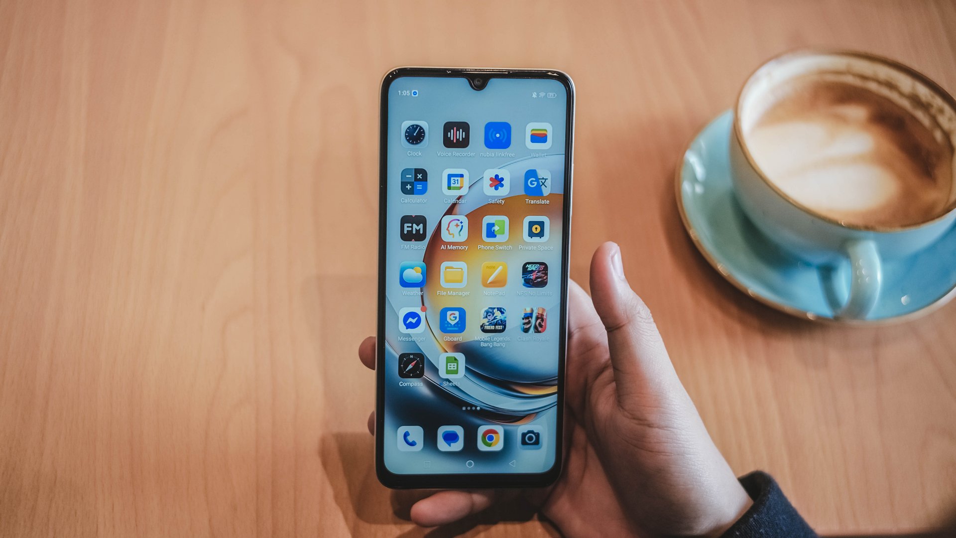
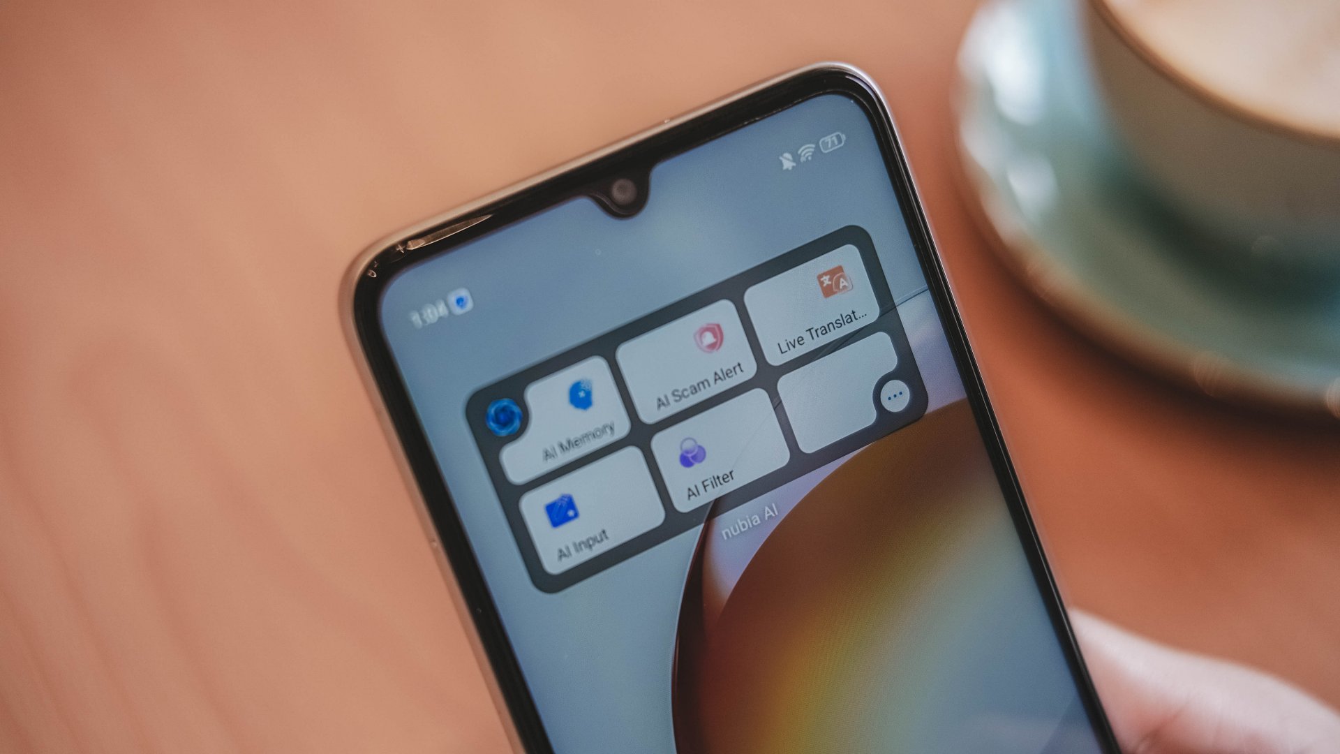
Also, there are AI features here that are somewhat actually useful. The AI Scam Alert is worth utilizing so you can avoid getting disturbed.
Is this your BudgetMatch?
It’s an easy Swipe Left for me. Plain and simple, the phone is usable but unenjoyable.
There are some commendable aspects but the performance lags, the display underwhelms, and the price hike doesn’t feel justified.
Throw in a few more bucks, and you’ve got some better-balanced options and budget gaming phones. There’s also better camera systems and displays on other budget handsets.

I would say it’s still for consideration for those who really just need a communication tool. Students, entry-level workers, stay-at-home adults, and more.
But in the end, the upgrades do not outweigh the compromises. By now, even the most affordable phones should offer more than just survive drops. They must be able to at least keep up with users’ lives.
Apps
Breaking up with Adobe Photoshop after 20 years
Wedding planning and Apple Creator Studio made me realize it was time

Planning a wedding, even a small and intimate one, has a way of sharpening your sense of priorities. Right as my fiancé and I were making decisions for our city hall wedding here in New York City, Apple announced Creator Studio.
Creator Studio is a subscription service that gets you access to eight creative pro and productivity apps for US$12.99 a month, or US$2.99 if you’re a student or educator. The design app included in the subscription, Pixelmator Pro, is also available as a standalone purchase for US$49.99. Adobe Photoshop, my design software of choice for over two decades costs me US$22.99 a month.
Seeing those numbers next to each other made me pause. It’s not that I was unhappy with Photoshop. I was just suddenly made aware how expensive it is. I’d been paying more for a single tool than I could for an entire creative ecosystem.
Adobe Photoshop was my first foray into the world of graphic design
Creative Studio’s lower price point, along with the free trial, made me consider switching to Pixelmator Pro altogether. That’s something I never thought I would do. Photoshop was how I got into graphic design. It was my first love, and up until recently, I truly thought it would be my ride or die.
Getting to know Pixelmator Pro
If you’re not familiar, Apple’s Pixelmator Pro is a graphic design and image editing app that’s similar to Adobe Photoshop. In practice, it covers a huge amount of the same ground but with a very different philosophy around usability and design.
I tried Pixelmator Pro, mostly as a challenge because we were doing a YouTube video on Apple Creator Studio. Personally, I was lowkey excited to try something new.
![]()
The first time I loaded the app, I recreated our YouTube thumbnail template — all within 10 minutes — and I haven’t looked back since.
Familiar enough to feel effortless
One of the biggest reasons my transition to Pixelmator Pro was so easy is muscle memory. Many shortcuts behave the same way: cmd+T for transform, cmd+R to show rulers, cmd+J to duplicate layers, just to name a few.
Having used Photoshop since high school, it felt familiar and intuitive — the complete opposite of how it felt to try and switch to Adobe Illustrator many years ago.
Photoshop is how I got into graphic design. It was my first love, and up until recently, I truly thought it would be my ride or die.
Later, I learned that you can import PSD (Photoshop) files directly to Pixelmator Pro. Apparently I didn’t even need to recreate the GadgetMatch assets. It does a good job of converting and preserving layers.
Photoshop now feels archaic
![]()
After using Pixelmator Pro for a few days, going back to Photoshop felt jarring. The sharp edges of the UI felt cold and rigid. Everything was layered with popups, panels, and tiny interruptions.
Pixelmator Pro, in comparison feels warm, smooth and frictionless. Its user interface is very Apple-like — rounded edges, softer icons and buttons. The Creator Studio version also gets the new Liquid Design touch, with transparent menus and elements that feel dynamic.
I especially love the little things. Color adjustments live in one simple panel instead of being scattered across different windows. There’s an eyedropper tool beside every color picker with a magnifier built-in.
When you hover over tools, it shows you the shortcut (e.g. “R” for Repair). There are also subtle animations, like when you use the Color Fill tool to change your canvas color.
Pixelmator Pro’s UI is warm, snappy, and approachable
The differences in user experience are stark. Photoshop’s animations either don’t exist or are too abrupt for one to notice.
Smart tools without the noise
Photoshop has one clear advantage over Pixelmator Pro: Generative AI. It’s great and powerful especially when you need to save time.
I personally used it a couple of times before to save time on cloning, erasing, or expanding elements. Am I going to miss it with this switch? Something tells me I won’t.
Pixelmator Pro’s clone and repair tools, though seemingly so simple, work like a charm. And for how I usually manipulate images, those two are more than enough.
From digital to physical
If Pixelmator Pro was going to replace Photoshop in my workflow, wedding prep was the perfect time to give it a real world test — and it more than held its own. Its ease of use gave me permission to think outside the box, because I knew I had a reliable tool that can help me make it happen.
On the left, a Kufic-inspired wedding logo designed on Pixelmator Pro; on the right, 3D printed stamps
Since my fiancé is half-Iranian, I designed a logo combining our names, inspired by Kufic calligraphy, and I did it entirely in Pixelmator Pro. I developed that same logo further and designed a save the date, with color, also inspired by Kufic calligraphy. I went through a few iterations to come up with the final designs, which were made easier by the Shape tool and grid overlays.
My fiancé then took the logo I designed in Pixelmator Pro, converted it to 3D on Revit, and printed it into stamps in different sizes. One way we’re using it is to deboss the handmade pottery he’s making as one of our party favors.
There are a few more wedding pieces I’m designing on Pixelmator Pro in the coming weeks: our final invitation, and the custom stationery for the dinner that follows the ceremony.
Through this whole process, Pixelmator Pro never felt like it got in the way, or that it was limited. On the contrary, it feels like that enabler friend who says yes to every idea I have, and can actually help make them real.
Powerful, but approachable
The best way I can describe what using Pixelmator Pro is like is this: it’s a mix of Photoshop’s professional tools, Canva’s free library of assets, and Apple’s UI sensibility.
Shortly after Apple announced Creator Studio, Adobe rolled out significant Creative Cloud discounts. Are they threatened? They better be.
That makes it great for beginners, small business owners, and casual creators. Like Canva, it comes with some beautiful templates to help someone with zero experience come up with something good.
But unlike Canva, it still feels like a serious design tool. I can do so much of what I need using Pixelmator Pro but with UI that’s so much more approachable compared to Photoshop.
As the great philosopher Ariana Grande once said, “Thank U, Next”
I remember meeting Canva’s founders before launch and not fully understanding their mission to make graphic design accessible to everyone. Now I do.
It was never about replacing Adobe products and pro designers. What Canva did was fill a huge void we didn’t know existed. They democratized something that used to be reserved only for the privileged few.
Pixelmator Pro comes with free templates, assets, and mockups like this MacBook Pro and coffee packaging
Pixelmator Pro’s lower barrier to entry has potential to make a significant impact. My hope is it opens doors for people who were previously shut out of the graphic design world, and that it becomes something they can grow with, just as I did with Photoshop.
Adobe is still the industry standard
Switching to Pixelmator Pro wasn’t about rejecting Adobe, in the same way that Canva’s success did not kill Photoshop.
It’s worth noting that Adobe products are still the standard in the industry. A lot of companies rely on them, and most schools teach them. In a traditional design or agency environment, Photoshop and Illustrator are still the default language.
![]()
Even on Apple’s own Design Resources site for developers, the official design templates are built for Adobe Photoshop and Illustrator, not Pixelmator Pro. That says a lot about how embedded Adobe is in professional workflows.
Competition makes the space better
Apple Creator Studio, and tools like Pixelmator Pro, challenge Adobe’s near-monopoly in a really healthy way.
It’s not lost on me that trading Photoshop with Apple software actually keeps me locked into one ecosystem. But having more pro creatives try Pixelmator Pro can put pressure on the industry. A strong alternative that’s more cost effective can force titans and dinosaurs to evolve in a way the likes of Corel was never able to do.
Ideally, that means better products and fairer pricing for everyone. Shortly after Apple announced Creator Studio, Adobe rolled out significant Creative Cloud discounts. Are they threatened? They better be.
Pixelmator Pro’s intuitive UI makes switching from Photoshop easy peasy
Access matters, and at the end of the day, with a healthy competition in the market, it’s consumers that win. Canva is a great example of this. It made design tools accessible to those who aren’t professionals. It didn’t make everyone a great designer, just as a novice who tries Final Cut Pro today won’t become a pro video editor tomorrow. Design is still a craft you develop over time with practice.
Is Pixelmator Pro my GadgetMatch?
Photoshop still has its place. But for my everyday work, and occasional personal projects, Pixelmator Pro can do everything that I need to accomplish, at a fraction of the cost.
It feels faster, lighter, and more alive. Honestly learning my way around new software has been so enjoyable — so much so that I feel a renewed sense of eagerness to try other design software like Blender and Figma.
Pixelmator Pro never felt like it got in the way, or that it was limited. On the contrary, it feels like that enabler friend who says yes to every idea I have, and can actually help make them real.
Wedding planning and Apple Creator Studio didn’t just make me switch to a new software. They also made me question how much I’ve been missing out on. How much of what I do is simply due to inertia?
![]()
Ending my longest relationship doesn’t mean it failed. I’m grateful for what Photoshop taught me. It helped shape the creative professional that I am today.
But alas, this is one area where my practicality wins over loyalty. Relationships — with people or with tools — only work when both parties keep showing up. There’s no room for complacency, despite the history.
Walking away from something that taught me so much feels bittersweet, but Pixelmator Pro fits the way I work now, and I hope it grows with me as I turn the next page.


My Hero Academia: All’s Justice: A familiar Final War, made playable
Reliving the Final War


nubia V80 Max: Long battery, marginal upgrades, casual budget phone
Upgrades here and there, but is the price increase worth it?


Breaking up with Adobe Photoshop after 20 years
Wedding planning and Apple Creator Studio made me realize it was time

HONMA x HUAWEI WATCH GT 6 Pro for golf launches
My Hero Academia: All’s Justice: A familiar Final War, made playable

AMD teases next-gen Xbox coming in 2027

Overwatch reinvents itself with a new story and five new heroes

What a day at Masungi GeoReserve taught me about a smartphone’s durability

HONOR X9d 5G launches in the Philippines: Price, preorder, availability

POCO M8 Pro review: Goin’ loco over this POCO

Infinix NOTE Edge debuts: High-end features for accessible pricing

HONOR Magic8 Pro review: What sorcery is this?

Redmi Note 15 Pro+ 5G review: The midrange fashion piece


-

 Gaming2 weeks ago
Now playing: Final Fantasy VII Remake INTERGRADE on Switch 2
-

 Gaming2 weeks ago
Forza Horizon 6 launches on May 19
-

 Gaming2 weeks ago
Nintendo’s latest toy is Super Mario Wonder’s Talking Flower
-

 Gaming2 weeks ago
You can now race as teams in Mario Kart World’s Knockout Tour
-
 News2 weeks ago
nubia joins durability competition with launch of V80 Max
-

 Gaming1 week ago
New DRAGON BALL game project “AGE 1000” for 2027 announced
-
Apps5 days ago
Breaking up with Adobe Photoshop after 20 years
-

 Gaming1 week ago
Blizzard will host four major game showcases starting this week