


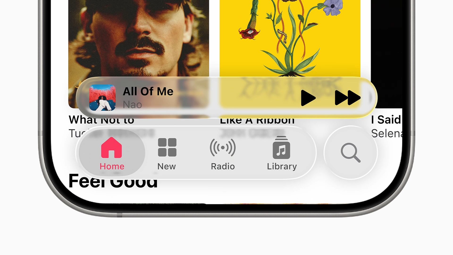
Instagram has become an outlet for a lot of creatives over the years. It’s evolved from a platform where we share mundane photos of food and moods to hyper-curated grids — until Instagram Stories was introduced, that is. If you’re one of those people who barely post anything other than stories, here are some easy and not-so-simple ways on how they can look better so you can tell your stories better:
Use the native camera app

Photos taken with the Samsung Galaxy Note 10’s wide angle camera, ultra-wide angle camera, and night mode
Most phones released in 2019 now have at least two different cameras — a combination of wide angle and telephoto, or wide angle and ultra-wide angle. Some even have up to three or four in total. Take advantage of these lenses by taking your photos on the native camera app instead of going straight to Instagram. By using an ultra-wide angle lens you can fit more in your shot without walking several steps backwards. If your phone has a built-in night mode, your low light shots will also turn out much better when you take them using the camera app instead of Instagram’s camera.

“Wrap” your caption around shapes

If your caption is a bit long, get creative by wrapping them around your subject’s shape. If you have a photo of food or coffee for example, you can type the letters one by one around the plate or cup.
Apply your video camera’s built-in filters

Smartphone cameras are getting more and more features each year. On the Samsung Galaxy Note 10 for example, there’s a feature called Live Focus Video where you get a TV glitch filter. This adds a retro, vaporwave aesthetic to your videos without having to install a third party app.
Add doodles

Make your subject pop by doodling around it. You can add dots, lines, hearts, stars, or broken lines around it — whatever you can think of! Doodles can also add a better narrative to your story than captions when Spider-Man appears out of nowhere for instance.
Animate your captions

By simply adding small GIFs like stars around your caption, or integrating word GIFs into your caption can make it look like it’s animated. If you have a Samsung Galaxy Note 10, you can also get animated handwriting with the S Pen using the phone’s native editor whether that’s on a photo or a video.
“Mask” your subject

Another way to make your subject stand out is by “masking” lines or handwriting behind it. Simply write over your subject using any of the pen shapes, then erase parts of the lines or handwriting to make it seem like it appears over and under the subject.
Mix fonts with your handwriting

Instagram’s font selection may be limited but doesn’t mean your imagination should be. Pick any font to write your caption with — ideally anything but Neon — then pick one word to replace with your handwriting. You can also play around with tracking by simply adding spaces in between letters.
The trick in making your Instagram Stories look better is to not overshare and not overdo any of the effects. Just because you can add GIFs doesn’t mean you should plaster the entire screen with them. While it should feel more raw than your posts, be more purposeful in what you share — always try tell a story whether you’re sharing a photo or a video. It’s called Instagram Stories for a reason.
How do you make your Stories different? Share your tips with us in the comments section below.


Apps
Don’t get tricked: Spot these financial monsters before they get you
Ghosts are harmless compared to these real-life threats that prey on your hard-earned money.

The spooky season has arrived, but not all monsters wear masks. Some hide behind fake links and shady offers designed to trick you into giving up your hard-earned money.
These are the real-life financial monsters: fraudsters, impersonators, and manipulators who turn everyday moments into horror stories.
According to the Cybercrime Investigation and Coordinating Center, 32% of Filipinos have fallen victim to digital fraud in the past year. And while it’s tempting to think you’d never fall for one, scammers are getting smarter and more creative.
Here’s what to watch out for:
Suspicious links and emails.
Those random texts and emails saying “there’s a problem with your account” or “you’ve won a prize”? They’re classic traps.
Scammers disguise themselves as legitimate companies to steal your information or access your accounts. Always double-check the sender’s address. If it looks off, don’t click.
Grammar gone wrong.
If a message is full of weird typos, awkward phrasing, or off punctuation, that’s a red flag.
Reputable companies review every message they send. When in doubt, don’t reply. Report it to authorities like the PNP Anti-Cybercrime Group or the NBI.
Urgent and emotional messages.
Scammers love to pressure you. They’ll make you feel scared or guilty to get you to act fast.
Real companies won’t threaten or rush you into sharing personal info. Take a breath, hang up, and reach out to the official hotline to verify.
Deals that sound too good to be true.
If someone promises instant money or massive discounts, run. These scams often demand “processing fees” or personal info before disappearing. No legitimate prize will ever require payment upfront.
Behind every scam is a story of someone who deserved better. Sometimes, what started as a simple loan application can turn into a nightmare if a rogue online lender decides to harass someone over payments they didn’t even fully receive.
It’s a familiar story for many Filipinos who’ve been preyed on by unregistered or unethical financial services.
Thankfully, more responsible lenders and financial platforms today (Tala, for example) are working to raise awareness and fight back against these threats.
Some even use advanced systems to flag suspicious behavior, partner with authorities for investigations, and educate communities through financial literacy programs.
At the end of the day, awareness is your strongest defense. So this Halloween, stay sharp because protecting your peace (and your money) will always be the sweetest treat.

It’s nothing new that most productivity subscriptions these days are forcing AI onto their subscribers to justify higher prices. Microsoft, for example, now bundles its Microsoft 365 subscriptions with Copilot and other AI-powered features. However, most users don’t really need or want these features. Apparently, the company recognizes this and offers a cheaper subscription without Copilot. It’s been hidden though, and now Microsoft is in trouble for keeping it hidden.
A few days ago, the Australian Competition and Consumer Commission (ACCC) is suing Microsoft foMicrosoft is ending support for Windows 10r allegedly hiding a cheaper subscription tier and effectively forcing users into a pricier tier (via Reuters). In the country, the price of an individual annual subscription rose by 45 percent.
Currently, the regular tier, dubbed Microsoft 365, packs in access to Microsoft Office, 1TB of OneDrive storage, and Copilot. The allegedly hidden tier contains everything above except Copilot. The Australian organization claims that the company did not clearly tell users about the cheaper subscription.
As a result, the ACCC wants Microsoft to pay around AUD 50 million per breach of the country’s consumer laws. The court is still investigating the ACCC’s claims.
How to access the cheaper subscription
Though the lawsuit is in Australia, the subscription is hidden for most users around the world. Because of how difficult it is to access, the ACCC does have a substantial claim that the company is intentionally hiding the tier. Here’s how to access it:
The tier, officially called Microsoft 365 Personal Classic (or Family Classic), isn’t available if you just go through Microsoft’s list of subscriptions. Currently (and as far as we can tell), you need to attempt to cancel your ongoing subscription. Only after then will Microsoft offer you the cheaper subscription without Copilot or any AI features.
According to Microsoft’s website, the cost of a regular subscription costs PhP 4,899 per year (or PhP 489 per month). In comparison, the cost of the Classic subscription costs only PhP 3,499 per year, which is what the regular subscription used to cost per year.
Is there a risk with going Classic?
Switching to the Classic subscription naturally begs the question: What happens when you go for a subscription that Microsoft desperately wants to hide?
Nothing, really.
If you don’t need Copilot, the Classic subscription saves you from paying for an unnecessary feature. Even if you can just turn off Copilot on a regular subscription, you’re still paying for it.
That said, Microsoft does say that there is a risk. The Classic subscription is just a “limited” option, meaning that there is a chance that the company will stop offering the tier for users.
Currently, Microsoft has not said anything about when (or if) this is happening. It’s also possible that the company might just gatekeep some upcoming features from Classic.
For now, Microsoft 365 Classic remains the only way to keep the subscription price low.
Apps
Apple continues to backtrack from Liquid Glass
A new toggle will let you turn Liquid Glass down.
Liquid Glass is Apple’s laborious experiment in discovering why Microsoft dropped the Windows Vista aesthetic all those years ago. As cool as the translucent glass looked, having so many elements on screen tended to be distracting or overwhelming. Apple started discovering that when they toned down the transparency of Liquid Glass prior to the launch of iOS 26. Now, the update is going further by adding a new toggle to make the interface even less transparent.
Starting with iOS 26, Apple introduced a new aesthetic called Liquid Glass. The design offers a departure from Apple’s flatter past. It’s supposed to make the interface more dynamic, but Apple quickly realized that it’s heavily dependent on the content underneath the glass interface. The update’s current version is, in fact, more opaque than its original iteration.
Today, Apple launched a new toggle in the iOS 26.1 beta (via MacRumors). The toggle, dealing with Liquid Glass, has two simple options: Clear and Tinted.
It does what it says it does. Under Tinted mode, the design is darker, and the elements underneath are more blurred. The intention is to make information more readable.
Unfortunately for those who really dislike the new aesthetic, there is no way to completely turn it off. However, the toggle, which should ship out when the update leaves beta, can at least give some reprieve from the translucent nightmare.


I thought the Insta360 X4 Air would be easy
Turns out 360 is a whole new challenge


Predator: Badlands is the adventure comedy that the series needs
There are so many good ideas, too.


Cooling down my daily life with the Aecooly Aero Ultra
A fan built for real heat

Marshall Heston 120 TV soundbar debuts in the Philippines

Apple reportedly shelved the iPhone Air series indefinitely

ASUS ROG Grand Tech Fair 2025: Incredible deals, raffle prizes
PlayStation might soon let you buy PC games
I thought the Insta360 X4 Air would be easy


-

 Reviews2 weeks ago
realme 15 Pro review: A step forward or a step back?
-

 Gaming2 weeks ago
ROG Xbox Ally X review: A proper sequel
-

 Accessories1 week ago
This gaming mouse made me fall in love with working from home again
-

 Reviews2 weeks ago
Infinix GT 30: Champion value budget gamer
-

 Singapore2 weeks ago
OPPO Find X9 Series: Price, availability in Singapore
-

 News2 weeks ago
OPPO Find X9 Series launches globally
-

 Gaming1 week ago
DRAGON QUEST I & II HD-2D Remake launches, completing the Erdrick Trilogy
-

 Laptops4 days ago
Spotlight: ASUS ProArt P16