
Reviews
OnePlus 12R review: Making sense of OnePlus’ latest flagship
Smooth beyond belief, but is it worth the upgrade?
OnePlus has been fairly consistent when it comes to their positioning. Historically, the brand has offered flagship-level smartphones for a more affordable price point compared to its chief competitors. The OnePlus 11, for instance, did great overall, with just minimal misses here and there.
Now, the brand is back with the OnePlus 12R. It’s technically the “lite” or base model of the latest numbered series, but promises the same smooth, flagship-caliber experience. Users loyal to the OnePlus brand might think, is it time to upgrade? Conversely, is it worthy of a non-OnePlus regular’s consideration?
OnePlus 12R specs
- Qualcomm Snapdragon 8 Gen 2 chipset
- OxygenOS 14 based on Android 14
- 16GB RAM
- 256GB internal storage
- 6.78-inch LTPO AMOLED display, HDR10+, Dolby Vision, 94.2% screen-to-body ratio
- 120Hz dynamic refresh rate, up to 1000Hz touch response rate
- 5,500mAh battery
- 100W SUPERVOOC charge
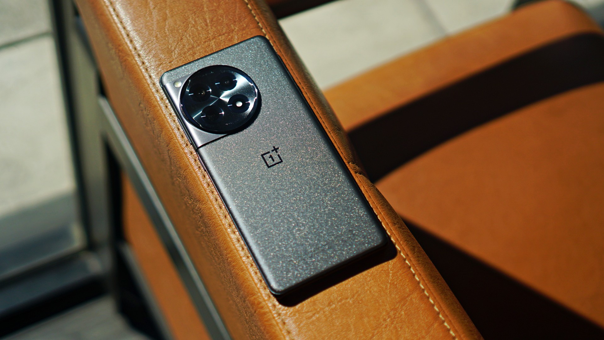
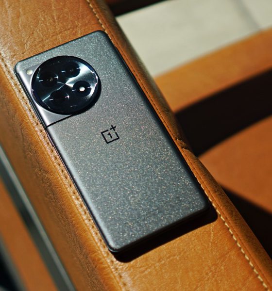
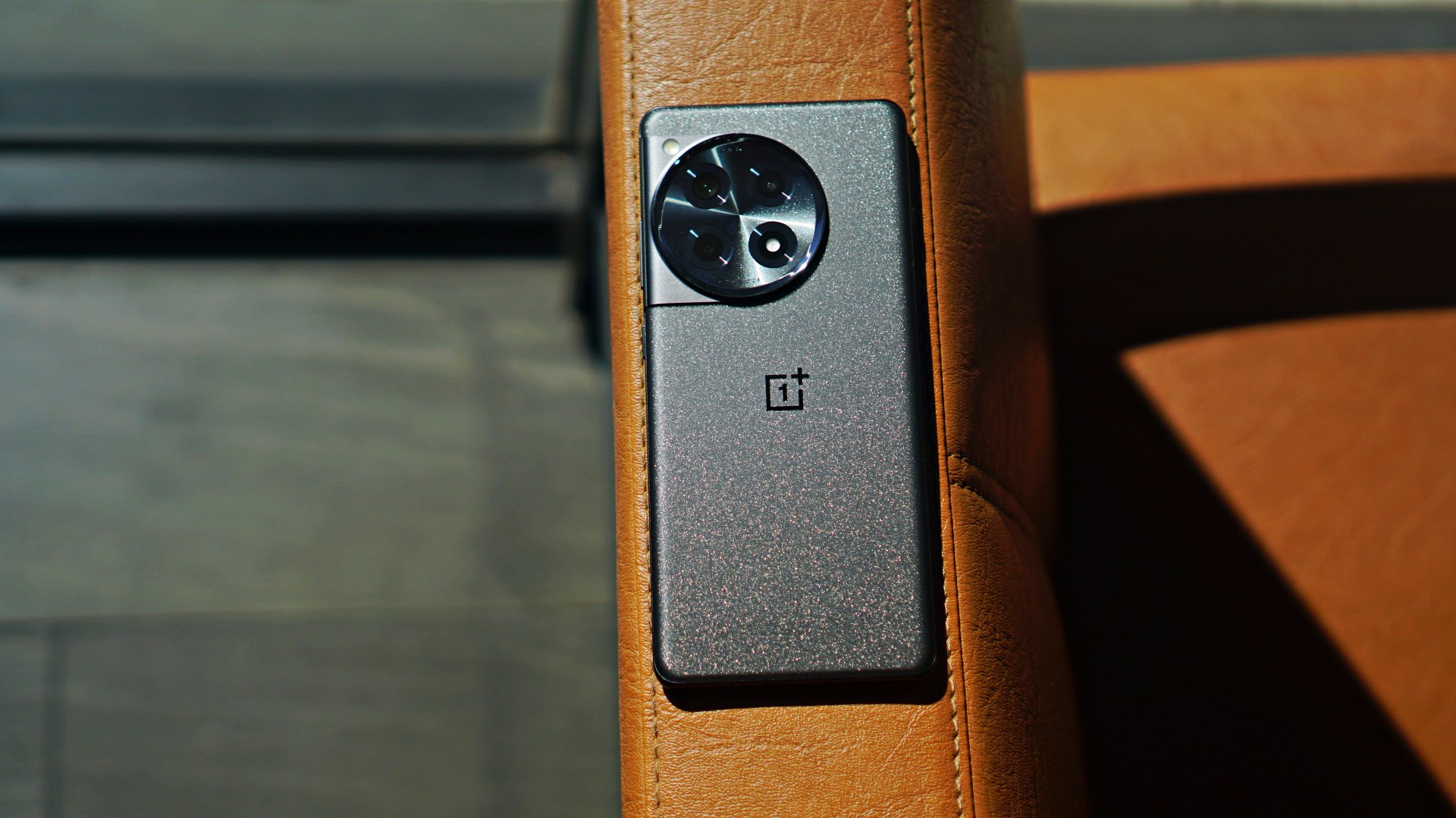
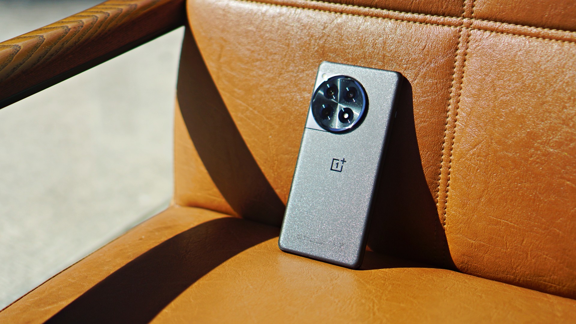
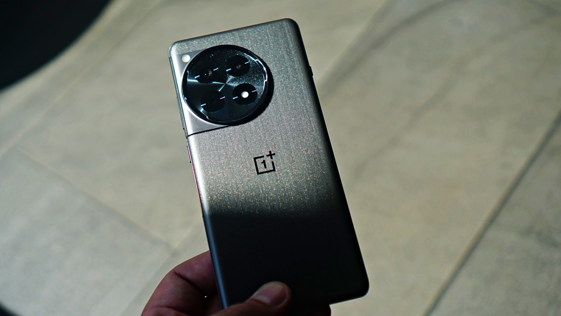
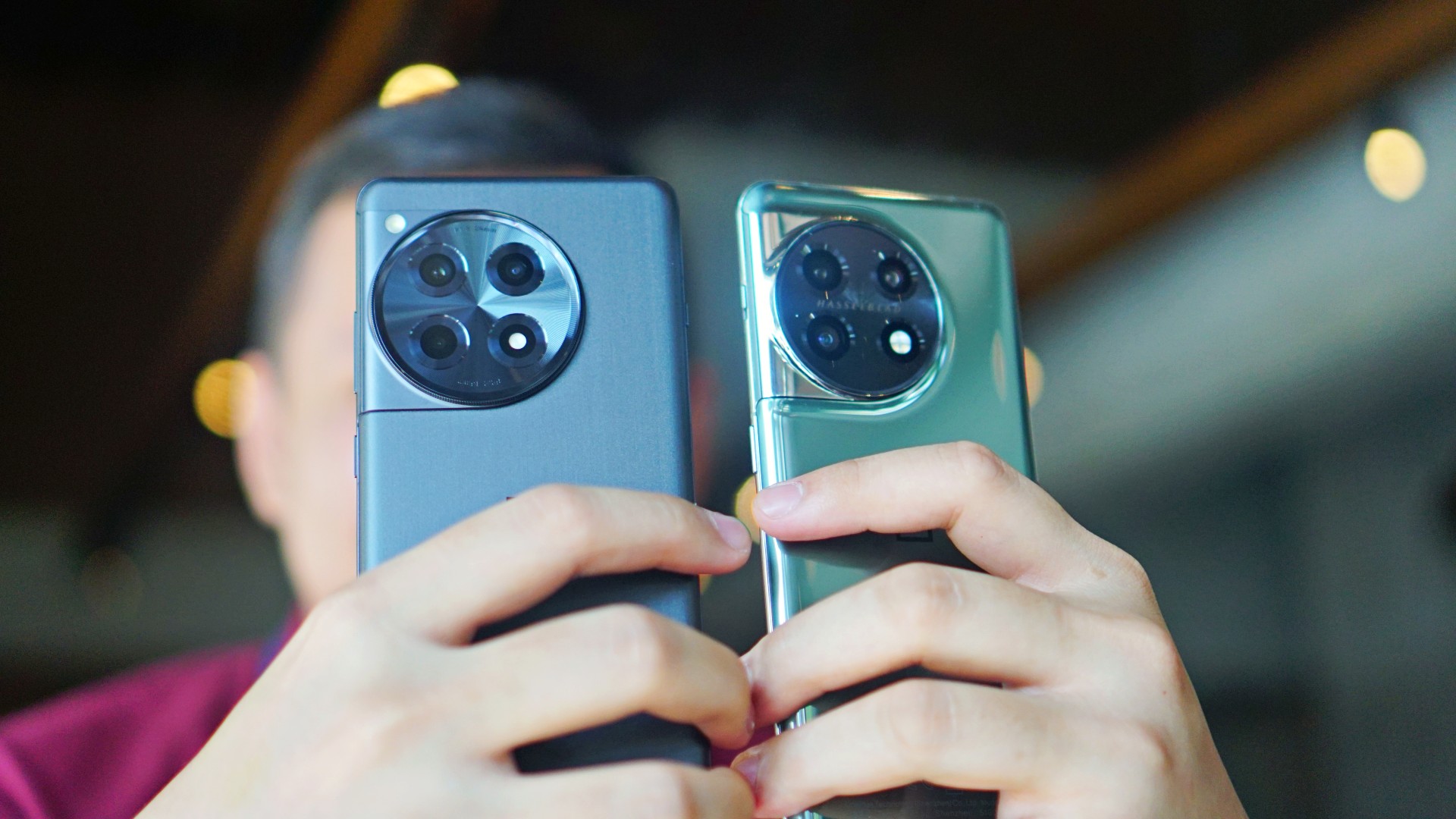
Appearance, feel: Still needs improvements
It’s good that the OnePlus 12R’s volume keys are now on the right. It makes it easier to adjust the volume when held with just one hand.

The alert slider is on the left, and the selfie camera punch hole is in the middle. Other than that, there aren’t many changes. The rear cameras look exactly the same from the OnePlus 11 series.
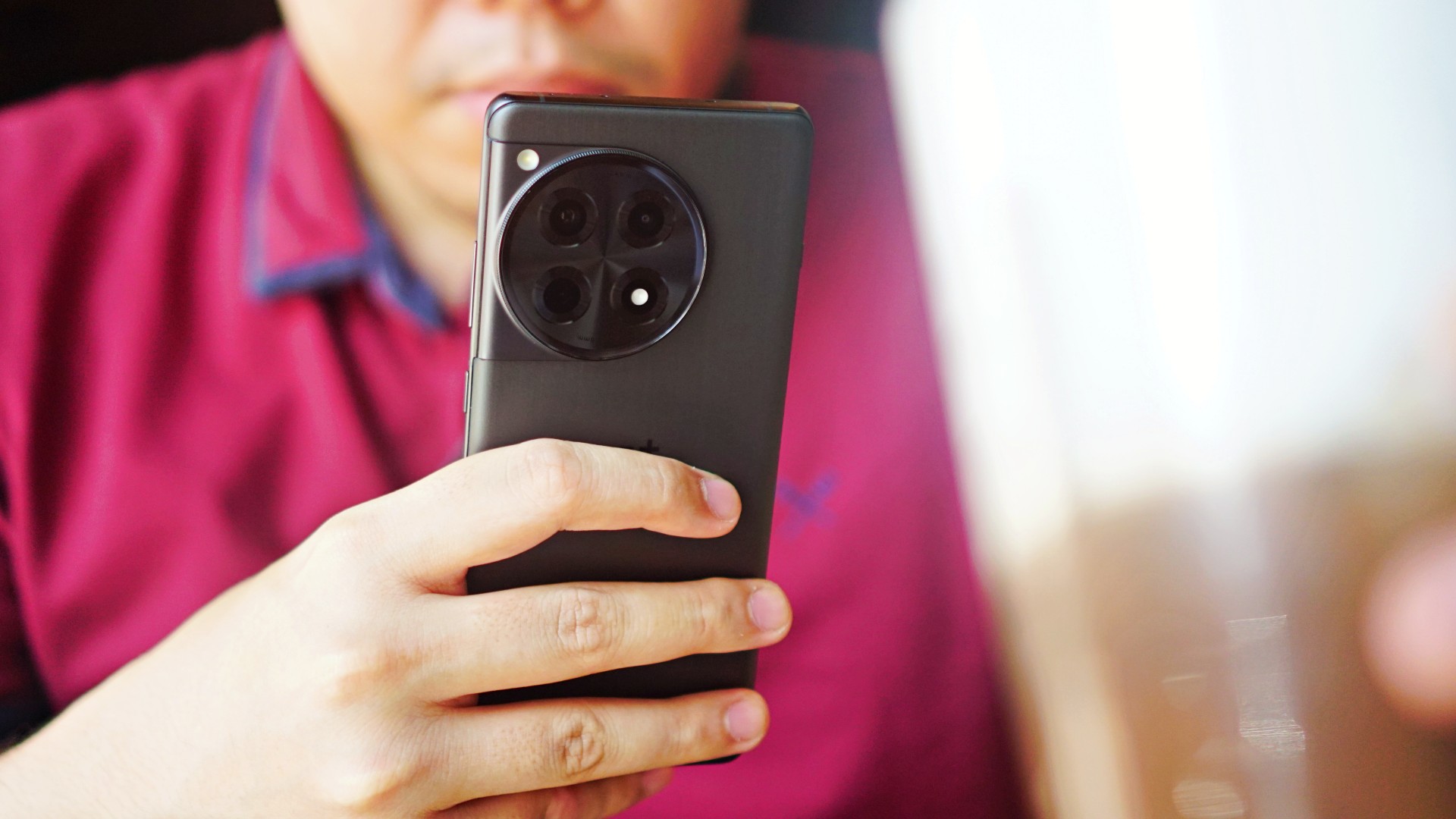
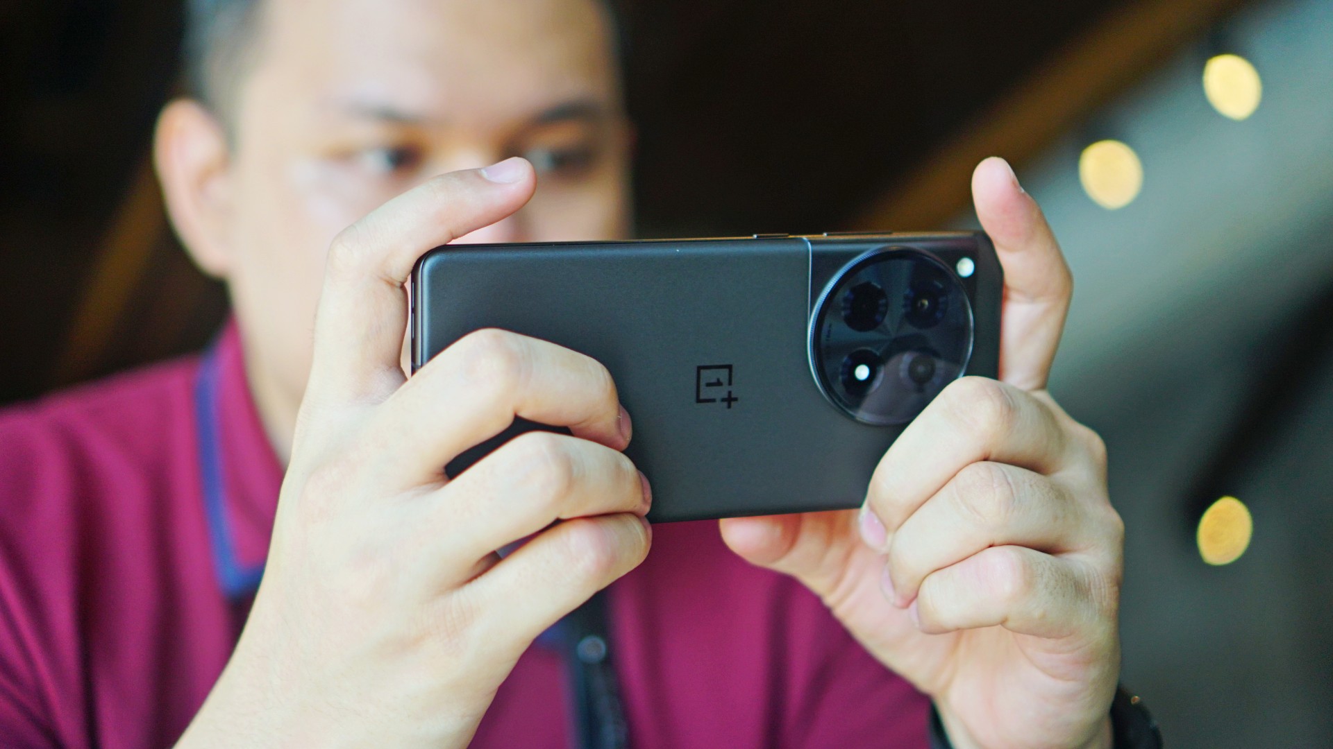
I wish OnePlus solved the slippery problem too. Although the unit we reviewed had a matte black finish, it was still slippery to hold. I’m sure most users have this habit of putting their phones on their laps from time to time. I wouldn’t recommend doing that with this particular model.
It will fall 100% of the time. Furthermore, it doesn’t help that there is no case to at least reinforce the grip. I was extra cautious every time I held the phone, because it just didn’t give me that assurance I was looking for.
Display, audio: Immersive, punchy

Moving on, the device’s display is bright as it gets. You will see content with a more natural tone. Details are vivid and crisp, and are retained even in bright and dark spots. Even when you zoom in on a 2160p video being played, you are guaranteed clear and accurate images. Moreover, I didn’t experience any eye strain while doing a handful of stuff on the phone. That’s always a great sign, but is expected of more expensive phones nowadays.

On the audio side, the dual speakers provide you with an immersive feel. The sound comes out loud and punchy. They’re also placed appropriately. Even when you hold the phone horizontally for streaming or gaming, chances are you won’t block the speakers with your fingers.
Performance, browsing, gaming: Smooth AF
Performance wise, the OnePlus 12R is good as advertised. You will feel the smoothness right away when scrolling, switching between one app to the other, and more. This annoying thing that happens with Android phones lately where the keyboard just suddenly hangs on your screen didn’t occur once with the OnePlus 12R.

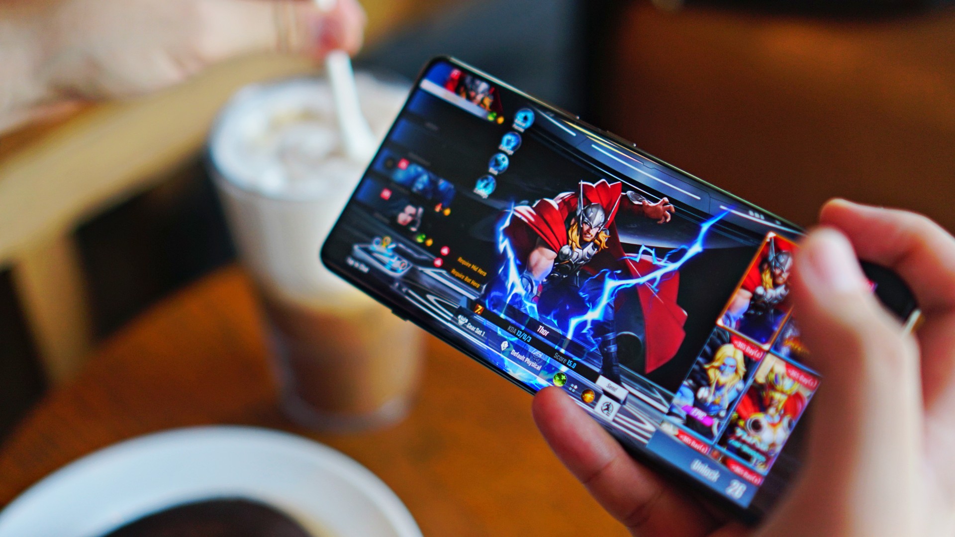
I also played Marvel Super War, easily one of the most demanding MOBA titles out there. The phone did not get hot even after a lengthy session at high graphics settings. That’s where the upgraded RAM capacity kicks in. But I feel it’s something the OnePlus 11 can also do, so it isn’t downright special.
I love the larger battery on the OnePlus 12R. It easily lasts a whole day on average usage. You’ll need just about 40 minutes to charge it from 15% back to full. When not in use, it will spend probably just 1% to 2% battery overnight on standby.
OnePlus 12R cameras: Hit and miss
- 50MP f/1.8 Sony IMX890 main camera
- 8MP f/2.2 ultra-wide camera
- 2MP macro camera
- 16MP selfie camera
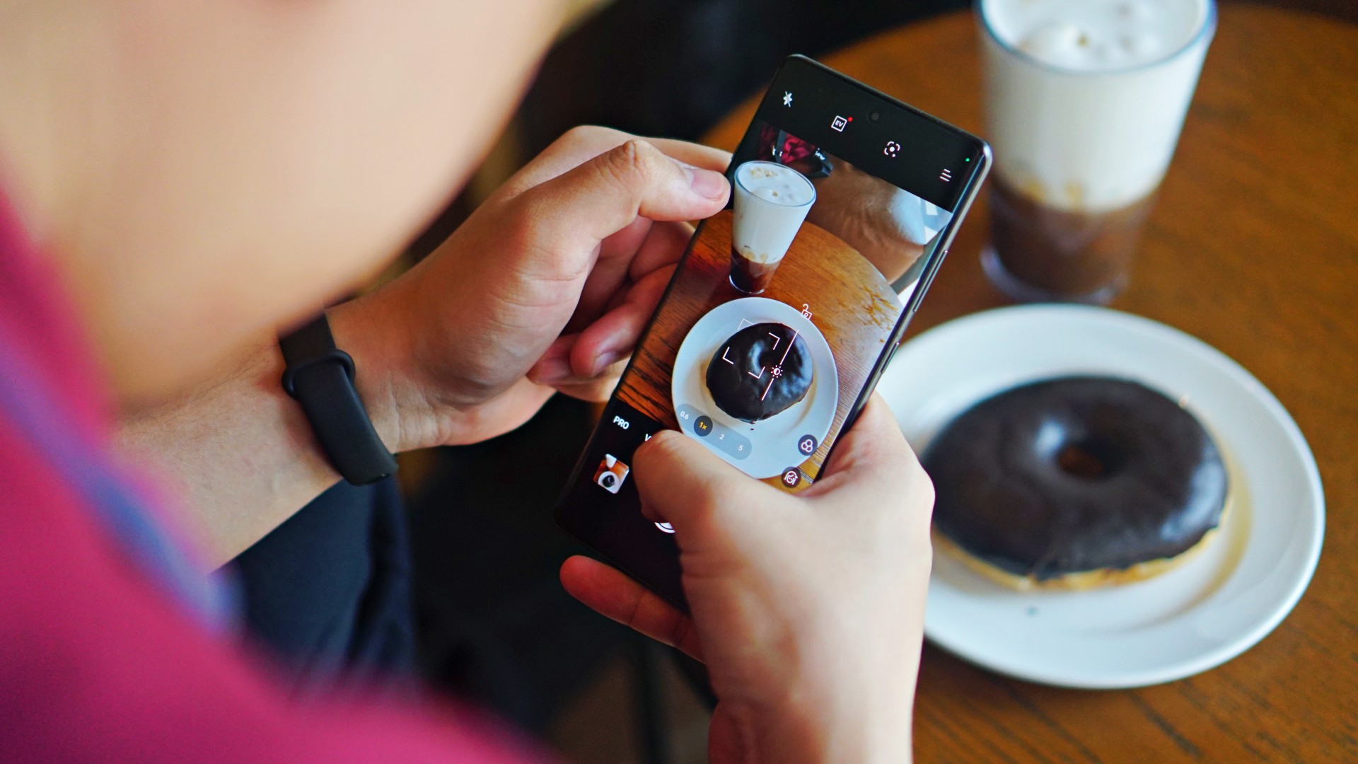
Although OnePlus has a partnership with Hasselblad, the OnePlus 12R particularly uses a Sony IMX890 sensor for its main camera. It delivers fairly well for what is expected of a OnePlus camera. Color reproduction is very… well, OnePlus (you’ll understand if you’ve been using OnePlus devices in the past).


The tone is more on the redder, browner, and slightly more saturated side, which is ideal for food and landscapes. You’ll definitely capture the vibe of places and entice viewers with your food photos. This is without needing to post-process the color temperature or add filters.

The main camera does its job. It retains good detail even in captures against the light, thanks to its high dynamic range. It does well to fend off the sun’s rays or unwanted glares, and blend it with the photos you take.


You will get crisp and vivid photos by default, but detail loss will begin to be felt at 2x zoom and beyond. But it’s not like that’s super noticeable from your phone’s screen.


What I appreciate is the adjustable depth of field after portrait shots, for you to be able to match the background’s blur or bokeh effect properly with the subject. Speaking of, I underwent a trial and error phase under portrait mode. Some snaps came out out of focus, even if the indicator said “ready.”


But I reckon it’s not a perfect process, so I just adjusted on the fly. However, I did expect a lot more assistance from the camera especially since there’s some AI processing that comes with the algorithms. There were also times where the blurred effect at f/1.4 was too exaggerated, as if it’s cartoonized. On the positive side, there’s not much segmentation error and the transition from focused to blurred parts is generally smooth. But it would be tricky for users who aren’t too meticulous adjusting settings and would just rather point and shoot.

Other than that, I enjoyed shooting cityscapes and landscapes with the 8MP ultra-wide lens. There’s just a “correct” feel to it and it covers what you intended to do properly. The 2MP macro lens is extraneous at this point, since the main camera does pretty well for close ups of food and other subjects. I wouldn’t have hurt for OnePlus to include a periscope lens or an extra portrait sensor, considering its price point. As for filming, the camera package also has OIS and EIS support, and taking videos at 1080p @ 60fps had no hiccups on my end.


In front, the selfie camera delivers the same, “realistic” results as its predecessor. This may both be a good and bad thing for those who want smoother selfies instead of having their pores or eyebags come out too sharp. Personally, I prefer some smoothness with selfies, but a little retouching won’t hurt. You do you.
Is this your GadgetMatch?
As I’ve mentioned, OnePlus is consistent with how they approach the market. Loyal OnePlus user? You may feel this is an upgrade if you’ve been using a handset from two to three generations prior. Trying something new to break the iPhone-Galaxy S series duopoly? Go ahead, there’s no harm trying.
The OnePlus 12R is smooth, without a doubt, if that’s what you’re looking for. The camera package delivers the same signature performance expected of the brand. On paper, there are a lot of improvements. But is it worth it? It’s tough to say yes resoundingly.
If you happen to own a OnePlus 10 or 11, the differences in overall usage are minute. If you’re ready to spend PhP 40,000 or more, there are a lot of options that come with more cameras or put focus on gaming. Alternatively, if you want to save, there are also capable flagship killers in the market for a lot less. Moreover, other top brands’ flagships — base model or better — are selling for a lot less these days.
That makes the release of this particular variant from the series a little confusing or questionable at this point. Perhaps, it would have been better if OnePlus waited a bit more and dropped a banger of a latest flagship line with a lot more features and enhancements. I’m trying to make sense of it, but for now, it’s best to wait.
The OnePlus 12R retails for PhP 43,990 in the Philippines.
SHP: https://bit.ly/OnePlus-12R-Shopee
LAZ: https://bit.ly/Oneplus12R
Kiosks and partner Stores: http://bit.ly/3O9q76V


THE Michael Josh puts AirTags in his bags, suitcases, keys, heck, even his TV remote.
They’ve saved him many times and keep anxiety at bay when it comes to delayed or missing baggage.
And just about last month, Apple announced a new model — the same size, shape, and price. But, it comes with a whole bunch of improvements that make it more findable.
So, should you rush out to get the new ones? In this review video, we test the range and sound of the all-new AirTag 2 in the real world.

As someone who tells stories for a living, I’ve always stood behind the camera.
I know all too well that I’m exceptional at framing people and landscapes, capturing moments that make sense later.
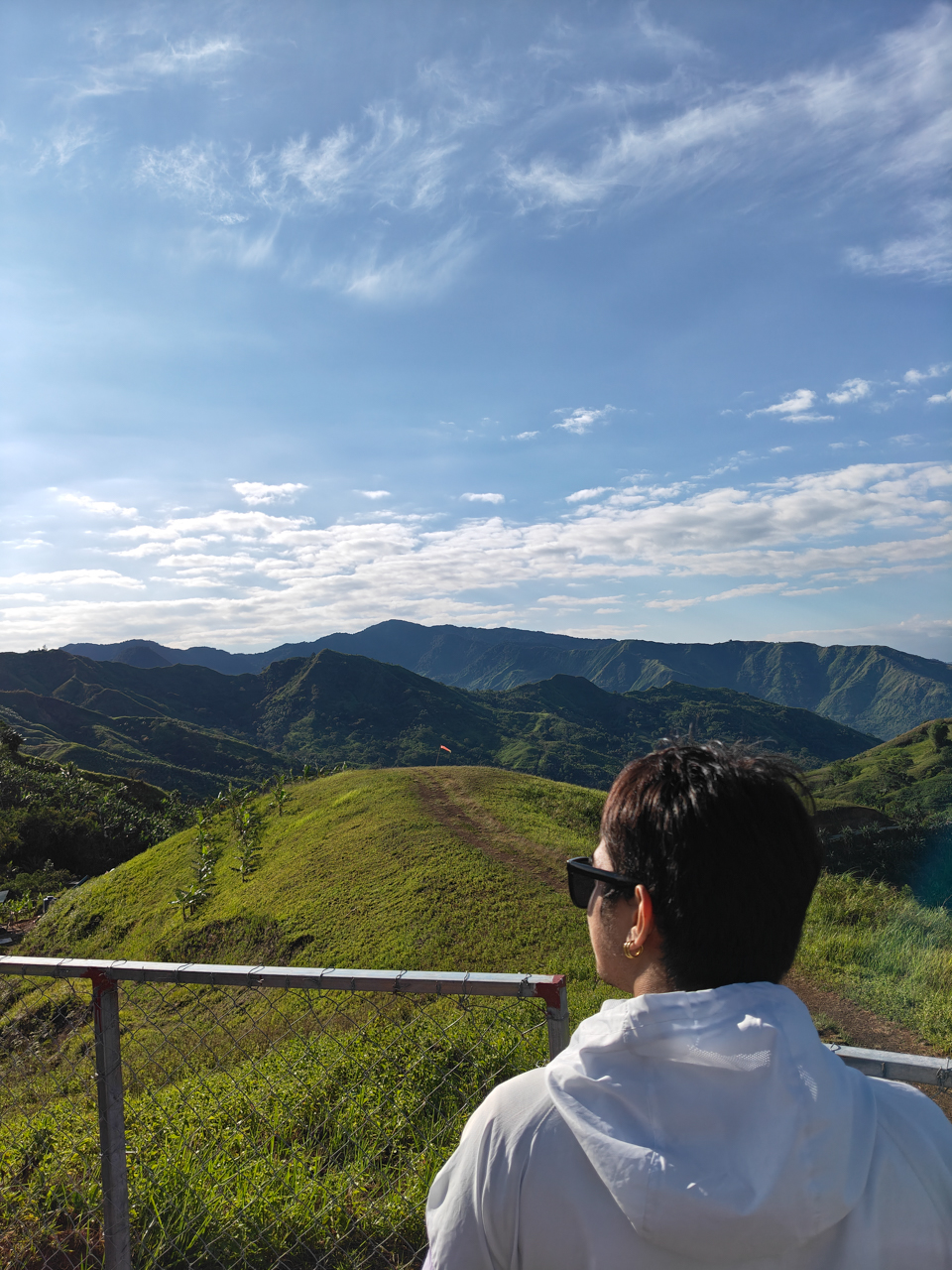
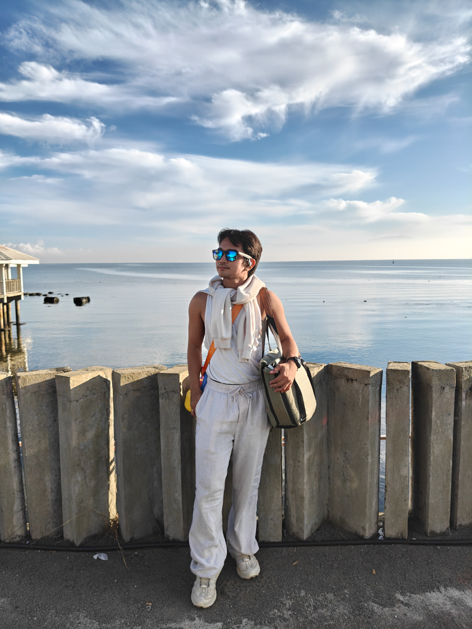
When I flew to Northern Mindanao, I told myself I was going for a change of scenery. I wanted to exist inside my own narrative, too.
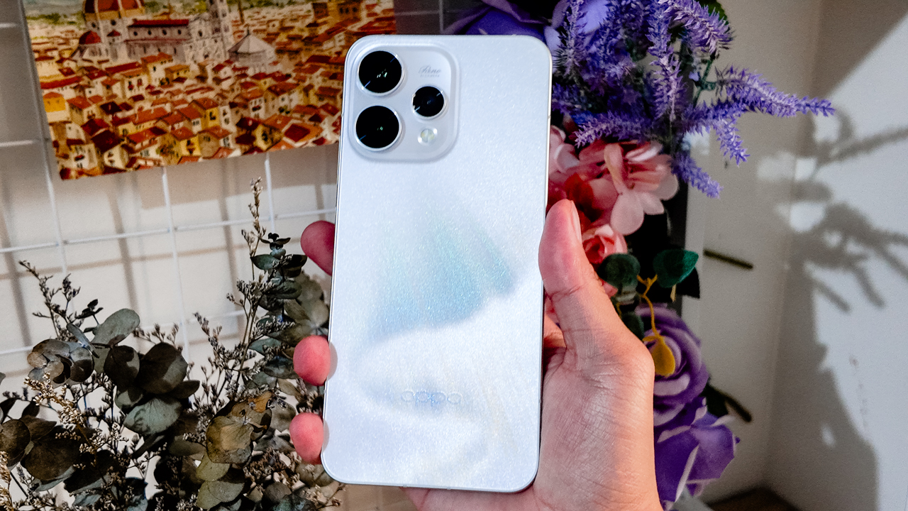
Bukidnon became the perfect backdrop for getting to know myself in and behind the frame. In my pocket was the OPPO Reno15 5G in Aurora White.
There were no expectations of the smartphone being part of the story. I just wanted to see if I could trust it to document my adventures.
Surprisingly, it did.
Refinement over noise
I’ve always been drawn to designs that stand out. Covering the Reno series from its earliest iterations up to the Reno15 has been a hallmark of my career in journalism.
I like pieces that catch attention. As a Leo, I’ve always loved it — in how I dress and in the items I carry. In the past, that meant bold finishes and loud statements, much like the Reno lines before this.
As I grew and aged gracefully, my taste evolved. I still want to demand some form of presence. I just don’t want it to feel abrasive.

The Reno15 demands attention without being loud. The Aurora White finish looks clean and polished from afar. Up close, the surface shifts under light and a shimmer reveals itself only when you move it.
The glass back flows seamlessly into the camera module, so the silhouette feels cohesive rather than decorative. It still carries that flat-edge familiarity people love to compare to an iPhone, and I get why.
In hand, the Reno15 5G feels substantial at 197 grams, yet it never became uncomfortable during long days of recording across different adventures.
The 6.59-inch frame sits comfortably when I’m scrolling one-handed or holding it up to film while moving, like when I rode a 4×4 to a ranch, gripping it tightly as rough terrain threatened to jolt everything out of place.
That said, I live actively. I move between environments without babying my devices. My arsenal looks like gear ready for battle, and that sums up what I need from a smartphone.
The Reno15 5G’s IP66, IP68, and IP69 protection means this beauty is tougher than it looks. It resists dust and handles water exposure. Add Splash Touch support, and even slightly damp fingers don’t interrupt what I’m doing.
Light under pressure
For someone who practically lives under the sun, the display became both a companion and a challenge.
When I was filming in open fields, the Reno15 5G’s screen sometimes struggled against harsh midday light. Even at 1200 nits in high brightness mode, the glare could be relentless.
I found myself stepping into pockets of shade, tilting the screen at careful angles, squinting just to confirm whether a shot was framed properly.
On days when there was no escaping the sun, I trusted the camera and my instinct for composition. I mounted the phone on my Ulanzi tripod, positioned myself in the scene, and focused on performing rather than obsessively reviewing every second.
There was a learning curve, but it reminded me that sometimes you have to let the moment unfold and stitch the story together later from whatever you captured.
Now Playing: Undercover Hong
My life as a creative director isn’t all shooting and exporting. I consume as much as I create. Inspiration has always come from film and television.
Lately, I’ve been watching Undercover Hong on Netflix, with Park Shin Hye playing Hong Keum-bo, an elite securities inspector who goes undercover as a rookie employee inside a suspicious investment firm.

Set in 1997 Seoul during the Asian Financial Crisis, the series commits fully to its time period. The palette leans into muted browns and dusty blues that echo economic tension.
Interiors feel dim and textured and office spaces look rigid. The fashion reflects the late ’90s without turning into a costume. Nothing is polished for surface appeal because everything feels rooted in its world.
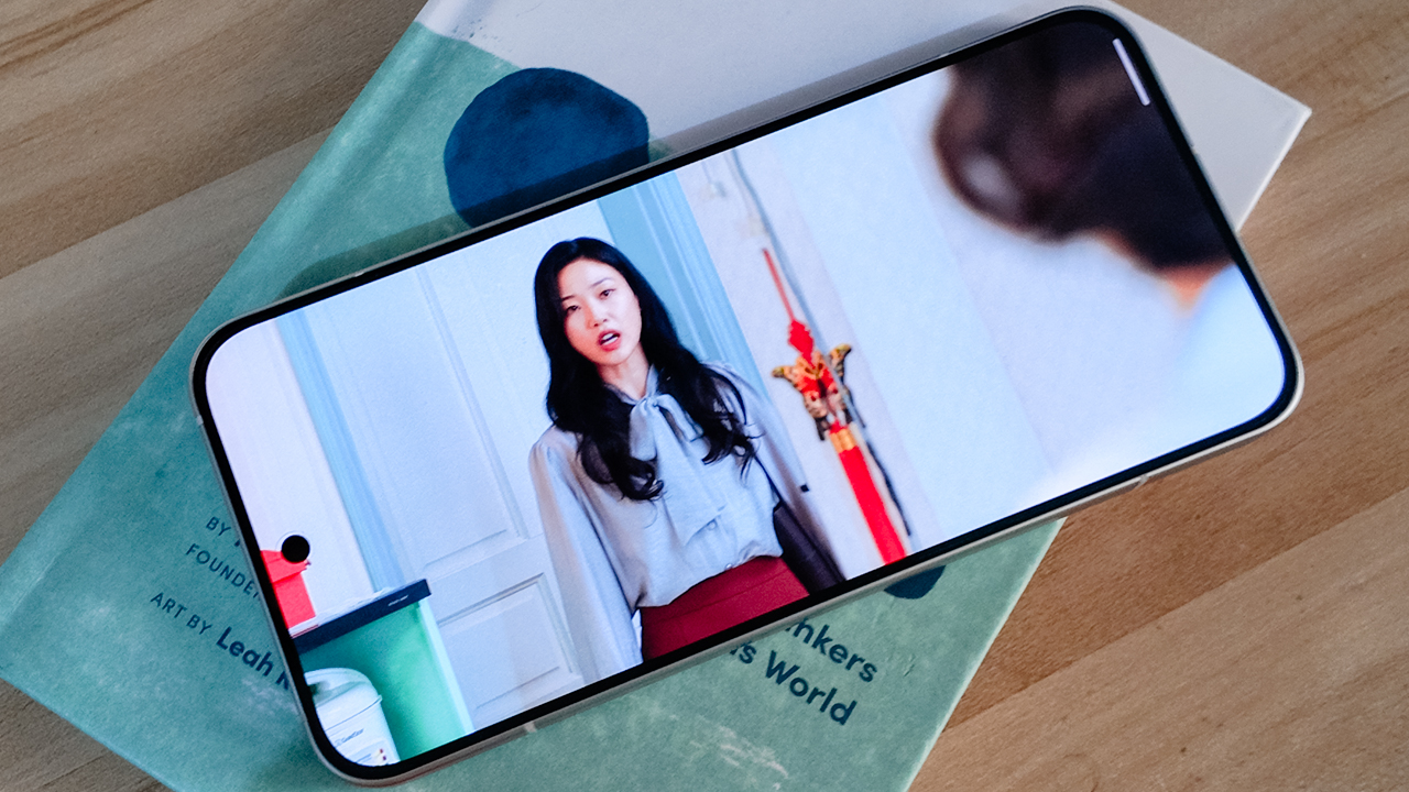
On the Reno15 5G’s 6.59-inch AMOLED display, those tonal differences came through clearly. Dark scenes retained shadow detail instead of collapsing into flat black, while warm tungsten lighting looked rich without veering orange.
Beyond inspiration, I trim clips and scrub through footage I captured during my trip. The 120Hz refresh rate makes swiping and scrubbing feel fluid.
Where nothing lags
As someone fond of flagship devices like my OPPO Find X9 and iPhone 16 Pro, I know immediately when a smartphone feels like a compromise. The OPPO Reno15 5G is technically midrange, yet it never felt like one.
From setup to day-to-day use, everything felt smooth. Apps opened quickly so I switched between shooting, editing, messaging, and uploading without hiccups.
My neurodivergent brain appreciated that it could keep up with the constant mental tabs I have open.
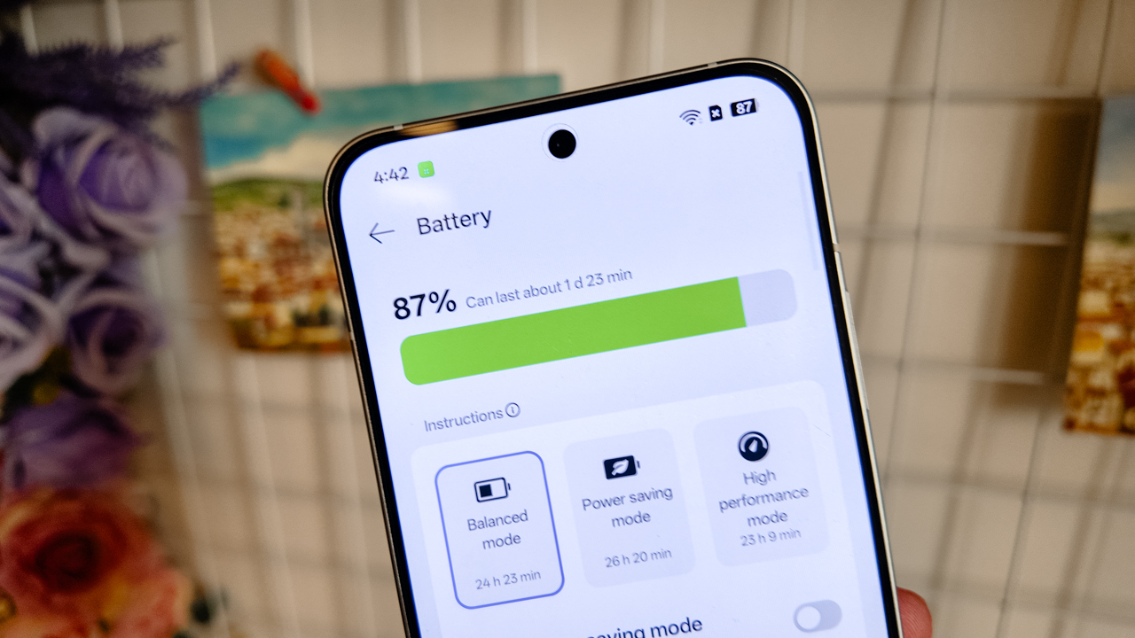
The 6500mAh battery lasted about a day and a half after shooting across cities and mountains. Charging took around 45-50 minutes from zero to 100% with 80W SUPERVOOC.
What I appreciated most was O+ Connect. I’ve used it before on the Find X9 and previous Reno devices, and it continues to make my workflow seamless.
It’s no secret that I exist deep within Apple’s ecosystem. My MacBook Air, iPad Pro, and iPhone 16 Pro are cross-functional tools for my work. I even switched to Apple’s Creator Studio.
Using the Reno15 5G as my primary content device during testing could have felt disruptive. Instead, O+ Connect allowed me to move files across devices easily.
I treated the Reno15 5G like a mirrorless camera, then refined everything on a bigger screen.
A playground for precision
Artificial Intelligence has ingrained itself into our devices in ways that don’t always feel natural.
I’ve seen AI productivity tools work well for people in high-pressure professions. For me, efficiency doesn’t mean teaching a system how to think before it works for me.
What stood out in the Reno15 series was AI Mind Space. It allowed my scattered brain to consolidate screenshots, schedules, references, and fragments of information into one hub that actually mirrors how I operate.
As someone who saves everything for later, it felt less like automation and more like organization that understands me.
Then there’s AI Motion Photo Popout. As a creative director, I don’t like posting stories the way everyone else does. I have a desire, deep in my bones, to stand out.
Popout lets me lift subjects out of the frame and turn them into layered visuals. I used it for Instagram Stories and thumbnails instead of settling for a random still from a Reel.
Being able to refine directly in the Gallery — erasing distractions or turning motion into cinematic snippets — meant I could act on impulse without sacrificing my love for curation.
Learning to be seen
During my time in Northern Mindanao, I stopped pretending I didn’t want to be in the photos.
For the longest time, I’ve been more comfortable orchestrating the frame than occupying it. I knew where to stand and how to direct, or where the light should hit… but for everyone else.
This past year, I’ve been learning to own the space I’m in and not dimming my light simply because I’m afraid of how bright it might be.
The OPPO Reno15 5G’s 50-megapixel ultra-wide front camera made that easier than I expected.
I told OPPO’s Creative Manager in passing that I genuinely liked the new hardware when he asked how the experience had been so far, and I meant it.


The wider field of view meant I didn’t have to overthink whether everyone fit into the frame. I didn’t have to do that subtle, Gen-Z arm stretch or step back awkwardly just to make room for the scenery.
I could capture more of the background without looking hideous in the process. The frame felt immersive, yet balanced: Faces looked natural and proportions didn’t warp.
There’s something powerful about not having to choose between yourself and the scenery. You can be the subject, or you can be part of the story. With this smartphone, you’re allowed to coexist with both.


I even asked my photographer friend, Neil Jimenez, to take my portraits using the 50-megapixel telephoto portrait camera.
Holding still in front of the lens felt unfamiliar. I tried to remain statuesque, composed, trusting him to see what I usually see in others.

The portraits came out vivid without distortion. The backgrounds softened, but never stretched or exaggerated.
It was strange to watch myself in those frames. To notice how the light rested on my cheeks, and see how my smile shifted when something genuinely amused me. To observe expressions I never see because I’m usually the one observing.
There’s another side of you that only appears when you let yourself be seen.
Behind the lens where I’m most comfortable
If being in the frame felt vulnerable, being behind it felt like home.

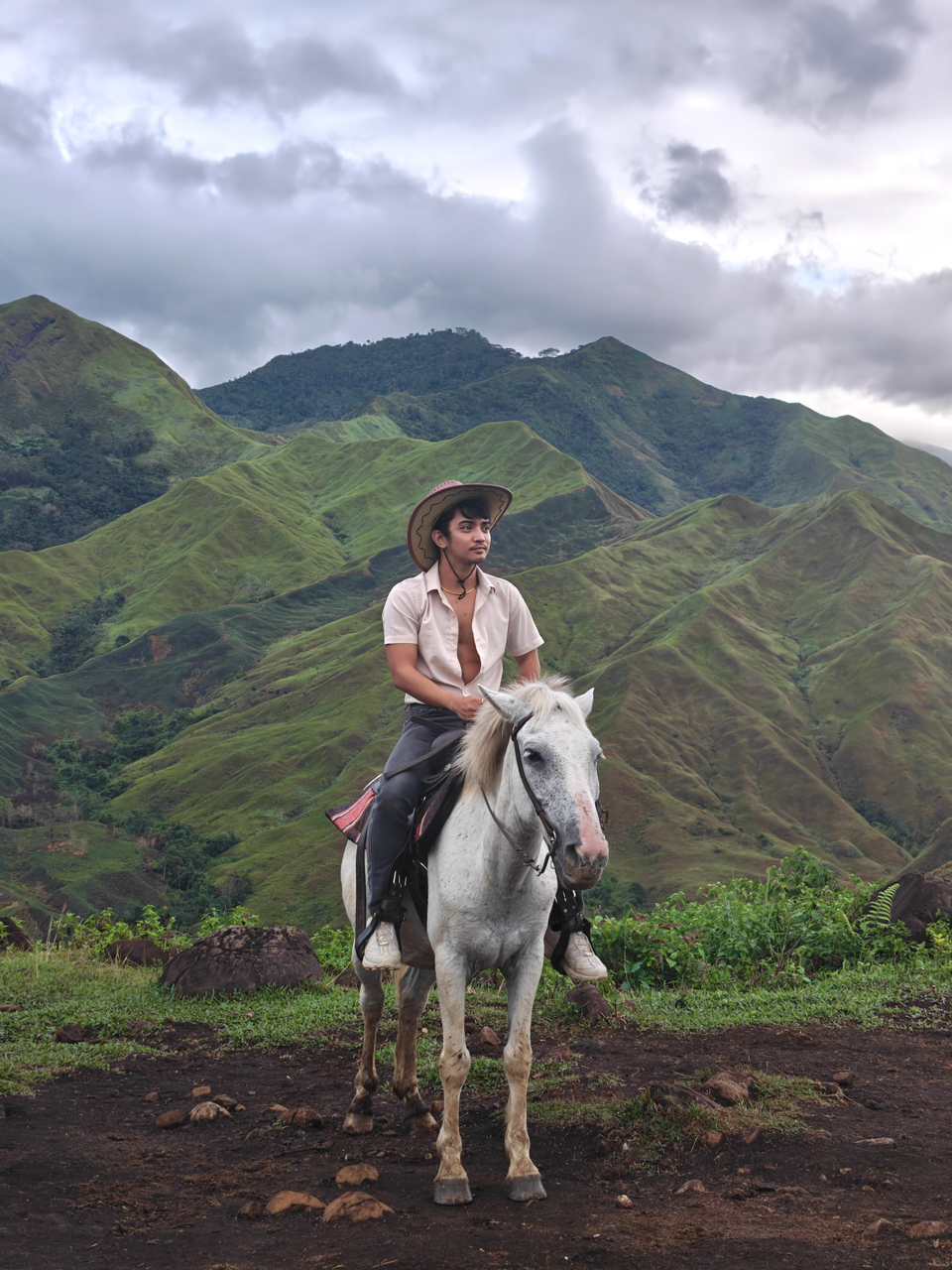
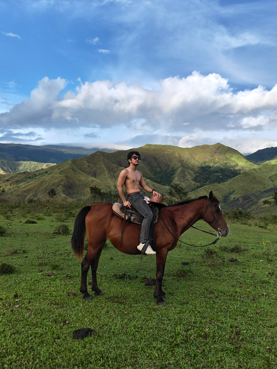
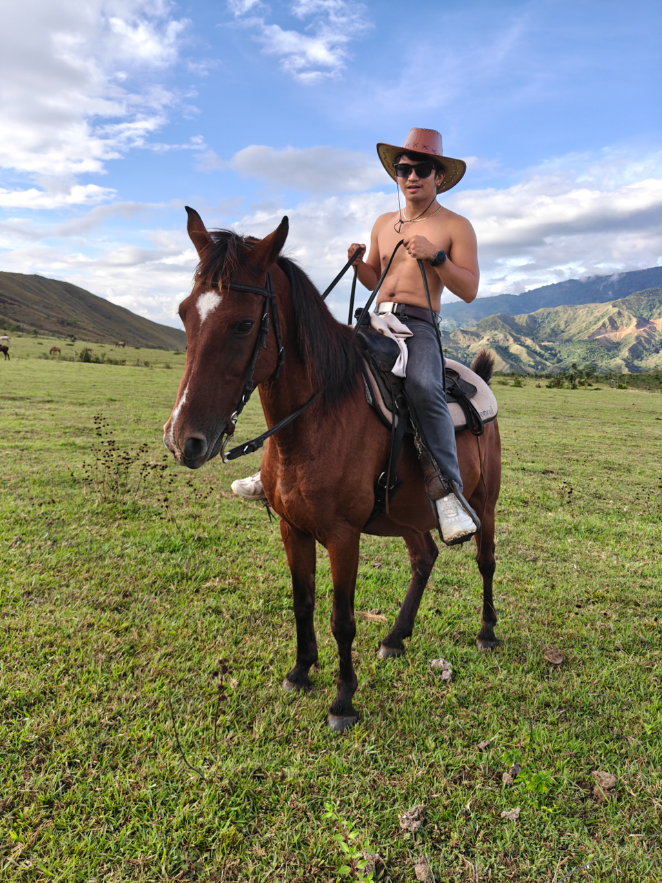
Bukidnon still feels like a dream when I replay it in my head: Horses moving across open fields, mountains layered into one another like watercolor washes.


I shot wide and then cropped in. The main camera gave me enough details to experiment. Whether I stayed at 1x or zoomed into 2x or 5x, I shaped the narrative the way I wanted people to experience it.
I framed lines and symmetry, and leaned into negative space. I played with contrast, like the way Alpine Village’s architecture stands against the surrounding greenery in Dahilayan.


There was room to explore. Room to make mistakes. It felt like the device in my hand wasn’t just a tool, but a collaborator responding to the way I see the world.
Filmed and directed by yours truly
After leaving the love of my life last year, I began documenting my trips. Maybe it was for content or healing. But I started treating my life like a film I had to direct and star in.


Acting in your own story while directing it at the same time is harder than it sounds. It requires vulnerability and believing that your perspective is worth documenting.
Bukidnon became my practice. I recorded clips using the OPPO Reno15 5G in 4K HDR because I wanted the footage to be stable and detailed even when I was moving.
I remember stressing over file sizes, wondering if I had overcommitted to quality. But when you care about storytelling, you’d rather have too much detail than not enough.
There were pine-lined roads. Snippets of conversations. Landscapes that felt cinematic without trying. And of course, me being a dramatic, slightly unhinged main character like I was starring in a Taylor Swift music video.
Getting out of my comfort zone meant taking the Reno15 5G — mounted securely on a tripod — to a 350-meter zipline ride. For a brief moment, I imagined I was Elphaba flying away from the Emerald City.
View this post on Instagram
I also brought it to the Razorback ride, using Dual-View Video to record the mountains stretching in front of me while capturing my own reaction at the same time.
I’ve done something similar during an ATV ride in Bohol, but this felt different. Higher stakes (and chances of falling if I abruptly stop). Faster wind (and a cold one, because we’re high up in the mountains). More nerves (because I’m not in control).
View this post on Instagram
I was terrified. The accelerator felt awkward under my control and the seatbelt didn’t feel secure. I’m short, so even sitting comfortably required adjustment.
There was a moment where I questioned whether I had overestimated my courage. But I survived. This story is published. The video is up.
Sometimes, being able to capture how a place made you feel — not just how it looked — is priceless. Vulnerability and honesty matters.
The courage to step into your own frame matters. It just helps when the device in your hand is capable enough to keep up with the story you’re brave enough to tell.
Is the OPPO Reno15 5G your GadgetMatch?
The OPPO Reno15 5G isn’t perfect. Priced at PhP 36,990, it sits a few thousand pesos higher than its predecessor, so the jump asks you to think twice.
What you’re really paying for is refinement. It has smarter AI integrations and a more cohesive overall experience.
But here’s the thing: this is the first Reno in a while that feels grown up. It makes storytelling easier for people who live half their lives online, with a camera system and performance that feel steady enough to rival devices in higher tiers.
So if you’re wondering whether it’s your GadgetMatch, consider a Swipe Right if you’re a content creator who values camera versatility, especially a strong front camera. If you move between Android and Apple ecosystems and need something that lets you shoot, edit, and publish on the go, this fits that workflow.
Swipe Left if you’re extremely price-sensitive or if you rarely go beyond basic point-and-shoot and don’t see yourself using the AI tools built into the system.
The OPPO Reno15 5G won’t transform your life. But if you’re already in the middle of writing your own story, it’s a dependable co-director and co-producer.
And sometimes, that’s all you need.
Nothing can beat the burden of being a remake or a remaster. Besides providing an enjoyable experience by itself, a remake or a remaster constantly has to justify its own existence: Why did this piece of media need to be rereleased? For some, it’s a no-brainer, such as the ongoing Final Fantasy VII remake series. For others, it’s a lot less clear, such as the many, many times there’s been an uber-mega-definitive edition of The Last of Us and Skyrim.
Now the third of its kind, Yakuza Kiwami 3 is inching perilously close to a point where it’s hard to justify why we need another remade Yakuza.
Continuing the series
Yakuza Kiwami 3 is a remake of the third entry in the Like a Dragon series. The original Yakuza 3 was the first one in the entire series to be developed for the PlayStation 3 era. Compared to the first two games, it features a lot more content and, on its own, can be considered a modern RPG by today’s standards.

Story-wise, it’s also a turning point for the series. Though Kazuma Kiryu already took the young Haruka under his wing by this point, Yakuza 3 is the first where the series protagonist tasted a life outside of the criminal underworld.
Being such an important milestone for the franchise, a Kiwami remake seems like the best or the worst idea.
(For reference, “Kiwami” refers to an ongoing series of remakes that rebuilds the classic Yakuza games with a new engine that began in Yakuza 0.)
When a new coat of paint doesn’t really help
Yakuza 0 came out in 2015. That means the studio has been using the same engine for over ten years. The engine is starting to overstay its welcome, especially in the Kiwami series.
Despite being built with PlayStation 3 technology, Yakuza 3 still had its limitations. For one, 1080p was just becoming a standard by then. Cutscenes had to be smaller and, thus, more tightly shot. But ultimately, the limits resulted in a more cohesive game that maximized what it worked with. Yakuza 3’s Kamurocho feels alive, and you never know what’s waiting behind the next corner.
Sadly, Yakuza Kiwami 3 does not take advantage of better hardware to update how the game feels. Cutscenes were splashed with a new coat of paint, but the composition remains the same. As a result, they look so empty with so much white space.
They could have added some clouds.
The “improved” Kamurocho also doesn’t feel all that updated. There’s a palpable sense of sameness as you explore through the game. Even Okinawa looks like just an extension of Tokyo. In the more modern games, exploring was rewarding. Even if the game tells you where missions are, there are new sights and new stores to just look at.
Kamurocho is a central piece of every Like a Dragon game. But I don’t think it has to be static, even if it’s just a remake.
That, and I’m just tired of seeing the same character models every time I boot up a Yakuza game.
A few controversial model changes
To be completely fair, the main characters did get some updates. And, of course, there are a few elephants in the room.
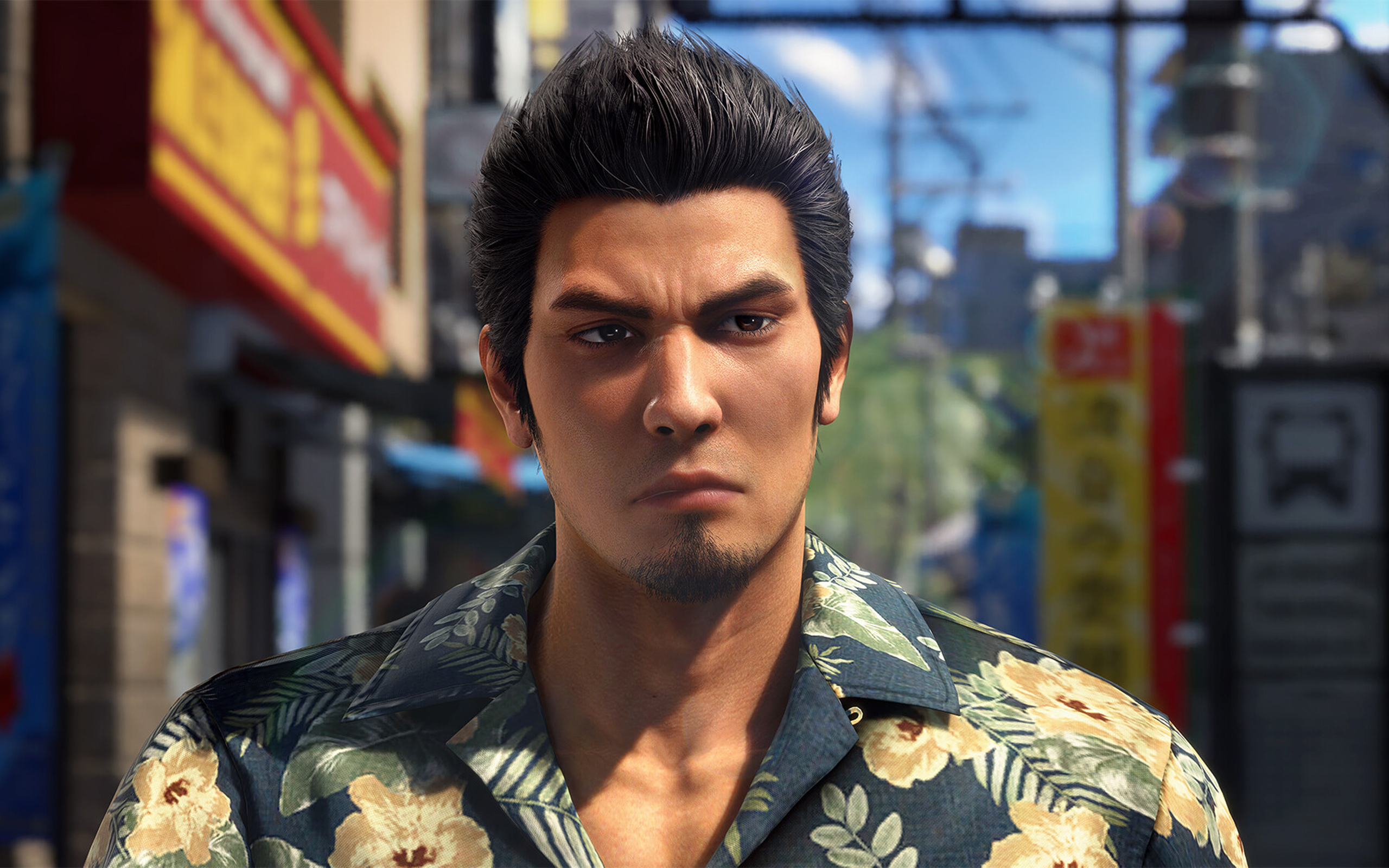
First up is Rikiya, the upstart yakuza from Okinawa. From other media, Rikiya is listed as being around 20 to 21 years old. Now, I’m not a good judge of age based on looks, but the old Rikiya from the original game really doesn’t look like he’s in his early 20s.
Yakuza Kiwami 3 has a new model for Rikiya, one based on Japanese actor Sho Kasamatsu. Others have criticized this decision because the new models looks so different from the original. In my opinion, the change just makes sense; he looks much younger and brasher, just as his character dictates.

Mine also looks like a Japanese George Russell now.
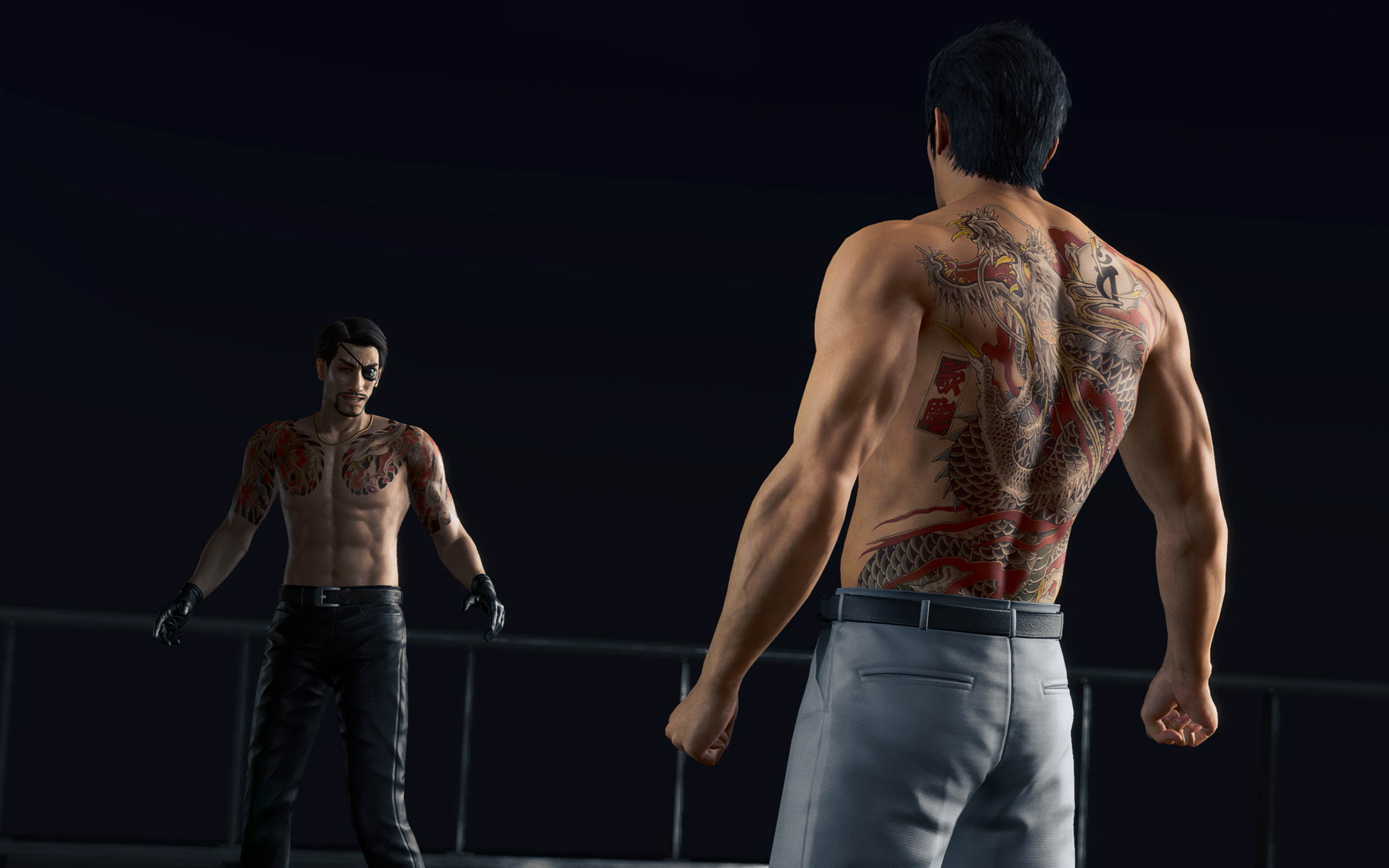
The other change, however, goes beyond just narrative disagreements. Hamazaki, one of the main antagonists in the game, also received a dramatic change. In contrast to his more thug-like looks in the original, the new Hamazaki looks smarmier and more cunning. The problem lies in their choice of actor, Teruyuki Kagawa, who’s had sexually charged issues in the past.
Strangely, the studio hasn’t responded in a way that’s consistent with how they responded to similar issues in the past. Previously, they halted sales just to deal with an issue with a voice actor. This time, the studio’s response boils down to: “Hamazaki is a creep, so we got a creep to play him.”
*shrug*
A pared down experience
Anyway, on to the gameplay.
Despite the concerns I’ve had with how this remake played out, I still had so much fun. My total playtime, according to Steam, is just a little less than 60 hours. This is also the first review game that I’ve earned all achievements for, before its release. It’s inaccurate to say that it’s a bad game because it hasn’t justified itself as a remake.
Compared to the original, Yakuza Kiwami 3 offers a shorter but tighter experience. While the old one had over a hundred and a dozen substories, the remake has only 31 substories to its name.
The remake is perfectly paced. There are hardly any points when I felt that the game was an endless grind.
Dark Ties, the secondary game focused on Yoshitaka Mine, is just as balanced. It has only three main chapters, 13 longer substories, and around 50 bite-sized activities. The story itself just tells how Mine got into the yakuza life and his relationship with Tsuyoshi Kanda (but we’ll get into the story later).
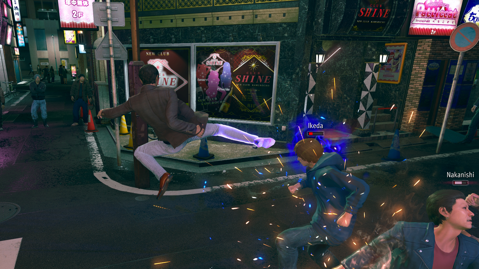
Mine’s fighting style feels smoother than Kiryu’s. He uses quick jabs, kicks, and grapples, similar to Judgment’s Yagami. For me, it’s more enjoyable to beat people up, compared to Kiryu’s slower beat-em-up approach.
Character-wise, Mine is also much colder. Seeing him go through the usual shenanigans of Yakuza’s insane substories is funnier and is much more refreshing because I’ve seen Kiryu go through the same schtick so many times in the past. It’s even funnier that his main goal is to help Kanda rebuild his reputation by doing good deeds around town while pretending to be him.
The side content is much better
As with every Yakuza game, Yakuza Kiwami 3 has secondary game modes that can suck in hours of your time. This time, the main game has two new ones: Morning Glory and Bad Boy Dragon.
Morning Glory is a Stardew-Valley-type mode where Kiryu manages the orphanage of the same name. By doing various minigames, such as sewing and cooking, he increases his reputation as a dad with the kids under his wing.
In the past, I’ve had problems with the franchise’s more laidback game modes, such as Infinite Wealth’s awful Animal Crossing island game. This one, however, is a perfect length. There’s a bit of a grind, but it’s short enough to be completed in one or two sittings.

Morning Glory feels more fleshed out.
The same goes for Bad Boy Dragon. In this one, Kiryu helps a female biker gang become the best biker gang in all of Japan. The gameplay is very similar to Pirate Yakuza’s Pirate Showdowns. It’s all about beating stronger and stronger gangs in combat.
Dark Ties has its own side content called Survival Hell, a dungeon crawler mode. Enemies get stronger with every level, so you have to collect “Gospels” that bolster your strength while inside the dungeon. Once again, it’s much shorter than previous modes of the same type.
All of them are enjoyable without dragging too much of your time. It also helps that you can earn big money by completing these modes. For example, completing Survival Hell’s hardest dungeon can net you over 25 million yen at least.
But, again, do we need the remake?
These are all well and good, but we still haven’t answered whether or not Yakuza 3 really needed a remake.
As I played through the game, it became clearer why we’ve gotten to this point. There are subtle to not-so-subtle changes to the story.
Ultimately, it helps with the continuity between games. It’s like the Rebuild of Evangelion but for the Yakuza franchise. However, I can’t help but wonder if fan service was a stronger motivator than building a more cohesive story.

For example, one of the new substories in the main game involves a fortune teller. When she tells Kiryu’s fortune, she references a major plot point in Infinite Wealth, a game that’s set so far into the future from the events of Yakuza 3. It feels a reference just for the sake of making a reference.
The franchise is getting to the point where there are more references and tapping into old wells than introducing new stories and characters.
Is Yakuza Kiwami 3 your PlayMatch?
As its own game, Yakuza Kiwami 3 & Dark Ties works well as its own game. By now, the franchise has perfected the Yakuza formula. It knows how to deliver an enjoyable experience. I wouldn’t have spent 60 hours on it, if it was a bad game.
However, with a reskin that doesn’t stand out from its predecessors and all the self-references, the game struggles as a remake. If you haven’t played the original, the remake is good to get you up to speed with the franchise’s story. However, if you enjoyed the original, there’s hardly any compelling reason to play through this pared-down version again.
Well, except maybe for the Dark Ties content.


EU wages war against doomscrolling

Are you ready for a more colorful MacBook?
ASUS, Acer PCs are banned in Germany

Apple AirTag 2 Review

Rayman: 30th Anniversary Edition out now

Infinix NOTE Edge debuts: High-end features for accessible pricing

HONOR X9d 5G review: Tougher, more long-lasting and optimized

BYD expands PH presence with entry of DENZA luxury EVs

Now playing: Final Fantasy VII Remake INTERGRADE on Switch 2

Breaking up with Adobe Photoshop after 20 years


-

 Gaming2 weeks ago
PlayStation, LE SSERAFIM Chaewon team for the ‘Love of Play’ campaign
-

 News6 days ago
TECNO will showcase the CAMON 50 and POVA 8 series at MWC 2026
-

 Accessories2 weeks ago
Sony WF-1000XM6 was accidentally leaked online
-

 Reviews2 weeks ago
nubia V80 Max: Long battery, marginal upgrades, casual budget phone
-

 Gaming2 weeks ago
Zenless Zone Zero Version 2.6 launches February 6 with idol group debut
-

 Laptops1 week ago
TECNO MEGABOOK K16s 13th review: No-frills beneath those grills
-

 Gaming2 weeks ago
My Hero Academia: All’s Justice: A familiar Final War, made playable
-

 Gaming2 weeks ago
New Civilization VII update will address everyone’s biggest issue