
Dating
This stimulating ring is divine, I can’t imagine date nights without it
Who would’ve thought date nights can be sexier and spicier?
The following is intended for readers 18+
Cock rings have come a long way: from plastic and metal bands to rubber silicones that vibrate. Now, there’s a cock ring that elevates one’s game. And It’s definitely not the same vibrating, stimulating ring we’ve known.
Meet the We-Vibe Bond, setting out to be a revolutionary cock ring that you can wear outside the bedroom.
But wait, how is it revolutionary?
Vibrating cock rings have been in the market for as long as I can remember. The very first one I’ve owned was a Satisfyer Royal One, which I bought using a coupon from Lauvette — a local adult shop — gifted to me by my confidante on my 25th birthday.
The SF Royal One is different for obvious reasons. First, it’s worn when you’re playing with yourself or when you’re having sex with someone like any other cock ring, vibrating or not. Second, you can’t wear it discreetly since it’s extremely tight when worn around an erect penis.
Meanwhile, the We-Vibe Bond is a wearable ring that you can wear underneath your pants. It wouldn’t hurt your gigglestick and no one would notice you’re wearing one.
Luckily, the restrictions started easing up when the We-Vibe Bond arrived. I started responding to suitors wanting to take me out on a date simply because I missed dressing up and having actual conversations. Also, I’m eager to test the newest cock ring out in the open.
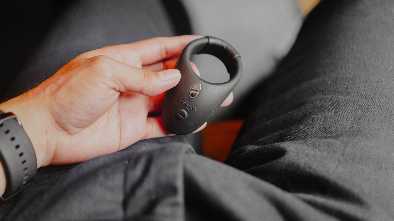
Worn like a ring
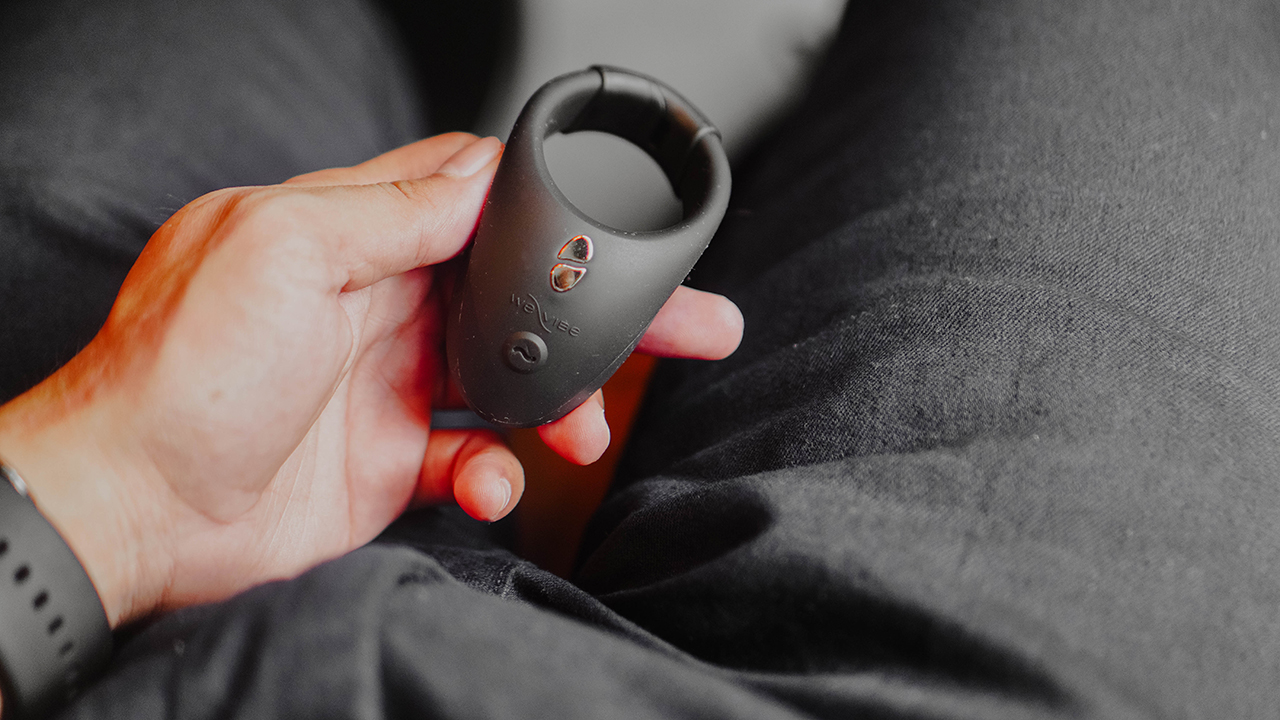
Let’s discuss the specifics first. Right off the bat, you’ll know the We-Vibe Bond is a cock ring. Except it’s curved and looks more oval than round.
This is because the ring is meant to be worn around your penis without creating a bulge that would warrant attention. So as not to arouse any suspicions that you’re having discreet vibrations underneath. And also, the shape aims to stimulate both the penis, your testicles, and the perineum.
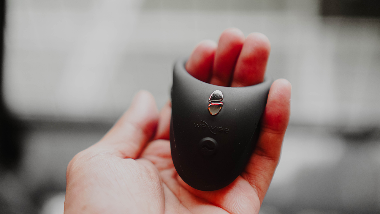
The silicone felt soft to the skin. It’s comfortable, but the material used attracts lint from your underwear or any fabric you use under your pants.
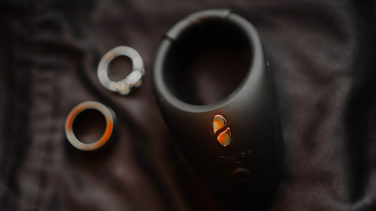
Wearing it would be easy as hell since the clasp uses a quick-release system. Per We-Vibe, the Bond uses a Custom Fit Link that will fit almost any penis size.
I tried it with my three fingers and of course, my own candystick, so it fits. But it seems impossible to clip it together with my testicle. I mean, I’ve tried but it hurts and was more uncomfortable than pleasurable. And I don’t even consider myself well-endowed.
The workaround I had was hanging it around the shaft, sitting above my scrotum, which would fit well should there be an erection. Although, wearing it just around your gospel pipe is somewhat loose. And you won’t feel the whole vibration it can offer.
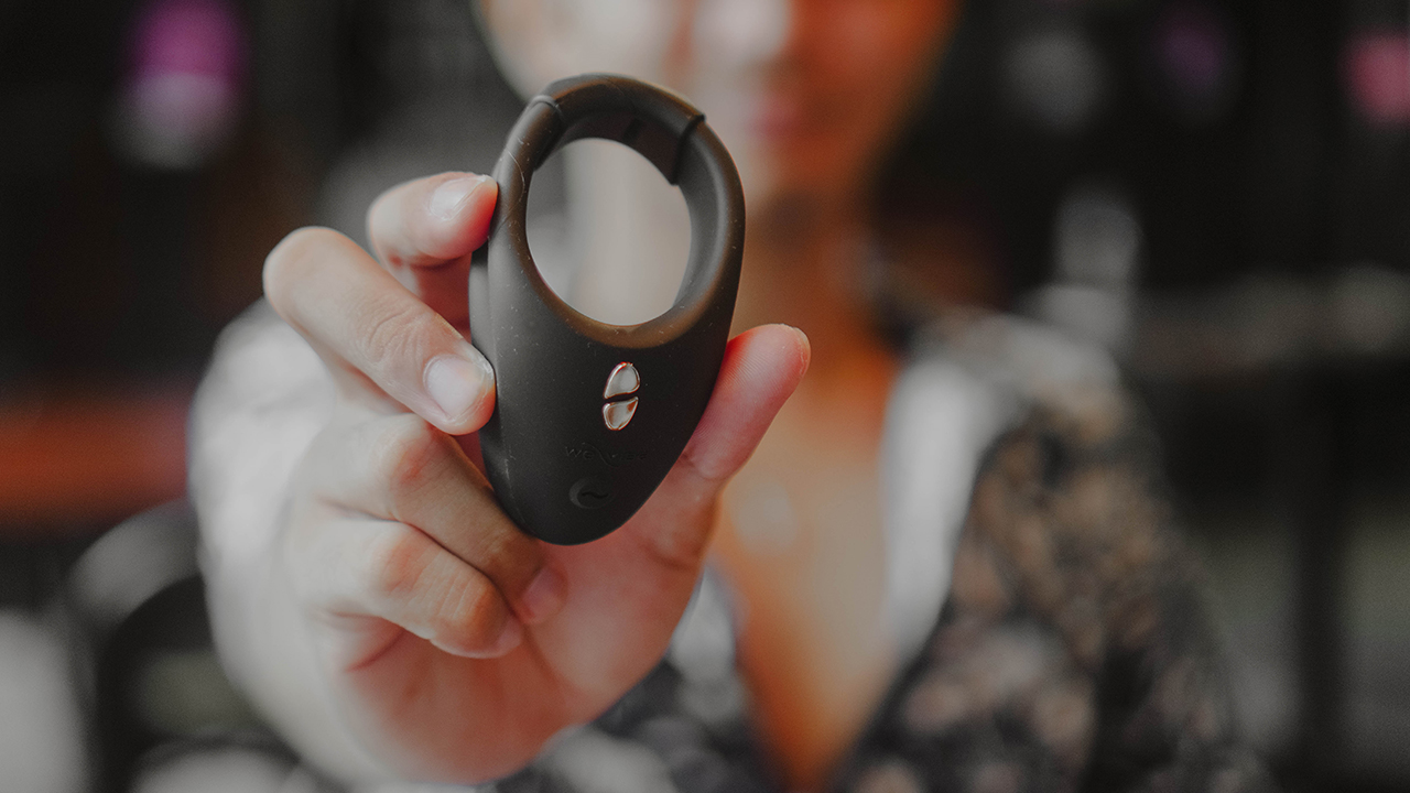
Remote control
Before we talk about vibrations, let’s discuss how to set up the We-Vibe Bond. The brand has a dedicated app for all its products called We-Connect, downloadable via the Play Store or the App Store.
You can pair the wearable via Bluetooth but it can only be done through We-Connect. Once connected, you can check the toy’s settings which include its battery status, the intensity for the vibrations, and a timeout feature in case you want it to automatically stop.
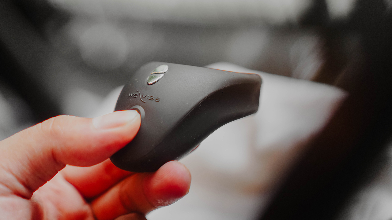
The power button turns the device on and off and pressing it for more than three seconds pairs it to any smartphone via Bluetooth.
There are options to create your own vibrations, Vibes for short, through the wavy button found on the Interface. This lets you access ten vibrations to play with: Vibrate, Pulse, Wave, Cha cha cha, Tease, Tempo, Step, Heartbeat, Massage, and Ramp. My personal favorite is Wave and I make sure to modify the vibrations to their highest level to match the pulsation I want.
There’s an option to have your partner control it for you, but the app has been failing all the time in that feature. Other than that, there isn’t really anything you can do on We-Connect.
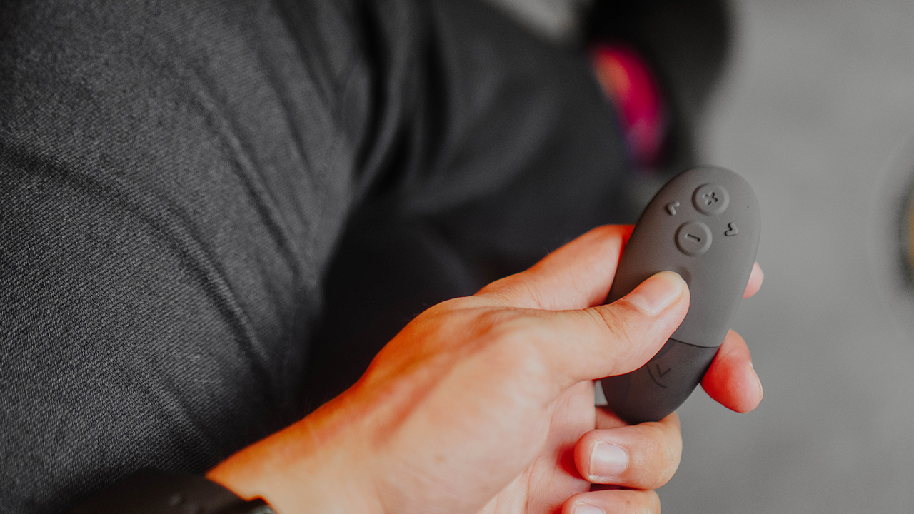
Luckily, the We-Vibe Bond comes with a physical remote so you don’t have to rely on the app. You can use it or hand it to your date so that he/she/they can control the pulsations.
Secret moments in a crowded room
I’ve worn the Bond a couple of times outside my bedroom. When I was doing my groceries, and when I went out on dates with my suitors.
It doesn’t work like other vibrating cock rings since the vibration strength is a little bit subtle. But that’s the whole point of it. This one is used so you can get in the mood. And probably do foreplay if you’re really feeling frisky.
Most of the time, I forget I’m even wearing the ring until it starts vibrating. The sudden jolt in your private parts, especially when you’re sitting, gives a different kind of pleasure. It makes you want to jump out of the chair and hop on your partner right away.
The subtle sensations aroused me. The silence, patience, and the anticipation — tension built up and I’ve been shaking from holding back. That’s the effect the Bond gave me and it has been a test of how I respond to my desires.
Its whisper-quiet vibrations are like a well-kept secret, but only to you and your partner (if you have one). I kept biting my lip the whole time I had it on, and I just wanted to forget the dinner and head out into the car.
I had an erection and it’s quite difficult to hide it when your shirt is tucked in. This is best worn when you have a large shirt on, in case you’re worried about your bulge.
But if you think you can have a hands-free release through this ring, that’s where you get it wrong. To an extent, the We-Vibe Bond can help you with edging. But you’d still have to trust your familiar pal — your very own hands — to give you a La Petite Mort.
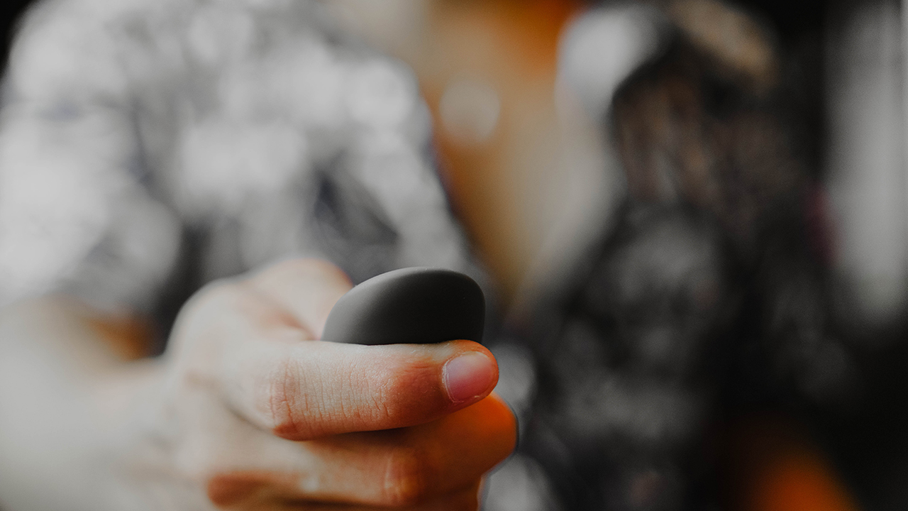
The device can last up to two hours, but I can assure you, you’re not going to wait that long after all the passionate build-up. When the Bond runs out of juice, simply charge it through its magnetic charger. And after 90 minutes, you’re back in the game.
Is this your PlayMatch?
The We-Vibe Bond can be the perfect companion whether you’re single or in a relationship. It’s discreet so you can have a raunchy moment without anyone knowing, and you can improve your connection with your lover through teasing and subtle foreplay.
It’s also waterproof so you can have a little bit of fun on your own in the shower or the tub. Just remember that it doesn’t have strong vibrations like most toys, since the device is really for building up the tension to really enjoy the heat.
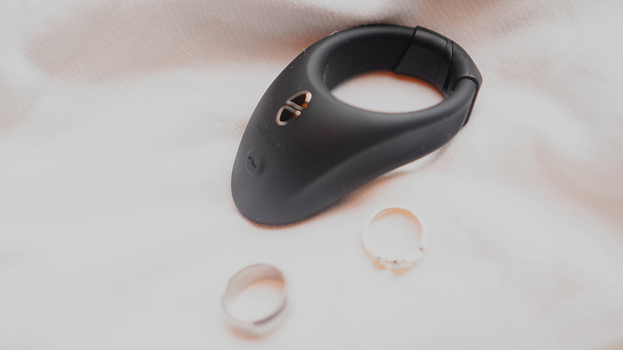
The We-Vibe Bond retails for US$ 129. Out of the box, you’ll get the wearable ring, the remote control, a magnetic USB charging cable, a quick start guide, and a black pouch to store your toy after cleaning.


Dating
Crossing an island to see if love would show up
A 24-hour detour in Cagayan De Oro, captured on OPPO Reno15
Doing things for the plot used to burn me badly. It always ended the same way: me lying on the floor, crying over choices I insisted were romantic when they were clearly reckless, while my cat stared at me with a look that suggested regret over choosing me as an owner.
I’ve gone through enough heartbreak that someone my age should have learned by now. I should know when to pause before making decisions that feel thrilling only because they are unhinged.
And yet, I still move through life the way I did in my early twenties, convinced that consequences can wait as long as I feel something in the moment.
I had always wanted to go to Cagayan de Oro. The city feels like a threshold, a gateway to Northern Mindanao, opening up to Camiguin and Bukidnon, two places I have romanticized endlessly through saved TikTok videos and screenshots meant for a future version of myself who finally had the time.
Travel felt like a good enough reason to go. It just wasn’t the real one.
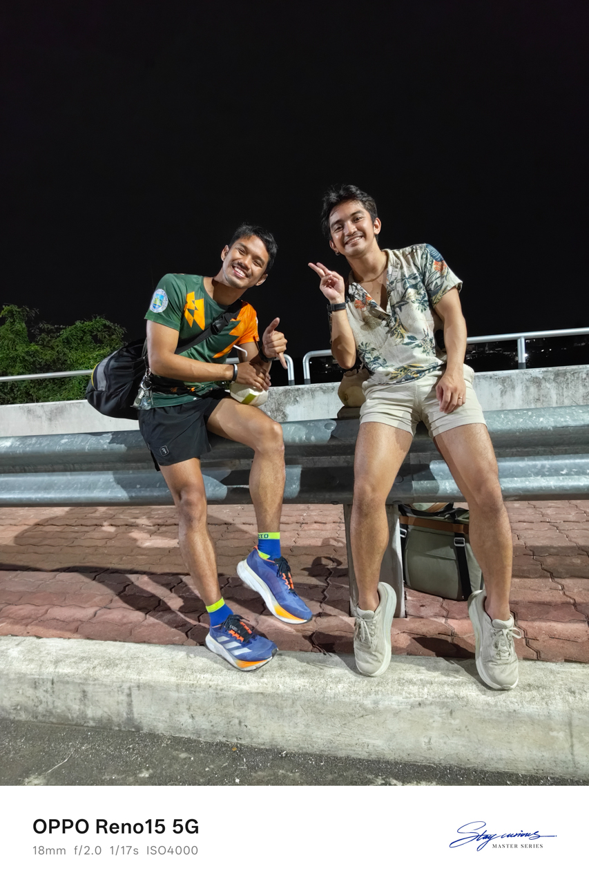
It was for love
Four years ago, I noticed him after watching at finish line of an ultramarathon on one of the hardest trails in the Philippines.
There was something about that moment — about the way exhaustion and triumph lived in his body at the same time. That single image stayed with me. Attraction and curiosity followed.
After walking away from my “loml“, loss of my life, unfortunately, as Taylor Swift would put it, I decided to take a risk to start the year. I wanted to see whether my heart would open again, even slightly.


Armed with nothing but courage I wasn’t fully confident in and the OPPO Reno15 mounted on my Ulanzi tripod, I crossed 800 kilometers to see a “friend.”
I used the word carefully, knowing how much work it was doing. I also knew this trip would either become one of the best decisions I made this year or one I would have to process slowly over time.
Touchdown with intentions
I was already on assignment in Northern Mindanao. In almost a decade of traveling for work, I had never extended a stay. I flew in, did the job, and flew out because Manila always waited with something urgent.

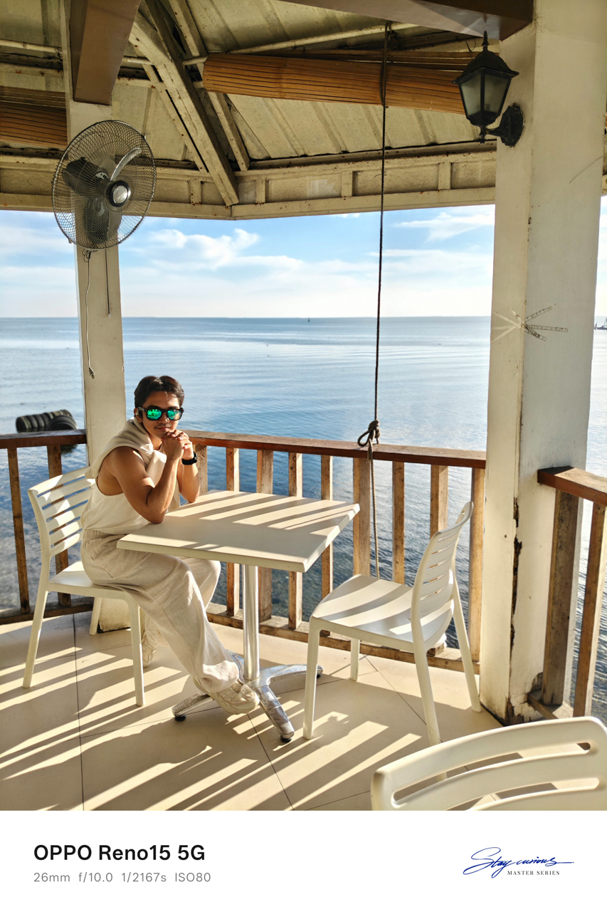

This time, I rebooked my flight for the next day, telling myself that one more day was reasonable. A stop at Panagatan Restaurant in Opol, Misamis Oriental made it feel like I had slipped into my own 1989 (Taylor’s Version)-coded vacation.
Blue skies stretched endlessly above a calm sea. The air felt cool against my skin, though there were no birds cutting through the frame.

I sat there soaking in sunlight, staring at the view as it unfolded in front of me. For the first time in a long while, I felt welcomed. I caught myself thinking that life might actually be okay. I could breathe.
Like in the song “Clean,” except this time I was twelve months sober from a love that almost broke me.
A table for one
I checked in at Red Planet because every hotel I genuinely wanted to stay at was fully booked. What remained were family rooms priced at over US$150.
The room I ended up with was simple, featuring a queen-sized bed and costing less than US$40. There was barely enough space for my drum-like American Tourister luggage, but the bed was wide and welcoming.
I spread myself out and slept like a starfish, the way you do when no one is watching.
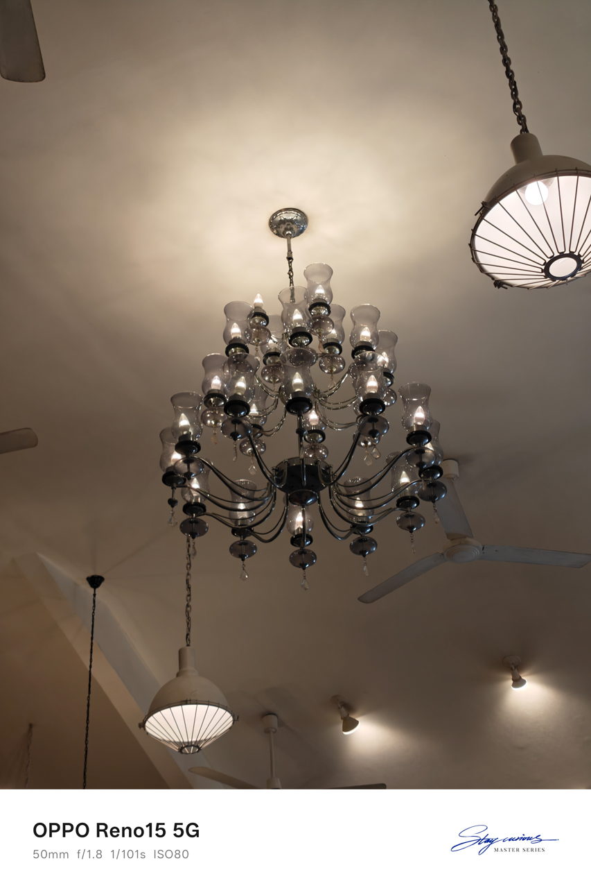
Just under two kilometers away sat Cucina Higala, known for serving modern Filipino cuisine rooted in Mindanao heritage. A friend from Cagayan de Oro had told me never to miss it, no matter how packed it got.


Of course, I listened.
Lunch there felt indulgent in the best way. The interiors made it feel like someone’s home rather than a restaurant. Even the bathroom caught my attention, tucked into a corner and washed in shaded daylight.
Everything worked together. The low murmur of diners layered with laughter; the smell of food arriving at nearby tables; the clink of cutlery against plates.


There was a sense that time moved slower here, encouraging you to stay longer than planned. I finally understood why the locals insisted going there.
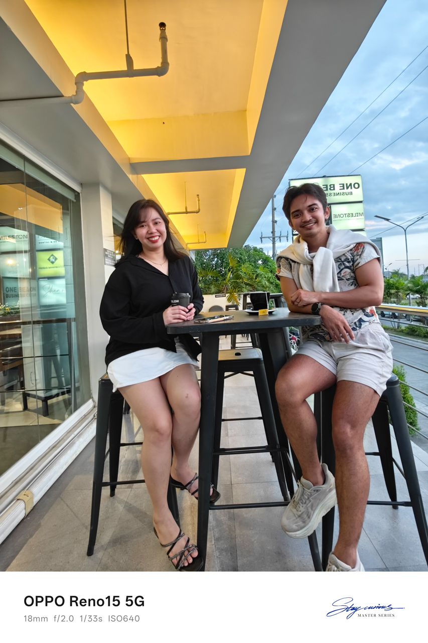
Waiting at six
Before dusk settled in, I headed to Uptown to meet a friend. I wanted to catch up and ground myself. Eventually, I admitted why I was really in the city.
We sat at Milestone Coffee + Kitchen in Uptown, cups of tea and coffee between us. They also have a branch downtown, but Uptown felt easier, more relaxed, like the right place to unravel stories and gossip that carried weight.
The truth was simple: I was there to see someone I had an interest on for years, and we were supposed to meet at six.
I was terrified of being stood up. Crossing land, sea, and sky for a man was something I had never done before. I believed we would meet because he said we would, but I still asked my friend for recommendations on where to go, just in case.
Backup plans felt necessary. I just needed to know there was something to hold onto if my heart cracked open in public.
After sunset
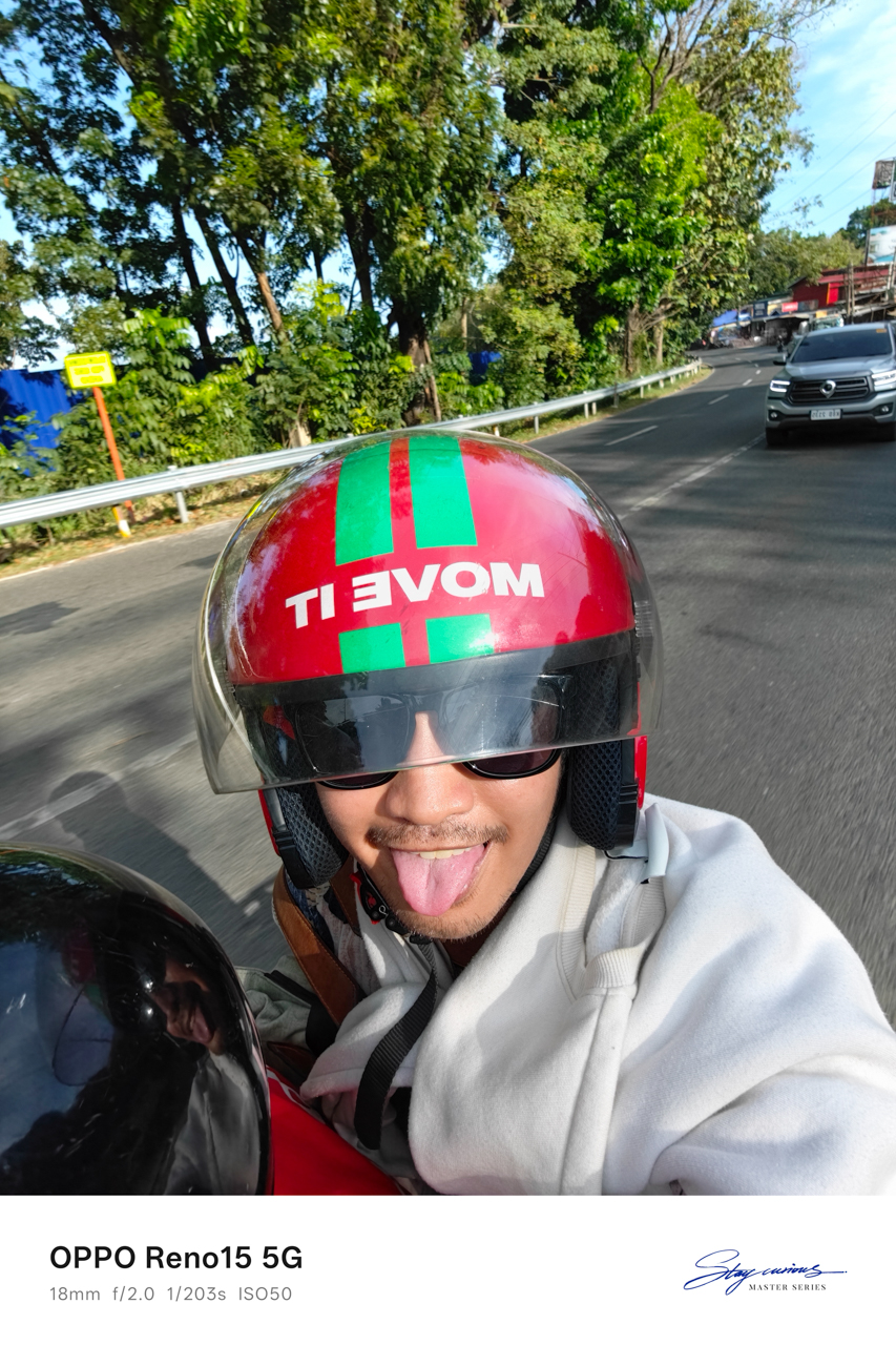
Thankfully, he picked me up at Milestone Coffee + Kitchen and met my friend. We rode back toward downtown through the diversion road, him on his brand-new Yamaha Fazzio in Matte Orange.
His motorcycle had a name. Ophelia. He bought it in October, right before Taylor Swift released her album The Life of a Showgirl and the single “The Fate of Ophelia.”


My 1989-coded escapade shifted into something “Opalite”-coded, as if I had wandered into a version of my own People We Meet on Vacation moment and somehow found my Alex Nilsen-slash-Travis Kelce.
We strolled along the boulevard where people walked, ate, laughed, and leaned into the night market energy. Some sat by the riverside, letting the evening pass without urgency.
I drank fresh coconut juice from a stall that stayed busy even at ten in the evening, while everything across the street had already closed. It tasted exactly like the moment felt — unexpected and sweet.
We ended the night drinking beer we bought from a convenience store, like teenagers sneaking alcohol because our parents would disapprove. It was simple and familiar… and it tasted like home.
On borrowed time
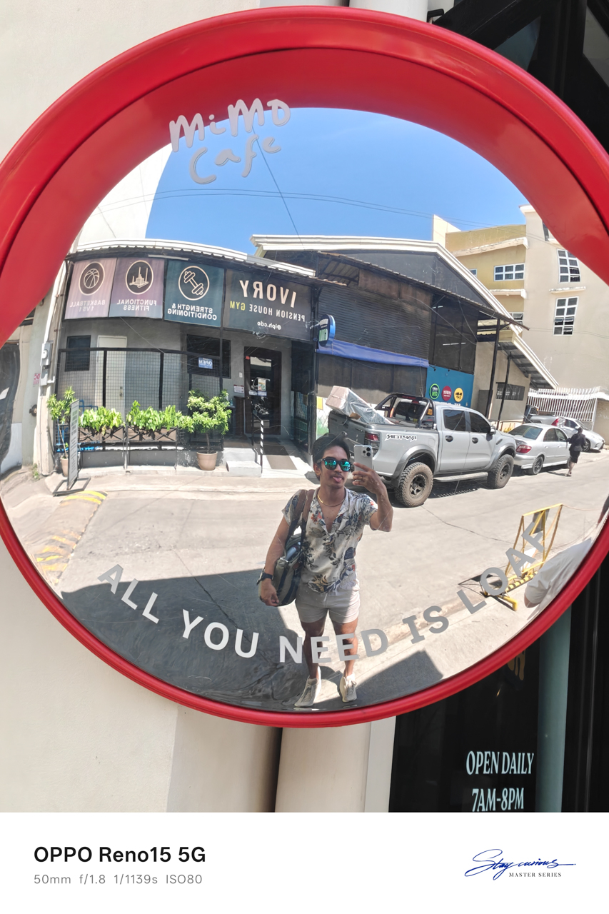
The next morning, I knew it was already my last day in the city. While he was working, like actual adults and not the versions we see in movies, I packed up, freshened up, and walked to Limketkai to grab coffee and brunch.
I took my morning slowly. I journaled in my pocket notebook, listening to “Past Lives” by sapientdream and Slushii, sipping my coffee while watching people move through their own lives.
It felt grounding to exist without urgency, even if only for a few hours.
When my beau finally gave the signal to visit his farm, where I could leave my luggage before heading to the airport, I checked out of the hotel and went on what felt like an almost hour-long ride.

The farm was only about a fifteen-minute drive from the airport, which meant we still had time, real time, to spend the rest of the day together.
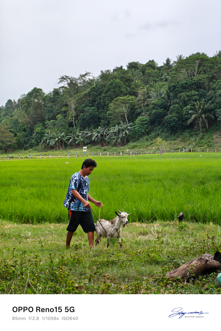
I toured his farm on foot and watched livestock being cared for with a gentleness that made me feel like I had stepped into a version of life far removed from mine.


I felt like a Disney princess playing with animals, temporarily forgetting that I had a return flight waiting for me.
We ate together, and at some point I fell asleep on the hammock, only waking up when he gently shook me so we could go to his favorite place.

At the edge of the day
The beach was so close to the airport that my heart sank the moment I saw it. Leaving the city suddenly felt very real. Leaving him even more so.
The entire encounter felt People We Meet On Vacation-coded, and yet I kept hoping this was not just a vacation fling, that he wasn’t merely a vacation boyfriend meant to exist only within a fixed timeline.
I relished the sight of the sea, his favorite spot as he told me, where he went to clear his mind whenever life felt overwhelming.


The water was turquoise, vivid against the rocks, and it was impossible to ignore. The sound of waves crashing against the cliffside rocks and the cool hum of the breeze wrapped around us as we talked.
We pondered about life, about where we were heading, about what this meant, and what it realistically could not be.
That was when I realized there was distance between us, not only measured in kilometers. We were two people meeting at different points in our lives, emotionally and mentally out of sync despite how naturally everything else fit.

We both rejected the idea of dating, even after acknowledging how rare it felt to find someone who matched our freak so effortlessly. I knew this could grow into something more if one of us was brave enough to go the distance.
I also knew that maybe neither of us was in the right place to choose someone else when our own dreams still demanded so much attention.
Goodbyes timed by the sky
The sky turned pink and purple as I headed to the airport. He followed behind me riding Ophelia, while I sat inside a tuktuk, a small motorized, three-wheeled rickshaw carrying me and my luggage through the last stretch of the city.


Rain had been forecasted all day. We both knew it. And yet somehow, the universe held it back, letting us have the beach, conversations, laughter, and pauses.
It waited until everything that mattered had already happened.
He made sure I got to the airport safely. Only after I gave him a tight squeeze and finally let go did the rain arrive, as if on cue, like it understood timing better than either of us.
It was an evening flight, and I looked like a deranged person wearing sunglasses, crying while sipping floral tea at Bo’s Coffee, staring out at the runway as planes lined up for departure.
I kept asking myself why distance suddenly frightened me when I had already crossed eight hundred kilometers for him.
Somewhere above the clouds, the answer floated heavily. I did love him. I just never said it out loud because I was afraid of what it would demand, and I was afraid of opening my heart again to someone I wasn’t even sure I would meet again.
For a moment, I felt loved and desired, and remembered what it felt like to be chosen, even briefly.
When I arrived in Manila, I looked through the photos captured on my OPPO Reno15 and smiled, seeing how a smartphone held on to a fleeting moment of love, written on sand and washed away exactly in time.
Apps
Breaking up with Adobe Photoshop after 20 years
Wedding planning and Apple Creator Studio made me realize it was time

Planning a wedding, even a small and intimate one, has a way of sharpening your sense of priorities. Right as my fiancé and I were making decisions for our city hall wedding here in New York City, Apple announced Creator Studio.
Creator Studio is a subscription service that gets you access to eight creative pro and productivity apps for US$12.99 a month, or US$2.99 if you’re a student or educator. The design app included in the subscription, Pixelmator Pro, is also available as a standalone purchase for US$49.99. Adobe Photoshop, my design software of choice for over two decades costs me US$22.99 a month.
Seeing those numbers next to each other made me pause. It’s not that I was unhappy with Photoshop. I was just suddenly made aware how expensive it is. I’d been paying more for a single tool than I could for an entire creative ecosystem.
Adobe Photoshop was my first foray into the world of graphic design
Creative Studio’s lower price point, along with the free trial, made me consider switching to Pixelmator Pro altogether. That’s something I never thought I would do. Photoshop was how I got into graphic design. It was my first love, and up until recently, I truly thought it would be my ride or die.
Getting to know Pixelmator Pro
If you’re not familiar, Apple’s Pixelmator Pro is a graphic design and image editing app that’s similar to Adobe Photoshop. In practice, it covers a huge amount of the same ground but with a very different philosophy around usability and design.
I tried Pixelmator Pro, mostly as a challenge because we were doing a YouTube video on Apple Creator Studio. Personally, I was lowkey excited to try something new.
![]()
The first time I loaded the app, I recreated our YouTube thumbnail template — all within 10 minutes — and I haven’t looked back since.
Familiar enough to feel effortless
One of the biggest reasons my transition to Pixelmator Pro was so easy is muscle memory. Many shortcuts behave the same way: cmd+T for transform, cmd+R to show rulers, cmd+J to duplicate layers, just to name a few.
Having used Photoshop since high school, it felt familiar and intuitive — the complete opposite of how it felt to try and switch to Adobe Illustrator many years ago.
Photoshop is how I got into graphic design. It was my first love, and up until recently, I truly thought it would be my ride or die.
Later, I learned that you can import PSD (Photoshop) files directly to Pixelmator Pro. Apparently I didn’t even need to recreate the GadgetMatch assets. It does a good job of converting and preserving layers.
Photoshop now feels archaic
![]()
After using Pixelmator Pro for a few days, going back to Photoshop felt jarring. The sharp edges of the UI felt cold and rigid. Everything was layered with popups, panels, and tiny interruptions.
Pixelmator Pro, in comparison feels warm, smooth and frictionless. Its user interface is very Apple-like — rounded edges, softer icons and buttons. The Creator Studio version also gets the new Liquid Design touch, with transparent menus and elements that feel dynamic.
I especially love the little things. Color adjustments live in one simple panel instead of being scattered across different windows. There’s an eyedropper tool beside every color picker with a magnifier built-in.
When you hover over tools, it shows you the shortcut (e.g. “R” for Repair). There are also subtle animations, like when you use the Color Fill tool to change your canvas color.
Pixelmator Pro’s UI is warm, snappy, and approachable
The differences in user experience are stark. Photoshop’s animations either don’t exist or are too abrupt for one to notice.
Smart tools without the noise
Photoshop has one clear advantage over Pixelmator Pro: Generative AI. It’s great and powerful especially when you need to save time.
I personally used it a couple of times before to save time on cloning, erasing, or expanding elements. Am I going to miss it with this switch? Something tells me I won’t.
Pixelmator Pro’s clone and repair tools, though seemingly so simple, work like a charm. And for how I usually manipulate images, those two are more than enough.
From digital to physical
If Pixelmator Pro was going to replace Photoshop in my workflow, wedding prep was the perfect time to give it a real world test — and it more than held its own. Its ease of use gave me permission to think outside the box, because I knew I had a reliable tool that can help me make it happen.
On the left, a Kufic-inspired wedding logo designed on Pixelmator Pro; on the right, 3D printed stamps
Since my fiancé is half-Iranian, I designed a logo combining our names, inspired by Kufic calligraphy, and I did it entirely in Pixelmator Pro. I developed that same logo further and designed a save the date, with color, also inspired by Kufic calligraphy. I went through a few iterations to come up with the final designs, which were made easier by the Shape tool and grid overlays.
My fiancé then took the logo I designed in Pixelmator Pro, converted it to 3D on Revit, and printed it into stamps in different sizes. One way we’re using it is to deboss the handmade pottery he’s making as one of our party favors.
There are a few more wedding pieces I’m designing on Pixelmator Pro in the coming weeks: our final invitation, and the custom stationery for the dinner that follows the ceremony.
Through this whole process, Pixelmator Pro never felt like it got in the way, or that it was limited. On the contrary, it feels like that enabler friend who says yes to every idea I have, and can actually help make them real.
Powerful, but approachable
The best way I can describe what using Pixelmator Pro is like is this: it’s a mix of Photoshop’s professional tools, Canva’s free library of assets, and Apple’s UI sensibility.
Shortly after Apple announced Creator Studio, Adobe rolled out significant Creative Cloud discounts. Are they threatened? They better be.
That makes it great for beginners, small business owners, and casual creators. Like Canva, it comes with some beautiful templates to help someone with zero experience come up with something good.
But unlike Canva, it still feels like a serious design tool. I can do so much of what I need using Pixelmator Pro but with UI that’s so much more approachable compared to Photoshop.
As the great philosopher Ariana Grande once said, “Thank U, Next”
I remember meeting Canva’s founders before launch and not fully understanding their mission to make graphic design accessible to everyone. Now I do.
It was never about replacing Adobe products and pro designers. What Canva did was fill a huge void we didn’t know existed. They democratized something that used to be reserved only for the privileged few.
Pixelmator Pro comes with free templates, assets, and mockups like this MacBook Pro and coffee packaging
Pixelmator Pro’s lower barrier to entry has potential to make a significant impact. My hope is it opens doors for people who were previously shut out of the graphic design world, and that it becomes something they can grow with, just as I did with Photoshop.
Adobe is still the industry standard
Switching to Pixelmator Pro wasn’t about rejecting Adobe, in the same way that Canva’s success did not kill Photoshop.
It’s worth noting that Adobe products are still the standard in the industry. A lot of companies rely on them, and most schools teach them. In a traditional design or agency environment, Photoshop and Illustrator are still the default language.
![]()
Even on Apple’s own Design Resources site for developers, the official design templates are built for Adobe Photoshop and Illustrator, not Pixelmator Pro. That says a lot about how embedded Adobe is in professional workflows.
Competition makes the space better
Apple Creator Studio, and tools like Pixelmator Pro, challenge Adobe’s near-monopoly in a really healthy way.
It’s not lost on me that trading Photoshop with Apple software actually keeps me locked into one ecosystem. But having more pro creatives try Pixelmator Pro can put pressure on the industry. A strong alternative that’s more cost effective can force titans and dinosaurs to evolve in a way the likes of Corel was never able to do.
Ideally, that means better products and fairer pricing for everyone. Shortly after Apple announced Creator Studio, Adobe rolled out significant Creative Cloud discounts. Are they threatened? They better be.
Pixelmator Pro’s intuitive UI makes switching from Photoshop easy peasy
Access matters, and at the end of the day, with a healthy competition in the market, it’s consumers that win. Canva is a great example of this. It made design tools accessible to those who aren’t professionals. It didn’t make everyone a great designer, just as a novice who tries Final Cut Pro today won’t become a pro video editor tomorrow. Design is still a craft you develop over time with practice.
Is Pixelmator Pro my GadgetMatch?
Photoshop still has its place. But for my everyday work, and occasional personal projects, Pixelmator Pro can do everything that I need to accomplish, at a fraction of the cost.
It feels faster, lighter, and more alive. Honestly learning my way around new software has been so enjoyable — so much so that I feel a renewed sense of eagerness to try other design software like Blender and Figma.
Pixelmator Pro never felt like it got in the way, or that it was limited. On the contrary, it feels like that enabler friend who says yes to every idea I have, and can actually help make them real.
Wedding planning and Apple Creator Studio didn’t just make me switch to a new software. They also made me question how much I’ve been missing out on. How much of what I do is simply due to inertia?
![]()
Ending my longest relationship doesn’t mean it failed. I’m grateful for what Photoshop taught me. It helped shape the creative professional that I am today.
But alas, this is one area where my practicality wins over loyalty. Relationships — with people or with tools — only work when both parties keep showing up. There’s no room for complacency, despite the history.
Walking away from something that taught me so much feels bittersweet, but Pixelmator Pro fits the way I work now, and I hope it grows with me as I turn the next page.
Bumble is ushering a new era of dating. The dating app has just rolled out a new brand design. This includes a new logo and user interface with bolder fonts and refreshed colors and illustrations. Along these are many significant updates to the app’s features, giving users better ways to connect with others.
For instance, Bumble has added hundreds of new prompts and have refreshed the prompts UI to help members show off their personalities easier. Shared interests have also been moved to the top of the profiles for users to better spot commonalities. This gives users a snippet of profiles for them to know right away what they have in common. Furthermore, the app has also increased the number of required profile photos to four to boost the likelihood of matches.

Among the new features on Bumble is Opening Moves. This allows women to set a post-match question for their connections to respond to within 24 hours. This facilitates a more meaningful connection and introduces another way to connect outside of Bumble’s Make The First Move. Of course, they may directly message their match even if they haven’t responded to the post-match question.
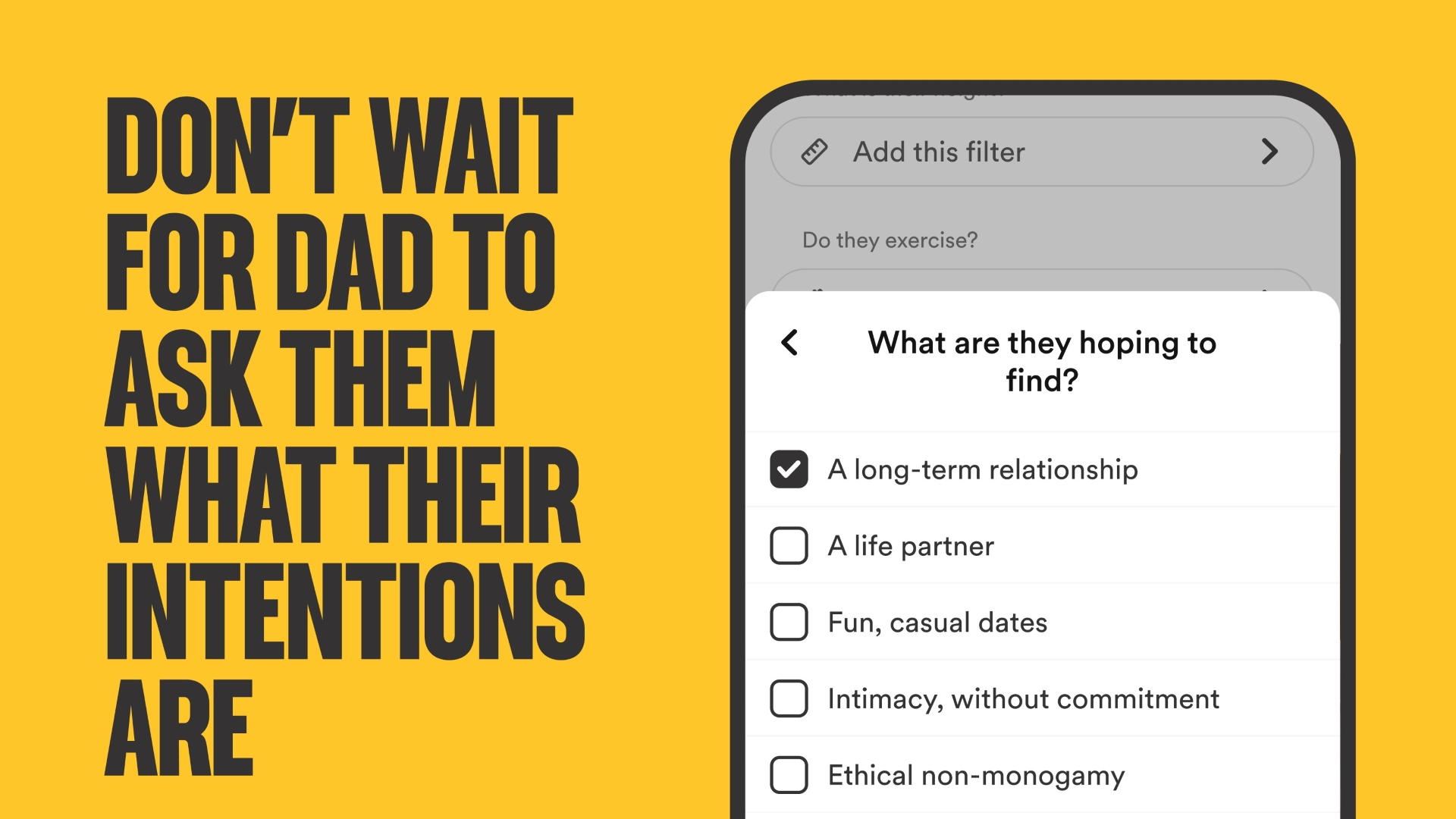
Meanwhile, Bumble has also expanded its Dating Intentions right from the setup. This is so users can answer the question “What are you hoping to find?” with more accurate choices. Among these are Long Term Relationship, Life Partner, Fun, Casual Dates, Intimacy without commitment, Ethical non-monogamy, and Marriage.
This change stemmed from a Bumble survey that saw 68% of women struggle with people not being upfront about their dating intentions. When browsing, the expanded dating intentions badges will show right below the person’s profile’s “About me” in a section called “I’m looking for.”
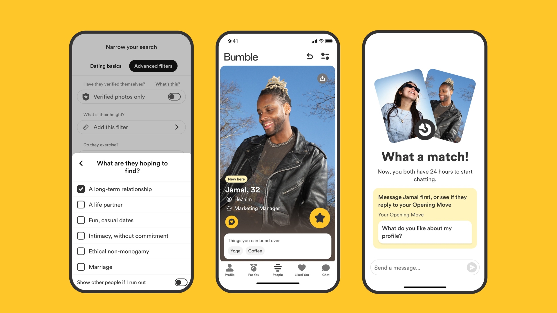
Moreover, Bumble has renamed Best Bees to For You. Bumble is employing a new machine learning model to give users their daily set of four curated and relevant profiles based on preferences and past matches.
The changes are part of Bumble’s mantra to empower women to make the first move, flip gender roles, and take control of their dating app experience and dating life in general.


nubia to launch new Neo 5 series gaming phones on March 28

SHINOBI: Art of Vengeance’s SEGA Villains Stage out on April 3

AMD poised to lead agentic AI era with high-performance CPUs

CIPTA debuts AI GPU server, edge workstation at CloudFest 2026

Dune: Part Three teaser trailer: First look at Robert Pattinson’s Scytale


-
 Reviews4 days ago
POCO X8 Pro Max review: A new beast from the far east
-

 News4 days ago
POCO X8 Pro Series: Price, availability in the Philippines
-

 Laptops1 week ago
Apple MacBook Neo Review
-

 Computers2 weeks ago
GIGABYTE collaborates with Capcom for RE Requiem custom PC
-

 Apps1 week ago
Google Maps is finally getting a 3D mode
-

 Entertainment1 week ago
The internet is thirsting over the One Piece Season 2 cast
-

 News2 weeks ago
Globe postpaid opens pre-orders for Samsung Galaxy S26 series
-
 Features1 week ago
Galaxy AI on the Samsung Galaxy S26 Ultra