
Apps
Bumble introduces new logo, better UI, features
Better dating experience
Bumble is ushering a new era of dating. The dating app has just rolled out a new brand design. This includes a new logo and user interface with bolder fonts and refreshed colors and illustrations. Along these are many significant updates to the app’s features, giving users better ways to connect with others.
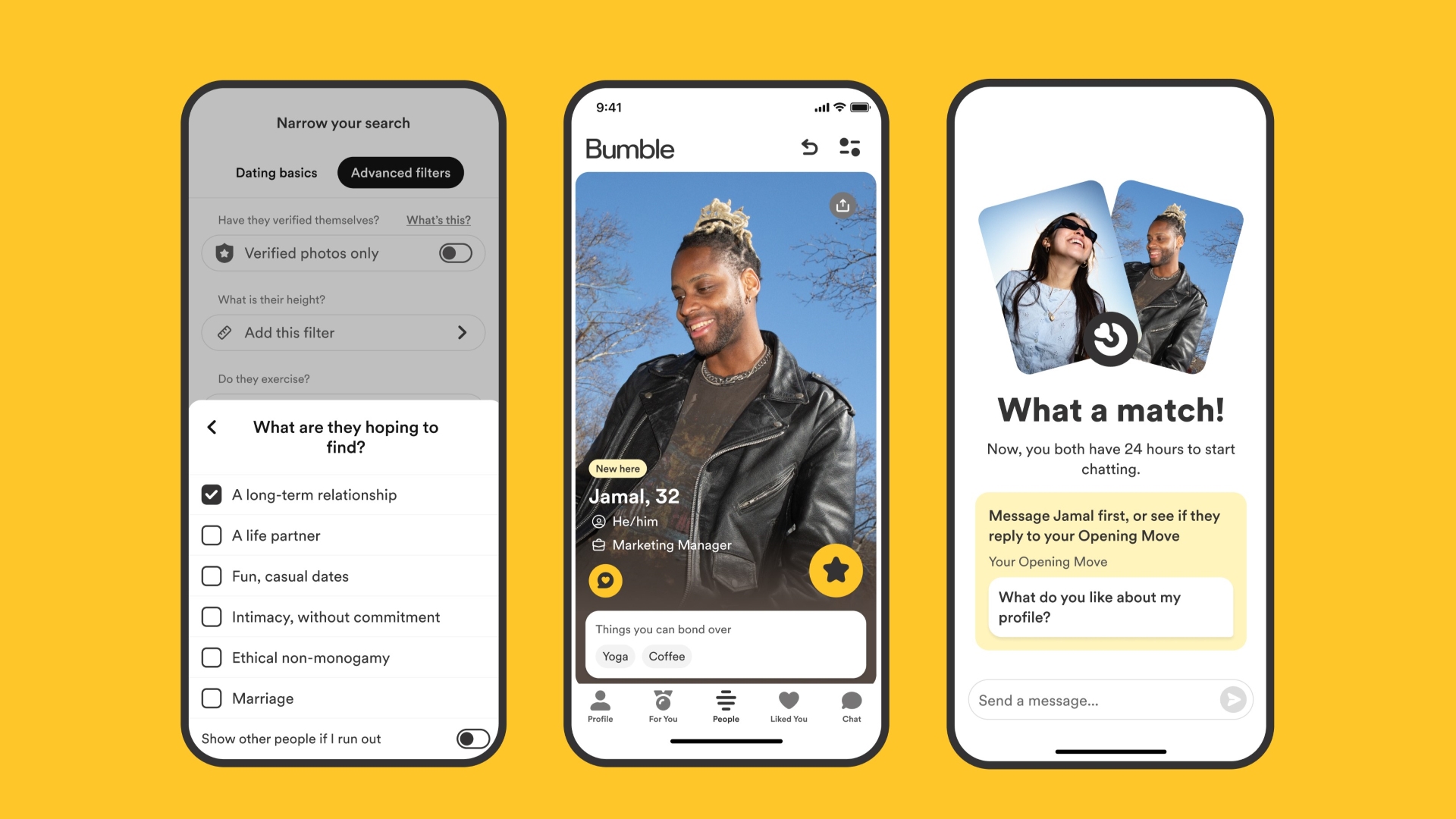
For instance, Bumble has added hundreds of new prompts and have refreshed the prompts UI to help members show off their personalities easier. Shared interests have also been moved to the top of the profiles for users to better spot commonalities. This gives users a snippet of profiles for them to know right away what they have in common. Furthermore, the app has also increased the number of required profile photos to four to boost the likelihood of matches.

Among the new features on Bumble is Opening Moves. This allows women to set a post-match question for their connections to respond to within 24 hours. This facilitates a more meaningful connection and introduces another way to connect outside of Bumble’s Make The First Move. Of course, they may directly message their match even if they haven’t responded to the post-match question.
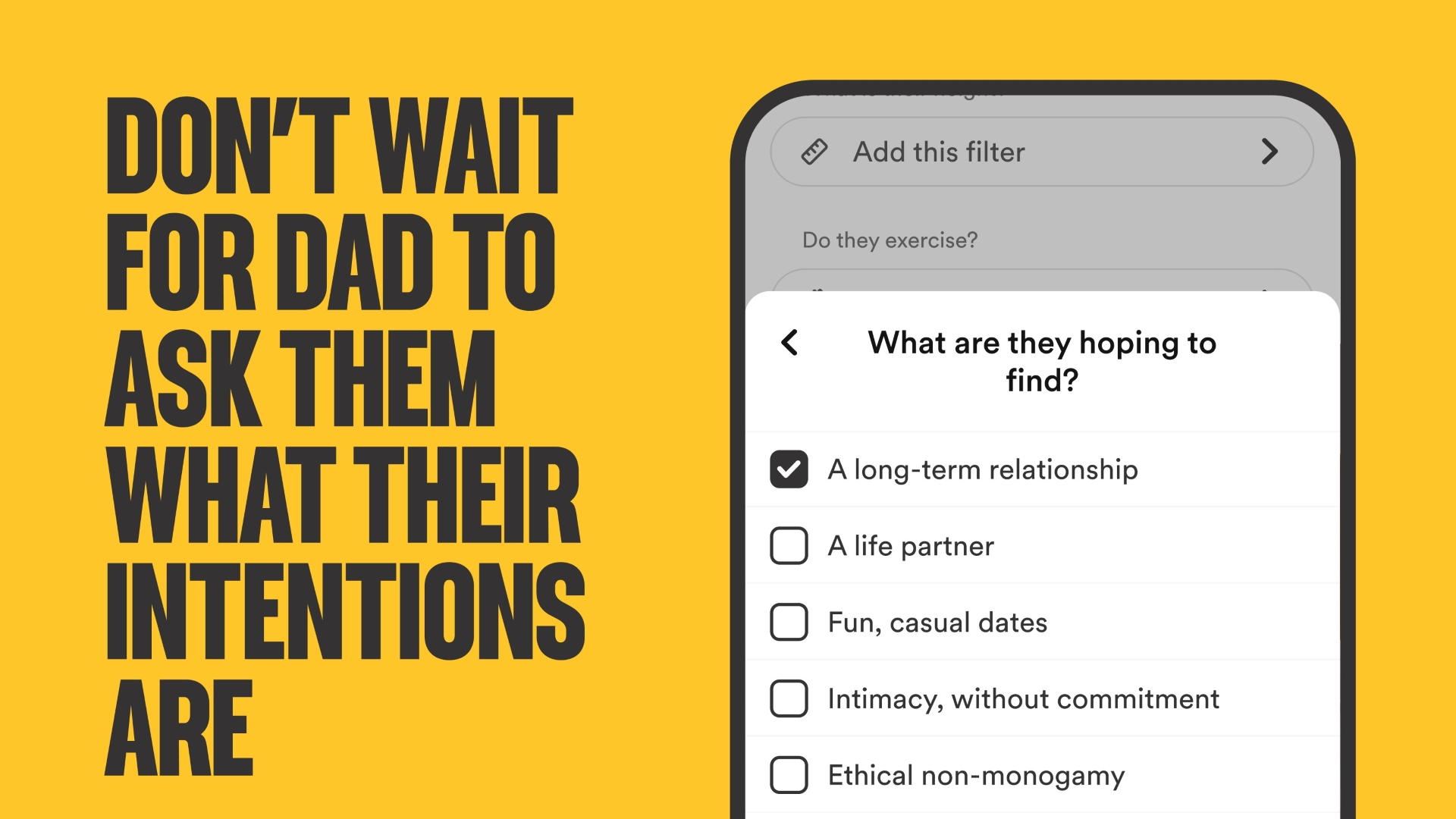
Meanwhile, Bumble has also expanded its Dating Intentions right from the setup. This is so users can answer the question “What are you hoping to find?” with more accurate choices. Among these are Long Term Relationship, Life Partner, Fun, Casual Dates, Intimacy without commitment, Ethical non-monogamy, and Marriage.
This change stemmed from a Bumble survey that saw 68% of women struggle with people not being upfront about their dating intentions. When browsing, the expanded dating intentions badges will show right below the person’s profile’s “About me” in a section called “I’m looking for.”
Moreover, Bumble has renamed Best Bees to For You. Bumble is employing a new machine learning model to give users their daily set of four curated and relevant profiles based on preferences and past matches.
The changes are part of Bumble’s mantra to empower women to make the first move, flip gender roles, and take control of their dating app experience and dating life in general.


Apps
Turn conversations into completed work: Zoom launches ZoomMate
Agentic AI work surface to help people move from conversation to execution

Zoom has officially announced ZoomMate, an agentic AI work surface to help people move from workplace conversations to execution without losing context along the way.
It will be offered in ZoomMate Basic (free) and ZoomMate which is priced starting at US$ 16.67 per month.
Unlike AI tools that solely rely on prompts or manual context, ZoomMate understands what was discussed to generate grounded, relevant outputs directly from meeting context.
The feature connects live conversational context to agentic search, workflow execution, custom agents, and AI content creation. It helps users overcome the friction introduced by fragmented tools and incomplete workflow by surfacing information across Zoom and connected business systems.
This creates deliverables from meeting and enterprise context, like presentations, documents, and spreadsheets. It also coordinates follow-though across workflows without switching tools.
ZoomMate capabilities
ZoomMate introduces advanced agentic AI capabilities that help teams move from insight to completion.
Agentic Search
With agentic search, it brings enterprise knowledge to every conversation. ZoomMate can search across Zoom, the web, and third-party systems to find the most relevant information for a project, account, ticket, policy, or business question.
Connecting to data sources such as ServiceNow, Salesforce, and Workday, and indexing across users’ integrated enterprise systems allows for surfacing information from enterprise files.
This includes customer records, open issues, service tickets, knowledge articles, project updates, files, and other business content.
Moreover, relevant context from Zoom Meetings, Phone, Chat, and other connected platforms, including Google and Microsoft, can be directly integrated into the flow of work.
Orchestrate
The next step is ZoomMate’s agentic layer enables proactive coordination and execution across systems, combining AI workflows with intelligent agents that can act, learn, and adapt within enterprise environments.
Agents can monitor ongoing projects, identify steps from meeting context, and automatically initiate follow-up actions for continuity.
Aside from that, ZoomMate can coordinate real-time task execution and can schedule events across Google Calendar or Microsoft Outlook.
Moreover, it updates records, creates follow-up tasks, drafts customer communications, and triggers onboarding or support workflows.
Complete
Lastly, ZoomMate turns meetings into finished work. It automatically creates presentations, documents, spreadsheets, reports, and project plans from meeting conversations and enterprise context so teams can move from discussion to execution faster.
It leverages Zoom’s AI Productivity Suite to update deliverables as decisions evolve, keeping plans, documents, and other outputs current in real time without manual syncing.
Apps
GCash rolls out in-app OTPs via push notifications to fight scams
SMS-based codes will be phased out by June 22
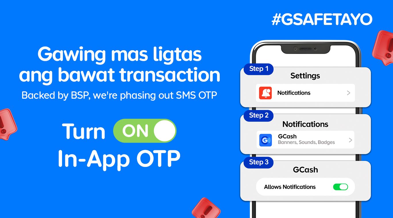
GCash is completely changing how users secure their accounts by rolling out in-app OTPs by June 22.
This fully replaces traditional SMS-based authentication as part of heightened cybersecurity measures against phishing scams and financial fraud.
With this security upgrade, users will no longer receive their OTPs via text messages. Instead, the codes will be sent through secure push notifications directly inside the GCash app.
This provides a much safer verification experiences. The migration to internal authentication is a direct response to a directive from the Bangko Sentral ng Pilipinas (BSP) to phase out SMS-based OTPs by June 2026.
Furthermore, the shift aligns with the country’s Anti-Financial Account Scamming Act (AFASA), which mandates stricter safeguards to curb digital fraud.
For years, cybercriminals have targeted SMS-based verification codes through various spoofing and phishing tactics to gain unauthorized access to accounts.
By routing OTP requests directly through the user’s authenticated GCash app, the platform ensures that only the rightful account owner can receive and use the unique codes.
Beyond security, the switch brings some much-needed convenience. The instant, one-tap authentication removes the annoying hurdle of switching between apps, copying codes, or waiting for delayed text messages to arrive in areas with poor cellular signal.
To get in-app OTPs on the GCash app, simply turn on Push Notifications on your iOS or Android device.
Apps
The No-Nonsense guide to mid-year shopping
Let AI do the heavy lifting for you this Lazada 6.6 Super WOW Sale

The mid-year sale season is here, but the days of mindless impulse buying are over.
Shoppers are shifting toward intentional, value-driven decisions, focusing on quality, authenticity, and actual utility over flashy, low-quality gimmicks.
From 8:00 PM on June 5 until 11:59 PM on June 8, 2026, the Lazada 6.6 Super WOW Sale is dropping major discounts. But the real win is using the platform’s tools to maximize your budget.
Lock in the baseline discounts

Before diving into specific items, map out how to stack the core offers.
You can stretch your money by hunting down LazFlash Deals for up to 90% off, collecting up to PhP 3,000 in stackable vouchers, and ensuring every order qualifies for the free shipping offers available throughout the event.
True value comes from combining these three layers of savings on things you already need.

Jisulife: One of the participating, trusted brands you can get from LazMall
Filter for authentic value
Shopping smart means avoiding the trap of “too good to be true” counterfeits that end up in the trash.
Data shows a massive consumer shift toward trusted quality, with LazMall growth vastly outperforming standard listings during major sales.
To ensure your money goes toward genuine products with real warranties, restrict your browsing to official, brand-certified stores.
If you are upgrading your tech, parenting gear, or wardrobe, look to trusted names anchoring the sale like UGREEN, JisuLife, ANTA, Maserati Watches, Momcozy, and O.TWO.O.
UGREEN: One of the participating, trusted brands you can get from LazMall
Outsmart the noise with built-in tech
Don’t waste hours scrolling through endless listings or guessing which product is better.
The smartest way to navigate a massive mid-year event is to let the platform’s built-in features cut through choice paralysis.

Tools like AI Lazzie and AI Picks allow you to instantly compare similar items, analyze prices, and get personalized recommendations based on actual data rather than generic marketing hype.
Smart Shopper Tip: True value is a mix of the right price, verified authenticity, and a seamless return policy. Use this sale period to stock up on everyday essentials and high-quality upgrades rather than panic-buying items you’ll regret later.


HONOR Watch 6 Review: Less guessing, more knowing
Beyond educated guesses


HONOR Magic V6 review: The best version of a book-style foldable?
Little left to sacrifice


Close without crossing: A Xiaomi 17T Pro photo essay
Distance and closeness are not always opposites.

Why is AI loved in COMPUTEX but hated in the rest of the world?

Father’s Day gift guide: Gadgets for every kind of dad

Buyer’s Guide: TECNO SPARK 50 Pro vs SPARK 50 5G

Budget smartphone realme C100 Series launches

Did Tim Cook just confirm that iPhone prices are going up?

The Infinix GT 50 Pro has the most inspired design for a gaming phone

TECNO’s POVA 8 5G is both futuristic and future-ready

Spring reset: Growing more at home with Auk Mini

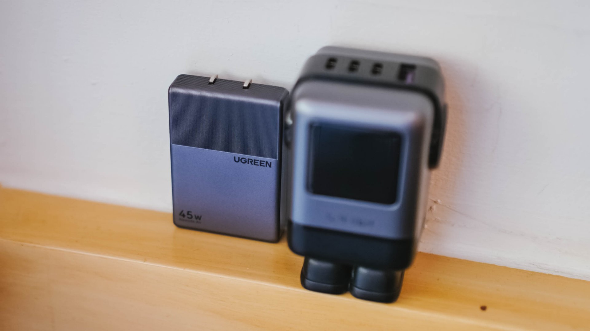
UGREEN MagFlow Air review: Airy Yet Mighty
Close without crossing: A Xiaomi 17T Pro photo essay


-
 India1 week ago
TECNO’s POVA 8 5G is both futuristic and future-ready
-

 Buyer's Guide2 weeks ago
Buyer’s Guide: Xiaomi Pad 8 Series
-
Reviews1 week ago
HONOR Magic V6 review: The best version of a book-style foldable?
-

 Gaming1 week ago
Kingdom Hearts IV gets new trailer, confirms Switch 2 release
-

 Gaming2 weeks ago
Final Fantasy VII Revelation arrives in Spring 2027
-

 Gaming1 week ago
Final Fantasy fans have two big reasons to look forward to 2026
-

 Smartphones1 week ago
Upcoming realme C100 series to feature 8,000mAh battery
-

 Gaming1 week ago
Nintendo officially announces Ocarina of Time remake