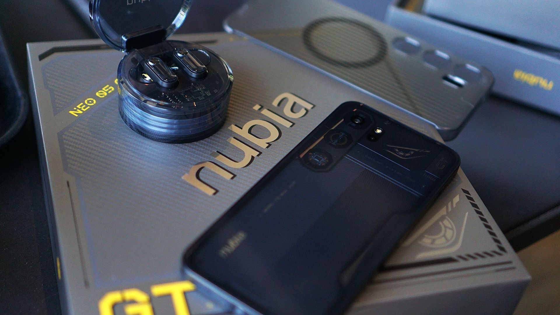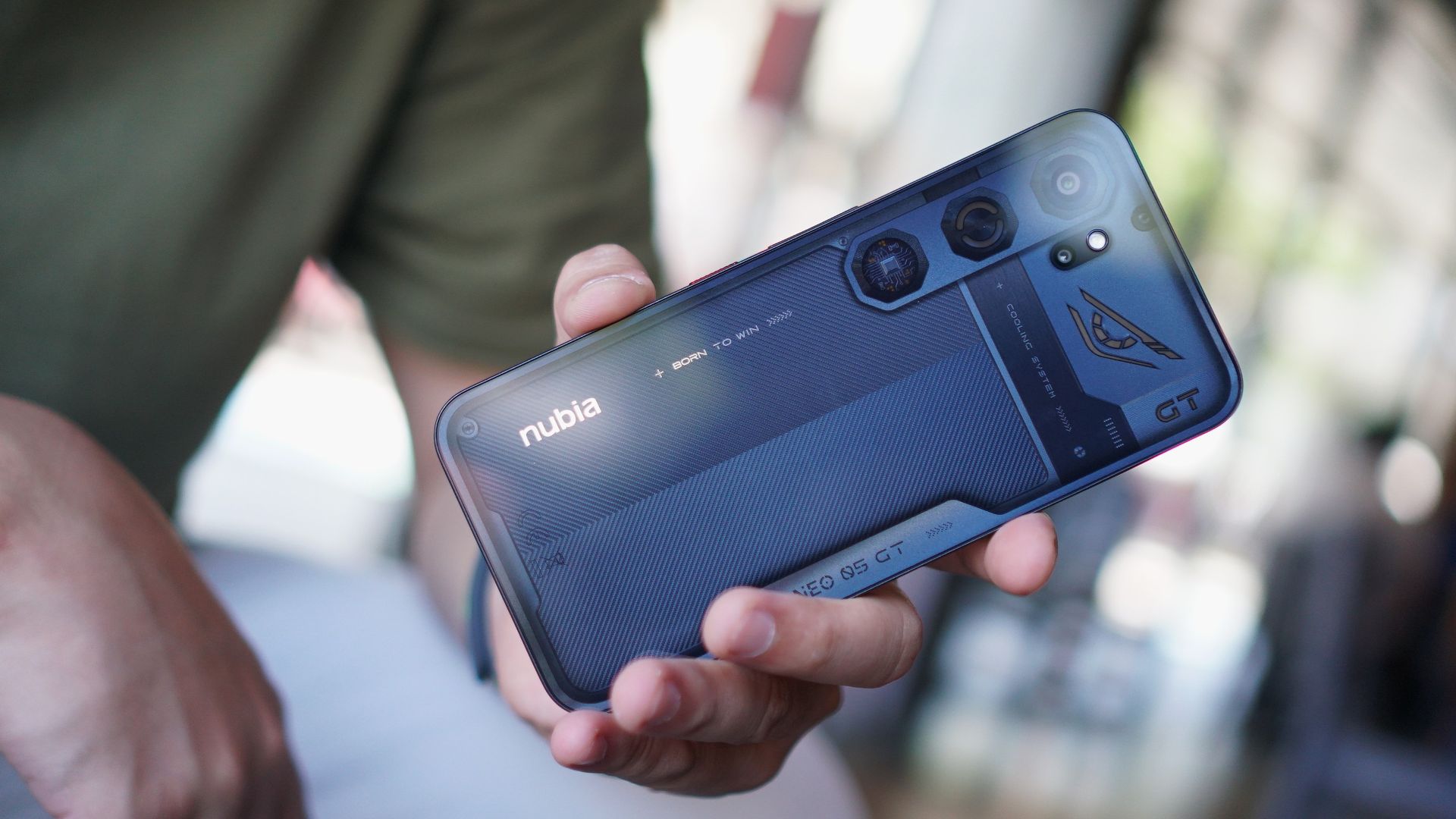

The realme GT Master Edition is a fine piece of tech. Spending roughly around 10 days with it, I can say it’s a pretty good midranger overall. So, this review is gonna be short and… I was tempted to say sweet, but I don’t think that’s the taste I’ll leave you with.
I’m going to jump right ahead to pricing. It’s always been one of realme’s strengths; offering great value products. That means you get a little more than what you pay for.
I’m gonna slap on the specs here once more so you can reference it as I babble about my time with the phone.
- Display — 6.43″ AMOLED, 120Hz refresh rate
- Processor — Qualcomm Snapdragon 778G 5G
- RAM — 8GB + up to 5GB DRE (Dynamic RAM Extension)
- Storage — 128GB and 256GB
- Battery — 4,300mAh, Dual-cell design, 65W SuperDart charging
- Rear Cameras — 64MP f/1.8 main camera, 8MP f/2.3 119° ultra-wide lens, 2MP f/2.4 macro lens
- Selfie Camera — 32MP
- OS — Android 11, realme UI 2.0
- Color Options — Voyager Grey, Daybreak Blue
Price and availability
The realme GT Master Edition comes in two colors — Voyager Grey and Daybreak Blue. And two variants: one in 8GB+128GB and another in 8GB+256GB. Here are the pricing and pre-order details:
Lazada Exclusive
- 8+128GB — PhP 18,990
- September 24 (Whole day flash sale) — PhP 17,490 (PhP 1,500 discount)
- 8+256 GB — PhP 21,990
- September 24 (Whole day flash sale) — PhP 19,990 (PhP 2,000 discount)
Offline Pre-Order details:
- September 24 – October 1 (with free realme Smart Scale)
- 8+256GB — PhP 21,990
- Claiming: October 2 & October 3
It’s right around the ballpark of my personal favorite midranger/sub-flagship — the OnePlus Nord 2 — a phone I was generally happy with.
Build quality and design
I had already expressed my opinion on the realme GT Master Edition’s design in the Unboxing and First Impressions article. TLDR:
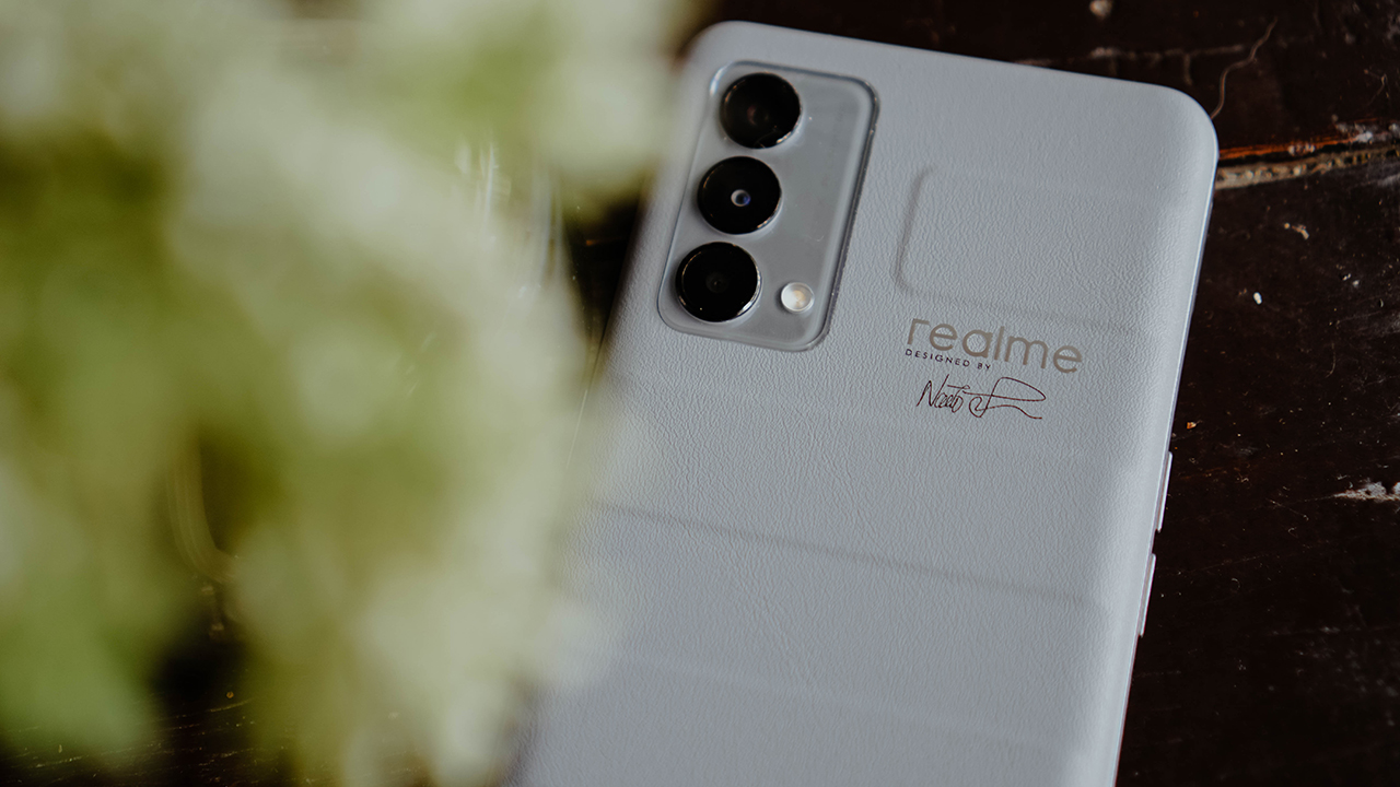
- The concave vegan leather feels great
- I appreciate the travel/suitcase theme
- Not particularly fond of the the designer’s signature (I even mulled over slapping TWICE stickers on it but decided otherwise)
I thought the size was perfect at first. Phones like this that have a 6.43” display are typically the ones I feel are in the sweet spot of not too big and not too small. However, after further use, I felt it could have used a little more chunk.
Without the included silicone-ish case, the phone gradually felt tiny in my hands. But I refused to use it with the case because it takes away from that fantastic leather feel. Perhaps they could have added another component or two to add some chunk and heft. Although, that may have pushed the price up which would betray realme’s whole “disrupt” approach.
That said, it’s not entirely unsatisfactory. And how it feels in your hand will vary differently from mine. One thing’s for sure, most people will love the concave vegan leather back. It’s a material rarely seen in this category and realme deserves props for having the balls to include it here.
Bloaty much
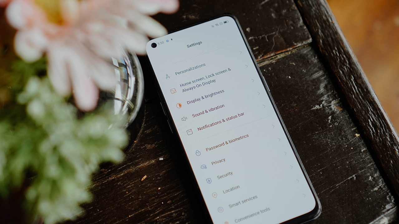
One thing I thoroughly disliked about the version of realme UI on the realme GT Master Edition is the incredible amount of bloat on the thing. You know how pre-installed apps take up some of the first home screen and maybe a little bit of the second page of the home screen. Well, this one took over half of the second page. That’s too much.
Sure, you have staples like Facebook, Messenger, and Netflix installed. But for every single one of those you get crap folders like Hey Fun, Hot Games, and Hot Apps. Yes, you can remove them, but it’s just inconvenient.
Speaking of inconvenient, that’s the only word I can think of to describe the App Market. Yes, it’s the same one found on some OPPO phones. It’s a hassle to have to go to the Google Play Store to install an app, but then have that same app go through the App Market for some security check before you can launch it.
I tried to figure out how to remove that extra App Market layer but eventually lost patience. This might be a minor inconvenience for some, but it is an inconvenience, nevertheless.
What sucks most is that these weren’t present in previous realme devices we reviewed. The realme UI is relatively clean, so this amount of bloat was a bit of a shock to my system.
Smooth despite the annoyance
I don’t want to leave you with the impression that I hated my time with the realme GT Master Edition. Despite the largely annoying additions when you fire up the device, it remains pretty smooth for whatever you want to do with it.
For me, that’s some casual browsing on Facebook, Twitter, and Instagram as well as mindlessly scrolling on TikTok before bedtime. I didn’t really do any work tasks on it other than using chat apps for coordinating with teammates and external partners.
Of course, I also snuck in some Netflix time in there for good measure.
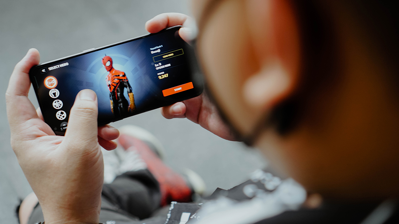
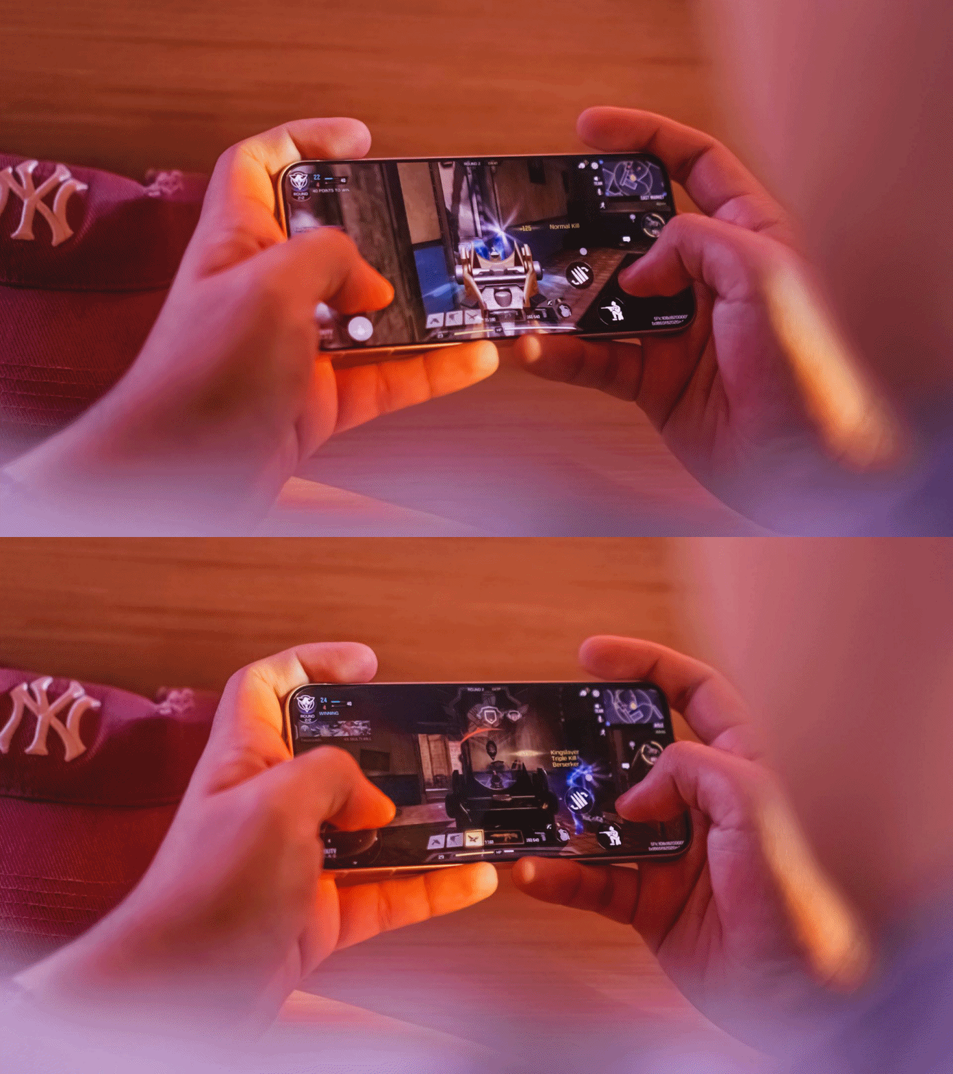
Most of my game time was also spent playing Marvel Future Revolution — which is the only other game on mobile I can tolerate other than Call of Duty: Mobile.
I usually play after having lunch or breakfast to finish a mission plus a few sidequests. That takes about 20-30 minutes. The phone performed admirably while displaying fantastic graphics. It did heat up but nowhere near an alarming point.
It can go up as high as 120Hz for the refresh rate, but my personal recommendation is to stick with the default adaptive setting. This way, the phone will identify the best refresh rate for each app and will help conserve battery life.
Speaking of battery life, this one’s right around what you would expect as well. It can last up to a day and a half for light to moderate usage, and one day for moderate to heavy usage.
Cameras, image processing is fantastic
Most realme midrangers have pretty good cameras. In fact, I even convinced one of my friends to buy a realme phone simply by showing a few sample photos. The realme GT Master Edition is no different. So I’m gonna do the same thing and just drop some samples here.
Food photos
Portrait
Filters
Night
Indoors
Zoom
Daylight
I don’t really have much to say in this section. I’m not the type who over analyzes the photo output. What I do know is that you’ll have a generally pleasant time snapping with the realme GT Master Edition.
It captures a good amount of detail, the image processing isn’t too aggressive, and the zoom performed so much better than I expected. Just be wary about using certain features in low light situations. For example, Portrait mode, that’s best when you have plenty of natural light.
If realme is selling you on this phone’s sheer photography prowess, it has every right to do so. It delivers as advertised.
Is this your GadgetMatch?
I wouldn’t call the realme GT Master Edition a disruptor, but it’s certainly one of the best devices in this category. My only real gripe is the bloatware but other than that, it’s pretty excellent considering price and performance.
realme could have taken a few steps to make sure this is a 100 percent easy recommendation. But even as it is now, it’s still a product worth your consideration if you’re in the market for a capable smartphone.

Reviews
vivo X300 FE review: Don’t judge the camera by its cutout
A midrange-sized camera bar doesn’t mean mid camera performance
Any modern smartphone series usually comes with a base, a Pro, and an Ultra model. However, some phone makers introduce a more affordable “Lite” version.
Still with the same intent, others do substitutes using “e”, “s”, a combination of “SE”, or an even rarer “FE” model.
Well, the vivo X300 series is a clear testament to this. Aside from last year’s base and Pro, the Chinese manufacturer has decided to launch two more models on both ends of the spectrum.
The clear headliner is none other than the X300 Ultra. But, the latest vivo X300 FE is meant for users who want that X300-grade cameras minus its soaring pricing. Or is it?
What are the compromises though? Are there even any? Here’s my extensive review.
FE = ✨ Fab Edition ✨
When Samsung launched the first “FE” phone, they thought of resurrecting the quite explosive Galaxy Note7 (literally and figuratively). All for the sole fulfillment of their fandom who’ve been clamoring against its sudden discontinuation right after the fueling fiasco.
The “Fan Edition” was then born.
However, my understanding with vivo’s X300 “FE” isn’t intended solely for fans. It’s rather an embodiment of full-on fanciness. Thus, that FE meant ✨ Fab Edition ✨ in my vocab.
If we’re talking about how it stands out from the rest of the X300 family, size isn’t just about it.
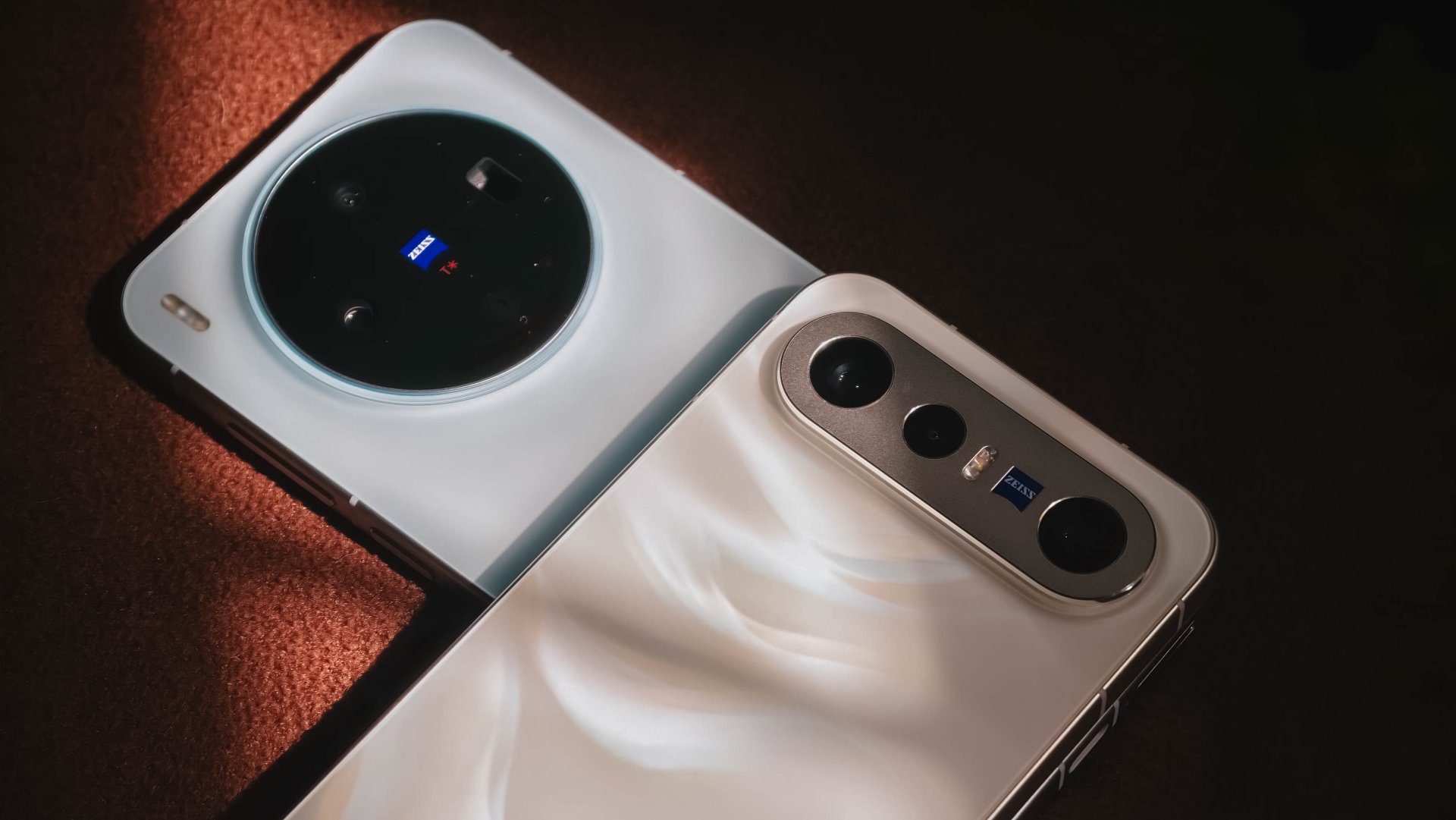
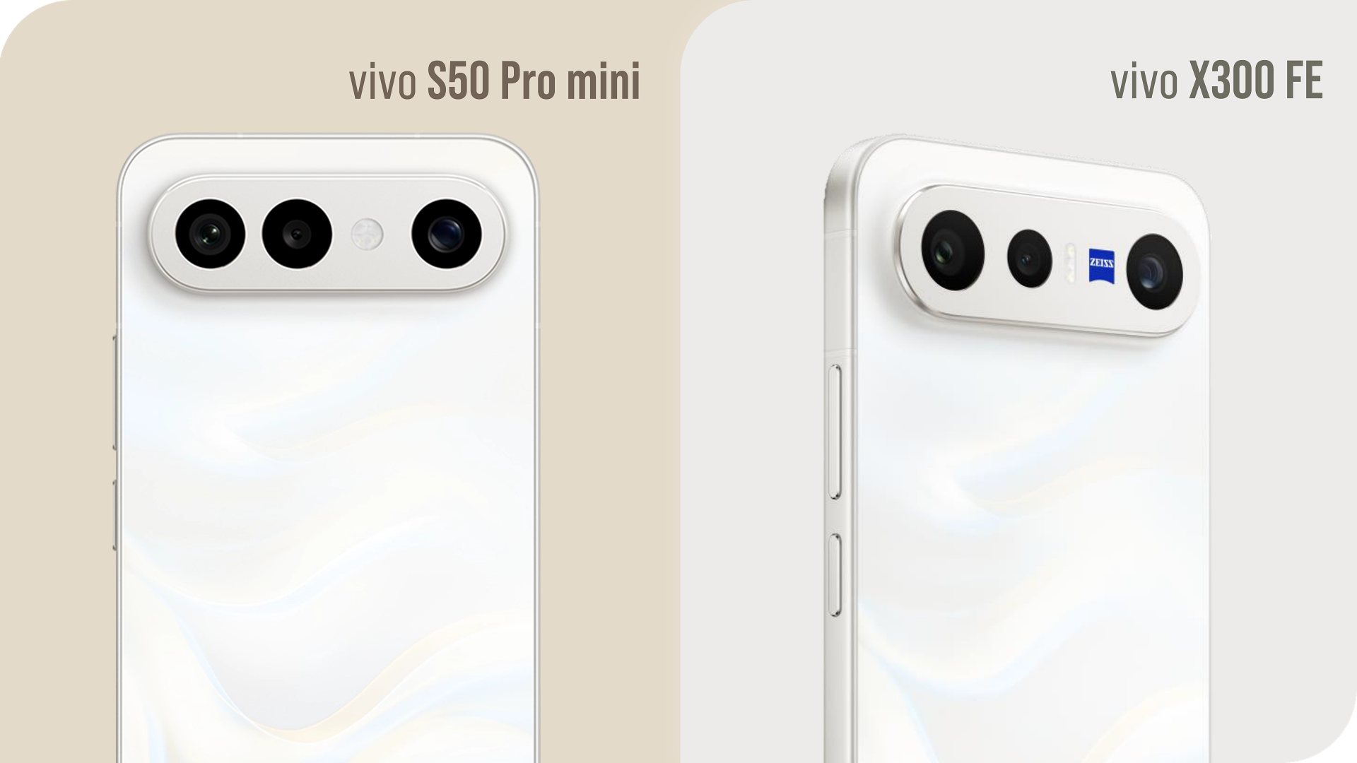
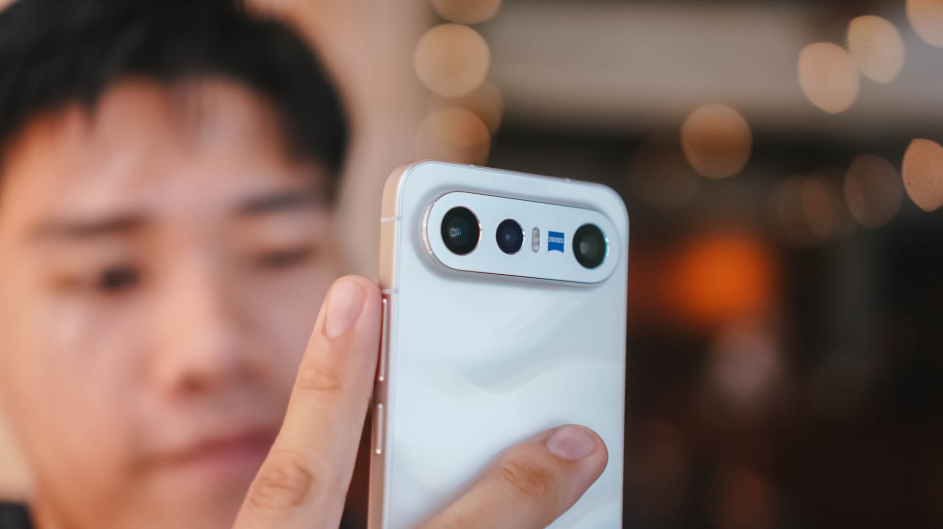
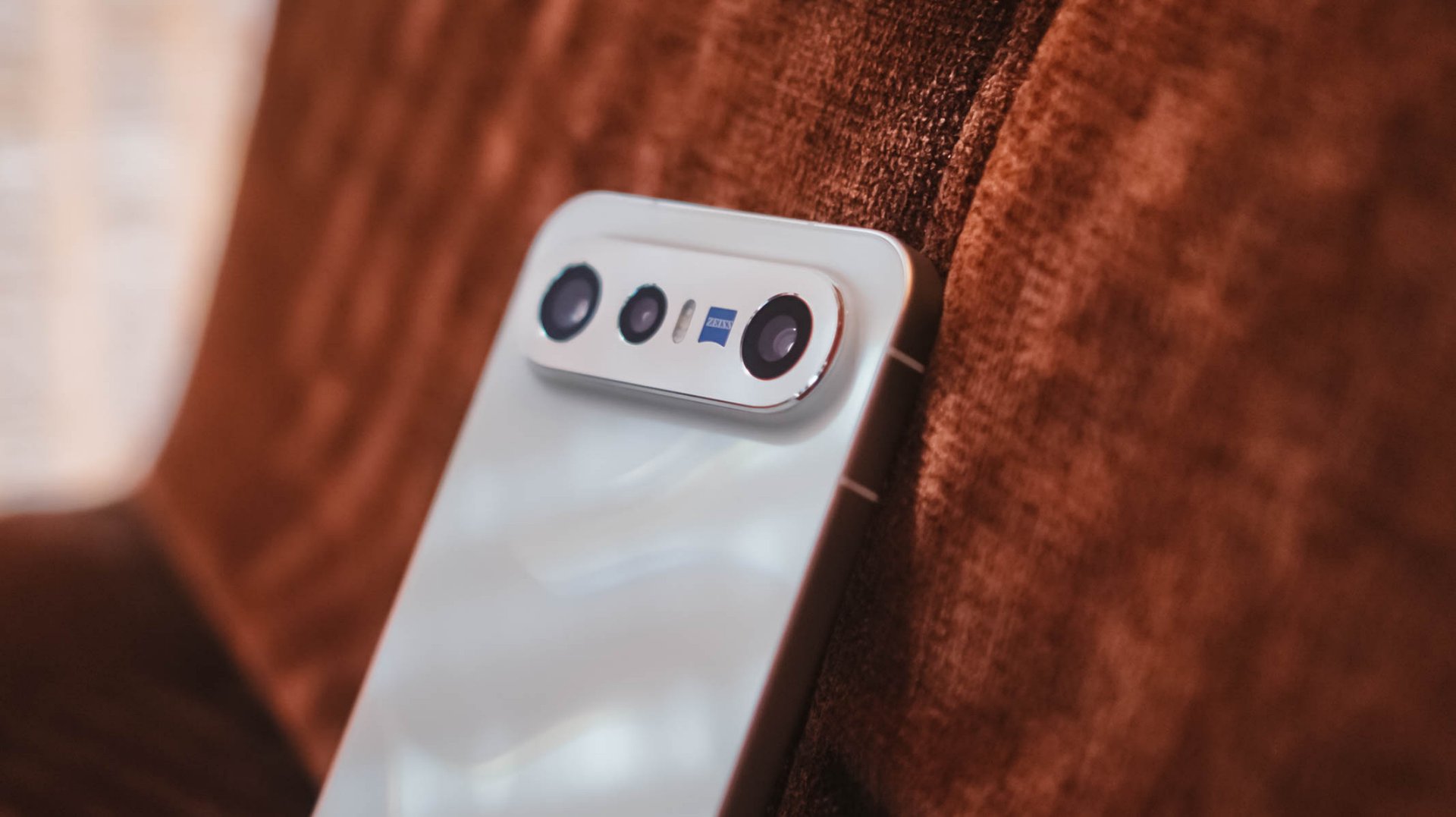
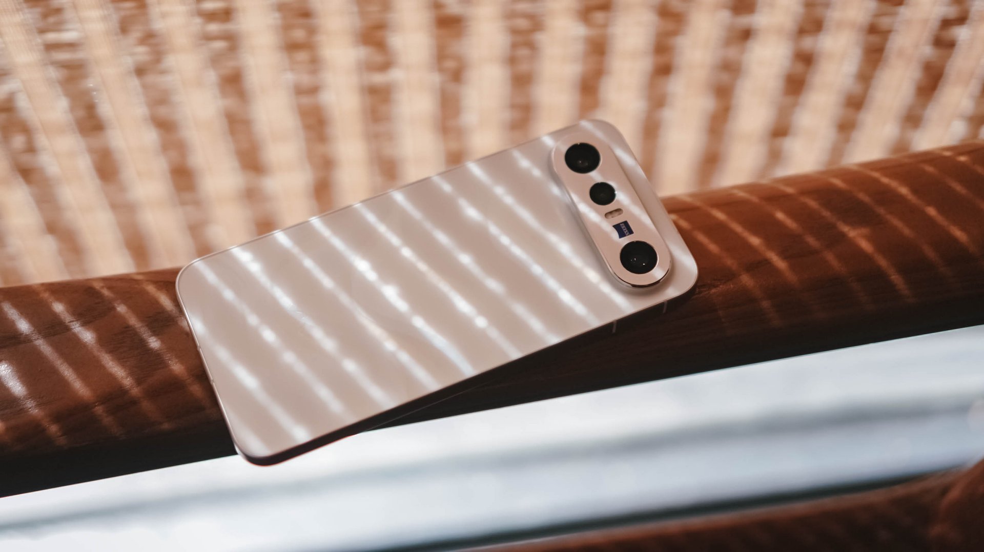
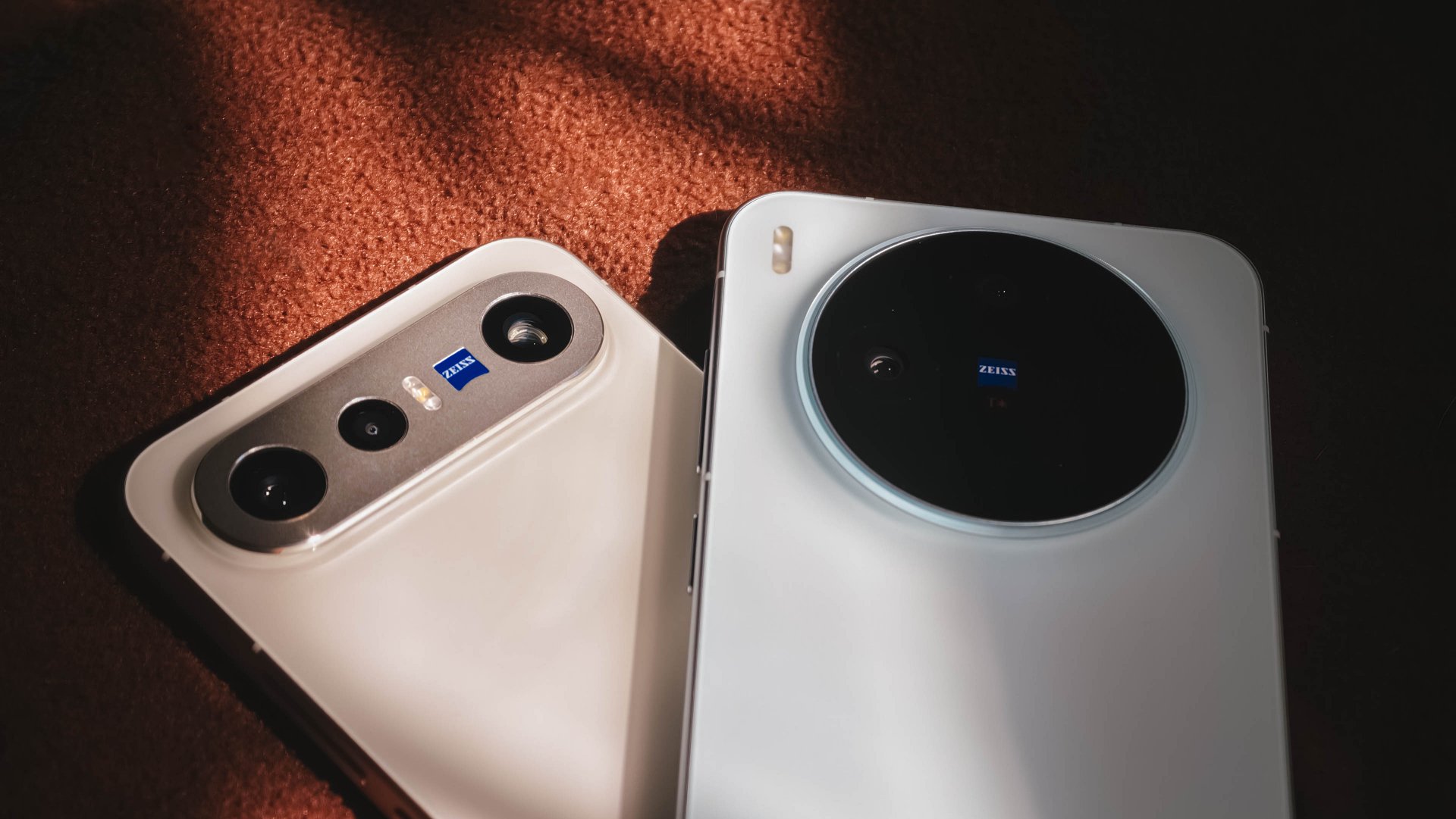
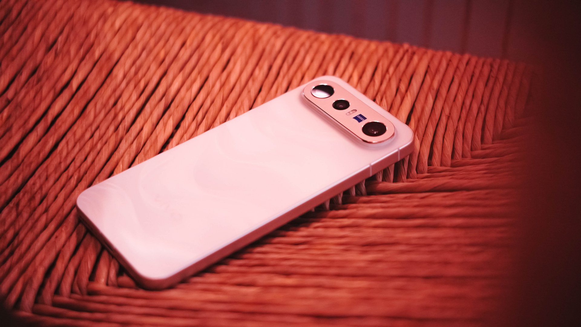
The dimensions of the X300 FE are teeny tiny close to the vanilla vivo X300. However, if you’re not a fan of its massive circular hump, X300 FE’s singular camera bar is the way to go.
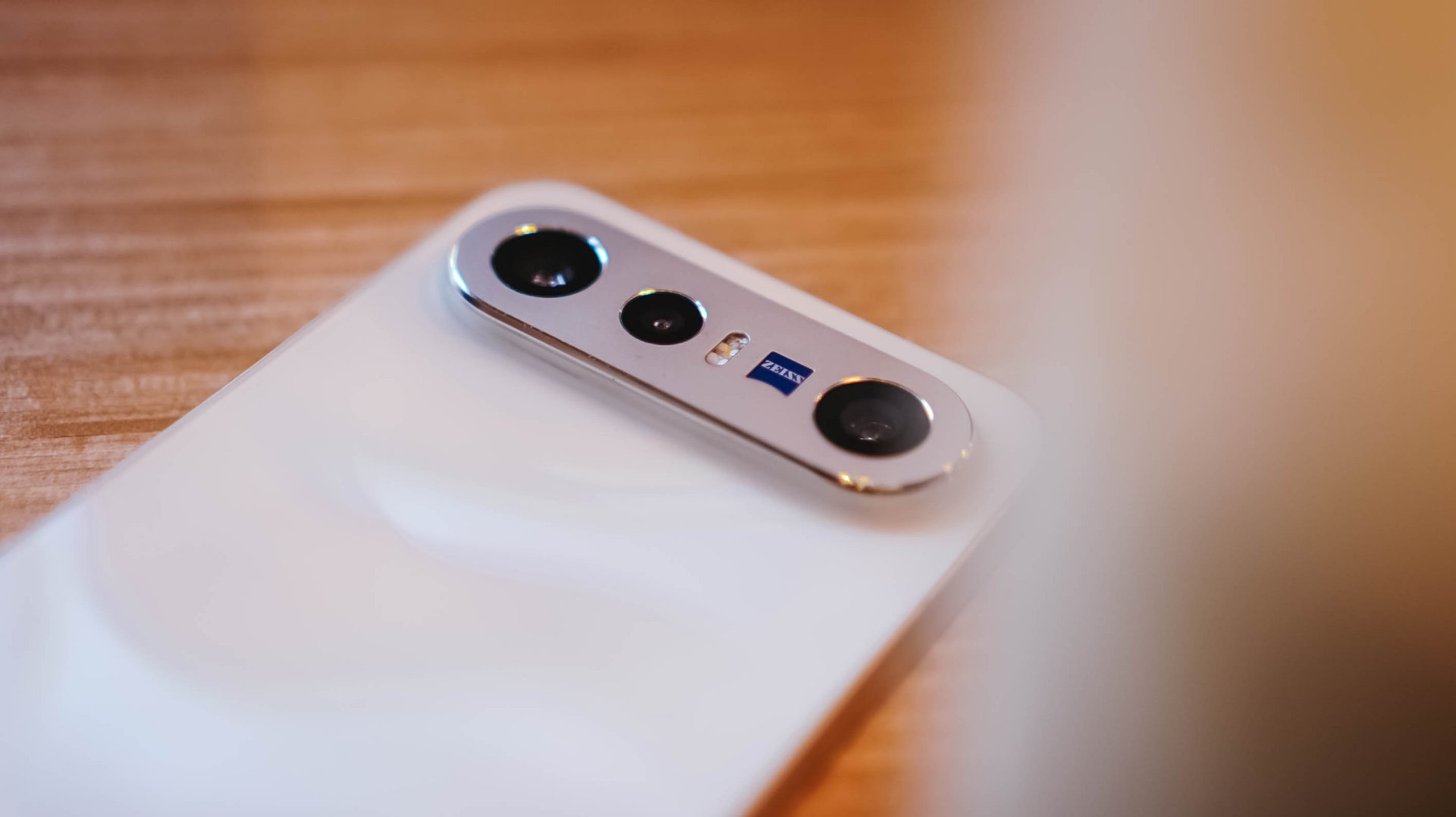
Honestly, I truly appreciate how vivo decided to use an aluminum enclosure rather than slapping a piece of glass wholly. That single move will make you think it’s another Pixel phone by Google.
Also, notice that ZEISS branding sitting beside the elongated flash unit? That’s the best way to tell that it’s the X300 FE, not the S50 Pro mini exclusive to China.
It’s these small design details that make me appreciate the beauty of a smartphone as a whole.
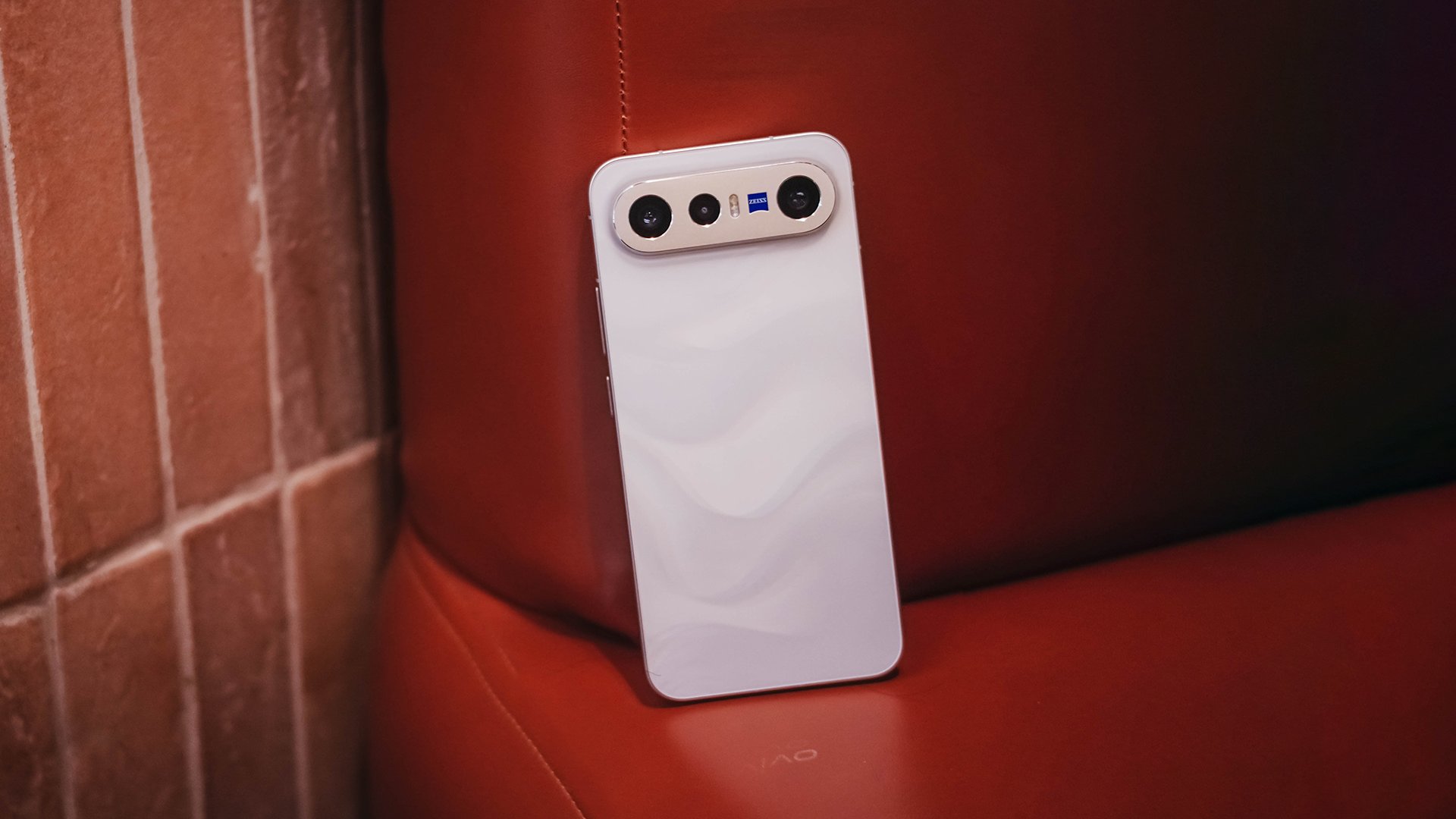
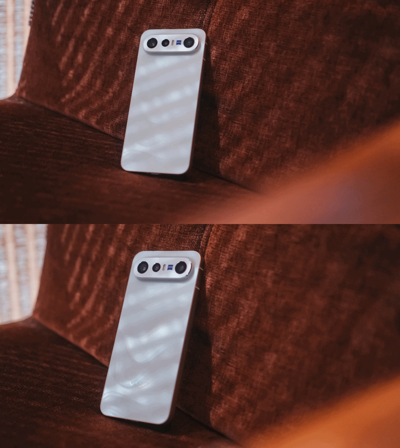
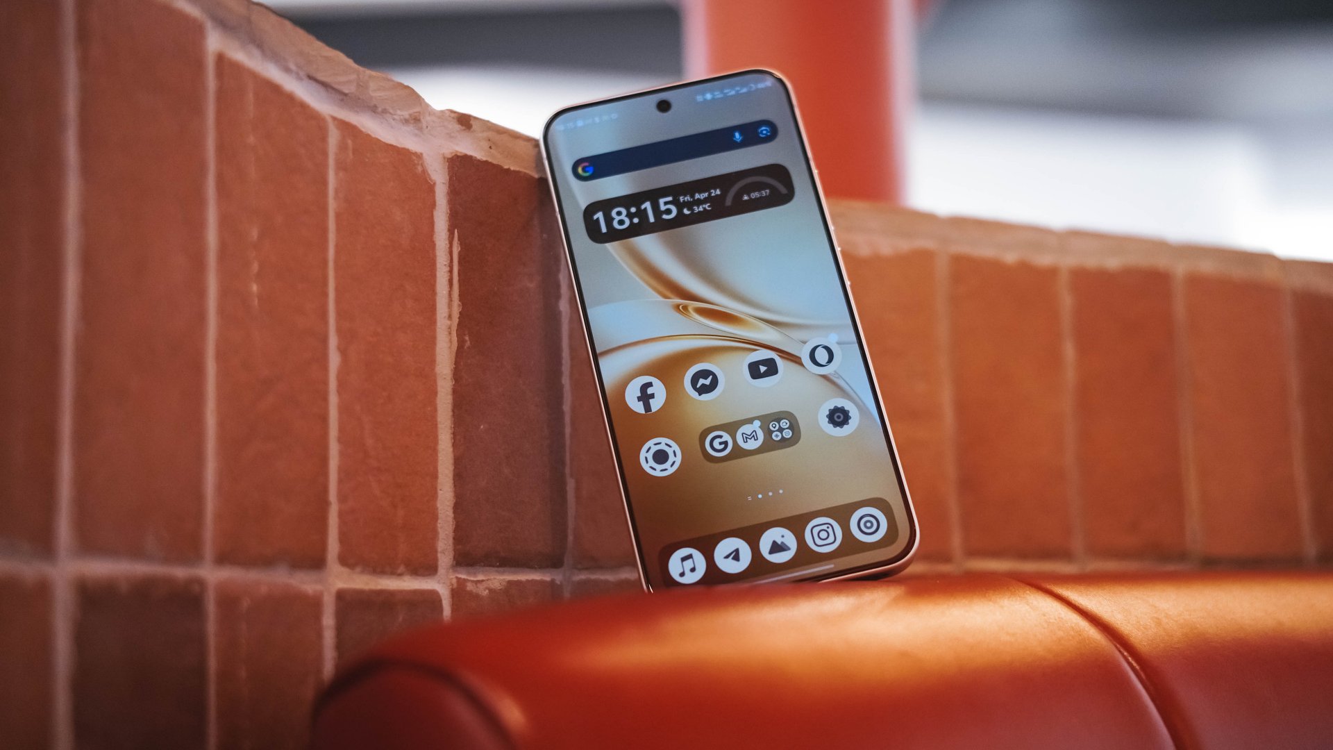
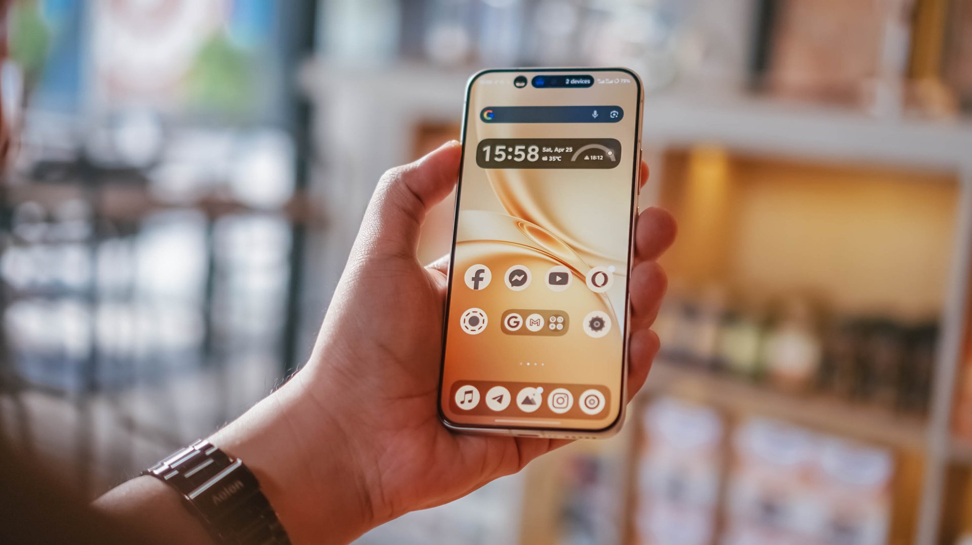
Speaking of, the X300 FE I rock is in this fabulous Glow White shade with subtle wave-like patterns when hit by faint light. Honestly, I love this texture for added elegance.
If that’s not your cup of (milk) tea, there are three more options to choose from: Cool/Noir Black, Urban Olive (or Green), and Mist/Lilac Purple — all without that added pattern.
When held, the phone is premium to the touch. Its aluminum side trims also feel solid with buttons that are tactile and not too clunky.
Time will only tell how long it remains unscathed against pointy objects in your pockets.
And, before I forget, it’s rated to withstand extremities with its dual IP68 and IP69 water and dust resistance rating.
#NowPlaying: Perfect Crown 👑
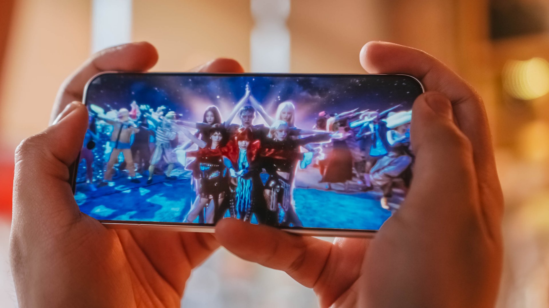
Finally flipping onto its front, the vivo X300 FE instantly reminds me of IU in Disney+’s Perfect Crown. Much like her petite yet powerful aura, the X300 FE shares the same feat — both in display size and quality.
For one, this ZEISS Master Color Display makes me truly enjoy all the heartwarming moments of Seong Hui-ju (or Sung Hee-joo) and the perfectly charming Grand Prince I-An (as starred by Byeon Woo-seok).
Blacks are as deep as the back stories and familial sentiments of both protagonists. More so, display nits go as high as 5000 nits — just like the sparkling eyes of I-An when he’s dazzled by Hui-ju’s beauty.
Colors ultimately pop too, like their lovey-dovey moments in between.
However, unlike the families of both sides trying to go overboard, this LTPO AMOLED display begs to differ as it displays the most accurate color representation possible. DCI-P3 Wide Color Gamut, 1.07 Billion Colors and HDR+ support, you get the idea.
Visuals are also as sharp as Hui-ju herself: a pixel density of 460 ppi and display resolution of 1.5K.
Also thinking about Prince I-An’s protection to Hui-ju against all odds, the X300 FE also wants to protect your eyes: 2160Hz PWM Dimming, Night Eye Care Mode, even SGS Low Blue Light Certification.
These are something most brands have often overlook in display tech, especially for those who have sensitive visuals.
Specs sounding too familiar? Well, the base X300 has the same powerful display. So yes, the quality has never been compromised to begin with.
The only thing that nitpickers will notice is the slightly thicker bottom chin of the X300 FE that the regular X300 doesn’t have. But I digress.
It’s also worth noting that the X300 FE finally adopts a speedy and ever-reliable ultrasonic fingerprint scanner. Last year’s X200 FE relied on a slower optical fingerprint sensor. This is more than just a welcome change considering that vivo pioneered the under-display fingerprint tech eight years ago.
On queue: LE SSERAFIM 🥳 + Xdinary Heroes 🚀
With LE SSERAFIM’s latest pre-release track “CELEBRATION,” it enticed me to test out how powerful the speakers of the vivo X300 FE really are.
Aside from all the member’s deep and soulful vocals, I was able to hear the hidden synths, thumps, and oomphs that are barely recognizable in other phones.
Moreover, I felt the depth of its stereo speakers when I played Xdinary Heroes‘ latest comeback track titled “VOYAGER” as well as the full “DEAD AND” album.
DAY6’s 후배 / hoobae (or junior) is as powerful as the speakers are.
From the beats and strums of the drums and guitars, all the way to the powerful voices of the members, it’s honestly surprising to hear that the X300 FE isn’t an actual embodiment of its small form factor.
Tiny in size never meant tinny in sound performance.
If I’m being bold enough, it’s as loud and powerful as what I had and heard with its bigger brother, the X300 Pro.
Dedicated pro-former 🎮
The vivo X300 FE is the only phone in the family that does not run a “top-tier” chipset.
As a matter of fact, it’s one of the fewest smartphones that run Qualcomm’s latest Snapdragon 8 Gen 5 SoC. Although this should not to be confused with the Snapdragon 8 Elite Gen 5, it’s still a very capable and power-packed flagship chip on its own.
And by that, I meant triple A games running as smooth as ever!
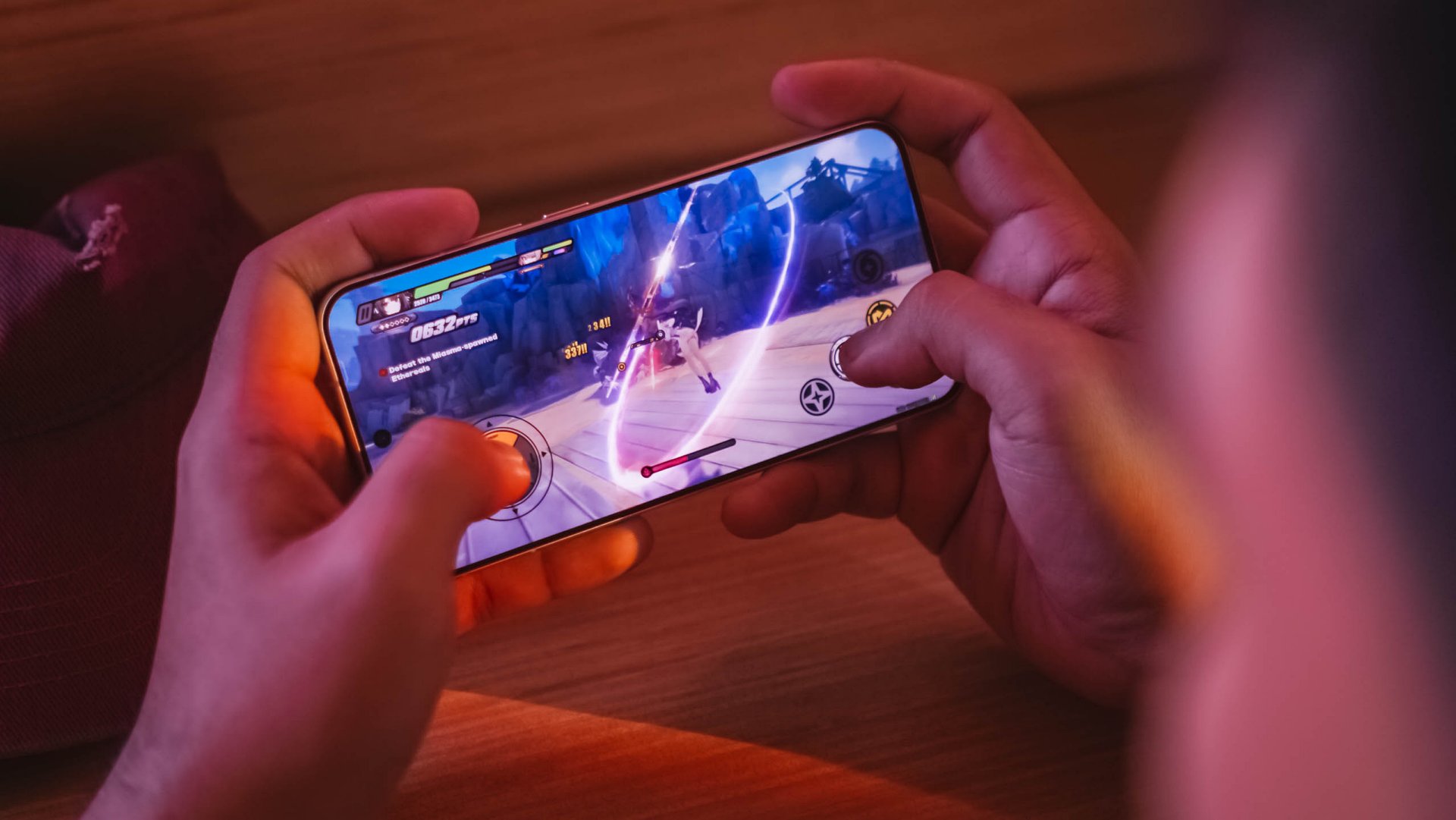
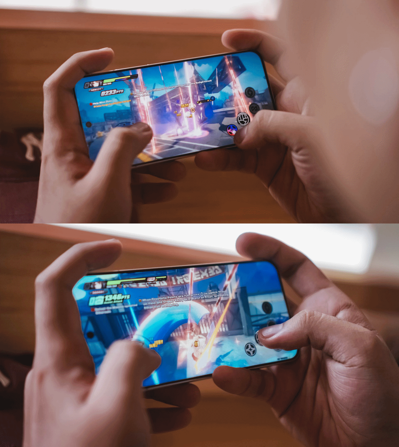
My extreme gaming benchmarking usually starts with HoYoverse’s Zenless Zone Zero due to its demanding graphics.
Right off the bat, the game runs in High graphics setting by default while Rendering stays at Medium.
My recent gameplay took me to a 20-minute combination of Combat Mode and extreme story-telling.
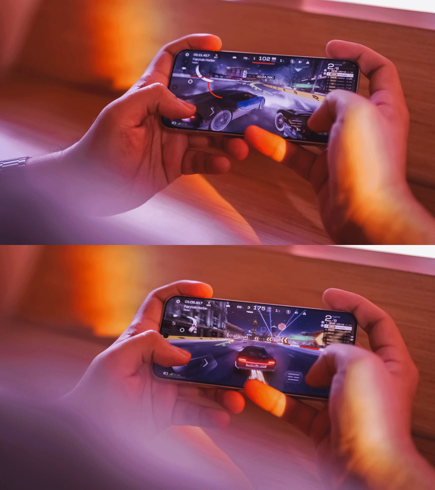
Moreover, Racing Master ran at Ultra-High graphics quality, HD resolution, high motion blur, and frame rate set to 60fps.
Surprising (or not) the vivo X300 FE handled all of these with ease, just like any modern flagship would.
This also meant that other less-intensive games such as CoDM (Call of Duty: Mobile), MLBB (Mobile Legends: Bang Bang), or any other similar FPS or MOBA game will run smooth like butter.
The only downside for me who has big hands, gaming here sometimes feel sore. Also, the lack of a bigger VC chamber that contributes to less efficient heat dissipation, resulting to warmer gameplay in the long run.
Speeds were neither compromised. It’s the same UFS 4.1 storage and LPDDR5X Ultra memory. The catch? Slower USB-C 2.0 port over USB-C 3.2 Gen 1.
Beyond gaming, overall UI smoothness is a must.
Thanks to vivo’s streamlined OriginOS 6, animations looked both snappy and fluid whenever opening or switching between apps. Aside from the usual AI shenanigans, there are more things to love such as Private Space, Origin Island, One-Tap Transfer, and more.
Even Office Kit that enables seamless connectivity between your MacBook was not left behind. It’s also reassuring to hear that the X300 FE will receive five (5) years of OS upgrades and seven (7) years of security patches.
Compact champ 🔋
You’ve known by now that the vivo X300 FE is definitely in the “compact” league. You also know how the FE serves as the “twin sister” of the X300.
But, the biggest disparity of the two are none other than their batteries. Although numbers aren’t everything, battery capacities matter a lot.
Despite its petiteness, the vivo X300 FE boasts a whopping 6500mAh battery capacity — similar to the larger X300 Pro. The base X300? Stuck at 6040mAh. Worse? European units are capped at 5360mAh.
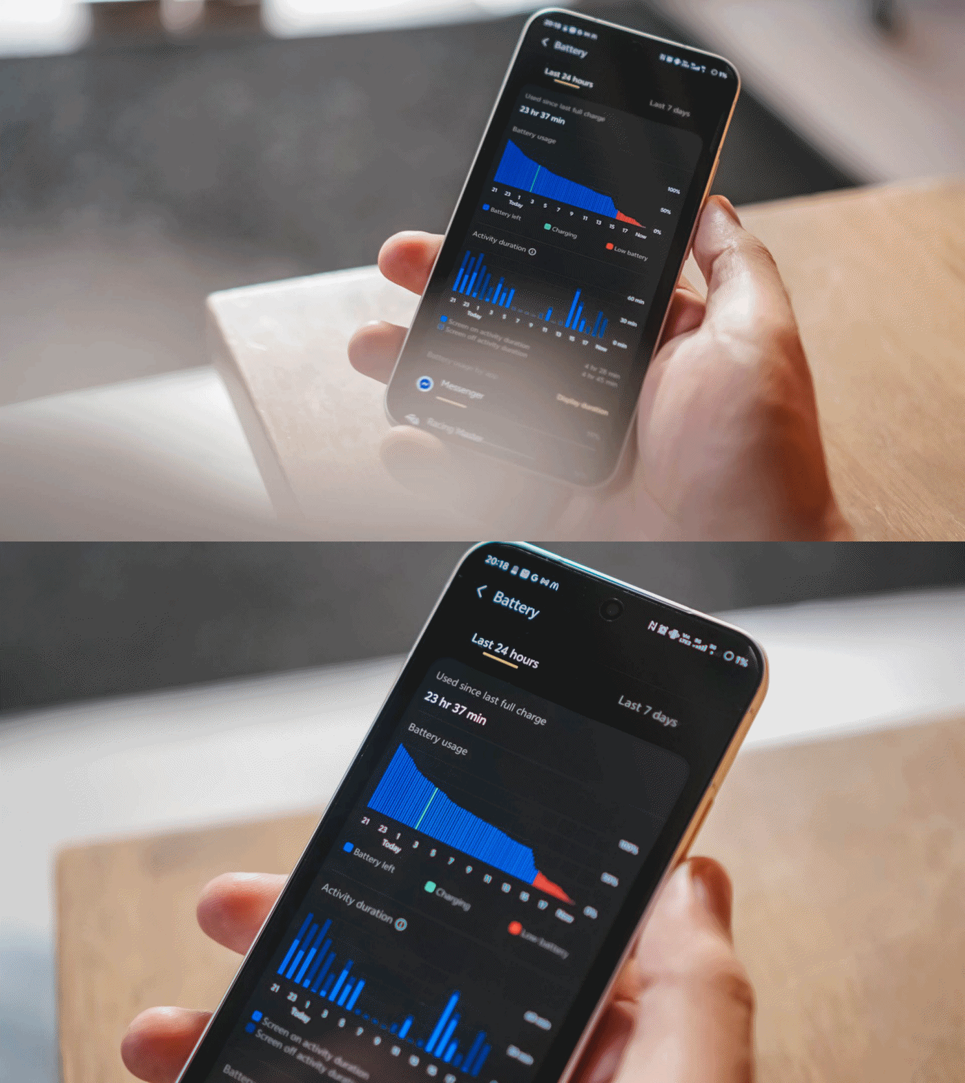
Using this phone under my light to moderate usage patterns, the vivo X300 FE can totally last way past midnight.
Using it in heavier scenarios was unavoidable. Gaming for around 1.5 hours deducts battery levels to 25% more or less.
Using its cameras every now and then to take lots of snaps and clips contribute more to that depletion.
Not unless you’re doom-scrolling or binging for more than five hours, an hour of content consumption or social media will not totally diminish that massive tank.
Some personal use-case: I went out to the city around 6AM and used it as my personal hotspot. After that 12-hour mark, there’s still around 31% battery left.
For the same scenario, my vivo X300 Pro dies right around that time. Worse? Lasting only around 7 to 8 hours.
Once empty, the X300 FE supports vivo’s 90W FlashCharge. Unlike European models, Asian variants (like I have) still have bundled charging adapter and cable when you buy one.
View this post on Instagram
In my GadgetMatch Charge Test, it can be juiced up from 0% to 100% in 75 minutes, as long as FlashCharge High Speed is enabled.
FlashCharge High Speed |
FlashCharge Normal |
|
START TIME (From 0%) |
7:29PM |
2:56PM |
3 minutes |
1% |
1% |
5 minutes |
4% |
4% |
10 minutes |
12% |
7% |
15 minutes |
17% |
13% |
20 minutes |
32% |
20% |
30 minutes |
44% |
33% |
45 minutes |
66% |
53% |
1 hour |
88% |
74% |
1 hour 15 minutes |
100% |
95% |
END TIME |
8:44PM
|
4:23PM
|
Normal FlashCharge speeds require you around 15 more minutes to completely fill to the very brim.
Like the rest of X300 iterations, the X300 FE also supports 40W wireless FlashCharge that the vivo V70 and V70 Elite do not provide.
Don’t judge the camera by its cutout
Last but definitely not the least, vivo X300 FE’s triple camera system.
Before anything else, here’s how it compares with its closest rivals: the vanilla X300 and the midranger V70.
vivo X300 |
vivo X300 FE |
vivo V70 |
|
Wide |
200MP f/1.68
|
50MP f/1.88
|
50MP f/1.8
|
Ultra-Wide |
50MP f/2.0
|
8MP f/2.2
|
8MP f/2.2
|
Tele-
|
50MP f/2.57
|
50MP f/2.8
|
50MP f/2.65
|
Selfie |
50MP f/2.0
|
50MP f/2.45
|
50MP f/2.0
|
While all share the same focal length choices, it all boils down to minuscule differences between image sensors to actual aperture count. Let’s just say the X300 FE shares more similarities to the vivo V70.
But, the filling is always the sweetest spot in the cake. Let’s go straight to actual shots taken with this phone.
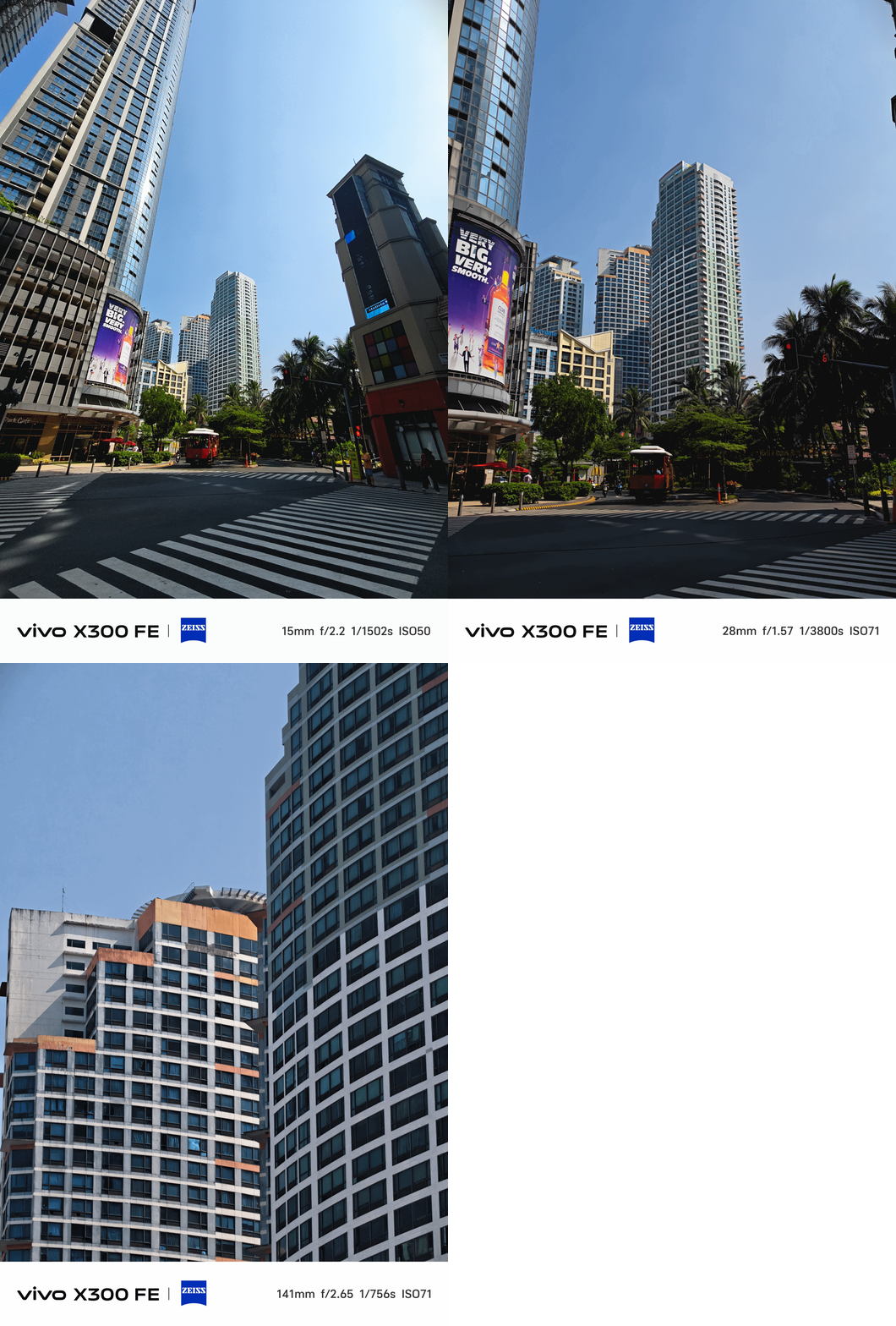
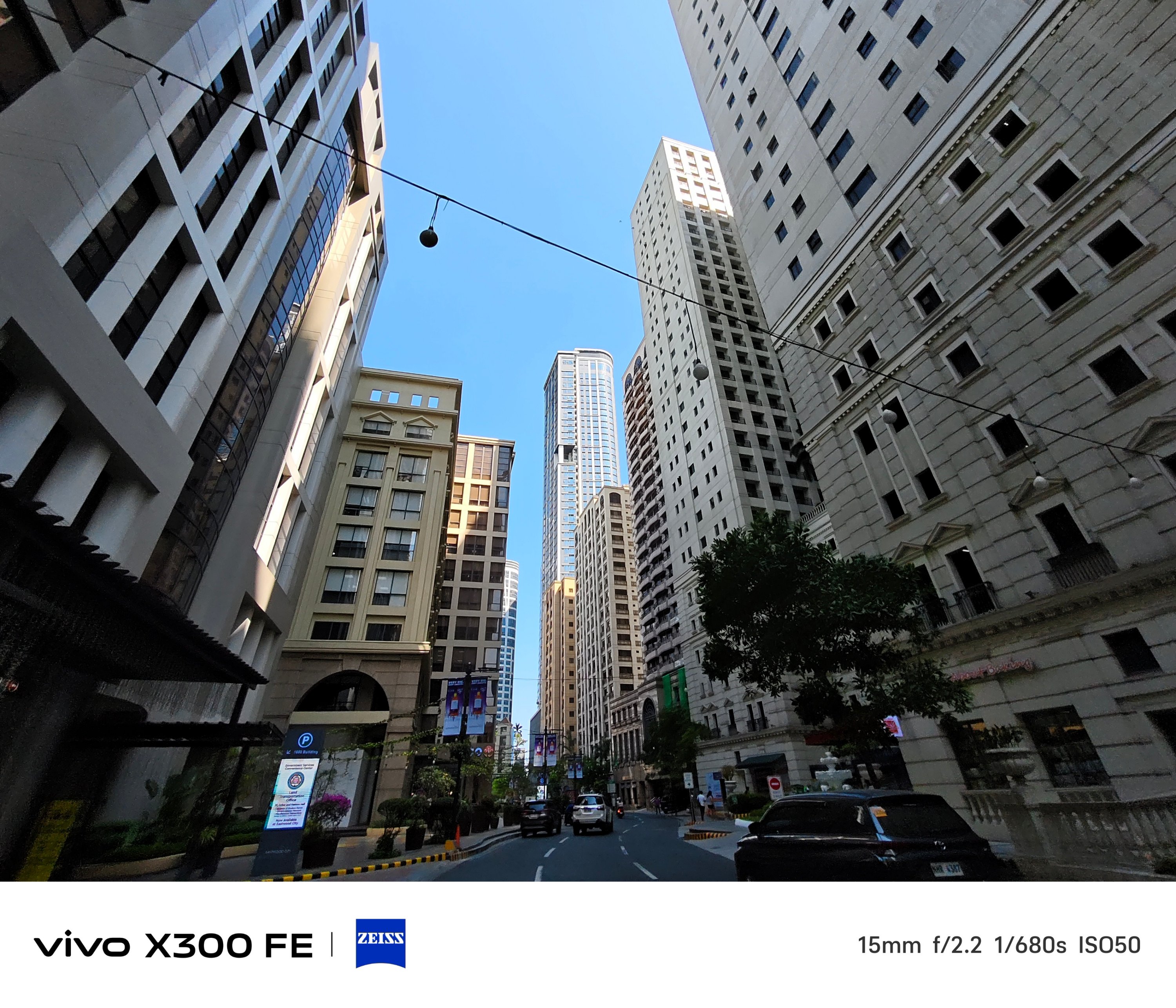
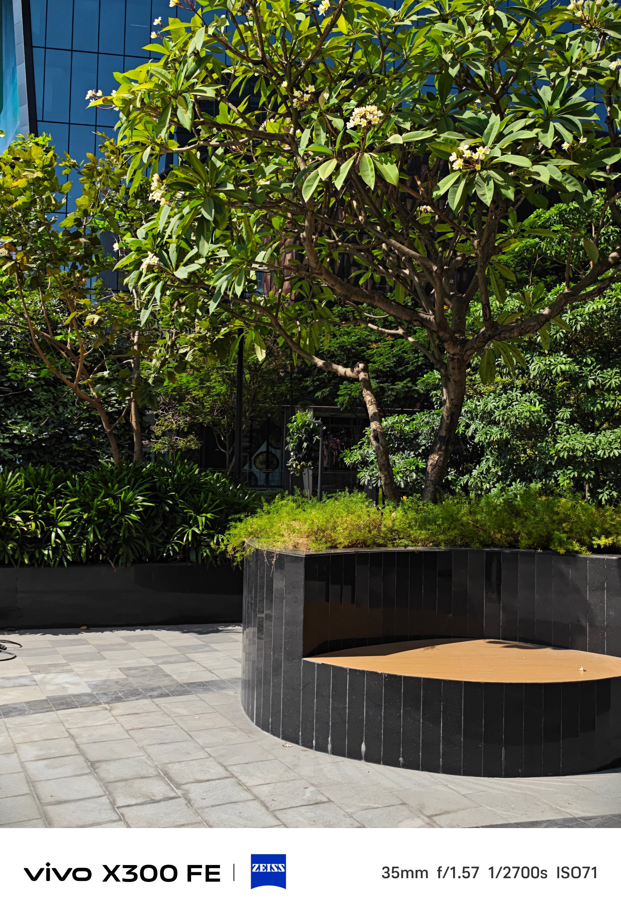
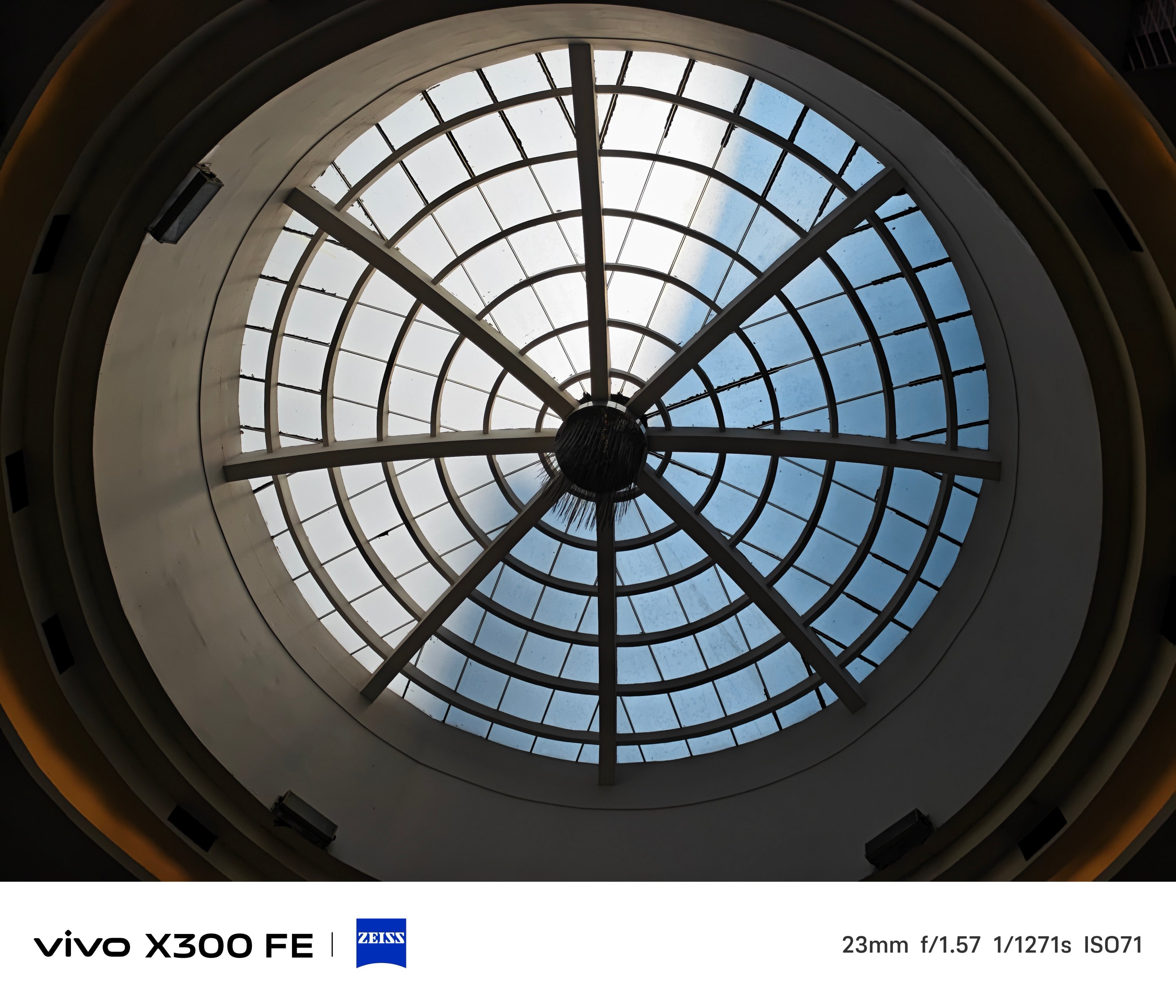
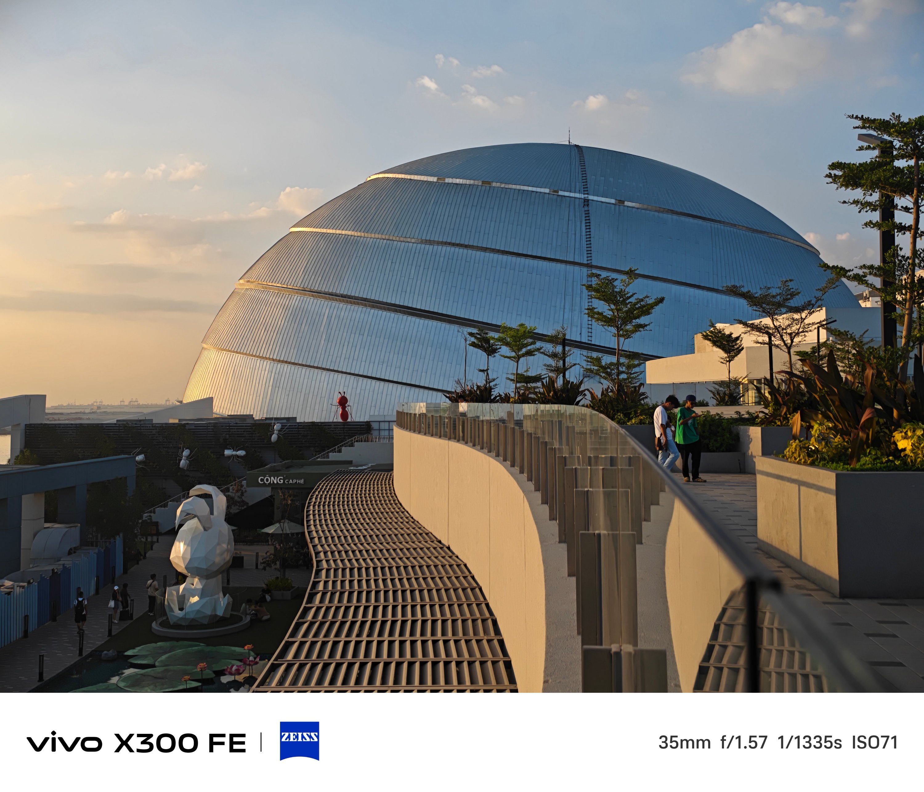
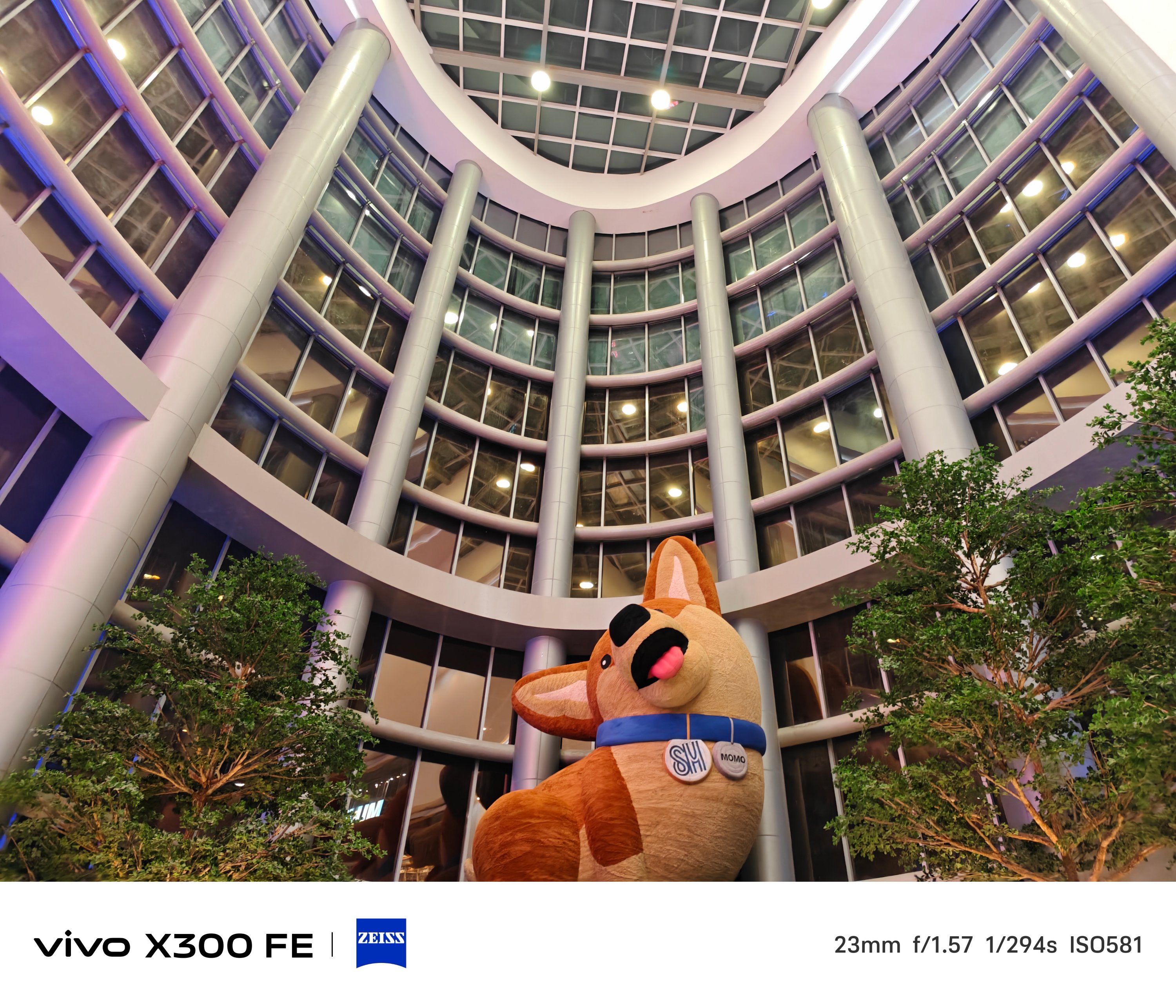
The X300 FE provides color consistency regardless of the focal length you choose — even past its optical zoom limit.
Ultra-Wide Angle (UWA) photos, while sufficient, has some over-sharpening happening in between.
That’s obviously to compensate for its measly 8MP shooter.
Thankfully, vivo made its other two lenses equal in terms of megapixel count.
Of course, regular 1x (wide) shots are taken with that default 23mm focal length — which can then be changed to 28mm and 35mm through a series of taps in the camera app.
2x zoom is also possible thanks to in-sensor cropping — 46mm or 50mm equivalent to be exact.
One must never judge a book by its cover — just like refraining from judging a camera solely by its cutout.
The vivo X300 FE is a living proof that having a camera cutout that’s comparable to midranger phones does not equate to mid camera performance and image output.
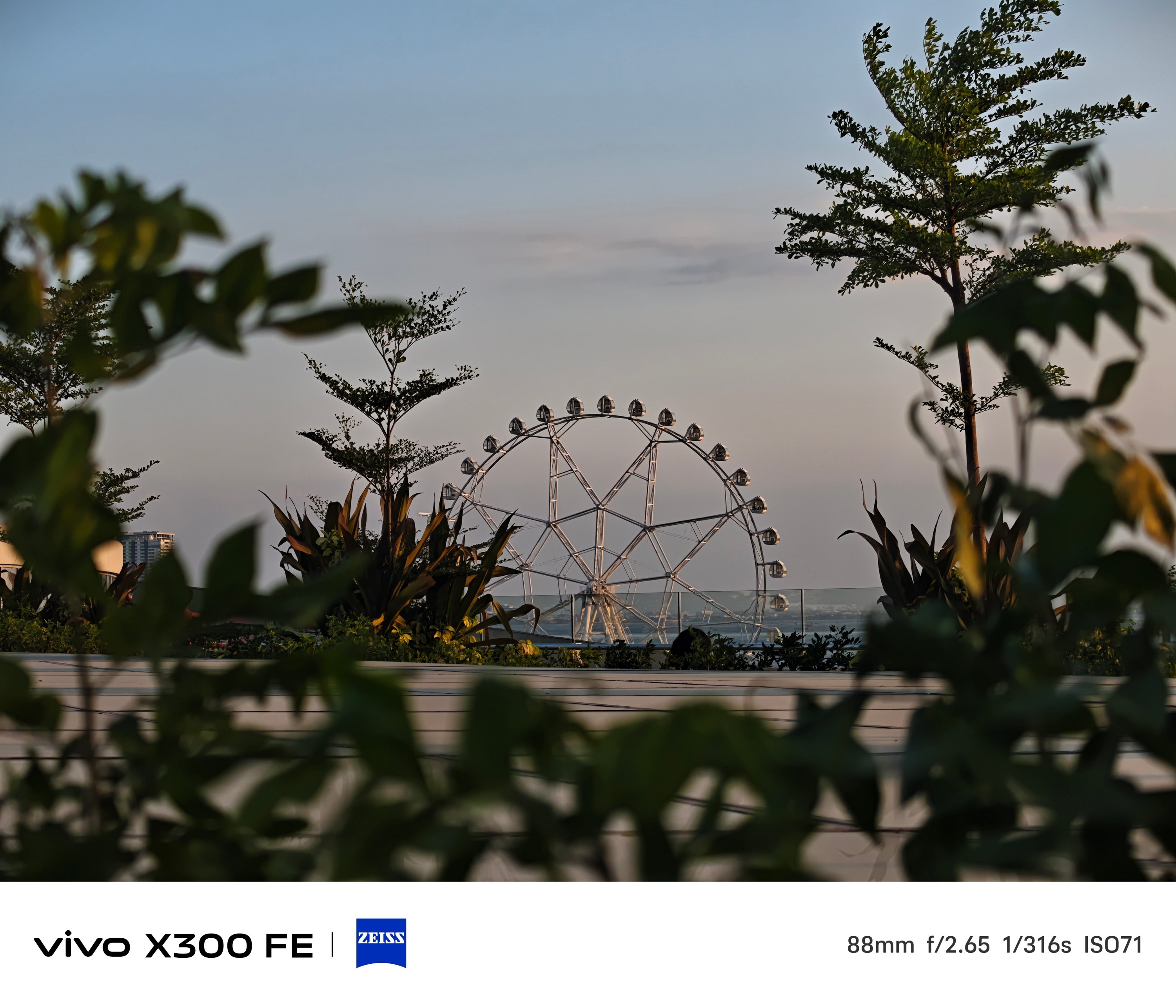
Even more, placing a 3x periscope telephoto module (73mm) inside that camera bar is a true feat of engineering.
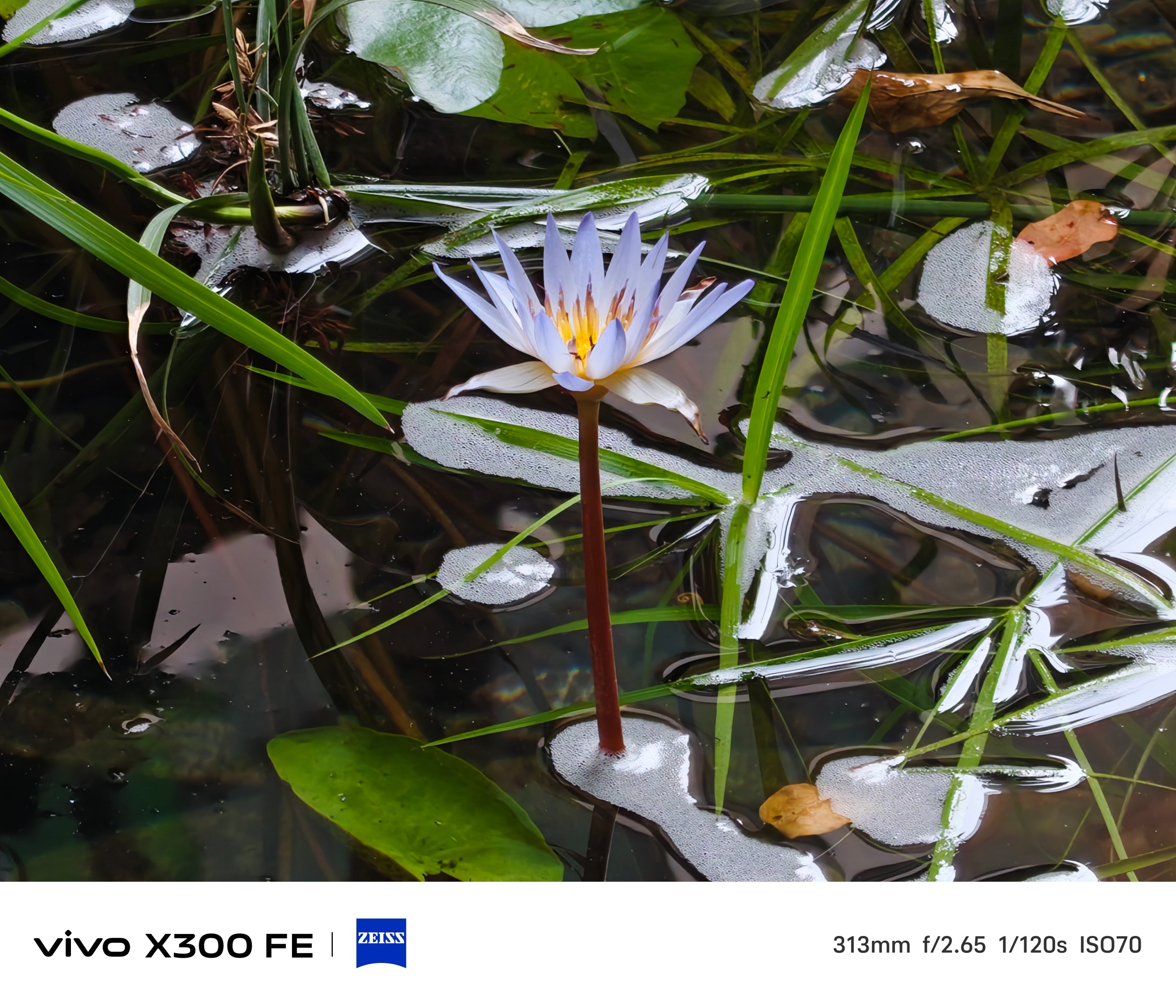
Even beyond its dedicated 3x optical zoom, results are surprisingly captivating to the eyes.
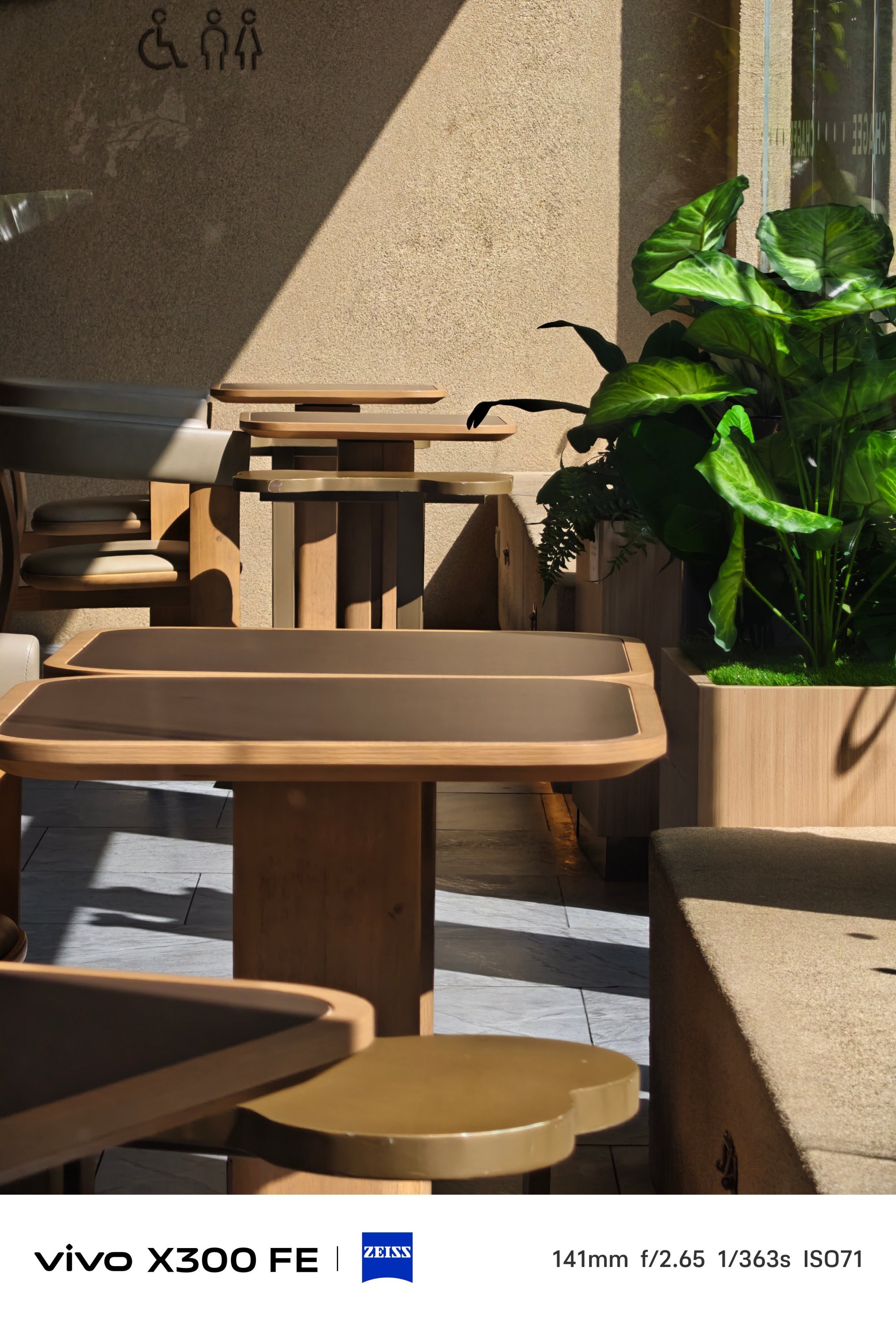
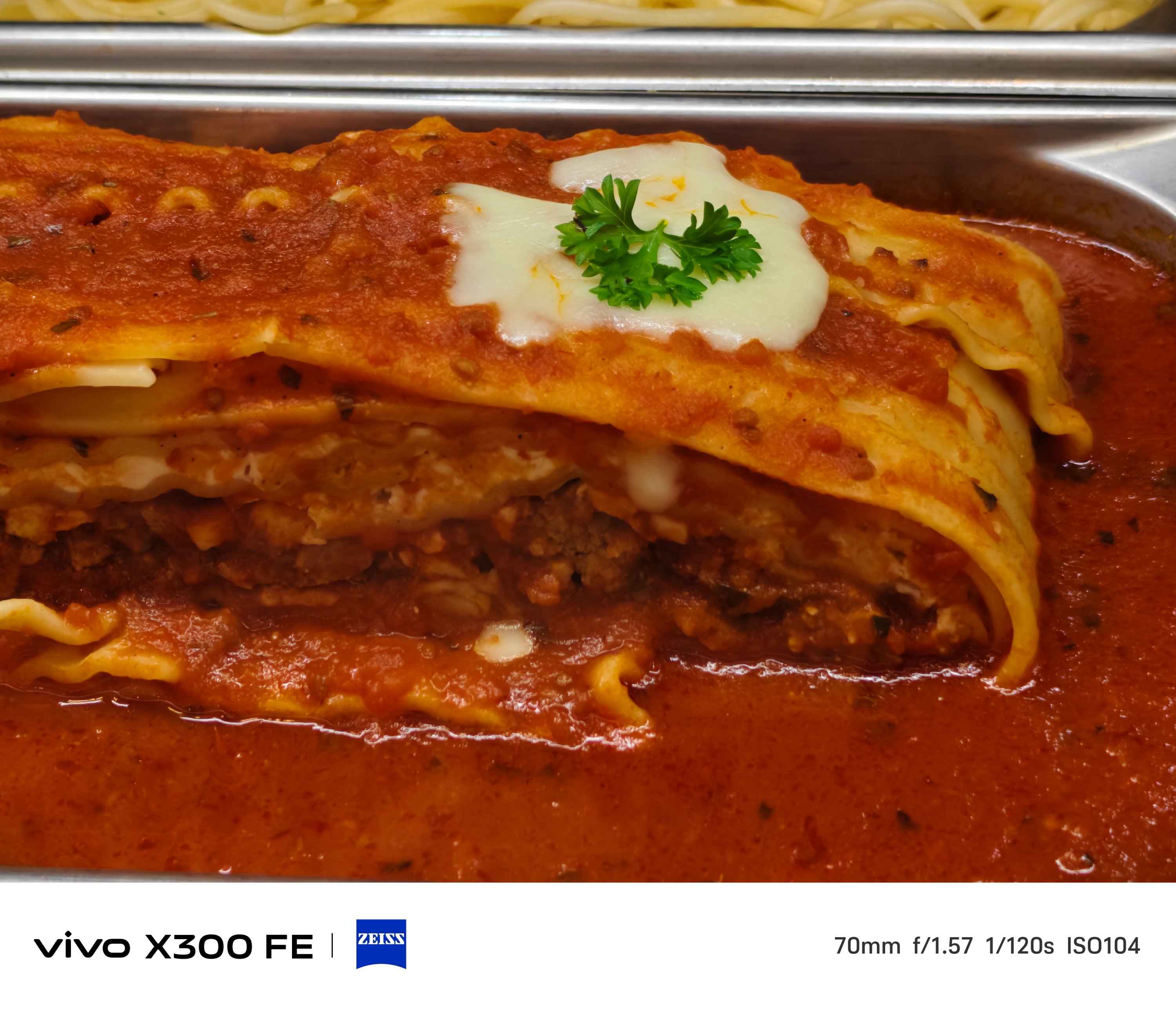
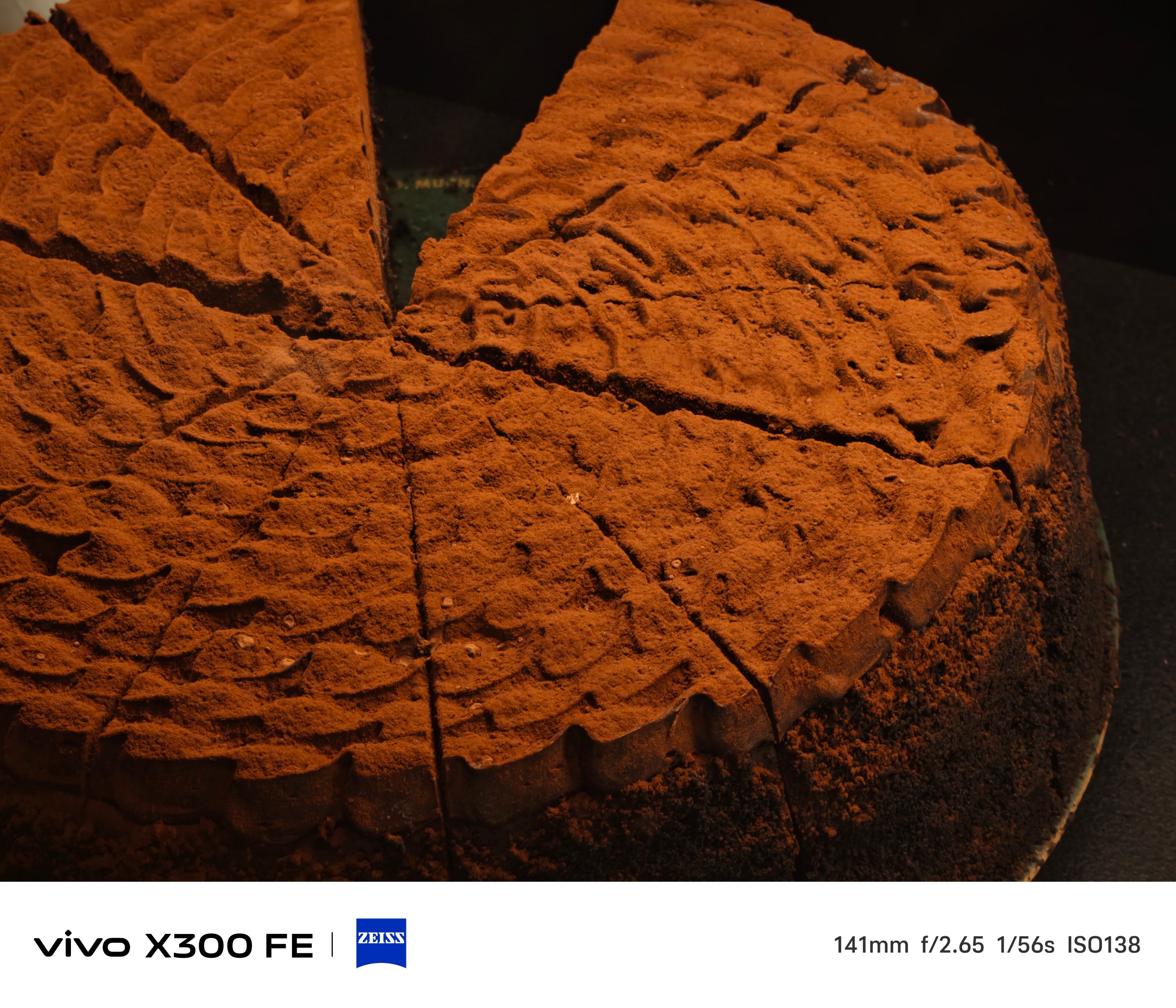
One thing’s for sure. The 3x telephoto camera of the X300 FE is better when it comes to minimum focusing distance that the vivo V70 suffers from.
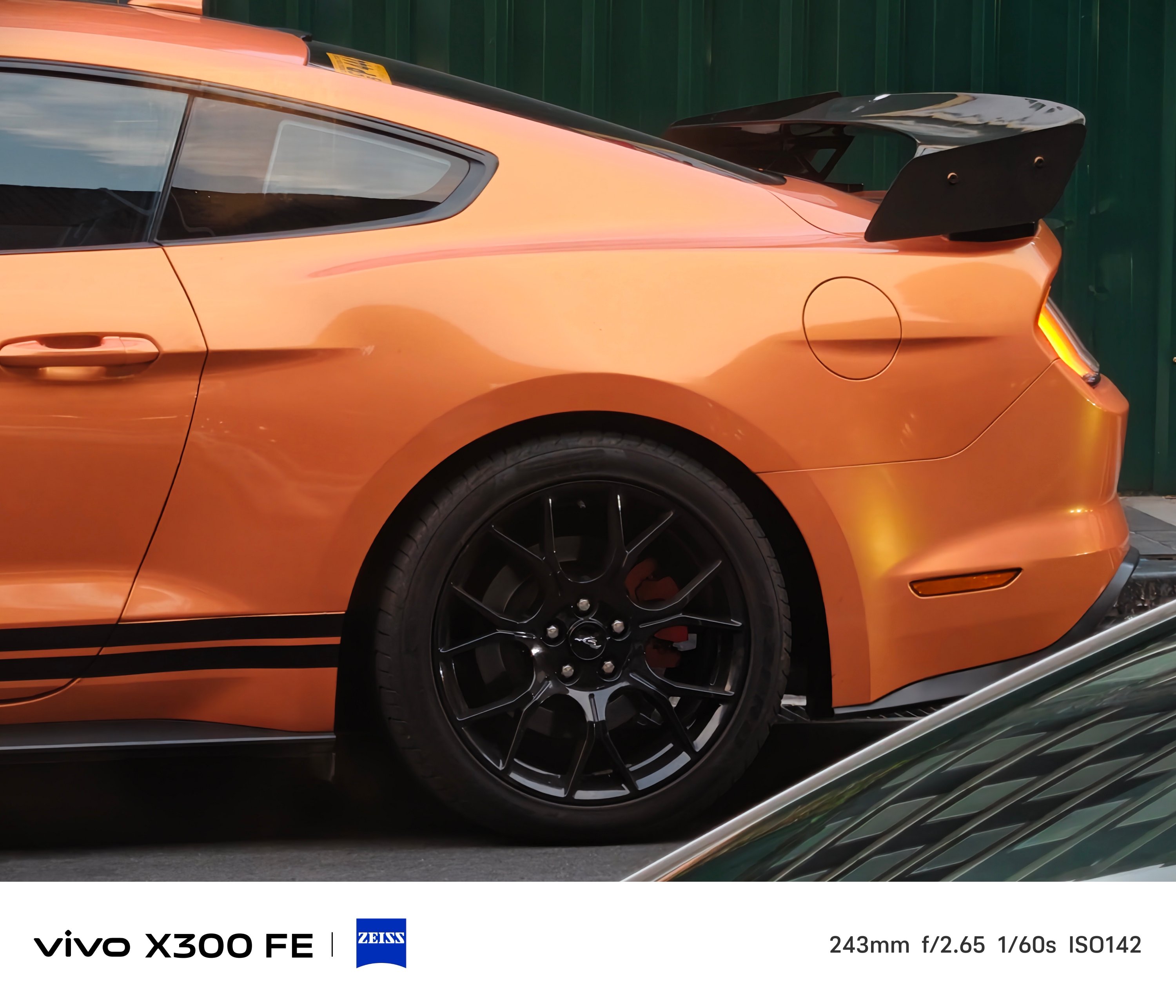
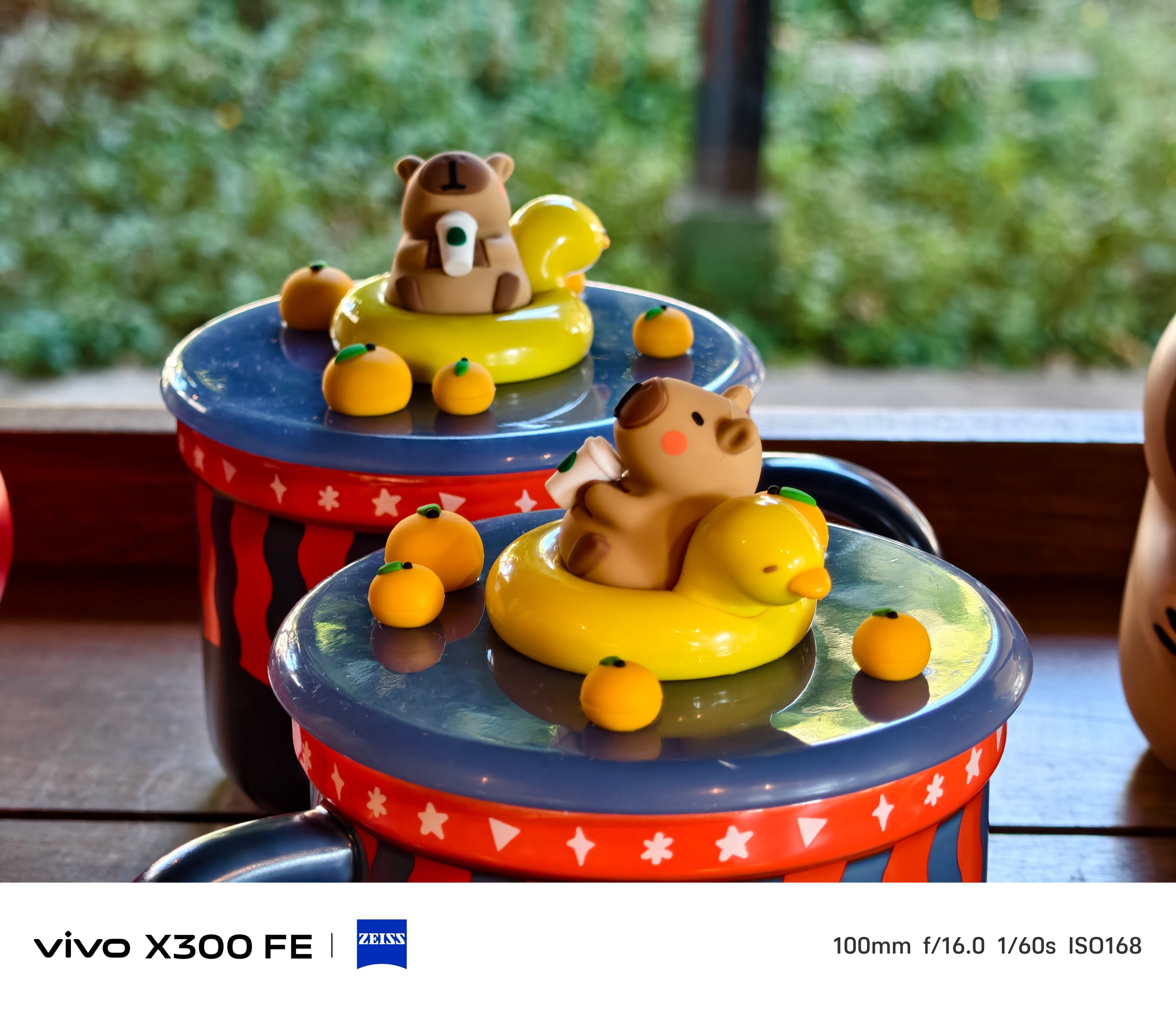
That meant you can take zoomed shots even at a closer distance, much like how I always do in taking #foodporn snaps.
BONUS: X300 FE vs X300 – Can you even tell them apart without nitpicking?
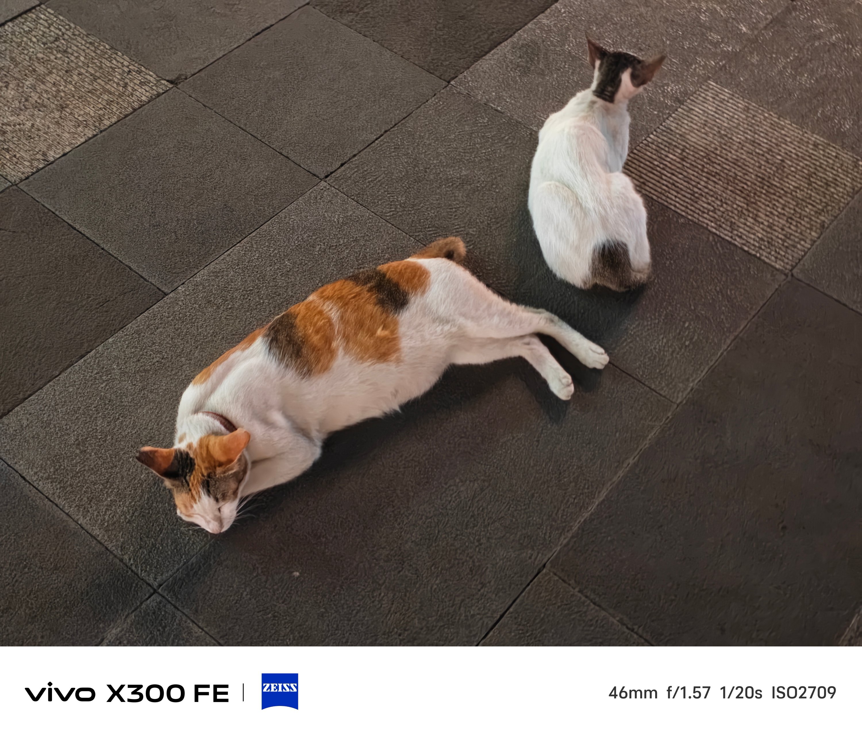
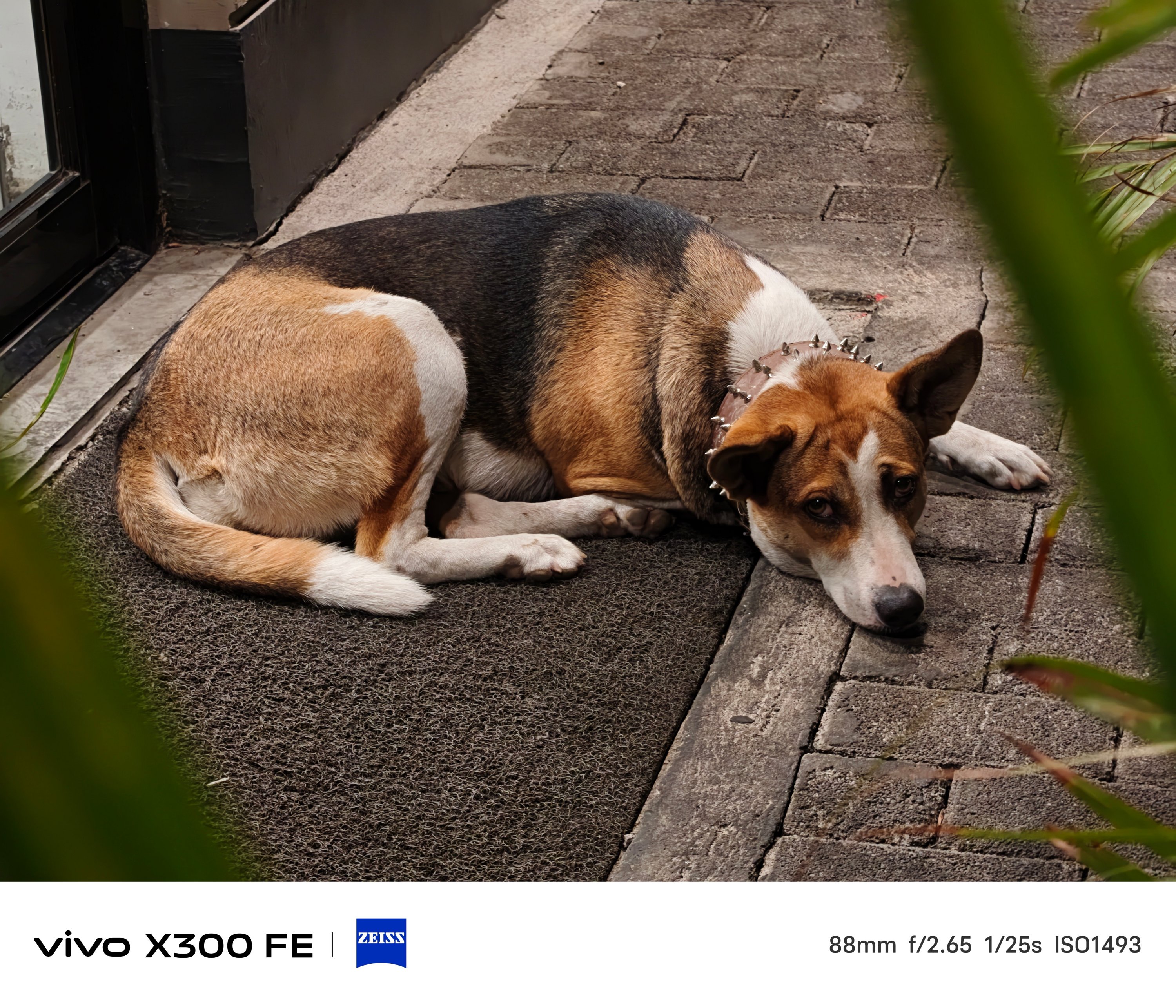
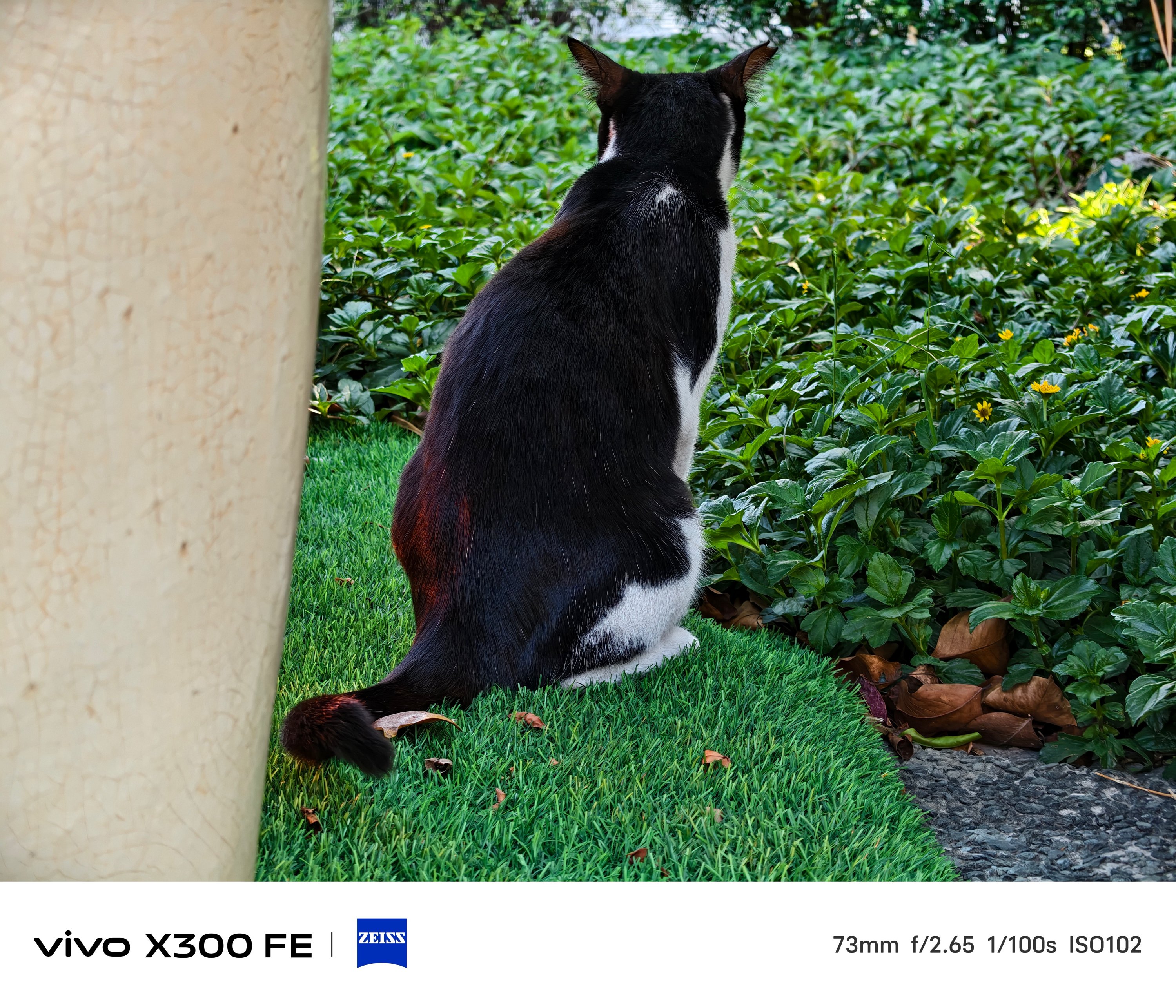
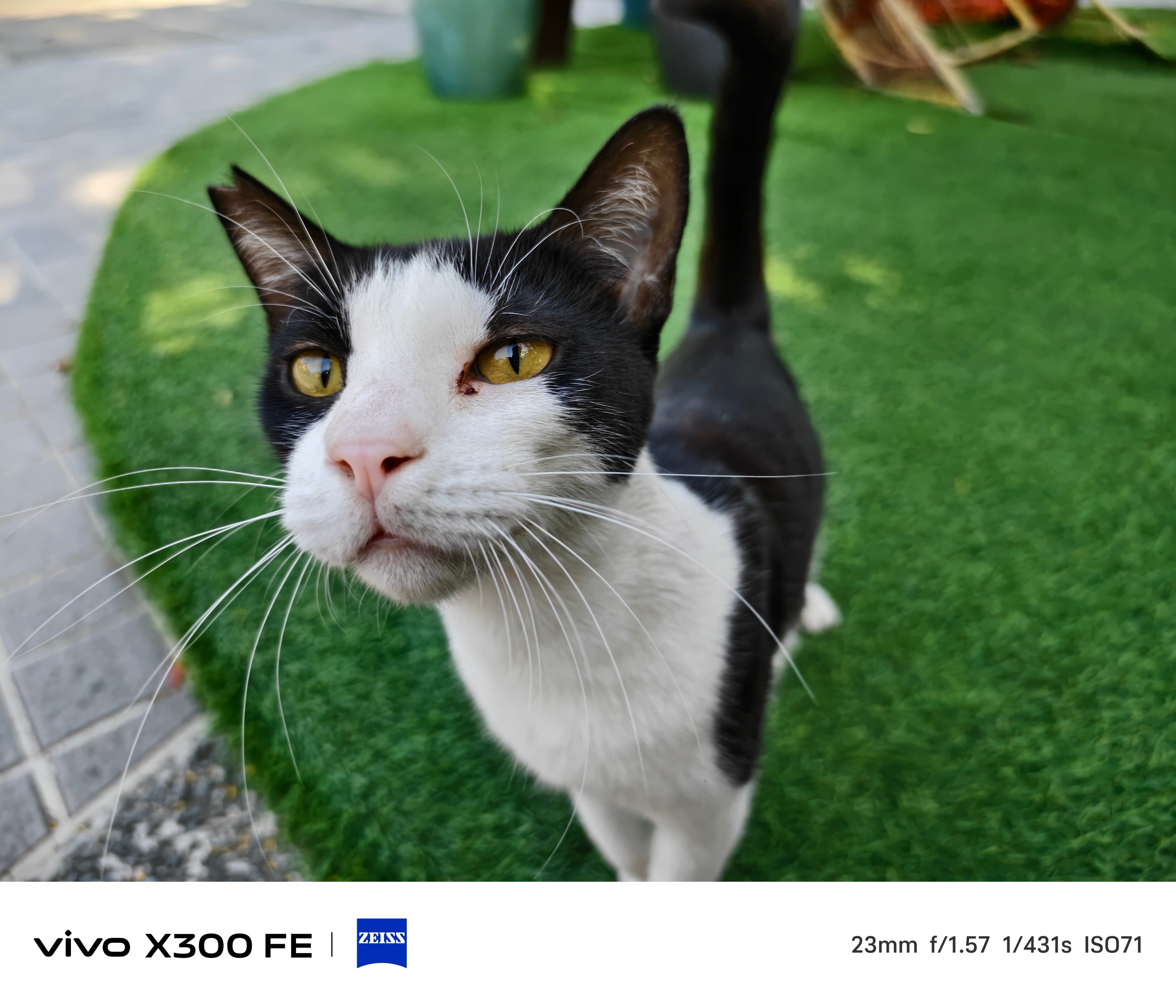
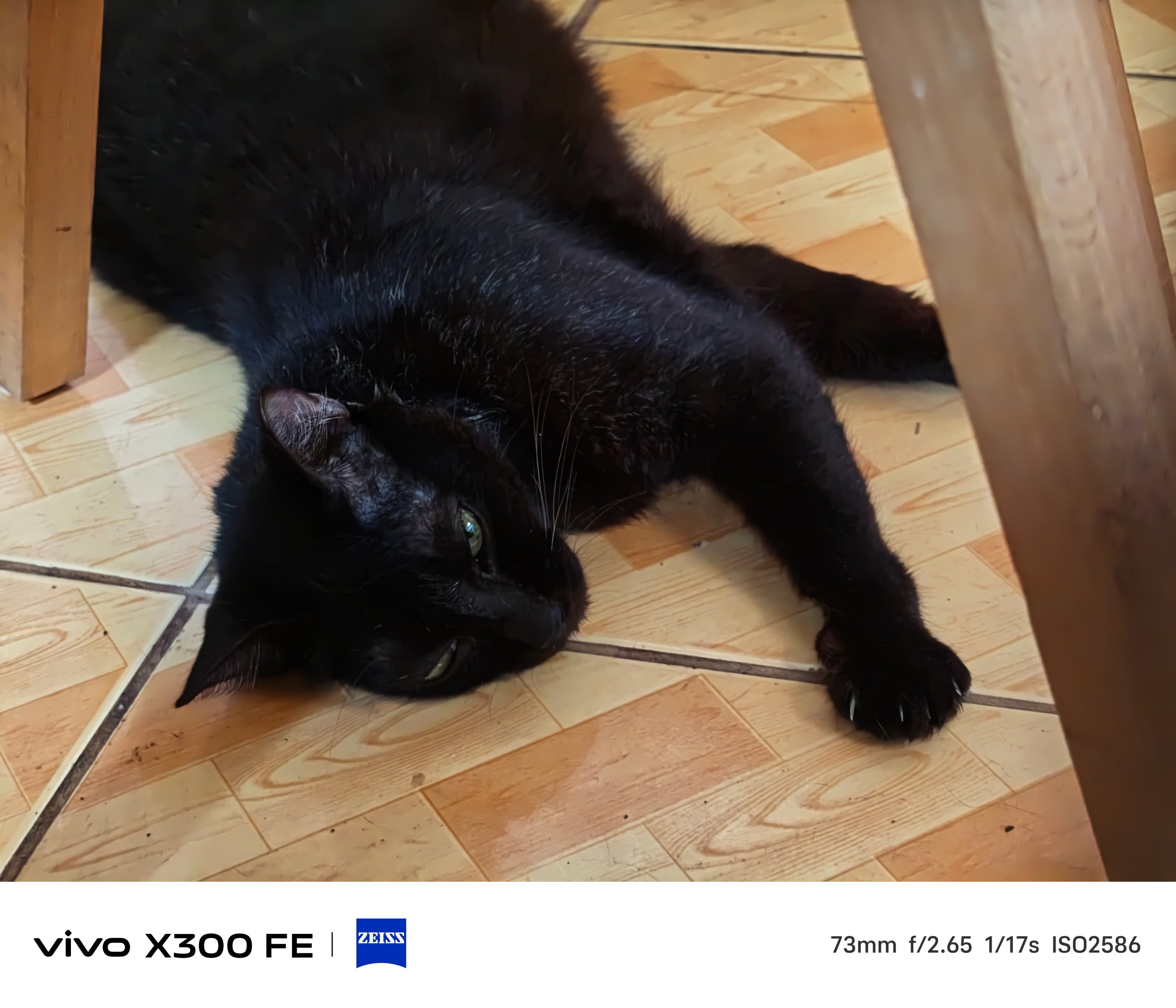
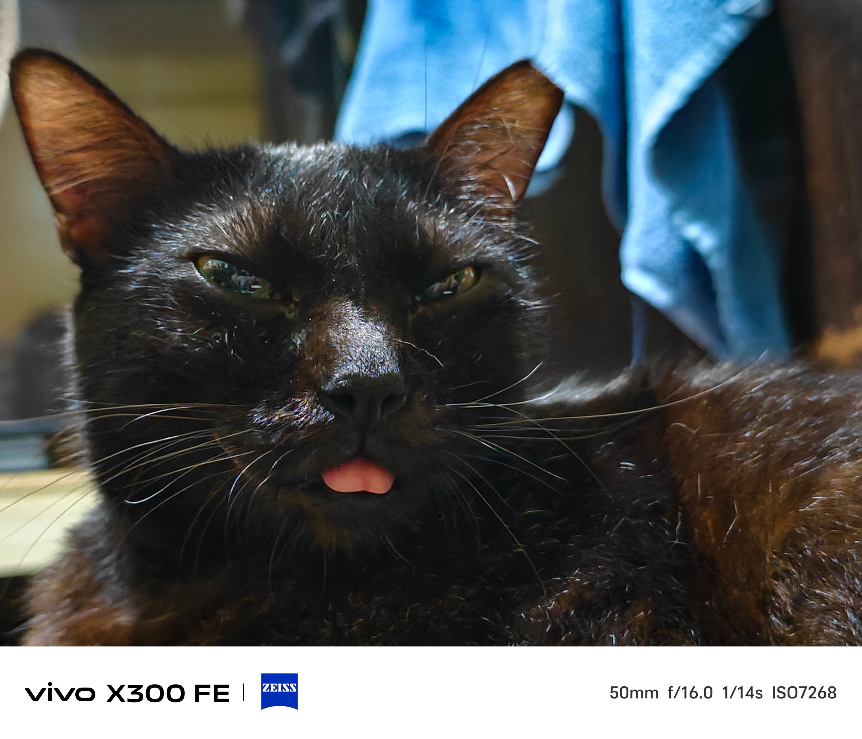
Taking mementos of your furry friends? The X300 FE handles that with ease.
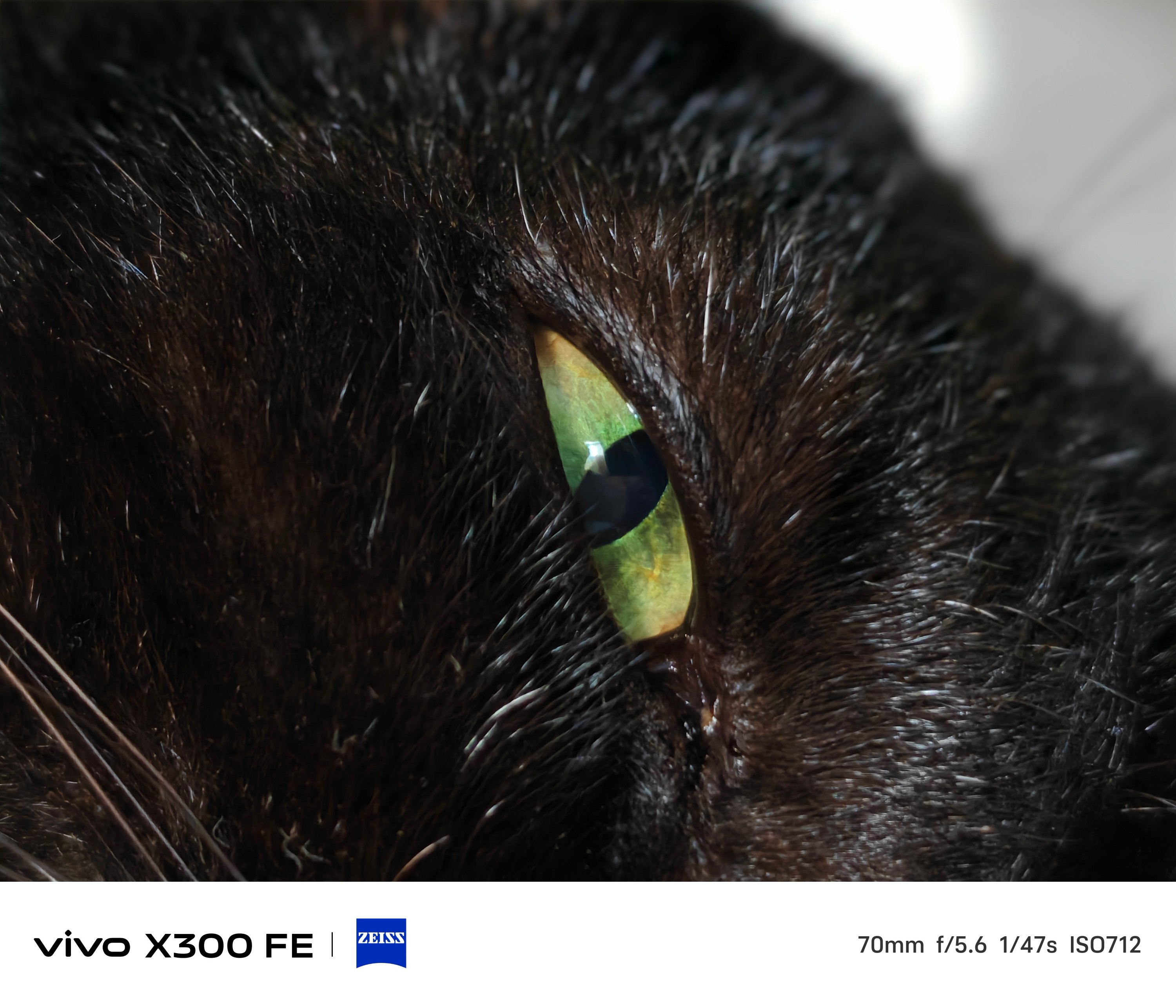
That focusing strengh also meant Super Macro mode is possible.
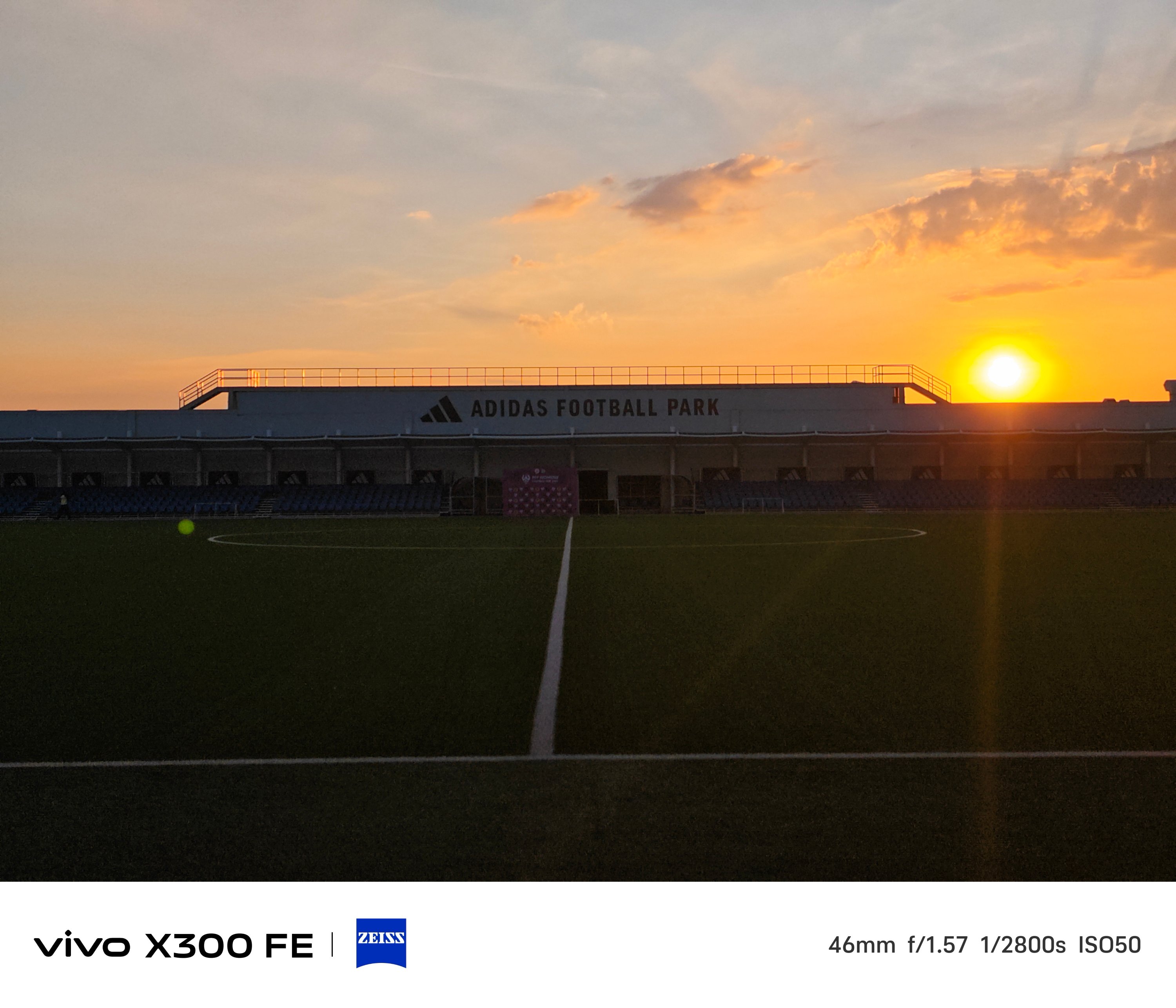
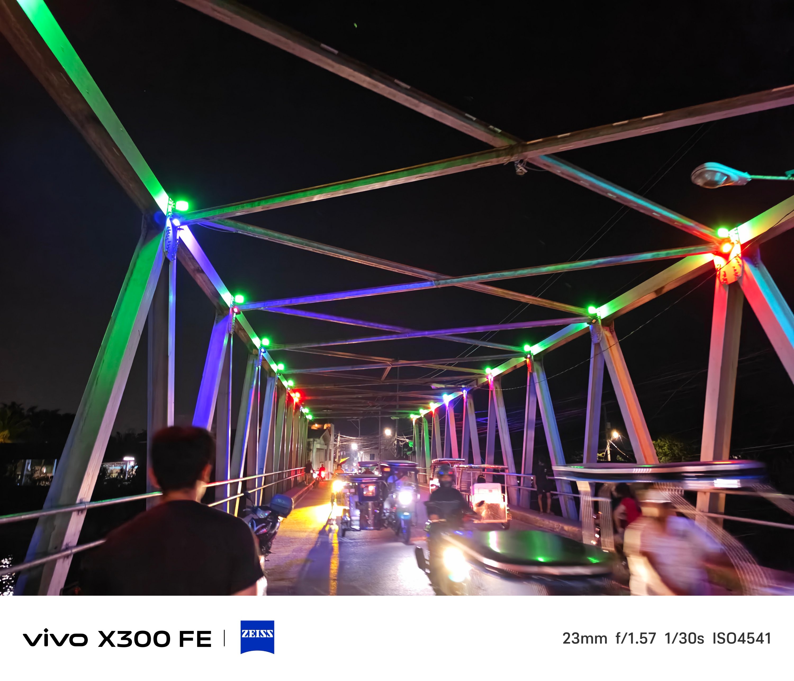
Lastly, shots from the Golden Hour to night.
Just remember to fire up vivo’s Night Mode algorithm in scenes where there’s clear absence of light.
The ZEISS Masterclass
With the existing ZEISS partnership, these usual color profiles are already given: ZEISS, Vivid, and Textured.
ZEISS Portrait Styles were not left behind as well. And it not only works with humans, but with animals and objects alike.
Even if you don’t switch to Portrait Mode, you can still snap close-ups with that creamy bokeh behind.
Speaking of Portrait Mode, beautification can be toggled and adjusted to your liking — both in front and back.
And while we’re at it, front-facing camera can go a bit wider — from 26mm to 20mm.
The X300 FE has also adapted the Humanistic Street Photography Camera interface that got introduced way back in the X200 series. The upgraded version means it’s also equipped with all these film-like presets:
- Textured
- Classic negative*
- Vivid
- ZEISS Natural
- B/W
- Positive film*
- Clear blue*
* newer film simulation looks
B/W, while not Leica levels, still looks dramatic as it could be.
But, even if you’re just shooting with the regular camera mode, the vivo X300 FE can still produce soulful shots with the correct framing and timing.
What about video shooting?
As for video recording, it’s also heaps better than the vivo V70.
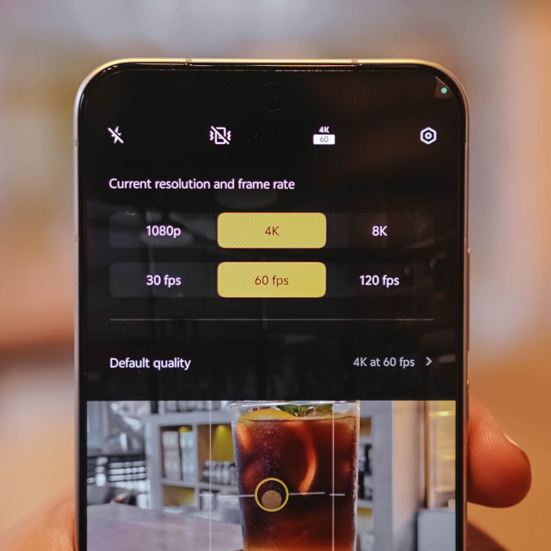
The said midranger is stuck at shooting 4K/60fps. The X300 FE? It can shoot as extreme as 4K/120fps — just without the goodness of Dolby Vision HDR.
- 4K/60fps recording
- 4K/60fps Focal Length choices
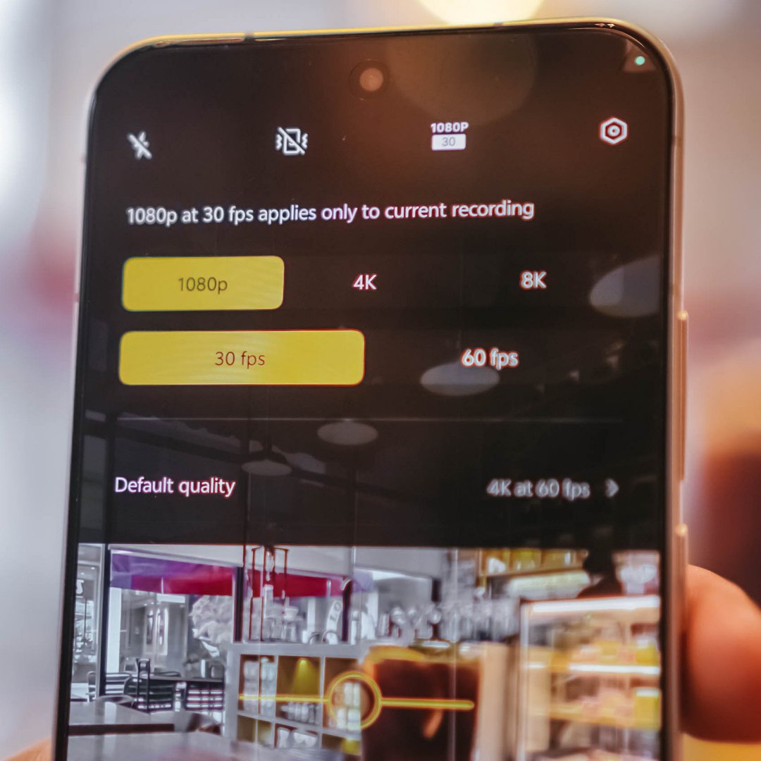
- 1080p/30fps recording
- 1080p/30fps Focal Length choices
For most users, that isn’t a compromise. But, you know what’s the real downside? Ultra-wide video shooting is capped at 1080p/30fps. That’s may be due to the small sensor and megapixel count of its ultra-wide sensor.
Shooting at 1080p/60fps and beyond starts at the regular 1x focal length.
Here are some recordings for you to judge:
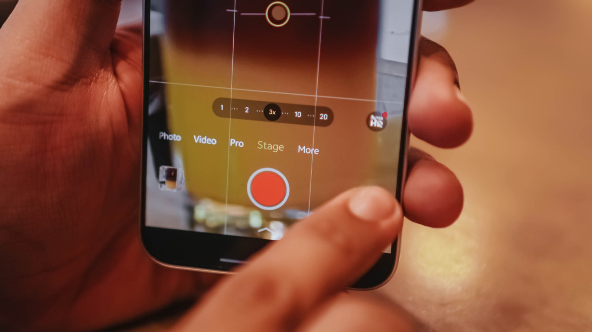
With the presence of that dedicated telephoto shooter lies vivo’s exclusive Stage Mode feature.
Clearly, it’s intended for shooting artists or celebrities in concerts.
To take things up a notch, the vivo X300 FE also has its own Telephoto Extender Kit — just like its X300 sibs.
Although I was not able to try it as vivo did not lend us one, it’s still a great way to fully-maximize that great telephoto goodness beyond the limits of a compact sub-flagship.
Is the vivo X300 FE your GadgetMatch?
The vivo X300 FE shares all the great feats that its siblings possess.
It’s solidly built, has a stylish design, boasts a brilliantly bright display, a true pro-grade performer both in core and cameras. Plus, a battery capacity that’s even bigger than its twin brother.
The vivo X300 FE is a solid Swipe Right.
The only reason to Swipe Left is the staggering pricing that isn’t synonymous to last year’s X200 FE (INR 54,999 / INR 59,999).
For context, the vivo X300 FE in India starts at INR 79,999 for the base 12+256GB. The 12+512GB configuration that I have? A whopping INR 89,999.
The non-FE vivo X300? Currently sold at INR 75,999 and INR 81,999 respectively. Indian buyers know what they’re dealing with.
However, Europeans might have a hard time deciding. The base X300 is only limited to a 12+256GB variant at EUR 899. Whereas the X300 FE has a higher 12+512GB config for EUR 999.
That 100 Euro difference means you’ll get double the storage, a huge, HUGE boost in battery (ICYMI: 6500mAh over 5360mAh). Also, a cleaner horizontal camera bar that most people prefer.
But, would you rather trade off the better camera system and more powerful flagship chip?
A redditor even pointed out that the X300 FE is more “import-friendly” (especially in Western regions) due to better network band support by Qualcomm that the regular X300 lacks because of having a MediaTek chipset.
At the end of the day, it will all still be your call.
Gaming
PRAGMATA is not for the faint of heart
Already a Game of the Year contender for all the feels

Six years and a few notable launch delays. That’s what it took for Capcom to finally introduce a new franchise in 2026. They already have legacy franchises getting new releases. However, the biggest question looming over their head was whether or not they dare to explore something new. What makes it more challenging is an entirely new team is working on its development. That comes with its own sets of risks and rewards.
This was the story of PRAGMATA, another exciting title finally getting its time in the spotlight on all modern platforms. Looking at trailers, screenshots, and even demo highlights, I already got the sense that this game may just be at par with a ton of sci-fi-inspired RPGs. The expectation on my end was clear: all action, all exploration, with a storyline that will tie everything together seamlessly.
I was not prepared for the storm of emotions and action that came my way.
Maximizing your brain power
PRAGMATA operates like most action-packed RPGs with how combat works: you point, you shoot. To set that up, you play as Hugh. He is an engineer sent to a moonbase called the Cradle to investigate comms being down. As you enter the Cradle, something already feels off. Before you even get a chance to blink, you’re already plunging into danger as the AI that keeps it safe has gone rogue. By the time you come to, you’re attacked by one of the bots that helped you out. From there, must fight your way throughout the game to survive.
Luckily for you, a support android named D-I-0336-7 fixes you up. The android willingly helps you fight the rogue AI by hacking through them. Not only will the hacking deal additional damage, but it will help you identify enemy weak spots to exploit. However, to achieve the perfect hack, you are required to solve a puzzle-like board with nodes mid-fight. Essentially, you’ll be doing two things at once to survive and fight your way through the Cradle.
It’s the kind of mechanic that feels unique as the level of difficulty escalates with every encounter. Oftentimes, the hacking and the shooting are separate mechanics that are done to calmly set you up for the fights. Now, it’s do-or-die with the hacking increasing your odds of success immensely. Enemies are hard to defeat simply on the gunplay alone. And you will need to keep that in mind as you progress through the game.
Expansive world to complete and unlock
Speaking of progression, as you get out of that initial skirmish alive with D-I-0336-7, who Hugh cutely gives the nickname “Diana” to, you end up in a tram to the Shelter. Effectively, the Shelter serves as both your base of operations and a rest spot to retool before combat. As you go through every area of the game, you unlock newer features. These are REM Replicators, upgrades to your health, firepower and hacking skills, and access to more weapon schematics and nodes. Also, you can even set up matching suits for Hugh and Diana before heading out into the world again!
Once you have everything you need, you will venture out into areas in the Cradle that need to be restored. A lot of the areas are incredibly expansive. This allows you to explore and grab as many freebies lying around as you can. From the Lunafilament used for upgrades to newer weapons at your disposal, the game scatters these for you to find and harvest from the overworld. Of course, you’ll run into the occasional swarm of enemies but you have Diana, and Diana has you!
Diana’s hacking even extends into these as you progressively acquire new skills. As you progress, you’ll be able to remove map hazards, clear traps, and scale structures effortlessly. This fully allows exploration to be less of a drag. There are newer pathways to areas you previously couldn’t explore or made it easier to backtrack. Plus, there are stations that can be activated as save points and hangars to return to the Shelter that Diana can activate.
It’s a large hub to explore. You’re encouraged to get and know everything because this next part will have you strapped.
Building bridges back to Earth
Without completely spoiling too much, PRAGMATA‘s storyline is one you gradually feel and resonate with. Earlier, I mentioned that the whole reason Hugh and his team were in the Cradle was to investigate its unresponsiveness. In an unfortunate turn of events, Hugh gets separated from his team and has to go through the entire Cradle looking for a way to get back to Earth. Along the way, Diana resurrects Hugh from certain death and accompanies him throughout the excursion mostly to be a guide and helping hand.
Throughout the game, Hugh and Diana develop a strong bond that already borders a father-daughter dynamic. Originally, Hugh didn’t really consider himself as a parental figure since he doesn’t have kids of his own. However, he goes out of his way to ensure Diana’s safety and overall wellbeing – effectively giving human compassion and love to an android. Oddly enough, Diana almost certainly feels more human and would even want to join him back to Earth.
As you explore throughout the game, you also pick up schematics of real Earth objects that are processed in the Shelter’s REM Replicators. These are neat trinkets that Diana actually gets to play with, even to a point of bonding with Hugh through them. It’s the kind of heartwarming moments in between the chaos that reflects the dynamic that many people will truly appreciate.
Struggles picked, sacrifices made
Remember how the game encourages you to explore to know everything? All of that was intentional for Hugh and Diana to get down to the bottom of what really happened at the Cradle. As it turns out, the AI mainframe of the Cradle, IDUS went into disarray after the moonquake that separated Hugh from his crew. Along the excursion through the Cradle, the pair discovers and meets up with another android called Eight who has the answers to effectively contain IDUS through Diana.
Only for them to realize that there are far graver dangers ahead. So now, the objective is to survive till the end, get back to Earth and stop anything that gets in the way. All throughout, you as Hugh will be tested on not only keeping Diana safe, but also ensuring that she gets to experience Earth with or without him. For the parents and parental figures out there, you know this feeling all too well.
A GamingMatch Made in Heaven?
No matter how you slice it, PRAGMATA nailed everything in my list of expectations: the right mix of exploration, easy-to-master combat mechanics, and an emotional story that transcends culture and hits right in the feels. It feels like Capcom continuously revitalizes the RPG experience with newer concepts and mechanics that truly test players at the core. Matching it with characters that allow you to have an emotional investment in, and the game hits right in the feels in more ways than one.
It’s a game that gradually keeps you engrossed in the experience from start to finish. From approaching tougher and larger enemies to traversing the overworld to collect resources, every instance feels wholly unique. Furthermore, the game incentivizes rest and reset without fully losing progress in your adventure.
More than anything, it offers a fresh take on character dynamics that will leave you in an emotional mess. Whether you like it or not. Admittedly, the bond between Hugh and Diana is one that a lot of people simply resonate and potentially aspire to have. It’s a reminder of how deep the human connection can truly transcend. And even be the ultimate key to survival against all olds.
Not only does PRAGMATA get a Swipe Right, but this game truly deserves to be up there for Game of the Year contention.
nubia has gone with an interesting direction for their latest midrange gaming line.
While other brands continue to blur the line between what is a “gaming-centric” smartphone and a reliable all-around device, the brands’ nubia Neo 5 series has been made even more aggressively for gaming.
And in 2026 where smartphone prices are skyrocketing and consumers are looking for the best value proposition before spending, that doesn’t seem to be the brightest route to go.
nubia Neo 5 GT
The nubia Neo 5 GT is the series’ top-of-the-line variant, with up 512GB of storage and a Dimensity 7400 processor.
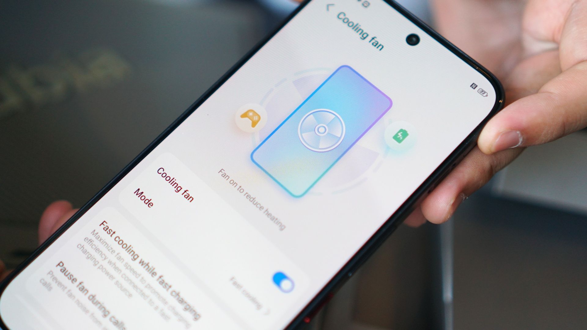
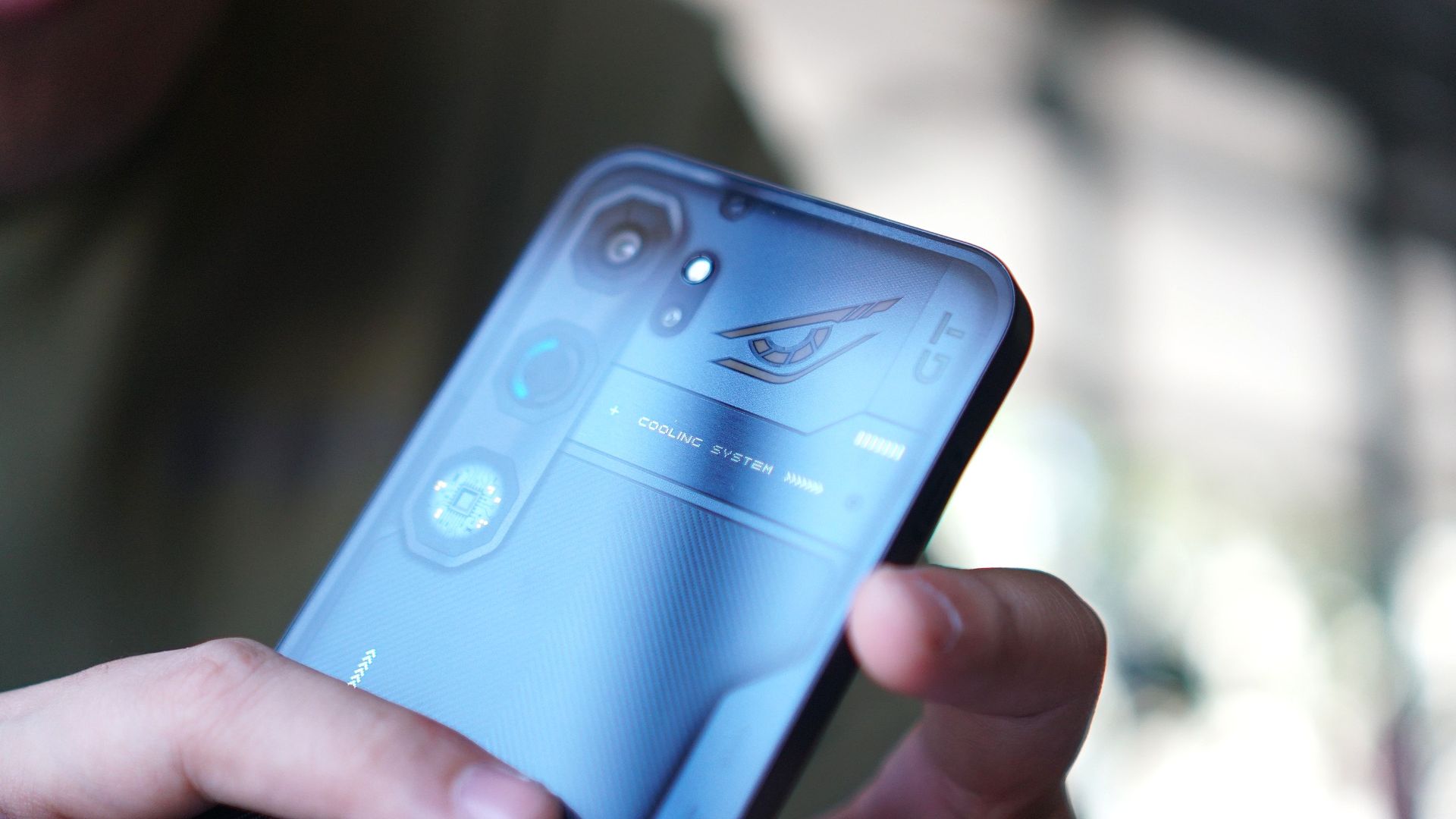
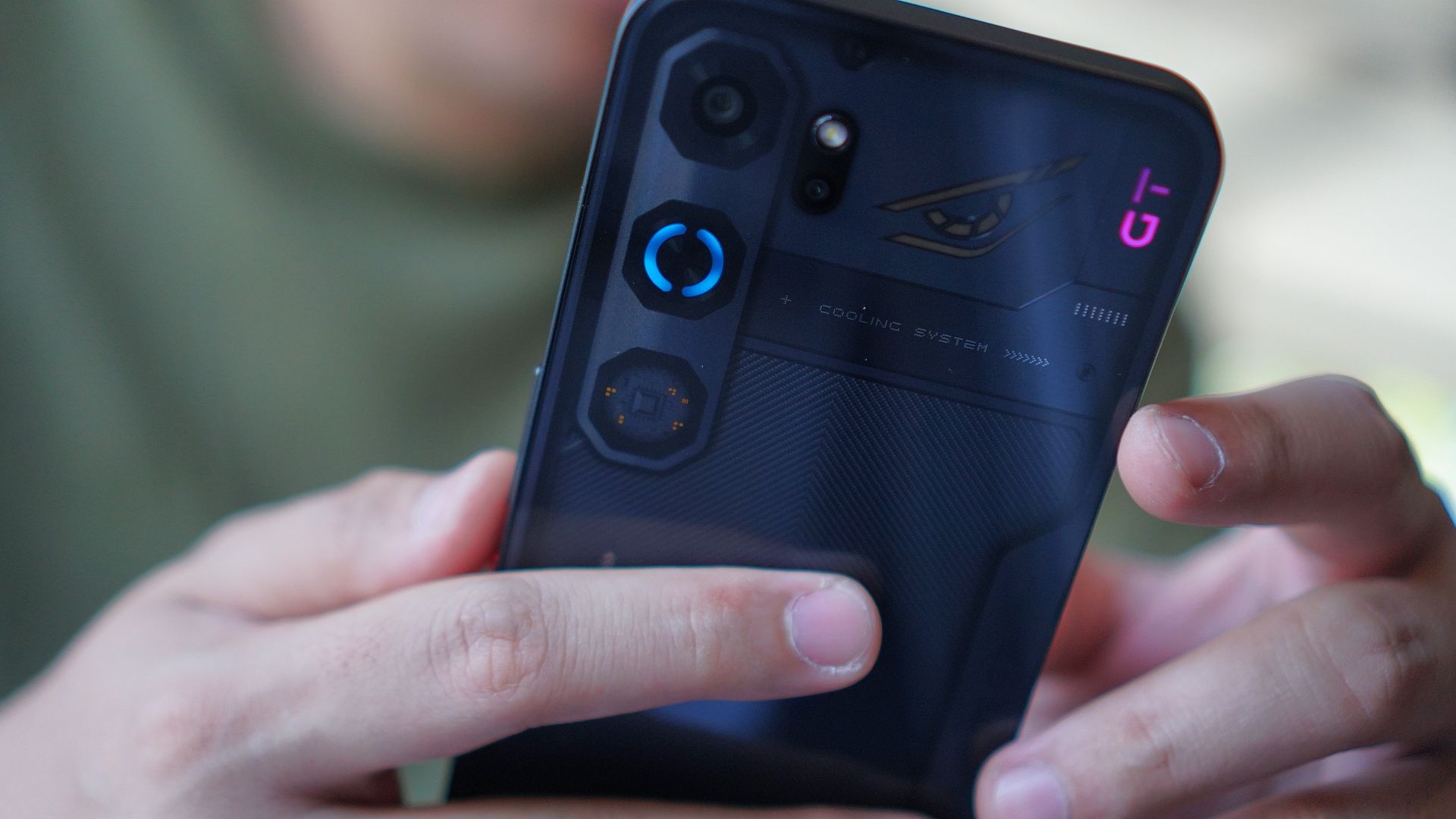
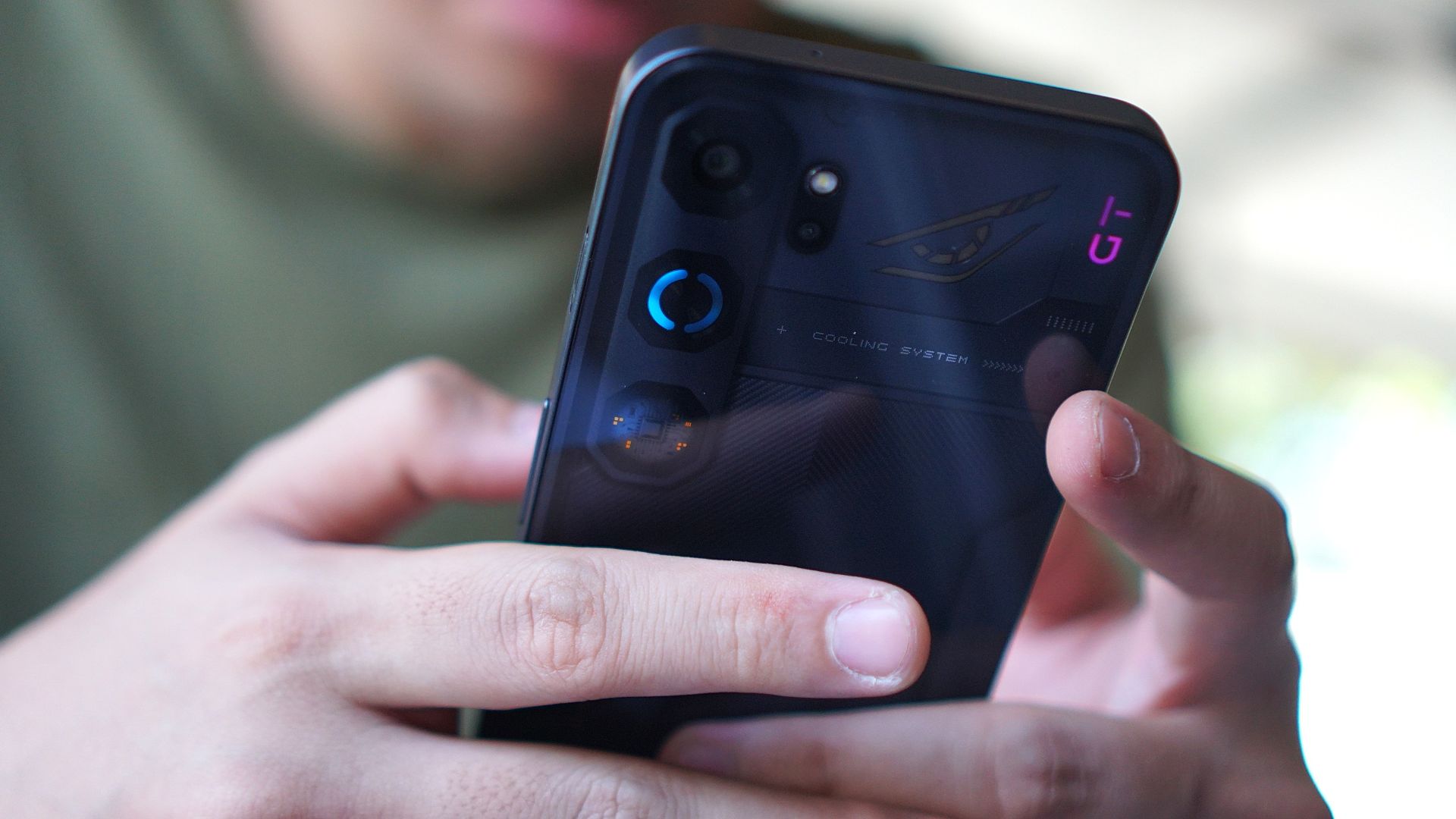
The biggest highlight of the new series is the built-in cooling fan and Vapor Chamber cooling system.
This eliminates the need for a physical cooler, which you usually get for free anyway but have to attach to a magnetic phone case and power with a USB-C wire.
I think taking away that hassle of a set-up allows users to concentrate on gaming itself, as what this device is chiefly intended for.
And the cooling system does what it is solely asked to quite well: keep the phone’s temperature a lot cooler.
Moreover, if you’re playing for hours, this comes in helpful for bypass charging (branded as “Charge Separation” by nubia) to keep the temperature low.
The same purpose can be leveraged for quick charging, as the device’s 6,120mAh battery supports 80W charging.
Now of course, I’ve exhausted the device for about a month, playing my usual go-to mobile titles. Here’s how the phone performed with each game.
Mobile Legends: Bang Bang
As expected, MLBB is one of those titles that ran on the device without any problems. I can play multiple rounds even without the cooling fan turned on, and with the performance mode set to Eco.
Dunk City Dynasty
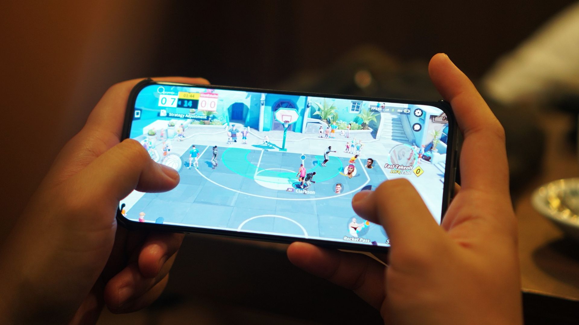
My time with this device also allowed me to revisit the NBA and NBPA-licensed Dunk City Dynasty.
I spent a lot of time on this multiplayer 3-on-3 title. Performance went generally smooth, although I had some connectivity issues.
This was a letdown since I needed to compete in real-time with other players. Nevertheless, I was able to chalk up several wins with characters like Jordan Clarkson and DeMar DeRozan.
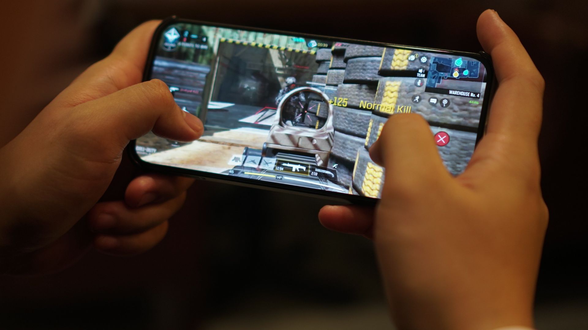
Call of Duty Mobile
CODM was perhaps the first real test for this device, and this is where the cooling fan and a balanced performance setting came in handy.
Panning went without hiccups, allowing you to focus on just shooting. The graphics look more refined, specially with the phone’s 6.8-inch display. And fitting enough, the device did stay relatively cooler (I played mostly indoors).
Battery drain, of course, was somewhere in the 12% to 15% range, and even higher when playing with mobile data. The network was somewhat stable during the sessions I played.
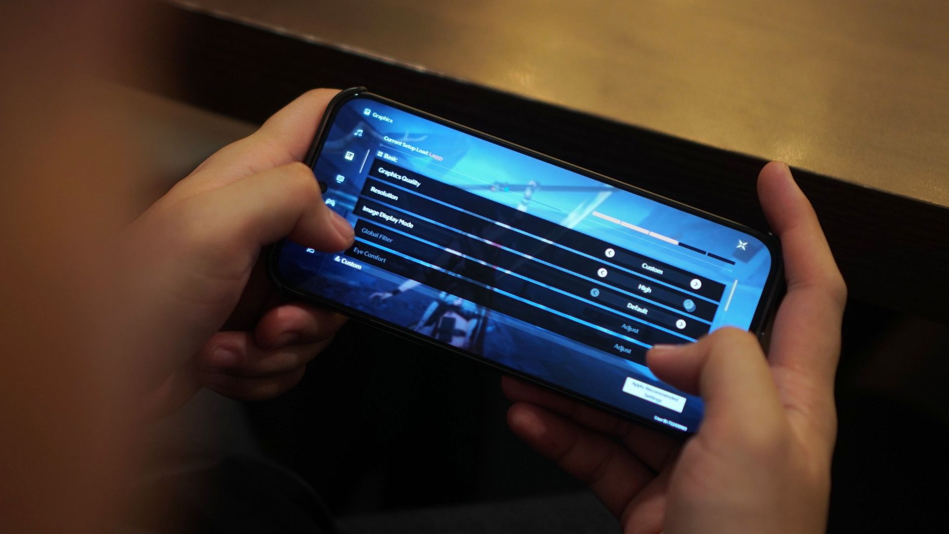
Wuthering Waves
I felt the nubia Neo 5 GT also excelled in distributing the resources for heavier mobile titles like Wuthering Waves.
Especially during combat, I didn’t experience any stutters nor frame drops with the fast-paced battles, which involved slashing, flying, and sliding, among other mechanics.
Taps felt responsive as well. If anything, I enjoyed playing this title again on this handset.
For reference, here’s the graphics settings I went with:
Honkai Star Rail
Lastly, HoYoverse’s space fantasy RPG also worked wonders on the device. That’s with the high-performance mode (Rise) on and the cooler again aiding the experience.
Visual effects definitely looked crisp and smooth, at a high frame rate setting. At 439ppi, the nubia Neo 5 GT’s pixel density ranks among the highest in its class, for refreshed graphics.
The 512GB storage capacity is definitely a plus. Just downloading assets for the two RPG titles will cost you about 100GB of space already.
Look, OS
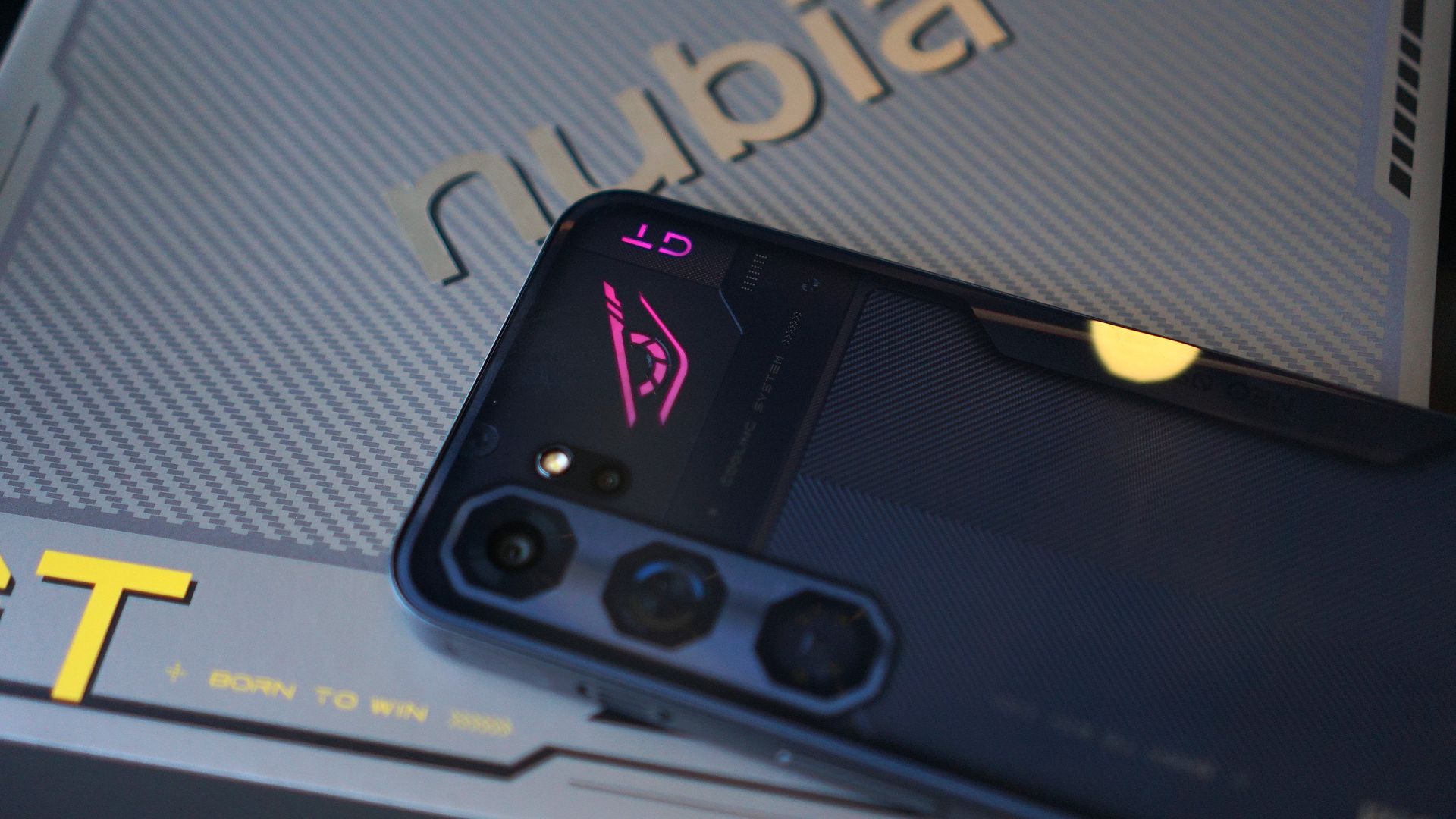
The nubia Neo 5 GT retains the familiar mecha-inspired finish, with a glossy back as if it has a glass cover. The lighting effects look a bit more toned down.
What’s good about the exterior design language is it took into consideration mobile gaming habits.
Even the tip of the USB-C charger was designed so that it doesn’t interfere when a user holds the phone in landscape mode.
The phone also has a completely flat back so you can just place it on a surface while playing or streaming.
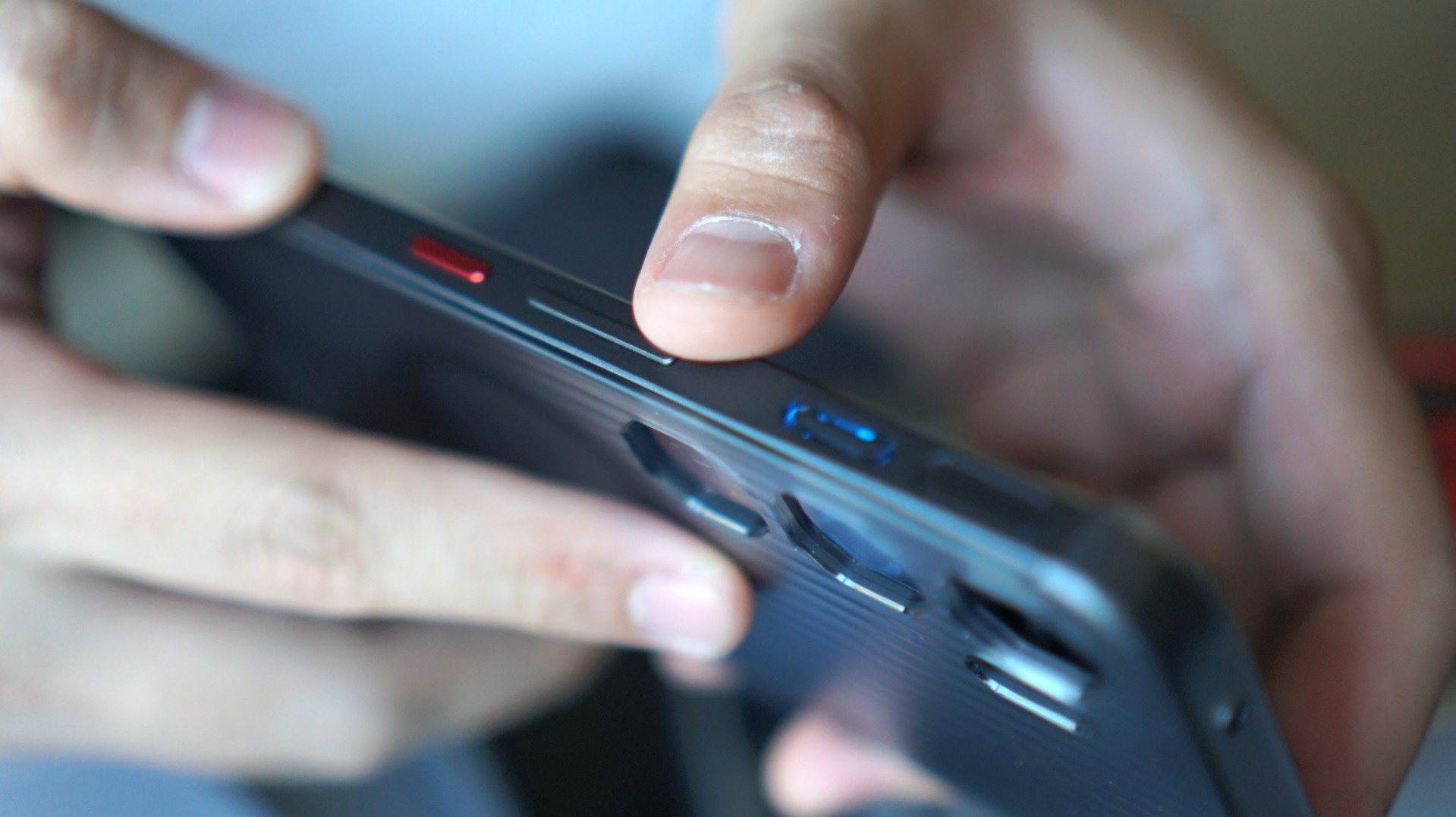
The biggest adjustment is the placement of the volume buttons and power button on the right-hand side of the phone. That’s because of the cooling system’s exhausts.
And when I started using this phone, I did commit a lot of errors, tapping on the volume down button instead of the power button.
Going old school
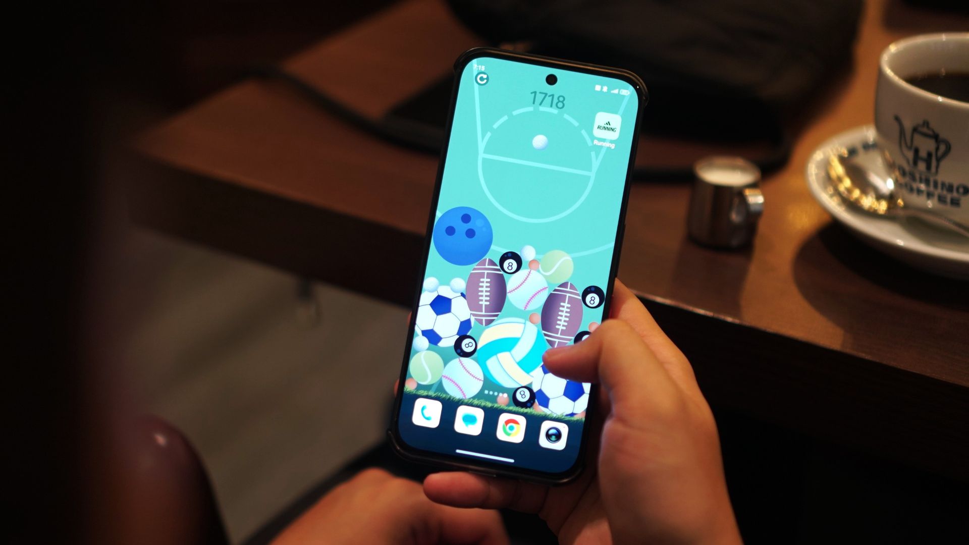
New to the series are integrated playable wallpapers, which throw you back to the good old days of playing Snake and Tetris.
There’s also a 2048-inspired game but instead of numbers, you’re dealing with ball sports. The smaller balls (i.e. billiards, golf) combine to form larger ones (baseball, football) and you’ll have to make the most out of the space.
Admittedly, this took a lot of my time every day and even had some competitive runs with my partner as we tried to overtake each other’s high score.
Connectivity
As I’ve mentioned, on the downside, the device has had its unstable Wi-Fi and mobile data moments.
I experienced this especially with Dunk City Dynasty and the phone suffered amidst real-time head-to-head combat.
I do have a feeling my sessions just coincided with Holy Week, and networks may have been congested.
Still, it’s something to ponder, especially if you’re considering purchasing it for other purposes like in the case of TNVS or delivery riders.
Camera
Onto the camera system, the nubia Neo 5 GT’s main camera is a 50MP shooter. I mostly just had captures of myself, food, and the street view.
For a device of this caliber, the camera does feel intended for such everyday moments. Lighting is a most definitely a friend, and colors can be off sometimes.
There are no violent reactions overall, but I have seen better and more capable camera systems on similar-priced devices.
Here are some samples:
Anything else?
Outside of gaming, I have been able to utilize this device pretty much as how it is intended to be used.
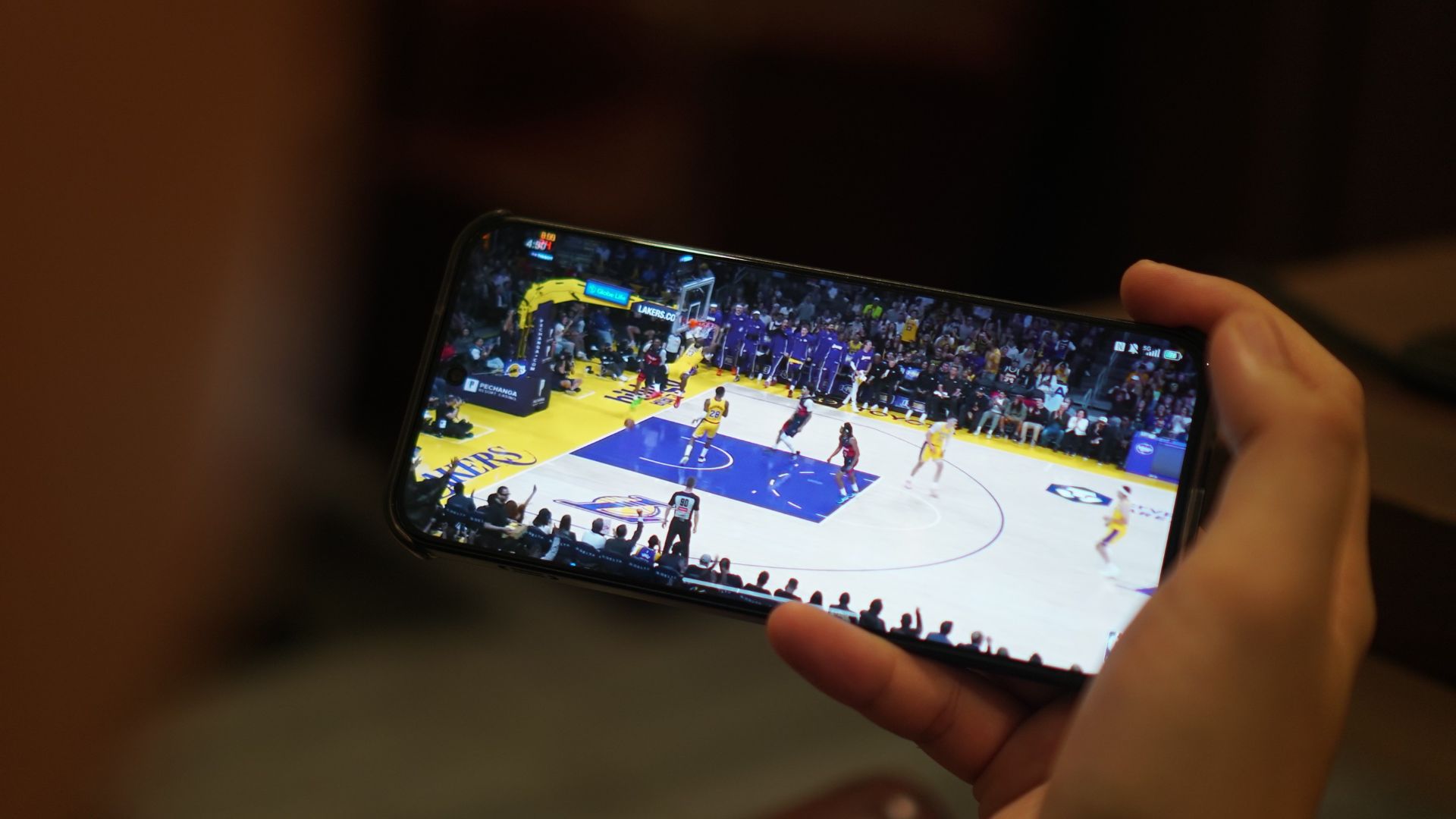
I browsed social media, watched basketball highlights, spoke with people through messaging apps, used Gemini, checked the maps, and everything else in between.
I would say loading times are a little better compared with extremely cheap handsets. The audio quality, however, sounds flat and cheap for music and gaming.
You do get the nubia Buds GT with early purchase, although the sound quality is too bass-leaning and not much of the mids and highs.
Is this your GadgetMatch?
The nubia Neo 5 GT is a Swipe Left. The addition of a built-in cooler and some OS add-ons make it enticing at first.
But for its price, you can already get a topnotch Infinix NOTE series device, or even a numbered series mid-ranger from the likes of HONOR, Redmi, or realme.
It’s understandably a niche device, but the value proposition feels off without a definitive punch and “all-around” offering.
At a time where consumers need more from manufacturers to justify price hikes, nubia went zagging with a more gaming-centric tool that doesn’t punch above its weight.
-

 Singapore1 week ago
vivo Y Series launches in Singapore with bigger battery, durability upgrades
-

 Automotive2 weeks ago
The VinFast VF6 is perfect for urban travelers
-

 Gaming1 week ago
PRAGMATA is not for the faint of heart
-

 Features2 weeks ago
A Galaxy summer to remember
-

 Laptops1 week ago
Spotlight: ASUS Zenbook A16
-

 Gaming1 week ago
Stranger Than Heaven is a Yakuza prequel with Snoop Dogg
-

 Gaming1 week ago
Star Wars: Galactic Racer launches October 6
-

 News7 days ago
iPhone 17 is the best-selling phone of 2026 so far


