
Apps
Android apps will be whiter and rounder with 2018 Material Design
A cleaner, whiter future for Google apps

Material Design for Android has been around since 2014 and it formally started on version 5.0 Lollipop. Google introduced it to keep the look of their operating system and its apps consistent and visually pleasing.
This year, Google is pushing out major changes to its Material Design guidelines. If you’ve been using Google services, you might have seen the revamp already. So far, it’s available on web versions of Gmail and Google Drive, early builds of Chrome, and on Android P Beta. Based on new information floating around, the Android side of things will soon get plenty of Material Design.
Without further ado, check out the images below courtesy of Arstechnica:
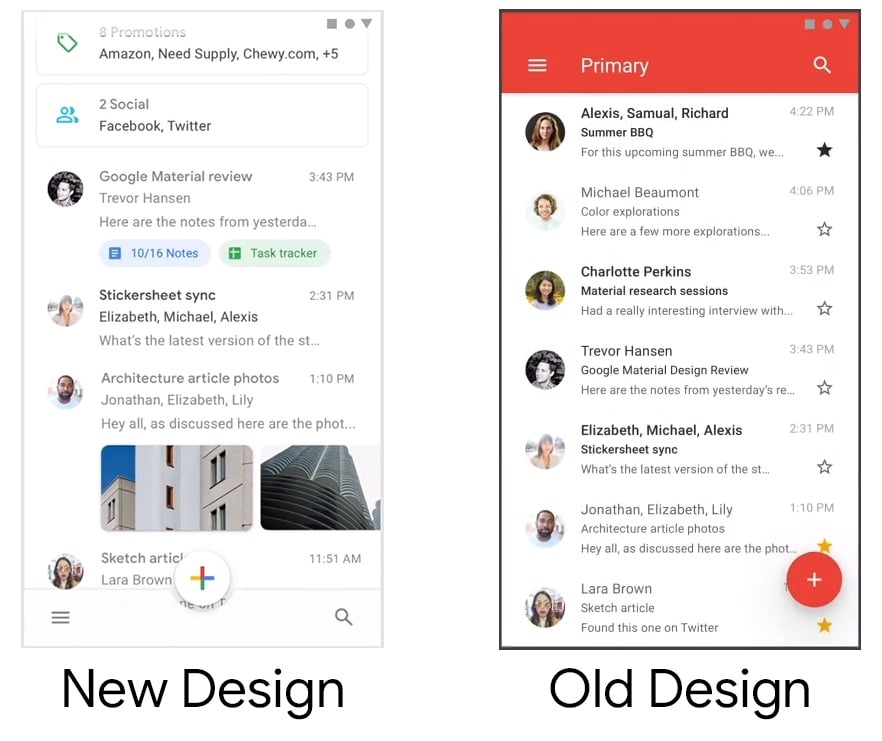
Gmail | Image credit: Arstechnica
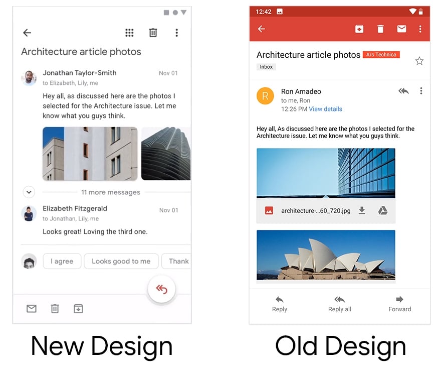
Gmail | Image credit: Arstechnica
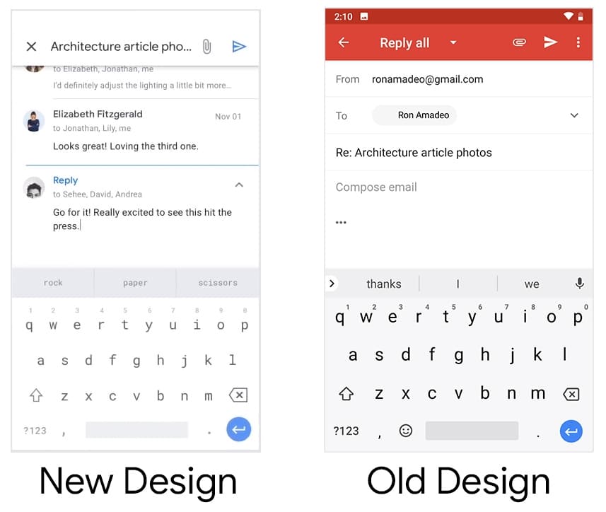
Gmail | Image credit: Arstechnica
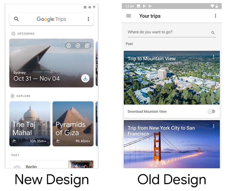
Google Trips | Image credit: Arstechnica
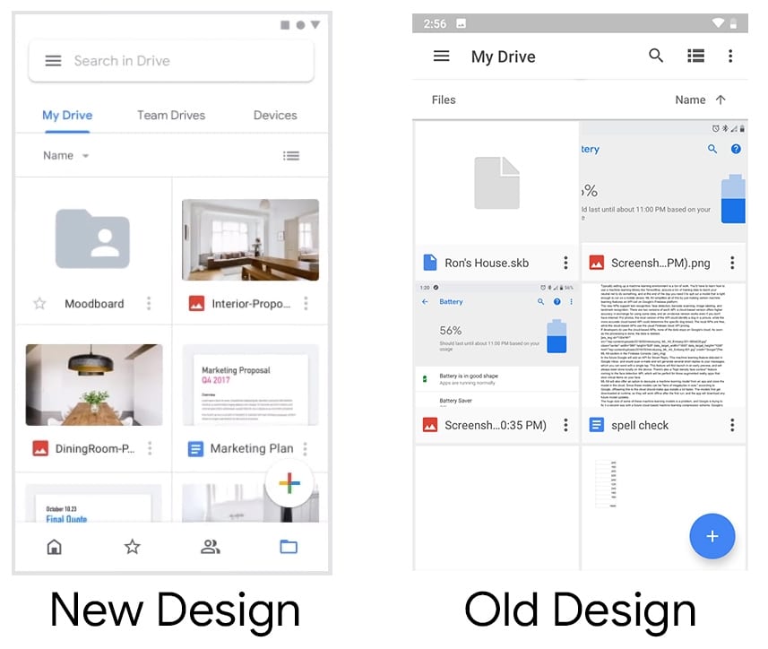
Google Drive | Image credit: Arstechnica
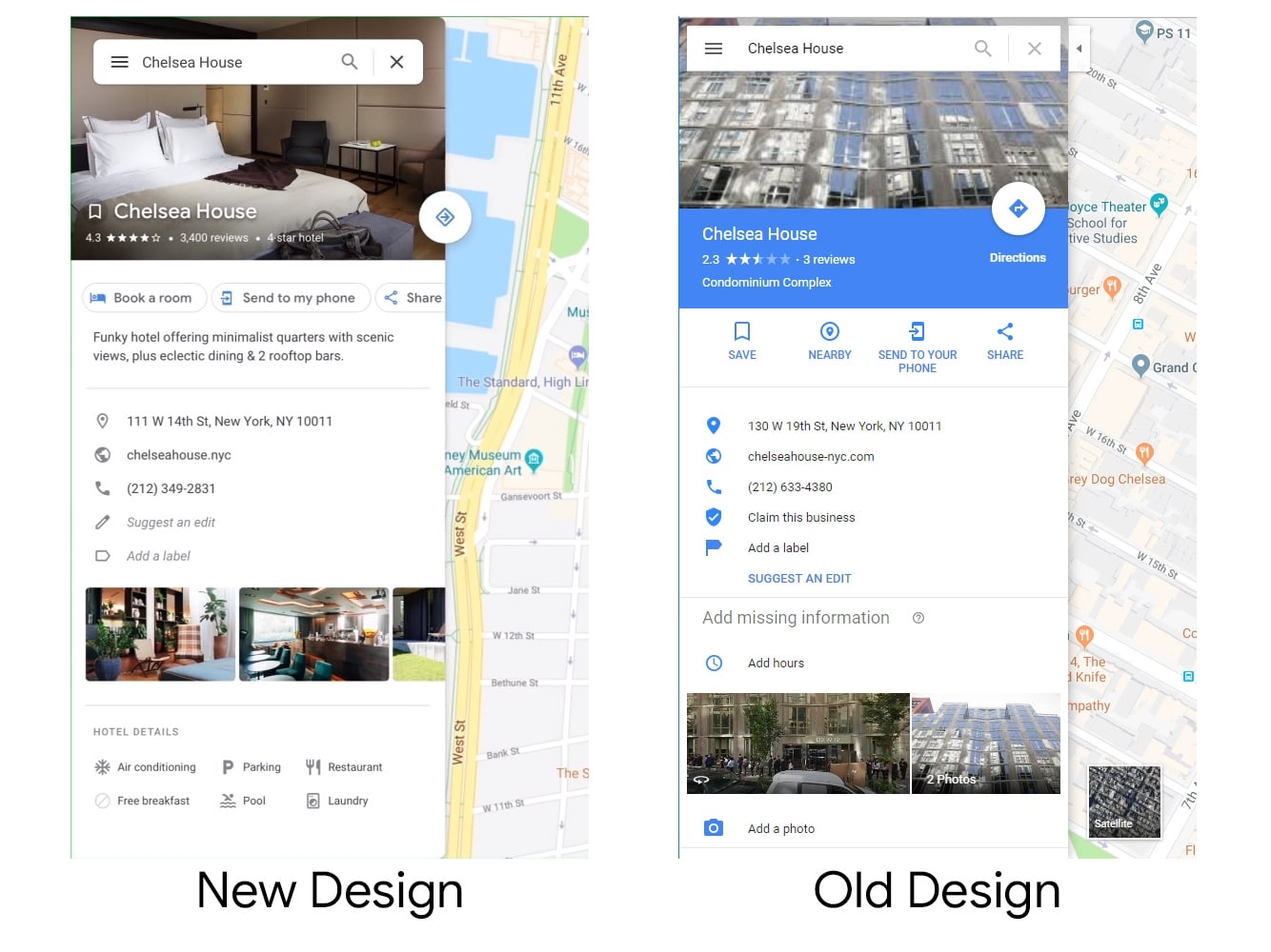
Google Maps | Image credit: Arstechnica
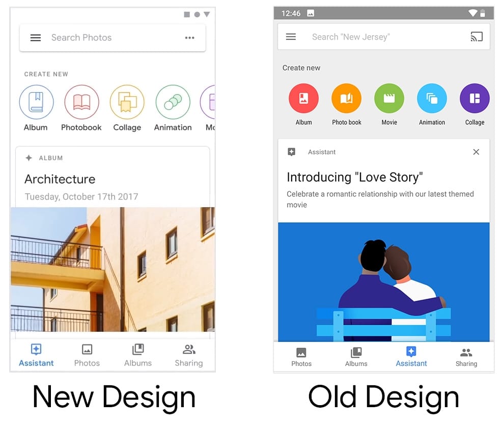
Google Photos | Image credit: Arstechnica
There’s also a video reel showing off the new design:
Keep in mind that the video shown above is not from Google themselves but from designers Adam Grabowski and Nicolo Bianchino. They have worked with Google several times on Material Design projects and the latest one is this video reel.
It was uploaded on Vimeo with a description saying they “worked together with the Google Material Design team to create a piece showcasing their updated design system for their internal teams.”
The video is now set to private on Vimeo but the folks over at winfuture.de were able to make a copy before it was taken down. The upload on Vimeo has been shared by various Google employees, so it should be the real deal.
The 2018 Material Design of Android apps includes a revised font, adjusted action buttons, and Google colors that are in subtle graphics. To sum things up, the general design direction of Android is to embrace the color white.


Apps
Honor, Xiaomi are working on their own Privacy Displays
Samsung’s Privacy Display is apparently very popular.
Normally, a smartphone brand’s blatant copying of another brand’s feature is not a good practice. Today, however, there is a new feature that we wish other brands would copy: Samsung’s Privacy Display. Thankfully, some brands, like Honor, have finally gotten the message and are working on version of the feature.
As reported by Digital Chat Station on Weibo, Honor is reportedly working on a privacy screen for its smartphones. Likewise, Xiaomi is working on the same thing, potentially launching the feature for the Xiaomi 18 Pro.
For the uninitiated, the Samsung Privacy Display is a built-in feature that blocks visibility of the screen at certain angles. If you’re not looking at the screen from the front, all you’ll see is a black void. It’s a built-in version of those protective screens that you can buy separately. Besides adding a nice layer of protection against scratches, it’s also meant to prevent snooping from your shoulder.
Samsung’s take was widely acclaimed for being insanely useful. When it arrives, this feature will be a godsend to more brands. Even better, users will no longer need to rely on third-party screen just to enjoy the privacy.
That said, there’s still no indication as to when these features will arrive on either Honor or Xiaomi.
SEE ALSO: LE SSERAFIM Chaewon flexes Galaxy S26 Ultra Privacy Display

Meta does not have the most stellar of reputations. Despite offering the world’s most popular social media platforms, the company, through its various experiments throughout the years, continuously proves that it has other priorities than just providing the best for its users. Today, another reported experiment wants to take Meta to a new market that its users might fall into: the prediction market.
If you haven’t heard of the prediction market, consider yourself lucky. These apps, such as Kalshi, are basically just gambling platforms without the glitz of playing cards or the rigor of the stock market. Users gamble on mundane circumstances like the weather and more serious ones like war.
Today, as reported by The New York Times, Mark Zuckerberg is reportedly asking Meta to develop a prediction app of its own. Interestingly, the experimental app, supposedly called Arena, will use virtual points, rather than real money. However, Meta has not ruled out real money — and hence, real gambling — in the future.
Meta is entering the industry at an extremely volatile time. The world is starting to crack down on prediction markets. Some users, for example, have been accused of using insider information to get easy wins on these platforms. Some markets have also accused these platforms of subverting anti-gambling laws.
SEE ALSO: Meta adds subscriptions for Facebook, Instagram, and WhatsApp
Apps
foodpanda relaunches cult-favorite roast chicken brand after 8 years of persistent search queries
Heritage chain Andok’s returns to the platform, driven entirely by long-term user analytics.

In the world of e-commerce and food delivery, platform algorithms usually dictate what consumers see. But occasionally, consumer behavior is so relentless that it shapes the platform’s strategy.
In a move driven entirely by long-term user analytics, foodpanda has officially relaunched Andok’s, one of the Philippines’ most iconic heritage rotisserie chains, back onto its platform after an eight-year absence.
The search bar as a digital wishlist
The decision to ink the partnership wasn’t just a marketing play. It was a response to an ongoing data anomaly. Despite being offline from the foodpanda platform for eight years, Andok’s consistently ranked as one of the most-searched merchants on the app.
Year after year, users treated the empty search results page as an unofficial wishlist. This persistent search intent gave foodpanda a clear, data-backed signal of pent-up demand.
Prior to the official digital rollout, teaser campaigns on social media validated this demand, generating thousands of organic interactions from users anticipating the return.
Bridging heritage flavor with digital infrastructure
For foodpanda, onboarding a merchant with this level of built-in demand fits its broader strategy of marketplace optimization and hyper-local network expansion, turning a heritage brand into another data point for how legacy retail plugs into delivery infrastructure.
For Andok’s, the integration works as a fast track to digital scale. A legacy quick-service chain skips years of independent app development and reaches customers already using foodpanda’s existing logistics network, on a platform they already check daily.
Andok’s built its following on charcoal spit-roasted chicken, a slow-cooked technique that’s stayed largely unchanged since the brand’s early days, alongside seasoned grilled pork belly.
More recently, the Dokito line extended that following into crispy fried chicken and chicken burgers, broadening the brand’s appeal beyond its original rotisserie format and giving foodpanda a menu with both heritage pull and everyday fast-food convenience.


vivo X300 Ultra review: A “Whole Different Animal”
Got the beast (finally) unleashed!


The realme P4 Power: realme’s midrange power play?
A power bank and a phone — and more


HONOR Watch 6 Review: Less guessing, more knowing
Beyond educated guesses

The vivo X Fold6 is the first foldable to support teleconverter lens

Now Playing: Supergirl

Apple raises the prices of iPad and MacBook lineups

LE SSERAFIM to perform at BlizzCon 2026

Xiaomi opens largest Singapore store yet at VivoCity

TECNO’s POVA 8 5G is both futuristic and future-ready

Close without crossing: A Xiaomi 17T Pro photo essay

realme launches P4 Series 5G, including Power with 10,001mAh battery

The Xiaomi Watch S5 proves you don’t have to take it off

Buyer’s Guide: Xiaomi Pad 8 Series


-

 News2 weeks ago
TECNO’s SPARK 50 Pro is the latest budget smartphone battery beast
-

 Buyer's Guide1 week ago
Buyer’s Guide: TECNO SPARK 50 Pro vs SPARK 50 5G
-
Reviews6 days ago
vivo X300 Ultra review: A “Whole Different Animal”
-
 Singapore3 days ago
Xiaomi opens largest Singapore store yet at VivoCity
-

 News1 week ago
Budget smartphone realme C100 Series launches
-
Reviews1 week ago
HONOR Watch 6 Review: Less guessing, more knowing
-
 Laptops2 weeks ago
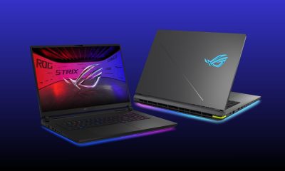
ROG launches 2026 Strix gaming laptop series
-
Reviews1 week ago
The realme P4 Power: realme’s midrange power play?