
Apps
Pokémon Go Plus wearable is out, doesn’t really do much

The Pokémon Go Plus accessory is finally available, and it’s here to rid users of the nuisances Pokémon Go players have been experiencing since its launch. No, the wearable won’t cure the broken tracking system or the in-game errors, but it’ll make creature catching a little less of a headache.
With a single button that lights up for notifications, the accessory allows players to leave their smartphones tucked away while both devices are connected through low-energy Bluetooth. It can be attached to any part of your clothing or the bundled bracelet — really depends on how proud you are of your Pokémon Go addiction.

It’s all as simple as it looks. Once paired with your phone, the Plus will flash a blue light when a PokéStop is in the vicinity. Press the lonesome button at that moment, and you’ll acquire all the available goodies. When a green or yellow light comes up, that means a Pokémon appeared in your area. Green means you’re about to catch a Pokémon you’ve seen before; tap the button, and the game will automatically throw a regular Poké Ball for you. Yellow signifies a pocket monster you’ve yet to own, so you’ll have to bring out your phone in order to catch it.
Successfully collecting from a PokéStop or securing a Pokémon will be confirmed by multiple flashing colors; failure leads to a string of red lights. Since there’s no screen to speak of, you have to check your phone’s notifications or the game’s journal to find out exactly what happened.

As you can tell, the Pokémon Go Plus is essentially a supplement to the mobile game, and can in no way stand alone. There’s also a bunch of functions you can’t pull off, such as battling gyms and sorting your items. On the bright side, users will have a much easier time hatching eggs, as the wearable device can record distance without the phone’s display being on.
Excited to purchase one of your own? Hold on, because here’s the bad news. Availability is quite limited, and even if you do find one, it’ll cost you $35. That’s an outrageous amount for a piece of blinking plastic with nothing but a button.
If you must have it, Nintendo’s Official UK Store, Amazon.com, and GameStop.com might have it in stock.
[irp posts=”10698″ name=”Pokémon Generation 2 is out”]
Source: Pokémon Go


Apps
The No-Nonsense guide to mid-year shopping
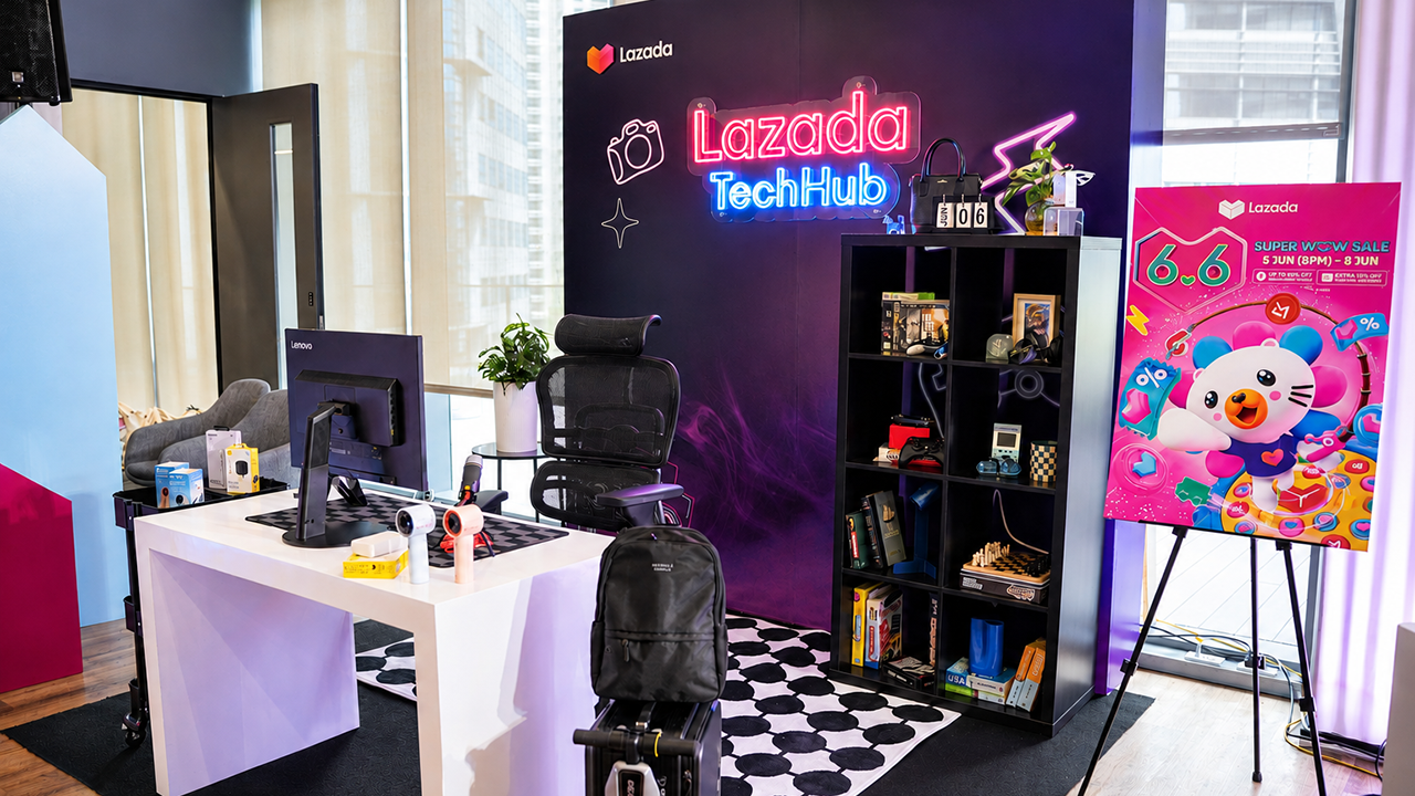
Let AI do the heavy lifting for you this Lazada 6.6 Super WOW Sale

The mid-year sale season is here, but the days of mindless impulse buying are over.
Shoppers are shifting toward intentional, value-driven decisions, focusing on quality, authenticity, and actual utility over flashy, low-quality gimmicks.
From 8:00 PM on June 5 until 11:59 PM on June 8, 2026, the Lazada 6.6 Super WOW Sale is dropping major discounts. But the real win is using the platform’s tools to maximize your budget.
Lock in the baseline discounts

Before diving into specific items, map out how to stack the core offers.
You can stretch your money by hunting down LazFlash Deals for up to 90% off, collecting up to PhP 3,000 in stackable vouchers, and ensuring every order qualifies for the free shipping offers available throughout the event.
True value comes from combining these three layers of savings on things you already need.
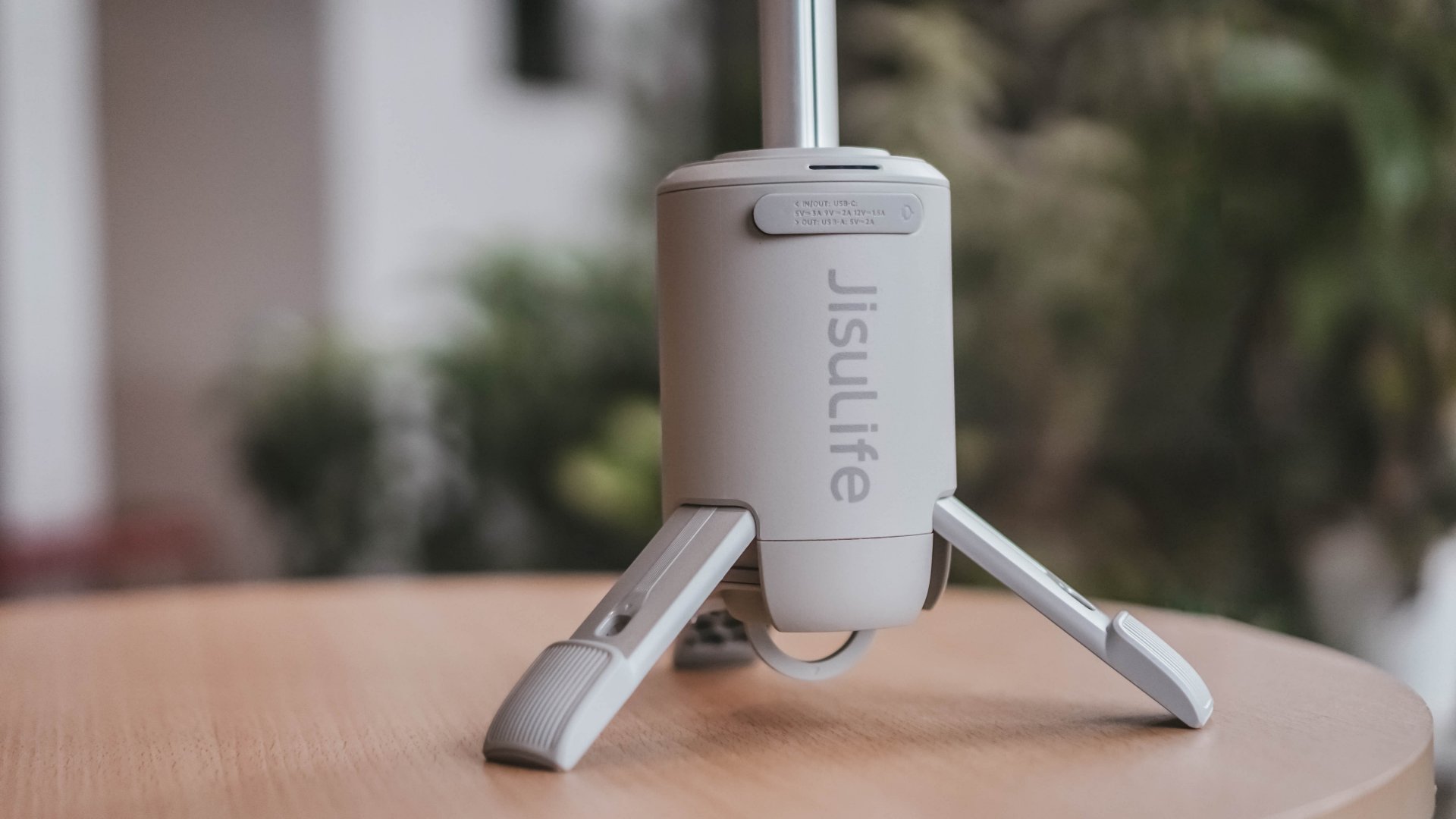
Jisulife: One of the participating, trusted brands you can get from LazMall
Filter for authentic value
Shopping smart means avoiding the trap of “too good to be true” counterfeits that end up in the trash.
Data shows a massive consumer shift toward trusted quality, with LazMall growth vastly outperforming standard listings during major sales.
To ensure your money goes toward genuine products with real warranties, restrict your browsing to official, brand-certified stores.
If you are upgrading your tech, parenting gear, or wardrobe, look to trusted names anchoring the sale like UGREEN, JisuLife, ANTA, Maserati Watches, Momcozy, and O.TWO.O.
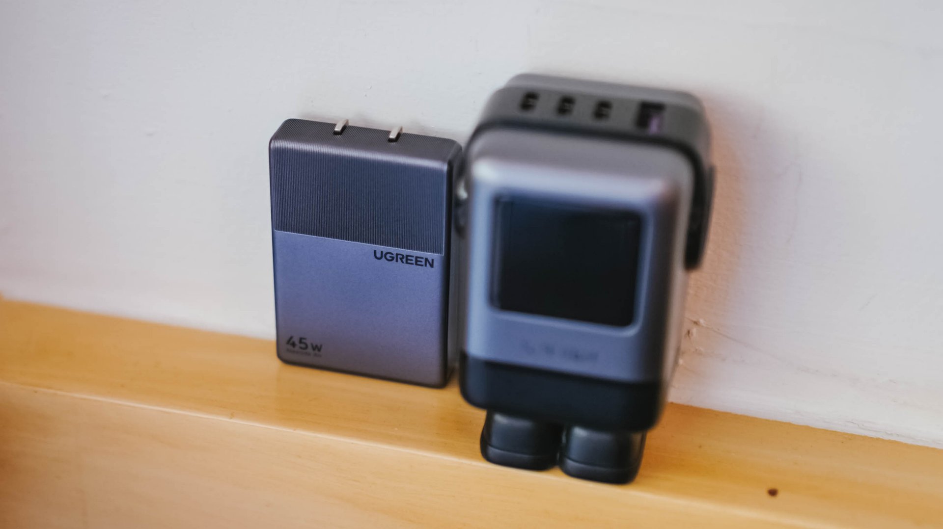
UGREEN: One of the participating, trusted brands you can get from LazMall
Outsmart the noise with built-in tech
Don’t waste hours scrolling through endless listings or guessing which product is better.
The smartest way to navigate a massive mid-year event is to let the platform’s built-in features cut through choice paralysis.

Tools like AI Lazzie and AI Picks allow you to instantly compare similar items, analyze prices, and get personalized recommendations based on actual data rather than generic marketing hype.
Smart Shopper Tip: True value is a mix of the right price, verified authenticity, and a seamless return policy. Use this sale period to stock up on everyday essentials and high-quality upgrades rather than panic-buying items you’ll regret later.
Is your wallet buckling from the weight of so many subscription services? Well, Meta has a trio of new subscriptions for you to sink your hard-earned cash towards. If you have a few dollars, here’s Facebook Plus, Instagram Plus, and WhatsApp Plus.
All three subscriptions are designed to add new features which can enhance the experience for those who practically live on these apps. Among the three, Instagram Plus is the meatiest. It offers users the ability to view other people’s Stories without showing up as a viewer, create more tailored audiences outside of Close Friends, and extend the duration of a Story beyond 24 hours, among others.
Since it shares similarities with Instagram, Facebook Plus offers much of the same features. WhatsApp Plus, however, offers more customization options including new themes, ringtones, and stickers.
If that’s not enough, Meta has also released a new subscription system for Meta AI. Though the basic use of the AI is still free, the new Meta One Plus and Meta One Premium plans offer more capacity and performance for power users. The company is also testing new creator-focused plans, Meta One Essential and Meta One Advanced.
Of course, the new AI-based plans are more focused on those who actually use the AI software. Meanwhile, the three app plans are more for regular users. Facebook Plus and Instagram Plus will cost US$ 3.99 per month. Meanwhile, WhatsApp Plus will cost US$ 2.99 per month.
SEE ALSO: Instagram takes on Snapchat yet again with new Instants feature
Apps
Meta quietly launches Forum app for Facebook Groups
The app highlights discussions from Facebook Groups.
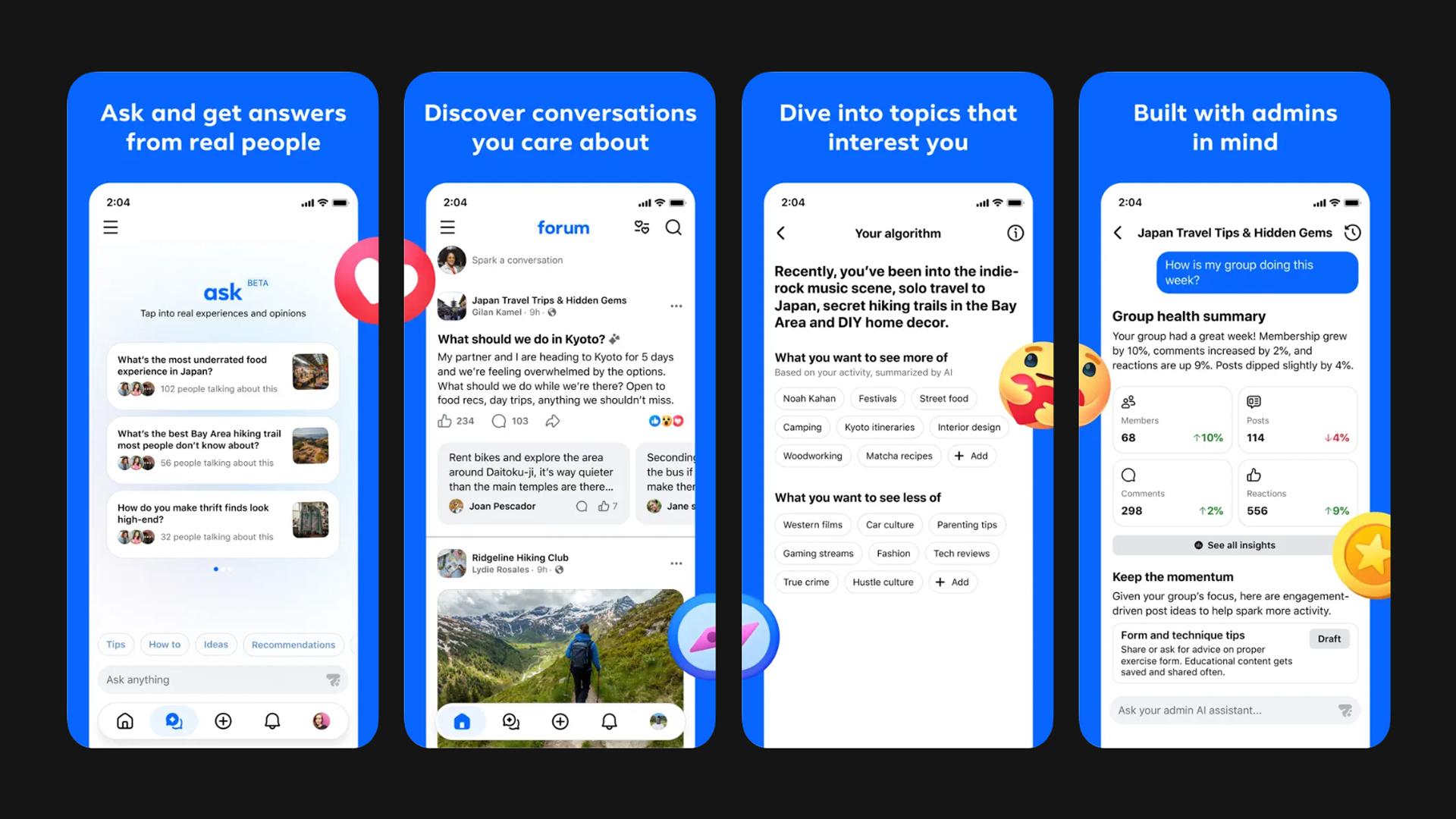
Since the rise of other platforms, Facebook Groups haven’t enjoyed as much popularity anymore. Despite this (or maybe even to help with this), Meta has unleashed an all-new app called Forum.
Designed specifically with Facebook Groups in mind, Forum collates discussions from Groups that the user might be interested in. Much like the websites of the same name from the 2000s, the app wants to feature conversations, rather than canned content that the algorithm shoves towards users on the main Facebook feed.
Users can also ask questions. Forum will sift through real discussions to find an answer. The closest analog today is searching Reddit for troubleshooting questions to get answers based on human experience. The main feed of the new app, however, feels more in tune with Quora’s concept.
That said, it’s a refreshing way to bring social media back to human-made feeds. It’s also a stark admission that the main Facebook feed (and, frankly, Instagram too) is just too inundated with content that users are not interested in.
Lately, Instagram also made the same admission by launching its own “lightweight” app called Instants. Like Forum, Instants was made to recapture the essence of Instagram before the rise of the almighty algorithm.
Forum, however, was launched with much less fanfare than Instants. There was no announcement. Rather, it’s just a casual drop from out of nowhere. The app is available now on the App Store and the Play Store.
SEE ALSO: Instagram takes on Snapchat yet again with new Instants feature


HONOR Magic V6 review: The best version of a book-style foldable?
Little left to sacrifice


Close without crossing: A Xiaomi 17T Pro photo essay
Distance and closeness are not always opposites.


Spring reset: Growing more at home with Auk Mini
From kitchen counter experiment to everyday habit

Kingdom Hearts IV gets new trailer, confirms Switch 2 release

Final Fantasy fans have two big reasons to look forward to 2026

TECNO’s POVA 8 5G is both futuristic and future-ready
Upcoming realme C100 series to feature 8,000mAh battery

What HYROX Hong Kong looks like up close

HONOR 600 Pro review

The Infinix GT 50 Pro has the most inspired design for a gaming phone

Sony Xperia 1 VIII arrives with AI Camera Assistant, bigger telephoto sensor

UGREEN MagFlow Air review: Airy Yet Mighty

The UGREEN Nexode Air 65W is the only charger I travel with now


-
Reviews2 weeks ago
Close without crossing: A Xiaomi 17T Pro photo essay
-

 Accessories2 weeks ago
UGREEN launches FineTrack Series with Apple Find My support
-

 News1 week ago
realme launches P4 Series 5G, including Power with 10,001mAh battery
-

 Philippines2 weeks ago
Xiaomi 17T series Philippines price, availability, offers
-

 Hands-On1 week ago
The Xiaomi Watch S5 proves you don’t have to take it off
-

 Computex 20261 week ago
ASUS ROG XBOX Ally X20 debuts at COMPUTEX 2026
-

 Gaming2 weeks ago
Acer unveils Predator Atlas 8 handheld with Intel Arc G-Series power
-

 Gaming2 weeks ago
Call of Duty: Modern Warfare 4 has been officially announced