

Reviews
Redmi 10 review: Page out of a premium playbook
That 50-megapixel shooter is the saving grace
Budget phones used to be just budget phones. They used to lack groundbreaking features to make your experience seamless. And you’ll need to shell out a lot of cash just to get a decent phone that actually works. But I was speaking about budget phones from around five years ago.
In 2021, smartphone companies are reinventing what it means to have an entry-level handset. Xiaomi’s sub-brand Redmi, which has been leading the segment for a few years now, seems to set the course again on a new range of affordable smartphones.

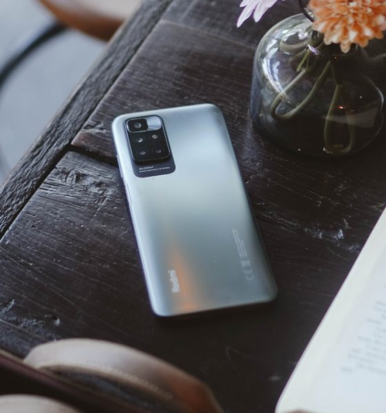
Meet the Redmi 10 — the successor to its popular Redmi 9 — offering premium-like design and smart features but with a price tag that you can easily reach.
Finally looking like its siblings
The Redmi 10 rehashed its looks, looking differently than its predecessor. It employed the same design language found on other Redmi and Xiaomi smartphones, which was a trend started by Samsung — trickling down from its flagship to the more affordable Galaxy A series.

Somehow, it’s working since the Redmi 10 looks sleeker and it can be quite difficult to tell the difference compared to the Redmi Note 10 Pro. And even the Xiaomi 10T Pro. Unless, of course, you’re a tech junkie and a Xiaomi fan. But that’s probably the case when you have the Carbon Gray color option.
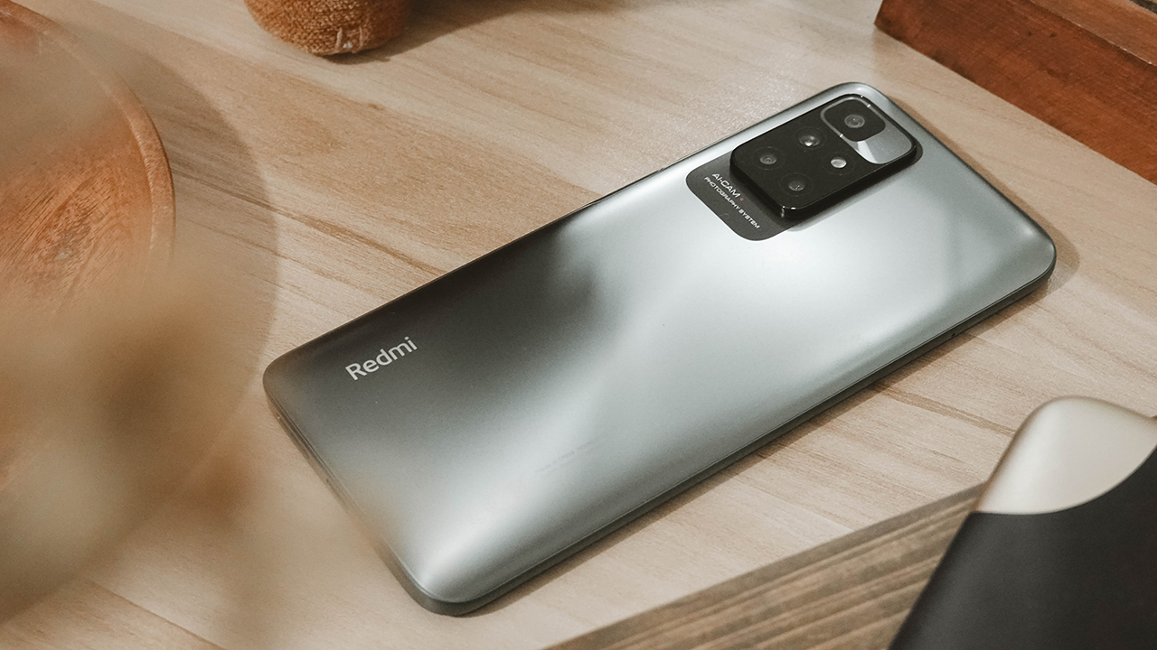
Nonetheless, the Redmi 10 in Carbon Gray looks neutral yet sleek with its frosted glass-looking back which is just actually plastic. But it makes up for being lightweight so it doesn’t put a strain on your hands for endless scrolling on TikTok. Just a heads-up, though. Carbon Gray is a smudge-magnet so you need to slap a clear case on — which comes in the box.

Moving to its frame and details, it’s also made of plastic but it comes with sweet, round edges and flat sides. Which I appreciate because the era of curved phones is now in my past.
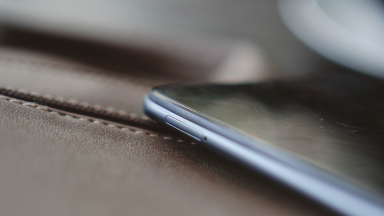
SIM tray
The left side houses the SIM tray while the volume rockers and the power button doubling as a fingerprint scanner are found on the right.

Power button/fingerprint scanner and volume rockers
Speaking of which, gliding your fingers across the scanner will prompt it to read your fingerprint easily — but it takes a second to boot the phone.
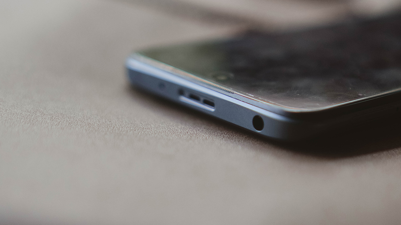
On the top side of the frame, you can find a stereo speaker, IR blaster, and the well-loved 3.5mm audio jack.

On the bottom side are the other loudspeaker and a USB-C port.
Performing quite well for your needs
Let’s talk about the design again, but on the front panel of the phone. The Redmi 10 sports a 6.5-inch IPS LCD panel with 2400×1800 resolution. It’s adorned with thinner bezels equal on all sides except the chin. The punch-hole cutout seems bigger than other smartphones employing the same approach, too.
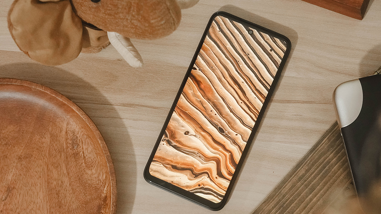
Despite the front design that clearly indicates it’s still a budget phone, the magic lies behind it. The Redmi 10 comes with the latest MIUI 12.5 based on Android 11. Having said that, you can expect that even if you have an entry-level device, Xiaomi will still supply you with core Android updates.
It also has a 90Hz refresh rate — which seems to be a staple to most smartphones. People are always clamoring about higher refresh rates for their gaming needs, and to be “in”. It also comes with AdaptiveSync, which adjusts the refresh rate depending on the content being viewed.

When you watch on Netflix, or if you play online games, AdaptiveSync will adjust accordingly. So you don’t have to worry about the battery life that easily drains when using a higher refresh rate. But then again, the Redmi 10 sports a 5,000mAh battery. It lasted me a day of heavy use and lasted up to three days when I put it on standby.
Although, my only problem would be its max 18W capacity when it comes to “fast” charging. So the 22.5W charging brick included won’t be of any help. It takes more than an hour to fill the juice, making it your cue to detach from your phone for a little while.
The dealbreakers
I only played Mobile Legends: Bang Bang on the Redmi 10 since it’s the only mobile game I play right now. I put it into the highest settings possible, in which case it performed decently.

However, I experienced the same type of drag I had when I used the Infinix Note 10 Pro. There was a noticeable delay — which lasts for one to two seconds — when toggling buttons and switching scenes inside the game. The delay still occurs even if you change to the lowest setting possible.
I’m starting to think that it’s a similar theme for budget phones, but it’s not necessarily a deal-breaker especially when you consistently play in the budget segment.
And even with a Helio G88 processor, the phone heats up a little while you’re playing mid-game. Nonetheless, it still performs decently as expected out of an entry-level handset. To expect more from it is just asking too much — there’s a Redmi Note 10 Pro if you want better performance at an easily reachable price tag.

The Redmi 10 comes in various configurations depending on your country: 4GB/64GB, 4GB/128GB, and 6GB/128GB. It has expandable storage through a dedicated microSD card slot.
What worries me is that the internal storage uses an eMMC 5.1 chip, not the UFS. So the reading and writing of data is slower and might wear out over time. Translation: slowed down performance after considerable updates.
So if you’re thinking of multitasking and using this phone for work, I’d advise you not to. Use it casually so you can make it last longer.
Specs
|
Processor |
MediaTek Helio G88 |
|
Configuration |
4GB/64GB, 4GB/128GB, and 6GB/128GB |
|
Battery |
5000mAh + 18W charging |
|
OS |
Android 11, MIUI 12.5 |
|
Front camera |
8MP |
|
Rear camera |
50MP + 8MP + 2MP + 2MP |
|
Display |
6.5” FHD+ IPS LCD 90Hz refresh rate 2460×1080 resolution |
|
Dimension |
162 x 75.5 x 8.9 mm |
50-megapixel goodness?
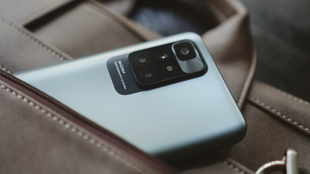
It’s rare for an entry-level smartphone to have a high megapixel count. In a way, the Redmi 10 is raising the bar for smartphones in the budget segment. After all, it delivers a quad-camera system: a 50-megapixel main camera, an 8-megapixel ultra-wide-angle camera, a 2-megapixel macro shooter, and a 2-megapixel depth sensor. On the front, it has an 8-megapixel selfie shooter.
For most people, this kind of camera setup works. So we took a few samples to see if the Redmi 10 can cover the bases.


For regular shots, the Redmi 10 takes decent captures both indoors and outdoors. As long as it comes with sufficient lighting. When taking backlit shots, the Redmi 10 doesn’t post-process and keeps shadows dark.


When using the ultra wide-angle lens, the Redmi 10 struggles with exposure and highlights both day and night.

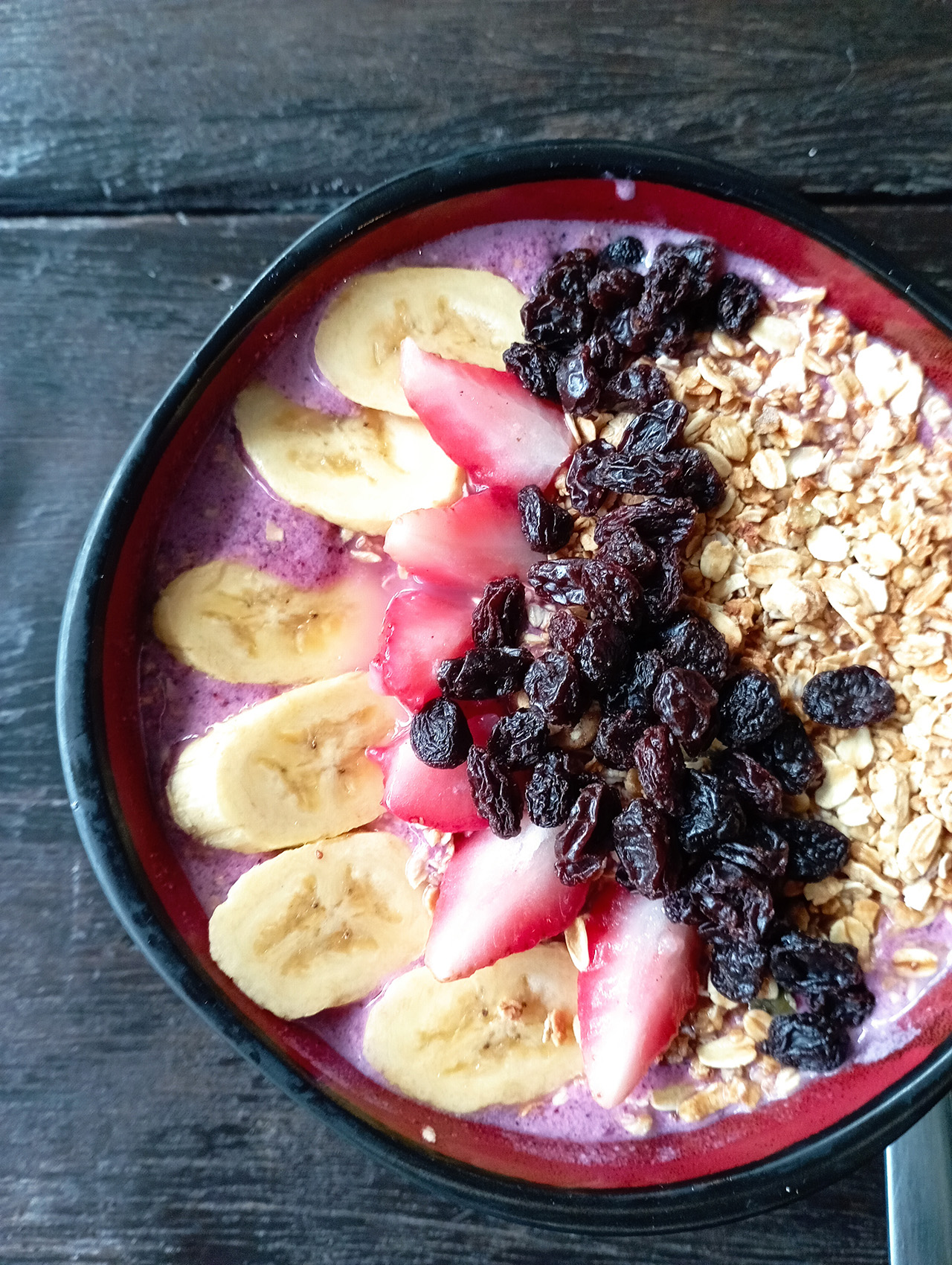

Food photos aren’t tasty-looking due to their lack of vibrance, even if you use the AI Cam. To make it look even more appetizing, I used the 2X optical zoom to capture more details and take better flat lays.


Cutouts are okay whether auto shots at night or even the portrait mode. Except photos don’t look as detailed as they should.


The same goes for shots taken at night using auto mode and night mode.
![]()
![]()
Of course, we took samples using the 50-megapixel shooter. It did well during daytime shots, retaining as many details as it can but compromises when it comes to color accuracy. At night, on the other hand, still struggles with exposure and highlights — a noticeable flaw for a supposedly great quad-camera system.


Moving on to selfies, its 8-megapixel front shooter pads a slight beautification to its photos even if you turn off its beauty mode. Color balance also varies depending on the lighting condition.
In a way, it delivers how it’s supposed to. If anything, a filter wouldn’t hurt if you want to correct the color balance of the photos. There are built-in presets, but you can never go wrong with Instagram filters!
Is this your BudgetMatch?
There are things to love about the Redmi 10, and there are things that might raise some red flags. Depending on your needs, the Redmi 10 can cover the base and perform decently as expected of an entry-level smartphone. It’s got a sleeker look, a 50-megapixel shooter that you can show off, a 90Hz refresh rate — all at an affordable price tag.
But if you’re asking for it to do more, then you’re way better off choosing something else. For nearly the same price, there’s the POCO M3. For those who need better performance for all-around use, add a few more bucks and you can get the Redmi Note 10 Pro.
On another note, the realme 8 5G is also a good alternative granted you can increase your budget by a tad. It has similar features — a 90Hz refresh rate, same display and panel, same battery, and charging capability. But more importantly, it has 5G connectivity which helps for future-proofing.

Frankly, the Redmi 9T appears so much better it feels like this one’s a downgrade. The only salvation for the Redmi 10 is that it’s got a better look, smarter features, and it has a 50-megapixel shooter compared to the alternatives mentioned.
If all your needs are covered, then this could be your BudgetMatch. But to most people, the Redmi 10 falls short especially when it comes to that eMMC 5.1 storage — when most smartphones are using UFS already.
The Redmi 10 retails for PhP 7,590 for the 4GB+64GB variant, and PhP 8,590 for the 6GB+128GB variant. It comes in three colors: Carbon Gray, Pebble White, Sea Blue. It’s available for purchase at Xiaomi’s official stores and authorized retailers.


Reviews
nubia V80 Max: Long battery, marginal upgrades, casual budget phone
Upgrades here and there, but is the price increase worth it?

The nubia V80 Max arrived in the Philippines with a noticeable price jump: PhP 6,499, up from the V70 Max’s PhP 4,799.
For it’s intended market — the budget-conscious users who are trying to make ends meet daily — those extra pesos matter a ton.
That’s why I’ve been torn on giving it a pass or no. I still am until now.

The V80 Max does tout durability upgrades and AI add-ons. The refreshed design also looks a bit more premium, ditching the circular camera island.
But all these improvements feel incremental or marginal. In the end, budget users need their phone to work as they try to survive each day too. From the get-go, using this device somewhat felt… non-enjoyable.
Performance: A bit unsteady
The nubia V80 Max is powered by a Unisoc T7250 processor with up to 1.8GHz clock speed. It can handle typing, messaging, and other light tasks.
However, just tapping on apps, loading them, and switching between them generally looked sluggish.

There’s also been slowdowns that weren’t experienced too much with the V70 Max, which my nephew even entrusted for PUBG.
I type quite fast, and to its credit, the nubia V80 Max has kept up. At least you can use this for endless chatting with friends and keeping loved ones updated.
But everywhere else, patience is required. Even just simulating a delivery rider’s routine and having navigation turned on was already pushed the phone past its comfort zone.

For gaming, I’ve played both Mobile Legends: Bang Bang and Need for Speed No Limits on the handset.
They are playable, although the overall experience may not be enjoyable due to sporadic connectivity issues and bare-minimum graphics.
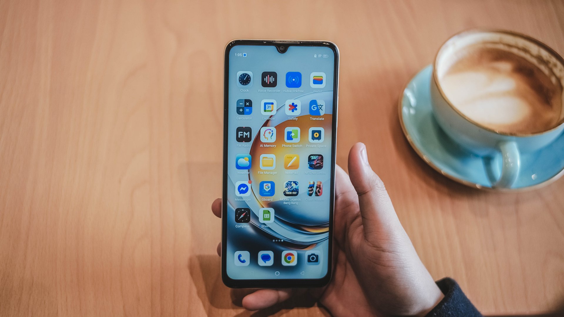
Display: Bright but basic
In front, the nubia V80 Max has a large 6.9-inch IPS display that is similar to the V70 Max’s panel.
A notable improvement is 780 nits peak brightness. That’s a welcome upgrade for outdoor visibility.
However, the resolution maxes out at 720p for YouTube videos and other scenarios. That and a low pixel density make the display most specially underwhelming even for just photos of food.
They look a lot unappetizing and just makes you scroll down instead.

The thick bezels and black bars also lessen the audiovisual experience. Speaking of audio, the sound quality is just par for its segment. It’s not totally flat but far from a premium soundscape too.
Battery: Long-lasting, enough for light work
With a 6,000mAh battery like its predecessor, the nubia V80 Max can deliver a full day of light use. Besides, there’s not much “demanding” tasks you can do on it smoothly.
For basic communication all day, plus browsing and light gaming in between, you’ll surely have enough power left.
The only downside is that it takes about two hours to fully replenish back to full. That’s unlike other budget phones with 33W to 45W charging at the very least.
A nice surprise is Bypass Charging to power gaming and extended use.
Durability, water and dust resistance: For assurance
As nubia has previously mentioned, the V80 Max is practically the brand’s own entry to the “rugged budget phone” meta.
On paper, it has an IP64 rating and up to a 1.8-meter drop resistance. It’s always good to have these as extra insurance for parents handing phones to kids or workers in tough environments.

At the same time, it plays a part in the higher asking price. A cheap case and a lanyard should do the same without a price bump.
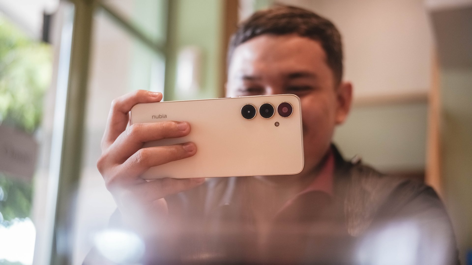
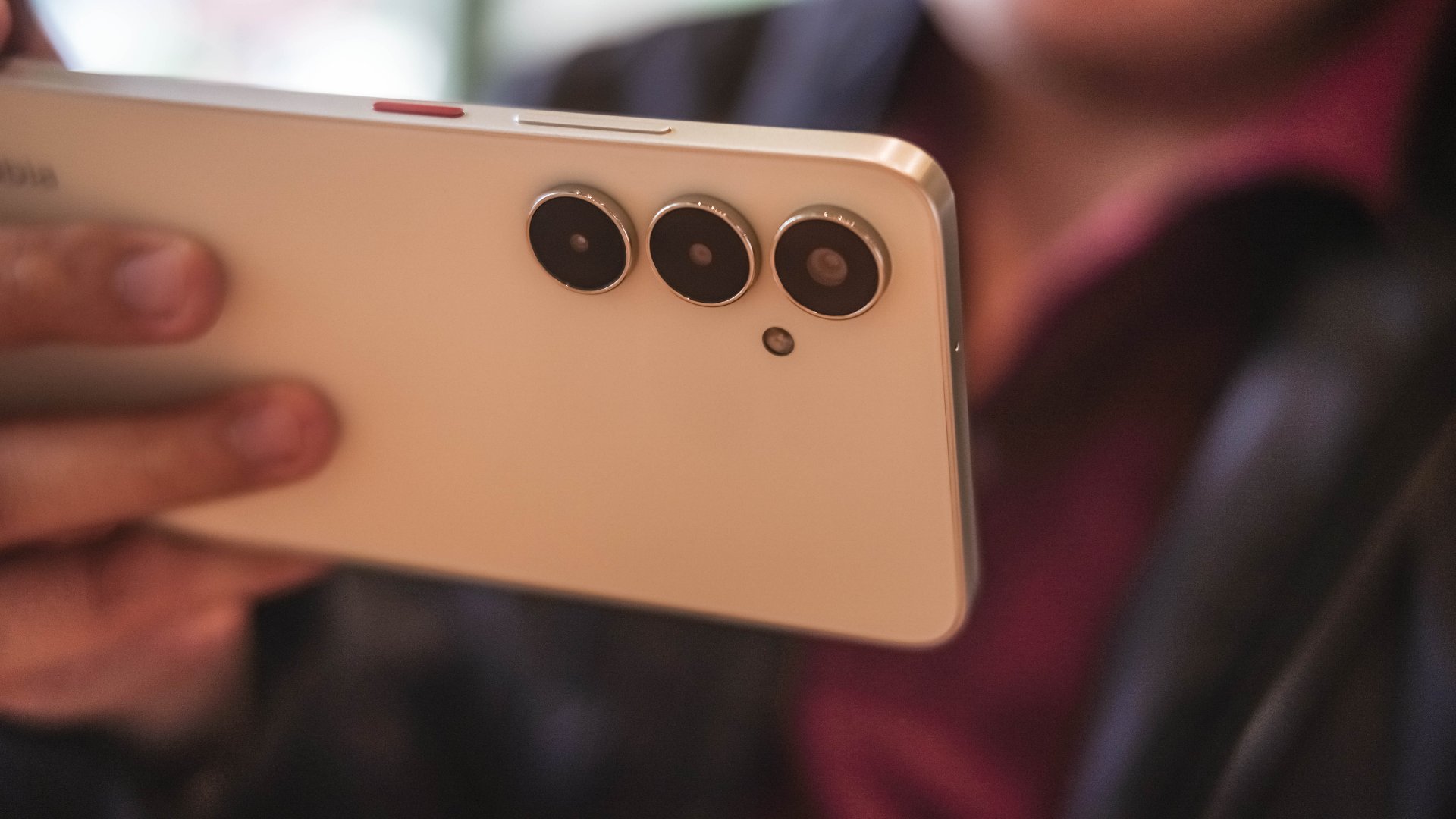
Cameras: Decent, with caveats

Lighting will always be your friend with a camera system like the V80 Max’s. The device comes with a 50MP main camera for decent detail and a 16MP counterpart in front.
It works, but your patience will definitely be tested. The results are fair to a point that the camera can be used for beyond documentation.


There was even one time I zoomed to 3X (in daylight) and the detail still looks amenable.


But forget quick captures. It takes time for the capture button to process your press. The camera demands stillness even after the snap.
To be fair, the colors are also decent — not washed out and totally dull. But in some cases, the color accuracy is off, especially for food and other red-hued subjects.


For good shots, just give them some post-processing, and they’re usable for social media.
One the other hand, low-light and night shots from both front and back shooters are predictably grainy and noisy.Selfies are also lighting-dependent for quality.


The camera UI could also use some upgrades. My palm also sometimes accidentally taps the right-hand side of the screen when holding the phone.
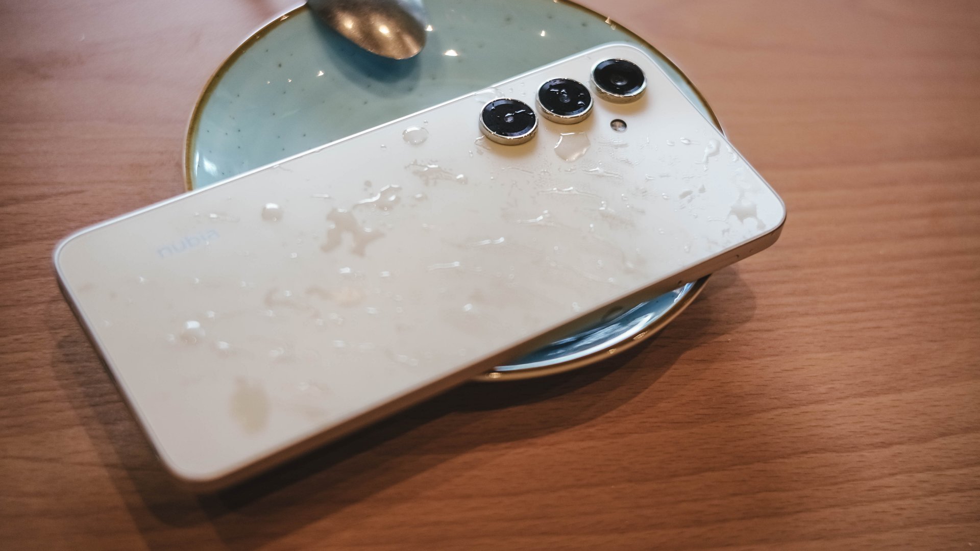
Design
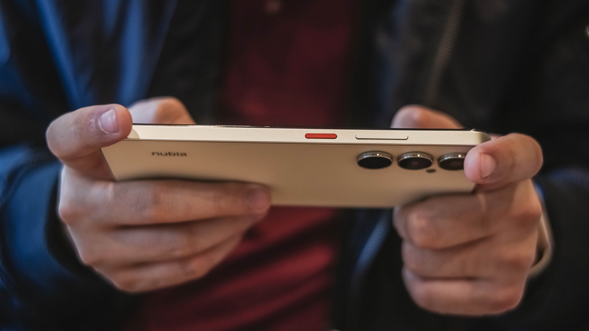
As mentioned, nubia has ditched the familiar Android top-middle-of-the-back camera island in favor of this setup:
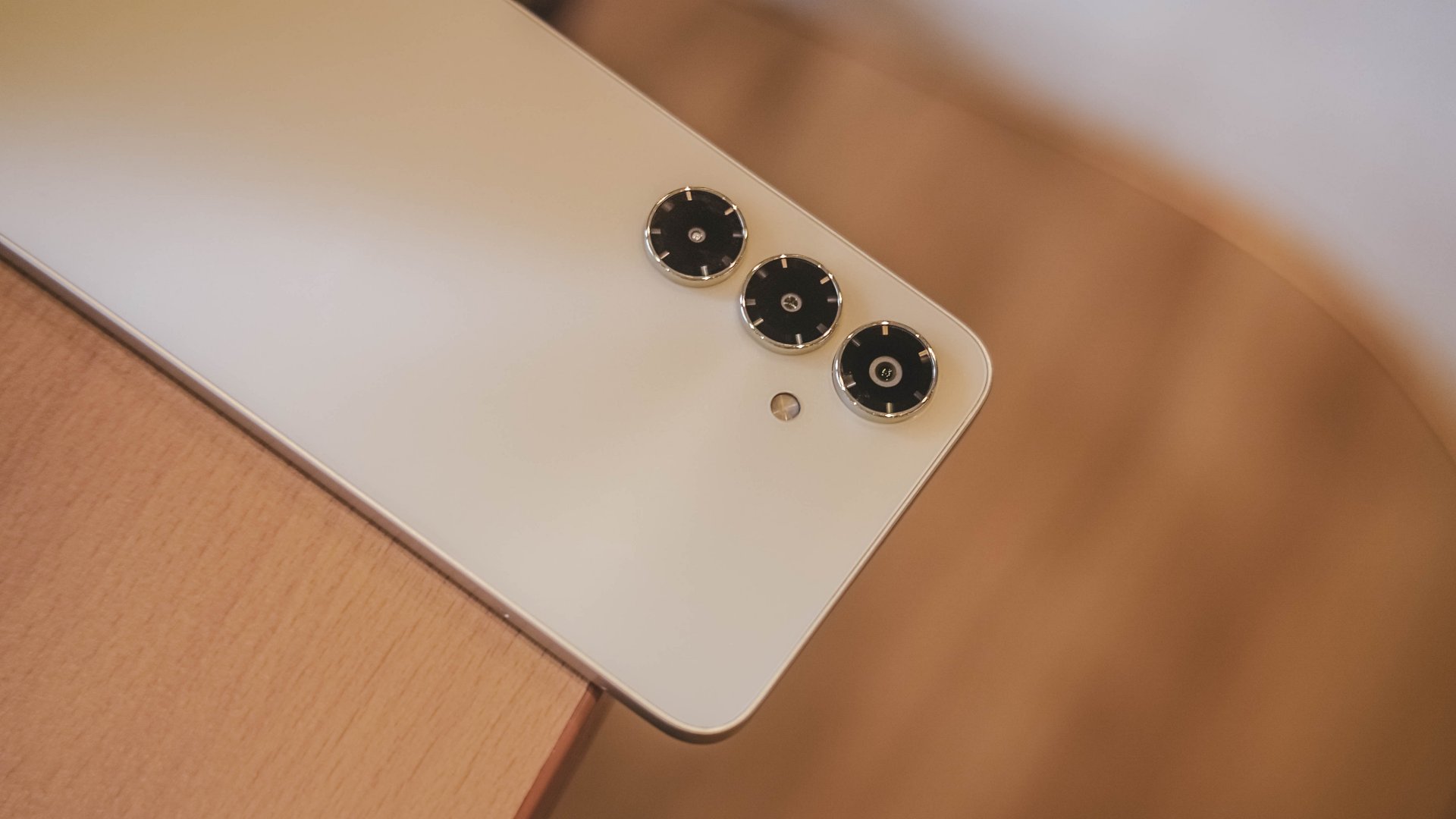
The three shooters protrude and are lined up vertically. You’ve definitely seen this arrangement from other Android brands, most notably Samsung’s previous offerings.
But it’s a new touch for nubia, while the power button being in red reflects their signature flair.
There are five colors, and mine was in Aurellia Gold which looks more of a light yellowish cream. The backside is smooth although the side frames provide enough friction for a good grip.
I’m pleased that the device didn’t come with bloatware out of the box.
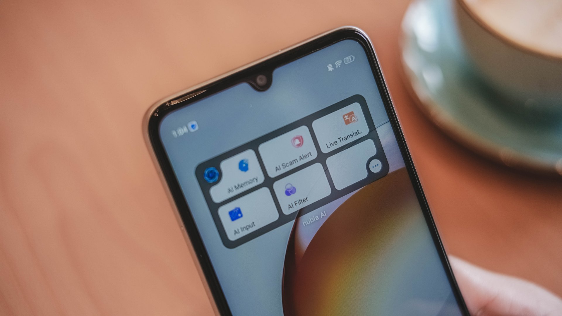
Also, there are AI features here that are somewhat actually useful. The AI Scam Alert is worth utilizing so you can avoid getting disturbed.
Is this your BudgetMatch?
It’s an easy Swipe Left for me. Plain and simple, the phone is usable but unenjoyable.
There are some commendable aspects but the performance lags, the display underwhelms, and the price hike doesn’t feel justified.
Throw in a few more bucks, and you’ve got some better-balanced options and budget gaming phones. There’s also better camera systems and displays on other budget handsets.

I would say it’s still for consideration for those who really just need a communication tool. Students, entry-level workers, stay-at-home adults, and more.
But in the end, the upgrades do not outweigh the compromises. By now, even the most affordable phones should offer more than just survive drops. They must be able to at least keep up with users’ lives.
Apps
Breaking up with Adobe Photoshop after 20 years
Wedding planning and Apple Creator Studio made me realize it was time

Planning a wedding, even a small and intimate one, has a way of sharpening your sense of priorities. Right as my fiancé and I were making decisions for our city hall wedding here in New York City, Apple announced Creator Studio.
Creator Studio is a subscription service that gets you access to eight creative pro and productivity apps for US$12.99 a month, or US$2.99 if you’re a student or educator. The design app included in the subscription, Pixelmator Pro, is also available as a standalone purchase for US$49.99. Adobe Photoshop, my design software of choice for over two decades costs me US$22.99 a month.
Seeing those numbers next to each other made me pause. It’s not that I was unhappy with Photoshop. I was just suddenly made aware how expensive it is. I’d been paying more for a single tool than I could for an entire creative ecosystem.
Adobe Photoshop was my first foray into the world of graphic design
Creative Studio’s lower price point, along with the free trial, made me consider switching to Pixelmator Pro altogether. That’s something I never thought I would do. Photoshop was how I got into graphic design. It was my first love, and up until recently, I truly thought it would be my ride or die.
Getting to know Pixelmator Pro
If you’re not familiar, Apple’s Pixelmator Pro is a graphic design and image editing app that’s similar to Adobe Photoshop. In practice, it covers a huge amount of the same ground but with a very different philosophy around usability and design.
I tried Pixelmator Pro, mostly as a challenge because we were doing a YouTube video on Apple Creator Studio. Personally, I was lowkey excited to try something new.
![]()
The first time I loaded the app, I recreated our YouTube thumbnail template — all within 10 minutes — and I haven’t looked back since.
Familiar enough to feel effortless
One of the biggest reasons my transition to Pixelmator Pro was so easy is muscle memory. Many shortcuts behave the same way: cmd+T for transform, cmd+R to show rulers, cmd+J to duplicate layers, just to name a few.
Having used Photoshop since high school, it felt familiar and intuitive — the complete opposite of how it felt to try and switch to Adobe Illustrator many years ago.
Photoshop is how I got into graphic design. It was my first love, and up until recently, I truly thought it would be my ride or die.
Later, I learned that you can import PSD (Photoshop) files directly to Pixelmator Pro. Apparently I didn’t even need to recreate the GadgetMatch assets. It does a good job of converting and preserving layers.
Photoshop now feels archaic
![]()
After using Pixelmator Pro for a few days, going back to Photoshop felt jarring. The sharp edges of the UI felt cold and rigid. Everything was layered with popups, panels, and tiny interruptions.
Pixelmator Pro, in comparison feels warm, smooth and frictionless. Its user interface is very Apple-like — rounded edges, softer icons and buttons. The Creator Studio version also gets the new Liquid Design touch, with transparent menus and elements that feel dynamic.
I especially love the little things. Color adjustments live in one simple panel instead of being scattered across different windows. There’s an eyedropper tool beside every color picker with a magnifier built-in.
When you hover over tools, it shows you the shortcut (e.g. “R” for Repair). There are also subtle animations, like when you use the Color Fill tool to change your canvas color.
Pixelmator Pro’s UI is warm, snappy, and approachable
The differences in user experience are stark. Photoshop’s animations either don’t exist or are too abrupt for one to notice.
Smart tools without the noise
Photoshop has one clear advantage over Pixelmator Pro: Generative AI. It’s great and powerful especially when you need to save time.
I personally used it a couple of times before to save time on cloning, erasing, or expanding elements. Am I going to miss it with this switch? Something tells me I won’t.
Pixelmator Pro’s clone and repair tools, though seemingly so simple, work like a charm. And for how I usually manipulate images, those two are more than enough.
From digital to physical
If Pixelmator Pro was going to replace Photoshop in my workflow, wedding prep was the perfect time to give it a real world test — and it more than held its own. Its ease of use gave me permission to think outside the box, because I knew I had a reliable tool that can help me make it happen.
On the left, a Kufic-inspired wedding logo designed on Pixelmator Pro; on the right, 3D printed stamps
Since my fiancé is half-Iranian, I designed a logo combining our names, inspired by Kufic calligraphy, and I did it entirely in Pixelmator Pro. I developed that same logo further and designed a save the date, with color, also inspired by Kufic calligraphy. I went through a few iterations to come up with the final designs, which were made easier by the Shape tool and grid overlays.
My fiancé then took the logo I designed in Pixelmator Pro, converted it to 3D on Revit, and printed it into stamps in different sizes. One way we’re using it is to deboss the handmade pottery he’s making as one of our party favors.
There are a few more wedding pieces I’m designing on Pixelmator Pro in the coming weeks: our final invitation, and the custom stationery for the dinner that follows the ceremony.
Through this whole process, Pixelmator Pro never felt like it got in the way, or that it was limited. On the contrary, it feels like that enabler friend who says yes to every idea I have, and can actually help make them real.
Powerful, but approachable
The best way I can describe what using Pixelmator Pro is like is this: it’s a mix of Photoshop’s professional tools, Canva’s free library of assets, and Apple’s UI sensibility.
Shortly after Apple announced Creator Studio, Adobe rolled out significant Creative Cloud discounts. Are they threatened? They better be.
That makes it great for beginners, small business owners, and casual creators. Like Canva, it comes with some beautiful templates to help someone with zero experience come up with something good.
But unlike Canva, it still feels like a serious design tool. I can do so much of what I need using Pixelmator Pro but with UI that’s so much more approachable compared to Photoshop.
As the great philosopher Ariana Grande once said, “Thank U, Next”
I remember meeting Canva’s founders before launch and not fully understanding their mission to make graphic design accessible to everyone. Now I do.
It was never about replacing Adobe products and pro designers. What Canva did was fill a huge void we didn’t know existed. They democratized something that used to be reserved only for the privileged few.
Pixelmator Pro comes with free templates, assets, and mockups like this MacBook Pro and coffee packaging
Pixelmator Pro’s lower barrier to entry has potential to make a significant impact. My hope is it opens doors for people who were previously shut out of the graphic design world, and that it becomes something they can grow with, just as I did with Photoshop.
Adobe is still the industry standard
Switching to Pixelmator Pro wasn’t about rejecting Adobe, in the same way that Canva’s success did not kill Photoshop.
It’s worth noting that Adobe products are still the standard in the industry. A lot of companies rely on them, and most schools teach them. In a traditional design or agency environment, Photoshop and Illustrator are still the default language.
![]()
Even on Apple’s own Design Resources site for developers, the official design templates are built for Adobe Photoshop and Illustrator, not Pixelmator Pro. That says a lot about how embedded Adobe is in professional workflows.
Competition makes the space better
Apple Creator Studio, and tools like Pixelmator Pro, challenge Adobe’s near-monopoly in a really healthy way.
It’s not lost on me that trading Photoshop with Apple software actually keeps me locked into one ecosystem. But having more pro creatives try Pixelmator Pro can put pressure on the industry. A strong alternative that’s more cost effective can force titans and dinosaurs to evolve in a way the likes of Corel was never able to do.
Ideally, that means better products and fairer pricing for everyone. Shortly after Apple announced Creator Studio, Adobe rolled out significant Creative Cloud discounts. Are they threatened? They better be.
Pixelmator Pro’s intuitive UI makes switching from Photoshop easy peasy
Access matters, and at the end of the day, with a healthy competition in the market, it’s consumers that win. Canva is a great example of this. It made design tools accessible to those who aren’t professionals. It didn’t make everyone a great designer, just as a novice who tries Final Cut Pro today won’t become a pro video editor tomorrow. Design is still a craft you develop over time with practice.
Is Pixelmator Pro my GadgetMatch?
Photoshop still has its place. But for my everyday work, and occasional personal projects, Pixelmator Pro can do everything that I need to accomplish, at a fraction of the cost.
It feels faster, lighter, and more alive. Honestly learning my way around new software has been so enjoyable — so much so that I feel a renewed sense of eagerness to try other design software like Blender and Figma.
Pixelmator Pro never felt like it got in the way, or that it was limited. On the contrary, it feels like that enabler friend who says yes to every idea I have, and can actually help make them real.
Wedding planning and Apple Creator Studio didn’t just make me switch to a new software. They also made me question how much I’ve been missing out on. How much of what I do is simply due to inertia?
![]()
Ending my longest relationship doesn’t mean it failed. I’m grateful for what Photoshop taught me. It helped shape the creative professional that I am today.
But alas, this is one area where my practicality wins over loyalty. Relationships — with people or with tools — only work when both parties keep showing up. There’s no room for complacency, despite the history.
Walking away from something that taught me so much feels bittersweet, but Pixelmator Pro fits the way I work now, and I hope it grows with me as I turn the next page.
Gaming
Now playing: Final Fantasy VII Remake INTERGRADE on Switch 2
Final Fantasy VII Remake, handheld again

There are two ways I ended up playing Final Fantasy VII Remake Intergrade on the Switch 2: handheld, and docked. And in many ways, that split mirrors what this release is really about—flexibility, familiarity, and a little bit of re-learning.
Relearning muscle memory
Let’s get the small friction point out of the way first. Button prompts. Even after all this time, my brain still defaults to PlayStation glyphs. Triangle means something very specific to me in Final Fantasy VII Remake, and retraining that muscle memory on a Nintendo layout took a bit longer than expected. That’s not the game’s fault—it’s just the reality of revisiting something you’ve deeply internalized on another platform. And honestly, it’s something I’ll just have to get used to as more of these previously PlayStation-first titles land elsewhere.
Once that adjustment period passed, the bigger surprise came quickly—especially in handheld.
Midgar in the palm of your hand
Without even stacking it up against the PS4 or PS5 versions, the Switch 2 version already looks impressive on its own. In fact, it looks really good. There’s a moment of quiet disbelief when you realize you’re holding Midgar in your hands, running locally, and still retaining that sense of scale and atmosphere the remake is known for.
I’ve played Final Fantasy VII Rebirth on devices like the ROG Ally and Legion Go, and the feeling here is similar. Not in raw power comparisons, but in that same sense of admiration—Square Enix managing to package something this dense, cinematic, and emotionally loaded into a handheld experience without it feeling compromised at first glance. That same awe of seeing this classic reimagined is still intact, even on a smaller screen.
Living with 30fps

Performance-wise, the most noticeable limitation is the 30fps cap. It’s there, and anyone coming from a 60fps playthrough will notice it immediately. That said, it never felt like a dealbreaker to me.
Command inputs still land cleanly, combat remains responsive, and nothing about the experience felt sluggish. If you’re sensitive to frame rate shifts, this might take some adjustment. But in motion, and especially in handheld, it rarely pulls focus away from the game itself.
Streamlined progression, real relief

One feature that quietly made a big difference for me is the new Streamlined Progression option. Being able to start with maxed-out stats, unlimited resources, and reduced friction is a genuine quality-of-life win—especially for players who’ve already finished the game once and don’t necessarily want to grind their way through Midgar again.
It turns Intergrade into a smoother re-experience, letting you focus on the story beats and combat flow rather than progression systems you already know by heart.
The storage reality check
The less glamorous reality check comes with storage. At roughly 90GB, this is a heavy install, particularly if—like me—you lean heavily toward digital purchases. I had to delete three games just to make room.
If you have the option to go physical on Switch 2, that might be the more practical route, especially as more large-scale ports make their way onto the platform.
A familiar journey, made portable
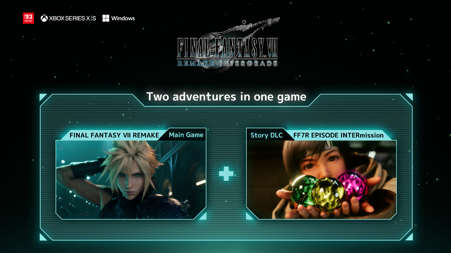
Contextually, this release matters beyond just another port. Final Fantasy VII Remake Intergrade arriving on Switch 2 is part of Square Enix’s broader push to bring the entire remake trilogy to more platforms, with the final entry already in development.
It also reinforces Intergrade as the most accessible entry point into the series—bundling the main campaign with the Yuffie-led EPISODE INTERmission, and now offering features that lower the barrier for newcomers while respecting returning players’ time.
At US$39.99, it lands at a price that feels fair. Whether you’re completely new to Final Fantasy VII Remake or just want a portable version of a game you already love, this is an easy recommendation—storage caveats aside.

Overall, this is an impressive Switch 2 port. Not perfect, not trying to outmuscle the PS5 version, but confident in what it is. Seeing Final Fantasy VII Remake Intergrade run this well, this comfortably, on a handheld still feels a little surreal—and that alone makes it worth playing again.
If you’re looking for deeper technical breakdowns and direct comparisons with the PS4 and PS5 versions, Digital Foundry continues to do excellent work on that front. But as a lived-in experience, this one already earns its place on the Switch 2.


nubia V80 Max: Long battery, marginal upgrades, casual budget phone
Upgrades here and there, but is the price increase worth it?


Breaking up with Adobe Photoshop after 20 years
Wedding planning and Apple Creator Studio made me realize it was time


Now playing: Final Fantasy VII Remake INTERGRADE on Switch 2
Final Fantasy VII Remake, handheld again

CM Punk graces cover of WWE 2K26

Stranger Things: Tales from ’85 premieres in April

Sony WF-1000XM6 was accidentally leaked online
nubia V80 Max: Long battery, marginal upgrades, casual budget phone

PlayStation, LE SSERAFIM Chaewon team for the ‘Love of Play’ campaign

HONOR X9d 5G launches in the Philippines: Price, preorder, availability

POCO M8 Pro review: Goin’ loco over this POCO

Infinix NOTE Edge debuts: High-end features for accessible pricing

HONOR Magic8 Pro review: What sorcery is this?

Redmi Note 15 Pro+ 5G review: The midrange fashion piece


-

 Reviews2 weeks ago
HONOR X9d 5G review: Tougher, more long-lasting and optimized
-

 Automotive2 weeks ago
BYD expands PH presence with entry of DENZA luxury EVs
-
Gaming2 weeks ago
Now playing: Final Fantasy VII Remake INTERGRADE on Switch 2
-

 Accessories2 weeks ago
Razer fully unwraps these limited BLACKPINK Edition gaming gear
-

 News2 weeks ago
Beyond the Box, Digital Walker turn over Tesla Model Y to iPhone 17 raffle winner
-

 Gaming2 weeks ago
Forza Horizon 6 launches on May 19
-

 Gaming2 weeks ago
Nintendo’s latest toy is Super Mario Wonder’s Talking Flower
-

 Gaming2 weeks ago
You can now race as teams in Mario Kart World’s Knockout Tour