

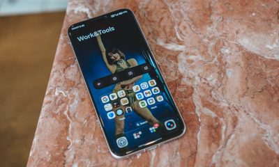
A cosmic pull. A supernatural attraction. These aren’t phrases one normally says on a smartphone review. And yet, here I am. Falling madly for the Samsung Galaxy S22+.
However, this wasn’t the case from the get go. First, I saw it in photos and it was alright. Then, I saw the specs on paper. Yeah, that’s pretty good. It was just another flagship, I thought.
But everything changed when it came to my doorstep and held it in my hands.
(P.S. All of my subheadings below are taken from the song “One Touch” by Gabe Bondoc. You can play it while you read 🙂).
One touch and I’m hooked and I am drowning
I am completely aware how overly infatuated I’m coming off and will come off for the rest of this article. But, having been in this smartphone reviewing gig for close to seven (7) years now, I’ve become almost numb to the usual releases.
Yes, every now and then I take a liking to a smartphone or two. But it has been a while since I really, really wanted to keep and/or buy a phone I’m reviewing.
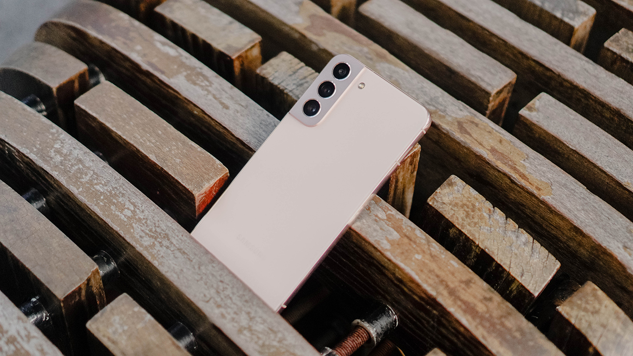
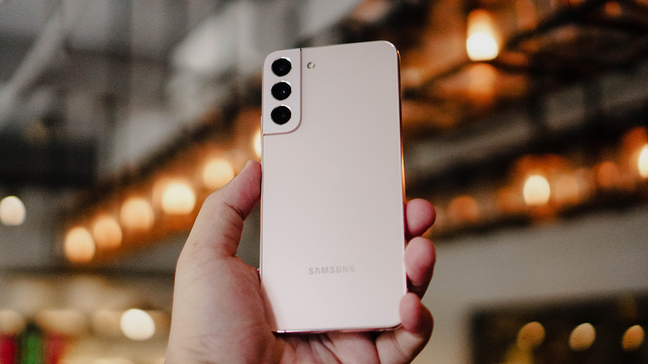
The Samsung Galaxy S22+ just felt perfect on my hands. The right width, the right length, and the right thickness. The heft of the device, its shiny metallic edges, and the clean premium finish of the back all scream premium. The material on its back has a smooth, matte feel and finish. It’s both smudge and scratch resistant.
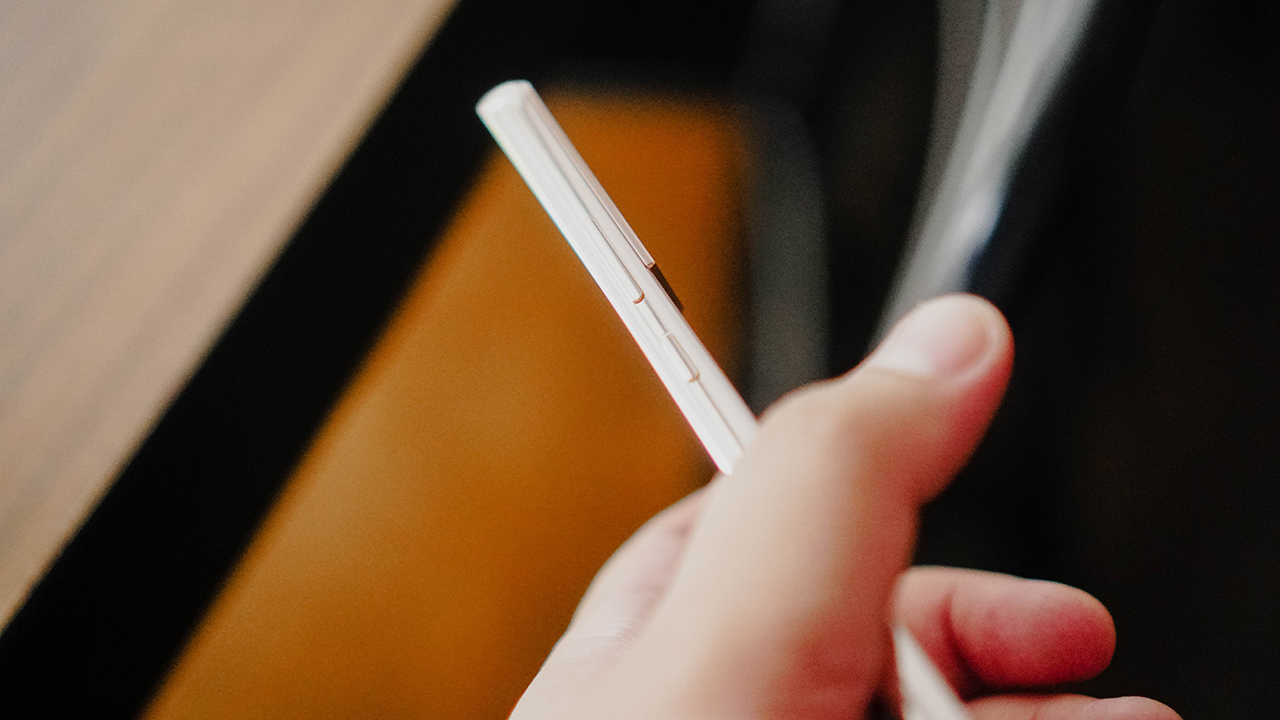
I’m a fan of its button placements too. With both the power button and volume rockers flushed on the right-hand side. It’s easy to slide up and down to press what you need to press.

And the metal lining on the edges feels smooth but grippable and perfectly complements the flat display.
Excuse me, I don’t mean to be staring

It’s no secret that Samsung consistently offers one of the best displays, especially in their flagship line. This remains true for the 6.6-inch Dynamic AMOLED 2X panel equipped on this beaut. The colors are rich and crisp under favorable lighting conditions. But even in broad daylight, the display is bright enough (1750 nits peak) to be comfortably operated without having to squint.

I had a grand time watching my favorite shows on the Samsung Galaxy S22+. I’ve had it for a while so I saw a few episodes of the Netflix K-Drama Business Proposal on it. I have also been catching up weekly on the HBO series Winning Time: The Rise of the Lakers Dynasty. For content that supports it, HDR10+ kicks in to elevate the visual experience.

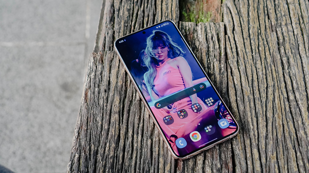
The display looks so majestic that it prompted me to put the love of my life Momo Hirai of TWICE as my wallpaper. And then of course, there’s the dynamic refresh rate that goes up as high as 120Hz. This means the screen changes its refresh rate depending on what you’re doing. If you’re scrolling through socials and what not, it kicks into high gear to give you a smooth experience. When idle, the refresh rate lowers down to save battery.
My heart won’t slow ’cause of you

The Galaxy S22+’s overall performance will really keep your heart racing. Normal, day-to-day interactions with your phone just feel extra sharp. The many features mentioned above coupled with the Snapdragon 8 Gen 1 powering this phone keeps it humming no matter what you do.
Keeping up with the news in the morning, checking socials to see what you missed, using messaging apps to keep in touch whether for work or personal matters – all of these just feel like a breeze. And the ONE UI 4.1 skin on top of this Android 12 flavor definitely contributes to just how things flow when you use this smartphone.
I didn’t do a lot of gaming, though. To test it, I defaulted to my go-to which is a few hours of Call of Duty Mobile. As expected it runs without hiccups on high graphics settings. There’s a game manager of sorts here that I didn’t tinker with much. It’s not too different from the ones implemented in previous Samsung phones. Some key features include focusing the phone’s resources to gaming and limiting or completely blocking notifications.
Battery life is also admirable. One afternoon, I used it to tune into a friend’s wedding via Zoom. The entire ceremony lasted roughly around two (2) hours. In that period, the Galaxy S22+’s battery went from 82% to 76%.
Naturally, that isn’t the single indication of its battery performance. I generally start my days at around 9AM and end at around 8PM. On days that I’m glued to my laptop, with only occasional glimpses on the phone, I would end the day between 60% to 70%. On days that I’m out and about and rely on it a lot to get work done, my day ends with around 25% to 35% of battery left.
You’re looking fine today, not that I only noticed now

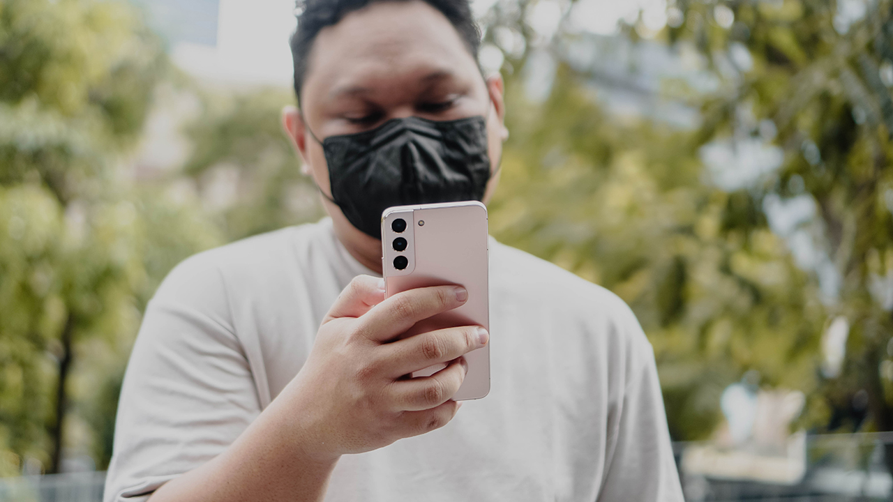
I have already done an entire separate article about the cameras on the Galaxy S22+. It’s one of the things that I enjoyed the most about the phone. It’s almost as if it’s impossible to take a bad photo with this on hand.
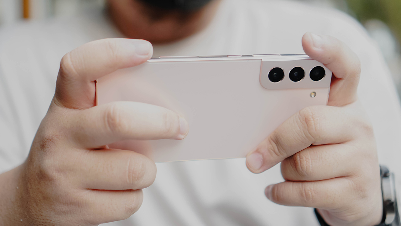
Easily switching between lenses is great. But what’s even better is how the quality and color reproduction doesn’t vary much from lens to lens. Check these samples out.
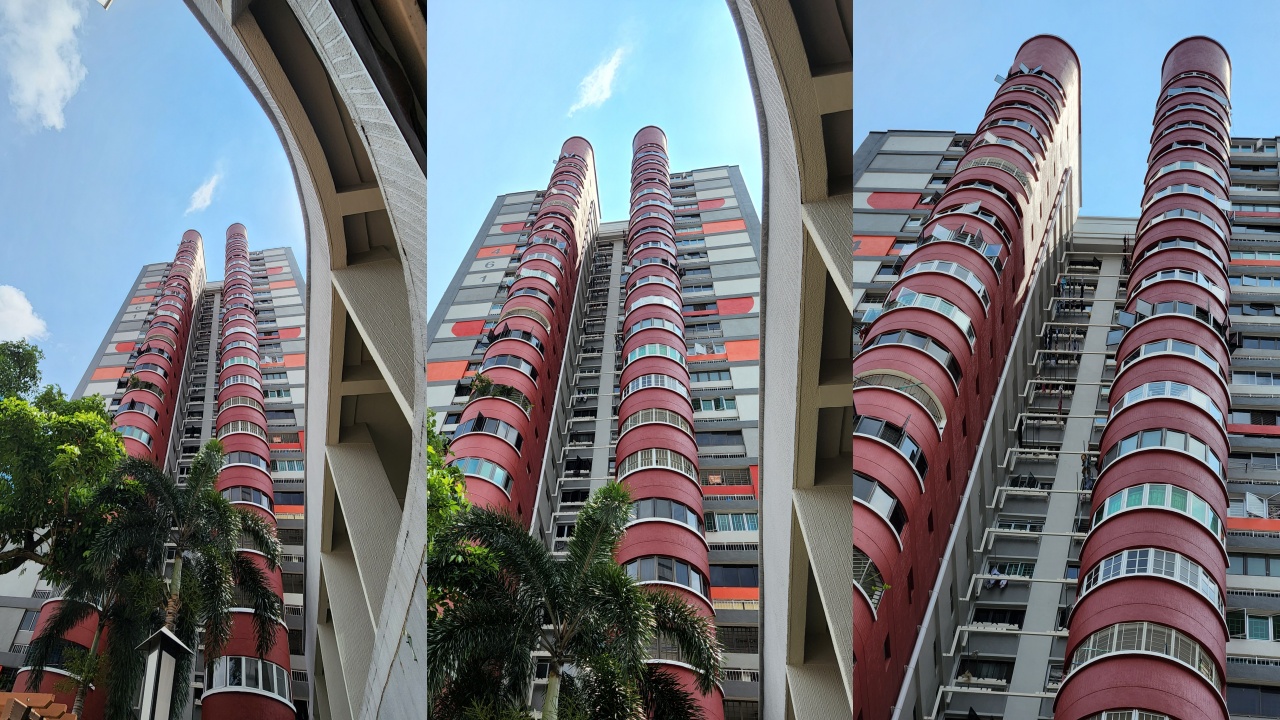

And you can even use 10X Zoom with barely any detail loss, especially if it’s a photo that you’re just uploading on social media.

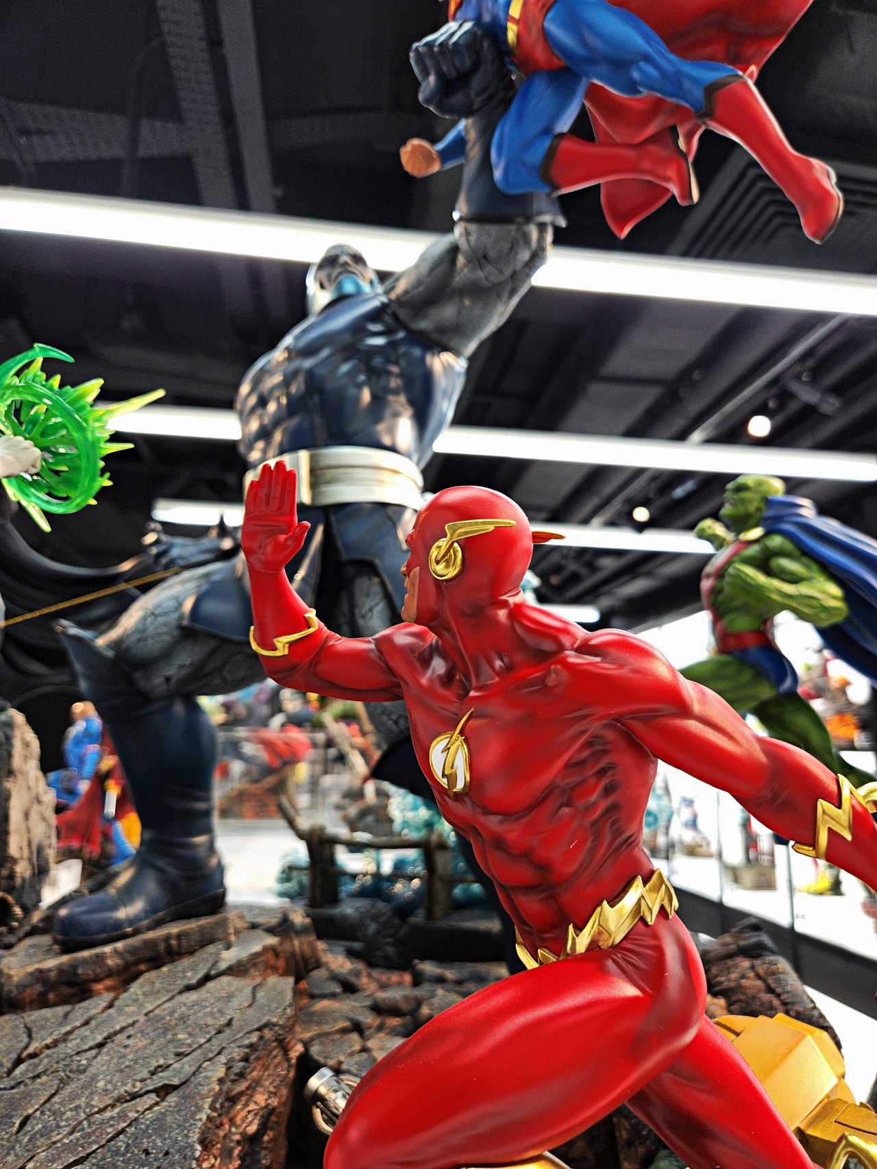
That versatility is unmatched and is fantastic for quick, run and gun shoots like the one I did during the opening of the XM Studio in Singapore.


I am thoroughly impressed and extremely satisfied with the quality of images it produces. And that’s saying a lot seeing as my regular daily phones include an iPhone 11 Pro and an OPPO Find X3 Pro. Both of which are excellent shooters in their own right.
Oh and yeah, “Nightography”.


You think there is a way that I can get you to stay?
You see, the thing about the Galaxy S22+ is that with just the first touch, you already know you’re in contact with something that you should hold onto for dear life. I can’t tell you how many oohs and aahs I got after letting other people hold it in their hands. It just has that effect.
Additionally, the phone is a smooth amalgamation of many other standout phones. It has the breathtaking display of Samsung phones, an overall footprint that feels like an iPhone 12/13 Pro Max, cameras that rival those that partner with notable camera brands, and much, much more. All of that comes in this package that looks and feels well-built on a phone that is easily an all-rounder performer.
Truly, I never want to let it go. And that’s not something I always say about smartphones. So here’s to hoping that this high praise leads to the Galaxy S22+ staying with me more than a little while longer.

The Samsung Galaxy S22+ 5G is still available today in Samsung stores near you, via online at Samsung.com, or at your preferred telecommunication service provider. Pricing information on our key markets are linked in the following: USA | Singapore | Philippines.
I know it’s been a while since its release. Despite all the hype long gone, it’s still a phone you won’t regret buying.


Health
Spring reset: Growing more at home with Auk Mini
From kitchen counter experiment to everyday habit
Spring and summer rolling around almost always makes me want to reset something in my routine.
A few years ago, it was growing broccoli sprouts in a jar. Getting the Auk Mini over Christmas felt like the natural next step.
From sprouts to something more
Starting with sprouts was easy. After having them at a family gathering, it clicked that I could actually grow something, even in our small apartment. Anyone, including my husband can do it on the kitchen counter, and upkeep takes less than a minute a day. Watching something grow and actually eating it made me realize how nice it is to have fresh greens around all the time.
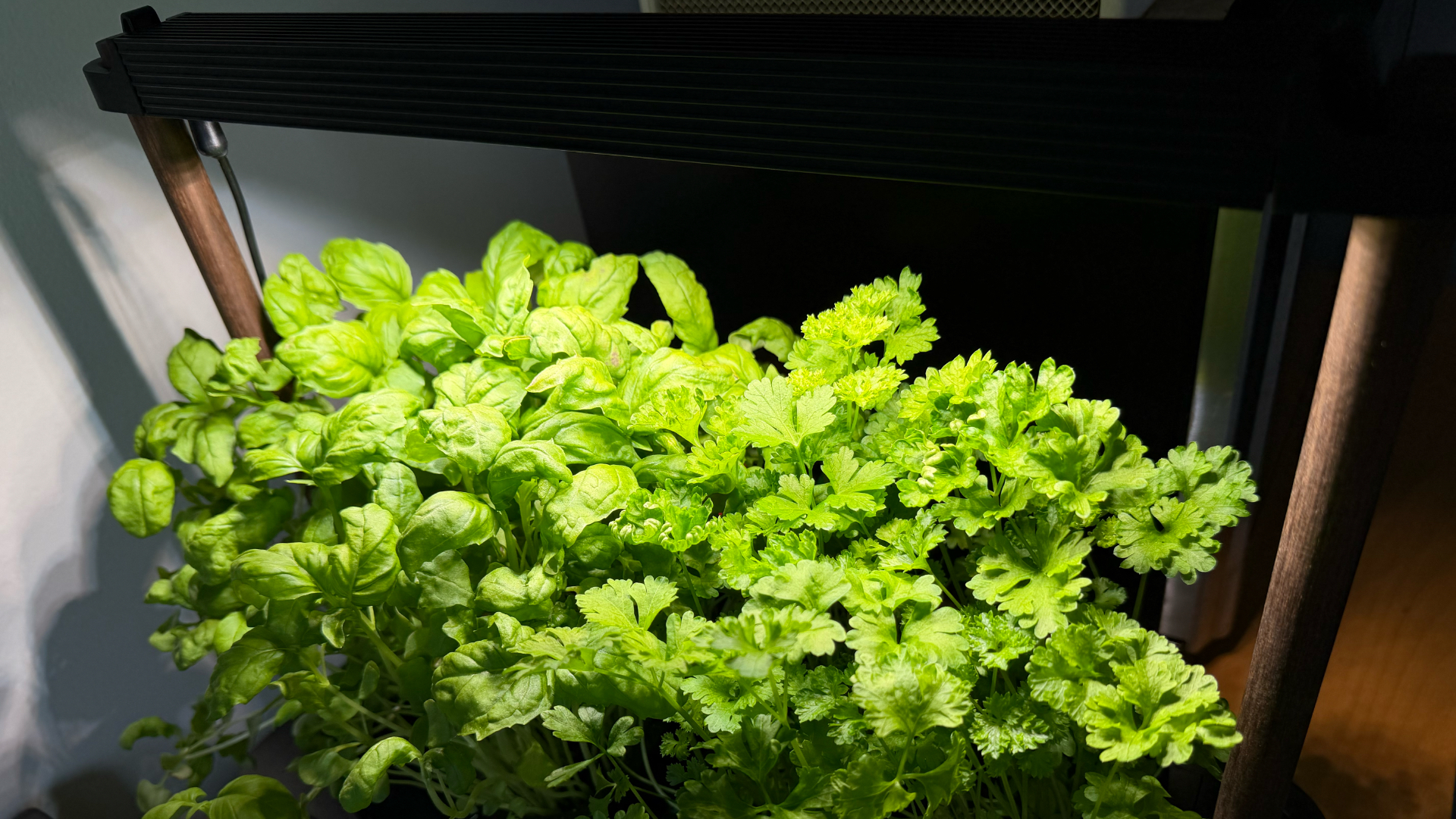
The Auk Mini builds on that. Instead of just one thing in a jar, now I have herbs growing consistently at home.
Getting started was easy
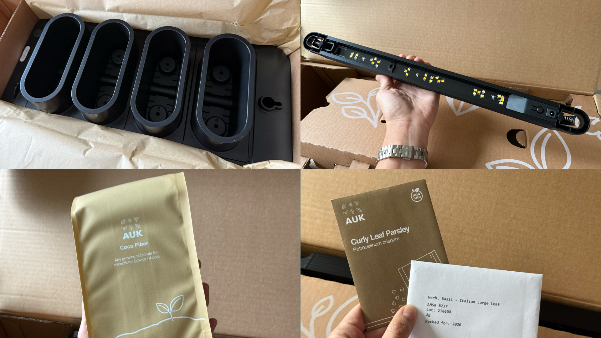
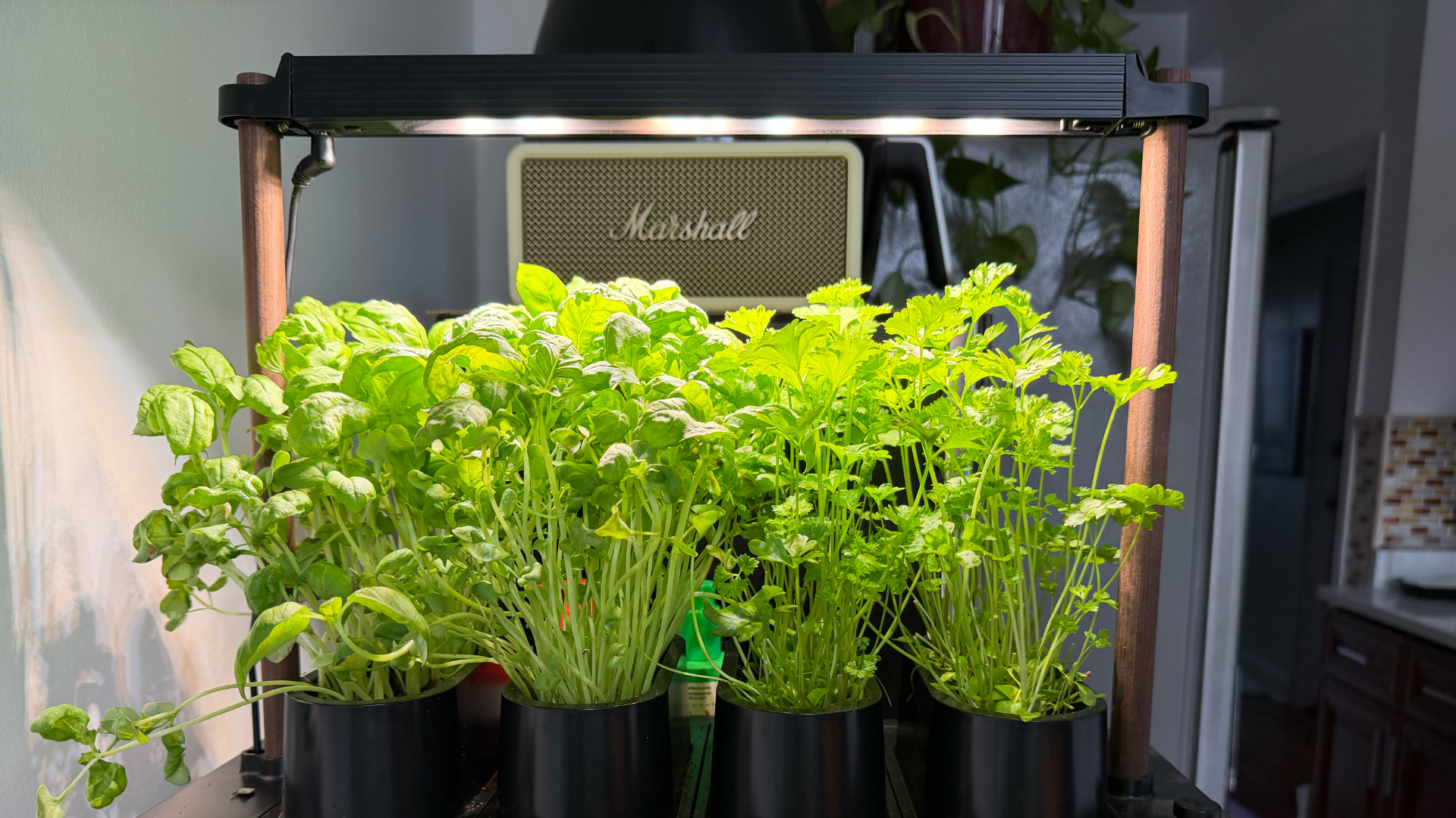
This was the part I was most unsure about, but it ended up being very straightforward. Setup took a few minutes, the instructions were clear, and nothing felt overly technical. The kit comes with everything you need to start: Auk Mini itself, seeds for planting, coco fiber, and nutrients that you add to the water to support both growth and flavor.
Once it’s up and running, it mostly takes care of itself. The lighting system handles what the plants need throughout the day, and the watering system keeps everything consistent. I have been away on trips, and I still come home to herbs that are healthy and fresh, waiting to be trimmed and added to my food.
It fits real life and small spaces

Fresh herbs growing beside my microwave
Living in a New York apartment, space is limited. While there are community gardens I could participate in, it’s not as convenient as having access to your own, especially when you’re in the middle of a snowstorm or a heatwave.
The Auk Mini sits beside my microwave, on a table that used to be my desk. It doesn’t feel like I added a new project to my life – it just blends in. I have the black and walnut version, which works well with the rest of my space, but it also comes in white, with oak or cork as other finishes, if you want something lighter.
Watching and competing
My husband and I set it up together and turned it into a challenge: who would harvest first?
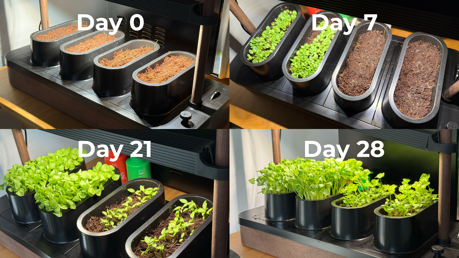
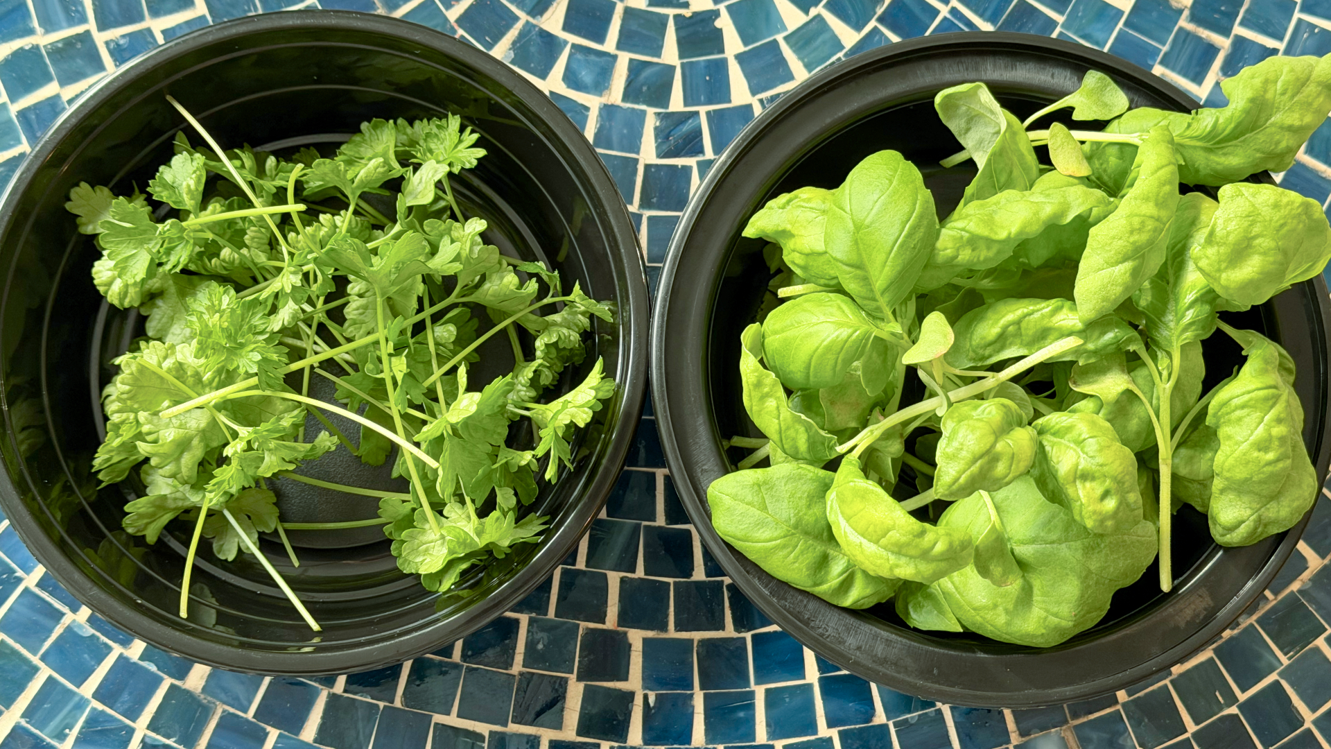
Our kit came with basil and parsley. He planted basil, which sprouted first. I took on parsley, which grew much slower and wasn’t ready for harvest until a little over six weeks later. The competition was a small thing, but it made the whole process more fun. We started paying attention to growth day by day, and it’s satisfying when you finally get to use what you grew.
One thing we learned pretty quickly is that different plants grow at different speeds, which can make lighting placement a little tricky in a shared setup like the Auk Mini. Since the basil grew faster and taller, we had to angle the light unevenly so it wouldn’t burn the basil while still giving the parsley enough exposure to catch up.
It changed how I use herbs
Basil and parsley used to be something I added as garnish. Now I’m using them all the time because they’re right within arm’s reach.

Learned to be creative and made pasta from scratch, made better with fresh herbs
I’ve been making sauces, marinades, pesto, even building meals and cocktails around them. It’s expanded the flavors we use in home cooking, and forced me to experiment instead of defaulting to our go-to recipes inspired by East Asian cooking. In fact, the biggest hurdle I’ve encountered is not having enough recipes in my repertoire that use herbs.
Even when a dish doesn’t call for it, I’ll cut some and add it anyway. Every time I did, it made the dish better. When something is always available and always fresh, you naturally start using more of it. And if you trim it properly, it just keeps growing back. It doesn’t go bad or get forgotten in the fridge.
You can grow anything you want
One of my favorite things about Auk Mini is that it’s not a proprietary system. They do offer other kits like a chili and tomato set or an Italian cuisine mix, but you can also grow your own choices.
I joined a Facebook group of Auk growers, and it’s been inspiring to see how others are using and expanding their indoor gardens. It makes me excited to try things that are harder to find or expensive in the U.S., especially vegetables and herbs I grew up with, like pechay, moringa, lemongrass, pandan, and kangkong.
A small step toward something bigger
Constant fresh herbs within reach
Growing herbs indoors reminds me of something from years ago. In university, I did an immersion program in a low-income community. We recommended sustainable food systems for the stay-at-home moms we met — including hydroponics systems — both as a source of extra income and fresh food.
That experience stayed with me, but I never acted on it. This feels like a small, techie version of that idea: a hydroponic system that works in real life, in a small space, and is easy to keep up with.
Is the Auk Mini your GadgetMatch?
Starting with sprouts showed me I could easily grow something. The Auk Mini showed me I can keep going and expand it. Now I have fresh greens ready whenever I need them.
It starts at $239, which isn’t the cheapest way to get into hydroponics. If you don’t use herbs on the daily like I do, the cost is even harder to justify. But that’s also why I recommend it even more. It’s convenient, it’s fresh, and at the same time it challenges you to be more creative with food.
Basil and parsley keep growing in the Auk Mini after multiple harvests
Auk Mini’s ease of setup and maintenance, and flexibility make it worth it, especially if you don’t know where to start. It was a great hobby to start the year with, and an even better habit I’ve kept building on five months on. It’s given me confidence I can grow my own food for the rest of my life, one way or another.
Accessories
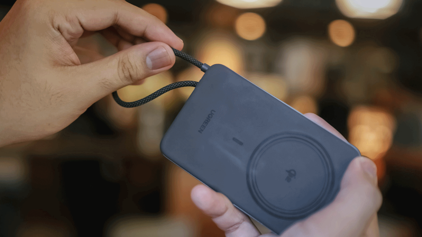
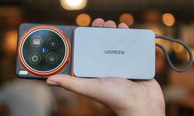
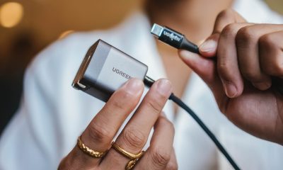
UGREEN MagFlow Air review: Airy Yet Mighty
Slim and light power bank with a strong suit and core
Power banks (or battery packs on the other side of the world) have gone through loops of ups and downs.
While it’s ever-popular for juicing up smartphones and several devices in a pinch, it’s also notorious for making you flinch whenever your airplane’s overhead bin blows some white smoke all of a sudden. Or worse: engulfing flames when left unattended.

But, with the advent of bigger yet slimmer (and safer) batteries this 2026, it’s hard not to wonder and ponder when such tech will arrive in power-packed accessories most of us use.
Very, Very Airy
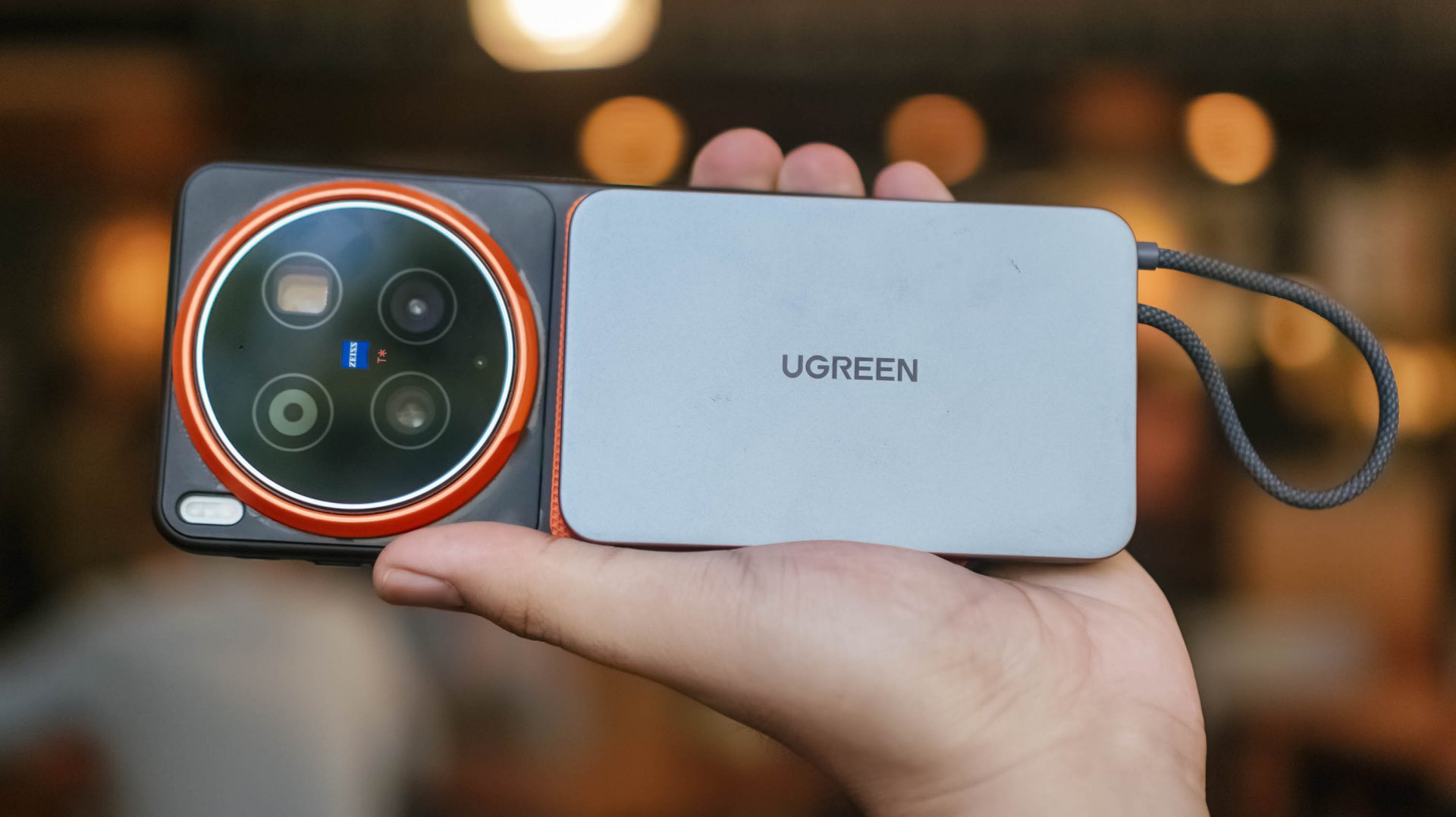
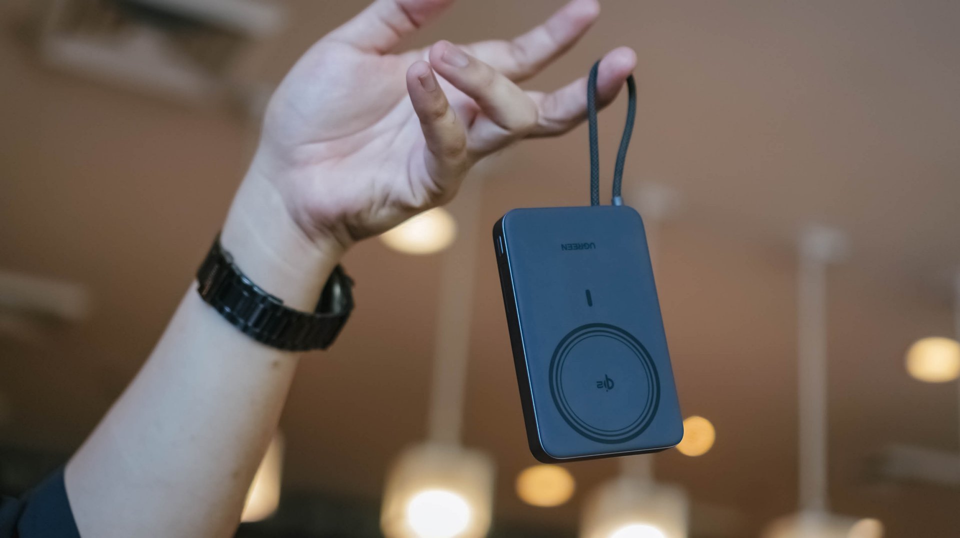
For a refresher, UGREEN launched the MagFlow series not too long ago. That’s specifically eight months from the time of this writing.
One of its standout features is its LED display. Removing that feat with some running on the treadmill gives you a power bank that managed to shed some weight and trim down its waist.
Thus, the UGREEN MagFlow Air truly stands out on the show floor.
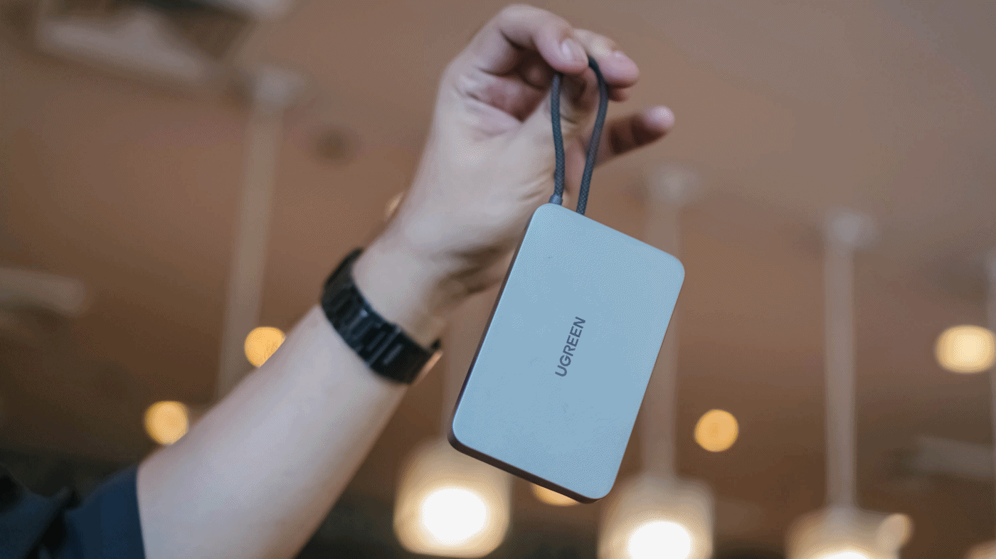
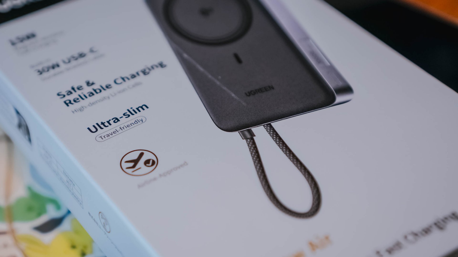
By the numbers, UGREEN’s MagFlow Air takes it to the next level with its 13.9mm slim chassis and 213 grams of feather-lightness.
The regular MagFlow, on the other hand, is heavyweight at 254g and oh-so-juicy-thicc at 21mm.
I even tried putting the new model up against UGREEN’s first-gen MagSafe power bank I personally bought from 2023. My OG power bank was still thick at 19mm and weighed as much as 235 grams.
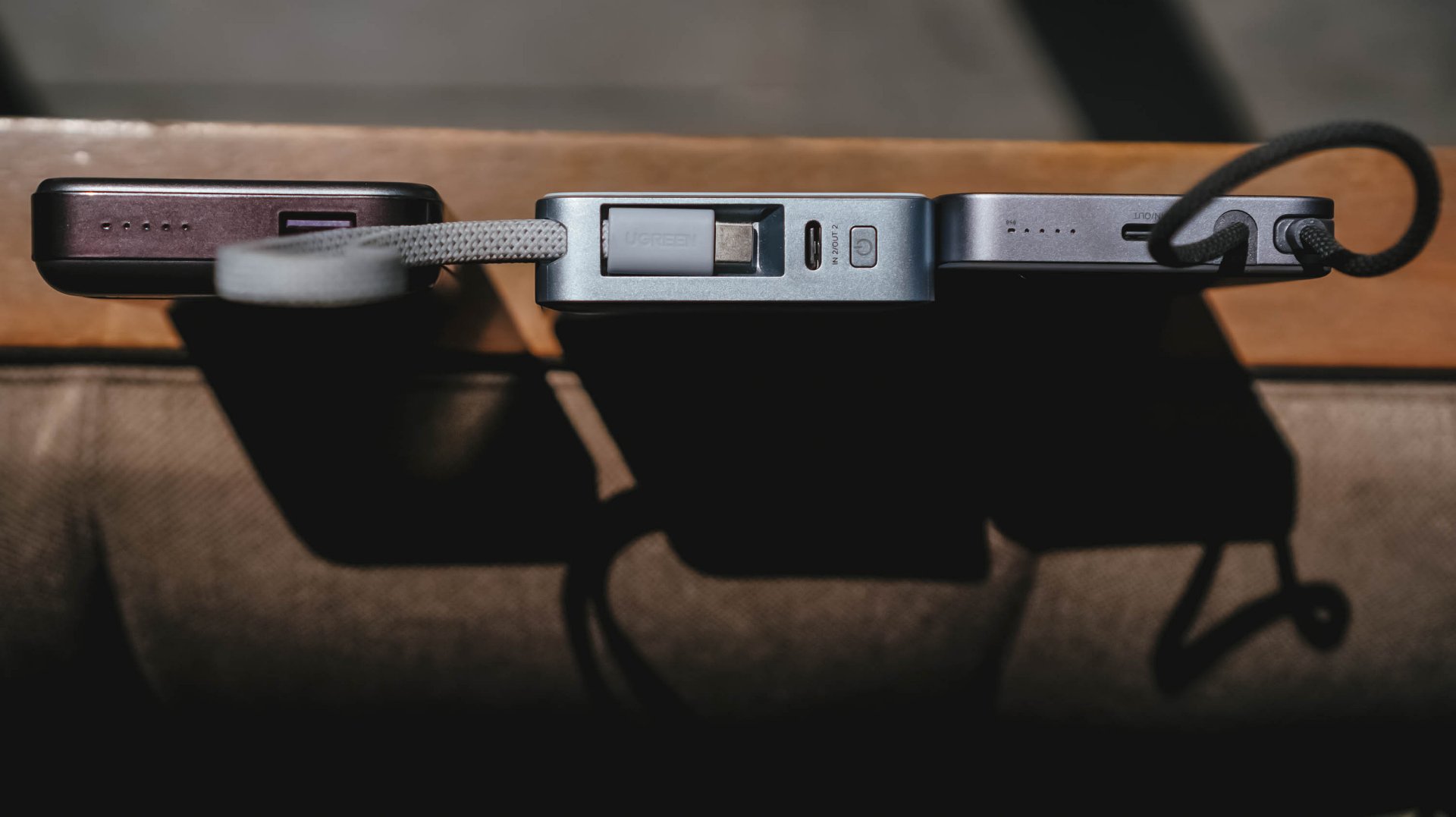
Visual differences aside, I’ve held it enough to say the size and weight differences were truly felt from every inch within.
But at what cost?
Just like its THICCer brother, the UGREEN MagFlow Air shares the same Qi2 wireless charging standard alongside the inclusion of Apple’s legendary MagSafe feature.
But, to achieve its thinner and lighter form factor, UGREEN clearly needed to make some sacrifices.
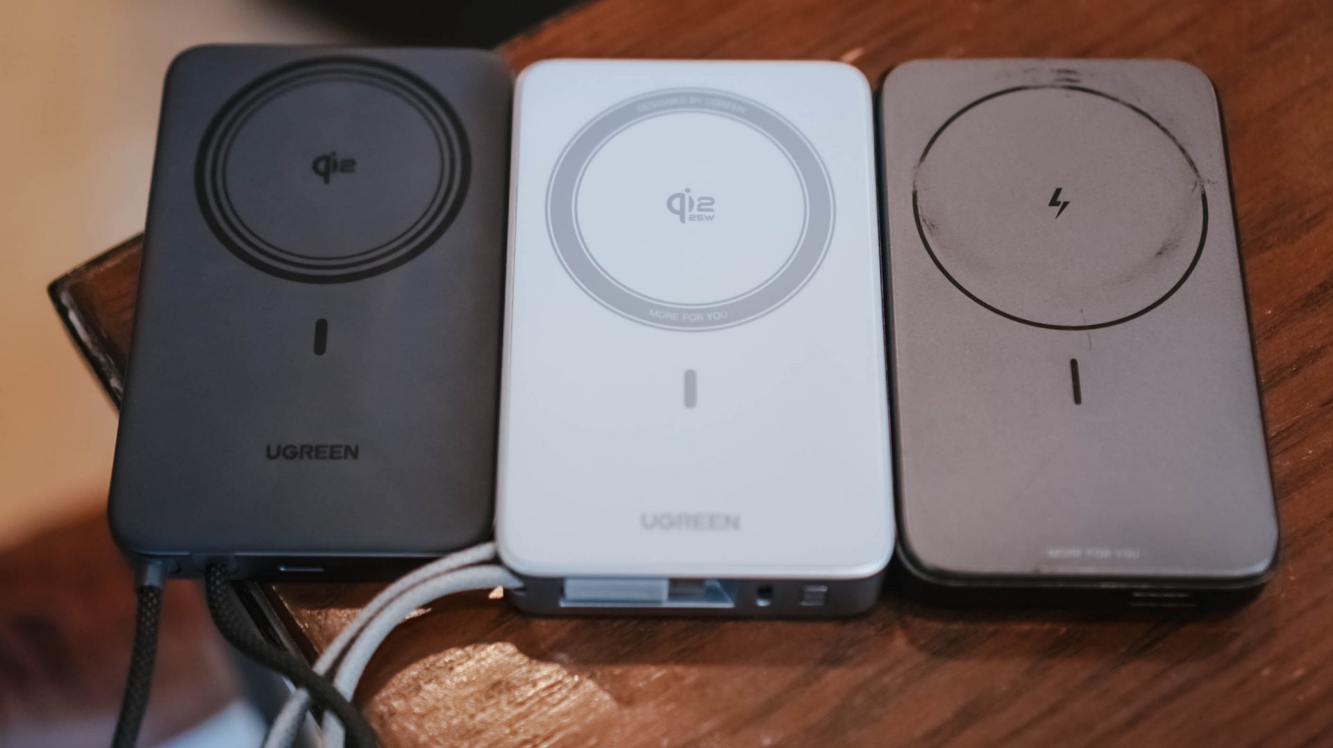
MagFlow Air vs MagFlow vs PB206
First and foremost: its wireless charging capabilities.
The first MagFlow power bank boasts as much as 25W wireless charging speeds. That has been downgraded to just 15W wireless in the newer MagFlow Air.
And another: the removal of its special LED display. This hinders possible buyers from checking if it actually fast charges one’s device.
Although some users prefer it, others don’t. It’s something that ends up on the buyer’s priorities at the end of the day.
Which further brings me to my extensive charge tests and how I tried conducting it.
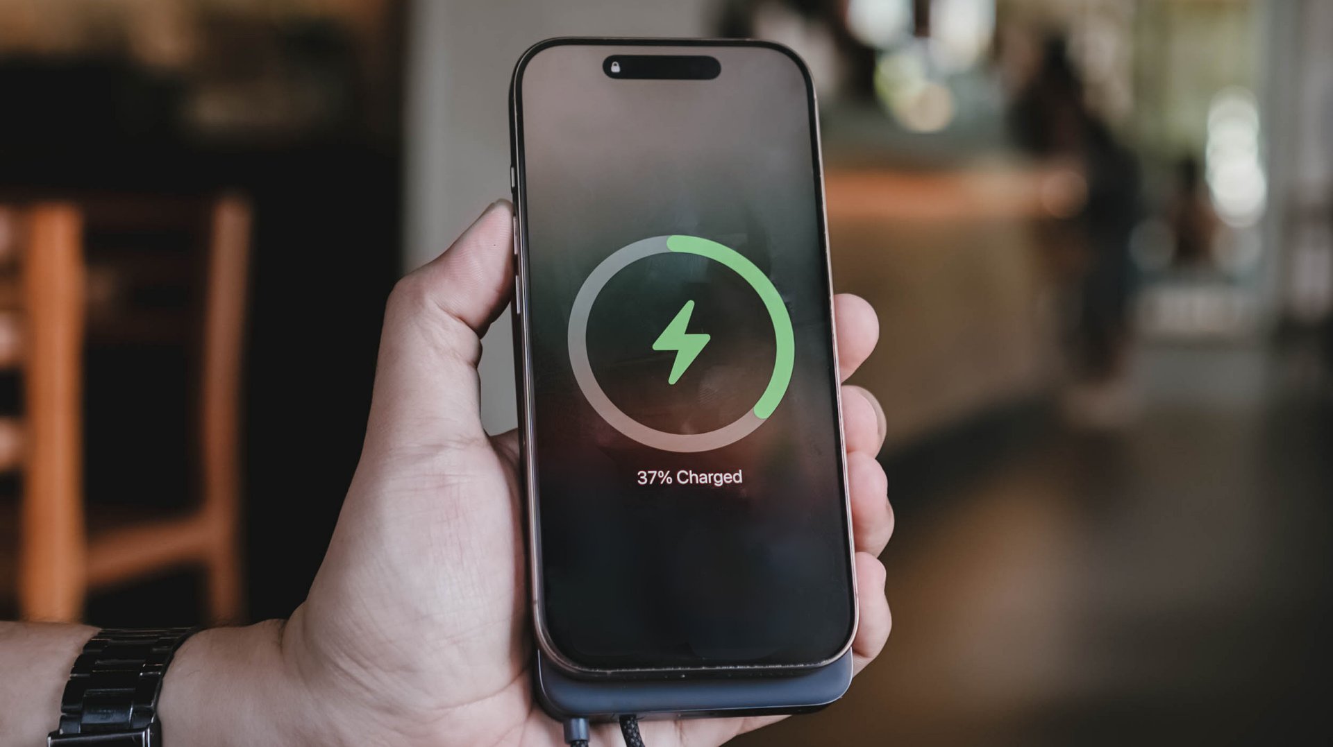
Feel that fill
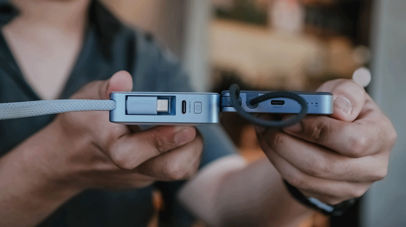
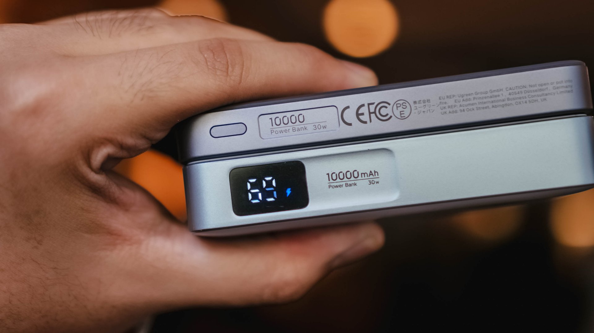
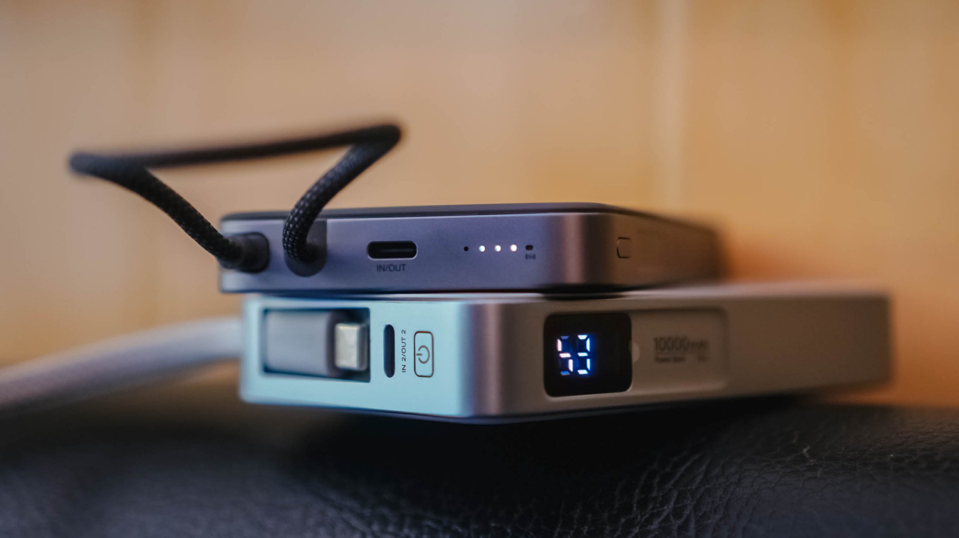
With the absence of that dedicated display, knowing the power bank’s overall charge status relies on the conventional 4-bar indicator.
While percentage accuracy is clearly impossible, it didn’t hinder me from conducting my GadgetMatch Charge Test.
With my smart watch timer and dedication on keeping tabs with the power bank’s actual battery level, the test was still a success.

UGREEN claims this 10,000mAh power bank can be charged up for around two hours.
I am not sure what type of charger and cable UGREEN used for their test. On my end, I used two of the most extreme combos I have with me.

First, their very-own UGREEN 100W Uno GaN charger paired with ADATA’s magnetic USB-C to USB-C cable that supports Qualcomm’s Quick Charge (QC 3.0) speeds.
For another, vivo’s newest 100W FlashCharge adapter — now with a better USB-C port (instead of USB-A).
UGREEN 100W Uno + ADATA
|
vivo 100W FlashCharge +
|
|
START TIME (from 0%) |
1:57PM |
3:15PM |
1 bar |
approx. 45 minutes |
approx. 50 minutes |
2 bars |
approx. 1 hour 5 minutes |
approx. 1 hour 5 minutes |
3 bars |
approx. 1 hour 20 minutes |
approx. 1 hour 20 minutes |
4 bars |
approx. 1 hour 30 minutes |
approx. 1 hour 30 minutes |
END TIME (Full Bar 100%) |
4:18PM
|
6:02PM
|
While UGREEN did not explicitly specify if it’s exactly a two-hour charging time, these results prove that you can fully fill the power bank to the very brim as long as you got the fastest chargers and cables around.
Power up to the top
My extensive charging benchmarking doesn’t end there.
Just like any other power bank in the market, smartphones are also built different. While flagships lead the race in having the best charging speeds possible, modern-day midrangers barely feel “mid” now especially with their behemoth battery tanks.
For the most objective yet inclusive test possible, I’ve decided to use the MagFlow Air and its built-in USB-C cable to charge two phones from my stash: the all-new vivo X300 Ultra and the TECNO POVA Curve 2 5G.
ICYMI, vivo’s X300 Ultra boasts a 6600mAh Si/C battery that supports speedy 100W wired FlashCharge speeds.
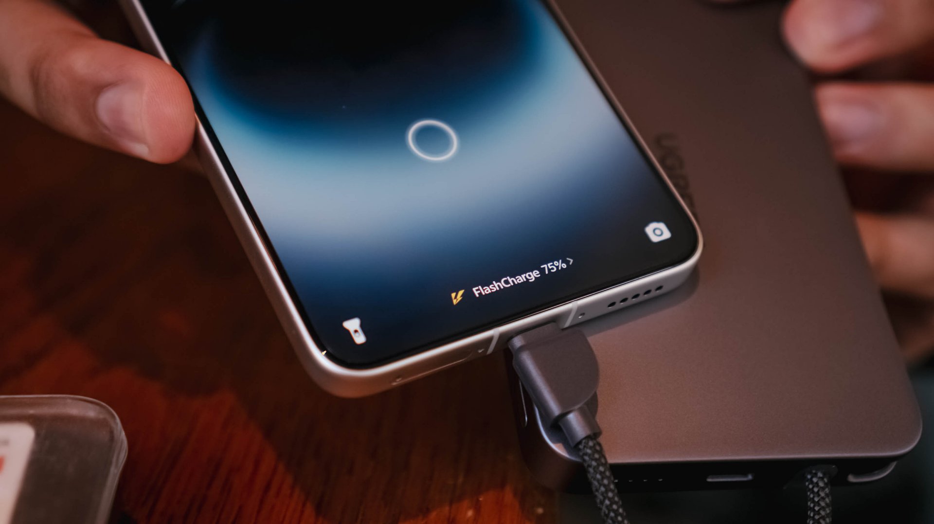
However, that’s not just limited to its bundled charger and cable. Thanks to a leveled-up USB-C PPS protocol, I was able to maximize its charging speeds even with just MagFlow Air’s stationary body cable.

On the other hand, the TECNO POVA Curve 2 5G has a gargantuan 8000mAh battery. Albeit, slower charging at 45W with the absence of PPS.
That said, my test shows differences affect overall charging time.
vivo X300 Ultra
|
TECNO POVA Curve 2 5G
|
|
START TIME (from 0%) |
4:54PM |
3:53AM |
5 minutes |
5% |
2% |
10 minutes |
13% |
8% |
15 minutes |
20% |
17% |
30 minutes |
47% |
21% |
45 minutes |
68% |
31% |
60 minutes |
96% |
40% |
75 minutes |
– |
46% |
90 minutes |
– |
53% |
120 minutes |
– |
72% |
150 minutes |
– |
88% |
END TIME (100%) |
4:18PM
|
6:43AM
|
Status Bar Indicator |
1 battery bar |
1 battery bar |
Moreover, this not only proves how fast and sturdy the built-in USB-C cable of the MagFlow Air is. It was also able to live up to its 10,000mAh battery capacity with both tests being able to keep one (1) battery bar alive and kicking.
Of course, using the USB-C port (given you have the right type of cable) can supply your phones and other devices as much as 30W of maximum charging output.
1-bar wonder?
As preluded to earlier, knowing the actual charge of the power bank after using it was never possible at all. Still, that never stopped me from trying to use it even under such a silly circumstance.
vivo X300 FE
|
vivo X300 Ultra
|
|
START TIME (from 0%) |
11:55AM |
1:45PM |
5 minutes |
1% |
7% |
10 minutes |
2% |
– |
15 minutes |
4% |
– |
30 minutes |
10% |
– |
45 minutes |
20% |
– |
FINAL PERCENTAGE |
27% |
8% |
Power bank dead after |
59 minutes |
7 minutes |
With that 1-bar left. it’s nothing but a guessing game. A battle against your anxious mind if it will actually help charge up your device or not.
This is also another testament that wired charging standards and protocols also matter as much as the charging cables and bricks we are also using for our power banks.
Safety is a HUGE priority
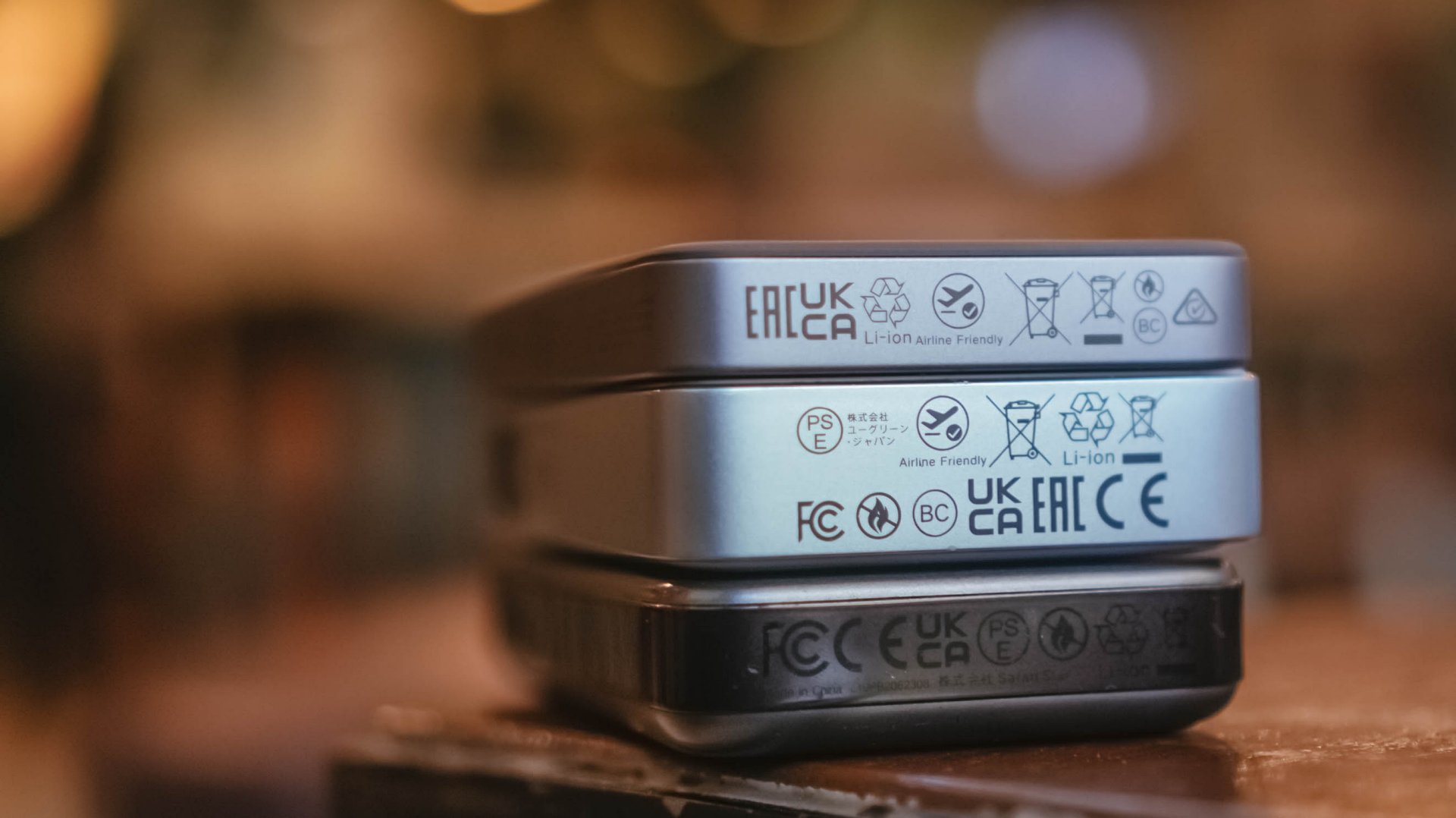
If you worry about bringing this in your upcoming trip, the UGREEN MagFlow Air is definitely allowed when you board your airplanes with its “airline-friendly” or “travel-friendly” mark.
My only cause of concern: Despite the brand originating in Mainland China, they still don’t put that much-needed CCC (triple C) Certification. Personally, this affected my work trips last year going to China.
Not being able to bring any certified power bank made me struggle — especially as someone who uses my phone as the main device when taking snaps and stills while still being connected to the internet via foreign SIM card (and/or eSIM).
Hopefully, UGREEN will secure all needed safety standards and certifications for it to be deemed as a “travel-friendly” power bank.
That said, even without China’s strict regulation against portable power packs, UGREEN’s multiple safety protections still make it a safe product to use whenever you’re out and about.
More so, that ThermalGuard feature that intelligently controls the overall temperature of the power bank when being used. A clear sign that it regulates heat caused by charging even in prolonged usage periods.
And now that we’re already at it, this is a friendly reminder not to use unauthorized third-party chargers and/or cables.
As much as you want your power banks, phones, and other devices to be safe from unsolicited battery blowouts, you should also be able to invest on authentic power adapters and charging cables that won’t harm or degrade the MagFlow Air.
Is the UGREEN MagFlow Air your GadgetMatch?
With a price of US$ 79.99, UGREEN’s MagFlow Air is definitely a power bank (or battery pack) worth considering and purchasing.
Without an ounce of doubt, the UGREEN MagFlow Air is a solid Super Swipe and deserves the GadgetMatch Seal of Approval.

If you’re not being too nitpicky about the lack of a dedicated status display or the slower 15W wireless charging speeds, the MagFlow Air is still as powerful as its MagFlow brother alongside other power banks in the same league.
While it’s overall slim and light, it still has a strong suit and core that makes it a must-have accessory to bring — especially if you’re the type who lugs, roams, or travels out a whole lot.
Reviews
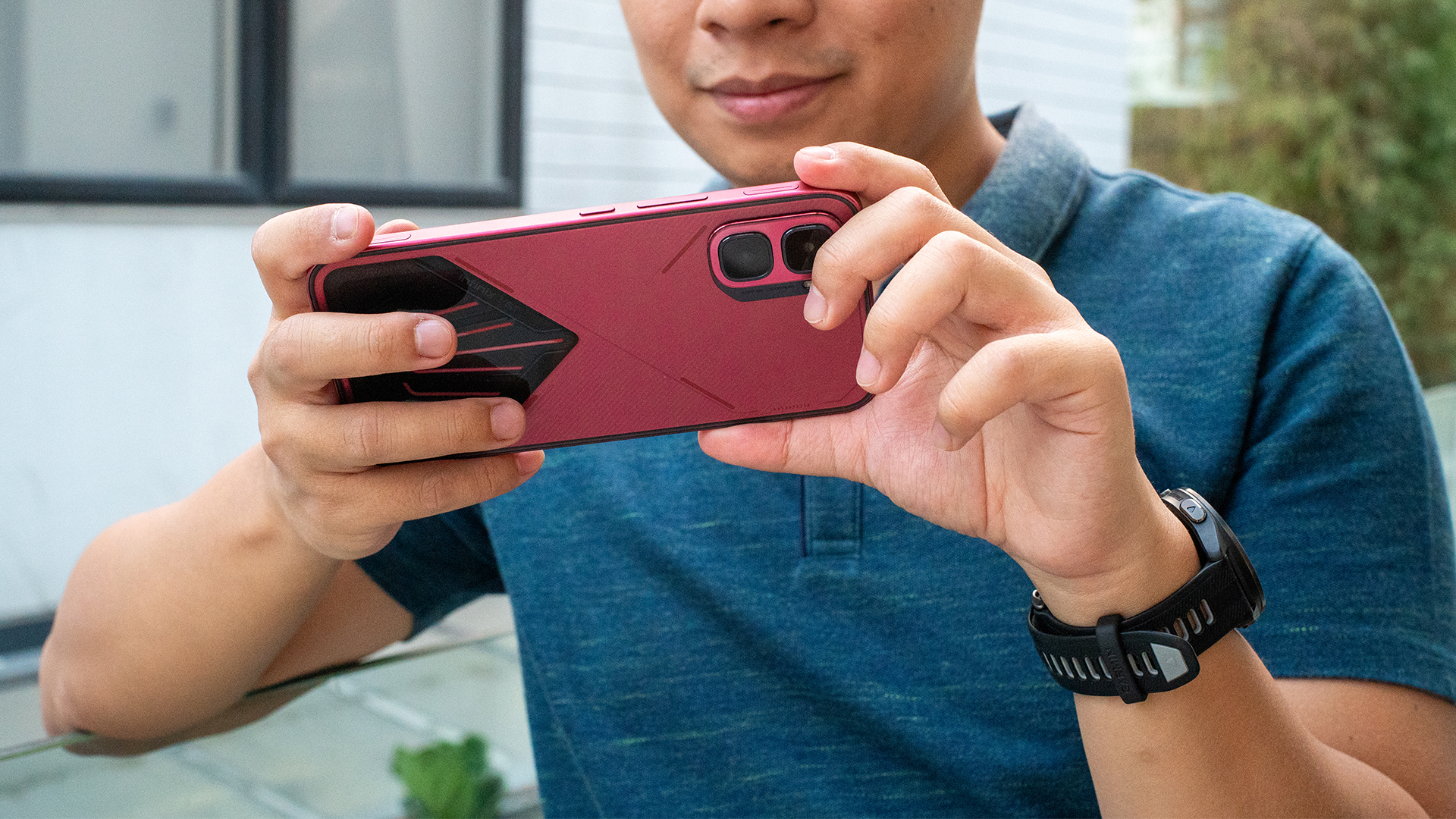
The Infinix GT 50 Pro has the most inspired design for a gaming phone
Liquid cooling that actually shows the liquid cooling.
I have a love-hate relationship with Infinix. While I appreciate how affordable its phones are, there’s always some little thing that makes me cringe: an uninspired design, a lackluster processor, or a deluge of bloatware, for example. Now, after an age of testing Infinix’s phones, the brand might have finally released a smartphone that ticks all the boxes. Ladies and gentlemen, here’s the Infinix GT 50 Pro.
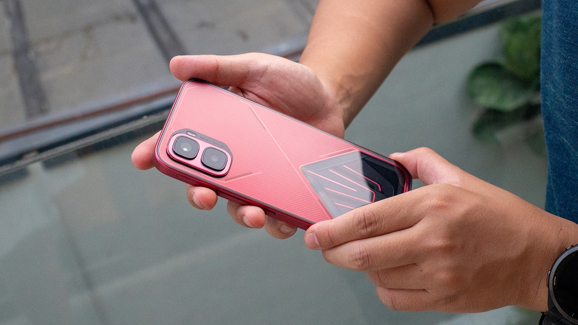
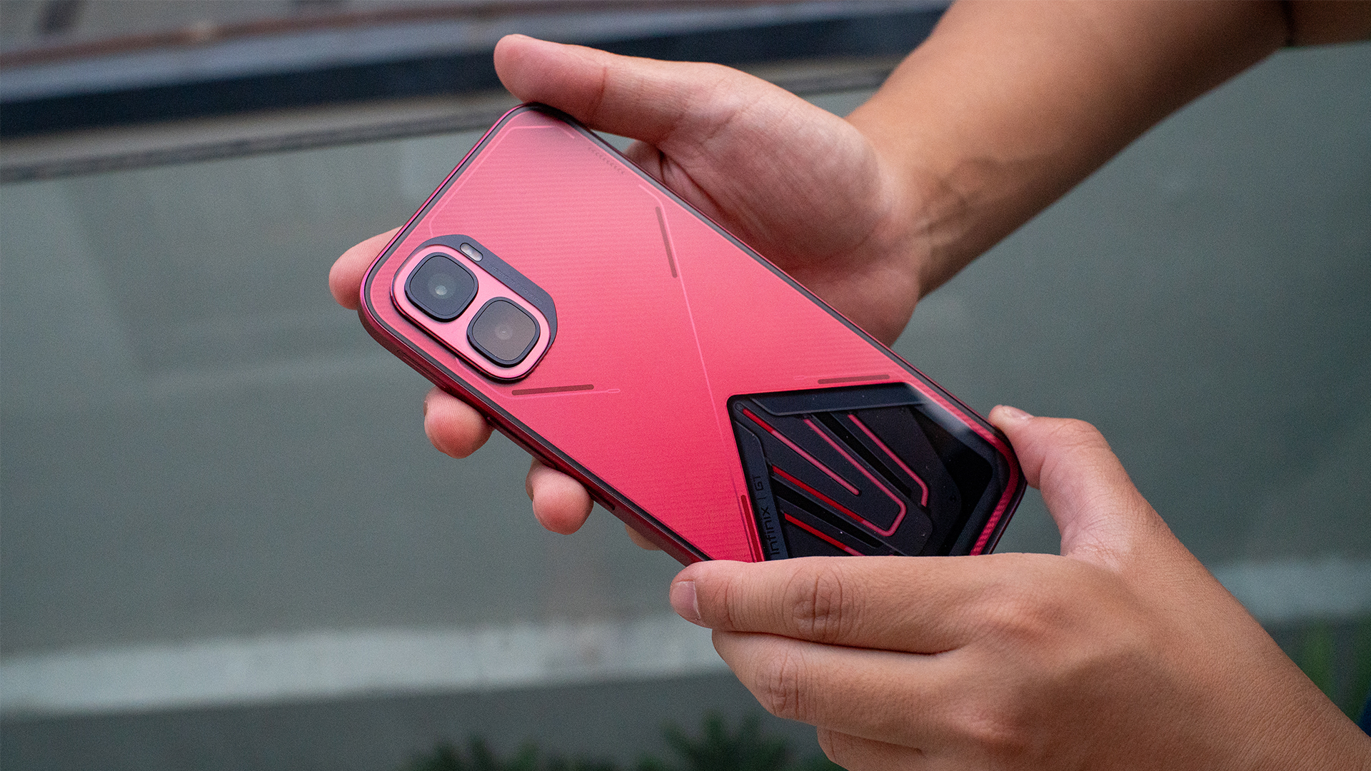
The most inspired transparent design I’ve seen
Smartphone designs today are soooo boring. I miss the days when brands weren’t scared to try something daring for their devices. By far, the only design philosophy that manages to wow me is the transparent rear popularized by Nothing.
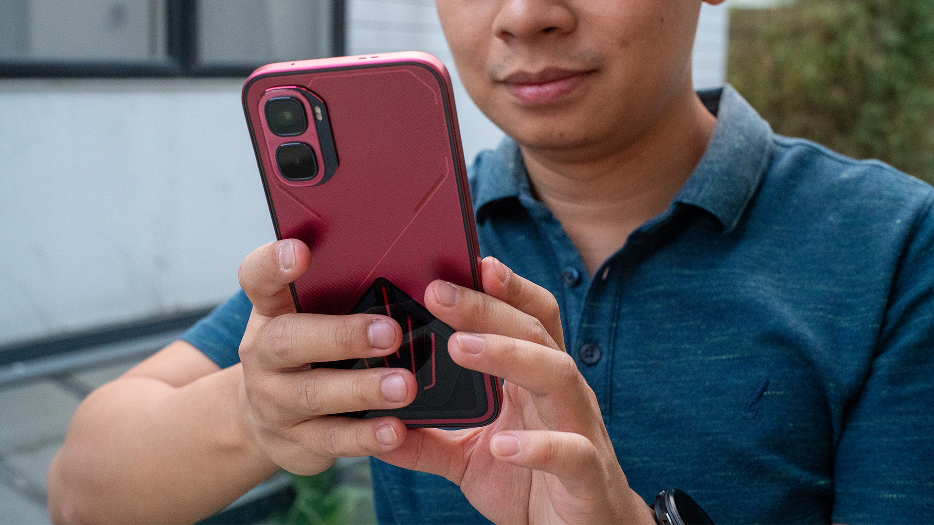
The Infinix GT 50 Pro has something similar. The chassis features a nice matte red finish that also feels pleasant to the touch. It also has a carbon fiber pattern and some futuristic decals that light up.
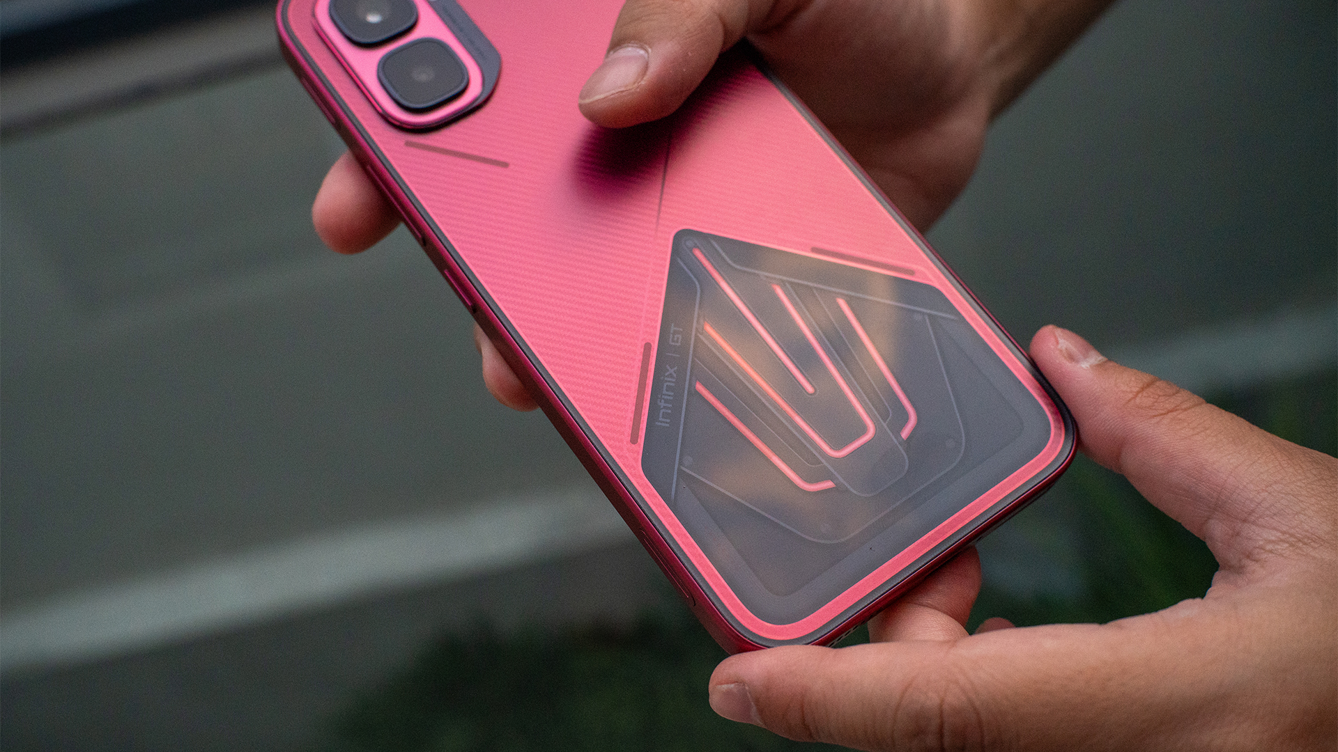
The highlight, however, is a transparent portion of the rear, enclosed by glass. Although, compared to Nothing, Infinix’s take does not pretend to give you a peek into the inner workings and the chips inside. Rather, it shows the actual pipes used for the phone’s liquid cooling. And yes, it works. While the phone’s under a heavy load, you can see the liquid circulating.
Overall, the Infinix GT 50 Pro doesn’t really break what a normal smartphone looks like these days. However, the addition of the transparent liquid cooling chamber just adds so much. It’s so inspired. Sure, it’s gimmicky, but it’s one that doesn’t force you to engage with it every two seconds.
This is truly a gaming phone
Though the subtle design hides the phone’s nature, the Infinix GT 50 Pro is a true gaming phone. It has the Dimensity 8400 Ultimate, a screen capable of 144fps framerate, and a pressure-sensitive trigger. Rounding this out, you’re also getting 12GB of RAM and up to 512GB of internal storage.
“Capable” is one way to describe the abilities of this phone. But you can just as well use “powerful” or “impressive”. As usual, my favorite test is Zenless Zone Zero. Though the game can be run on lower machinery, it can also push phones to their limits.
That said, the GT 50 Pro doesn’t seem to have any limits. Though the game defaulted to medium settings at first, the phone had no complaints about pushing the settings to its absolute maximum, including framerate. The game performed quite well for hours.
Even better, the phone didn’t really get to an uncomfortably hot level. The liquid cooling really does work. Despite not needing one, the package also has a plug-in fan you can attach with a MagSafe-like case. It’s overkill, but I appreciate the additional love.
The phone also has two pressure-sensitive triggers on the left and right sides. If you’re more attuned to console gaming, the triggers add a feeling of familiarity.
A decent camera package
So far, I’m loving the GT 50 Pro. But you can’t really win them all.
The phone has a 50-megapixel main sensor and an 8-megapixel ultrawide camera. It’s capable of shooting videos at 4K resolution and 60 fps.
Now, these two cameras are very decent at their jobs. The photos are more on the vibrant side. They’re neither too warm nor too cool. This was in comparison to the default settings of my daily driver, the Nothing Phone (3).


Quality aside, the bigger problem is the lack of zooming capabilities. The cameras can only zoom optically by 2x. Beyond this, there’s a digital zoom going up to 10x, but the quality, buoyed heavily by enhancing software, is barely anything to speak out.
The UI finally gets it right
Throughout all the times I’ve reviewed an Infinix phone, I’ve always had a problem with the brand’s operating system and its overabundance of bloatware. When you first open a new Infinix phone, the chances are high that it’s drowning in unnecessary apps (or suggestions for them).
The Infinix GT 50 Pro is the first time that I feel like I’m holding an actual phone, rather than a repository of ads for apps. The UI is slightly based on Apple’s Liquid Glass. The icons are customized with a futuristic aesthetic. It’s the cleanest I’ve seen in an Infinix device.
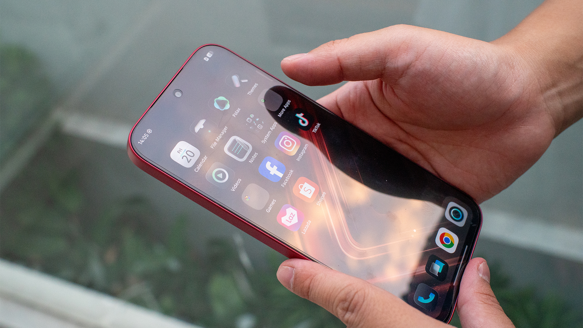
To be fair, there’s still a few dedicated folders for suggested games and apps, which includes, disgustingly, casino apps. The difference is that it’s only in two folders, rather than scattered all over the system. And thankfully, this can be turned off with a single switch.
Still, it’s a welcome improvement.
It can last how long?
The Infinix GT 50 Pro has a huge 6500mAh battery. On paper, this doesn’t seem like a huge jump from the norm. But the way it handles all this juice is impressive.
The phone lasted for exactly six hours playing Zenless Zone Zero. As I said previously, the game was on the highest possible setting. Lasting up to six hours on a stress test is an impressive feat.
For regular use, the phone is just as notable. It can last an entire day on less intensive software. If you don’t mind lighter gaming, you can squeeze out a lot more juice on a single charge. For example, I took the phone out for a spin while playing only the mobile version of Balatro, the day ended without me feeling even a slight tinge of battery anxiety.
Meanwhile, battery charging was not as notable, but that’s alright. For me, the norm is already at a pace that I’m more than happy with. Like others, the GT 50 Pro can charge to full in only an hour and 30 minutes. It will also naturally slow the charging down at 80 percent after an hour. In the unlikely event that you’re about to run out of battery while you’re going through your day, even a small break can keep you going for a while.
Is the Infinix GT 50 Pro your GadgetMatch?
It’s rare for a phone now to wow me as the Infinix GT 50 Pro did. The phone’s interesting design is more than just a foot in the door. If you’re tired of today’s uninspiring designs, Infinix’s latest phone will convince you that there are still some designers out there who aren’t afraid to experiment.
On the inside, the GT 50 Pro can match its bark with its bite. It’s gaming without limits. Plus, the durable battery and cool exterior is just the right amount of overkill to keep you satisfied for long gaming sessions.
With all that, the Infinix GT 50 Pro is a good Super Swipe for me. It’s a perfect gaming phone by today’s standards.


Spring reset: Growing more at home with Auk Mini
From kitchen counter experiment to everyday habit

UGREEN MagFlow Air review: Airy Yet Mighty
Slim and light power bank with a strong suit and core

The Infinix GT 50 Pro has the most inspired design for a gaming phone
Liquid cooling that actually shows the liquid cooling.

Verizon is offering the new moto razr 2026 for US$ 0

Anker’s soundcore Liberty 5 Pro series is powered by an AI chip

Samsung’s SECRET That Made OLED Even Better

Recap: Google I/O 2026

Meta quietly launches Forum app for Facebook Groups

HONOR 600 Pro review

vivo Y Series launches in Singapore with bigger battery, durability upgrades

Sony Xperia 1 VIII arrives with AI Camera Assistant, bigger telephoto sensor

5 games with the nubia Neo 5 GT 5G

Level Infinite launches Gangstar Mirage City exclusively in PH


-
 Reviews1 week ago
HONOR 600 Pro review
-
 Singapore2 weeks ago
Sony Xperia 1 VIII arrives with AI Camera Assistant, bigger telephoto sensor
-

 Reviews2 weeks ago
vivo X300 FE review: Don’t judge the camera by its cutout
-
 News2 weeks ago
HONOR Magic8 Pro gets Android 17 Beta 3 support early
-

 Gaming2 weeks ago
SEGA/ATLUS, animate launch year-long collaboration featuring popular IPs
-
 Accessories4 days ago
The UGREEN Nexode Air 65W is the only charger I travel with now
-

 Convenient Smart Home2 weeks ago
Spotlight: The Tech Behind Every Screen You Use
-

 News1 week ago
Xiaomi is making it easier for customers in the PH to shop