
Apps
Microsoft Edge’s new logo wants you to forget Internet Explorer
The Chromium future is here!
When was the last time you used Microsoft Edge? If you’re like the rest of us, you’ve opened it only once in your life — to download Chrome. Since Firefox and Chrome, Microsoft’s browsers have all but faded into the dustbins of internet history. That goes for both Internet Explorer and Microsoft Edge.
Finally, Microsoft has gotten the hint. Internet Explorer’s legacy just sucks. The only way out is to completely get rid of the ancient internet browser and all its influences.
Announced recently, Microsoft is launching an all-new version of its Edge browser. However, for the first time, Microsoft Edge will use Google’s Chromium software. Quite simply, the upcoming version will essentially be a Microsoft reskin of Google Chrome. Naturally, the Chromium-based Edge will come with Microsoft’s own custom tools. Previously, Edge used Microsoft’s own proprietary software.
The development was first announced late last year. Since then, Microsoft’s development team has outed testing builds throughout most of the year. Now, Microsoft is seemingly almost ready to release an official version soon.
Verifying this, Microsoft has released the new Edge’s logo. Likewise, Edge will no longer use an Internet Explorer-inspired logo. The new logo uses a circular wave-like pattern. Instead of the traditional blue, the logo’s color is a gradient between blue and lime green. Previously, Edge used a flatter version of the Internet Explorer’s E-shaped logo.
Will Microsoft finally redeem itself? Unfortunately, only time will tell. Microsoft will launch the first Chromium-based Edge soon.
SEE ALSO: Microsoft’s new Windows 10 May 2019 Update is now available for download


Apps
YouTube makes picture-in-picture mode free for everyone globally
The update is rolling out globally now.
Picture-in-picture (or PiP) mode is a godsend for multitaskers. The feature lets users watch videos in a tiny floating window while doing other tasks. However, the feature isn’t readily available for all users. Or wasn’t, at least. YouTube is now rolling out PiP mode for free globally.
Previously, PiP mode was exclusive to YouTube users who pay for Premium or Premium Lite. It was also exclusive to the United States.
Now, YouTube is making the feature completely free for users all over the globe. It will be available for both iOS and Android versions of the app.
There’s still a catch, though. The free version is available only for “longform, non-music content.” The same goes for Premium Lite subscribers. Music is still an exclusive feature for those who pay for the regular version of Premium. Basically, there is no change for paying users or users in the United States.
Using PiP mode is simple. All you need to do is load up a video you want to watch in the background. Then, just exit the YouTube app and go about your other tasks. The video will be inside a floating, resizable window while you look at other things.
There’s no timeline on when the update will reach your device. However, YouTube has promised that it will roll out globally within the coming months.
SEE ALSO: YouTube remains top PH video platform; advertisers urged to continue investing
It’s time to kindly shove off, flat design. After over a decade of Google’s Material Design, Android is finally showing signs of ditching flat, monotonous colors. In a series of logo redesigns, Google is reportedly trying out gradients as its latest reinvention.
As spotted by 9to5Google, Google is moving forward with incorporating gradients into its designs. Previously, the company started changing the icons of a few first-party apps including Photos and Maps. Now, it seems that the new design philosophy will reach the rest of Google’s suite.
In the obtained designs, the rest of Google’s plethora of apps will no longer look static. The splash of gradient adds the feeling of layering without losing the company’s roots in flat design. Docs and Sheets, for example, look like a light shining on pieces of paper.
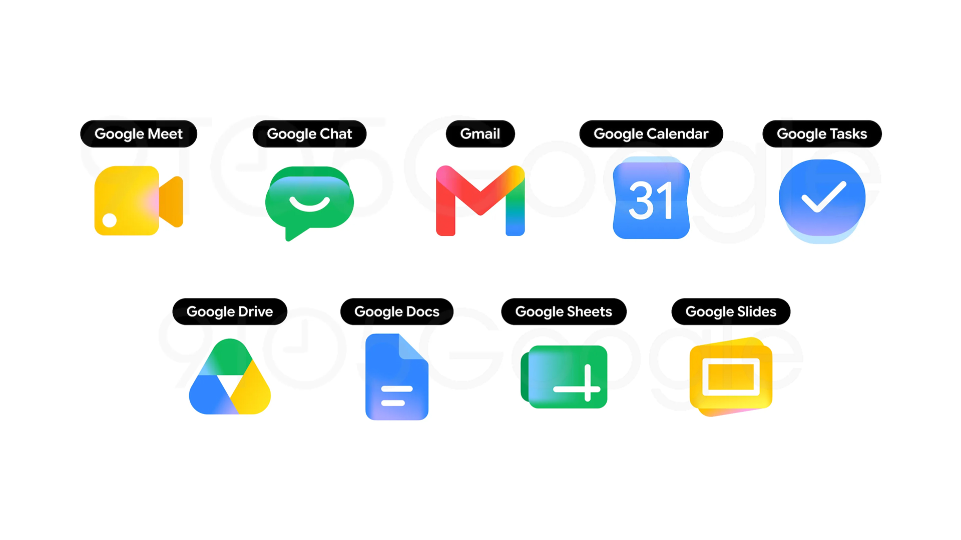
Image source: 9to5Google
It’s unknown when Google plans to incorporate the new philosophy. However, with Google I/O coming fast, it’s fair to bet that an update might come out around that time, especially since that event’s logo already has gradients.
Google’s evolution is not without its precedent. Besides the company’s small trial previously, Apple’s iOS has also made inroads into more three-dimensional designs with the new Liquid Glass. However, unlike Apple, Google’s newest design is a far cry from the former’s return to Windows Vista aesthetics.
Personally, I don’t mind the transition to 3D, as long as it’s done well. Though still visually pleasing, flat design has started overstaying its welcome. It’s time to try something new.
Apps
Significantly better ChatGPT Images 2.0 launches
Stronger creative reasoning, better design output, more formats, improved overall experience
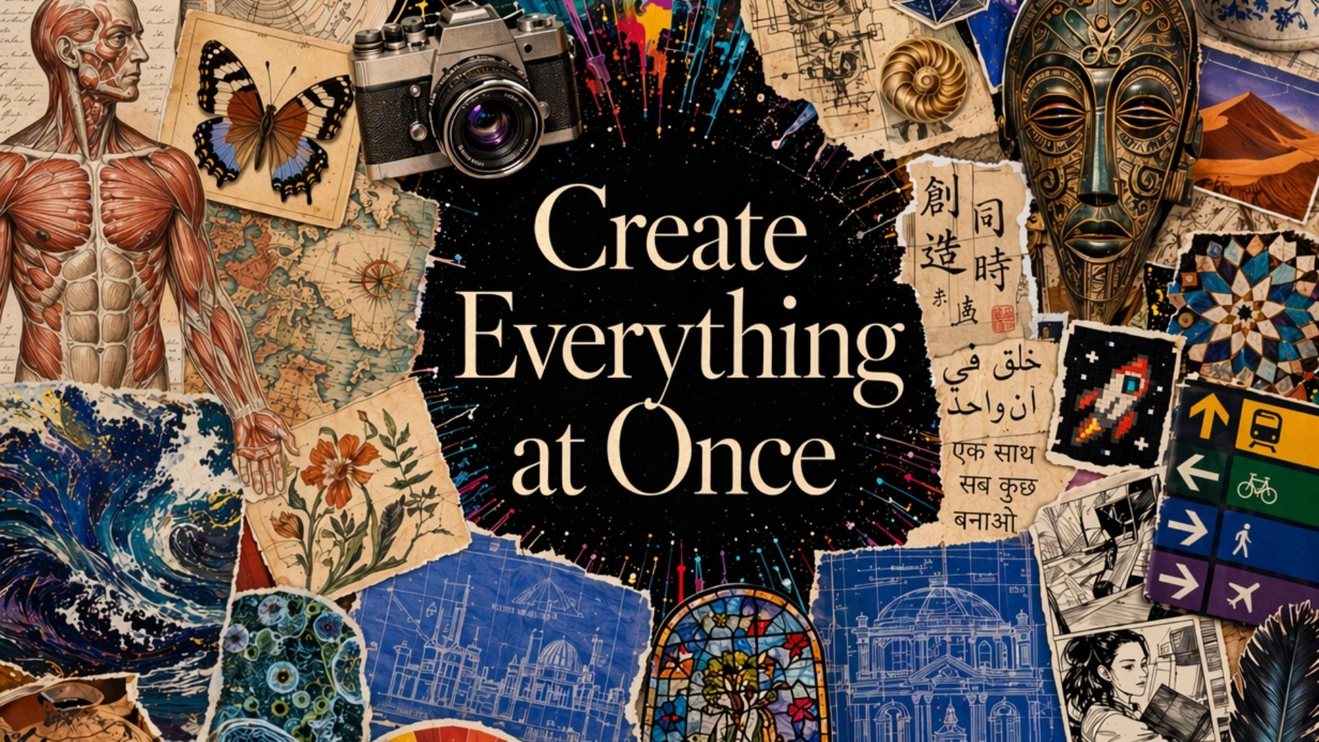
OpenAI has launched ChatGPT Images 2.0. This updated image generation model has a meaningful jump over competitors and its current ImageGen 1.5.
Now available across ChatGPT, Codex and the API, Images 2.0 delivers stronger creative reasoning, better design output, more flexible formats, and a faster, more intuitive user experience.
Paid users (Plus, Pro, Business, and Enterprise) will benefit from a more advanced image experience (ImageGen Thinking 2.0). The state-of-the-art model can take on complex visual tasks and produce precise and immediately usable visuals.
ChatGPT Images 2.0 is likewise better for creative and professional use cases. It has a significantly better performance at producing text-heavy assets, infographics, product mockups, UI concepts, and more structured visuals.
Moreover, users can generate images in a wider range of aspect ratios. The outputs are limitless, from posters to comics or anime to detailed infographics to simple images. API users, on the other hand, will also have access to 4K resolution.
To try the upgraded image generation model, simply head to ChatGPT and select “Images” in the sidebar.
Users will be able to see the top five prompts as well, curated by OpenAI, for them to try. This is to highlight the capabilities of the new model.
Overall, ChatGPT Images 2.0 offers a more seamless experience on mobile, web, and desktop. The intuitive user experience includes improved prompt suggestions, loading states, editing features, and multi-output views.

5 games with the nubia Neo 5 GT 5G
Niche device, but is worth the price?


Giving up counter space for reverse osmosis: Living with Waterdrop M6H in NYC
A 7-stage filtration system


Saros review: Returnal’s difficulty is back and better than ever
Although, it loses the memorable storywriting.

Motorola updates the razr family with its first book-style phone

A Galaxy summer to remember

The VinFast VF6 is perfect for urban travelers

Apple reportedly gives up on the Vision Pro

YouTube makes picture-in-picture mode free for everyone globally


-
 Reviews1 week ago
HONOR 600 review: A taste of more
-

 Laptops1 week ago
ASUS Zenbook S14 (2026) review: The perfect portable buddy
-
 News1 week ago
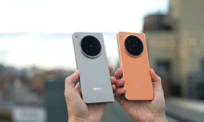
OPPO Find X9 Ultra lands in PH: Price, availability, pre-order perks
-

 Malaysia1 week ago
The OPPO Find X9 Ultra is Galaxy S26 Ultra’s biggest enemy
-
 News2 weeks ago
Forget the Pro+ and Ultra! HUAWEI unveils the Pura 90 Pro Max
-

 News1 week ago
OPPO Find X9s now official in PH: Price, availability, pre-order info
-
 Luxury Smart Home2 weeks ago
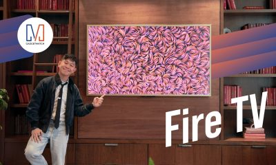
Spotlight: Amazon Ember Artline TV + New Fire TV Stick HD
-
 News1 week ago
OPPO Find N6 now in PH: Price, pre-order, availability