
Reviews
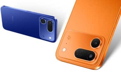
ASUS ZenFone 3 Deluxe review

It took almost half a year to reach us, but it’s here, and we’ve spent a good deal of time with it.
The ASUS ZenFone 3 Deluxe is now possibly rolling out to a store near you. Is it good? Yes — it’s a solid smartphone effort. But is it brilliant? Well, it is in one way. And therein lies the rub: ASUS could, and should, have done more to make the Deluxe stand out and be memorable, pricing be damned. Those of you expecting a strong phone of the year candidate will be disappointed.
[irp posts=”8379″ name=”ASUS ZenFone 3 Deluxe unboxing”]
Wolf in sheep’s clothing
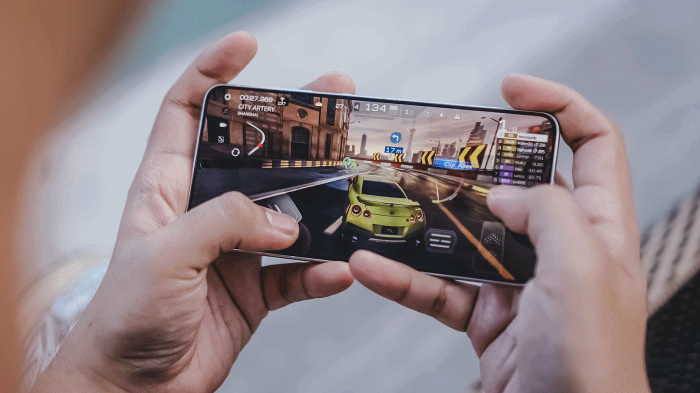
Let’s start off with something positive: performance. The Deluxe is, without any shade of doubt, the fastest and most capable ZenFone ever made. And you don’t have to look far for answers as to why that is; inside, a Qualcomm Snapdragon 820 processor — or 821, depending on the configuration (our review unit uses an 820) — hums along with 6GB of RAM, providing the speed and seamless multitasking you’d expect from a 2016 Android flagship.

The ZenFone 3 Deluxe is fast. Really fast. It unlocks in a fraction of a second; apps load up the moment you tap them; switching between windows is smooth and snappy; and we couldn’t find a game to slow this beast down, despite all the pre-installed apps, or bloatware, ASUS included on the handset. (A quick aside: You can uninstall most, but not all, of the preloaded stuff — and you should. While you’re at it, consider downloading icon packs from the Google Play Store; the square-ish stock icons don’t look that great.)
Charging the 3,000mAh battery from zero to 100 percent takes an hour and a half using the supplied USB-C cable and power adapter, so you can leave the device plugged in while you’re in the shower, and by the time you finish dressing in the morning, it should have enough power to keep the lights on until night time. The battery typically lasts a day on a full charge.
[irp posts=”7939″ name=”ASUS ZenFone 3 Max 5.5-inch review”]
The flash storage goes as high as 256GB on the most specced-out (and most expensive) model, though our unit maxes out at 64GB. But then again, 64GB is probably enough for most people’s needs — it really should be. If that isn’t the case, the second SIM slot can be used to expand the storage using a microSD card.

Speed is the highlight here, and the Deluxe doesn’t disappoint in the foot race. But to say it’s the fastest phone you can buy at any price, the human equivalent of Usain Bolt, would be ignoring the brilliance of other flagships in Android land and beyond. The Pixel and OnePlus 3 are more responsive than the Deluxe; we can say the same about the iPhone 7, too.
In fact, you don’t have to think hard to find an Android flagship that can keep up with ASUS’ latest and greatest. And that’s a concern because this phone doesn’t have any other killer feature to speak of. None whatsoever, really.
Sure, the full-metal jacket is smooth to the touch and feels nice in the hand thanks to its curved rear end and contoured edges. It slides easily in and out of the pocket as well. And those antenna bands that run across the backs of metal phones? You won’t find them here; ASUS has found a way to hide them without affecting signal performance. (Psst. Did you hear that, Apple?)

These positives aside, though, the Deluxe doesn’t offer any kind of protection against water damage, doesn’t have two rear cameras or attachment points for modular accessories like the Moto Z. Its display doesn’t bend on either side, and the resolution is 1080p, whereas rivals from Samsung, Motorola, and LG all step up to Quad HD panels. Worse still, the design doesn’t stand out starkly compared to the best choices in the mid- to high-end range.
All this to say, the hardware, though undeniably capable and fit for purpose, does not impress the way others would, especially given its lofty pricing.
[irp posts=”4193″ name=”ASUS ZenFone 3 Ultra unboxing and review”]
Missing the finer details
The front is completely flat from edge to edge — no 2.5D glass to make swiping feel more natural — and carries ASUS’ concentric-centric styling, though it is somewhat awkwardly designed: the 5.7-inch AMOLED screen is framed by thick black borders, with a bottom bar containing three capacitive keys that fall too close to the bottom edge, oblivious to the space above them. The top bar contains the earpiece and selfie camera.

The display is very good, better than what we had anticipated on a non-Samsung phone. Judged by the yardstick that is Sammy’s AMOLED technology, it measures up quite nicely, providing colors with impeccable contrast and deep blacks, as well as strong viewing angles. Brightness levels are high enough to use the phone comfortably under direct sunlight.
Of course, it won’t stack up to a Quad HD panel in terms of sharpness, but it should be more than enough for the occasional Netflix binge. What we’re not happy to see, however, are those borders: While they give the illusion of being bezel-free when the screen is off, they can be a distraction sometimes.

Just recently, ASUS issued a software update that added always-on functionality to the display. When activated in the Settings menu, this feature will display the date, time, battery status, and number of unread messages and missed calls when the screen goes black. It drains the battery more quickly, but only noticeably if it is constantly in use.
Click, click
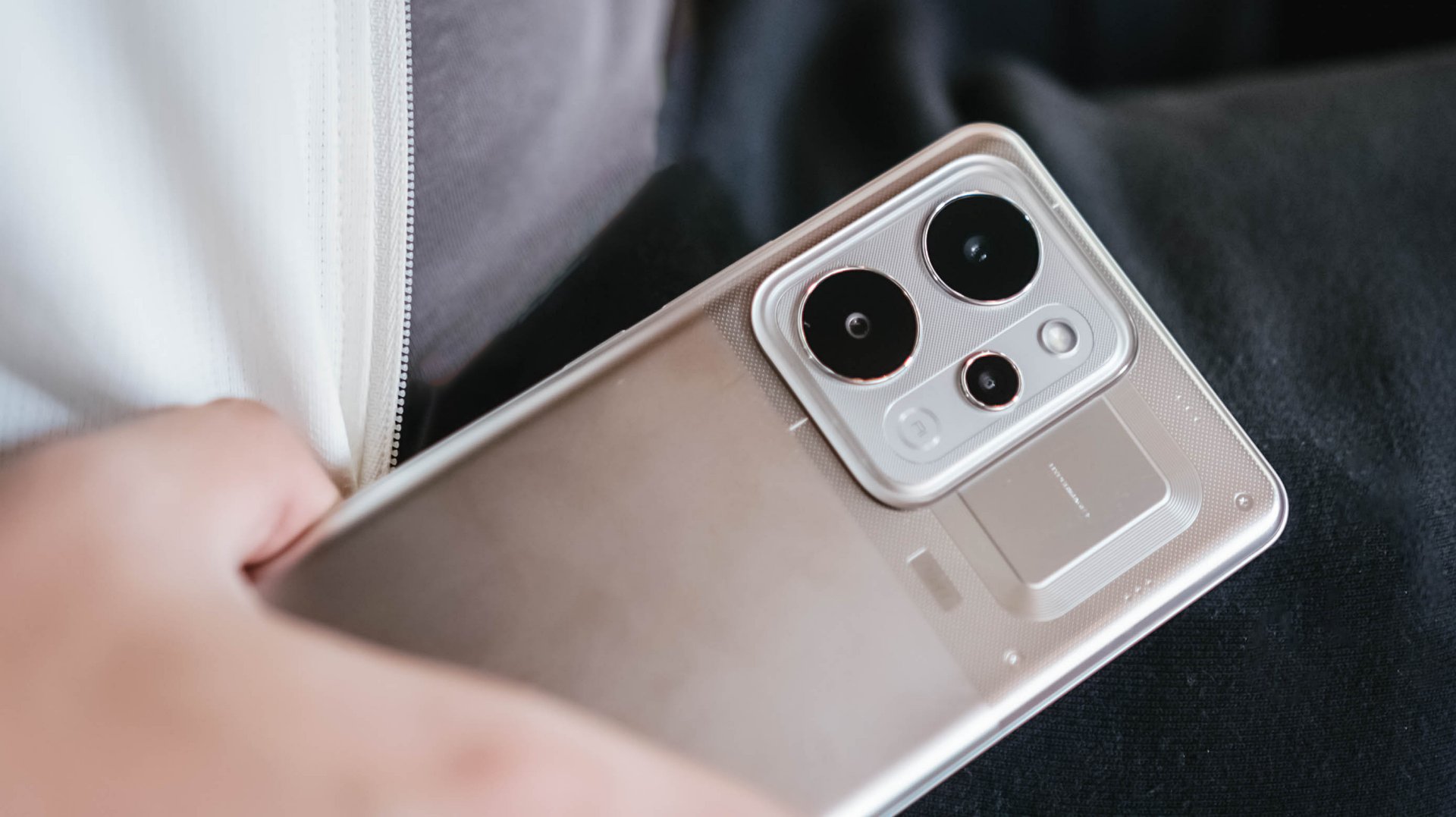
The ZenFone 3 Deluxe carries a 23-megapixel camera that has a maximum aperture of f/2.0 and a large pixel size to collect more light and improve the detail in the images. Well, at least that’s the theory; in practice, we found its camera to be no better than what Samsung, Google, and Apple have done with their mobile cameras.

When light is scarce, the gap widens, and the Deluxe finds itself on the losing end of the comparison. On a positive note, the phone got better at taking photos after a software update, so there’s hope yet.
The 8-megapixel selfie camera is pretty great — most will like its color reproduction and wide-angle lens. It struggles a bit in low light but no more than the competition.


Is this your GadgetMatch?
The unit sent to us is right up there with the latest iPhones and Galaxy S7s, price-wise, retailing for $700, or P34,995, in the Philippines. Meanwhile, the highest-end model, with a Snapdragon 821 chip and 256GB of storage, costs $900 (P44,995) locally. So if you don’t mind coughing up iPhone money for an Android flagship, then, sure, consider it. But don’t decide on anything until you’ve seen what the competition is like.
Not that we find anything inherently wrong with ASUS seeking better profit margins by asking customers to pay more. Problem is, the ZenFone 3 Deluxe doesn’t offer any compelling advantage over the premium-priced competition — besides what’s on the inside, of course — or anything superfluous, at the very least, to justify its price tag.
[irp posts=”3880″ name=”ASUS ZenFone 3 review”]
Samsung’s Galaxy S7 Edge has a gorgeous display that wraps around the sides of the device; the Moto Z is almost alarmingly thin, and has accessories that can be slapped on willy-nilly; the Xiaomi Mi Mix has a bonkers edge-to-edge, retina-melting screen; the Apple iPhone 7 Plus, LG V20, and Huawei P9 Plus all have twice as many cameras on the back; even the Pixel has a digital assistant that’s almost as capable and resourceful as a real person. And then there’s the OnePlus 3, which shares the same internals as our test phone but provides a better Android experience for a modest sum of $400. We could go on.
The ZenFone 3 Deluxe, though a worthy flagship entry by company standards, just doesn’t cut it anymore in the broad scheme of things.


With the arrival of vivo’s first “Ultra” smartphone last May 2024, I felt nothing but utmost excitement — until it was revealed to be China-exclusive.
Second generation landed, yet it remained the same. My disappointment grew twofold.
Despite rocking the vivo X200 Pro last year, my eyes were glued to the Ultra for its more powerful camera hardware.
Two years have passed, and my gloomy, rainy skies have finally turned into a sunny scenery.
The Chinese smartphone brand finally listened and unveiled the much-awaited vivo X300 Ultra slated for global markets.
A Whole Different Animal
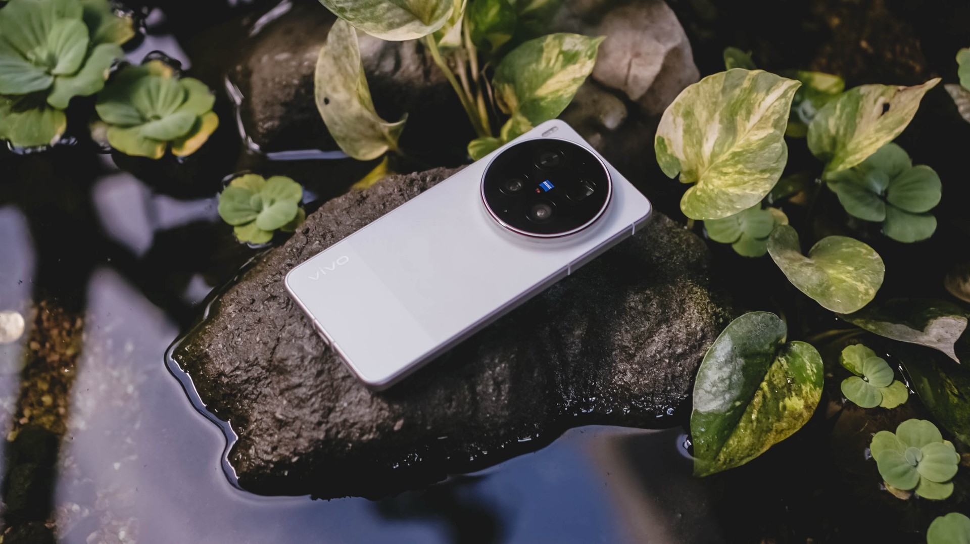
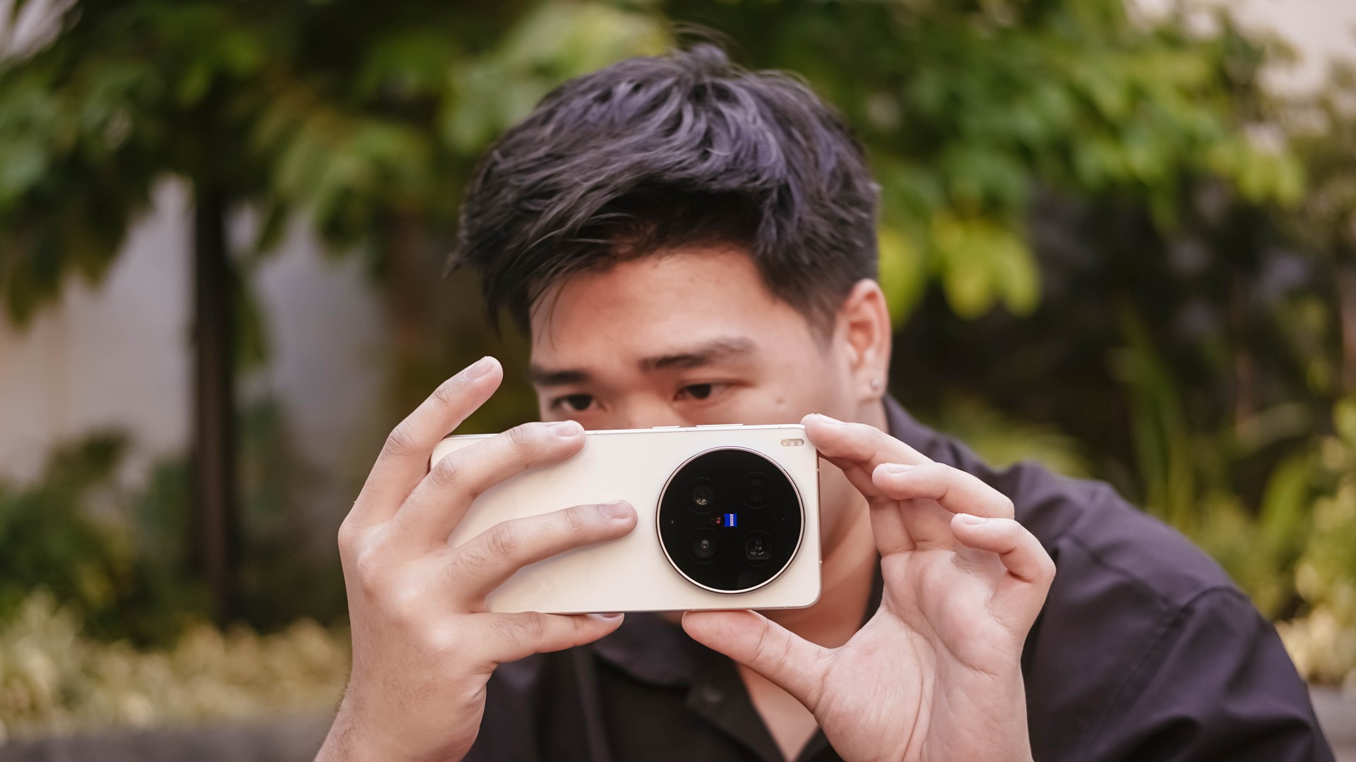
With all the “Ultra” smartphones released in the wild, the vivo X300 Ultra is of a different species.
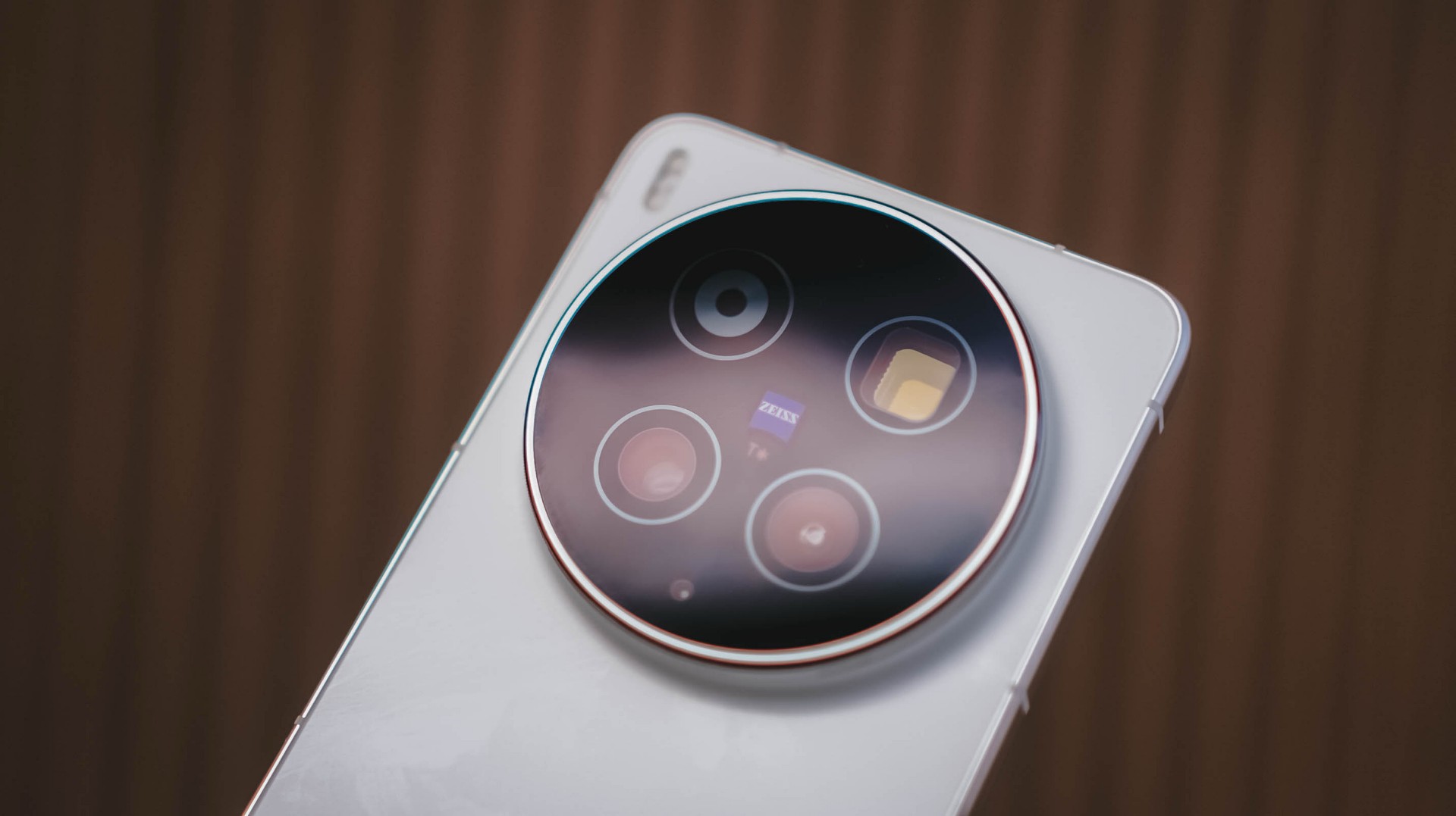
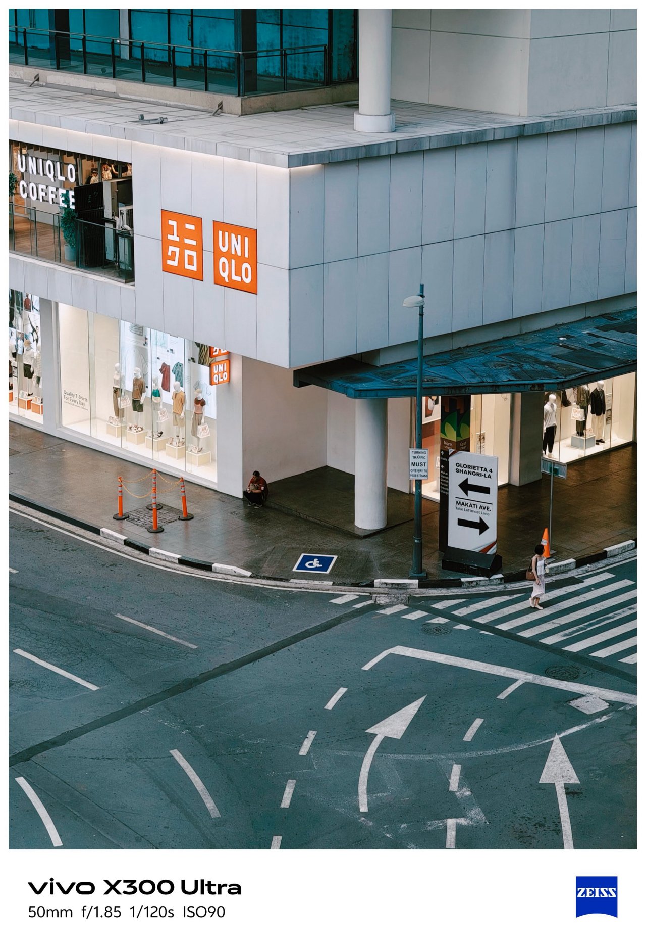
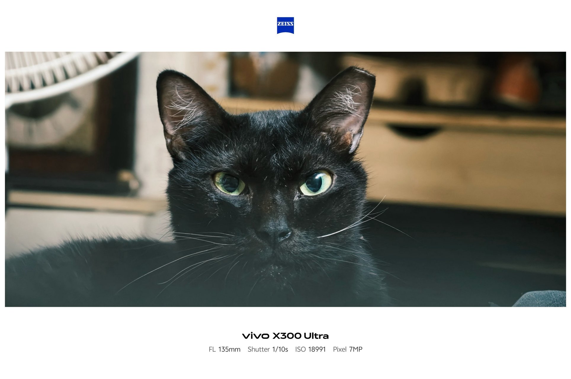
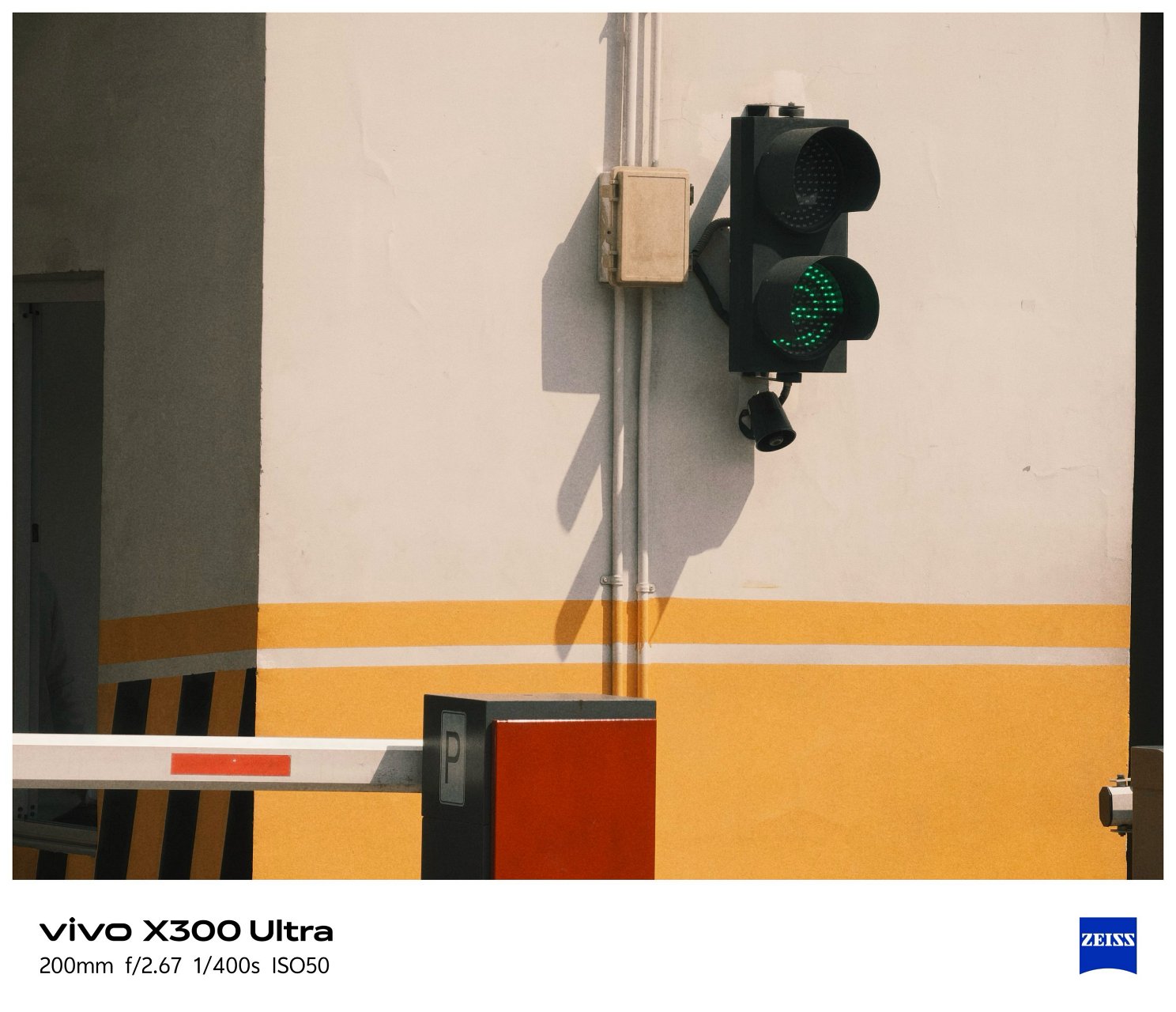
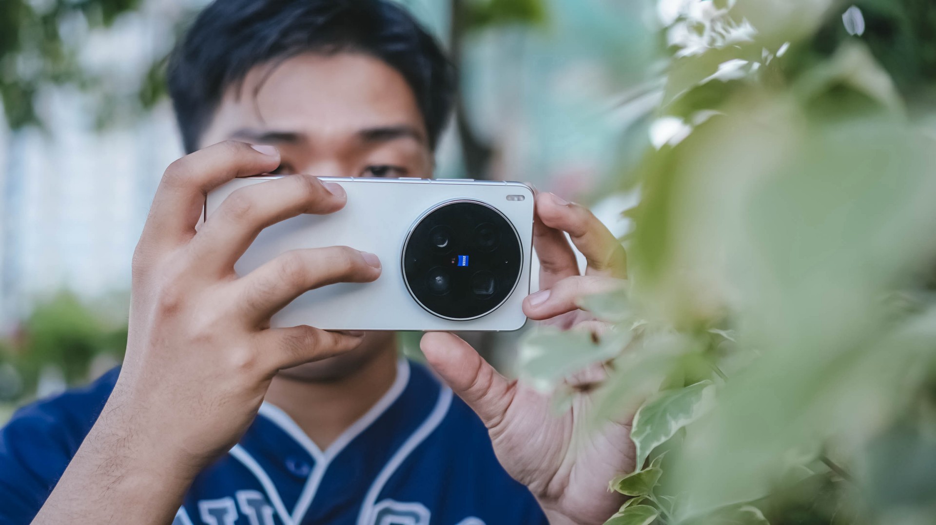
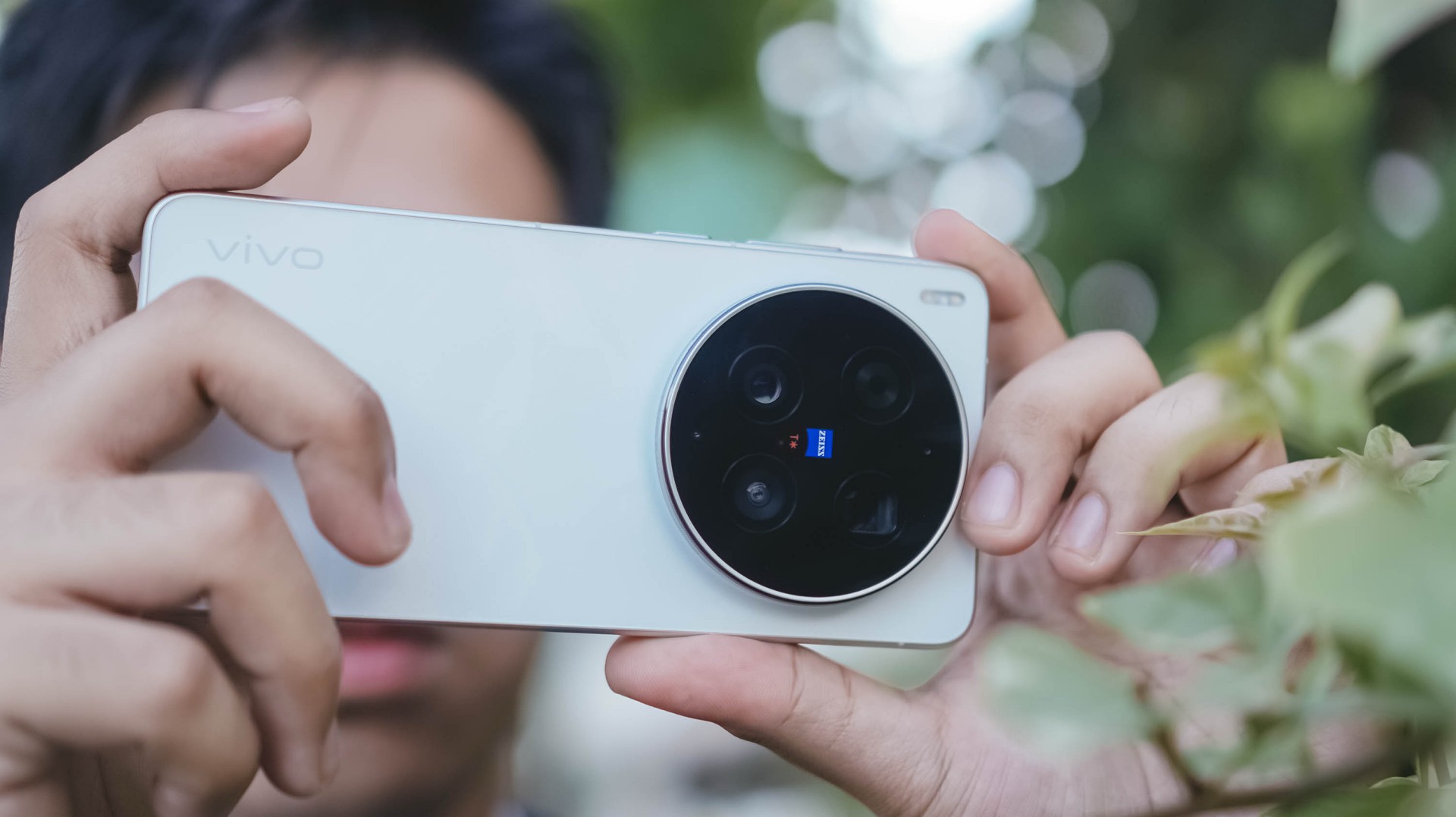
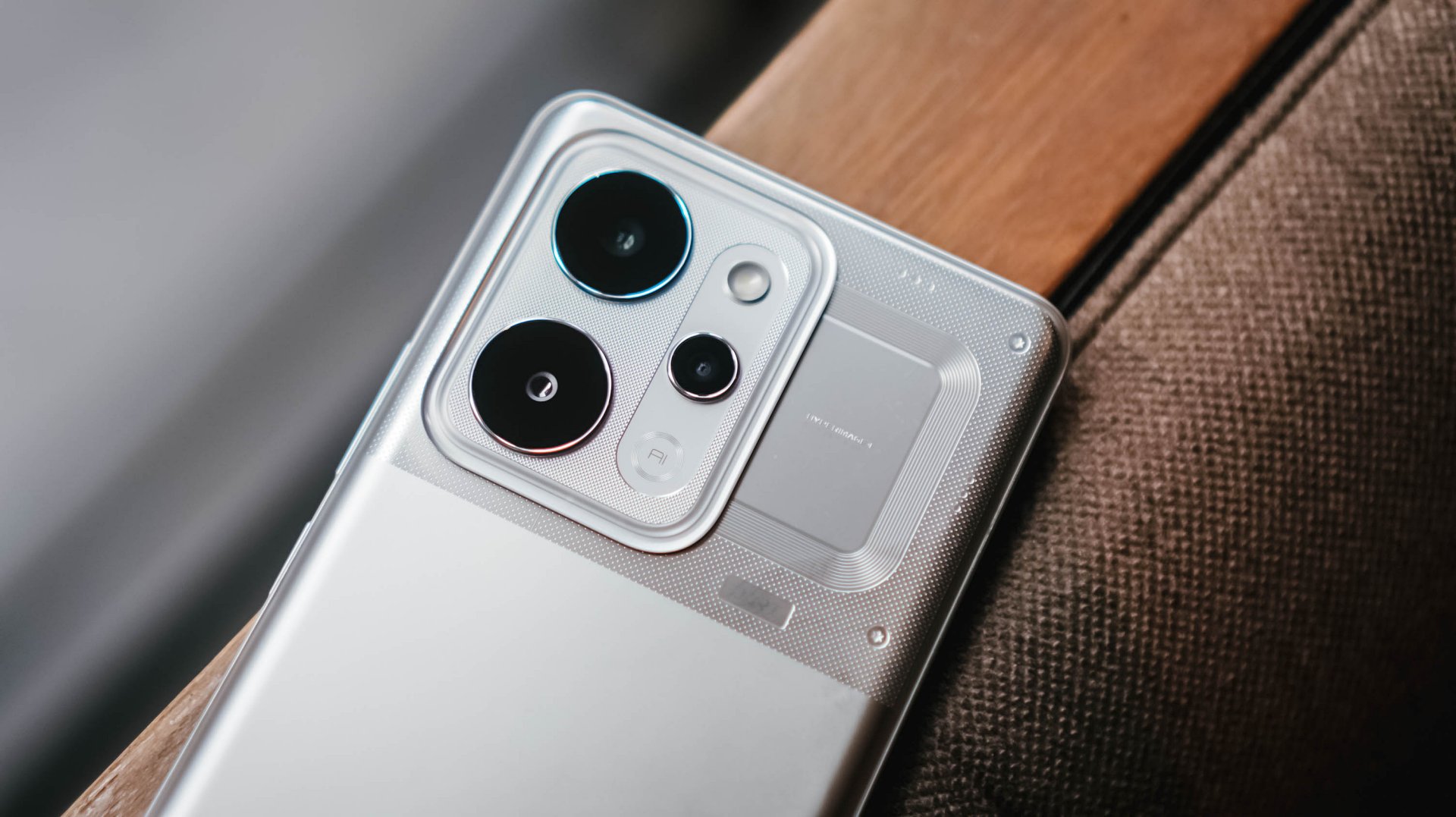
For starters, the vivo X300 Ultra has a massive 200MP f/1.85 rear camera based on Sony’s 1/1.12-inch LYTIA 901 (or LYT-901) image sensor.
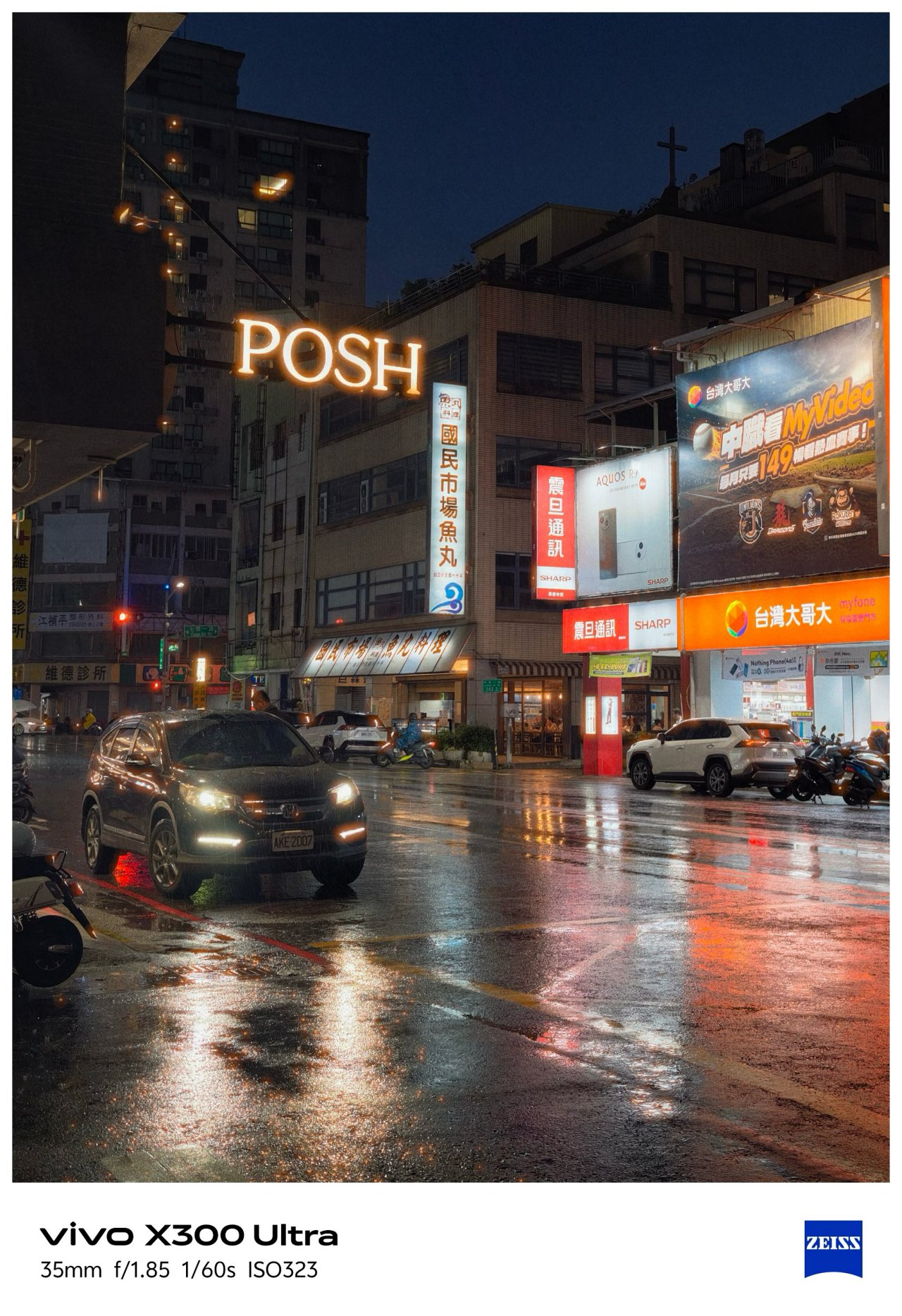
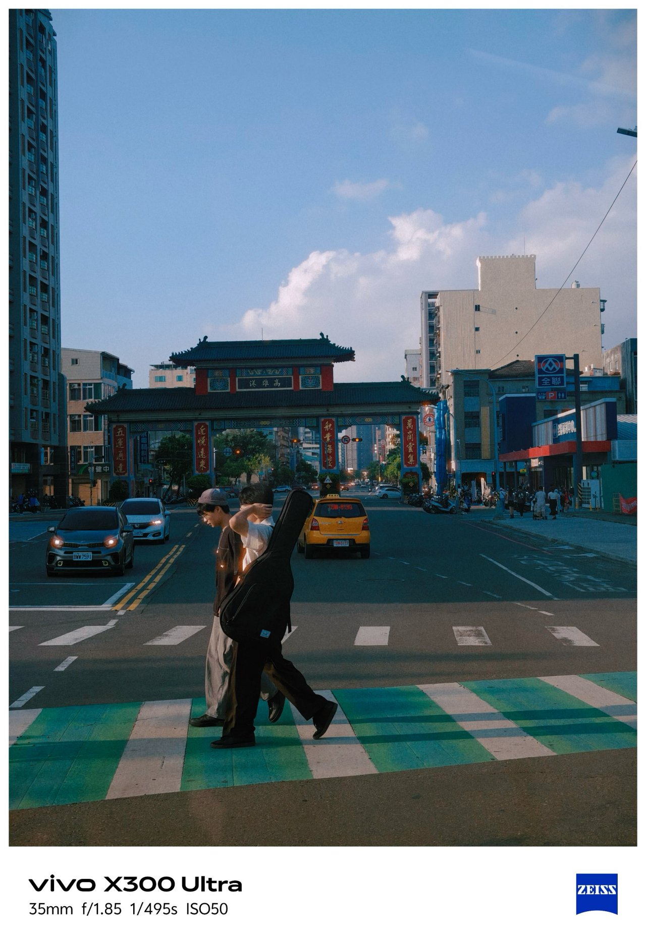
What makes it stand out from the rest is that 35mm focal length is uniquely of its kind. No other smartphone brand dares to do what vivo is currently doing.

Even though 35mm exists in most modern flagships through a series of camera app taps, it’s only vivo’s X300 Ultra (and last year’s X200 Ultra) that made 35mm the de facto focal length standard in contrast to all 23/24/26mm wide shooters out there. No fake 35mm cropping whatsoever.


Personally, I am a huge lover of this tight framing. Not only it gives the best balance of DoF (Depth of Field) and FoV (Field of View), it makes you focus and capture more intricate subjects altogether.


That mighty sensor is also capable of capturing 50mm shots through in-sensor cropping.

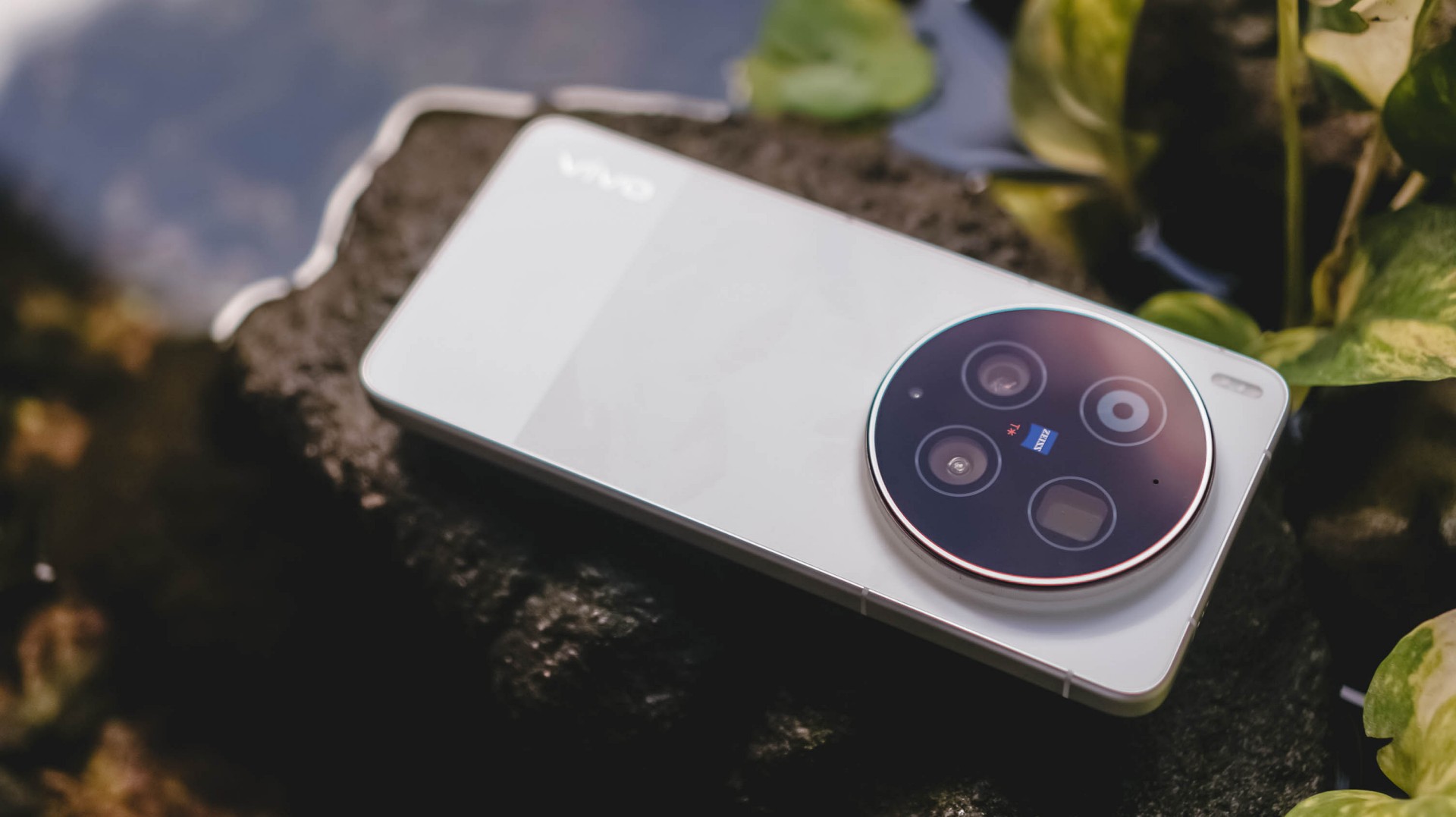
Deny it or not, ultra-wide angle shooters are what most brands often neglect. Well, vivo tried to make it up to par with that 50MP f/2.0 UWA lens.
But, it’s not just about the megapixel count nor aperture opening. The X300 Ultra boasts a 1/1.28-inch Sony LYT-818. X200 Pro’s main sensor was transformed into X300 Ultra’s ultra-wide unit.


This further proves how the vivo X300 Ultra is truly a W.D.A (Whole Different Animal).

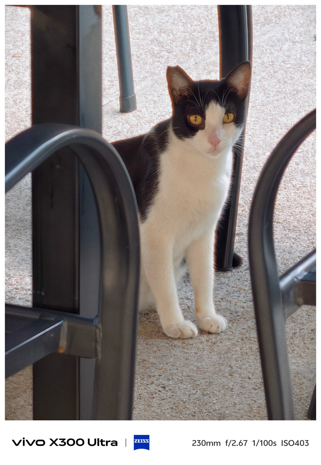
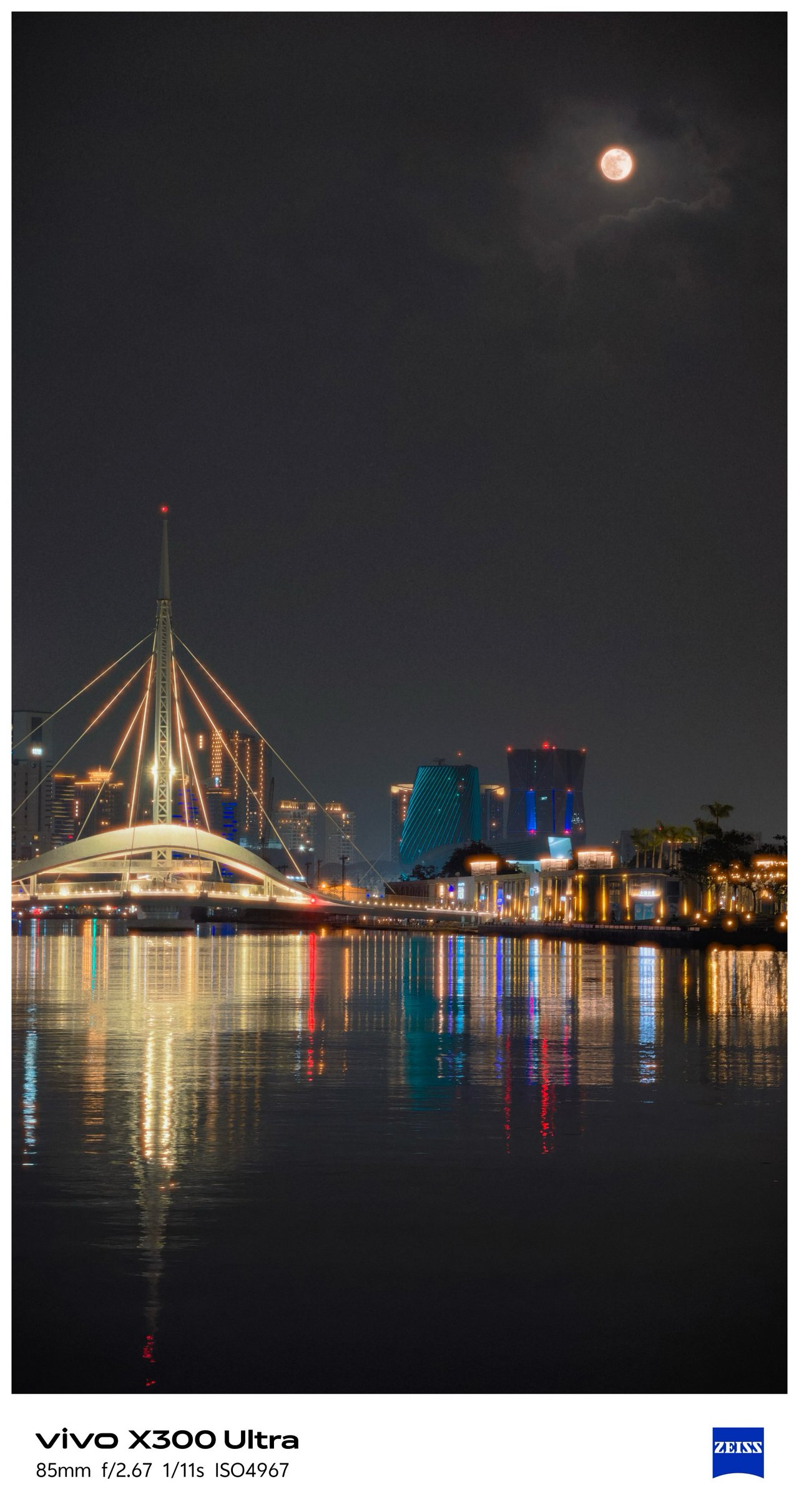
Last but definitely not the least, that 200MP f/2.67 periscope telephoto module capable of bringing in 3.5x optical zoom or an equivalent of 85mm.


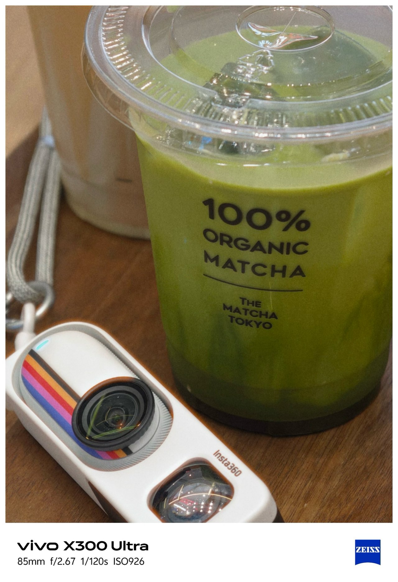

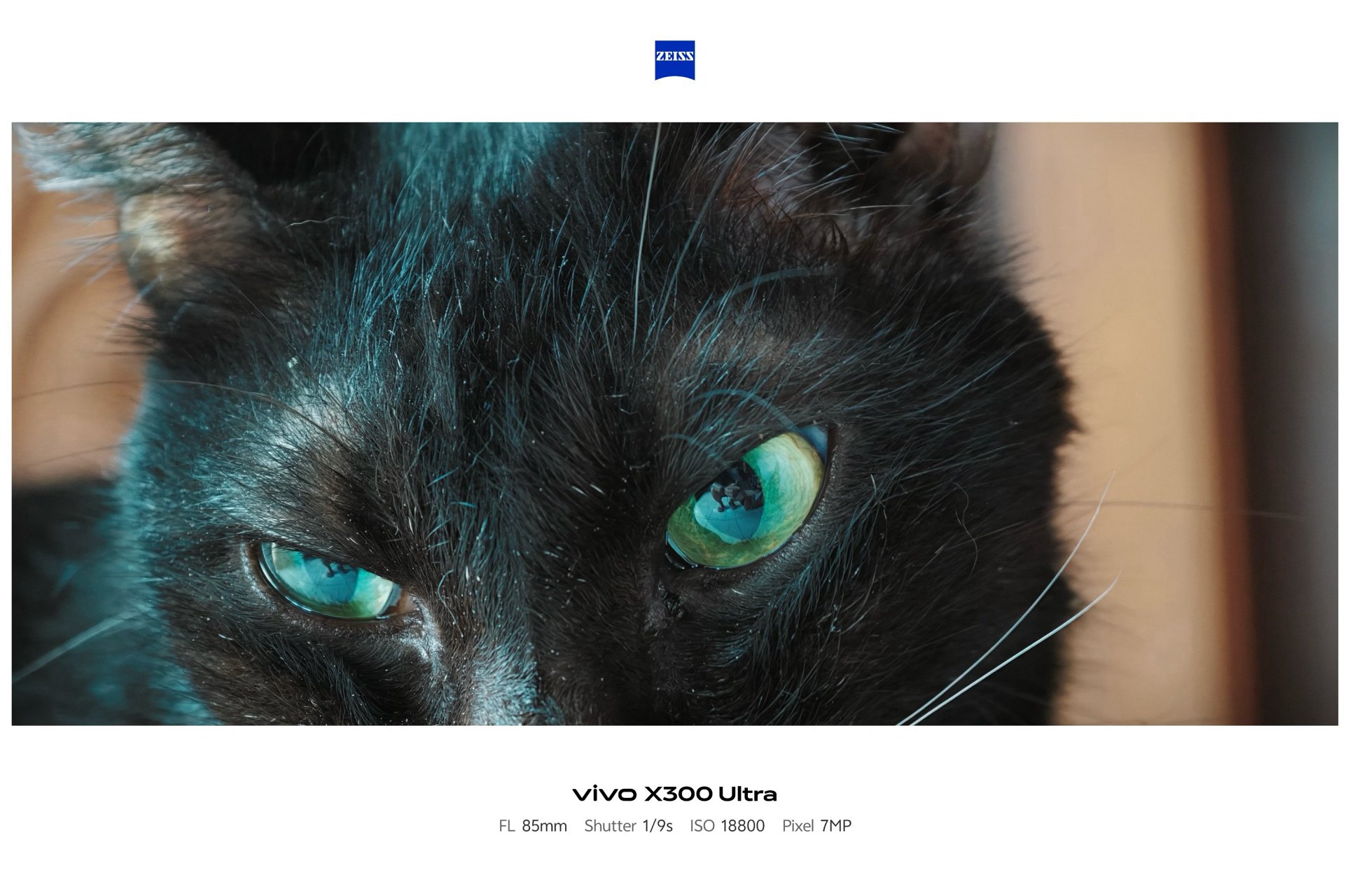
Shooting beyond 10x is still crisp and clear thanks to Samsung’s 1/1.4-inch ISOCELL HP0 sensor refined for vivo.


Before I forget, the X300 Ultra is the only phone in the X-series line to feature a 5MP f/2.0 multi-spectral sensor.

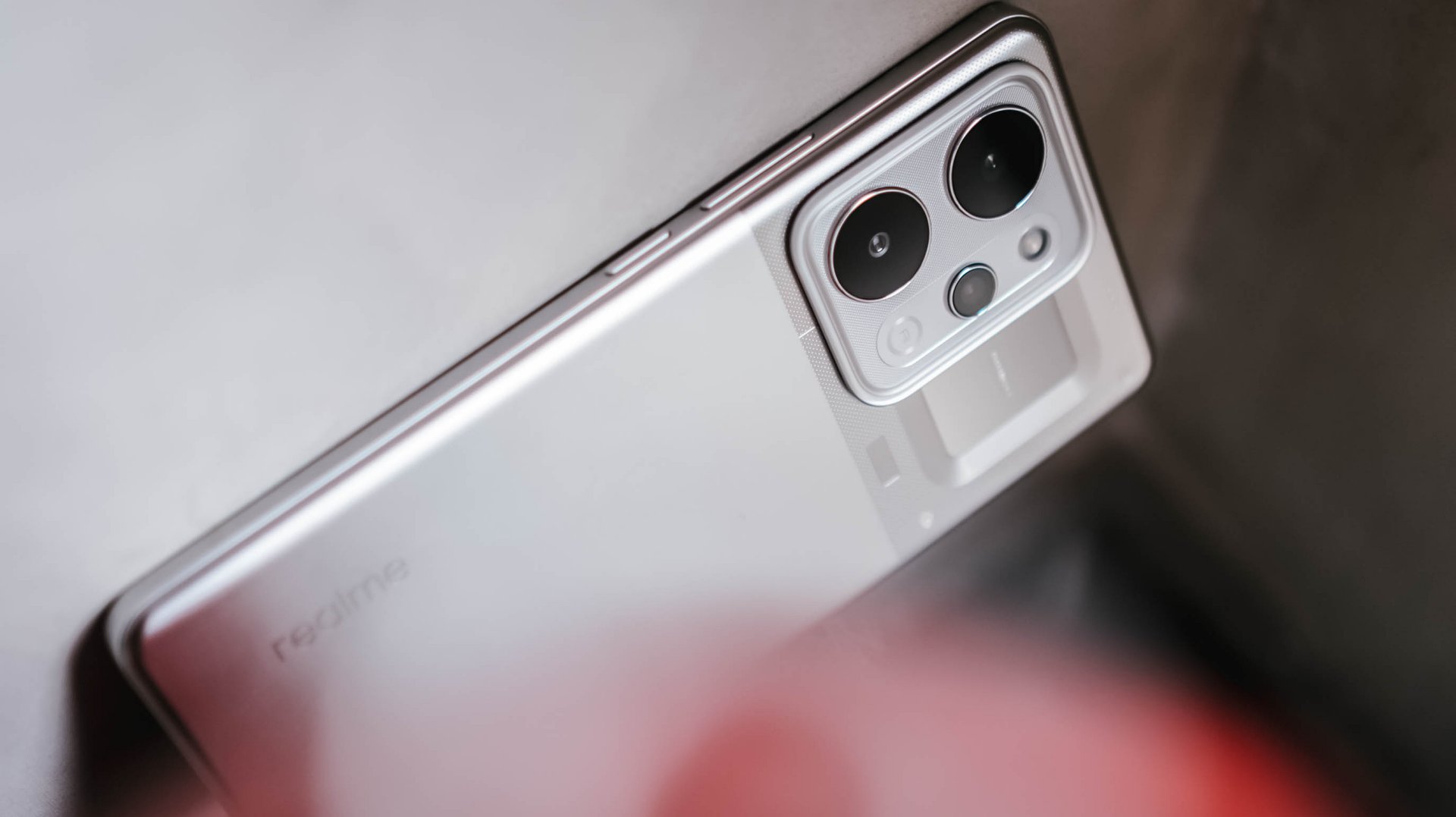
vivo X300 Pro (left), X300 Ultra (right)
For the spec-savvy, here are the detailed camera specs of the X300 Ultra against its Pro brother.
vivo X300 Pro |
vivo X300 Ultra |
|
Wide |
50MP f/1.57
|
200MP f/1.85
|
Ultra-Wide |
50MP f/2.0
|
50MP f/2.0
|
Telephoto |
200MP f/2.67 ZEISS APO
|
200MP f/2.67 ZEISS APO
|
Multi-
|
– |
5MP f/2.0 |
Selfie |
50MP f/2.0
|
50MP f/2.45
|
Mirrorless Mimicry
Last year’s vivo X300 Pro was already a very, VERY capable camera-centric flagship.
This year, vivo takes the X300 Ultra to the next level with their overhauled camera app features.
First and foremost, the shortcut bar on top is now customizable. Moreover, the lower right side lets you add more tools based on how you like them in your screen. This was not possible in previous iterations.


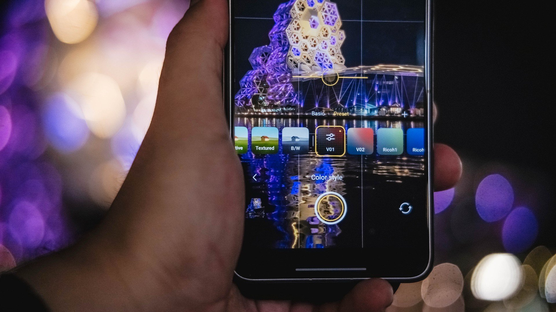
Now, if you’ve been following through over the years, the default color profiles were ZEISS Natural, Vivid, and Textured.
This year, the latter was changed to “Refined” while Textured was moved to less major presets in the list.

My first day with this monstrous camera phone made me explore all the new features — including making your very-own preset through Color Palette. This fully unlocks the hidden potential of the X300 Ultra.
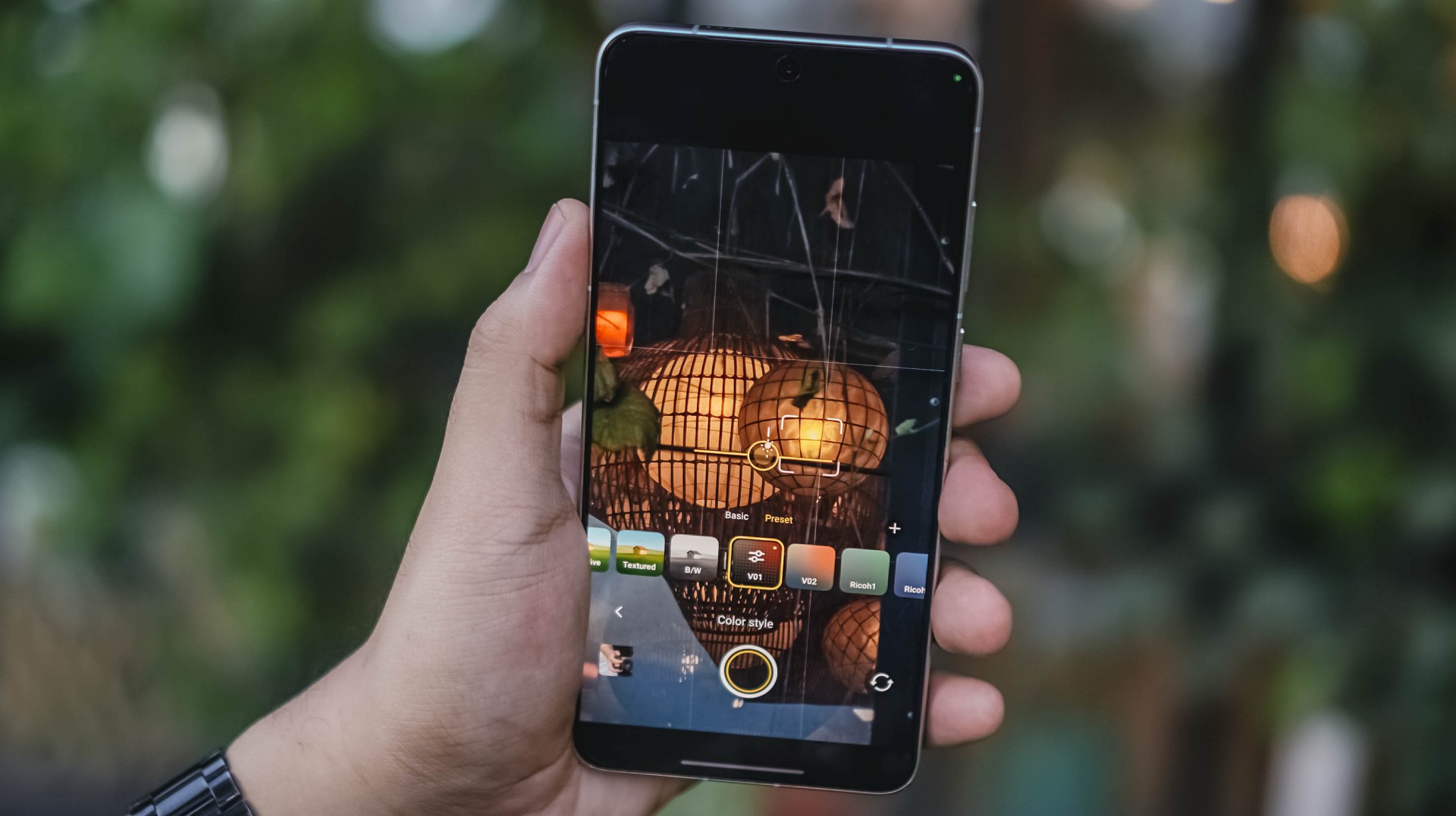
Upon firing up that camera app, I immediately tested it out and did my own film recipe just to make my photos reflect my photography style. Thus, V01 and V02 were born.
Now, if you’re not a tinkerer like me, mirrorless-like presets are floating around XHS / XiaoHongShu (or RedNote, whatever you prefer).
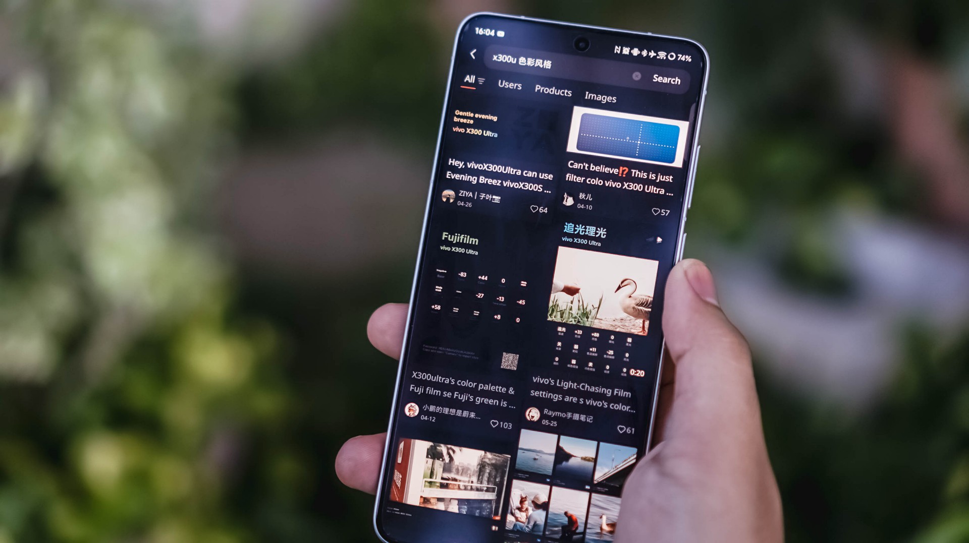

For reference, here’s a quick comparison between vivo’s built-in presets versus my own recipe.
-

- vivo – Vivid
-

- V – V01
-

- vivo – Refined
-

- V – V01
This added ability truly proves my sentiment that it can be a “mirrorless replacement.” And by that, I meant you can show off your own photography style without having to be too restricted with the phone’s built-in presets and camera processing, Neither color-grading after the fact.
Such new feat is why I can never go back to the X300 Pro. And, even if they do include it in a future software update, X300 Ultra’s camera hardware is simply unbeatable.
-

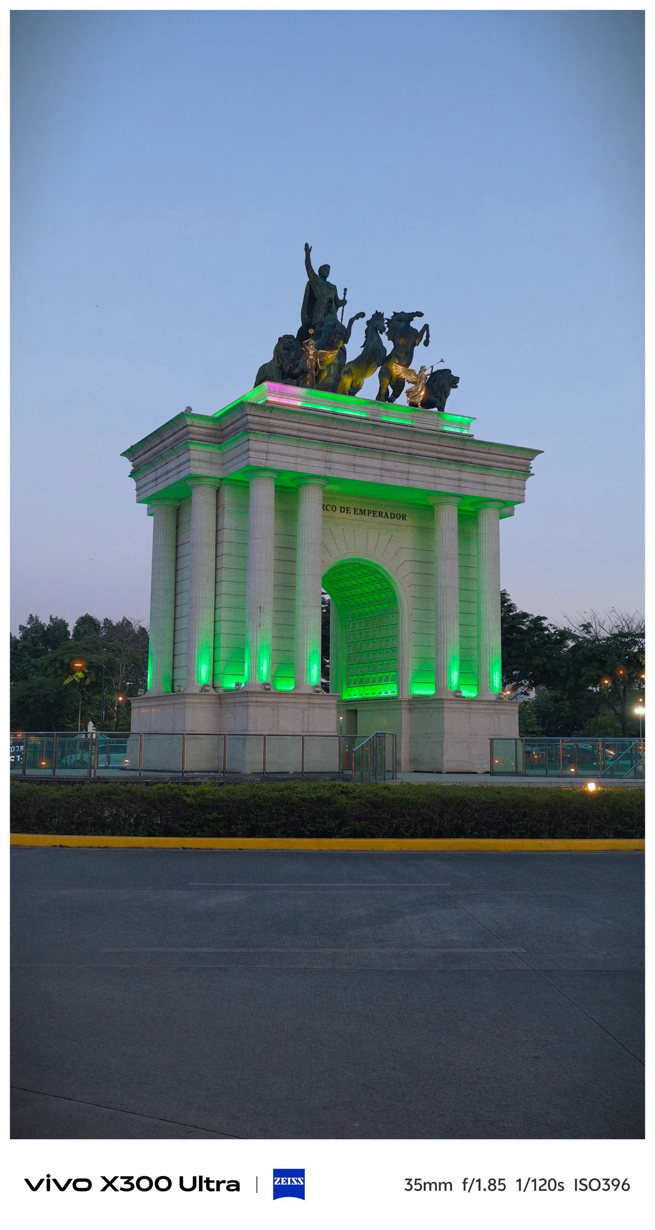
- vivo X300 Ultra 35mm + V’s V01 Recipe
-

- Sony ZV-E10 + TTArtisan 35mm f/1.8 II Prime Lens
Just for fun, I took both of these 35mm shots using the vivo X300 Ultra alongside the Sony ZV-E10 with my budget 35mm prime lens.
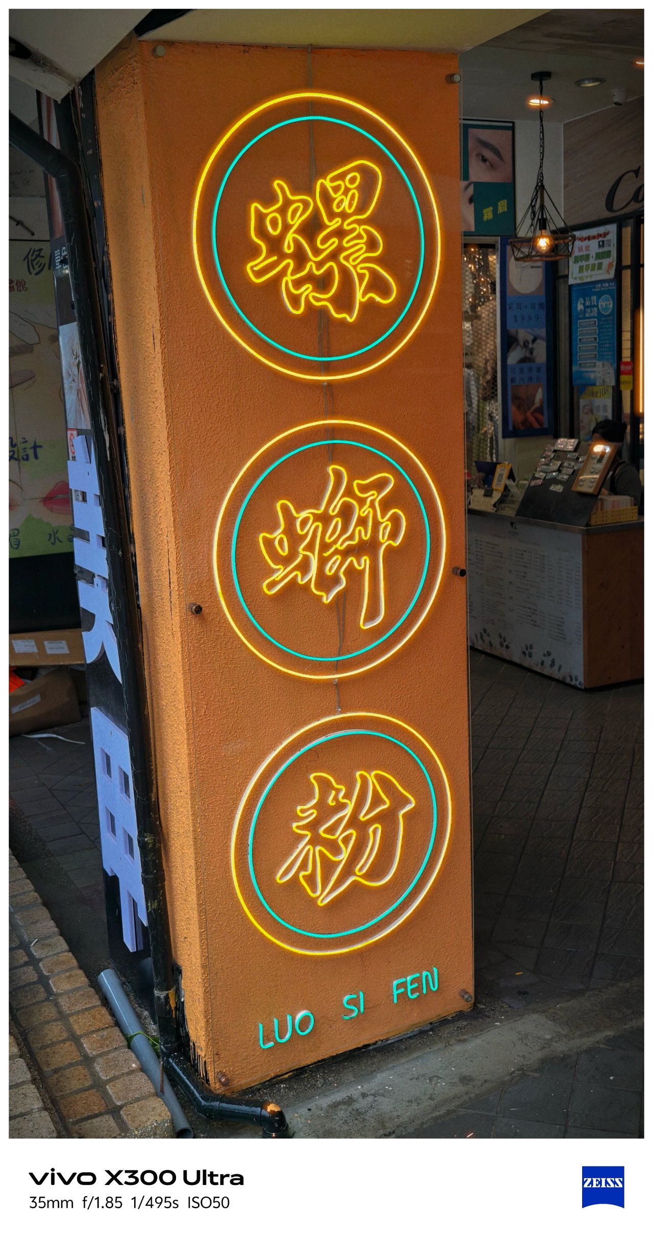
Postcards #PhotoDump
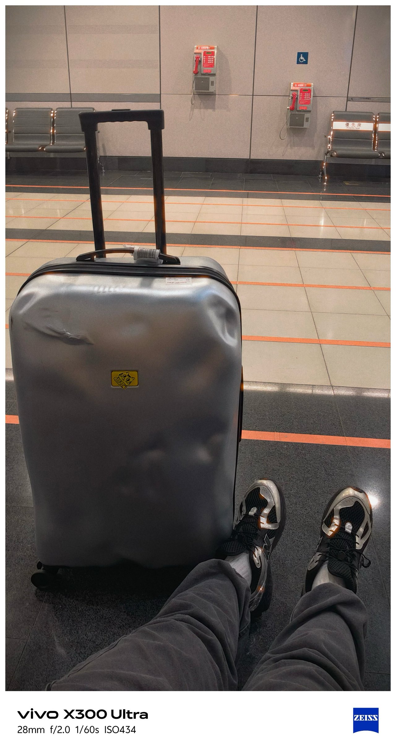
Spoiler alert: There are a lot to see! And, that’s the point of a “review” anyway 🤐
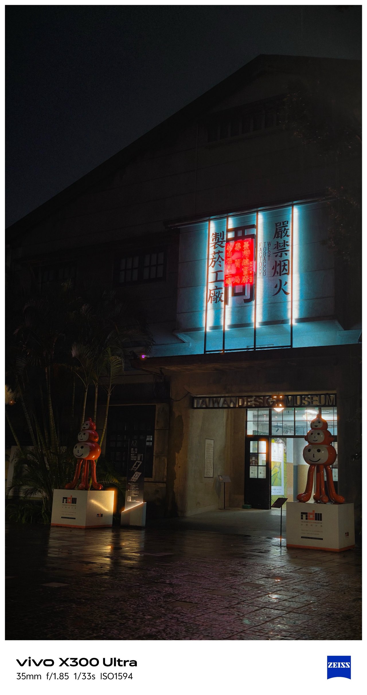
🇹🇼 高雄市 / Kaohsiung
📍 Cijin Island

By making and applying the preset I made, I was able to take all the glistening photos at these two different beaches in Kaohsiung.


📍 Sizihwan Beach


📍 Night Light


📍 Kaoshiung Center


📍 Angel & Demon Café


📍 Pier 2


📍 Hamasen


My inner railway fanaticism was screaming with the working diorama and all TRA / Taiwan Railway-filled memorabilia inside Hamasen Railway Museum.


📍 THSR Zuoying
All the train madness (and the Kaohsiung trip as a whole) ends here.


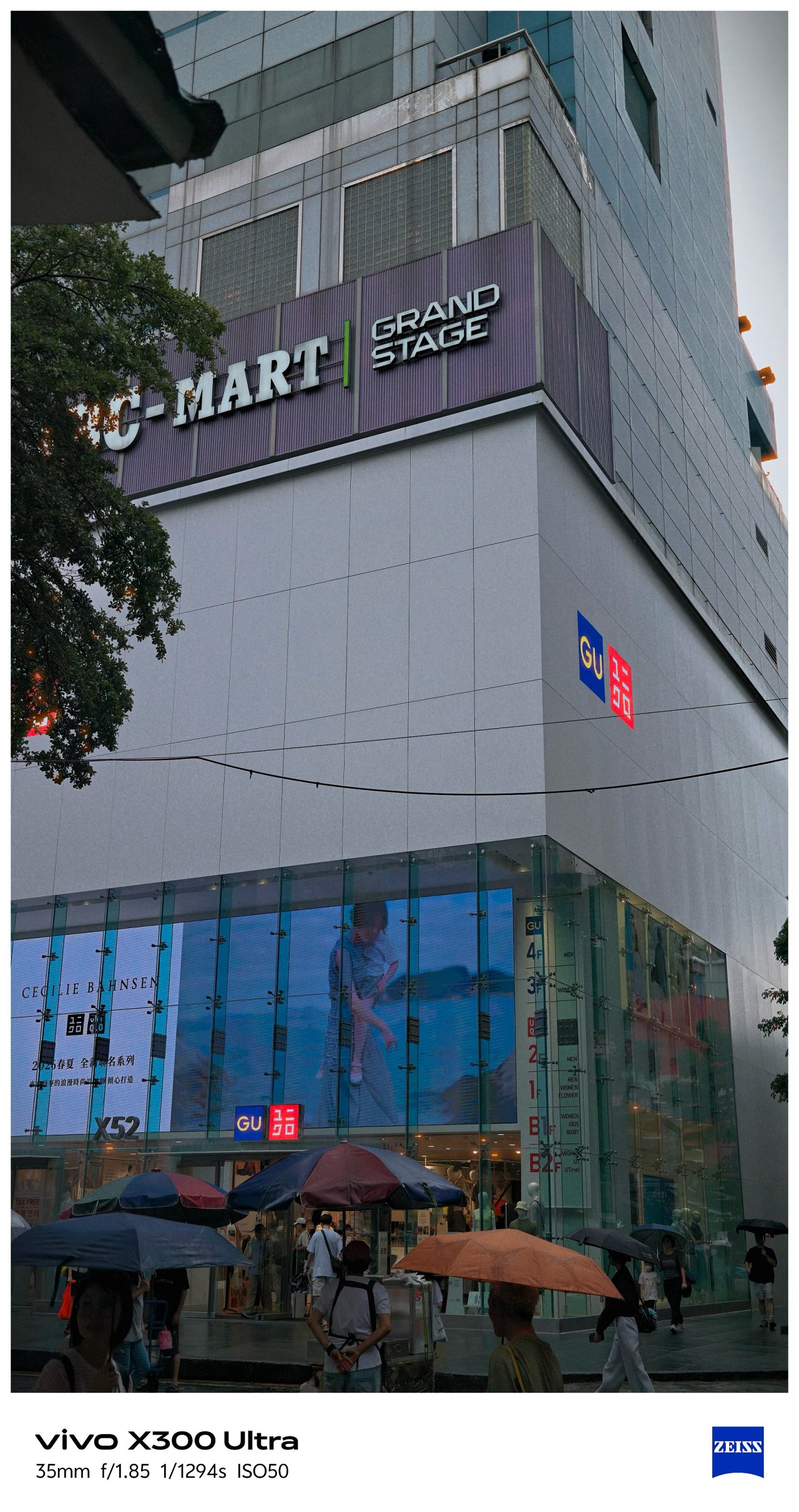
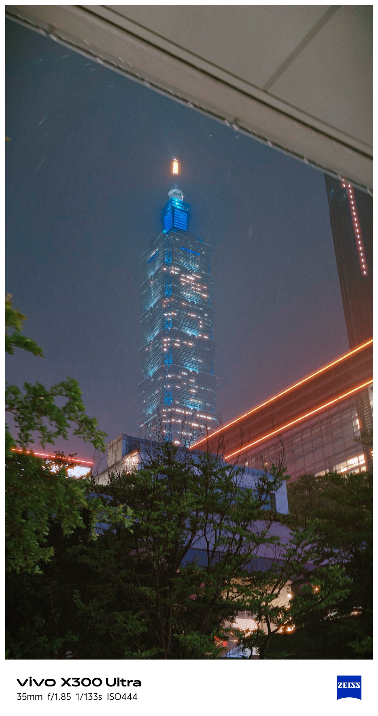
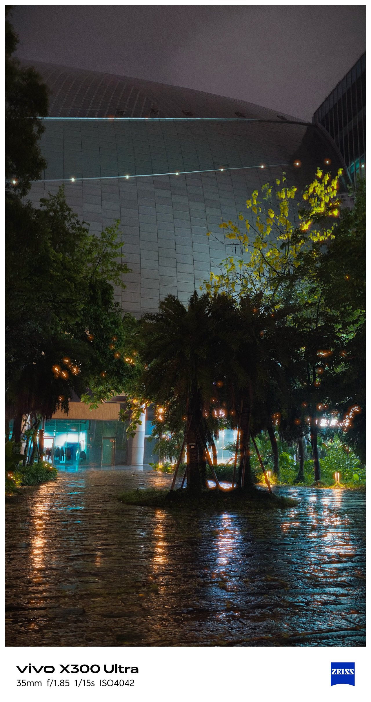
🇹🇼 臺北市 / Taipei
Moving from the southern city towards the north, Taipei’s weather also shifted drastically.
📍 Ximending


Being able to witness an eerie Ximending for the first time in my fifth Taipei visit along with this preset made it more dramatic.


I can’t imagine how “impactful” these would look if I applied vivo’s built-in presets.


📍 Xinyi


📍 Songshan


📍 Xizhi, Nangang


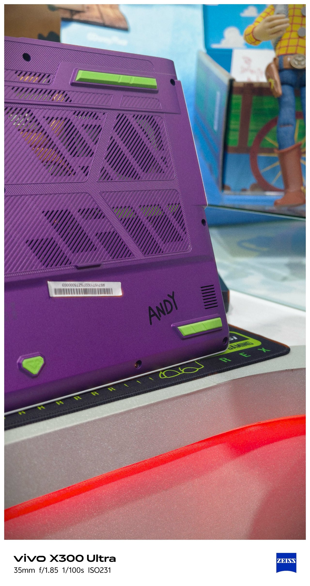
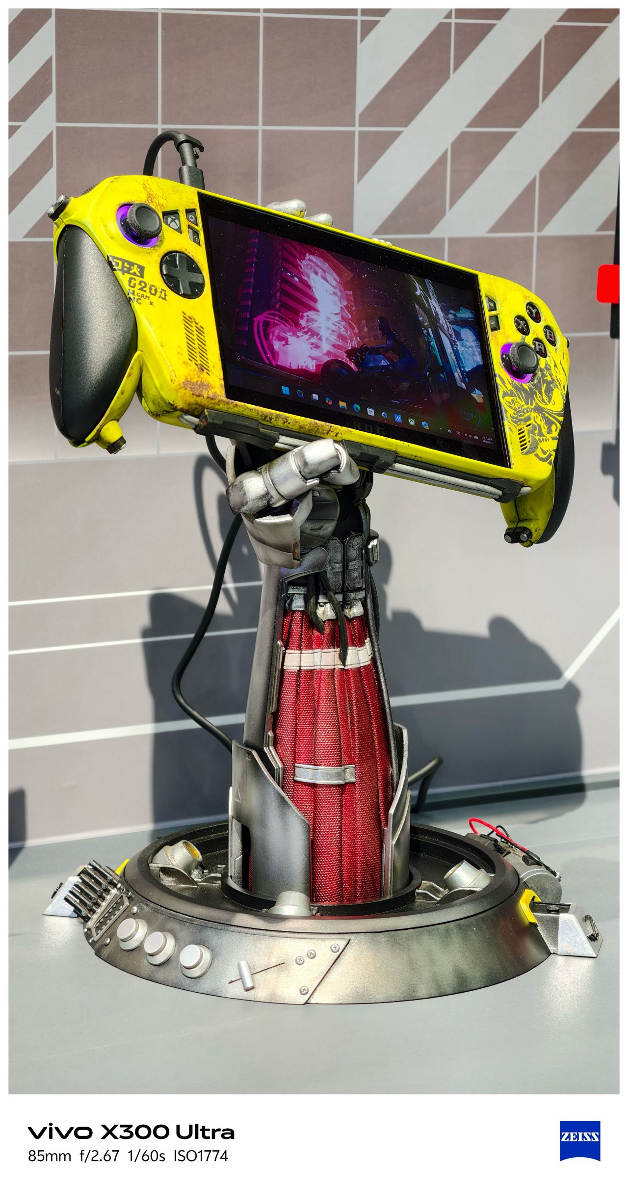
📍 Food


📍 X-tras


‼️ Bonus #1: COMPUTEX 2026

-

- Eye contact of ROG’s Kris Huang is melting me
-

- I mean???
SEE ALSO: Postcards from MSI’s 40th Anniversary Expo
‼️ Bonus #2: Selfies


🇰🇷 부산 / Busan
It’s funny how this phone was able to see Busan while its owner is still dreaming of seeing it with his own eyes one fine day.


As stated, I was not the person who traveled here (my friend took ’em for me), Still, I’m glad how these photos turned out all throughout her week-long trip in Busan.


Full-on FleXibility
With the newer G2 and G2 Ultra teleconverter lenses by vivo and ZEISS alongside the improved Grip Case produced by PGYTECH, it’s hard not to think the vivo X300 Ultra is a professional-looking mirrorless camera from afar.
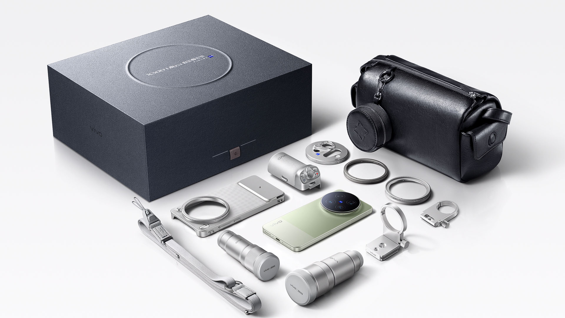
Unfortunately, we don’t have any of these X-tras with me.
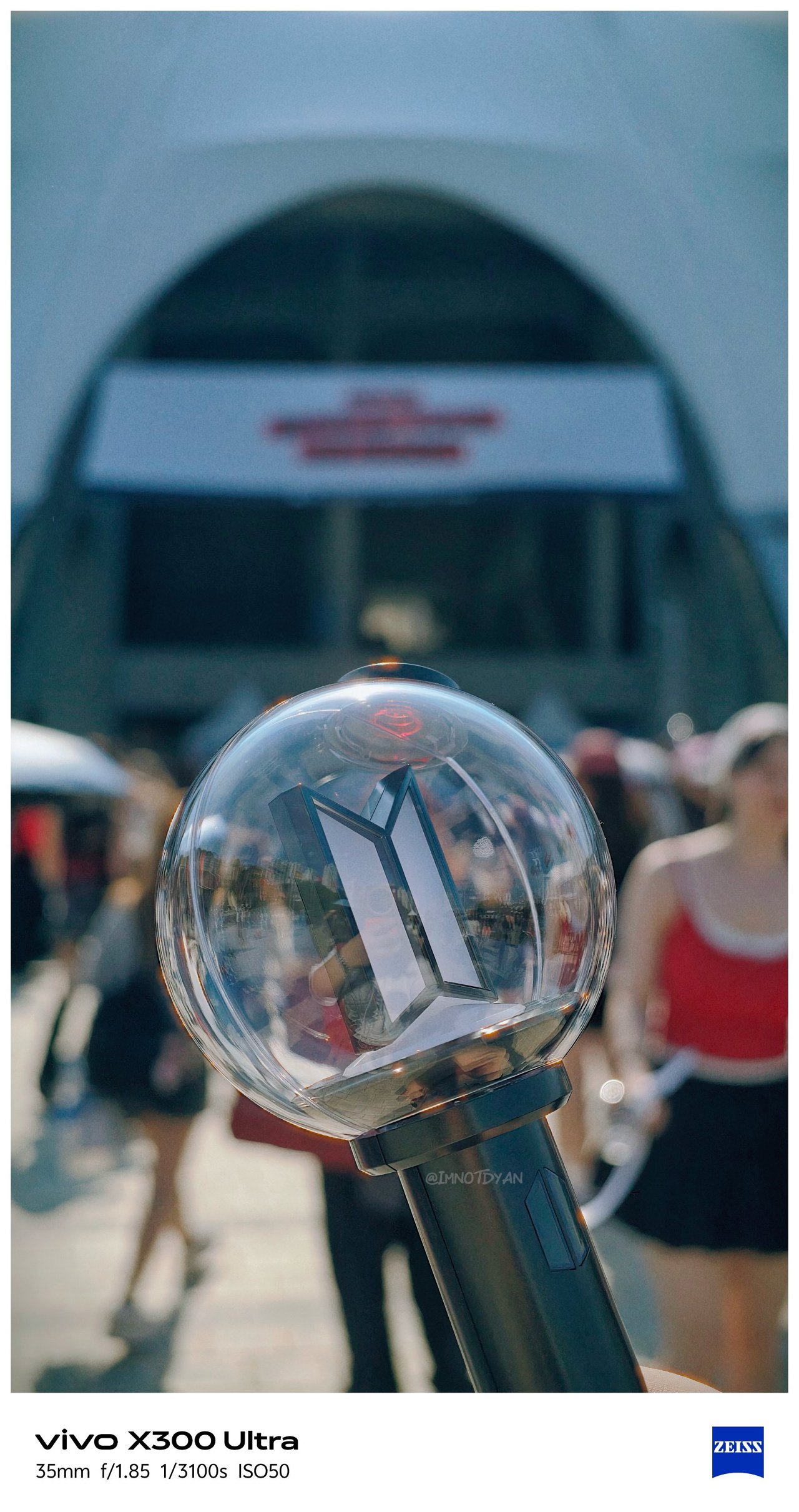
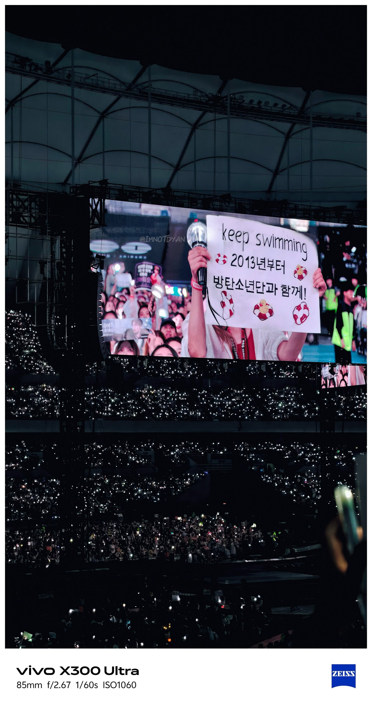
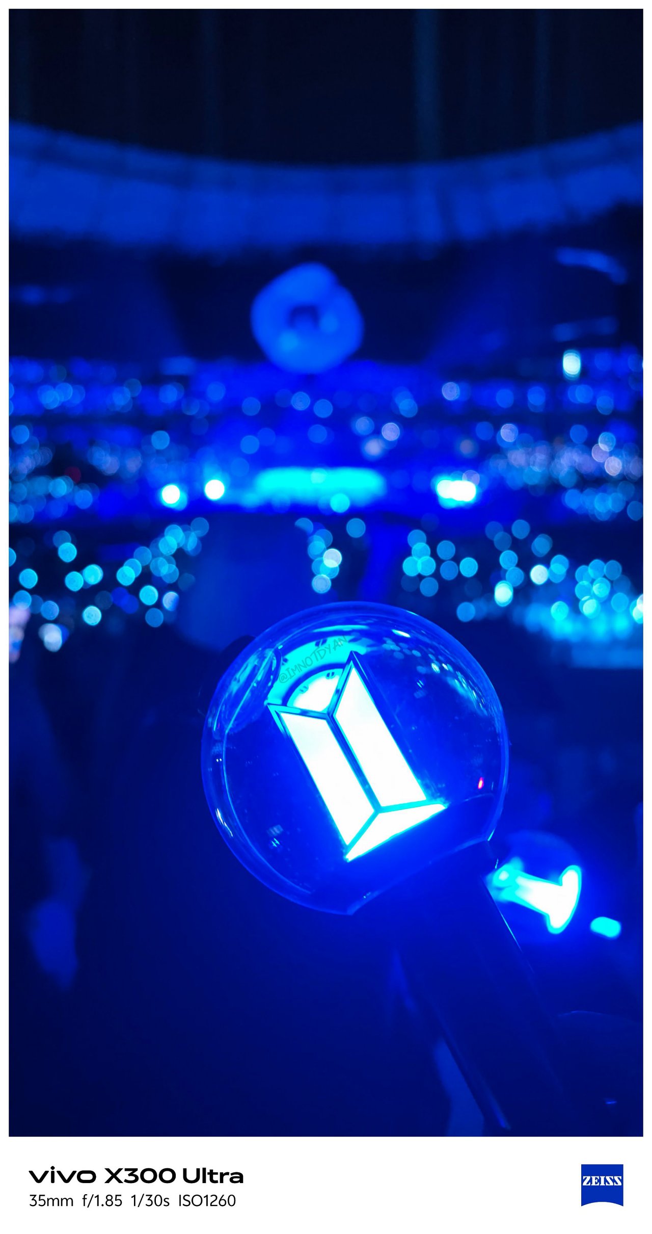
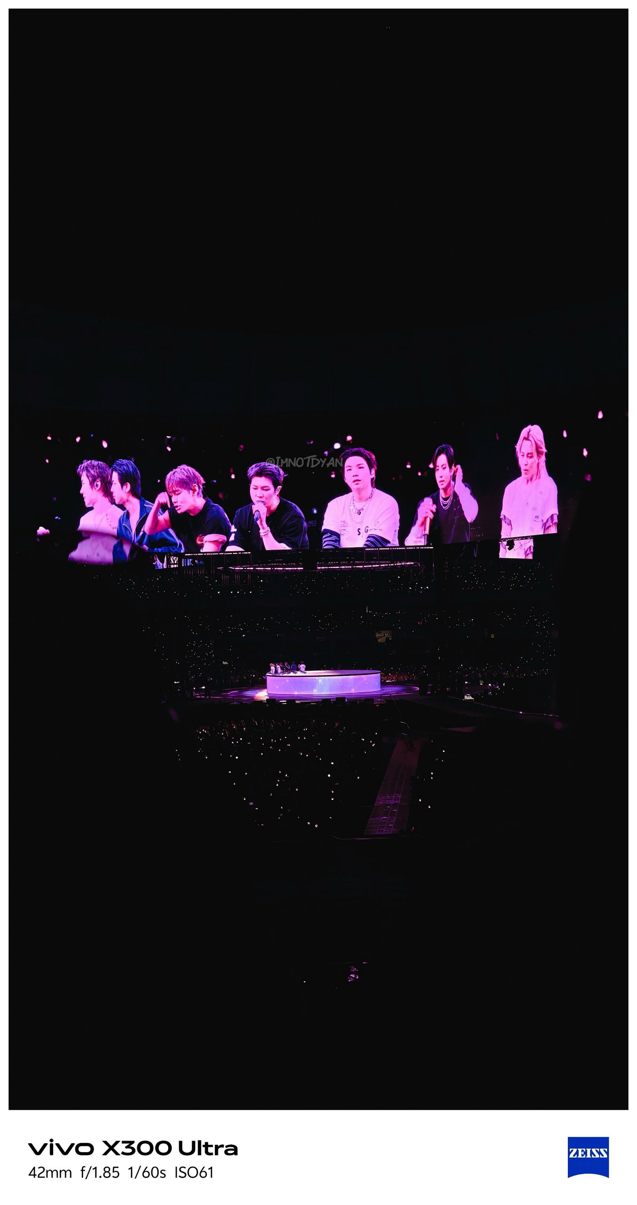
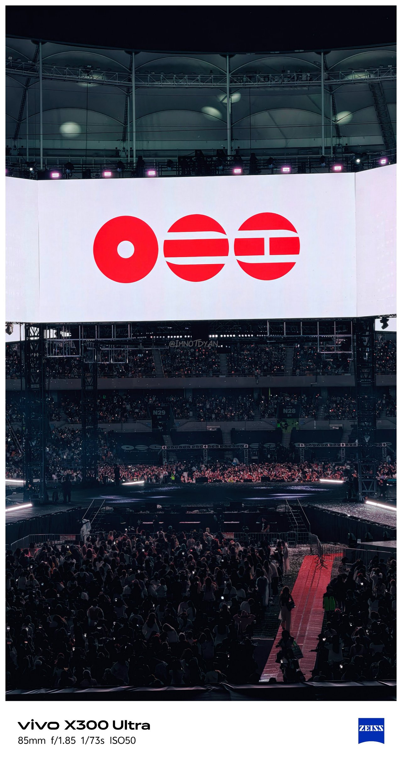
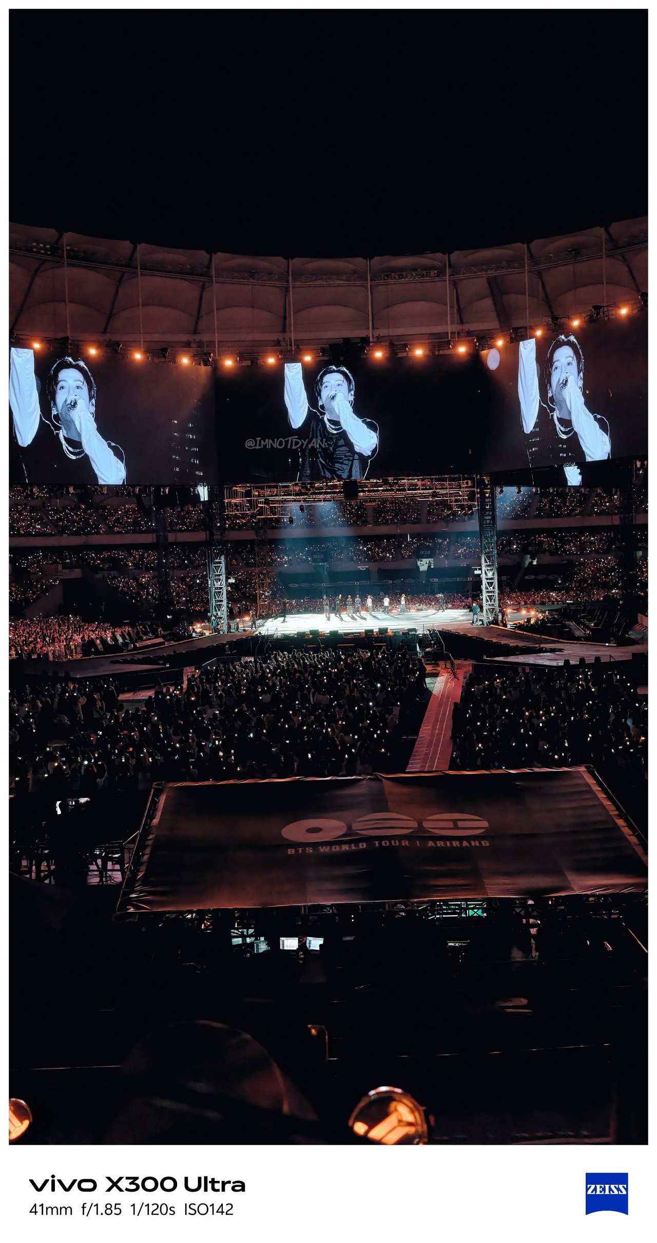
Still, it would be a huge miss not to test out the built-in periscope prowess of the X300 Ultra on concert grounds.
🎵 260612 BTS ‘ARIRANG’ in Busan


🎶 260425 IVE ‘Show What I Am’ in MNL


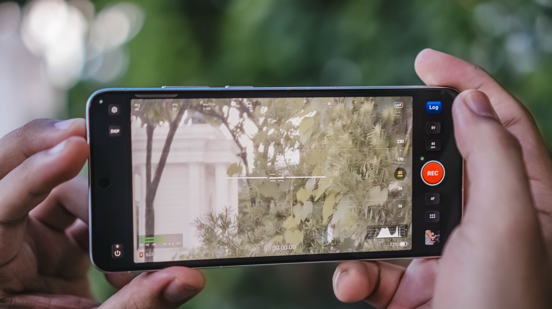
Video VerXatility
I’ve witnessed how vivo aimed to hit two birds with one stone by delivering a capable photo and video shooter like how Apple does with Pro-branded iPhones.
View this post on Instagram
vivo made the X300 Ultra rival the iPhone 17 Pro Max not just in photography, but in videography as well. This year, they have finally delivered.
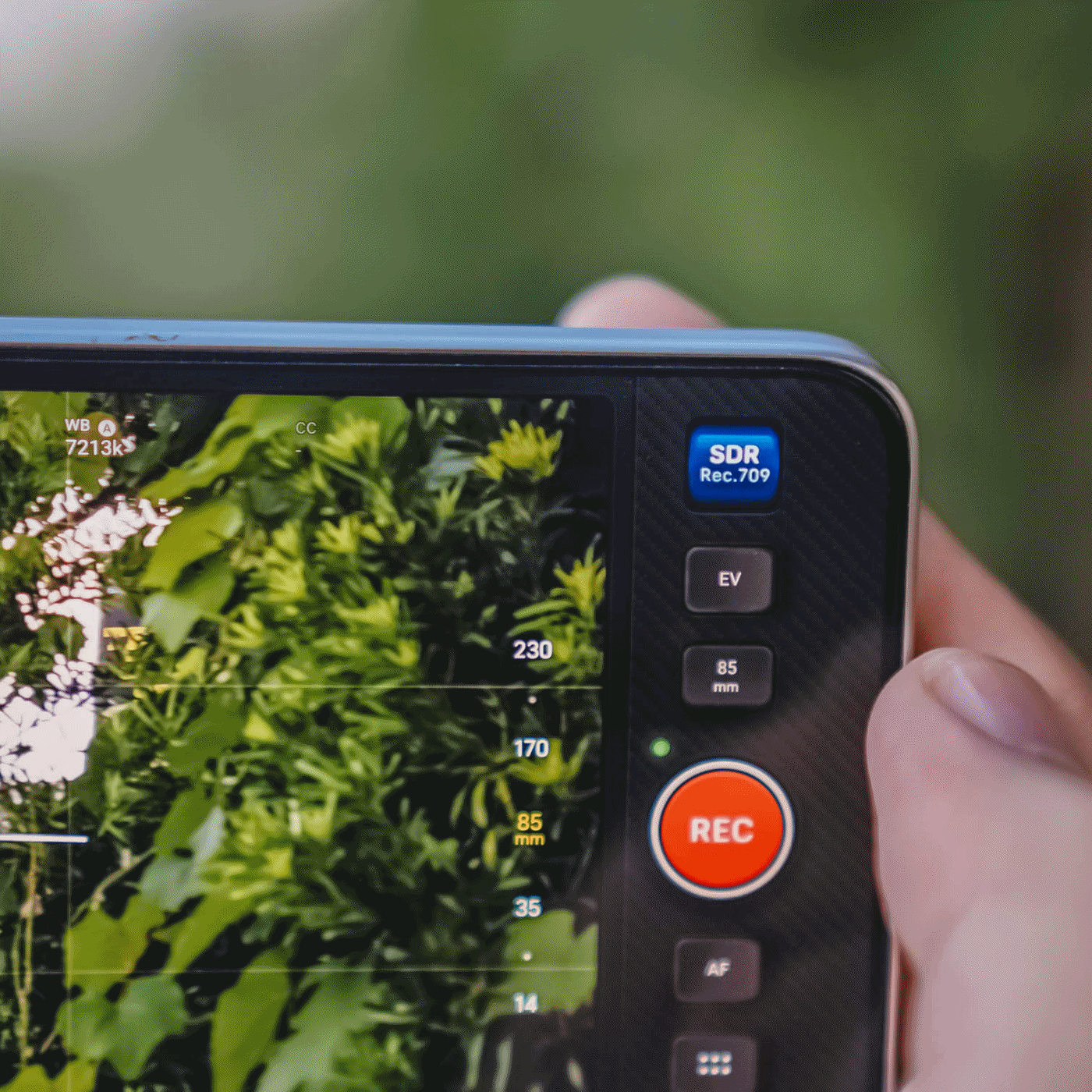
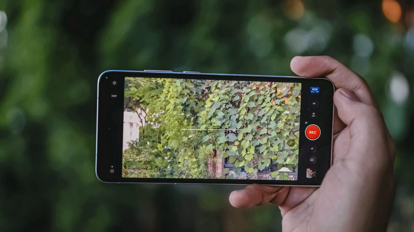
For one, there’s better lens versatility when shooting in 4K/120fps — regardless if it’s the default SDR (Rec.709) codec, Dolby Vision, or as extreme as Log recording. More so, slo-mo shooting will be smoother and clearer.
Additionally, low-light shooting, video stability, and even lens switching are all seamless.
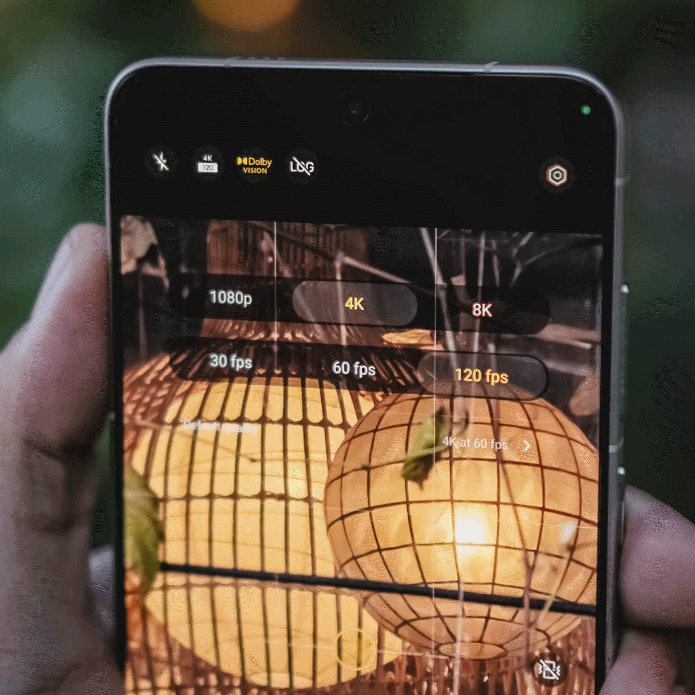
While I already enjoyed the video strengths of last year’s X200 Pro and X300 Pro, the X300 Ultra is remarkable and unbeatable.
Back to that custom color palette feature. Well, it also works in video shooting — making the vivo X300 Ultra an ultimate mirrorless sub.
Admittedly, unlike MKBHD and most filmmakers out there, I’m never a fan of 24fps as I prefer shooting in 60fps or higher. However, the X300 Ultra made me think otherwise as I enjoyed such “cinematic” shooting made possible with vivo’s Film Style mode.
If you’re just the point-and-shoot type of shooter without wanting vivo’s default color styles or not “pro” enough to make your own color recipe, Film Look also exists for those cine-rich footages.
It does not stop there! vivo even added this more profesh-looking layout reminiscent of professional cine cameras.
In all honesty, I only used it once since the texts are quite tiny, and adjusting controls were quite fiddly.
Clean and Lean
At first glance, the vivo X300 Ultra is nothing but subtle refinements.
Last year’s Rimowa-like texture of the X200 Ultra was gone in favor of that two-tone shade. Personally, I loved that design element more as it also serves as a functioning grip when held.
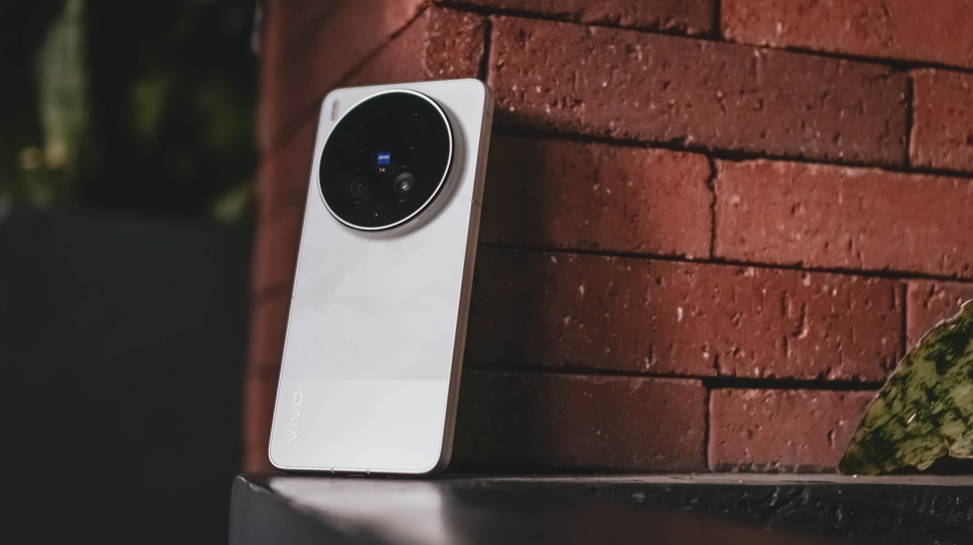
Moving through, while the Film / Steppe / Victory Green is closer to my heart, the White colorway given to me is still heaps better than the plain Eclipse Black shade.
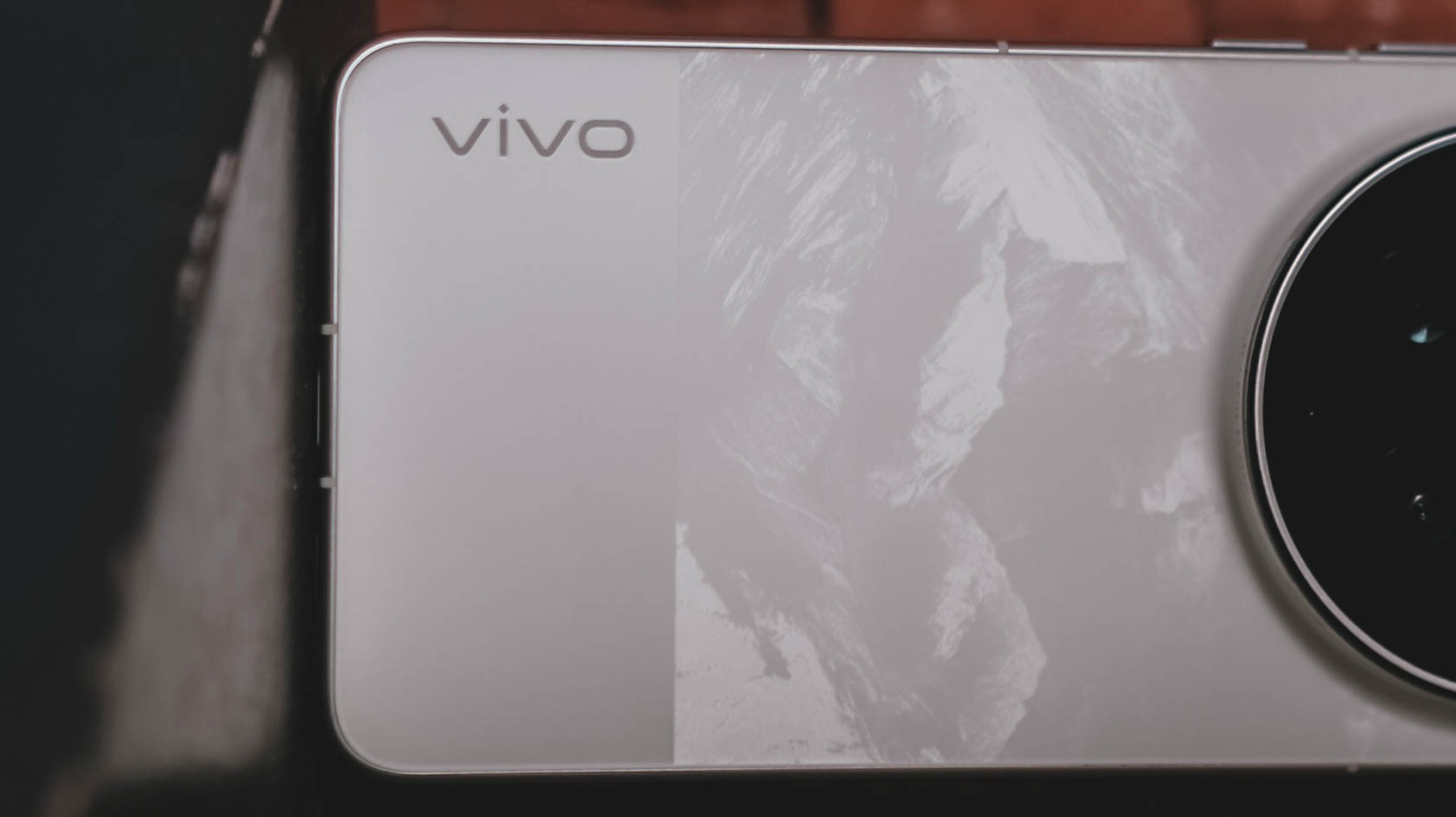
It’s not just clean-looking, the bigger part has that subdued, mountain-like pattern faintly showing up when hit by light.
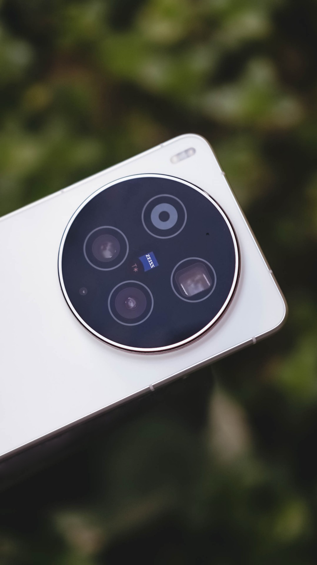

I’ve always been fond of massive circular camera cutout — vivo X-series not left out. Gladly, vivo still stuck with this design.

vivo X300 Ultra (above) vs X300 Pro (below)
Now, before you jump on that hump hate train, it’s great to appreciate how vivo engineers were able to fit all these massive camera components within.
I don’t mind the thiccer, protruding camera bump versus its Pro sibling. After all, it serves both form and function especially that it makes a great resting place for my finger when held one-handed.

At 8.49mm and 237 grams, it’s not too slim and hefty enough to avoid those unwanted drops and slides that I experienced frequently with the previous X200 Pro and X300 Pro.
#NowPlaying: The Legend of Kitchen Soldier, The WONDERfools
Flipping to its front shows the X300 Ultra’s 6.82-inch 144Hz LTPO AMOLED panel.
In the entirety of this review period, I was able to start and end The Legend of Kitchen Soldier starred by Park Ji-hoon — one of my ultimate biases (and crushes) both in the K-Pop and K-Drama world.

One of the best and most hilarious K-Dramas ever existed, periodt.
From the series’ cool video game-like VFXs à la smart glasses, mouthwatering cooking mastery, all the way to the hilarious, comedic snippets in between, it’s hard to deny how immersive it gets the longer you stare at that screen.
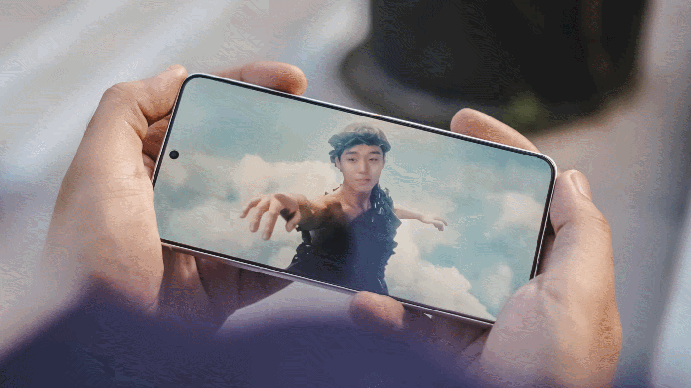
The bezels are impossibly thin for an Android smartphone.
Admittedly, I’m impatient when it comes to bi-weekly broadcasts (or two episodes being aired per week). Luckily, the one-time full release of Netflix’s The WONDERfools headlined by the amazing Park Eun-bin alongside the irresistible Cha Eun-woo made me sane.

This further tested its display strengths when I tried watching it against the harsh sun.
Just like the Legend Kang Sungjae and the Haeseong WONDERfools, X300’s Ultra display is legendary and wonderful on its own. 4500 nits peak brightness, 2K resolution, pixel density of 510ppi, and support for DCI-P3 Wide Color Gamut, what more could I ask for?

It would be a huge denial on my end though if I didn’t say I want a bigger 6.9-inch display in order to fully feel its “Ultra” naming superlative — just like how Samsung, Xiaomi, and Apple made it possible with their Ultra (or Pro Max) models.
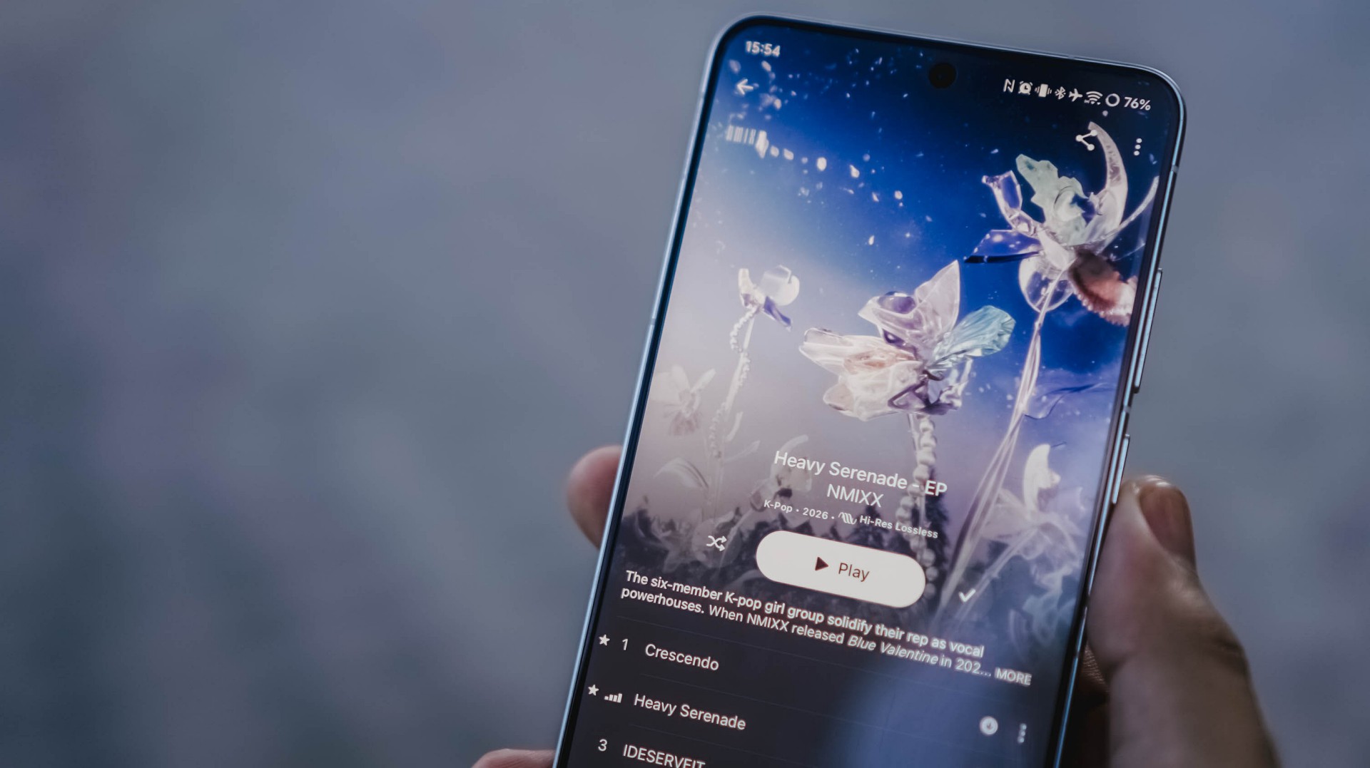
On Queue: I.O.I, NMIXX, tripleS
Sound produced by vivo’s X300 Pro were already loud and full. How much more with the X300 Ultra?
It’s hard to say that there are major improvements. Rest assured, its built-in stereo speakers sound superb.
Highs, mids, and lows are clearly separated without that unwanted flat nor muffled sound output.
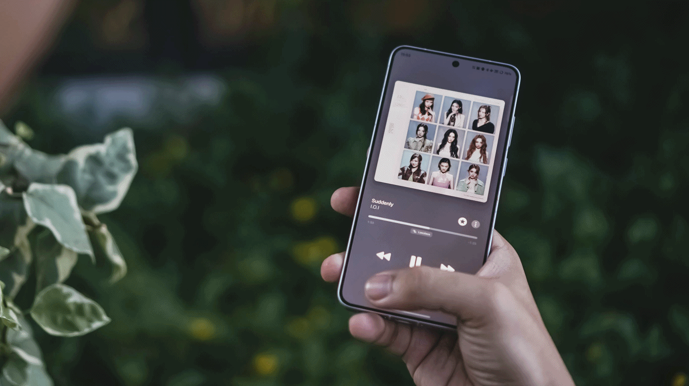
Speaking of separation, I.O.I has been separated 10 years ago but came back this 2026 for a short yet sweet reunion comeback. I was very giddy to play Suddenly through the phone’s mighty speakers.
Suddenly, it made me teary-eyed after realizing I’ve witnessed I.O.I’s hardships and very formation ever since I watched Produce 101 Season 1 since 2015.
Thanking all the gods for NMIXX’s existence
The lossless goodness can also be heard when I played NMIXX’s Cresecendo and Heavy Serenade — especially with Lily, Sullyoon, and Kyujin’s adlibs.
Last but definitely not the least, the soothing yet energizing vibe was felt all throughout when I played the rock-infused pop track Baby Flower by the K-Pop super group, tripleS.
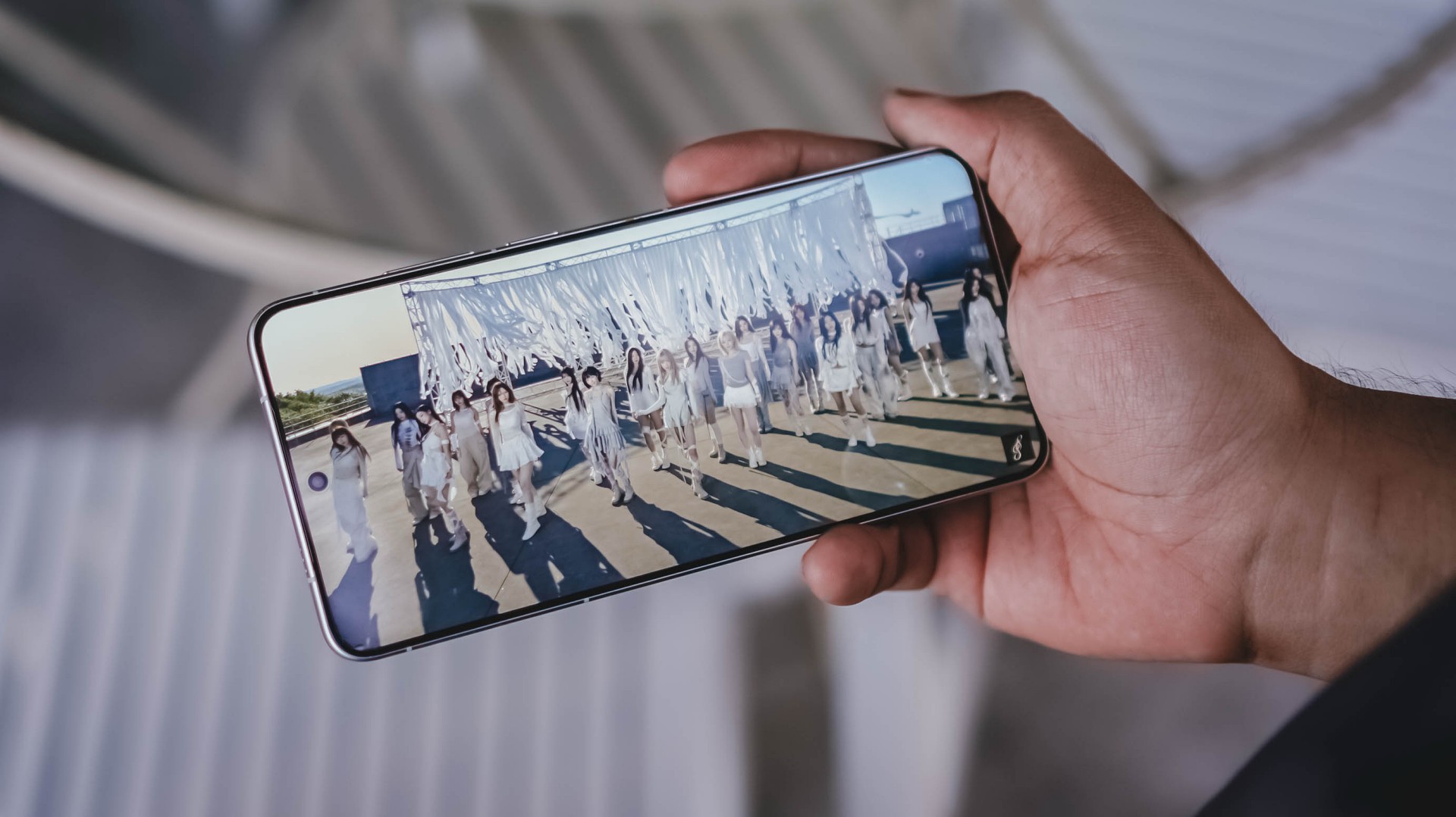
Finally! OT24 and ASSEMBLE26
It’s not just the song, rather, the full <LOVE&POP> pt.1 album, that’s worth listening to more than the streams they have garnered from their release date.
All in all, much like all these explosive bangers, the vivo X300 Ultra is a remarkable device for your banging loudspeaker sessions — even without the existence of any audio brand partnership.
True Blue Flagship
With flagship-grade display and cameras lie all the powerful core within.
Given that this is vivo’s ultimate flagship, it runs the latest and greatest 3nm SoC from Qualcomm: Snapdragon 8 Elite Gen 5.
Paired with a speedy 16GB LPDDR5X Ultra Pro memory, opening and switching or using apps simultaneously should be easy-breezy.

With OriginOS 6, animations are less fluid yet very snappy. I prefer it more over other Android skins (ColorOS, MagicOS, HyperOS, you get the idea).
Talk about perfect timing! I was thrilled when NTE (Neverness to Everness) finally made its release last May.
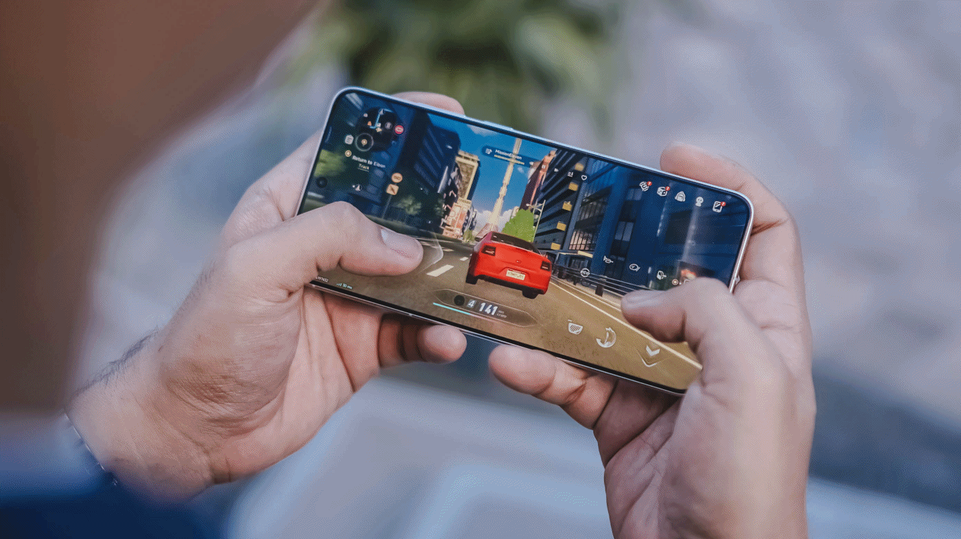
With this phone’s ultra-capable specs, it made me enjoy the all-new open-world game more fun and enjoyable. It’s like a mashup of Zenless Zone Zero and Cyberpunk 2077.

Looking at the graphics settings alone, you’re assured that the X300 Ultra will run the most intensive gaming titles to ever exist on the Android space.
While other markets have a 1TB storage configuration, the region where I reside in solely sticks to the 512GB variant.
Then again, it’s a major downside for a power user like me who easily fills up the phone. That’s considering how massive and daunting the file sizes are once you shoot in RAW and record in the most insane video resolution and codec possible in this device.

Hopefully though, vivo would consider bringing in 1TB to more regions — and 2TB like the newer iPhone Pros.
Now that I mentioned it: Other than the macOS integration with vivo’s Office Kit, the X300 Ultra can now do AirDrop as well! This was only a fantasy back then — especially for an Apple-slash-Android user like me.
The Not-so-flagship aspect
Frankly, the only thing that is not flagship-like about the X300 Ultra is its battery longevity.
Even though we are now being spoiled by 8000mAh ~ 10,000mAh+ midrangers nowadays, I am very much aware of the engineering challenges faced by manufacturers when prioritizing cameras in the flagship-class.
But, hear me out real quick. Why did OPPO manage to equip the Find X9 Ultra with an even bigger 7025mAh capacity? The Chinese Xiaomi 17 Ultra even has 200mAh more.


ICYMI, the X300 Pro already had a 6500mAh battery — and it didn’t last me throughout a whole day. How much more with the 6600mAh tank of the X300 Ultra?
Despite a more “power-efficient” chipset and a 100mAh boost in battery, the X300 Ultra is not in any way better in terms of endurance. While I thank vivo for the OriginOS transition, the battery efficiency of Funtouch OS was left behind.

While it can last well when used in moderate scenarios, it’s a heavy hogger when you use the cameras a LOT — which is the point of wanting this smartphone.
Case in point: During our COMPUTEX 2026 coverage, I relied heavily on this smartphone for shooting 90% of the stuff around the exhibition — especially because of how crammed and crowded the booths and pathways were.

From 9AM up until 2PM, it easily depleted its fully-charged state down to just 15%.
Fortunately, the vivo X300 Ultra supports one of the fastest charging speeds in a smartphone: 100W FlashCharge and 40W Wireless FlashCharge.
With my whole review duration, I utilized its wired charging capabilities more especially that it has a bundled charger plus USB-C to USB-C cable in the box.
FlashCharge High Speed |
FlashCharge Normal |
|
START TIME (From 0%) |
4:20AM |
6:06PM |
3 minutes |
2% |
2% |
5 minutes |
4% |
4% |
10 minutes |
10% |
7% |
15 minutes |
21% |
11% |
20 minutes |
30% |
20% |
30 minutes |
50% |
30% |
45 minutes |
77% |
44% |
1 hour |
98% |
62% |
1 hour 15 minutes |
— |
83% |
END TIME |
5:26AM1 hour 6 minutes |
7:35PM1 hour 28 minutes |
Mind you, third-party chargers, cables, and even power banks will still work and can take advantage of that FlashCharge High-Speed charging all thanks to that USB-C PPS protocol.
Although MagSafe isn’t supported, third-party cases with magnets can still make magnetic Qi2 (and Qi2.2) wireless charging possible.
Is the vivo X300 Ultra your GadgetMatch?
The original headline of this review was supposed to be “the true mirrorless for less.”
But, with a base price of PhP 109,990 / MYR 6799 / INR 159,999, it’s not precisely cheaper than most mirrorless setups in the market.

Still, that doesn’t mean the X300 Ultra performs less than a mirrorless.
Spending almost two months with the X300 Ultra, I can truthfully say I’ve enjoyed shooting with this power-packed phone more than the mirrorless camera I own.
This isn’t me saying smartphones can replace mirrorless cameras anytime soon. But, the focal length flexibility, photo and video versatility, plus plentiful software feats truly make the X300 Ultra the pinnacle of phone-tography and videography.
As I alluded to earlier, the X300 Ultra is vivo’s direct answer to Apple’s iPhone 17 Pro Max.
While acquiring that iPhone of the same configuration is cheaper at PhP 101,990 / INR 154,900 (but more expensive in Malaysia at MYR 6999), X300 Ultra boasts greater camera hardware and better pro-grade tools altogether.
And, even if you are stuck with some Apple devices (like yours truly), its readiness alongside the Apple ecosystem makes it an Android smartphone you cannot resist.
In Europe, while the starting price is higher at EUR 1999, that gives you double the storage. But, at the cost of removing the bundled charger and cable due to EU laws.

Enough talking! The vivo X300 Ultra is a hard Swipe Right, solid Super Swipe, and a worthy recipient of GadgetMatch’s Seal of Approval.
Whenever a brand slaps a “long battery life” label on a box, we take it with a grain of salt.
Even as smartphone battery capacities have become larger as of late, endurance is still subjective. It’s heavily dependent on your daily screen time, signal strength, and other habits.
But when a smartphone lands on your desk with a gargantuan 10,001mAh battery, then that subjectivity basically goes right out the window.

That’s what the realme P4 Power chiefly brings to the Philippine market for the first time, in the brand’s P series relatively quiet debut in the country.
It’s here to eliminate low-battery anxiety and render your bulky external power banks completely obsolete.
Tether-less freedom
We wielded this device for weeks as a primary daily driver, and the endurance is nothing short of black magic.
The daily rotation included endless social media scrolling, video streaming, continuous navigation, and a relentless stress test: serving as a portable Wi-Fi hotspot for up to three separate devices simultaneously.
Through all that usage, the phone flat-out refused to die. I didn’t consciously “try” to drain it. I just know it would last an entire day for up to the wee hours.

When acting as a multi-device router, the chassis does heat up slightly, but it never crosses into alarming or uncomfortable territory.
It simply sips power, providing a level of tether-less freedom that no standard 5,000mAh or 6,000mAh smartphone can replicate.

When it is finally time to recharge the device, it supports 80W SUPERVOOC charging so you won’t have to spend hours waiting.
Even if you don’t replenish it back up to 100%, an hour’s worth of charging should keep you going the extra distance.
Immersive visuals, casual performance
The massive battery pairs beautifully with a expansive 6.8-inch 144Hz AMOLED display. With a high, 453ppi pixel density and 1280 x 2800 resolution, media consumption and gaming become highly engaging — at least from a visuals standpoint.

There is a wider aspect ratio so you don’t get a comically long phone, and a curved screen. We aren’t typical fond of this but the curvature seems subtle, meaning no accidental edge touches.
When it comes to performance, the MediaTek Dimensity 7400 Ultra chipset handles everyday tasks and casual, less-demanding titles with absolute ease.

However, when jumping into competitive matches of Call of Duty: Mobile or exploring the heavy landscapes of Honkai: Star Rail, you will encounter frame drops and stuttering from time to time.
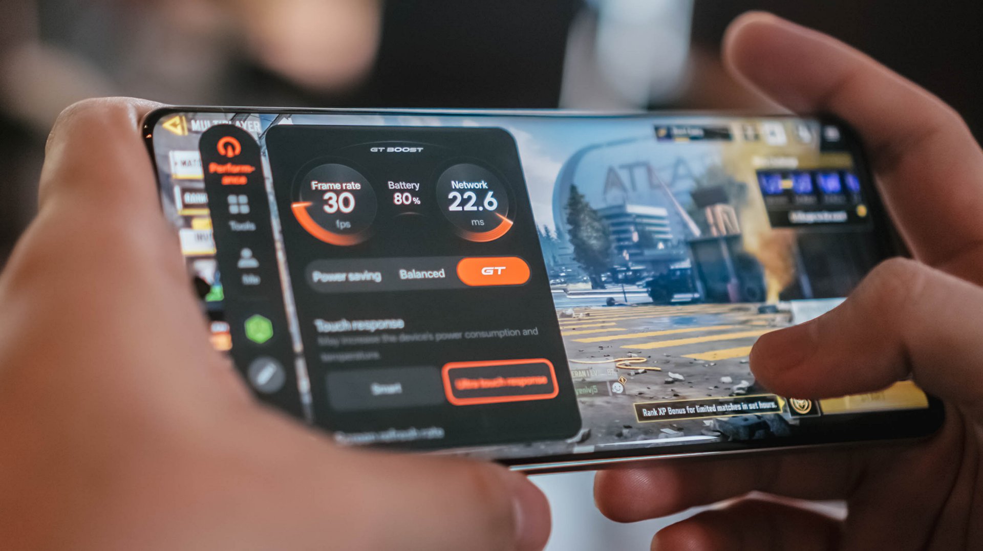
It’s never jarring enough to ruin your match or hinder what you’re trying to do, but it does occasionally disrupt an otherwise smooth gaming experience.
If anything, there’s Championship Mode and GT Mode to optimize the device for such tasks. Bypass Charging is a bonus so you can keep playing without the risk of device overheating.
Audio is loud but somewhat flat, but I didn’t expect much.
Heavy, mecha-inspired tank
That display curvature is part of the phone’s overall aesthetic. Around the back, the realme P4 Power embraces its “all about power” persona with a distinct, machine-inspired design language.
The upper half where the camera island is located, in particular, look aggressive and sharp, as if a nod to mobile gaming. The colorway for this unit is silver metallic.
However, housing a 10,000mAh cell requires a serious physical compromise: weight. This phone is significantly, undeniably heavy.
The sheer heft is a constant reminder of the juice it carries, to the point where switching back to a “normal” smartphone yields a stark, instantly noticeable contrast in your hand and pockets.
Reliable main camera, lagging selfies
For its camera package, the realme P4 Power comes with a dependable 50MP main camera with a Sony IMX882 sensor.
I didn’t exactly “test” the camera but just naturally used it whenever I was out and about. Hence, I ended up with plenty of food, product reviews, and random finds.
Performance is decent, with the 1x to 1.5x range being the sweet spot. Compared to budget devices, there is definitely more detail and texture.
Color reproduction is likewise amenable, with some depth and acceptable clarity. But camera-centric mid-rangers can obviously offer punchier, more “popped-up” contrast.


With OIS, video recording is likewise smooth. It’s usable for casual vlogging, although lighting is still the catch. You’ll need an extra tofu light for instance, which sacrifices the portability of the phone itself.
@manilaconnoisseur Dropped by Daily Beer Korean Chicken and Beer in ArcoVia, Pasig for some food after a team meeting!
The selfie camera, meanwhile, also lags compared to older realme number series devices I’ve used. Sharpness, vividness, and color accuracy are lacking.
@manilaconnoisseur Lipton Soda Iced Tea, now available in Berry Burst flavor! Zero sugar pa rin! Check out now. @Pepsi Philippines #LiptonSodaIcedTea #LiptonSoda #LiptonSodaBerryBurst #LiptonSodaZeroSugar
Built to survive the elements
As an added bonus, realme didn’t sacrifice ruggedness for the sake of capacity. The handset comes armed with a familiar IP69 rating for dust and water resistance, including high-pressure water jets and submersion.
![]()
We took it out on outdoor jogs, and heavy sweat didn’t cause a single issue. Even when dealing with moisture, the display’s touch optimization remained responsive.
Is this your GadgetMatch?
The realme P4 Power sits right in the competitive PhP 25,999 price bracket. In an era where smartphone prices are continuously climbing, it still offers a value proposition as an all-around mid-range device.

Think of it as buying a standard mid-ranger plus a power bank, minus the double pocket clutter. Long-term battery degradation remains to be seen but it seems the device is a fair purchase for power users.
It’s a close call, but the P4 Power is still a Swipe Right especially if your lifestyle demands endless battery life above all else.

After a week with the HONOR Watch 6, I realized I liked having data on things I normally would just leave to uneducated guesses.
I love seeing my sleep metrics, knowing if my heart is actually racing, and seeing notifications on the fly. These are things I find truly helpful in how I go about life currently. That’s why I can already see myself using the watch beyond the review period.
The thing is, I wasn’t expecting any of this.

The first thing that jumped out at me when I first wore the HONOR Watch 6 was that it barely felt like it was there. I was half expecting it to be this chunky-feeling thing. But it wasn’t. I was pleasantly surprised.
I have the silver model with the brown leather strap, and it feels light to wear. That was key for me because what I really wanted to track more than anything was my sleep.
The only time I really started to notice that I was wearing it practically all the time was around the fifth or sixth day. And honestly, that says a lot because I tend to want to take off most of the smartwatches I’ve used in the past.
A smartwatch that fits daily life

The brown leather strap is inoffensive in the best possible way. It blends well with both casual wear and smart casual outfits, which made it easy to keep on throughout the week.
In fact, I think it looks more at home during everyday life than during intense workouts.
That’s why I found myself looking at the HONOR Watch 6 less as a fitness watch and more as a health tracker that looks nice and tells me if there’s a proverbial fire I need to put out — or if she remembered me that day.
The display also quietly did its job.
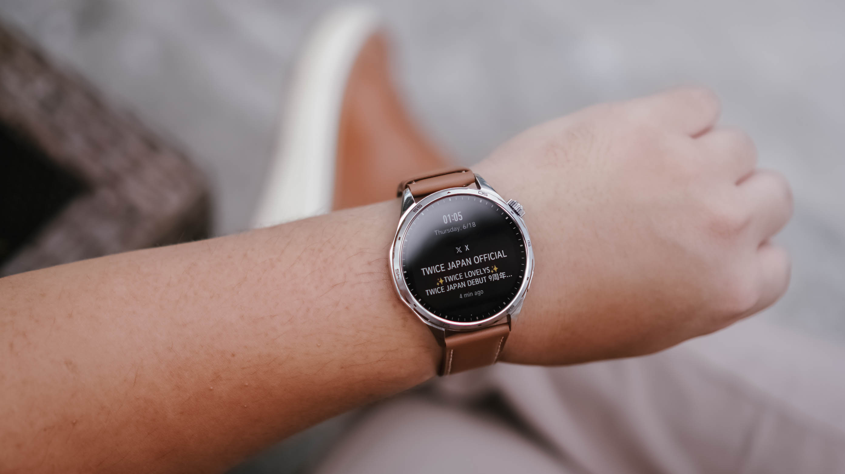
Of course it’s a TWICE notification
You know, I didn’t even think about it. Whenever I needed to check the time or glance at a notification, I simply gestured as anyone would to look at their watch. No matter where I was, what I needed to see was readily visible.
That’s probably the highest compliment I can give a smartwatch display. It never gave me a reason to think about it.
Managing attention without reaching for my phone
Oof. I cannot overstate how many notifications I get on any given day.
As a Managing Editor with occasional side hustles, notifications come from multiple messaging apps. One moment I’m tracking production progress on WhatsApp, the next I’m checking what the team is discussing on Telegram. Then there are the emails, Messenger messages from friends, and the “… sent you a reel” notifications that have recently dropped in frequency to my dismay.
I don’t always want to pull out my phone to check these.

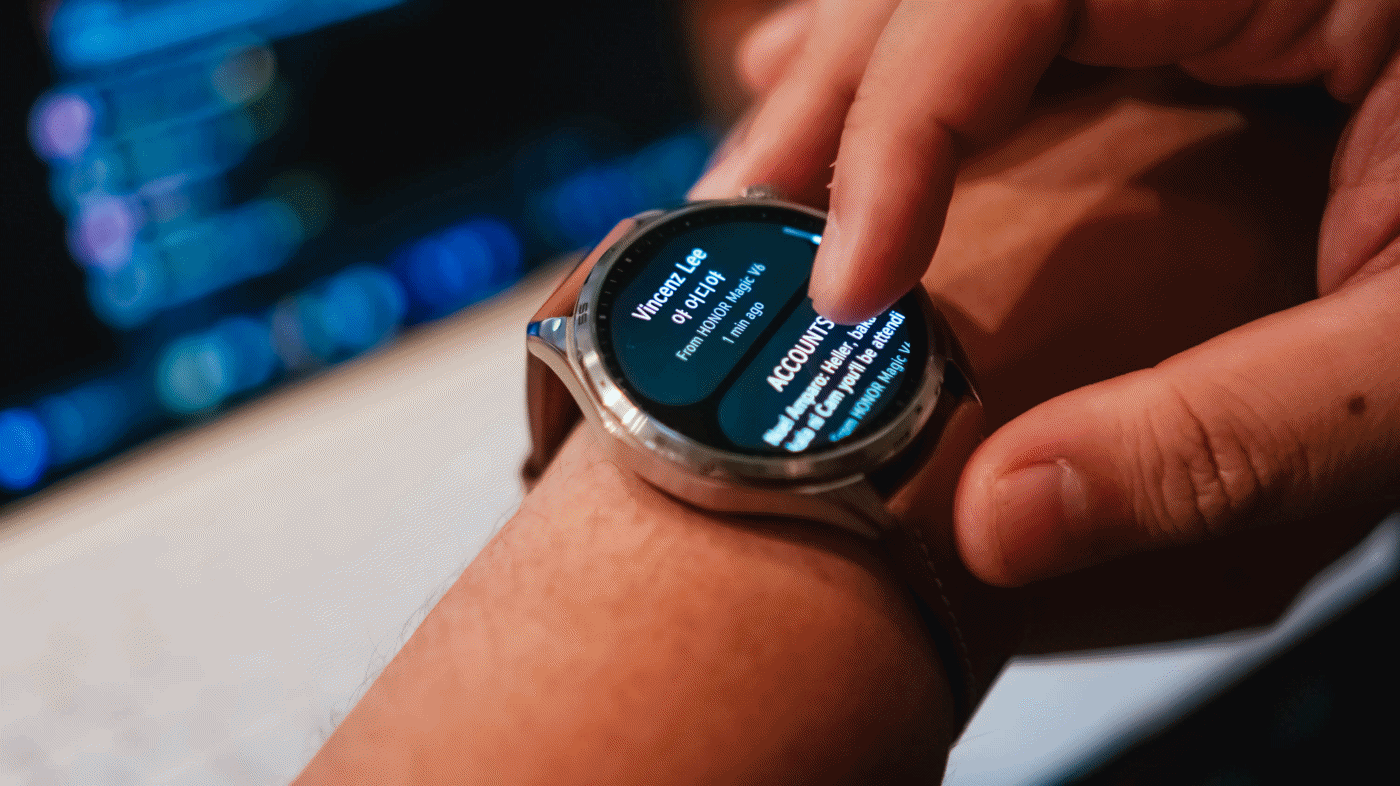
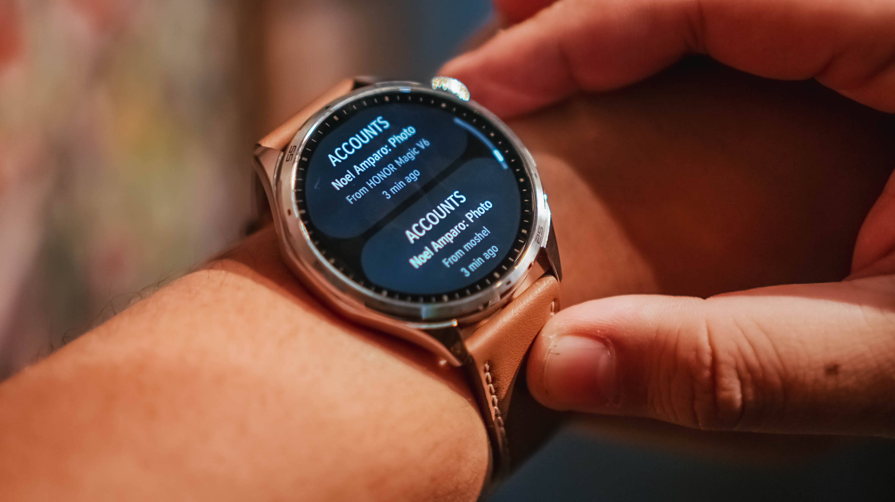
What I appreciated most about the HONOR Watch 6 is that notifications are grouped by app, and each one provides a clean preview. It gives me enough information to quickly assess what needs attention and what can wait.
For someone who is constantly juggling attention, that proved surprisingly useful.
Replacing guesses with data

The feature I was most interested in wasn’t fitness tracking.
It was sleep tracking.
Some time ago, a friend of mine started tracking her sleep and it helped her better regulate her energy throughout the day. I am nowhere near that level of discipline, but I was curious.
Between traveling across time zones, late-night coverage, doomscrolling, revenge bedtime procrastination, and everything else life throws at us, I honestly wasn’t sure if I was getting enough sleep.
![]()
What I learned is that I tend to wake up at least once in the middle of the night. Not for anything, really. I just do.
The mornings that felt best were often the nights where my sleep wasn’t interrupted. I know that sounds obvious, but if you’re not actively paying attention, these are the kinds of patterns you can easily miss.
The same goes for heart rate tracking.
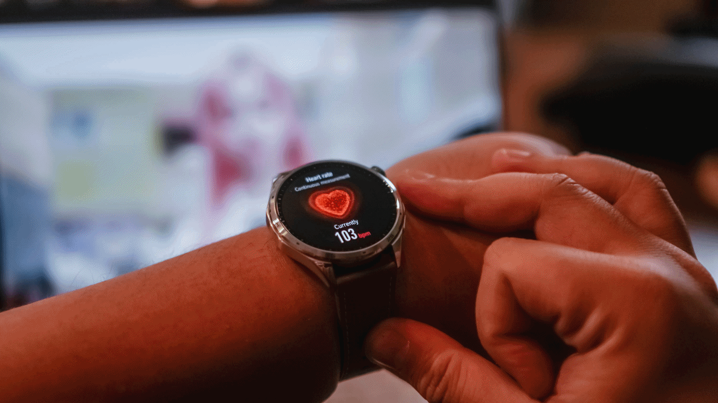
During a particularly stressful stretch, I noticed my heart rate was consistently elevated. It wasn’t exactly surprising, but seeing the data attached to the feeling made it feel more real.
That’s what I found myself appreciating most about the HONOR Watch 6. It didn’t magically solve anything. It simply helped me replace assumptions with information.
Battery life that quietly impressed
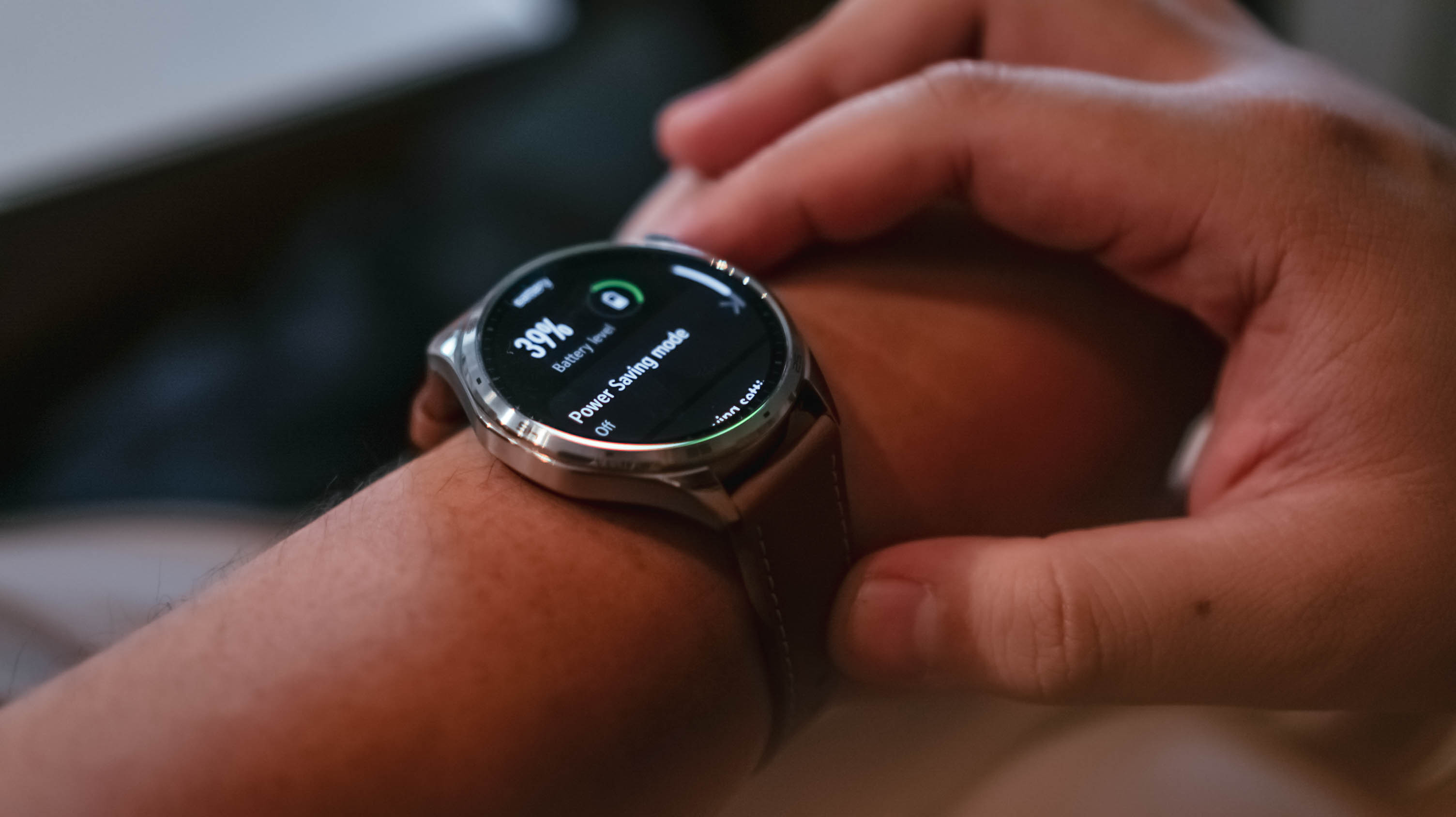
As of taking the photos, the battery life is at 39% – still coming off the first initial charge.
I charged the watch the moment I unboxed it. Seven days later, it was sitting at 59%.
During that time, I wore it constantly. Notifications were enabled. Health tracking was enabled. I tracked a handful of kettlebell workouts and wore it while sleeping.
I wasn’t exactly pushing the watch to its limits, but I also wasn’t babying it.
The result was a battery experience that quickly faded into the background. That’s exactly what I want from a smartwatch.
Everything else
To be completely honest, I didn’t have the time or bandwidth to thoroughly test every feature.
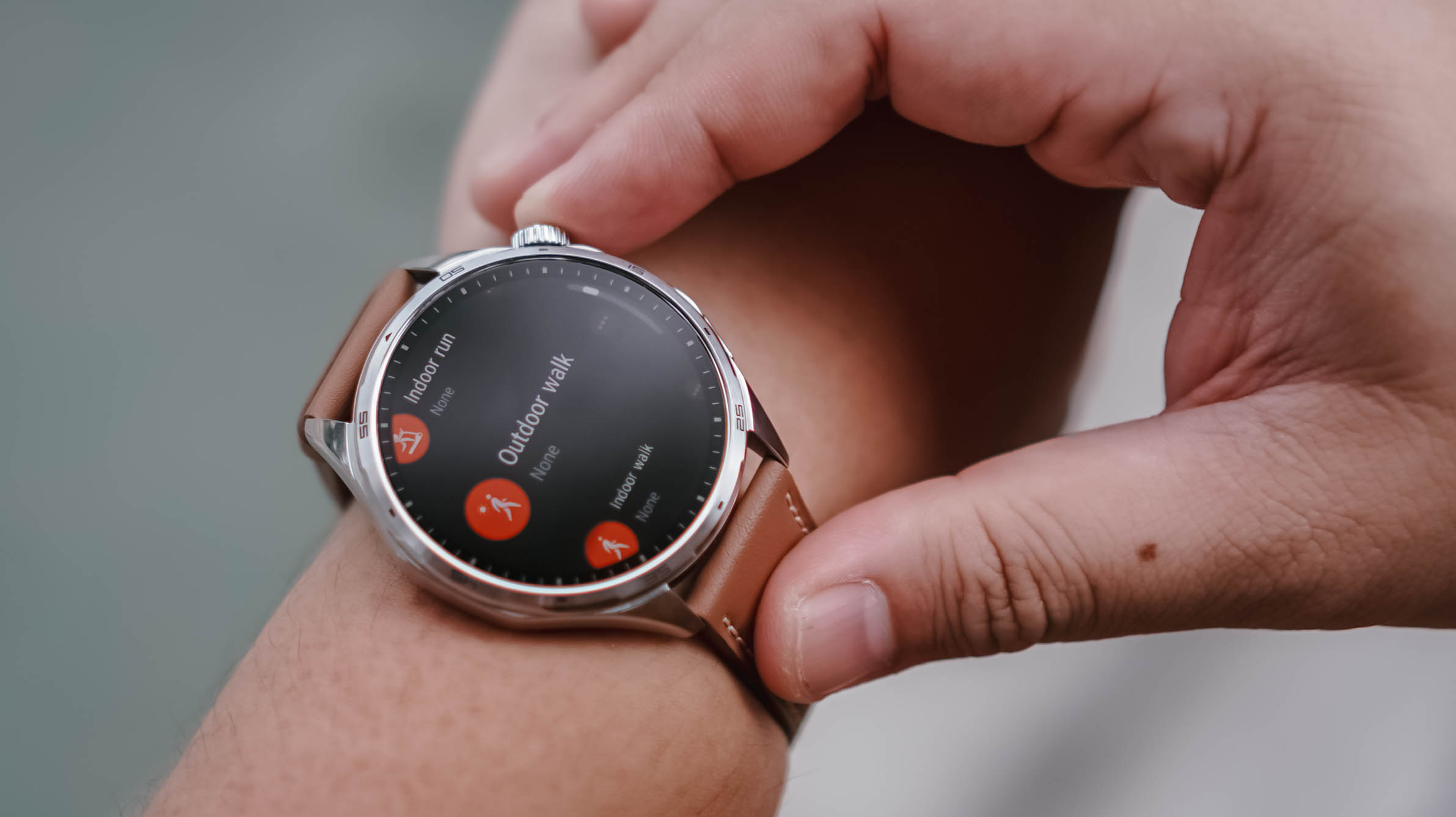
My workout sessions were limited to a few kettlebell workouts and my usual walking. That said, the breadth of sports tracking available here is impressive. If you can think of an activity, there’s a good chance the HONOR Watch 6 can track it.
Pairing was also straightforward. The initial setup process and software updates went smoothly, even if updates immediately after unboxing remain one of my least favorite parts of testing any device.

My one annoyance came from using the watch with multiple HONOR phones. At times, notifications would arrive twice or arrive at slightly different times depending on which device was relaying them. There’s probably a setting that solves this. I just didn’t have the opportunity to dig deeper.
Same notification, two different phones
As for features like AI Recorder and NFC payments, I simply didn’t encounter situations where they became essential to my routine. That’s not necessarily a criticism. It may simply reflect how different people use smartwatches.
Is the HONOR Watch 6 your GadgetMatch?

Something I don’t think we’ve talked about enough is that the HONOR Watch 6 also works well with an iPhone.
If you don’t particularly like the look of the Apple Watch but still want a smartwatch on your wrist, this is a viable alternative.
The HONOR Watch 6 is for people who want useful technology that blends into everyday life. It looks good enough for casual outings and nicer occasions alike, while still offering the usual smartwatch essentials like health tracking, workout monitoring, notifications, and long battery life.

After about a week with the HONOR Watch 6, I realized I liked having data on things I normally would just leave to uneducated guesses.
Smartwatches aren’t for everyone. But if you fancy having one, the HONOR Watch 6 is an easy swipe right.
It has the right features, excellent battery life, and a design that fits comfortably into many parts of daily life.
That’s really all most people need.


Steam Machine price, reservation system revealed

Mercedes-Benz holds a Welcome Home campaign to celebrate 140 years

Ubisoft co-founder dies in plane crash

No new CMF phones this year, Nothing confirms

vivo X300 Ultra review: A whole different animal

TECNO’s POVA 8 5G is both futuristic and future-ready

Close without crossing: A Xiaomi 17T Pro photo essay

realme launches P4 Series 5G, including Power with 10,001mAh battery

The Xiaomi Watch S5 proves you don’t have to take it off

Buyer’s Guide: Xiaomi Pad 8 Series


-
 India2 weeks ago
TECNO’s POVA 8 5G is both futuristic and future-ready
-
 Reviews2 weeks ago
HONOR Magic V6 review: The best version of a book-style foldable?
-

 Gaming2 weeks ago
Kingdom Hearts IV gets new trailer, confirms Switch 2 release
-

 Gaming2 weeks ago
Final Fantasy fans have two big reasons to look forward to 2026
-
 Smartphones2 weeks ago
Upcoming realme C100 series to feature 8,000mAh battery
-

 Gaming2 weeks ago
Nintendo officially announces Ocarina of Time remake
-
 News1 week ago
TECNO’s SPARK 50 Pro is the latest budget smartphone battery beast
-

 Buyer's Guide5 days ago
Buyer’s Guide: TECNO SPARK 50 Pro vs SPARK 50 5G